RSS
 

Posts Tagged ‘Using’

How to Simulate the Look of Analog Film Using Lightroom

06 Apr

The tones and organic nature of analog film are things many of us have began to long for in our digital age. Don’t worry, though, this will not be an article about the merits or disadvantages of digital photography or whether film is better or worse than digital. The purpose of this tutorial is to deliver what might be called the best of both photographic worlds. And if not the best, a very liveable compromise between the charm of analog film and the convenience of digital imaging – how to simulate the look of analog film using Lightroom.

How to Simulate the Look of Analog Film Using Lightroom

Photography, like most everything else, is invariably on a forward march of advancement. Always looking for the next best thing; better cars, better computers, and for us photographers…newer digital cameras. Intriguingly enough, often times we end up missing the “old school” feel of the very things we sought to replace with successive newer versions.

Imparting our digital photos with the great look of film is not only but possible, but simpler than it has ever been before. Furthermore, we can conduct all this retrograde post-processing alchemy in Adobe Lightroom. Yes, I promise it’s easy.

How to Simulate the Look of Analog Film Using Lightroom

Things to Note

Now is a good time to pause and make a small disclosure. There are many other variables that exist which determine the final look of a print made from analog film. These variables range from the type and temperature of the chemistry used to develop the film, to the way it was printed and scanned. Even the age of the film when it was shot can change the look of the final results. So remember that while exact accuracy might not be possible the fun of the process itself certainly is!

First Things First – Find a Film You Like

The first step in the process is to find the film you want to replicate. There are a number of ways to go about this. If you happen to be one of those glorious hybrids who shoot both digital and film then you likely have some examples readily available. But the easiest way I’ve found to discover a multitude of images made with analog film is to have a look at Flickr.

There are quite a few groups there that specialize in “film only”, so each image posted is shot on analog film and then scanned into the computer. Some of these groups, such as Film Database require participants to post their images with the film type indicated. Once you find an image with a grain and tone you like, it’s very simple to learn which film was used to create that image. The more images you can find that were shot with that film, the better you can understand the general feel of it.

How to Simulate the Look of Analog Film Using Lightroom

Moving to Lightroom

Once you’ve found the film-look that you’d like to replicate, it’s time to move into Lightroom and let the fun begin. First, we’ll look at the three key things to pay attention to when it comes to simulating the characteristics of film color tone, contrast, and grain. Then, we’ll walk through creating the look of film with a sample image, so you can see just how easy the process really is!

Color Tone

Color tone is a broad term that, for our purpose, describes the overall color temperature of a film and the saturation of those colors. Analog films come in virtually every color tone under the rainbow (pun intended). Some films are very warm toned with rich, vibrant colors. While others are more subdued, with cooler tones and less color saturation. Even black and white films have certain color tone variations.

When looking for the chromatic characteristics of a film, be sure to take note whether the overall tone is warmer or cooler in temperature. Then, look to see if there is any color cast to the image such as blue, red, green, etc. If the film you’re replicating is black and white, still pay close attention to any coloring that might be present. Black and white film is always more than just black and white!

Contrast

This is perhaps the most straightforward aspect of the entire replication process. Contrast is simply the difference between lights and darks within an image. Films carry different contrast latitudes (again, development is key) which you can observe. Are the blacks dark and dense or are they lighter and more faded? Are the highlights bright and contrasted or is the photo flatter and less punchy? Later in Lightroom, the contrast slider will do a lot of the work for you.

Grain

Perhaps the most fickle property of analog film is the presence of grain. Grain is brought about by the size and number of the tiny light-sensitive silver crystals found in the film’s emulsion. Higher ISO film has more grain and lower ISO films generally have less grain. Depending on the film these grains can be larger or smaller, rough or fine, and literally everything in between. It’s a good idea to view the image at the largest size available when examining the grain of the film. Pay special attention to the amount, size, and coarseness of the grain when taking your notes. You are taking notes…aren’t you? Of course, you are!

The Process of Simulation

How to Simulate the Look of Analog Film Using Lightroom

Fujifilm Provia 400X (Image courtesy of Fujifilm)

Now here comes the good part. We will take a digital image and give it the look of a particular analog film. In this case, I’ve chosen a mid-range ISO film, Fujifilm Provia 400X. It’s a moderately saturated film in terms of color, with nice contrast. At ISO 400 the grain is apparent, but not as coarse as some other mid-range ISO films. In most of the images that I viewed from this film, there exists a slight blue color cast present.

Make a Roadmap

So, before I do anything in Lightroom, I make a road map to help me along the way during my processing. It will list the core attributes of the film I’m hoping to replicate. Do this for your film now:

  • Color Tone: Slight blue hue especially in the shadows. Color saturation is moderate. Color temperature is slightly cool.
  • Contrast: Moderate to strong contrast with deep blacks.
  • Grain: Quite apparent but relatively smooth.

Do Basic Adjustments First

We begin with a photo that has been corrected for exposure but no adjustments for color or contrast. This is the best place to start for replicating analog film.

How to Simulate the Look of Analog Film Using Lightroom

Image before processing.

I crop the photo slightly and then move back to the Basic Panel.

How to Simulate the Look of Analog Film Using Lightroom

Follow the Roadmap

Going back to the road map list I made earlier, contrast is the first adjustment. I increase the contrast slider to +81 but this still doesn’t give me the depth in the shadows I’m after, so I go further and darken the blacks by -40. While I’m here, I reduce the saturation to better match the moderate qualities of the Provia 400x. Since the image needs to be slightly cooler, I decrease the temperature a very small amount as well.

To add a little more blue to the shadows we will next use one of the great unsung hero of Lightroom, the tone curve. Click on the tone curve panel and be sure it’s set to “channels” view. Since I want to add a blue color cast, I select the blue channel (see below).

How to Simulate the Look of Analog Film Using Lightroom

Since I want to apply the blue toning mostly in the shadow areas of the image, I raise the leftmost end of the curve upwards slightly. This will introduce a blue hue to the blacks. Be careful not to overdo it here. A little goes an incredibly long way.

How to Simulate the Look of Analog Film Using Lightroom

Using the Curves Adjustment, in the blue channel – adjust the blacks as shown here to add a cool tint to shadows.

Adding Grain

All that’s left now is to focus in on our grain situation. My original digital image was shot at ISO 500 which is close to the ISO 400 of the Provia. Here’s a 1:1 zoom of the original image.

How to Simulate the Look of Analog Film Using Lightroom
But film grain bears many more nuances. So let’s adjust the grain in the effects panel based on our notes from earlier. We observed that Fujifilm Provia 400x sported grain that was moderate, but rather fine. So I experiment with the Amount, Size, and Roughness sliders until I reach a grain effect that approximates the appearance I’m after. Don’t be afraid to manipulate these sliders into submission! The correct combination only comes from visually comparing the adjustments.

How to Simulate the Look of Analog Film Using Lightroom

Here is the grain we’ve added compared to the original image. At a 1:1 view the difference because readily apparent.

And now, you’re all done!

How to Simulate the Look of Analog Film Using Lightroom

Final image.

Don’t hesitate to go back and tweak the exposure or other adjustments to get the look you want. But remember if you change the contrast or color edits your photo might distance itself from the analog film you’ve attempted to simulate.

*Bonus* Try increasing the color noise reduction slider to remove any traces of color noise. Color noise is a trait exclusive to digital imaging and is not found in analog films.

Here’s the finished simulation of Fujifilm Provia 400x film compared to our original digital photo.

How to Simulate the Look of Analog Film Using Lightroom

Before and after.

Conclusion

While we can’t exactly replicate the look of film due to variances in the development and printing processes, we can achieve very similar looks. In a way, we have more versatility since we can strive to achieve the look of a multitude of films in our digital darkrooms. Show us your own analog film simulations in the comments section below!


Want to get a jump start at creating your very own analog film simulations? Take a look at these presets developed by myself, which replicate the looks of numerous classic analog films. All with just a click of the mouse!

  • Analog Film Simulations: Volume 1
  • Analog Film Simulations: Volume 2

The post How to Simulate the Look of Analog Film Using Lightroom by Adam Welch appeared first on Digital Photography School.


Digital Photography School

 
Comments Off on How to Simulate the Look of Analog Film Using Lightroom

Posted in Photography


Using Juxtaposition for More Compelling Landscape Photography

30 Mar

Juxtaposition – it’s one of my favorite words, and also one of the most important aspects of successful photography. It’s used in portraiture, outdoor adventure, and frequently in travel photography. In images of the landscape, however, juxtaposition is often overlooked.

I say overlooked because many photographers integrate juxtaposed elements in their landscapes without even being aware of them. You see, juxtaposition, or the way different elements conflict and contrast, is a key feature in most good landscape photographs.

Though there are a dozen or more different ways juxtaposition can occur in an image, in this article I’m going to concentrate on three; color, texture, and subject matter.

Using Juxtaposition for More Compelling Landscapes

Juxtaposition – Color

You are probably familiar with the color wheel. Likely you were introduced to the concept in grade school when you learned the difference between primary and secondary colors. More recently, if you have selected a new font color on your word processing program you’ve likely seen some form of the color wheel.

Simply, a color wheel shows the three primary colors (red, blue, and yellow) occupying three slices of the circle with all the mixing iterations of color blending together between them. The result is a continuous blur of colors, encompassing just about everything on the visible spectrum.

Using Juxtaposition for More Compelling Landscapes

Many landscape images will have multiple juxtapositions. In this case, color is foremost with the warm tones on the salt mounds against the deeper blues of the water and sky. But the shape and texture also stand out. (Salar de Uyuni, Bolivia).

Colors that are opposite from one another (complementary) on the wheel like; blue and yellow, red and green, or orange and purple, for example, will juxtapose. That is, they will stand out from one another; some in a pleasing way, some in a conflicting way. Both can work in photography, depending on your goal, but you need to be aware of the way colors communicate in an image to assure your final result is what you intend.

Using Juxtaposition for More Compelling Landscapes

In this aerial image of the Baird Mountains in northwest Alaska, the turquoise tarn in the foreground stands out as the brightest patch of color in the frame, juxtaposed from the muted grays and browns of the mountains.

Reds and blues, for example, are very commonly blended in landscape photography; blue water with sunset sky, red flowers on a bluebird day, autumn colors against a dark backdrop, etc. Color plays an important role in landscape photography, and we recognize pleasing color combinations as soon as we see them. But recognizing WHY they are pleasing, is different from seeing that they are. Look for those relationships in your compositions, and concentrate on their placement. Some colors, red for example, are extremely effective at drawing the eye. But to be most effective, red needs to be counteracted by cooler tones, balancing the image. Mind how the colors are distributed in your image. It matters.

Juxtaposition – Texture

Using Juxtaposition for More Compelling Landscapes

A long exposure softened the water which creates a juxtaposition with the rough stones of the cliff. (Grand Canyon National Park, Arizona.)

Using Juxtaposition for More Compelling Landscapes

In this image, both the color and the rounded texture of the autumn Bearberry in the foreground creates a juxtaposition with the blue sky and the sharp, upright trees in the background.

Juxtaposed textures are abundant in any landscape; spiky bushes against a smooth landscape, water flowing over rough rock, or just a jagged boulder in the middle of an otherwise soft, grassy meadow, etc. Textures, as like color, are easy to observe in the field. Like bright colors, aggressive textures too need to be used in moderation. Like reds and oranges, sharp, rough, textures will dominate an image if used too liberally.

Using Juxtaposition for More Compelling Landscapes

The antlers of this caribou skull and the bright white against the dark tundra make the subject leap out from the image.

Overwhelming textures, just like overwhelming colors, might be exactly what you want. Just be aware of that decision when you make the image. Make the harsh textures the point of your image, because the wrong balance, or aggressive textures placed too dominantly by accident, can ruin the balance of an image. Consider how they relate, the story you want to tell with their use, and place them in the frame accordingly.

This is a tough one to put to use because there are no clear rules about texture. You may not always realize when you’ve gotten this balance right, but you’ll definitely know when it’s wrong.

Using Juxtaposition for More Compelling Landscapes

In this image of Denali, in Denali National Park, Alaska, the two rounded forms, one green and spiky, one blue-white and more smooth echo one another, while providing wildly different textures, colors, and implications for the image.

Juxtaposition – Subject

Using Juxtaposition for More Compelling Landscapes

Bright flowers on a gray day on a barren dune. Few things can create more juxtaposition in this image.

Using Juxtaposition for More Compelling Landscapes

Without context, this image would not have an obvious juxtaposition, it’s just an image of a lightning strike. But, when I tell you this photo was made on the arctic coastal plain of northern Alaska where thunderstorms are as rare as unicorns, then the juxtaposition of location and lightning are more clear.

The first two examples, color and texture, are more nebulous and tougher to apply in the field than the subject of the image. In landscapes, juxtapositions within the subject matter are easier to apply, and will almost always add interest to your images.

Using Juxtaposition for More Compelling Landscapes

A rare rain storm in the Altiplano of Bolivia catches the last rays of sunlight. Both color and subject juxtapose here.

As I sat down to write this article, the first thing that came to mind was the weather. Storm light, that rare sunlight that appears despite the dark clouds, is a perfect example of subject juxtaposition. Few things contrast as much as a stormy day, and sunlight.

Using Juxtaposition for More Compelling Landscapes

Rainbow in the dry desert, another clear example of the way juxtaposed subject matter can add interest to an image.

Tying weather to elements of the landscape is another way to create juxtapositions. A few years ago, I was hiking in the Chisos Mountains of Big Bend National Park, Texas when I was treated to a rare thunderstorm. As the very brief storm cleared the mountains, a rainbow appeared. The desert landscape, topped by a rainbow against a blue sky, leads to an undeniable juxtaposition.

Similarly, last summer I was leading a wilderness photo tour in the Brooks Range of northern Alaska. On the summer solstice, it snowed four inches overnight, and the following morning the blooming flowers were covered in snow. Summer flowers and fresh snow juxtapose nicely.

Using Juxtaposition for More Compelling Landscapes

Summer flowers the day after a snow storm.

Summary

Juxtaposition, the way elements compare and contrast each other, is as important in landscape photography as it is in any other discipline of the art, even if it is more difficult to use. Pay attention to the way color, texture, and your subject interrelate within your image and you’ll find greater success with your landscapes.

Have you explored juxtapositions in your landscape photographs? Tell me about it in the comments, and share some of your successes.

The post Using Juxtaposition for More Compelling Landscape Photography by David Shaw appeared first on Digital Photography School.


Digital Photography School

 
Comments Off on Using Juxtaposition for More Compelling Landscape Photography

Posted in Photography


How to Create an Antique Photo Look Using a Lemon and Layer Masks in Photoshop

17 Mar

Layers were presented for the first time in Adobe Photoshop in version 3.0, which launched in 1994. We take them for granted nowadays, but they were a total game changer at the time as they allowed image composites to be taken to a whole different level with image stacking and transparencies.

Layer Masks may seem like a scary monster for a Photoshop newbie, but they are in fact quite easy to understand as they work the same way as layer transparency. But layer masks use a non-destructive way to reveal or hide portions of a layer by defining pixel opacities without affecting the original data.

It all happens with greyscale data: think of black as transparent, white as opaque and gray as different levels of opacity depending on if they are lighter or darker. Following this theory, this also means that you can convert any greyscale image into a Layer Mask and use it to create many types of effects on your image.

This tutorial is a step-by-step example on how to use this technique.

How to create your own Layer Mask

Create an old school effect

For this particular image, I wanted to create an old-school or antique effect, like an alternative darkroom process of developing a black and white image with a brush. This mask could be done in many different ways, but, because I wanted to make it really textured and as authentic as possible, I used an oxidation process.

Prepare the paper first

To give this process a try, you will need a paper sheet and some lemon juice.

02 How to create your own Layer Masks

Brush the paper with the lemon juice and create you mask area

03 How to create your own Layer Masks

The lemon juice will oxidate upon contact with air, but it will take a long time. To accelerate the process, you can put the paper near a heat source like a tungsten lamp or if you want it even faster, you can use an oven at a low temperature setting like I did here.

04 How to create your own Layer Masks

The lemon juice will start to turn a brown color. Remove the paper from the oven when you get the color and texture you intend, and your paper sheet is ready to be scanned or photographed to create an image file like this:

05 How to create your own Layer Masks

Photoshop technique

Now open Photoshop and the image on which you want to create the mask.

06 How to create your own Layer Masks

Convert the layer to a mask

Now click on the layer mask icon on the bottom of the layers’ palette and your background layer will be converted into Layer 0 with a white mask next to it.

Press the alt/option key on your keyboard and click on the white mask to make it visible and active. This is a very important step! If you miss this step the image itself will be active and visible instead of the mask, that is what you will be working on.

Once you have done this, the image itself will not disappear, it will just be hidden.

07 How to create your own Layer Masks

Convert to greyscale

Now it’s time to open your mask image and convert it to greyscale. One easy way to do it is to use the desaturate function located in: Image > Adjustments > Desaturate (or keyboard shortcut Control/Cmd+Shift+U)

08 How to create your own Layer Masks

The final image you want to create is white around the edges, so your mask should be the opposite. You can use the invert function for this: Image > Adjustments > Invert (Control/Cmd+I)

09 How to create your own Layer Masks

Put the image into the mask

Next, it is time to paste the image into the mask with these simple steps:

  • Select > All (Control/Cmd+A)
  • Edit > Copy (Control/Cmd+C)
  • Now click on the original image where you created the layer mask and go to: Edit > Paste (Control/Cmd+P)
  • Click on the eye icon on the left side of the layers’ palette to see the image and the mask working together.

10 How to create your own Layer Masks

Add a white layer

As you can see the mask creates different levels of transparency on the image. To be able to see the transparency as white we can create a new white layer to use as a background.

  • Go to: Layer > New > Layer (Control/Cmd+Shift+N)
  • Edit > Fill > Contents: White; Mode: Normal; Opacity: 100%

11 How to create your own Layer Masks

Now just drag the new white layer to the bottom position of the layers panel, and you will have a full view of the final image appearance.

12 How to create your own Layer Masks

Fine-tune the effect

Now it is just a matter of a few adjustments to fine-tune the effect you want. In this particular image, I will adjust the size of the mask. Click on the mask icon in the layers’ palette and then click on the chain between the image and the mask icon to unlink them.

13 How to create your own Layer Masks

Next go to: Edit > Transform > Scale (Control/Cmd+T). Drag the image edge lines to transform the shape of the mask and adjust it to the image size.

14 How to create your own Layer Masks

The size of the mask is right, but the image looks to washed out. We can increase the contrast of the mask to make the blending with the image look better.

Go to: Image > Adjustments > Levels (Control/Cmd+L). Adjust the sliders on the levels dialogue box to create the effect you want.

15 How to create your own Layer Masks

Lastly, for the old image look, you can use the black and white function. Click on the image icon in the layers’ palette so that you are editing the image and not the mask, then go to; Image > Adjustments > Black & White (Control/Cmd+Alt+Shift+B). Adjust the sliders on the Black & White dialogue box to create the effect you want.

Note: You can also add the black and white as an adjustment layer to keep your editing non-destructive. Additionally, you can paint on the mask with a black brush, over any areas you want to keep clear (such as her eyes or face). 

16 How to create your own Layer Masks

There it is, a quick and easy way to create your own layer masks. Give it a try and share your images with us in the comments below.

The post How to Create an Antique Photo Look Using a Lemon and Layer Masks in Photoshop by Ivo Guimaraes appeared first on Digital Photography School.


Digital Photography School

 
Comments Off on How to Create an Antique Photo Look Using a Lemon and Layer Masks in Photoshop

Posted in Photography


Geotagger World Atlas: Most Scenic City Routes Mapped Using Photo Data

16 Mar

[ By WebUrbanist in Destinations & Sights & Travel. ]

tokyo

Tapping into geo-tagging data and the collective wisdom of photographers, you can use this interactive tool to follow in the footsteps of those who have mapped out the most beautiful routes through cities. Click to pan and zoom through London below:

Eric Fisher of Mapbox has spent years compiling data from Flickr users, turning their sequential geo-located uploads into paths through urban environments including San Francisco, Beijing, Istanbul and Tokyo.

san francisco

The result is the Geotaggers’ World Atlas, a data-driven compendium of paths to take through cities. It is more than just a connection of dots — Fisher’s interactive guides specifically highlight trajectories from one image to the next.

beijing

“It signifies that people went there in the first place,” he says, and “saw something worth taking a picture of, and put the extra effort into posting it online for others to appreciate. And a sequence of photos along a route is even more significant, because it indicates that someone sustained their interest over distance and time rather than taking one picture and turning back.”

istanbul

The results are predictable in some cases, tracing lines between major landmarks, but often show side routes off of beaten tourist paths where keen photographers have found fascinating architecture and landscapes worth documenting along their way.

Share on Facebook


[ By WebUrbanist in Destinations & Sights & Travel. ]

[ WebUrbanist | Archives | Galleries | Privacy | TOS ]


WebUrbanist

 
Comments Off on Geotagger World Atlas: Most Scenic City Routes Mapped Using Photo Data

Posted in Creativity


How to Take Unique Double Exposures Without Using Photoshop

20 Feb

For over a hundred years, double exposures have captivated photographers and art enthusiasts alike. Discovered by pure chance, a double exposure is a trick where a single frame of film is exposed twice or more in order to achieve multiple images in a single shot. This results in a photograph that comes out as a combination of the two images that were shot, one superimposed on top of the other.

From the technique’s boom in the 1860s, this inspired accident created an avant-garde trend that could only be described as one of the most creative uses of photography. Today, you don’t need to shoot on film to be able to create wonderful double exposures. Digital cameras are all capable of performing this unique trick!

Double Exposures Made Simple

There are five key steps to creating a basic double exposure on a digital camera. Let’s look at them one at a time.

1. Conceptualize

Although spontaneity and experimentation in photography are excellent (and very important learning processes in becoming a good photographer), more difficult techniques require further planning and forethought. It is far easier to produce a successful and satisfying double exposure when you conceptualize the image(s) beforehand, than fumbling around for hours producing work that may leave you feeling frustrated! To begin your plan, ask yourself a few simple questions:

  • What is my subject?
  • What is my background?
  • What is this image’s purpose?
  • What resources do I have available to me?

After you have answered these, you should have a much better idea of what your finished photograph will look like. As such, bringing your vision to life will now be a breeze!.

Double Exposures Made Simple

2. Multiple exposures settings

For film, you would simply shoot on the same frame multiple times by re-rolling (or not advancing it) the film. Since digital is not a roll, you will have to dig into your camera’s settings (check your user manual if need by) and do a couple of tweaks. Most digital cameras, such as Canons and Nikons, have a multiple exposure setting to allow you to generate these distinctive images.

Often found in the menu, the multiple exposure setting will more than likely host an array of options.

One of the main selections presented is choosing how many images you would like to overlay. Most cameras range from two to ten. For the purpose of this simple tutorial, we will only be using two images. At the bottom of this article, I will mention how to use far more than two photographs for advanced techniques.

Another important option will be Multi-Exposure Control (or blend mode). This tells the camera how you want your images composited together. The options are typically Additive, Average, Dark, and Light.

Blend mode options

Additive means that your images will simply be overlaid one over the other without any special considerations (see below).

Double Exposures Made Simple

Average (which is similar to Additive) means that the camera will automatically adjust the exposure in any overlapping areas to prevent overexposure, based on the number of exposures you combine. Any non-overlapping areas will be rendered with a normal exposure.

Double Exposures Made Simple 8

Bright means that exposure priority will be given to bright objects so that they will retain their exposure even when combined with a dark background.

Double Exposures Made Simple 6

Dark means that exposure priority will be given to dark objects so that they will retain their exposure even when combined with a light background.

Double Exposures Made Simple

The final main setting should revolve around the actual physical camera controls. On Canon and Nikon cameras, you will most likely be presented with two options: Func/Ctrl (which allows you to pick your base image before shooting) and ContShtng (which means that you just photograph images one after the other and they will be composited).

Every camera is different, so remember to please reference your user manual for more detailed information.

3. Photograph the silhouette

A silhouette is the shape that will be filled by your background of choice. The key to this is making sure that your silhouette subject is photographed on a plain background. Don’t worry too much about properly exposing the details on your subject, all of that will be covered up by your background. Focus on making sure that the area around your subject is clear of objects.

Double Exposures Made Simple

The first thought that may pop into your head is using a studio, but that isn’t necessary. You don’t have to be in a studio to photograph your subject on a clean background. You can photograph your subject on a plainly colored wall or better yet, you can go outside and use the beautiful open sky above you.

To photograph your subject in front of the sky, shoot from a slightly lower angle to make sure that no additional clutter ends up disrupting your clear sky. Depending on your geographical position, the easiest time of day to photograph your subject is about an hour before sunset. The right exposure will ensure that no flare ends up in your photograph.

4. Photograph the background

This is the texture or image that will fill the silhouette you just captured. Good options for this image are well exposed trees, landscapes, flowers, mountains, or patterns. Make sure that your background is well lit, as to not lose any details. If the background is over or underexposed, the resulting image may be hard to read.

When picking your background, consider color, complementary shapes, and how these factors all correlate with one another to produce a great double exposure. If your silhouette is a soft, female form, think about using flowers with complimentary delicate shapes. If your silhouette is a rugged form, think about using some strong-featured trees to accent the silhouette’s configuration.

Double Exposures Made Simple

5. Watch the images line up

On some cameras, you need to remember the positioning of the two images. On others, you can use the Live View feature to actually see how the images line up before taking the last photograph. In either case, watch the photographs come together, and look in awe at your masterpiece.

The aforementioned steps are just the foundation for creating a simple version of these painterly images. The double exposure technique can be utilized for a variety of purposes, styles, and effects. Instead of just using two photographs, utilize three or more to create entirely new types of imagery. Here are some advanced techniques to really push the limits of double exposures:

Using double exposures for movement

Double exposures are a fantastic way to express artistic movement in an image and have the viewer move their eyes around the frame. Set your number of frames to three or more, and have your subject move differently in each shot. When the images are composited together, you will generate an image that showcases a lot of movement.

Double Exposures Made Simple

Using double exposures for sequences

You can use double exposures to create a step-by-step sequence in a single image. When Continuous Shooting (ContShtng) is selected in the settings, put the camera on a tripod, and fire away at your subject without panning (following the subject with your camera). Make sure that your focus settings are set to AI Servo for Canon or Continuous-Servo AF (AF-C) for Nikon (which means that the camera will lock focus on your subject and hold that focus no matter where the subject moves.

You want to keep the camera as still as possible so that the not-moving parts of your photographs do not have any overlap distortion. Your finished composite will feature every step in the sequence.

Super-imposing without photo editing software

Upon its discovery in the 1800s, a significant use of double exposures was to super-impose without needing to physically combine or paint photographs in the dark room. Today, although we have access to incredible post-processing and retouching programs, editing can be quite time consuming. A good way to combine images without the need of Photoshop is by utilizing this infamous technique.

Instead of silhouetting your subject and picking a background, you will now be placing subjects together. Similar to what was done with sequencing above, put the camera on a tripod to make sure that the frame does not move (as to not have any distortion on still objects.

Using double exposures for sequences

Ghosting

Back when double exposures were first discovered, many photographers of that time loved to create ghostly images. The concept of ghosts were quite prevalent because of the world’s tumultuous history. Photographers and artists alike were captivated with this eerie subject matter, and fascinated with the audience’s response to that kind of image.

To create your own ghostly photograph, set your camera on a tripod. Photograph the background location. Then for the next image, set your shutter speed quite low to create some motion blur. Finally, have someone slowly walk through the frame and take a picture. The composite will feature a ghostly presence.

Now that you’ve finished this guide, go out there and take some phenomenal double exposures. Please share your images and comments below.

googletag.cmd.push(function() {
tablet_slots.push( googletag.defineSlot( “/1005424/_dPSv4_tab-all-article-bottom_(300×250)”, [300, 250], “pb-ad-78623” ).addService( googletag.pubads() ) ); } );

googletag.cmd.push(function() {
mobile_slots.push( googletag.defineSlot( “/1005424/_dPSv4_mob-all-article-bottom_(300×250)”, [300, 250], “pb-ad-78158” ).addService( googletag.pubads() ) ); } );

The post How to Take Unique Double Exposures Without Using Photoshop by Anabel DFlux appeared first on Digital Photography School.


Digital Photography School

 
Comments Off on How to Take Unique Double Exposures Without Using Photoshop

Posted in Photography


5 Tips to Get Sharp Photos While Using a Tripod

11 Feb

We all love to admire landscapes and cityscapes. The moment we witness the beauty of nature we instantly take out our camera and start clicking photos. If you are travelling with a tripod you would most probably be using it to take photos in low light conditions or to capture creative long exposure shots.

Shooting with your camera mounted on a tripod might seem easy and a quick fix, but it is equally important to know a few things in order to capture sharp photos. Simply follow these five tips and by end of this article you may be able to figure out why you were not able to capture sharp photos using a tripod before.

Tips sharp photos tripod 01

1. Extend the tripod legs only when needed

While buying a tripod we all research about the maximum height and how tall it can stand, which is completely fine. I have seen many budding photographers extending the legs of their tripod fully the moment they take it out to shoot. But, it does not mean that you always have to fully extend the legs just because your tripod allows to do so.

As you go on extending the length of the lens, the stability and sturdiness of your tripod starts reducing. This gets worse when you are shooting landscapes or stars at a windy location. Even if you wish to extend the legs, start opening up the top (larger/thicker) most section of the legs and then move to the lower (thinner) ones. The last thing to extend should be the neck of your tripod, as it is most prone to causing shake.

Tips sharp photos tripod 02

2. Switch-off image stabilization while using a tripod

It is fairly possible that you possess a lens which features image stabilization (IS or VR) and there are fair chances that you may be using your lens with IS/VR switched on. It is fine when you are shooting at a high shutter speed using a tripod, but as you slow things down, that’s when the real problem starts.

Check your lens for the IS or VR switch.

When you are shooting with IS/VR switched on, your lens generates a minor shake (meant to counter-act your hand movements) which ultimately reaches the camera. This minor vibration can introduce shake in your photos when shooting on a tripod, especially at slower shutter speeds.

While shooting landscapes in the evening, star trails, light trails, or any long exposure shot, you need to slow down your shutter speed. As you cannot shoot these types of photos handheld, you will need a tripod. I would advise you to switch off the IS/VR on your lens in order to eliminate the minor shake that would have been generated otherwise.

Tips sharp photos tripod 03

3. Use the mirror lock-up feature on your camera

You may be aware of the fact that there is a mirror inside your digital camera (except for mirrorless cameras) that moves to expose the image sensor when you press the shutter release button. This movement of the mirror can cause a minor shake while the camera is mounted on a tripod, thus affecting the sharpness of your photos.

This shake caused by the mirror may not affect your photos while you are shooting at a fast shutter speed, but as you slow down the shutter speed the shake would become visible in your photos. In order to eliminate this, you can manually lock the movement of the mirror. This can easily be done by activating the mirror lock-up feature (look through your camera’s menu settings or consult the user manual).

Tips sharp photos tripod 08

As you activate the mirror lock-up feature on your camera, the camera will raise the mirror up and keep it there until you disable the feature. So when you press the shutter release button the mirror will not move and the chances of minor shake being generated would be eliminated.

Mirror Lockup feature on Canon

Mirror Lockup enabled.

Note: This works differently on some camera models. Some the mirror stays up until you release it, on others you press the shutter button twice – first one lifts the mirror, second one takes the shot and lowers the mirror. The latter requires you to do it each time, but you can see your scene through your viewfinder between shots. In the former you cannot as the mirror blocks light coming to the eye piece.

Tips sharp photos tripod 04

4. Use the 2-second timer or a remote shutter release

Do you use the shutter release button to take a photo when the camera is resting on a tripod? If you said yes, then make sure that you switch on the 2-second timer in your camera. Do not assume that if the camera is on a tripod there will be no shake no matter what. When you press the shutter button you introduce a minor shake by applying some pressure to the camera. By using the 2-second timer feature you can do away with the camera shake as you are allowing 2 seconds for the camera to absorb that minor shake before exposing the photo.

Use a remote trigger or your 2-second timer to eliminate camera shake.

If you want to be extra cautious and not take any chances, you can use a remote shutter release or cable. The remote allows you to go wireless and click photos without even touching the camera, thus ensuring that your images will be crisp and sharp. A wired trigger is equally useful except for the fact that there is a cable attached to the camera, otherwise it functions exactly the same as a remote.

Tips sharp photos tripod 05

5. Shoot at the lowest ISO possible

The lower the ISO, the less sensitive the camera’s image sensor is to light and the chance of noise and grain is lessened. While you are shooting with your camera on a tripod, likely you may be working in low light conditions or doing long exposures. You would usually shoot at high ISO in order to compensate for slow shutter speed, but that is not necessary while using a tripod.

If you are shooting in low light conditions, using high ISO would obviously introduce noise or grain into your images. As you are already using a tripod, you do not have to worry about camera shake because of slow shutter speed. Without any second thoughts set the ISO sensitivity to the minimum value available on your camera, this will result in a sharp and grain free image.

Tips sharp photos tripod 06

Conclusion

So if you have had issues getting sharp images while shooting with a tripod, I hope these tips will help you solve them. Please share your comments and thoughts below.

googletag.cmd.push(function() {
tablet_slots.push( googletag.defineSlot( “/1005424/_dPSv4_tab-all-article-bottom_(300×250)”, [300, 250], “pb-ad-78623” ).addService( googletag.pubads() ) ); } );

googletag.cmd.push(function() {
mobile_slots.push( googletag.defineSlot( “/1005424/_dPSv4_mob-all-article-bottom_(300×250)”, [300, 250], “pb-ad-78158” ).addService( googletag.pubads() ) ); } );

The post 5 Tips to Get Sharp Photos While Using a Tripod by Kunal Malhotra appeared first on Digital Photography School.


Digital Photography School

 
Comments Off on 5 Tips to Get Sharp Photos While Using a Tripod

Posted in Photography


How to Turn Your Kids into Star Wars Characters Using Photoshop

10 Feb

Do your kids love Star Wars? Do you love photography? If so, here’s a great opportunity to join forces and turn your kids into Star Wars heroes or villains by giving them the ultimate Star Wars weapon, the lightsaber.

How to Turn Your Kids into Star Wars Characters Using Adobe Photoshop

All you need to awaken the force are these three steps:

  1. The setup
  2. Capturing the shot
  3. Light up your sabers using Photoshop

BONUS tip – The Jumping Jedi

Step #1 – The Setup

For the setup, you will want to make sure that the photographs of your kids look as close to a Star Wars scene as possible. Don’t just take a picture of your kids wearing a t-shirt standing in the kitchen. Luke Skywalker doesn’t light up his lightsaber in a kitchen. Your kids will have a lot of fun getting into character, so spend some time on the setup.

Costumes

You can buy costumes for your kids on Amazon. Here are the costumes used in this tutorial.

  • Luke Skywalker
  • Rey
  • Kylo Ren
  • Lightsabers
  • Total customs cost ~ $ 40-70

Location

For the location, you will want to find a place that looks like it could be a scene in any of the Star Wars movies. The easiest location to use would be a park with trees, and no noticeable man-made objects in sight.

2 Location - How to Turn Your Kids into Star Wars Characters Using Adobe Photoshop

Step #2 – Capturing the Shot

Action shots

For action shots of a lightsaber battle, you will want to use a fast shutter speed of at least 1/500th of a second, and set your camera to continuous (burst) shooting mode. This will allow you to freeze the action of the battle and take multiple shots in sequence to ensure you capture the best of the action.

4 Action shot - How to Turn Your Kids into Star Wars Characters Using Adobe Photoshop

Shutter speed was 1/800th of a second.

Portraits

For the portraits, give your kids some epic poses to follow. To give you ideas for creative poses, do a Google images search for the Star Wars character of your choice. This will also help your child get more into the character. For example here are some for Rey.

5 Portrait pose - How to Turn Your Kids into Star Wars Characters Using Adobe Photoshop

Do basic edits to the image

After you capture the image, you will need to make a few adjustments to the image to make it stand out. This can be done in Adobe Lightroom and is the final step before your photo is ready to go into Photoshop for the lightsaber effect.

For the look of Star Wars, a few basic edits, such as increasing the contrast and the clarity will help give it a rough and grungy look that Star Wars is known for.

6 Before After Lightroom Edit Star Wars

Notice the differences between the before and after of this image by making a few basic edits in Adobe Lightroom.

Step #3 – Light your sabers up in Photoshop

Adding the lightsaber effect is the last and final step in making turning your kid into the Star Wars character of their dreams. This process should take about five minutes per photo once you have done it a few times.

Part 1: Prepare the layer

Start by creating a duplicate layer by pressing CTRL/CMD + J.

8 Duplicate layer - Star Wars character in Photoshop

Select the icon to create a new fill or adjustment layer, and from that menu select Hue/Saturation. Then, move the lightness slider to -100 to make it black.

9 Hue Saturation

Select CTRL/CMD + E to merge the adjustment layer and duplicate layer. Next, set the blending mode drop down to Screen.

10 merge and screen Star Wars

At this point, your layers are prepped and ready to add the lightsaber.

Part 2: Add the lightsaber by using the brush tool

Select the brush tool, and adjust the size and hardness of the brush. The size of your brush will vary based on the size of the lightsaber and your image. Set the hardness of the brush to approximately 50%.

11 brush selection

Begin to add your lightsaber using brush strokes. Select the end point of the lightsaber, then hold down shift, and click the other end of the lightsaber to draw a straight line. Repeat these lines multiple times to fill in the lightsaber with brush strokes. You will likely need to add free-form brush strokes around the base of the lightsaber to fill it in.

12 draw the saber

Illuminate the lightsaber

The next step allows you to illuminate the lightsaber. Create three duplicate layers of the lightsaber by selecting CTRL/CMD + J three times. For each layer, you will then select Filter > Blur > Gaussian Blur. But, each layer will be set to a different radius setting. For this image, we used 5, 15, 35, 75 for each respective layer. Note, that the amount of Gaussian Blur needed may vary based on the size of your image. Adjust these numbers as needed to ensure you have a nice glow from the lightsaber.

13 Gausian Blur

Select all of the duplicate layers (do not select the background), and merge them into one layer by pressing CTRL/CMD + E. Then set the blending mode to Screen.

14 Merge and Screen

Add color to the lightsaber

It’s now time to add color to your lightsaber. Select the icon to create a new fill or adjustment layer, and choose the option for Color Balance. Activate the clipping mask so that you only add color to the lightsaber, not the entire image. You can choose any color of your choice, but in this example, we are working with green.

You will want to add the color selection to each option for Shadows, Midtones, and Highlights. Adjust the color slider up or down based on the color preferences for your lightsaber. For this photo, we set shadows, midtones, and highlights to green at around +65.

15 Color Lightsaber

Your lightsaber is now complete, but there is still one more important step to get a realistic photo. You need to add some glow to the subject from the illumination coming off of the lightsaber.

Part 3: Add the reflective glow from the lightsaber

Select the background or base layer. Click the icon to create a new fill or adjustment layer, and choose the option for Color Balance. Choose the same color as you used for your lightsaber, but this time as you adjust the color for Shadows, Midtones, and Highlights, it will work best if you emphasize the color around the highlights more than the shadows or Midtones. For this photo, we used Shadows +32, Midtones +38, and Highlights +70

16 Color for Glow

Add a vector mask and then select CTRL/CMD + I to hide all of the color balance. Select the brush tool, and make it a soft edge brush with an opacity around +18. This will allow you to brush in a soft reflection of glow to parts of the image that make it look realistic.

17 Brush in glow reflection

Bonus – Jumping Jedi

A bonus tip that you may want to use in your Star Wars photo shoot is a jumping Jedi. With a few simple tricks, you can give the illusion of your Jedi jumping high into the air over a swinging lightsaber.

First, make sure you use a tripod as you will need the camera to be completely stationary for two different shots. You can have your Jedi jump off a chair at the same time that his enemy swings his lightsaber. Then remove the chair and capture a shot of the exact same scene, but this time without the chair or characters in the shot (tripod use is important for image alignment later).

The second shot should be empty with the exception of the background because it will allow you to take the chair out of the original picture to create the illusion of a jumping Jedi.

19 Jumping jedi tripod shots

Here’s how it’s done in Photoshop.

Start by opening both photos as layers. You will want the empty background shot to be set as the base layer and the action shot as the top one. Select the top layer of the action shot, and click Layer > Layer Mask > Reveal all.

20 Jumping Jedi mask

Select the brush tool, and make sure that your foreground color is set to black, which will allow you to brush away the top layer to reveal some of the base layer. If your foreground color is set to white as opposed to black you can switch it to black by clicking X. Simply brush over the chair (make sure you are painting on the mask NOT the layer) to make it disappear.

21 Jumping Jedi brush away

Add the lightsaber effect from above, and you have the illusion of a jumping Jedi.

22 Final photo Jumping Jedi

Below are some additional examples of the final images from this Star Wars project to give you additional ideas for action shots and portraits to bring your characters to life.

28 Final photo Rey portrait 29 Final Photo Luke portrait

30 Kylo Ren Red

27 Final photo saber battle

Finally

You can watch this whole process in the follow short video as well:

Note: thanks to my co-author on this article, David Kahl.

Try to awaken the force in your family by giving them a lightsaber and following this tutorial. In addition, leave a comment with any other fun photography projects that you have captured with your kids or family. Share your images if you give this a go, we’d love to see them!

googletag.cmd.push(function() {
tablet_slots.push( googletag.defineSlot( “/1005424/_dPSv4_tab-all-article-bottom_(300×250)”, [300, 250], “pb-ad-78623” ).addService( googletag.pubads() ) ); } );

googletag.cmd.push(function() {
mobile_slots.push( googletag.defineSlot( “/1005424/_dPSv4_mob-all-article-bottom_(300×250)”, [300, 250], “pb-ad-78158” ).addService( googletag.pubads() ) ); } );

The post How to Turn Your Kids into Star Wars Characters Using Photoshop by Paul Fontanelli appeared first on Digital Photography School.


Digital Photography School

 
Comments Off on How to Turn Your Kids into Star Wars Characters Using Photoshop

Posted in Photography


How to Turn Your Kids into Star Wars Characters Using Photoshop

09 Feb

Do your kids love Star Wars? Do you love photography? If so, here’s a great opportunity to join forces and turn your kids into Star Wars heroes or villains by giving them the ultimate Star Wars weapon, the lightsaber.

How to Turn Your Kids into Star Wars Characters Using Adobe Photoshop

All you need to awaken the force are these three steps:

  1. The setup
  2. Capturing the shot
  3. Light up your sabers using Photoshop

BONUS tip – The Jumping Jedi

Step #1 – The Setup

For the setup, you will want to make sure that the photographs of your kids look as close to a Star Wars scene as possible. Don’t just take a picture of your kids wearing a t-shirt standing in the kitchen. Luke Skywalker doesn’t light up his lightsaber in a kitchen. Your kids will have a lot of fun getting into character, so spend some time on the setup.

Costumes

You can buy costumes for your kids on Amazon. Here are the costumes used in this tutorial.

  • Luke Skywalker
  • Rey
  • Kylo Ren
  • Lightsabers
  • Total customs cost ~ $ 40-70

Location

For the location, you will want to find a place that looks like it could be a scene in any of the Star Wars movies. The easiest location to use would be a park with trees, and no noticeable man-made objects in sight.

2 Location - How to Turn Your Kids into Star Wars Characters Using Adobe Photoshop

Step #2 – Capturing the Shot

Action shots

For action shots of a lightsaber battle, you will want to use a fast shutter speed of at least 1/500th of a second, and set your camera to continuous (burst) shooting mode. This will allow you to freeze the action of the battle and take multiple shots in sequence to ensure you capture the best of the action.

4 Action shot - How to Turn Your Kids into Star Wars Characters Using Adobe Photoshop

Shutter speed was 1/800th of a second.

Portraits

For the portraits, give your kids some epic poses to follow. To give you ideas for creative poses, do a Google images search for the Star Wars character of your choice. This will also help your child get more into the character. For example here are some for Rey.

5 Portrait pose - How to Turn Your Kids into Star Wars Characters Using Adobe Photoshop

Do basic edits to the image

After you capture the image, you will need to make a few adjustments to the image to make it stand out. This can be done in Adobe Lightroom and is the final step before your photo is ready to go into Photoshop for the lightsaber effect.

For the look of Star Wars, a few basic edits, such as increasing the contrast and the clarity will help give it a rough and grungy look that Star Wars is known for.

6 Before After Lightroom Edit Star Wars

Notice the differences between the before and after of this image by making a few basic edits in Adobe Lightroom.

Step #3 – Light your sabers up in Photoshop

Adding the lightsaber effect is the last and final step in making turning your kid into the Star Wars character of their dreams. This process should take about five minutes per photo once you have done it a few times.

Part 1: Prepare the layer

Start by creating a duplicate layer by pressing CTRL/CMD + J.

8 Duplicate layer - Star Wars character in Photoshop

Select the icon to create a new fill or adjustment layer, and from that menu select Hue/Saturation. Then, move the lightness slider to -100 to make it black.

9 Hue Saturation

Select CTRL/CMD + E to merge the adjustment layer and duplicate layer. Next, set the blending mode drop down to Screen.

10 merge and screen Star Wars

At this point, your layers are prepped and ready to add the lightsaber.

Part 2: Add the lightsaber by using the brush tool

Select the brush tool, and adjust the size and hardness of the brush. The size of your brush will vary based on the size of the lightsaber and your image. Set the hardness of the brush to approximately 50%.

11 brush selection

Begin to add your lightsaber using brush strokes. Select the end point of the lightsaber, then hold down shift, and click the other end of the lightsaber to draw a straight line. Repeat these lines multiple times to fill in the lightsaber with brush strokes. You will likely need to add free-form brush strokes around the base of the lightsaber to fill it in.

12 draw the saber

Illuminate the lightsaber

The next step allows you to illuminate the lightsaber. Create three duplicate layers of the lightsaber by selecting CTRL/CMD + J three times. For each layer, you will then select Filter > Blur > Gaussian Blur. But, each layer will be set to a different radius setting. For this image, we used 5, 15, 35, 75 for each respective layer. Note, that the amount of Gaussian Blur needed may vary based on the size of your image. Adjust these numbers as needed to ensure you have a nice glow from the lightsaber.

13 Gausian Blur

Select all of the duplicate layers (do not select the background), and merge them into one layer by pressing CTRL/CMD + E. Then set the blending mode to Screen.

14 Merge and Screen

Add color to the lightsaber

It’s now time to add color to your lightsaber. Select the icon to create a new fill or adjustment layer, and choose the option for Color Balance. Activate the clipping mask so that you only add color to the lightsaber, not the entire image. You can choose any color of your choice, but in this example, we are working with green.

You will want to add the color selection to each option for Shadows, Midtones, and Highlights. Adjust the color slider up or down based on the color preferences for your lightsaber. For this photo, we set shadows, midtones, and highlights to green at around +65.

15 Color Lightsaber

Your lightsaber is now complete, but there is still one more important step to get a realistic photo. You need to add some glow to the subject from the illumination coming off of the lightsaber.

Part 3: Add the reflective glow from the lightsaber

Select the background or base layer. Click the icon to create a new fill or adjustment layer, and choose the option for Color Balance. Choose the same color as you used for your lightsaber, but this time as you adjust the color for Shadows, Midtones, and Highlights, it will work best if you emphasize the color around the highlights more than the shadows or Midtones. For this photo, we used Shadows +32, Midtones +38, and Highlights +70

16 Color for Glow

Add a vector mask and then select CTRL/CMD + I to hide all of the color balance. Select the brush tool, and make it a soft edge brush with an opacity around +18. This will allow you to brush in a soft reflection of glow to parts of the image that make it look realistic.

17 Brush in glow reflection

Bonus – Jumping Jedi

A bonus tip that you may want to use in your Star Wars photo shoot is a jumping Jedi. With a few simple tricks, you can give the illusion of your Jedi jumping high into the air over a swinging lightsaber.

First, make sure you use a tripod as you will need the camera to be completely stationary for two different shots. You can have your Jedi jump off a chair at the same time that his enemy swings his lightsaber. Then remove the chair and capture a shot of the exact same scene, but this time without the chair or characters in the shot (tripod use is important for image alignment later).

The second shot should be empty with the exception of the background because it will allow you to take the chair out of the original picture to create the illusion of a jumping Jedi.

19 Jumping jedi tripod shots

Here’s how it’s done in Photoshop.

Start by opening both photos as layers. You will want the empty background shot to be set as the base layer and the action shot as the top one. Select the top layer of the action shot, and click Layer > Layer Mask > Reveal all.

20 Jumping Jedi mask

Select the brush tool, and make sure that your foreground color is set to black, which will allow you to brush away the top layer to reveal some of the base layer. If your foreground color is set to white as opposed to black you can switch it to black by clicking X. Simply brush over the chair (make sure you are painting on the mask NOT the layer) to make it disappear.

21 Jumping Jedi brush away

Add the lightsaber effect from above, and you have the illusion of a jumping Jedi.

22 Final photo Jumping Jedi

Below are some additional examples of the final images from this Star Wars project to give you additional ideas for action shots and portraits to bring your characters to life.

28 Final photo Rey portrait 29 Final Photo Luke portrait

30 Kylo Ren Red

27 Final photo saber battle

Finally

You can watch this whole process in the follow short video as well:

Note: thanks to my co-author on this article, David Kahl.

Try to awaken the force in your family by giving them a lightsaber and following this tutorial. In addition, leave a comment with any other fun photography projects that you have captured with your kids or family. Share your images if you give this a go, we’d love to see them!

googletag.cmd.push(function() {
tablet_slots.push( googletag.defineSlot( “/1005424/_dPSv4_tab-all-article-bottom_(300×250)”, [300, 250], “pb-ad-78623” ).addService( googletag.pubads() ) ); } );

googletag.cmd.push(function() {
mobile_slots.push( googletag.defineSlot( “/1005424/_dPSv4_mob-all-article-bottom_(300×250)”, [300, 250], “pb-ad-78158” ).addService( googletag.pubads() ) ); } );

The post How to Turn Your Kids into Star Wars Characters Using Photoshop by Paul Fontanelli appeared first on Digital Photography School.


Digital Photography School

 
Comments Off on How to Turn Your Kids into Star Wars Characters Using Photoshop

Posted in Photography


Four Advantages of Using Lightroom Collections

29 Jan

In this article, I will explain Lightroom Collections, a very powerful cataloging feature. We’ll focus on how using Lightroom Collections and Collection Sets can help you build a significant portfolio of your best work. Then we’ll move on to the difference between Standard and Smart Previews and how combining Smart Previews with Collections makes it even easier to review and process your best work. Next, we’ll learn how Lightroom Mobile dovetails with Collections and finish up with a few tips on using both of them to share your images. It’s a lot of info (it’s a long one) so buckle up.

Four Advantages Lightroom Collections

A little background first

A year ago at a photography conference run by a consortium of local camera clubs, I had the pleasure of introducing Lightroom expert Tim Grey to the audience. After I introduced him, I sat in on his seminar. He asked everyone to raise their hands if they organize their image files chronologically by date. Knowing that most experts agree this is a terrible way to organize your files, very few attendees admitted to organizing this way. I raised my hand because of course, I do. It just makes my brain happy to be chronological. Mr. Gray asked me how I could ever keep track of or find images by date, so I explained how I also used Lightroom Collection Sets and Collections. He laughed at me and told me to put my hand down. He felt I didn’t really organize things chronologically at all.

Use Lightroom Collections to Build Your Portfolios

The main goal of Lightroom Collections is to create cohesive groupings of your best images. Naming and how you sort and organize your images is up to you, based on how and what you shoot. The key to building a portfolio using Collections is to include only your absolute best images. If you shoot 10,000 images on a two-week photo trip, the images you put in your Collections are the top 1%, the best-of-the-best. These are the ones you share online, upload to sell as stock images, prepare an exhibit or your work, or make some prints for your own walls.

How to Create Collections and Collection Sets

You can find Collections in the Develop Module, on the left-hand panel between Folders and Publish Services. To create a new Collection or Collection Set, click the + (plus sign).

Four Advantages Lightroom Collections 1

Once you click the + (plus sign), a dialog box pops up. Click Collection Sets to create a container that will hold multiple, related Collections. Or, if you just have one group of images that isn’t related to anything else, click Collections.

Four Advantages Lightroom Collections

NOTE: In this article, we’re focusing on Collections, not Smart Collections, which work a bit differently. Read this for more on that topic: How to Create and Use Smart Collections in Lightroom.

Collections Versus Collection Sets

Four Advantages Lightroom Collections 1 2

This is the dialog box for creating a Collection.

Four Advantages Lightroom Collections 1 3

This is the dialog box for creating a Collection Set.

Four Advantages Lightroom Collections 1 4

I’m headed to Nevada soon so I created a new Collection Set for Nevada. To do this, type the title of your Collection Set in the 1st box and click Create.

Four Advantages Lightroom Collections 1 5

When I’m in Nevada, I’ll be staying in Ely so I created a Collection within my Nevada Collection Set for Ely.

To do this, first, check the box indicating that this Collection sits inside the Nevada Collection Set. When titling Collections, repeat the title of your Collection Set (e.g. Nevada: Ely Nevada). This is important because it helps maintain the file structure in Lightroom Mobile. (More details on that in a few paragraphs.) Make sure you also check the box to Sync with Lightroom Mobile.

Four Advantages Lightroom Collections 1 6

Second Collection for wild horse images.

I’ll also be photographing the wild horses in the Antelope Valley HMA, so I created a second Collection within my Nevada Collection Set for that called – Nevada: Antelope Valley Wild Horses (as shown above).

Now you can see the new Nevada Collection Set within the Collections tab on the left panel (below). Note that the icon for the Collection Set is like a large file box. The icons for the two collections inside of it are smaller, like file folders. Both say that they contain zero images because I haven’t added anything to them yet.

Four Advantages Lightroom Collections 1 7

How to Name Your Collections Sets and Collections

As you can see, I most frequently organize based on location. My Collection Sets are often names of countries or American states. That works for me since I travel a lot to make my images and I often go back to the same places over and over again. When I create a collection of my best images of Italy, I’m not interested in whether I made the image in 2013, 2014, 2015 or 2016. I’m interested in whether it’s the best image I’ve ever made in that region of that subject.

If you’re a macro flower photographer, it might make more sense for you to name your images by flower type and color. E.g., your Collection Set could be called Peonies, and your Collection names would be Peonies: Pink, Peonies: White, Peonies: Purple.

You would be able to continue that naming structure across all flower types that you photograph: Zinnias, Dahlias, Daisies, etc. By naming this way, if you get a request for an image of a pink peony, you know exactly where to find it. Click your Peonies Collection Set and scroll down to the Collection called Peonies: Pink.

If you want to have more comprehensive portfolio-like collections, you can have a Collection Set called “Best of”. Your Collections can be called Best of: Peonies, Best of: Zinnias, etc. You can even have a Collection called Best of: All Flowers, which would be the most superlative macro flower images you have ever made.

Collections Add a Second Level of Organization to Your Files

Basically, Collections are a secondary organization structure for your images. The first (for me) is chronological organization. Think of those folders as archives. All images live there. Collections are a second tool to harness the best of those images and make them easier to find. How you name them doesn’t matter as much as consistency. By consistently naming your Collections, you’ll be able to take the most advantage of their features and quickly locate your portfolio-worthy images.

Think of a Collection like a bookmark. Each time you create a Collection, you’re basically bookmarking the images inside of it so that you can quickly and easily find them by clicking on that Collection. You can bookmark each image as many different ways as you want by adding them to multiple Collections. A flower image could be in your Collection called Peony: Pink. It can also be in Best of: Peonies and Best of: All Flowers.

The main purpose is always to include your best work. You never want to scramble to find that great image you think you took two years ago in in Italy but you’re not sure exactly when? Or what town? By using Collections, you’ll always know exactly how to find that awesome image which is worth its weight in gold.

Adding Images to Collections

Four Advantages Lightroom Collections 1 7 3

Now that you know how to create and name Collections, and why they’re useful, YOU need to add some images to them. First, select an image. The one above is from a group of images I made on a recent trip to Georgia (USA). I like it and have processed it, so now I select and drag the thumbnail to the Georgia: Cumberland Island Wild Horses Collection. Once the Collection name is highlighted, just release the image and it will drop into the Collection.

Four Advantages Lightroom Collections 1 7 1

To remove an image from a Collection, first select it. You can see it’s highlighted in pale gray, which means it’s been selected. Right-click and when the menu pops up, scroll to the bottom and select Remove from Collection. Voila! The image will be removed from the Lightroom Mobile Collection too.

Four Advantages Lightroom Collections 1 7 2

Bonus Feature That Makes Collections Even More Useful

If you are looking through your Collections and find the perfect image, but wish it was shot in vertical rather than landscape format, you need to be able to find the original folder where your image file lives. Luckily, Lightroom builds in a neat little trick to help you to quickly jump to that folder.

Four Advantages Lightroom Collections 1 8

For example, in the Italy: Tuscany Collection, there is a beautiful landscape looking over Barga with lush green grass and heavy clouds sitting on the mountains above the village. To check whether this image is available in a vertical orientation, select the image and right-click to bring up a menu. Scroll to the top of the menu and click; Go to Folder in Library.

Four Advantages Lightroom Collections 1 9

Lightroom takes us from the Italy: Tuscany Collection to the main folder where all of the RAW images taken that same day actually live on the hard drive. You can see in the left side panel we’re now in the 2015 May 20 folder. I think of these folders as archives. They contain all the RAW images I shoot, even the so-so ones or the ones that are near duplicates of other, better images. And – good news – there is a very similar image in a vertical orientation.

Standard Previews Versus Smart Previews

Whenever you upload images using Lightroom, Lightroom creates a small Standard Preview. This preview is like a tiny little jpeg allowing the program to quickly show you your image. If you want to edit that image, Lightroom usually needs to be able to access the original image file.

If you have just a few images, you can keep the files on your computer’s hard drive but since you’re an avid photographer, you probably have your images saved on external drives. The more images you take, the more external hard drives you probably have containing all of your images. If you’re looking for your best Italy images from the last 10 years, you might have to look through images on four hard drives. That can get a little unwieldy. To solve this problem, create Smart Previews for all of the images that you have organized in your Collections.

Creating a Smart Preview

To create a Smart Preview, click on the icon next to where it says Original Photo in the right side panel. A dialog box will pop up. Click Build Smart Preview.

Four Advantages Lightroom Collections 1 10

Now in the right side panel, you can see that the icon has changed and the text now reads Original + Smart Preview.

Four Advantages Lightroom Collections 2

A Smart Preview is a larger jpeg than the Standard Preview. The advantage is that it lives on your computer with your Lightroom Catalog files. A Smart Preview takes up far less space than an actual image file but it still contains plenty of information available in it for you to increase the size of the image on your screen, to magnify the details, and even to process it within the Lightroom Develop Module. Any changes you make to the Smart Preview will carry over to your original image once you connect your hard drive too.

Four Advantages Lightroom Collections 2 1

This file is a Smart Preview. You can see the icon on the image and also in the side panel on the right.

If you click on that icon, Lightroom shows a dialog box letting you know the image isn’t available but that Lightroom knows where it should be. In this case, if I attach the external hard drive and click Locate, Lightroom will find the image for me. Note that LR is also telling me that I can process the image without the original which is exactly what I want.

Four Advantages Lightroom Collections 2 2

NOTE: You cannot export an image if you are only working from a Smart Preview. You also cannot edit it outside of Lightroom (e.g., like Edit in Photoshop).

Here you can see that since the external hard drive for this image is attached to the computer, the full image file is available. Lightroom doesn’t show the Smart Preview icon in the Grid View since you’re working with the actual file. In the side panel on the right, LR does show you that this image has a Smart Preview available.

Four Advantages Lightroom Collections 2 3

How are Smart Previews Helpful?

Let’s say you’re printing images for a solo exhibition, and want to showcase your images of Italy. There’s no need for you to slog through the 25,000 images on your miscellaneous external hard drives. All you need to do is open Lightroom, click on Collections, and scroll down to your Italy Collection Set.

Because you’ve made Smart Previews for all your images, you don’t even need to have the hard drives which contain the actual images connected to your computer. This is the key to pairing Smart Previews with Collections. Even if your external hard drives are at home and you only have five minutes before you head back to work, you can begin selecting exhibition images on your laptop. Once you get home and can connect to your external hard drives, you can finish the selection and start printing.

How Lightroom Mobile Dovetails with the Collections Feature

If you are an Adobe Creative Cloud member you are getting so many more features than constant updates to Photoshop and Lightroom. One of those features is Lightroom Mobile. The mobile app doesn’t have the processing power of the full version but I don’t typically use it to edit images so that’s not an issue for me. I use it mainly to have my best images at my fingertips all the time.

Sync with Lightroom Mobile

To Sync with Lightroom Mobile, you need to be logged in to your Adobe CC (Creative Cloud) account and you have Sync turned on. Click your nameplate in the upper left corner to ensure you are logged in and Sync is on. My nameplate has been customized, yours might simply say Lightroom. Here you can see that Face Detection and Address Lookup are off but that Sync is on. If you’re ever confused about the on and off positions, just hover your cursor over the box or triangle. A dialog box will pop up letting you know if that feature is on or off.

Four Advantages Lightroom Collections 3

On the left of each collection is a double-sided arrow (see below). This indicates that these Collections are being synced with Lightroom Mobile.

Four Advantages Lightroom Collections 3 1

You can toggle Sync with Lightroom Mobile on and off by clicking this arrow. When you turn syncing off, Lightroom will double check with you and let you know that it will remove these images from Lightroom Mobile too.

Four Advantages Lightroom Collections 3 2

If you leave Sync with Lightroom Mobile on, Lightroom will sync the images in your Collections to the mobile app. This is a good time to install the app on your phone and tablet if you haven’t already. Now that you’ve installed the mobile app and logged in, your phone or tablet will be busy grabbing copies of those collections.

While Lightroom Mobile is working, you’ll see the cloud icon in the upper left-hand corner will have three moving dots. When the dots stop moving, the mobile app should be synced with your desktop or PC.

Four Advantages Lightroom Collections 3 3

Remember earlier when we created a Nevada Collection Set? And then created a Nevada: Ely Nevada Collection and a Nevada: Antelope Valley Wild Horses Collection? Here they are in Lightroom Mobile.

Four Advantages Lightroom Collections 3 4

We’ve been working a lot with the Italy Collection Set too and you can see all of those folders here on the mobile app.

Four Advantages Lightroom Collections 3 5

When you click on one of the folders – for example, Italy: Lucca – you’ll see that the images are exactly the same as they are on the desktop version.

Four Advantages Lightroom Collections 3 6

Four Advantages Lightroom Collections 3 7

Why Collection Names are Important in Lightroom Mobile

Remember back when we were setting up our Collection Sets and Collections on the desktop version? We repeated the name of the Collection Set in each Collection. It seems a little clunky to do it that way but hopefully now that we’re in Lightroom Mobile, you can see why we’ve chosen to name things that way. Lightroom Mobile doesn’t have Collection Sets. Instead, the mobile app organizes everything alphabetically by title.

If we hadn’t repeated the name of the Collection Set when we named our Collections, the names wouldn’t be specific enough. For example, I might not know what images are in a file called Artisan Shops if I don’t know those shops are in Italy. Now, by adhering to this slightly clunky naming structure, if someone (i.e. a publisher, client, gallery owner, friend or fellow photographer) wants to see your Italy images, you can open the app on your phone, scroll down the alphabet to Italy and show them the most important group of images.

NOTE: You can actually change the organization method in Lightroom Mobile by clicking the Organize menu. For our purpose of building portfolios of your best work, it’s best to stick with the default, Alphabetize by Title.

Using Collections to Share Images from the Desktop Version of LR

For many of us, sharing our images is the very heart of why we do what we do. Lightroom has built some handy features right into Collections to make it as easy as possible to share our portfolios.

Let’s start with the desktop or full version of Lightroom. The first way we can share a Collection or portfolio of images is by right-clicking on a Collection. Let’s click on Italy: Lucca. A dialog box pops up. Click on Lightroom Mobile Links. Then, in the second dialog box, under Private Link, click on View on Web.

Four Advantages Lightroom Collections 4

That takes us online to Adobe.com. If you’re not signed in, you’ll need to sign in now. You can see that once again, we’re in the same collection where we started. It’s titled the same and the images are in the same order. You can easily share by clicking on the Shared icon that is a box with an arrow sticking out of it.

Four Advantages Lightroom Collections 4 1

Once you click that icon, another dialog pops up. This dialog gives you a link to share. Here’s the link to my Italy: Lucca Collection. https://adobe.ly/2h76GJn. There are also a few options you can choose to specify how much about your images you want to share.

Four Advantages Lightroom Collections 4 2

Depending on where you’re sharing your Collection and why the only box I would suggest you almost never check is Allow Downloads. If you prefer to be credited for your work and to be paid, do NOT check this box or allow anyone to download your images.

Four Advantages Lightroom Collections 4 2 1

You can share your entire Collection on Facebook, Google+, or Twitter too. Tap the icon for your favorite social media site and follow the prompts. Lightroom will post the link to your entire Collection.

Four Advantages Lightroom Collections 4 2 2

Four Advantages Lightroom Collections 4 3

Four Advantages Lightroom Collections 4 4

Four Advantages Lightroom Collections 4 5

Another way you can share your images from the desktop or full version of Lightroom is to click the Make Public button in the top right corner.

Four Advantages Lightroom Collections 4 6

Once you click that link, Lightroom will generate a public link.

Four Advantages Lightroom Collections 4 7

When you click a public link, Lightroom again takes you to Adobe.com only this time, you’re not the only one who can see it. Anyone online can see your public Collection as a web gallery. To make the Collection private again, just click the button that says Make Private.

Four Advantages Lightroom Collections 4 8

Using Collections to Share Images from Lightroom Mobile

You can also share from the Lightroom Mobile in almost exactly the same way, with the same options.

Here we have the Italy: Lucca Collection. When you tap the Share button (the box with the arrow sticking out of it), you pull up a dialog. Tap Share Collection. Another dialog box pops up giving you the option to make the Collection Public by tapping Share at the bottom of the dialog. If you change your mind, tap Unshare.

Four Advantages Lightroom Collections 4 9 Four Advantages Lightroom Collections 4 10
Four Advantages Lightroom Collections 4 11 Four Advantages Lightroom Collections 4 12

Why do you even need these links?

You might be thinking at this point that while it’s pretty cool to have shareable links to your Collections, you don’t really need them. That brings us back to the idea of building a portfolio. Regardless of whether you are an amateur photographer hoping to go pro someday, or whether you are a very serious enthusiast, building a portfolio is going to help you improve your photography.

More than that, sharing your portfolio enables you to get feedback on what you think are your best images. If you have a trusted mentor, you can share a link to one of your Collections with her, she can view the images, comment, and you can use her feedback to improve.

These links can also be used to share the image files from your shoot if you are a pro and work with clients. If you’re looking to sell your travel images, you can share a link with a local tourism bureau or to a travel magazine when you pitch a story. Or, if you were in Italy with friends and want them to see why exactly you always carry 30 pounds of camera gear with you when you travel, send them a link to one of your Italy Collections. They’ll re-live the trip as they scroll through your images and maybe even offer to carry some of your gear the next time you travel together.

Sharing to Instagram from Lightroom Mobile

Your sharing options from Lightroom Mobile are similar to the sharing options from the full desktop version and also include Facebook, Twitter, and email. One of the best ways to use the Lightroom Mobile app is to share to Instagram. Since uploads to Instagram can only be done from your phone, if you want to share images from your DSLR, it’s always a bit of a trick getting them over to your phone in a quick, easy way. Lightroom Mobile is the perfect solution.

My Instagram feed is only images of horses so let’s jump to Arizona: Salt River Wild Horses Collection. Click on the image you want to share. Tap the Share button (the box with the arrow sticking out of it). In the dialog box that opens, tap Share…. Then, in the Image Size dialog box that opens, tap either one (it doesn’t matter so much for Instagram). Finally, in the next box that opens, click the icon that says Import with Instagram.

Four Advantages Lightroom Collections 5

Four Advantages Lightroom Collections 5 1 Four Advantages Lightroom Collections 5 2
Four Advantages Lightroom Collections 5 3 Four Advantages Lightroom Collections 5 4
Four Advantages Lightroom Collections 5 5 Four Advantages Lightroom Collections 5 6

You might also see an icon that just says Instagram. I don’t use that one because it gives fewer options. The Import with Instagram button takes you right into the app with all the native options to Instagram. Now you’re all set. Caption and hashtag as you normally would and go on your merry way.

NOTE: I’ve really just posted that image to Instagram. Go find it and give it some love so I can give you bonus points for reading all the way through this very long article.

Four Advantages Lightroom Collections 5 7

As long as you consistently sync to Lightroom Mobile, you can easily share your images to Instagram on a daily basis and eventually, your feed will be a living portfolio of your best images.

How do you use Lightroom Collections Sets and Collections?

The goal with this article was to show you how to set up and use Lightroom Collections to build your portfolio, to demonstrate the utility of Smart Previews, to clarify how to sync with Lightroom Mobile, plus a few tips on using Collections to share your images.

Do you use Lightroom Collections? Do these ideas work for you?

Share with me in the Comments below. I’d love to know how you build and share your portfolios.

googletag.cmd.push(function() {
tablet_slots.push( googletag.defineSlot( “/1005424/_dPSv4_tab-all-article-bottom_(300×250)”, [300, 250], “pb-ad-78623” ).addService( googletag.pubads() ) ); } );

googletag.cmd.push(function() {
mobile_slots.push( googletag.defineSlot( “/1005424/_dPSv4_mob-all-article-bottom_(300×250)”, [300, 250], “pb-ad-78158” ).addService( googletag.pubads() ) ); } );

The post Four Advantages of Using Lightroom Collections by Lara Joy Brynildssen appeared first on Digital Photography School.


Digital Photography School

 
Comments Off on Four Advantages of Using Lightroom Collections

Posted in Photography


3 Ways to Make Selective Color Portraits Using Lightroom and Silver Efex Pro 2

26 Jan

3 Ways Make Selective Color Portraits Using Lightroom and Silver Efex Pro 2
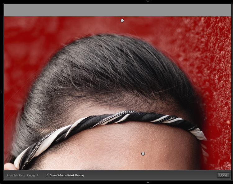
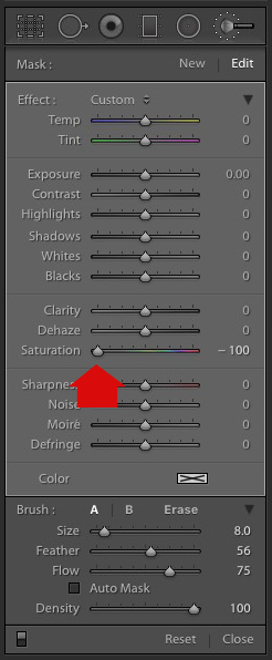
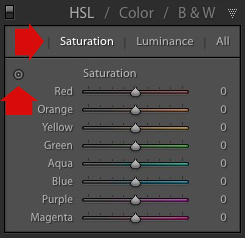
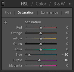
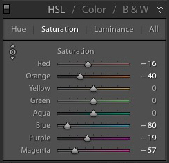
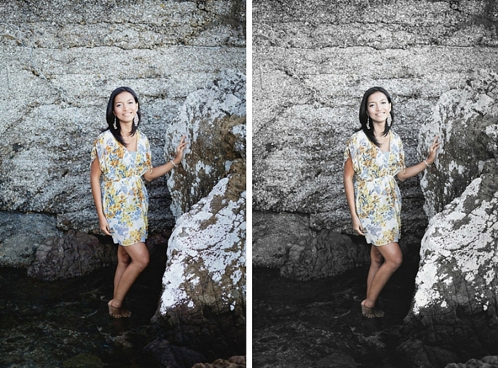
Selective coloring is a post-processing technique where you convert an image to black and white, but leave part of it in color. It has a bad reputation because it can be used to create some truly horrendous images where the only thing on display is the photographer’s lack of ability.

But the good news is that you can use selective coloring in a far more sophisticated way to create some interesting images. The key is to keep it subtle and to use it only on suitable photos. I like to make selective color portraits, but of course you are free to experiment with other subjects as well (but please, no flowers).

I prefer to keep my workflow within Lightroom whenever possible as it saves hard drive space and makes the entire photography workflow much simpler. The first two techniques below are for Lightroom, the third uses Silver Efex Pro 2, a free plug-in you can download from Google.

1. Selective color in Lightroom using the Adjustment Brush

The first example, below, shows what you can do in Lightroom. This is the portrait that I am going to work with for this technique.

3 Ways Make Selective Color Portraits Using Lightroom and Silver Efex Pro 2

The simple background means it’s ideal to use for a selective color portrait.

Start by going to the Develop module and activating the Adjustment Brush tool. Paint in the background to create a mask (as shown below).

3 Ways Make Selective Color Portraits Using Lightroom and Silver Efex Pro 2

The mask is shown here in red.

It may help to zoom in and use a smaller brush around the model for a more accurate mask.

3 Ways Make Selective Color Portraits Using Lightroom and Silver Efex Pro 2

View zoomed in so you can mask more accurately around the model.

Go to the Adjustment Brush sliders and set the saturation to zero.

3 Ways Make Selective Color Portraits Using Lightroom and Silver Efex Pro 2 - set saturation to zero

That removes all color from the background, giving this effect. Don’t forget you don’t have to move Saturation all the way to zero – you can simply lower it to reduce the color intensity of the background. Play around and see what works best for your image.

Selective coloring in Lightroom

It’s important that you chose the correct image for this technique to get the best effect. There are several reasons it works well with this portrait.

  • The background is monochromatic. It wouldn’t work as well with a colorful background.
  • The rocks in the background have plenty of texture, which looks good in black and white.
  • Some of the model’s clothes are black or charcoal gray, so introducing this color into the background fits with the overall aesthetic of the image.

2. Selective coloring in Lightroom using the HSL

The next portrait (below) has a more colorful foreground. I’m not going to remove the color completely, but I would like to make it more monochromatic. That will help the subtle colors in the model’s dress and skin to stand out.

3 Ways Make Selective Color Portraits Using Lightroom and Silver Efex Pro 2

Go to the HSL / Color / B&W panel in the Develop module. Click the Saturation tab, then the Targeted Adjustment tool (marked below) to activate it.

Selective coloring in Lightroom

Move the cursor over part of the image that you want to desaturate. In this case, the foreground has a blue cast that I want to remove, so I chose this spot (marked by the small cross circled in red below).

Selective coloring in Lightroom

Click and hold the button as you move the mouse downward. Lightroom reads the pixels under the cross representing the Targeted Adjustment tool and reduces the saturation of those colors across the entire image. The matching color sliders in the HSL panel move to the left. When I did this, Lightroom set Blue to -80 and Purple to -10.

Selective coloring in Lightroom

This is the result.

3 Ways Make Selective Color Portraits Using Lightroom and Silver Efex Pro 2

I took it further by repeating the technique. This time using the Targeted Adjustment tool on the pink and orange paintwork on the wall, resulted in the following saturation settings.

Selective coloring in Lightroom

This is a before and after of the final portrait showing these extra adjustments.

selective-colored-portrait-01

Notes:

One key thing to be aware of is how the colors in your photo are related. In the photo above reducing the saturation of the pink paint affected the model’s dress, which is also pink.

Reducing the saturation of the orange paint also affected the model’s skin. In this case, it worked out okay, but you should always zoom in and double check, especially when changing the color settings of Red, Orange or Yellow hues, as this can have some strange effects on skin tones.

3. Selective coloring using Silver Efex Pro 2

Silver Efex Pro 2 is one of my favorite black and white plug-ins. I’d like to show you how to use it for making a selective color portrait with a subtle effect that almost looks like an old style hand-tinted black and white print.

This is the portrait I’m going to use. It’s a good photo to use as the colors are subtle.

3 Ways Make Selective Color Portraits Using Lightroom and Silver Efex Pro 2

If you don’t have Silver Efex Pro 2 already, you can download it for free from the official Nik Collection website.

Once it’s installed go to Lightroom’s Library module and select the photo you want to edit. Go to File > Edit In > Silver Efex Pro 2 (you can also find this option by right-clicking the photo).

Select the option that says “Edit a Copy with Lightroom Adjustments” in the next window (it will probably be the only one you can select) and click Edit. Lightroom converts the Raw file to a TIFF file and opens it in Silver Efex Pro 2.

Selective coloring in Silver Efex Pro 2

Your first task in Silver Efex Pro 2 is to decide whether you want to stay with the default neutral black and white conversion or use one of the built-in presets. I selected the Soft Sepia preset (below), then made some adjustments to the tonal values until I was ready to apply selective coloring.

3 Ways Make Selective Color Portraits Using Lightroom and Silver Efex Pro 2

In Silver Efex Pro 2 you make local adjustments by going to the Selective Adjustments panel and adding Control Points. This screenshot shows seven of the Control Points that I added to this photo. Each one is depicted by a yellow dot.

Selective coloring in Silver Efex Pro 2

Using Control Points

Control Points work by analyzing the color and brightness of the pixels underneath them, then applying the selected effect to the pixels within the circle. In this photo, I moved the Selective Coloring slider (SC) to the right to bring the colors back to the model, but not the background.

You control the size of the circle by moving the top slider. Silver Efex Pro 2 displays a circle to show you the area affected by the Control Point.

3 Ways Make Selective Color Portraits Using Lightroom and Silver Efex Pro 2

Add multiple Control Points with circles that cover the model but as little of the background as possible. When you are finished, click the Save button. Silver Efex Pro 2 closes, saving the new TIFF file in the same folder as the original file and adding it to the same Collection in Lightroom.

Here’s the before and after with portrait after selective coloring in Silver Efex Pro 2. Notice it’s very subtle.

selective-colored-portrait-02

Conclusion

Hopefully, this article has shown you how to use selective color in a subtle and sophisticated way that moves on from the garish examples you have probably seen online. Do you have any questions about these techniques? Let me know in the comments below.


If you’d like to learn more about Lightroom, then please check out my popular Mastering Lightroom ebooks.

googletag.cmd.push(function() {
tablet_slots.push( googletag.defineSlot( “/1005424/_dPSv4_tab-all-article-bottom_(300×250)”, [300, 250], “pb-ad-78623” ).addService( googletag.pubads() ) ); } );

googletag.cmd.push(function() {
mobile_slots.push( googletag.defineSlot( “/1005424/_dPSv4_mob-all-article-bottom_(300×250)”, [300, 250], “pb-ad-78158” ).addService( googletag.pubads() ) ); } );

The post 3 Ways to Make Selective Color Portraits Using Lightroom and Silver Efex Pro 2 by Andrew S. Gibson appeared first on Digital Photography School.


Digital Photography School

 
Comments Off on 3 Ways to Make Selective Color Portraits Using Lightroom and Silver Efex Pro 2

Posted in Photography