RSS
 

Posts Tagged ‘tool’

Studio Update: Nikon D7200 and Panasonic GF7 added to comparison tool

06 Apr

Monday got you down? We’ve got something to help pick you right back up – our studio scene comparison tool has just been updated. Now included are samples from the Nikon D7200, Panasonic Lumix DMC-GF7 and Panasonic Lumix DMC-ZS50. Take a look at how they perform against their peers. Read more

Articles: Digital Photography Review (dpreview.com)

 
Comments Off on Studio Update: Nikon D7200 and Panasonic GF7 added to comparison tool

Posted in Uncategorized


How to Use the Text Tool in Photoshop

01 Feb

royal-albert

There are  many reasons that you might want to add words over your images. Text on photos makes great promotional items such as postcards; you can create your own social media messages with quotes or inspirational  sayings; and you can add your name or your website URL. I’m sure that once you understand all the creative options for adding text, you’ll come up with hundreds of other things you can create with your photos.

This article will guide you through the many ways you can work with text in Photoshop to create beautiful and eye-catching messages with your photos.

Basic Text Tools

It may seem like a pretty simple topic, but Photoshop has a really versatile selection of tools for working with text. Like so may other Photoshop goodies though, some of the best ones aren’t really obvious. So, in this section you’ll learn the various ways to add, adjust, and work with text.

Here are the basic text tools in Photoshop:

tools_

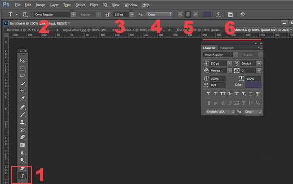
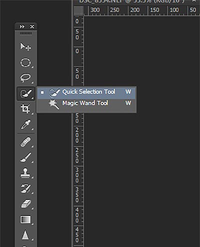
  • When you click the Text Tool in the Tools Palette (#1), the context menu on top will display most of your text tools.
  • #2 Select your font  (the typeface ), font style, bold, italic, etc.
  • #3 Font size (TIP: you can type any number in here, you’re not limited to the numbers that are displayed so your text can be ANY size you like – type 500 into this space and see what happens!)
  • #4 Anti-aliasing options
  • #5 Alignment of the text
  • #6 Text adjustments pop out

There are a few more tools in here but we’ll talk about them later. So now that you know the lay of the land, lets add some text and play with it.

Playing with Text

There are 2 ways of adding text, and it’s critical that you know when to use one way, and when to choose the other.  The first way is how most people use text, by using what is called the Point text tool. You simply click on the Text Tool in the tools palette, click back on your image and start typing. The second way is to use Paragraph Text. Let’s try both.

Open a new document in Photoshop, and click on the Text tool (keyboard shortcut = T). Start typing. you’ll see something like this:

point-text

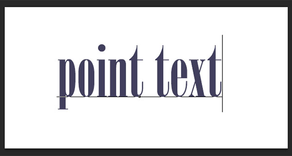
Your text will have an underline and a cursor will show where you are inserting the next letter.  If you keep typing, the text will continue along in one long single line. To get text on a new line you have to hit ENTER. You have just created text using the POINT TEXT tool. Save this and call it “point text.”

Open another document, click on the Text tool if it’s not already clicked, now take the text tool and DRAG it out to make a rectangle. You should see something like this.

paragraph-text-box

paragraph-text

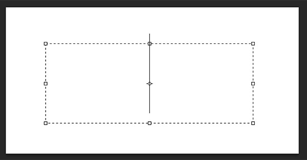
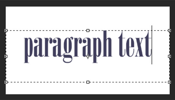
Go ahead and type. Type a lot of text. See how the text is constrained by the size of the box? This is Paragraph text. You can grab the text box handles (the little boxes on the middles and corners) to define the size of the area in which you want the text to appear. You can see this is great for larger areas of text. Because you can change the size of the text box, you have great flexibility using paragraph text.

You can use the MOVE tool to position the entire block of text anywhere on your page.

Paragraph text is also easier to center on your page. To center your text, just grab one of the handles and drag it to the right edge of your page. Drag the left box to the left edge of your page, then up in the context menu, click the CENTER text icon where number 5 is on the diagram above. It’s a little miracle! Your text is now precisely centered horizontally on your document. No more guessing.

Transforming letters in text

To give your text variety, you can also change the spacing of the individual letters, the height of the letters, and the width of letters. You can also instantly change a block of upper case text to lowercase, and vice versa. Sometimes the font you are using might be missing the italic version. You can create faux italic in Photoshop. So let’s explore the Text Character pop up box where you can try out all the nifty tricks.box

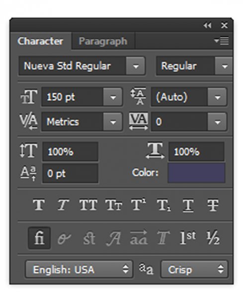
You’ll find this box in the context menu – so make sure you have your Text Tool selected, and look where number 6 is in the diagram above. Click the icon that looks like a sheet of paper (above the #6 above). This will open the Character Transform panel.  If you’re editing Point text, your text layer needs to be selected for these edits to work. If you’re using Paragraph text, you’ll need to select the text you want to transform. So, choose your text, and try going through all these options. Hovering over an item will cause a tool tip to pop up that gives you a brief explanation of what each does.

Transforming blocks of text

You can easily create attention-grabbing text by angling or slanting it. With your text layer or text selected, go to the main menu, and select EDIT>Transform>Skew. Grab a handle one of the corners and drag. You should see something like this:

skew

You can do the same with Edit>Transform>Scale and Edit>Transform>Rotate. Easy peasy!

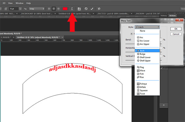
To make text follow a curve, use the Warp Text tool (select the text tool in the tools palette and look between 5 and 6 on the context menu – it looks like the letter T with a curve underneath).

Create some text, and  make sure you are on the text layer. Click the Warp Text Tool to open the section popup box. Here you can select what type of shape to give your text, it’s so easy!

warp-tool


Three simple ways to make text really pop

Sometimes when you add text to a photo it can get a bit lost in the image. Even if you make it larger it just doesn’t seem to be crisp or clear. There are a few options:

A) It may be your anti-aliasing settings, #4 on the top context menu. Make sure this drop down is NOT set to None. This is particularly important on images that you will be using online. Select any of the other options and see how they change the edges of the text. These chooses are personal preferences, as to what type of smoothing look you prefer.drop

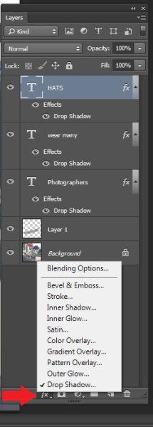
B) It may be your choice of colors. Often white works best as it has a clean, elegant look. But it’s easy for white text to get lost in the details of the image. Here’s an old web designer’s trick to make light colored text really pop. Add a drop shadow of black. But not just any random drop shadow. This one will be almost invisible but the subtle punch it adds is tremendous. Here’s how:

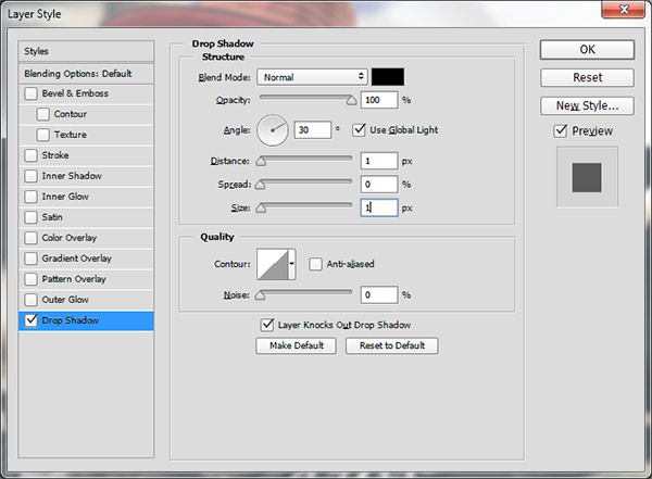
First select the text layer you want the drop shadow on. Go to your layers palette and select the Layer FX icon at the bottom, then select Drop Shadow.

In the Drop Shadow dialog box make your drop shadow with these settings. If you are working on a high res image from print, change the shadow size from 1 to 10. You may need to adjust these setting depending on the size of your image, just make sure they are both the same number.

drop2

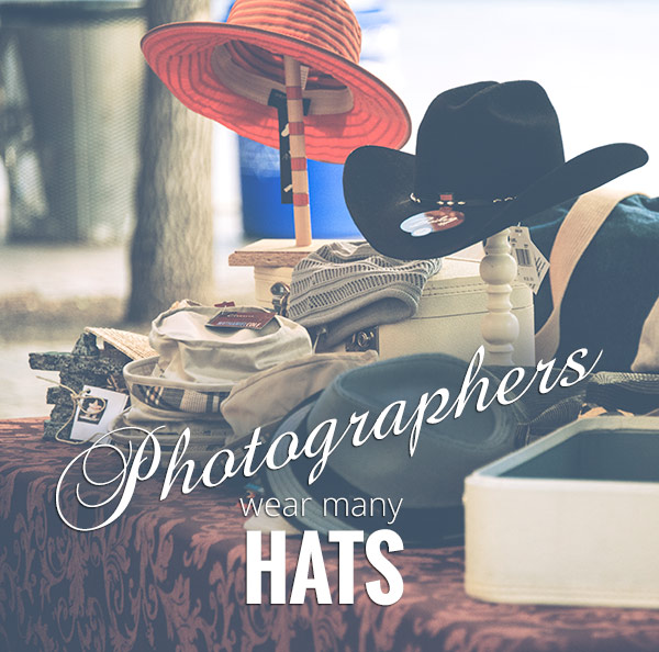
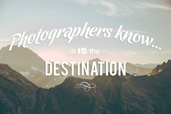
See how the white text pops in this image even though the image is all soft shades? No cheesy 1990’s drop shadows here.  It gives just enough edge separation and dimension to make the text obvious, without being obnoxious.

_DSC8453---W

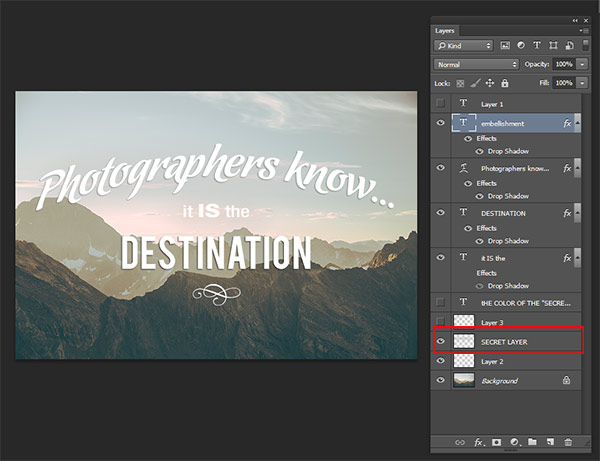
C) Finally, another text popping trick from the graphic design world  – add a “secret” layer behind your text and use layer blending modes to darken it down just a bit, to give your text a darker background for more contrast.

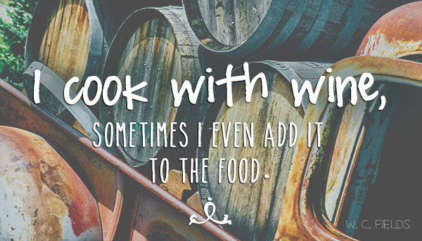
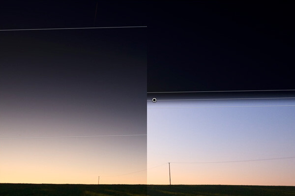
In the example below, you want to get rid of the clouds behind the text, and make the sky just a touch darker to make the text stand out more.   Select a soft-edged brush, and use the eye-dropper tool to select a mid-tone brush color – in this image I selected the sky just above the “P”. Make the brush diameter equal to the height of the letters. Now add a new layer between the photo and your text, this is your secret layer, and just brush over the text – which will really be under the text as your layer is “under” the text. Change the blending mode to Darker Color or Darken ( this will depend on the color you’re using) and then you can adjust the layer’s opacity to suit.

secret-layer

_DSC7232--

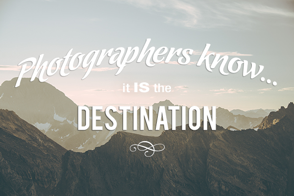
Text before the secret layer. 

With the secret layer added.

With the secret layer added.

Text embellishments and decorations

One of the most common questions I get asked about text on photos is how did I make the swooshes and swirly decorations and embellishments. These in most cases are simply fonts that are decorations rather than letters. There are hundreds of free fonts like this. Here’s one place you can get started: Embellishment fonts.  Be sure to check the licensing restrictions on free fonts  – some require payment or donations if you are selling your images.

_DSC8194---

So there you go – the basics of adding creative text you your photographs. You can now elegantly add messages, taglines, quotes, and verses to your images. You can make text grab your viewers’ attention by  placing it at an angle or on a curve; you can make it really stand out by using a few simple techniques, and you can add interest and artistic flair by adding embellishments and decorations. Unleash your inner graphic artist – you have the technology!

Give it a try – I’d love to see what kinds of messages you add to your images!

googletag.cmd.push(function() {
tablet_slots.push( googletag.defineSlot( “/1005424/_dPSv4_tab-all-article-bottom_(300×250)”, [300, 250], “pb-ad-78623” ).addService( googletag.pubads() ) ); } );

googletag.cmd.push(function() {
mobile_slots.push( googletag.defineSlot( “/1005424/_dPSv4_mob-all-article-bottom_(300×250)”, [300, 250], “pb-ad-78158” ).addService( googletag.pubads() ) ); } );

The post How to Use the Text Tool in Photoshop by Alex Morrison appeared first on Digital Photography School.


Digital Photography School

 
Comments Off on How to Use the Text Tool in Photoshop

Posted in Photography


How to use Photoshop’s Quick Selection Tool to Change a Background

20 Jan

It’s the question I get asked the most in my workshops and classes – “How do you change the background of an image?” Or “How can I cut my subjects out of an image and place them on a new background?”

A quick capture of my parents at a coffee shop.

A quick capture of my parents at a coffee shop. The BEFORE image.

Perhaps, despite your best efforts at placing your subjects in a pleasing, non-distracting environment, the situation made it impossible. Maybe you used your smartphone to capture a spontaneous moment and now the image needs a little background work? Maybe you want to cut your subjects out of the background to isolate them or use them on a website banner or other marketing material? Whatever the reason, this task has challenged every photographer, beginner or pro, since the invention of the camera! I’m going to show you how to use one of Photoshop’s most underrated tools for easily extracting your subjects from the background.

This photo (above) was a very spontaneous iPhone capture of my mom and dad, the photo itself isn’t great (lots of things wrong with it technically) but it has big sentimental value for me. It’s the last photo I have of my parents together.  But it also has a busy background which typically causes problems for many photographers when trying to use Photoshop’s Selection Tools to remove it. In previous Photoshop versions, selection tools like Magic Wand and Lasso would get confused by the similar colors, and patterns of this type of background, making it a difficult and frustrating project. But with a relatively new selection tool it’s pretty straight forward, so this is a good example photo for learning the technique.

In this demonstration, you can make this a stronger image by removing the cluttered background to make it less like a snapshot and more like a portrait. The secret of any image editing is to use the right tool for the job. In this situation you want to use the Quick Select Tool to remove your subjects from an image and place them on a different background.

How to use the Quick Select Tool

In the past, you may have avoided most of the Selection Tools in Photoshop because they were not easy to use. The Quick Select Tool has changed all that. It has never been easier to make selections that don’t look like they were “cut and pasted.” There are two, or sometimes three steps.

Choose the Quick Selection Tool from the Toolbox palette:

tool

It works like a Brush so you can change the size of the tool by using the [ –  ] keys on your keyboard (  [ to make it smaller, and ] to make it larger).  Give the tool a size that makes it easy to select your subject.

Step 1: Make your selection

Just drag the tool over your subject and stop when the “marching ants” get to the edge. The tool is smart and can detect the change in pixels so most of the time it will stop on the edge correctly. If it selects something that you don’t want it to, just click on the Alt key to switch to “deselect” mode and drag the selection back to where it should be.

selection

The Quick Select Tool selecting the subject with the “marching ants” outline.

Step 2: Refine the Edge

Once you’ve got everything selected as you want it, click on the Refine Edge button on the top menu. In this area, you’ll adjust the pixels around the edges of the selection. This will make the “cut” more smooth and realistic.

refine-edge


The refine Edge tool opens a pop up that looks like this:

refine-edge-palette

From here you can select how you want to view your selection against a few background options. You can select the Mask overlay which you may be familiar with if you’ve used layer masks before. This view allows you to see the background as well as your selection. But you can also check it against a black background, which I like, so you can clearly see how your edge looks and if you have selected everything accurately. To change views, click the drop-down to get the View Options box. Scroll through these to get a feel for how they display your data. The Adjust Edge sliders give you many options to smooth, feather, and further refine your edge if needed.

For now, select Black & White view mode. Hover over the Black & White Box and click.

popup

You should see something like this (below). You can see your edges very well against the black. You can see that the edges look okay, they are well defined, and not pixelated or blocky. But what about that hair? My poor dad with his fine and wispy (almost no hair), and my mom who had recently undergone chemo also has fine baby-like hair, making the hair selection task a bit of a challenge. But the Quick Selection Tool has a method for this too!

b+wmask

Click the Edge Detection Smart Radius box and move the slider to the right just a bit. watch how the edge around the hair change to be a bit more transparent. Be sure to watch the rest of your edges to make sure they don’t change too much.

Step 3: If needed, use the Edge Detection Brush

If you still need to get more transparency for hair, make sure the brush icon on the left is selected and carefully brush around where you need more transparency. You can switch between the View modes to see what is being displayed or removed. If you remove too much you can click and hold the Refine Edge brush to reveal the Eraser which lets you undo your brush strokes, much like a regular layer mask.

Untitled-2

When you’re happy with your results, Look for the Output section at the bottom of the Refine Edge box, and click on Decontaminate Colors and select a small number as the amount, 2 is usually good, depending on your image.  Change Output To: New Layer with Layer Mask.

This is what you should see now:

layermask

Note: to see the transparent background you must turn off the visibility of the bottom layer.

Your cluttered background is gone!  You have a nice transparent background and all on new layer. This will be your main image.

Add your new background layer

Open the image you want to use as your new background, and using the Move Tool, drag the new background into your main image. Voila! You have a great new background layer and your subjects look very realistic and not like cut and paste paper dolls.

You may have to drag the new background layer under the subject layer – the one with the mask. I’ve deleted the original Background layer and replaced it with the scenery background and called it new background. You could also make any existing background layer invisible if you don’t want to display it.

almost-done

Here’s a 100% close up look at the job the Quick Select tool and Refine Edge brush did on my mom’s hair (yes the image is a bit shaky at 100%, but I think you can see that took works pretty well to give you very realistic extractions, with the right amount of transparency and detail preservation).

100crop-hair

The finishing touches

So for the final image, let’s balance the colors a bit and give this photo a nice warm tone, by using a layer mask and a warming Photo Filter.

layermaskto-photofilter

photofilter

And here is the final image:

final-warming-filter

Final image AFTER changing the background. Not a snapshot any more!

What do you think? Is it better than the original? Was it worth the 10 minutes to edit and give it a new background? Just imagine, with a well captured image (not a shaky iPhone capture) think  of all the new possibilities you will have if you master this process.

Why not give this nifty tool a try and post your results here – I’d love to see how you use this. If you have questions or problems, just let me know, I respond to my comments and questions regularly.

googletag.cmd.push(function() {
tablet_slots.push( googletag.defineSlot( “/1005424/_dPSv4_tab-all-article-bottom_(300×250)”, [300, 250], “pb-ad-78623” ).addService( googletag.pubads() ) ); } );

googletag.cmd.push(function() {
mobile_slots.push( googletag.defineSlot( “/1005424/_dPSv4_mob-all-article-bottom_(300×250)”, [300, 250], “pb-ad-78158” ).addService( googletag.pubads() ) ); } );

The post How to use Photoshop’s Quick Selection Tool to Change a Background by Alex Morrison appeared first on Digital Photography School.


Digital Photography School

 
Comments Off on How to use Photoshop’s Quick Selection Tool to Change a Background

Posted in Photography


Studio update: Cameras added to our comparison tool that you may have missed

22 Dec

It’s been a busy few weeks around the DPReview office. Alongside full-length reviews, we’ve been busy making sure our camera roundups are up to date as well as preparing seasonal content like our holiday gift guides. We know you’ve been busy too, and you might have missed some of the most recent additions to our studio test scene. Read more

Articles: Digital Photography Review (dpreview.com)

 
Comments Off on Studio update: Cameras added to our comparison tool that you may have missed

Posted in Uncategorized


How to Correct Skin Blemishes Using the Patch Tool in Photoshop

11 Nov

There are many articles that discuss the overuse of skin smoothing in portrait photography. Photographers strive to find a balance between realistic skin and fixing the imperfections. Obviously, one way to minimize the use of Photoshop for skin issues is to hire a phenomenal makeup artist who can make the skin look realistic and flawless all at the same time. For the times when there are issues with a client’s skin I try to not go overboard and fix every little thing. I want my client to still look like themselves when I am done editing.

UsingPatchToolSidebySideBeforeandAfter_DigitalPhotographySchool_LoriPeterson600

Some photographers use the spot healing brush religiously. I never use it. Instead I use the patch tool. My reasoning is that the Patch tool actually takes samples of the pixels and closely matches them to what you are trying to fix. If the results are not quite right, you can tweak them to suit your needs.

Step 1. Open your image

As you can see my model is absolutely beautiful, but she does have a few blemishes on her skin and we are going to fix those before we give the image to her.

Step 2. Select an area and apply a path

Hit Ctrl or Command + J to duplicate your layer. You can add a Layer Mask in case you want to undo anything later.  Then select the Patch tool and draw around the part of the skin that you want to replace (make sure the “Source” setting is selected to patch the source from the destination so it will use information from the area you drag to fix the blemish). Once selected, keep holding your mouse down and move it over to better spot of brighter skin. The skin does not have to be in the same area where you are working. You can use skin from the neck, shoulder, hand, or wherever you find better, smooth skin.

1UsingPatchToolEdits_DigitalPhotographySchool_LoriPeterson600

Step 3. Repeat and refine

Repeat the process for any other skin issues. Just keep circling the area you want to replace and dragging the circle over to a clean area. If you change something you did not want to or it doesn’t look right you can use your layer mask to hide it or you can click undo (Cmmd/Ctrl+Z).

Step 4. Reduce dark circles under eyes

Most of the time you will find that some dark circles under the eyes are showing. While it’s actually normal, we want our clients or models to look bright eyed.  If you want to decrease these, simply use the patch tool and circle the under eye area. Drag that circled area over to better skin. The result will be very harsh if left like that, so fade the technique. Go to Edit > Fade Patch Selection and a pop up window will appear. Lower the slider until the fade looks like it will blend in. Repeat the process for the other eye. The percentage of fade you use may not be the same on both sides, depending on the lighting.

2UsingPatchTool_DigitalPhotographySchool_LoriPeterson600

Step 5. Review and merge layers

Once you finish, you will see that the skin looks much better and smoother, but the details of the skin are still there without being overly fake looking. If you are satisfied, merge your layers. If you are going to do any further edits, go to your History in the Layers Palette and make a snapshot of the image so you can always come back to it.

Step 6. Brighten eyes optional

Optionally, you can brighten up the eyes a bit. Duplicate your layer again using Ctrl or Command + J. Again, add a Layer Mask in case you might want to change anything later. Select the Dodge Tool and make sure your exposure is set to around 30%. Take a big brush that covers the eye and the brow and in one motion with your mouse sweep over the eye and the brow. You can adjust the layer if it’s too bright or use your Layer Mask and remove the parts that might be too overdone.

3UsingPatchTool_DigitalPhotographySchool_LoriPeterson600

The Patch Tool can be one of the easiest and quickest ways to clean up skin and still retain the overall look of your client without making the image seem overdone. After a few times, using the Patch Tool can become like a second nature and skin edits will go quicker. Here is the before and after showing that with just a few motions with the patch tool you can achieve an overall better image where skin looks smoother, brighter, and still looks natural.

UsingPatchToolSidebySideBeforeandAfter_DigitalPhotographySchool_LoriPeterson600

The post How to Correct Skin Blemishes Using the Patch Tool in Photoshop by Lori Peterson appeared first on Digital Photography School.


Digital Photography School

 
Comments Off on How to Correct Skin Blemishes Using the Patch Tool in Photoshop

Posted in Photography


Using Depth of Field as a Compositional Tool

05 Aug
In a scene like this, you want all the trees in focus, a deep depth of field is necessary

In a scene like this, you want all the trees in focus, a deep depth of field is necessary

There are many written and unwritten “rules” in Photography. Mostly, they are guidelines, I am not sure that there are rules about any art form, but some guidelines help us out. You have probably heard of the rule of thirds as it relates to composition. You have heard about the golden mean for composition, but have you thought about how depth of field affects your composition?

Composition is one of the easiest techniques to use to improve your images, it is also one of the most overlooked. You may never think about it, but perhaps you really should. Your composition can make a mediocre image strong, just by moving your camera.

Composition has been used by painters for hundreds of years. Many of our current composition tools come from the art world. The master painters worked out how people look at a painting and put a system together that would cause people to stare into their paintings. They used techniques like leading lines, S-curves, symmetry and pattern, repetition and other techniques, to make their paintings more dramatic and compelling. Something they also used was perspective. Perspective gave a three dimensional feel to the painting and made a two dimensional scene seem three dimensional. Leonardo da Vinci mastered this technique and used it to great effect in some of his masterpieces, most notably, The Last Supper and the Mona Lisa. In some ways, Leonardo used depth of field to compose his paintings.

A deep depth of field emphasises the large vista of the scene

A deep depth of field emphasizes the large vista of the scene

1. What is depth of field?

Depth of field is the transition from sharp focus to soft, out of focus areas in the image. The zone of sharp focus, and how much is in focus, is known as the depth of field. You will hear photographers speak of a shallow depth of field or a deep depth of field. The latter means that most or all of the image is in sharp focus. A shallow depth of field means that a small portion of the image is in focus.

How does this work? If you are photographing a landscape scene, you will likely want all of that scene to be in sharp focus. This is called a deep depth of field, and means that the whole scene is in focus. This is good for some forms of photography. At other times you will want only a small portion of your overall image to be in focus. For example, in a close up shot of a flower, you will want the flower to be in focus and everything else to be softly out of focus, this is called a shallow depth of field.

In a city scene, a deep depth of field is good as you want everything in focus.

In a city scene, a deep depth of field is good as you want everything in focus.

2. How does depth of field impact your image?

You have seen images where the one part of the flower is in super sharp focus and the rest is soft and blurry. Some portrait shots also look like this, the person is in sharp focus and the background is out of focus. Why would you want to do that?

The biggest reason is that your eye will naturally go to whatever is in focus in a photograph. So, if you are shooting a wedding and you have a photo of the bride and groom, but they are out of focus and the people behind them are in focus, where do you think viewers will look? They will look at the people behind the couple of course. We assume that if something is out of focus, that we aren’t supposed to look at it. So you can use shallow depth of field to force your viewer to look at your subject. Make sure that whatever your subject is (flower, rock, insect, bride etc) that it is sharp and in focus. If the rest of the image is out of focus, that part of the image will stand out and people will immediately look there.

Everything in focus makes this scene compelling

Everything in focus makes this scene compelling

3. How do I get a shallow depth of field?

Depth of field is determined by the aperture setting on your camera. Your aperture setting is called the F-Stop. Technically speaking, the F-Stop is the focal ratio of the lens. It is the ratio of the lens’s focal length to the diameter of the entrance pupil. Technical, I know, but not critical.

What is critical is that you need to know how the “F” number works. The basic rule of thumb is as follows, the lower the number (i.e. f/2.8, f/4) the shallower the depth of field or only a small amount of your image will be in focus. If you have a higher number (i.e. f/8, f11) the more of your image will be in focus. So if you want the look of having a small part of your image in focus then use an F-Stop of 2.8 or 4.  If you have a lens that goes down to f/2.8 or even f/4 give this a try:

  • Set your camera in manual mode
  • Put your camera on a tripod so that it will be easy to take the shots without moving the camera
  • Focus on a flower or something that will be perfectly still
  • Compose your image, get in as close as you can
  • Set your aperture to f/2.8 and take a shot
  • Then set your aperture to f/4, take a second shot,
  • Then f/5.6 and take a third shot
  • Then two final images, one at f/8 and one at f/11
  • Adjust the shutter speed accordingly to make sure you expose them all correctly

Now take a look at the images, what you will notice is that the f/2.8 image will have a small part of the image in focus, the f/8 and f/11 images will have most of the scene in focus.  This now becomes a compositional choice. You can decide on every image what should be in focus and what can be blurred.

Shallow depth of field isolates the grass and makes it the focal point

Shallow depth of field isolates the grass and makes it the focal point

4. How is this a compositional tool?

As a photographer you have the ability to determine what you want people to look at. By using a shallow depth of field and having only part of the scene in focus, you will make sure that there is no doubt about what the subject is and where you want your viewers to look. A deep depth of field is also important in some images. In landscape photography, you will want a deep depth of field, a shallow depth of field in a landscape image might be confusing. Use your depth of field to determine where you want your viewers to look. Once again, with lots of practice and seeing the results, depth of field will be come an invaluable compositional tool.

I find that the most well known “rules” of composition are a good place to start. Once I have a scene set up, I then think about what I want to be in focus and what I want out of focus, or more precisely, what is my subject or focal point. From there I look at exposure, light, etc., and then I make the image. For me, depth of field has become an important creative tool that I use as often as I can to define my subject. Let me know what you think? Do you use depth of field as a compositional tool or not? If not, will you try it out? Let me know your comments below.

A shallow depth of field isolates the leaves from the soft background

A shallow depth of field isolates the leaves from the soft background


The post Using Depth of Field as a Compositional Tool by Barry J Brady appeared first on Digital Photography School.


Digital Photography School

 
Comments Off on Using Depth of Field as a Compositional Tool

Posted in Photography


10 Tips on How to use Photography as a Tool for Personal Transformation

20 Jul

Have you ever found yourself in a relationship that’s not really working, or a job that has you feeling trapped? Or maybe your day in, day out lifestyle has you feeling glib.

Whatever the case may be, we’ve all been there. We use different things to cope. Some people drink, while others go to therapy or journal. Well, there is a way that photography can play a part in raising you up out of that negative mindset.

From the Nap Series, Nov.09th, 2012 @Catherine Just

When I was a new mom, my son Max was not really napping. It was driving me absolutely crazy. So I decided to take my iPhone to nap time and when he fell asleep I’d take a photograph. When I saw the photo, I realized that I was so caught up in what I wanted to do that I was missing this very sacred moment between the two of us. It became a three year photo project, and changed my own perception of what was important. I teach a course called In Plain Sight that was inspired by this experience. Below I share some tips from that course, and my own life, so that you can partake in the transformation as well.

You can use whatever camera you wish, and you don’t need to be a pro photographer to make this work for you. I used my iPhone for the Nap series and it worked perfectly.

Here are 10 tips on how to use the camera as a tool for transformation:

#1 Identify the issue

Identify what the issue is that you want to focus on. Let’s say you’re in the middle of a bad breakup, or you’re moving across country.  That’s going to be the topic of your photography project.

NapSeries_CJust2

#2 Photograph the thing that frustrates you most

Instead of taking photos of that person, or of the things about this situation that drive you mad, instead, focus on how to create a gorgeous photograph of the thing that is frustrating you the most. Sounds pretty hard doesn’t it? But if you detach a bit from the story line, and start to look at things through your viewfinder as a photographer, you’ll find light wrapping itself around the subject in a way that means more than it did before.

napseries_Cjust4

#3 Take one photo every day for 30 days

Make this an investigative process. What could you learn every day about your life and how light, composition, shadows, objects, and the space around these objects all intersect with the story line that’s running in your head?

napseries_Cjust3

#4 Get closer

Remove the details that don’t serve the photograph. See what can be said with less.

#5 Pay attention to the light

Notice when things are illuminated and how that plays a roll in creating a more dramatic or emotional image.

napseries_Cjust5

#6 Go slow

No need to just snap a billion photos. Take one a day. Be thoughtful and on purpose.

#7 Move around the subject

Move around your subject to find the best way to express the emotion. Don’t just hold up the camera and take the photo. Be more in charge of what you create and remember that you can change your vantage point.

Nap series_CJUST_06

#8 Organize your photos

Keep all of your images in a folder on your computer and label them with the date and time you took the photo. Over time you will start to see something emerge that you didn’t expect. Something shifting about how you view this situation. A deeper awareness of who you are, and what this situation wants to tell you.

#9 Share your photos

Post your photos daily on your Instagram feed, and make up a hashtag for the project. People will want to join in and it’s actually an amazing thing to get feedback and support as you move through this process.CatherineJust_Naptime_1

#10 Keep going

You don’t have to stop at 30 days. My Nap Series turned into a three year project. The frustrating situation may stay the same, but you will have a new relationship with it. It’s about progress rather than perfection. If you miss some days, it’s no big deal. You’re not getting graded. This is for you. My Nap series is not a perfect daily project. I missed days for sure, but the transformation happened regardless.

So just keep going and pay attention to what the photographs are telling you. The shift will happen and you’ll be amazed before you are half way through. You’ll be more present for the moments that matter and be a little more curious within the areas of life that are triggering you. You’ll see them in a new light.

The post 10 Tips on How to use Photography as a Tool for Personal Transformation by Catherine Just appeared first on Digital Photography School.


Digital Photography School

 
Comments Off on 10 Tips on How to use Photography as a Tool for Personal Transformation

Posted in Photography


Sony Alpha 7S added to test scene comparison tool

20 Jun

TestScene2.jpg

We’ve just added the Sony A7S to our studio test scene comparison. The A7S is a 12 megapixel full-frame mirrorless camera capable of shooting at ISO 409,600. It’s as much designed for video as it is for stills, but for now take a look at its low light performance in our test scene and compare it to an ever-growing list of cameras. See studio results

News: Digital Photography Review (dpreview.com)

 
Comments Off on Sony Alpha 7S added to test scene comparison tool

Posted in Uncategorized


Improve Your Images with the Lightroom Graduated Filter Tool

30 Apr

Using the Graduated Filter in Lightroom

The Lightroom Graduated Filter is a versatile tool for making local adjustments to your photos. Don’t be fooled by the name – it may be named after a type of filter used for making skies darker in landscape photography, but its uses go far beyond that.

Before we look at how you can use the Graduated Filter tool to improve your images, you may want to think about the style in which you’d like to process the photo. What is your ultimate aim? My article Finding and Achieving Your Style in Lightroom will give you some advice on figuring that out. Once you know what you want to do, the rest falls into place.

How to use Graduated Filters

Using the Graduated Filter in Lightroom

This is how you apply a Graduated Filter in Lightroom

1. Click on the Graduated filter icon underneath the Histogram (the keyboard shortcut for it is “M”). The Graduated filter panel opens up beneath, revealing the sliders that you can adjust.

2. Hold the left mouse button down and drag the mouse across the image to place the Graduated filter. In this example I held the mouse button down while I dragged to create a wide Graduated Filter. There is a lot of space between the lines making up the filter, indicating that it will create a smooth graduation.

Using the Graduated Filter in Lightroom

3. If you let go of the mouse button early, you create a narrow Graduated Filter that gives a harder graduation. Drag the pin to position the Graduated Filter where you need it.

Using the Graduated Filter in Lightroom

Here, I set Exposure to -4.0 to show you the difference between the two types of Graduated Filter:

Using the Graduated Filter in Lightroom

This illustration shows the difference between creating a wide Graduated Filter (left) and a narrow one (right). Experiment with both to see how they affect your photos.

Now you know how to use the Graduated Filter tool, here a few ways you can make your photos better with it.

Note: you can reposition the placement by dragging the pin, or widen the gradation any time even after applying the filter. Just reactivate it, select it (the dot will be black) and adjust. To adjust the gradation just hover the mouse over one of the edges, click to grab it, hold down the mouse button and pull to widen or narrow the spread. 

1. Making skies darker

Let’s start with the obvious application of using the Graduated Filter to make the skies in landscape photos darker. Note that the Graduated Filter can’t rescue you if the sky in your photo is so overexposed that detail is lost – you may still need to use a neutral density graduated filter when you take the photo in the first place.

Using the Graduated Filter in Lightroom

Starting image

The first step is to make the sky darker. I did this by adding a Graduated Filter and pulling back Exposure to -1.81. Every photo is different, so use your eye to judge the Exposure adjustment required on your photos.

Using the Graduated Filter in Lightroom

Exposure -1.81 applied using the Graduated Filter

2. Adjusting Contrast and Clarity locally

My aim with this landscape was to make the foreground darker and sharper, directing the viewer’s gaze towards the horizon. I achieved this by adding another Graduated Filter from the bottom. But this time, as well as adjusting Exposure to -0.79, I increased Contrast to +20 and Clarity to +27:

Using the Graduated Filter in Lightroom

Bottom Graduated Filter applied, Contrast +20 and Clarity +27

Here’s a before and after comparison, so you can see the difference adding the Graduated Filters has made. The two simple adjustments have transformed the photo.

Using the Graduated Filter in Lightroom

3. Adjusting White Balance

Another use of the Graduated Filter is to adjust colour temperature in part of the image. Sticking with the same landscape photo, I selected the top Graduated Filter to activate it and set Temp to 30. This warmed up the sky, emphasising the deep orange and red colours of the sunset:

Using the Graduated Filter in Lightroom

Be careful with adjusting Temp. If you push the slider too far the results may not look natural.

4. Making edges of your image darker

Moving away from landscapes, Graduated Filters are a handy way of making the edges of your images darker. This helps direct the viewer’s attention towards the focal point.

Using the Graduated Filter in Lightroom

This diagram shows roughly where I placed the three Graduated Filters. The benefit of using individual Graduated Filters (instead of the Radial Filter or Adjustment Brush) is that you can adjust each one individually.

Using the Graduated Filter in Lightroom

5. Adding a colour wash

The Color setting at the bottom of the Graduated Filter panel lets you add a tint. It is laid over the filter in addition to the effects created by whichever sliders you choose to adjust. To select a colour, click on the colour picker icon at bottom of the Graduated Filter panel (the white rectangle with black cross inside indicates no colour has been selected) and select the colour you wish to add:

Using the Graduated Filter in Lightroom

Slider below is for adjust the Saturation of your selected color

One use of this is to add a colour wash to a photo, to make it look as though the subject is lit by the light from the setting sun. This technique works best when the subject was genuinely shot during the golden hour, and you use the Graduated Filter to emphasize that. In this example I selected an orange hue to imitate the sun and set Exposure to +1.16 to lighten that side of the image.

Using the Graduated Filter in Lightroom

6. Lens blur effect

The Sharpness slider in the Graduated Filter panel is dual purpose. From zero to -50 it reduces sharpness. From -50 to -100 it creates lens blur. This lets you replicate the effect of using a tilt-shift lens or large format camera to create a photo with a tilted plane of focus. This is what it looks like. You may have to look closely – the model’s head is sharp but the areas at the top and bottom are not.

Using the Graduated Filter in Lightroom

I created this effect by adding five Graduated Filters, two at the top, and three at the bottom, their position shown by the coloured lines. The effect works best with a narrow Graduated Filter.

Using the Graduated Filter in Lightroom

The red lines indicate where I added Graduated Filters with Sharpness set to -100 at top. The green lines show you where I placed three filters at the bottom. Spacing the Graduated Filters mean the effect is strongest at the edges, replicating the true effect of using a tilt-shift lens.

Hopefully these tips will help you use the Graduated Filter more creatively. Lightroom is great for processing your photos and understanding how its tools work will help you use it more effectively. If you’re new to Lightroom, then my article Seven Pieces of Advice for New Lightroom Users will help you get started. Once you’ve mastered the Graduated Filter, I suggest you read Four Ways to Improve Your Photos With the Clarity Slider in Lightroom or 3 Uses for the Radial Filter Tool in Lightroom 5 to learn how to use more of Lightroom’s fabulous tools. Have fun!

By the way, I’m curious to hear how you use Graduated Filters in Lightroom. What techniques have you come up with? Please share them with other readers in the comments.


Mastering Lightroom: Book One and Two
mastering-lightroom-bundle-1

My Mastering Lightroom ebooks are a complete guide to using Lightroom’s Library and Develop modules. Written for Lightroom 4 & 5 they take you through every panel in both modules and show you how to import and organise your images, use Collections and creatively edit your photos.

The post Improve Your Images with the Lightroom Graduated Filter Tool by Andrew S. Gibson appeared first on Digital Photography School.


Digital Photography School

 
Comments Off on Improve Your Images with the Lightroom Graduated Filter Tool

Posted in Photography


LensRentals.com needs name for massive lens calibration tool

01 Apr

lensrentals.jpg

One of the drawbacks of running a company devoted to renting out photographic equipment is that it’s necessary to evaluate and service equipment just about every time it comes back. That’s why the team at LensRentals.com have just purchased and installed a massive and cumbersome looking lens calibration system. In one of the geekier unboxing articles, they show every step of the assembly of the device. Learn more

News: Digital Photography Review (dpreview.com)

 
Comments Off on LensRentals.com needs name for massive lens calibration tool

Posted in Uncategorized