RSS
 

Posts Tagged ‘Tips’

Post-Processing Tips for Beginners

10 Oct

They say photography is an art form, and I couldn’t agree more. There are so many elements that go into making a great piece of art. Not only do you need to know your gear and the environment you work in, but you also need to know how to put the finishing touches to your art, that takes it from good to great.

This can be quite challenging especially to a beginner. But like any great artist would say, all of this can be done with a lot of practice and patience. Great photos tend to have universal appeal. They are technically sound, and also have an editing style that appeals to the mass majority. While most photographers, including myself, advocate getting it right in camera, there are some basic steps that you may need to follow just to add the right amount of oomph to your images in the post-processing stage.

Choosing the right type of editing software

The type of editing you apply to your images does depend on the type of software you use. There are many different options for editing software on the market. Adobe Photoshop and Lightroom are two of the most popular ones for serious amateurs, and professional photographers. But if you are an absolute beginner they might be cost prohibitive for your needs. There are some good free editing software, like PicMonkey and Picasa, that work great at a basic level. If you are a cell phone photographer, then most smartphones have built-in editing software that does the job fairly well too. Apart from the basic editing steps they also have a ton of filters for adding some really cool effects to your images. But just be careful of the audience and the purpose for these cell phone images before applying funky filters.

For the purposes of this article, I will be using Lightroom. Most of the steps are common to all editing software, just choose the one that works for you and your photography needs.

Adjust the horizon

One of the first things I do to any image is to adjust the horizon, also known as straightening the image. I am not a fan of tilting my images. I find that when I look at tilted images, I don’t know which way is up. Am I supposed to turn my head to the right or the left? Crazy tilts make me dizzy. I don’t see images in tilts in my day-to-day, so why would I want to click images that are tilted. This is just my personal preference. I know some photographers who consider it very artsy to have tilted images. If that is your thing, then go for it and do what makes you happy. For images that have the horizon or leading lines in them, getting the horizon level is an absolute must.
Memorable Jaunts DPS Simple Processing Tips Before-01

This was taken from the passenger side of the car – I really loved the leading lines but knew the horizon was way off.

Memorable Jaunts DPS Simple Processing Tips After-01

In Lightroom, I adjusted the horizon, increased the contrast gently, and warmed up the image by adjusting the temperature slightly.

Adjust or crop out any unwanted elements

Nothing can be more distracting than an unwanted element in the frame. Before cropping or removing unwanted elements ask yourself whether the object is actually adding value to the image, or is it competing with the subject for attention. Removing unwanted elements can be done by using the clone/stamp tool in Photoshop, the spot healing brush Lightroom or a simple crop function in your photo editor of choice.
Memorable Jaunts DPS Simple Processing Tips Before-2

I loved the texture of the brick wall but hated the stains on the wall right near the chair.

Memorable Jaunts DPS Simple Processing Tips After-2

I chose a closer crop for the chair, and cloned out the stains using the spot removal tool in Lightroom. I also brightened the image a tad.

Remove any dust spots

This is something that is prominent if you are photographing against a light background, or when converting to black and white. If your sensor is dirty or has minute dust specks, they appear in your photographs. You can use the clone tool or even the patch tool (Photoshop) and clean out these dust spots in the image.

Adjust the exposure and contrast

After you have straightened the horizon and removed any unwanted or distracting elements from the frame, next adjust the exposure of the image. This adjusts the brightness. If the image is too dark, add light in and if the image is too bright, reduce light. Keep in mind that often times adjusting brightness will affect the contrast of the image as well. This can be fixed by adjusting the Contrast Slider in Lightroom. It makes the brightest parts of the image brighter and the darkest parts darker, and improves the overall look of the adjusted image.
Memorable Jaunts DPS Simple Processing Tips Before-3

While I adore this pose of my clients, the image is a little too dark (underexposed) as the light was changing very fast.

Memorable Jaunts DPS Simple Processing Tips After-3

As part of my edits to this image, I increased the exposure, warmed up the image by increasing the temperature and also adjusted the contrast a bit to add a little more umph (punch) to the image.

Adjust saturation

Typically if I have adjusted temperature and contrast in an image, I do not adjust the saturation slider. But this is a personal preference for most people. Adjusting the saturation value of an image can add a certain punch to an image, but use this tool with a light hand as you don’t want you image to look too processed.
Memorable Jaunts DPS Simple Processing Tips Before-4

I love this image of fresh snow on the blades of tall grass near my home. But, because everything was so dark and gloomy due to the snow, the image appears a bit flat and dull.

Memorable Jaunts DPS Simple Processing Tips After-4

I wanted to exaggerate the colors of the blades of grass to show that they were extremely dry and also pop-out the white snow on the grass. So I adjusted the saturation and vibrance sliders in Lightroom, and also warmed up the image by adjusting the temperature.

Export for web or print

Depending on what is the final treatment for your images, you can either save them as low resolution JPEGS or high resolution JPEGS. There are many other formats as well like TIFF, BMP, and GIF. JPEG are more universally accepted, and is the format that I use for all my images – the ones for print as well as for the web. Typically an image approximately 72PPI (pixels per inch) is considered as a low resolution image, ideal for the web. An image of 150DPI or 300DPI is considered a high resolution image ideal for print. DPI stands for Dots per inch. Per wikipedia, it is used to describe the resolution number of dots per inch in a digital print.

Ultimately how you process your images is an extremely personal decision. Choose the style and the tools that best describe your photography style. It is okay to experiment with the latest fads, filters, and looks but keep in mind that you may want your images to have a timeless look and feel so that years from now when you look at them, they still evoke an emotion.

googletag.cmd.push(function() {
tablet_slots.push( googletag.defineSlot( “/1005424/_dPSv4_tab-all-article-bottom_(300×250)”, [300, 250], “pb-ad-78623” ).addService( googletag.pubads() ) ); } );

googletag.cmd.push(function() {
mobile_slots.push( googletag.defineSlot( “/1005424/_dPSv4_mob-all-article-bottom_(300×250)”, [300, 250], “pb-ad-78158” ).addService( googletag.pubads() ) ); } );

The post Post-Processing Tips for Beginners by Karthika Gupta appeared first on Digital Photography School.


Digital Photography School

 
Comments Off on Post-Processing Tips for Beginners

Posted in Photography


Tips on Choosing a Free Photo Editor for Post-Processing

08 Oct

A question I get asked a lot is, “What software for post processing would you recommend if you were starting out in photography today?”

Don’t know which photo editor to choose, here are some free options worth considering.

My go-to software for editing photos is Adobe Photoshop. This doesn’t mean I am advocating that Photoshop is the only photo editor worth considering – far from it. I will be using Photoshop as a frame of reference only, and not as a direct comparison to other software products mentioned in this article.

Title

Deciding which Photo Editor can be daunting for a beginner, especially as there are so many to choose from!

However, it is the industry’s number one software for professionals. Prior to the new subscription model, Photoshop was a standalone piece of software and was expensive. But even with the subscription model, it’s a recurrent expense, which over time will amount considerably for your buck.

After doing some research, I was quite amazed at the plethora of photo editing software applications, on the market that are relatively inexpensive to purchase. Most of which equip the beginner with more than enough features and tools to get your images looking great.

Also, most of the applications can be downloaded free, for a limited trial period. This gives you a better idea what it’s like, and you’re able to test the software and its capabilities.

Other products can be downloaded for entirely free and some are even web based, so you don’t have to download any software onto your computer. The disadvantage is that you do need a reliable internet connection. Also, I did find the annoying ads that pop up alongside the interface distracting. An alternative to get rid of these ads is to pay for an upgrade.

Let’s take a look at some of the free options:

Pixlr

Pixlr is a web based, online editing tool. You can create a new image, upload an image, or grab one directly from a URL location. I found this product very intuitive and easy to use. The images load up fast in the web browser. The interface is quite similar to Photoshop. It has all the tools like: layers, lasso tool, brush controls, cloning, and filters.

Pixlr-web-based-launch-screen

The Launch screen as it appears when you load Pixlr in your web browser.

Pilxr-web-based-image-editor-interface

You have four options to choose from when you go to open your file. It’s that easy.

Ok, so where do you start with your post-processing?

When you have your image open, duplicate it so that you keep the original intact. That way, if you completely mess up, don’t worry, you still have the original to begin again.

Post editing is a skill. It does take patience and time to master.

Color correction

I would consider color correction an important area to begin your post-processing.

The Levels setting exists in many image editors. It is a powerful tool for adjusting the tones (contrast) in your image, and for making color adjustments. In Photoshop, you select Layer> New Adjustment Layer > Levels. In Photoshop Elements choose Enhance > Adjust Lighting > Levels. Other image editors place it differently, but essentially it does the same job. The Levels setting is a bit daunting and complex to begin with, but I do feel it is worth the time to get to know.

The Levels dialog box has an image histogram which is similar to the display on the back of your camera. A simple explanation of the histogram is: the shadows (blacks) are on the far left, mid-tones (grays) are in the middle and the highlights (whites) are on the far right. So by adjusting any of the sliders on the bottom, you will affect the contrast of your image.

Levels-in-Pixlr-and-Photoshop

The Levels setting on the left belongs to Pixlr, and on the right is the Levels adjustment as it appears in Photoshop CS6.

Okay, but what about the color of the image?

An easy way to adjust color correction is by changing the color channels which are found in the Levels dialog box. The default setting is RGB in Pixlr.

Adjustment-Levels-Pixlr

Where you find the Levels setting in Pixlr.

Go to Adjustment Tab and select Levels. Click on the downward arrow next to RGB in Channel, this brings up a drop-down menu for the red, green and blue channels. Choose the first one, which is red. Look at the histogram graph and check for gaps in it.

Color-channels-in-Levels-pixlr

The colour channels appear in a drop down menu by clicking on the small arrow to the right of RGB.

For this image, as it is quite over-exposed a lot of the shadow detail is lost (overly gray and no black in the image), see left of the graph. Move the shadow slider to the right, in towards the middle, where the graph starts to go up.

You want your graph to represent a nice mountain shape starting from the shadows rising high in the midtones and back down to the highlights. See photo. Repeat this process for the other two channels. Click back to RGB.

To add some contrast, just move the middle slider (mid-tones) to the right, see photo below. There is a lot more to learn about the Levels adjustment, but this is just an easy way for beginners to start.

Before-and-after-color-correction-pixlr

Before and after colour correction on the RGB channels using Pixlr.

Some other alternative web based solutions are SumoPaint, which has a similar interface to Photoshop, and another called PicMonkey.

SumoPaint

Similar to Pixlr, SumoPaint was very easy to use. I was able to adjust the color correction on this image using the Levels adjustment and modifying the color channels, as I did using Pixlr.

Sumopaint-in-browser

Sumopaint-Levels

Sumopaint-Levels-channels

If you prefer to download software onto your computer. Again there is a wide choice of free products available.

  • Paint.net, which is Windows based.
  • Picasa is Google’s photo manager and editor. It plugs into Google+.

Photoscape

Here’s another one that you may or may not have come across, called Photoscape. This software is packed with excellent features for free. It has a built-in image viewer, which lets you see all your images quickly at a glance using thumbnails. It also has a Batch Editor, so if you apply an edit to one photo or resize it – using the Batch Editor will apply the same edit to multiple images. It even has a RAW Converter. For beginners, it offers image cropping, brightness and colour adjustment, red eye removal, and some great effects too. It does appear to more intuitive and offer a less steep learning curve for beginners.

Photoscape

Photoscape

Editor-tool-in-Photoscape

Main editor tools in Photoscape

Adding-frames-in-Photoscape

Adding frames in Photoscape

Edit-photo-edge-photoscape

Edit photo edge in Photoscape

Preview, which is Apple’s built-in image and document viewer for OS X, surprised me. It has the capability to crop, resize, and do color adjustment which was quite impressive.

Conclusion

In summing up, there is a vast range of post-processing image editors to choose from. In this article, I only hinted at a mere few. The list is endless!

As a guide for beginners, I would experiment with the free options and test them out for yourself. There is no financial investment only your time. The time invested will give you a better idea which application suits you best in the long run.

Post-processing does require time, no matter how skillful you become at it. Once you have established a certain level of skill at post editing, you can then graduate to purchasing a reasonable priced standalone image editor, if you prefer.

Example products are:

  • ACDsee19 for $ 59.99
  • Photoshop Elements 14 for $ 99.00
  • Adobe Lightroom 6 for $ 149.00
  • Affinity Photo for the Mac is only for $ 49.99
  • PhotoPlusx8 for $ 99.99

Or you could simply download GIMP, (some equate this software as being powerful to Photoshop) which is an open source image editor with versions available for Windows, OS X, and Linux. There are lots of tutorials and resources already on the web to help you further with this software.

In fact, if I was new to photography and I had to decide which photo editor to pick, I would feel spoilt for choice!

Disclaimer: I was not contacted or sponsored to test any of the above software applications. Opinions are purely by the author only.

googletag.cmd.push(function() {
tablet_slots.push( googletag.defineSlot( “/1005424/_dPSv4_tab-all-article-bottom_(300×250)”, [300, 250], “pb-ad-78623” ).addService( googletag.pubads() ) ); } );

googletag.cmd.push(function() {
mobile_slots.push( googletag.defineSlot( “/1005424/_dPSv4_mob-all-article-bottom_(300×250)”, [300, 250], “pb-ad-78158” ).addService( googletag.pubads() ) ); } );

The post Tips on Choosing a Free Photo Editor for Post-Processing by Sarah Hipwell appeared first on Digital Photography School.


Digital Photography School

 
Comments Off on Tips on Choosing a Free Photo Editor for Post-Processing

Posted in Photography


8 Tips for Fall Landscape Photography

08 Oct

Fall is a fantastic time of year for you to photograph the landscape and really push your creativity. The colors, textures, and soft light provide an amazing palette to create compelling photographs. It’s really easy though to just point your camera at the color and hope the image comes together without thinking about the composition. Here are just a few tips to take with you into the field to make the most of the colorful season in your fall landscape photography:

1. Use a longer focal length lens

Dd tip1

It’s tempting to photograph grand scenes with a wide angle lens, but using a longer focal length lens, 200mm or longer, can really help simplify the scene and make the subject about more than just color. You can also use the longer focal length lens to photograph the intimate details of a forest interior. Look for elements in the scene where there is a break in the pattern or use negative space to help isolate the subject.

2. Use a wide aperture to isolate the subject

Dd tip2

Pick a wider aperture, around f/2.8 or f/5.6, to isolate your subject from its surroundings. This will help create visual contrast between the sharp subject and the background, which will be softer and more abstract. This also adds tension between the real and the unreal, providing you with an image that’s more dynamic and expressive. Experiment with different subjects and backgrounds and get creative with your choices. Pay close attention to your subject and make sure that you have the desired amount of the subject in focus when using a wide aperture.

3. Make fall color the secondary subject

Dd tip3

The temptation is for you to make the primary subject all about the fall colors. Find other primary subjects such as streams and waterfalls that are accented by the fall colors, to make images that have more depth and complexity. Although the color may attract your eye to the scene, ask yourself what the subject might be other than color.

4. Look for patterns and textures

Dd tip4jpg

Color is an obvious design element that you’ll be working with in your images but look, for others like pattern and texture, to create satisfying compositions. Learning to see the world around you as elements of 2-D design (line, pattern, texture, etc.) will help you move forward in your composition skills.

5. Be patient and wait for interesting or dramatic light

Dd tip5

Patience may be the best tool in your camera bag. Fall colors are wonderful, but can be even more stunning when combined with the right light for your subject. Patience usually is a big factor between a good image and a great image. Many times the best light can be short lived, so think through your composition in advance, and be ready for the light to work some magic.

6. Experiment with intentional camera movement

Dd tip6

Definitely experiment with moving your camera vertically as you release the shutter to blur the scene and create an abstract image of lines, textures, and colors. Experiment with different shutter speeds, and the pace of moving your camera, until you find the right amount of blur. This is a great opportunity for you to take your camera off the tripod and just play with camera movement. Darker elements that work well include a rock face, canyon walls, or deep shaded areas in the forest.

7. Look for elements that contrast the fall color

Dd tip7

Fall colors are usually bright and have texture and pattern. Look for opportunities to place the fall colors against darker elements so you can create an image with some dramatic tension.

8. Don’t forget to look up

Dd tip8

The interior of a forest can be an amazing and colorful place to photograph, but it’s often difficult to isolate a subject. If you’re having trouble, look up and explore the canopy. Images that contrast the fall colors with the deep blue sky can be really pleasing and make interesting wide angle photographs. Don’t forget to use smaller apertures like f/22, to create a starburst effect as you shoot through the forest toward the sun.

Summary

Hopefully these tips will help you make the most of your time photographing the amazing colors of the fall season. Take the list with you into the field so you can slow down, think through your compositions, and return home with some compelling photographs.

googletag.cmd.push(function() {
tablet_slots.push( googletag.defineSlot( “/1005424/_dPSv4_tab-all-article-bottom_(300×250)”, [300, 250], “pb-ad-78623” ).addService( googletag.pubads() ) ); } );

googletag.cmd.push(function() {
mobile_slots.push( googletag.defineSlot( “/1005424/_dPSv4_mob-all-article-bottom_(300×250)”, [300, 250], “pb-ad-78158” ).addService( googletag.pubads() ) ); } );

The post 8 Tips for Fall Landscape Photography by Dusty Doddridge appeared first on Digital Photography School.


Digital Photography School

 
Comments Off on 8 Tips for Fall Landscape Photography

Posted in Photography


8 Tips to Help You Come Home with Great Travel Photos

02 Oct

In this article I will talk about travel photography and how you can take great images of everything when you travel. I’m not talking about camping out at sunrise with bags full of lenses and filters to take epic landscape photographs; I’m talking about taking really nice shots of EVERYTHING! The food, people, details and landscapes combined – and all without turning your holiday into a photo shoot. With some simple tips you can come home with an album full of memories that stretches beyond a few hero shots.

Editor’s Note: The following article is written to be a fun guide to different types of documentary style travel photography. The author was exploring Vietnam as a guest of Helloworld Australia and Insider Journeys. She considers herself a jack-of-all-trades, master of none in the photography world.

8 Tips for great travel photos

#1 Landscape photography

1DaytimeLandscape

As much as I love waking up for a sunrise and utilizing all of the photography tools available to me to get a killer shot, sometimes I just want to take some snaps and have them be nice. When shooting landscapes during the day I look for vibrant colors, leading lines and simple compositions.

If you want to come home with a handful of nice landscape images from your holiday but you don’t want to spend all your time out in the field at the break of dawn then look for simple compositions, vibrant colors and leading lines. Using the most basic techniques like the Rule of Thirds (imagine your photo broken down into thirds both horizontally and vertically, and place points of interest on these third lines, for example the horizon) and the light that is available to you, it’s possible to come back with some keepers. Good examples can include the narrow laneways of old Dubai, the canals of Venice, the rivers of Alberta and the irrigation lines of the rice fields of Vietnam.

#2 Photographing the locals

I’m sure that you love to meet the locals from whichever exotic location you’re visiting, but find it can be intimidating to ask for a photo. The trick to photographing locals is to have your camera absolutely ready to go before you even ask. I’m talking the right lens, the right light, and the right settings. Photographing strangers often means you don’t have the benefit of multiple shots to get it just right. A great focal length for photographing people is 85mm, it’s very flattering and it also means you don’t have to be in people’s faces when you shoot. Shooting in the morning or late afternoon means you’ll have soft, consistent light, on your subjects’ faces, and f/2.8 is a great aperture for shallow depth of field. For handheld shooting keep your shutter speed above 1/200th to minimize camera shake.

2PortraitOfLocals

I desperately wanted to take a photo of a mother and daughter I had just watched rounding up their water buffalo in Ninh Binh, but I knew the chances of them speaking English were slim. I didn’t have my portrait lens with me so I made do with my 24-70 f/2.8 at 70mm, and I had it ready to go for the ambient light before I even asked. I snapped off three quick bursts and nabbed a keeper.

#3 Shoot the details

If you ever find yourself quietly admiring the small details of a new destination, then you might like to play around with isolating and photographing them. A great place to try your hand at detail shots is the local market. Using a shallow depth of field (f/2.8 – f/5.6) you can play around with photographing all manner of small details; the textures of a new fruit, a close-up of a flower, or even a line of colorful fabrics. Some photographers consider these filler shots but you might find they bring back wonderful detailed memories after time has passed.

3TDetailsMarkets

I personally love the small details of a new destination and often take my most favorite shots at bustling markets, or in the garden of a palace, instead of the palace itself. I always look for bright colors and new textures, then isolate what I love from a cluttered background by either zooming in or using shallow depth of field.

#4 Use juxtaposition

In a new destination you can’t help but notice that often things aren’t the same as they are at home, and sometimes a fun way of photographing that is through juxtaposition. This is when two very different things are shot close together of contrasting effect, for example ice cream with a steak, or a beautiful field of wildflowers with an urban factory in the middle. New locations can offer unlimited potential for photographing two things with juxtaposition together, that you might not see at home. Think new versus old, natural versus artificial, nature versus industry, etc.

4JuxtapositionStreetScenes

During an incredible morning exploring the Hanoi flower markets I enjoyed photographing the juxtaposition of the flowers besides the scooters, rubbish and chaos of Hanoi.

#5 Photograph animals

You might be fortunate on your travels to make some furry friends. This is often the case in South East Asia where cats and dogs roam the streets freely, and the smart ones know how to get a scrap of food or a cuddle. Photographing animals can be tricky at the best of times, let alone photographing animals that you don’t know very well. The first thing to remember if you want to increase your chances of getting a clean shot is to have a fast shutter speed, 1/1000th is ideal. Animals also benefit exceptionally well from having a sharp focus on their eyes, so a single focus point trained on the eye closest to you will work wonders. Other than that it’s really a matter of a little patience to capture a personality trait, or cute moment.

5FurryFriends

I don’t consider this photo a triumph of photography, by any stretch of the imagination, but I thought this puppy was adorable. I was able to quickly shoot a sharp image of him looking goofy, with a fast shutter speed and shallow depth of field.

#6 Photograph your resort or accommodation

If you want to take a great photo of your resort to show off to friends and family you might quickly notice that resorts are usually quite populated. Rather than waiting for scores of people to move out of your way it’s possible to make them a part of your image without being the focus of your image and you can do this by using a distracting foreground. Rather than straight out taking a photo of the pool, garden, or communal area of your accommodation, scout around for a nice foreground such as a garden bed, a great path, grass or flowers or even a reflective puddle.

6YourResortGrounds

In Mai Chau I stayed at the stunning Eco lodge in Mai Chau valley, and I desperately wanted to photograph the pool, but hordes of swimmers weren’t going anywhere. After playing around with various compositions I realized that the flowers planted around the pool made a distracting foreground when I focused on them, but used a fairly wide depth of field using f/11.

#7 Food photography

If you are a foodie, and let’s face it aren’t we all these days, then you’re going to want to take photos of some of the delicacies that await you when you travel. Food photography can be very hard, or very easy, depending on what you are trying to achieve – but for holiday snaps you should K.I.S.S. (keep it simple silly).

The hottest food photography trend to hit the market these days is the flat lay, or simply photographing food from above. You can do this with a simple snapshot, or take a few minutes to improve your shot. Firstly a single focus point trained on a plate of food nearest to the middle is best. Unless you want to stand on a chair and lean precariously over the table the best way to get this shot is by holding your camera above the table facing straight down. A reasonable depth of field like f/5.6 will mean you’ll still get enough food in focus, even if you slightly miss your planned focus point. Taking a few minutes to arrange the food and utensils on the table can also pay off in the final shot.

7Food

I am a massive fan of the flat lay. I think it looks great in most instances, plus it has the added bonus of showing everything you’re eating and drinking in a single frame. In Vietnam we made a roadside stop and I enjoyed boiled eggs, sticky rice in a bamboo pipe, purple corn on the cob and fiery hot bird’s eye chilies. I loved all the broken eggshells on the dirt floor and worked them into my composition with a wider vantage point.

#8 Photograph your travel companions

I’ve saved the best for last, photographing your family, friends, or loved ones. I’m sure you love the simple gift of taking a nice photograph of your travel companion(s) in an exotic location, without making a major production out of it.

The best way to do this is by beating the crowds, just that. Wake up early and have the pool, beach, or street to yourself, and get the shot you want without the distraction of hordes of people. Take a minute to think about composition so that your subject is well framed by the location; use local props if you want to be a real tourist. Then it’s a matter of referring back to basic portraiture rules like flattering focal lengths and good light, a given if you make the effort to wake up early.

8FriendsOrFamily

In Mai Chau I wanted a nice shot of my travel companion, Simone, and I wanted the scene to be noticeably Vietnamese. We borrowed a hat from the resort, and set an early alarm hoping for mist in the valley. We weren’t disappointed.

So there you have it: How to take great photos of just about anything while you’re traveling, without destroying your holiday to do it. Always keep a camera close at hand, and enjoy showing off the many aspects of a new destination through your own unique photography: people, landscapes, food, animals, details and all the special moments that pass you by.

googletag.cmd.push(function() {
tablet_slots.push( googletag.defineSlot( “/1005424/_dPSv4_tab-all-article-bottom_(300×250)”, [300, 250], “pb-ad-78623” ).addService( googletag.pubads() ) ); } );

googletag.cmd.push(function() {
mobile_slots.push( googletag.defineSlot( “/1005424/_dPSv4_mob-all-article-bottom_(300×250)”, [300, 250], “pb-ad-78158” ).addService( googletag.pubads() ) ); } );

The post 8 Tips to Help You Come Home with Great Travel Photos by Lauren Bath appeared first on Digital Photography School.


Digital Photography School

 
Comments Off on 8 Tips to Help You Come Home with Great Travel Photos

Posted in Photography


13 Effective Interior Photography Tips for Dummies

29 Sep

How often have you seen great properties being completely ruined by awful photography? That’s right – terrible interior and exterior photos are a norm, especially when made by average camera users who know next to nothing about composition, lighting or specifications. But the truth is that taking nice rental property photos is within your reach, even if you’re new to Continue Reading

The post 13 Effective Interior Photography Tips for Dummies appeared first on Photodoto.


Photodoto

 
Comments Off on 13 Effective Interior Photography Tips for Dummies

Posted in Photography


Tips for Creating Original Images

27 Sep

Years ago I shot an image for a competition that I was sure was a highly original piece of genius. Only to find out when looking at other entries, there seemed to be rather a lot of other highly original geniuses with exactly the same idea.

To get further in competitions I realized I had to start thinking outside the box. So I developed a strategy for getting a bit more original with my photography. Here are some tips you may find helpful for coming up with unique ideas and for creating original images.

Coming up with an idea

If you don’t already have an idea to work from, you can pick one right now – be it the first item you see after reading this sentence, or google your town and see what comes up. For example, the first link might be to a local hairdresser, so your theme could be hair. Try this with some other keywords like; photography or art, or go completely random and google both hair plus the first item to your left.

Send in the clowns

A quote from musician Nick Cave explaining his song writing process:

“Do you want to know how to write a song? Song writing is about counterpoint. Counterpoint is the key. Putting two disparate images beside each other and seeing which way the sparks fly. Like letting a small child in the same room as, I don’t know, a Mongolian psychopath or something, and just sitting back and seeing what happens. Then you send in a clown, say, on a tricycle and again you wait and you watch. And if that doesn’t do it, you shoot the clown.”

Apply this to your photography. Your theme, that’s your small child. Add to that a certain style of photography, macro , high speed , light painting, that’s your Mongolian psychopath. Now send in the clown, perhaps this could be, as above, the first thing you see to your left, or something available to you that might not be available to other photographers like an awesome local location, unique props, or skills. In my case some mad crafty skills and a friend, with a lot of red hair, to model for me.

An unusual prop is a good place to start when aiming for an original image.

Combining other skills or hobbies (in this case my crafty skills) with your photography can help to create unique images. I made a crown out of coat hangers and wrapped the model’s hair around it. The jewels in the crown were some old chandelier parts I found at a market. Markets and thrift stores can be a good source for unusual items to inspire an original photograph.

Think about what is available to you

It’s all well and good to want to do a high-speed Kung Fu fighter action shot in low light, when all that is available to use is your mobile phone camera and your dog as the actor, and he has no Kung Fu training whatsoever. Not that it can’t be done, just saying, know your limits – then ignore them, or try to work around them.

Go for a walk

Even if you have a good idea, it’s a good idea to go for a walk.

When you get home, write or sketch further ideas. They don’t have to be good, or fully thought through, just get them down on paper or computer. Make notes of anything that comes to mind, you can sort out what works later. Even if you think your first idea is the one, still try to stretch yourself to come up with at least five to 10 more. This may sound like a lot, but sometimes that is what it takes to get yourself thinking outside the box.

If by then you don’t come up with anything original that you are excited about, go for another walk.

Let it rest

Creativity requires leisure, as they say. I am all for striking while the iron is hot, as they also say, but there is a lot to be said for allowing yourself to just mull over ideas for a while. Send in or shoot a few more clowns, see if you can improve the concept, or add a new element to really make it original.

Research

Google your idea or theme in an image search. This may not only inspire further ideas, but also allow you to check that any you’ve come up, with haven’t already been done a million times before.

Be prepared to re-shoot

Sometimes we can get caught up in an idea. I once went to great length with costume, setup and a bizarre concept, for a competition brief. After a lengthy photo session and editing, I realized the idea didn’t actually make any sense because the concept was too complicated. So I simplified the whole thing back down to basics, shot the clown as Mr. Cave advised, and the second attempt worked a treat. Going that extra mile to keep thinking and photographing, plus a willingness to let go of an idea you have worked hours on, will help you get to that truly original image in the end.

Shoot a series

This works on the same principle as coming up with 10 ideas in the sketching stage before you settle on one. Getting past your first inclinations, and pushing an idea, will get you outside your initial box. Photographing a series, forces you to take that a step further. When you are thinking about an idea over an extended period of time, over several shoots, you really give your creativity a work out. You may surprise yourself with what you come up with by your seventh photo shoot, based on your first concept.

Collaborate

Aristotle said; “The whole is greater than the sum of its parts”. Not all collaborations create equally, but when they work, something wonderful happens. The combination of two or more collaborators can create concepts and ideas that take you far beyond what you would have done on your own.

Even something as simple as asking a portrait subject to bring in some props or personal items of their own, can change a photo shoot from ordinary to original.

Go beyond the sunset

This applies to any form of photography but I’ll use the ubiquitous sunset shot as an example.

Basically what I am saying here is get out of your comfort zone, and take a different approach. Instead of the cliché sunset, try something new with it, be it learning different photographic method such as infrared photography, multiple or long exposures, light painting, or add a new element, some random item. Hair + sunset = a challenge, but it’s going to take you beyond the ordinary sunset photograph.

An exercise to stretch your imagination

Choose one of each from the two lists below, then try a few of the tips above, especially coming up with 10 possible photograph ideas. Then go have a hoot photographing the one you like best!

Items:

  • Something from your refrigerator
  • A bottle
  • A piece of fabric
  • An item from your bathroom

Camera method:

  • Long exposure
  • High shutter speed
  • Black and white
  • Low light

An image from that list could be a low light shot (sunset) and a message in a bottle on the beach, not exactly an original concept. However, just because something has been done before, doesn’t mean you shouldn’t run with it, put your own mark on it, find an original way to show that story.

Should you try the exercise, or any of the above tips, share your results in the comments, let’s have some fun with this!

googletag.cmd.push(function() {
tablet_slots.push( googletag.defineSlot( “/1005424/_dPSv4_tab-all-article-bottom_(300×250)”, [300, 250], “pb-ad-78623” ).addService( googletag.pubads() ) ); } );

googletag.cmd.push(function() {
mobile_slots.push( googletag.defineSlot( “/1005424/_dPSv4_mob-all-article-bottom_(300×250)”, [300, 250], “pb-ad-78158” ).addService( googletag.pubads() ) ); } );

The post Tips for Creating Original Images by Lea Hawkins appeared first on Digital Photography School.


Digital Photography School

 
Comments Off on Tips for Creating Original Images

Posted in Photography


6 Tips to Get Started with Portraits

23 Sep

591

People fascinate me. I love the diversity in personality and expressions, and I love using my camera to capture all those personalities! People are by far my favorite subject to have in front of my camera.

If you are new to photography and getting frustrated that you aren’t creating portraits like you hoped, I’m here to help! Let’s go through six tips to get started with portraits. You’ll be a pro before you know it.

183

1. Get yourself a 50mm lens

Are there better lenses out there for portraits? Yes. But the 50mm is inexpensive, versatile and great to get started! Once you’ve gotten the hang of this lens, you’ll know what other lenses to invest in later and you’ll never regret having a 50mm prime lens in your bag. Your camera probably came with a kit lens that zooms in and out. The drawback of this lens is that you can’t open the aperture very wide.

Have you noticed portraits that have a creamy blurred background, and the subject just pops? This is achieved by setting the aperture on a very low number, usually between f/1.8 and f/2.8. Look at your kit lens. It probably can only go down to f/3.5, and if you zoom in your lowest aperture number is probably f/5.0. You could get the 50mm 1.4 or, if you’re really unsure about what you want, give the 50mm 1.8 a try. It’s the least expensive lens out there, but it will still give you a lot of bang for your buck. Trust me on this one! If I could only choose one lens to have in my bag for the rest of my life, it would be this one.

187

2. Focus on the Eyes

Toggle your focus point of your camera until it’s right on the eyes; if your subject is close to you, put the focus point on one eye (if one eye is closer to you than the other, focus on that one). If you are still letting your camera automatically choose where to focus, change that in your settings now! Pull out that manual you hid away and put it to good use.

If your subject’s eyes are in focus, it will be a much more compelling portrait. After all, the eyes are the window to the soul! If possible, try to position your subject so they have some catchlights (or sparkle) in their eyes.

f164

Be cautious when you are shooting really close portraits. You want to make sure that you have your aperture number high enough that everything you want to be in focus will be in focus. If you are really close to your subject and your aperture number is really low, like f/1.8, you may notice that the eyes are in focus, but the nose is not. Just bump up the aperture a little at a time until you get the look you are going for. When you are learning and experimenting, it’s helpful to zoom in on the preview on the back of your camera after you have taken the photo. Sometimes it may look like everything is in focus, but later when you upload it to your computer, you realize that it definitely was not in focus. If you can find this out WHILE you are shooting, you have a chance to correct things and learn at a faster rate.

143

3. Experiment with Distance and Orientation

Sometimes as beginners we might get stuck doing things always the same way, like needing to put the subject’s whole body into a portrait, or having the face fill up the frame. Neither is right nor wrong. The important thing is not to produce the exact same photo over and over.

Try stepping back a bit and include the surroundings in your portrait. It might tell a great story about the person you are photographing. Then try getting really close. Now get even closer. Don’t worry about what grandma is going to say – it’s okay to cut off the top of someone’s head in a photo.

You might notice that you almost always shoot vertically (portrait), or maybe you’re stuck shooting horizontally (landscape) all of the time. Don’t let yourself get in a rut! Try close-up portraits horizontally and try vertical portraits that take in lots of the surroundings (and vice versa).

167

4. Create a True Portrait

We can stick anyone in front of a paint splattered backdrop, sit them on a stool, turn their shoulders at an angle, tell them to smile and call it a portrait. Or we can use our skills to make a portrait that truly shows who your subject is, and what they are about. I love the portraits that tell a true story about my subject because I know that I have captured something worth keeping.

Try to get to know your subject a little bit and use that knowledge to create a portrait that anyone could look at and know a little bit about who that person is. You could do this with props, expression or posing. If they’re passionate about something, they may want it included in the photo with them. If he’s a person who smiles all the time, a serious portrait may not capture who he really is.

Your job as the photographer is to make a portrait that will be treasured by everyone who knows your subject. They will know that you really caught who he is. It’s also your job to create a portrait that will be compelling to those who don’t know your subject. It should make them want to get to know him and let them know a little bit about who he is, even if they’ve never met.

131

5. Lighting First, Background Second

Good light on your subject’s face is most important in a portrait. I look for good lighting before I look for a good background. The easiest lighting to work with for beginners is an overcast day (if that’s the way the cards fall that day) or shade. On an overcast day, try having your subject facing toward the light source. Even if it’s cloudy, often the direction you have your subject face will either illuminate their eyes or put their face in shadow. If you’re not sure which direction to have him face, just rotate until you have that aha! moment when the light is just right.

You might find shade on the shady side of a building (subject facing out towards the light) or in the shade of trees, but if the light is patchy in the trees have your subject put her back towards the sun. You don’t want to have dappled light on her face, or half-shadow and half-sun. Try to have the light as even on her face as possible. Also, avoid having full sun on your subject’s face. This can cause harsh shadows and make it almost impossible for some not to squint their eyes.

Expose for the face for portraits, even if it causes your background to not be exposed correctly. In a portrait, the person is obviously the most important part, so this makes sense.

175


6. Don’t Worry About the “Rules”

It’s important to learn all you can about the rules of photography. Learn them, practice them, use them. Then be creative and have some fun without worrying too much about the rules. If you’re making a portrait, the eyes don’t have to be looking at the camera. The photo doesn’t always have to be divided into the rule of thirds. You don’t have to do what everyone else is doing, either. Be true to yourself and have fun with it! When you create a portrait of someone, it can be truly unique. Nobody else will be able to take that same photo in that same light with that same expression. Make sure it represents who you want to be as a photographer and make sure it represents the person you are creating a portrait for.

Do you have questions about taking portraits? I’d be happy to answer everything I can in the comments. I’d also love to see your favorite portraits you’ve taken!

156


googletag.cmd.push(function() {
tablet_slots.push( googletag.defineSlot( “/1005424/_dPSv4_tab-all-article-bottom_(300×250)”, [300, 250], “pb-ad-78623” ).addService( googletag.pubads() ) ); } );

googletag.cmd.push(function() {
mobile_slots.push( googletag.defineSlot( “/1005424/_dPSv4_mob-all-article-bottom_(300×250)”, [300, 250], “pb-ad-78158” ).addService( googletag.pubads() ) ); } );

The post 6 Tips to Get Started with Portraits by Melinda Smith appeared first on Digital Photography School.


Digital Photography School

 
Comments Off on 6 Tips to Get Started with Portraits

Posted in Photography


10 Lightroom Tips for a Smoother Work Flow

22 Sep

If photography has become an integral part of your existence, or is destined to be, chances are fair to good that you will find yourself staring longingly into the eyes of Lightroom like an insatiable lover. That might sound romantic, but in reality it is more like a hypnotic spell which can be difficult to break.

Hypnotic trance

It’s easy to squander away lots of time fumbling your way through Lightroom.

However, when you find yourself in this situation, rest assured that it will hopefully be time well spent as it is an indispensable resource in your photographic arsenal. One of the keys to getting the most out of your Lightroom experience in a reasonable amount of time is to approach it like a dangerous animal – in small, carefully planned steps.

Sure, you can just jump in blindly headfirst, but knowing what lies ahead can save you precious time and unnecessary pain (read=frustration).

In this article, I’m going to lay out some of Lightroom’s features that I like to exploit to achieve my goals in a more direct and timely manner.

1. Apply on Import Settings

You can save time early on in the process when first importing images into Lightroom by utilizing the Apply During Import feature.

When you are in the Library module, the Import button will be live in the lower left corner. Clicking it reveals the Import window which is where you have the Apply During Import dropdown menu in the panel on the right.

Apply on import screenshot

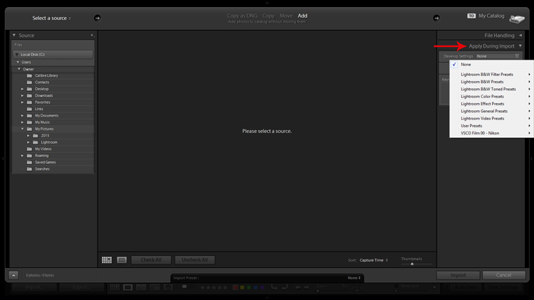
Applying Develop presets on import is a good way to get a jumpstart on the the editing process.

The Develop Settings dropdown provides access to your Develop module presets. If you haven’t created any, this will only be populated by Lightroom’s built-in preset options.

This is a way to save you some clicks by allowing Lightroom to apply things like sharpening, saturation, color temperature, etc. (any settings savable within a preset) while it imports your new photos to your catalog.

You are also presented with the opportunity to populate the Keywords box and apply common metadata like image location or copyright information. I recommend beginning an unwavering habit of adding keywords on Import and not procrastinating until later to it. You will thank yourself in a few years when you’re looking for a specific picture in your library of 20,000 images.

2.Preview and Selection

Once you have imported your latest batch of soon-to-be masterpieces it’s time to sort through and separate the wheat from the chaff.

There are a number of ways to go about this, but I prefer to start at the beginning, viewing images at full screen (keyboard shortcut F) and using the arrow keys to flip through. When I come across a potential keeper, I mark it by color. You can do this by clicking one of the four colors in the lower tool bar menu (while not in full screen mode) or using keyboard shortcuts 6-9 which correspond to the four colors (while in full screen mode). If the color labels are not visible, click on the arrow on the right side of the lower toolbar and click on Color Label.

I have attached specific meanings to these colors. Red, for example, means that the photo is a potential candidate for editing after closer inspection.

Screenshot of photos grouped by color label

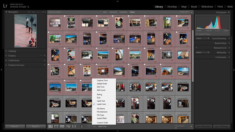
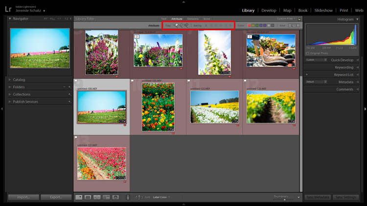
Color labels and flagging are convenient tools for sorting and locating images.

After you sift through a batch of imported photos and have color coded them, you can then sort or filter by label color for quick selection or organizing. To do this, you must be in grid view in the Library module. In the upper Library Filter toolbar, you can click on Attribute and then click the desired color and Lightroom will group all photos with that label color at the top.

If you just want to group together photos with the same color label without hiding all of the other images in that folder, you can click on Sort in the lower toolbar and select Label Color. After you have applied color labels and grouped them together, you now have a convenient way to delete unwanted images by clicking the first one, holding shift, clicking the last one (which will select the whole group) and then hitting delete.

3.Use Keyboard Shortcuts for a Smoother Editing process

As you spend more time using Lightroom, you will find that all of these little tricks which seem to save only trivial amounts of time/effort are compounded quickly.

Keyboard shortcuts are one of those tricks. Don’t be selfish, share the carpal tunnel with your left hand too.

At the very least, learn the keyboard shortcuts for the processes that you use most often.

Although I could list them all here, you really only need to know one: CTRL+/. This will open a pop-up window of some of the keyboard shortcuts for the respective module that is active.

Screenshot of keyboard shortcut cheat sheet

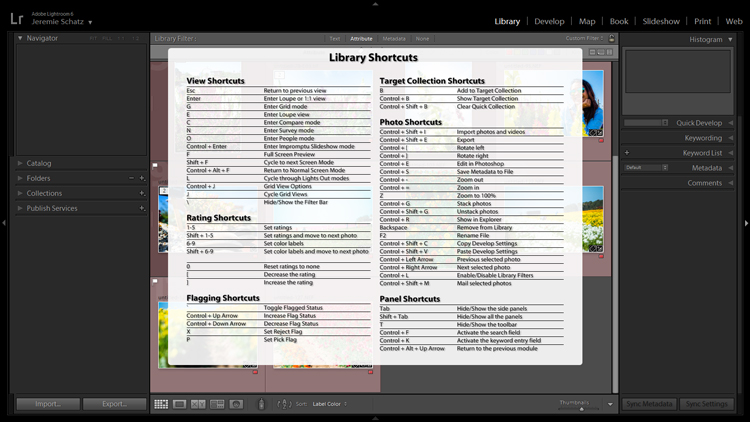
Pressing CTRL+/ brings up the keyboard shortcut cheat sheet for the module you are in.

Another little trick you may not be aware of can be found in the Develop module. Instead of clicking and dragging sliders, you can click on the name of an adjustment (click the word Exposure for example) and then use the (+) and (–) keys to move the slider in incremental amounts.

Screenshot for develop adjustments

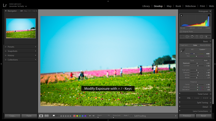
Clicking on an editing action will activate it and using the + and – keys makes incremental adjustments.

If you’re one who likes to work top to bottom, you can use the (,) and (.) keys to cycle through the adjustments in the active panel.

4.Use the Target Adjustment Tool

You will find this handy little tool in the top left corner of the Tone Curve, HSL and B&W panels. The concept is that once you have clicked on the tool and activated it, click anywhere on your image, drag up or down and Lightroom will make the appropriate adjustments.

Screenshot of the target adjustment tool

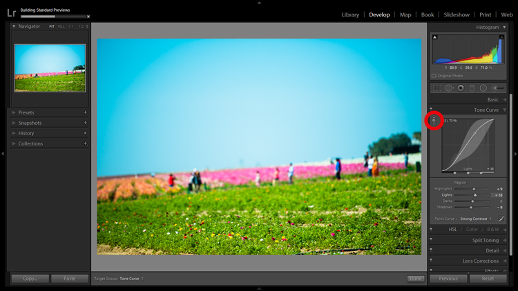
Using the target adjustment tool takes some of the guesswork out of editing.

If used in the Tone Curve panel, the tone you select will fall into one of the four quadrants the tone curve is divided into: highlights, lights, darks, shadows. Within the HSL panel, the tool is a little more intelligent and can be used to tweak combinations of the eight color sliders for hue, saturation and luminance. For example, if you click on some green grass and start dragging, the tool may move both the yellow and green slider to pinpoint the correct hues for adjustment.

The B&W panel does the same as HSL except the adjustments are to the various shades of gray that the image has been converted in to.

5.Create Virtual Copies to Compare Edits

More than likely you are aware of the basic premise which Lightroom uses to edit your images. It’s simple: a tiny little file called a sidecar file (with the .xmp file extension) piggybacks onto your original image and keeps track of all the edits you’ve made to that image.

Lightroom enables you to add some extra info to that .xmp file which allows you to make further edits on the virtual copy while maintaining the edits you’ve made thus far. This can be accomplished by choosing Photo>Create Virtual Copy (keyboard shortcut CTRL+’).

Screenshot of image comparison

Making virtual copies allows you to compare different edits of the same image side by side.

Lightroom also allows boasts the Snapshot feature in the Develop panel on the left of your screen. A Snapshot basically bookmarks a specific spot in your edit history which you can revert the image back to.

One approach can be to work through your editing process, make a virtual copy at some point and go for a different look with the copy. Then you can compare both edited images side-by-side to see which tickles your fancy. Virtual Copies can also be exported in the same way as the original. This is why I use Virtual Copies rather than Snapshots.

6.Create Collections to Group Choice Images

The Collections panel really warrants an entire article to itself as there are many features within it, but let’s discuss its most basic use, which is to create a grouping of images.

There is a plus sign beside the Collections heading and clicking that launches a dropdown menu. The first choice is Create Collection and that’s where you should start. A dialog box will launch and you should name your collection and check the Set as target collection box.

Screenshot of new collection dialog box

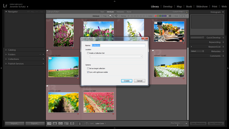
Once a new collection is created, pressing B while any photo in your library is selected adds it to the target collection.

Let’s say you embarked on a wild journey across Siberia and have a zillion photos in several folders. You could create a collection called Choice Siberia Pics, then add your favorite images to this collection to show off to friends in a slideshow. To add images to the collection, either right click and select Add to Target Collection or use keyboard shortcut B.

One benefit of using collections is that you add photos easily from anywhere in your library, and Lightroom doesn’t actually make copies so no additional space is taken up on your computer’s memory.

7. Use Camera Calibration Profiles

In the Develop module, the last choice on the right-hand menu is Camera Calibration. If this panel has been shrouded in mystery and, as such, you have pretended it doesn’t exist, it’s time to enter unchartered territory.

What Camera Calibration profiles do is adjust your image to recreate, as closely as possible, whatever various picture profiles your camera may offer. If you are shooting in RAW and reviewing your photos in-camera, you are likely seeing a JPEG preview that the camera whipped up for you. When you import those RAW files, Lightroom ditches that JPEG and you get that unsharp, unprocessed dull-looking image.

In Camera Calibration there is a Profile dropdown menu which offers up the same processing options that you will find in your camera. I shoot with a Nikon so Lightroom gives me the options of:

-Adobe Standard
-Camera Landscape
-Camera Neutral
-Camera Portrait
-Camera Standard
-Camera Vivid

Camera calibration screenshot

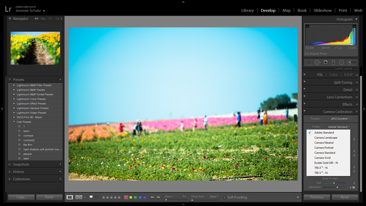
Camera calibration profiles offer the same settings found in many cameras.

That first choice is Lightroom’s default. If you find one of these settings appealing and want to make it a default setting, you can hold down the Alt key and click the Set Default button at bottom right.

8.Create Develop Presets for Common Settings

In the Develop module, the first panel item on the left menu is Presets. This is pretty self-explanatory and Lightroom has some loaded in there to get you started.

You can create your own presets for common edits you use. If you want to get started in creating your own presets, click the plus symbol next to Presets and take a peek at all of the attributes Lightroom allows you to save.

Screenshot of develop presets dialog box

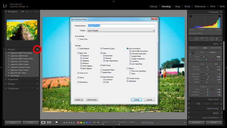
Don’t mess around trying to match edits that you’ve made before – create presets for them along the way.

Remember the Apply on import setting we talked about earlier? Any Develop presets you create can also be chosen to apply on import. Sure, you can always import a batch of photos, hit CNTL+A to select all of them and then choose one of your presets, but that will take some time for Lightroom to process and the idea here is to save yourself time and clicks.

Develop presets are a great way of preserving complex edits or distinct styles which you may want to reproduce again. There is a bottomless well of preset bundles you can purchase online and even some free ones floating around out there on the interwebs if you don’t feel like making your own.

9.Flag and Rate for Easy Sorting

In much the same way you can slap color labels on images in your library for identification and sorting purposes, so too are you able to take it a step farther by flagging and rating them.

Flags (keyboard shortcut P, or U to unflag) show up as a flag which is displayed in the upper left corner of thumbnails when in grid view. I personally use flags as a thumbs which tells me that the photo is final and client-ready, ready for export or printing. There is also the option to use a reject flag (keyboard shortcut X). I don’t use these in my workflow, but you may find them more useful.

Rating images is based on a five-star system. You can use the star system to put a value rating on images which can be used for filtering or whatever significance you place on them.

Screenshot showing filter for flagged and rated photos

Flagging and rating are ways you can identify certain images and easily locate them later.

By this point you are probably seeing a clearer picture of Lightroom’s multi-layer system of organizing, archiving and locating images in your catalog. The more identifying markers you have on images in your library, the more specific you can be in narrowing down what you are looking for.

If you are not an old-hand with Lightroom, all of this keywording, color coding and flagging might seem redundant and excessive, but as your library grows to unwieldy proportions you will be forever grateful that you formed these good habits early on.

10.Stack Images for a Tidy Workspace

If you shoot in RAW+JPEG, create virtual copies in Lightroom or use Photoshop or other plugins which make copies of your original images before editing, you may end up with several versions of similar images in your library. Same with you time-lapse shooters who don’t process the video in-camera.

To keep your library looking clean and organized, consider using Lightroom’s stacking feature. Stacking is pretty versatile, allowing you to hide an entire folder behind one image if you wish.

Screenshot of a stacked image folder

Stacking enables you to easily hide groups of photos behind a cover image.

The order which the images were displayed in grid view will be preserved after stacking with the active photo being on top.

Once again, stacking can be used in conjunction with all of the previously mentioned identifying and organizing features.

To stack, select the desired images (CTRL+A to select all, CNTRL+click to select non-contiguous images and CTRL+SHIFT to select a continuous string of images), right click on any of the selected images and hover over Stacking to reveal the sub-menu (keyboard shortcut CTRL+G).

Conclusion

I know there’s a distinct possibility that when you got into photography you didn’t envision spending so much time on your computer cursing Lightroom. However, if you haven’t already, you will have to come to terms with the fact that post-processing is a fact of modern photographic life.

Lightroom and other editing software are tools and like tools for any other purpose, learning the various approaches to using them in the most efficient and productive way is crucial to furthering your craft.

googletag.cmd.push(function() {
tablet_slots.push( googletag.defineSlot( “/1005424/_dPSv4_tab-all-article-bottom_(300×250)”, [300, 250], “pb-ad-78623” ).addService( googletag.pubads() ) ); } );

googletag.cmd.push(function() {
mobile_slots.push( googletag.defineSlot( “/1005424/_dPSv4_mob-all-article-bottom_(300×250)”, [300, 250], “pb-ad-78158” ).addService( googletag.pubads() ) ); } );

The post 10 Lightroom Tips for a Smoother Work Flow by Jeremie Schatz appeared first on Digital Photography School.


Digital Photography School

 
Comments Off on 10 Lightroom Tips for a Smoother Work Flow

Posted in Photography


Portrait Photography Tips: Tapping The Tween Market

21 Sep

Who’s fun, adorable, up for anything, happy, laughing, totally decisive, and the most undershot market on the planet? They’re the new Seniors… they’re Tweens! This summer I had the privilege of working with the 9-13 set quite a bit, and I absolutely loved it. As a group, tweens will try just about anything once, and it’s so much fun for Continue Reading

The post Portrait Photography Tips: Tapping The Tween Market appeared first on Photodoto.


Photodoto

 
Comments Off on Portrait Photography Tips: Tapping The Tween Market

Posted in Photography


Easy Tips to Help Beginners Understand Composition

20 Sep
Title-portrait-subject's-eye-above-the-horizon-line

Place your subject to the right or left of centre. For portraits, the eyes should be above the centre line for a pleasant good composition.

Composition is all about the balance of the elements in your photograph. This also includes colors tones and textures. This is what separates a snapshot from a great shot. If you want to achieve a good composition, you need to plan it out and see where each element is going to be placed before you take the shot.

You may have heard photographers talk about seeing the shot in their head before they have actually taken the shot. It’s this ‘seeing’ that I’m going to describe in more detail. I’ll also demonstrate a few useful tips to train your eye in seeing or framing a scene with or without a camera, and in post-editing.

A good composition in a photo will most likely have followed a compositional rule. These are very useful to know. I’ve chosen five of these principles to describe how they work. I prefer to call them principles or guides rather than rules. There are many more, but these five are a good place to start.

cut-out-cardboard-frame

Cut-out cardboard frame for training your eye to see.


Let’s get back to seeing your shot or framing the scene. For this exercise, you won’t need a camera. You might get funny looks but bear with me. Choose any place, location that you want.

Cut out a frame from cardboard or any material you want as long as it’s a rectangle. See above.

You could equally use your hands, but I preferred using the cardboard frame.


frame-the-scene-hands

Framing your shot using hands.


As you will see, the frame narrows your field of vision and helps to block out distractions and look for the main focal point, which is what the viewer’s eye is drawn to. I can’t emphasize enough that this simple exercise will help you train your eye to see better in terms of composition. Don’t forget to get down low and look up too.


What-we-see

Take this metal bridge, for example. Not a very interesting photo.


framing-the-shot-bridge

By using the cardboard frame to ‘see’ the potential for an interesting shot.


final-image-how-we-see

Bring it into your post-editing software and create an interesting texture shot.

Another useful tip that I would highly recommend is a trip to your local art gallery to see great works of art. Not only is it visually pleasing, but you get the chance to study how these great artists used composition to great effect. So the next time that you happen to be in such a museum, observe and take note. Ask why you liked a particular painting? How were the elements in the painting arranged or placed? Where was the horizon line – a third up from the bottom? What about color and texture?

Okay, what if you don’t live near an art gallery? Then maybe a visit to your local library could be an option? Libraries are such a wonderful resource. In the art section alone, you have great masters, such as Leonardo da Vinci, Rembrandt and so forth. And of course, the masters in the photography world such as Henri Cartier-Bresson and Ansel Adams, to name just a couple.

Art-books

Go to your local library for inspiration from the masters in the art world to see how they used composition in their works.


Before you go and get your camera, let me explain the following five compositional principles I believe are a great starting point for beginners.

Rule of Thirds

You may have already heard of this one. This is an actual formula based on mathematical principles of harmony and proportion. It has been used by artists for centuries. So think of your photo with imaginary lines that are drawn dividing the image into thirds both horizontally and vertically. You place important elements of your composition where these lines intersect. Similar to a tic-tac-toe game.

rule-of-thirds

How the rule of thirds looks like. Where the lines intersect are the points in which to place your elements.

Rule of Odds

This may sound a bit odd (sorry, excuse the pun), but our brain looks for evenness and symmetry. So this principle asserts that having an odd number of objects in an image will be more interesting and, therefore, more pleasing. By having one or three elements is better than two.

Rule-of-odds

Odd numbers of elements are more pleasing and interesting than even ones.

Lines

Keep the horizontal lines level and the vertical lines straight. This is particularly important if you shoot landscapes, seascapes and cityscapes. Leading lines are also very effective for drawing the viewer to where the focal point is.

lines-straight

The red lines are to show the horizontal lines are even and the vertical lines are straight.

Color and textures

Color and textures are a great way to demonstrate good composition.

Color-and-rule-of-thirds

Here is an example of color and rule of thirds for this composition. Notice the curve elements.

Negative space

This is an abstract concept which describes the space around your subject, otherwise known as ‘white space’ that draws your eye to it. Basically like ‘sky’ or a blurred background that provides the main emphasis on the subject.
Think of it in terms of letting your main subject or object breathe by giving it room.

As photography is about creativity, rules are not meant to be strictly adhered to. In the bikini photo, although I used two of them and they are symmetrical, I used color to contrast the elements and by not placing them in the centre gives the photo a more pleasing compositional effect.

knowing-how-to-break-the-rules-color-as-composition

Although I used two pairs of elements and I know that these are even, the color contrast and using the rule of thirds still makes this image a good composition.

Right, let’s get the camera out. Most DSLR cameras have built-in grid lines and some have a virtual horizon or a spirit level. If your camera has none of these options, you can always add a leveling aid, such as a hot shoe-mounted spirit level or use the focusing points within the viewfinder.

Use your tripod to help you frame your shot so that you get a good composition. Look through the viewfinder, see what elements are in the frame. Then take a look at the scene in front of you with both eyes, then go back to your viewfinder, recompose, then shoot.

Practice will improve your understanding and shooting better compositions. Don’t expect to get it in one go. Give yourself time.

Last, but not least, cropping your images in post-editing. Whether you use Camera Raw, Photoshop or Lightroom, cropping your photos will give you a better understanding of how the principles of composition apply.

You can easily straighten crooked horizon lines by using the Crop Tool or get rid of barrel distortion in buildings using the Lens Correction filter in Photoshop. Or simply change the image dramatically from the one you shot originally. All of these edits can be done non-destructively, so you can crop to your hearts content!

original-title-shot

This is how the photo at top of this article was shot, yet when I cropped in tight on the model to the right, it gave me a different shot.

To summarize, like any complex subject that goes beyond just one article, I hope I have illustrated some useful tips to show the importance of composition in your photography. Please share your comments below.

googletag.cmd.push(function() {
tablet_slots.push( googletag.defineSlot( “/1005424/_dPSv4_tab-all-article-bottom_(300×250)”, [300, 250], “pb-ad-78623” ).addService( googletag.pubads() ) ); } );

googletag.cmd.push(function() {
mobile_slots.push( googletag.defineSlot( “/1005424/_dPSv4_mob-all-article-bottom_(300×250)”, [300, 250], “pb-ad-78158” ).addService( googletag.pubads() ) ); } );

The post Easy Tips to Help Beginners Understand Composition by Sarah Hipwell appeared first on Digital Photography School.


Digital Photography School

 
Comments Off on Easy Tips to Help Beginners Understand Composition

Posted in Photography