RSS
 

Posts Tagged ‘Texture’

Weekly Photo Challenge – Texture

27 Feb

The post Weekly Photo Challenge – Texture appeared first on Digital Photography School. It was authored by Sime.

Texture is one of the seven elements of art. Rough vs smooth, patterns, contrast. We have many ways to show texture and this week we want to see how you interpret and show texture in a photograph. I’ve gathered a few examples of what ‘texture’ is, to me, and I guess we can interpret it in our own way and it might be different for you – but anyway! here are a few examples…

This Week Your Challenge Theme is #dPSTexture

Weekly Photo Challenge – Texture

There are some great examples and articles on #dPSTexture on the blog, too! Make sure you pop across and take some extra inspiration from them!

  • How to use texture to create compelling images.
  • 17 highly detailed images that show texture.
  • Tips for abstract macro photography using texture and light.

You can upload your photo here (comments down below) or over in our Facebook Group.

Share them on Instagram or Twitter and use the hashtag #dPSTexture so we can see them!

How do I upload my photo to the comments?

Simply upload your shot into the comments field (look for the little camera icon in the Disqus comments section) and they’ll get embedded for us all to see. Or, if you’d prefer, upload them to your favourite photo-sharing site and leave the link to them.

Weekly Photography Challenge – Looking Up

The post Weekly Photo Challenge – Texture appeared first on Digital Photography School. It was authored by Sime.


Digital Photography School

 
Comments Off on Weekly Photo Challenge – Texture

Posted in Photography


DIY: How to Create a Coffee-Stained Texture for Aging Images in Photoshop

21 Feb

The post DIY: How to Create a Coffee-Stained Texture for Aging Images in Photoshop appeared first on Digital Photography School. It was authored by Megan Kennedy.

coffee-stained-texture-in-photoshop

As a kid, I remember coffee-staining scrap paper to create ancient maps that marked out treasure in the backyard. Nowadays, I’ve discovered that the same process can be great for photography projects too. With help from Photoshop, experimenting with textural layers is a great way to introduce an aged look to your images. But sometimes it can be hard to get a hold of quality textures on the internet. That’s where a bit of DIY comes in. By making your own coffee-stained texture, you can create seemingly aged canvases, which can then be applied to your images.

coffee granules

What you’ll need:

  • 1/4 cup of instant coffee granules
  • 1 teaspoon
  • a damp cloth, sponge or paper towel
  • a few pieces of white paper (I use plain old sheets of A4 copy paper. While copy paper does pucker when water is introduced to it, I think it adds to the overall aged effect. Plus, it’s less expensive than good art paper!)

How to coffee-stain paper

  1. First, lay out your sheets of paper on a wipeable surface. I prefer to work on the kitchen bench.
  2. Sprinkle some instant coffee on your sheets of paper – about a teaspoon per sheet.
  3. With a damp cloth, sponge or paper towel, begin to press the instant coffee granules into the paper. As the coffee moistens, you can start to spread the granules around the paper with broader strokes. The more varied the strokes, the rougher the effect will be.
  4. You can add more coffee and a little water if you need it. The more coffee you add, the darker the coffee-stained paper will turn out. You can even leave some partially-dissolved coffee granules on the page.
  5. Once you coat the paper, place the sheets somewhere safe and leave them to dry for a few hours.
  6. Sometimes the drying process can lighten the stained effect somewhat. If this happens, add more coffee and water to darken the paper further.

Here’s my result:

coffee stained texture paper

How to apply coffee-stained textures in Photoshop

Once your coffee-stained paper is dry, scan or photograph the page/s and save the files somewhere handy on your computer.

Next, open an image in Photoshop. This will be the image we’ll apply the coffee-stained texture to. I went with the image below:

flower original image

1/100 of a second f/4.5 ISO 100

With your chosen image open, add a Black & White Adjustment Layer by clicking the Black & White icon in the Adjustments panel (the names of the icons appear when you rest your mouse on them).

If you can’t see the Adjustments panel, select Window from the top toolbar and then click on Adjustments. The Black & White Adjustment Layer will non-destructively convert your image to black and white.

black and white

black and white adjustments

Toggle the Black & White Adjustment Layer settings until you are satisfied with your image.

Next, with the Black & White Adjustment Layer selected in the Layers panel, click File from the top toolbar. Then select Place… and locate and select the coffee-stained image file.

The coffee-stained texture layer will be imported over your original image.

placing coffee-stained texture

If needed, adjust the dimensions of the coffee-stained image by dragging its corners to completely cover the entirety of the canvas.

With the coffee-stained texture selected in the Layers panel, click on the Blending Modes drop-down menu located within the layers panel. Set the Blending Mode to either Overlay or Soft Light. Overlay is a bit harsher in contrast than Soft Light, so test out both options before settling on one.

blending modes panel

coffee stained texture overlay blending mode

Next, select the coffee-stained texture layer and click on the Curves icon in the Adjustment Layers panel. Adjust the Curves settings until you are happy with the overall contrast of your image.

coffee-stained texture curves adjustment

At this point, you can refine the Black & White Adjustment Layer further or even add additional coffee-stained layers to increase the intensity of the aged effect.

This is my finished result…

coffee-textures overlay final result

Here are two more images I’ve attempted to age a little with the same method…

coffee-stained textures travel landscape

coffee-stained texture aircraft stearman

What do you think? Up for a cuppa? If you’ve given the coffee-stained texture method a try, be sure to share your results in the comments!

The post DIY: How to Create a Coffee-Stained Texture for Aging Images in Photoshop appeared first on Digital Photography School. It was authored by Megan Kennedy.


Digital Photography School

 
Comments Off on DIY: How to Create a Coffee-Stained Texture for Aging Images in Photoshop

Posted in Photography


Texture and Clarity Sliders in Lightroom Classic CC: What’s the difference?

10 Aug

The post Texture and Clarity Sliders in Lightroom Classic CC: What’s the difference? appeared first on Digital Photography School. It was authored by Adam Welch.

Throughout the last couple of years, Adobe has released an absolute tsunami of updates for their photo editing platforms. Adobe Lightroom Classic went through a plethora of upgrades and changes, with new (and sometimes major) add-on’s seemingly incorporated with each new build. One of these sizable fresh additions to the Lightroom Classic toolkit came in May of 2019 with the release of v8.3. It’s called the Texture slider.

Texture and Clarity Sliders in Lightroom Classic CC: What's the difference?

Yep, that little guy right there.

You’ll find the texture slider nestled comfortably in the Presence section of the basic panel alongside the now veteran Clarity and Dehaze adjustments. These Presence sliders are extremely interesting in their effects and how they each accomplish their separate actions. Clarity, Dehaze, and now Texture, all perform similar adjustments. They each tweak contrast within our photos to varying degrees with wholly different results.

Texture and Clarity are particularly interesting. Both perform quite similarly, while at the same, remaining their own animals…if that makes any sense? In this article, we’re going to have a closer look at the Clarity and Texture sliders.

I’ll explain how they work and show the different effects each of these powerful sliders can have on your photos.

Texture vs Clarity

All right, so what’s the difference between Clarity and Texture?

We’ve already surmised they are similar in that they function to bring out detail within a photo. However, you’ll notice some very obvious differences as soon as you view the effects of each slider side by side. Have a look at this. Here’s the original photo:

Texture and Clarity Sliders in Lightroom Classic CC: What's the difference?

And now a side-by-side comparison of some Clarity and Texture Slider adjustments.

Texture and Clarity Sliders in Lightroom Classic CC: What's the difference?

In the photo on the left, I’ve increased the Clarity slider to +100. I’ve applied +100 Texture to the photo on the right. The difference is apparent, but what exactly is happening here? First, let me remind you what our beloved Clarity slider actually does.

A refresher on Clarity

In short, Clarity interacts with our photos by increasing or decreasing the contrast between midtone luminance values. This essentially gives the illusion of our image becoming clearer. However, in reality, all that is happening is the application of more or less contrast to the light and dark areas which fall as midtones (between highlights and shadow).

You’ll also notice that the photo is perceptively brighter and that the color saturation diminishes slightly when increasing Clarity. On the other end of the spectrum, decreasing clarity adds in a soft-focus effect. This can sometimes work extremely well, depending on your subject. For a little more of a breakdown on Clarity check out my other article, How to Make Your Photos Shine Using Clarity, Sharpening, and Dehaze in Lightroom. You’ll also learn some great tips on using Clarity along with the Sharpening and Dehaze sliders.

What is Texture?

Now let’s talk about the new kid on the block, the Texture slider.

Ironically enough, the idea for the Texture slider was born not from the goal of increasing the textures (positive) within an image but rather decreasing them (negative) thereby essentially smoothing out a photo. The Texture slider was initially named the “Smoothing slider” in the early stages of its development.

The team at Adobe were aiming to migrate into Lightroom (at least to some extent) the skin retouching capabilities of Photoshop. Their goal was to offer a feature that packed a less drastic punch than the Clarity slider. All while still being able to increase (or decrease) the apparent contrasts in the photo to give the illusion of enhanced textures within the images.*

Image: +69 texture added globally

+69 texture added globally

The Texture slider lands somewhere between Clarity and Sharpening in Lightroom. A good way to think about Texture is that it is much less harsh than Clarity and offers more subtle results without affecting absolute brightness or color saturation.

Texture focuses it’s smoothing or clearing effects on areas of a photo which possess “mid-frequency” features. You can think of these as medium detail areas. For reference, a cloudless sky would be considered a low-frequency feature while a cluster of trees would be considered a high-frequency feature.

It is also worth mentioning that like many of the tools found in Lightroom Classic, you can apply the texture effect both globally (the entire photo) and locally to specific areas. Local negative texture adjustments work wonders for smoothing out skin wrinkles and blemishes in your portraits.

Image: Before localized skin smoothing

Before localized skin smoothing

Image: After some retouching using a negative texture with Lightroom’s adjustment brush. Now I...

After some retouching using a negative texture with Lightroom’s adjustment brush. Now I only look nominally haggard…

*Note: This is an extremely basic explanation of the Texture slider. If you’re feeling truly adventurous and want to learn more about the technical makeup of the Texture slider, I highly recommend this post over on the Adobe Blog.

Should I use Clarity or Texture Slider?

The looming question is, “When should I use Texture, and when should I use Clarity?” Unlike most commentary I offer on the absolutes of post-processing, which often borders on a Zen-like existentialist approach of “it all depends on the image,” there are some relatively straightforward things to look for when deciding which adjustment will work best for your particular photo.

Try the Clarity slider if:

  • Your image consists of high-frequency features
  • The effect is needed on a more global scale
  • Your image is a landscape
  • The image is black and white

Try the Texture slider if:

  • Your image has large areas of mid to low-frequency features
  • A more subtle enhancement is needed
  • The image is a portrait
  • Your image has extreme color contrasts/saturation

Of course, these are just guidelines, and I hope you experiment with both the Clarity and Texture sliders.

Also, nothing is stopping you from using a combination of the two – especially when you are applying them using local adjustment tools.

Closing thoughts on Texture and Clarity Sliders

You’ve heard me say time and time again that less is generally more when it comes to applying adjustments in post-processing. Just because a tool is available doesn’t always mean you have to use it to its full strength.

Perhaps this is no truer than when it comes to using the tools found in the Presence section of Lightroom, in this case, the Texture and Clarity sliders. These nifty little adjustments can yield amazing results for your photos.

In fact, I use both local and global Clarity and Texture slider adjustments in virtually all of my photos to one extent or another.

With that said, it’s a good practice not to over-process your images. Some judicious use of negative Texture can shave years off your clients face. However, go too far, and they might end up looking like a wax doll.

Adding positive Texture can bring out the subtle beauty of tree bark, however, use too much, and you’ll end up with…well, you get the idea.

What are your thoughts on the new Texture slider in Lightroom Classic CC? Is it a feature you will use regularly? Sound off in the comments below!


texture-and-clarity-sliders-in-lightroom-classic-cc

The post Texture and Clarity Sliders in Lightroom Classic CC: What’s the difference? appeared first on Digital Photography School. It was authored by Adam Welch.


Digital Photography School

 
Comments Off on Texture and Clarity Sliders in Lightroom Classic CC: What’s the difference?

Posted in Photography


Weekly Photography Challenge – Texture

03 Aug

The post Weekly Photography Challenge – Texture appeared first on Digital Photography School. It was authored by Caz Nowaczyk.

This week’s photography challenge topic is TEXTURE!

Image: Image by Glenn Harper

Image by Glenn Harper

Go out and capture absolutely anything that includes texture. You can photograph anything that has texture, or you can overlay textures in post-processing to create a whole new work of art. They can be color, black and white, moody or bright. Just so long as they include texture! You get the picture! Have fun, and I look forward to seeing what you come up with!

Image: Image by Rick Ohnsman

Image by Rick Ohnsman

Image: Image by Megan Kennedy

Image by Megan Kennedy

Check out some of the articles below that give you tips on this week’s challenge.

Tips for Shooting TEXTURE

How to use Texture to Improve Your Photos

10 Tips for Shooting for Graphic Textures

Texture as a Design Element in Photography

Working with Textures – 8 Ideas to Get You Started

How to Create Your Own Textures

Applying textures in post-processing

How to Add a Texture Overlay to Your Images for a Stunning Effect

Beginners Guide to Creating and Applying Texture Overlays Using Photoshop

How to Apply a Texture Overlay to Your Images to Create an Antique Look

How to Use Textures to Create Compelling Photographs

Weekly Photography Challenge – TEXTURE

Simply upload your shot into the comment field (look for the little camera icon in the Disqus comments section) and they’ll get embedded for us all to see or if you’d prefer, upload them to your favorite photo-sharing site and leave the link to them. Show me your best images in this week’s challenge.

Share in the dPS Facebook Group

You can also share your images in the dPS Facebook group as the challenge is posted there each week as well.

If you tag your photos on Flickr, Instagram, Twitter or other sites – tag them as #DPStexture to help others find them. Linking back to this page might also help others know what you’re doing so that they can share in the fun.

The post Weekly Photography Challenge – Texture appeared first on Digital Photography School. It was authored by Caz Nowaczyk.


Digital Photography School

 
Comments Off on Weekly Photography Challenge – Texture

Posted in Photography


Lightroom Texture Slider vs. Skin Smoothing

09 Jul

The post Lightroom Texture Slider vs. Skin Smoothing appeared first on Digital Photography School. It was authored by Simon Ringsmuth.

One of Adobe’s recent feature updates to Lightroom has profound implications for photographers who retouch their portraits. While in-depth alterations are best handled in an app like Photoshop or Affinity Photo, Lightroom’s brush tool has been a good choice for basic retouching for many years. Users can dial in specific settings to help skin appear softer and smoother, or select a preset defined by Adobe. However, these retouches have typically employed the Clarity slider, which is great for a lot of situations but not exactly ideal for portraits. Thankfully, the new Lightroom Texture Slider option aims to solve this and a whole lot more.

Lightroom Texture Slider vs. Skin Smoothing - 1

Before I get too deep into the Texture option, it’s important to know that it’s not just for tweaking headshots. It is specifically designed to either increase or decrease the detail on textured surfaces. These can be cloth, rocks, plants, skin, or anything that has a non-uniform appearance.

If you want to smooth the texture to make a surface appear more glassy, slide the Texture option to the left. By contrast, if you want to enhance the look of any textured object, just slide the tool to the right.

Texture vs. Clarity vs. Sharpening

Texture is fundamentally different from other tools such as Clarity or Sharpening, each of which has long been a staple in many portrait photographers’ workflows. Clarity works by increasing or decreasing contrast specifically along edges, or areas of already-high contrast. It primarily affects mid-tones and not the lightest and darkest portions of an image. Sharpening makes the edges of objects and surfaces much more vivid. It has some additional parameters like Radius and Amount that can be fine-tuned to get you just the right balance.

Lightroom Texture Slider vs. Skin Smoothing - 2

Each of these tools has a specific purpose, and they can be used alone or together to create specific results. If you usually do basic portrait retouching by using the Brush tool and selecting the Soften Skin option, you may have noticed that it’s merely a combination of Clarity and Sharpness. Texture, on the other hand, is specifically designed by Adobe to alter the appearance of textured surfaces.

If you have traditionally done some basic retouching using Clarity and Sharpening, you might be surprised at how effective the Texture option is.

The Soften Skin brush preset in Lightroom is just a combination of -100 Clarity and +25 Sharpening.

Retouching with Texture

While you can apply texture globally by using the option in the Basic panel of Lightroom’s Develop module, portrait photographers will appreciate that it can be applied selectively using the Brush tool. Select the Brush option and then look for the Texture slider, which is right above Clarity, Dehaze, and Saturation. You can also configure parameters like Size, Feather, Flow, and Auto Mask though I would recommend leaving the latter turned off if you are editing portraits.

Click on your photograph and brush in the Texture adjustment the same you would with any other adjustment. Be careful to stay in the facial region and not brush into hair, clothing, or other parts of the image. You certainly can apply the texture brush to other elements of your picture later on, but to start with stay focused on the face.

Lightroom Texture Slider vs. Skin Smoothing - 3

Original image with no brush adjustments applied.

As you brush in the Texture adjustment, you will see rough areas of the skin become smooth. I recommend starting with a value between -25 and -50. This retains most of the original look of the portrait while smoothing things out just a bit.

If you have never worked with the Adjustment Brush tool, you might take a minute and look over these five tips that could speed things up or make your work a lot more efficient.

Lightroom Texture Slider vs. Skin Smoothing - 4

Texture -50 adjustment brush applied to the cheeks, chin, and nose.

The resulting portrait has a smoother, softer appearance where the Texture adjustment was applied. Details such as pores and wrinkles remain, and color gradients and shifting tones are also preserved.

This is much different than the results typically produced by using the Skin Smoothing option, which employs a mix of negative Clarity and positive Sharpening.

Lightroom Texture Slider vs. Skin Smoothing - 5

Image with Soften Skin adjustment applied to the same areas.

This third image looks as though petroleum jelly has been smeared over the camera lens. The woman’s cheeks are missing the subtle color variations from the original image. While the skin is certainly smoother, it also looks more artificial.

To show how these images look in direct relation to one another, here is a graphic that shows all three versions for three seconds at a time. First is the original, then the Texture adjustment, then the original again, and finally the Soften Skin adjustment.

Lightroom Texture Slider vs. Skin Smoothing

You can create your own Adjustment Brush preset if you don’t want to rely on the Soften Skin preset. But if you have traditionally used the Clarity option, you may find it pleasantly surprising how vastly improved your results are by using Texture instead.

Comparison two

For another comparison, here are three more images to help you see the difference between Texture and other methods of softening skin.

Lightroom Texture Slider vs. Skin Smoothing - 6

The original image with no skin softening adjustments applied.

Applying a Texture -50 Adjustment leaves the pores, stubble, and small wrinkles intact but smooths them out just a bit. It’s a subtle change that doesn’t alter the original too much or make the face appear artificially smooth.

Lightroom Texture Slider vs. Skin Smoothing - 7

Texture -50 applied to the cheeks, chin, nose, and forehead.

A custom skin smoothing adjustment of Clarity -75 and Sharpness +15 makes the young man’s forehead and cheeks appear fake and plastic. It’s not a great look for a portrait.

Lightroom Texture Slider vs. Skin Smoothing - 8

Clarity -75 and Sharpness +15 applied to the same areas.

Looking at the three images sequentially shows the effect in a more pronounced fashion. The Texture adjustment gives a much more natural result while the final image seems over-processed and fake.

Lightroom Texture Slider vs. Skin Smoothing - 9

Conclusion

There’s a lot more you can do with the Lightroom Texture slider, and it’s useful for a wide variety of images aside from portraits. Some photographers like to reduce texture in the face and increase texture on hair and clothing for a punchier look.

My recommendation is to open up some of your images, especially portraits or headshots, and try it out for yourself. You might be surprised at how well it works.

Have you used the Lightroom Texture slider? What are your thoughts? Please share your thoughts (and images) with us in the comments section.


Lightroom Texture Slider vs Skin Smoothing

The post Lightroom Texture Slider vs. Skin Smoothing appeared first on Digital Photography School. It was authored by Simon Ringsmuth.


Digital Photography School

 
Comments Off on Lightroom Texture Slider vs. Skin Smoothing

Posted in Photography


Adobe adds new Texture slider to Lightroom CC, Lightroom Classic and ACR

16 May
A screenshot of the new ‘Texture’ setting under the ‘Presence’ module inside Adobe Lightroom CC, Adobe Lightroom Classic CC and Adobe Camera Raw.

Adobe has announced the addition of a new Texture slider to the latest updates for Lightroom, Lightroom Classic and Adobe Camera Raw (ACR). According to Adobe, Texture is the result of user requests for a way to smooth skin without reducing image quality or spending large periods of time making adjustments.

‘Photoshop may still be needed for some workflows,’ Adobe’s Max Wendt said in a blog post about the slider, ‘but we think that Texture will be great for many of your images.’

Texture, according to Wendt, was first developed as a smoothing slider that eventually expanded to cover both smoothing and texture enhancement. Positive texture — that is, enhancement rather than smoothing — is described as something like a cross between positive Sharpening and Clarity. Negative Texture for smoothing is comparable to Noise Reduction.

Texture reduces or enhances what Adobe calls ‘mid-frequency’ areas of an image, which enables the tool to boost or reduce important details generally without amplifying noise or producing a flat, plastic appearance. Specifically, Texture is great for smoothing skin without obliterating fine details that are key to its realistic appearance.

Texture and Clarity can be used together to adjust different aspects of the image, as well; Adobe provides examples, beyond the ones we’ve included in this article, involving both portraits and landscape images. Those are ultimately just samples of different ways Texture can be utilized, however, with Wendt explaining in his post:

The best way to discover your vision is to experiment. Texture is fully non-destructive, so don’t be afraid to explore and just try things. Go too far, pull it back, go too far again. You’ll find what values work for you. It’s all about your own vision.

Users can access the new Texture slider by updating their software to the latest versions of Adobe Lightroom CC, Adobe Lightroom Classic CC and Adobe Camera Raw available in Creative Cloud.

Articles: Digital Photography Review (dpreview.com)

 
Comments Off on Adobe adds new Texture slider to Lightroom CC, Lightroom Classic and ACR

Posted in Uncategorized


How to Apply Creativity to Your Images with Texture Overlays Using Luminar

28 Nov

How to Apply Creativity to Your Images with Texture Overlays Using Luminar

Layers of fun

One advantage that Luminar has over the average Raw processor is the ability to work with Layers. “What is a layer?” I hear you ask.

Well, your basic image is a single layer, like a sheet of paper on a table. Adding another layer is akin to adding another sheet of paper on top. With layers, you get the benefit of being able to control the layer opacity (the transparency effectively) as well as what parts of the layer are shown – a bit like choosing tracing paper or cutting holes out of the paper.

How to Apply Creativity to Your Images with Texture Overlays Using Luminar

Think of layers like a stack of paper. By cutting out parts of the sheet you can see the one below, or like with tracing paper, you can see through to the layer before.

Originally you’d need to erase the bits of the layer you didn’t want showing, which could be messy if you made a mistake erasing. These days you’d use a layer mask instead. A layer mask is a greyscale map running from white, where everything is visible, to black, where everything on the layer is hidden. Varying shades of gray indicate how visible a part of the layer is or the mask opacity. Lighter is more visible.

There’s a mantra I learned many years ago that helps you remember. “White reveals, and black conceals”.

The beauty of Luminar (by Macphun, soon to be Skylum) is that it hides some of the mechanics of this because rather than painting in black or white, you have a brush that either paints in, or erases the mask. It’s really great!

When you have a few layers together, the combined set of layers is called the layer stack. Working in layers allows you to apply effects to only certain parts of your photo, or to combine more than one photo into a more interesting composition.

Beginning

Let’s open Luminar and choose a photo. Click Open Image to begin.

How to Apply Creativity to Your Images with Texture Overlays Using Luminar

Luminar opening screen.

Navigate to your photo and select it. This process will be easier when the new DAM (Digital Asset Management) module for Luminar 2018 comes next year. I’m going to work with this shot of an old cottage.

How to Apply Creativity to Your Images with Texture Overlays Using Luminar

Original image.

Making a Layer

Luminar provides a few options for creating new layers. In the right panel, you have the Layers panel. To make a new layer, click the + icon in the panel header and select one of the following options:

How to Apply Creativity to Your Images with Texture Overlays Using Luminar

Layers: click the plus symbol to make a new layer.

  • New Adjustment layer; which creates a layer that contains only the filters that you add.
  • Create Stamped Visible Layer; which copies the results of all the underlying layers (combining them) to a new flattened layer.
  • New Original Layer; which copies the base layer on top of the currently selected layer.
  • Add New Image Layer; which allows you to add any other image to the layer stack. This is the one that allows you to add texture and other files!
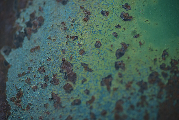
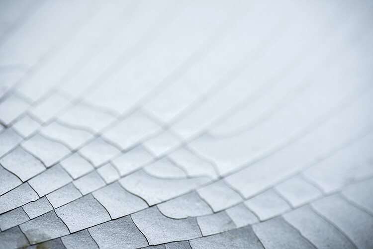
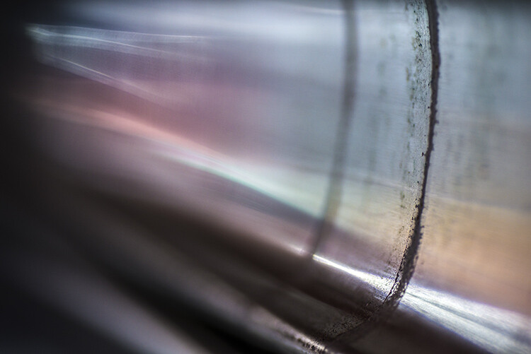
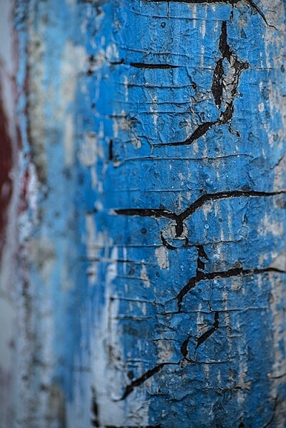
Add a texture file

Luminar doesn’t store textures, but you can use any texture file you like. Personally, I keep my favorite textures in a folder on Dropbox for easy access from anywhere, but you can use any cloud service you like for this.

From the Layer options, choose Add New Image Layer and navigate to your textures folder. Choose the texture you want to add to the current photo. Viola. It’s loaded.

How to Apply Creativity to Your Images with Texture Overlays Using Luminar

Texture image.

Now obviously the texture file will load over your original image. This is fine, you’ll fix this shortly. But first, you should check that the file fits how you like. By default, Luminar will make it fit over the layer below, but you’re not stuck with it.

You have three options in the Layers menu for this. Right-click on the layer and from the Image Mapping option in the menu, choose from Fill, Scale to Fit, or Fit (as seen below). If you don’t like how these look, you have another option:  the Transform tool.

How to Apply Creativity to Your Images with Texture Overlays Using Luminar

You can pull and drag your textures file into shape as required. It doesn’t have to retain its original aspect ratio as it’s adding to your original image and isn’t the actual focus of the final composition. In my case, the texture looks fine for now in regards to size.

Blending Modes

The next step is to go through the different blending modes to find one that suits the images best. Different ones work for different images, so it’s best to experiment. Overlay and Soft Light tend to get used a lot, but often Multiply or Screen can work too. Even Hard Light can be perfect sometimes.

How to Apply Creativity to Your Images with Texture Overlays Using Luminar

Overlay Blend Mode.

How to Apply Creativity to Your Images with Texture Overlays Using Luminar

Soft Light Blend Mode.

Whichever one you use, you’ll probably find that the effect is really strong. That’s fine because you’re working with layers, you can just reduce the opacity until the texture looks good.

For this image, I thought both Multiply and Color Burn looked great. I loved the saturation that Color Burn gave to the photo, but reducing the opacity to bring back some shadow detail removed too much of that. For that reason, I went with Multiply.

How to Apply Creativity to Your Images with Texture Overlays Using Luminar

Multiply Blend Mode.

How to Apply Creativity to Your Images with Texture Overlays Using Luminar

Color Burn Blend Mode.

Masking

You may not want the texture to appear on all parts of the photo. So you’ve got two options. Paint in the texture, or just paint out where you don’t want it. To access the masking functions, click on the brush icon on your texture layer. This opens a menu allowing you to choose the type of local adjustment you want to apply. Your options are Brush, Radial Mask, or Gradient Mask. You can also go with a Luminosity mask. For this image, the brush is the best option.

How to Apply Creativity to Your Images with Texture Overlays Using Luminar

Access the masking tools.

Once the brush is selected, the options appear at the top. I’m going to remove the texture from the house. If you want to remove (hide) part of a layer, click the Erase option on the Brush settings menu. Set Size, Softness and Opacity to taste as you paint.

How to Apply Creativity to Your Images with Texture Overlays Using Luminar

You will see this menu at the top of your screen when you active the Brush tool. Choose Erase to paint away effects, choose Paint to add it in. This allows you to make corrections if you go too far with your painting as well.

Once you’re finished, click Done on the end of the brush options bar.

How to Apply Creativity to Your Images with Texture Overlays Using Luminar

Adjusting the Texture

One good thing about Add Image is that the layer you’ve created has full access to all the Filters in Luminar. Let’s say you’re using either the Overlay or Soft Light blend mode. Any part of the image that’s mid-grey will be unaffected by the texture.

If your texture is dark, or light, the image will reflect this. You can easily change this by adding a Tone filter and adjusting the exposure. If the color from the texture is too strong, you can use Saturation to reduce this or use Hue Shift to change it.

How to Apply Creativity to Your Images with Texture Overlays Using Luminar

Apply filters to the texture layer to fine tune it.

Finishing the image

Of course, you can also apply filters to the original image. Being a landscape, this would be a good time for you to try the Landscape workspace. When you click on the original image, layer Luminar hides the layers above it. To get to the workspaces, click on Clear Workspace and choose Landscape from the menu.

How to Apply Creativity to Your Images with Texture Overlays Using Luminar

Landscape workspace.

Using the suggested filters in the workspace, it’s easy to add back the saturation I saw when I used Color Burn blending mode on the texture.

How to Apply Creativity to Your Images with Texture Overlays Using Luminar

To activate the texture again, simply click on the texture layer.

How to Apply Creativity to Your Images with Texture Overlays Using Luminar

Saving the file

Once you’re done, you’ve got a few options for saving your image. Using Save will create a .lmnr file, which is Luminar’s native editing file format – this will retain all layers and filters you’ve applied (similar to a PSD file in Photoshop).

By using Export instead, you can choose a range of other options, like JPEG, PSD or TIFF.

How to Apply Creativity to Your Images with Texture Overlays Using Luminar

Export options.

Using Filters to add Texture

You’re not forced to use a layer to add textures with Luminar though. They also have a handy new filter called Texture Overlay. Pretty much everything you can do on a layer can be done with this filter. The only thing you can’t really do is rotate the texture at a random angle via Transform, but it’s very rare that you’d ever need to do this.

Start with the image you want the texture on again. Click the blue Add Filter button. Use the Search Bar in the Filters Catalog menu that appears to find the “Texture Overlay” filter. Click to add it.

The Texture Overlay filter added. These are the options and sliders for this filter.

To add your texture file, click “Load Texture…” This will open your file on top of the background photo. The default amount of 50, means you can see the mix of the original image and the texture at 50% opacity; it’s also in Normal blend mode.

The texture added at the defaults – 50% and Normal blend mode.

The Amount control can also run to negative figures, so you can add an inverse version of the texture, which is a cool feature. Here’s how -20 on the Amount slider looks.

If your texture is a different aspect ratio to your original image, you can use Keep Aspect Ratio to force it to fit the image. The two buttons below this allow you to flip the texture file horizontally, or vertically, or both (they appear blue when applied so you know if it’s been flipped).

Zoom will let you scale the texture file to fit the features of your underlying photo. Below Zoom is the Blend mode menu. From here choose the blend mode that suits in the same way as with our first method. Again Color Burn looks great at 100 Amount.

The effect is still a little strong, so you could pull it back by reducing the Filters Amount slider. Here 67 looks great.

Amount = 100, Filters amount = 67

Masking the Filter

Filter masking is really straightforward with this method too. You simply hover over the panel header to reveal the brush icon. Click on this to choose the mask type: Brush, Radial or Gradient. Choose Brush to apply your mask in a specific area.

Filter masks are useful and are applied the same way as a layer mask.

If you’re only looking to remove a small area of texture, switch to the Erase Brush in the brush toolbar that appears above the photo.

In this photo, I’ve brushed the texture away from the cottage.

You can add as many texture overlay filters as you like, just remember that the Filters Amount affects the whole filter set.

Getting Texture files

You can get plenty of commercial texture packs to get you started, but there are free ones out there too. When you’re out and about, consider capturing any textures you find interesting to try out yourself!

Please share your finished textured masterpieces created with Luminar in the comments below. We’d love to see what you make.

Disclaimer: Macphun is a dPS advertising partner.

The post How to Apply Creativity to Your Images with Texture Overlays Using Luminar by Sean McCormack appeared first on Digital Photography School.


Digital Photography School

 
Comments Off on How to Apply Creativity to Your Images with Texture Overlays Using Luminar

Posted in Photography


17 Highly Detailed Images That Display Texture

08 Aug

I hope you enjoy this detailed image collection of subjects with a lot of texture. To capture texture in an image requires a few elements to come together – the right lighting, the right camera angle, and a good degree of image sharpness.

I’ll start you off with a couple of my own images, and then we’ll branch out to see what a few other photographers have done to capture texture with their cameras.

By Darlene Hildebrandt (shot in Havana Cuba)

By Darlene Hildebrandt (shot in Granada, Nicaragua) 

By JLS Photography – Alaska

By Nicholas Erwin

By ROBERTO CABRAL PHOTOGRAPHY

By Thad Zajdowicz

By Suzy Hazelwood

By Gabriel Caparó

By Sandy Sarsfield

By BriarCraft – crazy busy in July

By Kate Ter Haar

By XoMEoX

By Peyton Stanton

By Hernán Piñera

By Iain Merchant

By Marco Verch

By Alexander Day

The post 17 Highly Detailed Images That Display Texture by Darlene Hildebrandt appeared first on Digital Photography School.


Digital Photography School

 
Comments Off on 17 Highly Detailed Images That Display Texture

Posted in Photography


Weekly Photography Challenge – Texture

08 Aug

Detail and texture are two things that tend to draw the viewer’s eye into an image. I shared 17 images that are great examples of the use of texture in a photo here.

By Matthias Ripp

Weekly Photography Challenge – Texture

So what things have to come together to capture an image that showcases and subject with texture?

  • Quality of light – ideally the harder (harsher) and more contrasty the lighting the better, but not 100% necessary.
  • The direction of light – to enhance texture in a subject the light must come from the side, skimming across the surface.
  • Get close – this one is obvious, right?
  • Get it in sharp focus – also fairly obvious. Use the right focus point, focus mode, and aperture for maximum sharpness.
  • Lastly, find a good subject. Remember people can have texture too!

By Priya Saihgal

By Snipps Whispers

By Carlyle Ellis Photography/Human Quotient

By four12

Share your images below:

Simply upload your shot into the comment field (look for the little camera icon in the Disqus comments section) and they’ll get embedded for us all to see or if you’d prefer, upload them to your favorite photo-sharing site and leave the link to them. Show me your best images in this week’s challenge. Sometimes it takes a while for an image to appear so be patient and try not to post the same image twice.

Share in the dPS Facebook Group

You can also share your images on the dPS Facebook group as the challenge is posted there each week as well.

The post Weekly Photography Challenge – Texture by Darlene Hildebrandt appeared first on Digital Photography School.


Digital Photography School

 
Comments Off on Weekly Photography Challenge – Texture

Posted in Photography


Tips for Abstract Macro Photography – Using Texture and Light

21 Aug

Macro photography opens up a whole new world to those who are willing to get up close. There is no shortage of subject matter to photograph, but in this article we’ll look at the abstract world of texture and light.

Rusted paintwork of a Dodge Campervan

Rusted paintwork of a Dodge Campervan

The beauty about these subjects is that they can be shot anywhere; in your backyard, on your street, or in any part of your city. Textures are everywhere. They are really easy to find, and working with the light properly will help you to highlight the grittiness and tactile effect of textures. Ideally, a macro lens would be perfect to use for this type of photography, but a good 50mm or 85mm can work too. A macro lens gives you the bonus of being able to focus really close, normal lenses may not be able to get as close as you want.

My view is that even if you don’t have a macro lens, give this a try anyway, a new tiny world of wonder awaits you!

What is Abstract Macro Photography?

Abstract photography, in general, is about representing a subject in a non-literal way. The focus of abstract photography is more about colour, shape, and texture, as opposed to the literal representation of the subject. Abstract macro photography, takes this to the next level by enabling you to get even closer to your subject, and therefore also able to be more abstract in a sense. In this article, we are concerned with texture and showing that in our images.

The same guidelines around composition apply, you can use the rule of thirds, curves, and lines, to draw the viewer into your image. The difference is that the subject may not be immediately recognizable, your centre of interest might be a colour, or the curve of a flower. So for abstract macro photography, you will need to think a little differently.

Cracked paint on a car bumper

Cracked paint on a car bumper

What will I need to do abstract macro photography?

A macro lens will work best. A 50mm or 85mm lens will work pretty well too, you may not be able to get as close to your subject though, so be aware of that (or you can try close-up filters). You will need a tripod too, or some sort of support for your camera, as shooting macro images handheld is really difficult and can be frustrating.

What can I photograph?

Textures are all around you. Think of the rusted lamppost at the corner of your street, the peeling paint on the wall of the shed, or even the cracked paint on the bumper of a car. They are everywhere.

You need to spend time looking at all the surfaces around you, then take some test shots to see if they work. The key thing to be aware of when shooting textures is how the light is affecting the scene. Macro photography is like a micro landscape image. It has a foreground, middle-ground and background. There are colours, shapes, and of course textures in the image.

When you look at the texture, take some time to study where the light is coming from, and how it is affecting the image. Try a few different angles to see what works best in the scene. Using side light (i.e. light some from the left or the right) will accentuate the texture in your image. Side light will give your image a three dimensional quality, so try and get some directional light on your scene if possible.

Reflections from a security gate

Reflections from a security gate

Find your texture, and use this as a workflow

  • Work on building your composition – is there a particular part of the texture you want to emphasize, try and get some side light if possible?
  • Use manual focus to bring even a small part of your image into sharp focus, this sharp area will be the natural focal point for your viewer.
  • As an abstract image, you don’t need a subject as such, but the texture and the colours will be the reason for the image, so make sure the subject matter is interesting.
  • Check the histogram to make sure that you are exposing your scene correctly.
  • Capture the shot.
  • Try shooting the same subject from different angles, and maybe even with a different centre of interest.
  • Take as many images as possible, from different angles, with different focal points.

The beauty about this type of photography is that you have an infinite number of subjects. It is really easy to get going once you start looking around you, at what there is to photograph.

The beauty of cracked window putty

The beauty of cracked window putty

Have you tried abstract macro photography before? If not give it a go and share some of your images in the comments below. See if we can guess what you photographed.

googletag.cmd.push(function() {
tablet_slots.push( googletag.defineSlot( “/1005424/_dPSv4_tab-all-article-bottom_(300×250)”, [300, 250], “pb-ad-78623” ).addService( googletag.pubads() ) ); } );

googletag.cmd.push(function() {
mobile_slots.push( googletag.defineSlot( “/1005424/_dPSv4_mob-all-article-bottom_(300×250)”, [300, 250], “pb-ad-78158” ).addService( googletag.pubads() ) ); } );

The post Tips for Abstract Macro Photography – Using Texture and Light by Barry J Brady appeared first on Digital Photography School.


Digital Photography School

 
Comments Off on Tips for Abstract Macro Photography – Using Texture and Light

Posted in Photography