RSS
 

Posts Tagged ‘TECHNIQUES’

Next Level Techniques for Advanced Beginners

28 Sep

You’ve been bitten by the photography bug – it’s not an actual insect, but you know what I mean.

Andreas.

By Andreas.

After the salesman pried that hard-earned money from your hands, you brought home that tantalizing-looking DSLR and your friends looked at it like it was a dangerous alien device, inquiring what all of those buttons, dials, and switches actually do.

At the time you didn’t really even know what they did, but you did know that once you figured it out, some cryptic combination of clicking knobs, pushing buttons and twisting rings on that lens, you were going to produce some knock-out photos.

Since then, you have spent eons of your life that you will never get back reading and researching on Digital Photography School, and highlighting juicy passages in your camera’s user manual (that last part might not be true). And guess what? It’s paid off!

Now you know how aperture affects depth of field, how to use shutter speed to freeze or blur movement and that once mysterious acronym, ISO, finally means something to you. Looking back you now understand what it is like to be a beginner, and that realization alone has raised you to a new level.

JD Hancock

By JD Hancock

What now? You are getting some shots you are proud of, have a pretty firm grasp of the fundamentals and are ready to take it to the next level. You are ready to learn some new techniques, emerge from survival mode and get out there and photograph with intention.

Let’s take a look at some techniques that just might get you over that hump and give you the skills, knowledge and power to capture great photos consistently.

Understanding and Using Aperture and Shutter Priority Modes

These are features that the vast majority of DSLRs have, and even many point-and-shoot cameras on the market as well. Some purists may balk at the thought of using one of these “automatic” settings, but pro shooters have long ago learned the versatility and usefulness of these controls.

Aperture priority settings

Aperture priority gives you full control of aperture while your camera takes care of the rest.

Although the various options for these settings may vary between manufacturers and camera models, the basic premise remains the same.

As the name suggests, these settings are pseudo-automatic. However, unlike the Program (P) setting, which does allow a minute amount of influence from the shooter, Aperture and Shutter Priority modes let you set certain parameters that change automatically to compensate for other adjustments that you remain in control of.

For instance, if your camera is set to Aperture Priority you retain the ability to adjust the Aperture to alter the depth of field as you see fit, and in conjunction with ISO, the camera will automatically choose the corresponding shutter speed for correct exposure. Many cameras give you the option to control ISO manually or let the camera adjust it for you.

The Shutter Priority setting does what you would expect, allowing you to control the shutter speed while the camera does the heavy lifting of setting the appropriate aperture.

Thomas Hawk

By Thomas Hawk

Some cameras offer the option to set limits on the extent of certain settings. For example, if you are shooting in aperture priority, you can set the camera so the shutter speed won’t drop below a predetermined speed or the ISO won’t exceed a maximum level.

My camera is set to Aperture Priority more often than not – this is personal preference. I know my camera like the back of my hand, and can anticipate how all the settings correspond to one another, so I feel comfortable using this setting under most conditions. It is certainly important to be comfortable using your camera in Manual Mode, however, you are likely to find that once you become accustomed to Aperture or Shutter Priority modes, you will have enough control without having to spin dials as much. Priority modes also help prevent accidental changes which can result in improper exposure.

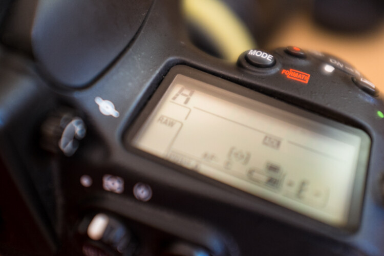
Exposure Metering, Exposure Lock, and Exposure Compensation

A*J*P

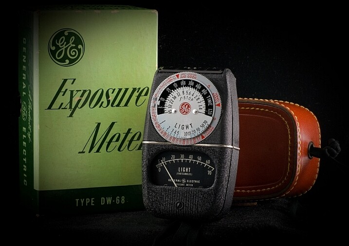
Vintage exposure meter – By A*J*P

While we’re on the subject let’s look at some other ways that you can work with your camera to get proper exposures in all sorts of conditions.

DSLRs give you a few different options as to how they meter and determine exposure for a given scene. The most common are spot, center-weighted and evaluative or matrix metering. Take a look at this handy cheat sheet that should help you wrap your mind around the concept.

Fancy technicalities aside, what are the practical applications of these different settings?

Spot metering

Since spot metering bases exposure on the reading from a very small area of the image, it is a great choice if the subject of your composition is small and significantly lighter or darker than the rest of the image, so you can hone in on the correct exposure. This metering mode can be useful for small backlit subjects, as the light source shining directly at the camera will most often result in an underexposed subject. Keep in mind that regardless of the type of focus points you are using, spot metering will read only about a 4mm radius (depending on the camera) from the very center of the focus point.

Center-weighted metering

Center-weighted metering takes the whole frame into consideration, but puts more value towards the center of the focus points (somewhere in the 12mm range). This setting works great when your subject takes up a larger part of the frame, or the lighting is more even. Consider a close-up portrait where spot metering might be too specific if it reads a shadowed or highlighted area, but center-weighted would give you more of an average.

Evaluative or Matrix metering

The last of three main metering types, evaluative (Canon) or matrix (Nikon) metering, determines exposure in a more complex way by taking into account composition, tones, color and some cameras can even factor in the distance objects are from the camera to estimate what the main subject is. This system of metering works great for landscapes and wide angle shots.

Many cameras are equipped with a dedicated exposure lock button or have customizable settings in order to delegate one. This is used when you want to take an exposure reading and hold it. If your subject fills a large part of the frame, the camera may do a good job at setting exposure. If the subject takes up only a small part of the frame, you can move in close to get an exposure reading, lock exposure and recompose the image.

Exposure/focus lock button

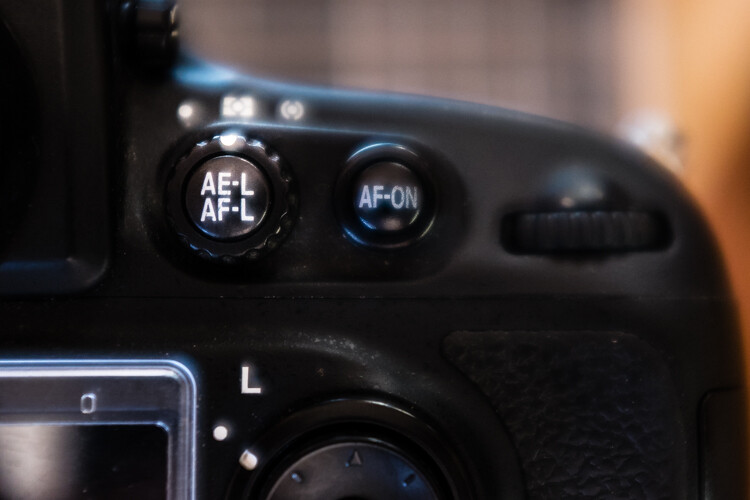
Once you familiarize yourself with the exposure/focus lock button, you will be surprised how often you use it.

Exposure compensation

Exposure compensation allows you to over or underexpose the image manually. This is most useful while using automatic or semi-automatic settings like Aperture or Shutter Priority. In the example of a backlit portrait, many photographers prefer to overexpose the camera’s suggested exposure, knowing that the reading will be wrong because of the lighting. You could certainly change your exposure metering to try and secure a more accurate reading, but with experience you can easily predict how the camera’s exposure meter will react ,and use exposure lock or exposure compensation as a more direct, and one-off, route to proper exposure.

Just keep in mind that the most challenging conditions for your camera’s exposure meter are high contrast situations, and with enough experience you will learn to “see” like your camera and easily be able to anticipate necessary compensations.

Selecting Different Focus Settings

To start with, there are two main categories of autofocus settings: Single and Continuous.

Single (One Shot on Canon) is intended for stationary subjects. When the camera finds focus in single servo mode, it holds that focus point until the shutter is released or the autofocus is released and re-activated.

However, single servo focusing can be very useful for action in certain applications. For example, one technique when shooting a moving, yet predictable subject, is to compose the image and lock focus on the spot where you know your subject will be, and wait for it to enter the frame (think panning).

In continuous focus mode, your camera will continually refocus while the autofocus is engaged. This is the setting to use if your subject, or you and your camera, are on the move. In continuous mode, many cameras allow you to choose how many focus points are live. Say you are shooting a sporting event and there are a lot of players, you may want to use fewer focus points in order to single out your subject.

Continuous servo autofocus

Continuous servo focusing is best used to maintain focus on moving subjects – especially if they are moving towards or away from you.

It’s also worth mentioning that just in case you haven’t figured it out already, you can move the focus points around the frame in the viewfinder with the multi-selector. This is key while trying to maintain a certain composition with a moving subject. Consider some basic compositional conventions such as the rule of thirds when setting your focus points for a shot.

Confirm Focus by Previewing Images at 100%, In-camera

As a digital photographer you are extremely fortunate to have access to a feature like this –film shooters didn’t/don’t have this luxury.

The concept is simple: if you are unsure whether you nailed a sharp image, due to camera shake or shallow depth of field, zoom in to 100% and do a little pixel peeping for confirmation. Make a habit of doing this instead of ending up in front of your computer in disappointment at a great shot that’s not sharp.

Zoomed to 100% in camera

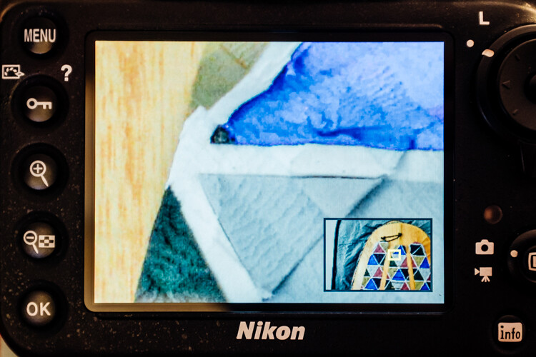
Zooming to 100% is a quick way to confirm you have a sharp image.

Some cameras (check your user’s manual to see if your camera supports this feature) allow you to customize a button which zooms directly to 100% for this purpose.

Many cameras have a setting (sometimes called shutter release priority) which won’t allow a picture to be taken unless it recognizes that your focus point is actually in focus. Personally, I loathe this setting. I think it is better to take your chances and at least try to get the shot. Although the focus may not be spot on, you still may get a usable image.

Conclusion

These are just a few of the major technical considerations to keep in mind as you bravely forge ahead in your photographic pursuits.

Every situation requires its own approach, and the more tricks you have up your sleeve, the more prepared you will be to nail the best shots. Keep your nose to the grindstone and embrace the challenge!

Do you have any other tips for the advanced beginner? Please share in the comments below.

googletag.cmd.push(function() {
tablet_slots.push( googletag.defineSlot( “/1005424/_dPSv4_tab-all-article-bottom_(300×250)”, [300, 250], “pb-ad-78623” ).addService( googletag.pubads() ) ); } );

googletag.cmd.push(function() {
mobile_slots.push( googletag.defineSlot( “/1005424/_dPSv4_mob-all-article-bottom_(300×250)”, [300, 250], “pb-ad-78158” ).addService( googletag.pubads() ) ); } );

The post Next Level Techniques for Advanced Beginners by Jeremie Schatz appeared first on Digital Photography School.


Digital Photography School

 
Comments Off on Next Level Techniques for Advanced Beginners

Posted in Photography


Weekly Photography Challenge – Black and White Techniques

15 Aug

This week on dPS it’s all about black and white photography. We are featuring a series of tips and articles around that topic. You can earlier ones below and more daily over the next few days.

  • 5 Simple Ways to Create Expressive Photos in Black and White
  • Tips for Black and White Wildlife Photography
  • 7 Tips for Black and White Portrait Photography
  • 28 Images with Strong Black and White Compositions

Photograph Happy Holidays! by Sam Assadi on 500px

Happy Holidays! by Sam Assadi on 500px

Photograph  One Railroader by Silvia S. on 500px

One Railroader by Silvia S. on 500px

Weekly photography challenge – black and white techniques

Your challenge this week is to try out different black and white techniques. Try any or all of the following:

  • Shoot in b/w mode
  • High contrast lighting
  • Convert to b/w in Lightroom
  • Convert to b/w using Photoshop
  • Try out a black and white plugin
  • Try out some sepia tone or split toning
  • Do a b/w portrait, landscape, macro, night shots, street photography, or flowers
  • Try a b/w silhouette

Photograph The essence of night by Liban Yusuf B&W on 500px

The essence of night by Liban Yusuf B&W on 500px

Photograph Venice Nostalgia by Csilla Zelko on 500px

Venice Nostalgia by Csilla Zelko on 500px

Photograph Time to go ... by Gaelle Lunven on 500px

Time to go … by Gaelle Lunven on 500px

Photograph The Last Ride by Rob Dweck on 500px

The Last Ride by Rob Dweck on 500px

Photograph Ways of Life by Eileen Hafke on 500px

Ways of Life by Eileen Hafke on 500px

Share your images below:

Simply upload your shot into the comment field (look for the little camera icon in the Disqus comments section) and they’ll get embedded for us all to see or if you’d prefer upload them to your favourite photo sharing site and leave the link to them. Show me your best images in this week’s challenge. Sometimes it takes a while for an image to appear so be patient and try not to post the same image twice.

googletag.cmd.push(function() {
tablet_slots.push( googletag.defineSlot( “/1005424/_dPSv4_tab-all-article-bottom_(300×250)”, [300, 250], “pb-ad-78623” ).addService( googletag.pubads() ) ); } );

googletag.cmd.push(function() {
mobile_slots.push( googletag.defineSlot( “/1005424/_dPSv4_mob-all-article-bottom_(300×250)”, [300, 250], “pb-ad-78158” ).addService( googletag.pubads() ) ); } );

The post Weekly Photography Challenge – Black and White Techniques by Darlene Hildebrandt appeared first on Digital Photography School.


Digital Photography School

 
Comments Off on Weekly Photography Challenge – Black and White Techniques

Posted in Photography


3 Useful Photoshop Techniques for Making Images Exposure Corrections

20 Jul
Title-correct-exposure

Using a Curves Adjustment Layer with the Blend Mode set to Screen to correct exposure in Photoshop.

In general, where images are too dark, this is referred to as underexposed. Conversely, images that are too light are overexposed. Photos taken on sunny days are prone to being overexposed.

exposure

An animated gif to illustrate a correct exposure, an underexposed shot and an overexposed one.

In an ideal situation, the aim is to try and get the correct exposure in-camera. In doing so, less time will be spent in front of your computer post-processing.

In this article, I will describe how to easily correct photos that are underexposed (photos that are too dark) and overexposed (photos that too light) using Adjustment Layers and Blend Modes in Photoshop. I will then describe how the Dodge and Burn tools work to target specific areas to brighten or darken your image.

The following techniques are not new, but have been around for quite some time in Photoshop. The methods are still very effective, quick and easy to do.

  • Overexposed photos – Blend Mode: Screen with Curves Adjustment Layer.
  • Underexposed photos – Blend Mode: Multiply with Curves Adjustment layer.
  • Dodge & Burn tools – New Layer above the image filled with 50% gray – Blend Mode: Overlay/Softlight.

Read:  The First 3 Photoshop Blend Modes You Need to Understand

All of the images I used in this article are the jpegs straight out of the camera, completely unedited. I want to demonstrate how effective these techniques are when applied.

Correcting Overexposed Images

Becky-overexposed

A typical washed-out look from an overexposed photo.

As you can see, from the first overexposed shot. The subject has that washed-out look. The subject is overexposed by a stop and a half. I applied a Curves Adjustment Layer and changed the Blend Mode to Multiply. Straight away, the contrast of the image has dramatically increased.

Becky-curves-multiply

The result is quite dramatic when the Curves Adjustment Layer (with Multiply blend mode) has been applied, but there is a noticeable change in color shift.

The Multiply Blend Mode can cause a shift in color, but this is easily remedied. To adjust the color balance, go to the Properties panel (CS6) and choose the channel you want by clicking on the menu left of the Auto button. In this case, the color was too cool, so I adjusted the three channels (Red, Green and Blue) to get the result I wanted.

Becky-correct-exposure

The color balance has now been modified by adjusting the red, green and blue channels in the the properties panel for the Curves layer.

In the image of the Rhino below, when I applied the adjustment layer and changed the Blend Mode to Multiply, the effect caused a color shift to green, and the intensity of the effect was too dramatic. I adjusted the color balance by choosing the green and red channels in the Properties panel. I then reduced the Opacity to 55% of the layer to further fine-tune the image.

Rhino-underexposed

Overexposed photo of a Rhino taken at Dublin Zoo.

Rhino-curves-multiply

A Curves Adjustment layer with the Blend Mode set to Multiply.

Rhino-correct-exposure

I reduced the Opacity of the Curves Adjustment Layer as the effect was too much. I then adjusted the color balance by tweaking the red, green and blue channels.

Correcting Underexposed Images

Underexposed shots are typical when working outdoors on sunny days. Usually, the background is properly exposed but your subject is silhouetted. Similarly, if the background is washed out but your mode/subject is exposed correctly.

For example, the photo of the flower was taken at the beach on a very sunny day. I focused and exposed for the flower, which meant the background was way too dark. I applied a Curves Adjustment Layer and changed the Blend Mode to Screen. The shadows became lighter, but I duplicated this layer again as I wanted more detail in the shadows. (In most cases, this effect of using the one Adjustment Layer is enough but if your photo is very washed out, or very dark, you may need to duplicate the Adjustment Layer and adjust the opacity accordingly.)

flower-underexposed

An underexposed flower in green foliage.

I reduced the opacity of both layers and added a mask to bring back the highlights on the flower’s petals. Similar to the Multiply Blend Mode, the Screen Mode can cause a shift in color. In this instance, the photo had too much green. Similar to the photo above, I was able to adjust the color balance in the Properties panel and chose the green channel to modify the color balance.

flower-curves-screen

Two Curves Adjustment Layers were applied to this photo. I wanted to bring out more detail in the shadows.

flower-changing-to-green-channel

flower-input-output-sliders

By going into the different channels, it’s easier to target the specific colour that needs adjusting. In the image of the flower, I wanted to reduce the green colour. So by clicking on the top right point of the graph (output) and dragging it down. I then moved this Input slider to the right to bring in some magenta. As this an adjustment layer, you can play around with each of the colour channels and experiment using the input and Output sliders in an non-destructive way.

flower-green-channel-S-curve

A more accurate way would be to plot different points on the grid to get that classic S shape, which is what the Curves Adjustment is know for.

flower-correct-exposure

Opacity was reduced on each of the two Curves Adjustmnet layers. The green channel was adjusted to modify the color balance.

The shot of the hippo below was taken at Dublin Zoo and the day was quite overcast. As before, I added a Curves Adjustment layer and changed the Blend Mode to Screen. I then adjusted the red, green and blue channels to correct the color balance. I reduced the opacity on the Adjustment Layer only slightly.

Hippo-underexposed

A underexposed shot of a hippopotamus taken at Dublin Zoo

Hippo-curves-screen

A Curves Adjustment layer with the Blend Mode set to Screen.

The shot of the Hippo was taken at Dublin Zoo and the day was quite overcast. As before, I added a Curves Adjustment layer and changed the Blend Mode to Screen. I then adjusted the red, green and blue channels to correct the color balance. I reduced the opacity on the Adjustment Layer only slightly.

Hippo-correct-exposure

The Opacity was only slightly reduced for this image but the color balance again had to be adjusted in all the channels.

So by using an adjustment layer and changing the Blend Mode to Multiply or Screen, overexposed and underexposed shots can be easily fixed in a few steps. But what if specific areas of your image only need the exposure corrected?

Dodge and Burn

The Dodge tool lightens and the Burn tool darkens specific areas of your photo. This is why the Dodge and Burn tools are really useful if you don’t need to apply a global exposure correction.

I use these tools a lot in my workflow, it can create highlights in hair. When I shoot headshots, the eyes are important and the Dodge and Burn tools can also really enhance eyes and make them sparkle. Other forms or parts of the body can also be accentuated and given more depth by using these tools.

However, the Dodge and Burn tools, if used directly on a image, work in a destructive way. So to use these tools non-destructively, you will need to create a new blank layer above the image that you are working on, fill it with 50% gray and change the Blend Mode to Overlay or Softlight.

Dodge-Burn-tools

Where to locate the Dodge and Burn tools in Photoshop.

Before you begin, use a brush with the hardness set to soft (0-30). In the Tools Options Bar, make sure that you set the Range to Midtones, Exposure is set to low (8-10%) and that the Protect Tones is checked, as shown below.

Midtones+Exposure+Protect-Tonespsd

Set the Range to Midtones. Keep Exposure at a low setting. Make sure the Protect Tones box has been checked.

dog

In this photo of the dog, I want to create some highlights on the dog’s fur. Well, fur is like hair!

Dog-dodge-burn

You can see the difference in what a little dodging can do in this image of the dog with the photo above.

If you feel that you have overdone either the Dodge or the Burn tool, just lower the opacity of the layer.

Lisa

Lisa, before any Dodging or Burning has been applied to the image.

Lisa-dodge-burn

Just a little dodge and burn can make a difference to your photo.

Even subtle differences can enhance your images. In this image of Lisa, I applied some dodging to her eyes, I used the Burn tool to emphasize her lips. I then added a bit more dodging to the face and hair.

I hope you find these techniques useful? Maybe, you have some of your own? If so please share in the comments below.

googletag.cmd.push(function() {
tablet_slots.push( googletag.defineSlot( “/1005424/_dPSv4_tab-all-article-bottom_(300×250)”, [300, 250], “pb-ad-78623” ).addService( googletag.pubads() ) ); } );

googletag.cmd.push(function() {
mobile_slots.push( googletag.defineSlot( “/1005424/_dPSv4_mob-all-article-bottom_(300×250)”, [300, 250], “pb-ad-78158” ).addService( googletag.pubads() ) ); } );

The post 3 Useful Photoshop Techniques for Making Images Exposure Corrections by Sarah Hipwell appeared first on Digital Photography School.


Digital Photography School

 
Comments Off on 3 Useful Photoshop Techniques for Making Images Exposure Corrections

Posted in Photography


LAB Color Correction Video Tutorial: Creative Grading Techniques for Images

12 Nov

In this second video on LAB we explore a way to add creative color grading onto a desaturated dusk image. Once again exploring LAB colour mode and curves we get playful to create saturation and color contrast to add life to a dull scene. Don’t miss our first video on the LAB colors tutorial. Before After

The post LAB Color Correction Video Tutorial: Creative Grading Techniques for Images appeared first on Photodoto.


Photodoto

 
Comments Off on LAB Color Correction Video Tutorial: Creative Grading Techniques for Images

Posted in Photography


Two Quick and Easy Photoshop Head-Swapping Techniques

03 Nov

photo-1

Sometimes you get that photo that is almost perfect. If all it takes to make it great is a little head swap, well, today is your lucky day! I’m going to show you two techniques, for quick and easy head swapping. I’ve even included a demo video at the end, if you want to watch the tips in action. I am using Photoshop CS6 for this demonstration. If you are using a different editing program, these methods may not work for you. If you are using an older version of Photoshop, the techniques should work the same, but your screen may look slightly different.

potential

Ready to see how to combine two photos to make that perfect photo? Let’s get started! First, open the two photos you want to work on in Photoshop. Select the photo that you want to swap a head FROM. Now we’re ready to really get to work.

Method #1

01

For the first method, we are going to use the Lasso Tool. You can click right on the lasso in the menu, or click “L” as a shortcut. The instructions will indicate shortcuts in parenthesis (L) to help speed things up as you as you try these techniques on your own photos.

02

Use Cmd/Ctrl+C to copy the selection

Use the lasso to draw a loose circle around the part of the photo that you want to move. You’ll want to leave extra room, and make the circle fairly large. This is easy to take off later, but if you have to add more on, you can’t do anything except start over. Copy the selected part of your photo.

03

Go back to your original photo, and paste the selection there. I like to decrease the opacity of that layer so I can line things up a little bit easier. Select the move tool, and move the layer around until things are as lined up as possible. In the photos I worked with, I tried to line the mom’s fingers up exactly. If you can find something near the edge of the new part and the old part that is the same in both photos, this can make things a lot easier.

04

Bring the opacity of the layer back up to 100%, and add a mask to the layer. Layer masks are really awesome! They allow you to show parts of that layer or hide them.

05

Now you can select a soft brush. You want your brush to be black, because your layer mask is white. When you are turning part of the layer off, you need to make sure that the brush is the OPPOSITE color of the mask (white reveals, black conceals). If the white box is in the front, just click “X” to toggle back and forth between black and white.

06

Use that black brush to hide the excess parts of the new layer. I like to start with the hard circle edges, and then work in to the details. You can zoom your photo in as close as you need to for this part.

08

Once you feel that it’s mostly there, you can click the visibility off and on on the layer to see if there are strange things happening, or spots that you missed. If you turned too much of the layer off with your black brush, simply change your brush back to white and brush it back on.

09

Method #2

Not too hard, right? Let’s try another method for swapping heads, this time using the Clone Stamp. This one is not as forgiving, but it is super quick! You’ll want to make sure that your two photos are very similar for this one. The placement needs to be close to the same for both photos. This method works especially well if you just need to replace closed eyes with open eyes from an almost identical photo.

10

Select your Clone Stamp tool, and let’s give this one a try!

11

It’s easiest if you select a part of the photo that is easy to see and line up once you switch to the original photo. In this example, I selected mom’s hand.

12

Cmd/Cntrl+J duplicates the layer as well

You can do this without making a background copy, but if you don’t make a background copy, and you make a mistake, you have to start over. This allows you to fix a mistake later without starting completely over.

13

Line the stamp up with your selected spot, and then, while holding down the mouse button, move the stamp over the old part that you want to replace. As you do this, you’ll see the new face appear.

14

If you covered more area than you wanted to, add a layer mask, and use the soft black brush again to take off some of that layer. (Just like we did before.)

finish

Head swapping doesn’t work for every photo, and it always works best for photos taken one right after the other, with all the people positioned almost the same. It never hurts to give it a try, and the more you practice, the better you will get at making it look natural, and working quickly. You’ll also be able to tell at a glance if a head swap will work for two photos or not.

I’ve made a quick video demo to show these techniques in action. Let me know if you have any questions, and I’ll do my best to answer them. Now, go swap a few heads, just for fun!

The post Two Quick and Easy Photoshop Head-Swapping Techniques by Melinda Smith appeared first on Digital Photography School.


Digital Photography School

 
Comments Off on Two Quick and Easy Photoshop Head-Swapping Techniques

Posted in Photography


Split, Broad & Short Lighting Techniques

17 Sep

Image from Alana Tyler Slutsky's Surrealia series featured on Fashion Photography Blog (FashionPhotographyBlog.com)SPLIT, BROAD AND SHORT TECHNIQUES

Hey FashionPhotographyBlog.com readers! Welcome back.

Today we’ll cover the other three basic techniques for lighting – split, short and broad lighting.  If you missed yesterdays’ basic techniques of Paramount, Loop and Rembrandt lighting, you can find them here.

Let’s jump right in!

LIGHTING TECHNIQUES

Split Lighting: Slight lighting literally divides the subject’s face in half.  It’s also known as side lighting.  Because of the nature of this type of lighting, it’s great slimming light.  Keep in mind that in lighting from the side, it will show any texture (and imperfections).  Aka- this is not ideally the light to be used on a very zitty person.

Split/side lighting is exactly as it sounds – Place the key light at your subjects side.  It will illuminate half of their face and leave the other half in shadow.

If you don’t want as extreme a shadow as pictured above, use a bounce fill or fill light to bring in detail on the shadow side.

Split lighting diagram featured on Fashion Photography Blog (FashionPhotographyBlog.com)

Split Lighting Diagram

These next two lights are not exactly a lighting pattern, but terms that deal with the subject and the lights orientation to the camera.  The two lighting scenarios below deal with the subject being 3/4 to the camera.

Broad Lighting: Broad lighting will create a “broad” or “wide” face.  This is because the part of the face that is lit (the part of the face that is facing the camera) is wider than the section of the face that is in shadow.  Don’t use this type of light on heavier people, it will make them look bigger than they are.  It’s ideal for thin people.

To achieve this, place the light opposite the direction of your subject’s face.  For example, If the subject is looking to the left of the camera, place the light to the right of the camera.

Broad lighting example featured on Fashion Photography Blog (FashionPhotographyBlog.com)

Broad lighting diagram featured on Fashion Photography Blog (FashionPhotographyBlog.com)

Short Lighting: Short lighting will create a narrower looking face.  This is because the part of the face that is in shadow (the part of the face that is facing the camera) is wider than the section of the face that is lit.  This type of light is great for heavier people!  It creates a thinning effect which makes it really flattering lighting.

To achieve this, place the light in the same the direction of your subject’s face. For example, If the subject is looking to the left of the camera, place the light to the left of the camera.

Short lighting example featured on Fashion Photography Blog (FashionPhotographyBlog.com)
Short lighting diagram featured on Fashion Photography Blog (FashionPhotographyBlog.com)
Lighting type guide featured on Fashion Photography Blog (FashionPhotographyBlog.com)

If you want to know more about Kickers, Rim, Hair, and Background lights, check our post on Types of Light.

As always, if you have any questions, feel free to shoot me an email.

– Alana


IMAGE SOURCE:

Feature image & image 1: photography by Alana Tyler Slutsky from her Surrealia series. To view the rest of the photos from this series visit her website.

Image 2-8: Alana Tyler Slutsky


Fashion Photography Blog

 
Comments Off on Split, Broad & Short Lighting Techniques

Posted in Uncategorized


4 Steps to Photoshop Artistry Using Fine Art Grunge Techniques

02 Jun
PhotoshopGrunge600x600

Image by Sebastian Michaels

Sebastian Michaels has the course Photoshop Artistry: Fine Art Grunge Composition which is current on sale for 67% off at SnapnDeals.com for a limited time only. Grab it now before the deal is over.

One question. Do you sharpen just about all your images? If so … you should stop. As photographers we tend to want our images to be perfect: perfect exposure, perfect white balance, perfect sharpness. But aren’t you a little tired of being so perfect all the time? Let me clue you in. Art doesn’t always have to be so darn pretty. What if instead you let yourself RELAX a bit, lighten up, and have some fun? What if you let yourself get a little messy? Maybe not full-blown grunge. But how about “fine art grunge”?

Start here: a little more blur, a little more noise, an unexpected angle or crop, perhaps some striking effect of light combined with a subject you never would normally have thought to consider.

BellyDance

Photo credit: Catherine King (course student)

Sometimes we forget that at our core we are ARTISTS. Owning a Canon 5D Mark III rig and enough lighting gear to stage a Pink Floyd reunion tour doesn’t change that. Just because we spend so much time trying to capture the perfect shot doesn’t mean that we can’t switch it up now and then and treat our images (even our mistakes, even our botched shots) as nothing more than the starting point in more elaborate artistic compositions.

Here’s a mental trick to get you started. Think of some of your favorite shots. But instead of imagining your photos all printed pretty and perfect, imagine them layered-in and composited with other images and rendered as a painted canvas.

Think paint on canvas. Not that you need to simply run a paint filter on your photos. That’s not going to cut it here. Think instead of paint on a canvas in the sense of a wild-eyed painter with oil paint in his hair, brushes sticking out of his pockets and one clenched between his teeth – attacking a canvas in a frenzy of creativity and passion. When was the last time you approached your photography with that kind of intensity? When was the last time you let yourself step outside of your serious photographer role and actually felt like an ARTIST creating a great canvas?

EnjoyYourLife

Photo credit: Li Li Wee (course student)

That kind of artistry is in you. Let’s look at how you might begin tapping into it.

STEP ONE: Take More Chances With Your Photography

I mentioned a little of this earlier. You might already have some shots that you would otherwise delete out of hand just because they are blurred or the contrast is screwy. Give those a second look. Maybe there’s something artistic you could do with them. Maybe you could crop them in a creative way.

When you are shooting, try some angles you normally wouldn’t even attempt. For that matter, try shooting some subjects outside of your usual comfort zone. Take a walk down a dark alley (or a woodland trail) and see what you come out with.

Maybe enlist some models you normally wouldn’t have chosen, or stockpile some odd objects and lug them out to quirky locations. In other words: experiment more. Get out of your comfort zone and try something new. Take some chances for your art.

STEP TWO: Throw In Some Blend Modes (and Maybe Some Textures)

It’s surprising how much more interesting an image can become simply by slapping a Curves layer on it (or even simply duplicating the background layer) and assigning that layer a Blend Mode. Give it a try and see.

BlendModes1

BlendModes2

Your best bet is almost always with Multiply or Screen blend modes, or alternately with Overlay, Hard Light, or Soft Light. I recommend memorizing the keyboard short cuts for those so you can toggle through them quickly and pick the best. You might also want to lower the opacity of the layer (or you might want to duplicate that layer with Cmd/Ctrl+J, doubling up the effect, or giving that duplicate layer a different Blend Mode of its own).

You might also want to stick a Layer Mask on there and paint in precisely where you want that effect to show. Every image is different, and layer Blend Modes can create rich results.

I recommend also trying out some textures combined with Blend Modes and Layer Masks. A texture or overlay might be as simple as a photo of a grungy patch of concrete, or it might be a scanned watercolor wash. It could also be an intricately layered piece in and of itself, comprised of scanned swatches of paint, scratched up paper with coffee stains on it, colorized with a Hue/Saturation layer and given a dark vignette. When you decide to explore photo-artistry, you begin collecting a lot of these kinds of textures and overlays.

Texture

But whatever you use, you drop it in over the image and give it a Blend Mode; again, you might tweak the opacity or employ a Layer Mask. Already your image is likely looking more dramatic and artistic. It’s probably a bit “grungy” at this point, and that’s okay. Embrace it. You might already find yourself astonished; discovering something in the image you never quite knew was there until this moment.

STEP THREE: Get More Dramatic With Your Lighting or Experiment With Some Filters

You never know where an image is going to take you. All you can do is try a few things and see if one of them looks especially cool. One approach you may want to try is to slap another Curves layer on top of the image (or Brightness/Contrast if you’re working with Elements) and deliberately darken the entire image. Go back in with the Brush Tool to paint over the Layer Mask at a low opacity and, in essence, paint in the lighting where you want it. Be sure to use a soft-edged round brush at only about 20% opacity, layering your strokes while using black and white and toggling between the two by pressing the “x” key.

Here you are painting in where you want light. But you can do something very similar with any of the effects in the Filter Gallery. Here’s how:

  1. Go to the top layer of your layer stack and execute what has come to be known as “The Move”: Cmd-Option-Shift-E on a Mac (or Ctrl-Alt-Shift-E on a PC) to “merge everything visible” onto its own new layer.
  2. Select the new layer you just created and press Cmd/Ctrl+J to duplicate it.
  3. Run a filter from the Filter Gallery on that layer. Go ahead and try out one or more of the painting filters, but experiment with the others as well, and how they interact. LayerMaskShortcuts
  4. After you apply the filter to your duplicate layer, stick a Layer Mask on it and again use a black or white soft-edge brush at low opacity to paint the effect in or out as you like. Try masking out the effect a bit in the areas of greatest focus, leaving everything on the edges more enhanced. Experiment and see where the image takes you.

STEP FOUR: Go Ahead and Add an Edge Effect and a Signature

Now that you have an interesting artistic image, it’s nice to give it some kind of artsy edge treatment. There are half a dozen ways to do this (you can even pick up OnOne Software specifically built for the task of creating edge effects), but we can leave the pure Photoshop methods for the next tutorial.

You might even want to stick a more artistic signature on the corner of the piece, because you’re likely excited at this point, since you are now looking at a work fit for canvas.

Cat

Photo credit: Irene Hofmann (course student)

You took some chances and it paid off. Next time maybe you’ll get even grungier, because by now you’re seeing that “grunge” is just another way of saying “artistic.” Above all else, whatever your tools, and whatever your approach, you are first and foremost, an artist.

For walk through of this process and a better idea of what the course is like, check out this video:

// < ![CDATA[ _evpInit('dHV0b3JpYWwxMjgweDY5MndlYi0xLm1wNA==[evp-f593aa84764ec0c7dba0fa770e9114bc]'); // ]]>

Sebastian Michaels has the course Photoshop Artistry: Fine Art Grunge Composition which is current on sale for 67% off at SnapnDeals.com for a limited time only. Grab it now before the deal is over.

The post 4 Steps to Photoshop Artistry Using Fine Art Grunge Techniques by Sebastian Michaels appeared first on Digital Photography School.


Digital Photography School

 
Comments Off on 4 Steps to Photoshop Artistry Using Fine Art Grunge Techniques

Posted in Photography


5 Tips to Seriously Improve Your Food Photography Techniques

15 May

11 Tip05 Neutral BG

Food photography is arguably one of the most challenging types of photography out there. Like painting, you start with a blank canvas and build. Layer upon layer, you construct the photo until you reach the perfect balance of reality and art.

Everything in the photo is a decision. Every piece is perfectly placed by the photographer.

Starting out is frustrating, I know. You’re the chef, stylist, and the photographer. Once you reach technical proficiency with the camera, what’s next? I have been, and in a lot of ways still am, in that position. So, how do you improve your food photography beyond the basics? You work on the story.

Whether it is an after-party from the perfect cocktail, or the homemade roasted chicken recipe on the farm, like all photography, you’re telling stories.

Some shoots are more complicated stories than others, and it may sound like a lot of work, but it’s really not. Here are five quick tips you can use to seriously improve your food photography and tell better stories.

#1 – CHOOSE YOUR ANGLE

There are really only a few camera angles in food photography that you see again and again, but you need to make the one you choose, a conscious decision. Where you place the camera will affect the type of story you’re trying to tell.

Think of the food beforehand. Its size, shape, height and what is unique about it. Then place the camera where you think best highlights these qualities. Some dishes look great when you shoot from right in front of the food, and others are best suited when the you are looking down from directly above the table. Take a look at the cupcakes below; their spiralled and delicate toppings really stand out when shot from in front, yet the viewer doesn’t even see the size or shape when photographed from above.

01 Tip01 45 vs 90 Cupcakes

On the other hand, it’s difficult to see all the ingredients and beautiful shape of these salmon tacos when shot from the front, so the shot from above was definitely the way to tell this story.

02 Tip01 45 vs 90 Tacos

#2 – SURROUND YOUR HERO

When shooting from the front of the food try to keep a great foreground and background to play with. Use these empty spaces to tell more of a story. Surround your main dish with ingredients and props that relate to the food. Ingredients, sauces, oils, and cooking utensils could indicate how the dish was made.

Tins, jars, herbs, glasses, fabrics and linens could speak about the origin of the dish or the season in which it is served. Placing a few of these in the foreground and background will definitely elevate your story and give it depth.

03 Tip02 Props

The props in this image of baklava bring more to the story. The viewer has a sense of place that describes the Arabic origins of this delicious sweet.

#3 – NATURAL IS BEST MODIFIED

Light is king, and acquiring a few tools to help you control it will bring your food photography up to the next level. Poor use of light will ruin your story and immediately turn off your audience. So making sure light doesn’t distract will help out your food photos big time.

04 Tip03 Natural vs Diffused

Direct natural light can give really hard and defined shadows like beneath the lemon cake on the left. Where those shadows are softened in the image to the right, with a little help from a cheap diffusor.

Placing a diffusor between the window and your table is first on the list. When working with direct sunlight, a diffusor (or even a thin white bed sheet) will greatly improve the quality of light. Softening those hard, dark shadows and bright highlights caused by direct sun light.

05 Tip03 White vs BlackCard

Using white and black cards really gives you control over the shadow areas. A white card was used to brighten up that lemon frosting on the left, but if you prefer more contrast than grab a black card and you’ll get an image like the one on the right.

Next up are white and black cards. You can make these yourself using foam core boards, bought at any craft store. Size them to fit your needs, using white cards to bounce light into shadow areas, revealing important details, or black cards to make shadows stronger for more contrast.

06 Tip03 BG Blocked vs Unblocked

Nothing really changes between these two images except for a black card that was used to stop light from hitting the background, making sure the cake was the brightest area of the photograph.

Here is a little secret, when working with natural light. I call it, blocking (sometimes also called “gobos”). Sometimes that pesky natural light will fall on your background or props, causing them to be as bright or even brighter than your subject.

Since the viewer will always look at the brightest spot in your photo first, if it’s not your subject, it can harm your story. You can use your black cards to block light from hitting areas that will compete with your subject. This is also a very important technique for creating darker, low-key styled images.

07 Tip03 Final Image

Here is the final image, with a diffusor softening the window light, a white card to fill in the shadow on the lemon frosting and a black card to block the light on the background.

#4 – OUR OLD FRIENDS LINES AND LAYERS

With all these props and ingredients in the frame, how will we ever get the audience to look at our subject? Well, bring on the trusty techniques of composing with lines and layers. You can use props or ingredients to create lines and layered effects in your images. This is a compositional technique used by photographers to lead their audience’s eyes to the main subject.

You can use various props to create lines. Like this spoon, which forms a nice line, directing the viewer straight to the bowl of baked peaches and ice cream.

08 Tip04 Lines

Since shooting from above always gets you more graphic images, there are plenty of chances to create some great lines here as well. Some could be quite literal like this cutlery leading to the round of Brie – or more abstract, like how the knife and pomegranate seeds create lines, framing our subject.

09 Tip04 LeadingLines vs FramingLines

Composing images with layers is always a winner. This Brie, shot from the front, is set in the middle of various props and two large out of focus areas. This creates a layered effect, sending your eyes straight to the star.

10 Tip04 Layers

#5 – HOLD THE COLOR

11 Tip05 Neutral BG

This is my personal favorite. I love hunting for props, backgrounds and tableware to put in my images. This little tip was also the first big mistake I was making when I was starting out. It’s great to have props that are colorful, but if you’re not careful that colorful prop can easily upstage your food, and grab all the attention.

When placing items into your food images, try selecting neutral tones, something that makes the food really pop against it. Selecting a neutral background like this black metal tray and baking paper, amplifies the bright red strawberries and rhubarb inside these Crostatas, making them really steal the show.

Do you photograph food? Do you have any additional tips to share with us? Please add your comments below.

For more food photography tips, try these articles:

  • 8 Steps to Create Mouth Watering Food Photography
  • 11 Quick Food Photography Tips to Make Mouth Watering Images
  • The Ultimate Guide to Food Photography
  • SnapnGuide on Food Photography

The post 5 Tips to Seriously Improve Your Food Photography Techniques by Skyler Burt appeared first on Digital Photography School.


Digital Photography School

 
Comments Off on 5 Tips to Seriously Improve Your Food Photography Techniques

Posted in Photography


Top 10 Pet Photography Tips and Techniques

26 Feb

Fergie bathroom copyright cowbelly pet photography

Top 10 Pet Photography Tips and Techniques

The pros make it look easy, but anyone who has ever tried to photograph an unpredictable creature like a cat or a dog knows it is anything but. Here are some pet photography tips that the pros use to help you ‘get the perfect shot’.

1. Relax

Animals are like little emotional sponges, and if you are stressed and anxious, they will sense it and become stressed and anxious too. A stressed animal will give you ‘ears flattened’, ‘concerned eyes’ looks, which don’t translate well ‘on film’. Take a deep breath and remember to have fun with it!

2. Focus on eyes and expressions

Ozzie copyright jamie pflughoeft

The eyes are the most expressive part of an animal’s face, so if you want to create really engaging portraits, focus on the eyes and facial expressions. A well-timed puppy whine (from you) can reel in focus in a puppy or curious dog, and have them staring straight at the camera faster than you can say “woof”.

3. Get rid of clutter first

Before you even pull your camera out of your bag, take a look around at your shooting location and get rid of clutter and distracting objects first. Do you really want to see that empty Starbucks cup on your coffee table in the photos of your cat? Is the garden hose snaking through the grass where you are photographing your dog, adding an aesthetically-pleasing element to your photos?

If an element in your background doesn’t serve to enhance your images in some way, either remove it first or move to a different location. An uncluttered environment produces more aesthetically pleasing images, and reduces post-processing work. Nobody needs to see photos of your puppy with an overflowing garbage can in the background.

Seamus copyright jamie pflughoeft

4. Shoot in their world

While a few shots looking down at your pet, while you are standing can be cute – to create the really engaging portraits the pros make, shoot down at their level, ‘in their world’. For a Great Dane their world may be the height of your hips; for a Chihuahua it may be all the way down at the level of your ankles. For a cat lounging on a cat tree, you may need to pull out a step stool to get on their level. Practice ‘shooting from the hip’ to place the camera in their world without having to crouch or kneel if they are on the ground.

Miles copyright jamie pflughoeft

5. Be flexible and do some stretching first

If you have ever watched a professional pet photographer in action, you will notice that they bend and twist and turn and crouch and crawl – whatever it takes to get the shot. Be prepared to get those muscles working in order to get the perfect composition. Sometimes all it takes for a dog to break their sit-stay is for you to go from sitting to standing, and it’s better to reach and lean, than make a large movement that will cause the pet to move from their perfect pose.

6. Go where the light is best

Good light is everything in photography, especially in pet photography, where it’s critical to be able to see the catchlights in the pet’s eyes (the white reflective parts). Avoid photographing in dark rooms or under heavily overcast days. Bright yet diffused light is the easiest to create flattering pet portraits under, so before you even start shooting, take a look around your subject’s environment and determine where the best bright, yet diffused light is; then move to that location.

Abbey copyright jamie pflughoeft

7. Pay your model

Every animal needs to have some sort of motivation to pay attention to you during the shoot; otherwise they will wander off and become disinterested. Determine what they are motivated by (i.e. their ‘payment’), and provide it to them throughout your shoot. For dogs it may be treats or toys, or simply getting love and affection. For cats it may be a feather toy, a paper bag, tuna fish, catnip or even their favourite blanket. For horses it may be their favourite food such as carrots or apples.

The biggest ‘trick’ in pet photography is to fool the animal into thinking that they are making the decisions, when it’s really you that is motivating them to do what you want, without telling them so outright . The ‘getting them to do what you want’ comes in the model payment. Get creative when it comes to ‘rewarding’ your models, and they will reward you with great shots and be more cooperative too. Plus the shoot will be more fun, and pet photography is supposed to be fun!

Penny copyright jamie pflughoeft

8. Create a concept and a shot list

The most engaging animal imagery shows them in context. It may be a cat looking up at an owner opening a bag of food in the kitchen (concept: desire), a dog looking longingly through a front door waiting for his or her buddy to come home (longing), a horse owner with her arms wrapped around her equine’s neck (connection). If you can say something with your images, they will speak to your viewers on a deeper emotional level.

Charlie doughnuts copyright jamie pflughoeft

9. Be quiet

There is no quicker way to confuse a dog, or freak out a cat than to bark commands at them repeatedly. Cats will disengage or even leave the room, and dogs will become confused and concerned.

Try communicating with the pets the way they do each other- nonverbally. Use hand signals or point to invite them ‘over here’. Use the sit hand signal for dogs that understand it. If you do need to say ’sit’, say it quietly and calmly, only once or twice. Avoid saying the pet’s name, because the more times they hear it during a photo shoot, the more inclined they are to tune out.

In my opinion, there’s nothing worse than a photographer (and an owner), hovering over a little dog and saying “sit Charlie,… no- SIT. I said Charlie sit. Sit. Down! Sit Charlie. Charlie- sit. Siiiit. SIT”. Poor Charlie! No wonder he’s confused. The less talking and ‘commanding’ you do, the better the shoot will be, and the more little Charlie will pay attention and ‘listen’.

Sid copyright jamie pflughoeft

10. Move slowly

Unless you are adept at documentary, on-the-fly, photography where the animal is moving a lot and you capture the perfect moment of them walking, sniffing, jumping, hunting, etc., learn to move slowly around them while taking their pictures. This is especially important with cats, who are prone to either radically change the expression on their face (and ears) at your slight movements, or split the scene altogether. This is also true of dogs that are in a sit or lay-stay position.

When you shift position they sense you are off on a new adventure and want to follow you. If you need to move, and you don’t want your model to move, do so very slowly without making any eye contact. And remember to reach, bend, and lean. You’ll not only have a comical pet photography session, you’ll get a workout too!

The post Top 10 Pet Photography Tips and Techniques by Jamie Pflughoeft appeared first on Digital Photography School.


Digital Photography School

 
Comments Off on Top 10 Pet Photography Tips and Techniques

Posted in Photography


Techniques for Working Textures Into Your Photography

12 Jan

Textured-purple-flower-600Where do you begin when you are considering using textures in your photography? I suggest you begin with the absolute best photo possible. Adding a texture to a bad photo does not make it a good photo. You want to make sure you have it exposed correctly, composed well, have a clear subject and not too much in the competing in the background competing. Textures work best with photos that are not too busy to start. Once I have chosen the photo I am going to work with, I do all of my edits before I add the texture, including adjusting the colors and sharpening.

In this article I’ll share some of my techniques for working textures into your photography.

Sharpening your image

You want to sharpen your photo before you add the texture. This is so that your subject is sharp and the texture isn’t over sharpened compared to the subject. You want the texture to enhance your photo, not compete with it. When I sharpen the photo I use the high pass filter as opposed to the unsharp mask. I like this method best because it defines and clears up all the edges of your subject without over-sharpening all the fill areas. Below is how I do this and the settings:

  1. Duplicate your background layer and while that duplicate copy is still highlighted, go up to the Filter menu and select: Other > Highpass filter
  2. Set the filter radius between 6 and 10 pixels (or higher) depending upon how sharp you need to have your photo, but be careful not to over sharpen.
    Sharpening highpass pop up
  3. Next change the blending mode of this layer to “Softlight” or “Overlay”. Overlay is stronger than Softlight, so test out each option to see what works best for your image.
Textured-yellow-flower-600

Finished image with texture and vintage paper applied

Once I am finished adding my textures to the photo I might do a final sharpen at the end if needed.

How to erase texture and still retain tone, plus a few extras

Once you are finished with your edits and sharpening, you are ready to add the texture. One concern people have in adding texture is how to erase the texture from the subject without it being obvious. You wouldn’t want to have the face of a baby be texturized, for instance, but you would want the face to match the rest of the photo in color and tone.

5 Steps:

  1. Place the selected texture on your photo. Do this by going to: “File > Place” in the top menu. Then select the texture image you want to use. It opens up as a new layer on top of your photo, ready to resize. Do that, then I right click the texture layer and choose “rasterize”, so it will no longer be a Smart Object. Change the blend mode and opacity of the texture layer to suit your image, such as “Softlight” or “Overlay”. At this point you are just manipulating the texture and not worrying about erasing it yet.
  2. While the texture layer is still highlighted, there are a few techniques you can do to the layer before you move on. Adjust the levels, curves, and the saturation of the texture layer to make the texture more vivid or pronounced, but not more opaque. I work in Softlight mode a lot as it brings out some of the texture without changing the mode.Levels curves saturation
  3. Once you are happy with the way the texture is working with the image, duplicate the texture layer and apply a Gaussian blur set to about 60 pixels to the bottom texture layer so it gives you the exact tones of the texture. Get to the Gaussian blur box by going to “Filter > Blur > Gaussian blur”. Next, turn off the bottom layer that you just added the blur to.
    Gaussian blur
  4. Add a mask to the top layer. With a soft black brush, set to about 30% opacity, ybegin to brush off the texture in any areas where you don’t want it. By using a low opacity you can slowly build up the amount you are removing. If you remove too much simply change the brush to white ,and wipe some of the texture back on. Make sure while you are doing this that you have the mask box selected (it will have square brackets around it) not the image itself.Sharpening mask
  5. Once you are happy that the texture is removed from all the important areas – select the mask box, hold down “Shift + Alt” and drag the mask box from the top texture layer to the bottom texture layer. Now you have applied the mask to the blur layer, and you have inverted it at the same time. Turn that layer back on and you will notice the tone where you erased the texture has the same coloring as the rest of your photo.Sharpening finished

Using vintage papers in your photography

Working with vintage papers is another fun aspect of textures that you can use in your photography. I get vintage papers from several great sources including my own family documents from the mid 1800’s, flea markets, online searches, Etsy, etc. I have curated several collections on my website for sale if you don’t want to go through the trouble of searching for them yourself. I especially love vintage French papers because of their wonderful scripts, markings, and fancy headers.

Part One

Working with the vintage papers is the same as working with textures. Place the paper on your photo in the approximate location that you want to use it. You will notice in the sample that I have placed it on the top of the many textures I have used in this photo, but you can place it on any layer that you want, to get the look you are trying to achieve.

Textures vintage paper

Part Two

Next, adjust the layer using the darkening blending modes: darken, darker color, color burn, linear burn, and multiply. Experiment with them all to see which one works best on the photo. The goal is to make the paper part of the document disappear, and have just the writing remain. Then just adjust the opacity to suit your taste. You can add a mask to this layer if you want to strategically erase some of the text which I do quite often.

Vintage paper texture

Finished image

Finished image

I hope you will give some of these techniques a try whether you are new to textures or have been doing them for years. If you do, please share in the comments below!

Further reading on using textures in your photography:

  • How To Create Your Own Unique Textures and Apply Them To Your Photography
  • Textures Made Simple
  • How To Apply Textures To Your Photographs

The post Techniques for Working Textures Into Your Photography by Denise Love appeared first on Digital Photography School.


Digital Photography School

 
Comments Off on Techniques for Working Textures Into Your Photography

Posted in Photography