RSS
 

Posts Tagged ‘Simple’

3 Simple Tips for Subtle Landscape Photography Post-Processing

23 Apr

Landscapes are one of the most popular photography subjects, and for good reason. Nature is enchanting to the human eye, and it’s only natural for people to want to capture that stunning natural scene with cameras. Some landscape pros and über-enthusiasts will plan ahead with tripods, shutter release cables, filters, and extra gear to make sure they really nail the shot they have in mind.

Then there are more casual photographers like myself who tend to shoot landscapes on a spur of the moment basis, usually during vacation. If you fall into the latter group, this article is more geared toward you. Maybe you have a single landscape shot that looks pretty good, but you’re looking for some light post-processing tips to top it off. If that’s you, read on!

In this article, I will present a few methods for enhancing natural scenes to keep them looking close to how you originally viewed them. All of these techniques have to do with enhancing a single shot, and the effects are not too dynamic or exaggerated, keeping you safe from overdoing it with say, HDR.

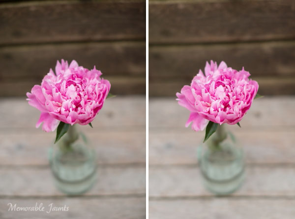
Tip #1: Enhance details

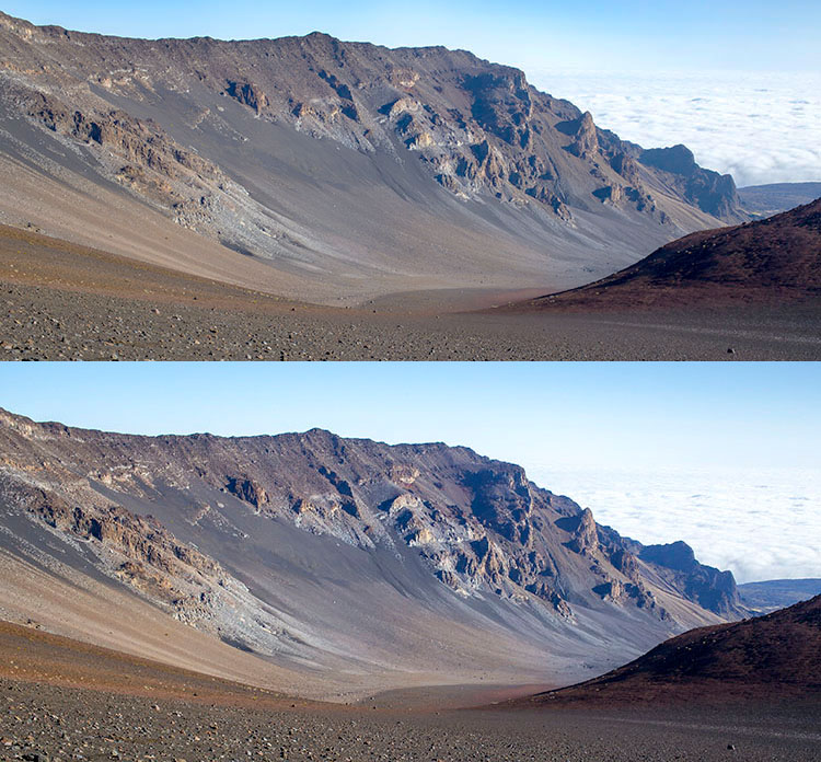
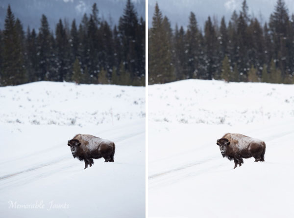
One of the quickest and easiest ways to polish any photo is to apply image sharpening. There are several ways to do this in Photoshop. For this article we’ll focus on applying the High Pass filter’s image sharpening effects to the landscape image below of Haleakala, a hiker-friendly dormant volcano in Maui, Hawaii. The before image is above and the after one is on the bottom. The effects may seem subtle from a zoomed-out perspective, but compare distinct areas such as the rock formations to see the sharpening in effect.

High pass sharpening filter landscape photography

Steps for sharpening using the High Pass filter

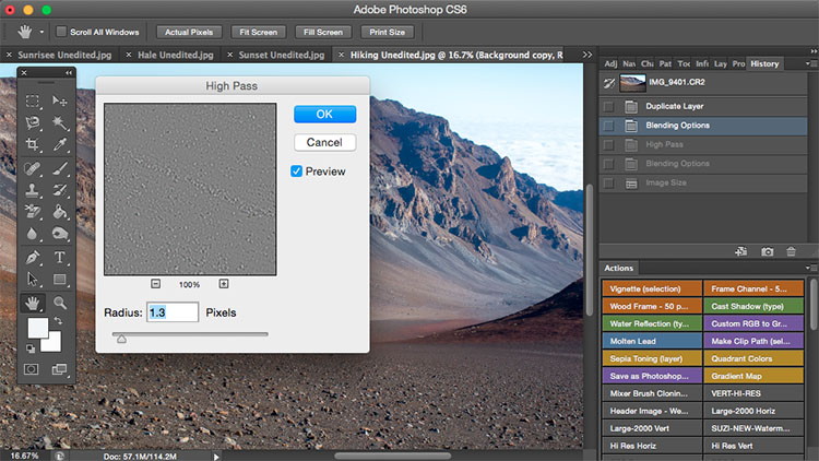
  1. Start by duplicating the Background layer, and changing the blend mode of the new layer to Overlay. The image will appear heavily contrasted, and with the Overlay blend mode applied, you’ll be able to get a preview of the High Pass filter effects.
  2. Next, apply the High Pass filter to the duplicate layer. It is located in the Filter menu at the top screen in the Other section.
  3. Adjust the filter settings: You’ll then see the High Pass filter dialogue box, which will allow you to use a simple slider to increase or decrease the intensity of the radius value (aka strength of the filter’s effect). The higher the value, the more intense the High Pass filter effect. Generally speaking, it’s best to keep the value on the lower side, between 1-5 pixels. In the case of this image, the radius was set to 1.2 to provide just enough sharpening around the edges of the image without exaggerating the effect.
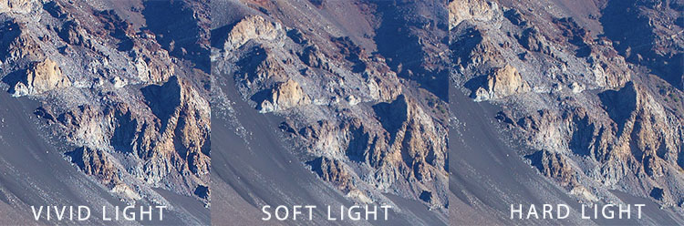
  4. Tweak the layer settings: After the High Pass filter is applied, it can be fine-tuned by adjusting the blend mode of the duplicate background layer and/or lowering the layer’s opacity. The blend mode you choose can either intensify or reduce the amount of sharpening. For some examples, take a look at the image comparisons below. Hard Light and Vivid Light increase sharpening, whereas Soft Light keeps it subtle.

Landscape photography high pass sharpening filter

High Pass filter landscape photography

Tip #2: Remove image haze

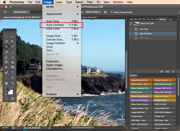
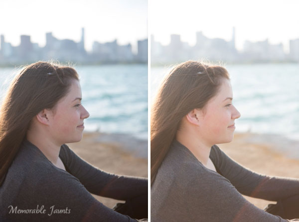
It’s not uncommon for landscape images to appear hazy or foggy when the natural weather conditions are such. The image above was shot on the Oregon Coast a few summers ago using a Canon 70-200mm at f/11 with just a basic clear UV haze filter on the lens. The mist in the air give the photo a dull look in the unedited, straight-out-of-camera version (top image below) but luckily this can be easily fixed in Photoshop (bottom image below).

Landscape Haze before and after

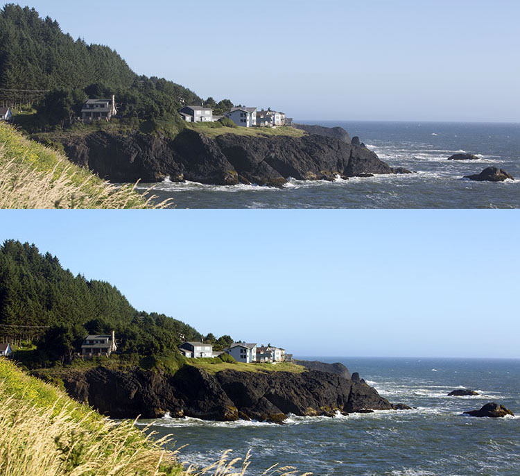
Since the biggest problem with hazy images is soft contrast, the quickest fix is to simply select the Auto Contrast function, located in the top menu dropdown under Image. Poor image contrast is then instantly fixed based on pixel luminosity, resulting in overall finer image contrast. After Auto Contrast was applied, I also adjusted Levels, Saturation, and Vibrance, and the resulting image looks much more balanced and vibrant despite the hazy conditions of the scene. 

Landscape photography auto contrast

Tip #3: Enhance the colors in the sky

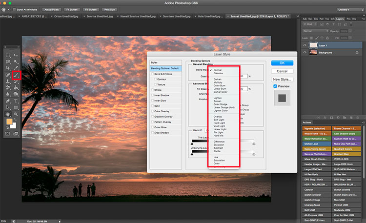
Most sunset photos are already quite spectacular when they’re captured with a camera, but sometimes it doesn’t hurt to enhance them a bit more, to fully convey an exceptionally surreal or beautiful scene you witnessed. The photo below is an unedited sunset shot taken at the Grand Wailea in Maui, Hawaii. It looks pretty fine on its own, but I wanted to paint a little more orange and pink into the sky. 

Landscape photography Sunset before after

To do so, we’ll follow these simple steps:

  1. Create a new layer by clicking on the layer icon to the left of the trash can in the layers panel.
  2. Then go to the toolbox and select the Paintbrush icon. To ensure a smooth transition, make sure the opacity is set to 100% and the brush hardness is set at zero.
  3. Set your color: With the Paintbrush still selected, click on the Foreground Color, which is at the bottom of the toolbar. A dialogue box will appear and your cursor will transform into an eyedropper tool. Left click on the desired color in your image that you wish to paint with, in my case a light pink-orange.
  4. Next, start painting over the areas of the sky that you wish to enhance. Be sure to limit the brush strokes to just your sky area; in my case, I wouldn’t want to paint over the darkened shadows on the left side of the photo since I want to keep them as dark as possible.
  5. Change the Layer Blend Mode: After you’re done painting, right-click on the layer you painted on and change the blend mode to something like Soft Light or Overlay to achieve the desired effect. If the effect is too strong, adjust the opacity of the layer to a lower percentage.
  6. Violá! You should now see much stronger, vibrant colors radiating from your sunset image.

Landscape photography sunset sky painting

How do you process your landscape images? Do you have any other tips or tricks? Please share in the comments below.

googletag.cmd.push(function() {
tablet_slots.push( googletag.defineSlot( “/1005424/_dPSv4_tab-all-article-bottom_(300×250)”, [300, 250], “pb-ad-78623” ).addService( googletag.pubads() ) ); } );

googletag.cmd.push(function() {
mobile_slots.push( googletag.defineSlot( “/1005424/_dPSv4_mob-all-article-bottom_(300×250)”, [300, 250], “pb-ad-78158” ).addService( googletag.pubads() ) ); } );

The post 3 Simple Tips for Subtle Landscape Photography Post-Processing by Suzi Pratt appeared first on Digital Photography School.


Digital Photography School

 
Comments Off on 3 Simple Tips for Subtle Landscape Photography Post-Processing

Posted in Photography


5 Simple Yet Clever Ways to Impress Your Photography Clients

30 Mar

While a satisfied client is the fuel for further sales and word of mouth, an excited client is the jet engine for your marketing. Unfortunately, many photographers don’t know how to turn regular customers into fans.

In this article you’ll find five simple, time-proven techniques of impressing your photography clients and building a long-lasting relationship from an ordinary photo shoot.

1. Be Professional

01 be professional
Image by niekverlaan

You should portray a professional image of yourself right from the beginning. This doesn’t necessarily involve spending hundreds of dollars on premium graphic design services and printed materials. In today’s world we have to deal with poor customer service too often, so being quick with your replies to client requests is an old yet very effective way to impress people.

Another factor contributing to your professional image is your website. It’s the first thing your clients see when they find you on the Internet, so it’s critically important to keep your site accessible and up-to-date. Don’t forget to update your portfolio and copyright information and make sure your website is mobile-friendly. Update information on your site regularly along with the copyright, share some personal stuff on your blog and “about me” page to show that you’re an open and available person, share your interests to make potential clients feel closer to you even before you meet.

Also, take care of your outfits and your entire appearance. No matter what type of photo shoot you’re heading to, make sure you’re dressed appropriately as it will directly affect whether or not you’ll get future jobs from this shoot. A rule of thumb is to avoid busy and loud clothing in favor of smooth colors and neutral style. Consider your own comfort, but probably more importantly, make your clients feel comfortable with you walking around.

2. Be Helpful, Be an Authority

02 be authority

Image by tpsdave

Give your clients an additional reason to book your service by providing exclusive, helpful information. It can be a blog post on how to dress for different types of photo sessions, or you could organize a workshop for moms on how to take great snaps of their children using a smartphone or a pocket camera. The idea is to figure out your clients’ possible knowledge gaps and fill them.

Not only is this a great way to strengthen relationships with your current customers, but it can also help you establish the reputation of being an experienced, leading professional which works as a charm for attracting qualified leads.

3. Get Creative with Bonuses

Every business is interested in long-term relationships with their customers, and photographers should be no exception. Your loyal clients help you find new client, but what do they get in return? Develop a loyalty program for your customer base. An exclusive discount or a free mini-session just for using your services will definitely leave an impact.

03 give bonuses
Image by GLady

Another neat way to please your loyal audience with an unsolicited bonus is creating a personalized product for them. For instance, with Defrozo you can create custom downloadable client galleries for free. The albums look great on both desktop and mobile screens, and can be built within a couple of minutes. The developers of Defrozo also promise full-featured websites for clients available later this year as the project raises funds on Kickstarter. You could also create a sweet, short video showing some backstage moments using Magisto.

Remember that bonuses don’t have to be monetary. It’s attention and a personal approach that will impress people.

4. Be the guy/girl next door

In other words, get to know what interests you have in common and use this info to customize your approach to the needs of your clients.

Fortunately you can make use of social networks. Not all of your clients will use them or share a lot of their personal details, but you can still get to know people you work with better by simply following their social media updates.

04 be the guy next door
Image by Alejandro Escamilla

Another great way to connect with your clients on a personal level can be seen on the website of well-known wedding photographers Justin and Mary Marantz. They simply listed things they like presented as icons accompanied by funny comments on their About page. That’s the information that turns a “leading destination photographer” into a “guy/girl next door” that understands you in a way no other photographer does, and therefore, can be entrusted to photograph one of the most special days of your life. Genius, huh?

5. Follow Up

Following up is important. When done right, it helps you reinforce relationships with your current clients. Besides, it’s a sure way for you to be recommended more often.

05 follow up
Image by Ginger Quip

It’s not uncommon to send your clients a printed Thank You card, along with a photobook or image pack from their session. You could go further and send them an extra print about a month after. Break the mould of typical follow-up messages that are only sent when a business wants to sell something and only include a note that would remind your client about the fun time you had during the photo shoot. It can work great as a feedback request too.

If sending a physical gift does not fit your budget at the moment, writing a detailed blog post about a specific client’s session is a decent alternative. It won’t cost you a penny, but sincere words shared publicly won’t leave them cold, for sure.

Summary

It’s sincerity, passion for what you do, and commitment to quality that motivates people to stick around forever. Is that what you can say about your business approach? Congrats, then, you’ve got that wow-factor to impress your clients. Remember that when creating your next marketing campaign and it will work like a charm.

What’s your number-one marketing tactic you use to impress your clients? Share with the community by leaving a comment below!

googletag.cmd.push(function() {
tablet_slots.push( googletag.defineSlot( “/1005424/_dPSv4_tab-all-article-bottom_(300×250)”, [300, 250], “pb-ad-78623” ).addService( googletag.pubads() ) ); } );

googletag.cmd.push(function() {
mobile_slots.push( googletag.defineSlot( “/1005424/_dPSv4_mob-all-article-bottom_(300×250)”, [300, 250], “pb-ad-78158” ).addService( googletag.pubads() ) ); } );

The post 5 Simple Yet Clever Ways to Impress Your Photography Clients by Julia May appeared first on Digital Photography School.


Digital Photography School

 
Comments Off on 5 Simple Yet Clever Ways to Impress Your Photography Clients

Posted in Photography


How to Create a Simple Slideshow in Lightroom

27 Mar

Slideshow module Lightroom

If you’re over a “certain” age, you remember creating slideshows for friends or family members to see. The viewing process required a projector and a screen, plus a darkened room to enable people to see the projected slides properly.

Thankfully, things have moved on since then and it’s now much easier to show your photos to an audience. The advent of laptop computers, social media, blogs and photo sharing websites has rendered the old style of slideshow redundant.

However, there’s still a place for the new style of slideshow – one viewed on a computer monitor, rather than a white screen. Lightroom users can create slideshows from within the program itself, using the Slideshow module, greatly simplifying the process.

In this article I’ll show you how to create a simple slideshow, and point out some of the more advanced customization features you may wish to explore.

First steps in the Slideshow module

It helps greatly if you create a new Collection for the photos you want to use in your slide show. Once you have done so, switch to the Slideshow module. You will see, depending on whether you have used it before, something like this.

Slideshow module Lightroom

Click the Create Saved Slideshow button at the top of the Content window. When you do so, Lightroom creates a new Slideshow Collection which is placed (by default) inside the original Collection. From this point on, any changes you make to your slideshow are automatically saved, and you can’t lose them.

Give your slideshow a name in the Create Slideshow window, and decide where to save it using the drop-down menu under Location. If you tick the Make new virtual copies box you will be able to edit Virtual Copies in the Slideshow Collection without affecting the originals.

Slideshow module Lightroom

Identity Plates

If you have created a custom Identity Plate then you may see it displayed in the top-left corner of your slide show, as several of Lightroom’s slideshow templates incorporate Identity Plates in their layout.

You can move the Identity Plate by clicking and dragging, or enlarge it by clicking on, and dragging the white squares around the edge. Now is probably a good time to point out that there are two types of personalized Identity Plates in Lightroom – Graphical and Styled Text Identity Plates.

While Graphical Identity Plates have their uses (mainly as a picturesque alternative to Lightroom’s default Identity Plate) you can’t enlarge them beyond their native size of 400 x 57 pixels without pixelating the graphics, making them nearly useless for incorporating into slideshows. Styled Text Identity Plates are much better as Lightroom simply scales them to the required size without any pixelation.

If you don’t want to include an Identity Plate in your slide show at all, go to the Overlays panel and untick the Identity Plate box. This is the simplest option, but if you wish you can create your own Styled Text Identity Plate by going to Lightroom > Identity Plate Setup (Mac) / Edit > Identity Plate (PC).

Slideshow module Lightroom

Previewing your slideshow

Opening the Slideshow module automatically creates a slideshow (yes, it’s as simple as that) and if you’re happy with the default settings you’re already done. To see what it looks like, click the Preview Slideshow button (the play icon) in the Toolbar. For maximum effect retract the top, bottom and side panels first (keyboard shortcut: Shift+Tab).

Slideshow module Lightroom

Customizing your slideshow

Now that you have seen the default slideshow in action, it’s time to take a look at how you can customize it.

The place to start is the Template Browser, located in the left-hand panels. There are five Lightroom Templates to choose from. They are fully customizable. The easiest way to design your slideshow is to choose the template that gets you closest to where you want to be, and then make the required adjustments from there.

Slideshow module Lightroom

For my slide show I chose the Crop to Fill template, which expands (and crops) the photos in the slide show to fill the entire screen.

Slideshow module Lightroom

Most of the templates have Text Cells. If you don’t want a Text Cell to appear in your slide show, simply click on it and press the Delete (Mac) / Backspace (PC) key on the keyboard to remove it.

Alternatively, you can edit the content of the text box by clicking on the Text Cell, then going to the Custom Text menu in the Toolbar and select Edit. This opens the Text Template Editor, where you can select what will be displayed in the Text Cell.

Slideshow module Lightroom

If you want to add a new Text Cell (for example, if you are using the Crop to Fill template, which has none) you can do so by clicking the ABC button in the Toolbar. Select Edit (or one of the presets) from the Custom Text menu. If you select Edit the Text Template Editor opens and you can choose what will appear in the Text Cell.

You can drag the Text Cell around the slideshow to position it, and adjust the size of the font by making the text box larger or smaller by dragging the corner or edge handles. Go to Text Overlays in the Overlays panel to set the font type, colour and opacity of the font in the active Text Cell.

Slideshow module Lightroom

Exporting slideshows

The easiest way to show someone a slideshow is to open Lightroom, go to the Slideshow Collection you wish to view and hit the Play button.

There are also times when you may need to export the slideshow in a format that is viewable by other people, such as a movie file. To do so, click the Export Video button underneath the left-hand panels. Exported videos are saved in the .MP4 format, which is compatible with many video players including Adobe Media Player, Apple Quicktime and Windows Media Player 12. The video includes music if it has has been added to the slideshow.

Slideshow module Lightroom

Conclusion

Hopefully this article has given you a good idea of what you can achieve in Lightroom’s Slideshow module. If you like what you’ve seen so far, take some time to explore the right hand panels, where you will discover more ways to customize the appearance of your slideshow.

What uses have you found for Lightroom’s Slideshow module? Is it powerful enough for your needs or do you prefer alternative software? Please let us know in the comments.


The Mastering Lightroom Collection

Mastering Lightroom ebooks
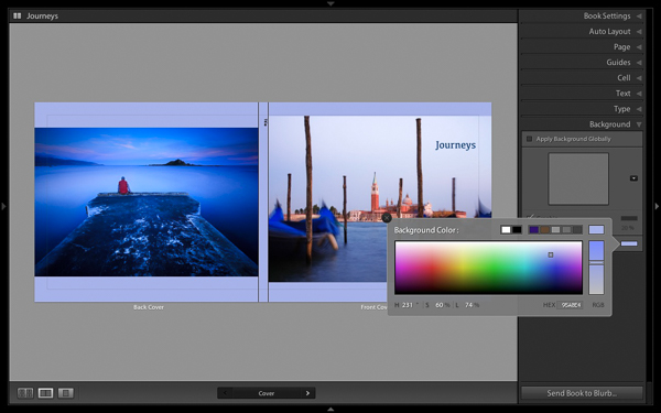
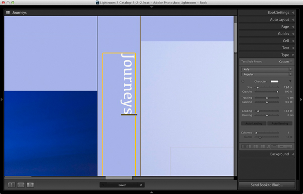
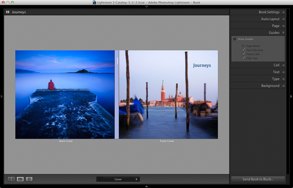
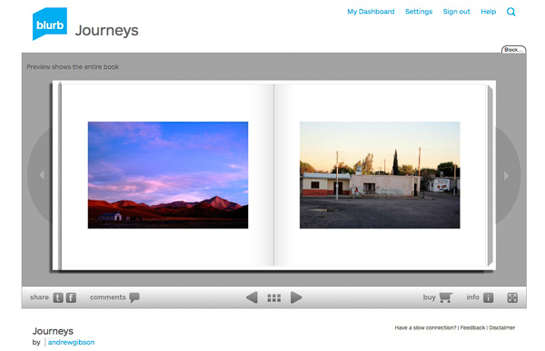
My Mastering Lightroom ebooks will help you get the most out of Lightroom 4 and Lightroom 5. They cover every aspect of the software from the Library module through to creating beautiful images in the Develop module and making photo books and slide shows. Click the link to learn more or buy.

googletag.cmd.push(function() {
tablet_slots.push( googletag.defineSlot( “/1005424/_dPSv4_tab-all-article-bottom_(300×250)”, [300, 250], “pb-ad-78623” ).addService( googletag.pubads() ) ); } );

googletag.cmd.push(function() {
mobile_slots.push( googletag.defineSlot( “/1005424/_dPSv4_mob-all-article-bottom_(300×250)”, [300, 250], “pb-ad-78158” ).addService( googletag.pubads() ) ); } );

The post How to Create a Simple Slideshow in Lightroom by Andrew S. Gibson appeared first on Digital Photography School.


Digital Photography School

 
Comments Off on How to Create a Simple Slideshow in Lightroom

Posted in Photography


How to Make a Photoshop Collage in 9 Simple Steps

10 Feb

We all aim to tell a story through one single image. For many occasions, though, a well-assembled collage is an excellent way to pull the viewer in for a full experience. Consider this method for sharing photos from an event, a real estate shoot, or even a family photo session!

Collage4

Collages are easy to put together in Photoshop, so let’s walk through the steps. Note that I am working on a Mac with Photoshop CS3, so your system may have slight variations in the key commands needed.

Photo selection is crucial. You want to select a mix of scales that will span the entire event. That means you pick some wide shots that show the entire scene, and some detail photos that show lots of texture and personality. Without one or the other the story will not be complete, and won’t carry the same emotion that it could.

Step 1. Open the selected images in Photoshop

Open all selected photos in Photoshop. You’ll want to pick a minimum of three, but avoid getting cluttered with too many also. Typically, I limit my photo selection to no more than eight. Keep in mind that the more photos you select, the tougher it will be to see details of each one.

Step 2. Create a new file

Create a new file (File -> New). Be sure to make it a bit larger than the size you want in the end. I always make it 20×30″ at 150ppi.

Collage1

Step 3. Add your images one at a time

Go to one of the open photos and, using the marquee tool, select all (or press command+A). Press Command+C to copy. Click into the new document and press Command+V to paste. This will bring the photo into the new document on its own layer. Depending on the size and resolution of the photo you brought in, you may need to adjust the size. To do this, press Command+T to transform. Use the corner node and, while pressing Shift, adjust the scale of the photo until it is small enough to comfortably move around on the new document canvas.

Note: if you convert the image layer to a Smart Object first it will maintain integrity of the image quality as you size up and down.

Step 4. Create your layout

After you have added all images that you want in the collage, it’s time to lay out the photos! This is where you will shift the photos around until you feel they tell your story best. You’ll discover a style of your own after doing several collages. I generally like to either have symmetry in layouts, or make it look like an interlocking puzzle. That being said, each story has slightly different needs.

Collage2

Step 5. Add image spacing

When you have the layout figured out and the photos are all sized as they should be, you can create a thin white border between images to give a bit of visual space. This step is optional, and the amount of white space you put between photos is a personal preference.

To do this, select the image layer that you want to move then use the arrow keys to shift it in the direction you want. Using the arrow keys rather than shifting with the mouse will help keep track of distance so that the spacing in between photos is even.

Alternatively you can butt them up against one another and using a Layer Style (select Stroke > Inner) add a white or black border around each image. See screen capture below.

Screen Shot 2015 02 06 at 3 01 27 PM

Step 6. Merge all layers

Once you have your collage laid out and the photos are spaced as you want them, you are ready to merge all layers. To do this, press Command+Shift+E.

Step 7. Crop the final image

Once your collage is merged into one layer, crop any extra white space around edges so that it’s even. This outside white border is typically very narrow on my collages, so I don’t bother measuring. Be sure that it looks even all around.

Collage3

Step 8. Resize for online usage

To make sure your collage fits your social media needs, you may want to resize it once complete. I recommend saving your original flattened collage as a JPEG for possible future re-use.

To resize your collage and bring it down to social media friendly dimensions, press Opt+Command+I. Sizing varies per social media platforms, but I typically save it at 1000 pixels on the short edge and 150ppi.

Step 9. Add a watermark if desired

If you want to put a watermark on your masterpiece, now is the time. Bring in your watermark and be sure to merge all layers once more to save as a JPEG. You are now ready to share it with the world.

Collage4

Have you made any collages? Have any additional tips? Please share in the comments below.

googletag.cmd.push(function() {
tablet_slots.push( googletag.defineSlot( “/1005424/_dPSv4_tab-all-article-bottom_(300×250)”, [300, 250], “pb-ad-78623” ).addService( googletag.pubads() ) ); } );

googletag.cmd.push(function() {
mobile_slots.push( googletag.defineSlot( “/1005424/_dPSv4_mob-all-article-bottom_(300×250)”, [300, 250], “pb-ad-78158” ).addService( googletag.pubads() ) ); } );

The post How to Make a Photoshop Collage in 9 Simple Steps by Natalia Robert appeared first on Digital Photography School.


Digital Photography School

 
Comments Off on How to Make a Photoshop Collage in 9 Simple Steps

Posted in Photography


How to Create a Simple Blurb Photo Book in Lightroom

07 Feb

How to create a simple photo book in Lightroom

The easiest way to get started with Lightroom’s Book module is to create a simple photo book, letting Lightroom do most of the work for you so you don’t get bogged down in the extensive design process involved in making a more complex book.

Things to do before you start

You will make the book design process much easier by doing, or at least thinking about, the following things before you start:

  • Select which photos you’re going to include. Or at least narrow it down as much as you can. You might change your mind many times as you work on the design. Organize them in a Collection.
  • Arrange the photos in the approximate order they will appear in the photo book by clicking and dragging. You can do this in the Filmstrip in the Book module, but it is much easier to do it in Grid View in the Library module. It helps if you have created a Collection containing the photos you wish to include in the photo book. Again, this doesn’t need to be precise as you will probably change your mind as you work your way through the design process.

How to create a simple photo book in Lightroom

  • Choose photos for the front and back covers. The cover photo is the first one in the Collection, the back cover photo is the last. You can change your mind later if you need to.
  • Process your files, if required. Naturally, you have probably already processed the photos you would like to include in your book, but are the photos processed in a consistent way? For example, if you are creating a book containing toned black and white photos have they all been toned the same colour, or are they different? It might be better for the book if they are all toned the same colour. If your photos need processing, it may be helpful to make Virtual Copies, so the originals are unaffected by the changes.
  • Pick which Blurb photo book size to use. There are five to choose from: small square, standard portrait, standard landscape, large landscape and large square. Sizes and prices of Blurb books are outlined on Blurb’s website.
  • Go to Book Preferences, which are found under the Book menu in the Book module (you can’t open them from any other module). Set Default Photo Zoom to Zoom to Fit and leave the Start new books by autofilling box unchecked. The other settings don’t matter for simple photo books.

How to create a simple photo book in Lightroom

Creating a simple photo book

Go to the Book module. If you set your Book Preferences as recommended above, you will see something like this.

How to create a simple photo book in Lightroom

Regardless of what you see on screen, start by clicking the Clear Book button at the top of the Content window. Then go to the Auto Layout panel, set the Preset to One Photo Per Page and use the drop down menu accessed by the double arrow icon to select Edit Auto Layout Preset. The Auto Layout Preset Editor window opens (below). Look for the Zoom Photos To setting and set it to Fit (if it isn’t there already). Click the Done button at the bottom of the window.

How to create a simple photo book in Lightroom

Click the Auto Layout button in the Auto Layout panel. Lightroom creates the book for you. It will look something like this, depending on the number of photos in your book.

How to create a simple photo book in Lightroom

At this stage you will see the words Unsaved Book in the top-left corner. They indicate that the current book layout hasn’t been saved. Click the Create Saved Book button. This prompts Lightroom to open the Create Book window and create a Book Collection – a specialized type of Collection containing photos used in a photo book.

Give the book a name and select a Collection Set to store it in. Click the Create button. Lightroom duplicates the current Collection and turns it into the new Book Collection. It is displayed in the Collections panel with a book icon to differentiate it from other Collections. The name of the Book Collection is also displayed in the top-left corner of the Book module. Lightroom updates the Book Collection every time you make a change, so you can come back to it at any time without losing your work.

How to create a simple photo book in Lightroom

Go to the Book Settings panel and select the Size of the book and the type of Cover you’d like (I chose Standard Landscape with Hardcover Image Wrap for this example). It’s important to decide now which you want, as it may affect the layout if you change them later.

Lightroom displays the estimated price of the photo book at the bottom of the panel (click the double arrow icon to the right of the price to see it in a different currency). The figure changes according to the size of the book, the number of pages in it, and the Paper Type (there is more information about paper types on Blurb’s website.

You can save money by including the Blurb logo page – an extra page at the back of the book with Blurb’s logo. Doing so gives you a discount, but adds an extra page to the layout.

http://www.blurb.com/proline

The first and last photos in the Book Collection are used as covers, but Auto Layout also adds them as the first and last photos in the book. If you don’t want them in those positions then you need to remove them.

Starting by going to the first image, right-clicking and selecting Remove Photo.

You should now see a grey square with a cross in it (if you don’t, go to the Guides panel and tick the Show Guides and Photo Cells boxes). The icon indicates the page contains an empty Photo Cell – Lightroom’s term for the spaces allocated to photos within the layout.

The left-hand page is dark grey, indicating that it’s the inside of the front cover, and that you can’t add anything to it.

How to create a simple photo book in Lightroom

Repeat the process with the last photo in the book. This time, right-click the photo and select Remove page.

How to create a simple photo book in Lightroom

Add a white border

The next step is to create a white border around the photos in the book, rather than run them up to the edge of the printed page. The photos will be smaller, but the additional white space will give the book a more professional look.

Click on a page containing a photo in the landscape orientation to activate it and go to the Cell panel. Grab the bottom slider and move it right. The other sliders should move with it at the same time (if they don’t, click the grey Link All square – when all the squares are white, they will move together). Adjust the sliders until the photo has a solid white border around it like the one in the screen shot below.

How to create a simple photo book in Lightroom

Right-click on the page and select Save as Custom Page. Switch to the Multi-Page View and go to Edit > Select All to select all the pages in the book (the cover isn’t included).

Click any arrow in a yellow frame, go to Custom Pages and select the page layout you just created. If this is the first time you have done this, it will be the only one there. Lightroom updates the selected pages with the chosen layout.

How to create a simple photo book in Lightroom

Design the covers

Go to the covers spread, click on the front cover and then the grey Add Photo Text button at the bottom. Type in the book title. You can change the font colour, size, and text in the Type panel. Click and drag the yellow border to move the text.

You can’t change the width of a Photo Text Cell. But you can easily move the title left or right by going to the Cell panel and moving the Left slider until the title is positioned where you want it.

How to create a simple photo book in Lightroom

Open the Background panel and select a background colour that complements the front and back covers.

How to create a simple photo book in Lightroom

Go to the title on the spine of the cover, and change it to the title of your book. For consistency, you should use the same font you selected for the title on the front cover.

How to create a simple photo book in Lightroom

Another option for the cover is to expand the photos so that they fill the available space. This will crop the photos, which you may not want, but can look really effective. You may also need to move the title. To do so, right-click on the cover images and select Zoom Photo to Fit Cell. This is what it looks like with my covers.

How to create a simple photo book in Lightroom

Congratulations, you have finished your photo book! There are lots of ways you can tweak and improve your design in the Book module,  I may go into those in a later article. But hopefully you now see how easy it is to get started in the Book module. Indeed, if you are happy with this simple design, you can create a photo book in a few minutes.

Uploading your photo to book to Blurb

In order to print your book with Blurb you need a Blurb account, which you can sign up for on their website.

Then, press the Send Book to Blurb button underneath the right-hand panels. Lightroom prompts you to sign into your account. Then, enter the title and author’s name and click the Upload Book button. The upload takes some time, but when it’s done you can sign into your Blurb account online and see your book. Leave this step until you’re ready to order though, as Blurb will delete the book from your account if you don’t order at least one copy within 15 days.

Here are some preview pages from the photo book I just created.

Have you made a book yet? Please share your comments and questions below.
lightroom-create-simple-photo-book-18
How to create a simple photo book in Lightroom


Mastering Lightroom: Book Five – The Other Modules ebook coverMastering Lightroom: Book Five – The Other Modules

My new ebook Mastering Lightroom: Book Five – The Other Modules shows you how to use Lightroom’s powerful features to create fun and interesting projects using the Map, Book, Slide show, Print and Web modules. Whether it’s geotagging, putting together a photo book, printing your best photos or creating web galleries all the information (and inspiration) you require is right here.

googletag.cmd.push(function() {
tablet_slots.push( googletag.defineSlot( “/1005424/_dPSv4_tab-all-article-bottom_(300×250)”, [300, 250], “pb-ad-78623” ).addService( googletag.pubads() ) ); } );

googletag.cmd.push(function() {
mobile_slots.push( googletag.defineSlot( “/1005424/_dPSv4_mob-all-article-bottom_(300×250)”, [300, 250], “pb-ad-78158” ).addService( googletag.pubads() ) ); } );

The post How to Create a Simple Blurb Photo Book in Lightroom by Andrew S. Gibson appeared first on Digital Photography School.


Digital Photography School

 
Comments Off on How to Create a Simple Blurb Photo Book in Lightroom

Posted in Photography


3 Simple Ways to Take Better Photos on Your Next Trip

04 Feb

I love to travel. To me, nothing compares to living on the road and waking up to new places every day. All the different photographs I’ve made during my journeys are the most rewarding part of it all.

Making photos while traveling or on vacation has a special quality because you’re seeing your subjects often for the first time. Travel also presents unique challenges, though – unfamiliar landscape, climate, and culture can easily throw you off. However, it is those very things that can also make beautiful, one-of-a-kind photographs!

Bay of Fundy, New Brunswick

Bay of Fundy, New Brunswick

When travelling to new places, you want to create photos that express the way you feel about the place. You also want to make unique images that are unlike anyone else’s. The sense of wonder you feel when seeing beautiful places for the first time can easily translate into the images that you make with these three simple tips to help you take better photos.

1. Plan, plan, plan

Once you decide where you’re going, read up on the area and educate yourself about the place and what kind of conditions you can expect. What will the weather be like? Are there any special events taking place? Will the flowers be blooming? If you’re traveling internationally, is there a language barrier? If so, try to learn a few key words and carry a phrase book with you. No matter where in the world you go, locals are always more helpful when you make an effort to speak to them in their own language – even if it’s just a few words.

Find out what else is around that you might be able to see during your visit. If you’re photographing nature, you can find great locations by studying maps. Photography websites and forums are full of advice and examples of interesting places to shoot. Learning about the location’s history and culture will also help direct you to unique and interesting subjects.

Sanibel Island, Florida

Sanibel Island, Florida

Find out as much as you can about the places and subjects you’ll be photographing, so you can prepare for them. For instance, if you’re going to be shooting in the desert, near the ocean, or in very cold, wet, or humid environments, you’ll know to bring protective gear to shield your camera from damage caused by moisture, salt, and sand. If you expect temperatures lower than -10c or higher than 40c, extra batteries will be needed as they drain quickly at extreme temperatures. You might consider renting a particular type of lens that is perfect for your subject like a super-telephoto or a tilt-shift. You’ll also need to know what sort of clothes to wear for the weather.

Big Bend National Park, Texas

Big Bend National Park, Texas

2. Don’t let your gear drag you down

No matter where you’re headed, there are some things you’ll need no matter what. When packing your gear, make a checklist to ensure you don’t forget anything important. It should include:

  1. Your main camera
  2. A backup camera
  3. A normal focal length lens (around ~50mm)
  4. A long focal length lens (~100mm or more)
  5. A wide-angle lens (~35mm or less)
  6. Your favourite, most-used lens
  7. A polarizing filter
  8. A battery charger
  9. Spare batteries and memory cards, and a place to backup images (computer, external drive, the cloud)
  10. A lens cloth and/or air blower to keep your equipment clean
  11. A comfortable camera bag – preferably one that doesn’t stand out as a camera bag to avoid making yourself a target for thieves.
  12. A good, sturdy, but lightweight tripod. Many manufacturers such as Manfrotto, Giottos, and Benro (among others) make special travel tripods that are made of strong, light carbon fibre and fold up into a small carrying case.
Strathcona Provincial Park, British Columbia

Strathcona Provincial Park, British Columbia

Be selective with your packing. Don’t bring things you probably won’t use because camera bags can get very heavy, very fast. Use lightweight luggage and never check your camera bag, since checked luggage can be mishandled or lost. If you are flying, check the size and weight restrictions of carry-on luggage so you don’t get an unwelcome surprise at the airport. If you leave your home country, purchase travel insurance that will cover your precious equipment from loss, damage, or theft while abroad.

3. Seek the unique

When traveling, try to avoid the mass-marketed tours and biggest attractions. Not only are they full of people that get in the way of your shot, but they’re also full of people getting almost the exact same photos that you are. Instead, search for places that are beautiful but overlooked. You may be able to find this information online, but the best way is to be open and talk directly to the people who live there – start with your hotel staff, be friendly, and ask locals where the most beautiful places are that most people don’t see.

Goblin Valley State Park, Utah

Goblin Valley State Park, Utah

This can even start when booking your accommodations – instead of staying in a generic chain hotel, look for places with more character such as cabins, villas, or bed and breakfasts. Or, if you’re like me, you can find an RV site right in the midst of the beauty to call home base. This way, the place you spend the most time can present its own photographic opportunities.

Remember to give yourself time to experience the place before you start photographing. Give yourself a chance to find out what is special about the place first, and then try to convey that in your images. If you are photographing something common like a famous monument or national park, try to find a new perspective.

Joshua Tree National Park, California

Joshua Tree National Park, California

It’s easy to become overwhelmed by the exotic nature of new places. But always remember that good light is a photographer’s best friend. A new place may look fascinating to you in the middle of the day, but it will look magical during good light.

googletag.cmd.push(function() {
tablet_slots.push( googletag.defineSlot( “/1005424/_dPSv4_tab-all-article-bottom_(300×250)”, [300, 250], “pb-ad-78623” ).addService( googletag.pubads() ) ); } );

googletag.cmd.push(function() {
mobile_slots.push( googletag.defineSlot( “/1005424/_dPSv4_mob-all-article-bottom_(300×250)”, [300, 250], “pb-ad-78158” ).addService( googletag.pubads() ) ); } );

The post 3 Simple Ways to Take Better Photos on Your Next Trip by Anne McKinnell appeared first on Digital Photography School.


Digital Photography School

 
Comments Off on 3 Simple Ways to Take Better Photos on Your Next Trip

Posted in Photography


A Super Simple Way to Make Landscape Photos POP Using Lightroom

17 Jan

It seems like virtually all outdoor or landscape photographs suffer from the same illness when they come out of the camera. The symptoms are:

  • An overly bright sky
  • Foreground that is too dark
  • A general lack of color and contrast.

Sound familiar?

Fortunately, there is a cure for this ailment. Actually, as anyone who has worked with post-processing software for any length of time knows, there are a lot of different cures. But I want to show you a super simple way to fix pictures with these problems. I performed these fixes in Lightroom, but you can also do them on the Adobe Camera Raw screens of Photoshop or Photoshop Elements.

Colorado road photo with Lightroom adjustments

The quick-fix shown here will involve nothing more than moving six sliders, each of which is in the Basic panel of Lightroom’s Develop module. The edits will take less than 30 seconds of your time. I performed these edits – and only these edits – to the pictures you see throughout this article to show you the effects.

The Steps

Let’s not dally with a lot of explanation just yet. Here are the steps to perform a quick-fix of landscape photos. The first three steps are the most important, where you will see about 90% of the changes to your pictures. After walking you through these steps I will explain the process in a little more detail.

  1. Decrease the Highlights: Just pull the highlights slider to the left as much as is needed to add more detail to your sky.
  2. Increase the Shadows:  Pull the Shadows slider to the right to brighten the foreground. Don’t worry if it looks a bit washed-out after this step.
  3. Reduce the Blacks: Pull the Blacks slider to the left. This will add contrast back to the picture, and will fix the washed-out look that might have crept into your picture after the last step.
  4. Increase Vibrance: Pull the Vibrance slider to the right a bit to add more color to the picture.
  5. Increase Contrast: Pull the Contrast slider to the right a little bit to increase overall contrast. Don’t go too far, or it might start to undo the changes you just made above.
  6. Increase Clarity: Pull the Clarity slider to the right to add some clarity (edge contrast) to your photo and make it appear less soft.

That’s it. Just move these six sliders and you should see a vast improvement in your landscape pictures. This might seem more complicated than it actually is, because there are six steps. But after a while you will be able to do all of it in a matter of seconds.

Bass Harbor photo with Lightroom adjustments

What’s Going on Here

Now that I’ve shown you the steps and a few examples, let’s talk about this process.

What you are doing first is reducing the tones in the sky by using the Highlights slider. The sky is typically the brightest part of landscape photos. The Highlights slider will ONLY affect the brightest tones in the image, so decreasing it should tone down your sky but not touch the darker portions of your picture. Decreasing the highlights will not only keep the sky from being too bright, but will also add detail and texture to the clouds.

After the change to the sky, step 2 is to increase the brightness of the foreground. The foreground is almost always too dark in outdoor photos, and you need to brighten it up and add detail there. As you pull the Shadows slider to the right, you should see your foreground brighten up. The sky, which is not among the shadows of your photo, should remain largely unaffected. Your photo should be looking a lot better at this point.

Many times, when you make the change to the foreground in step 2, that area starts to look a little bit washed-out. Therefore, step 3 is the pull the Blacks slider to the left. Whereas the previous step brightened the shadows, we are now taking the very darkest tones in the photo and bringing them closer to black. The shadows were made brighter in the last step, and now the blacks are made even blacker. That adds more contrast to the foreground and eliminates that washed-out look. It often adds a little bit more contrast to your sky as well.

Note: For a handy tip on using sliders, read The Magic Alt Key article here. 

At this point, your photo should be looking pretty good. In fact, about 90% of the effect is applied to your photo after step 3. Now you will just clean up by making the photo a little clearer, and more colorful.

Texas field photo with Lightroom adjustments

In step 4, we will just increase the vibrance of the photo to add more color to the scene. The Vibrance slider is just below the sliders you have been working with.  Pull it to the right to add more color to the picture. You can adjust this slider however you want, but don’t overdo it.

You might wonder why you should use the Vibrance slider instead of the Saturation slider. The answer is that vibrance is designed to have a higher impact on less saturated colors. Saturation adjustments apply to all colors equally, so an increase in saturation can make certain highly saturated colors look garish. Vibrance, by focusing on colors that are less saturated, lets you increase the overall saturation of your colors without overdoing any colors.

Next, you add a little contrast. Pull the Contrast slider to the right a little bit. You have to be careful here because essentially what you did in the first three moves of this process was reduce overall contrast (making the bright sky darker and the dark foreground lighter). If you crank the contrast up now using the Contrast slider, you will be working against the moves you previously made. A small or moderate increase in contrast, however, can add more texture to the photo, so I recommend you do that.

Finally, a small to moderate increase in Clarity usually makes the photo look sharper and clearer. Don’t overdo this, as clarity is a powerful tool. Just add a little bit by pulling the Clarity slider to the right, and this final step can really make your photos pop.

After having gone through this process, there is nothing stopping you from continuing with additional editing, if you wish.  You can take your photo into Photoshop and make a lot of other changes, or you can use the plug-in of your choice. But even if you decide to do additional editing, the process I have described in this article can still be a good starting point for your landscape photos. It also works really well when you are in a hurry or you’d like to process a lot of photos at once.

Head Harbor Lighthouse photo with Lightroom adjustments

Bonus Tip

I want to keep this process as simple as possible and not confuse it with a bunch of other things, but there is just one more tip I want to pass along in this article. It is a way to add more contrast to your skies in Lightroom (or in ACR in Photoshop).

Scroll down to the HSL/Color/B&W panel in Lightroom’s Develop module, where you will see sliders for eight different colors. Go to the Blue slider and make sure the Luminance tab is selected just above the colors. Decrease the luminance of the blues in your picture by pulling the Blue slider to the left. This will make the color in your sky a deeper, richer blue.

Recall that Step 1 of the process above was to decrease the highlights in an effort to tone down and add detail to your sky. If you decrease the luminance of the blues, you might find that you don’t need to do Step 1 (or at least that you do not need to pull down the highlights as much). In fact, keeping the highlights nice and bright, while decreasing the luminance of your blues, can really add some nice contrast to your skies.

Colorado National Monument photo with Lightroom adjustments

Conclusion

This is one simple way to make super fast changes to your landscape photos. After you have done it a few times, you can make these changes in mere seconds. I know we are all sensitive to falling into ruts and doing the same thing over and over again, so you don’t want to do this process all the time. But it is great when you just want high impact in a short amount of time, or as a quick baseline for further changes.

googletag.cmd.push(function() {
tablet_slots.push( googletag.defineSlot( “/1005424/_dPSv4_tab-all-article-bottom_(300×250)”, [300, 250], “pb-ad-78623” ).addService( googletag.pubads() ) ); } );

googletag.cmd.push(function() {
mobile_slots.push( googletag.defineSlot( “/1005424/_dPSv4_mob-all-article-bottom_(300×250)”, [300, 250], “pb-ad-78158” ).addService( googletag.pubads() ) ); } );

The post A Super Simple Way to Make Landscape Photos POP Using Lightroom by Jim Hamel appeared first on Digital Photography School.


Digital Photography School

 
Comments Off on A Super Simple Way to Make Landscape Photos POP Using Lightroom

Posted in Photography


Simple Post-Processing Tips For Minimalists

30 Nov

Pink Flowers on a cloudy day

Are you a minimalist in terms of your photography? Do you crave simple composition and clean lines in your images? There are many wonderful articles on minimalist photography and simple imagery. In fact Valerie Jardin has a fantastic article on Minimalist Photography – 4 Tips To Keep It Simple right here on Digital Photography School.

This article encourages you to take that approach a step further into post-processing to achieve a clean, timeless look to your imagery. A clean, crisp image always stands the test of time. You don’t have to look very far, just dig into your own image archives from prior years and see which images appeal to you the most.

As a photographer, your greatest achievement is when you are able to capture images exactly as you envision them or see them with your mind’s eye. When you import your images to your computer and the SOOC (Straight Out Of Camera) image simply takes your breath away, you know you’ve got what it takes. While all of us aim for that exact moment of shining glory, sometimes we need to add just a little bit of oomph to the image, simple adjustments that take the image from great to awesome.

Here are some post-processing tips on achieving a great look using simple adjustments. These are all done in Lightroom 5 – a great processing tool for you – using only the Basic and Lens Corrections Panels. The Basic Panel in LR contains adjustment sliders like: Temperature and Tint which adjust White Balance, Exposure and Contrast, Highlights, Shadows, Whites and Blacks which adjust Tone and Clarity, and Vibration and Saturation which adjust Presence. The Lens Correction Panel in LR primarily contains profile corrections for various Lenses.

Lightroom 5 Basic Panel and Lens Profile Correction Panel

Another point to note is: Use RAW format for your images if your camera has the ability to record images in that format. This type of file format has a lot more leeway in terms of post-processing adjustments. There are several articles in the Digital Photography School’s archives that discuss RAW file formats in great detail.

Post-Processing Steps for Minimalist

1) Enable the Lens Correction

Certain lenses, particularly wide angles, introduce some distortion in the images, especially around the edges of the frame. This is generally more obvious in images that either have horizontal lines, curved lines  or the horizon in the frame. Lens Correction can be done in the Profile tab where you can Enable Profile Corrections. Selecting that box, should bring up the profile of the lens used for that particular image. With each new version of LR (we are currently in LR 5.6) more and more lens profiles are being added to the software.

Note: if you cannot find your lens you can try looking on the manufacturers site or use one that is similar.

In the Profile mode, LR automatically detects the lens used and corrects the distortion. Finer adjustments can be done using the sliders under the Lens Profile. You may have to drop down the list and find your particular lens. Enabling Profile Corrections first eliminates the distortion and sometimes brightens the images just a tad – which might be just what the image needs. For more control, switch to the Manual tab for individual profile correction adjustments.

Left is SOOC; Right is Lens Correction adjustment (notice the wood panel in the top of the image)

The left image is SOOC; the right has Lens Correction adjustments done (notice the wood panel in the top of the image)

2) The Basic Adjustment Panel is your BFF (best friend forever)

80% of all minimalistic adjustments happen in the Basic Panel. White Balance (Temperature and Tint) are the most commonly used sliders. Most adjustments are quite minimal. A few stops up or down generally gives you exactly what you are looking for. Take note that small adjustments are very subtle. If your photograph has people, be cognizant of skin tones and colors as they can vary a lot among people and hence the WB slider numbers will also vary. Other variables that affect white balance are; the type of light (artificial versus natural) as well as the time of day (morning, high noon, or dusk). If your camera has the ability to do custom adjust white balance in camera, you can use that to further reduce this adjustment step. Photographing in Auto White Balance versus Custom White Balance is a personal choice.

Left is SOOC; Right has Lens Correction, White Balance (Temp/Tint) adjusted

The left image is SOOC; the right has Lens Correction and White Balance (Temp/Tint) adjusted.

3) Exposure and Contrast go hand-in-hand

The easies way to explain exposure is its ability to brighten or darken an image. Moving it to the right (+) adds brightness to the overall image and moving it to the left (-) reduces brightness. Often times when adjusting exposure more than half or one full stop (i.e. adding more brightness) the overall contrast of the image is affected. The Contrast slider adds more definition between the darks and the lights in the image. Play with the contrast sliders (Contrast and Clarity); they provide an additional pop to the colors in the image that are generally blown out when exposure is drastically increased.

Left is SOOC; Right has Lens Correction and White Balance (Temp/Tint) adjusted

The left image is SOOC; the right has Lens Correction and White Balance (Temp/Tint) adjusted.

Left is SOOC; Right has Lens Correction, White Balance and Contrast adjusted

The left image is SOOC; the right has Lens Correction, White Balance, and Contrast adjusted.

Left is SOOC; Right has Lens Correction, White Balance (Temp/Tint), Exposure and Contrast adjusted

The left image is SOOC; the right has Lens Correction, White Balance (Temp/Tint), Exposure, and Contrast adjusted.

In most cases, minimalistic editing is done at this point. Highlights/Shadows/Whites and Blacks can be adjusted to taste depending on the image. With Portraits, you can also adjust the Clarity slider a bit just to smooth out the skin. For more information on Clarity Slider check out Peter West Carey’s article Lightroom’s Clarity Slider – What Does it Do? in the dPS archives. The easiest thing to remember about the Clarity slider is that it adjusts the edge contrast in only the mid-tones of the image. Go easy with this slider because a little does go a long way and too much clarity, particularly on skin, can provide a very plastic looking skin.

Left is SOOC; Right has Lens Correction, White Balance (Temp/Tint), Exposure and Contrast, Clarity and Highlights adjusted

The left image is SOOC; the right has Lens Correction, White Balance (Temp/Tint), Exposure, Contrast, Clarity and Highlights adjusted.

Left is SOOC; Right has Lens Correction, White Balance (Temp/Tint), Exposure and Contrast, Clarity and Highlights adjusted

The left image is SOOC; the right has Lens Correction, White Balance (Temp/Tint), Exposure, Contrast, Clarity and Highlights adjusted.

As always, the amount of post-processing you do to an image is a personal choice, including the minimalistic option; but it definitely provides for a faster workflow – less than a few minutes per image. In most cases of minimalistic post-processing the adjustments are very subtle. Less time in front of the computer equals more time spent perfecting the art of photography to get those nearly perfect images right out of the camera.

The post Simple Post-Processing Tips For Minimalists by Karthika Gupta appeared first on Digital Photography School.


Digital Photography School

 
Comments Off on Simple Post-Processing Tips For Minimalists

Posted in Photography


Print Charming: Safe, Simple 3D-Printing Comes Home To Play

24 Nov

[ By Steve in Gadgets & Geekery & Technology. ]

POIEO3D family-friendly 3D printer
Following in the footsteps of the microwave oven, at-home 3D printing in the form of the Poieo3D Printer is ready for prime time, play time and study time!

POIEO3D family-friendly 3D printer

Designed BY families FOR families, the Poieo3D Printer aims to make an exciting new technology as commonplace and worry-free as microwave ovens and other home appliances we now take for granted. While not quite “Tea, Earl Grey, Hot”, the Poeio3D Printer just might be the closest thing on Earth to home-based Star Trek tech.

POIEO3D family-friendly 3D printer

Poieo3D is the brainchild of several families in the greater Toronto area who felt inspired by the wealth of opportunities offered by the amazing new world of 3D printing. The founders fervently believe an affordable, easy to use, and child-safe 3D printer should be available to ALL families and should be a vital component of every home, workplace and classroom.

POIEO3D family-friendly 3D printer

The Poieo3D Printer isn’t just user-safe, it’s environmentally-friendly too – something you’d expect of a product that’s to be a permanent part of one’s lifestyle. The 3D printing process employs biodegradable print material derived from renewable resources such as corn starch and sugarcane. Unlike petroleum-based plastics, this material doesn’t give off foul-smelling, toxic fumes when the printer is used making it ideal for non-industrial use. Available in a rainbow of colors at a surprisingly low price, the material comes in the form of thin flexible filaments wound on spools for ease of storage.

Next Page – Click Below to Read More:
Print Charming Safe Simple 3d Printing Comes Home To Play

Share on Facebook


[ By Steve in Gadgets & Geekery & Technology. ]

[ WebUrbanist | Archives | Galleries | Privacy | TOS ]


WebUrbanist

 
Comments Off on Print Charming: Safe, Simple 3D-Printing Comes Home To Play

Posted in Creativity


3 Simple Ways to Create Stunning Eyes in Your Portrait Photography

03 Oct

EYE MONTAGE

Image model credits, clockwise from top left: Chris Milligan/Fremantle Media, Rachael Lever, Danny Spannerz/East Brunswick Tattoos, Tiffany Diaz

“Here’s looking at you, kid.”

Reclusive Hollywood legend Marlon Brando would always close his eyes when paparazzi tried to take his photo. He knew that without his eyes open an image wasn’t worth publishing.

The eyes are the single most important feature of any portrait. Beautiful eyes can make even the dullest portrait mesmerizing. Poorly lit, out of focus eyes, or eyes that lack connection, will weaken the impact of a portrait.

Here are my three favorite techniques to make eyes really stand out in your portraits.

#1 – Light

Light makes photography. Embrace light. Admire it. Love it. But above all, know light. Know it for all you are worth, and you will know the key to photography.” – George Eastman

Eyes look best when they are lit well, with beautiful catch light. Catch lights are the reflection of a light source in the eyes. The size, shape, and brightness of your catch lights depend on the light source you use.

WindowLight

Two large, frosted windows from my studio create beautiful catch lights. Model: Bryana Karanikos

Naked Flash on camera

Diffused flash on-camera creates a slightly softer, rectangular catch light.

Med Soft off camera

Medium softbox, off-camera, positioned at 2 o’clock gives a soft, natural catch light.

ChasingLight 2250

Poorly lit eyes without catch lights look cold, and a bit creepy.

#2 – Expression

You are what you think. All that you are arises from your thoughts. With your thoughts you make your world.” – Anon.

EyesBA

In the image on the left (above), Tiffany’s eyes are cold, and she looks nervous. After I gave Tiffany a visualization exercise, her eyes appear warm, confident, and connected (right image above) Model: Tiffany Dias

How you communicate, connect, and direct your model is key to capturing a great expression in the eyes. If your model’s smile isn’t genuine, his or her eyes will appear cold and dull-looking. If your model is nervous or distracted, this too will be reflected in his or her eyes.

One technique I use to create a great expression is visualization. I ask my model, If you could be anywhere doing anything right now, where would that be? Tell me about that moment. Who is there? What does it feel like? Once they are in the moment of their visualization, their entire body language and expression changes.

#3 – Post-production

Be willing to give that extra effort that separates the winner from the one in second place.” — H. Jackson Brown Jr.

Post-production can lift your images from good to great, when it’s done well. The key to great post-production is not overdoing it. It’s easy to get excited with all the tricks and enhancements that post-production software offers. It’s addictive and much like opening a jar of Nutella – very difficult to control yourself once you’ve begun.

I try and use the overnight rule when it comes to retouching. Once I’ve worked on an image, I won’t look at it again for at least a day. I find my eyes constantly adjust to the modifications I’m making, so it’s more difficult to see when I’ve gone too far (much the same way I dressed in the ’80s).

Here’s a step-by-step technique to enhance eyes using Adobe Lightroom:

EYESBP 10

Before and after: I’ve used Lightroom to make the eyes sharper and brighter and enhanced their color.

a) Import your image into Lightroom and use the basic development panel to develop the shot. In this case, I’ve used one of my own beauty presets.

EyesBP 2

EyesBP 2B

Here are the basic adjustments I’ve made for this image.

b) Zoom in to the eyes (B.) and select the adjustment brush tool (A.) You can also select the brush using keyboard shortcut K. See image above.

EyesBP 4

c) The next step is adjusting the eye color:

EyesBP 5

  • Increase the temperature slider (A.) to make the eyes appear warmer in tone.
  • Increase the exposure slider (B.) to brighten the iris.
  • Increase the shadow slider to bring more detail into the shadow area (C.)
  • Increase the sharpness slider to make the eyes appear more detailed.

Adjusted only the colored part (the iris) of her eye (highlighted in red) and set the brush to have a slight feather and low flow so you can build up your adjustments slowly.

d) Next, select a new adjustment brush (A.), increase the sharpness slider (B.) by +22 and paint over the colored part of the eyes, eyelashes, and eyebrows. This will really make the eyes stand out.

EyesBP 6

e) Finally, select a new adjustment brush. Set the exposure slider to -29 and increase the clarity to +10. Paint around the edge of the iris. This will darken the area slightly and give the eye more definition.

f) The final image has been imported into Adobe® Photoshop®, where I have done a basic skin retouching to remove a few small blemishes.

EyesFINAL

I’d love to hear about your techniques for enhancing eyes and see some examples.

Gina has a new dPS ebook just released – Portraits: After the Shot – check out out here!

The post 3 Simple Ways to Create Stunning Eyes in Your Portrait Photography by Gina Milicia appeared first on Digital Photography School.


Digital Photography School

 
Comments Off on 3 Simple Ways to Create Stunning Eyes in Your Portrait Photography

Posted in Photography