RSS
 

Posts Tagged ‘QUALITY.’

5 Tips for Going from Pixels to Print Quality

18 May

Whatever level of photographer, you are sure to have gathered a stockpile of pixels.

It’s just the way it is nowadays. Whether you are the kind of person that clogs up their hard drive, gradually slowing your Mac or PC down until you are forced to do something about it. Or perhaps you are already super organized having kept negatives, CDs, DVDs, hard drives, a raid system or even the cloud?

Indeed whatever storage method you choose you need to catalogue the files by name, event, and year, so you may retrieve without having a complete breakdown while searching for your favorite file. After all photography should be fun, not pain.

Many photographers use Lightroom, which is a great program, not only for editing but also for organizing your ever-increasing pile of pixels. But then what? What do you do with them then? I think you would agree we all spend too much time in front of screens? So why would you keep your masterpieces locked away in digital format?

To create that killer slideshow you will amaze your friends with is a lot of fun, especially if you have a large TV or digital projector. However, be careful of the content of your slideshow. Nothing worse than visiting a friend, only to be subjected to look through every snap taken on their holiday. Slideshows really should not be much more than ten minutes long or people generally loose interest. Keep them simple also, not too many whizzy effects, that just makes your viewer feel queasy!

PIC 10 simonjohn co uk

So you have this catalogue full of great images, what next? I would say enjoy them. Have your favorites printed and framed. Photography is personal, just like any other art form. By printing your special images, and hanging them in your home, you are not only enjoying the fruits of your labour, but also creating personalized wall art. This shows friends your talents, without the need for a longwinded slideshow.

You may find as time goes by, the framed photographs mean more or less to you. This is quite natural as we grow, and our taste and habits change also. Not to worry, you can always replace them with fresh images. It’s not like the old days when the portrait your parents had remained in the given spot forevermore. In fact, it is refreshing to change your images from time to time. Just like wallpaper or any other interior design things, move on. Only when you can look back at a photograph you made perhaps 10, 20, or 30 years ago, and still love it, will you know it’s a keeper!

My background is a portrait and wedding specialist. Lets take a look at an image from my portfolio. I will describe the process from capture through editing, and finally the framed piece for the wall (above).

#1 – Get it right in-camera

Pic 1 simonjohn co uk

As you can see the old chair, and soft natural light, was perfect for the basis of this portrait. I positioned the mother in the first third of the image, placing her legs over the arm of the chair for a more relaxed contemporary look. My directions to her were simply to get close, and look at your beautiful boy. All I had to do then was to get the toddler to look in the right direction, with the expression to fit. A squeaky toy often saves the day!

The mother is in profile, while the toddler is in three quarter face, adding interest and different angles to the image. The lighting was a large window (not with hard sunlight) off to the right. I also placed a reflector just below the mum’s boots, to bring light back into the eyes and softly wrap around into the shadows. The exposure was 1/250th (freezing the toddler) with an aperture of f/5.6, using a 70mm focal length, as my back was pressed against the far wall of the room.

So to summarize; I feel the expressions are captured well. The lighting is fitting, being soft and directional. The image has style, and is well balanced compositionally. But it just needs something more. The capture stage is so important to get right. Photoshop should not be regarded as a fixer. The great Ansel Adams talked about “printing virtuosity” and just because we now craft our images on a screen, as opposed to in the darkroom, quality and finishing are still paramount.
So take a look at the edited image below.

Pic 2 simonjohn co uk

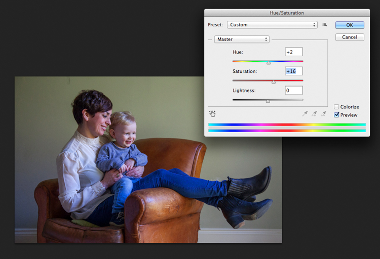
#2 Basic adjustments in Photoshop or Lightroom

Firstly, you will need to level the image in Photoshop, bringing the sliders in to just clip the histogram at both ends. This ensures depth in the blacks and good clean whites. The mid-tone is really your X factor, but just be aware that you have detail throughout all tones if that is the look you are after. Be careful if you make it too light, the image could appear milky. While if you make the mid-tones too dark the image could appear muddy.

Screen Shot 2016-04-27 at 21.12.41-untitled

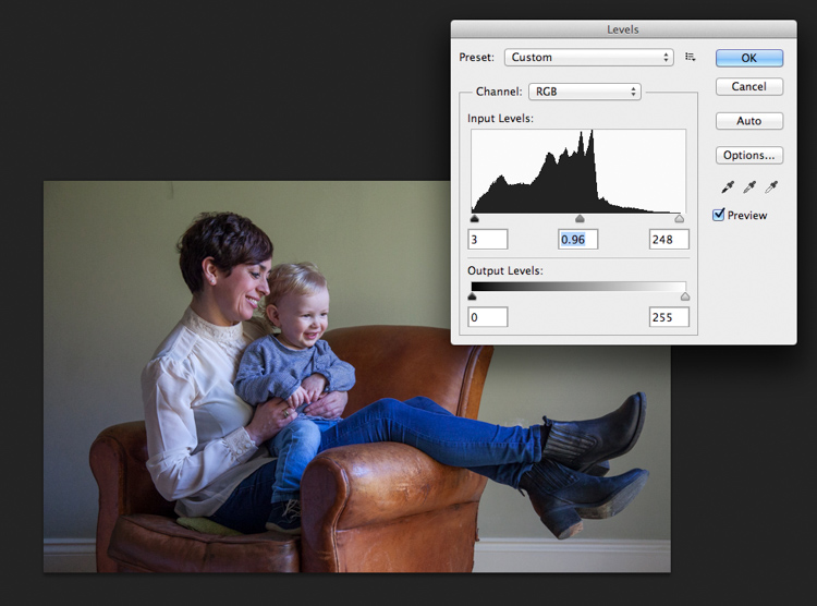
Secondly, I have adjusted the Saturation and the hue of the image to achieve the color pallet I require. Often you can go between the levels and saturation, and make small tweaks as the image takes shape.

Screen Shot 2016-04-27 at 21.13.20-untitled

#3 – Add a texture overlay (optional)

Next you could do as I have here, added a texture overlay. I felt it complimented the chair in its shabby chic style. I photographed a piece of wall, then blended the two images using opacity in the layers pallet. I added a layer mask, then rubbed through with a soft brush to create the subtle look you see here. I then added a soft Gaussian blur from the PS filters, blending the two layers together.

PIC 5 simonjohn co uk

PIC 6 simonjohn co uk

Pic 2-simonjohn.co.uk-untitled

PIC 8 simonjohn co uk PIC 9 simonjohn co uk

#4 – Local tone control

Finally to complete my image I needed to Dodge and Burn. As you can see this really is a subtle finishing skill, and should not be left to a Photoshop filter. In a future article I will explain exactly how to dodge and burn your images like a professional, directing the eye of your viewer to the important parts of the image. But for now, let’s see the final piece as it was hung on my gallery wall.

PIC 10 simonjohn co uk

#5 – Print it

I have printed the image on Fuji fine art 300mgs rough texture paper, which I love. The paper is not only excellent for color rendition but has a wonderful tooth to it, adding texture and depth. I have framed the portrait in a simple natural oak and white acid free mount. I have chosen clear glass. Although there is much talk about non-reflective glass, this simply flattens and dulls the image; I would not recommend it. The finished portrait compliments its surroundings, and fits well into the décor and given space.

As I said at the start of the article, it’s important to display your favorite images rather than hide them away on a computer. I am happy to share with you, that I have done just that here. This is my girlfriend Yvonne and my son Miles.

Some photographers prefer to print their own images. This can be a very good way of speeding up workflow and achieving exactly the right colors you require. In recent years printers have became smaller, and inks and paper more archival. I will perhaps invest this year simply for ease of use, and meeting clients deadlines. Perhaps one issue, according to friends who print their own, is you tend to have a fair amount of wastage profiling papers and inks. If you are not particularly a high volume, large output photographer, ink wells can get clogged up causing spattering of pigment. However I think both these problems are now almost eradicated as technology improves year after year.

If you choose, as many professional photographers do, to use a pro lab you have to close the color loop from the start. I use a Spyder 4, as seen in the screenshots below, and my lab use the Epson 9900 and 4900 for printing the Giclee fine art papers I require.


2

4
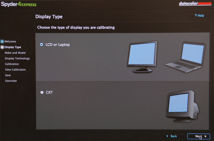
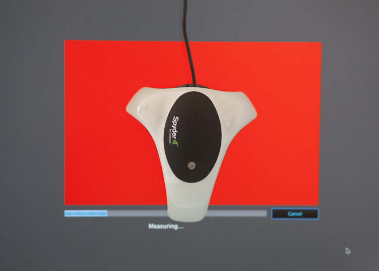
It is attached via USB to your monitor, and simple to follow with onscreen instructions. Basically it brings the colors back in line within the colors space you use. Until recently most labs suggested sRGB, as the colors seen on your screen were pretty much what could be printed. The other often used space is Adobe 98, but not all printing machines can produce such subtleties in color. Progress moves on and there are machines that can print Adobe 98, but my advice for now would be stick with sRGB (ask your lab if you want to know which they use).

Because you are working in a given color space the lab can set its own monitors accordingly, and with a skilled technician the loop should be closed. Sometimes you may find a print is slightly too dark or light. This may be due to the ambient light in yours or your printer’s room being marginally different. A good working relationship is what is needed when using a lab. When asked to reprint an image they should work with you, and offer tips and help if needed; its in everyone’s interest. I rarely have a print that is off, but if I do my lab simply reprints without charge.

So how should you prepare your files? Follow this checklist below for ease of use:

  • Always shoot in raw. Much more detail recorded through highlight to shadow.
  • Save the raw file but create a working tiff.
  • Once you are happy with the finished tiff export as a jpg if sending to a lab.
  • Export or print always at 300dpi for best quality.
  • Check your prints against your monitor and if adjustments are needed, make sure you talk to your lab first.
  • Never compromise composition for print size, i.e. if your image looks better 10×5.5 rather than 10×8, make it that way and drop it on the nearest paper size available. Simply have a mat made to fit your masterpiece.

Do not hang your finished prints in direct sunlight. Like anything that has natural fibers and dyes they will fade. Hung correctly, ink jet prints are now considered very stable, and a alternative to traditional lab chemistry for environmental reasons, but also better quality colors and increased tonal range.

Please share photos of prints you make and hang up on your walls in the comments below. Ask any questions you may have about the process as well and I will try and help you out.

googletag.cmd.push(function() {
tablet_slots.push( googletag.defineSlot( “/1005424/_dPSv4_tab-all-article-bottom_(300×250)”, [300, 250], “pb-ad-78623” ).addService( googletag.pubads() ) ); } );

googletag.cmd.push(function() {
mobile_slots.push( googletag.defineSlot( “/1005424/_dPSv4_mob-all-article-bottom_(300×250)”, [300, 250], “pb-ad-78158” ).addService( googletag.pubads() ) ); } );

The post 5 Tips for Going from Pixels to Print Quality by Simon John appeared first on Digital Photography School.


Digital Photography School

 
Comments Off on 5 Tips for Going from Pixels to Print Quality

Posted in Photography


Beastgrip expands into UK and Japanese markets, announces plans for high quality lenses from Kenko Tokina

13 Apr

$ (document).ready(function() { SampleGalleryV2({“containerId”:”embeddedSampleGallery_4199009759″,”galleryId”:”4199009759″,”isEmbeddedWidget”:true,”standalone”:false,”selectedImageIndex”:0,”startInCommentsView”:false,”isMobile”:false}) });

US mobile phone rig and lens mount manufacturer Beastgrip has started distribution of its Beastgrip Pro smartphone grip in the UK and Japan, and announced it is working on new ‘high quality’ lenses with Kenko Tokina. The Beastgrip Pro is an adaptable smartphone housing that uses adjustable clamps and a sliding lens mount assembly to fit conversion lenses over the camera of any model – Beastgrip claims.

The system uses a 37mm threaded lens mount that accepts conversion lenses from Beastgrip’s own collection as well as those from independent manufacturers. The company also offers what is calls a DOF (depth-of-field) adapter that allows Canon EF-mount lenses to be used on the rig in front of the smartphone lens to achieve a shallow depth of field.

The rig also features a cold shoe and tripod thread for attaching accessories such as microphones and lights, as well as a number of mounting threads.

While the company offers its own wide, ultra-wide and fisheye conversion lenses the partnership with Kenko Tokina promises some extra interesting lenses. Kenko’s own line of smartphone conversion lenses includes a 7x telephoto lens that would convert most smartphone focal lengths to 196mm – but that’s not to say it would be also produced to fit the Beastgrip Pro.

The system will be distributed by Kenko Tokina in Japan and Intro2020 in the UK. The price of the rig on its own is $ 139.99/£139.99, and kits are available that include wide and fisheye conversion lenses. For more information visit the Beastgrip website.


Press release:

Beastgrip Pro – the world’s first universal lens adapter and camera rig for smartphones

With immediate effect, Intro 2020 has been appointed sole UK distributor of BEASTGRIP PRO.

Beastgrip Pro is the world’s first universal lens adapter and camera rig system for smartphones. It is the ultimate tool for photographers, videographers and the rapidly growing live streaming market.

The Beastgrip Rig features an adjustable lens mount with spring loaded clamps to ensure a secure grip and perfect fit with virtually any smartphone on the market. It is a modular rig system with a removable lens mount assembly and handle that allows the user to modify the Beastgrip Pro to their own personal preference. It comes with industry-standard photography mounts and an ergonomic grip, allowing you to attach all kinds of photography gear and take a better shot.

There are 3 kits in the product range, including 2 with lenses, as follows:

Beastgrip Pro Rig
Universal/adjustable and works with virtually any camera phone on the market. It is simple and convenient to use and works with or without a protective phone case. It features a standard 37mm threaded lens/filter mount and is compatible with wide variety of conversion lenses and filters. It also features a cold shoe mount for attaching LED lights, microphones, and other accessories plus comes with five standard ¼”-20 threaded mounts for attaching to supportive photo/video gear such as tripods, stabilizers, sliders and other accessories.

Beastgrip Pro Rig plus Wide Angle Lens
This set includes a 37mm 0.43x Extreme Wide-Angle lens, which nearly doubles the field-of-view in your photo/video, letting the user see much more in the frame than a standard phone camera. It’s perfect for shooting large scenes like landscapes, concerts, sports, family photos etc.

Beastgrip Pro rig plus Wide Angle and Fish-eye lenses
Includes the Beastgrip 37mm 0.43x Extreme Wide-Angle lens and an ultra wide-angle lens that produces strong visual distortion, i.e. the classic “fisheye” circle, and an immersive 180° field-of-view. It’s perfect for action sports like skateboarding, biking, snowboarding/skis, etc.

SUGGESTED RETAIL PRICES:
•    Beastgrip Pro Rig £139.99 including VAT
•    Beastgrip Pro Rig plus Wide Angle Lens £169.99 including VAT
•    Beastgrip Pro Rig plus Wide Angle & Fisheye Lenses £199.99 including VAT

All units are available immediately.

Articles: Digital Photography Review (dpreview.com)

 
Comments Off on Beastgrip expands into UK and Japanese markets, announces plans for high quality lenses from Kenko Tokina

Posted in Uncategorized


Nikon D5 and D500 Review: Exceptional Image and Video Quality

18 Feb

Professional photographers and shutterbugs alike were excited when Nikon Corporation launched in January 2016 the Nikon D5 (the most advanced professional DSLR to date), as well as the Nikon D500 (which replaced the D300S, Nikon’s previous DX-format flagship DSLR). Let’s take a deeper look at each of the new Nikon cameras. Nikon D5: Setting New Benchmarks for Speed, Accuracy, and Continue Reading

The post Nikon D5 and D500 Review: Exceptional Image and Video Quality appeared first on Photodoto.


Photodoto

 
Comments Off on Nikon D5 and D500 Review: Exceptional Image and Video Quality

Posted in Photography


Leica SL firmware update improves image and EVF quality and L-Log gamma

15 Dec

Leica has announced a firmware update for its SL (Typ 601) full-frame mirrorless camera. The company says that firmware v1.2 improves low ISO performance, the quality of the image on the electronic viewfinder, and makes entering Wi-FI passwords easier.

It also corrects an issue with using the Leica Log Gamma curve (L-Log) with internal 8-bit recording, which was previously only capturing the bright tones from the scene. The update has lowered the offset to zero, which will allow the files to incorporate darker tones.

Finally, there’s now an image magnification tool for use with Leica M and R lenses, which is activated by the AE Lock button. The update also ensures that the correct EXIF information is recorded when using R lenses via their adapter.

The update is now available for download and can be installed at a local Leica store. 


Press release:

Leica Camera Announces New Firmware Update for SL Users

Leica Firmware Update 1.2 Optimizes Picture Quality and Improves Handling 

December 14, 2015 – Leica Camera today announced a new firmware update 1.2 for the Leica SL, which includes several fundamental improvements in the camera’s picture quality and handling. To access the firmware update, registered camera users can log into the Leica owner’s area of the Leica website and download the firmware version at: https://owners.leica-camera.com. Leica users can also take their camera to a Leica store and take advantage of the free update installation service. 

The new firmware update 1.2 includes optimization of picture quality at ISO values from 50 to 400, improvements to the image in the electronic viewfinder and greater flexibility when entering WLAN passwords. 

When shooting with Leica M and R lenses, camera users will find that the new firmware update 1.2 activates a loupe (magnifying) function with the auto exposure lock button (AE Lock) to allow fast manual focusing. Additionally, the firmware update guarantees the correct indication of the R-Adapter-M and the R-Lens used in the EXIF data of image files.

Finally, the firmware update offers an improvement in the Leica Log Gamma curve (L-Log) for video, enabling its use for in-camera 8-bit recording. The reduction of the offset will now allow recordings to appear considerably darker. Subsequently, videos recorded with L-Log must be corrected with a gamma correction in an external video editing program. The use of L-Log enables greater leeway for post-production color grading of videos recorded on the Leica SL. 

Leica SL owners can also find a regularly updated and expanded overview of all SD cards compatible for use with their camera at sl.leica-camera.com.

For more information about the Leica SL Firmware Update 1.2 or Leica visit www.leica-camera.com, or follow the brand on Facebook, Instagram and Twitter.

About Leica Camera

Passion for creating perfect pictures. Leica represents a union of craftsmanship, design and experience. It is a beautiful collision of art and engineering, and the future of form and functionality. Leica Camera is an internationally operating, premium-segment manufacturer of cameras and sport optics products. The legendary status of the Leica brand is founded on a long tradition of excellence in the supreme quality and performance of cameras and lenses, and the iconic images that artists and photojournalists everywhere captured with them. Leica Camera AG is headquartered in Wetzlar, Germany.

Articles: Digital Photography Review (dpreview.com)

 
Comments Off on Leica SL firmware update improves image and EVF quality and L-Log gamma

Posted in Uncategorized


Byte sized: JPEGmini claims no loss of perceptual quality, up to 80% smaller files

03 Dec

Most of us think of image compression as a necessary evil. It makes our files more manageable in terms of size, but reduces the quality of our images and can undo the incremental benefits of buying more pixels and better lenses. If offered the choice between more or less image compression, I suspect that most photographers would always go for less. Hence, the idea of buying a piece of software that aims to reduce the size of JPEG files by up to 80% might seem a little crazy. But that is exactly what Beamr, the company behind the JPEGmini application, is offering.

Introduced in 2011, JPEGmini acts as a standalone product or as a plug-in for Lightroom and is a compression optimizer that takes in existing JPEG files and makes them smaller – without reducing the quality of the image, the company claims. The idea is to save space on hard drives, external storage devices, make websites run more quickly, deliver more manageable file sizes to clients and help reduce spending on cloud storage. We’ve read up on it and written about its desktop and mobile applications briefly, but Senior DPReview Contributor Damien Demolder recently had the chance to sit down with the company’s Chief Technology Officer to find out more about how it works.

How it works

Dror Gill, CTO and VP of Beamr, the company behind JPEGmini

In an interview, Beamr’s CTO Dror Gill explains how JPEGmini works and how the company measures its claimed ‘no change’ in image quality.

‘JPEGmini works with standard JPEGs. The input is a standard JPEG and the output is a standard JPEG. We recompress that standard JPEG photo by up to 80%, and the resolution remains the same and the perceptual quality of the image remains the same. When we talk about ‘perceptual image quality’ we mean that if you took this photo and viewed it on your screen at Actual Pixels, or 100% magnification, and compared it to the original you wouldn’t be able to determine which was the original and which one was the optimized. That’s what we call ‘perceptually identical’ to the original.’

I wanted to know who the ‘you’ was in that qualification – as the opinions of a general consumer, a photographer and a scientist will all be significantly different. Gill said that ‘99% of the population’ wouldn’t be able to tell the difference, including most photographers. 

‘Any JPEG compression introduces artefacts, but the question is,
are these artefacts visible by humans or not?’

‘Most of our customers are professional photographers, and they have realised that the photos that they get out of JPEGmini are as good as the originals and that they can use them in the same situations and for the same uses. Of course, the JPEG process introduces artefacts that you don’t find in the RAW file, so any JPEG produced by Photoshop or Lightroom will have artefacts, but our claim is that our processed image will look the same as the original JPEG and the compression will not introduce further artefacts. Any JPEG compression introduces artefacts, but the question is, are these artefacts visible by humans or not? We have developed a quality measure that gives us that answer with very high accuracy. This quality measure has much better correlation with human results than other scientific quality measures.’

The software works by analyzing the content of each image, and determining how much compression can be applied to each individual area. Images are broken down into tiles of a set number of pixels, and the degree of compression acceptable is assessed according to the level of information recorded in the tile. Gill wouldn’t say how the tiles interact with each other, but we worked on the presumption that the tiles were about 150 pixels square.

If there isn’t much data recorded the content can be compressed more than if a tile contains a lot of data, so the savings are made via a more flexible process than the usual global compression ratios that most software applications and cameras work with. The software produces compression level ‘candidates’ for each tile, which basically means it tries different levels and determines the maximum that can be achieved without loss of the information in the tile – and then that amount is applied.

$ (document).ready(function() { SampleGalleryV2({“targetContainerClass”:”sampleGalleryImageViewerContainer”,”galleryId”:”6536787672″,”isEmbeddedWidget”:true,”selectedImageIndex”:0,”startInCommentsView”:false,”isMobile”:false}) });

Gill says camera manufacturers don’t like to use a lot of compression because too many reviewers and customers think that image quality and the amount of detail in an image can be determined by the size of the file created, and that people associate smaller file sizes with lower levels of picture information. Camera brands, he says, don’t want to produce files that are smaller than their competitors as some reviewers will immediately mark them down for it without studying the comparison images.

‘what we do is take that image and determine
what is the exact optimal level of compression for that particular picture’

Cameras don’t have any mechanism for evaluating the content of the image either, he says, so the compression has to be global and to err on the safe side. ‘This results in a relatively large JPEG,’ says Gill, ‘but what we do is take that image and determine what is the exact optimal level of compression for that particular picture. Some images are more easily compressed than others – some have very delicate textures and smoothly varying color gradients, and for those you need to use high quality settings. If the content is mainly smooth surfaces and busy backgrounds, that you can’t tell if they are degraded or not, you can use a higher compression ratio.’

Gill says that out-of-focus backgrounds can be compressed more than focused areas, as the software analysis works by detecting the amount of detail and information present. This brings up the question of whether a poor lens will be made to look worse by the compression compared to the same area captured by a sharp lens, but Gill maintains that the difference wouldn’t show. Tests, I suppose, will give us the sure answer to that.

If you view the optimized images at 800% Gill admits that you would see the differences, but at normal viewing and for normal use you won’t. ‘These optimised files are designed to be viewed at 100% and to be printed. In print it is even harder to see the differences than on screen.’

‘the inefficiency of normal JPEG compression pollutes the environment’

The whole idea of JPEGmini, Gill explains, is to save space on laptops, hard disks, online and in external storage. ‘There are a lot of terabytes wasted by files that are larger than they need to be. There is no point using bytes and bits that are not visible to humans. The industry is doing it all the time. Maybe we should calculate how many exabytes are being wasted every day – the inefficiency of normal JPEG compression pollutes the environment’ he only half-jokes.

Gill’s father is Aaron Gill, who was one of the chief scientists who worked on the original JPEG standard in the 1980s. I ask how he feels about his son tampering with the way JPEGs are created. ‘At first he was sceptical and asked me what I was doing getting mixed up with this company that wants to reduce file sizes, but after he tried it I think he was proud of me.’

Trying it out

JPEGmini supports JPEG files up to 28MP, while its JPEGmini pro and JPEGmini Server siblings support up to 60MP images. To give an idea of what JPEGmini does, I ran a 25.45MB Raw file through Lightroom and exported a ‘best quality’ JPEG of 10.12MB. After being exported again via the JPEGmini plug-in the file was compressed to 2.66MB, and still measured the same 4608×3456 (16MP) pixels it did originally – so the JPEGmini file is a quarter of the size of the normal JPEG.

The software still makes considerable savings even if you don’t usually convert your images using the best quality settings. For comparison, that Raw file exported as a JPEG at 80% quality in Lightroom (not using JPEGmini) resulted in a 4.8MB file. The 2.6MB JPEGmini file is just over half the size.

Although photographers might like the idea of saving space most are not interested in doing so at the cost of quality, and frankly I think most of us struggle to believe that such a dramatic file size reduction can be achieved without any detrimental effect on the content of the picture.

Normal JPEG exported from Lightroom at best quality JPEG exported from Lightroom via the JPEGmini plug-in

In my very brief tests I have been able to see slight differences in levels of micro contrast and the amount of very fine texture that is resolved when the images I used were viewed at 100% on screen. More tests will be required to see exactly what is lost and what is at stake, and I’m compelled to make those tests by the carrot of saving a massive amount of space in storage and by the prospect of having a website with large images that runs quickly. At this stage I can say that in the image I tested the plug-in with tiny differences could be seen when the images were compared at 100%, but at print size (33%) the differences were certainly not apparent.

Normal JPEG converted from Raw at quality 11 – 2.2MB JPEG further compressed via JPEGmini app – 980KB

If you can’t wait for the results of my testing you can download the $ 19.99 standard standalone version of JPEGmini for a free trial. JPEGmini Pro costs $ 149 but can work with images of up to 60MP, is up to 8x quicker and comes with the Lightroom plug-in option as well as the standalone application. At the moment however, JPEGmini only accepts JPEG files. That means even using the Lightroom plug-in, a Raw file must first be converted to JPEG to then be re-saved as a smaller JPEG by the application. 

For more information visit the JPEGmini website.

Articles: Digital Photography Review (dpreview.com)

 
Comments Off on Byte sized: JPEGmini claims no loss of perceptual quality, up to 80% smaller files

Posted in Uncategorized


Understanding Natural Light Part 1: Quality of Light

14 Oct

Light has different qualities, and by understanding those differences and using them in your favor, you can become a better image maker. From my point of view, the best place to start improving your ability to work with light is by learning its most basic form, which is natural light.

quality of light - soft light portrait

Therefore, this article is the first of a series that will focus on understanding how to work with natural light. We will:

  • Explore the difference between harsh (hard) and soft lighting and each of their pros and cons.
  • Understand how to use color to serve the visual story we want to portray.
  • Learn how the direction and intensity of light affects the final image.

Even if you are a studio photographer, who wishes to work exclusively with strobes and flash, this article is crucial for you. If you manage to understand how to work with natural light, this knowledge can be later applied to any genre or style of photography. As a portrait photographer, in my explanation and examples, I will focus on working with natural light in portraits. However, as mentioned, once you understand the concept, this can be applied to any genre or subject.

George Eastman, the American entrepreneur that founded Kodak (and who probably knew a thing or two about photography), said, “Embrace light. Admire it. Love it. However, above all, know light. Know it for all you are worth, and you will know the key to photography.”

What do you think that Mr. Eastman meant by “know light. Know it for all you are worth.”? From my point of view, he meant that as photographers, light is our raw material. It is like letters to the writer and notes to the musician, and as photographers, we must understand how this raw material works and behaves under different conditions.

quality of light - soft light

Quality of light – Understanding hard and soft light

In this first chapter we will:

  • Understand the differences between soft and hard (or harsh) light.
  • Explore the concept of “Good Light” versus “Bad Light.”
  • Learn about common challenges faced when working with natural light, and how to overcome them.
  • Suggest exercises that you can use to practice the explained concepts and techniques.

Soft lighting

Soft light is characterized by low levels of light, lack of shadows, a small and gentle difference between dark and bright areas.

soft lighting

Soft lighting situation is characterized by the lack of shadows and (as you can see in this image), cold hues during cloudy weather, which fit the greens and blues in this situation.

When does it happen? Depends on the weather and your location on the globe (it won’t happen at the North Pole, during winter), but you will usually encounter a soft lighting situation, at the edges of the day (also referred to the Golden Hours), just after sunrise and just before sunset (how much time before and after, is again dependent on your location). Besides the edges of the day, you can find soft lighting conditions under a cloudy or overcast sky.

Challenges: Soft light is not suitable for every portrait, it all depends on what you wish to evoke (in terms of emotion and mood) in your image, as I will describe later. Another issue is the level of light, which may be too low. So, it is very important that you pay attention to your shutter speed and increase it manually, to avoid blurriness.

Hard/harsh lighting

Hard light is characterized by strong levels of light, long and deep shadows, a big difference between dark and bright areas (high dynamic range). Because of contrast, harsh light will strengthen the current situation in the field, in terms of color. Saturated and rich colors will seem even more intense, and dull colors will seem even more so.

hard or harsh lighting

In harsh light, there is a huge contrast between the dark and bright areas in the image and details might get too bright or too dark – but this is perfectly fine!

When do you have hard light? It also depends on the weather and location, but usually, you can encounter harsh lighting situations during the day, about two hours after sunrise, until one hour before sunset (middle of the day).

Challenges: the main problem with the harsh lighting is the huge difference between the dark and bright areas (also known as contrast). Contrary to our sophisticated eyes, the camera is (still) not able to cope with this difference. So, the result will be the loss of details in your image, as they become too bright or too dark. For example, you might get a great exposure on your subject while losing detail in the background or vice versa.

Some photographers mistakenly think that this condition (the loss of details) is due to an error they made in operating their camera. So, the first step to the solution is to understand the problem. If you are shooting under harsh light, that lost of details is something that you cannot change (unless you use flash or post-process the image), because it is due to the contrast between the dark and the bright areas. So, changing the aperture, shutter or ISO, won’t help correct it.

“The artist vocation is to send light into the human heart.” – Robert Schumann

Forget about “good” lighting

Due to the challenges I have mentioned, most photographers avoid shooting under harsh lighting condition. They prefer to work under soft lighting, which is usually referred to as more pleasing to the eyes. However, it is not always the right choice for your portrait.

hard lighting

That day in the streets of Havana was extremely hot. So, I used the harsh light to evoke that sense.

The thing to remember is that you want to match the light to the visual story you want the portrait to tell. As we just learned, each lighting condition has its own qualities and characteristics. While the soft light from a setting sun might be best for a romantic couple’s photoshoot, it may be less suitable for a portrait of a hardworking man outdoors. Let’s stop using the concepts of good and bad lighting, and start thinking in terms of more suitable, or less suitable lighting.

Planning

To work under the most suitable lighting conditions, you should plan for it instead of just wishing for it. Check the weather forecast, as well as the sunrise and sunset times. For example, if you need soft lighting for your project, you should know exactly where to be, and what to do around sunrise and sunset every day. Do not waste even a minute on sleeping when there is suitable light out there.

1. Matching the time of day to desired mood – You should choose the most suitable time to go out and work, according to your desired results.

2. Matching the visual story to the given lighting conditions – I often choose the visual story, according to the available light given to me on location.

soft light

Flexibility

Sometimes even with careful planning, the weather changes and therefore, so does the natural lighting condition. That’s what happened to me when I was working on an assignment in southern Thailand. In a place known for pristine beaches and postcard-like islands, the mighty monsoon decided to make an appearance and show everyone who’s boss. At first I was afraid that I wouldn’t be able to provide the images that I had in mind to my editor.

However, I know one thing for sure: you cannot fight the light. So I changed my plans and headed to the small village of the Chao Leh (Sea Gypsies) community. This visit (which ultimately became a seven-year project), allowed me to discover a different, much less touristy side, of that area. I discovered a story about a struggling community of sea drifters, that never fully recovered from the tsunami of 2004.

soft light be flexible

The Chao Leh (Sea Gypsies) community in southern Thailand. The stormy weather, with its soft, low, blue-colored light gave the images a sense of “cold winter,” which was a perfect match to the feeling I wanted to evoke in that story.

A few days later, the clouds gave way to the sun and I was back to my original shooting list. When I sent the images back to my editor, she was thrilled with the new direction and decided to run a full story about this community.

“What makes photography a strange invention is that its primary raw materials are light and time.” – John Berger

In conclusion, do not limit yourself to working exclusively under soft light, as both harsh and soft light summon great challenges and opportunities. As a visual storyteller, aim to always try and match the story you are trying to tell, to the light you are using, to bring that visual story to your viewers. The key element is planning, with a bit of flexibility, and some room for serendipity.

Practice working with quality of light

Exercise #1 – using over exposure compensation while working with a harsh light condition.
  • Time: A sunny afternoon.
  • Location: Any outdoor location – from your backyard to the local park.
  • Step one: Place your favorite model (it can be a friend, a family member, your partner, or a beloved dog) under the midday sun.
  • Step two: Take a moment to understand how the light illuminates your subject’s face. Do you notice the high contrast between dark and bright areas (lit forehead versus dark eyes)?
  • Step three: Work in Aperture Priority mode (A in Nikon and AV in Canon), and use exposure compensation (overexpose), until you manage to bring more light to your subject’s eyes. Don’t panic, as you will probably burn out (lose details) the background, and parts of the subject’s face. It is okay. This exercise is about being able to stop reviewing your images through the histogram tool and highlight alerts, and start thinking in terms of story, and if that story is working or not.
hard light portrait

Harsh light helped me to create a sense of “roughness” in this portrait, which I felt that support the visual story I wanted to tell.

Exercise #2 – switch to black and white while working under soft light conditions.
  • Time: A cloudy day or the edges of the day.
  • Location: Any outdoor location – from your backyard to the local park.
  • Step one: Approach a stranger and ask his or her permission for a portrait. Perhaps you can send the final image by email as a token of appreciation.
  • Step two: Switch to Monochrome mode, which is black and white photography (under Picture Style in Canon and Picture Control in Nikon).
  • Step three: Take a close-up portrait (torso and face only). Note how the light gradually illuminates the subject’s face, creating soft pockets of shadows that evoke a sense of depth.

black and white in soft light

The author would like to thank Nicholas Orloff for his assistance in writing this article.

googletag.cmd.push(function() {
tablet_slots.push( googletag.defineSlot( “/1005424/_dPSv4_tab-all-article-bottom_(300×250)”, [300, 250], “pb-ad-78623” ).addService( googletag.pubads() ) ); } );

googletag.cmd.push(function() {
mobile_slots.push( googletag.defineSlot( “/1005424/_dPSv4_mob-all-article-bottom_(300×250)”, [300, 250], “pb-ad-78158” ).addService( googletag.pubads() ) ); } );

The post Understanding Natural Light Part 1: Quality of Light by Oded Wagenstein appeared first on Digital Photography School.


Digital Photography School

 
Comments Off on Understanding Natural Light Part 1: Quality of Light

Posted in Photography


Sony updates 24-70 and 16-35mm A-mount Zeiss lenses with improved AF and image quality

24 Apr

As promised last November, Sony has announced two new full-frame A-mount lenses. Compared to their 2008-vintage predecessors the Vario-Sonnar T* 16-35mm F2.8 ZA SSM II and 24-70mm F2.8 ZA SSM II feature improved image quality, less ghosting and flare, and a four-fold improvement in subject tracking speed, according to Sony. Another addition are seals that should make these lenses dust and water resistant. More details

Articles: Digital Photography Review (dpreview.com)

 
Comments Off on Sony updates 24-70 and 16-35mm A-mount Zeiss lenses with improved AF and image quality

Posted in Uncategorized


Quality of Light – What is Beautiful Light?

22 Apr
quality of light

This photo is lit by the soft light found inside on a sunny day. The light suits the subject because it reveals all the detail on the antique scales.

We talk about quality of light a lot in photography. I often use the word beautiful, and tell people that great photos require beautiful light. But what is beautiful light?

To answer that we need to understand that light has many qualities that vary immensely, depending on factors like the light source, time of day, season, and location. Light can be extremely hard (one extreme) or very soft (the other extreme) or anywhere in-between. It takes time to appreciate the nuances and variations of light and learn how to use light that suits both the subject matter, and the style that you are shooting.

What is hard light?

Hard light is strong, directional light that casts deep, hard-edged shadows. It’s the quality of light you get in the middle of a sunny, cloudless day, or from an unmodified flash head.

quality-light-hard-soft-10

Hard light, generally speaking, is considered bad lighting for many types of photography. There are two fundamental problems with hard light.

One is contrast – the brightness range (between the area lit by the light source and the shadows it casts) is so great that the camera’s sensor (or film) can’t record detail in both. The other is that hard light is not as aesthetically pleasing as soft light in many situations. It’s another generalization, I know, but it’s the reason that time and time again you will be advised not to take photos in midday sun or with an unmodified flash head.

The key to working with hard light is to recognize its limitations and find suitable subjects to work with. Personally, I find that black and white is better than colour for working in hard light, and that subjects like buildings can work quite well.

quality of light

Hard light is considered unsuitable for portraits because the hard shadows create too much contrast across the model’s face and are not flattering. However, you may be able to work in hard light with a male model, especially in black and white, as it tends to suit the ruggedness of a man’s face. Regardless of whether your model is male or female, simply facing them into the light so that shadows are as small as possible can work well.

I don’t have any portraits that show these techniques myself, but here are a couple of examples from photographer Betina la Plante. Just click the links to see the photos.

Female portrait taken in hard light. Note how the model faces the light so that the shadows are minimized.

Male portrait taken in hard light. See how the photographer used the deep shadow cast by the hard light to throw one side of the model’s face into shadow and bring out the texture of his skin.

quality-light-hard-soft-11

In both cases the black and white treatment suits the hard light.

Another solution is to use portable flash to light the model when shooting in hard light. The idea is that the softer light from the flash (fitted with appropriate modifier) overpowers or fills in the hard light from the sun. That’s what I did with the following image.

quality of light

What is soft light?

Soft light is that which casts either no shadows, or shadows with soft edges. It is more suitable than hard light for many subjects, including many types of landscape and portraits (but especially portraits).

For example, if you are taking someone’s portrait during the middle of a sunny day, then one of the best things you can do is find some shade, and take a photo of your model there. The softness of the light, and the fill from the brighter, sunlit surroundings, is a very flattering type of light that makes the model’s face glow and creates large catchlights in her eye.

quality of light

You also get nice light for portraits after the sun has set at the end of a sunny day, when the sky is filled with a soft glow from the last rays of the setting sun. This works best during the longer days (and twilights) of spring and summer.

quality of light

If you are using flash, then a modifier such as a softbox or umbrella softens the light, making it more flattering for portraits (although it won’t be as soft as the types of natural light just described).

In-between light

I’ve just described several scenarios, starting with midday sun, which is very hard, through to shade or twilight, where the light is very soft. The truth is that most light falls somewhere between these two extremes.

For example, lets say you are taking a landscape photo on a sunny day. The light changes as the sun gets lower, softening and changing in colour. The exact changes depend on the time of year, atmospheric conditions and the weather. Here in New Zealand, the light is very hard, especially during the summer, until the sun slips below the horizon. In other places the prevalent atmospheric conditions may make the light much softer, even on a sunny day.

This photo was taken just after the sun had set. The light was soft and warm, but still hard enough to pick out the side of the island.

quality of light

The key is to find the point at which the light suits your subject, in the style that you’re trying to shoot. Depending on what you want to achieve, the light is most likely to be suitable sometime during the transition from the hard light of the day to the soft light of twilight. It’s up to you to familiarize yourself with the lighting conditions in the places that you shoot, and to learn to recognize how hard or soft the light is, and when the quality of the light matches the subject you want to shoot.

This photo was taken on an overcast day. The soft, even lighting means the toy car casts a soft shadow. The soft light makes it easy for the camera to record all the important details, avoiding clipped highlights and overly dark shadows.

quality of light

Size of the light source

So far I’ve just talked about light in terms of its quality. I think the best way to evaluate the quality of light is to learn to look at it and assess the direction it’s coming from, plus the hardness or softness of the light, for yourself by seeing how it falls on the subject.

But it will help if you understand the key factor that differentiates a hard light source from a soft one is the size of the light source relative to the subject.

The key factor that differentiates a hard light source from a soft one is the size of the light source relative to the subject

For example, if you use a flash head without a modifier to take a portrait, the light is hard because the light source is much smaller than your model. To make the light softer, you need to use the largest modifier you can and move the flash as close to your subject as you can.

quality-light-hard-soft-9

The light on a sunny day is hard because the sun is small in relation to your subject. If you were able to look at it without damaging your eyes it would appear to be just a dot in the sky.

Yet if it is cloudy, foggy, or raining, the weather conditions diffuse the light, spreading it out so that it seems to be coming from the entire sky, rather than a single point in the sky. The light source is now very large compared to the subject, and the light much softer.

A similar diffusion effect occurs as the sun nears the horizon at sunset.

Your turn

Hopefully this article has helped you understand the key differences between hard and soft light. How important is the quality of light in your work? What types of light do you prefer to shoot in? Please let us know in the comments.


Mastering PhotographyComposition and line

My ebook Mastering Photography: A Beginner’s Guide to Using Digital Cameras introduces you to digital photography and helps you make the most out of your digital cameras. It covers concepts such as lighting and composition as well as the camera settings you need to master to take photos like the ones in this article.

googletag.cmd.push(function() {
tablet_slots.push( googletag.defineSlot( “/1005424/_dPSv4_tab-all-article-bottom_(300×250)”, [300, 250], “pb-ad-78623” ).addService( googletag.pubads() ) ); } );

googletag.cmd.push(function() {
mobile_slots.push( googletag.defineSlot( “/1005424/_dPSv4_mob-all-article-bottom_(300×250)”, [300, 250], “pb-ad-78158” ).addService( googletag.pubads() ) ); } );

The post Quality of Light – What is Beautiful Light? by Andrew S. Gibson appeared first on Digital Photography School.


Digital Photography School

 
Comments Off on Quality of Light – What is Beautiful Light?

Posted in Photography


Finding the Best Quality of Light During the Day

27 Mar

Light is the main ingredient in any photograph. Without light, you cannot make an image. Photography is all about drawing or painting with light. One book I read on the subject said that light IS the subject in photography, in many ways, this is true. Light is a difficult phenomenon to quantify. Most of the time, we don’t really think about light in our day to day lives.

Shoot for the light...

Shoot for the light…

As a photographer however, light is your currency. Without it, you cannot create an image. If you were in a lightproof room, with no light entering the room at all, it would be nearly impossible to make a photograph. However, if you were to light one candle in that lightproof room, suddenly you could make many images. Light is the key to every photograph ever made.

As a result of light being so ethereal, the photography world has tried to make sense of it. Photographers speak about the attributes of light, namely: quality, direction, color and intensity. In this article, I want to look at the first of those definitions, known as quality of light.

What is quality of light?

Light quality is determined by the source of the light. Small light sources that are far from the subject, will create harsh lighting conditions, while a large light source will create soft lighting conditions. Another way to think of it is to look at the shadows what are created by your light source. If the shadows are clear and defined, then your light source is small relative to your subject, and the light is harsh and high contrast. If the shadows are blurry or nondescript, then the light source is large compared to your subject, and the light is soft and low contrast.

A small light source could be something like the popup flash on your camera. This is a small, sharp source of light that will blast bright light into your scene. It creates hard shadows and will create a high contrast scene. A large light source could be the light on an overcast day. The sun’s light is scattered, or diffused, by the cloud cover so the light becomes larger, soft, and less defined.

Warm sunset colours over the Vancouver runway

Warm sunset colours over the Vancouver runway

Time of day is key

You will be shooting either in daylight or nighttime conditions and often in the soft light between day and night. Each situation comes with its own challenges. If you are serious about taking your photography to the next level, you need to be shooting more often during the golden hour of the day. The golden hour occurs from about half an hour before, until about an hour after sunrise in the morning, and then an hour before sunset, to about 20 to 30 minutes after the sun has gone down in the evening. If you are going to shoot in this soft light, you will need a tripod, the rewards will be well worth the effort. It is not always possible to shoot at these times of day, so below are some guidelines about shooting throughout the day. Another good time to photograph is during the blue Hour which is the hour after the sun has set (more on this later).

1. Shooting in the middle of the day

Many of us were taught to shoot under bright sunlight, in the middle of the day, with the sun behind us. Sure, that can work, but you won’t get dramatic results every time, in many cases, your images will look very average. This is because light is harsh at this time of day.

Generally, when the sun is high in the sky, it is a small light source compared to the subject. This means that your subject will have very bright highlights and very dark shadows. This is high contrast scene. Also, the shadows will be very well defined and the light will be very directional. In other words, you will be able to see clearly where the sun is because the shadows will be very well outlined.

If you are photographing a wedding at midday in the summer (this is often the case) and the bride is in the full sunlight, you will have have some harsh shadows under her eyes to deal with. That’s not to say that you should never photograph in the midday sun, you can, but you need to know how to deal with the contrast situation. That might mean you need to use a reflector to put some of the light back into the bride’s face, or use some fill flash to lighten the shadows under her eyes. Remember, the brighter and smaller the light source, the harsher the quality of light.

Panoramic image taken at midday in full sun. The image works because the image is properly exposed for the bright sun.

Panoramic image taken at midday in full sun. The image works because the image is properly exposed for the bright sun.

2. Shooting during the golden hours

Shooting in the early morning, before the sun has risen, or shooting at sunset as the sun goes down, gives you a great opportunity to capture images, in dramatic light. Many of the scenes that people love to see in photography, are very often low light or golden hour ones. The reasons why these times are so good to shoot at area:

  • The light is golden in colour and changes colour from yellow, to orange to magenta.
  • The light is soft, i.e. no major contrast such as hard shadows and very bright highlights.
  • Colors are more exaggerated, the color of the light is far more emphasized, much more oranges, reds and magentas are visible in the scene.

It is for these reasons that photographers choose to shoot in the early morning or early evening, these times produce the most dramatic images.

Golden hour shot of the city with a warm glow in the sky.

Golden hour shot of the city with a warm glow in the sky.

3. Shooting during the blue hour

Blue hour conditions don’t always occur, but when they do, the results are spectacular. For the best possible blue hour conditions, you will want a sunset with very little, to no clouds in the sky. Summertime is normally good for this, but any time of year can work. If there is 80% cloud cover, you will probably not see the blue light in the sky, so a clear sky is important to make this work. Blue Hour is the time after the sun has dropped below the horizon and the sky goes a radiant blue for a while. The blue lasts anywhere from 40 minutes to an hour, and that’s the time you want to be photographing.

To make sure you get it right, be in position and set up 20 minutes before sunset. That way, when the light starts getting good, you are able to hit the shutter release and make some great images. Cityscapes work really well for blue hour images. The reason is that the sky will go blue, but the city will be reflecting the yellowy, orange light of the sunset. This means that you will have the sun setting behind you.

The beauty of blue hour images is that that the blue and yellow colours work well together, they are complementary colours on the visual colour wheel, so the scene is visually appealing. If you are not sure about when blue hour will be, you can visit this site and simply enter your city name and it will tell you what time it will be occurring in your city, on a given evening and morning. There is even an iPhone app you can download to work this out in the field, pretty amazing!

Blue Hour panoramic, the blues and the yellows work well in this image

Blue hour panoramic, the blues and the yellows work well in this image

What do I need to use to get the best images

A tripod is always a good idea. You will be able to make sure that your camera is perfectly still as you make longer and longer exposures. As the light starts fading, your exposures may be a few seconds long, this is impossible to handhold without getting blurred images. Use the best quality lenses you have and a cable release or remote shutter release to avoid any camera shake. You will want to set your camera up in manual mode and have your aperture settings at f/8 or f/11. Set your shutter time accordingly, make sure your ISO setting is at 100 and you are ready to go. When the light show starts happening, click away and enjoy the results!

googletag.cmd.push(function() {
tablet_slots.push( googletag.defineSlot( “/1005424/_dPSv4_tab-all-article-bottom_(300×250)”, [300, 250], “pb-ad-78623” ).addService( googletag.pubads() ) ); } );

googletag.cmd.push(function() {
mobile_slots.push( googletag.defineSlot( “/1005424/_dPSv4_mob-all-article-bottom_(300×250)”, [300, 250], “pb-ad-78158” ).addService( googletag.pubads() ) ); } );

The post Finding the Best Quality of Light During the Day by Barry J Brady appeared first on Digital Photography School.


Digital Photography School

 
Comments Off on Finding the Best Quality of Light During the Day

Posted in Photography


How to get more from your printer – besides good quality prints!

26 Nov
Canon Pixma MG6350 All-in-one-printer

Canon Pixma MG6350 All-in-one-printer

If you like to print hard copies of your photos at home, how do you decide which inkjet printer to buy? With such a myriad of printers on the market it can be daunting which one to choose. However, similar to buying a camera, one main consideration will be how much do you want to spend.

I bought a Canon PIXMA MG6350 a little over a year ago.

As luck would have it, my local computer shop had the white version in stock for nearly 50 Euros ($ 62USD) less than the black one. The white one was my first choice.

This is a high-end, multifunction, inkjet printer. It is an all-in-one color printer with two paper trays. This means that it can print, copy, and scan and it also has WiFi and Airprint. I believe the latter lets you print from a smartphone or tablet but I haven’t tried it yet.

The lower cassette can hold up to 125 sheets of A4 (US letter) size paper, while the upper tray is for photo paper (20 sheets) of 10 x 15cm (3.9 x 5.9 inches) or 13 x 18cm (5.1 x 7.1 inches). So it doesn’t hold a great deal of paper but I only ever load one sheet at a time.

Its physical size, measuring 466 x 369 x 148mm (18.34 x 14.5 x 5.8 inches)was a perfect fit for my shelving unit. My Manfrotto travel tripod measures 18 inches when folded and this is exactly the width of the printer. It’s not small but at least it doesn’t have a top paper feed which can be awkward if the space between the shelves isn’t adequate enough.

It’s solid but it is not light, it weighs approximately 8.4 kg (18.5 lbs). Also, this printer is noisy.

Canon printer with Manfrotto travel tripod

Manfrotto travel tripod on top of Canon Pixma MG6350 All-in-one-printer

Canon Pixma MG6350 All-in-one printer

Canon Pixma MG6350 printer-perfect fit on these shelves

Inks

The branded inks aren’t cheap. This is often the case with home, small office printers, whereby the consumables are not cost efficient. The Canon Pixma MG6350 uses a six-tank ink system. A full set of standard 15ml tanks will cost you around 62 Euros ($ 77.50 USD). The 22ml XL versions cost around 85 Euros ($ 106 USD), and are better value for money. The Canon Pixma MG6350 has a print resolution of up to 9600 x 2400 dpi.

Generic third party inks have improved in their quality. It will be a case of trial and error to see which ones are better than others. The upside is that they can work out much cheaper. Currently, the non-branded full set XL versions cost 52 Euros ($ 65 USD) for this printer, so it is worth taking at look at them.

DPI/PPI/MP

In printing, DPI (dots per inch) refers to the output resolution of a printer or imagesetter. The more dot’s the higher the quality of the image.

PPI (pixels per inch) refers to the input resolution of a photograph or image. Although these two terms are used in the same context, they are different but are analogous to each other.

The real digital “resolution” of your photos are its pixels, the total of those is expressed as megapixels. For example, if your camera shoots 2848 x 4288 natively. Multiply these two figures and this represents the megapixels of your camera. In this case, it is 12.2 MP.

Images viewed on the web have an output value of 96dpi (for PCs) and 72dpi (for Macs). However, this is where it can get confusing. An image displayed on your monitor with a resolution value of 72dpi, and the same image saved out as 300dpi will look exactly the same on screen (the resolution on your monitor is fixed). But if you were to print these images, this is where they would look very different. The image saved out as 300dpi will be a quarter the size of the image at 72dpi but the image will be better quality and won’t have that pixelated (jaggies) look.

So why bother saving images for the web at 96/72dpi? Because they load faster and it saves on bandwidth.

The standard output resolution(dpi) for printing when using inkjet printers is normally 240dpi (good), 300dpi (better) and 360dpi (better yet).

To change the the resolution of a file in Photoshop, you first choose Image from the File menu and then Image Size. Make sure to uncheck Resample Image. If you need to make the image smaller or larger than leave Resample Image checked.

However, if you want to change the resolution and the document size (print output size) at the same time here’s what you do. In this example, I want to change this file sized 9.49” x 14.29” at 300ppi to a 4” x 6” at 360ppi.

  1. Choose Image > Image Size (Alt+Ctrl+I). The Image Size dialog box appears.
  2. Deselect the Resample Image option, and change the Resolution to 360ppi. Notice that the Document Size changes to 7.9″ x 11.9″ because you’re moving the pixels closer together.
  3. Select Resample Image option and change the Document Size Width to 4 inches.
  4. Click OK. Now you have a file that is 4″ × 6″ at 360ppi.
Resampling and image resizing in Photoshop

Animated gif illustrating how to change resolution and size of image in Photoshop

Scanning

The Canon Pixma MG6350’s flatbed scanner has an optical resolution of up to 2400 x 4800 dpi, and is Twain compatible. This means that you can scan an image through Photoshop rather than using proprietary software. What I like about this flatbed scanner is that the flap can extend upwards allowing for books and larger items.

This was particularly useful a few months back, I was presented with this very old portrait image to make a copy. As you can see, the actual image is much larger than the surface area of the scanner.

Old large image on scanner bed

Old large image on scanner bed

Old portrait image-actual size-larger than scanner bed

Old portrait image-actual size-larger than scanner bed

Tip: Scan the image in as four separate files, working from top left to top right and then bottom left across to bottom right to ensure all the image has been scanned. Don’t worry if they overlap. Depending on the size of your photo, it is better to increase the DPI.

For this image, I increased the DPI to 400. Save out the images as PNGs. This format is lossless, whereas JPEGs are a lossy compression which means that some detail is lost. The size of the image worked out at 6056 x 6983 pixels. This is a high resolution image.

You then bring the four separate images into Photoshop. Go to File>Automate>Photomerge. A dialog box appears. By default, Auto is chosen which is fine. Make sure Blend Images Together checkbox is ticked too.

Photomerge dialog box in Photoshop CS6

Photomerge dialog box in Photoshop CS6

Photoshop usually does a fantastic job of blending images together. It also creates the layer masks. This will be a huge time saver. Then save out your file as a PSD and work on cleaning up the image.

Photomerge action completed showing scanned image with layer masks

Photomerge action completed showing scanned image with layer masks

Photo Papers

When it comes to photo papers, the better quality branded papers are excellent. They are consistent and produce much better quality prints over non branded cheaper versions. My choice is the Ilford Galerie range (especially the Prestige Smooth Pearl paper), Hahnemühle FineArt Pearl-finish, and the Canon Luster range.

However, I do use cheaper photo papers for my girls’ school projects. And if you are feeling in a creative mood, like I was, you can print up ID tags for your kids’ school bags using an old plastic gift/iTunes card, some double-sided tape, a colored cable tie and an O-ring.

Another gift idea is the iron-on transfer papers. These papers allow you to print your photo onto a t-shirt. In the past I have given these as last minute birthday presents. They have always gone down as a treat.

T-shirt+name-tag

T-shirt+name-tag

WiFi

That fact that this printer works from WiFi is a plus. This helps prevent your desk looking like a spaghetti junction of cables from other connected peripherals.

CD/DVD Labels

A feature that I hadn’t realized came with the printer was neatly tucked under the second paper tray. This is the direct-to-disc tray for printing CD, DVD and Blu-ray labels.

This is a much more favourable option over the self adhesive labels. These are known to peel and get stuck in the optical drive.

While Apple is doing away with optical CD and DVD drives from their range of desktops and laptops. This technology is becoming defunct, especially as flash drives are getting cheaper to buy. Nonetheless, it makes for a good presentation to give someone a CD with photos and a cool label on it. This could be a potential client or gift to someone you like.

Do you have any other printer tips you’d like to share?

The post How to get more from your printer – besides good quality prints! by Sarah Hipwell appeared first on Digital Photography School.


Digital Photography School

 
Comments Off on How to get more from your printer – besides good quality prints!

Posted in Photography