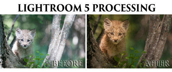
This is Part 3 of a 3-part series on creative color effects in Lightroom. In this article I will explain how to use the Tone Curve tool for creative color effects.
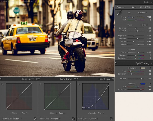
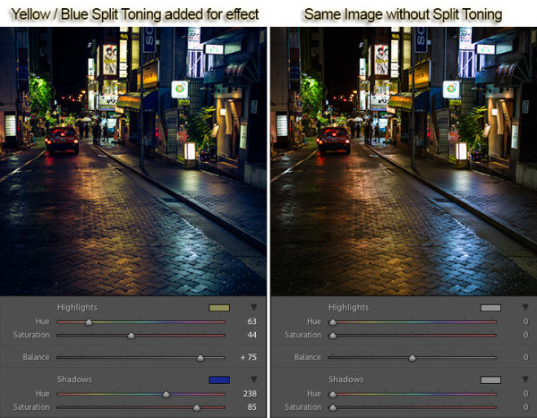
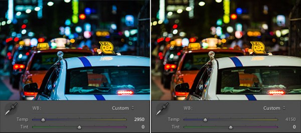
Tokyo Street Scene Color Settings
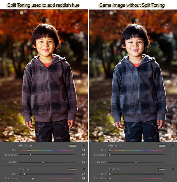
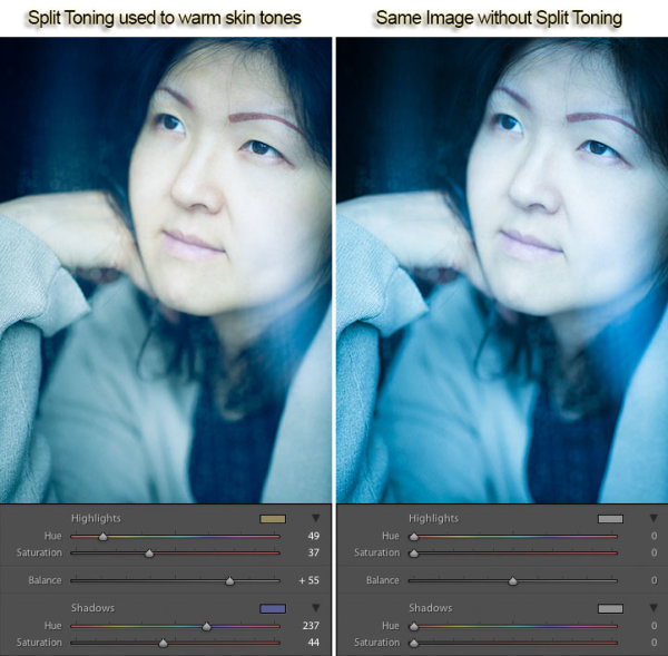
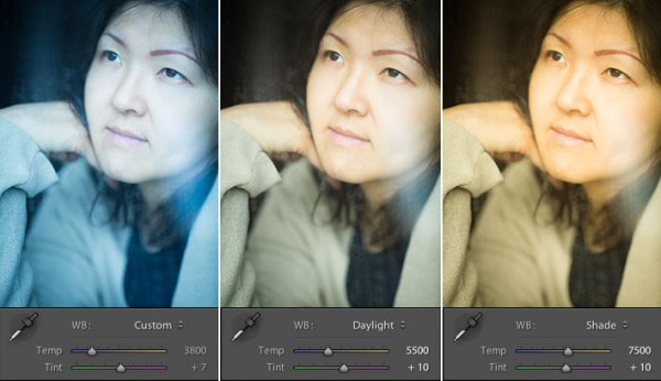
In Part 1 of this series I covered white balance. I discussed split toning in Part 2, as well as how to use split toning and white balance together. If you missed parts 1 or 2, check them out here:
Creative Color Processing (Part 1/3 – White Balance)
Creative Color Processing (Part 2/3 – Split Toning)
Tone curve is perhaps the most powerful tool in our creative color tool box. Tone curve is usually used for precise contrast control, but with Lr 4, we now have access to the individual RGB channels via the tone curve adjustment. Prior to Lr 4, this type of edit required Photoshop.
Note: this technique only works in Lightroom 4 and requires the 2012 process. Check out these articles to learn about Lightroom process versions if you’re not sure what this means:
Understanding Lightroom Process Versions
5 Tips for a Faster Lightroom Workflow
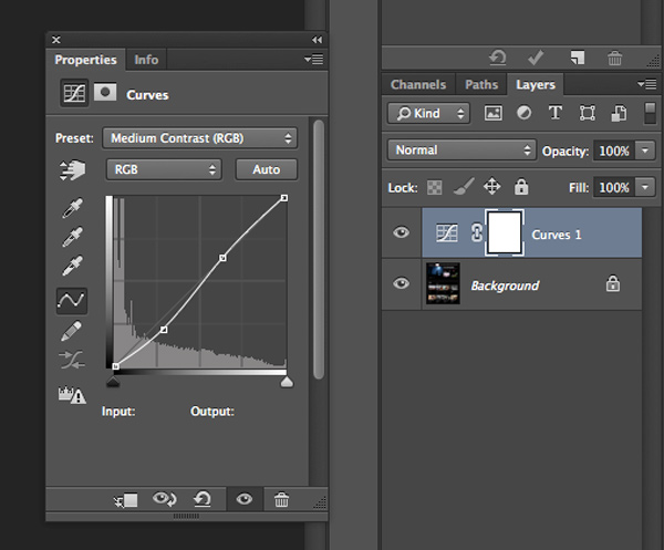
Editing Individual Color Channels with Tone Curve
To access the separate RGB channels in the Tone Curve you need to switch to the point curve adjustment:
1. Click the point curve box in the bottom right of the Tone Curve control:
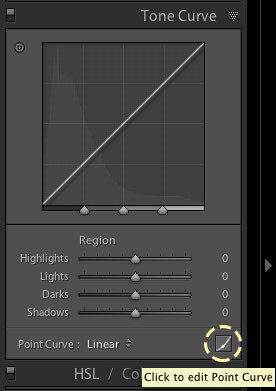
Editing the point curve in Lightroom
2. Choose the color channel you want to work with.
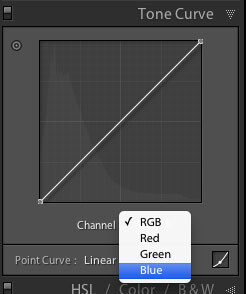
Selecting a color channel in the point curve
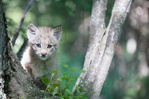
Each tone curve actually controls a pair of colors, and the shades between them. To illustrate this, let’s take a look at this image of joss sticks, that I shot at a temple in Singapore. First, here’s the image without any color adjustments:
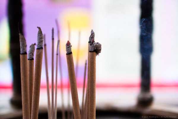
Joss sticks without color adjustments
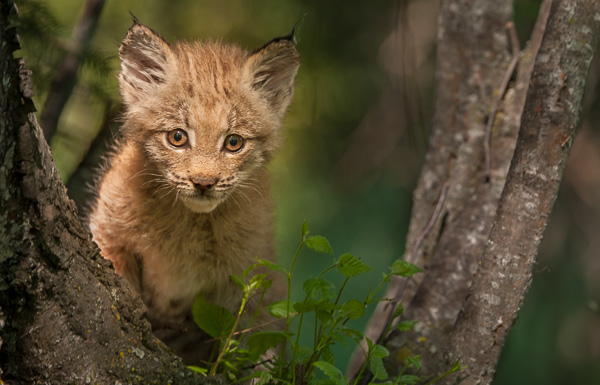
Red Channel
The red channel controls the color range from red to cyan, think of it as the Red / Cyan curve:
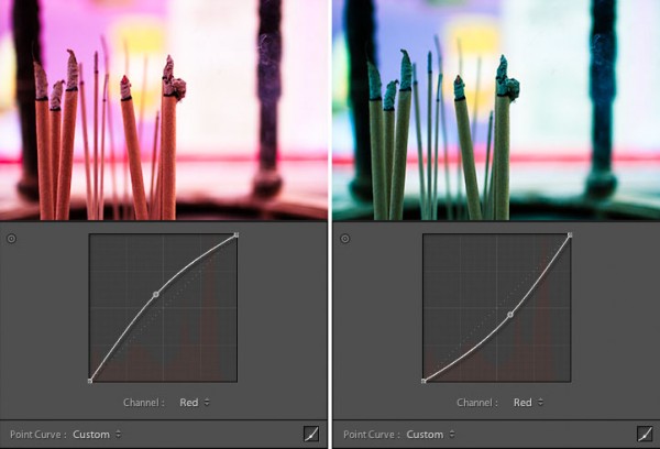
The red channel controls the red / cyan balance
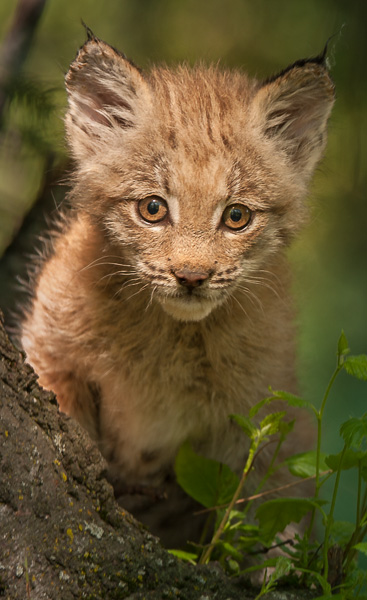
Green Channel
The green controls the color range from green to magenta, think of it as the Green / Magenta curve:
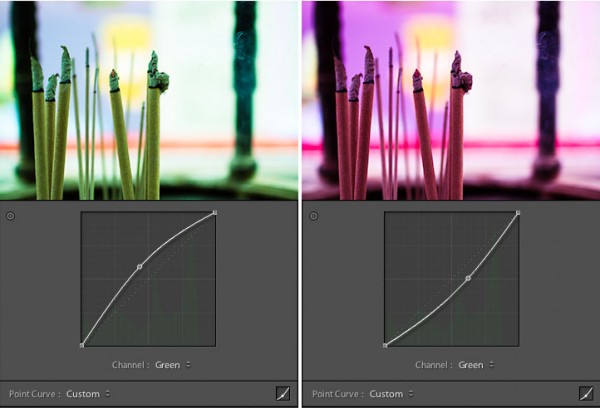
The green channel controls the green / magenta balance
Blue Channel
The blue channel controls the color range from blue to yellow, think of it as the Blue / Yellow curve:
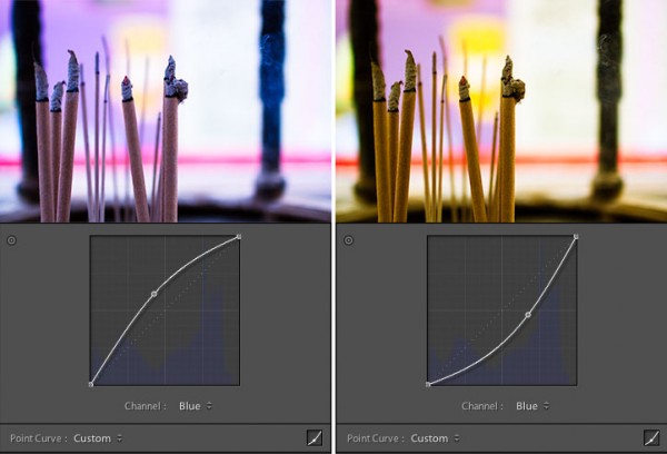
The blue channel controls the blue / yellow balance
The possibilities are endless here, but I’ve found that the blue channel is often the most useful for creative color effects. Simply select the channel you want to work with and click the tone curve to begin adding points. To get rid of a point on the curve, grab it with your mouse and pull it to the side, out of the graph area.
Tips for Editing Color with Tone Curve
1. Play around with the shadow tones, a slight color tint in the just shadow areas of your photo is sometimes just enough to make people stop and stare.
2. Treat the shadows differently than the highlights, this is like taking split toning to the next level. Or the next, next level.
3. Keep at it. It takes time to develop your eye for color, and it takes time to develop your own aesthetic. Over time you will gravitate toward a particular “look” for your images. Just as a musician finds his or her sound, you will find a signature look for your photography. The key is to just keep tinkering, until you find it.
Putting It All Together
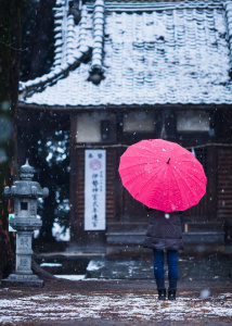 To conclude this 3-part series on creative color processing in Lightroom 4, here’s an image that combines all three of the techniques that I discussed in the series: white balance, split toning, and tone curve.
This is a photo of my wife standing in front of a temple in Takasaki, Japan. A sudden snow storm created an interesting photo opportunity that was too good to miss. The photo at right shows the colors as produced by the camera. The camera was set to auto white balance, which resulted in a white balance value of 4350 for this shot.
I wanted to bring out the mood of the snowy day, and also give the photo a bit of a timeless feel. To do this I combined a cool white balance with a yellow / blue split tone, as well as tone curve adjustments in the green and blue channels. The white balance adjustment gives the image a cold feel. The split toning emphasizes the cold feel by adding blue to the shadows, while also adding yellow to the highlights to keep the snow from looking blue. Finally tone curve adjustments in the green and blue channels give an interesting color cast, mostly to the shadow areas.
Here’s the final result:
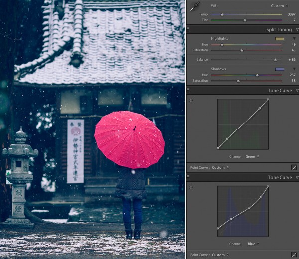
Japanese Temple in the Snow – Creative Color
This concludes the 3-part series on creative color effects in Lightroom 4. I hope I’ve inspired you to think creatively about color and given you some new ideas and techniques for getting creative with your photographs. I appreciate feedback, please comment below or feel free to connect with me through Facebook or Google+. I’ll do my best to answer questions and reply to comments.
Post originally from: Digital Photography Tips.
Check out our more Photography Tips at Photography Tips for Beginners, Portrait Photography Tips and Wedding Photography Tips.
Creative Color Processing (Part 3/3 – Tone Curve)

Digital Photography School


You must be logged in to post a comment.