RSS
 

Posts Tagged ‘Photoshop’

3 Steps to Easily and Realistically Change Hair Color in Photoshop

18 Jul

For those who follow trends you’ll know there is a move to “metallic” hair colors for both men and women, and this is especially evident in fashion photography.

From this, to this in 4 steps.

From this, to this in 3 steps using Photoshop

Whether you want to add extra pizzazz to a fashion shot, jazz up a promotional photo without having your models spend hours (and probably big bucks) at the salon, or to simply see what you’d look like with a different or metallic hair color –  this simple process will help you change the color of a subject’s hair color in a realistic way, with no frustration. You can even use this technique to create fantasy animals for your artistic digital manipulations, by changing the color of their fur with the same steps.

Editing hair has often been a challenging process. Even with the most meticulous editing, the results were often unrealistic, and obvious as manipulations. This workflow changes all that.

Step 1: Masking the Hair

Thankfully Photoshop’s Quick Select tool makes masking hair a breeze. Open the image you want to edit. Select the Quick Selection Tool from the tool palette.

quickselect

Change the size of the brush by using the square brackets keys on the keyboard, you’ll find these next to the “P” on  most keyboards. Now select the hair using the selection brush – you’ll see the famous marching ants as you make your selection. If your selection extends too far use the CTRL key to subtract the selection.

selection

When you have the hair selected, click on the Refine Selection button in the top context menu. This will allow you to soften the edges and add some transparency to the selection to make it very realistic. You’ll see a new palette pop up with some edge options to choose. First, select On White from the View Mode dropdown. This will enable you to see only the hair selection. Next select the Brush from the left hand side, and make the radius between 1.5 and 2.5, this will vary with your image. Now you can brush to bring back some of the transparency around the edges, especially where there are fine hairs such as the bottom left in this image.

selection-tools

Once you’ve refined the edges, go to the Output section and select New Layer with Layer Mask. This will output your refined edge selection on a new layer, which you’ll use in the next step.

Step 2: Create your Color

Here’s your opportunity to bring our your inner stylist. First, go over to the Layers Palette. Here, you’ll make a special Adjustment Layer using Color Balance adjustment. To do this first make sure that the layer mask thumbnail on your recently created layer is active. Don’t click on the thumbnail of the photo. What you’re doing here is telling the Adjustment Layer you’re creating, to ONLY affect the hair selection.

Now CTR+click in the layer mask thumbnail to get the marching ants selection on your image. Next, at the bottom of your layers palette, click on the Adjustment Layers icon to create your new adjustment layer. From the pop-up  menu, choose Color Balance. You’ll now see your new adjustment layer called Color Balance, at the top of your stack.

create-color-balance-layer-mask

Now make the Color Balance layer active by clicking on the scales icon thumbnail. This will bring up the color balance sliders where you can now create the color for your hair. Remember to also use the top drop-down in the slider pop-up to also adjust the highlight and shadow tones.

color-balance

You’re now ready to apply your color. Depending in whether you’re going for a bold and artistic look, or fashionable and metallic, your color choice will be made here in the color balance adjustment layer. Play around with changing all the colors, and note the results. In the final step you’ll be adjusting the intensity and the opacity of the color to make it look realistic, no matter what style you want to show.

Step 3: Blend Modes and Opacity

At this point, you’re ready for the fine detail adjustments to ensure your new hair color looks realistic, and not Photoshopped. All you need to do now is adjust the opacity and the blend modes of your color balance layer. T0 achieve the metallic look try blending mode HUE with an opacity of 75%.

For bolder looks try SATURATION or SOFT LIGHT. Depending on what colors you’re using you can also achieve great looks with DARKEN and SCREEN.

Stylistic Color

Here we have four totally different looks. They are all from the same file and one adjustment layer, just by changing colors with color balance; and varying the intensity using opacity and blending modes.

haircolor3 haircolor4 haircolor6 version

Here’s the PSD file for you to practice with (zip format). Download it to your computer. Unzip and open the PSD in Photoshop.

The original image is used under the Creative Commons license and is attributed to Looking Glass.

googletag.cmd.push(function() {
tablet_slots.push( googletag.defineSlot( “/1005424/_dPSv4_tab-all-article-bottom_(300×250)”, [300, 250], “pb-ad-78623” ).addService( googletag.pubads() ) ); } );

googletag.cmd.push(function() {
mobile_slots.push( googletag.defineSlot( “/1005424/_dPSv4_mob-all-article-bottom_(300×250)”, [300, 250], “pb-ad-78158” ).addService( googletag.pubads() ) ); } );

The post 3 Steps to Easily and Realistically Change Hair Color in Photoshop by Alex Morrison appeared first on Digital Photography School.


Digital Photography School

 
Comments Off on 3 Steps to Easily and Realistically Change Hair Color in Photoshop

Posted in Photography


How To Create Two of the Same Person in One Photograph Using Photoshop

12 Jul

This is a fun twist on portraiture that can often tell a bit more of a story about your subject, by allowing them to reveal two or more sides to their personality. It’s an old photography trick used in the days of the darkroom, and now with modern technology can be done in minutes with a few simple steps in Photoshop.

First you are going to need two or more photographs of your subject, so find yourself a victim to experiment on, or try a self portrait. The main trick to this technique is to get things set up well in the shooting stage so everything goes smoothly when you go to edit.

Getting Set Up to Shoot

You’ll need to put your camera on a tripod. Your tripod position, lighting setup, your camera and its settings, all need to remain the same throughout the shooting session. Once you’re set up don’t move or twiddle anything, otherwise things can get a bit wobbly when you go to blend your final images.

It is possible to do this with natural light, but you’ll have to work fast before the light changes too much. If you don’t have studio lighting you can try light painting or some of the other DIY lighting tips from my article Creating Effective Studio Lighting with Household Items

Start with a simple set such as two chairs. To make it a bit more interesting, add something like a small table in between with a prop or two; your subject could be sharing a cup of tea or a glass of wine with themselves.

portrait-photography-trick02

Positioning your subject

Once you have set your stage and are happy with how it looks through the viewfinder, bring in your subject to test out the lighting on them for both positions. Then you are ready to roll.

Think about how the different versions of your subject will interact with each other. Will they be in conversation, raising a glass congratulating themselves on a portrait sitting job well done perhaps? In such a case it’s important to get their line of site correct to achieve the illusion of the subject looking at themselves.

portrait-photography-trick03

It is a good idea, when first attempting this, to ensure there is no overlap of the two versions of your subject, such as a stray foot, to save you any extra fiddling about in the editing stage. You can help to keep both versions separate by placing a small marker, such as a tiny bit of tape on the floor in the middle of your setup, so your subject knows where that invisible overlap line is located.

For the shot below I had the female version lean on a rolled up towel to imitate the knee of the male version of herself. This gave a natural lean to her pose and helped create the illusion that she is actually leaning on the male version’s lap.

portrait-photography-trick04

Take as many shots as you and your portrait subject have the time and patience for. The more versions you have, the better chance of finding a perfect match in the editing stage. Try different facial expressions and poses for each version of your subject.

Easy editing

We are going to be working with layers here, but if that’s new to you don’t panic! It really is easier than you might think. Just follow the few steps below and you’ll be pulling a photographic rabbit out of a Photoshop hat in no time.

  • Open your favorite image of each version of your subject in Photoshop.
  • Make sure both images are the same size.
  • Using the Move Tool, click on the thumbnail of the first image in its Layers Palette, drag over the top of the second image and let go.
  • You now have both images on top of each other in the same file, seen as Background and Layer 1 in the Layers Palette (shown below).

portrait-photography-trick05

  • You’ll need to see both versions, so go to the Layers Palette and select the Layer 1 thumbnail.
  • Using the Opacity slider just above it, slide it around until you can see both images, about 50% usually works the best.

If you haven’t moved anything about during shooting the images should line up perfectly. In which case, you’ve done the hardest part already, it’s smooth sailing from here.

If your setup got bumped, you can probably still line things up well enough to work. Just use the Move Tool to slide around top image and try and get the best alignment. It helps to zoom in to check accuracy (you can also use Auto-Align Layers” in the edit menu but it may be fooled by the subject – but give it a try).

portrait-photography-trick06

Now the fun part

  • Select Layer 1 in the Layers Palette.
  • At the bottom of the Palette is a little square with a circle in it, commonly known as the Add Layer Mask button, or as I like to call it, the Where the Magic Happens button.
  • Click on it and a Layer Mask white box will appear next to the image thumbnail.

It’s not sounding very magic so far, but hang in there.

  • The Background and Foreground Colour squares at the bottom of your Tools Pallette will need to be black on the top (foreground color).
  • Select a brush, set to zero hardness and get ready to make magic happen.
  • Set both Layer and Brush Opacity sliders to 100%.
  • Make sure that white Layer Mask thumbnail is still selected.
  • Start brushing and watch as the second version of your model magically appears, tada!

portrait-photography-trick07

Don’t worry if you go too far, and erase something more than you intended, if you do, you can just switch those little black and white boxes in the Tools Pallette with the tiny arrows (or press X on your keyboard) so white is on top, then brush back in to reverse the mistake (black conceals, white reveals).

That’s it! All the tricky stuff done and dusted.

Now you simply flatten the image. File> Flatten Image, and all that is left is to edit as you would any other photograph. For this image it was a crop here, a filter and color adjustment there, and erasing the umbrella light reflection in the window.

portrait-photography-trick08

This technique is something you can really play with, from building sets and getting creative with props, or simply using it to get more of a story from your portrait subject. Either way, it is great fun to try. If you do, please share your results in the comments. Happy experimenting.

googletag.cmd.push(function() {
tablet_slots.push( googletag.defineSlot( “/1005424/_dPSv4_tab-all-article-bottom_(300×250)”, [300, 250], “pb-ad-78623” ).addService( googletag.pubads() ) ); } );

googletag.cmd.push(function() {
mobile_slots.push( googletag.defineSlot( “/1005424/_dPSv4_mob-all-article-bottom_(300×250)”, [300, 250], “pb-ad-78158” ).addService( googletag.pubads() ) ); } );

The post How To Create Two of the Same Person in One Photograph Using Photoshop by Lea Hawkins appeared first on Digital Photography School.


Digital Photography School

 
Comments Off on How To Create Two of the Same Person in One Photograph Using Photoshop

Posted in Photography


Photoshop alternative Affinity Photo now available in Mac App Store

10 Jul

In February, Serif launched a beta version of its image editing application Affinity Photo. The software is a Photoshop alternative designed specifically for Mac OS X, and the beta has been updated several times since the February launch. Serif has just taken the software out of beta and officially launched it in the Mac App Store. Read more

Articles: Digital Photography Review (dpreview.com)

 
Comments Off on Photoshop alternative Affinity Photo now available in Mac App Store

Posted in Uncategorized


The First 3 Photoshop Blend Modes You Need to Understand

07 Jul

Photoshop can be extremely intimidating to learn, but once you start to get a grasp on some of the tools it has to offer, you’ll wonder how you ever processed photographs without it. If there’s one area of Photoshop that is both extremely confusing, and yet, extremely powerful when harnessed properly, it’s got to be the collection of blend modes. While this article won’t cover all of the options available within Photoshop, it should give you a good place to start your journey into using Photoshop blend modes.

Photoshop blend modes: a few basics to get you startedphotoshopblendmodes

  • Photoshop blend modes are found in a drop down menu at the top of the layers panel (it defaults to “Normal”)
  • There are 27 different options to choose from, including the default “Normal” blend mode.
  • Adobe has organized these 27 blend modes into six different categories
    • Normal – Contains blend modes that don’t actually blend the layer being selected. (Normal shows the layer, and the dissolve layer essentially just removes pixels from the top layer as you reduce the opacity this effect is increased).
    • Darken – These blend modes use 100% white as a neutral, they have an overall darkening effect on images.
    • Lighten – Here Photoshop is using 100% black as a neutral, they have an overall lightening effect on images.
    • Overlay – In the Overlay mode Photoshop is blending the top layer and bottom layer together in a way that adds contrast. The effect of this changes based on the opacity of the layer, and the type of blend mode selected.
    • Difference – The difference set can be referred to as the inversion group, as these blend mode options are often used to either cancel colors of the layer below it, or to invert them.
    • Hue – Here Photoshop allows you to get very creative with the HSL of the layers in question.
  • When you apply a blend mode to a layer, it takes the effect of the given blend mode and it is applied to the layer directly below it within Photoshop.

To simplify the process of trying to learn all 27 blend modes at once below, let’s learn about the three most versatile blend modes Photoshop has to offer.

The first three Blend Modes you need to learn

In all the example photographs below I’ll be using two layers to demonstrate the different effects of each of the three blend modes. The top layer is simply a white, gray, black layer and the bottom layer is the same image placed under those three colors.

3-tones

White, gray, black layer.

Multiply Blend Mode

This blend mode falls within the “Darken” group and therefore it is considering 100% white a neutral. The basic math behind how this blend mode works is that the dark pixels of the background layer are multiplied with those of the foreground layer and combined. Therefore the result you end up with is an overall darkening of the image, as the dark pixels within both layers become more significant while the light pixels are essentially removed.

blend-modes-multiply


As you can see in the 50% gray layer, the darker pixels from the gray foreground layer are helping to darken the layer below it.

This blend mode is great for creating shadows or removing bright pixels from an underlying layer. It can be used in conjunction with a curves adjustment layer to add additional darkness to a layer. By effecting the dark end of the curve this can become really handy when trying to emphasize shadows, or darken an image.

Screen Blend Mode

As mentioned above, the lighten group sets black as neutral and therefore when we use the screen blend mode the black layer has no effect, 100% white stays as white and the 50% gray is somewhere in the middle.

blend-modes-screen


In a similar mathematical method to the Multiply blend mode the screen blend mode is multiplying the light pixels of both the foreground and background layers to achieve the final blend. As you can see in the above example, at 50% gray the light pixels are made even lighter as the bright pixels of the gray layer are multiplied with those of the layer below it.

The Screen blend mode is therefore great for removing darkness from an image or can even be used to create soft glow effects around a subject.

Soft Light Blend Mode

Here the formula used by Photoshop is essentially both that of the Multiply and Screen blend modes, then that effect is divided by two. What this means is that you’ll be darkening the dark pixels and lightening the light pixels, and then dividing the end result by two (or 50% of full strength). What ends up happening is an overall increase in contrast of the image

As a result, the Soft Light blend mode, is a great way to add a bit of contrast to an image. For an even stronger effect – use the Overlay blend mode.

blend-modes-softlight


One of the best techniques for using this technique is to duplicate your layer and apply the Soft Light blend mode to that layer. You’ll se an instant increase in contrast which can then be fine tuned with the opacity slider of your duplicated layer.

An example of Photoshop blend modes in action

photoshopblendmodes1

Original – (placed as Full Size 750 x 378)

The original image was a bit on the flat side, so by duplicating this layer, and changing it Soft Light blend mode, you’ll notice an increase in contrast. This higher contrast look works well with the rocks, and graffiti wall behind the model.

photoshopblendmodes2

Duplicated with Soft Light blend mode

To take it a step further, a Curves Adjustment Layer was added above the duplicate layer and the blend mode was set to multiply. A layer mask was then applied to this Curves layer to reveal it only over the model’s upper body and face. By applying this small adjustment you’ll notice a bit more definition in the face and shadows.

photoshopblendmodes3

Curves adjustment + Multiply blend mode added to model’s face and upper torso to add definition and shadow detail.

These three Photoshop Blend modes are just the beginning, but the key to learning a program the size and depth of Photoshop, is to take it in bite sized pieces or you’ll get frustrated and give up quickly. I hope that by focusing your attention to just these three blend modes you’ll be able to digest the program a bit easier.

googletag.cmd.push(function() {
tablet_slots.push( googletag.defineSlot( “/1005424/_dPSv4_tab-all-article-bottom_(300×250)”, [300, 250], “pb-ad-78623” ).addService( googletag.pubads() ) ); } );

googletag.cmd.push(function() {
mobile_slots.push( googletag.defineSlot( “/1005424/_dPSv4_mob-all-article-bottom_(300×250)”, [300, 250], “pb-ad-78158” ).addService( googletag.pubads() ) ); } );

The post The First 3 Photoshop Blend Modes You Need to Understand by John Davenport appeared first on Digital Photography School.


Digital Photography School

 
Comments Off on The First 3 Photoshop Blend Modes You Need to Understand

Posted in Photography


How to Watermark Your Images Using Lightroom and Photoshop CC

29 Jun

Watermarks, love them or hate them, are a way of protecting your images. Although, just because you have one on your image doesn’t mean it won’t be stolen. If you are like me, I do it as a deterrent.

There are many ways to watermark your images. In this article I’m going to show you how to add a watermark to your images using Adobe Lightroom and Photoshop CC.

Lightroom (6) CC

Lightroom makes watermarking your images very easy, there are a couple of ways of doing it. Once you have processed your images and are ready to export them, then it is also time to watermark them.

Exporting Your Images

Select the images you want to export and watermark. You need to make sure you are in the Library module, then click on Export.

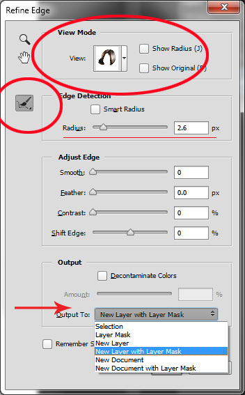
The Export Window will come up. We aren’t going to go through how to export your images, there are other tutorials that will show you how to do that. For this purpose we are concerned with the section down near the bottom, so scroll down until you see Watermarking. Take a look at the following image.

watermarking-1

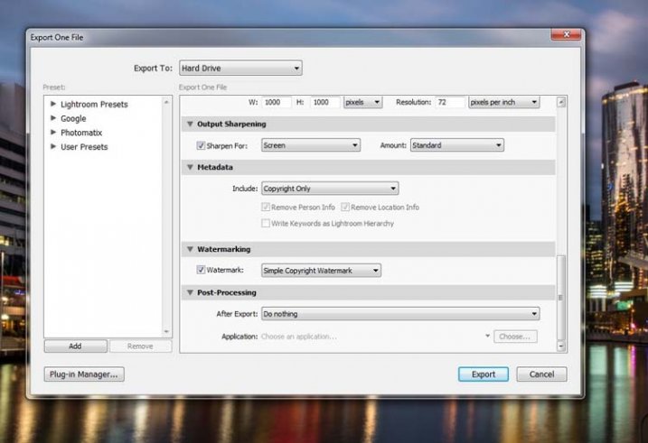
If it hasn’t been ticked, then check the box for Watermark. Next to that is a drop down menu click on that.

Simple Watermark

watermarking-2

If you’ve never watermarked anything before, then you could simply click on Simple Copyright Watermark and it will just put your name on the photos. Though you must be registered in order for Lightroom to know your name.

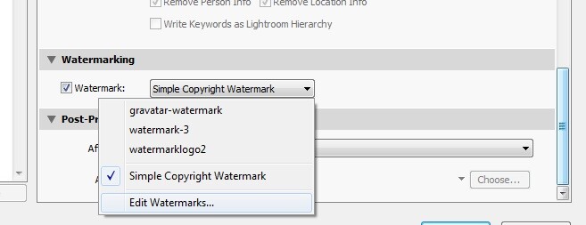
Another option under that drop down menu is Edit Watermarks, so let’s go through that option.

Edit Watermarks

In this section you can edit the text for the water, or what you want it to look like.

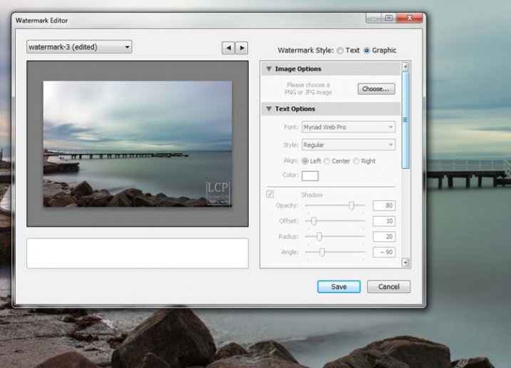
Before you can change the simple watermark you will have to make sure that at the top where it says Watermark Style, you have selected Text. In the image below you can see the window for the Watermark Editor and in the top right corner you can see Watermark Style.

watermarking-3

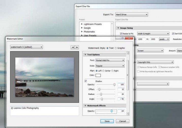
In the box underneath the image you can see the simple watermark, you can now select that and delete it, and write anything you like. The most common thing to do is put the copyright symbol, ©, with your name or business name after it. To make the copyright character on Windows simply press the Alt key and type the number 0169, on a Mac press Option+G.

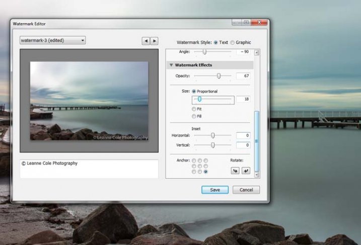
There are various sliders in the Watermark editor as well, one allows you to change the opacity of the watermark. How opaque you make it is up to you. I like to make mine so that you can barely see it. A lot of people looking at images can find watermarks distracting, so it is something you should keep in mind when you are adding them to your images.

There are different things you can do to adjust the watermark, for example changing its position. There is also a size slider to make it bigger or smaller.

watermarking-4

Add a Logo or Unique Watermark

If you have a logo or a special watermark you can use this in Lightroom too.

In the same window that we have been using, go back to the top and select graphic. Directly underneath you will see Image Options where you can load your file. You can make the same changes in regards to size, opacity and location as you did with the text watermark.

watermarking-5

Saving the Watermark Preset

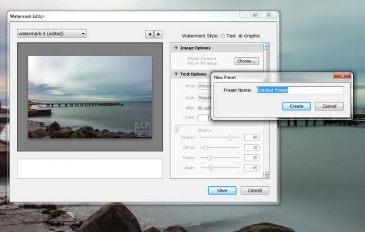
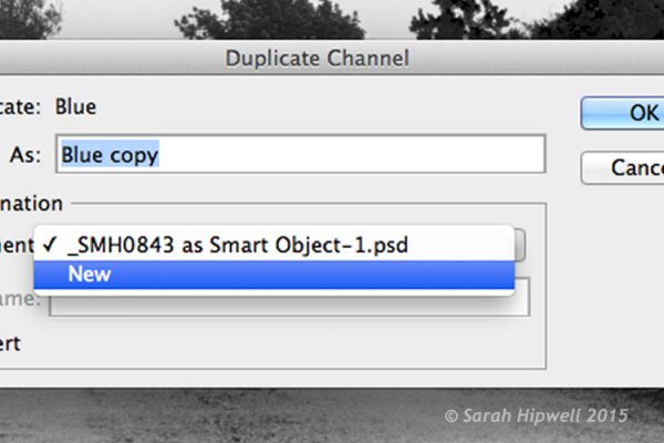
Once you have worked it all out, you don’t have to do all that every time you want to export images. You can save what you have done as a watermark preset, and give it a name (pull down the menu top left where is says “Custom” to find Save Current Settings as New Preset – select that to see the pop-up box below) . The next time you want to watermark an image, just look in the same drop down menu that you used earlier to edit the watermark, and you will find your saved preset there.

watermarking-6

Here you can see that I have called one of my presets: watermark-3.

Photoshop CC

There are also some simple ways of watermarking in Photoshop CC as well. It is a little different, but not harder.

Prepare your image as usual, then get it ready for its designated use and how you want to add a watermark to protect it. I resize every image I put online, that is my choice, it is up to you whether you decide to or not.

Easy Watermark

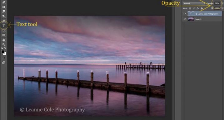
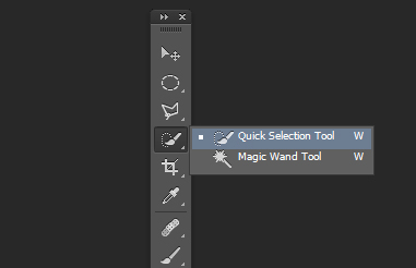
Once you are ready to save your image, read for use, one of the easiest ways of watermarking it is to simply use the text tool, located in the tool bar on the left of your workspace. The image below shows where it is located.

Click on the image where you want to put the watermark, and start typing. Remember you can also add the copyright symbol the same as you did using Lightroom.

You can change the size and colour of the text at the top, in the tool options bar below the main menu (or choose Window>Character to show the text adjustment panel). Select the text to change it. You can also move it around when it is highlighted as well. The opacity slider is above the layers panel on the right, you can change it to suit your preference.

watermarking-7

Making Your Own Logo or Watermark

You always have the option of making a custom watermark, which can be saved and used any time you need it, and can also be used in Lightroom.

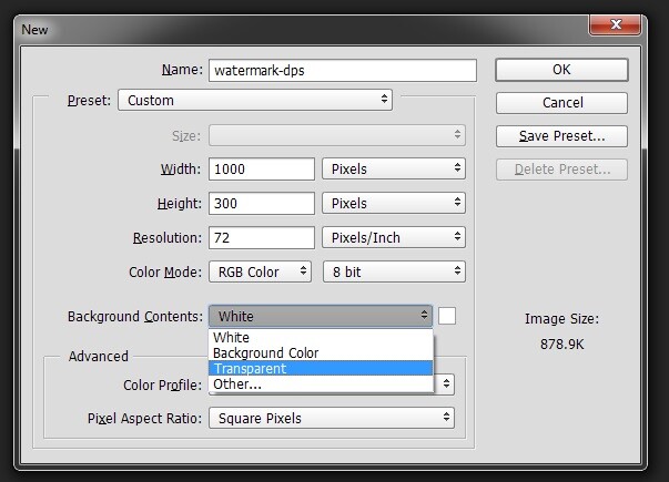
To start, go to File in the main menu and click New (File>New). I usually make the size of the new image match my final image size, so the longest side is 1000 pixels. Make the width that size for this example. For the height, it doesn’t have to be that big, it just depends on what you are going to do. For this one it was 300 pixels. You will also need to make sure the Background Contents setting is set to transparent, see below.

watermarking-8

So you can see what you are doing, you could add a new layer. Do that from the new layer icon at the bottom of the Layers Panel, or go to the main menu at the top and select Layer>New>Layer and click OK. Once that is in place use the Paint Bucket Tool which is in your tool bar, it is under the Gradient Tool icon. We are going to make the layer black, so make sure the foreground colour is black. The foreground and background colour selection is also in the tool bar, down near the bottom. There are two squares, one black and one white (click D on your keyboard which defaults the colors to black in the foreground, white in the background). Click on your new layer and it should be filled with all black.

Select the text tool (T) and make sure that white is now the foreground colour (click X on your keyboard to switch the foreground/background colors so white is now on top). Click on your image and start typing. Like you did for the Easy Watermark you can highlight it, then change the size. Once you’ve done that, you can crop it further so just the text appears.

Double click on text layer, towards the right side, and you should get the following window, Layer Style.

watermarking-10

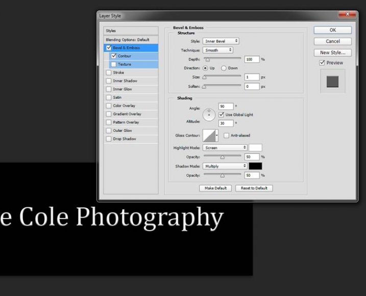
You can see I have checked Bevel Emboss, and the Contour option underneath. You can play around with the sliders, but just ticking those did enough for this purpose. Then the black layer is deleted. You can do that by dragging it to the rubbish bin (trash can) in the bottom right corner. You can also right click on the layer and find delete. The easiest way is to highlight the layer by clicking on it, and pressing delete on the keyboard.

It is very important when you save this file that you do so as a .png or a .psd, otherwise the transparent part of the layer will be made white and you will no longer have the watermark that you desired.

watermarking-11

That is an easy way of doing a watermark that you can save so you can use again, but you could make a logo or something similar as well. One thing that quite a few people do is add a signature, like below.

signature-watermark

There are a couple of ways of doing this, but the most common is using a tablet with a pen, I use a Wacom Intuos Pro. Do everything the same as you did for the last one, but instead of using the text tool, get your brush, make it small enough using the left square bracket key, then write your name.

If you find the surface too slippery, try putting a piece of paper over the top, it will help add some resistance. You can also try doing it with a mouse or touch pad. Again, save it the same way.

Easy Way of Adding Watermarks

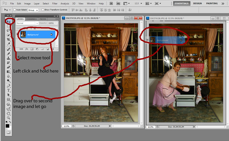
One of the easiest ways to use the watermark you have just created is to open it, then select all (Ctrl+A on a PC and Command+A on a Mac), then copy it, (Control+C on a PC and Command+C on a Mac). Go over to your image and press Ctrl+V or Command+V to paste it; the watermark should now be in the middle of your image.

You can use the move tool (V), which is the first one in your tool panel, and move it to where you want, like you did with the Easy Watermark.

Hiding Your Watermark in the Image

With a simple watermark you can also put it into the image and sort of hide it. This is the method I use for many of my fine art images. I try to place it where it isn’t obvious, and where it could be more difficult to remove.

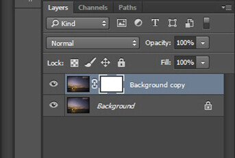
Once your image is ready, copy and paste your watermark onto your image. Now you need Transform it; Edit>Transform in the main menu, or by pressing Ctrl+T/Command+T. You will notice a framework around your image, as shown below.

watermarking-12

By clicking and dragging on the corners, or in the middle of the lines, you can change the size. Click and drag to make it bigger or smaller (hold Shift down to keep the proportions the same, otherwise it will stretch out of shape). If you want to rotate it, hover around just outside a corner and a small curve arrow will appear, then you can turn it around. You can also move it by clicking in the middle and moving it where you want. As I said, find somewhere to hide your watermark in the image, hopefully somewhere not too noticeable, as demonstrated in the image below.

watermarking-13

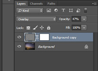
To apply the Transform Tool you can double click inside the box, press Enter or click it with the move tool. Then the opacity of the watermark layer is changed to help it blend, see below.

watkinsbaywatermarked-2

Once you get good using Transform, you can experiment with what else the tool does.

Using a Brush to Watermark Your Images

watermarking-14There is a very easy way of doing your watermark, but it takes a bit to set it up. Getting the watermark ready pretty much works the same as before, only this time you want a white background, and you need to use black to create it. Take a look at the image on the right.

Note: create your new file 2500 pixels wide as that is the maximum size for a brush. You can always make the brush smaller when you apply it to your image, but making it the largest size now will give you the best quality.

I created the signature with my Wacom Tablet, but you could also use a pen or black marker on a piece of paper and scan it, that will work just as well.

Once you have your signature, you can now make your custom brush. Go to the Edit menu and choose Define Brush Preset, and click on it.

watermarking-15

watermarking-16
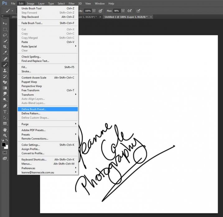
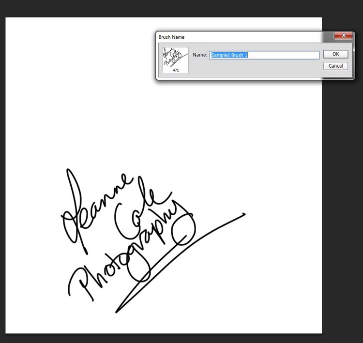
Next, you will see another window pop up window ,asking you to give your brush a name. You can name it what you like, perhaps something that will remind you what it is later; I called mine Brush Signature Watermark.

Now your watermark will work just like a brush, you can make it smaller or larger (remember if you made it 2500 pixels it will hold quality up to that size with out pixelating), you can also change the colour. It works exactly the same way as the normal brush does; use the square bracket keys to make it bigger or smaller. If you want to change the colour, click on the foreground colour and the Color Picker window will appear.

I would suggest adding your watermark to a new transparent layer, so you can also change the opacity as needed.

To find your new brush, go to your brush presets, they are over on the side of your layers panel, and click on the icon that looks like small lines at the top where a drop down menu should appear.

watermarking-18

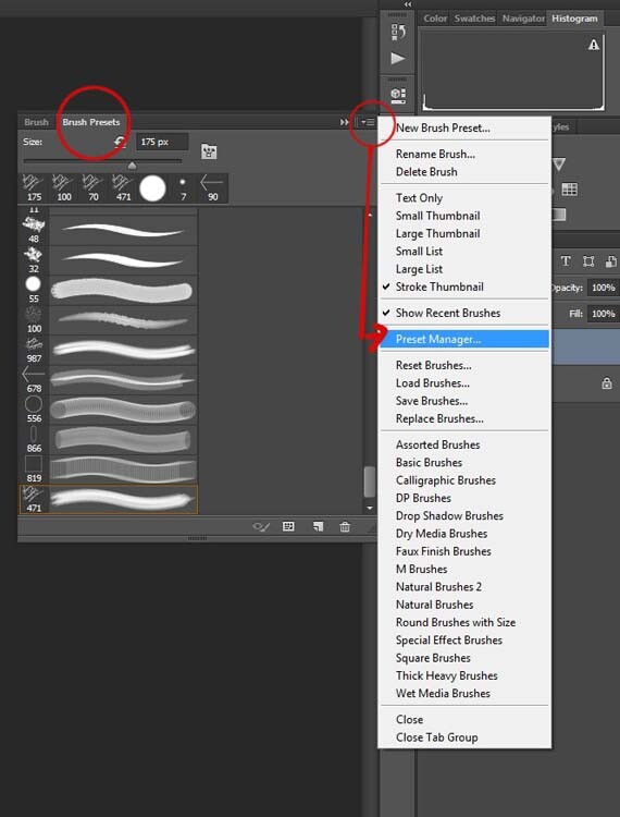
Go down to Preset Manager and click. A new window will appear with all your brushes. Now you can click, and drag the brush you just created to a spot where it will be easier to find, like up to the top.

watermarking-19

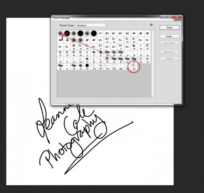
You are now ready to use your new watermark brush any time you want.

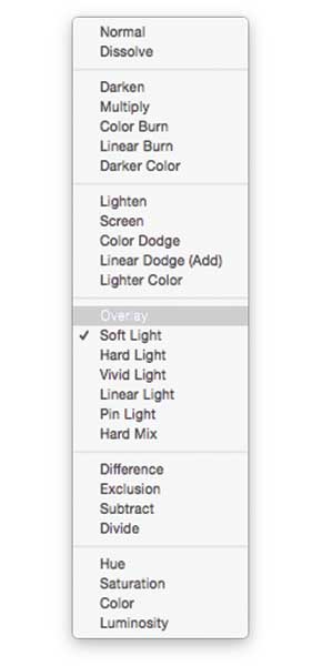
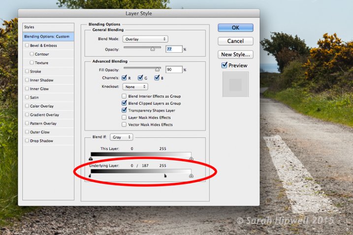
As I said, you can change the size of it using the square bracket keys [ ] on your keyboard. You can change its colour by clicking on the foreground colour in the tool panel and selecting a new one. You can also add layer effects like a drop shadow, emboss, etc., you can even make the text itself transparent and only leave behind the shadow.

layer-effects

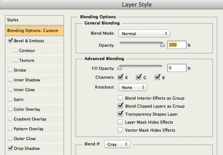
To make text “invisible” change the Fill Opacity Under Blending Options, in the Advanced Blending section to 0%.

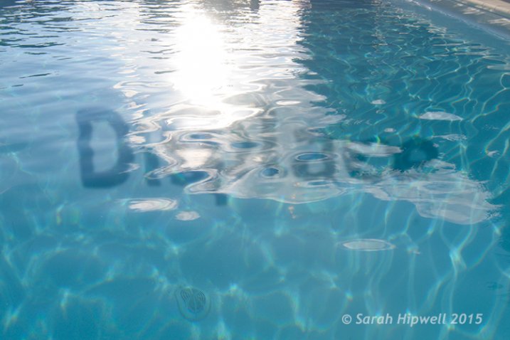
It will look something like this and will blend into any area:

layer-effects-transparent

Here is one I played with:

watermarking-17

There are so many different ways to do a watermark and it is really up to you to work out which one will work best for you. Do you have any other tips for watermarks or methods  you use to make them? Please share in the comments below.

googletag.cmd.push(function() {
tablet_slots.push( googletag.defineSlot( “/1005424/_dPSv4_tab-all-article-bottom_(300×250)”, [300, 250], “pb-ad-78623” ).addService( googletag.pubads() ) ); } );

googletag.cmd.push(function() {
mobile_slots.push( googletag.defineSlot( “/1005424/_dPSv4_mob-all-article-bottom_(300×250)”, [300, 250], “pb-ad-78158” ).addService( googletag.pubads() ) ); } );

The post How to Watermark Your Images Using Lightroom and Photoshop CC by Leanne Cole appeared first on Digital Photography School.


Digital Photography School

 
Comments Off on How to Watermark Your Images Using Lightroom and Photoshop CC

Posted in Photography


10 Things Photoshop Beginners Want to Know How to Do

22 Jun

Terry White is an Adobe Photoshop expert and in this video he answers the 10 things that Photoshop (particularly for Photoshop CC) beginners want to know how to do including:

  1. How to touch up a photo; how to make people look better
  2. Layers and adjustment layers; what are they and how to use them
  3. Working with layer masks
  4. How to crop a photo
  5. Adjusting the exposure and using the Adobe Camera Raw filter
  6. Removing something from an image
  7. Move or copy objects in a photo
  8. How to put a person from one photo onto a new background (or putting two photos together)
  9. How to add text
  10. Saving photos and saving formats that are shareable

It’s a bit of a long one but some really good tips in here that I’m sure you’ll find helpful if you’re new to Photoshop.

He also mentioned grabbing a Wacom tablet to use for your editing instead of a mouse. I use one in Lightroom as well and it is much better and more precise and doesn’t leave you with a cramped hand after working on images for hours.

googletag.cmd.push(function() {
tablet_slots.push( googletag.defineSlot( “/1005424/_dPSv4_tab-all-article-bottom_(300×250)”, [300, 250], “pb-ad-78623” ).addService( googletag.pubads() ) ); } );

googletag.cmd.push(function() {
mobile_slots.push( googletag.defineSlot( “/1005424/_dPSv4_mob-all-article-bottom_(300×250)”, [300, 250], “pb-ad-78158” ).addService( googletag.pubads() ) ); } );

The post 10 Things Photoshop Beginners Want to Know How to Do by Darlene Hildebrandt appeared first on Digital Photography School.


Digital Photography School

 
Comments Off on 10 Things Photoshop Beginners Want to Know How to Do

Posted in Photography


Tips for Enhancing Night Sky Photography in Photoshop

17 Jun

You will learn some important steps of enhancing a night sky photo in this tutorial. It is specifically useful if your photos were shot in areas with notable light pollution. Light pollution could spoil your photo by outshining the comparatively dim stars in the sky. Here are the tips for bringing back those spectacular stars in the sky.

First a slight digression, I recommend to shooting your night sky photos in RAW format if you aren’t already. This is because RAW has an incomparable dynamic range which enables you to bring back the details of the photo, including the night sky in post-processing.

Pic1

The photo in the above screen capture is underexposed. We will need to play around with the exposure adjustments in a RAW Editor first. Generally, if the exposure of a dark image is boosted too much, there will be tons of noise. It is because the sensor failed to capture sufficient photons when the photo was underexposed. Therefore, the differences in the number of photons among pixels are significant. Such differences are the culprit of noisy images.

Pic2

First, you have to increase the exposure until the brightness of the photo appears to be appropriate. While adjusting the exposure parameter, use the histogram in the top right corner as a reference.

Pic3

You may want to play around with the value of the Highlight, Shadows, Whites and Blacks sliders for fine tuning the exposure. After that, add some contrast to the photo, this will make the stars stand out a little bit.

Pic4

You will need to boost the Clarity here for the whole scene. This improves the sharpness of the photo, including the stars. In my opinion, a bluish night sky is far more impressive and, therefore, you will need to adjust the Temperature setting. I would recommend a color temperature between 3500-4100. This will strike a balance between realism and aesthetic. Then, click “Open Image” (if you’re using Lightroom right click and choose “Edit in Photoshop” to continue with the next steps).

pic5b

Make a duplicate a copy of the Background layer after opening the image. Right click on the original layer, and click on “Duplicate Layer” from the pop-up menu. After that, create a layer mask for the duplicated layer. To create a layer mask, you will need to have the new layer chosen and click on the third button at the bottom of the Layer panel. Then, select the image next to the layer mask in the Layer panel.

Pic6

Now you are going to add a High Pass filter to the newly duplicated layer. Choose Filter > Other > High Pass. This is to further enhance the visibility of the stars.

Pic7

A pop-up window will appear, tweak the Radius until the stars are being highlighted in the preview.

pic8b

Head back to the Layers panel. You will have to switch the Blending Mode of the layer from Normal to Overlay. The whole image will be sharpened noticeably. If you feel like the image is over-sharpened, you can lower the Opacity of the layer.

Pic9

You may find that the areas outside the night sky are being oversharpened. In order to remove the excessive sharpening from the other areas, you will have to erase (hide) them by painting on the layer mask that you created earlier.

Pic10

First, choose the layer mask in the Layer panel. Then, paint over the unwanted areas (the highlighted area in the above screen capture) with a black-colored brush.

Here is the final result:

Before

BEFORE

IMG 0110

AFTER

Conclusion

There are three techniques for enhancing the visibility of stars in the night sky. First, adding some contrast to the photo will help to a certain extent. Secondly, increase the clarity of the whole photo. Lastly, don’t forget to use the High Pass filter sharpening for the final enhancement. Thanks for reading, I hope you enjoyed it.

googletag.cmd.push(function() {
tablet_slots.push( googletag.defineSlot( “/1005424/_dPSv4_tab-all-article-bottom_(300×250)”, [300, 250], “pb-ad-78623” ).addService( googletag.pubads() ) ); } );

googletag.cmd.push(function() {
mobile_slots.push( googletag.defineSlot( “/1005424/_dPSv4_mob-all-article-bottom_(300×250)”, [300, 250], “pb-ad-78158” ).addService( googletag.pubads() ) ); } );

The post Tips for Enhancing Night Sky Photography in Photoshop by Chris Yiu appeared first on Digital Photography School.


Digital Photography School

 
Comments Off on Tips for Enhancing Night Sky Photography in Photoshop

Posted in Photography


Adobe Updates Photoshop and Lightroom with Creative Cloud 2015 and Launches Adobe Branded Stock Photography Library

16 Jun

Lightroom Dehaze UI

Today Adobe is announcing updates for their Creative Cloud 2015 Photography package as well as the launch of their new stock photography offering Adobe Stock.

I saw a demo last week of the new Creative Cloud enhancements. The enhancement that I liked the most was a new slider in Lightroom for haze and dehaze. With the haze slider you can now reduce unwanted haze in photos or add haze back in if you want more of an ethereal foggy type mood. I think that this tool will be especially dramatic when working with long exposure photography where you have clouds or low fog and want to get the mix of fog to subject just perfect.

Photoshop is also adding in an additive noise function where you can produce more camera like realistic bokeh and blur noise when desired, making the transition in blur more natural. The Photoshop healing brush also now heals in real time and is faster than previous versions.

These feature enhancements and updates will not be available to the current desktop versions of Lightroom and Photoshop, they will only be available for Adobe Creative Cloud subscribers. This is in line with Adobe’s previous stated goal of providing fast and rapid real time updates and upgrades to their subscription customers. I’m assuming that eventually these new enhancements will make their way to desktop upgrades/updates, but at present Adobe seems to be focused on providing the best and most current features available to their subscription customers.

There are also additional features being launched for the mobile versions of Adobe products including better tone and vignette adjustment for Lightroom mobile and an Android version of Photoshop Mix.

Adobe’s Creative Cloud photography package costs $ 9.99/month and you can subscribe to it here. They also offer a 30 day trial for you to try out Creative Cloud to see if it is right for you.

Adobe Stock

In addition to the improvements in Lightroom CC and Photoshop CC, Adobe is also announcing the launch of their new stock photography service simply called Adobe Stock.

Because Adobe is so widely used by creatives in general, leveraging their software products to sell an Adobe labeled stock photography library seems to make a lot of sense. Adobe’s stock photography service will be featured as a menu item in Photoshop and will allow stock buyers to use watermarked versions of stock photos to create mockups and test design/layout ideas. Once a stock buyer is ready to license an image they can license it directly from Photoshop and download the unwatermarked version of the image.

Images will cost $ 9.99 each to license or Creative Cloud subscribers can purchase one of two different subscription plans. The first plan costs $ 29.99/month and allows a subscriber to license up to 10 images a month and a second plan will cost $ 199.99 per month and will allow a subscriber up to 750 images per month.

Adobe will pay out 33% of their sales proceeds to photographers — photographers interested in applying can apply here.

Because so many stock photography buyers are connected into Adobe’s ecosystem, I think this stock photography offering will end up being very successful and represents formidable competition to the current stock photography giant Getty Images. Earlier this year Adobe purchased the stock photography agency Fotolia, but this new stock offering appears to be a different offering marketed directly under the Adobe brand and available through Adobe’s flagship Photoshop product.

More: MacRumors, The Verge, Engadget, Techmeme.


Thomas Hawk Digital Connection

 
Comments Off on Adobe Updates Photoshop and Lightroom with Creative Cloud 2015 and Launches Adobe Branded Stock Photography Library

Posted in Photography


Get Creative with Displacement Maps in Photoshop

09 May
Creating a film noir look with a displacement map in Photoshop.

Creating a film noir look with a displacement map in Photoshop.

What is a Displacement Map?

If you are new to Photoshop, the mere mention of displacement maps can be daunting. The purpose of this article is to give you an introduction to them; guide you in easy-to-follow steps on how to generate simple grayscale displacement maps from an existing image, and show you how to effectively implement them using the Displace Filter in Photoshop.

A displacement map is a grayscale version of the same image that you are working on, saved as a Photoshop (.PSD) file. This displacement map is then used to apply a texture to a flat graphic via the Displace filter, and it distorts the graphic to conform to the shape of the map. This gives the flat graphic, or 2D object, a more realistic 3D look. You may have seen images online where a texture is mapped onto someone’s face or a logo contoured onto a textured surface.

Why use Displacement Maps?

Displacement maps are a great way to map texture onto 2D objects, such as logos or text, add give depth and a 3D perspective. I hope to illustrate that displacement maps are not as daunting as they might appear, although, I do realize that this article may suit intermediate users of Photoshop rather than complete novices.

How to implement a Displacement Map?

Once a displacement map has been generated. You need to use the Displace filter to distort the 2D object, or flat graphic, onto the map. The Displace filter has been in Photoshop since version 2.0. It hasn’t changed much since then, however, it’s still a filter worth getting to know. It may appear to be a convoluted process to use, but when you have tried it a couple of times, it is straightforward. What it does is move the light pixels up and to the left and the dark pixels are moved down and to the right. This creates an illusion of depth through light. This is why your displacement map needs to be quite contrasty.

Filter-Distort-Displace

How to access the Distort filter in Photoshop.

The first method I describe below shows you how to use a vector shape to create a road marking and map this onto a road surface. This process would be the same for applying logos or text on any textured background. In the other two examples, I describe how displacement maps can be used to create shadow effects. Let’s take a look.

1. Adding a realistic road marking

Before-after-road-marking

Before and after where the road marking has had a displacement map applied.

Aim: To create a realistic road marking from a vector graphic.

Let’s start with the base image of the road. The displacement grayscale map will be created from this image. The third image is the flat vector image of the road marking. I used the Polygonal Lasso Tool to draw a shape similar to a road marking and filled it with white. Convert this to a Smart Object, then hide this layer.

Displacement map process:

Open your Channels panel and click on each of the red, green and blue channels to see which has the most contrast. In this example, I chose the Blue one. Click and Duplicate this channel.

Duplicate-channel-panel

Duplicating the blue channel to create a displacement map.

This brings up another dialog box (see below). Where it says Document, click on the tab and choose New. Name this file Displace road or whatever you want and click OK.

Duplicate-channel-new

Clicking on the Document tab to select New to create a new document for a displacement map.

This creates a new document with the layer named Alpha 1. Before you save this document out as a grayscale PSD (Photoshop) file. You need to add some more contrast, go Menu> Image>Adjustments >Levels, then add Gaussian Blur of 9.9 pixels. This will allow the edges of the road marking vector shape to hug the contours of the road, rather than have a jagged edge. Convert this image to Grayscale and save it out as Displace road.psd. Close this document.

Duplicate-channel

This dialog box appears directly after selecting New in the previous step.

Displace-road

A grayscale displacement map of the road image.

Go back to the original document where we are still in the Channels panel and the blue channel is still highlighted. Click on the RGB layer, to bring back the image to colour.

In the Layers Panel (I normally have this nested beside the channels panel) click on the square to the left of the layer thumbnail to bring back the visibility of the road vector shape that I had drawn before making the displacement map. See image below.

Layer-visibility

With this layer highlighted, go up to Menu>Filter>Distort>Displace. A small dialog box appears. The amount of distortion that you apply will depend on the values that you enter in the Horizontal and Vertical scale boxes. It defaults to 10 in each box. These values represent percentages.

The higher the values the greater the distortion. Experiment to see the desired effect that you want. When you convert your layers to Smart Objects, any adjustments that you make can be done easily and non-destructively. For this image, I chose 55 in the Horizontal scale and 80 for the Vertical one. I wanted more distortion on the road marking so that it would match the worn look of the road.

At this point your image may look a bit odd, follow the next step to make it look more blended and realistic.

Zoomed-in-road-marking

Close-up of the road marking after the displacement map and final tweaks have been applied.

Final tweaks: To give the road marking a more realistic look.

I added Gaussian Blur of 4px to get rid of the ever so slightly pixelated edge on the shape. Double-click anywhere to the right of the layer to bring up the Layer Style box. I changed the Blend Mode to Overlay, reduced Opacity to 77% and Fill to 90%. In the Blend If section, I moved the black slider to 187 on the Underlying Layer.

Tip. If you hold down the Alt/Option key when dragging the black or white sliders, this splits the slider arrow into two which makes the blend more smooth.

Layer-style

The black slider is split on the Underlying Layer in the Blending Options dialog box.

2. Shadow Effects – Water

Displace-in-water

Displace-in-water-map-applied

Before and after images showing the distortion on the word “Displace” when a displacement map has been applied.

Aim: To create a realistic reflective shadow in water with text.

I used the word “Displace” to show how a shadow in water can look quite effective and realistic. The displacement map I made for this image worked really well in distorting the text to wrap around the ripples of the water. I followed the same steps to generate the displacement as above but I applied a Gaussian Blur of 5.4px for this image.

The values I added in the Displace dialog box for the Horizontal and Vertical scales were 80 respectively.

For the final tweaks, I added Gaussian Blur of 10.1px. I changed the Blend Mode to Softlight, reduced Opacity to 78%, and Fill to 80%. In the Blend If section, I moved the black slider on the Underlying Layer to 148.

Displace-in-water-final

The word Displace distorted using a displacement map.

2. Shadow Effects – Film Noir Look

Woman-film-noir

Using black horizontal lines and a displacement map to simulate light shining through window blinds.

Aim: To create a film noir look or the effect of light coming through blinds.

For this image I had to do more work in Photoshop to get the final look. The process to generate a displacement map is the same here as in the other examples. Just bear in mind that the blue channel is not the best choice for subjects as the skin tones look awful.

I isolated the model from this image and put it on a separate layer with a layer mask. I added a Black and White adjustment layer, then created thick black horizontal lines using the Rectangular Marquee Tool to resemble window slats on a separate layer. Next, I duplicated that layer. I used one for the background layer and added a significant amount of Gaussian Blur. I then moved the other layer above the model with the layer mask. I wanted to angle the black lines (window blinds) across the model’s face. I did this using the Free Transform Tool.

Woman-black-lines-film-noir

Black lines created using the Rectangular Marquee Tool.

I made a displacement map and distorted the slats over the model’s face using 15 and 20 as the values for the Horizontal and Vertical scales.

Woman-displacement-map-applied

The black lines have been distorted via the Displace filter using a displacement map.

This is only a brief description of the final tweaks: I applied a Gradient Overlay and some Burning to darken the left side of the model as the light source is coming from that directoin. I added Gaussian Blur of 28.9px and reduced Opacity to 40%.

Tips

  • Blue is the worst channel to choose if you are making a displacement map where skin tones are involved.
  • The green channel usually shows the most contrast.
  • Make sure to use Gaussian Blur when generating displacement maps.
  • Displacements maps must be saved out as a grayscale .PSD file.

I hope I have inspired you to start making displacement maps and use the Displace Filter if you have never tried it before.

googletag.cmd.push(function() {
tablet_slots.push( googletag.defineSlot( “/1005424/_dPSv4_tab-all-article-bottom_(300×250)”, [300, 250], “pb-ad-78623” ).addService( googletag.pubads() ) ); } );

googletag.cmd.push(function() {
mobile_slots.push( googletag.defineSlot( “/1005424/_dPSv4_mob-all-article-bottom_(300×250)”, [300, 250], “pb-ad-78158” ).addService( googletag.pubads() ) ); } );

The post Get Creative with Displacement Maps in Photoshop by Sarah Hipwell appeared first on Digital Photography School.


Digital Photography School

 
Comments Off on Get Creative with Displacement Maps in Photoshop

Posted in Photography