RSS
 

Posts Tagged ‘Photos’

Posing Guide for Photographing Women: 7 More Poses to Get You 21 Different Photos [Part III]

20 Jul

A post by Kaspars Grinvalds from Posing App.

This is the third article in the series. You may want to look at the previous ones here: 7 standing poses [Part I] and 7 sitting poses [Part II].

Let’s move on with 7 lying down poses for women. And again I’ll briefly try to describe the process, how I tried to slightly adjust these poses in order to get three different photos for each pose.

Pose 1

Pose1

Very simple pose to start with. After getting the model into initial position, ask her to raise the upper body as high as she comfortably can.

7poses3 1

Photo 1: The first picture is the result of recreating this simple pose. Notice that you should shoot from very low angle, nearly from the ground level.

Photo 2: With such a basic pose as this one, you always have different options to variate – different hand placements, head tilts, eye directions and face expressions. In this shot the only difference is hand placement and slightly lowered upper body.

Photo 3: And I continued by asking the model to lower down even more. Notice that tighter crop is also a nice option to differentiate your shots.

Pose 2

Pose2

Very similar pose as the first one, but this angle is better for including longer model’s body line in the frame. And notice that one of the model’s legs is bent in the knee. This helps to raise her bum up for a better looking body shape.

7poses3 2

Photo 4: If you compare this shot with the first one, you will notice that it is nearly the same pose, but the changed angle gives different look to the image.

Photo 5: And again I continued with different hand placement. Note that hand doesn’t support the head, it actually doesn’t support anything, it’s just placed in the hair.

Photo 6: And one more hand placement variation and tighter cropping.

Pose 3

Pose3

Another very similar pose to the previous ones, the main difference again is the shooting angle – right from the front. At this point the model hasn’t even moved from the initial position, it’s the photographer who moves gradually around her.

7poses3 3

Photo 7: Here the model already started to repeat the gestures from earlier shots. Don’t be afraid to take these nearly similar poses as these minor variations might be invaluable when selecting the final choice of images in post production.

Photo 8: The variations with both hands stretched in front.

Photo 9: And close-up crop again, but this time with the eyes closed.

Pose 4

Pose4

We continued with the next easy and straightforward lying down pose.

7poses3 4

Photo 10: An easy to describe and really easy to execute pose.

Photo 11: Again, only couple of options to change here. Arms could be connected under the breast line as in this example. The arms could also be stretched back behind the head for another variation.

Photo 12: And in this photo the model tried to achieve kind of dreamy look with eyes closed and hands placed asymmetrically.

Pose 5

Pose5

Lying down very low. Works very good as well for close-up portrait shots.

7poses3 5

Photo 13: As my model was lying on the sandy beach, I asked her to support the head on the hand, but in other settings the head might as well touch the ground.

Photo 14: Here I asked the model to raise the head higher and keep the hands placed asymmetrically.

Photo 15: And the next variation was sleeping pose with eyes closed.

Pose 6

Pose6

Lying down on the side. Couple of points to check. The left leg is crossed over the right. The left arm is rested on the hip and partly hidden behind the body. The right hand is placed under the head but it supports it with only the tips of the fingers. If the model’s head would be fully supported by the hand the pose would just indicate tiredness.

7poses3 6

Photo 16: Following the previously described instructions, the model easily recreated the sample pose.

Photo 17: Here basically only the right hand’s placement is different. And placing it down on the ground instantly raises her upper body higher.

Photo 18: From there she straightened the supporting hand and raised the body even more higher.

Pose 7

Pose7

And finally a bit more demanding pose. The biggest challenge for the model is to keep an air of relaxation. Ask her to fold her head back as far as possible while slightly facing it to the camera. And this posture for sure works best with eyes closed.

7poses3 7

Photo 19: If the model can manage to look relaxed, the results will be rewarding.

Photo 20: This pose is a nice variation to the previous one as it’s far more simple for the model to recreate.

Photo 21: And here I asked the model to raise higher up and took the shot from above.

So, together with the previous articles – 7 standing poses [Part I] and 7 sitting poses [Part II] – you now have lots of poses to choose from. For more variation and a more dynamic result I would suggest to choose a few from each article and mix them in a single shoot. You will very soon discover that even a small number of starting poses is more than enough to have a great, productive session.

All of these illustrations and many more posing samples are available on Posing App for your mobile devices.

Kaspars Grinvalds is a photographer working and living in Riga, Latvia. He is the author of Posing App where more poses and tips about people photography are available.

Post originally from: Digital Photography Tips.

Check out our more Photography Tips at Photography Tips for Beginners, Portrait Photography Tips and Wedding Photography Tips.

Posing Guide for Photographing Women: 7 More Poses to Get You 21 Different Photos [Part III]


Digital Photography School

 
Comments Off on Posing Guide for Photographing Women: 7 More Poses to Get You 21 Different Photos [Part III]

Posted in Photography


Make Rad Abstract Photos From Milk and Food Coloring

18 Jul

Extra photos for bloggers: 1, 2, 3

Picasso had his paint brush, Michelangelo had his marble, Escher had his sketchbook, and now you have a milk carton?

Strange as it may sound, you can make twisted tie-dye swirls and churning volcanos of color by simply mixing milk, soap, and a little food coloring.

This is the stuff of dreams if you are one of those photographic Jackson Pollocks who gets their jollies from abstract snaps.

Plus, you don’t need any fancy gear and all it costs is lunch money.

Poke your head in the pantry, swing by the fridge, check under the sink, and in minutes you’ll be making your own Moona Lisa.

Make a Modern Milksterpiece

p.s. We’re hiring for an amazing opening at Photojojo. We’re looking to re-invent what/how/where we publish online, and we’re seeking one amazing somebody to lead the charge. Learn more and apply for our Editorial & Community Lead.

Why It’s Cool:

Your fifth grade baking soda volcano may not have turned out so well, but take our word for it this experiment is an easy and fun way to make abstract art!

You never know what creations will come out of this churning rainbow wonderland and it’s good times for everyone from kids to Great Aunt Edna.

And although it’s quick and easy to clean up, it won’t be short on the wow factor.

Milk swirls in Action from Photojojo loves you on Vimeo.

The Ingredients:

  • Whole or 2% milk
  • Dinner Plate
  • Food coloring (red, blue, green, yellow)
  • Dish-washing soap (Dawn seems to work well)
  • Q-tips

STEP 1: Pour the Milk

beforeSet your dinner plate somewhere level and safe from getting knocked over, and then pour in a layer of milk.

A thin coat will do, you don’t need to go overboard.

STEP 2: Add a Dash of Color

beforeGrab your droppers of food coloring and add a few drops of each color to the center of your plate of milk.

The food coloring will allow you to see the reaction that happens in the next step so feel free to experiment with the placement of your dye drops for different effects.

STEP 3: Get Soapy

beforeApply a good dollop of dish soap to one end of a clean Q-tip.

Twirl the soap around a bit to make sure the whole cotton swab is coated.

STEP 4: Dip Your Q-Tip

beforeDab your soapy swab into your milk and dye mixture and watch the colorful explosion!

You can keep dipping your Q-tip and reapplying soap to create new shapes, colors, and textures.

STEP 5: Capture the Color

beforeGrab a phone, compact, or DSLR and start snapping.

We found that increasing the saturation, contrast, and sharpening, helps to get pictures that really pop.

If you are using a phone, you can do this after the fact with an app like Photoshop Express or Pixlr.

Try using a macro lens with your phone or DSLR for super close ups.

Also, using a fast shutter speed will help prevent the moving colors from blurring.

You can experiment with new color combinations, try using a different type of milk, drop colors around at random, use two or three Q-tips at once, or anything else you can think of to spice up your pics.

Taking It Further

  • Setup your milk and dye in a glass dish and shine a bright light through the bottom for an illuminating effect.
  • See what other experiments you can turn into works of art like steel wool lightpaninting, create photos using plants, or develope film with coffee!
  • Try photographing your food coloring dropped into water for some fantasticly abstract results.

Many thanks to Casetofoane for use of their song ’90′ in our video!

Related posts:

  1. How to Create Coloring Book Pages Using Your Very Own Photos! Extra photos for bloggers: 1, 2 Imagine a world where…
  2. Coloring Pages from Your Photos in 3 Easy Steps So we were walking around Toys R Us the other…
  3. Photo Food Tags: A Thanksgiving DIY Project Extra photos for bloggers: 1, 2, 3 Thanksgiving at your…


Photojojo

 
Comments Off on Make Rad Abstract Photos From Milk and Food Coloring

Posted in Equipment


4 Fun Tricks to Enhance Your Photos With Lightroom’s Graduated Filter Tool

18 Jul

A few weeks ago I shared some key tips on how to get a lot out of Lightroom by using only a handful of sliders and while this is a great place to start eventually you’ll want to get a bit more creative with the software. Today I’m going to show you four different things that you can accomplish by using Lightroom’s Graduated Filter tool.

4 Creative Ways to Use Lightroom’s Graduated Filter

Split White Balance – This technique can be a powerful one when trying to get some interesting colors out of the sky, but retaining the natural colors of the earth. In the photo below I’ve added some pinks and purples to the sky, but was able to retain the natural green color of the grass.

whitebalanceb&a  

How I Did It – The graduated filter was dropped in from the top and rests just above the horizon line. I then made adjustments to the temperature and tint sliders until I was happy with the colors. Note: if there are objects that fall within your graduated filter’s effected zone you can correct it by using the adjustment brush and adjusting the tint & temp sliders locally for that specific area.

Direct the Light – By applying multiple filters to your photo you can create spot light like effects, leading lines and even your own very customizable vignette effect like seen below.

directing eyes

How I Did It – Here I’ve dropped in four different filters which all work together to create the final effect. There are two that are pulled in from the sides of the frame to drop the exposure of the edges. Then I dropped one in from the top and placed it almost at the bottom of the frame I use this one to increase the exposure of the overall photo excluding the very bottom of the frame. However, once this one was applied the top of the frame was over exposed so I then apply one more filter, again dropped in from the top, but placed towards the middle of the frame. This time I drop the exposure to cancel the effect of the previous filter and thus create the vignette effect. Yikes that was a mouthful!

Soften Your Borders – Sometimes you might want to soften the borders of your photo to draw in more attention to the center of the frame.

soft borders

How I Did It – This is a fairly simple process of dropping two filters in one from each side of the photo and then reducing the sharpness and clarity on both of them to -100. This effectively blurs out the sides of the frame and draws your attention to the middle.

Create a B&W to Color Transition – A very cool effect can be the black and white to color transition. It’s  not something that’s going to be used on every photograph you produce, but when you do use it it will often get people to look twice.

Black & White Color

How I Did It – The black and white to color transition is done by using one single graduated filter and dropping the saturation to -100. It’s up to you where you want it placed and how dramatic you’d like the transition to be – a narrow filter makes for a more dramatic transition.

For Those Who Prefer Video

If you’re anything like me it is so much easier to learn this kind of thing when things are in motion and therefore I’ve included a video which walks you through everything I talked about above, plus a few other Lightroom goodies as well. Enjoy!

Post originally from: Digital Photography Tips.

Check out our more Photography Tips at Photography Tips for Beginners, Portrait Photography Tips and Wedding Photography Tips.

4 Fun Tricks to Enhance Your Photos With Lightroom’s Graduated Filter Tool


Digital Photography School

 
Comments Off on 4 Fun Tricks to Enhance Your Photos With Lightroom’s Graduated Filter Tool

Posted in Photography


Create Photos With IMPACT By Composing With Purpose

09 Jul

After I started my own critique forum I soon started to realize that composition is one of the most commonly critiqued parts of a photograph and in reality composition is the most important element of a photograph next to the subject.

That said, what composition really comes down to, and what I’m talking about today, is the idea of composing with purpose.

Compose With Purpose Not As an After Thought

I’m not here today to tell you about the different “rules” of composition. I’m not going to tell you what is right and what is wrong, because ultimately, the “rules” themselves are both right and wrong in different situations and it’s up to you as the photographer to determine when and how to use them – to do that – you must compose with purpose.

It’s not easy to teach the idea of composing with purpose, but I’m going to attempt to do so by using one of the most commonly photographed landscape subjects out there – sunset – as an example. After all it’s probably safe to say that most of us have experienced at least one or two of these in our lives.

So how many of you return to your computer after photographing a spectacular sunset to see that the entire import is filled with images that basically look exactly the same as one another? Not only do they all look the same, but they’re all missing something. They might look a little like this one right?

Composed With Purpose-2

It’s not that this is a bad photograph of the sunset, there’s detail in the water, the sky and even in the tree line behind the lake, but there’s no planned composition or story being told in the photo. It has nothing to keep the eyes of the viewer interested and ultimately it falls flat.

Just a Small Change Can Have a Big Impact

The photograph below is the exact same sunset at the same location the only difference is that I’ve just chosen a very specific composition for the scene and thus created a more complete photograph.

Composed With Purpose

By taking a little extra time to think about all the elements of the scene in front of me (with my eyes not my camera) and consciously place everything from the setting sun, to the trees in the foreground, to the lily pads on the water within the frame I was able to take what is not only a beautiful sunset and capture it in time, but I was able to add depth to what I captured which allows me to showcase not only what was happening, but where it was happening – this is what adds impact to your photos.

Of course the above is a very simple example of what I’m talking about today, but it’s important to realize that composition isn’t just a set of rules that we must follow – instead composition is an active search for the best elements within the scene in front of you.

Sometimes you’ll need to step back and take the entire scene in to find the composition that make the most sense, other times you might want to put on a super telephoto or grab some binoculars and zoom way in to find some very interesting details not obvious to your normal vision.

So the next time you go out with your camera and something starts to attract your attention, whatever it may be, don’t stress too much about the rules that you’ve learned instead just try to compose with purpose. Hopefully by doing so you’ll get some unique and powerful compositions that will ultimately allow your photographs to stand out from the crowd.

Post originally from: Digital Photography Tips.

Check out our more Photography Tips at Photography Tips for Beginners, Portrait Photography Tips and Wedding Photography Tips.

Create Photos With IMPACT By Composing With Purpose


Digital Photography School

 
Comments Off on Create Photos With IMPACT By Composing With Purpose

Posted in Photography


Discover These Stunning Creative Lighting Techniques That Will Electrify Your Photos

03 Jul

Light is photography.. Without it, photographs would make for some of the dullest looking objects; as pointless an activity, as that of watching a documentary on the beauty of rainbows on a black and white television set! Many first time photographers struggle with the fundamentals of lighting, I certainly did, as there are so many options and choices available to Continue Reading

The post Discover These Stunning Creative Lighting Techniques That Will Electrify Your Photos appeared first on Photodoto.


Photodoto

 
Comments Off on Discover These Stunning Creative Lighting Techniques That Will Electrify Your Photos

Posted in Photography


Top of the World: Photos & Videos from Atop Tallest Towers

03 Jul

[ By WebUrbanist in Art & Photography & Video. ]

tallest building top view

First he presented a photo-edited version (carefully stitched from dozens of photos) to show what the view would look like without the building he on top of which he took it. Still, impressive as that was, photographer Gerald Donovan‘s raw shot is all the more dizzying despite leaving the obstructions in the frame.

tallest building panoramic photograph

tallest structure top view

In the unedited version, the last bits of tower and few people right below give you a sense of the distance from Earth at which the shot was taken – 2,722 feet at the top of the Burj Khalifa.

It is in fact so tall you can see a sunset twice in the same day, per the video above. You can watch the sun set once from the ground, then take the elevator up, and witness it for a second time minutes later. Amazing. The second film above shows a 24 hour sequence of this incredible structure from below.

top of wtc photo

And if static images of the Burj in Dubai are not sufficient to get your heart racing, try watching the last video above showing the last piece being installed at the top of One World Trade Center  in New York City (image and video via the Port Authority of NJ & NY).

Share on Facebook


[ By WebUrbanist in Art & Photography & Video. ]

[ WebUrbanist | Archives | Galleries | Privacy | TOS ]


WebUrbanist

 
Comments Off on Top of the World: Photos & Videos from Atop Tallest Towers

Posted in Creativity


‘Liking Isn’t Helping’ – ad campaign uses jarring press photos to spur action

03 Jul

flood_1.jpg

It’s all very well ‘liking’ a charitable cause on Facebook, but what difference does it make? Crisis Relief Singapore is running an ad campaign called ‘Liking Isn’t Helping’ which uses photos showing victims of war and natural disasters to encourage volunteerism – with an ironic twist. The images are composites of real press photos and Facebook-style thumbs ups, accompanied by the message that ‘Liking isn’t helping’. Click through for more details.

News: Digital Photography Review (dpreview.com)

 
Comments Off on ‘Liking Isn’t Helping’ – ad campaign uses jarring press photos to spur action

Posted in Uncategorized


Fine Art Painterly Images From Your Photos

01 Jul

A Guest Post by Alex Morrison

So, you’re thinking about unleashing your inner artist? Good for you! Old school photography can seem a bit limiting sometimes, with all those pesky rules – the rule of thirds, the rules of thumb, sunny 16 rule. Who needs rules! Your creative after all and we creatives are born to break the rules!

Fine art photography is one of those photographic genres that defies rules, bends and breaks them and in the process of doing so the photographer creates art. A bad out of focus image of a flower could become your masterpiece; a mediocre landscape can hang in a gallery! With a little know how, and a creative eye, fine art images are pretty easy to create.

In this article we’ll discover what fine art photographs are, how to develop your own artistic style, and a simple way to process your photos into art images.

But Is It Art?

So what’s the difference exactly, between a fine art image and any other kind of photography? Well, this is where a clear definition gets a little murky.

Here are some general parameters, so we can talk about fine art photography from a common perspective (excuse the pun). Art photography is printed, and hung. (Hopefully in a prominent place!). It can be used in decor, in homes and offices; or “art for art sake” in galleries and exhibitions. Fine art photos are usually presented and sold as limited editions.

Here’s a pretty clear definition I really like, from the Professional Photographers of Canada that covers most of the generally accepted requirements of a fine art image:

Fine art images may consist of unusual images, individual images or a series of images. The range of styles and treatments varies greatly, from the classic black and white scenes to more non-conventional images. In fact, conventional beauty, formal design and familiar subjects are often not components of fine art images and can include painterly effects, soft-focus, journalistic, snapshot type images, bizarre and erotic images and other unconventional approaches.

Fine art images are usually sold to individual collectors, museums and business clients. Photo Decor is usually the term used to designate a print hung to decorate a room, whether in a private home, an institution, a corporate boardroom, a gallery, etc.

All right, now that we know what we are talking about let’s find out about how to create these wondrous and unconventional images. For this discussion we’ll be devoting our exploration to painterly styles and effects – the coolest and easiest techniques to learn! Other fine art photography techniques will be discussed in future articles. So hang tough if your favourite style isn’t included here yet :-) And if you don’t like photographs that look like paintings don’t despair – this is only one way of so many ways you can create fine art photographs.

Finding Your Artistic Style

First, let’s look at classic fine art. I know this seems counter intuitive – how can we break the rules if we’re studying classics – didn’t they define the rules?! Well, yes, but…these historical styles and techniques give us powerful insight into the range of artistic expression that you can build on when considering painterly looks.

449px Flowers in a Crystal Vase Edouard Manet c1882Since I’m a big fan of Sir Isaac Newton’s “..on the shoulders of giants…1″ school of greatness, I believe you achieve success in anything by building on and learning from the achievements of others.

A great place to begin absorbing a fine art point of view is with the old classic paintings, from Goya to the Post-Impressionists, and all schools in between!

I adore works by Claude Monet, and much of my art photography style is of his influence (his picture to the right).

Not to be confused with Claude is Édouard Manet, whose use of colour in his still lifes also moves me deeply.

The great thing is you don’t even have to “study” these works, just look at them and notice the colours, the brush strokes, the compositions, the subject matter.

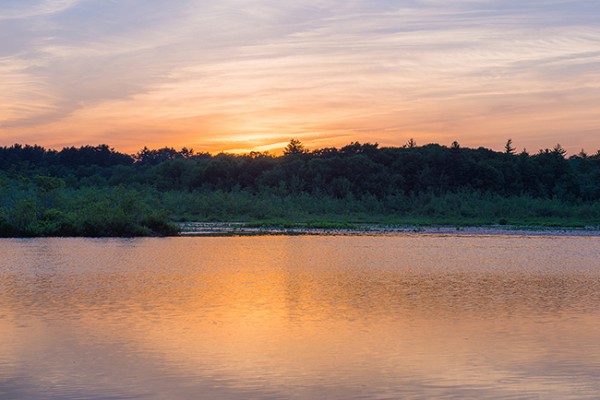
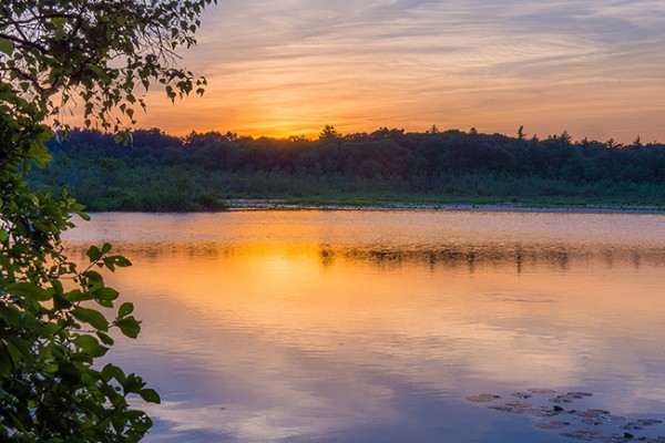
Are you inspired yet? Ok, here’s another artist for you to investigate, in case you want more examples than just flowers in vases! Look for works JMW Turner an 18th century water colour artist who changed landscape art forever.

He inspired this image of a reflection in a lake.

Rainforesttapestry

The Subject of Your Desires

If your aim is to sell your fine art images as decor, be sure that your subject matter is something most people would want in their homes or offices. Think about the context. Ugly doesn’t sell – no matter how artistically it is portrayed. But beauty generally does. Artistic treatments of flowers, landscapes, still lifes, abstracts and impressionistic figure studies are safe bets as subject matter. They seem to be almost universally accepted.

One of my most acclaimed art images – won several major awards – and one that everyone absolutely loves is “the Devils’ in the Details.” Someone loved it so much they bought it, but returned it to the gallery a week later because once they got it on the wall – it was just too freaky and disturbing!

Devilsinthedetails
?
If you plan on selling to collectors then usually any subject is fair game – some lesser known van Gogh paintings were of old shoes. Who knew!

But it’s YOUR creative interpretation and treatment of these subjects, whatever they may be, that creates the WOW factor. And it is here in your treatment and interpretation that you can break all the rules!

Viewing the works of artists who have gone before will expand your imagination and get your creative consciousness flowing for styles, subjects and different and unique ways to portray them. Once you have your image captured, you can then create a wild assortment of artistic and painterly effects in your post production processing…which is coming right up!

Creating Painterly Techniques in Post Production

One of the most flexible and fun ways to give your images a painterly fine art quality is to use overlays, underlays and textures, which you add in post production. As long as your favourite image editor supports layers and blending modes you’re good to go. If you get really expert you may even want to make your own textures and under/overlays to take full control of your final image. You’ll be rocking epic fine art photography.

Back in 2006 I was playing with a program called Corel Painter – it is a painting program where you can create all sorts of paint effects in a digital way. I had created an image in Painter using an oil paint “brush” and the texture and some subtle colours. Just our of curiosity I layered this image on top of a landscape and wow! the brush strokes came through in a most enchanting way – and so my own form of painterly fine art overlays were born! I use these a lot and make new ones as needed. But you don’t have to go to all that work – often using random images you have in your folders can be just as useful, as we will soon see.

Achieving a painterly affect in a photograph requires two main components in post production, usually a texture to emulate canvas, cloth, or some other base media; and at least one other texture or overlay to give it the image the look of something other than a straight-up photo – something like a painting! Depending on your initial image you may not have to use both these types of textures. In fact because there are no rules here you can stack multiple layers in a variety of combinations to achieve stunning images.

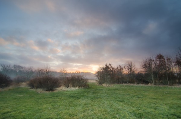
“Winter Garden” started out as this. A fine mess of dead and withered grasses in my garden in January!
?
Wintergardenbefore

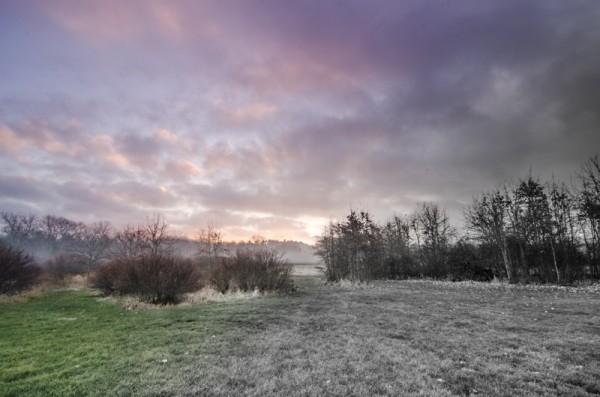
And it was transformed to this, and went on to win several national and provincial awards for Fine Art photography:

Wintergardenafter
?

And now finally – How do I do this?

First, take a stroll around the Internet and look for free textures. Not textures of wooden boards and bricks though – look for cloth and fabric textures. Also look for textures of brush strokes or that have a very fine pattern like rust, old concrete. Other photos that are out of focus, or that have primarily one colour or pattern such as frost or rain drops on a window also work particularly well.

If you’re not inclined to go on a treasure hunt right now, I’ve created source files for you! Here are the files I used for Winter Garden, to get you started!

(downloads) (warning: this is an 18MB download and will give you a zip file with a PSD file and some JPGs).

The idea is to underlay and overlay these textures and images with your base image using blending modes and opacity to alter the way the textures interact with the base image. Ready to get started?

The Process of Post Processing

In Photoshop or your image editor, open your main photograph – your base image – in this case if you’re using my source files, Image 0852. Double click on the Background layer in the layers panel to make your Background layer editable. It will be called Layer 0. Set its blending mode to Soft light.

Then go to File>Place and select the image 0853.jpg. Stretch it to fit if needed. This will become Layer 1 Change the blending mode to Hard Light.

Duplicate this layer, and set the blending mode to Luminosity, and change the opacity to 20%. Flip the layer horizontally by going to Edit>Transform> Flip horizontal.

Almost there! Now place Image 0775, this is a photo of frost that I am using as a texture and colour overlay – stretch to fit if needed, and then set the blending mode to color, and opacity to 49%.

Now we’re going to create the UNDERLAYS! These are layers that we will add UNDER Layer 0. How exciting!

So… place image 0870, and drag the layer to be immediately under Layer 0. Set Layer 0 to Soft Light.

Set your underlay layer to 53% opacity.

And finally we will add our last underlay layer by placing the texture, Image 0809. Well add this in 2 places, but first place it as we have done with the others, and move it to be the bottom-most layer in your stack. It will be Normal and 100%.

Now duplicate this layer (CTRL J) and drag the copy to be the top-most layer in your stack. Set it to soft light and 42%.

At this point you should save your file as a layered image. What do you think? Quite painterly, no?

Want to adjust some more? Awesome! You can now play with these layers, the order, the opacities, the blending modes and even adjusting hue and saturation of individual layers to suit your own style and your interpretation of withered grasses in the winter. You can add other textures you may have on hand or that you’ve found online.

With a few simple images, some inspiration from the Masters, and your own imagination, free from rules and constraints, you’ll be making fine art images in no time!

Screenshot

Alex is a professional fine art and nature photographer, accredited by The Professional Photographers of Canada, and was Canadian Photographic Artist of the Year in 2009. In 2012 and 2011 she was selected Manitoba Photographic Artist of the Year. She teaches photography, runs workshops and online classes on fine art and nature photography, infrared photography and iphone photography. Her educational website with photography tips and tricks is at www.nature-photography-central.com. Her art photography portfolio is www.alexandra-morrison.com. Connect with Alex on Facebook, Pinterest and Google+.

Post originally from: Digital Photography Tips.

Check out our more Photography Tips at Photography Tips for Beginners, Portrait Photography Tips and Wedding Photography Tips.

Fine Art Painterly Images From Your Photos


Digital Photography School

 
Comments Off on Fine Art Painterly Images From Your Photos

Posted in Photography


Submitting Your Photos to Online Forums

30 Jun

A contribution from Lori Peterson

Every day photographers use Facebook and other photo sharing websites, such as Instagram, for sharing images with their clients and potential customers. This ability to share has made it much easier to get instant feedback from the images that are posted and for photographers to see what their client base is actually looking for.

Facebook has overwhelmingly provided photographers with a unique way of interacting with other photographers. Online photography forums and groups are plenty in the World Wide Web. Photographers can submit images to have them critiqued, they can have them considered for publications, and they can even win awards for their online submissions.

Submitting online forums

While some photographers may think that these forums and groups are a waste of time, there are others who will tell you that you are missing out on a lot of opportunities by not participating. The internet is always opening up new possibilities for people, especially in the world of photography.

Photographers and artists will typically create a Curriculum Vitae instead of a traditional resume. A Curriculum Vitae is basically a summary of your qualifications and will include any exhibits and publications that have showcased your work. There are many juried art and photography forums online. Winning awards can be the jump-start on your Curriculum Vitae for helping you to obtain grants, get into art exhibits, and get your work published. It will also give insights to any exhibit curator as to your creative process and what your specific vision for your art is.

Submitting online forums 2

There are many forums online you can submit to, such as Just Color & Art (JCA), Lemonade and Lenses, Cameraraw, View Bug, or Pixoto.

Once you submit to any of these forums, photographers of all other skill levels will see your work. When you post in the online forums you have to be prepared for the critiques (yes, even the dreaded unsolicited ones!). Those critiques (both asked for and those not asked for) give you a rare opportunity to get insights from other photographers, other eyes, and other artists. Don’t take any negative critiques personally. Remember, art is very subjective. But do read the comments and consider where they are coming from. Could you have increased your shutter speed? Would a higher or lower ISO made for a better shot? Obviously, you can’t go back and change those things, but they are food for thought for future images.

Some businesses have taken to Facebook and it’s availability of online forums to look for photographers who are local to them for product photography, real estate photography, and even headshots for their company. Keeping your work current and out there for people to see can lead you to new ways to make money as a photographer.

Online forums can also spark photographer friendships. Having a photographer friend who is not your local competition can be a wonderful asset. Photographers are generally willing to listen and help out when they can. Friendships between photographers can be helpful when you are learning something new, trying out new ideas, or even when you are feeling overwhelmed or frustrated. Having a like-minded person listen to you and bounce ideas around can really help you to re-focus your time, energy, and mind where it needs to be.

Another boost to submitting to online forums? Increased SEO (Search Engine Optimization) for your photography website or blog. When you post from your photography page you are creating a cross-link between the forum and your page. Using specific keywords and updating your blog posts and website with any awards, recognitions, or honors from online forums can also help increase your SEO. 

There are many benefits to utilizing online photography forums and you will have to decide whether or not it is right for your specific business model. They are a very unique way for photographers to interact and learn from one another. They provide an opportunity for learning, friendships, and in some cases, they can lead to employment opportunities. Utilizing online forums can also help you to get your work seen by potential publishers and grant committees.

Lori Peterson is an award winning photographer based out of the St. Louis Metro Area. Her dynamic work ranges from creative portraits to very unique fine art photography. Lori’s work can be seen at www.loripetersonphotography.com and also on her blog at www.loripetersonphotographyblog.com. You can follow her on Facebook at https://www.facebook.com/LoriPetersonPhotography.

Post originally from: Digital Photography Tips.

Check out our more Photography Tips at Photography Tips for Beginners, Portrait Photography Tips and Wedding Photography Tips.

Submitting Your Photos to Online Forums


Digital Photography School

 
Comments Off on Submitting Your Photos to Online Forums

Posted in Photography


6 Tips for Getting Better Parade Photos

27 Jun

My last article I went over 15 tips for successful fireworks photography. This week I’m following up with 5 tips for better parade photos. I figured it is the season for parades and they’re so much fun I want to give you a few quick tips to help you get more engaging, stunning photos at any parade.

#1 Location, location, location

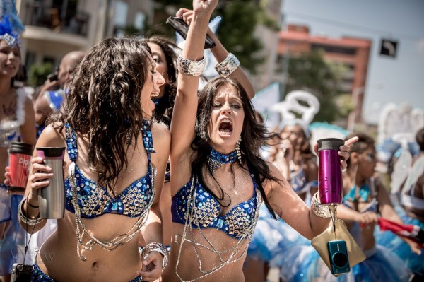
Find a good spot by getting there early and checking out the parade route. This seems like a no-brainer, but the lighting can be tricky especially if you’re in a spot where the floats and people are half in the sun, and half in the shade. So select a spot where you can either get them all in the shade (and have a shady background too), or all in the sun. Don’t be afraid to move if you find the location you selected isn’t working, for whatever reason. Maybe the lighting is bad, or the background is too busy or too bright. Then see tip #2 below!

#2 Use your feet

Unless this is prohibited by parade marshals or the local police (check first if you aren’t sure so you don’t get in trouble), don’t be stuck to sitting on your butt on the curb.  Get up and move around. Most people that attend parades find a spot and basically camp out there for the duration. But what do you see the real photojournalists doing? The guys and gals that work for the newspapers? Right, you see them following the parade and getting right out on the street.

use-feet-parade

Notice where I am standing here? In between the dancers, they literally walked around me!

**NOTE: do not get yourself in trouble, if the parade marshal or police tell you to cease and desist please listen to them and follow their guidelines. Perhaps find out ahead of time if you need special permission to walk the parade route.**

#3 Join the parade and a part of it

I followed this float for 5 blocks because their music was so good!

I followed this float for 5 blocks because their music was so good!

Joining the parade either officially, or unofficially can get you closer to the action. Volunteer to be security, or help out and ask if you can bring your camera along. You may get access to backstage areas, or being on the street in places that you might not otherwise get to go.  Many parades, at least here anyway, encourage people to get up and join in and march along behind the bands, or dance behind the floats with the great music. That’s part of what makes parades to universally fun. We have a parade called “Cariwest” which is a celebration of Caribbean culture and music. They highly encourage people to follow them and dance along the entire parade route. I love to attend this parade because it’s so colorful and I can get close to the action. Try to find ones like this, often in smaller cities or towns the rules are more relaxed, so get out of the big city if need be.

#4 If in doubt, back-light your subjects

As I mentioned earlier you can encounter some really tricky lighting situations at a parade. I tend to like to put the sun behind my subjects, then I expose so they are well lit and the background gets overexposed or blow out. I’m fine with that as opposed to the opposite of drab photos in the shade with no sense of drama and separation. The sun creates a rim light (outline on the subject) and separates them from the usual boring buildings behind them.

back-lighting1 back-lighting2

#5 Use a telephoto lens but get in close

Often in my beginner photography classes my students assume that the longer telephoto and zoom lenses are for photographing things far away. While that is sometimes the case, as in wildlife or birds, they have other great uses as well. See my article on “How to achieve blurred backgrounds in portraits” as those tips apply here as well. Using a longer lens and large aperture, will help you get the distracting background of the parade route more out of focus.

get-closer

I also suggest you get physically closer to the people you’re photographing. This will do two things . . .

First it let’s them see you’re taking their photo, and allows interaction with them if only by eye contact. They know they’re on display in the parade and expect to have their photo taken many times. So if you are hesitant or tentative taking people’s photos this is a perfect opportunity because you have a whole stream of willing subjects literally parading in front of you (sorry pun intended). Sometimes you’ll get a great reaction when they see your camera like the series of images below. She turned, saw me, and I captured a few shots as she rotated and pointed right at me. If I were out on the street edge, likely that wouldn’t have happened.

Second, it will simplify your images and allow you to focus more on one thing at a time. Parades can be visually stimulating, and overly busy so getting in closer will help solve those problems. Pick one person, or one part of a float and get closer.

Float details

Float details

#6 Try to create a series of images that tell a story

Over on my own site I wrote “What is your message? Storytelling photography” and gave some examples. As you photograph the parade try and create a series of images that tell the story of the event, and relate it to someone that wasn’t there. What do you see, hear, feel, taste and touch? What is the main thing you want tell people that see your images of the parade? Journalists will say that you need to cover: wide, medium and long. What that means is show the big picture by shooting some wide shots; show the medium range like one person or one float; and show long or tight shots like details of costumes of floats or musical instruments.  Try to also capture some action images, dancers in mid-bounce, drummers with hands or drumsticks all a blur in motion. A story also needs a beginning, middle and end. Think of those things while you photograph and you may surprise yourself with the results.

peak-parage-action

Hmm, is it just me or are these firemen enjoying the parade just a little too much?!

Hmm, is it just me or are these firemen enjoying the parade just a little too much?!

Bonus tip

Don’t forget to drink lots of water, stay hydrated, and have some FUN with it!

Have a great summer (if you’re in the northern hemisphere) and enjoy it while it lasts.

Post originally from: Digital Photography Tips.

Check out our more Photography Tips at Photography Tips for Beginners, Portrait Photography Tips and Wedding Photography Tips.

6 Tips for Getting Better Parade Photos


Digital Photography School

 
Comments Off on 6 Tips for Getting Better Parade Photos

Posted in Photography