
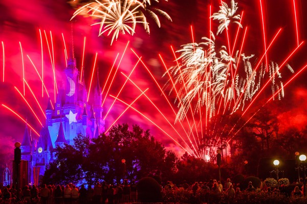
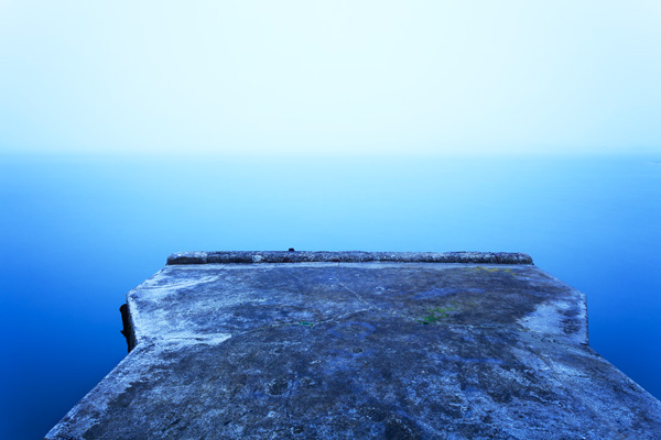
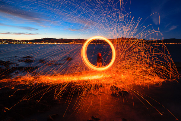
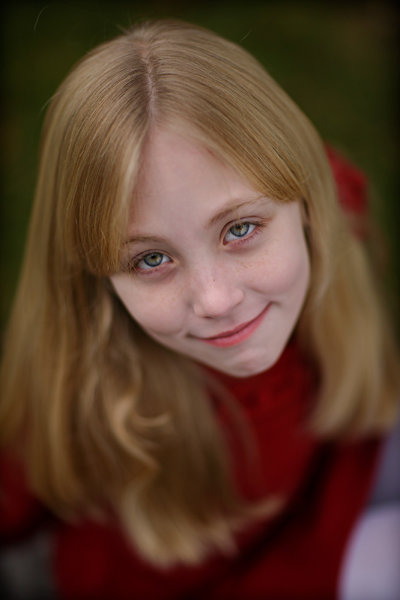
Image created with Daylight to Sunset preset
This post was written to coincide with my latest deal over at the DPS sister site – Snapndeals. Over the years I’ve created and stockpiled tons of presets in Lightroom, just for personal use. I finally made them available to the public earlier this year at the request of many of my blog readers and the feedback has been amazing! The collection on Snapndeals includes all of the presets I have released (80 total in 7 different groups) and they are all, of course, fully customizable. I put a ton of work into these and I really think you will love them!
So Lightroom presets are something I’ve become really obsessed with. I use them with pretty much 100% of my family photos and about 70-80% of my other images. Sometimes it’s just one click and I can take an image from it’s RAW state to a completely post processed and finished image. Other times I can apply a preset and be about 80-90% finished. From there it’s just a few minor adjustments to get the image looking great but the total time saved by adding the preset is still incredibly valuable. So here’s a few tips for using my new JamesB Lightroom Presets to help your workflow and create amazing images. Let’s go!
1) Spend Some Quality Time Familiarizing Yourself With The Presets
I’ve found that using presets becomes more efficient the more you use them. If you use them rarely, you aren’t very familiar with the presets you own. Therefore, when it comes time to use one you have to wade through them all to find the right one which can take a lot of time (especially with a collection of 80 presets like this one). When you use presets regularly you memorize where each one is, you know where your favorite presets are and how to get to them fast, you know which presets will work better for certain images. When you get into this mindset, your workflow in Lightroom really becomes optimized. And who among us doesn’t need more time on our hands?
I broke the presets into 7 different groups and each group has presets that were specifically designed for different genres/styles of photography. That doesn’t mean you can’t use a portrait preset on a landscape image, I’ve done that several times. But more often that not, I use travel presets for travel images. Portrait presets for portrait images.
2) Create A New Folder For Your Absolute Favorite Presets
 Over time, you’ll discover that there are certain presets that you use quite often. Feel free to create a new folder in your presets catalog and the drag your favorites into that one. A few of my favorites are Day At The Zoo and Bright and Sunny from my “Family Lifestyle” set, B&W Film Grain and B&W High Contrast from my “Monochrome” set, Sweet Pea Vintage in my “Nostalgia Film” set and Rome in my “Travel” set.
Creating a new folder in the presets panel is easy, although not very intuitive if you haven’t done it before. Clicking the + mark at the top right won’t do it, that’s just for creating new presets. You have to hover over your presets and right click, choose New Folder and then give the folder a name. Then it’s as easy as dragging the presets from one folder to another.
3) Don’t Be Afraid To Fine Tune
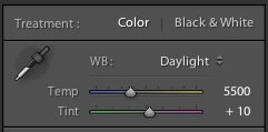
The Develop module can be pretty intimidating to those who haven’t used it before. There are a LOT of options over there. A lot of ways to make a photo look great, and a lot of ways to make a photo look terrible! When you add a preset, you’ll be able to see the changes that it made over on the right side of Lightroom. If the photo doesn’t look just how you were hoping, go over and play around with the sliders a bit to get it just where you want it. The truth is, there’s no preset out there that will work perfectly for every photo, so most of the time you will have to make slight adjustments.
4) Create Your Own!
Once you’ve used presets for a while, you will start to get more and more comfortable tweaking and fine tuning them to your taste. The more comfortable you get, the more you will start using certain looks time and time again. Feel free to use some of my presets as a base or a starting point. Then add to it, change it up, tear it down and rebuild it, then create new preset that’s all your own. I do this quite often and not only is it a great learning experience, to see how much work goes in to creating a great preset, it’s also a lot of fun!
Be sure to grab a set of the presets for yourself, I promise you’ll love them!
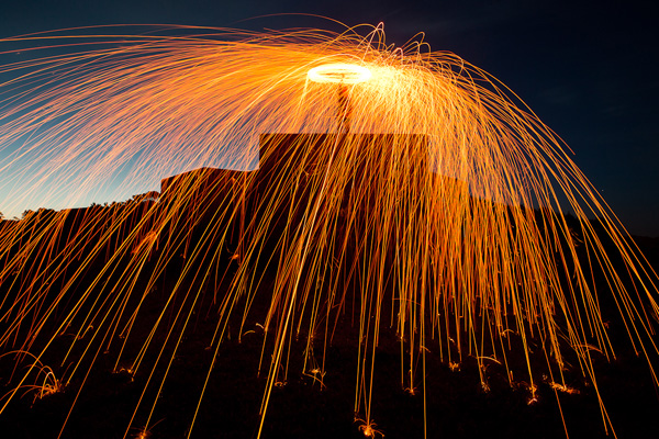
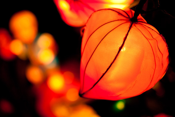
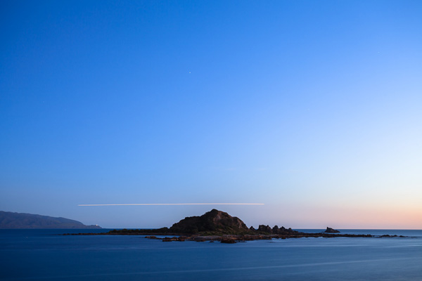
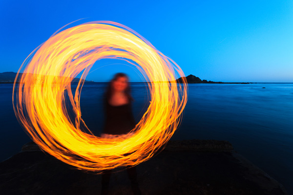
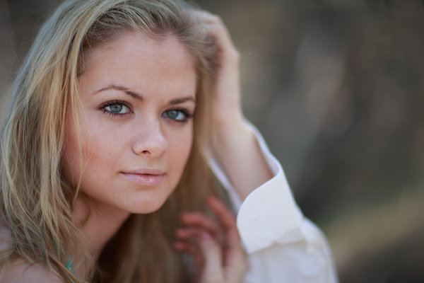
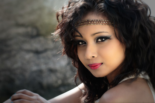
A Few Samples Of Images Created Using My Presets


Post originally from: Digital Photography Tips.
Check out our more Photography Tips at Photography Tips for Beginners, Portrait Photography Tips and Wedding Photography Tips.
4 Quick Tips For Getting The Most Out of Lightroom Presets


You must be logged in to post a comment.