Ever wondered how the professional photographers get those dreamy black and white or sepia toned images? Wonder why yours come out looking dull and flat looking? I’m going to give you 3 tips to help you do better black and white conversions using Adobe Lightroom, and solve that problem!
Today’s cameras are pretty smart, and many of them offer a black and white setting or shooting mode. I recommend using those to start, especially if you’ve never done any black and white (B&W) or if you are not currently doing any post processing or image editing on your files. BUT, if you have some experience with b/w photography, and you are processing your images, I recommend doing the conversion yourself as you have more control over the look of the final image. I’m going to show you a few ways of converting them into B&W using Lightroom.
Note: for the most part these tips will work in Photoshop as well, using the Adobe Camera Raw features and sliders.
First a quick note about my background. Back when I took my photography degree (dare I say, in 1987-88, and date myself) I spent the entire first year shooting black & white only, using a 4×5 view camera no less. I processed my own film and made my own prints. I spent a lot of time in a black & white darkroom, so I’m pretty well versed in how it works and how to control it to my advantage.
To grab some info from those film days, it’s important to note and understand that your camera sees light and colours differently than does the human eye. Black and white film sees blue tones much lighter than our eyes, for example. Coloured filters were used to shift how the B&W film “saw” and rendered the scene. Using a red filter would lighten anything red in the image and darken blue tones. So if you were a landscape photographer you’d often use a red filter to darken the sky and make it less washed out. A green filter would lighten green and blue tones and darken red and orange. So photographers used the appropriate filter to capture the scene as they envisioned it.
In Lightroom and ACR (Adobe Camera Raw) in Photoshop you have the same tools at your disposal! So without the use of filters, you can adjust how the scene is rendered in B&W. That brings me to the first tip.
Tip #1 – use the B&W mix to do your conversions
In Lightroom’s Develop module (and ACR) there are a few ways that you can convert your images into B&W. You can just pull the saturation slider all the way to left to -100. You can also do similar with the Vibrance slider, but it may not give you a 100% B&W image, depending on the image. Both of those options will give you a black & white result. However, they give you no control over how the colours render into the various shades of grey. A better choice, in my opinion, is to use the B&W mix, located on the third panel down on the right in Develop – see below.
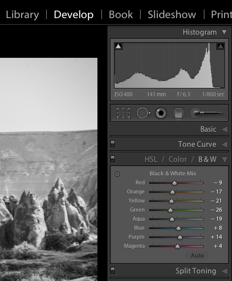
Black and white mix panel in Lightroom Develop module
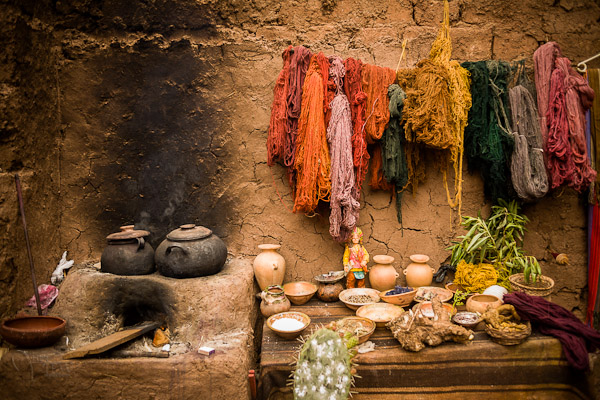
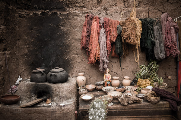
Let’s take a look at an example using the same image.
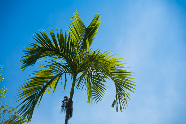
Original colour image
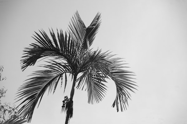
B&W conversion done using the Saturation slider at -100
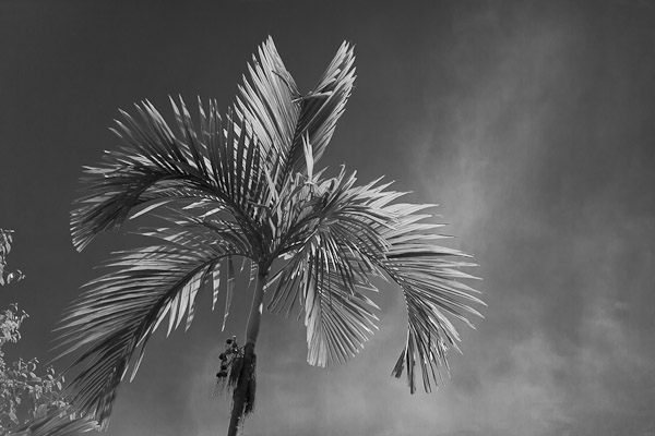
B&W conversion done using the B&W mix in LR
In the images above, notice how the blue sky went really light using the desaturate method? This is often the case when you have a lot of blue sky in an image, as I explained above. Using the B&W mix and pulling a few of the sliders I was able to get very different tones. This is what my sliders in the B&W Mix panel look like on the third image:
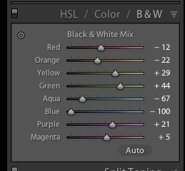
Notice the blue slider is pulled all the way to the left to -100. That is what is darkening my sky. Also worth noting is the green and yellow sliders are moved in the opposite or plus direction. This lightens both yellows and greens (most grass and trees are often a mix of green and yellow, sometimes more yellow than green). I have not done any selective adjustments to darken the sky here, just the sliders you see to the right! How very different this image is from the desaturated one, and so simple to do using this method!
Also on this panel notice there is an “Auto” button. Clicking it will allow Lightroom to apply a predetermined B&W mix for you. You can also set up in your Lightroom preferences to apply that for you when B&W mix is selected, then you can just fine tune from there. Otherwise all the sliders will start at “0″.
Another little known trick for using these sliders is the funny looking little double circle thing on the top left. As you move the mouse over it, you will see this:
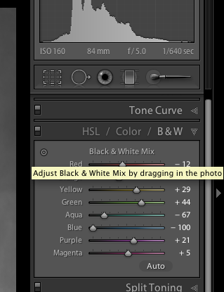
Adjust Black & White Mix by dragging in photo. So what on earth does that mean, you may wonder?! If you click on the little circle your mouse pointer will now have little up and down arrows, as well as your cursor showing the same icon as you hover over the image. Click anywhere on the image, hold and drag, and it will adjust ONLY the colours that you’ve clicked on. Drag up to move the sliders to the right (+) and drag down to move them to the left (-). How cool is that?!
This is very helpful if you do not know which sliders to adjust. Just select the area of your image you’d like to adjust the tones on and drag away!
Tip #2 – don’t just stop there, add some punch
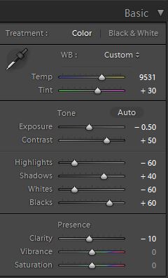
Sometimes even using the B&W mix sliders the resulting image still looks a bit flat and dull looking. Take it up a notch by adding some punch to your image. I do the following to most of my B&W images:
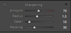
- increase the clarity: if it’s a scenic I’ll push it quite far like +60 or higher, if it’s a person I keep it under +30 or they start to look a bit crunchy and overly wrinkled (especially if the photo is of your mom or your spouse, they tend not to be too happy about that)
- lower the black slider, until it looks good. Highly scientific, yes! Here’s a little trick for you as well using the Blacks slider: if you click and hold the Opt/Alt button while you slide it, you will get to see exactly where your blacks are clipping (meaning going off the chart on the histogram and having no detail). You can use that information to make sure you have just enough blacks, but make sure you keep all the detail in important areas.
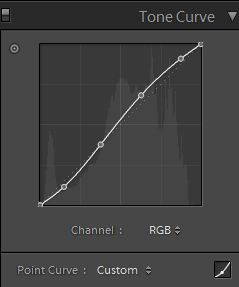
- increase the contrast either using the Contrast slider or Curves
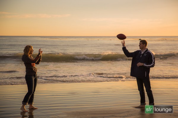
Occasionally after making these contrast adjustments it will affect the overall image and you may want to go back and rework the B&W sliders a bit too. It’s a dance, play them back and forth until you get a mix you like. Here’s the final version of the image above, with contrast and punch adjustments applied.
Notice how much more snap it has, while still maintaining that nice rich, dark sky!
Secret to making great B&W images that the pros won’t tell you . . .
Black! That’s it. Make sure you actually have some black, and some white in your image. Check the histogram and use my little tip on seeing the clipped bits. Add contrast or increase the blacks, whites, or both to get a full range of tones. No matter what the subject is in the photograph, having enough contrast to have pure white, and pure black is key to having a stunning B&W image. Otherwise you’re just left with a bunch of grey mud.
Tip #3 – creating selective coloured images
There are a couple ways to make selectively coloured images, and also to create that faded look that is really popular. Once again you can use the Vibrance and Saturation sliders in the Basic panel, however they will affect colours in the entire image the same. You can also use the Adjustment Brush and paint in a lower saturation onto parts of your image where you want to fade out the colour. I use that method quite often, even on full colour images, to do tone control on items in the background that are distracting.
Lastly you can use the sliders in the HSL panel. By sliding selected colours to the left you can desaturate only those colours. You can also use the little Click and Drag tool we used earlier to do the B&W Mix to click on your image and pick the areas to fade. Here’s an example using each of these methods. None is right or wrong, just give you a different look and some have more control than others. Choose the one that works for you on in individual image basis.
Original colour image
Vibrance slider set to -75

Saturation slider set to -75

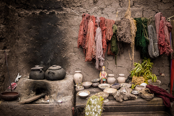
Adjustment brush used to paint in saturation at -75 to the whole image except for the wool
HSL sliders used to desaturate by separate colours
*Bonus Tip – making a nice duotone or sepia toned image
A little extra bonus tip for you. Adobe has made it super easy to create a really nice duotone (just means two tones, go figure!) image, which includes Sepia. Just go to the Split Toning panel after you’ve done your B&W conversion, it’s the fourth one down.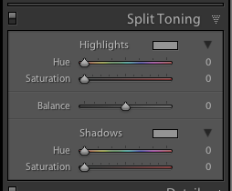
You will see sliders for both Highlights, and Shadows. My personal tip on how to keep a nice clean sepia or toned image is to use ONLY the Shadows sliders and do not touch Highlights. That will leave you with clean, crisp white highlights even after you’ve applied the toning.
How to create the duotone
First start by choosing the Hue slider (for Shadows). If you want a nice brown colour, start with it around 40-45. Each image tones slightly differently, so start there and adjust to your taste and style. You may notice that nothing happened, right? That is because you need to increase the Saturation slider before the tone will show up. The more you increase saturation, the deeper and more vibrant the colour tone will become. Again, there is no right or wrong, it’s all about preference. For a subtle, dark, chocolate brown try 10-20. For a deeper colour go higher with saturation (NOTE: make sure the “balance” slider is set to zero)
If you want a different tone just move the Hue slider. You can create some really neat affects this way including Blue Tone or a true Duotone.
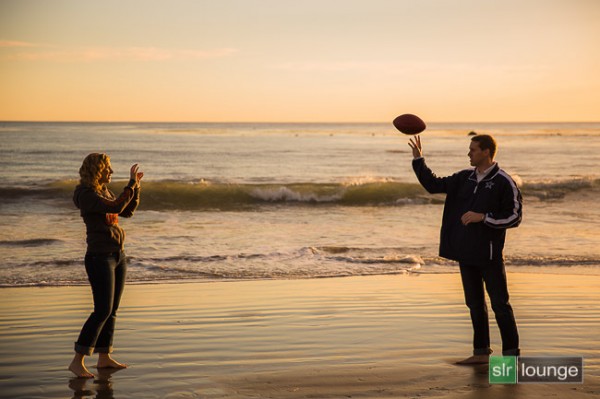
Example using a portrait
For this final example I’ll show all the steps we’ve just covered using a portrait. This is applicable to any people photos, you don’t need to make portraits to use this information.
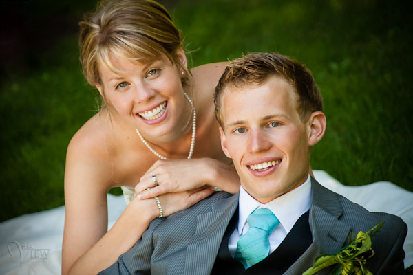
Original colour image
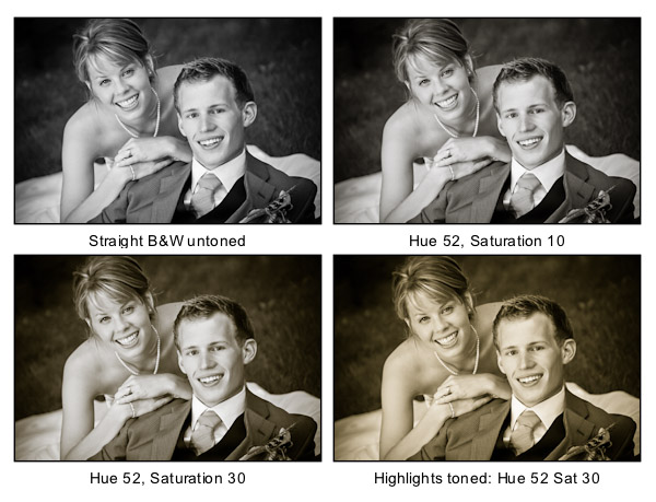
Notice the last image where I’ve added in colour to the Highlights and how it completely changes the look of the image. The whites have a yellow tint now instead of a nice clean look. I personally prefer the third one but there are times I do use this option. Do what feels right for your image, you’ll know what to do.
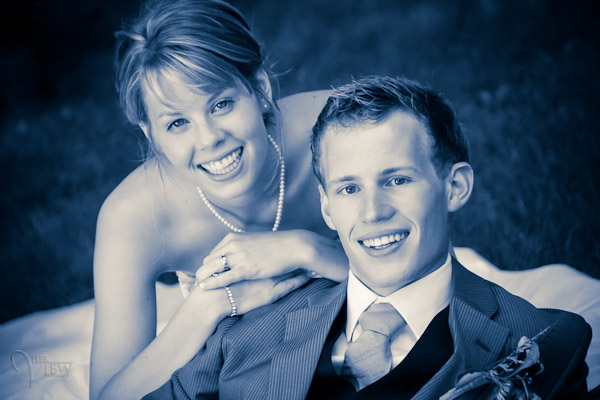
A "duo" tone using different colours for the Highlights and Shadows. Shadow settings: Hue 232, Sat 70 – Highlight settings: Hue 52, Sat 37. I did move Balance to -27 to skew the colours more towards the Shadows as well.
What next?
As always I encourage experimentation. If you have another way that you like better, that’s awesome! Please share it with us if you will. Another way to do some really quick B&W inside Lightroom is to find some good presets. There are literally tens of thousands of Lightroom Develop presets available for free on the internet. Try a Google search for: Free lightroom b&w presets. Then just pick the ones you like and install them.
Now get out there and go make some images and let’s see what you can do in Black & White!
Post originally from: Digital Photography Tips.
Check out our more Photography Tips at Photography Tips for Beginners, Portrait Photography Tips and Wedding Photography Tips.
3 Tips for Better Black and White Conversion using Lightroom

Digital Photography School
 The new deal over on SnapnDeals this week is one I know many dPS readers are going to enjoy – it’s 30% off Phil Steele’s Lightroom Made Easy Course – that’s just $ 33 (normally $ 47).


You must be logged in to post a comment.