.jpg")
processed using VSCO’s Kodak TRI-X film preset
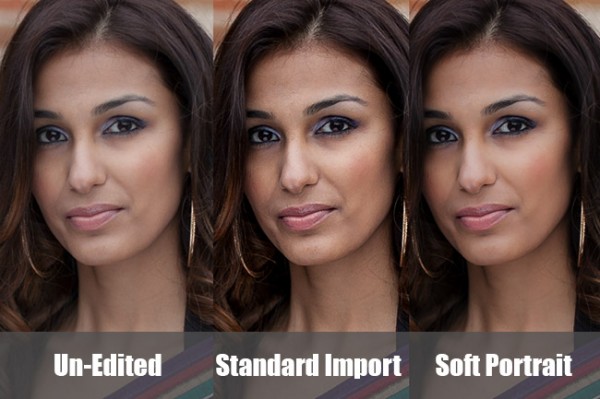
Those of you who think Instagram and its ilk are pushing us towards the end of “real photography” can quit reading right now. For everyone else, the following paragraphs will show you how to get that ever-so-trendy, faded, slightly desaturated, vintage, “look” that is so prevalent from both professionals and hobbyists. I’m going to let you in on a secret that professionals have been utilizing for awhile (many use it secretly!) to give their photos that added edge.
Specifically, I am going to cover the use of film simulation presets to develop your RAW files in Lightroom. Why use film simulation at all? As evidenced by the popularity of mobile apps like Instagram, emulating the look of traditional film stocks has become a rather trendy and prevalent practice in photography and can be a useful tool in your post-processing arsenal. Your clients may not specifically request a certain film, but they may ask you to give them a specific look & feel that is a result of simulating film, i.e. “Can you give my engagement photos that faded, vintage-y feeling?”, or “Make my photos look like they were taken with Instagram”. I’ve had several clients ask for that style of processing without realizing it was the result of emulating a 50-year old film stock. Film simulators answer the question: “What would this digital image look like if I took it with Kodak TRI-X film?”.
In short, film simulation presets are designed to process your camera’s specific RAW files into images that emulate the look provided by some classic film types. Before I discovered these plugins, I foolishly spent countless hours playing with various Lightroom sliders attempting (and failing) to get that look I wanted to emulate. After trying a number of these, my favorite by far is VSCO Film, created by a company called Visual Supply Co (VSCO for short). They create a number of plug-ins for Lightroom, Adobe Camera Raw, and Aperture, that all do the same thing; make your digital image look like it was taken with an old-school film camera. We’ll be covering how to use these in Lightroom though they should have the same effect in ACR or Aperture. It should be mentioned that I do NOT work for VSCO and / or receive payment in any way from them.
![]()
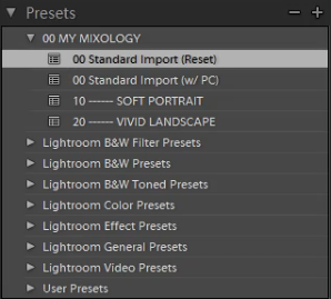
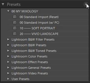
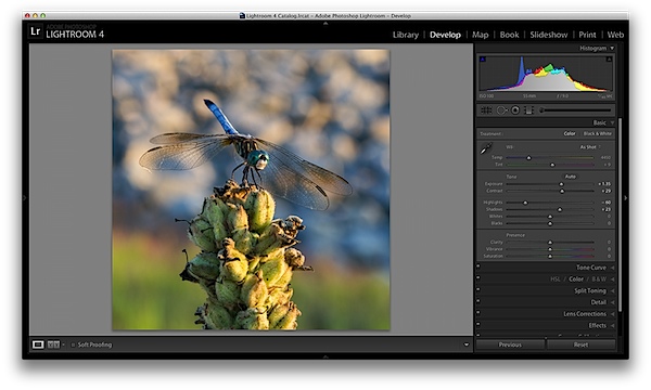
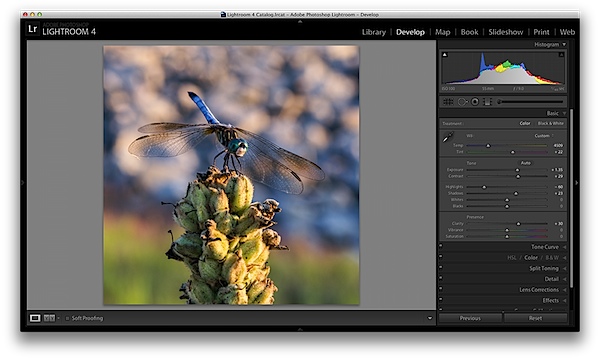
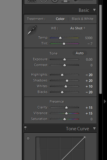
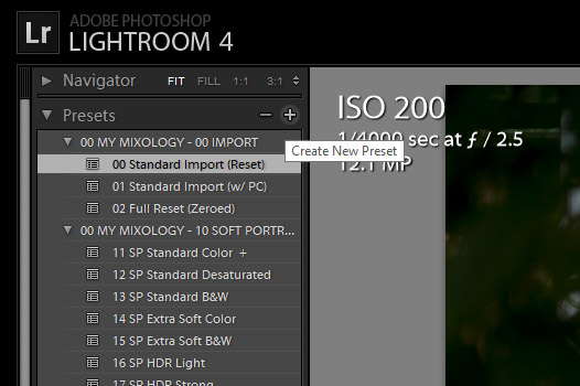
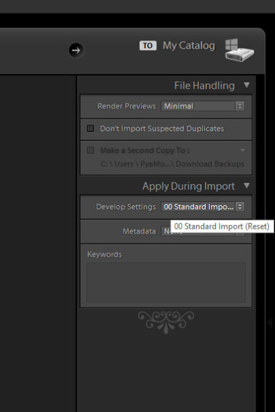
VSCO’s film packs come as downloads from their website and installation is as easy as running the downloaded installer and booting up Lightroom afterwards. You will then find several new groups of presets once you’re in Lightroom’s Develop module.

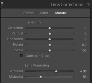
Once you’ve installed the presets, applying them is as easy as selecting the image(s) you want to process, and clicking on the desired preset on the left. If you mouse-over the list of presets, you’ll notice that the Develop module’s Navigator window will show you a preview of the preset’s effects on your image. You’ll find that each different film type will give you varying effects on color, contrast, brightness, and will alter the tone curve of the image. Some film presets will introduce subtle changes, while others do dramatic things, and covert your image to B&W, add grain, and reduce the dynamic range of the image by resetting the tone curve.
Frankly, I am unsure if there is anything a VSCO filter can do that you can’t do manually, however, it is an incredible time saver if you don’t want to spend hours re-creating the look of specific film stocks. VSCO’s team has already done the research into the settings to emulate popular film types, and all you need to do choose which ones you like. You’ll also notice that each preset has “-”, “+”, “++” versions of each film, representing the degree to which you’d like the particular film’s effects applied. Film presets work like any other preset and the develop settings can be copied and pasted from image to image or applied to a large batch of images at once.
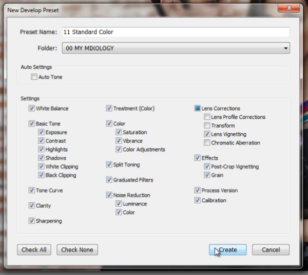
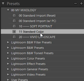
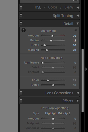
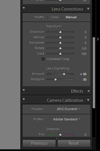
However, the beauty of VSCO (and similar presets), is that once you’ve selected a film stock that you like, you can then tweak it to your heart’s content. For example, you can start off with a baseline Kodak Portra 400+, and decide that you’d want to bring up the shadows, add some grain, and saturate the blues. Save those settings as a new preset, and boom, you’ve developed your own, unique look. VSCO’s film pack also comes with “Toolkit” presets that will help you fine-tune your image. With a click of a button you can add grain, bring up the shadows, save your highlights, or fix Chromatic Aberration. Again, these are all things that you can do manually, but the presets will save you quite a bit of time.

VSCO has now released three different film packs, each with its own set of films, with the latest film pack focusing on a variety of instant (Polaroid!) films. The film packs are not cheap, at $ 119 / pack, but existing customers will receive a discount on subsequent film pack purchases. I’d suggest buying VSCO 01 and only adding the others if you really like the first pack. Don’t feel like ponying up the dough or only use your iPhone to take pictures? VSCO actually has an iOS app called VSCO Cam.
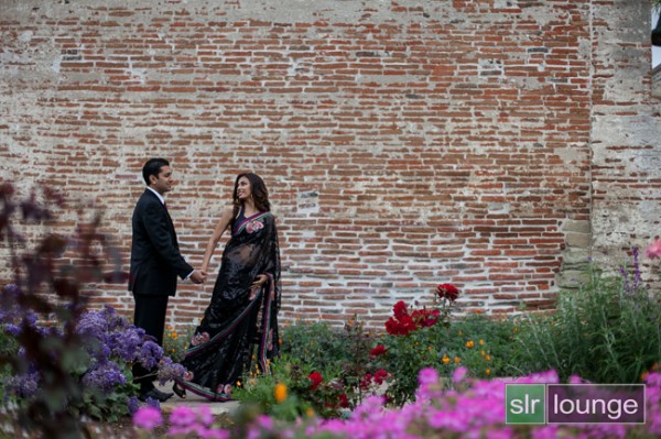
So that’s all there is to it! I will leave you with some quick before & after examples that may help demonstrate how powerful these presets can be. Each of these following images will be presented in two forms, the “before”, sans preset and without any major Lightroom modifications, and the “after”, with a specific preset applied. For the sake of this demonstration, I have picked films with a relatively dramatic effect on the original image.
Before:
 ??After, with a “Polaroid 690 cold” preset applied:
.jpg")
Before:

After, with a Polaroid 669 preset applied:
.jpg")
Before:

After, with a “Polaroid 690 cold” preset applied:
.jpg")
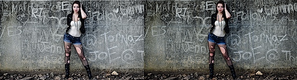
Before:

After, with a Kodak TRI-X filter applied:
.jpg")
Frank Wang is a NYC photographer specializing in portrait and architectural photography. You can find him online at www.frankwangphotography.com and www.framephotographics.com. Connect with him via witter / Instagram: @frankwangphoto
Post originally from: Digital Photography Tips.
Check out our more Photography Tips at Photography Tips for Beginners, Portrait Photography Tips and Wedding Photography Tips.
How to Use Film Simulator Presets in Lightroom


You must be logged in to post a comment.