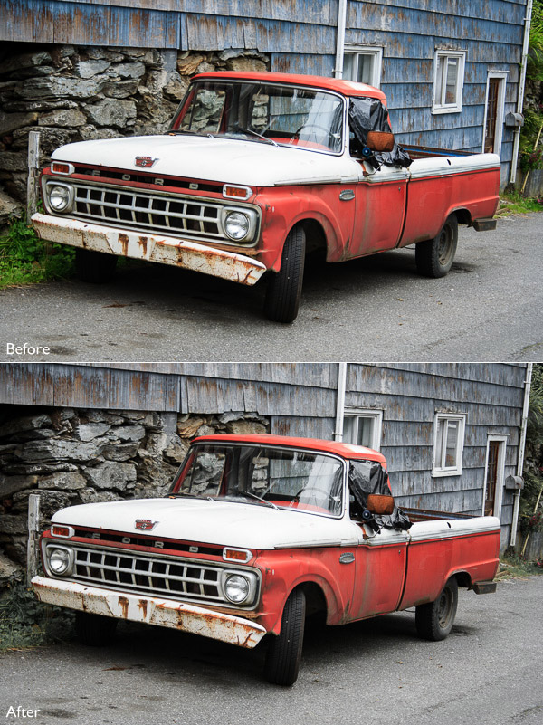
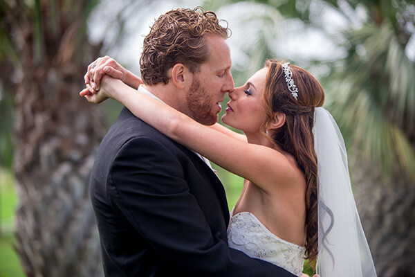
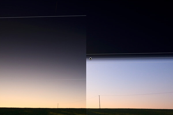
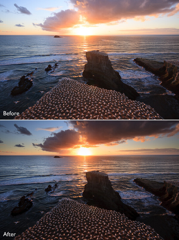
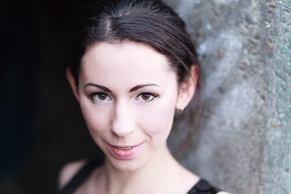
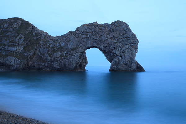
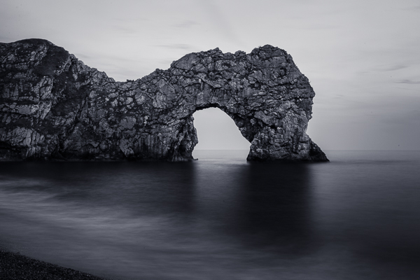
Would you like to get started with black and white (or color) fine art photography, but don’t really know how to get the results you want? I will give you some insight in the process to take your photos to the next level and let you see how you can make the most of the not so ideal situation. I will explain how you can take your ordinary photo and transform it from this . . .

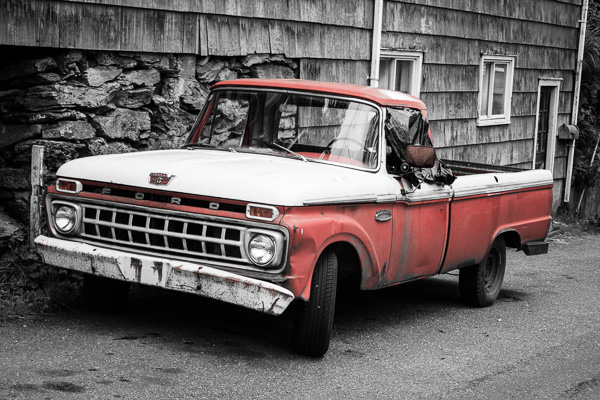
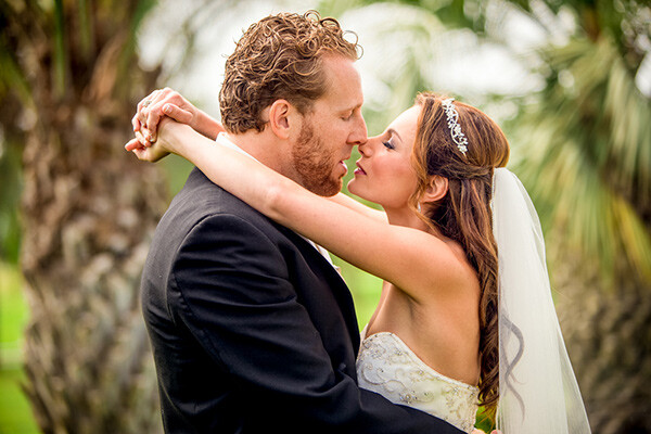
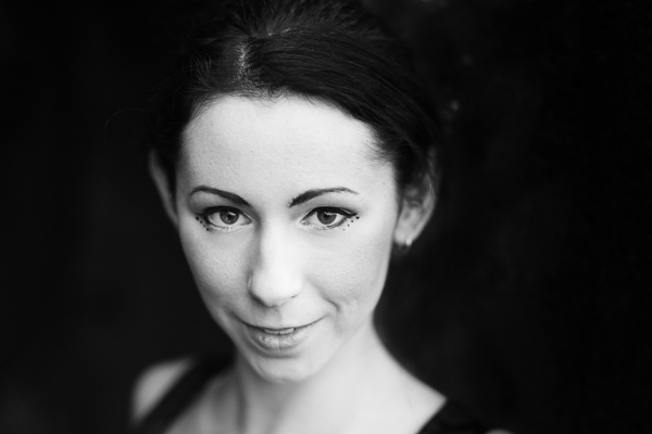
to this!

Take your Photos from Blah to WOW with Lightroom and Photoshop
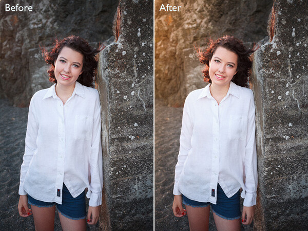
For the creation of this photo I used both Adobe Lightroom and Adobe Photoshop (Note: any program that handles layers will also work including GIMP or Photoshop Elements). The beginning photo is just a black and white conversion of the color photo, as shot. It is important that when you go out and shoot, you have an idea of the final image in your head. If you are at a location, take a moment and think of what you would like to see as a final result. This way, it will take you less shots to get your winning photo.
First step the photography, how was this photo created?
This photo was shot with a Nikon D3000, Tokina 12-28mm f/4 (IF) DX AT-X PRO and Haida ND3.0 (10 stop neutral density filter). That’s right, it’s not a full frame camera! With good light conditions you don’t need one, spend money on lenses instead. I was aiming at an exposure time of minimum 25 seconds, to make the clouds and water smooth. I metered 1/60th at f/14, 100 ISO, so that would give me the 25-27 second exposure (with the ND3.0) I wanted.
You can find exposure tables online, and sometimes you get them with the filter you buy. If all the conditions were perfect (which wasn’t the case) I wanted to shoot until sunset, expanding my exposure time to over 1 minute. But clouds rolled in (wasn’t forecast) and ruined the light. After a few shots, I got what I wanted and was heading home.
Next step, post-processing your image
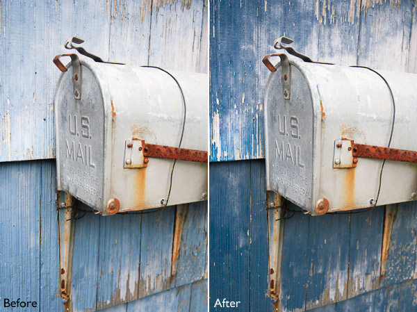
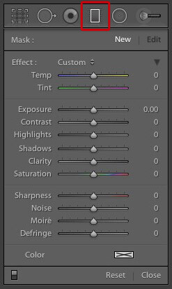
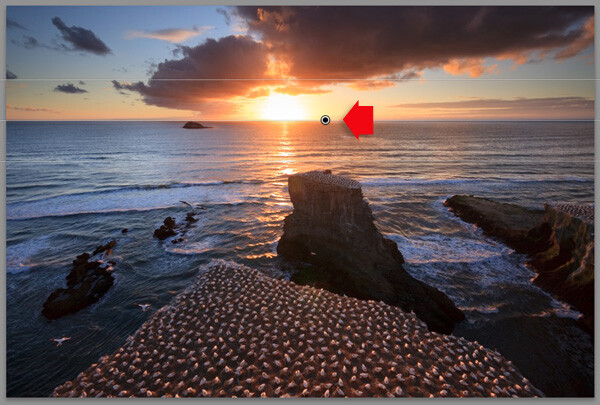
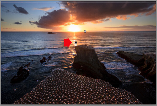
First load the photo in to Lightroom and give it some minor adjustments to contrast and clarity. Increase the contrast a bit and reduce the clarity of the bottom part of the photo (the water). This can be done with a graduated filter (keyboard shortcut “M”) and moving the clarity slider to the left.
Now move over to Photoshop to take care of the sky (you can export it directly from Lightroom, right click on the photo and select edit in Photoshop). I was aiming for a nice movement in the sky, but the clouds weren’t going fast enough for my maximum exposure time. So we are going to replicate that with the help of photoshop.
Duplicate the image and select the sky, using the magic wand selection tool (W). Use the current layer and a brush seize of 30 pixels. When you’ve got your selection (it won’t be perfect but that is fine), click on the add layer mask symbol. (below the layers on the bottom right side of the screen).
You can make the layer mask more accurate with the pen tool (p). Click on the edge of a building (and later on the bridge) and work your way around the skyline, by clicking on every corner. The pen too will automatically draw a straight path from one point to another. When complete (you have to get all the way back to the first point you made), right click on the image and select “make selection” (feather 0, and make new selection) hit OK in the new window. Now fill your selection with black and you have a nice and clean layer mask of the sky.
Add motion blur to the sky
Now you can add a zoom blur to the sky layer, so you get a nice washed out cloud formation. Here is how to do that:
- Select the duplicated sky layer then select Filter -> Radial Blur
- In the menu select Blur Method -> Zoom, Quality -> good and amount 70 (you can add more, but that depends on the photo) – don’t hit OK yet!
- Nest select where the Blur Center is positioned in the right window by clicking and dragging it around (somewhere in the middle for this photo)
- Hit OK
- After this you need to clean up the layer, because it now runs over the buildings
- Hold CMD (alt on win) and click on the layer mask for the sky. Click -> selection -> inverse (you now have everything but the sky selected and hit delete.
Now you should have something like this:

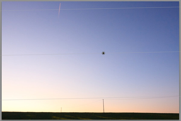
As you can see the sky is now very pleasing, full of movement. When you look closer you can see that all the wires from the bridge are gone. We will have to fix that next. The wires aren’t straight lines, so the selection process of these is a pain – but worth the effort.
Using the pen tool (P) you can select all the wires on the background layer (which took me quite some time). You can do this one by one. Select one complete wire and duplicate the selection into a new layer. When you have all of them, merge all of these layers to one and place it above the duplicated sky layer.
You could also use the Magnetic Lasso Tool (L) to select all the wires but because of the low contrast in some places it won’t work, and you have to correct it later on.
Using the pen tool is a complete chapter, and I’m feeling that explaining how to use the tool takes too much focus away from this tutorial. It can take some time to master but I highly recommend reading tutorials on how to use the pen tool. You will need it for this image, but for the most of the images you can just make straight selections.
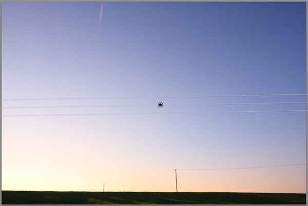
Here is my selection of the wires:

Now you can add some adjustments to the contrast in the wires and bridge, using a Brightness/Contrast adjustment layer. I used: Brightness +3 and Contrast +24

Final adjustments in Lightroom
From this point we leave Photoshop and continue in Adobe Lightroom. You could, however, do the same in Photoshop with dodging and burning, but I like the workflow of Lightroom more and used it to get to the final stage of the image.
From here it is basically just adding and removing light (exposure, contrast, white point) to selective places in the photo and checking for some dust particles. I can go into the details here, but it’s your vision of what you would like to achieve with the photo. Use the gradient filter (M) and the adjustment brush (K) in Lightroom to add and remove light to selected areas of the image. You have to “color” the photo to your wishes and crop it when needed. You are in fact painting with light.
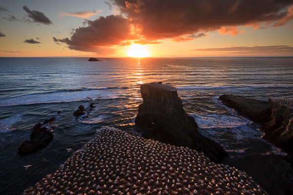
Here is what I came up with for the final image:

“Catch the light” – Rotterdam (The Netherlands)
Do you have any additional tips for processing for that wow factor? Please share in the comments below.
The post Take your Photos from Blah to WOW with Lightroom and Photoshop by Martijn Kort appeared first on Digital Photography School.

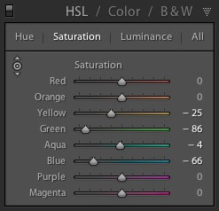
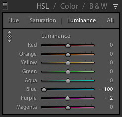
 My Mastering Lightroom ebooks are a complete guide to using Lightroom’s Library and Develop modules. Written for Lightroom 4 & 5 books One and Two take you through every panel in both modules and show you how to import and organise your images, use Collections and creatively edit your photos. Book Three shows you how to create stunning black and white images in Lightroom.


You must be logged in to post a comment.