RSS
 

Posts Tagged ‘lightroom’

Directing your Viewer’s Eyes with Lightroom to Make a More Powerful Image

17 Aug

One key to a successful photograph is that it directs the viewer’s attention towards the subject in question. There are many ways that this can be achieved through composition and lightning in the field, but did you know, you can also direct the attention of your viewer’s eyes through post-production?

truck edit-2

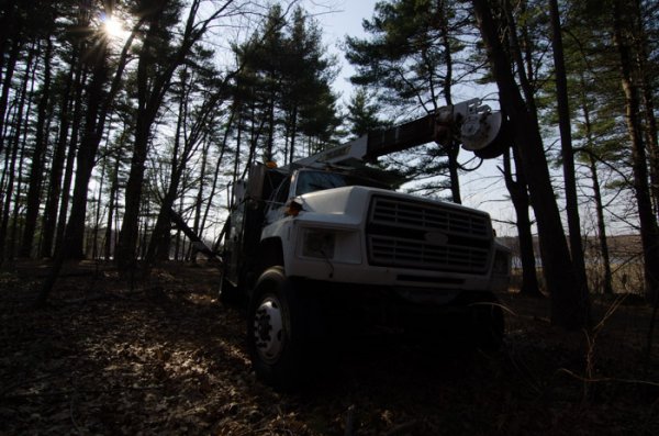
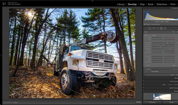
You still need an interesting subject for this to work, as directing your viewer’s eyes to a boring location within a frame is still going to result in a boring photograph. For the sake of this tutorial I’ll be using this photograph of an abandoned utility truck, but you could use anything from an interesting tree, to a model, to your pet, and achieve similar results.

First a few basic edits to bring the photo to life

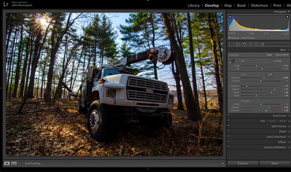
Before we can work on drawing the attention of the viewer this photograph needs a bit of life pumped back into it. Having shot this photograph into the sun, the foreground and front of the truck are going to require some basic recovery techniques. I’ll be using the Basic Tab in Lightroom 5 to recover the detail and add some interest to the shot.

Step One: Highlights and Shadows

direct-viewers-attention-11

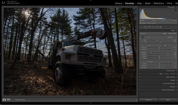
Shooting into the sun can be tricky as it often will cause your sky to turn white. Reducing the highlights slider will help to counteract this. It does so by targeting the brightest areas of your photograph without effecting the overall white point of the image. The shadows slider has a similar effect on the darker areas of the image, allowing detail to be brought out in the grill of the truck and along some of the trees.

Step Two: Add contrast with the Blacks and Whites sliders

direct-viewers-attention-10

One of the problems with the highlights and shadow recovery technique above is that it often will reduce the contrast of the image and create a sort of muddled and dull look. To counteract this you can use the whites and blacks sliders to effectively set your white and black points, as well as bring a bit of contrast back into the image. This allows you to have a bit more control over the contrast of your image as opposed to the more global Contrast slider adjustment.

Do this by dragging your White slider to the right until your histogram touches the right edge of the graph. Make sure not to go too far and clip any highlights. Holding down the Alt (Option) key while you drag the slider will show any areas that are clipped – so drag to the right until you see some, then bring it back to the left just until they are no longer visible. Do the same with the Blacks slider by pulling it to the left. The Alt (Option) key works with this one too, but in the case of Blacks you actually do want a little clipping. Having a good black in your image will add that contrast you’re looking for.

Step Three: Even out the exposure

direct-viewers-attention-9

Now that the highlights, shadows, whites and blacks are set –  a quick bump up on the exposure slider will even out the rest of the scene and get us close to something we’re ready to work on.

Step 4 (optional): Saturation and Vibrance

direct-viewers-attention-8

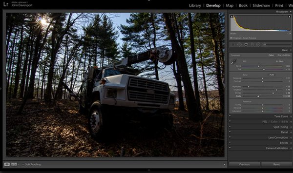
For this particular shot I wanted to add a bit more saturation to the trees and the floor of the forest. It’s going to depend on the shot that you’re working on, and the look that you are trying to achieve, as to whether this step is necessary. But it doesn’t hurt to play around with it before you move on to the next steps.

For more on Lightroom’s Basic Tab read: Master These Five Lightroom Sliders and Your Photos Will Pop

Now to draw the attention of the viewer

While the truck itself is a strong subject, and one that does capture the viewer’s attention on its own, there are a few tools that Lightroom has to offer which will allow for even more attention grabbing goodness.

Cropping for better positioning

direct-viewers-attention-7

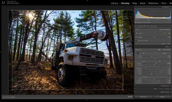
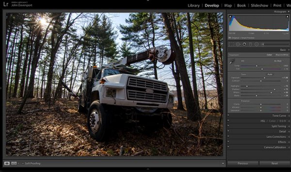
The crop tool allows you to have more control over the positioning of your subjects within the frame. In this shot the truck was a bit too centred and there was a little too much dead space in the forest so by cropping in a bit closer the shot becomes a bit more balanced, allowing the viewer’s eyes to stay focused on the truck.

The Graduated Filter tool

direct-viewers-attention-6

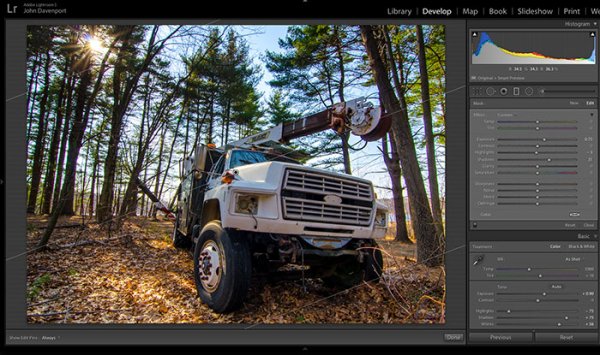
By adding a graduated filter to the bottom right of the image more detail can be recovered from the front of the truck without effecting the rest of the exposure. This allows for a more compelling focal point for the viewer to rest their eyes on. When you go about placing graduated filters in your own images be sure to think about how it’s effecting the overall light of the scene and ask yourself if it looks natural.

Getting creative with graduated filters can allow you to have some really interesting results read 4 Fun Tricks to Enhance Your Photos With Lightroom’s Graduated Filter Tool for more creative uses of the graduated filter tool.

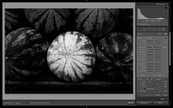
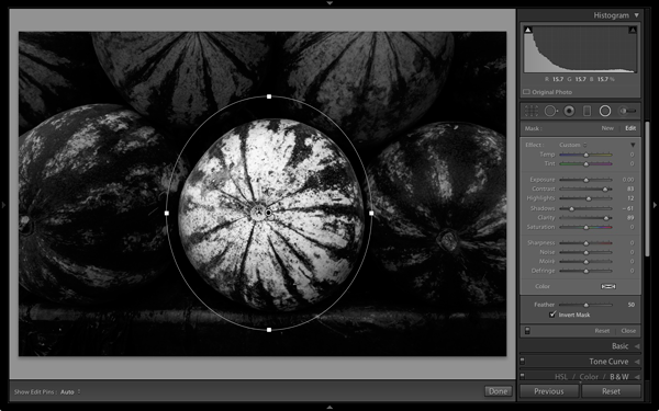
The Radial Filter tool

direct-viewers-attention-4

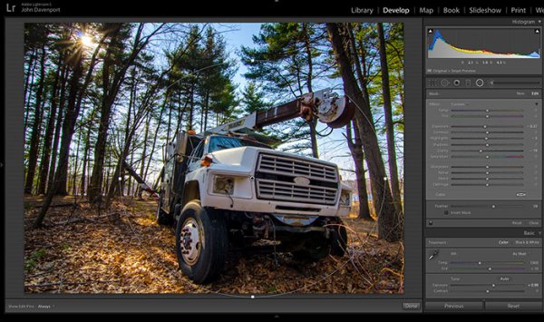
The radial filter allows for a subtle vignette to be added to the image which helps to keep the viewer’s eye within the frame. It also has the added benefit of darkening the sky, without darkening the truck, allowing for deeper blues to come through. After I was happy with this first radial filter I dropped in a second one to increase the brightness and detail of the grill of the truck. To do this the radial filter was inverted and the exposure and clarity sliders were increased.

direct-viewers-attention

Removing distractions

direct-viewers-attention-2

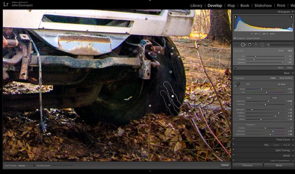
Once you’ve gone through all the work of drawing attention to a particular area of a photograph you’ll want to go through with Lightroom’s clone/healing tool and remove anything that competes for that attention. Adobe has greatly improved this tool in Lightroom 5 allowing you to drag paths, making it possible to remove distracting branches with ease.
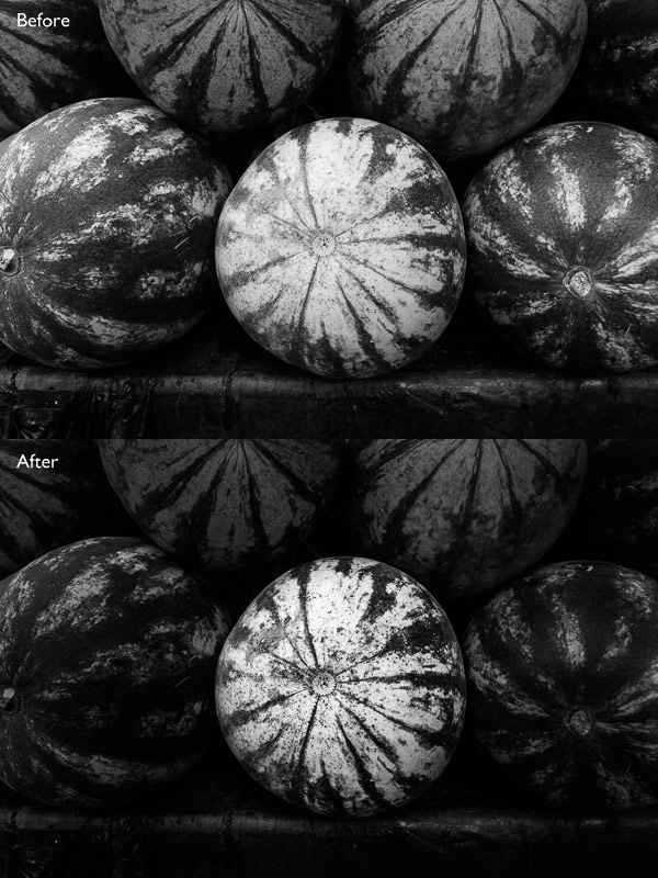
The Final Edit

With a few quick adjustments in the basic tab, a simple crop, and a few of Lightroom’s filters –  this utility truck really grabs the attention and is a vast improvement over the original straight out of camera shot. Go try this workflow for yourself and share your own before and after in the comments below!

truck-edit2

Watch this Edit Click for Click

For those who prefer to sit back and watch – here’s  a quick video of the edit above.

The post Directing your Viewer’s Eyes with Lightroom to Make a More Powerful Image by John Davenport appeared first on Digital Photography School.


Digital Photography School

 
Comments Off on Directing your Viewer’s Eyes with Lightroom to Make a More Powerful Image

Posted in Photography


How to use Lightroom Develop Presets to Learn Processing Tips

24 Jul

Learn Lightroom from Develop Presets

In my previous article you learned how to create a vintage effect using Lightroom. I started by showing you some Lightroom Develop Presets you can use as a shortcut, and finished by demonstrating some techniques you can use yourself. The hidden message in the article was that one way to learn how to use Lightroom is to buy some Develop Presets (or download some free ones) and analyze them to see how they work. You can then apply the same techniques to your own photos, and even create your own Develop Presets.

Today I’m going to give you some tips on analyzing other people’s Develop Presets. I’m going to do it using some presets I downloaded from onOne Software. These are free presets that anyone can download and use themselves (just follow the link), so it is easy for you to follow along.

Preset: onOne Instantastic – Daisy

The Daisy preset, part of the onOne Signature Collection Presets (Vol. 2), gives an Instagram filter effect. There is a slight matte effect and a blue colour cast.

Learn Lightroom from Develop Presets

A. Original photo B. Daisy preset

Vibrance and saturation adjustments

This preset uses two techniques to create the colours. The first is applied in the Basic panel. The preset increases Vibrance to +20, and reduces Saturation to -20.

Learn Lightroom from Develop Presets

To understand the effect of these tweaks you need to know the difference between Saturation and Vibrance. Saturation affects all colours in the photo evenly. Reducing Saturation to -20 has a uniform effect on all the colours within the frame.

Vibrance, on the other hand, affects the least saturated colours in the photo the most. The net effect of decreasing Saturation and increasing Vibrance is that the strongest colours in the frame are desaturated while other colours are not desaturated nearly so much.

Learn Lightroom from Develop Presets

A. Vibrance 0, Saturation 0 B. Vibrance +20, Saturation -20

Tone Curve adjustments

The rest of the colour adjustment is carried out in the Tone Curve panel, with two adjustments to the blue and red Tone Curves. Here’s what the adjustments look like.

Learn Lightroom from Develop Presets

Raising the blue curve on the left creates a matte effect and a blue colour cast. Pulling the right hand side of the curve down adds yellow (the opposite of blue) to the highlights. This comparison shows the difference.

Learn Lightroom from Develop Presets

A. Blue curve lifted on left. B. Blue curve lifted on left and pulled down on right.

The red curve adjustments are also a subtle colour and tonal adjustment. Moving the bottom left corner to the right adds cyan and makes the shadows a little darker.

Moving the top right corner to the left adds magenta and makes the highlights a little brighter.

This comparison shows the difference the red Tone Curve adjustment makes. The difference is subtle, so you may have to look closely.

Learn Lightroom from Develop Presets

A. Blue Tone Curve adjustment only. B. Blue and red Tone Curve adjustments combined.

Preset: Nicolesy Matte 3

The Matte 3 preset, part of the Nicolesy Matte Presets for Adobe Lightroom 5 set, creates a subtle matte effect and a red colour cast.

Learn Lightroom from Develop Presets

A. Original photo. B. Matte 3 preset.

The Develop Preset does its work in the Tone Curve and Split Toning panels. Let’s take a look at each.

Tone Curve adjustment

The Tone Curve adjustment combines two adjustments in one to the RGB curve (the colour curves haven’t been touched). First, the bottom left corner has been moved upwards to create a matte effect. Second, the center of the RGB curve has been pushed gently upwards, making the mid-tones brighter. The net effect of this Tone Curve adjustment is to add a matte effect and make the mid-tones brighter at the same time. This comparison shows the difference it makes.

Learn Lightroom from Develop Presets

A. Linear Tone Curve. B. Adjusted Tone Curve.

Split Toning

The colour has been added to the photo using the Split Toning panel. The preset adds hot pink to the Shadows, and a luminescent green to the Highlights, with the Balance slider pushed to the right to give prominence to the green tone. This comparison shows the difference the split tone makes:

Learn Lightroom from Develop Presets

A. No Split Tone. B. With Split Tone.

Putting it all together

In my last article I wrote that buying Lightroom Develop Presets made by other people (or downloading free ones) is a shortcut to creating effects like these. One benefit of using other people’s presets is that you can take advantage of their knowledge and hard work and use the presets for yourself.

But the main advantage is that other people’s presets can introduce you to new and creative ways of processing your photos, using techniques that you may never have thought of by yourself. The real benefit comes when you take a close look at the settings altered by the preset and take the time to understand how they work. Your understanding of Lightroom will become deeper as you do, so that you can use these techniques in your own photos.

For example, in this article you have learned how to use the Tone Curve panel to create a matte effect and change the colours in your photos. You have also learned how to use the Split Tone panel in combination with a Tone Curve adjustment to create another type of matte effect. The rest is up to you.

Can you come up with ways to use these techniques creatively on your own photos? What Tone Curve adjustments can you make? What Split Tone combinations can you apply? Have fun, experiment and good things will surely follow.


Mastering Lightroom: Book Four – The Photos ebookMastering Lightroom: Book Four – The Photos

My new ebook Mastering Lightroom: Book Four – The Photos takes you through ten beautiful examples of photography and shows you how I processed them step-by-step in Lightroom. It explores some of my favourite Develop Presets and plug-ins as well as the techniques I use in Lightroom itself. Click the link to learn more.

The post How to use Lightroom Develop Presets to Learn Processing Tips by Andrew S. Gibson appeared first on Digital Photography School.


Digital Photography School

 
Comments Off on How to use Lightroom Develop Presets to Learn Processing Tips

Posted in Photography


How to Create a Vintage Look using Lightroom

21 Jul

How to create the vintage look in Lightroom

Before you create a vintage look using Lightroom, you have to decide what characteristics you think that look should have. It may mean different things to other people, but here’s my version. Photos with the vintage look are nostalgic, evoking the look of faded photos taken decades ago. There may be a colour cast or faded blacks, and they should look as if they may have been taken with film.

What is your definition of the vintage look? Whatever it is, once you have arrived at it, you can think about how you can achieve that look in Lightroom.

Using Lightroom Develop Presets

The easiest way to create a vintage look is to buy Develop Presets or download free ones. Don’t worry, I will explain how you can create the vintage look yourself, without buying somebody else’s presets, in the second part of this article. But I think it’s wise to acknowledge that sometimes the easiest path is to let someone else do the hard work of figuring out the mechanics, and buy into their expertise.

By the way, if you are new to presets, my article A Concise Guide to Lightroom Develop Presets will give you an introduction to the subject.

Free Vintage Develop Presets

An easy place to start is with onOne Software’s free Develop Presets for Lightroom. I recommend Nicolesy’s Matte Presets for Adobe Lightroom 5 and the onOne Signature Collection Presets (available for Lightroom 4 and 5). There are also some presets for Lightroom 2 and 3 if you are using those versions.

You can also try these free vintage presets from Presets Heaven.

This comparison shows you some of the effects you can create with these presets. Please remember that the best way to use Develop Presets is as a starting point. Once you have applied the preset you can then go to the right-hand panels and tweak the settings to get the most out of your photo (something I haven’t done with these examples as I wanted to show you how they work straight out of the box).

How to create the vintage look in Lightroom

A. Original photo B. onOne Signature Collection: Vintage – Grandma’s Lemonade preset C. Nicolesy Matte Lightroom Presets: Nicolesy Matte 2 preset D. Presets Heaven: PH Vintage IV preset

Best Paid Vintage Develop Presets

Not everybody wants to pay for Lightroom Develop Presets (my article Are Lightroom Develop Presets Worth the Money? asked that question) but there are certainly some great preset collections out there if you don’t mind doing so. I recommend (and have personally bought and used) the following:

Nicole S. Young’s Vintage Fade presets. These are the least expensive out of all these preset packs. The set includes Photoshop Actions and ACR presets as well as Lightroom Develop Presets.

Lightgram Instafade presets. These presets emulate the beauty and nostalgia of film. I like Lightgram’s presets a lot. They also have some free presets you can try out.

Really Nice Images Faded Films presets. These are the more expensive than the others, but you get nearly twice as many presets plus a toolkit to help you tweak the settings. But most importantly they are really good.

How to create the vintage look in Lightroom

A. Original photo B. Nicolesy Vintage Fade: Rainfall preset C. Lightgram Instafade: Lightgram Faded 12 preset D: Really Nice Images: Faded Films – Utah Monochrome preset

How to create the vintage look yourself

Now it’s time to take a look at a few of the techniques you can use to create the vintage look yourself in Lightroom.

1. Fade out with the Tone Curve

Go to the Tone Curve panel and raise the left side of the RGB curve upwards. Doing so removes true black from the photo, making the darkest tones lighter. How far you move it is up to you – the best way is to judge the effect by eye.

You’ll get the best results when the RGB curve starts from its linear position (a straight line from bottom-left to top-right). If you are planning to use the Tone Curve to create a matte effect, it is best to carry out tonal adjustments such as increasing contrast in the Basic panel. You may also wish to reduce Saturation or Vibrance to weaken the colours in the photo, emphasizing the vintage look created by the matte effect.

Alternatively, click on the RGB curve three times (where the lines intersect it on the grid) before lifting the left-hand corner. This gives a slightly different look. Experiment with both techniques to see which one suits your particular photo best. This is what the curves look like.

How to create the vintage look in Lightroom

A. Linear curve B. Entire curve raised. C. Left-hand side of curve raised only.

This is how those curve adjustments affect the photo.

How to create the vintage look in Lightroom

A. Linear curve B. Entire curve raised. C. Left-hand side of curve raised only.

Using the RGB Tone Curve applies a matte effect without affecting the colour. However, you can play with the colour curves as well. If you use the same technique on a colour curve, it affects the colour of the photo as well as the contrast. Here are a couple of examples.

How to create the vintage look in Lightroom

A. Blue curve raised. B. Red curve raised.

2. Split toning

Another way to add colour is with split toning. The basic concept is simple. Apply a warm colour to the highlights (such as orange, red or yellow) and a cool one to the shadows (for example blue, dark green or teal). You may be aware that warm colours appear to move towards the viewer, and cooler ones away. Split toning builds on that principle.

How to create the vintage look in Lightroom

A. Original photo. B. RGB Tone Curve raised (neutral colour). C. Split tone applied. D. The Tone Curve and Split Toning settings used for these photos.

Conclusion

Now you know how to create a vintage effect in Lightroom. If you have any other tips for creating a vintage effect, please leave them in the comments below.


Mastering Lightroom: Book Four – The Photos ebookMastering Lightroom: Book Four – The Photos

My new ebook Mastering Lightroom: Book Four – The Photos takes you through ten beautiful examples of photography and shows you how I processed them step-by-step in Lightroom. It explores some of my favourite Develop Presets and plug-ins as well as the techniques I use in Lightroom itself. Click the link to learn more.

The post How to Create a Vintage Look using Lightroom by Andrew S. Gibson appeared first on Digital Photography School.


Digital Photography School

 
Comments Off on How to Create a Vintage Look using Lightroom

Posted in Photography


Adobe Lightroom allows users continued access after license expires

12 Jul

Adobe’s latest Lightroom update has made it possible for subscribers to continue accessing their images and edits, as well as some limited functions of Lightroom once a license for it has ended. Key functions, including the ability to use the Develop module, do go away once the subscription is out of date, but users retain the ability to view, organize and export images. Read more

Articles: Digital Photography Review (dpreview.com)

 
Comments Off on Adobe Lightroom allows users continued access after license expires

Posted in Uncategorized


Create Better Black and White Photos Using Local Adjustments in Lightroom 5

08 Jul

Local adjustments in Lightroom

I showed you how to convert your photos to black and white in Lightroom in an earlier article. But, considering it dealt purely with global adjustments, the piece only gives you half the story. Global adjustments get you started, but in order to get the best black and white conversion possible you need to make local adjustments as well. This article will show you how to do this.

First, a couple of definitions:

Global adjustments: Any adjustments (to brightness, contrast etc.) that affect the entire image.

Local adjustments: Adjustments that affect only part of the photo.

Before I show you how to make local adjustments, let’s think about why you would do so. Certain things pull the eye more than others. For example, when you look at a photo with people in it, your eye will go straight to them, even if they are small in the frame. This is probably down to human curiosity more than anything, but it works.

Two other things that pull the eye are highlights and contrast. The idea behind making local adjustments is that you can alter the brightness or contrast of certain areas in the frame to influence where the eye goes. This creates a better, more beautiful photo.

Dodging and burning

Here’s the photo we’re going to work with in today’s article. I’ve already converted it to black and white using global adjustments.

Local adjustments in Lightroom

As you can see, it lacks a focal point. It also contains lots of beautiful textures which will look great in black and white if we can bring them out.

In order to make effective local adjustments you need to decide what you want to achieve before you start. Here, I decided to make the central watermelon the focal point of the composition. Decision made, it’s just a question of how to achieve it.

Dodging and burning

Although Lightroom itself doesn’t use these terms, you will find them referred to time and again in post-processing. Dodging is the act of making part of the photo lighter, and burning is the act of making it darker. They originated in the chemical darkroom and are also done in photo editing programs like Photoshop.

The first step to achieving my aim of making the central watermelon the focal point, is to make the rest of the photo darker. I did that by placing a Radial Filter over the central watermelon and moving the Exposure slider left.

Local adjustments in Lightroom

Note: The Radial Filter is new to Lightroom 5. If you have an earlier version of Lightroom, you can use either Post-crop Vignetting or the Adjustment Brush instead.

The two watermelons either side of the central one are a little too bright. So I used the Adjustment Brush to select (mask) them and moved the Exposure slider left to make them darker. The screenshot below shows the area covered by the mask. Note how I only painted the top parts of the watermelons as the bottom part was already dark.

Local adjustments in Lightroom

This is the result of the local adjustment.

Local adjustments in Lightroom

Contrast and Clarity

The next step is to improve the appearance of the central watermelon. I can do that by increasing contrast to bring out the beautiful textures of its skin.

I placed another Radial Filter over the watermelon (you could also use the Adjustment Brush) and ticked the Invert Mask box so the adjustment was applied inside, rather than outside, the filter. Then I increased Contrast and Clarity, and moved the Highlights slider right and the Shadows slider left. The result is a big increase in contrast, bringing out the texture of the watermelon’s skin. Here’s the result.

Local adjustments in Lightroom

Here are the before and after views so you can see the difference, which is entirely down to the local adjustments.

Local adjustments in Lightroom

That completes my overview of using local adjustments in Lightroom. As you can see, the local adjustments turned an average photo into a much stronger one. There is nothing overly complicated about it, it’s more a matter of training your eye to see in black and white and then deciding how to use the tools that Lightroom gives you to realize your vision.

I’m curious to hear how you use local adjustment when you convert your photos to black and white. Please let us know in the comments.


Mastering Lightroom: Book Three – Black & White

Masterlng Lightroom: Book Three – Black & White by Andrew S GibsonMy ebook Mastering Lightroom: Book Three – Black & White goes into the topic of black and white in depth. It explains everything you need to know to make dramatic and beautiful monochrome conversions in Lightroom, including how to use the most popular black and white plug-ins. Click the link to visit my website and learn more.

The post Create Better Black and White Photos Using Local Adjustments in Lightroom 5 by Andrew S. Gibson appeared first on Digital Photography School.


Digital Photography School

 
Comments Off on Create Better Black and White Photos Using Local Adjustments in Lightroom 5

Posted in Photography


Video Tutorial How to Manage Your Lightroom Catalog While Travelling

07 Jul

Last week I shared one of Serge’s videos on some of the new features of Photoshop Creative Cloud (CC). Serge is a French photographer in Paris and was recently doing a workshop with our very own dPS writer Valerie Jardin. So I’ve approached Serge and hopefully he’ll be doing some videos just for you on dPS shortly.

Until then he has many helpful videos already, you can search through his YouTube library. I found this one and thought I’d share it as this is something that comes up a lot on my travel tours and workshops about travel photography. How to manage your Lightroom catalog while travelling or on the road. You should get some good tips from this – have a watch.

Need more Lightroom help? Try these:

  • How to Convert Photos to Black and White in Lightroom
  • Mastering Color in Lightroom using the HSL Tab
  • Save Tons of Editing Time with Lightroom Presets
  • The Triangle of Color Adjustments in Lightroom

The post Video Tutorial How to Manage Your Lightroom Catalog While Travelling by Darlene Hildebrandt appeared first on Digital Photography School.


Digital Photography School

 
Comments Off on Video Tutorial How to Manage Your Lightroom Catalog While Travelling

Posted in Photography


Adobe Lightroom Mobile now available for iPhone

19 Jun

lr-mobile_ipad_iphone_sync_1400x80011.jpg

Adobe has announced that Lightroom Mobile – first released for the iPad back in April – is now available for the Apple iPhone. Available for owners of Lightroom 5 for desktop, Lightroom Mobile essentially allows you to work on images on an Apple iPad or iPhone and sync adjustments between mobile and desktop versions of the software. Click to read more at connect.dpreview.com

News: Digital Photography Review (dpreview.com)

 
Comments Off on Adobe Lightroom Mobile now available for iPhone

Posted in Uncategorized


How to Convert Photos to Black and White in Lightroom

18 Jun

Andrew’s book Mastering Lightroom III is on sale now at Snapndeals for 40% off. This is a limited time offer, grab it while it’s available.

Black and white conversions in Lightroom

Today I’m going to show you just how easy to use, and effective Lightroom is, for converting colour photos to powerful black and white images.

The key to getting the best out of it is to use the Raw format rather than JPEG. The extra bit depth means they contain far more information for Lightroom to use. The end result is that you have more options and get smoother conversions.

This article concentrates on global adjustments – those that affect the entire image (I’ll leave local adjustments to another article).

There are two ways to convert an image to black and white in Lightroom:

  1. Set Treatment to Black & White in the Basic panel
  2. Go the B&W tab in the Color/HSL/B&W panel

Let’s take a look at each of these in turn.

Set Treatment to B&W in Basic panel

A good way to start is with a colour image that has already been processed. Before you start, set Saturation and Vibrance to zero, and adjust the White Balance sliders to give a neutral colour balance (the Auto setting works well most of the time).

Black and white conversions in Lightroom

This preps the image for the conversion. Here’s my starting image.

Black and white conversions in Lightroom

And this is what it looks like with Treatment set to Black & White.

Black and white conversions in Lightroom

The next step is to refine the conversion using the Tone sliders. These are the most useful ones, working in order from top to bottom:

Exposure – sets the overall brightness of the image. Adjust this first. If you started with a processed colour image, you may not have to.

Contrast – sets the overall contrast. Most black and white images benefit from higher contrast than you would use for colour processing. Set Contrast second.

Shadows – adjusts the darkest tones in the photo independently of the others. Use this to make the shadows lighter or darker.

Highlights – adjusts the lightest tones independently of the others. Use it to make the highlights lighter or darker.

With my photo I increased Contrast, moved the Highlights slider left to make the model’s skin darker, revealing texture, and the Shadows slider left to darken the shadows and add drama. Here’s what it looks like so far.

Black and white conversions in Lightroom

There are three other sliders you may find useful:

Clarity – increases mid-tone contrast, emphasizing sharpness and texture. A side effect is that the image often becomes a little darker when you increase Clarity, so you may need to return to the Exposure or Shadows sliders to lighten the photo.

My article Four Ways to Improve Your Photos With the Clarity Slider in Lightroom goes into the topic in more depth.

White Balance – after you have used the other sliders, you can go to the Temp or Tint sliders and move them to see the effect they have on your conversion. These sliders change the colour balance in the original photo, which in turn alters the tones in the image. Experiment with these to see if they improve the tones in your image.

These three images show the difference it can make. Moving the Temp slider altered the skin tones (see second image), and moving the Tint slider mostly affected the green background (see third image). The differences are subtle, you may have to look closely to see them.

Black and white conversions in Lightroom

Activate the B&W tab in the Color/HSL/B&W panel

The second option for converting photos to black and white in Lightroom is to go straight to the B&W tab in the HSL/Color/B&W panel.

Black and white conversions in Lightroom

Again, it is a good idea to start with a processed colour photo with a neutral colour balance and Vibrance and Saturation zeroed.

Black and white conversions in Lightroom

The eight sliders under this tab let you make the tones corresponding to the colours in the original photo lighter or darker.

For example, if you move the Blue slider left Lightroom makes any grey tones converted from blue darker. Move it right and it makes them lighter. The most obvious use of this slider is for making blue skies go dark and dramatic in black and white.

Black and white conversions in Lightroom

The other coloured sliders work the same way. Alternatively you can use the Targeted Adjustment Tool. To do so, click on the Targeted Adjustment Tool icon (see below red arrow on the left) and move the mouse over the grey tone you wish to adjust in the image. The Targeted Adjustment Tool icon and a cross-hair appear (see below, arrow on the right). Hold the left mouse button down and pull the mouse down to make the tones underneath the cross-hair darker, or up to make them lighter. Lightroom analyses the colours under the cross-hair and moves the appropriate colour sliders accordingly.

Black and white conversions in Lightroom

Be careful not to move the colour sliders too far or you will introduce unwanted artefacts and haloes into the image. The point at which this happens depends very much on the content of your photo. The best approach is to get in the habit of zooming to 100% and checking to make sure that there are no haloes around edges, and that the transitions are smooth in the affected colours.

This screenshot shows what happens when you push the sliders too far (in this case the Blue slider to -58). The edge of the sculpture is marked by a thin halo that isn’t present in the original photo:

Black and white conversions in Lightroom

Note that the initial position of the colour sliders in the B&W tab depends upon a setting in the Presets tab in Preferences. If the Apply auto mix when first converting to black and white box is unticked, the sliders will be in their zeroed positions.

If it is ticked, then Lightroom sets them according to what it calculates will make a good conversion. My preference is to have the colour sliders zeroed, and it’s what I advise you to do. If you’d like to see Lightroom’s conversion, you can press the Auto button at the bottom of the B&W tab at any time.

Black and white conversions in Lightroom

After you have finished in the B&W tab you can go to the Basic panel and make further adjustments with the sliders as explained above. Of course, if you elected to go to the Basic panel first, you can then go to the B&W tab to make changes there. In reality you may find yourself switching between the two panels as you refine the image.

How do you know which panel to go to first? That depends on the image. If it’s a photo with strong colour, then the B&W tab will probably be the most useful. But if the colours are not so strong, then the Basic panel may be better. It’s a judgement call that becomes easier with experience.

I’ve only touched on the topic of black and white conversion in this article. Now you have learnt how to make global adjustments. In my next article I will show you how to make local adjustments to really bring your black and white images to life.

Andrew’s book Mastering Lightroom III is on sale now at Snapndeals for 40% off. This is a limited time offer, grab it while it’s available.


Mastering Lightroom: Book Three – Black & White

Masterlng Lightroom: Book Three – Black & White by Andrew S GibsonMy ebook Mastering Lightroom: Book Three – Black & White goes into the topic of black and white in depth. It explains everything you need to know to make dramatic and beautiful monochrome conversions in Lightroom, including how to use the most popular black and white plug-ins. Click the link to visit my website and learn more.

The post How to Convert Photos to Black and White in Lightroom by Andrew S. Gibson appeared first on Digital Photography School.


Digital Photography School

 
Comments Off on How to Convert Photos to Black and White in Lightroom

Posted in Photography


Adobe to offer Lightroom and Photoshop CC for $9.99 monthly

18 Jun

1_Adobe_2014_CC_Release.jpg

Adobe has announced a new pricing plan for photographers that bundles Lightroom 5 and Photoshop Creative Cloud together for $ 9.99 per month. This plan makes it possible for photographers whose only interest is image editing to make use of both of these apps without signing up for a much costlier subscription to the complete Creative Cloud suite. No previous version of Photoshop is required. Read more

News: Digital Photography Review (dpreview.com)

 
Comments Off on Adobe to offer Lightroom and Photoshop CC for $9.99 monthly

Posted in Uncategorized


Everything you wanted to know covered in helpful Lightroom tutorial

10 Jun

shared:AdobeLogo.png

Adobe’s Lightroom 5 is a powerful program, but that power comes at the expense of a learning curve that some find pretty steep. In this excellent video shot at B&H, Photographer Robert Rodriguez, Jr. walks photographers through the functions and features of Lightroom’s Develop module in an hour-long hands-on tutorial as he covers just about every panel and slider in the Develop module. Learn more

News: Digital Photography Review (dpreview.com)

 
Comments Off on Everything you wanted to know covered in helpful Lightroom tutorial

Posted in Uncategorized