Have you seen the writing on images? You know, the little pictures or words that show the photographer’s name? Those are called watermarks. Photographers often watermark their images so that they are properly credited for their work. Here are a few ways to watermark images with Photoshop and Lightroom.
Watermarks using Photoshop
You can create watermarks in Photoshop several different ways. Here are a few of them.
1. Text layer
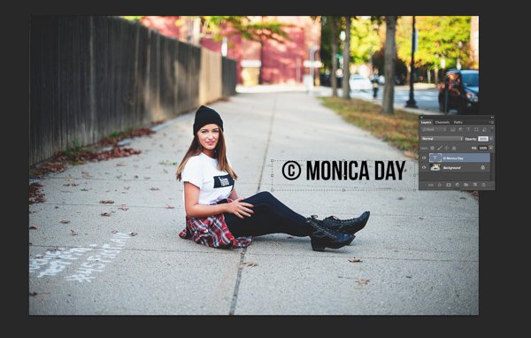
The first way is to create a text layer. This is great for simple word watermarks. You can then write your name or your photography business’ name. From there, you can adjust the opacity as you see fit. Try adjusting the blending mode to achieve the look you want. To get the © symbol type; option+g on a Mac, or Alt+0169 on a PC.
Normal blending layer with black font at 100% opacity.
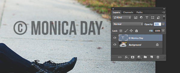
Normal Blending Mode with an opacity of 63% in black font.
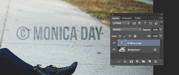
Overlay Blending Mode with a black font color at 100% opacity.
2. Logo file
If you have a logo you can place it on your image. You want to make sure your logo has a transparent background. Usually, this will be a PNG file, a GIF or even a vector graphic. If you are unsure, check with your logo designer. Use the place option to put your logo on your image. Again, you can adjust your opacity and blending modes to get the desired effect.

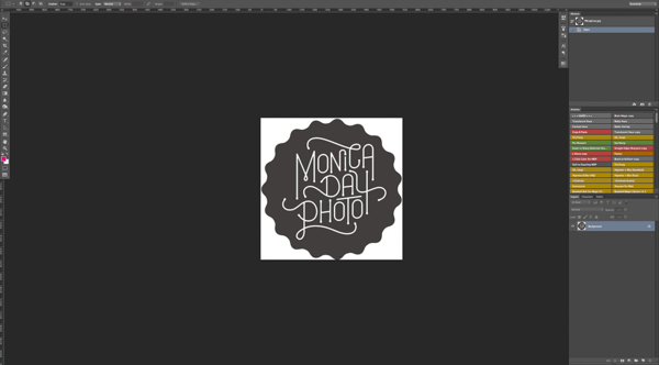
PNG file with a transparent background. The checker pattern lets you know that the background is transparent.
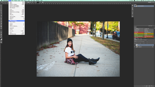
Place function in the Photoshop CC menu. You then choose the file you’d like to place.
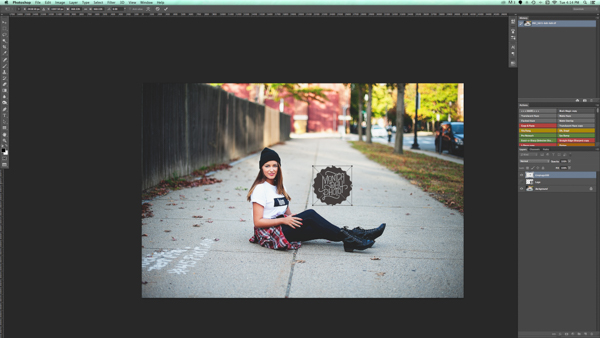
Place the file and adjust the size as you wish. (Hold the Shift key down as you resize to maintain the aspect ratio and proportion of your logo)

You can again adjust the opacity and blending mode to get your desired look.
2a. Making your logo background transparent if it isn’t already
If you have a logo file that does not have a transparent background then follow these simple steps to create one. First, open your file in Photoshop. Go ahead and unlock this layer (double click it, then hit Enter).
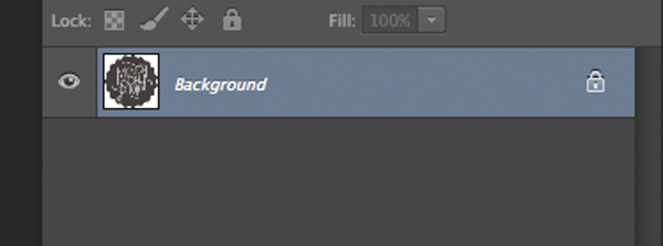
Background layer locked
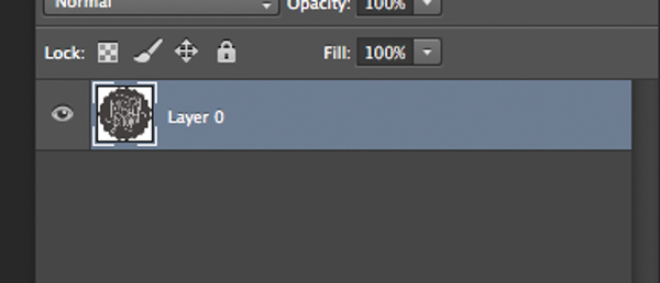
Layer is now unlocked.
Next, use the magic wand to select the background. If the background is not a solid color then select your logo image and then invert the selection. Now that your background is selected, simply cut. You can do this with cmd+x (Mac) or ctrl+x on a Windows computer.

Select the background only.
Your image should now have a transparent background. Save this file as a .PNG (JPGs cannot hold transparency) and you’re ready to go.

Where you see the grid pattern it’s now transparent.
3. Using the brush tool
For an even easier way to watermark, create a brush. This way you do not have to go through these steps each time you want to watermark your images.
To create the brush with text you’ve written you will need to open a new document in Photoshop. Make sure your document has a transparent background. Type the information you want to have on your watermark. Make sure you have it set up exactly like you want it on your images. Once you have your watermark just as you want it you should go to Image > Trim > Transparent Pixels. Next, Edit-Define Brush Preset. Name your brush and you’re ready to go. The same process can be done with your logo file.
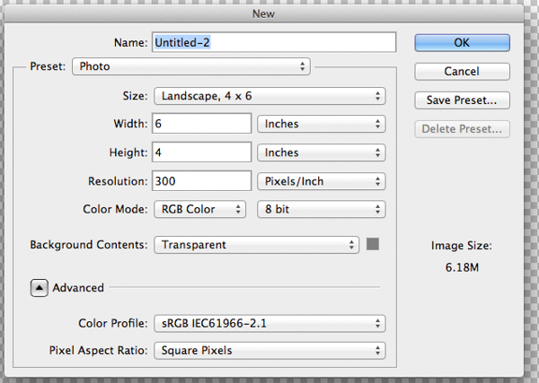
These are sample settings that work well in most cases. Make sure your background is set to “Transparent”.

Notice that the font is written very large.
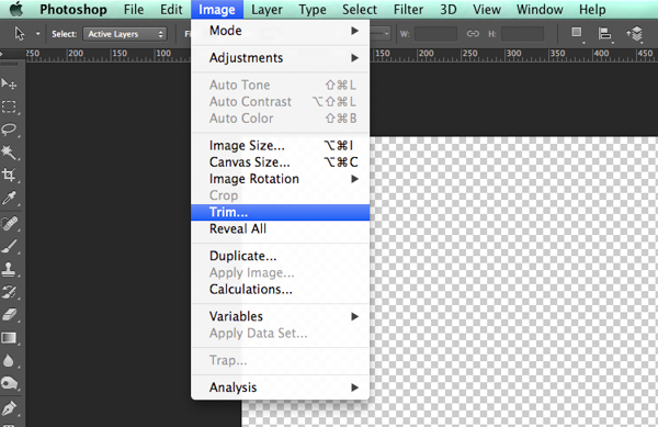
Make sure you trim your watermark text.
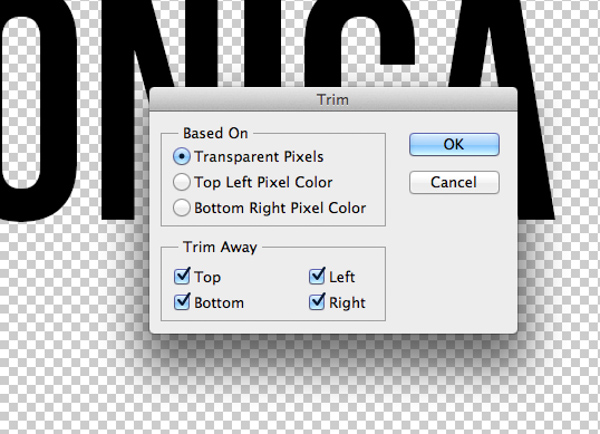

Your trimmed text should have no space around it.
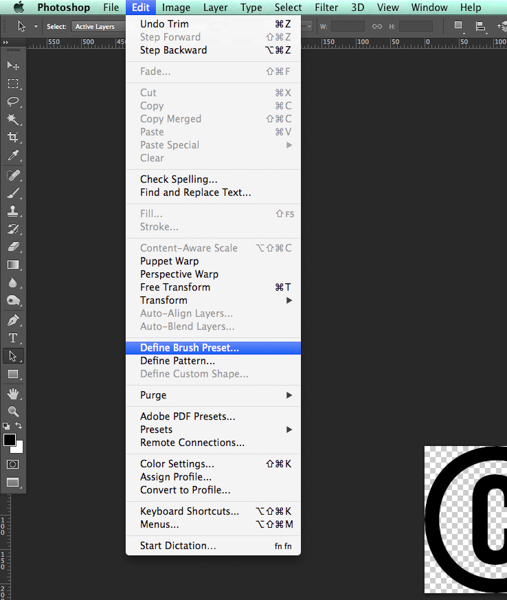
Define your brush in the edit menu.
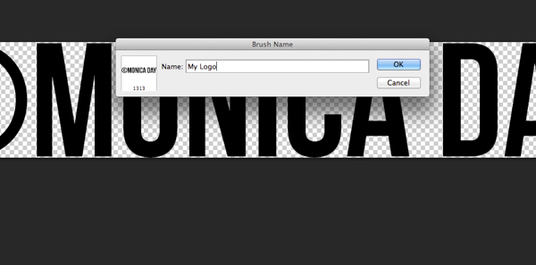
Give your brush a descriptive name.
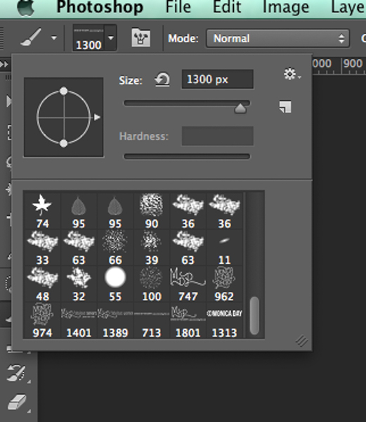
Notice that your brush is now in your brush menu. You can see it at the bottom right in this picture.
You can now use your brush as you would any other brush. The key to having it watermark is to create a layer and select the brush that is your watermark. A simple click will watermark your image. You can adjust the size, opacity, and blending mode as your like.
For more on making a signature brush read: How to make a signature brush in Photoshop
Watermarks using Lightroom
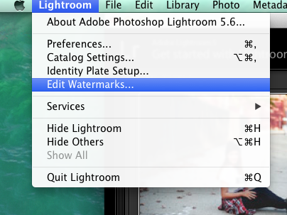
Lightroom has an awesome feature built-in that allows you to watermark your images upon export. In order to use this feature you must first set up your watermark, to do that go to Lightroom>Edit Watermarks.
You can choose an image or text. There are several different settings that allow you to adjust your watermark like you want. Remember, to get the best results you’ll want to use a PNG file with a transparent background. If you don’t, you’ll have a white box around your logo. You’ll need to save and name your watermark.
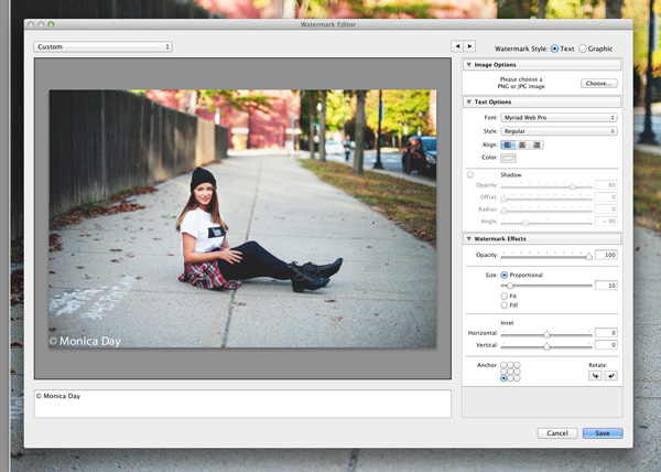
For a text watermark simply write your desired information in the white box. You can change the font, color, shadow, and size of your watermark. Watch the image to see your desired effect. Use the Anchor option to adjust placement and the Inset option for further tweaks.
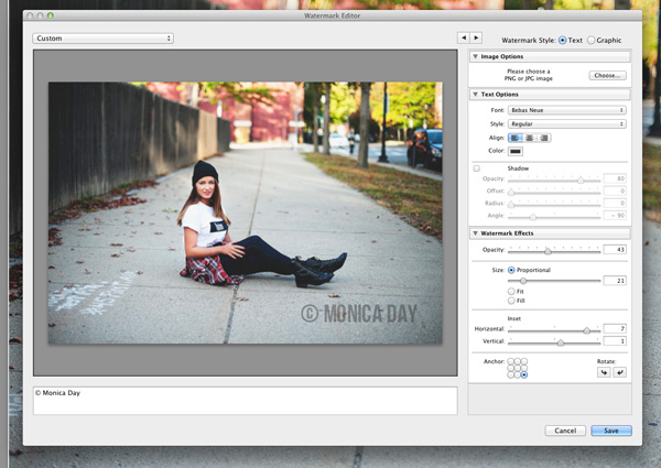
The font, opacity, size, and location can be altered as you like.
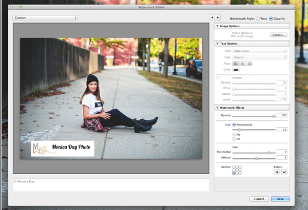
Make sure you use a logo file with a transparent background to avoid this white box. JPEG files cannot have transparent backgrounds.
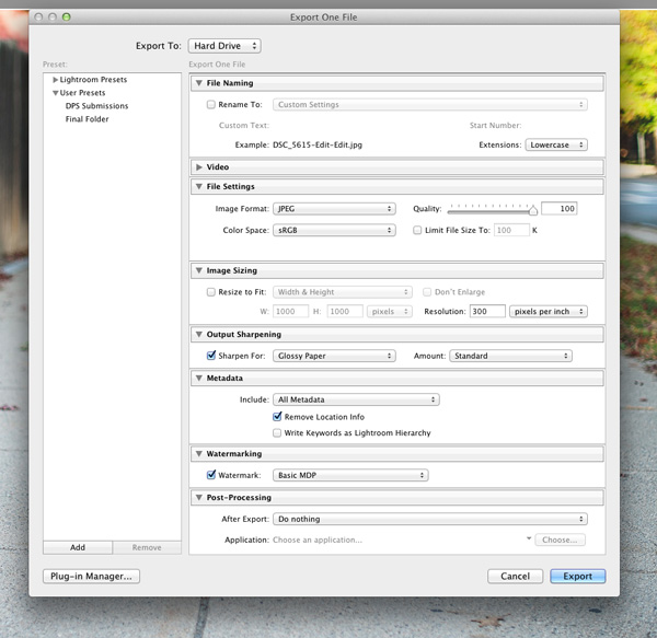
Now that your watermark is all set up, let’s apply it to your image. Go to Export and Watermarking. There you can choose whatever watermark you have setup. Your image will be exported to the desired location with the watermark chosen.
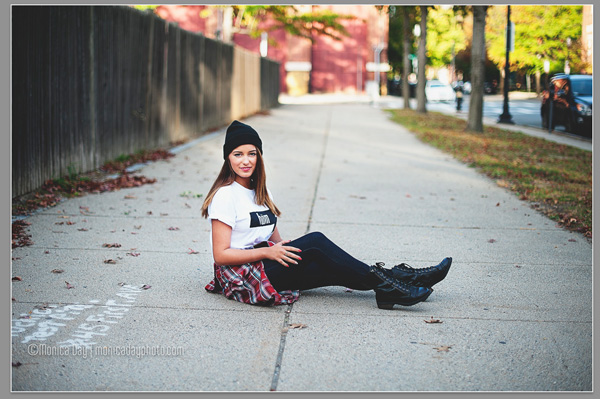
This image was watermarked in Lightroom with a shadow.
Have you got any other methods for adding a watermark to your images? Please share your tips or your results using these methods in the comments below.
The post How to Watermarking Images With Photoshop and Lightroom by Monica Day appeared first on Digital Photography School.
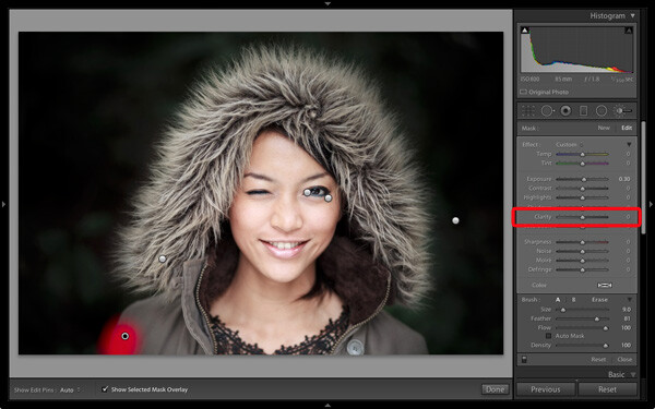
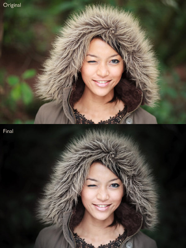
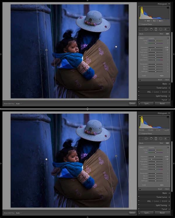
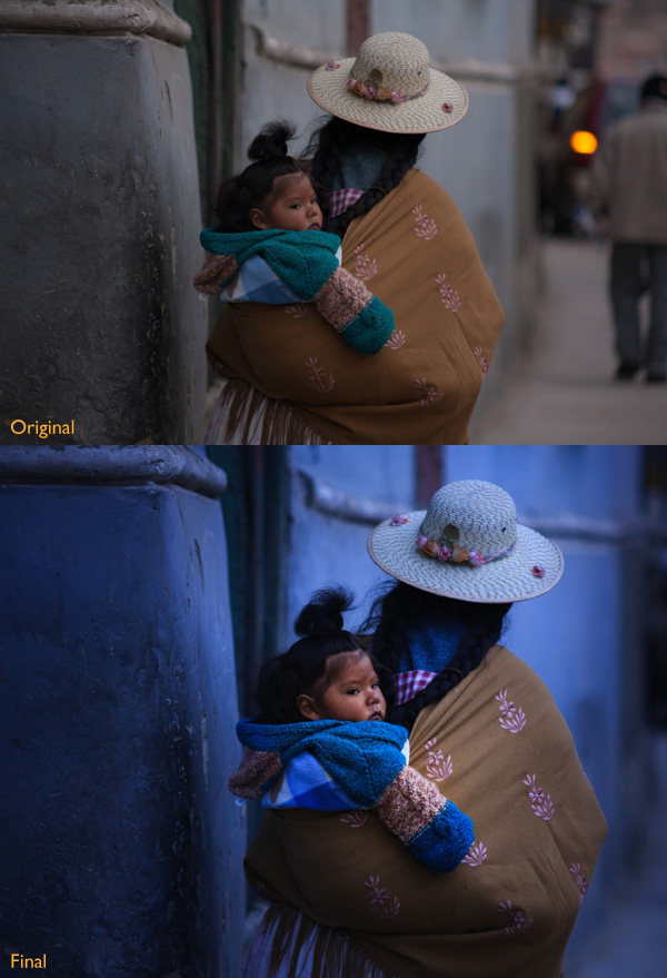
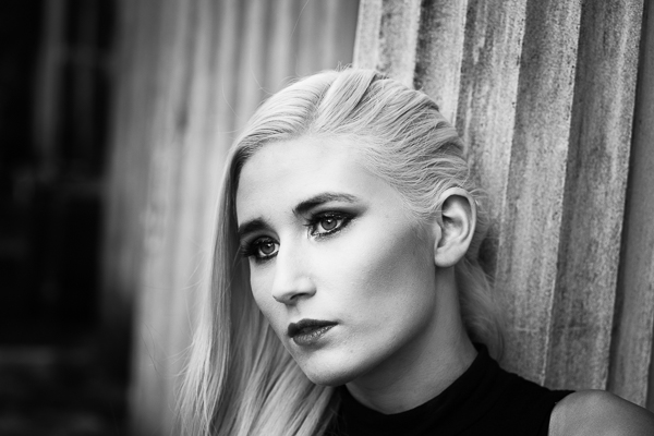
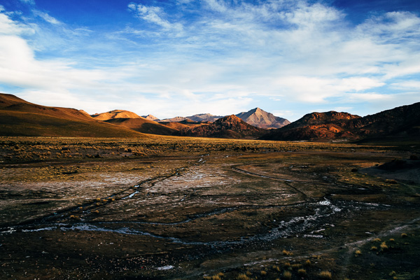
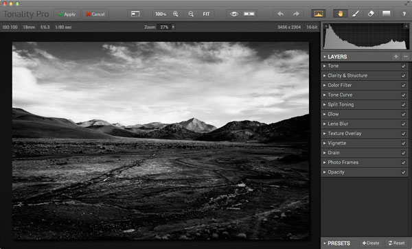
 Andrew’s ebook Mastering Lightroom: Book Four – The Photos is available now at a special price of 40% off for a limited time from Snapndeals. It’s an advanced guide to processing photos in Lightroom’s Develop module, explaining how to use Lightroom’s powerful processing engine plus Develop Presets and plug-ins to create beautiful images. This photo is one of ten case studies from the book.
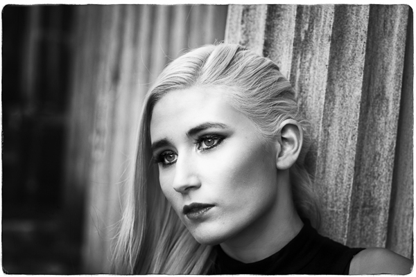
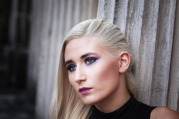
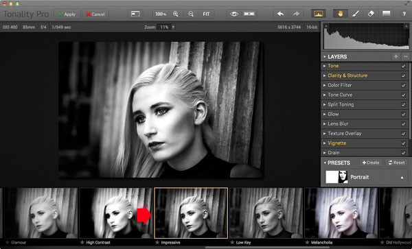
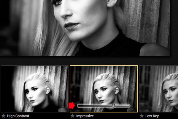
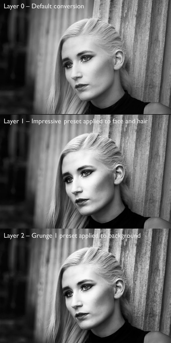
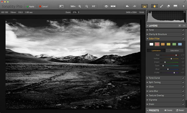
 My ebook Mastering Lightroom: Book Three – Black & White goes into the topic of black and white in depth. It explains everything you need to know to make dramatic and beautiful monochrome conversions in Lightroom, including how to use the most popular black and white plug-ins. Click the link to visit my website and learn more.


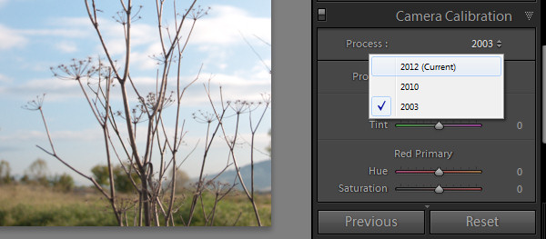
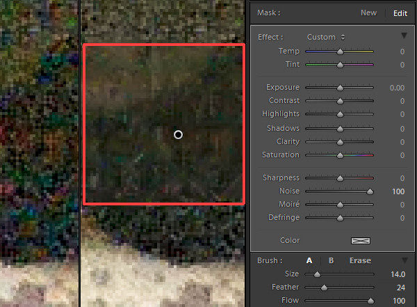
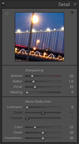 For raw images Lightroom automatically applies color noise reduction in the import process. So the Color Noise Reduction slider will be set, by default, to 25 with Detail and Smoothness set at 50 for all raw images. The Luminance noise slider will be set at 0, with Detail at 50 (see screenshot on the right)
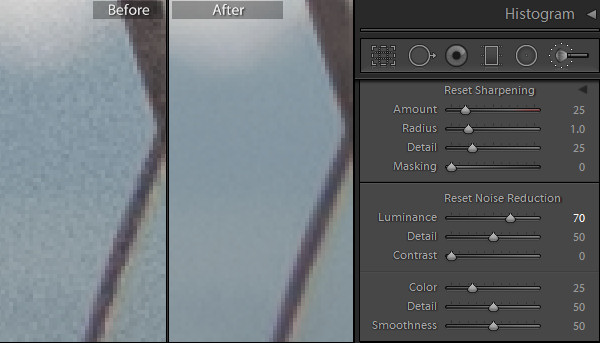
 Newborn photography requires a tremendous amount of patience, skill, a willingness to be okay with accidents, and even stronger photo editing skills as these precious little newborns often have numerous skin imperfections that can cause you to spend a significant amount of time editing and retouching the photos.


You must be logged in to post a comment.