Toning originated as a darkroom process designed to extend the longevity of black and white prints. Photographers did so using chemical toners such as sepia, selenium and gold. Toners work by removing silver from the print and replacing it with another element with a longer life span.
A side effect of toning is that it adds colour. Sepia toned prints range from light yellow to deep brown, selenium is a subtle blue or purple, and gold anything from blue to deep red (if applied to a photo that has already been sepia toned). For many photographers the colours were just as important as the archival benefits because of the emotional values they added to the monochrome print.
Another, more unfortunate side effect of darkroom toning is that many of the chemicals are hazardous. Luckily, in the digital age, there is no need to use them. Toning is much quicker, and you can create any colour tone you like, using Lightroom’s Split Toning panel.
Furthermore you can use Virtual Copies to create several different versions of the same image, each with a different tone. It makes experimenting easy, and you can compare them afterwards to see which you prefer. You can even turn your favourite toning effects into Develop Presets so you can use them again whenever you want.
Emotional value of toning
Before we start, let’s look why you would tone a black and white photo. With digital, there is no need to tone for archival purposes, that leaves two reasons. The first is simply because you want to add some colour. Toning is a good way to do that and can really lift your images. The second reason is to add emotional value to the photo. For example, sepia toning both flatters the model and adds a sense of nostalgia and warmth. Blue toning, on the other hand, adds a cold feel.
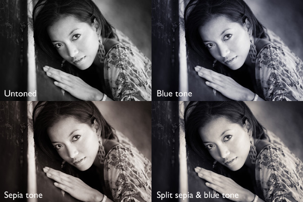
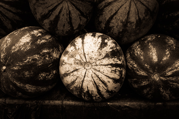
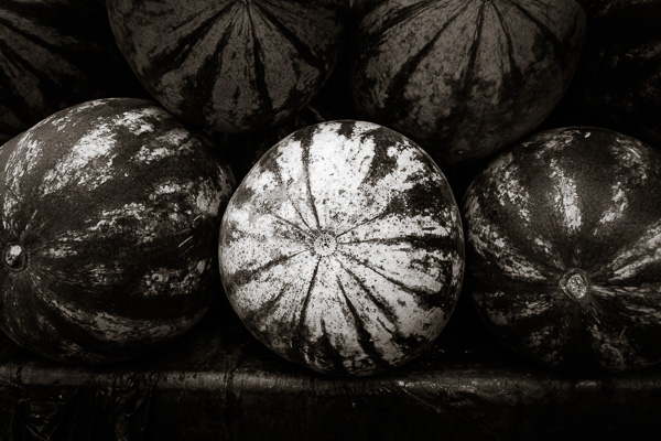
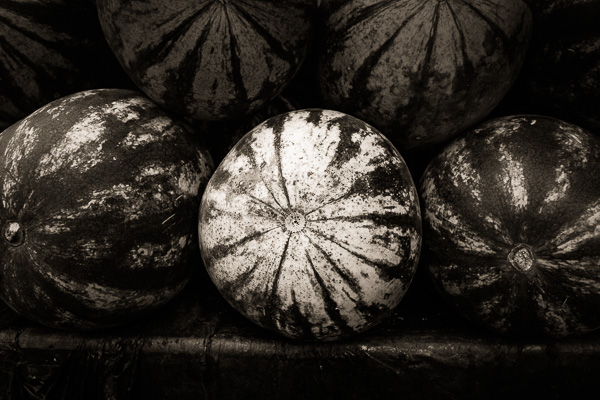
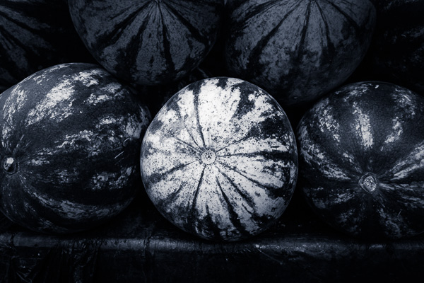
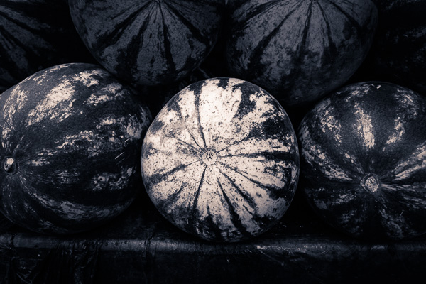
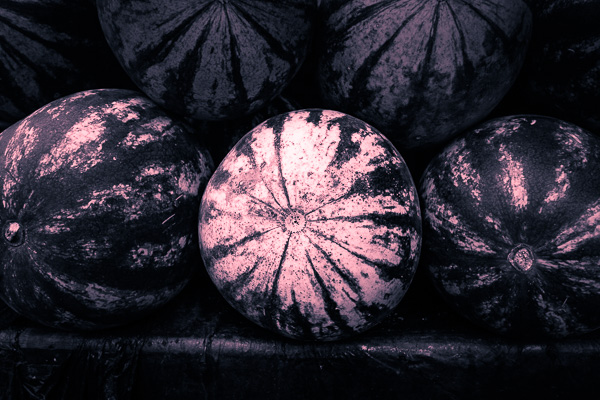
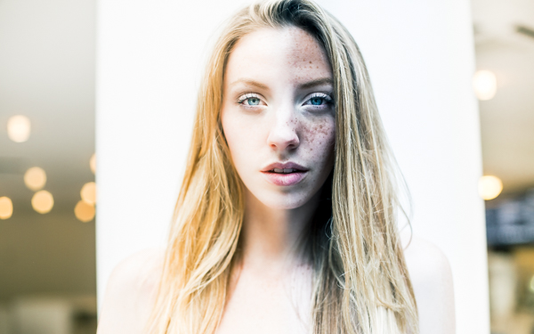
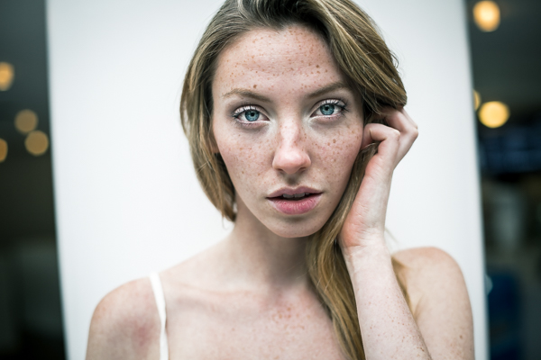
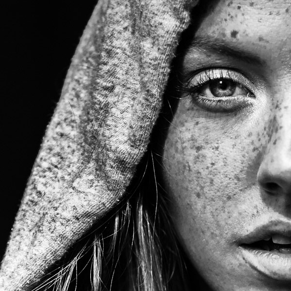
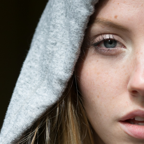
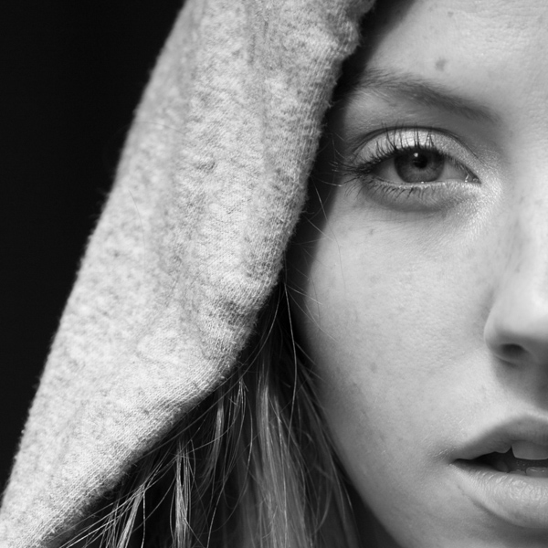
These four photos are processed identically apart from the toning treatment. The colour makes a huge difference to the appearance and emotional impact of each image.
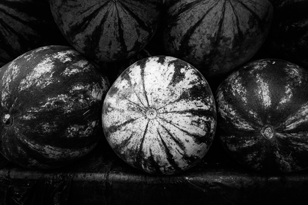
It should be noted at this point that not all black and white photos take well to toning. The best images to use are those with lots of dark tones (plus some highlights for contrast – my article about tonal contrast goes into this more). Black and white photos with lots of light tones don’t seem to tone as well as those with lots of shadows.
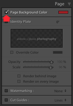
How to use the Split Toning panel
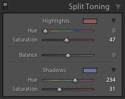
The Split Toning panel
The Split Toning panel is simple to use. The first pair of Hue and Saturation sliders sets the colour that is applied to the photo’s highlights. The second pair sets the colour that is applied to the shadows. The Balance slider is used to give precedence to either the highlight or the shadow colour.
If you hold the Alt key down while moving the Hue slider, Lightroom displays the Hue at 100% saturation, helping you judge the colour accurately.
Here are some examples. Most black and white split toning combinations are a variation of the following.
Highlights: Hue 0/Saturation 0 | Shadows: Hue 0/Saturation 0
Untoned black and white image.
Highlights: Hue 0/Saturation 0 | Shadows: Hue 45/Saturation 13
Sepia tone applied to shadows only, leaving highlights unchanged.
Highlights: Hue 46/Saturation 17 | Shadows: Hue 45/Saturation 15
Sepia tone applied to shadows and highlights.
Highlights: Hue 0/Saturation 0 | Shadows: Hue 234/Saturation 26
Blue tone applied to shadows only, leaving highlights unchanged.
Highlights: Hue 39/Saturation 30 | Shadows: Hue 234/Saturation 26
Blue tone applied to shadows, sepia tone applied to highlights. This is the classic split tone look. Split toning like this helps create a sense of depth. Basic colour theory tells us that warm colours appear to be closer to the viewer and that cool colours recede. Applying a cool tone to the shadows and a warm one to the highlights helps reinforces a similar sense of depth created by the effective use of tonal contrast.
Highlights: Hue 0/Saturation 47 | Shadows: Hue 234/Saturation 31
Blue tone applied to shadows, copper tone applied to highlights. This imitates the blue and copper split tone effect that was possible to achieve in the chemical darkroom.
Highlights: Hue 47/Saturation 52 | Shadows: Hue 36/Saturation 23
Sepia tone applied to shadows, gold tone applied to highlights. This imitates the sepia and gold split tone effect it was also possible to achieve in the chemical darkroom.
Those combinations should be enough to get you going, and of course you can experiment as much as you like with the sliders in the Split Toning panel to see what you can achieve.
Please share some of your split toning creations in the comments below.
Mastering Lightroom: Book Three – Black & White
 My ebook Mastering Lightroom: Book Three – Black & White goes into the topic of black and white in depth. It explains everything you need to know to make dramatic and beautiful monochrome conversions in Lightroom, including how to use the most popular black and white plug-ins. Click the link to visit my website and learn more.
googletag.cmd.push(function() {
tablet_slots.push( googletag.defineSlot( “/1005424/_dPSv4_tab-all-article-bottom_(300×250)”, [300, 250], “pb-ad-78623” ).addService( googletag.pubads() ) ); } );
googletag.cmd.push(function() {
mobile_slots.push( googletag.defineSlot( “/1005424/_dPSv4_mob-all-article-bottom_(300×250)”, [300, 250], “pb-ad-78158” ).addService( googletag.pubads() ) ); } );
The post How to Split Tone Black and White Photos in Lightroom by Andrew S. Gibson appeared first on Digital Photography School.

 Mastering Lightroom: Book Five – The Other Modules
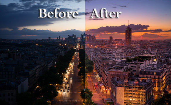
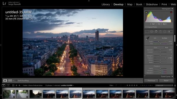
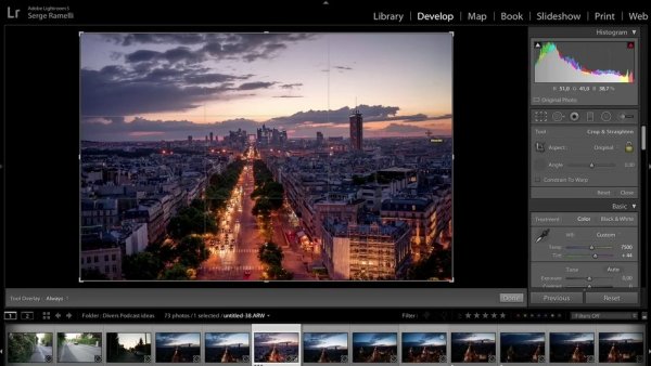
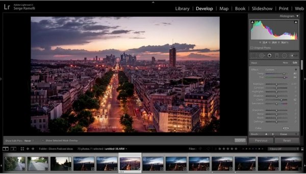
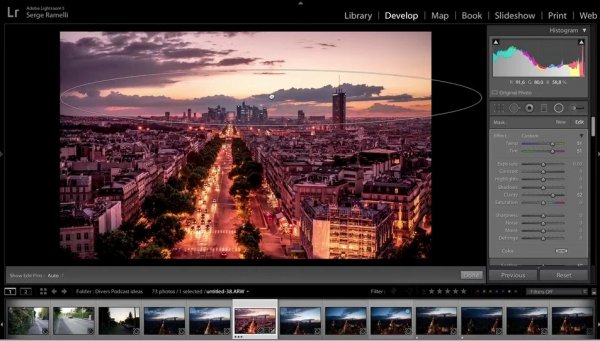
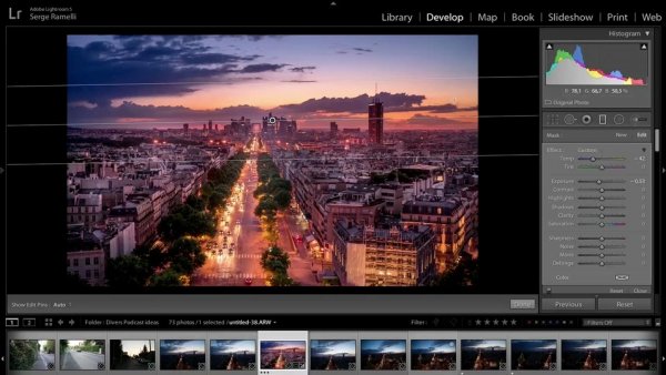


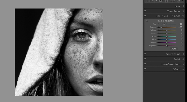
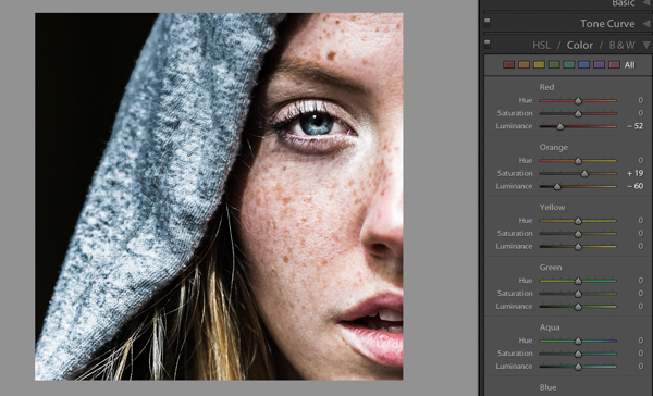
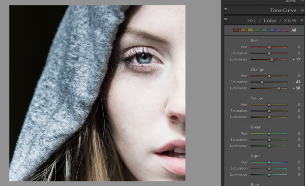
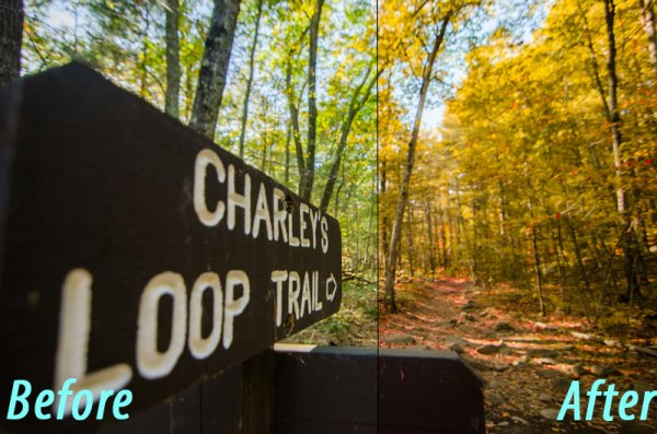
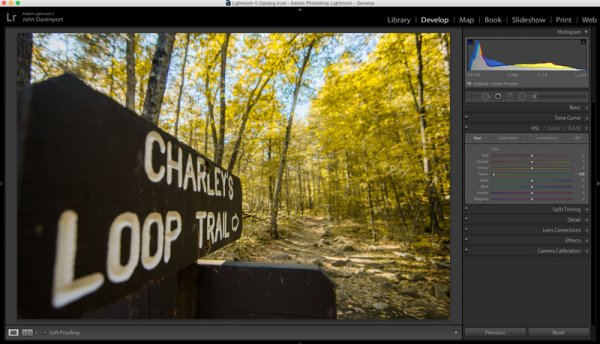
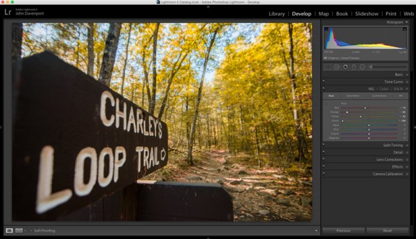
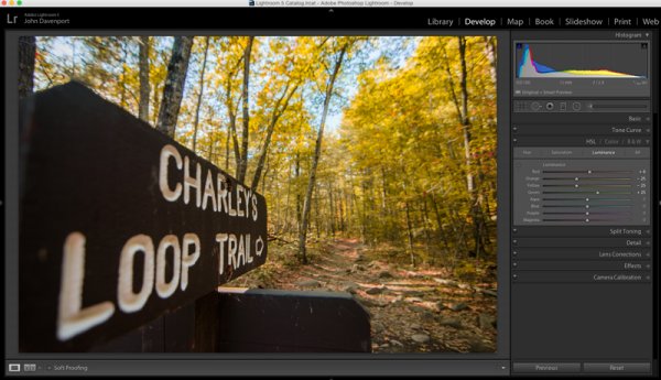
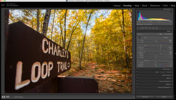
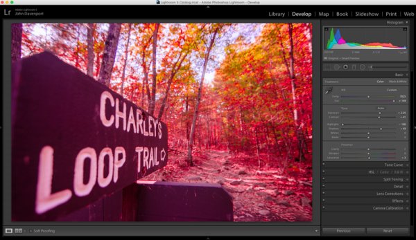
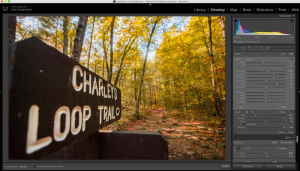
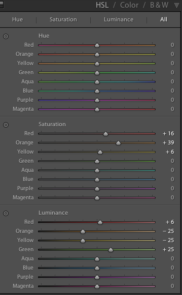 The workhorse of the manipulations you will see today is the HSL tab in Lightroom. It allows you to control the Hue, Saturation, and Luminance of your photograph on a color by color level. This gives you the ability to modify reds separately from oranges, blues from greens and so forth.
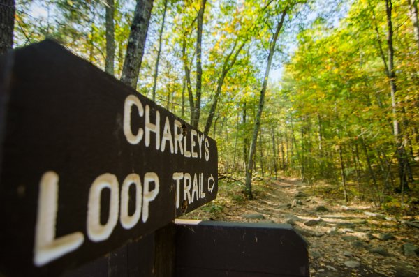


You must be logged in to post a comment.