RSS
 

Posts Tagged ‘lightroom’

Two Useful Lightroom Print Module Custom Layouts

14 Aug

On sale now at Snapndeals: August 11-25th get 20% OFF Andrew’s ebooks – Mastering Lightroom Complete Collection: Lightroom 6 & CC Update. 

With a little imagination and know-how you can use the Lightroom Print module to create amazing layouts, which in turn you can use to create prints, postcards or even business cards. I’m going to give you a couple of examples, which you can copy or adapt to your own requirements. Let them inspire you to come up with your own creative designs!

Custom Layout #1: Single Image / Contact Sheet

This is the first custom layout we are going to create. It uses the Single Image / Contact Sheet Layout Style. With this Layout Style, each selected photo in the Collection is added to the layout just once, in the order that they appear.

Lightroom Print module

1. Maximize template

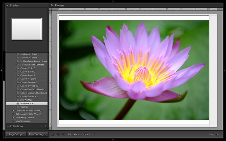
Go to the Template Browser panel in the Lightroom Print module and select the Maximize Size template. This simple template is an ideal starting point for creating your own layouts.

Note: I started with paper size set to A4 (click the Page Setup button to set paper size and orientation). If your paper size is different, you will require different measurements to those used here. The same applies if your page bleed area, which depends on the printer model, is different.

Lightroom Print module

2. Save Print

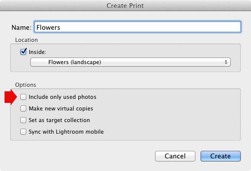
Before you go any further, click the Create Saved Print button. The Create Print window appears. Give the print a name, and make sure the Include only used photos box is unticked. Click Create, and Lightroom creates a new Collection called a Print Collection (marked by a printer icon in the Collections panel) containing the photos in the original Collection. Now it’s impossible for you to lose your work – you can leave and come back to the Print Collection at any time.

Lightroom Print module

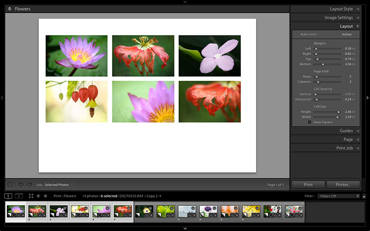
3. Set up the page layout

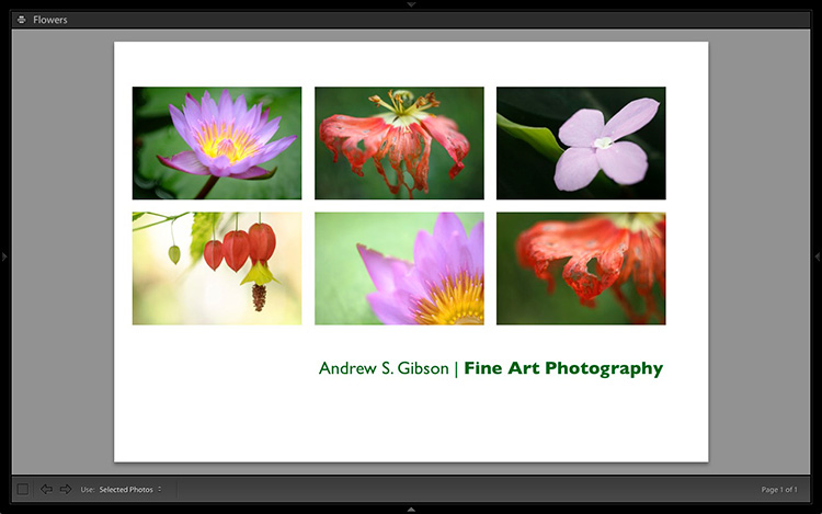
Go to the Layout panel and under Page Grid; set Rows to 2 and Columns to 3. Only selected photos appear in the layout, so in the Filmstrip, select the photos that you want to appear, clicking and dragging to rearrange the order if necessary. Note: If you select more than six images, Lightroom creates a second page to automatically fit them onto.

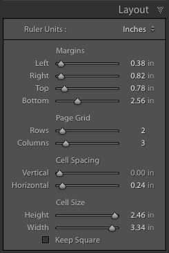
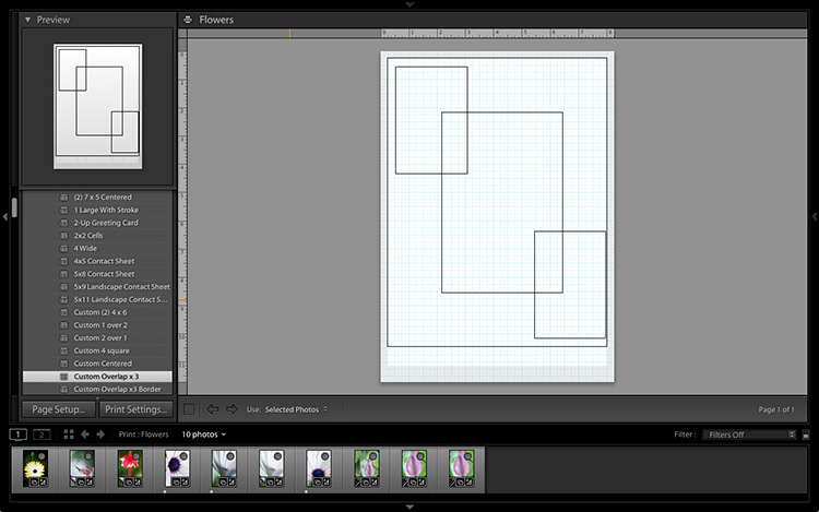
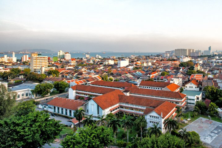
Adjust the Margins, Cell Spacing and Cell Size settings to add space between the photos and create the style you see below. The layout is shown both with the guides on and off (tick/untick the Show Guides box in the Guides panel) for clarity. Remember to centre the photos between the grey border representing the page bleed area, not the page itself.

Lightroom Print module

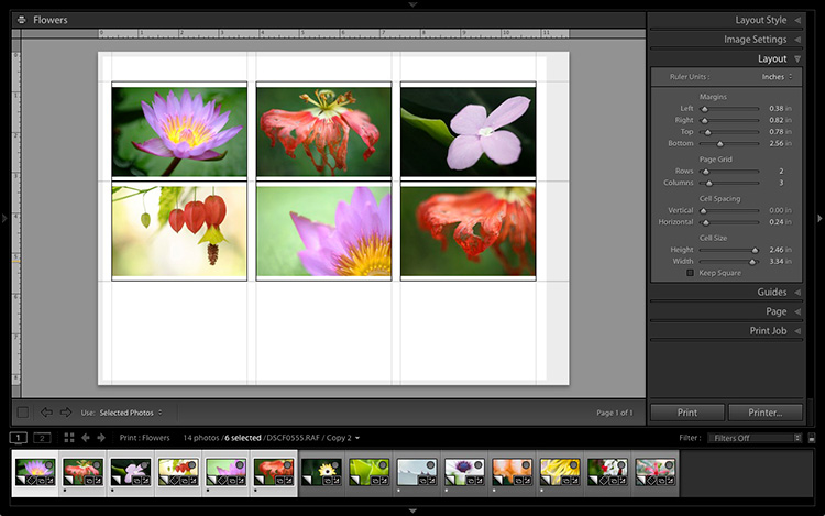
This screenshot shows the layout with Guides enabled. Note the page bleed area around the edge (shown in grey) and the black lines showing the dimensions of the Photo Cells.

Lightroom Print module

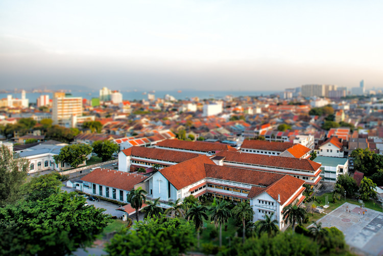
The layout is much easier to see with the Guides turned off.

The idea is to keep the spaces between the photos as even as possible (or as close as you can get according to the restrictions of your selected paper size). The settings I used are shown below, but yours may differ if you are using a different paper size, or if your photos have a different aspect ratio.

Lightroom Print module

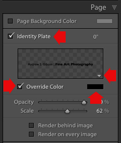
4. Set up the Identity Plate

Go to the Page panel and tick the Identity Plate box. Click the white arrow icon (down facing one) and choose a Styled Text Identity Plate to go at the bottom of the layout – if you don’t have a suitable one already, you can create a new one by selecting Edit from the menu. Tick the Override Color box and click the rectangle to the right of it to select a colour for the Identity Plate text.

Lightroom Print module

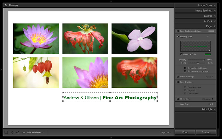
5. Set size of identity plate to match two columns

If possible, resize the Identity Plate so it is the same width as the last two columns. As long as the text doesn’t look too large or too small (you’ll have to exercise your own judgement), aligning it with the photos this way adds a professional touch to the design.

Lightroom Print module

Custom Layout #2: Custom Package

The Print module contains nine templates that work with the Custom Package Layout Style. This Layout Style is like the Single Image / Contact Sheet Layout Style, except that it lets you add the same image to a page more than once, and also overlap photos.

Another difference between the Custom Package Layout Style and the others, is that Lightroom doesn’t add photos automatically to the layout. Instead, you add them yourself by clicking and dragging them from the Filmstrip. This makes it easy to move photos around without having to rearrange them in the Filmstrip, and to add the same photo to a page more than once.

1. Select the Custom Overlap x3 template

Go to the Template Browser panel and select the Custom Overlap x 3 template. Don’t forget to click the Save Print button to create a new Print Collection.

Lightroom Print module

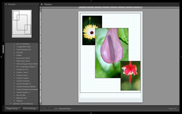
2. Add the photos by dragging and dropping them

Unlike the previous example the template doesn’t automatically populate with selected images. Instead, you have to click and drag photos from the Filmstrip. Here’s how it looks with photos added.

Lightroom Print module

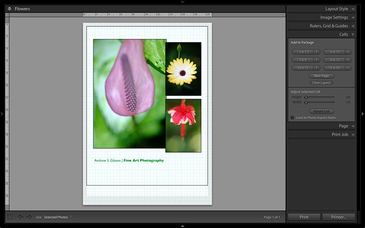
3. Resize images to suit

The overlapping images are less than ideal, but unlike the Single Image / Contact Sheet Layout Style used in the first example, you can drag and resize the Photo Cells to something that suits you. You can adjust the size of the Photo Cells precisely in the Cells panel (and add new ones), and keep them aligned by going to the Rulers, Grids & Guides panel and setting Grid Snap to Grid.

Right-click on a Photo Cell and select Send to Front to bring it on top of the others.

You can also add a Styled Text Identity Plate the same way as in the first example. A little tweaking enabled me to come up with the following design.

Lightroom Print module

Hopefully these examples will show you just how flexible the layouts in the Print module are when you take the time to explore the possibilities. But did you know that you can also create triptychs and calendars quite easily in the Print module? The following articles show you how to do it.

  • How to Create a 2015 Calendar in the Lightroom Print Module
  • How to Make a Triptych in Lightroom

The Mastering Lightroom CollectionMastering Lightroom ebooks

On sale now at Snapndeals: August 11-25th get 20% OFF Andrew’s ebooks – Mastering Lightroom Complete Collection: Lightroom 6 & CC Update. 

googletag.cmd.push(function() {
tablet_slots.push( googletag.defineSlot( “/1005424/_dPSv4_tab-all-article-bottom_(300×250)”, [300, 250], “pb-ad-78623” ).addService( googletag.pubads() ) ); } );

googletag.cmd.push(function() {
mobile_slots.push( googletag.defineSlot( “/1005424/_dPSv4_mob-all-article-bottom_(300×250)”, [300, 250], “pb-ad-78158” ).addService( googletag.pubads() ) ); } );

The post Two Useful Lightroom Print Module Custom Layouts by Andrew S. Gibson appeared first on Digital Photography School.


Digital Photography School

 
Comments Off on Two Useful Lightroom Print Module Custom Layouts

Posted in Photography


Understanding Black and White Filters in Lightroom

13 Aug

Shooting in black and white can be an amazingly creative way to explore new areas of photography, and help you see not only your pictures, but the world around you in a whole new light. However, unless you are shooting with black and white film or with a dedicated black and white camera like the Leica M Monochrom, all your pictures will initially be shot in color and later transformed into black and white through software tricks or filters.

Lightroom has an impressive array of presets that allow you to apply black and white effects to your color pictures, but in order to select the right filter for your particular pictures it’s important to understand how these presets work behind the scenes, and what they are really doing to your photos.

black-and-white-filters-hispanic-student-association

Back in the days of film photography, black and white film was composed of a single layer of silver crystals that were sensitive to light and affected the film in different ways depending on the wavelength, or color, of the incoming light. Green light (like reflected off of plants and trees) had a different effect on the film than red light (reflected off apples) or blue light (reflected off the sky).

When color film was invented it contained not one, but three layers of silver halide crystals, each of which produced different colors when exposed to light–similar to how the photosensitive pixels work on modern digital cameras. The problem with this method was that sometimes a photographer would need his or her film to be extra sensitive to different wavelengths of light, depending on the particular scene being photographed. One popular solution was to use colored filters that screwed onto the front of the camera lens, which still left the resulting image monochrome but changed its properties in significant ways.

A collection of color filters that can be quite useful in black and white photography.

A collection of color filters from Amazon that can be quite useful in black and white photography.

These filters operate by absorbing light on different parts of the spectrum while letting other colors pass through much more easily: green filters absorb more of most colors except green, blue blocks most colors except blue, and so on. This means that portions of the spectrum similar to the color of the filter will be lighter since more of that color of light makes it through the filter and essentially over-exposing those portions of the film. Conversely, portions on the opposite side of the color wheel from a given filter color will be darker since less of that light is allowed to pass through. For example, this diagram illustrates the basic principle behind a red color filter:

black-and-white-color-filters-diagram

The fact that more red is allowed to enter through the camera lens means the camera’s light meter would then adjust itself accordingly: you’re essentially exposing for the reds, which means that a properly exposed black and white image with a red filter would have pleasing reds with very dark cyans, blues, and greens.

black-and-white-color-filters-diagram-stars

By taking this basic idea and applying it to modern digital photography you can start to see how different black and white post-processing solutions work. In Lightroom you can mimic the effects of a color filter when converting an image to black and white. It’s not quite the same as actually using a physical filter on your lens and shooting using black and white film, but it’s a decent approximation that gets the job done for most circumstances. The trick is knowing which filter to use in a given situation.

This shot of kids’ feet would be nice in black and white, but in order to choose the right style it’s important to know how each type of color filter will affect the results. A green filter will make the leaves lighter while darkening the skin colors, since they are somewhat opposite on the color wheel. A blue filter will lighten the bluish hue of the rocks and the darker areas in the leaves but darken the skin colors, though perhaps a bit too much.

black-and-white-filters-feet-original

Here’s what the same image looks like with five different Lightroom black and white filter presets applied:

black-and-white-filters-all

In the end I chose a yellow filter to create the final image because it exposes the legs and feet a bit more while underexposing the blue and purple hues in the rocks:

black-and-white-filters-feet-yellow-filter

Of course Lightroom is not actually putting a color filter over your picture, but using digital tricks to approximate the same effect. It does this by altering the values of various parameters in the Develop module when a given preset is applied. After selecting a Black and White Filter preset you can see how various color values change by choosing the B&W panel in the Develop module. Note how the sliders change for various selected Presets, such as the Yellow and Blue in the example below.

black-and-white-lightroom-presets

Lightroom is not applying different colors to a black and white image, but deciding how much of each color value to over or under-saturate in order to mimic the effect of putting the same type of physical filter on your camera. While it’s not quite the same as shooting in pure black and white, one of the nice advantages is how Lightroom allows you to essentially create custom black and white filters by adjusting the slider values yourself. You can tweak any of the existing Presets, not just the Black and White ones, by increasing or decreasing various sliders, and even save your adjustments as new Presets that you can apply instantly to any image.

As one more extreme example, here’s an image of some bocce balls with different filters applied.

black-and-white-lightroom-balls-original

The original color image, properly exposed.

Applying a red filter preset in Lightroom produces an image where the reds are properly exposed and a bit lighter, but the blue shirts are dramatically darker since red and blue are rather opposite on the color spectrum.

black-and-white-lightroom-balls-red-filter

The same image with a Red black and white filter preset applied.

Now look what happens when a blue filter preset is applied. Just like a real physical filter on the front of the camera lens, the blues are lighter while all opposing colors are incredibly dark because very little of that light was allowed to pass through–or at least that’s the effect that Lightroom attempts to mimic.

black-and-white-lightroom-balls-blue-filter

A Blue filter preset now changes the image dramatically.

So how do you get a properly exposed image, with a well balanced amount of black and white across the frame? In real life you would use a green filter since this would block roughly equal amounts of both reds and blues, and the effect works quite well in Lightroom as well.

black-and-white-lightroom-balls-green-filter

Using a green filter preset results in a well balanced image.

As you can see, getting a proper black and white conversion in Lightroom is not always as simple as just clicking a button. It helps to know not only what options are available, but why they function the way they do.

What about you? What are your favorite black and white tips and tricks in Lightroom? There is much more I have not covered in this article, and if you have anything you’d like to share leave your thoughts in the comments below.

Editor’s Note: This is the second article in a week full of features on black and white photography. Look for 5 Simple Ways to Create Expressive Photos in Black and White earlier today and more daily over the next week.

googletag.cmd.push(function() {
tablet_slots.push( googletag.defineSlot( “/1005424/_dPSv4_tab-all-article-bottom_(300×250)”, [300, 250], “pb-ad-78623” ).addService( googletag.pubads() ) ); } );

googletag.cmd.push(function() {
mobile_slots.push( googletag.defineSlot( “/1005424/_dPSv4_mob-all-article-bottom_(300×250)”, [300, 250], “pb-ad-78158” ).addService( googletag.pubads() ) ); } );

The post Understanding Black and White Filters in Lightroom by Simon Ringsmuth appeared first on Digital Photography School.


Digital Photography School

 
Comments Off on Understanding Black and White Filters in Lightroom

Posted in Photography


7 Reasons Why You’d be Crazy Not to use Lightroom Presets

11 Aug

Today, in this digital age, your job isn’t done once you’ve taken the photos, you’re really only halfway there. You need to edit your photos. Luckily, using Adobe Lightroom, combined with some really high-quality presets, you can instantly start getting amazing results, rather than spin your wheels being frustrated trying to edit your photos.

But first – what is a Lightroom preset?

DPS Presets Article Cover Photo

A Lightroom preset is simply a collection of photo edit settings inside of Lightroom that are bundled into a single click allowing you to edit photos far more efficiently than you would otherwise by repeating those same settings and editing steps one by one.

Here are 7 reasons why you’d be crazy not to use Lightroom presets:

Save Time

When using Lightroom presets, with only one click you’ll be able to instantly get your photos to an 85-90% edited state, and sometimes you’ll even be completely done with one click! Rather than edit each photo from start to finish, you can spend your time on the fine-tuning part of the editing process.

Simple to Use

Learning any new software can be intimidating, and take time to master. While it’s certainly important to always take strides at truly learning the program, using presets will let you instantly get started in Lightroom, and edit your photos simpler than ever before.

LR Preset Screenshot what and why presets

Variety

Does the photo look best in black and white or a sepia edit? Or maybe a vibrant color edit or a subdued vintage look? Using Lightroom presets will give you a ton of creative variety right at your fingertips so you can effectively try different edits and see which style is most fitting for a particular photo, or even full photo session. Quick tip – when you hover over a different preset, Lightroom will show you a preview of how that photo will look with that preset applied (in the Navigator box, at the top of the left panel in the Develop Module, see screenshot above).

Digital Photography School Lightroom Presets 0001 Variety

Consistency

When you are editing an entire photo session, using the same presets across the whole photo shoot will give your images a more uniform and consistent look, as opposed to editing each and every photo one-by-one, which can yield varying settings and a disjointed look to your image set.

Completely Customizable

Have a preset you love, but you always have to slightly adjust the color or contrast? Or maybe your very own style has changed over time? No problem at all. Any develop preset you use inside Lightroom is completely customizable and it’s as easy as a couple mouse clicks.

DPS Customize Presets 750

Lightroom versus Photoshop

Presets work inside Lightroom and actions work inside Photoshop. Both programs have their place in a professional photographer’s editing workflow. However, Lightroom is the primary editing software of choice for both professionals and hobbyists alike. Not only is it far easier to use and learn compared to Photoshop, but within Lightroom all of your edits are non-destructive. That means that your original unedited photo is always stored in Lightroom so you can experiment as much or as little as you want, without ever degrading the quality of your original image.

Presets + Batch Editing = The Winning Combo

Final Landscape 750

Example from the dPS 101 Lightroom Presets Pack

One of the greatest benefits of using Lightroom is its ability to edit a lot of photos very quickly by batch editing, or syncing, your settings from one photo to many at once. When you combine high-quality presets with batch editing in Lightroom you will be able to drastically cut down your complete photo editing time per session.

Now that you have a better understanding of how using Lightroom presets can dramatically reduce the amount of time you spend editing your photos, while getting you better results and increasing your creativity – it’s time to grab some presets for you to use inside of Lightroom.

Introducing the dPS 101 Lightroom Presets Pack

You can scour the web to research and find different Lightroom presets, you can choose to create your own, or you can make your life really easy and purchase the official Digital Photography School – 101 Lightroom Presets Pack that I’ve created.

Final Portraits 750

Example using the Summer Sun preset from the dPS 101 Lightroom Presets Pack

This ultimate preset bundle includes seven different themes, so you can easily find and use a preset that is the most fitting for your specific photo, without having to waste any time. You’ll find presets dedicated for portraits, stunning black and white & sepia presets, presets for landscape photography, street photography, vintage presets and much more.

It doesn’t matter if you are a beginner or professional, you’ll love these presets and the amazing results you’ll get from them. Click here to learn more and save big by getting them during this limited time introductory special promotion price.

Final Street 750

Example from the dPS 101 Lightroom Presets Pack


presets_coverdPS 101 Lightroom Presets Pack

Cole’s handcrafted a brand new set of presets, exclusive to dPS.

  • Instant Digital Download
  • Guaranteed for 2 full months
  • Pay by PayPal or Credit Card

For a limited time only get them at the introductory price of $ 20.


googletag.cmd.push(function() {
tablet_slots.push( googletag.defineSlot( “/1005424/_dPSv4_tab-all-article-bottom_(300×250)”, [300, 250], “pb-ad-78623” ).addService( googletag.pubads() ) ); } );

googletag.cmd.push(function() {
mobile_slots.push( googletag.defineSlot( “/1005424/_dPSv4_mob-all-article-bottom_(300×250)”, [300, 250], “pb-ad-78158” ).addService( googletag.pubads() ) ); } );

The post 7 Reasons Why You’d be Crazy Not to use Lightroom Presets by Cole Joseph appeared first on Digital Photography School.


Digital Photography School

 
Comments Off on 7 Reasons Why You’d be Crazy Not to use Lightroom Presets

Posted in Photography


How to Creatively Alter the Light in Your Photo Using Lightroom

28 Jul

photo of a Tokyo streetscape after being fixed in Lightroom

Learn how to fix problem light and enhance your vision for your photos in Lightroom.

If you’re like most of us, you’ve taken photos from time to time that you’ve had high hopes for, only to realize later on that they didn’t turn out the way you’d hoped. Often what looks like awesome light when you captured the image, just doesn’t translate to great light when you view the photo on your computer screen.

When the photos you’ve captured are once in a lifetime memories they deserve better than this. Thanks to Lightroom they can be improved, fairly quickly and easily. In this video you’ll see how to relight a photo in Lightroom. You’ll learn techniques that you can use on your photos to move the light from where it is now to where you want it to be.

You will see how to use the Graduated Filter to darken skies, how to use the Radial Filter and the Adjustment Brush to bring light and saturation to where you want it to be.

Don’t get me wrong, I’m a big advocate of using the correct settings and capturing a good photo right in the camera. I’m also pragmatic and I know that, despite the best of intentions, the photos you capture don’t always look as good you’d like. Lightroom can help.

So here’s how you can use Lightroom’s tools to improve a photo. This rather lifeless Tokyo streetscape is improved so it is a crisper, shinier image with light and saturated color where it should be. This is something you can do too.

We’d like to see what you do with these tools and your photos, so feel free to show us in the comments below.

googletag.cmd.push(function() {
tablet_slots.push( googletag.defineSlot( “/1005424/_dPSv4_tab-all-article-bottom_(300×250)”, [300, 250], “pb-ad-78623” ).addService( googletag.pubads() ) ); } );

googletag.cmd.push(function() {
mobile_slots.push( googletag.defineSlot( “/1005424/_dPSv4_mob-all-article-bottom_(300×250)”, [300, 250], “pb-ad-78158” ).addService( googletag.pubads() ) ); } );

The post How to Creatively Alter the Light in Your Photo Using Lightroom by Helen Bradley appeared first on Digital Photography School.


Digital Photography School

 
Comments Off on How to Creatively Alter the Light in Your Photo Using Lightroom

Posted in Photography


6 Easy Steps for Post-Processing a Low-Light Photo in Lightroom

16 Jul

The word photography comes from the ancient Greek words for “light” and “drawing”. With the presence of light being a rather important constituent in the making of a photograph, it is no wonder that low-light conditions are often a photographer’s nemesis.

While so many other lighting variables have an immense impact on your images – the quality, direction, color temperature, and intensity – but if you don’t have enough light to begin with, none of these really matter.

This article will walk you through my approach to post-processing an image taken in poorly lit conditions.

A poorly lit image after editing.

With a little Lightroom sorcery, poorly lit images can be brought back to life.


The key is to start with as strong a foundation as possible, which is to maximize the quality of the image captured in camera. For more detailed advice on how to accomplish this, have a read of:

  • How to Shoot in Low Light – 9 Commonly Asked Questions
  • A Guide to Shooting Outdoors in Low Light Conditions
  • Another great resource to bookmark is Cheat Sheet: What Gear and Settings to Use for Low Light Photography

It is also worth noting that, as far as I’m concerned, the debate over whether to shoot in RAW or JPEG does not apply here. If you are shooting in low-light conditions, shooting in RAW is imperative. You want to ensure that you have as much latitude as possible to maximize post-processing efforts.

I will also echo the sentiments of others when I say, you should not rely on editing software as a crutch. Don’t be lazy. Make every effort to use lower ISO settings, noise reduction (NR) features, use slower shutter speeds, etc., in camera first.

What is low-light?

So what do I mean by low-light anyway? I believe this is one factor which contributes to the confusing nature of this topic to begin with. When I think of shooting in low-light, I imagine a scenario where I have a hard time seeing well enough to frame the shot, the camera may struggle to find focus, and without some work, the final image will make it apparent that shooting conditions were challenging.

This is when having better quality equipment pays off. Those of you with camera bodies which can produce clean shots at high ISO settings (just take a look at the Sony A7s) have a distinct advantage from the get go. Throw in a wide aperture, fast, lens and the quality of images these device can capture in near pitch dark is absolutely incredible – especially compared to 10 years ago.

With experience, you will learn the limits of your equipment and editing software to achieve the results which you consider acceptable.

Example

I will work with this street photo I snapped in Santa Monica, California as an example. It was taken long past sunset, with only some dim illumination from distant store windows and street lights. Some hoodlums had dumped soap into a fountain which had then churned into a frothing mess when this passerby stopped, grabbed a handful and blew the suds into the air.

A night shot taken in poor lighting with a Nikon D700 at 70mm, f/2.8, ISO 4,000 and 1/60th of a second.

A night shot taken in poor lighting with a Nikon D700 at 70mm, f/2.8, ISO 4,000 and 1/60th of a second.

The combination of the image being a RAW file, and the less-than-ideal conditions it was taken in, has resulted in an image that is flat, has inaccurate color temperature, is low contrast, and has some noise. There is no exact process that can be replicated on every image, but I will walk you through the steps I toook to bring this photo back to life.

1. Check for clipped highlights, shadows

You can do this in two ways:

  1. Hold the Alt key while clicking on the highlights or shadows slider
  2. Hover the mouse over the small triangles in the upper corners of the histogram.

This will quickly and easily identify the areas of the photo which contain no information, and therefore no details to recover.

Clipped highlights are shown in red

Hovering the mouse over the triangle in the upper right corner of the histogram will illuminate all clipped highlights.

Alt + clicking on the Highlights slider shows clipped highlights

Alt + clicking on the Highlights slider shows clipped highlights

Alt + Shadows slider shows all clipped shadows.

Alt + Shadows slider shows all clipped shadows. This photo has no clipped shadows.

For shooting in low light, you will most often be concerned with clipped shadow areas. If details important to the image are clipped, it may not be salvageable – this is a judgment call to make on an individual basis.

Although it is underexposed, the image has no clipped shadows, and only a small bit of clipped highlights.

2. Adjust exposure correctly for the subject

For this image, the person is the subject so I want him to be properly exposed therefore I will zoom in on him and set the exposure. I want his face to be a bit brighter and clearer so I’ve increased exposure 9/10 of a stop (+0.90).

Before and after of exposure adjustment.

The exposure was increased to brighten the subject. Before and after of exposure adjustment.

3. Increase contrast

This is going to involve a process of trial and error, adjusting several sliders, and analyzing the effects they have on the image in combination with one another.

From what the histogram showed me, and what is obvious by looking at the image, there are significant portions of the image that are dark – the sky, the subjects jacket, etc. These dark areas have nothing to add to the image and after increasing the exposure, have become a lighter shade of gray and have created more noise.

Therefore, I am going to purposefully clip some of these shadowed areas by decreasing the Blacks slider value. I prefer to drag the slider all the way to -100, and start increasing it until the image looks good. At -70 the shadows obscure unimportant details which brings more attention to highlighted areas.

Contrast can be adjusted further in the Tone Curves panel. If this is uncharted territory for you, the article Lightroom’s Tone Curve Explained is a good place to start.

Image showing location of drag and adjust tool in Tone Curve panel

A shortcut for adjusting all similar tones in an image can be found in the Tone Curve panel.

TIP: Using the click and drag tool in the upper left hand corner of the Tone Curves panel is a quick and easy way to adjust tones in your image. Click the tool to activate it; place it over the tone in the image that you wish to adjust (shadows, highlights, etc.); click and drag the tool up or down and it will adjust all similar tones in your image automatically.

4. White balance

As exposure and contrast affect the colors in an image, I prefer to make those adjustments before dialing in the white balance. There are two ways to accomplish this:

  1. Click and drag the Temp slider
  2. Use the Eye Dropper (targeted adjustment) tool to let LR attempt to correct the white balance automatically
Image showing the location of the Eyedropper tool.

The Eyedropper tool is an automated feature that will approximate correct white balance for you.

The key to the Eye Dropper tool is to select an object in your image that should be pure white (or anything that you know is a neutral tone like black or gray). I find the tool can sometimes give you a starting point from which to work, but very rarely gives you an accurate result straight away.

As a result of the sodium vapour street lights, this image is far too warm, has turned the subject’s skin orange, and has made the greens too yellow. I’ve reduced the white balance color temperature from 3,750 degrees to 3,300.

TIP: In the Develop Module, the forward slash key toggles between before and after, so you can quickly see the adjustments you have made. You can also click the the box in lower left with two Y’s, which shows a before and after side-by-side comparison (if that tool bar is not showing, click T on your keyboard to show/hide it). Although this can help guide any changes you make to your image, I find it particularly useful to toggle back and forth when correcting white balance.

5. Clarity

The Clarity slider changes local contrast, especially in the midtone areas of your image. Increasing clarity can help define the edges of objects and add depth to an image, while decreasing clarity will soften details and add a dreamy glow.

Raising the Clarity slider to +25 adds a bit more pop to this image. Adding too much clarity can accentuate blemishes in portraits and dull colors, so use it sparingly.

6. Noise Reduction

Noise and color noise are the downfall of many lo- light photos, especially those taken on less capable cameras. Noise adds a general grainy haze, and color noise shows up as little little specks of random colors, which can look like big splotches on shadowed areas.

It’s often most noticeable in the dark areas of an image but can wreak havoc on skin tones as well. Luckily, it’s easy to fix in LR and doesn’t decrease image quality too much. It does have its limits so always shoot at the lowest ISO possible.

Since this photo was taken on a camera with legendary low-light capabilities (in its day), noise levels aren’t too bad even at ISO 4,000.

The Noise Reduction slider is found in the Details panel underneath the Sharpening sliders. For this image I increased the Luminance slider to +30 and the Color slider to +15.

Image showing before and after noise reduction.

The noise is this image was fairly minimal and Lightroom easily reduces it. Image showing before (right) and after (left) noise reduction.

A side effect of noise reduction is decreased detail so don’t be too heavy handed.

Image before edits.

The original image before any post-processing.

Image after edits.

The original image after post-processing.

That is a basic walk-through of my approach to a photo shot in low-light, or poor conditions. Although the editing process could go much further and get more technical, this is a good starting point to breathe some life back into poorly lit shots.

Do you have any other good post-processing tricks for low-light images to share?

googletag.cmd.push(function() {
tablet_slots.push( googletag.defineSlot( “/1005424/_dPSv4_tab-all-article-bottom_(300×250)”, [300, 250], “pb-ad-78623” ).addService( googletag.pubads() ) ); } );

googletag.cmd.push(function() {
mobile_slots.push( googletag.defineSlot( “/1005424/_dPSv4_mob-all-article-bottom_(300×250)”, [300, 250], “pb-ad-78158” ).addService( googletag.pubads() ) ); } );

The post 6 Easy Steps for Post-Processing a Low-Light Photo in Lightroom by Jeremie Schatz appeared first on Digital Photography School.


Digital Photography School

 
Comments Off on 6 Easy Steps for Post-Processing a Low-Light Photo in Lightroom

Posted in Photography


A Brief Guide to Lightroom Mobile and Lightroom Web

09 Jul

Lightroom mobile and Lightroom web

As you are aware, there are two ways to buy Lightroom.

The first is to buy a perpetual license, which means that you pay a set one-off fee to use the software for as long as you want. The second way is to subscribe to Adobe’s Creative Cloud Photography plan. With this, you pay a monthly fee that allows you to use Lightroom CC, Photoshop CC, Lightroom mobile and Lightroom web for as long as you keep up the subscription.

The subscription plan is somewhat controversial, and I know from comments on previous articles that some of you don’t like it. However, as it gives you access to Lightroom mobile and Lightroom web (as well as Photoshop CC) it’s worthwhile exploring the benefits of this licensing model.

Photoshop needs no introduction, but Lightroom mobile and Lightroom web are less well known. So let’s take a look at what they do, and how you can use them in your workflow.

Note: Lightroom mobile is now available for most Android and iOS smart phones and tablets. Up to date operating systems may be required.

Lightroom mobile helps you synchronize photos on your mobile device

In Lightroom CC you can synchronize any Collection with Lightroom mobile.

Lightroom mobile and Lightroom web

The lightning bolt icons on the left indicate these Collections are synchronized with Lightroom mobile.

Synchronized Collections appear on your mobile device (internet connection required) and you can download them for offline viewing.

Lightroom mobile and Lightroom web

Synchronized Collections created in Lightroom CC are immediately available for viewing in Lightroom mobile.

One practical application of this is that you can create a Collection containing your best photos to show people interested in viewing your portfolio. You can add or remove photos in Lightroom CC, and the updates are automatically pushed to Lightroom mobile. Very little work is required on your part, as most of the process is automated.

Lightroom mobile and Lightroom web

Lightroom mobile doesn’t require much storage space on your mobile device

Unless you have a device with a lot of storage space you probably don’t have room to store hundreds of full-size JPEG or Raw files in addition to what’s already on there.

Lightroom mobile works around that by using Smart Previews; a compressed preview of your photo that measures 2540 pixels along the longest edge. Crucially, Smart Previews are only a fraction of the size of a JPEG or Raw file (around 2%).

When you synchronize a Collection with Lightroom mobile, Lightroom CC generates Smart Previews of the photos it contains (if they don’t exist already) and uploads them to Adobe Cloud.

In turn, Lightroom mobile accesses Adobe Cloud and downloads the Smart Previews when they are required. They are cached and can be deleted when you need to free up memory. This system ensures you can use Lightroom mobile on devices without much spare storage space.

Lightroom mobile and Lightroom web

This Collection contains 37 photos yet only takes up 54.6Mb of my device’s storage space.

You can also download Smart Previews to your device and store them to enable off-line viewing and editing. This requires more storage space (although not a lot), but doing so both speeds up Lightroom mobile, and lets you view and edit photos without an internet connection. If you have a device with 64GB or 128GB storage, you have space for tens of thousands of Smart Previews.

Note: Lightroom mobile can be set to use a wi-fi connection only, so it doesn’t consume mobile bandwidth.

Lightroom mobile lets you Flag and rate images

If you use the Lightroom Library module to view images you will be aware that even on fast systems it’s not always as fast as you would like. Viewing images in Lightroom mobile is much faster. There’s virtually no delay in previewing images as long as you have enabled offline editing.

This means you can view photos and assign Flags or Ratings very quickly, greatly speeding up the amount of time it takes to view images from a shoot, and decide which ones to process.

Any changes you make to metadata, including Flags and Ratings, are automatically updated in Lightroom CC (internet connection required).

Lightroom mobile and Lightroom web

Lightroom mobile lets you process photos

Yes, you can process your photos in Lightroom mobile as well. All edits are synchronized with Lightroom CC. However, you don’t have the full functionality of Lightroom’s Develop module. But you can carry out the following:

  • All the adjustments available in the Basic panel
  • Cropping images
  • Apply one of 42 built-in presets
  • Add a vignette
  • Adjust Tone Curves
  • Use the Color/B&W adjustment tool

Note: Most mobile devices are not colour calibrated, so critical processing work should be carried out on a computer with a calibrated monitor.

Lightroom mobile and Lightroom web

Lightroom mobile synchronizes photos taken with your mobile device, with Lightroom CC

You can create a Lightroom mobile Collection that automatically populates with photos taken with, or added to your mobile device. Lightroom mobile uploads them to Adobe Cloud when you go online, and when you open Lightroom CC it downloads them and saves them on your computer. This works with JPEG, PNG and video files but not Raw files.

Lightroom web lets you make photos available for online viewing

When you synchronize a Collection with Lightroom mobile you can also make it available for public viewing. Lightroom generates a unique link for you to share with people so they can view the Collection in a web browser. Viewer’s logged in with an Adobe ID can comment on photos and mark favourites.

Lightroom mobile and Lightroom web

Lightroom web lets you access your photos from a web browser

Log in to the Adobe Lightroom website using your Adobe ID to access all your synchronized Collections. You can assign flags and ratings, make comments, mark images as favourites, and view essential metadata such as exposure settings. However, you can’t carry out any processing. You can also download a large JPEG file (generated from the Smart Preview).

Lightroom mobile and Lightroom web

Lightroom mobile as a backup

You may be wondering if you can use Lightroom mobile to edit or view photos taken in the field. The answer is you can, but with restrictions. The major one is that you can’t import Raw files into Lightroom mobile, even if they have been downloaded from your camera to your mobile device.

But you can import JPEG files. This is the workflow. It’s not as straightforward as it could be, but it works.

  • Shoot Raw+JPEG in-camera
  • Download all the photos to your mobile device
  • Import the JPEG files into Lightroom mobile
  • Assign Flags and Ratings, or process images in Lightroom mobile
  • When you get home, import the Raw files into Lightroom CC without changing the name. Meanwhile the JPEGS are synchronized via the Adobe Cloud
  • Use John Beardsworth’s Syncomatic plug-in to synchronize the changes you made to the JPEG files with their Raw equivalents

Your turn

Do you use Lightroom mobile or Lightroom web? What do you use them for? I’d love to know – please tell us in the comments.


The Mastering Lightroom CollectionMastering Lightroom ebooks

My Mastering Lightroom ebooks will help you get the most out of Lightroom. They cover every aspect of the software from the Library module through to creating beautiful images in the Develop module. Click the link to learn more or buy.

googletag.cmd.push(function() {
tablet_slots.push( googletag.defineSlot( “/1005424/_dPSv4_tab-all-article-bottom_(300×250)”, [300, 250], “pb-ad-78623” ).addService( googletag.pubads() ) ); } );

googletag.cmd.push(function() {
mobile_slots.push( googletag.defineSlot( “/1005424/_dPSv4_mob-all-article-bottom_(300×250)”, [300, 250], “pb-ad-78158” ).addService( googletag.pubads() ) ); } );

The post A Brief Guide to Lightroom Mobile and Lightroom Web by Andrew S. Gibson appeared first on Digital Photography School.


Digital Photography School

 
Comments Off on A Brief Guide to Lightroom Mobile and Lightroom Web

Posted in Photography


DEAL: 100 Lightroom* presents for just $10!

04 Jul

NewImageIt’s day 3 in our Mid Year Sale and today we have the return of a deal that went absolutely bananas during our Christmas sale last year.

100 Lightroom* presents for just $ 10!

These normally go for $ 89, so this is your chance to save a whopping 88%.

Grab yours here before they’re gone.

Have you ever looked at a stunning image and wondered, “why don’t mine look like that”?

While taking a great photo is definitely the first step, great editing can be equally as important and is a pro secret for enhancing the beauty of your shots.

With these professionally-developed presets from Mike Newton at Hacking Photography, you’ll be able to convert your photos from average to amazing with just one click, saving you a whole lot of processing time.

Split into four collections, you get:

  • 25 color blast presets — stunning, vivid, rich, buttery colors in every image
  • 25 black and white presets — for a stark, sharp effect that’ll give your images the soul they could be missing
  • 25 old school color presets — roll back the clock for a vintage appearance
  • 25 night color presets — to add different colored street, building and ambient lights

We don’t need to say much more than at $ 10 for the next 24 hours, these are a true photography bargain.

Pick yours up here.

Don’t miss out!

Please Note: to use these presets, Adobe Lightroom is required.

googletag.cmd.push(function() {
tablet_slots.push( googletag.defineSlot( “/1005424/_dPSv4_tab-all-article-bottom_(300×250)”, [300, 250], “pb-ad-78623” ).addService( googletag.pubads() ) ); } );

googletag.cmd.push(function() {
mobile_slots.push( googletag.defineSlot( “/1005424/_dPSv4_mob-all-article-bottom_(300×250)”, [300, 250], “pb-ad-78158” ).addService( googletag.pubads() ) ); } );

The post DEAL: 100 Lightroom* presents for just $ 10! by Darren Rowse appeared first on Digital Photography School.


Digital Photography School

 
Comments Off on DEAL: 100 Lightroom* presents for just $10!

Posted in Photography


How to Watermark Your Images Using Lightroom and Photoshop CC

29 Jun

Watermarks, love them or hate them, are a way of protecting your images. Although, just because you have one on your image doesn’t mean it won’t be stolen. If you are like me, I do it as a deterrent.

There are many ways to watermark your images. In this article I’m going to show you how to add a watermark to your images using Adobe Lightroom and Photoshop CC.

Lightroom (6) CC

Lightroom makes watermarking your images very easy, there are a couple of ways of doing it. Once you have processed your images and are ready to export them, then it is also time to watermark them.

Exporting Your Images

Select the images you want to export and watermark. You need to make sure you are in the Library module, then click on Export.

The Export Window will come up. We aren’t going to go through how to export your images, there are other tutorials that will show you how to do that. For this purpose we are concerned with the section down near the bottom, so scroll down until you see Watermarking. Take a look at the following image.

watermarking-1

If it hasn’t been ticked, then check the box for Watermark. Next to that is a drop down menu click on that.

Simple Watermark

watermarking-2

If you’ve never watermarked anything before, then you could simply click on Simple Copyright Watermark and it will just put your name on the photos. Though you must be registered in order for Lightroom to know your name.

Another option under that drop down menu is Edit Watermarks, so let’s go through that option.

Edit Watermarks

In this section you can edit the text for the water, or what you want it to look like.

Before you can change the simple watermark you will have to make sure that at the top where it says Watermark Style, you have selected Text. In the image below you can see the window for the Watermark Editor and in the top right corner you can see Watermark Style.

watermarking-3

In the box underneath the image you can see the simple watermark, you can now select that and delete it, and write anything you like. The most common thing to do is put the copyright symbol, ©, with your name or business name after it. To make the copyright character on Windows simply press the Alt key and type the number 0169, on a Mac press Option+G.

There are various sliders in the Watermark editor as well, one allows you to change the opacity of the watermark. How opaque you make it is up to you. I like to make mine so that you can barely see it. A lot of people looking at images can find watermarks distracting, so it is something you should keep in mind when you are adding them to your images.

There are different things you can do to adjust the watermark, for example changing its position. There is also a size slider to make it bigger or smaller.

watermarking-4

Add a Logo or Unique Watermark

If you have a logo or a special watermark you can use this in Lightroom too.

In the same window that we have been using, go back to the top and select graphic. Directly underneath you will see Image Options where you can load your file. You can make the same changes in regards to size, opacity and location as you did with the text watermark.

watermarking-5

Saving the Watermark Preset

Once you have worked it all out, you don’t have to do all that every time you want to export images. You can save what you have done as a watermark preset, and give it a name (pull down the menu top left where is says “Custom” to find Save Current Settings as New Preset – select that to see the pop-up box below) . The next time you want to watermark an image, just look in the same drop down menu that you used earlier to edit the watermark, and you will find your saved preset there.

watermarking-6

Here you can see that I have called one of my presets: watermark-3.

Photoshop CC

There are also some simple ways of watermarking in Photoshop CC as well. It is a little different, but not harder.

Prepare your image as usual, then get it ready for its designated use and how you want to add a watermark to protect it. I resize every image I put online, that is my choice, it is up to you whether you decide to or not.

Easy Watermark

Once you are ready to save your image, read for use, one of the easiest ways of watermarking it is to simply use the text tool, located in the tool bar on the left of your workspace. The image below shows where it is located.

Click on the image where you want to put the watermark, and start typing. Remember you can also add the copyright symbol the same as you did using Lightroom.

You can change the size and colour of the text at the top, in the tool options bar below the main menu (or choose Window>Character to show the text adjustment panel). Select the text to change it. You can also move it around when it is highlighted as well. The opacity slider is above the layers panel on the right, you can change it to suit your preference.

watermarking-7

Making Your Own Logo or Watermark

You always have the option of making a custom watermark, which can be saved and used any time you need it, and can also be used in Lightroom.

To start, go to File in the main menu and click New (File>New). I usually make the size of the new image match my final image size, so the longest side is 1000 pixels. Make the width that size for this example. For the height, it doesn’t have to be that big, it just depends on what you are going to do. For this one it was 300 pixels. You will also need to make sure the Background Contents setting is set to transparent, see below.

watermarking-8

So you can see what you are doing, you could add a new layer. Do that from the new layer icon at the bottom of the Layers Panel, or go to the main menu at the top and select Layer>New>Layer and click OK. Once that is in place use the Paint Bucket Tool which is in your tool bar, it is under the Gradient Tool icon. We are going to make the layer black, so make sure the foreground colour is black. The foreground and background colour selection is also in the tool bar, down near the bottom. There are two squares, one black and one white (click D on your keyboard which defaults the colors to black in the foreground, white in the background). Click on your new layer and it should be filled with all black.

Select the text tool (T) and make sure that white is now the foreground colour (click X on your keyboard to switch the foreground/background colors so white is now on top). Click on your image and start typing. Like you did for the Easy Watermark you can highlight it, then change the size. Once you’ve done that, you can crop it further so just the text appears.

Double click on text layer, towards the right side, and you should get the following window, Layer Style.

watermarking-10

You can see I have checked Bevel Emboss, and the Contour option underneath. You can play around with the sliders, but just ticking those did enough for this purpose. Then the black layer is deleted. You can do that by dragging it to the rubbish bin (trash can) in the bottom right corner. You can also right click on the layer and find delete. The easiest way is to highlight the layer by clicking on it, and pressing delete on the keyboard.

It is very important when you save this file that you do so as a .png or a .psd, otherwise the transparent part of the layer will be made white and you will no longer have the watermark that you desired.

watermarking-11

That is an easy way of doing a watermark that you can save so you can use again, but you could make a logo or something similar as well. One thing that quite a few people do is add a signature, like below.

signature-watermark

There are a couple of ways of doing this, but the most common is using a tablet with a pen, I use a Wacom Intuos Pro. Do everything the same as you did for the last one, but instead of using the text tool, get your brush, make it small enough using the left square bracket key, then write your name.

If you find the surface too slippery, try putting a piece of paper over the top, it will help add some resistance. You can also try doing it with a mouse or touch pad. Again, save it the same way.

Easy Way of Adding Watermarks

One of the easiest ways to use the watermark you have just created is to open it, then select all (Ctrl+A on a PC and Command+A on a Mac), then copy it, (Control+C on a PC and Command+C on a Mac). Go over to your image and press Ctrl+V or Command+V to paste it; the watermark should now be in the middle of your image.

You can use the move tool (V), which is the first one in your tool panel, and move it to where you want, like you did with the Easy Watermark.

Hiding Your Watermark in the Image

With a simple watermark you can also put it into the image and sort of hide it. This is the method I use for many of my fine art images. I try to place it where it isn’t obvious, and where it could be more difficult to remove.

Once your image is ready, copy and paste your watermark onto your image. Now you need Transform it; Edit>Transform in the main menu, or by pressing Ctrl+T/Command+T. You will notice a framework around your image, as shown below.

watermarking-12

By clicking and dragging on the corners, or in the middle of the lines, you can change the size. Click and drag to make it bigger or smaller (hold Shift down to keep the proportions the same, otherwise it will stretch out of shape). If you want to rotate it, hover around just outside a corner and a small curve arrow will appear, then you can turn it around. You can also move it by clicking in the middle and moving it where you want. As I said, find somewhere to hide your watermark in the image, hopefully somewhere not too noticeable, as demonstrated in the image below.

watermarking-13

To apply the Transform Tool you can double click inside the box, press Enter or click it with the move tool. Then the opacity of the watermark layer is changed to help it blend, see below.

watkinsbaywatermarked-2

Once you get good using Transform, you can experiment with what else the tool does.

Using a Brush to Watermark Your Images

watermarking-14
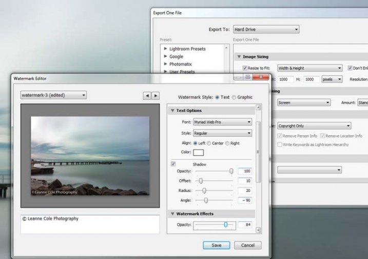
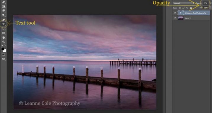
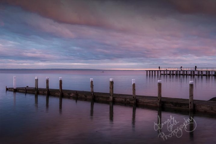
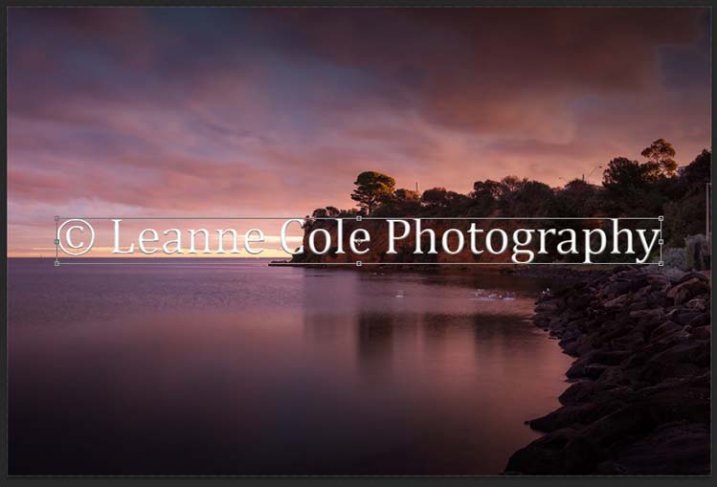
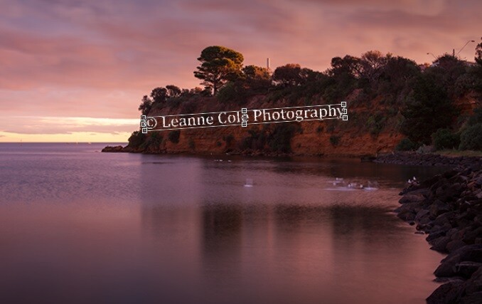
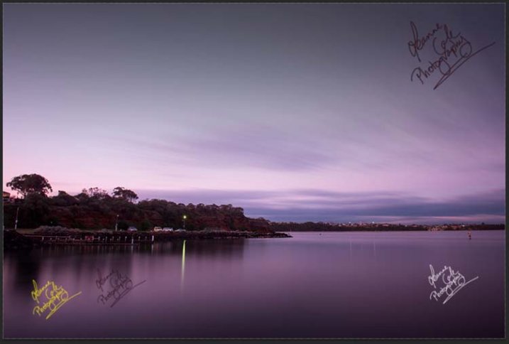
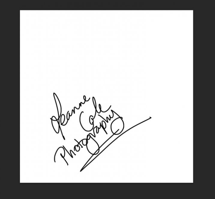
There is a very easy way of doing your watermark, but it takes a bit to set it up. Getting the watermark ready pretty much works the same as before, only this time you want a white background, and you need to use black to create it. Take a look at the image on the right.

Note: create your new file 2500 pixels wide as that is the maximum size for a brush. You can always make the brush smaller when you apply it to your image, but making it the largest size now will give you the best quality.

I created the signature with my Wacom Tablet, but you could also use a pen or black marker on a piece of paper and scan it, that will work just as well.

Once you have your signature, you can now make your custom brush. Go to the Edit menu and choose Define Brush Preset, and click on it.

watermarking-15

watermarking-16
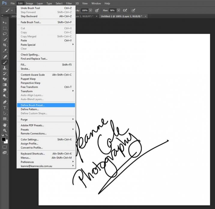
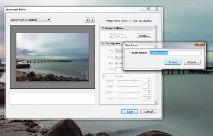
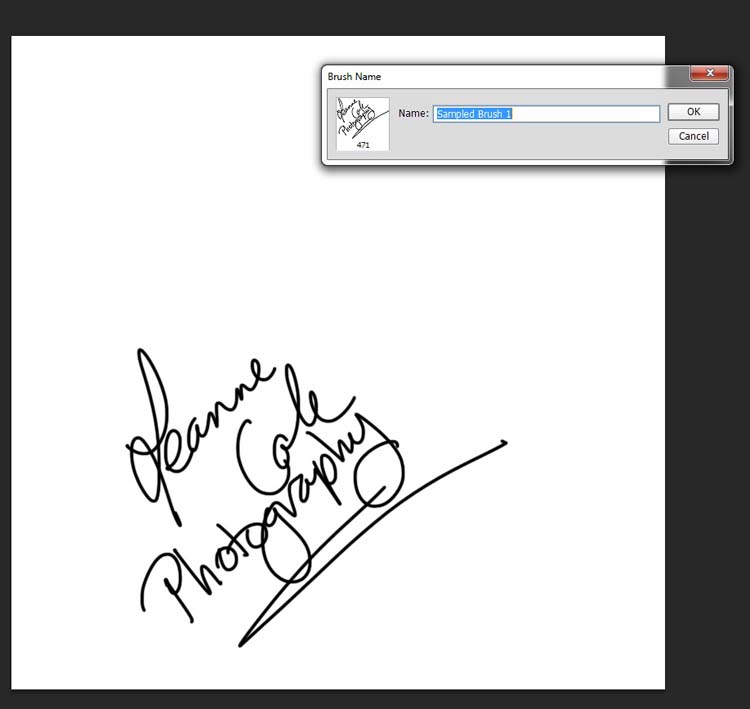
Next, you will see another window pop up window ,asking you to give your brush a name. You can name it what you like, perhaps something that will remind you what it is later; I called mine Brush Signature Watermark.

Now your watermark will work just like a brush, you can make it smaller or larger (remember if you made it 2500 pixels it will hold quality up to that size with out pixelating), you can also change the colour. It works exactly the same way as the normal brush does; use the square bracket keys to make it bigger or smaller. If you want to change the colour, click on the foreground colour and the Color Picker window will appear.

I would suggest adding your watermark to a new transparent layer, so you can also change the opacity as needed.

To find your new brush, go to your brush presets, they are over on the side of your layers panel, and click on the icon that looks like small lines at the top where a drop down menu should appear.

watermarking-18

Go down to Preset Manager and click. A new window will appear with all your brushes. Now you can click, and drag the brush you just created to a spot where it will be easier to find, like up to the top.

watermarking-19

You are now ready to use your new watermark brush any time you want.

As I said, you can change the size of it using the square bracket keys [ ] on your keyboard. You can change its colour by clicking on the foreground colour in the tool panel and selecting a new one. You can also add layer effects like a drop shadow, emboss, etc., you can even make the text itself transparent and only leave behind the shadow.

layer-effects

To make text “invisible” change the Fill Opacity Under Blending Options, in the Advanced Blending section to 0%.

It will look something like this and will blend into any area:

layer-effects-transparent

Here is one I played with:

watermarking-17

There are so many different ways to do a watermark and it is really up to you to work out which one will work best for you. Do you have any other tips for watermarks or methods  you use to make them? Please share in the comments below.

googletag.cmd.push(function() {
tablet_slots.push( googletag.defineSlot( “/1005424/_dPSv4_tab-all-article-bottom_(300×250)”, [300, 250], “pb-ad-78623” ).addService( googletag.pubads() ) ); } );

googletag.cmd.push(function() {
mobile_slots.push( googletag.defineSlot( “/1005424/_dPSv4_mob-all-article-bottom_(300×250)”, [300, 250], “pb-ad-78158” ).addService( googletag.pubads() ) ); } );

The post How to Watermark Your Images Using Lightroom and Photoshop CC by Leanne Cole appeared first on Digital Photography School.


Digital Photography School

 
Comments Off on How to Watermark Your Images Using Lightroom and Photoshop CC

Posted in Photography


How to Simulate Tilt-Shift Lens Effects Using Lightroom

24 Jun

We’ve all at one point been enamoured by the effects produced by tilt-shift or PC (perspective control) lenses.

Even in wide-angle shots, the extremely narrow field of focus transforms the scene into a surreal miniature world. It can be hard to decipher whether it’s actually a close-up of a tiny model scene, or the result of the visual trickery that a tilt-shift lens can produce.

Tilt-shift effect applied to a beach scene.

The tilt-shift effect can be used on more than city street scenes. Use your imagination and be creative!

Besides the nifty miniaturization effect, these high-end specialty lenses are imperative for professional architectural photography. Tilt-shift lenses are basically split into two, parallel to the lens, elements and enable you to tilt the front of the lens barrel in relation to the rear portion, or slide it parallel.

Without actually changing the physical location of the camera, these adjustments allow you to alter the perceived perspective. The most practical application of this effect is to eliminate certain types of distortion, especially the keystone effect.

The keystone effect refers to the convergence of parallel lines which occurs when a camera’s sensor is not parallel to them. You have seen this distortion a million times when the camera was pointed upward at a tall building. It looks as if the building is about to fall over backwards, and it creates the illusion that it is wider at the bottom and continually narrows to the top. The same thing happens with horizontal lines but is often less noticeable, or detrimental to the image.

Although tilt-shift lenses have other practical uses, these are the two that can be replicated effectively in post-processing: creating a miniature effect, and fixing certain kinds of lens distortion.

Eliminating Converging Lines Distortion

Correcting lens distortion in Lightroom (LR) is fairly straightforward with a couple of considerations to keep in mind. I’ll use a night shot of the Petronas Tower in Kuala Lumpur, Malaysia as an example.

1. Straighten first.

If the image you are working with has a distinct horizontal or vertical line which you know to be level or plumb, use the Straighten tool located within the Crop tool (keyboard shortcut R) to align the image before making any lens corrections.

The Level tool can be found beside the Align slider or activated by holding CTRL key.

The Level tool can be found within the Crop panel beside the Align slider, or activated by holding CTRL key.

To align the image using a vertical line, it must be near the center of the image due to the distortion which you are about to fix. With the Crop tool active, you can either grab the Level tool located beside the Angle slider, or hold down the CTRL key and drag the cursor along the chosen line and LR will rotate the image to level or plumb.

Note: new in LR6 or LRCC is the Auto function of the crop tool which attempts to do this for you. Alternatively, the Rotate slider in Lens Corrections can be used with similar results.

2. Open the Lens Corrections panel and click on the Manual tab.

Distortion corrections are made in the Lens Corrections panel.

Distortion corrections are made in the Lens Corrections panel.

3. Check the Constrain Crop box.

Note: As is often the case in life, you don’t get something for nothing. When LR manipulates the image to fix these lines, it must also crop it. You can also crop it manually after you adjust the image, but it is easy to inadvertently leave a little gray strip somewhere along the edge of your image by not cropping it enough.

4. Adjust the sliders

There are several ways to adjust sliders: dragging the slider itself, clicking the name of the slider and using the +/- keys, clicking the value on the right of the slider and dragging the cursor left or right, clicking the value and entering the desire value or clicking the value and using the arrow keys to make micro adjustments. I recommend the latter for accuracy.

5. Show the grid

Hovering the mouse over any of the sliders will show a grid over the image to help guide your adjustment. For this image, a -18 compensation straightens the lines right up.

A before and after showing corrections for converging lines.

A before and after showing corrections for converging lines.

If you plan on shooting architecture and utilizing this feature instead of dropping $ 1,400 on a tilt-shift lens, it may benefit you to activate the crop tool (keyboard shortcut R) to get an idea of how much LR cropped your image. This will give you a point of reference while composing scenes in the future.

Creating a Miniaturization Effect

The tilt-shift effect of severely softening most of an image to isolate a small sharp strip can be simulated in post-processing very effectively. Although there are a couple of different ways to achieve this effect in Lightroom, I find the following to be the easiest and most effective.

Golden Gate Bridge with the tilt-shift effect applied.

The tilt-shift effect can add another level of interest to certain photographs.

Keep in mind that not every photo is a good candidate for this effect. You can find good advice about image selection in the article An Introduction to Tilt-Shift Photography.

1. Process the image as you normally would.

Boosting sharpening, contrast and saturation can help exaggerate the effect.

2. Activate and setup the Adjustment Brush (keyboard shortcut K).

Drag the Sharpening slider all the way down to -100. I also like to reduce Clarity which adds a bit of glow and exacerbates the effect.

3. Show the Mask Overlay box (keyboard shortcut O)

This will allow you to clearly see where the effect is being applied (shift+O will rotate through different mask colors, you may find red is better one image whereas green may work on another).

5. Adjust the brush settings

Setup such things as brush size, flow, etc. Spend a few minutes experimenting with different combinations of these settings to find what works best for your image. CTRL+Z (CMD+Z on Mac) is your friend here.

6. Blur most of the image less a small strip

Holding down the shift key while you click and drag the brush horizontally across your image will apply the effect in a straight line. The goal is to blur the entire image except for a small strip. Make one line across the upper boundary and one line across the lower boundary of the strip you wish to isolate. You can then release the shift key and paint in the remainder of the areas. The in focus strip should account for 20 per cent or less of the image area. If the strip is too big, the effect will be weak.

Holding down the shift key will keep the brush level to paint a straight line.

Holding down the shift key will keep the brush level to paint a straight line.

7. Repeat to increase the effect.

Repeating the previous step several times will compound the effect. To repeat the step, click on New at the top of the Adjustment Brush panel – this will remove the mask to reveal the most recently applied effects, and allow you to add a new pin (brush strokes) and repeat the process.

Before applying the effect to a photo of Penang, Malaysia.

Before applying the effect to a photo of Penang, Malaysia.

After application of the miniaturization effect.

After application of the miniaturization effect.

The effect can also be applied using the Graduated Filter tool but I find it ends up blurring the entire image to some extent and is less effective.

This is a starting point from which to experiment with the effect. Everybody’s tastes differ, so although the general process will remain constant, go crazy with the other variables and see what happens!

googletag.cmd.push(function() {
tablet_slots.push( googletag.defineSlot( “/1005424/_dPSv4_tab-all-article-bottom_(300×250)”, [300, 250], “pb-ad-78623” ).addService( googletag.pubads() ) ); } );

googletag.cmd.push(function() {
mobile_slots.push( googletag.defineSlot( “/1005424/_dPSv4_mob-all-article-bottom_(300×250)”, [300, 250], “pb-ad-78158” ).addService( googletag.pubads() ) ); } );

The post How to Simulate Tilt-Shift Lens Effects Using Lightroom by Jeremie Schatz appeared first on Digital Photography School.


Digital Photography School

 
Comments Off on How to Simulate Tilt-Shift Lens Effects Using Lightroom

Posted in Photography


Adobe Updates Photoshop and Lightroom with Creative Cloud 2015 and Launches Adobe Branded Stock Photography Library

16 Jun

Lightroom Dehaze UI

Today Adobe is announcing updates for their Creative Cloud 2015 Photography package as well as the launch of their new stock photography offering Adobe Stock.

I saw a demo last week of the new Creative Cloud enhancements. The enhancement that I liked the most was a new slider in Lightroom for haze and dehaze. With the haze slider you can now reduce unwanted haze in photos or add haze back in if you want more of an ethereal foggy type mood. I think that this tool will be especially dramatic when working with long exposure photography where you have clouds or low fog and want to get the mix of fog to subject just perfect.

Photoshop is also adding in an additive noise function where you can produce more camera like realistic bokeh and blur noise when desired, making the transition in blur more natural. The Photoshop healing brush also now heals in real time and is faster than previous versions.

These feature enhancements and updates will not be available to the current desktop versions of Lightroom and Photoshop, they will only be available for Adobe Creative Cloud subscribers. This is in line with Adobe’s previous stated goal of providing fast and rapid real time updates and upgrades to their subscription customers. I’m assuming that eventually these new enhancements will make their way to desktop upgrades/updates, but at present Adobe seems to be focused on providing the best and most current features available to their subscription customers.

There are also additional features being launched for the mobile versions of Adobe products including better tone and vignette adjustment for Lightroom mobile and an Android version of Photoshop Mix.

Adobe’s Creative Cloud photography package costs $ 9.99/month and you can subscribe to it here. They also offer a 30 day trial for you to try out Creative Cloud to see if it is right for you.

Adobe Stock

In addition to the improvements in Lightroom CC and Photoshop CC, Adobe is also announcing the launch of their new stock photography service simply called Adobe Stock.

Because Adobe is so widely used by creatives in general, leveraging their software products to sell an Adobe labeled stock photography library seems to make a lot of sense. Adobe’s stock photography service will be featured as a menu item in Photoshop and will allow stock buyers to use watermarked versions of stock photos to create mockups and test design/layout ideas. Once a stock buyer is ready to license an image they can license it directly from Photoshop and download the unwatermarked version of the image.

Images will cost $ 9.99 each to license or Creative Cloud subscribers can purchase one of two different subscription plans. The first plan costs $ 29.99/month and allows a subscriber to license up to 10 images a month and a second plan will cost $ 199.99 per month and will allow a subscriber up to 750 images per month.

Adobe will pay out 33% of their sales proceeds to photographers — photographers interested in applying can apply here.

Because so many stock photography buyers are connected into Adobe’s ecosystem, I think this stock photography offering will end up being very successful and represents formidable competition to the current stock photography giant Getty Images. Earlier this year Adobe purchased the stock photography agency Fotolia, but this new stock offering appears to be a different offering marketed directly under the Adobe brand and available through Adobe’s flagship Photoshop product.

More: MacRumors, The Verge, Engadget, Techmeme.


Thomas Hawk Digital Connection

 
Comments Off on Adobe Updates Photoshop and Lightroom with Creative Cloud 2015 and Launches Adobe Branded Stock Photography Library

Posted in Photography