RSS
 

Posts Tagged ‘lightroom’

How to Organize Your Photos in Lightroom

30 Sep

The Lightroom Catalog is a database containing all the relevant information that Lightroom needs about your photos in order to process your images and sit at the centre of your workflow.

Lightroom is a digital asset management (DAM) tool – you can use it to organize and search your photos, as well as process them. This is the main difference between Lightroom and Photoshop, which is a powerful image editor, but has no database capabilities.

Even if you use Photoshop for all your processing you can still use Lightroom to view, organize, and search your photos. That’s why the two programs come together if you subscribe to Adobe’s Creative Photography Plan (and why Photoshop no longer comes with Adobe Bridge). This article will walk you through some of the tools inside Lightroom to help you organize your photos.

Using Collections

Lightroom uses Collections to organize your images. A Collection is a virtual folder that exists in the Lightroom Catalog. You can create as many Collections as you like within Lightroom and use them for whatever purpose you see fit. The more you use them, the more you will find better ways to use them.

There are several types of Collections in Lightroom:

Collections: Virtual folders to which you can add any photo that you have imported into Lightroom.

Collection Sets: Another type of virtual folder to which you can add Collections, but not photos. Collection Sets are used to keep your Collections organized.

How to organise photos in Lightroom

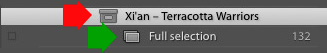
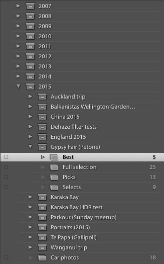
This screen shot shows the icons used to represent Collection Sets and Collections in Lightroom. Xi’an – Terracotta Warriors (red arrow) is a Collection Set. Full Selection (green arrow) is a Collection. The icon is indented because it is inside the Collection Set.

Smart Collections: Collections that are populated automatically according to the rules that you set. For example, you could create a Smart Collection containing all photos taken in 2015, tagged with the keyword phrase “New York” to find all photos that meet those criteria. A Smart Collection is really a way of searching for images, and retaining the result indefinitely.

Published Collections: Beyond the scope of this article, Published Collections are created in Lightroom’s Publish Services. You can learn more about Published Collections in my article How to Upload Photos to Flickr and 500px Using Lightroom 5 (the information applies to Lightroom 6 and Lightroom CC as well).

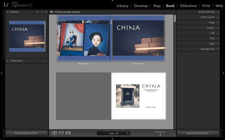
Book and Print Collections: These are created in the Book and Print modules. My articles How to Create a Simple Blurb Photo Book in Lightroom and How to Create a 2015 Calendar in the Lightroom Print Module go into more detail.

For the purposes of this article we are interested in Collections and Collection Sets.

Creating Collections and Collection Sets

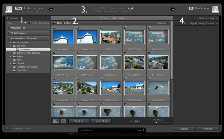
If this is your first time using Lightroom you won’t have any Collections yet (apart from the Smart Collections that it already contains). So let’s get started! I’m assuming that you have already imported your first photos into the Lightroom Catalog.

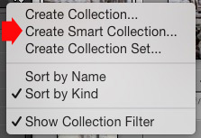
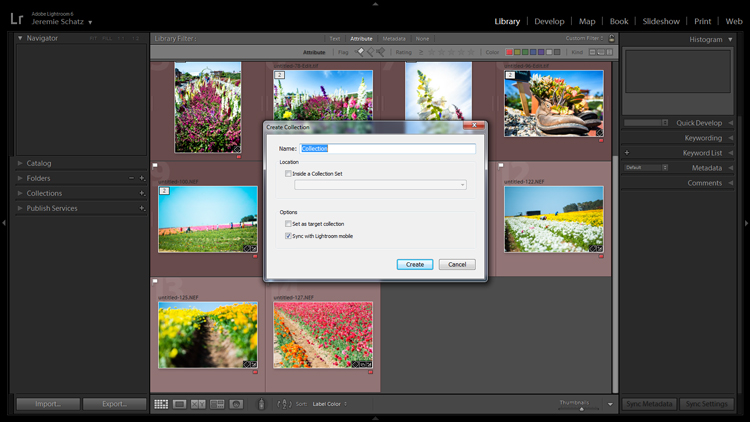
Go to the Collections panel and click on the plus icon you see in the top right corner. Select Create Collection Set.

How to organise photos in Lightroom

The Create Collection Set window appears, where you can give the Collection Set a name.

How to organise photos in Lightroom

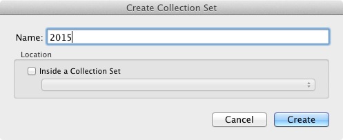
I’ve named this one 2015. The idea is that it will house all the Collection Sets containing photos taken in the year 2015 (remember that Collection Sets can only contain Collections, not photos).

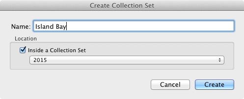
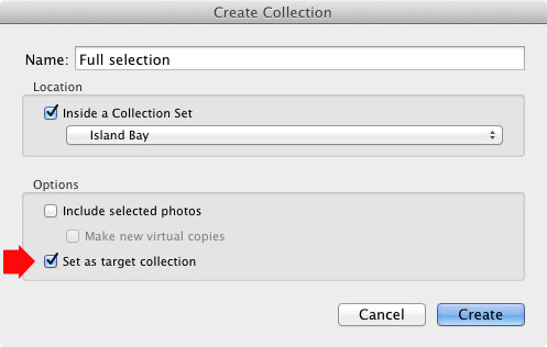
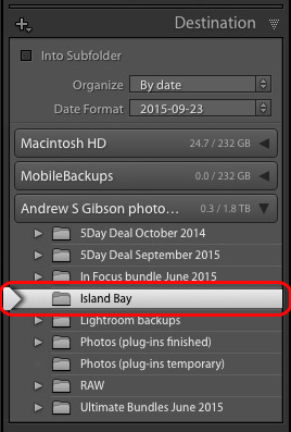
Now right-click on the Collection set you just created and choose Create Collection Set. Lightroom prompts you for a name. I’ve called this Island Bay because it’s the Wellington suburb where the photos in my last import were taken (and have saved it inside the 2015 Collection Set).

How to organise photos in Lightroom

Right-click on this new Collection Set (Island Bay) and select Create Collection. The Create Collection window opens. This is slightly different and gives you more options. Name the Collection “Full selection” (I’ll explain why in a minute), tick the Set as Target Collection box and click Create.

How to organise photos in Lightroom

Now go to the Catalog panel and click on Previous Import. Lightroom displays the last set of imported images in the Content window. Go to Edit > Select All to select all the photos and press the B key. Lightroom adds all the selected photos to the Target Collection – the Collection called Full Selection that you just created. Congratulations, you have just created your first Collection!

How to organise photos in Lightroom

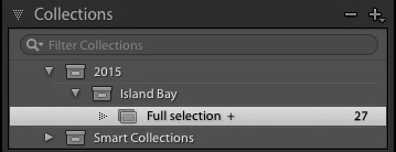
This is what the Collection Sets and Collection I created in the example above look like in the Collections panel in the Library module. The plus icon next to the Collection Full Selection indicate it is the Target Collection. The number 27 on the right tells you how many photos are in the Collection.

Collections and workflow

Of course, you are probably wondering why I asked you to create such a strange name as Full Selection. To find out why read my article Use Lightroom Collections to Improve Your Workflow. It shows you how to use Collections to help you decide which photos from a shoot you are going to process. All will become clear when you do so.

Flags, Ratings and Color Labels

The Lightroom database (called the Catalog) lets you assign Flags, Ratings, and Color Labels to your photos. There seem to be as many ways of using these as there are photographers, but if you have read my article about using Collections to improve your workflow you will understand that I favour a very simple system, which is this:

Use Flags to indicate which photos you are going to process.

I ignore Ratings and Color Labels and don’t use them. Of course, you may wish to use them and there is nothing wrong with that. Workflow is a personal thing, and ultimately you will figure out what works best for you through trial and error.

Let’s take a closer look at Flags, Ratings, and Color Labels. The easiest way to see them is in Grid View, which you can go to from any Lightroom module by pressing the G key on the keyboard. Read my article Making Sense of Lightroom’s Grid View to learn more.

Flags

Every photo in your Lightroom Catalog is either unflagged (the default), flagged as a Pick (indicated by a white flag) or flagged as a Reject (marked by a black flag with a cross in it).

The quickest way to flag a photo as a Pick is to select and it and press the P key. You can remove the flag by pressing the U key or mark it as a Reject by pressing the X key. Flags are generally used to indicate which photos you would like to process (Picks) and which you would like to delete (Rejects).

How to organise photos in Lightroom

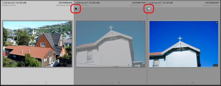
The middle photo has been flagged as a Reject. It is marked with a black flag (circled left) and the thumbnail is greyed out, making it easy to pick out in Grid View. The right photo has been flagged as a Pick and is marked by a white flag (circled right). The left photo is unflagged. There is no flag icon, but Lightroom displays a grey one when you mouse over the thumbnail.

Ratings

Every photo in your Lightroom Catalog is either unrated (the default) or has a one, two, three, four or five star rating. You can apply these ratings by selecting a photo and pressing the corresponding number key (1, 2, 3, 4 or 5).

Ratings are generally used as a way to indicate which photos are your favourites. Give your best images a rating of 5, and use the other numbers for the rest.

How to organise photos in Lightroom

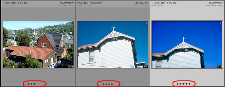
Here, the three photos have been given a rating of three, four and five stars respectively. The star rating of each photo is displayed under the thumbnail in Grid View.
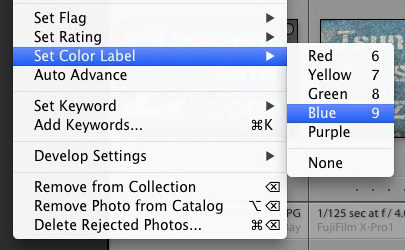
Color Labels

You can also assign a color label to your photo by selecting it, going to Photo > Set Color Label and choosing from Red, Yellow, Green, Blue, Purple or none. You can also use the 6, 7, 8 and 9 number keys as a shortcut to applying Red, Yellow, Green and Blue color labels.

How to organise photos in Lightroom

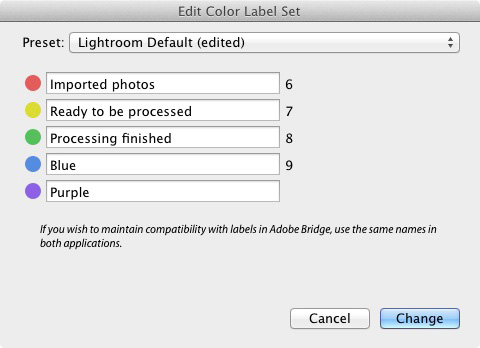
Colour labels are designed to be adaptable so you can use them for whatever you want. Go to Metadata > Color Label Set > Edit to assign a meaning to each color label. In this example I have entered a purpose for three of the color labels. It’s just an example to show you the possibilities – in reality I prefer to keep things simple and not use them.

How to organise photos in Lightroom

Hopefully this article has given you a good overview of the process of using Lightroom as a digital asset management tool. The next article in this series will show you how to get started in the Develop module. Meanwhile, if you have any questions about organizing your photos in the Library module then please let me know in the comments.


Mastering Lightroom Book One: The Library Module

Mastering Lightroom ebookMy latest ebook Mastering Lightroom Book One: The Library Module (second edition) is a complete guide to using Lightroom’s Library module to import, organise and search your photo files. You’ll learn how to tame your growing photo collection using Collections and Collection Sets, and how to save time so you can spend more time in the Develop module processing your photos.

googletag.cmd.push(function() {
tablet_slots.push( googletag.defineSlot( “/1005424/_dPSv4_tab-all-article-bottom_(300×250)”, [300, 250], “pb-ad-78623” ).addService( googletag.pubads() ) ); } );

googletag.cmd.push(function() {
mobile_slots.push( googletag.defineSlot( “/1005424/_dPSv4_mob-all-article-bottom_(300×250)”, [300, 250], “pb-ad-78158” ).addService( googletag.pubads() ) ); } );

The post How to Organize Your Photos in Lightroom by Andrew S. Gibson appeared first on Digital Photography School.


Digital Photography School

 
Comments Off on How to Organize Your Photos in Lightroom

Posted in Photography


How to Import Photos into Lightroom

27 Sep

If you are new to Lightroom, the first thing you need to do after installing the software, opening it up, and taking a look around is import some photos.

As Lightroom is a database you can’t open photos in it the same way you can in Photoshop – instead, you have to import your photos before you can view, or process them. The import process adds photos to the Lightroom Catalog (Adobe’s name for the database that the program uses) and generates a preview of the image for you to view. Once imported, images stay in the Lightroom Catalog forever (or until you remove them from the Catalog yourself).

The Lightroom modules

Lightroom is modular software, there are seven of them: Library, Develop, Map, Book, Slideshow, Print and Web. You can only work in one module at any one time, but you can move around between them as often as you want.

The Library module is the heart of the system. This is where you view photos, organize them into Collections and carry out searches. The Library module is your window to the Lightroom Catalog ,and all the information that it holds about your images.

Importing and viewing photos happens entirely within the Library module.

The Lightroom module layout

The screenshot below shows the Library module layout. If you haven’t imported any photos into the Lightroom Catalog yet this is what it will look like.

Importing photos into Lightroom

1. Module selector
2. Side panels
3. Filmstrip
4. Content area

The screen is divided into four areas.

1. The Module selector: This is the bar at the top that tells you which module you are in (in this case, the Library module). You can make it disappear by clicking the white arrow at the top of the screen, freeing up screen space.

2. The left- and right-hand panels: These contain all the Library module tools. You can click the arrow on either side to make them disappear and reappear.

3. The Filmstrip: Displays thumbnails in the currently selected Folders, Collections or search results. If there are no photos in your Catalog it will be blank. Click the white arrow at the bottom of the screen to show/hide it.

4. The Content window: This is the central display area. After you have imported some photos into Lightroom you can view them here. If you hide all four side panels (use the keyboard shortcut Shift+Tab) it will fill your screen.

Importing photos

To get started, free up some screen space by hiding the Module Picker, Filmstrip and right-hand panels. Click the Import button in the bottom left-corner of the left-hand panel.

Importing photos into Lightroom

If this is your first import you are likely to be importing your photos from your hard drive, but you can also import them directly from a memory card, or connected camera.

It is best to import your photos one folder at a time, so you can organize them as you go along. It is more difficult if you import all your image files in one go. Plus, Lightroom will make you wait a long time while it carries out the import process!

The Import window

When you click the Import button Lightroom takes you straight to the Import window. It is divided into four sections (marked below).

Importing photos into Lightroom

1. Source 
2. Photo thumbnails
3. Import options
4. Destination

1. Source (left panel): This is the folder(s) from which you are going to import the photos. You can navigate through all hard drives, cameras, or memory cards connected to your computer.

2. Photo thumbnails (middle section): Here Lightroom displays thumbnails of the photos in the selected source folder or folders. The photos are ticked to show that Lightroom will import them into the Catalog when you press the Import button (you can untick any that you don’t want to import).

3. Four import options which tell Lightroom what to do with the photos (top middle): They are:

  • Copy as DNG: When you select this option Lightroom converts your Raw files to Adobe’s DNG format (non-Raw formats such as JPEG and TIFF are not converted). This is the most time consuming option as Lightroom has to first copy your photos then convert them to a new format. Make Lightroom Faster by Using DNG explains the advantages of the DNG format. If you’re new to Lightroom leave this option alone for the moment, as it’s for more advanced users.
  • Copy: Lightroom copies your files from their current location to a new one, without changing the file format. This is ideal for importing photos from a memory card, as it leaves the original files intact on the card.
  • Move: Lightroom moves your files from their current location to a new one, without changing the file format. However, it does delete the original files after they have been moved. This is ideal when you want to move photo files from one folder to another on a hard drive.
  • Add: Lightroom imports your photos into the Catalog, without moving or copying them from their current location. Select this option if you are importing photos from your hard drive and don’t want to change their location.

4. Destination (right panel): This is where you tell Lightroom what to do with the photos (and where to put them) during the import process. If you select the Add option you will see two panels here (File Handling and Apply During Import). If you select Copy as DNG, Copy, or Move, Lightroom also displays the File Renaming and Destination panels.

Putting it together

Ready to import your first photos into Lightroom? These are my recommended settings – you can start with these and adjust the workflow to suit your needs as you become more comfortable with Lightroom’s settings.

1. Navigate to the folder containing your photo files on the left and select the Add option from the top.

Importing photos into Lightroom

2. On the right open the File Handling panel (click on the heading to open and close panels) and set Build Previews to 1:1.

Importing photos into Lightroom

3. Open the Apply During Import panel and set Develop Settings and Metadata to None. The idea is to keep your first import simple – you can learn how to use Develop Presets and Metadata presets later (this article How to Create Your Own Lightroom Presets will get you started).

Importing photos into Lightroom

4. Click the Import button (bottom right). Lightroom returns to the Library module and starts the import process. It takes Lightroom a while to build the 1:1 previews, but the wait is worth it, as it makes viewing them in the Library module much quicker.

Importing photos into Lightroom

Once Lightroom has imported your photos, you can view them in the Library module. These articles Making Sense of Lightroom’s Grid View and The Hidden Secrets of Lightroom 5’s Loupe View (yes it applies to Lightroom 6 and Lightroom CC too) will get you started.

Importing photos from a memory card

Once you’ve carried out your first import, at some stage you will want to import photos directly from a memory card into Lightroom. There are a couple of extra steps in this process. Start by selecting Copy (instead of Add) at the top of the Import window.

Importing photos into Lightroom

Set the File Handling and Apply During Import panel settings as above. Ignore the File Renaming panel (another advanced topic).

In the Destination panel, select the folder where you would like to save the imported images (you can create a new folder by right-clicking on an existing one and selecting Create New Folder). The selected destination folder is marked in white.

Importing photos into Lightroom

Click the Import button when you’re ready.

After the import

It’s important to understand that the import process doesn’t physically add your photo files to the Lightroom Catalog. The Catalog contains previews of your photos, plus information about them, including the location where they are saved. The photo files themselves remain on your hard drive.

The next task is to organize your newly imported photos. I’ll show you how to do that in a future article.

Do you have any questions regarding this process? Please let me know in the comments.


Mastering Lightroom Book One: The Library Module

Mastering Lightroom ebookMy latest ebook Mastering Lightroom Book One: The Library Module (second edition) is a complete guide to using Lightroom’s Library module to import, organise and search your photo files. You’ll learn how to tame your growing photo collection using Collections and Collection Sets, and how to save time so you can spend more time in the Develop module processing your photos.

googletag.cmd.push(function() {
tablet_slots.push( googletag.defineSlot( “/1005424/_dPSv4_tab-all-article-bottom_(300×250)”, [300, 250], “pb-ad-78623” ).addService( googletag.pubads() ) ); } );

googletag.cmd.push(function() {
mobile_slots.push( googletag.defineSlot( “/1005424/_dPSv4_mob-all-article-bottom_(300×250)”, [300, 250], “pb-ad-78158” ).addService( googletag.pubads() ) ); } );

The post How to Import Photos into Lightroom by Andrew S. Gibson appeared first on Digital Photography School.


Digital Photography School

 
Comments Off on How to Import Photos into Lightroom

Posted in Photography


A Brief Introduction to Lightroom

25 Sep
A Brief Introduction to Lightroom

Lightroom’s Book module lets you create photo books to publish using Blurb’s print on demand printing service.

Since the first version was released over eight years ago, Lightroom has become the go-to software for many photographers, both hobbyist and professional. But if you’re new to Lightroom you may be wondering exactly what it does, what you would use it for, and how it differs from other well known programs like Photoshop.

What is Lightroom?

Lightroom is part Raw converter, part photo processor (yes, you can edit JPEG and TIFF files in Lightroom too), and part photo organizer. The latter task is often referred to as digital asset management (or DAM for short).

The key thing to understand about Lightroom is that it is a workflow application. It is designed to take care of your photos from the moment you copy them from your camera’s memory card, to your computer’s hard drive. Once in Lightroom you can process photos, add them to a map to show where they were taken, create a photo book or slide show, print them or export them to other programs for further processing.

This is why Lightroom is so useful, and so popular. It becomes the centre of your workflow, and while it is powerful enough to be used independently, it also integrates seamlessly with programs like Photoshop. You can use Lightroom by itself, or in partnership with other programs.

A Brief Introduction to Lightroom

The Lightroom Develop module. This is where you process your JPEG, TIFF or Raw files.

The Lightroom Catalog

At the heart of Lightroom is the Catalog – a database that contains a preview of every photo that you have imported into the program, a record of each photo’s metadata (including processing) plus the location where it is stored on your hard drive.

It is important to note that the Catalog doesn’t contain the photos themselves, just information about them. Your photo files are always saved on a hard drive, even if you use Lightroom CC (Creative Cloud).

A Brief Introduction to Lightroom

The Lightroom Library module. This is where you view, organize, and search photos. It is the heart of Lightroom and arguably its most important module.

The database advantage

Because Lightroom is a database, it gives you several advantages over programs like Photoshop.

1. It saves you hard drive space

Lots of it. When you process a Raw file in Lightroom, the edits you make are saved in the Lightroom Catalog as a series of text commands which take up very little space.

When you process a Raw file in Photoshop, you have to convert it to a 16 bit TIFF or PSD file first (yes, you can use JPEG instead but the other formats give better image quality). TIFF and PSD (and even JPEG) files take up much more space than the text commands in the Lightroom Catalog do.

The end result is that, over time, you save hundreds of gigabytes of storage space, making it much easier to manage your growing photo collection.

Note that this benefit is diminished if you are in the habit of exporting photos to Photoshop or plug-ins for processing. That shouldn’t stop you from using those applications (although it is good practice to see if you can do something in Lightroom first) nor should it put you off using Lightroom.

2. Lightroom lets you see all your photos in one place

Provided you import all your photos into a single Catalog (it is possible to have multiple Catalogs in Lightroom but this is for advanced users only) you can view any of your photos using Lightroom’s Library module.

3. Lightroom lets you search your photos

Lightroom is a database, which is designed to collect, organize and search information.

Would you like to find all your photos taken with a particular camera or lens? That’s easy in Lightroom. How about all portraits taken with the aperture set to f/2.8? That takes a little more work as it relies on accurate keywording, but it’s entirely possible. Or what about all photos of a specific person taken in 2012? Easy with the face detection tool in Lightroom 6 and Lightroom CC.

A brief introduction to Lightroom

In this example I used Lightroom’s Library module to find all photos taken in 2015 with my Fujinon 35mm lens at an aperture of f/2.8 or greater.

4. Lightroom lets your organize your photos how you want

The problem with storing images in folders is that you can only save a photo in one location. Let’s say you took some photos of a friend called Sarah, in London, in July 2015 (maybe you were at Wimbledon). When you copy those files to your hard drive, you can only save them in one folder (which may be called Sarah, or London, or something entirely different).

Lightroom Collections

One of Lightroom’s key features is Collections. A Collection is like a virtual folder. You can call a Collection whatever you want, add as many photos as you like, and add photos to as many Collections as you need.

Using the above example, once you have imported your photos of Sarah into the Lightroom Catalog, you can add them to multiple Collections. For example, you may have one Collection that contains all your photos of Sarah, another with all your photos of London, and another with all the photos taken in July 2015.

It’s a simplified example, but the advantages of Collections become more apparent the more you use them. In short, they give you the flexibility to organize your images in a way that suits you.

A brief introduction to Lightroom

This is how I organize my photos using Collections. There is a separate Collection Set for each year. Each of those contains Collection Sets and Collections organizing photos by topic.

Lightroom versus Photoshop

Does that mean you should use Lightroom exclusively and forget about programs like Photoshop? Not at all. There are plenty of things that you can do in Photoshop (not to mention all the other plug-ins and editing programs that you can buy) that you can’t in Lightroom.

Many photographers use the two in conjunction. This is encouraged by Adobe with its Creative Photography Plan, which includes both Photoshop and Lightroom, along with Lightroom mobile and Lightroom web.

If you are new to Lightroom your first task is to import some photos into it so you can work on them. I’ll show you how to do that in my next article.

If you were unsure about what Lightroom is and what photographers use it for, then I hope this article has helped. Do you have any questions? Please ask in the comments and I’ll do my best to help.


The Mastering Lightroom CollectionMastering Lightroom ebooks

My Mastering Lightroom ebooks will help you get the most out of Lightroom. They cover every aspect of the software from the Library module through to creating beautiful images in the Develop module. Click the link to learn more or buy.

googletag.cmd.push(function() {
tablet_slots.push( googletag.defineSlot( “/1005424/_dPSv4_tab-all-article-bottom_(300×250)”, [300, 250], “pb-ad-78623” ).addService( googletag.pubads() ) ); } );

googletag.cmd.push(function() {
mobile_slots.push( googletag.defineSlot( “/1005424/_dPSv4_mob-all-article-bottom_(300×250)”, [300, 250], “pb-ad-78158” ).addService( googletag.pubads() ) ); } );

The post A Brief Introduction to Lightroom by Andrew S. Gibson appeared first on Digital Photography School.


Digital Photography School

 
Comments Off on A Brief Introduction to Lightroom

Posted in Photography


10 Lightroom Tips for a Smoother Work Flow

22 Sep

If photography has become an integral part of your existence, or is destined to be, chances are fair to good that you will find yourself staring longingly into the eyes of Lightroom like an insatiable lover. That might sound romantic, but in reality it is more like a hypnotic spell which can be difficult to break.

Hypnotic trance

It’s easy to squander away lots of time fumbling your way through Lightroom.

However, when you find yourself in this situation, rest assured that it will hopefully be time well spent as it is an indispensable resource in your photographic arsenal. One of the keys to getting the most out of your Lightroom experience in a reasonable amount of time is to approach it like a dangerous animal – in small, carefully planned steps.

Sure, you can just jump in blindly headfirst, but knowing what lies ahead can save you precious time and unnecessary pain (read=frustration).

In this article, I’m going to lay out some of Lightroom’s features that I like to exploit to achieve my goals in a more direct and timely manner.

1. Apply on Import Settings

You can save time early on in the process when first importing images into Lightroom by utilizing the Apply During Import feature.

When you are in the Library module, the Import button will be live in the lower left corner. Clicking it reveals the Import window which is where you have the Apply During Import dropdown menu in the panel on the right.

Apply on import screenshot

Applying Develop presets on import is a good way to get a jumpstart on the the editing process.

The Develop Settings dropdown provides access to your Develop module presets. If you haven’t created any, this will only be populated by Lightroom’s built-in preset options.

This is a way to save you some clicks by allowing Lightroom to apply things like sharpening, saturation, color temperature, etc. (any settings savable within a preset) while it imports your new photos to your catalog.

You are also presented with the opportunity to populate the Keywords box and apply common metadata like image location or copyright information. I recommend beginning an unwavering habit of adding keywords on Import and not procrastinating until later to it. You will thank yourself in a few years when you’re looking for a specific picture in your library of 20,000 images.

2.Preview and Selection

Once you have imported your latest batch of soon-to-be masterpieces it’s time to sort through and separate the wheat from the chaff.

There are a number of ways to go about this, but I prefer to start at the beginning, viewing images at full screen (keyboard shortcut F) and using the arrow keys to flip through. When I come across a potential keeper, I mark it by color. You can do this by clicking one of the four colors in the lower tool bar menu (while not in full screen mode) or using keyboard shortcuts 6-9 which correspond to the four colors (while in full screen mode). If the color labels are not visible, click on the arrow on the right side of the lower toolbar and click on Color Label.

I have attached specific meanings to these colors. Red, for example, means that the photo is a potential candidate for editing after closer inspection.

Screenshot of photos grouped by color label

Color labels and flagging are convenient tools for sorting and locating images.

After you sift through a batch of imported photos and have color coded them, you can then sort or filter by label color for quick selection or organizing. To do this, you must be in grid view in the Library module. In the upper Library Filter toolbar, you can click on Attribute and then click the desired color and Lightroom will group all photos with that label color at the top.

If you just want to group together photos with the same color label without hiding all of the other images in that folder, you can click on Sort in the lower toolbar and select Label Color. After you have applied color labels and grouped them together, you now have a convenient way to delete unwanted images by clicking the first one, holding shift, clicking the last one (which will select the whole group) and then hitting delete.

3.Use Keyboard Shortcuts for a Smoother Editing process

As you spend more time using Lightroom, you will find that all of these little tricks which seem to save only trivial amounts of time/effort are compounded quickly.

Keyboard shortcuts are one of those tricks. Don’t be selfish, share the carpal tunnel with your left hand too.

At the very least, learn the keyboard shortcuts for the processes that you use most often.

Although I could list them all here, you really only need to know one: CTRL+/. This will open a pop-up window of some of the keyboard shortcuts for the respective module that is active.

Screenshot of keyboard shortcut cheat sheet

Pressing CTRL+/ brings up the keyboard shortcut cheat sheet for the module you are in.

Another little trick you may not be aware of can be found in the Develop module. Instead of clicking and dragging sliders, you can click on the name of an adjustment (click the word Exposure for example) and then use the (+) and (–) keys to move the slider in incremental amounts.

Screenshot for develop adjustments

Clicking on an editing action will activate it and using the + and – keys makes incremental adjustments.

If you’re one who likes to work top to bottom, you can use the (,) and (.) keys to cycle through the adjustments in the active panel.

4.Use the Target Adjustment Tool

You will find this handy little tool in the top left corner of the Tone Curve, HSL and B&W panels. The concept is that once you have clicked on the tool and activated it, click anywhere on your image, drag up or down and Lightroom will make the appropriate adjustments.

Screenshot of the target adjustment tool

Using the target adjustment tool takes some of the guesswork out of editing.

If used in the Tone Curve panel, the tone you select will fall into one of the four quadrants the tone curve is divided into: highlights, lights, darks, shadows. Within the HSL panel, the tool is a little more intelligent and can be used to tweak combinations of the eight color sliders for hue, saturation and luminance. For example, if you click on some green grass and start dragging, the tool may move both the yellow and green slider to pinpoint the correct hues for adjustment.

The B&W panel does the same as HSL except the adjustments are to the various shades of gray that the image has been converted in to.

5.Create Virtual Copies to Compare Edits

More than likely you are aware of the basic premise which Lightroom uses to edit your images. It’s simple: a tiny little file called a sidecar file (with the .xmp file extension) piggybacks onto your original image and keeps track of all the edits you’ve made to that image.

Lightroom enables you to add some extra info to that .xmp file which allows you to make further edits on the virtual copy while maintaining the edits you’ve made thus far. This can be accomplished by choosing Photo>Create Virtual Copy (keyboard shortcut CTRL+’).

Screenshot of image comparison

Making virtual copies allows you to compare different edits of the same image side by side.

Lightroom also allows boasts the Snapshot feature in the Develop panel on the left of your screen. A Snapshot basically bookmarks a specific spot in your edit history which you can revert the image back to.

One approach can be to work through your editing process, make a virtual copy at some point and go for a different look with the copy. Then you can compare both edited images side-by-side to see which tickles your fancy. Virtual Copies can also be exported in the same way as the original. This is why I use Virtual Copies rather than Snapshots.

6.Create Collections to Group Choice Images

The Collections panel really warrants an entire article to itself as there are many features within it, but let’s discuss its most basic use, which is to create a grouping of images.

There is a plus sign beside the Collections heading and clicking that launches a dropdown menu. The first choice is Create Collection and that’s where you should start. A dialog box will launch and you should name your collection and check the Set as target collection box.

Screenshot of new collection dialog box

Once a new collection is created, pressing B while any photo in your library is selected adds it to the target collection.

Let’s say you embarked on a wild journey across Siberia and have a zillion photos in several folders. You could create a collection called Choice Siberia Pics, then add your favorite images to this collection to show off to friends in a slideshow. To add images to the collection, either right click and select Add to Target Collection or use keyboard shortcut B.

One benefit of using collections is that you add photos easily from anywhere in your library, and Lightroom doesn’t actually make copies so no additional space is taken up on your computer’s memory.

7. Use Camera Calibration Profiles

In the Develop module, the last choice on the right-hand menu is Camera Calibration. If this panel has been shrouded in mystery and, as such, you have pretended it doesn’t exist, it’s time to enter unchartered territory.

What Camera Calibration profiles do is adjust your image to recreate, as closely as possible, whatever various picture profiles your camera may offer. If you are shooting in RAW and reviewing your photos in-camera, you are likely seeing a JPEG preview that the camera whipped up for you. When you import those RAW files, Lightroom ditches that JPEG and you get that unsharp, unprocessed dull-looking image.

In Camera Calibration there is a Profile dropdown menu which offers up the same processing options that you will find in your camera. I shoot with a Nikon so Lightroom gives me the options of:

-Adobe Standard
-Camera Landscape
-Camera Neutral
-Camera Portrait
-Camera Standard
-Camera Vivid

Camera calibration screenshot

Camera calibration profiles offer the same settings found in many cameras.

That first choice is Lightroom’s default. If you find one of these settings appealing and want to make it a default setting, you can hold down the Alt key and click the Set Default button at bottom right.

8.Create Develop Presets for Common Settings

In the Develop module, the first panel item on the left menu is Presets. This is pretty self-explanatory and Lightroom has some loaded in there to get you started.

You can create your own presets for common edits you use. If you want to get started in creating your own presets, click the plus symbol next to Presets and take a peek at all of the attributes Lightroom allows you to save.

Screenshot of develop presets dialog box

Don’t mess around trying to match edits that you’ve made before – create presets for them along the way.

Remember the Apply on import setting we talked about earlier? Any Develop presets you create can also be chosen to apply on import. Sure, you can always import a batch of photos, hit CNTL+A to select all of them and then choose one of your presets, but that will take some time for Lightroom to process and the idea here is to save yourself time and clicks.

Develop presets are a great way of preserving complex edits or distinct styles which you may want to reproduce again. There is a bottomless well of preset bundles you can purchase online and even some free ones floating around out there on the interwebs if you don’t feel like making your own.

9.Flag and Rate for Easy Sorting

In much the same way you can slap color labels on images in your library for identification and sorting purposes, so too are you able to take it a step farther by flagging and rating them.

Flags (keyboard shortcut P, or U to unflag) show up as a flag which is displayed in the upper left corner of thumbnails when in grid view. I personally use flags as a thumbs which tells me that the photo is final and client-ready, ready for export or printing. There is also the option to use a reject flag (keyboard shortcut X). I don’t use these in my workflow, but you may find them more useful.

Rating images is based on a five-star system. You can use the star system to put a value rating on images which can be used for filtering or whatever significance you place on them.

Screenshot showing filter for flagged and rated photos

Flagging and rating are ways you can identify certain images and easily locate them later.

By this point you are probably seeing a clearer picture of Lightroom’s multi-layer system of organizing, archiving and locating images in your catalog. The more identifying markers you have on images in your library, the more specific you can be in narrowing down what you are looking for.

If you are not an old-hand with Lightroom, all of this keywording, color coding and flagging might seem redundant and excessive, but as your library grows to unwieldy proportions you will be forever grateful that you formed these good habits early on.

10.Stack Images for a Tidy Workspace

If you shoot in RAW+JPEG, create virtual copies in Lightroom or use Photoshop or other plugins which make copies of your original images before editing, you may end up with several versions of similar images in your library. Same with you time-lapse shooters who don’t process the video in-camera.

To keep your library looking clean and organized, consider using Lightroom’s stacking feature. Stacking is pretty versatile, allowing you to hide an entire folder behind one image if you wish.

Screenshot of a stacked image folder

Stacking enables you to easily hide groups of photos behind a cover image.

The order which the images were displayed in grid view will be preserved after stacking with the active photo being on top.

Once again, stacking can be used in conjunction with all of the previously mentioned identifying and organizing features.

To stack, select the desired images (CTRL+A to select all, CNTRL+click to select non-contiguous images and CTRL+SHIFT to select a continuous string of images), right click on any of the selected images and hover over Stacking to reveal the sub-menu (keyboard shortcut CTRL+G).

Conclusion

I know there’s a distinct possibility that when you got into photography you didn’t envision spending so much time on your computer cursing Lightroom. However, if you haven’t already, you will have to come to terms with the fact that post-processing is a fact of modern photographic life.

Lightroom and other editing software are tools and like tools for any other purpose, learning the various approaches to using them in the most efficient and productive way is crucial to furthering your craft.

googletag.cmd.push(function() {
tablet_slots.push( googletag.defineSlot( “/1005424/_dPSv4_tab-all-article-bottom_(300×250)”, [300, 250], “pb-ad-78623” ).addService( googletag.pubads() ) ); } );

googletag.cmd.push(function() {
mobile_slots.push( googletag.defineSlot( “/1005424/_dPSv4_mob-all-article-bottom_(300×250)”, [300, 250], “pb-ad-78158” ).addService( googletag.pubads() ) ); } );

The post 10 Lightroom Tips for a Smoother Work Flow by Jeremie Schatz appeared first on Digital Photography School.


Digital Photography School

 
Comments Off on 10 Lightroom Tips for a Smoother Work Flow

Posted in Photography


5 Practical Lightroom Tips for Newbies

13 Sep

One of Lightroom’s most important assets is also its Achilles Heel. It is such a powerful program that many of its useful features can take a long time to discover, and are often hidden beneath a blanket of keyboard shortcuts and obscure menus.

When I first started learning Lightroom I was already a longtime user of Apple’s image processing program Aperture, and for a while after making the switch I was overwhelmed by the sheer number of options available. With so many menus, buttons, and sliders at my fingertips I thought there was no way I would ever be able to make sense of them all. After much experimenting, online searching, and good old-fashioned trial and error, I have figured out a workflow that suits my needs; the same holds true for most photographers. You may not use every single feature and option available to you in Lightroom, but the key is to find the tools that work for you and learn to master them.

five-lightroom-tips-for-beginners-sunrise

Adjusting the RAW file to arrive at this final image took a while, but was a lot easier thanks to some simple tips and tricks described below.

That being said, here are five of the most practical, useful features that I use on a daily basis. Try them out and they may greatly enhance your own experience with Lightroom as well.

1. Create import presets

five-lightroom-tips-for-beginners-PresetsYou probably already know that Lightroom contains dozens of presets to get you started when editing your photos, which can be quite handy when you need a quick adjustment or effect such as Aged Photo, Bleach Bypass, or any number of black and white conversions. These presets are not special filters like what you might find in Instagram or other such image-sharing programs, but in fact are pre-made manipulations of the various sliders and controls available to you in the Develop module. The Cold Tone filter, for example, is a collection of saved values for the White Balance, Tone, and Presence adjustments in the Basic Develop pane.

You might also be aware that you can create your own presets by adjusting any of the Develop parameters and then choosing New Preset from the Edit menu. But you can extend this functionality a step further by automatically applying a given preset, even one you create yourself, to all your pictures upon import. This is incredibly useful if you have a given set of values that you like to use as a starting point. Rather than making similar adjustments to things like Highlights, Shadows, and Clarity for every image you can simply apply default values to every picture you import. To do this, use the Apply During Impor” pane in the Import dialog, and select any of Lightroom’s existing Presets or one that you have made on your own.

five-lightroom-tips-for-beginners-D7100-Import-Preset

As an example of how this can be useful, I often found myself applying similar adjustments to every picture that I took with my Nikon D7100 because I was not happy with Lightroom’s interpolation of my RAW files. This became somewhat time-consuming, so I saved my common adjustments as a Preset called, D7100 Import. Now every time I import photos from my D7100 memory card, I apply that Preset. I have a unique Preset saved for each of my cameras, and applying these settings on import has saved me untold hours and a great deal of frustration. It’s a fantastically useful feature that could greatly improve your own workflow as well.

2. Use number keys to fine-tune adjustments in the Develop Module

When working in the Develop module it can be a bit tricky to get the exact values you want by manually moving the sliders. One way to fix this is to give yourself a bit more real estate by hovering your cursor over the left side of the panes and dragging until the panels are much wider.

five-lightroom-tips-for-beginners-develop-sliders

Another handy trick is to use the arrow keys to adjust the number values in very small increments. For example, click on the White Balance numerical value, and press the Up or Down arrow keys to change it in increments of 10. Or highlight Clarity and press Up or Down to change it in increments of 1. For greater adjustments, hold down the Shift key while you press Up or Down, which will alter White Balance in increments of 200, Clarity in increments of 10, and so on.

3. Customize the Develop Module

If you’re like me, you may have been overwhelmed at the massive number of options in the Develop module, but thankfully there is a way to tame this beast by right-clicking anywhere in the adjustment panels. Doing so brings up a menu that allows you to disable the adjustments you don’t want so you have a cleaner and less cluttered working environment, and don’t waste time clicking on features you never use.

five-lightroom-tips-for-beginners-hide-panels

One especially useful element of this right-click menu is called Solo Mode, which is a way to de-clutter the Develop module even more by collapsing all the panels except the one you are currently using. I used to waste all sorts of time scrolling up and down through the various open panels, expanding or collapsing them to get to the one I really wanted. But by using Solo mode every time I click on a new panel, the other one I was using is automatically shrunk to just its title. This one little feature has single-handedly saved me not just a lot of time, but a great deal of headache medicine as well.

4. Create Smart Collections to automatically sort photos in the Library Module

Lightroom’s Library module is a great way to help you keep your images organized. You can create virtual folders called Collections (e.g. Ceremony, Reception, and Speeches for a wedding) that can even be placed inside of Collection Sets (e.g. Smith-Miller Wedding).

But what I find even more useful is the Smart Collections feature which allows you to dynamically organize your images, based on any number of conditions you specify. To create a Smart Collection, choose New Smart Collection from the Library menu and specify the parameters you want to use. Any picture that meets these criteria, at any point in your editing process, will automatically be placed inside the virtual folder you have just created.

five-lightroom-tips-for-beginners-smart-collection

In the above example I have created a Smart Collection that automatically sorts through all my photos, including any that I import after the Smart Collection is created, that meet specific criteria. Using Smart Collections are a great way to enhance your organization process, and help you sort through your images to focus on the ones you really want to work with.

5. Hold down the Option/Alt key when adjusting Develop sliders

The effects of many of the adjustments in the Develop module are self-evident; increase the Exposure and your image will get lighter. Increase the Saturation and your photo will lose a bit of color. But what about the adjustments that are not so easy to see? One particular set of sliders I use all the time is under Sharpening in the Detail pane, but the exact effects of the Radius, Detail, and Masking are sometimes difficult to see. This problem can be solved by holding down the Alt/Option key when moving almost any slider in the Develop module, which will show you a realtime display of exactly what is happening when you make the adjustment.

five-lightroom-tips-for-beginners-pastry

As I was editing this photo I needed to make some adjustments such as dialing down the Black levels, but I didn’t want to go so far so as to make any part of the image completely black. (That is, I did not want to clip anything in the picture.) By holding down the Option key as I adjusted the Black slider I was able to see a realtime display of what areas of the image were being affected:

five-lightroom-tips-for-beginners-pastry-option-key

In the above image the bottom of the pastry has become completely black, which means it cannot get any darker while the red areas will soon become entirely black if I continue to move the slider to the left. The yellow areas are being affected, but not so much just yet that I am losing my color data. This works for almost every adjustment slider in the Develop module, and can greatly assist you in making sure you are doing the edits precisely how you mean to.

These five Lightroom tips and tricks have been a major boon to me as I have worked with the program over the years, what about you? What are your favorite aspects of Lightroom that you find particularly handy? Or do you have any hidden gems that others might not know about? Leave your thoughts in the comments below.

googletag.cmd.push(function() {
tablet_slots.push( googletag.defineSlot( “/1005424/_dPSv4_tab-all-article-bottom_(300×250)”, [300, 250], “pb-ad-78623” ).addService( googletag.pubads() ) ); } );

googletag.cmd.push(function() {
mobile_slots.push( googletag.defineSlot( “/1005424/_dPSv4_mob-all-article-bottom_(300×250)”, [300, 250], “pb-ad-78158” ).addService( googletag.pubads() ) ); } );

The post 5 Practical Lightroom Tips for Newbies by Simon Ringsmuth appeared first on Digital Photography School.


Digital Photography School

 
Comments Off on 5 Practical Lightroom Tips for Newbies

Posted in Photography


3 Simple Steps to Make Your Skies Pop in Lightroom

08 Sep

2-for-1 special

As part of Landscape Photography Week here on dPS, we’re offering TWO for the price of ONE on our best-selling Living & Loving Landscape Photography ebooks!

Click here to take advantage of this offer.


Photo of Monument Valley: Example of sky enhancement with Lightroom.

You take a photograph of a scene that includes a beautiful blue sky with puffy white clouds. You look at your LCD after taking the photo only to see that the sky your camera captured is not what you see in front of you. Instead, your camera captured a washed-out-looking sky with little or no detail. It looks overexposed. What to do?

You could take another picture, reducing the exposure so that the sky looks better. But if you do that, the foreground will be underexposed and maybe even black. So what now?

There is good news here, and it is that Lightroom can fix this problem easily and incredibly quickly. In fact, there are three quick steps you can take in Lightroom that will each dramatically improve the daytime sky in your pictures. They are all dead simple. You can do any one of the steps, or do all three together. Even if your sky already looks pretty good, and you just want a minor enhancement, these steps will help.

Photo of Big Sur: Example of sky enhancement using Lightroom

1. Darken the Blues

The first move you should make is to darken the blue tones in your image. This is simple to do in the HSL/Color/B&W panel in Lightroom’s Develop module. There you will see a number of sliders that control individual colors. You can adjust the hue, the amount of saturation, or the luminance of these colors. Use the sliders – specifically the  blue slider – to affect only the blue tones in the image and reduce the brightness of those tones. Just find the slider marked Blue, make sure that the panel is set to change Luminosity, and pull the slider to the left. There is no set amount or range of values for this change, it will just depend on each picture.

HSL/Color/B&W panel in Lightroom's Develop Module

If you need more punch to the blues, change the setting above to saturation, and push the Blue slider to the right. This will increase the saturation of the blues in your image. For our purposes here, what is important to know, is that increasing the saturation of the blues will make the luminosity adjustment you just made have even more bite.

You should see a dramatic improvement in your sky, just with this one move. Sometimes it is all you need to do. But for additional improvements, read on.

Note: be careful not to go too far. Pulling one color to extremes can cause banding (separation of the colors into stripes, not a smooth transition) or image degrading. 

Photo taken from Seven Mile Bridge in the Florida Keys: Example of sky enhancement using Lightroom

2. Control the Highlights

It might have surprised you that our first move was not to tone down the highlights of the image. After all, that is where the problem lies. The sky is so bright that there is little detail in it, and a reduction in the highlights will target those tones and add detail.

Highlights control in Basic panel of Lightroom's develop module

But recall that part of what makes a sky look great is deep rich blue tones combined with bright white clouds. If you crank down the highlights, yes, you will add detail to the clouds, but you will push the tones of the blues and whites together so that there will not be the strong contrast you want. That’s why we started with darkening the blue tones.

If there is already sufficient detail in your clouds, you do not need to do anything further. In fact, sometimes you may want to increase the Whites or the Highlights to create more contrast between the blue sky and white clouds.

Other times, however, your sky will still be too bright and the clouds will lack detail. In that case, it is time to tone down the brightest portions of the image to add some detail. Do that by pulling down the highlights of your image. You want to do just enough that you add detail in the sky, but not so much that your clouds turn grey. Let the histogram be your guide. Pull the Highlights slider to the left until any spike on the right side of your histogram moves to the left (use the Alt/Option button to see where the highlights are clipped). At the same time, you should be adding detail to your sky.

Photo of Lighthouse on Sanibel Island, Florida: Example of sky enhancement using Lightroom

3. Add a Blue Tint to the Sky

At this point, your sky should be looking very good. In fact, in most cases, the two moves above should be all you need. If you have a particularly flat and lifeless sky, however, you may need to break out the big guns. That means adding a tint to your sky.

To do this, you will need to employ the Adjustment Brush (actually, you can use the Adjustment Brush for either of the two steps above, but you usually won’t need to). Click on the Adjustment Brush, then when the sliders for the brush appear, go to the White Balance ones at the top. Move the Temp slider to the left, which will increase the amount of blue in the image.

Adjustment brush and tint controls in Basic panel of Lightroom's develop module

Before you apply the brush to the sky, there is one important thing you need to check. Make sure the “Auto Mask” box at the bottom of the Adjustment Brush panel is checked. Doing so will limit the brush to the sky only. Once that is checked, go ahead and brush in the effect where you want it.

When you are done, you can adjust the effect by moving the blue slider (or any other sliders you might want to change). When you close the Adjustment Brush, the sky should be blue and look much better.

Photo of the Portland Head Light: Example of sky enhancement using Lightroom

Application

The old adage about “getting it right in-camera” still applies. Try to get your skies looking as good as possible in the field with proper exposure techniques. Further, if you have a polarizing filter, that will make midday skies look much better. You might also employ a graduated neutral density filter to tone down the sky and make it even with the foreground.

When these techniques won’t work, however, Lightroom can make your skies look dramatically better. Of course, you could also use blending or HDR techniques, but these can appear surreal and involve much more work. The same goes for a wholesale sky replacement.

So next time, use Lightroom to achieve the desired effect simply. You can use these steps along with your normal workflow to make your photos look even better.


Here on dPS this is landscape week – here is list of what we’ve covered so far. Watch for a new article (or two) on landscape photography daily for the next day or so.

  • 6 Tips for Better Low-Light Landscape Photography
  • Landscape Photography and the Human Element
  • 5 Ways a Telephoto Lens Can Improve Your Landscape Photography
  • Landscape Photography from the Side of the Road
  • 32 Majestic Landscape Photos to Inspire Your Wanderlust
  • Weekly Photography Challenge – Landscape
  • Landscape Photography – Shooting the Same Location Through the Seasons
  • How to Solve 5 Composition Conundrums Faced by Landscape Photographers
  • 6 Tips for Creating More Captivating Landscape Photographs
  • Tips for Getting Started with Urban Landscape Photography

googletag.cmd.push(function() {
tablet_slots.push( googletag.defineSlot( “/1005424/_dPSv4_tab-all-article-bottom_(300×250)”, [300, 250], “pb-ad-78623” ).addService( googletag.pubads() ) ); } );

googletag.cmd.push(function() {
mobile_slots.push( googletag.defineSlot( “/1005424/_dPSv4_mob-all-article-bottom_(300×250)”, [300, 250], “pb-ad-78158” ).addService( googletag.pubads() ) ); } );

The post 3 Simple Steps to Make Your Skies Pop in Lightroom by Jim Hamel appeared first on Digital Photography School.


Digital Photography School

 
Comments Off on 3 Simple Steps to Make Your Skies Pop in Lightroom

Posted in Photography


Quick Lightroom Tip Using the Graduated Filter

29 Aug

This video tip is courtesy of Anthony Morganti and shows us what you can do using the Graduated Filter tool in Lightroom. What if you’ve maxed out your basic adjustments and want to go farther? This little tip might do the trick for you, check it out:

Learn more about using the Graduated Filter in LR here.

A very cool tip, had you thought of that or done this before? Do you have any other Lightroom tips and tricks? Please share in the comments below.

googletag.cmd.push(function() {
tablet_slots.push( googletag.defineSlot( “/1005424/_dPSv4_tab-all-article-bottom_(300×250)”, [300, 250], “pb-ad-78623” ).addService( googletag.pubads() ) ); } );

googletag.cmd.push(function() {
mobile_slots.push( googletag.defineSlot( “/1005424/_dPSv4_mob-all-article-bottom_(300×250)”, [300, 250], “pb-ad-78158” ).addService( googletag.pubads() ) ); } );

The post Quick Lightroom Tip Using the Graduated Filter by Darlene Hildebrandt appeared first on Digital Photography School.


Digital Photography School

 
Comments Off on Quick Lightroom Tip Using the Graduated Filter

Posted in Photography


A Guide to Black and White Conversion in Lightroom

24 Aug

Vintage, retro, moody, classic are all adjectives that might be used to describe black and white photographs. It may seem counter-intuitive in an age where cameras are lauded for their abilities to render colors and skin tones in super accurate or pleasing ways, to just go and eliminate all the colors in post-processing. Nevertheless, the timeless qualities of grayscale images continue to persist, and the alluring beauty shows no sign of subsiding.

A black and white architectural photo

Since most of us see in color, black and white images seem to be inherently abstract.

In Lightroom (LR), the transformation of a photo from color to black and white is simple – drag the Saturation slider all the way to the left. The end.

I’m only half-joking. Although this will drain all of the color from the photo, there are many other considerations to mull over, various entry points to begin the process, and an immense amount of control and fine-tuning to explore.

Image Selection

Naturally you will need to start with a photo, so the decision as to which photo is a good candidate to make the transformation to black and white is your first task.

There are a few characteristics in a photo that would make it qualify as a good candidate. Obviously any photo that has strong colors, which add strength or appeal may not make the cut. You would be doing yourself a disservice by taking a beautiful, saturated sunset shot only to rob it of its finest feature.

I prefer to convert photos which have a lot of repetitive detail, high contrast, or have an inherent look that would be accentuated by converting to black and white. Architectural shots work well, and sweeping landscapes with puffy clouds against a blue sky stretching off into the horizon can be dramatized tastefully.

Without any colors to lean on, black and white images must have other strengths. Your black and white images just may have to rely a tiny bit more on the subject, composition, emotion or lighting. This is a good thing. Thinking in black and white can help train your eye to look for other photographic strengths which will make your color images that much stronger as well.

Where to Start

In Lightroom there are several features built-in that enable you to control the look of your black and white images. Let’s take a look at their dedicated black and white converter.

LR-bw-conversion

The B&W sub-panel gets your images to grayscale in one click.

If you simply click on the B&W panel in the Develop module, LR converts the image to gray scale. The same thing can be accomplished at the top of the Basic panel where it says Treatment by selecting Black & White.

Note that when you do this the eight Black & White Mix sliders are all zeroed out. You may also note that there is a curious little oval-shaped Auto button hanging out underneath the sliders. What might this do? In case you didn’t guess, LR will use its own infinite wisdom to evaluate your image and adjust the color tones to what it thinks is appropriate. I’ve never clicked that button and said “wow” but you never know.

LR-bw-conversion-2

The Auto button adjusts tones as LR sees fit, but I find further editing is usually necessary.

If you like the settings that LR chooses for you with the Auto setting you can have it applied automatically every time you convert an image to black and white by navigating to Edit>Preferences and under the Presets tab, check the box that says: Apply auto mix when first converting to black and white, as shown below.

LR-bw-conversion-3

You can have LR instantly apply its automatic black and white settings upon conversion by navigating to Edit>Preferences and checking the appropriate box.

Filters

Before you open Pandora’s Box and start dragging sliders all over the place, let’s see what other kind of shortcuts LR has to offer.

Within the Navigator panel is the handy Presets menu. The first three selections are dedicated black and white preset menus including Filter Presets, Presets and Toned Presets. The 25 presets found within these menus are pretty cool and are way more powerful one-click options than the Auto button.

A sample of LR's black and white filters

LR is loaded with 25 black and white presets to give you some quick conversion options.

The filters can also be used as jumping-off points from which to work in your editing endeavours.

Start with the Basics

I would like to preface this section with something to keep in mind when converting an image to black and white and processing it: LR edits that may appear to affect colors only, also effect tones and contrast in grayscale images. For example, although I never change them in my black and white processing, the White Balance and Tint sliders are active, and can be used to alter tones in your black and white photo.

The rest of the sliders, in both the Basic and Tone Curve panels, do the same for a black and white image as they do for a color one. You can be more zealous with contrast since there are no colors to be over/under saturated. I also find that the Clarity slider works especially well to tease out tons of detail in black and white images. Beware, however, that it can be unkind to wrinkles and blemishes in portraits, unless that is the look you are going for.

Simply increasing the Clarity on a black and white image can add a lot of drama. No other edits have been made to the above photo except increasing the Clarity to 100 per cent.

Simply increasing the Clarity on a black and white image can add a lot of drama. No other edits have been made to the above photo except increasing the Clarity to 100 per cent.

The HSL/Color/B&W Panel

I briefly touched on this earlier when mentioning the the Auto setting. So what happens when you start messing around with all of those sliders? Well, if you’re anything like me when I was fumbling my way through LR back in the day, you’ve already gone through and started indiscriminately throwing sliders all over the place.

What they do is increase or decrease the luminosity of the corresponding color in the original image, which is now represented in various shades of gray. If you’ve already applied one of LR’s black and white filters these sliders may not be zeroed out any longer.

In addition to adjusting the individual sliders, there is also a click and drag (target adjustment) tool similar to the one found in the Tone Curve panel, and it’s pretty sweet. Once you activate the tool, click on an area in your image and start dragging, you will notice that LR will not only adjust one slider, but will combine multiple sliders to pinpoint the tones you wish to adjust.

LR-bw-conversion-4

The Targeted Adjustment Tool (left arrow) works well to isolate colors to desaturate. Holding the Alt key presents you with the option to reset all the sliders at once to start fresh (arrow on the right) – this option is available in many of LR’s adjustment panels.

Another approach to this whole black and white post-processing thing can also be initiated in the HSL/Color/B&W panel. If you select HSL and choose the Saturation sub-panel, you will be presented with another set of eight color sliders.

These sliders provide you a quick and easy way to achieve selective color effects. You can start by dragging all of the sliders down to -100 and then add the colors you want to preserve. You also have a click and drag tool that works the same sort of magic as the one mentioned earlier.

You can also select the All sub-menu which reveals all of the Hue, Saturation and Luminance sliders. Adjusting the Luminance sliders gives you control over the brightness of individual colors now represented in black and white.

Utilizing the controls found within the Camera Calibration panel can give you similar, yet much more limited, control over your black and white tones.

Split Toning

If you’re looking to add a radical tint to your black and white images, the Split Toning panel is where you want to be. Okay, so it doesn’t have to be too radical but a little tinting can help alter the mood of your image.

The tool gives you control over the intensity of highlight and shadow tint colors, and the ability to balance the two however you wish. Subtle use of this effect can be a fantastic way to sneak a hint of color back into your photo, while still maintaining the charm of black and white.

Split Toning allows you to tint an image's highlights and shadows different colors.

Split Toning allows you to tint an image’s highlights and shadows different colors.

The Split Toning panel is also where you can apply, and fine-tune, sepia toning effects to get that warm antique look that gives images a grungy and elegant look at the same time.

As you have probably found out by this point, LR does a pretty thorough job at giving you a ton of control processing black and white images – from big global adjustments to small tweaks to tease out just the look you are going for. Don’t forget that you can get really creative by throwing the Adjustment Brush and Gradient tools into the mix, not to mention the plethora of plugins available on the market that give you even more options.

Have you been met with some success in black and white conversion with Lightroom? Show off your results in the comments below.

googletag.cmd.push(function() {
tablet_slots.push( googletag.defineSlot( “/1005424/_dPSv4_tab-all-article-bottom_(300×250)”, [300, 250], “pb-ad-78623” ).addService( googletag.pubads() ) ); } );

googletag.cmd.push(function() {
mobile_slots.push( googletag.defineSlot( “/1005424/_dPSv4_mob-all-article-bottom_(300×250)”, [300, 250], “pb-ad-78158” ).addService( googletag.pubads() ) ); } );

The post A Guide to Black and White Conversion in Lightroom by Jeremie Schatz appeared first on Digital Photography School.


Digital Photography School

 
Comments Off on A Guide to Black and White Conversion in Lightroom

Posted in Photography


The What, Why, and How of Using Lightroom Export Presets

21 Aug

ExportPresets-Header

You’re probably quite familiar with Lightroom presets for editing photos, called Develop Presets. When was the last time you created your own Export Presets, though? These presets can help you speed up your workflow even more, by allowing you to save different export settings, for different needs. Let’s look at what they are, how they can help you in your workflow, and how to create your very own.

What are export presets?

Export presets are simply ones that tell Lightroom the parameters to follow when it exports your image files. Just like develop presets, they save you from applying the same settings repeatedly, only these are for exporting rather than editing.

To see the current presets you have loaded, go to the Library Module, select a sample photo, and click Export. A window will pop up with all your exporting options, including things like destination folder, image name, image size, and watermarking options. The left side of this box will have a list of what export presets are available for you. Alternatively, you can see the list of presets if you go to File -> Export with Preset and you’ll see the list pop up. That view, however, doesn’t show you the details of each preset.

ExportPresets-Locate

Why use export presets?

This is all great, but how are they helpful to you? Let’s work through your general workflow and see how these presets can be beneficial. You import your fresh photos into Lightroom, then go into the Develop module to work your editing magic. Once you’re ready to finalize and export the final product, you click back into the Library module to export. You have loads of options for how you could export this photo, all depending on its intended use.

Will the photo be used for social media? Then the size and resolution will be lower, and most likely you’ll want to add a watermark. Is this photo going to be printed and enlarged? Then you’ll want to make sure to give a large size and higher resolution to allow for enlargements. Is this photo going to be part of a set? Perhaps you want all the final photos to be labeled cohesively (for example: JonesFamilySession-1.jpg). Export presets allow you to set up parameters for each of these situations, saving you from having to remember settings and change them with each export. You can select multiple photos, click Export, and select the export preset that will then be applied to all photos in that export session.

How to use export presets

Great! Export presets are awesome! Let’s talk about how you can create some for yourself. While in the Library module, click Export to get the exporting window to pop-up. Begin at the top with Export Location and choose all the settings to put the images where you want them for your current need. If you’re exporting to send someone proofs from a session, for example, you’ll want to pay attention the resolution, watermarking, and file naming so that they are ready to show to your client. Don’t be shy about clicking on pull-down menus or playing with various numbers – you can always click Cancel and start over.

You can also always delete a preset if it was not properly set up. Now that you have the options all set how you want them, look to the left column where it has the list of existing presets. In the bottom of this column there is an Add button. Click that and a new small window will pop-up for you to input the name. Here is where you will name this preset, so be sure to make it something simple and clear for your future use. You can name it anything as long as it doesn’t have the exact same name of another existing preset. For example, your preset for client proofs may simply be called Proofs.

You can see that I have created a preset for images shown on Digital Photography School to fit the website requirements! Go through this process for each preset you want to create.

ExportPresets-DialogueBox

ExportPresets-New

When you are ready to use one of these presets, select the photos to export, click Export, select the preset you want to use, and then click Export to complete! Note that you can modify these presets as you use them. For example, say I want to export a file with the same parameters as the Proofs preset, but I don’t want to watermark this one. I simply go to export, click on Proofs, then scroll down and modify the setting for the watermark. If this is a one-time use and I do not want to save this as a new preset, then I simply go ahead and click Export. If I decide I want this to be a new modified preset for me, then I would click Add after making my modifications, and name it something different (like: Proofs-clean).

What happens if you make a mistake and save an export preset you no longer want? In the Library module, click to Export. When the window pops up, click once on the export preset you want to delete. When that preset is highlighted, the Remove button next to Add will become available. Click Remove and it’s gone! Note that there is no confirmation window that pops up for deleting the preset, so be sure that you do want to remove it completely before you do this.

Do you have other exporting tips for speeding up your workflow and making life a bit easier? Please share in the comments below!

googletag.cmd.push(function() {
tablet_slots.push( googletag.defineSlot( “/1005424/_dPSv4_tab-all-article-bottom_(300×250)”, [300, 250], “pb-ad-78623” ).addService( googletag.pubads() ) ); } );

googletag.cmd.push(function() {
mobile_slots.push( googletag.defineSlot( “/1005424/_dPSv4_mob-all-article-bottom_(300×250)”, [300, 250], “pb-ad-78158” ).addService( googletag.pubads() ) ); } );

The post The What, Why, and How of Using Lightroom Export Presets by Natalia Robert appeared first on Digital Photography School.


Digital Photography School

 
Comments Off on The What, Why, and How of Using Lightroom Export Presets

Posted in Photography


Split Toning Black and White Images in Lightroom

18 Aug

It can at times seem difficult to make our images unique, or at the very least more interesting. During our workflow we sometimes even discard photos because we feel they aren’t interesting, or that we have failed at an exposure or composition. What we often forget is that we can actually make our images stand out from the rest, and become less mundane, just by being slightly creative with our editing. Sometimes we can even go so far as to salvage an image that might otherwise have been introduced to the delete button. Just by using some powerful, yet simple, post-processing techniques we can discover hidden gems within our images.

Rain-on-Grass.jpg
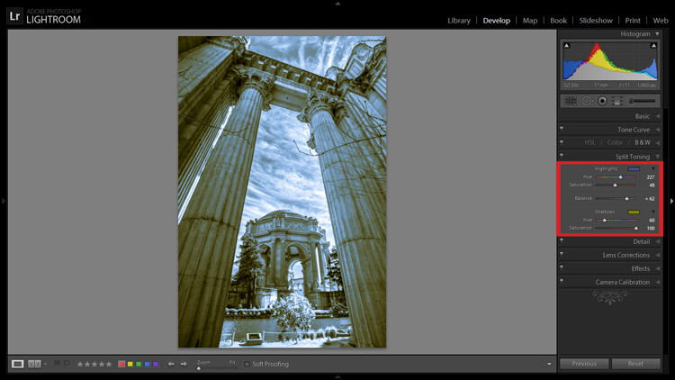
Introducing split toning

One such technique which can add uniqueness and strength to an image, is the process of split toning. Most likely, you have already viewed many images that were split toned, even if you didn’t know anything about it. Many of the vintage looking photographs, that seem to be trending at the moment, almost always employ split tone processing to some extent. That’s not to say that split tone images are something new, in reality, the situation is actually quite the opposite. Split toning has its roots in film photography and dark-room printing. Before we begin to learn just how easily you can convert your images to split tone, let’s first take a brief look at what split toned images are, and examine (even more briefly) a little bit of the history behind the process.

What is split toning?

Split toning is quite simply a process by which color tone is added to the highlight and shadow areas of an otherwise monochromatic photograph. Traditionally, the photo being processed with split tones begins its life as a black and white image capture. After the print has been fully made and developed, it is then introduced to other chemicals, which affect the image tones in different ways, depending on the relative compositions of the chemistry involved. In our world today, digital darkrooms now allow us to carry-over this technique of selective toning to our color prints. Color split tone images are quite possible and are often very pleasing. However, for our purposes here, we will keep the discussion limited to the process of using split toning as it relates to black and white photos exclusively.

History of split toning

Virgin Falls

It all started with the birth of the photographic process itself in the mid 1800s. The images produced during that era of early experimentation into the medium were very delicate, and extremely susceptible to degradation from physical touch, atmospheric conditions, as well as exposure to light post-development. As photography evolved, the pioneers of the art found they needed a way to make their finished prints more durable and longer lasting. This lead to the introduction of toners in the darkroom printing process. Essentially, most toners replace the metallic silver present in the print with a more stable silver compound.

The finished print tone of course depended on the type of toner used. A readily identifiable example of this is sepia tone. We’ve all seen them before; the warm and golden hues that look predominately old fashioned and can lend a sense of nostalgia to an image. Originally, sepia toned photographs were a result of a chemical process in the darkroom. The process involved treating the finished print with chemical compounds that converted the silver present into a silver compound called silver sulfide, which made for a much longer lasting finished print.

The split toning processes came about by using different toning agents in different stages, in different proportions. A photographer might treat a photo with one type of toner and then stop the process at a desired stage, leaving only the highlights unreacted. Then, another and different type of toner might be introduced, which would react with the remaining silver present in the shadows left over from the previous treatment. Thusly, the tones visible within the image would be split – hence split toning.

Roots

Ansel Adams, one of the most influential photo makers of the our time, also employed the use of split toning in his masterworks. This in itself is quite interesting since Adam’s was a realist in all ways. Meaning that he promoted straight photography with minimal manipulations in the darkroom aside from his own adjustments, using mostly dodging and burning. Ansel choose primarily selenium based toning agents for his work, which added a very slight blue hue to the shadows of most of his prints. He called the color tones eggplant, and indeed the coolness of bluish blacks produced images that are still counted among some of the most magnificent examples of photographic art ever made.

How to apply split toning in Lightroom

Now that you have an understanding of what the split tone processing is all about, we can move on to the fun stuff. Let’s take a look at how you can easily make your black and white images really stand out using split toning feature in Adobe Lightroom 6 (the split toning feature is also available in other image processing software including LR CC, Photoshop and ACR).

Let’s begin with a color image that we feel would benefit from being converted to black and white. Photos which transition well to black and white more often than not possess stark contrasts between the light and shadow areas, and have great texture within the subject matter.

This is quick snapshot of my dog Leia. The bright light coming through the door casts her profile nearly in silhouette and the high ISO made for a slightly grainy image, but really no remarkable color of which to speak. So I chose to convert it to black and white and use the grain in order to produce a gritty, and spontaneous look to the photo.

Leia Original

Original color image

Leia Original BW

This is the image after converting to black and white.

But, I still wanted more than just a black and white photo, so I decided to apply some slight split toning. Here we have the same photo of Leia opened in LR 6. The Split Tone panel is highlighted.

Split Tone Panel

You’ll see a few options for controlling the highlight and shadow tonality, along with a hue and saturation slider for each. There is also a balance slider. The balance slider controls how the color tones are applied in relation to one another.

Split Tone Panel 2

I adjusted the tones to make the highlights into a yellow hue, while the shadows I changed to a bluish-purple. I simply kept adjusting each slider until I achieved the look I wanted for the image.

Split Highlights

Here is the edit with the balance slider favoring the highlights.

Split Shadows

Here we see it balanced to favor the shadows.

Leia Split Tone

Here is the finished image after split toning. From beginning to end the processing took less than five minutes.

Applying split toning to your black and white photographs can be an easy way to move beyond merely converting your photo to black and white. It adds interest to your shot, and helps to make it stand out from the ordinary. Luckily, digital photography has given us enormous range to experiment with our images, apply edits, and see the effects in real-time.

Here is another example of an image which has been processed using split toning (see others throughout the article as well). Try some split tone processing techniques for yourself and see what your black and white photos can become!

Cataloochee Valley Overlook

Editor’s Note: This is one of a series of articles this week featuring black and white photography tips. Look for earlier ones below and more daily over the next few days.

  • 5 Simple Ways to Create Expressive Photos in Black and White
  • Tips for Black and White Wildlife Photography
  • 7 Tips for Black and White Portrait Photography
  • 28 Images with Strong Black and White Compositions
  • Weekly Photography Challenge – Black and White Techniques
  • Tips for Black and White Wildlife Photography
  • How to Convert Images to Black and White and Add a Color Tint in Photoshop
  • Shooting all Black and White for a Day to Improve Your Photographic Eye

googletag.cmd.push(function() {
tablet_slots.push( googletag.defineSlot( “/1005424/_dPSv4_tab-all-article-bottom_(300×250)”, [300, 250], “pb-ad-78623” ).addService( googletag.pubads() ) ); } );

googletag.cmd.push(function() {
mobile_slots.push( googletag.defineSlot( “/1005424/_dPSv4_mob-all-article-bottom_(300×250)”, [300, 250], “pb-ad-78158” ).addService( googletag.pubads() ) ); } );

The post Split Toning Black and White Images in Lightroom by Adam Welch appeared first on Digital Photography School.


Digital Photography School

 
Comments Off on Split Toning Black and White Images in Lightroom

Posted in Photography