
If you have read my earlier articles about Lightroom you will already understand how it differs from Photoshop and how it uses a database to organize your photos as well as process them.
Lightroom has evolved into a powerful raw processor, and it is now possible to process most of your images in it. You only need to use other software (such as Photoshop or a plug-in) when you reach the limits of what Lightroom can do.
Raw processing takes place in the Lightroom Develop module. If you haven’t used Lightroom before you may find the Develop module layout confusing, especially if you are used to pixel editing software like Photoshop. Lightroom has no layers or blending modes, and there is no real set order in which to do things. But don’t worry if it makes little sense at first – this article will help you come to grips with the basics, and make a start on processing your raw images.
Note that you can also use Lightroom to process JPEG and TIFF files, although some of the options Lightroom gives you differ slightly. I have used raw files in this article.
The Lightroom Develop Module
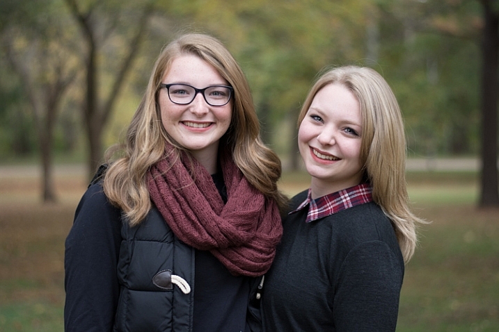
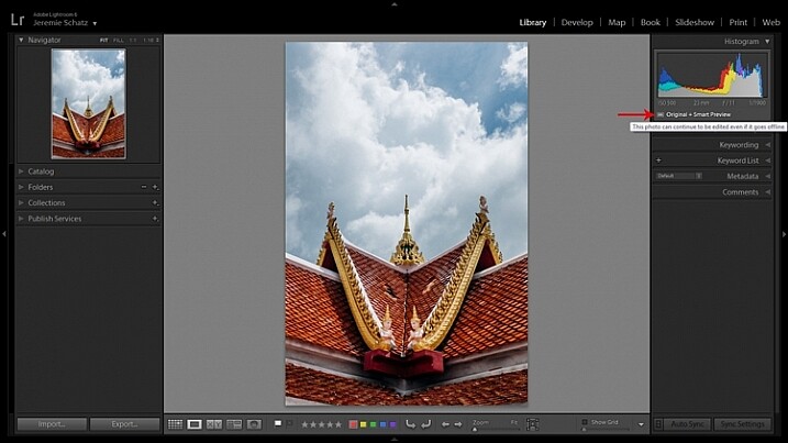
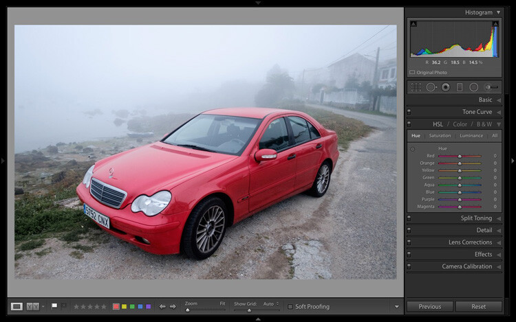
To start, go to the Library module and select the photo you want to process. Click on Develop in the Module Picker, or press D on the keyboard, to open the image in the Develop module.
The Develop module is split into sections. There are panels on the left, some more on the right, and the Content Window in the middle, where the photo you are currently working on is displayed. Just like the Library module, you also have the Module Picker at the top and the Filmstrip at the bottom.

You may have noticed that there is no Folders panel (left side) in the Develop module. This is Adobe’s way of encouraging you to use Collections. So if you are not doing so already, now is time to get in the habit.
We don’t need the Module Picker, left-hand panels, or Filmstrip for this article, so when you’re ready click on the white arrows at the edges of the screen to hide them.
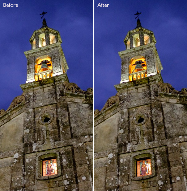
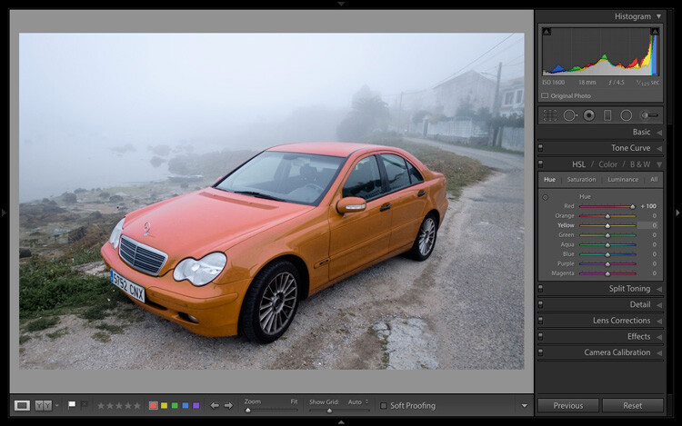
Your screen should look something like this, with the right-hand panels and the histogram available on the right, and the photo you are working on occupying the rest of the screen.
If you do not see the toolbar below your image hit T on your keyboard to show/hide it.
The right-hand panels contain most of the tools that Lightroom has for processing raw files. Today we are going to look at three of these:
 |
- Camera Calibration panel
- Lens Corrections panel
- Basic panel
|
These panels are important because they are the foundation of the processing work you do on an image.
The Camera Calibration panel
The Camera Calibration panel is the ideal starting point for processing an image. When you come here you are looking for two important settings.
Process: Should be set to 2012 (Current), which is set by default.
 Profile: Should be set for the most appropriate setting for your photo. The options you see here depend on the camera used to take the photo. All cameras have profiles that you set to determine the treatment of the image. Each manufacturer has different names for this setting (for example, Canon calls it Picture Style, Nikon Picture Control and Fujifilm Film Simulation).
Lightroom should show you most of the settings you have available on your camera plus another one called Adobe Standard. Your job is to pick the profile that is most suited to your photo.
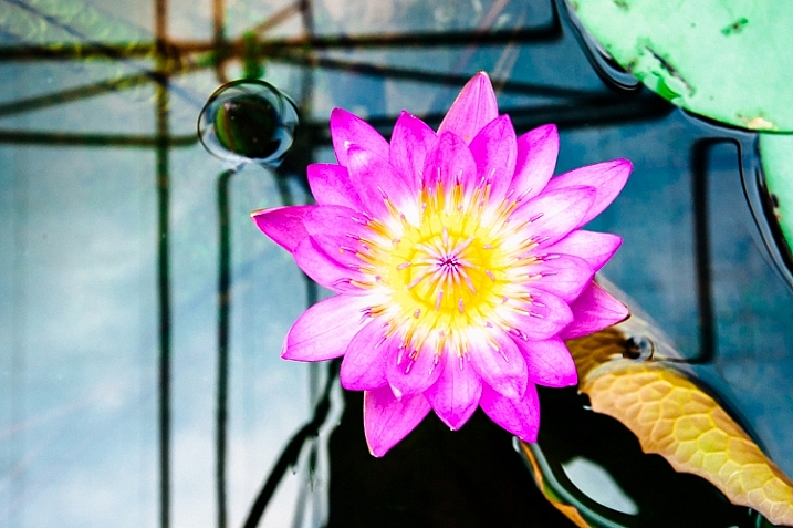
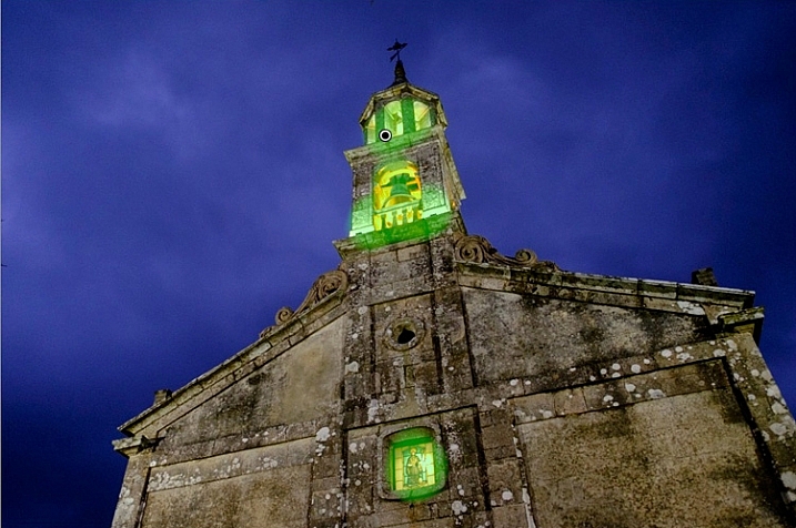
I’ll assume you know your own camera settings well enough to do so. If there’s any doubt, just move through the available options and pick the one that has the most suitable effect. In this case I selected Camera Velvia/Vivid to bring out the strong colours in the photo.
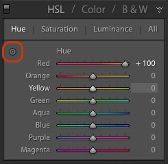
Ignore the colour sliders in the Camera Calibration panel for now, they are for advanced users.
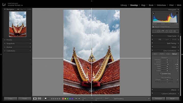
The Lens Correction panel
There are a lot of things you can do in the Lens Correction panel, but to get started you only need two:
#1 – Enable Profile

Note that this screen shot is from a photo taken with a Canon camera.
Click Profile and tick the Enable Profile Corrections box. Select your lens using the menus underneath. Lightroom contains profiles for most commonly used lenses (the full list is available here).
Set the Distortion slider to 100 (the default). Lightroom uses the selected profile to remove any barrel or pincushion distortion caused by the lens.
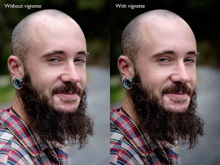
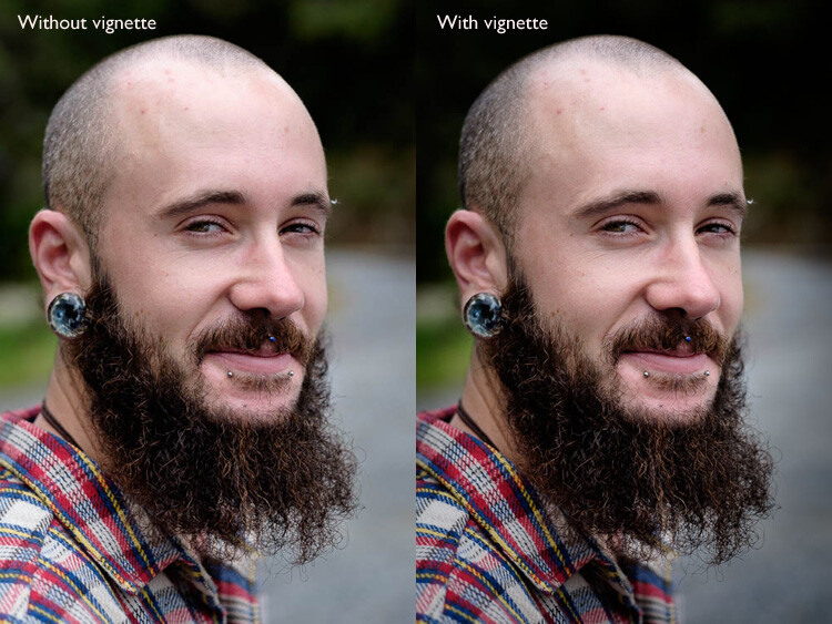
The default for the Vignetting slider is 100. This lightens the edges of the photo to compensate for the vignetting effect caused by using your lens at wide apertures. You may wish to include the vignetting for aesthetic reasons – in which case move the slider left until you get the effect you want.
Some Raw files, such as those created by most Fujifilm cameras, have an embedded profile that Lightroom uses to correct barrel and pincushion distortion. If this is the case, and you are using Lightroom 6 or Lightroom CC, then the message Built-in Lens Profile applied is displayed at the bottom of the panel. If you see this message, don’t tick the Enable Profile Corrections box. Lightroom doesn’t have a profile for your lens and you won’t be able to find it.

In earlier versions of Lightroom the Built-in Lens Profile applied message isn’t displayed, even if your Raw file has a built-in profile. If you can’t find your lens in the list, it’s probably because:
a. The lens is so old Adobe hasn’t got around to profiling it yet.
b. The lens is so new that Adobe hasn’t had chance to profile it yet (updates with new lens profiles are released periodically).
c. The camera used embeds the lens profile into the Raw file, and Lightroom uses it automatically. This is most common with mirrorless cameras.
#2 Remove Chromatic Aberration
Click on Color and tick the Remove Chromatic Aberration box. This tells Lightroom to remove any chromatic aberrations caused by the lens.

The sliders underneath are for removing purple and green fringing. They are zeroed by default, and for the moment we will leave them there, as they are a topic for another article.
The Basic panel
The Basic panel is where you adjust the color and tonal values of your image. These sliders can make a dramatic difference to the appearance of your photo, and there are times when you won’t need to touch any of the other panels in the Develop module.
The White Balance sliders
If you’re not sure what White Balance is then read our article Demystifying White Balance, but really all you need to know here is that you move the Temp slider left to make the image cooler (add a blue cast or remove an orange cast) or move it right to make the image warmer (add an orange cast or remove a blue cast).
 Alternatively, you can use the WB presets: As Shot, Daylight, and so on (note: those options only appear when you are processing a Raw file). I selected Daylight for this image for a fairly neutral colour balance.
The Tint slider is for removing green and magenta colour casts. These are usually caused by artificial lighting such as fluorescent lights.
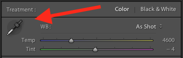
If none of the above options seem to work then activate the eyedropper tool by clicking on the eyedropper icon and click a neutral grey or white area in the photo. Lightroom analyzes the pixels underneath the cursor and adjusts the White Balance accordingly to remove any color cast and make it neutral.
What is the purpose of White Balance? The answer depends on what you want to do with the image. There are three basic options.
- Create an image with neutral colour: In this case you are trying to eliminate any colour casts present in the image.
- Create an image with a warm colour cast: This is something you might do with a landscape photo taken during the golden hour or a portrait (where warm tones are more flattering) to the subject.
- Create an image with a cool colour cast: This is something you might do if you want to impart a cold feel to the image. This would suit a landscape taken in winter, for example.
Think about your intent when you adjust White Balance. Once you know what you want to do, you can adjust the sliders to suit.
 White Balance is all about color and there are two more sliders at the bottom of the Basic panel that assist with controlling colour, they are called Vibrance and Saturation. Move these sliders left to reduce the color intensity, or right to increase it.
The Saturation slider affects all hues equally, whereas the Vibrance slider has a greater effect on weaker colours than it does on stronger ones. Play around with them on a few different images to get the hang of how they work.
Be careful with both sliders – they are usually used to desaturate colour rather than increase it (which can look false). For this photo I have left them both at zero.
The Tonal Sliders
 The following sliders affect tones, and are used for adjusting brightness and contrast. Feel free to press the Auto button to see what Lightroom thinks you should do with your photo.
The Exposure slider
This slider is very simple – move it right to make the photo brighter or left to make it darker.
The Contrast slider
Again, a simple slider to use. Move it right to increase contrast, or left to decrease it.
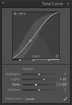
The Highlights and Shadows sliders
Whereas the Exposure and Contrast sliders affect every tone in the photo, the Highlights sliders affects only the lightest tones and the Shadows slider affects only the darkest tones.
Move the Highlights slider right to make light tones lighter, or left to make them darker. Move the Shadows slider right to make the dark tones lighter, or left to make them darker.
Note: you may have notice sliders left makes your image lighter, sliders right makes it darker.
Again, the best way to learn how these sliders work is to play with them. Move them around and observe the effect they have on the histogram (displayed at the top of the right-hand panels), and the appearance of the image itself.
Don’t worry if you’re not sure how to read the histogram. It deserves an article to itself and I will write one shortly.
The Whites and Black sliders
You don’t have to worry too much about these sliders when you are just starting out. You can either leave them at the default setting of zero or let Lightroom work out what the settings should be.
To set the Whites slider automatically, hold the Shift key down and double-click on the word Whites. Do the same to set the Black slider automatically, hold the Shift key down and double-click the word Blacks.
If the slider settings don’t change when you do so, that means that zero is the ideal setting.
The Clarity slider
The Clarity slider affects something called mid-tone contrast. In simple terms, moving the Clarity slider right emphasizes texture, and moving it left removes texture by softening the image. Many photos benefit from a subtle increase in Clarity (between +10 and +20). Black and white photos, of which texture is often an important part, can benefit from greater adjustments.
Play around with the Clarity slider on different photos to see what effect it has. Resist the temptation to make your photos pop by moving it too far to the right – it may seem like a good idea at the time but the result will simply hurt your eyes.
My article Four Ways to Improve Your Photos with the Clarity Slider in Lightroom explores the topic in more detail.
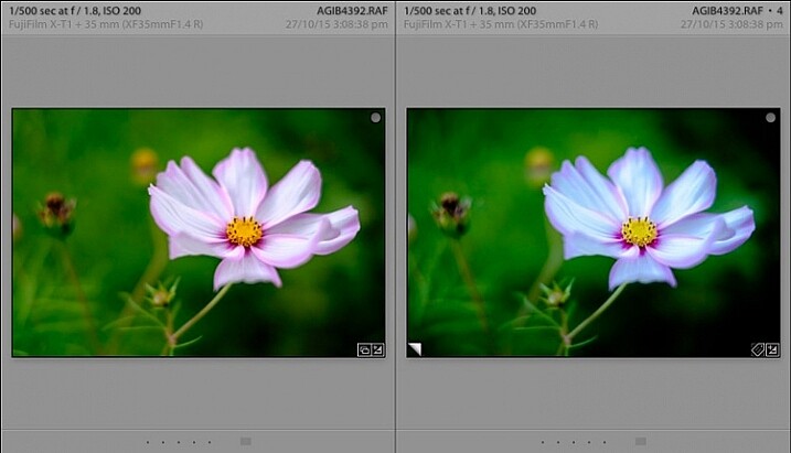
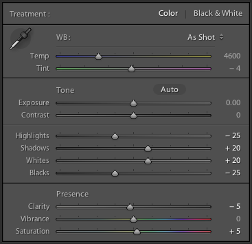
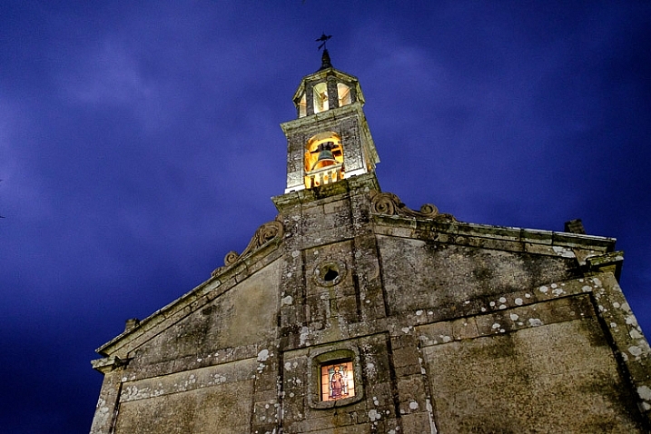
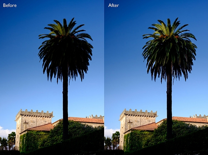
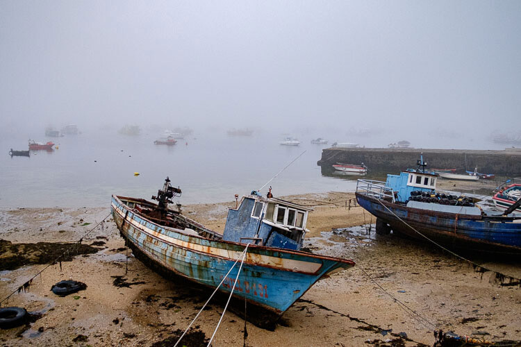
These are the Basic panel settings I settled on for this photo. Every image is different, but at least it gives you an idea.

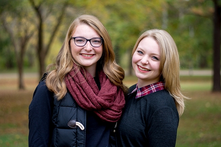
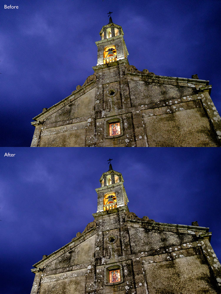
This is how the photo looks so far. Not very exciting, I admit, but that’s because so far we’ve been doing mainly preparation work. The real excitement comes when you add local adjustments or convert the photo to black and white. 
I’ll show you what the other right-hand panels do in my next article. In the meantime, if you have any questions about processes explored in this one, please let me know in the comments.
The Mastering Lightroom Collection
My Mastering Lightroom ebooks will help you get the most out of Lightroom. They cover every aspect of the software from the Library module through to creating beautiful images in the Develop module. Click the link to learn more or buy.
googletag.cmd.push(function() {
tablet_slots.push( googletag.defineSlot( “/1005424/_dPSv4_tab-all-article-bottom_(300×250)”, [300, 250], “pb-ad-78623” ).addService( googletag.pubads() ) ); } );
googletag.cmd.push(function() {
mobile_slots.push( googletag.defineSlot( “/1005424/_dPSv4_mob-all-article-bottom_(300×250)”, [300, 250], “pb-ad-78158” ).addService( googletag.pubads() ) ); } );
The post Steps for Getting Started in the Lightroom Develop Module by Andrew S. Gibson appeared first on Digital Photography School.

Digital Photography School

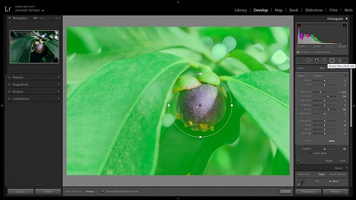
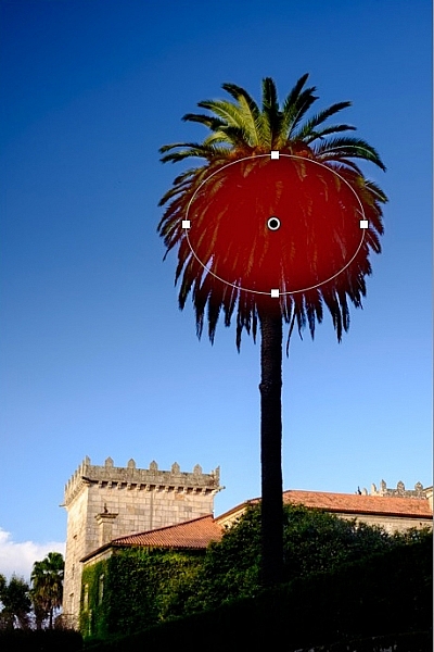
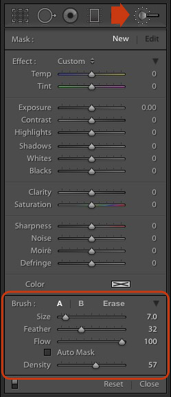 Note that masks work differently in Lightroom than in Photoshop. In Photoshop, the adjustment is applied to the area that isn’t covered by the mask. In Lightroom, the adjustment is applied to the area covered by the mask.
You must be logged in to post a comment.