I see a lot of winter. The interior of Alaska, where I live, gets a solid six months, often seven, of the white stuff. Essentially anytime from October to mid-April, we are likely to have snow on the ground. Unless I put the camera down for most of the year (which I don’t), I end up with a lot of photos on my computer of snowy mountains, forest, and tundra. Come the early-spring, brown season, I have a lot of computer work to take care of.
Though the method of processing winter images is largely the same as many other types of outdoor images, you’ve got to approach snowy images with cold focus (insert laughter here). I jest, but actually the cold, and bright blue tones of winter, are elements that should not be forgotten (or overdone).
My Approach
When I come at an image in Lightroom, I don’t tackle it with a standard formula. Rather, I consider the time and place I made it, what the landscape looked like, and just as importantly, how it felt. Those memories play an important role in my vision for the final image.
With that in mind let’s dive into the first of the three winter images I want to walk you through my processing steps.
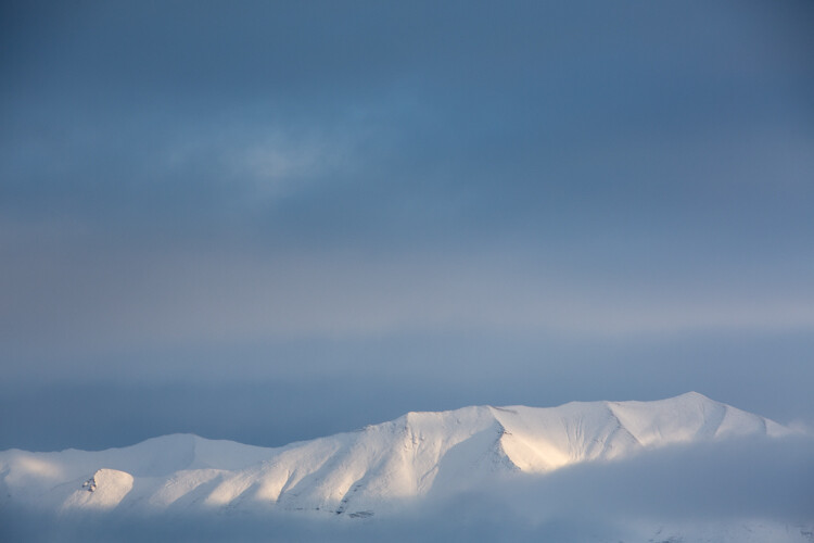
Brooks Range, Alaska – Early winter
On a river trip in early September, down the remote Kelly River of the western Brooks Range, my clients and I were hit by the first snowfall of winter. It started the evening before I made this image, with a few big, wet flakes falling from the overcast sky. By the following morning, my tent, the gravel bar on which we were camped, and the entire landscape, was covered in six inches of fresh snow. The snow was tapering off, and I could see breaks in the clouds where patches of blue sky shone through. It didn’t take long before those patches were turned into beams of sunlight on the mountains. I walked down to the river with my camera, and started making images of the shifting light on the land. This shot came out of that session.
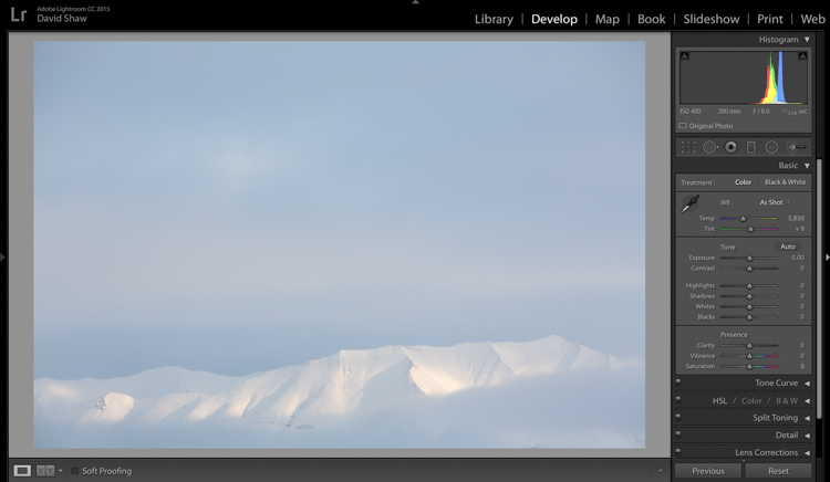
The light and color is typical of many winter images, bright, with lots of blue. Take a look at the histogram in the upper right, and you can see how it’s pushed to the right, meaning the image is on the bright side (but no blown-out highlights), exactly what I want with an out-of-camera winter shot.
Step One – White Balance
The first thing to consider is the white balance. Cloudy days tend to cause warmer tones, and snow, particularly under-exposed snow, can take on a yellowish hue. This can be off-putting, so pushing your white balance toward the blues can help provide a more pleasing, and accurate tonality. In this case, my camera selected an appropriate White Balance in the field, and didn’t need any adjustment in Lightroom. But keep this in mind when processing your own images.
Step Two – Exposure
The next step was to bring down the exposure by 0.75 stops, making the image a bit moodier, and less bright. I then bumped the contrast a hair to +16 just to make those highlights more clear before I dove into the more important contrast adjustments.
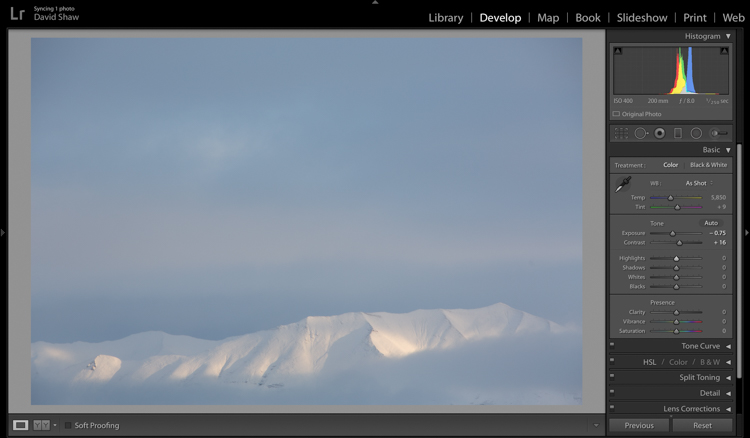
As a quick note, I bet I do 85% of my Lightroom edits in the Basic panel. This very effective section of the program is one you should know intimately, before you go exploring too much of the huge variety of other tools provided by the software.
The next four sliders provide a more specific modification of lighting in the image. In this case, I wanted to recollect some of the feeling of the dissipating storm by emphasizing the dark clouds. To do so, I pulled the Shadows slider down nearly all the way, making the dark blues and grays of the clouds appear more menacing. The Highlights, I bumped just a notch, adding some pop to the bright patch on the mountains. Whites and Blacks each got a nudge up (Whites) and down (Blacks) respectively, finishing the job I started with the first two sliders.
Step Three – Clarity
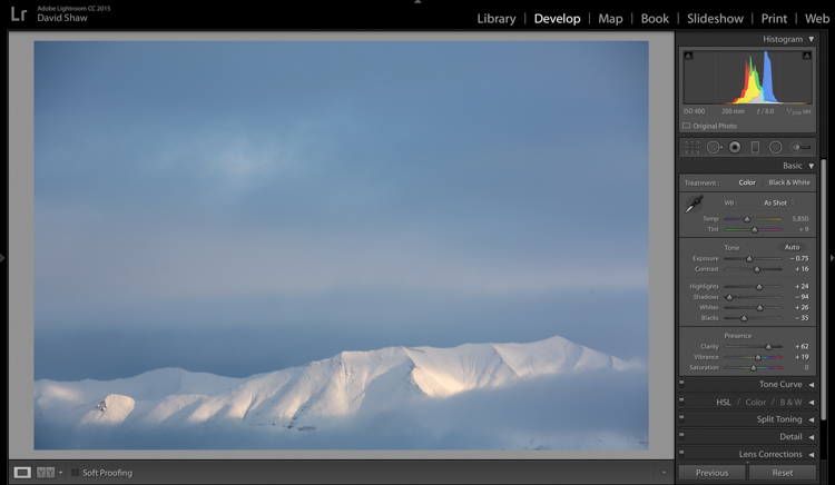
The first of the next three sliders is Clarity. This nifty tool, increases the contrast where dark and bright edges meet, and adds apparent sharpness to the image. On the morning I made the image, the clear morning light made the mountains very sharp to the eye. Wanting to emulate that effect in the image, I gave the Clarity a substantial boost to +62. That’s about as high as you can go on most images without appearing artificial.
Step Four – Vibrance and Saturation
The Vibrance and Saturation sliders are dangerous. Photographers tend to believe that bright colors mean a good image. I want to say this very clearly: Do NOT over-saturate your images. It doesn’t look as good as you think it does, so, you know, just don’t.
Vibrance increases the intensity of the less saturated tones. When used in moderation it adds pop. In this image, I left the saturation slider completely alone.
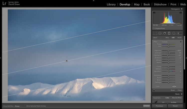
The rectangular icon in the row below the histogram is the Graduated Filter. This useful tool allows you to adjust a portion of the frame, without affecting the other areas. Just as importantly, you can adjust the edge softness (transition area) as hard or soft as you like. In this case, I wanted my changes to taper naturally into the frame so made the filter edge fairly wide (set feather to a high number). Using this tool, I chose to darken the sky, and draw attention to the mountains at the bottom of the frame. After adjusting the placement, I lowered the exposure in the sky. This allowed me to subtly darken the sky, without affecting the brighter tones of the mountains.
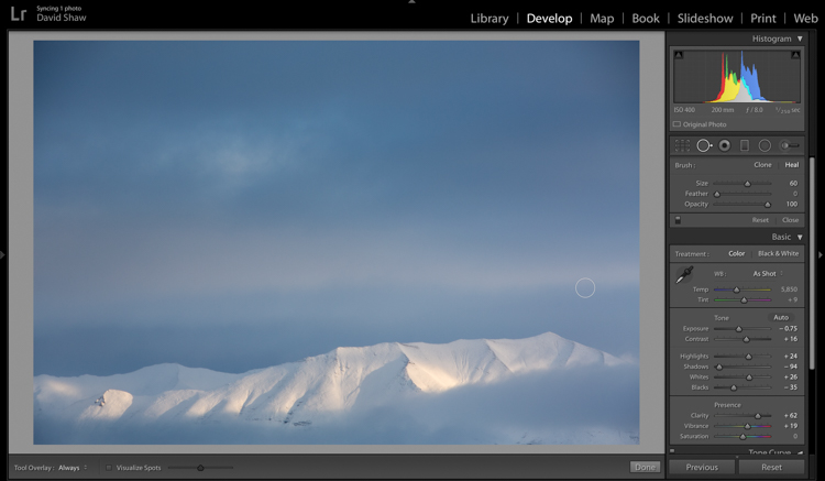
Adjusting contrast can cause previously invisible imperfections to appear. In this case, it was a dust spot on my sensor, which I cloned out using the “Heal” tool.
The final image, as you can see, is a substantial improvement over the original, and holds true to the scene as I remember it.
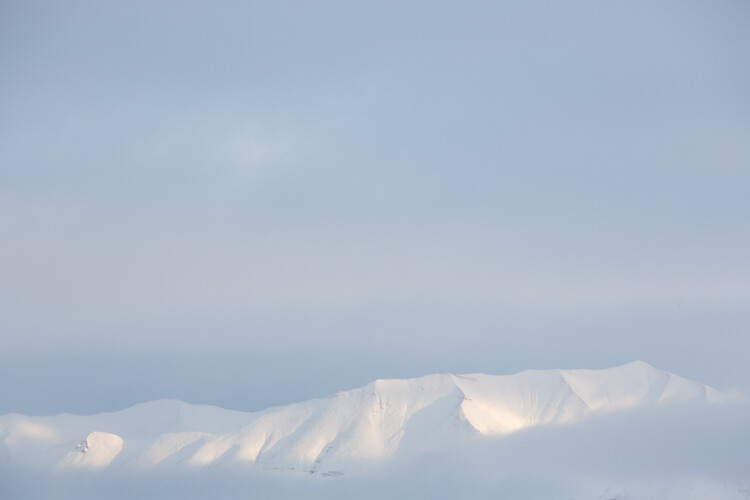
Before processing
After processing
Color in the Cold
Not all images of the winter rely on cool tones for their success. At times, it is the juxtaposition of those cool tones and bright warm colors that make an image.
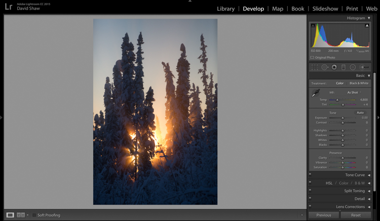
This is one such image. I made it on an extremely cold mid-winter day, on the ice of the small creek that flows on the lower part of my property north of Fairbanks, Alaska. It was about -35f (-37c), and water, pushed up from the bottom of the creek by the pressure of the ice, was trickling out onto the surface where it steamed into the frigid air, before freezing. It was midday, and the sun, just a few ticks above the horizon to the south, was throwing orange beams through the branches of the snow-colored spruces. Fortunately, I had my camera, and managed this photo before the sun slipped away.
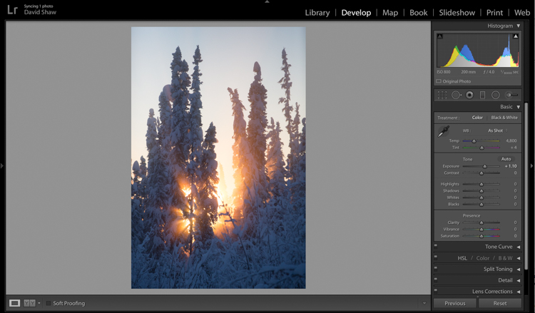
On that cold day, I was forced to underexpose the image to keep the beams of sunlight and the sky from blowing out. My first step was to return some of that brightness to the image by raising the Exposure +1.10 stops.
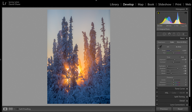
In general, I dislike High Dynamic Range (HDR) images, particularly the over-processed ones that appear regularly on Facebook and Instagram feeds. That said, HDR, or my Lightroom version of it, can be helpful in highly contrasted images like this one. Here, I pulled the highlights all the way down, bringing the beams and the sky back to more appealing levels. The Shadows I brought up, which revealed details in the trees and shrubs which were previously too dark to see. The effect, when used appropriately, does not look artificial.

The image was already colorful and sharp so required very little in the way of Clarity, Vibrance or Saturation. A small boost (+9) to Clarity, +11 to Vibrance, and no change in Saturation was all the image needed.
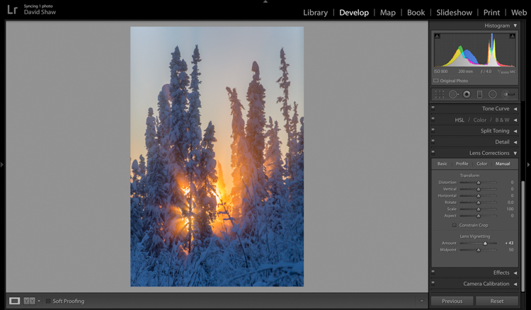
The lens I used to make the image has a hood, which I realized after the fact, was slightly mis-aligned and threw a vignette over the corners of the photo. If I want a vignette (see next), it needs to be purposeful, not the accident of a poorly fitted hood. So, using the Lens Corrections module, I made a single adjustment, sliding the Lens Vignetting slider to the right, brightening the corners, and almost entirely eliminating the ugly dark area in the top right.
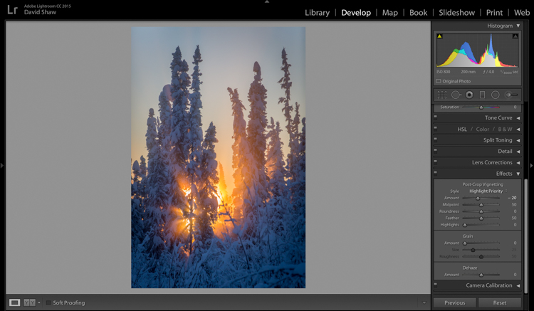
The last thing I wanted to do was darken the sky a touch more, and bring further attention to the starburst of sunbeams coming through the trees. So, using the Effects Module, I added a -20 Post-crop Vignette, which effectively darkened the sky and lower corners.
With that final change, the image was complete, a starburst of color on a brutal winter day.
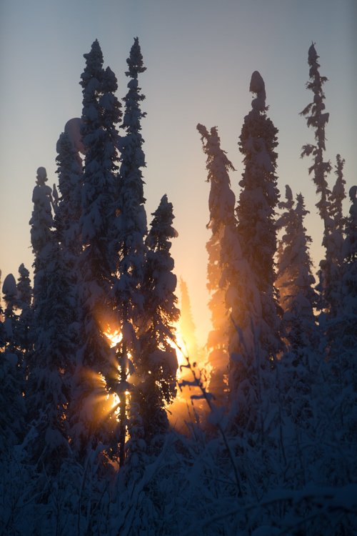
Before processing
|
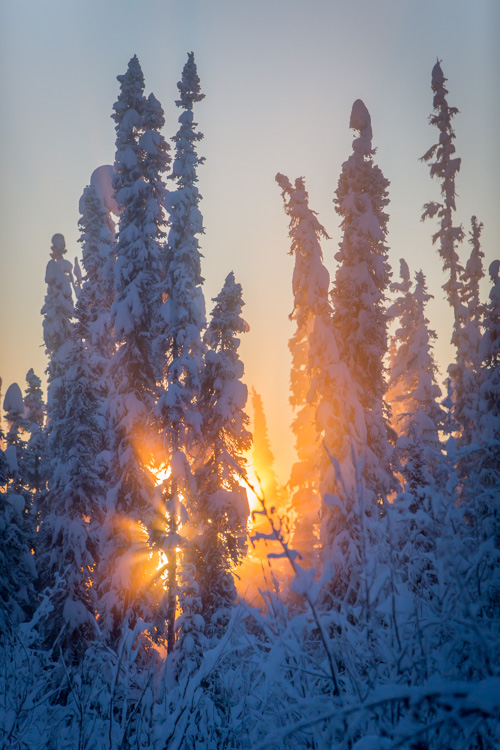
After processing
|
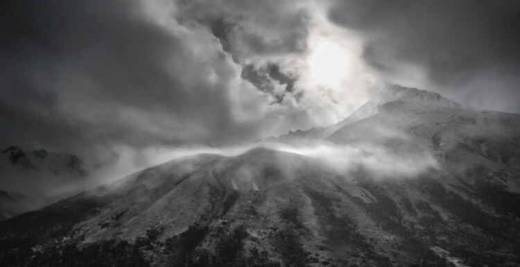
The Storm
A number of years ago, I spent 10 days trekking through the Himalayas of Bhutan. It was October, the tail end of the trekking season for the little mountain kingdom. My group and I hiked up from the lowlands, to a high camp at over 13,000 feet, where we planned to cross over two 15,000 foot passes before making a long descent back to the city of Thimpu. It didn’t work out as planned. We’d scheduled two nights at the high camp to acclimatize before crossing the passes. Just before bed on the second night, a storm rolled in, and by the time we woke up the following morning, there were eight inches of snow on the ground. Any hopes of penetrating higher into the mountains were dashed. Making the best of it, I rose and made photos of the dark mountains and falling snow.

In the field, I purposely underexposed to keep the small patch of bright sky surrounding the sun from blowing out entirely. The mountains ended up nearly black, and the sky dark gray. Though consistent with my desire to make a moody, foreboding image, I wanted to emphasize that feeling even more.
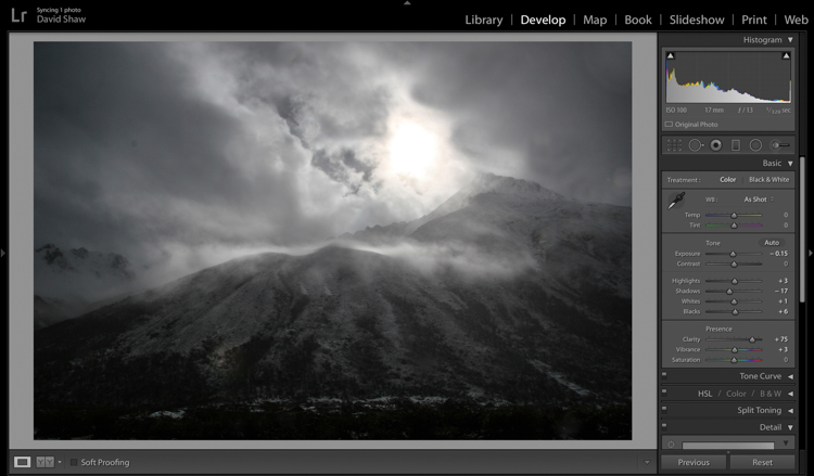
In the Basic Module, you can see that I darkened the image a bit more, left the highlights more or less alone, darkened the shadows a hair, and bumped the blacks just a bit to bring some texture into the dark lower corners. The Clarity slider I pushed notably to the right, which made the textures in the sky and mountain pop against the otherwise soft grays. I left the color adjustments mostly alone.
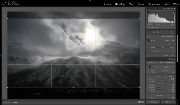
The more I looked a the photo, the more I realized the top and bottom edges added nothing to the image. Using the crop tool, I nipped them off, bringing all the attention to the action in the central part of the frame.
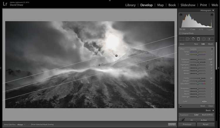
At this point, the processing got a bit complicated. I wanted to deal with the sky and mountains separately. One I wanted to brighten, the other darken. There were two ways to deal with this:
- Use the Adjustment Brush tool to select and develop the two areas
- Use Graduated filters to accomplish the same thing. Because the Graduated filter allows more flexibility to change the softness of the adjustment edge, I decided to use that.
The filter that adjusted the sky I darkened, and increased the clarity. The one for the mountains, I brightened, boosted the highlights, to make the scudding clouds pop, and added some clarity.
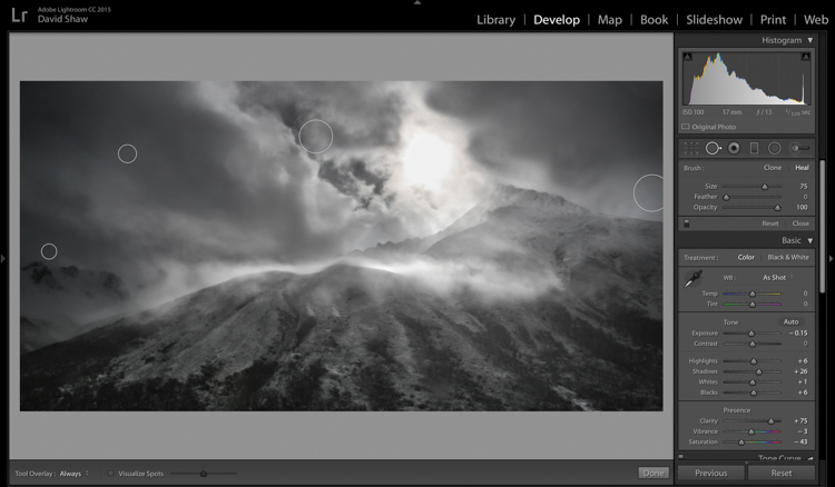
As noted earlier, the changes in contrast can emphasize imperfections, and I took a moment to remove lens flares and dust spots.
Last, I did a second pass of the Vibrance and Saturation. The yellowish patch around the sun was annoying me, so I dropped both the color sliders down reducing the image to a near black-and-white.
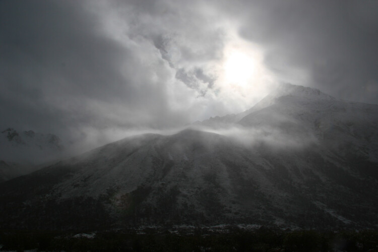
Before processing
Finished image after processing
I really like the final image. It provides a sense of the storm and the foreboding nature of mountain weather. Looking back, I can easily remember my nervousness that snowy morning, the uncertainty, and eventually, our retreat back the way we’d come.
Conclusion
Great images can come from snow. Many photographers put their cameras away during a winter storm, but I strongly recommend you don’t because there is great stuff out there if you’ve got the perseverance to suffer through some cold days. The images you gather, like these, can be optimized in your computer. Remember to take a moment before you begin, to recall how the scene looked and felt when you made the image, then use those memories as your guide.
Do you have any winter images on your computer that are begging to be processed? Now’s the time to do it, please share your images and comments below.
googletag.cmd.push(function() {
tablet_slots.push( googletag.defineSlot( “/1005424/_dPSv4_tab-all-article-bottom_(300×250)”, [300, 250], “pb-ad-78623” ).addService( googletag.pubads() ) ); } );
googletag.cmd.push(function() {
mobile_slots.push( googletag.defineSlot( “/1005424/_dPSv4_mob-all-article-bottom_(300×250)”, [300, 250], “pb-ad-78158” ).addService( googletag.pubads() ) ); } );
The post Tips for Processing Winter Landscapes in Lightroom by David Shaw appeared first on Digital Photography School.

Digital Photography School


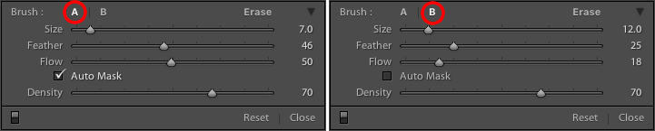
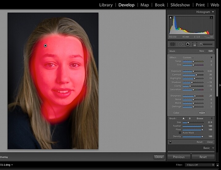
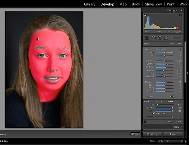
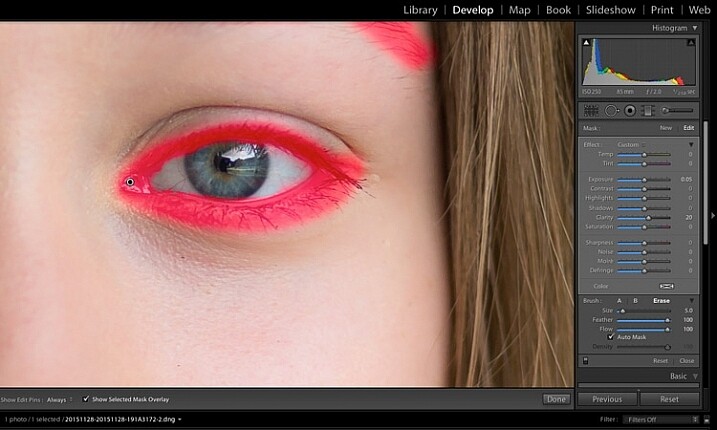
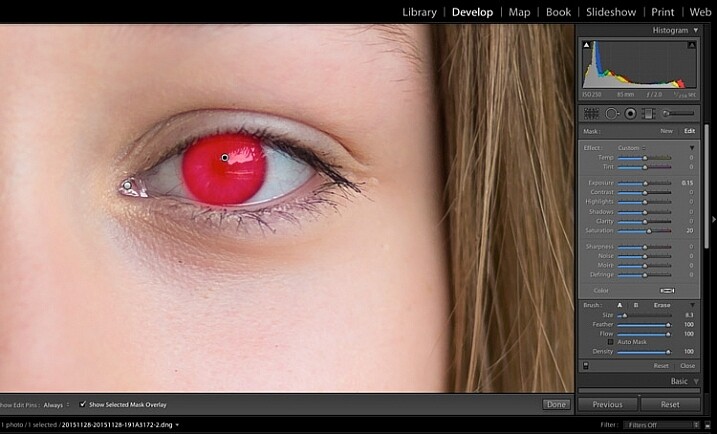
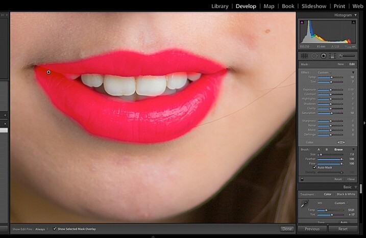
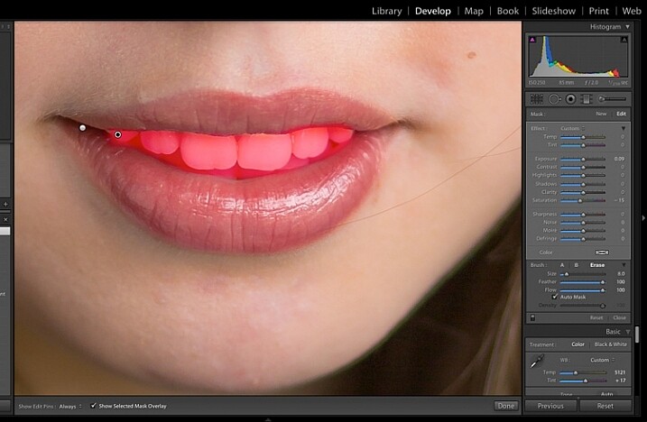
 After you have brushed in a particular set of edits, click “New” on the top-right of the Brush panel to create a new brush, but notice that all your sliders and adjustments remain unchanged. To reset all your parameters to their default values, hold down the alt key (option on a Mac) and you will see the Effect label at the top change to Reset. Click on that and everything will be set back to zero for you to start creating a fresh set of edits.


You must be logged in to post a comment.