RSS
 

Posts Tagged ‘lightroom’

Stylized Techniques for Editing Portraits Using Lightroom

25 Jul

This is the promised follow-up to my article on Creating Compelling Wide-Angle Portraits Using One Off-Camera Flash. While part one discussed equipment, composition, lighting and posing, this article focuses exclusively on post-processing.

1 Romanian Woman

Let me start by stating the obvious. Everyone has their own unique preferences regarding post-processing. Just read the comments below a posted image that is somewhat heavy on processing and you will see the variety of opinions out there. Personally, I like creating portraits that look somewhat surreal. I achieve some of this look by lens choice and composition and the rest in Adobe Lightroom and Photoshop.

2 Malawian Guy

Rather than go through my entire workflow, I’ll focus on five steps in Lightroom that form the foundation for my portrait processing. If you also like portraits that look a bit surreal, my hope is that you will learn a technique or two here that you find helpful.

This article assumes that you already have some familiarity with the menus and tools in Adobe Lightroom or Bridge.

3 Chinese Guy Hat

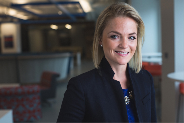
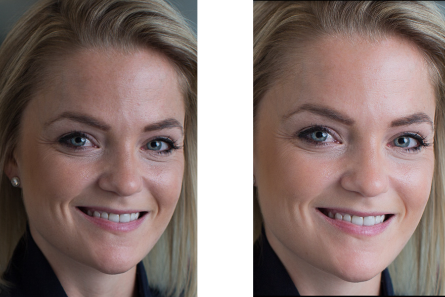
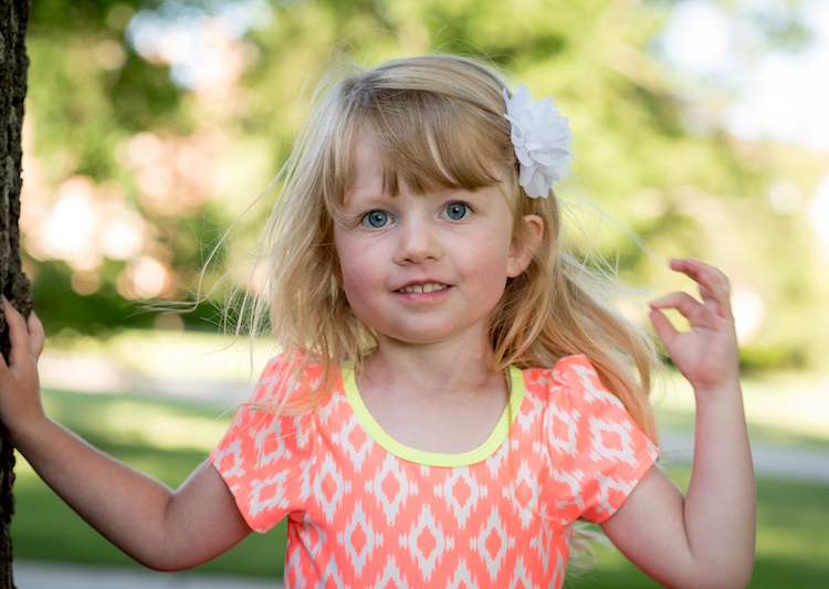
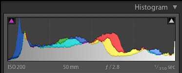
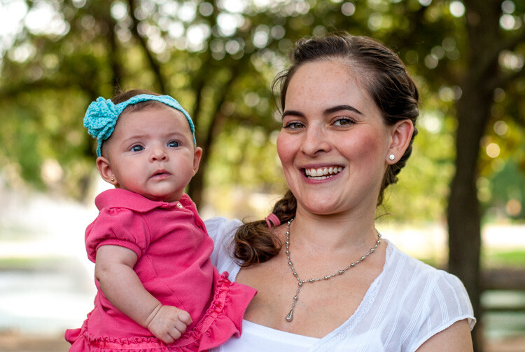
Let’s look at the work I did in Lightroom for the above portrait, shot in rural China. First, here is the image right out of camera.

4 Out Of Camera

Step 1. Move the contrast to the mid-tones

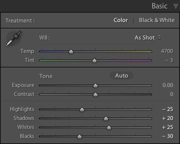
One of the first steps was to reduce the overall contrast in the image using the Highlights, Shadows, Whites and Blacks sliders. The image is fairly contrasty, but weighted more towards dark tones. I moved the Highlights and Whites sliders left (only a minor adjustment to Whites) to reduce some of the highlights (bright areas) in the background. I then moved the Shadows and Blacks sliders right (only a minor adjustment to Blacks) to make sure detail can be seen throughout the image, even in the gentleman’s hat.

These initial adjustments gave the image a flat (non-contrasty) look as a starting point. This was intentional, as I planned on building contrast back into the image.

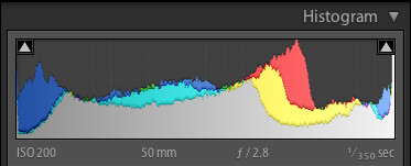
Notice in the image below that the light area in the background is somewhat less distracting, and that there is more visible detail in the background shadows.

5 Global Luminosity

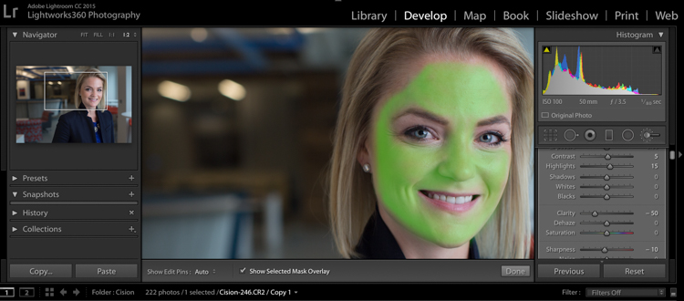
While I removed some contrast at the outer ends of the spectrum, I then added contrast into the midtones by pushing up the Clarity slider. This varies by image, but in this case I moved it to +60 in Lightroom, in order to accentuate facial features. The Clarity slider focuses on the mid-tones while mostly leaving the luminosity of the brighter and darker areas of the image as is. Here are the results:

6 Clarity

Step 2. Reduce saturation globally

For my portraits, I always make an initial global reduction (applies to the entire image) to Saturation and Vibrance. In this case, I reduced Saturation to -10, and Vibrance to -5. The shirt is still too blue in my opinion, but I’ll target that in the next step.

7 Reduce Saturation

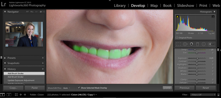
Step 3. Make local adjustments using the Adjustment Brush

Using the Adjustment Brush, I made changes to luminosity, saturation and sharpness in targeted parts of the image:

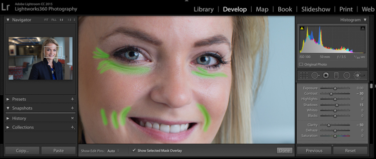
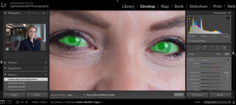
Adjustments to Luminosity – Your eyes usually gravitate towards the brightest areas of an image. So, I used the Adjustment Brush to draw more attention to the subject, especially his face, and less attention to other areas.

I started by brushing over brighter areas that were competing with his face, and darkening them slightly using the local Exposure and Highlights sliders. I also brushed over some darker areas that were missing detail, and pulled the local Shadows slider up slightly. Lastly, I added some overall brightness to the face and a little more to the eyes.

Adjustments to Saturation – I used the Adjustment Brush and local Saturation slider to further desaturate the man’s t-shirt. In this case, I also darkened it, while de-saturating.

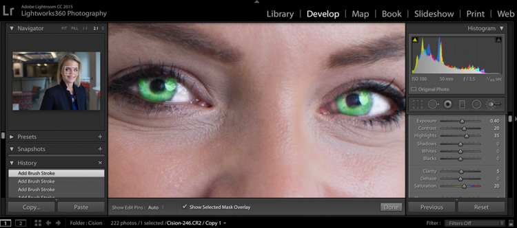
Adjustments to Sharpness – I added a bit of additional sharpness to the eyes, eyebrows, and hair using the Adjustment Brush with the local Sharpness slider.

After these local adjustments, here is the image at its next stage:

8 Local Adjustments

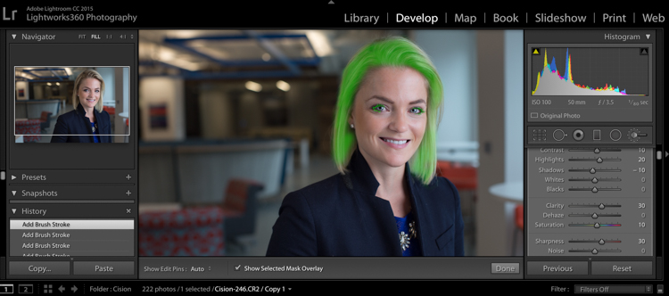
Step 4. Create a vignette using the Gradient Tool

In photography, when someone speaks of a vignette, they are usually referring to the darkening of the outer areas of the image, relative to the center of the image. The standard vignette darkens the outer edges equally, usually in an oval shape. However, using several gradients allows you to control the direction, size and strength of the vignette on each side independently.

I clicked on Lightroom’s Gradient Tool, then clicked and dragged from outside the image towards the center, overlapping the subject slightly. Then, I pulled the local Exposure slider down, until I created a subtle edge vignette. I then added a gradient from the opposite side, and a very subtle one from the bottom. Conversely, if the edge of your image is darker than you’d like, you can also increase exposure with the gradient.

Here is the image after adding a subtle gradient vignette:

9 Vignette

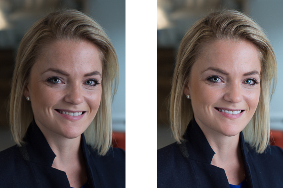
Step 5. Create a virtual copy of the RAW file for the background

To add more dimension to this image, I used a different processing treatment between subject and background. I created a virtual copy of the file in Lightroom (Photo > Create Virtual Copy, or use the keyboard shortcut CMD/TRL+’) and named it “Background”. If you use Adobe Bridge, you can create a copy of the RAW file instead. Then, for this second copy, I simply pulled the Clarity slider back to zero, and backed off on the global Sharpness slider as well. No other changes were made.

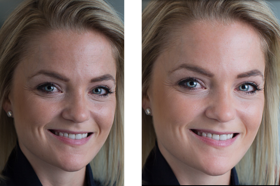
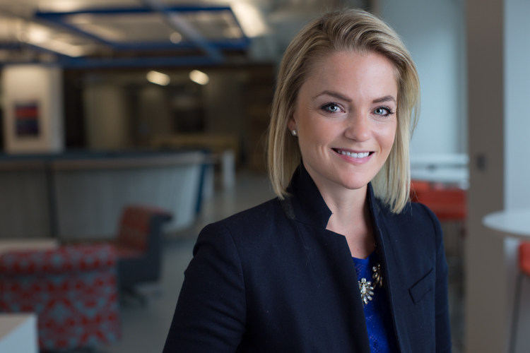
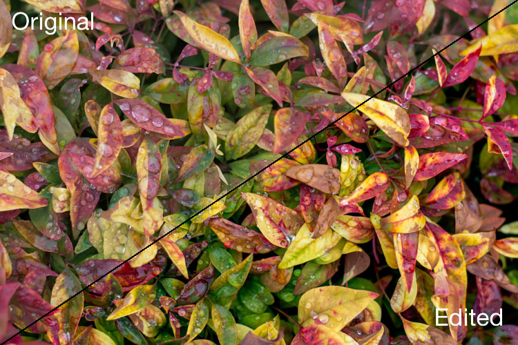
I then opened both of these file copies into Photoshop as layers, with the sharper rendition as the top layer. With the top layer active, I made a careful selection of the subject and created a mask so that the less sharp bottom layer becomes visible in the background areas. This adds a bit more dimension and helps keep your focus on the subject, as seen below.

10 Imported Photoshop

Background edits applied in Photoshop

4-Out-Of-Camera.jpg

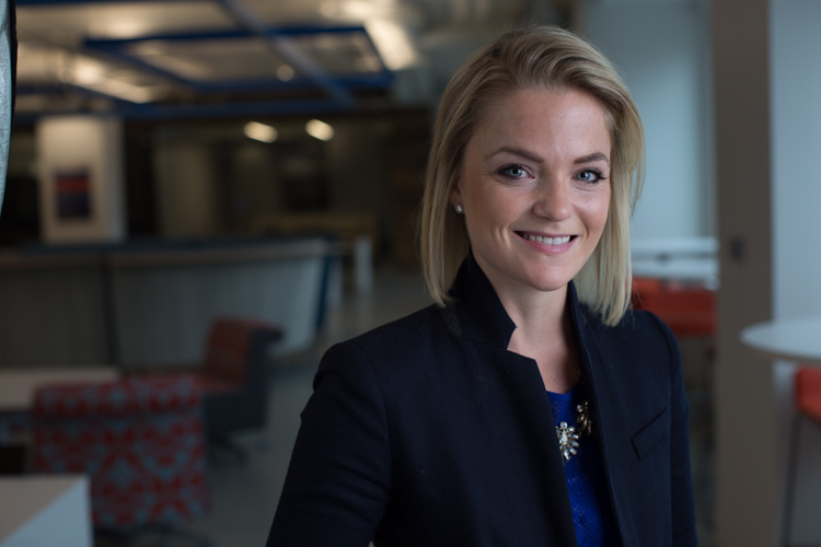
Original out of camera for comparison

Note: If you do not have Photoshop, you can also use the Adjustment Brush inside Lightroom to paint in less Clarity and Sharpness to the background areas.

Although it is beyond the scope of this article, I continued on with processing in Photoshop, including additional adjustments to luminosity and contrast.

3-Chinese-Guy-Hat.jpg

I hope this short overview of my five steps in Lightroom has been helpful and that there was a technique or two that will help you in your workflow.

googletag.cmd.push(function() {
tablet_slots.push( googletag.defineSlot( “/1005424/_dPSv4_tab-all-article-bottom_(300×250)”, [300, 250], “pb-ad-78623” ).addService( googletag.pubads() ) ); } );

googletag.cmd.push(function() {
mobile_slots.push( googletag.defineSlot( “/1005424/_dPSv4_mob-all-article-bottom_(300×250)”, [300, 250], “pb-ad-78158” ).addService( googletag.pubads() ) ); } );

The post Stylized Techniques for Editing Portraits Using Lightroom by Ken Koskela appeared first on Digital Photography School.


Digital Photography School

 
Comments Off on Stylized Techniques for Editing Portraits Using Lightroom

Posted in Photography


How to Accelerate the Development of Your Personal Photographic Style with Lightroom

16 Jul

If you want more Lightroom help from Viktor, get 50% OFF his Four Seasons Lightroom Preset Collection, on now at Snapdeals (only until July 19th, 2016)

Over the years, Lightroom has become the most important tool for my photography. I use it for organizing and editing my photos, as well as publishing them to various channels. But, this hasn’t always been the case.

Images Personal Artistic Style in Lightroom 01

When Adobe introduced Lightroom years ago, 100% of my editing was done in Photoshop. But, gradually over the years with every new version or update of Lightroom, it became a one-stop destination for all of my post-processing activities. Today, Lightroom meets 90% of my photography needs with Photoshop meeting only 10%.

Compared to Photoshop, I love Lightroom because of its nondestructive RAW editing and speed. But, if I had to choose my favorite Lightroom feature, it would be the ability to create presets.

Images Personal Artistic Style in Lightroom 02

Notice patterns and make them into presets

Preset functionality drastically changed the way I approach photo editing and helped me accelerate the development of my personal style. Yet, when presets were first introduced in Lightroom 3, I initially overlooked the feature until I decided to put an extra effort toward increasing the efficiency of my editing.

When I started analyzing the way I take and edit photos, I noticed certain patterns. I recognized that the way I take pictures directly affects the way I process photos in Lightroom.

For example, when shooting landscapes and cityscapes, I always set the exposure for the highlights (sky) that results in underexposed foreground shadow areas. Then, as I begin editing, I start by opening up the shadows, recovering details in the highlights and adding a graduated filter to the sky area. I boost contrast and clarity, increase the saturation and vibrance. This usually results in an oversaturated sky so I only desaturate the blue hues. I also ensure that the vegetation in my photos is not electric green by shifting the green hues toward the yellow spectrum. In the final steps, I add vignetting, increase sharpening and reduce noise.

Images Personal Artistic Style in Lightroom 03

Though these steps soon became second nature, it also meant that I performed anywhere from 20 to 30 identical adjustments to every edited photo. When I realized this, it quickly became obvious that if I recorded the common edits and adjustments as a Lightroom preset, then I could reuse them again and again more efficiently.

When I finally saved the edits listed above, my first preset was born. I named it “Natural” because it fully reflected my photography style in achieving a natural and well-balanced look, with rich colors.

Images Personal Artistic Style in Lightroom 04

Create variations

I then created two more presets, based on the first Natural preset. I shifted the color balance toward warm colors (yellow, orange) to emulate the warm hues of the early morning. I called this one “Sunrise.” Another preset I created was “Overcast” in which I decreased saturation and boosted contrast to imitate cloudy and darker days.

These three presets – Natural, Sunrise and Overcast — were the foundation of my Landscape collection.

Images Personal Artistic Style in Lightroom 05

Over the years, I gradually created new presets while making sure each of them reflected my taste and photography style. At some point, I looked back and realized that I was actually defining and perfecting my own artistic style while also exploring different artistic directions and the future of my work.

Today, I have three main preset collections that cover the different aspects of travel photography: Landscape Collection, Cityscape Collection and People Collection.

Experiment and save

I use the preset-based editing approach on a daily basis because it not only saves me an enormous amount of time editing, it also keeps my artistic style consistent. But, at the same time, I am also able to continue experimenting with new approaches that can be saved as new presets that reflect my evolving style.

I highly recommend that you try a similar approach with your photography.

Images Personal Artistic Style in Lightroom 06

Making your own presets

Here are some actionable steps that can help you jumpstart the process of creating your own presets:

If you’ve been using Lightroom and have a decent sized photo collection, select your favorite photos from the archives and create your own presets based on the edits and adjustments of the selected photos. Continue refining your presets over time to make sure that they are generic enough to work with a variety of photos. Also, keep growing your preset collection, and be sure to organize them by topic and/or style.

For photographers who are just starting out and don’t yet have a sizeable archive, I recommend using someone else’s presets as a starting point. It is fairly common that well-established photographers are willing to sell or give away their Lightroom presets to help budding photographers. Simply find a photographer whose style you like, and use his or her Lightroom presets as the foundation for your future collections.

You can even try to reverse engineer them to figure out how certain effects were achieved. Also, don’t be afraid to modify the presets until you come up with something exciting and unique to you.

Images Personal Artistic Style in Lightroom 07

Conclusion

Developing your personal artistic style in photography is a long, and sometimes chaotic and uncontrollable process. By recording your artistic tastes and versions as Lightroom presets, and by using them as the foundation for your preset-based editing routine, you can accelerate, simplify, and streamline an otherwise extremely complex process.

If you want more Lightroom help from Viktor, get 50% OFF his Four Seasons Lightroom Preset Collection, on now at Snapdeals (only until July 19th, 2016)

googletag.cmd.push(function() {
tablet_slots.push( googletag.defineSlot( “/1005424/_dPSv4_tab-all-article-bottom_(300×250)”, [300, 250], “pb-ad-78623” ).addService( googletag.pubads() ) ); } );

googletag.cmd.push(function() {
mobile_slots.push( googletag.defineSlot( “/1005424/_dPSv4_mob-all-article-bottom_(300×250)”, [300, 250], “pb-ad-78158” ).addService( googletag.pubads() ) ); } );

The post How to Accelerate the Development of Your Personal Photographic Style with Lightroom by Viktor Elizarov appeared first on Digital Photography School.


Digital Photography School

 
Comments Off on How to Accelerate the Development of Your Personal Photographic Style with Lightroom

Posted in Photography


Adobe boosts Lightroom Mobile with Raw editing for iOS

14 Jul

Adobe’s Lightroom Mobile apps for Apple and Android mobile devices have both been given significant updates that allow users a much wider range of controls when editing and shooting. The company has quite different apps for the two operating systems, and while Android users have been able to edit Raw files for some time the facility is now offered to iOS users via version 2.4. Owners of Android devices can now install version 2.1 which offers what Adobe calls a ‘Pro’ shooting mode that allows much more detailed control over the way pictures are recorded.

Adobe says the version 2.1 for Android has a completely new Lightroom Camera function that features a mode that gives the photographer access to shutter speed, ISO, white balance and focus so that they can all be adjusted manually. Aperture isn’t listed as few mobile cameras have significantly variable apertures. The company also says it has improved the app’s ability to export high resolution files.

Apple iPhone and iPad users get Raw Technology Preview, which effectively allows photographers to import files from all the cameras supported by the main desktop version of Camera Raw. These Raw files can be edited using a wide range of tools to control contrast, exposure and white balance, and marked with star ratings and flags – all of which can be synched with Lightroom on the owner’s other devices. The company says it has edited 50MP images from the Canon EOS 5DS on an iPhone 6 to demonstrate how powerful the application is.

iOS users can also now make radial and linear selections that allow local editing of particular areas of the image.

Both the Android and iOS versions of Lightroom Mobile are free to download and use, but to enjoy the new features iOS users need to have a subscription to Creative Cloud.

For more information see the Adobe blog. 

Photograph by Elia Locardi of the valley in Meteora, Greece. Shot in raw on a Fuji XT-2 and edited on location with an iPad Pro with Lightroom for iOS.

Manufacturer’s information:

Two big updates for Lightroom for mobile are now available for download

Lightroom for iOS 2.4
In version 2.4, two major improvements have been added: a raw technology preview and the addition of local adjustment tools. In addition to these major improvements, we’ve also added the ability to use keyboard shortcuts with physical keyboards connected to iPads, the ability to add your copyright to all imported photos, functionality to turn on lens profiles (if your camera and lens combination are supported), as well as the usual bug fixes and improvements.

Raw Technology Preview
We’re sure it’s happened to you before: you’re out taking photos (in raw of course) and you capture a real stunner that you can’t wait to share with the world. Until now, you had to either transfer a JPEG version of the file over or you had to wait until you got back to your desktop or laptop. With the raw technology preview, you’ll be able to import raw photos immediately to either your iPhone or iPad, edit them, and then share them, anywhere you’ve got a connection. Our goal with Lightroom for mobile is to make it an indispensable part of your photography workflow, providing the tools that you’re familiar with and the quality you expect in a product that can be with you, no matter when inspiration strikes. With this technology preview, we want to push the boundaries of how photographers around the world work with their mobile devices.

You get all of the benefits of raw, such as the ability to change the white balance, being able to recover blown out highlights, access to the full range of color information, as well as editing an uncompressed file, all using the exact same technology that powers Lightroom on your desktop. An added benefit is that the raw file that you’ve imported into Lightroom for iOS will be synced with Lightroom on your other devices, such as Lightroom for desktop or Lightroom on the web, along with any of the edits, star ratings, or flags that you added.

Lightroom for mobile supports all of the same raw files that Lightroom for desktop as well as Adobe Camera Raw support, with the full list available here.

To transfer photos to your mobile device, you need to use either the camera connection kit or the lightning to SD or USB kits from Apple to transfer your raw files over to your device, which will bring up the Import tab within the iOS Photos app. Importing the files will add them into your camera roll, where you can then access and load in any raw file directly into Lightroom mobile. It’s important to keep in mind that raw files are significantly larger (3-5 times larger) than JPEGs, meaning the raw files will take longer to import, upload, and take up more space on your device. Even as such, we found that the added control and quality that the raw files afforded were so useful that it outweighed the negatives.

Just as when working with raw files that were synced from Lightroom for desktop or Lightroom on the web, you’ll be able to perform raw-specific enhancements, such as changing the white balance with greater control and recovering clipped highlights, but unlike when working with raw files synced from Lightroom for desktop, you’ll have access to the full resolution file AND you can do it anywhere in the world, even from your iPhone! 

We’ve run Lightroom for mobile through its paces on a number of different files, including the 50MP Canon 5DS running on an iPhone 6, proving that you really can edit nearly any photo anywhere. After playing with the app for a few months, we’ve found that it’s a really great way to take a few of your favorite images from the day (or even that you just captured), review to make sure you captured what you saw, edit, and then share them, all right away, and with all of your edits carried through the rest of the Lightroom ecosystem.

We had the pleasure of working with a number of photographers while creating the raw technology preview, take a look at how travel photographer Elia Locardi was able to put the technology to use while shooting on location in Greece.

You can read more about the images that were created for this release through an article about Elia on Adobe Create as well as on Elia’s own blog.

Linear and Radial Selections
In addition to the raw technology preview, we’ve also added in the ability to perform local adjustments with linear and radial selections, the two most requested features after raw support.

Lightroom for iOS Availability
Lightroom mobile 2.4 is available immediately for iPhone and iPad from the iOS App Store for free. Both of these improvements are available only for members with a creative cloud subscription or or if you start a free Creative Cloud trial.

Lightroom for Android 2.1

While the iOS team was working hard on the raw technology preview, the Android team doubled-down on the unique end-to-end DNG capture experience first announced in Lightroom for Android 2.0 and created a brand new capture experience. Our goal is to create the best mobile photography experience available, and with the amazing quality possible on Android devices, especially thanks to DNG raw capture, we wanted to provide all of the controls and functionality needed.

Now, the built-in camera has a new Pro mode that lets you control the shutter speed, ISO, white balance, and focus all manually, in a brand new interface.

You can access the camera directly using the new Lightroom Camera widget. This new widget will launch the Lightroom camera directly, making it faster for you to get in and start taking pictures.

In addition to the new built-in camera, we’ve also improved the app’s ability to export full-resolution files. If the files are available somewhere within the Lightroom ecosystem, Lightroom for Android will now download the full resolution version and enable you to export them.

You can download Lightroom for Android 2.1 here now for free.

Articles: Digital Photography Review (dpreview.com)

 
Comments Off on Adobe boosts Lightroom Mobile with Raw editing for iOS

Posted in Uncategorized


How to Edit Corporate Headshots in Lightroom

09 Jul

Although even lighting, and perfect exposure are your biggest allies when it comes to making people look their best in headshots, there are many small adjustments you can make in the editing process, that will make your shots (and your clients) look that much more professional.

corporate-18-of-18b

To begin, a lot of things on the day of the shoot will be out of your control. Take a booking I had recently, for example, it was scheduled on a Friday afternoon after a full week of the Annual Meeting. All the head honchos were dead tired and this was the last thing on their to-do list. After a week of deciding the future of their company, a lot of them looked a little, let’s say, less than fresh. Dehydration, bags under the eyes, and coffee-stained teeth began to rear their ugly heads. Because we’re human, and that’s what happens. Although soft light helps, our wonderfully designed cameras tend to be rather unforgiving of the under-slept.

Although most of my corporate headshot clients know that post-production doesn’t mean they’ll end up as Heidi Klum, they do appreciate just a smidge of help once the photos are loaded up.

Corporate touch-ups are about making the subject look as fresh as can be. I like to keep my post-processing efficient, effective, and easy, so I can get the photos off my desk and onto theirs as quickly as possible. Here’s how I tackle it.

My Lightroom Workflow

Let’s start with the shot straight out of camera.

dpsheadshot (1 of 1)

This particular company wanted to feature their employees in their native work environment, so the office became the background, which eliminated the need to bring a backdrop. I lit the subject with window light, an octabox, and a reflector. You’ll notice I shot these with 50mm lens as well. Normally, I’d grab my 85mm for corporate work, but we were out of town and didn’t have our full complement of gear with us. The 50mm did the job just fine.

My first step is to adjust the Cropping, Exposure, and White Balance. I need to crop the reflector out of the frame for starters, apply a lens correction to get the side wall to line up. I’m happy with the way the White Balance is on this, but I’d like to take the exposure up slightly and take the overall highlights down slightly.

We end up with this:

dpsheadshot2 (1 of 1)


Local Adjustments

The local (in one area of the image only) adjustments I use are subtle. The best way to get some of these adjustments is to have the client get a great night’s rest and stay hydrated, but those are mostly out of our control. These adjustments aren’t meant to turn anyone into an airbrushed masterpiece, just to give them a little nudge.

Before we dive in, let’s review some Local Adjustment Quick Keys to help you in the process.

Adjustment Brush Quick Keys

  • Press H to hide or show the pin you’re using. This is helpful when the pin is in the way and you want it to disappear.
  • Press O to hide or show a mask overlay of the Adjustment Brush tool effect, or use the Show Selected Mask Overlay option in the toolbar. This is helpful so you can see exactly what areas you’re affecting. It also makes editing at a coffeeshop or plane pretty funny because whoever peeks over your shoulder thinks you’re turning all your subjects into the Incredible Hulk. (Shift+O will tile through the overlay colors: white, black, red, green).
  • Press Ctrl+Z (Windows) or Command+Z (Mac OS) to undo your adjustment history.
  • Hold Alt to take away any mask you’ve put in (holding Alt while you use the paintbrush turns it into an eraser to paint away). This is helpful just to clean up any minor mistakes you made while adding adjustments.

Okay, here are the adjustments I make (in this order too):

#1 Soften Skin

This helps just to clear up pores and generally be forgiving of any blemishes.

  • Clarity -50
  • Sharpness -10
  • Contrast +5
  • Highlights +15 (to counteract the highlights being muddied by lowering clarity)

I take my brush over the entire face except for the eyes, eyebrows, and lips, so the face is fully Hulkified.

dpsheadshot (1 of 6)

Note that you can change the color of the Mask Overlay (Shift+O), but I just stick with green as it’s nice and easy to see. If you make a mistake and go over any of the areas you want unaffected, just use the Alt key to turn the brush into an eraser and paint them away.

#2 Diminish Lines

I put this in to give an overall softening of shadows created with any kind of wrinkle or smile line.

  • Contrast -30
  • Shadows +15
  • Clarity -50
  • Sharpness -10

dpsheadshot (2 of 6)

So let’s look at the before and after of what we have so far. You’ll see that the the skin is more even throughout, and the deep shadows of the lines are reduced and softened, but not removed completely. The goal is to freshen, not make them look like a plastic doll.

dpssidebysideskin

Next up, let’s get those eyes popping a little more. This is easy to overdo, so be judicious with this step.

#3 Brigthen Eyes

Get the whole eye in this first adjustment:

  • Exposure +0.2
  • Contrast +10
  • Clarity +10

dpsheadshot (4 of 6)

#4 Enhance the Iris

Now we’ll focus on just the colorful part of the eye, the iris. We’ll add a little more exposure and a touch of saturation:

  • Exposure +0.40
  • Contrast +20
  • Highlights +35
  • Clarity +5
  • Saturation +20

dpsheadshot (3 of 6)

Let’s check back in with a before and after comparison:

dpssidebysideeyes

It’s subtle, but there’s just enough pop around the eyes, without it being overdone.

#5 Whiten the Teeth

Let’s make their dentist proud:

  • Temp -25 (adding blue takes out any yellow in the teeth)
  • Exposure +0.25
  • Saturation -20

dpsheadshot (5 of 6)

#6 Hair and Eyelashes

For this final touch, it’s nice to give a little definition to the hair and eyelashes.

  • Contrast +10
  • Highlights +20
  • Shadows -10
  • Clarity +30
  • Saturation +10
  • Sharpness +30

dpsheadshot (6 of 6)

Cute wig, right?

Let’s look at the final before and after now:

dpsheadshotsidebysidefinal

And here’s the photo that was delivered to the client:

dpsheadshotdeliver (1 of 1)

All of these changes are delicate. Done right, and they’re almost imperceptible. Retouching your corporate headshots doesn’t need to be an hours-long endeavor. Your clients don’t need to be on the cover of Vogue– they need a no-fuss photo that’s Linkedin ready, and shows them at their best.

googletag.cmd.push(function() {
tablet_slots.push( googletag.defineSlot( “/1005424/_dPSv4_tab-all-article-bottom_(300×250)”, [300, 250], “pb-ad-78623” ).addService( googletag.pubads() ) ); } );

googletag.cmd.push(function() {
mobile_slots.push( googletag.defineSlot( “/1005424/_dPSv4_mob-all-article-bottom_(300×250)”, [300, 250], “pb-ad-78158” ).addService( googletag.pubads() ) ); } );

The post How to Edit Corporate Headshots in Lightroom by Tim Sullivan appeared first on Digital Photography School.


Digital Photography School

 
Comments Off on How to Edit Corporate Headshots in Lightroom

Posted in Photography


DEAL: Save 72% off Lightroom Editing System for Travel Photography

08 Jul

Travel lightroom presetsIt’s day 2 of our Summer Sale and today we have a special Adobe Lightroom Presets Travel pack* for you with a 72% Saving.

This “system” normally sells for $ 176, but it’s being offered to dPS readers for the special price of $ 49 USD – a massive 72% saving.

One of the best parts about travelling is documenting your trip with pictures. But what’s not so great is pending hours weeding out the stinkers from the keepers. And editing them to look as awesome as possible.

What if you could systemize and cut the editing process in half?

And reduce the struggle, endless fiddling and overwhelm with all the features and options of Lightroom editing tools?

Well, now you can thanks to the Lightroom Rapid Editing System for Travel Photography.

Pro travel photographer Viktor Elizarov got tired of drowning in digital images. And spending more time processing pictures than taking them.

So he searched for a better way. And after a year testing different approaches and systems with lots of trial and error – the Rapid Editing System was born.

And he wants to share it with you.

Learn how to automate 80% of your editing process so you save time on repetitive tasks. And have more free time to spend on fun tasks (like taking pictures).

Viktor’s system features a large collection of Lightroom Presets specifically for travel photography. And will help take your photos from good to great – fast.

Viktor normally sells his system for $ 176, but he’s offering it to dPS subscribers for the special price of $ 49 – a 72% saving.

Here’s everything you get:

  • 90+ page eBook with step by step tutorial on how to use Lightroom Rapid Editing System
  • 20 1-Click LANDSCAPE Style presets
  • 20 1-Click CITYSCAPE Style presets
  • 20 1-Click PEOPLE Style presets
  • 10 1-Click Fall Colors Style presets
  • 10 1-Click Winter Colors Style presets
  • 10 1-Click Spring Colors Style presets
  • 10 1-Click Summer Colors Style presets
  • 41 TOOLKIT adjustment presets
  • “Reset All” preset that reverts your image to its original state
  • Documentation and Installation Instructions
  • Source RAW and JPEG photos used in the tutorials

If you love travel photography – or just want to speed up your post processing – don’t miss out.

But hurry! This valuable offer for the Lightroom Rapid Editing System for Travel Photography only lasts 24 hours – secure it for yourself and save 72% today only.

*Note: You’ll need a copy of Adobe Lightroom installed to use these presets.

googletag.cmd.push(function() {
tablet_slots.push( googletag.defineSlot( “/1005424/_dPSv4_tab-all-article-bottom_(300×250)”, [300, 250], “pb-ad-78623” ).addService( googletag.pubads() ) ); } );

googletag.cmd.push(function() {
mobile_slots.push( googletag.defineSlot( “/1005424/_dPSv4_mob-all-article-bottom_(300×250)”, [300, 250], “pb-ad-78158” ).addService( googletag.pubads() ) ); } );

The post DEAL: Save 72% off Lightroom Editing System for Travel Photography by Darren Rowse appeared first on Digital Photography School.


Digital Photography School

 
Comments Off on DEAL: Save 72% off Lightroom Editing System for Travel Photography

Posted in Photography


Hands On: RNI All Films 4.0, analog presets for Lightroom and ACR

06 Jul

$ (document).ready(function() { SampleGalleryV2({“containerId”:”embeddedSampleGallery_9248880534″,”galleryId”:”9248880534″,”isEmbeddedWidget”:true,”standalone”:false,”selectedImageIndex”:0,”startInCommentsView”:false,”isMobile”:false}) });

All images in the gallery above were processed using presets from RNI All Films 4.0 – Pro (the duplicate is the un-edited version for comparison). Click through for larger previews and more info on which presets were used.

Really Nice Images has announced RNI All Films 4.0, the latest version of its film simulation presets for Lightroom and Adobe Camera Raw. It will be sold in two versions, Pro and Lite. 

In the full ‘Pro’ version, 58 film stocks are organized into 5 categories including Negative, Slide, Instant, Black & White, and Vintage. And because most film stocks have several versions, in total RNI 4.0 offers more than 300 presets, 170 of which are brand new from the previous release.

Processed using the new ‘Fuji Natura 1600 – 01’ preset.

RNI specifically highlights Fuji Natura 1600, Fuji Velvia 2.0 and Fuji Pro 400H among its new film stocks, but many more have also been added. Furthermore, according to RNI, the vast majority of presets included from previous releases have been fine-tuned or completely reworked for more accurate skin tones and more realistic grain.

RNI’s film simulations are created from analyzing actual film stocks, so if you are an analog purist, this may be the easiest way to dial in the look of some of your favorite films. RNI 4.0 also now features customized camera profiles, with support for most modern digital cameras.

The software also includes RNI 4 Toolkit, a set of presets that allows users to quickly adjust parameters like grain and softness. They’re useful if you are going for a ‘very analog’ look. Though I personally found the Toolkit presets made my images look over-processed. And when working with film presets, there is a fine line between good processing and over-processing.

Once installed, RNI presets will show up in the left-most Lightroom panel. Hovering over a preset will show a quick display in the thumbnail (upper left) of what it will look like once applied.

Of course, there are quite a few companies marketing realistic film emulations and presets. Two of the most popular are VSCO Film and DxO Filmpack. VSCO Film, like RNI All FIlm, is a set of analog-like presets for Lightroom and ACR. However, unlike RNI All Film, VSCO Film is packaged into 8 different packs of presets, sold separately. Each pack goes for $ 59 and includes around 20 film stocks (each film stock has multiple variations, some have up to 10). 

DxO Filmpack 5 on the other hand is both a plugin for LR and ACR and a stand-alone program. It is sold in two editions: the Elite edition is $ 99, the Essential Edition is $ 49. The former includes 120 different ‘styles,’ 80 of which are based off of film. 

RNI All Film 4.0 also comes in two flavors, Pro and Lite. Pro will run you $ 122. The Lite version, which is stripped down and includes a curated selection of presets from the Pro version will cost you $ 59, the same as one VSCO pack. Of course, if you’re upgrading from a previous RNI Pro version, the price is cut in half, same goes if you’re upgrading from a previous RNI Lite version to RNI Lite 4.0.

Processed using the ‘Fuji Fortia SP’ preset. 

I’ve long been a user of VSCO’s film presets, but in just briefly trying out RNI 4.0, I’m eager to keep using it in the future for processing. Most of the actual film stocks (not Toolkit presets) are well-judged and there are plenty to experiment with. Not to mention, RNI 4.0 offers quite a few film stocks not available from the competition.

 You can download All Films 4.0 directly from RNI here.

Articles: Digital Photography Review (dpreview.com)

 
Comments Off on Hands On: RNI All Films 4.0, analog presets for Lightroom and ACR

Posted in Uncategorized


How to Use Lightroom to Learn Composition in Photography

06 Jul

If you want more Lightroom help from Viktor, get 50% OFF his Four Seasons Lightroom Preset Collection, on now at Snapdeals (only until July 19th, 2016)

When you start learning about photography, the whole process can be overwhelming with its complexity. But, when you break it down into smaller pieces that you can tackle one at a time, you quickly realize that photography isn’t rocket science at all. By then, it’s only a matter of time before you understand the whole picture, and are comfortable with the different aspects and techniques.

Images Composition in Lightroom 01

I still find one aspect of photography is more challenging than the rest, however. That is composition, which is difficult to learn and even more difficult to teach.

Why? The main reason is because of its subjective nature. It is not easy to quantify composition. In other words, there is no right or wrong; everything is open to interpretation. As a result, learning and mastering composition is usually a long and gradual process.

I want to share with you an exercise that you can perform using Lightroom, in the comfort of your home, that can accelerate the composition learning cycle. This approach was incredibly helpful in building my comfort with, and understanding of composition, in my photography. I hope you find it useful too.

Images Composition in Lightroom 02

The way I approach composition today is different, compared to my approach five years ago. The reason for that is because of new publishing channels.

As a photographer who runs a popular blog dedicated to travel photography, I have multiple channels where I publish my photographs. It all begins on the blog, then moves to social media networks like Facebook, Instagram, G+, and Pinterest. Plus, I often prepare an extra version for printing purposes as well.

Typically, different publishing channels require different versions of the same photograph. For example, if the original photograph has a landscape orientation with the aspect ratio of 3 x 2, Instagram requires a square 1 x 1 version, and Pinterest requires a vertically oriented image. I might need a panoramic version for print.

Even though creating multiple versions of the same photo with meaningful composition takes more time and effort, I find this exercise is extremely valuable in learning and mastering composition in photography.

Exercise in a Real Life Scenario

I took this photo just after the sunrise on O’ahu Island in Hawaii.

Images Composition in Lightroom 03

From the very beginning, I could see the potential of the scene and was confident that I would use it on my blog, and maybe even in my portfolio.

I intentionally took the shot of the scene wider than I would want for a regular 3 x 2 landscape composition. I left some room to have more freedom when creating different versions for publishing. I have no problem with cropping and trimming my photographs in post-processing, because 24 Mpx sensor on my Sony a6000 gives me enough pixels even for very aggressive cropping.

I started the editing process by applying few of my favorite presets from my Landscape collection, and when I was happy with the result I started working on composition.

Images Composition in Lightroom 4

First, I set up the Crop tool Overlay options, setting it to Golden Ratio. I know that Thirds is the most popular option among visual guides, but I find that Golden Ratio helps me to create more balanced compositions.

Images Composition in Lightroom 05

You can also scroll through the various overlay options by repeatedly hitting the O key on your keyboard, until you find the one you want.

I set the aspect ratio to 2×3 and lock it.

Images Composition in Lightroom 06

I create my first version by simply making the composition tighter.

Images Composition in Lightroom 07

Images Composition in Lightroom 09

Version 1 – Aspect Ratio 3 x 2

When I am happy with the result I use the Snapshot functionality of Lightroom to save my version as a new Snapshot, and name it 3 x 2.

Images Composition in Lightroom 08

Then, I move on to the next version.

Images Composition in Lightroom 10

Version 2 – Aspect Ratio 1 x 1 (Instagram)

Images Composition in Lightroom 11

Version 3 – Aspect Ratio 2 x 1

Images Composition in Lightroom 12

Version 4 – Aspect Ratio 4 x 3

Images Composition in Lightroom 13

Version 5 – Aspect Ratio 16 x 9

Images Composition in Lightroom 14

Version 5 – Aspect Ratio 3 x 4 (Pinterest)

When I am done I have the Snapshot Panel filled with six newly saved versions (snapshots).

Images Composition in Lightroom 15

Another alternative is to use the Virtual Copy functionality for each version I create. bu I prefer the Snapshot panel, which makes Lightroom less cluttered.

Now, I can review each version by clicking on an individual Snapshot version, and if I am happy with the results, I am ready to start publishing.

Conclusion

The only way to learn composition in photography is to practice on a regular basis. I highly recommend the exercise I outlined above. Make a habit of creating at least two extra versions for each photograph you edit, one for Instagram and another for Pinterest. I can guarantee you it will help you to accelerate the process of learning.

If you want more Lightroom help from Viktor, get 50% OFF his Four Seasons Lightroom Preset Collection, on now at Snapdeals (only until July 19th, 2016)

googletag.cmd.push(function() {
tablet_slots.push( googletag.defineSlot( “/1005424/_dPSv4_tab-all-article-bottom_(300×250)”, [300, 250], “pb-ad-78623” ).addService( googletag.pubads() ) ); } );

googletag.cmd.push(function() {
mobile_slots.push( googletag.defineSlot( “/1005424/_dPSv4_mob-all-article-bottom_(300×250)”, [300, 250], “pb-ad-78158” ).addService( googletag.pubads() ) ); } );

The post How to Use Lightroom to Learn Composition in Photography by Viktor Elizarov appeared first on Digital Photography School.


Digital Photography School

 
Comments Off on How to Use Lightroom to Learn Composition in Photography

Posted in Photography


4 Key Lightroom Sliders That Will Supercharge Your Photos

04 Jul

Lightroom is kind of like a Swiss Army Knife or, better yet, a Leatherman Wave, in that it does so many things and is an invaluable program for many photographers–amateur, professional, or anywhere in between. Regardless of whether you’re the kind of person who prefers presets, or someone who likes scooting sliders, there are four options hidden in plain sight, right on the Basic panel of the Develop module, that can dramatically enhance almost any picture.

It took me a few years to learn to use these sliders properly, and even now I am still figuring out new ways to work with them, in combination with other options in the Develop module to get my pictures looking just the way I want. But, now I am at a point where adjusting these four options is the very first thing I do on almost every single photo. They’re that useful for me, and could be for you too.

four-lightroom-sliders-girl

The four key Lightroom sliders are:

  1. Highlights
  2. Shadows
  3. Whites
  4. Blacks

Learning how to work with these four key sliders can have an amazing impact on your photography.

Exposure-slider
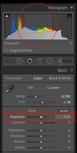
To demonstrate the effect of each slider I’m going to show you a picture in various states of editing, as I adjust values for each option one by one. If you are used to using the Exposure (note in the screenshot on the right what areas of your image are affected by moving the Exposure slider) and Contrast sliders to adjust your images, you may want to put those aside for now and focus on these other four instead, as they can give you significantly better results.

I should also note that, as with virtually all Lightroom tips and tricks, your results will be best if you shoot in RAW instead of JPG. The picture I’m going to start with is a shot of some colorful leaves on a rainy day, that seems fairly decent to begin with, but is made much more vibrant and richer just by adjusting these four key Lightroom sliders: Highlights, Shadows, Whites, and Blacks.

The original photo straight out of my camera with no adjustments applied whatsoever.

The original photo straight out of the camera with no adjustments applied whatsoever.

Histogram of original unedited image.

Histogram of original unedited image.

#1 – Highlights slider

Highlights-slider
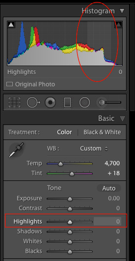
I mentioned the Exposure slider in the previous paragraph, which is a tool that adjusts the overall brightness or darkness of an entire image (based on the midtones). The Highlights slider allows you to perform a similar type of adjustment, but only with the brightest parts of an image (tones not quite pure white). Moving it to the left will make the brightest parts darker, and moving it to the right will make the same parts brighter. Hover over the Highlights slider with your mouse to see on the histogram which parts of the image will be affected (see screenshot at the right).

I use this as a starting point when making adjustments to a picture, because it can help recover some of the details in the lighter parts of an image that might seem a bit too bright or washed out, and can give the picture a more evenly-lit appearance overall.

Highlights adjusted to a value of -80. Notice how the yellow leaves, particularly the large one on the right-hand side, now display a much richer shade of yellow and are not as washed-out as in the initial photo.

Highlights adjusted to a value of -80. Notice how the yellow leaves, particularly the large one on the right-hand side, now display a much richer shade of yellow and are not as washed-out as in the initial photo.

Histogram with highlights adjusted.

Histogram with highlights adjusted.

As you adjust the Highlights, or any of the other three sliders mentioned in this article, you can use the built-in clipping guide to help get the right amount of adjustments to your image. Hold down the alt key (option on Mac) as you move the slider from left to right and you will see your image go all dark except for a few spots. These spots indicate areas of your image that are clipped, which means image data is being lost in those parts. You generally want to avoid clipping, so it’s a good idea to not adjust the Highlights or any other slider so much that you start seeing lots of clipped areas.

A peek at the histogram on top of the Basic module will show you similar information, as the more you adjust the Highlights slider to the right the more you will see the colors move to the right-hand side as well. If they move so far that they are off that side of the grid, areas of your image are being clipped, and there are going to be spots of pure white that you may not want.

#2 – Shadows slider

Shadows-slider
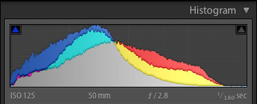
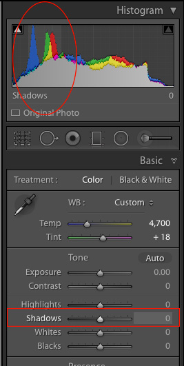
In a similar vein as the Highlights slider, the Shadows option makes the dark parts of your image a little brighter (see image right for which areas are affected). It’s kind of like using the Exposure slider to make your image brighter, but restricting it only to the sections of an image that are very dark, while ignoring the rest. This works wonders on pictures that are underexposed, as modern cameras have image sensors that capture an amazing amount of detail in the shadows, particularly at lower ISO values. It’s rare that you will need to (or even want to) boost the shadow level clear up to 100, but it’s nice knowing Lightroom at least gives you the option of doing so.

I should also note that you could use the same slider to make the shadow areas of an image even darker, and depending on the type of photography you do, that may very well be a useful option but most photographers will want to just lighten the shadows instead.

Adjusting the shadows by +50 helped to bring back some of the detail that was lost in the darker areas, as you can see in the area of green leaves inside the circle.

Adjusting the shadows by +50 helped to bring back some of the detail that was lost in the darker areas, as you can see in the area of green leaves inside the circle.

Highlights and shadows adjusted.

Highlights and shadows adjusted.

#3 – Whites slider

Whites-slider
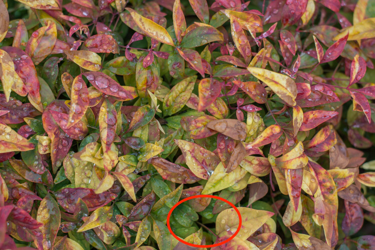
This is related to the highlights, but has a slightly different impact on your image, that is subtle but quite impactful. Adjusting this to the right essentially makes the white tones in your image, more pure white. It affects all the white tones in the photo (see image on the right) as opposed to the highlights slider which only deals with a narrow range of very bright colors.

What you’re doing here is setting the white point, or telling Lightroom what you want the brightest point of your photo to actually be. This can give a flat image much more depth and tonality, and take an otherwise boring picture and really start to make it shine. I almost always drag this slider a little bit to the right, though you must be careful not to let anything get clipped, which you can do by holding down the alt or option key while you drag it.

Bringing the white slider to a value of +45 now makes all the white areas more pure white. The effect is most noticeable on the various water drops which now appear much more vibrant and well defined.

Bringing the white slider to a value of +45 now makes all the white areas more pure white. The effect is most noticeable on the various water drops which now appear much more vibrant and well defined.

Highlights, shadows and whites adjusted.

Highlights, shadows and whites adjusted.

#4 – Blacks slider

Blacks-slider
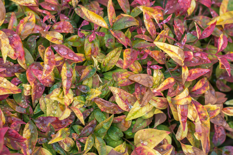
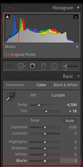
Similar to the Whites slider, this one adjusts the black point of your image, or how dark the darkest portions really render. I almost always slide this to the left to give my photos a little more punch. It helps pictures have a little more contrast, while bringing out a lot more color in any image as a whole.

One difference to note when adjusting this slider, as opposed to some of the others, is that you actually do want the black level to be clipped slightly. So, when you hold the alt or option key down as you adjust this one, you want to see a few highlighted areas show up. The reason for this is to make the very darkest parts of your images truly black, which adds depth and a nice pleasing look to your pictures, that is far more effective than simply moving the contrast slider.

Note: the contrast slider pushes out from the middle of the histogram, whereas pulling the Whites and Blacks sliders pulls out from the edge – thus giving you more control over how contrast is applied to your image.

Bringing the shadows down to -70 makes the black areas pure black, and gives a much richer sense of contrast to the image overall than simply adjusting the contrast slider.

Bringing the Blacks down to -70 makes the black areas pure black, and gives a much richer sense of contrast to the image overall than simply adjusting the contrast slider.

All four adjustments made.

All four adjustments made.

Before and after

To give you a clear sense of just how much these four sliders can affect an image, here’s a before and after comparison of the same photo. The original seems so dull and lifeless, compared to the vibrant dynamic edited version. Remember, the only things that were adjusted were the Highlights, Shadows, Whites, and Blacks sliders.

four-lightroom-sliders-leaves-comparison

There are dozens of other edits that can be done in Lightroom to improve photos. Simple things like increasing the clarity, adjusting the tone curve, fine-tuning the sharpening, or selectively editing each color, can improve your original images (especially if you shoot in RAW) leaps and bounds beyond what you might have thought. But if all that seems like a bit too much to take in all at once, just know that you can get a huge amount of improvements just by using these four simple sliders in the Basic panel.

When I said that these four key Lightroom sliders can supercharge your editing, I really meant it. Learning to use them only takes a few minutes, and can make a huge difference in your images.

To recap, here’s what each slider does in a nutshell:

  • Highlights: Adjusts the brighter portions of an image to bring back some color that might be too washed out.
  • Shadows: Adjusts the darker portions of an image to bring out some color and detail where it may appear to be too dark.
  • Whites: Makes the whitest portions of an image more pure white.
  • Blacks: Makes the blackest portions of an image more pure black.
Original image, straight out of camera, with no edits applied.

Original image, straight out of camera, with no edits applied.

Original image histogram.

Original image histogram.

Highlights -47, Shadows +83, Whites +79, Blacks -56, and no other edits at all.

Highlights -47, Shadows +83, Whites +79, Blacks -56, and no other edits at all.

Adjusted histogram.

Adjusted histogram.

I have found myself using these four sliders so much that I actually created a custom preset in Lightroom that sets them all to specific values. I often apply this preset to every picture upon import, as it gives me a good starting point to work from, when doing my other edits. The values I use are:four-lightroom-sliders

  • Highlights -25
  • Shadows +20
  • Whites +25
  • Blacks -30

Your mileage will vary, and again this is just a starting point, but hopefully all of this illustrates just how useful these four sliders are. When I first started working with Lightroom I was so overwhelmed with all the options at my disposal, that not only did I think I would never be able to learn it, but I didn’t even know where to start. If that sounds like you, I would recommend giving these four sliders a try and use this as the springboard for the rest of your edits.

What about you? What are some of your favorite editing tips and tricks in Lightroom? Do you have a particular key to an effective workflow that you’d like to share? Leave your thoughts in the comments below.

googletag.cmd.push(function() {
tablet_slots.push( googletag.defineSlot( “/1005424/_dPSv4_tab-all-article-bottom_(300×250)”, [300, 250], “pb-ad-78623” ).addService( googletag.pubads() ) ); } );

googletag.cmd.push(function() {
mobile_slots.push( googletag.defineSlot( “/1005424/_dPSv4_mob-all-article-bottom_(300×250)”, [300, 250], “pb-ad-78158” ).addService( googletag.pubads() ) ); } );

The post 4 Key Lightroom Sliders That Will Supercharge Your Photos by Simon Ringsmuth appeared first on Digital Photography School.


Digital Photography School

 
Comments Off on 4 Key Lightroom Sliders That Will Supercharge Your Photos

Posted in Photography


Tips for File Renaming Success in Lightroom

03 Jul

This article is about how to build a useable file renaming strategy, and how to implement it in Lightroom. Your standard camera names are generally pretty boring. IMG this or DSC that, or even P0235425653. If you’re not using continuous naming you might even end up with hundreds of IMG_0001 files. Don’t laugh, I was there once upon a time after reading some terrible advice on camera settings.

If you’re using Lightroom, renaming is really straightforward and accessible from quite a few places in the application.

File naming in lightroom 1

Before we talk about how to rename your files, let’s talk about what you should name them. First and foremost, each photo should have a unique name. There are two number sets that can pretty much ensure this. The first is the date the photo was taken, and the second is the sequence number the camera creates (assuming you do use a continuous camera naming system). Mixed together these give each file a unique name. You’d need to shoot 10,000 images in a day to get two identical names with this structure. You could just use this method and nothing else, but a series of numbers, while great for sorting, is generally meaningless to most people.

File naming in lightroom 2
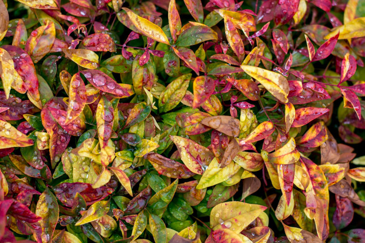
Some photographers use those number sets and their initials to get the filename. It’s enough to create that unique pattern. A string of numbers doesn’t tell you what’s in the file though, even with some initials. For this reason, I use a custom text field that I change with each shoot that I import. In Custom Text field I put a little description of the shoot. That way even outside Lightroom I can tell the contents of the file just from the name. It also gives me additional search terms I can use when looking for a file. Let’s look at how to set this up.

File naming template in Import

Renaming in Lightroom uses a mix of tokens and direct text in the box. The Dialog for creating File Naming Templates can be called up from a variety of places in Lightroom. The first place you see it is in the Import Dialog box when using one of the following settings: Move, Copy or Copy as DNG. It’s on the right hand side in the appropriately named File Renaming panel. As well as the type of File Naming, you can choose Custom Text/Shoot Name, a Start Number, and whether the file extension is upper or lower case.

File naming in lightroom 3

File naming in Lightroom depends on Templates, so click on the Template list and choose Edit from the bottom of the list (shown above). This opens the Filename Template Editor (below). At the top we see the current Template, or in a typically Lightroom fashion, it’s called a Preset here, versus being called a Template in Import. The contents of this list matches the one you saw in Import from the Template dropdown. Note that the Filename Template Editor is not exactly the same in each location you can use it in Lightroom. You’d think it would be, but nope, it’s not.

File naming in lightroom 4

Note this is the box you will see in the Import dialog popup. If you access rename files from the Library module it looks slightly different.

Next is the text box where the template is built. Any item you click from the list below will be added to the box, in the order you click them. You can also type directly into the box. Remember that text typed directly into the box will be added to all filenames, so use it sparingly (above there is only a hyphen added between tokens Custom Text and Sequence # to separate them).

File naming in lightroom 5

Below this are the tokens, split into sections of similar information. Image name has two options, Filename and Filename number suffix. The latter refers to the string of numbers at the end of the current filename (not necessarily the original file numbers). Note: When you use Edit in the Library version of renaming, you also get Folder Name as an option.

File naming in lightroom 6

Numbering has far more options. In each case you can choose an option with leading zeros. It’s good practice to include enough of these so your sorting looks okay. For example, Image1 is followed by Image10, then Image2 if you have no leading zero in the file name. For most things three leading zeros is enough.

File naming in lightroom 7

Import refers to the number of imports and can be set in the Catalog Settings dialog (under the Edit menu on PC, Lightroom menu on Mac), as can Image. Image itself refers to the number of images imported into Lightroom. Sequence creates a new sequence each time, with the start number set in the renaming panel (except on Export). Total refers to the number of images that are being imported at that time.

File naming in lightroom 8Next is the Additional Section. For the Date, you can opt for any combination of year, month, day, hour, minute or second. Personally I go for the YYYYMMDD version, though you could choose Year YY, Month MM and Date DD as as shorter year set. Using this at the start of the name puts all the photos in a dated chronological order when when sorting by name.

File naming in lightroom 9

The 2nd part of Additional is a metadata list (above). It contains things like the camera serial number and file dimensions.

Custom lets you add text that can change between imports. Shoot Name is available only in the Import menu. Shoot related naming is not available using Auto Import.

File naming in lightroom 10

When you’ve entered the tokens you can either click Done, to have the settings apply as Custom Settings or you can go back to the Presets menu, where you now have additional options. If you started off by editing an existing Preset (e.g. Filename) you can Save you settings as a new Preset, Update the Current Preset, or restore the default presets.

File naming in lightroom 11

If you select a Preset and don’t edit it, you get the options to Delete or Rename the preset (below) instead of the Update option. That covers the mechanics of creating a File Naming Template.

File naming in lightroom 12

My method:

My preferred renaming method is: {YYYYMMDD}_{Custom Text}_{Original Filename Suffix}. The items in {} are the tokens from the Date, Custom Text and Filename menus (see right). The underscores are written directly into the textbook between the tokens. You may prefer to use a dash instead. I use underscores, because the Web module changes dashes into underscores.

File naming in lightroom 13

This keeps files in order by set based on the Date and Custom text, the Suffix then keeps the sequence. You can use any naming system you like, of course. The important thing is that you use the same naming consistently. When I first started using this kind of renaming system, I had the Custom Text first, but it turned out to be a pain for sorting. Generally when I look through a shoot now, I visually ignore the date part of the name and look at the custom text if I’m just browsing. I don’t need to see it generally, but it helps the sort.

File naming in lightroom 15

This is how my file naming looks

Renaming inside the Library Module

As well as renaming on Import, you can batch rename inside Library by pressing the F2 key. This brings up a really basic dialog where you can select or edit a preset, change the Custom Text, or the Start Number if you’ve chosen a sequence. When you select Edit from the Preset list, the Filename Template Editor has a slightly different set of options to that of the editor inside of Import.

File naming in lightroom 14

We’ve looked at Image Name. The other main differences are the Sequence menu now has Date as well and the Additional section is now called Metadata with a 2nd set of Metadata, in this case IPTC metadata. Other than that, it works identically to in Import.

File naming in lightroom 16

Renaming on Export

You can also rename when Exporting. In the Export Dialog, File Naming is usually the second option. It’s similar to the other instances where you can select or edit a file naming preset, add Custom Text or choose a Start Number. In this case the Filename Template Editor is the same as the one available in the Library module.

File naming in lightroom 17

So that’s a look at how to choose a suitable naming system in Lightroom, and how to create a filename template to match it. How do you do your file names? What structure do you find works best for sorting and finding images later? Please share your thoughts in the comments below.

googletag.cmd.push(function() {
tablet_slots.push( googletag.defineSlot( “/1005424/_dPSv4_tab-all-article-bottom_(300×250)”, [300, 250], “pb-ad-78623” ).addService( googletag.pubads() ) ); } );

googletag.cmd.push(function() {
mobile_slots.push( googletag.defineSlot( “/1005424/_dPSv4_mob-all-article-bottom_(300×250)”, [300, 250], “pb-ad-78158” ).addService( googletag.pubads() ) ); } );

The post Tips for File Renaming Success in Lightroom by Sean McCormack appeared first on Digital Photography School.


Digital Photography School

 
Comments Off on Tips for File Renaming Success in Lightroom

Posted in Photography


Plugin allows direct Instagram posting from Lightroom

21 Jun

Despite its success and millions of users, many people still think of Instagram as an image sharing platform for teenagers to post selfies and pictures of their breakfast. In reality, Instagram is full of inspiring photography as many professional photographers and talented amateurs have discovered the platform as a viable tool for promoting themselves and their work.

Problem is that, despite more and more ‘serious’ photographers using it, Instagram remains a mobile platform and posting pictures that have been taken with a non-connected camera and edited on a computer typically involves some third-party uploading tool or image transfer to a mobile device for upload. 

Now a new Lightroom plugin makes things considerably easier, at least for those users who rely on Adobe’s editing and image management software. LR/Instagram lets you post images to Instagram directly from Lightroom. Once installed you can authorize one or more Instagram accounts. Images are uploaded by dragging them into a publish collection and before you do so you can add hashtags or captions or crop your images to an aspect ratio that is supported by Instagram. By default images are auto-padded with a white border.

The plugin can be downloaded and installed for free from the LR/Instagram website but the developers ask for a $ 10 contribution via registration in the Lightroom Plugin Manager if you like the tool.

Articles: Digital Photography Review (dpreview.com)

 
Comments Off on Plugin allows direct Instagram posting from Lightroom

Posted in Uncategorized