RSS
 

Posts Tagged ‘Learning’

Tips for Learning to Love Photoshop Actions

13 Dec

This is a guest contribution from Meghan Aileen Schirmer at The Shoppe Designs & Photoshop Actions. Their In Vogue Action Set is available on Snap N Deals now for just $ 29! (until December 24, 2013)

Learning to Love Photoshop Actions

Photoshop actions tips 04

When it comes to Photoshop Actions or presets photographers tend to love them or hate them. But, when done right they can really enhance a digital image in a way that a straight out of the camera digital image cannot achieve. If you use film, that is very different, and the variety in types of film and processing techniques allows for a greater variety of beautiful looks for your images. However digital photography, in general, is limited to that digital look we all know, especially when we are in the context of a commercial photography workflow. You can of course edit your images individually in Lightroom, ACR or Photoshop. But when you use Photoshop Actions and presets it is simply speeding up this process. When you have hundreds of images to edit, time savers are very valuable.

What can you use Photoshop Actions for?

Photoshop Actions can be used for workflow speed, such as simply adding a little contrast and saturation to all of your straight out of camera images. They can also be used to specially edit key images or to add a unique style or look to your images that makes you memorable amongst the sea of competition. Action sets at The Shoppe Designs & Actions usually each contain, several specialized Photoshop Actions that you can use at different opacities and different combinations for various style looks, as well as some utility Actions such as adding contrast or grain.

Action styles

Our In Vogue set was inspired by the pages of high end fashion magazines. In this set you will see the matte look and slight toning of modern fashion photography, as well as the clipped blacks of vintage black and white film. When shooting film is not an option, using Actions to mimic the look of film is a great alternative. Maybe you love the look but are not in a position to switch to shooting film.

Here you can see the plain digital image and then the sample using the In Vogue Action Set. Our Actions are set up to leave you with a folder on top of your background layer in Photoshop, so that you can easily adjust the strength of the action. We give them to you at 100% strength or a bit less, and then you can adjust them to say 20% for a more subtle look. Perfect when you don’t want the image to look like you edited it with Actions, but just want to get rid of that digital feel. See how in these samples the actions are used at a lower opacity to simply enhance the image and not heavily alter it.

Photoshop actions tips 01

Photoshop actions tips 02

Black and white Actions

Using Actions to make your images black and white is an excellent use of them. Especially if you like the black and white film look. Just reducing the saturation on an image in Photoshop is not going to get a gorgeous black and white image, it will be flat and digital looking. Our Actions create different tones, different depths of contrast, flat or deep blacks and some even add grain for that authentic film look.

Photoshop actions tips 03

Photoshop actions tips 04

Applying Photoshop Actions

When using Photoshop Actions, we recommend trying a variety of them on several different types of photos with different lighting conditions. Not all Photoshop Actions work the same on all images, it is just not possible. Some greatly enhance one image, but may not work at all on another. As you use them often you get to know which works best on the different types of images. Some will really bring out the color in one image, while diminishing the color in another. As I mentioned our Photoshop Actions leave a folder on top of your image in your layers palate in Photoshop. We recommend playing each one on an image, then turning the folder off and on to see the effects. Then adjust the opacity of the entire folder and see what looks best. Then you can play another to add different effects and keep adjusting the folder opacity until you love it. It is best to go back to the background layer before playing each one.

Photoshop actions tips 05

In general, I recommend doing basic image editing in a RAW editing program before starting to play with Actions, unless you are using the utility Actions such as ADD CONTRAST. Stylized Photoshop Actions are simply meant to enhance while utility Actions like adding contrast, boosting saturation and sharpness can be used on original camera images.

If you want to use a utility type Action on a bunch of images at once, or a stylized action on a set of similar images, you can do that as well. In Adobe Bridge, go to TOOLS > PHOTOSHOP > BATCH and then choose the folder of images, the action to use, and the destination for them. I recommend saving them in a different folder and not saving over your originals in case you want to edit them differently later.

However you decide to use them, Photoshop Actions can be very versatile and very useful. It is a matter of fitting them into your workflow and discovering how Photoshop Actions in general as well as which Photoshop Actions in particular work best for you and the way you work.

The Shoppe Designs & Photoshop Actions has many well respected action sets to choose from, and the In Vogue Action Set from is available on Snap N Deals now for just $ 29! (until December 24, 2013)


Designer and Photographer Meghan Aileen Schirmer is the owner of The Shoppe Designs, Inc. Meghan has designed and photographed for some of the most well-known companies in the world over the past 15 years. From Sony to Nickelodeon, as well as Grammy winning artists and musicians. She lives in Nashville, TN with her family.

  • Try a FREE sample set of Actions by liking The Shoppe Designs Facebook Page
  • See more available Actions on their website  The Shoppe Actions
  • See the In Vogue Actions set, regular price.

The post Tips for Learning to Love Photoshop Actions by Guest Contributor appeared first on Digital Photography School.


Digital Photography School

 
Comments Off on Tips for Learning to Love Photoshop Actions

Posted in Photography


Use it or lose it: Learning photography keeps your brain fit

30 Oct

elderlyphotog1.jpg

Crossword puzzles, sudoku, and listening to classical music won’t keep your mind as sharp as you once thought. New research found people who only participated in passive activities such as playing games got little memory benefit. However, learning photography showed significant gains in memory. Read more

News: Digital Photography Review (dpreview.com)

 
Comments Off on Use it or lose it: Learning photography keeps your brain fit

Posted in Uncategorized


Megapost: Learning how to use your first DSLR

20 Sep

If you’ve bought yourself a DSLR and, after unpacking it from the box, you are intimidated by the number of buttons and dials, and by the thickness of the manual, it can be very tempting to put the manual down, flick it onto ‘Auto’ and start shooting.  Whilst that is fine for some, it may not be long until you crave the creative control that inspired you to purchase a DSLR in the first place, but where do you begin? 

If you consider yourself a beginner who is unsure of how to make the most of your camera, this post is designed for you.  It’s intended to be a brief, a one-stop shop to help you take your camera off auto, and take control of your DSLR.  It isn’t intended to be a replacement for your camera manual, so will not explain every last setting in great depth, but will cover enough of the basics to get you in control of your camera, and give you the key topics to go back to your manual to read.

The topics covered in this post are:

1. Shooting modes
– aperture priority
– shutter priority
– program
– manual
2. ISO
3. Completion of the ‘exposure triangle’
4. Metering
– exposure compensation (+/-)
5. Focussing
– focussing modes (AF-S/AF-C)
– focus points
6. File size/types
– raw vs jpeg
7. White balance

Which should be more than enough to get you on your way.  So let’s begin…

1. Shooting modes

The best place to start is with shooting modes.  The shooting modes will most likely be found on a dial labelled with ‘auto, Av, Tv, P, M’ and maybe more.  Selecting a shooting mode will determine how your camera behaves when you press the shutter, for example, when ‘auto’ is selected, the camera will determine everything to do with the exposure, including the aperture and shutter speed.  The other modes, ‘Av, Tv, P, M’, are there to give you control:

Mode-dial.jpg

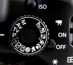
Don’t worry if your mode dial looks a little different; different manufacturers use different abbreviations for the shooting modes.  Your mode dial may have the letters ‘A, S, P, M’ (instead of Av, Tv, P, M), yet they all function in the same way.  Below, I have given each abbreviation for the given mode.

Aperture Priority (Av or A)
Aperture priority can be thought of as a ‘semi-automatic’ shooting mode.  When this is selected, you as the photographer set the aperture and the camera will automatically select the shutter speed.  So what is aperture and when would you want to control it?

The aperture is the size of the opening in the lens through which light is allowed to pass whenever the shutter is opened – the larger the aperture, the more light passes through.

The aperture is measured in ‘f-stops’ and is usually displayed using an ‘f-number’, e.g. f/2.0, f/2.8, f/4.0, f/5.6, f/8.0 etc, which is a ratio of focal length over diameter of the opening.  Therefore, a larger aperture (a wider opening) has a smaller f-number (e.g. f/2.0) and smaller aperture (a narrower opening) has a larger f-number (e.g. f/22).  Reducing the aperture by one whole f-stop, e.g. f/2.0 to f2/8 or f/5.6 to f/8.0, halves the amount of light entering the camera.

Aperture illustration

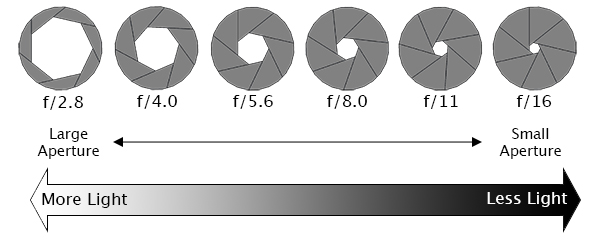
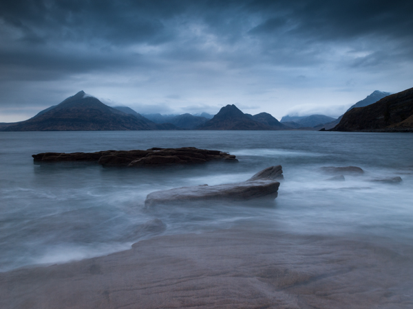
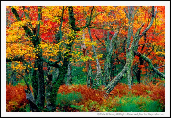
Aperture is one of the most important aspects of photography as it directly influences the depth of field – that is, the amount of an image that is in focus.  A large depth of field (achieved by using a small aperture (large f-number)) would mean that a large distance within the scene is in focus, such as the foreground to the background of the landscape below.

landscape taken at small aperture

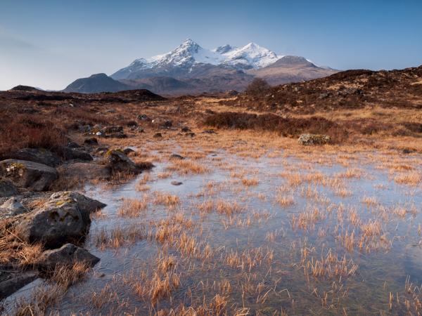
An aperture of f/13 was used here to give a large depth of field, ensuring that the whole image, from the foreground grasses to the background mountains. was sharp

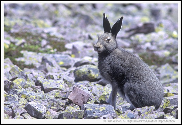
Whereas a shallow depth of field (achieved by using a large aperture (small f-number)) would produce an image where only the subject is in sharp focus, but the background is soft and out of focus.  This is often used when shooting portraiture or wildlife, such as the image below, to isolate the subject from the background:

large aperture wildlife

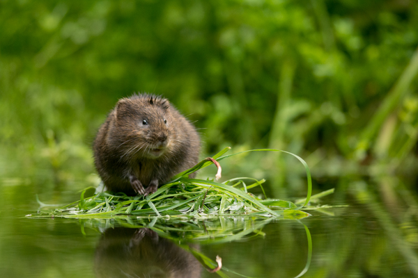
A large aperture of f/4.5 was used to capture this water vole, against a soft, out of focus background

So when using aperture priority, you can get complete control over your depth of field, whilst the camera takes care of the rest.

Shutter Priority (Tv or S)
Similarly to aperture priority, this is another ‘semi-automatic’ shooting mode, though in this instance, you as the photographer set the shutter speed and the camera will take care of the aperture.  The shutter speed, measured in seconds (or more often fractions of a second), is the amount of time the shutter stays open when taking a photograph.  The longer the shutter stays open, the more light passes through to the sensor to be captured.

You would select a short shutter speed if you wanted to freeze a fast moving subject, such as shooting sports, action or wildlife, for example:

fast shutter speed

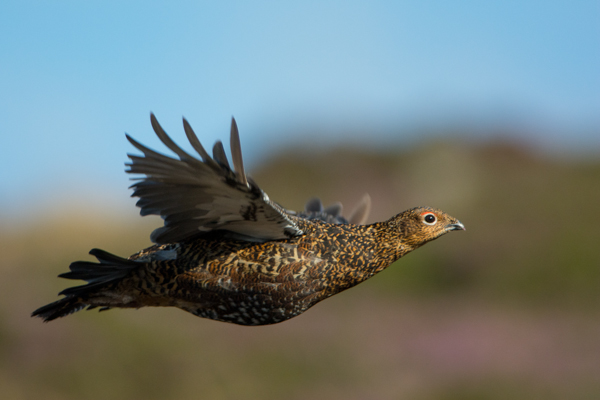
A very fast shutter speed of 1/4000th sec was used to freeze the motion of this grouse in flight

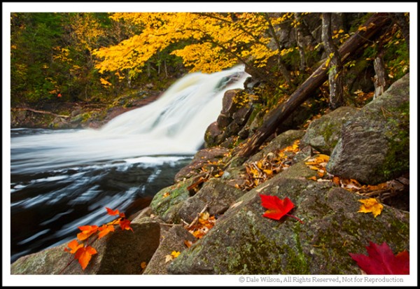
You would use a long shutter speed if you wanted to blur a moving subject, for example water rushing over a waterfall (slower shutter speeds will require you to put the camera on a tripod to ensure the camera is held steady whilst the shutter is open):

Slow Shutter Speed

To capture the motion of the waves, and render the water with a soft, milky texture, a shutter speed of 6 seconds was used here

So whilst you worry about what shutter speed you need for a given photograph, the camera will determine the appropriate aperture required to give the correct exposure.

Aperture and shutter priority shooting modes may be semi-automatic, meaning that some may deride their use because they’re not fully manual, however they are incredibly useful modes to shoot in that can give you enough creative control to capture scenes as you envisage them.

Program (P)
Program mode is almost a halfway house between the semi automatic modes of aperture/shutter priority and full manual control.  In program mode, you are able to set either the aperture or shutter speed, and the camera will maintain the correct exposure by adjusting the other one accordingly, i.e. as you change the aperture, the shutter speed will automatically change, and vice versa.  This gives you additional freedom that using either aperture priority or shutter priority cannot give without switching between shooting modes.

Manual (M)
Manual mode is exactly what it sounds like, you are given full control over the exposure determination, setting both the aperture and shutter speed yourself.  There will be an exposure indicator either within the viewfinder or on the screen that will tell you how under/over exposed the image will be, however, you are left to change the shutter speed and aperture yourself to ensure you achieve the correct exposure.

Practically Speaking: as a first step to taking your camera off ‘auto’, aperture priority and shutter priority modes offer two very simple ways to start to understand how the different setting impact your images and are a perfect starting place for learning how to use your camera more creatively.

2. ISO

ISO is a measure of how sensitive the sensor of your camera is to light.  The term originated in film photography, where film of different sensitivities could be used depending on the shooting conditions, and it is no different in digital photography. The ISO sensitivity is represented numerically from ISO 100 (low sensitivity) up to ISO 6400 (high sensitivity) and beyond, and controls the amount of light required by the sensor to achieve a given exposure

At ‘low’ sensitivities, more light is required to achieve a given exposure compared to high sensitivities where less light is required to achieve the same exposure.  To understand this, let’s look at two different situations:

Low ISO numbers
If shooting outside, on a bright sunny day there is a lot of available light that will hit the sensor during an exposure, meaning that the sensor does not need to be very sensitive in order to achieve a correct exposure.  Therefore, you could use a low ISO number, such as ISO 100 or 200.  This will give you images of the highest quality, with very little grain (or noise).

Low ISO

Taken at ISO 100, the image does not show signs of noise (even when looking at the 100% crop (right)

High ISO numbers
If shooting in low light conditions, such as inside a dark cathedral or museum for example, there is not much light available for your camera sensor.  A high ISO number, such as ISO 3200, will increase the sensitivity of the sensor, effectively multiplying the small amount of available light to give you a correctly exposed image.  This multiplication effect comes with a side effect of increased noise on the image, which looks like a fine grain, reducing the overall image quality.  The noise will be most pronounced in the darker/shadow regions.

High ISO

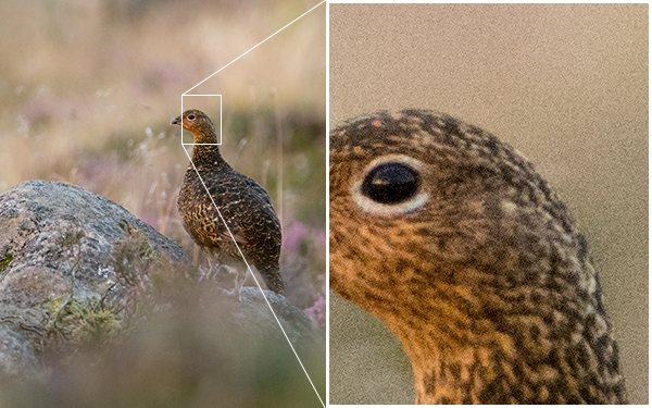
This image was taken as the sun was going down, meaning there was not much ambient light. Therefore, this was shot with ISO4000, however you can see very obvious noise in the 100% crop (right)

Practically Speaking: you want to keep the ISO as low as possible, as the lower the ISO, the less noise and the higher the quality of the resulting image.   Outside on a sunny day, select ISO200 and see how it goes.  If it clouds over, maybe select an ISO between 400-800.  If you move indoors, consider an ISO of around 1600 or above (these are approximate starting points).  

Most digital SLRs now have an ‘auto-ISO’ function, where the camera sets the ISO depending upon the amount of light in which you are shooting, keeping it as low as possible.  Auto-ISO is a very useful tool when starting out with your camera, as it is allows you to define an upper limit i.e. where the images become too noisy such as ISO1600 or 3200, and then forget about it until situations where you specifically want to override the automatic setting, for example if taking landscape images using a tripod, you can afford to use the lowest ISO possible. 

3. Completion of the Exposure Triangle

It’s important to note that aperture, shutter speed and ISO are all part of the ‘exposure triangle’.  They all control either the amount of light entering the camera (aperture, shutter speed) or the amount of light required by the camera (ISO) for a given exposure.

Therefore, they are all linked, and understanding the relationship between them is crucial to being able to take control of your camera.  A change in one of the settings will impact the other two.  For example, considering a theoretical exposure of ISO400, f/8.0, 1/10th second.  If you wanted to reduce the depth of field, and decided to use an aperture of f/4.0, you would be increasing the size of the aperture by two whole f/stops, therefore increasing the amount of light entering the camera by a factor of 4 (i.e. increasing by a factor of 2, twice).  Therefore, to balance the exposure, you could do the following:

  • Situation 1: Reduce the shutter speed by a factor of 4, i.e. to 1/40th second.
  • Situation 2: Reduce the ISO by a factor of 4, i.e. to ISO100
  • Situation 3: A combination of the above, shutter speed by a factor of 2 (to 1/20th second) AND reduce the ISO bv a factor of 2 (to ISO200).
Exposure triangle

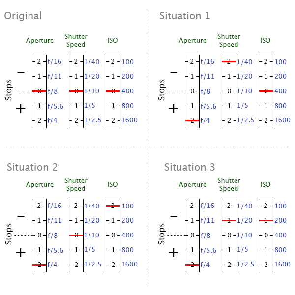
Aperture, shutter speed and ISO are all facotrs that influence your exposure, and are all linked. It’s just a case of balancing the books!

They all have the net effect of reducing the amount of light by a factor of 4, countering the change in aperture.  It’s just a case of understanding that they are all linked, and so changing one setting, will cause a change in another.

Using a combination of the semi-automatic shooting modes and auto-ISO would mean you won’t necessarily need to think about adjusting your exposure in such a way initially, however understanding the relationship that ISO or aperture has with shutter speed, and knowing the practical implications is a big step in mastering your DSLR .

4. Metering

Through out all of the above discussion, I have said that the camera calculates the exposure depending on the amount of available light, but what is it actually doing?

When taking a photograph, using any form of automatic exposure calculation (e.g. aperture priority mode, shutter priority mode, auto-ISO etc) the camera always tries to calculate an ‘average’ exposure.  It will asses the entire scene, both light and dark areas, and determine the exposure so that all of the tones within the entire image average to 18% grey – called the ‘middle’ grey.

This is known as metering, and it is the reason that if you point your camera at a bright white scene, such as after it has snowed, and take a photograph the resulting image will always appear darker than you or I see it.  Similarly, if you point your camera at a really dark scene, such as a low-lit room, and take a photograph the resulting image will always be brighter than you or I see it.

The scene is always being averaged by the camera and most of the time that results in the image appearing to be correctly exposed.  However, you can control what areas of the scene are being assessed by the camera in order to influence the way in which the exposure is metered.

Generally, there are three metering modes that you can choose from:

Average – The camera will assess the tones across the entire image form corner to corner, and expose the scene to 18% grey from that assessment.

Centre-weighted – The camera weights the exposure reading for the area in the centre of the viewfinder that can total up to approximately 80% of the scene, ignoring the extreme corners of the image.

Spot metering – The camera will use a very small area of the scene, typically a small circle in the centre of the viewfinder that totals approximately 5% of the viewfinder area.  It will make the assessment of dark/light tones in this area and expose the entire scene to 18% grey, from that assessment.

Practically speaking: when starting out with your camera, either average or centre weighted metering are a good starting point.  They will both provide a fairly consistent measure of the exposure required and, if you select one mode and stick with it, you will soon begin to understand when a scene will be under exposed (i.e. too dark) or over exposed (i.e. to light) compared to how you see it with your own eyes.

But what can you do if a scene is under/over exposed?  That is where exposure compensation comes in.

Exposure compensation

Generally found on a small +/- button near the shutter, this is one of the most useful functions to learn how to use.  It allows you to either increase or decrease the cameras default meter reading to account for the actual brightness of a scene.

evbutton.jpg

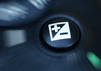
If a scene contains primarily bright tones and is being rendered too dark, for example, a bright white snow scene (that will typically be reduced to 18% grey by the default metering system), you can apply positive exposure compensation to let the camera know that the scene should be lighter than middle grey.

exposure compensation

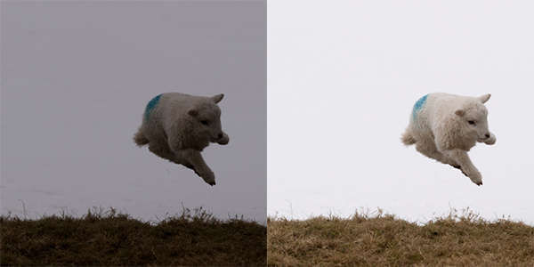
A spring lamb leaping in front of a snowy hillside. Left: Straight out of camera, with the snow caught as grey. Right: With +2 stops exposure compensation (added in post processing). The bright snowy background caused my camera to underexpose this scene by nearly two stops, which could have been corrected by exposure compensation in camera.

Conversely, if a scene contains primarily dark tones and is being rendered too light, for example, a dark night scene (that will typically be increased to 18% grey by the default metering system), you can apply negative exposure compensation to let the camera know that the scene should be darker than middle grey.

5. Focussing

Regardless of what shooting mode you are using, or what ISO you define, the chances are there will be a subject of your image that you want to have in focus.  If that focus is not achieved, the image will not be what you wanted.

Autofocus modes
DSLRs come with a range of autofocus modes, however, for simplicity, the two that are most important to understand are AF-S and AF-C

AF-S – autofocus-single.  This is best used when taking photos of stationary subjects such as portraits of people, landscapes, buildings etc.  When you half-press the shutter, the focus will be acquired and locked on that point for as long as you hold the button down.  If you want to change to focus, you need to release the button, recompose and then re-half-press.

AF-C – autofocus-continuous.  This is best used when taking photos of action or moving subjects such as sports and wildlife.  When you half-press the shutter, focus will be acquired and locked on to a given subject.  When that subject moves, the focus will adjust with it, refocusing all of the time until the photograph is taken.

(These modes are not to be confused with the AF/MF switches on the lens, where AF stands for autofocus and MF stands for manual focus.  That switch is an override for if you want to manually focus your lens.  If you want to make use of the autofocus modes discussed above, ensure the lens is set to AF).
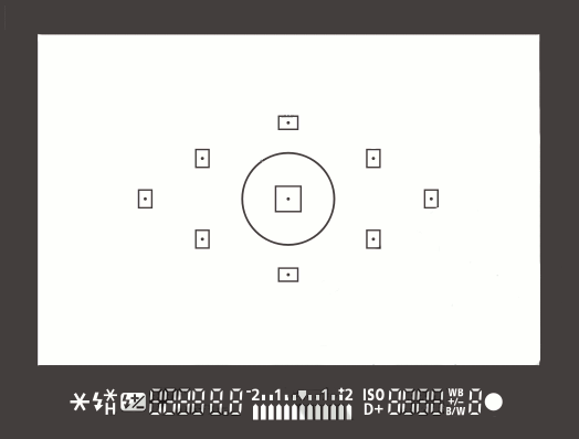
Focus Points
Both of those focus modes rely on what are known as focus points.  When you look through the viewfinder, you should see a number of squares/dots overlaid across the screen.  When you half-press the shutter, you should see one of these squares be highlighted in red.  That is the active focus point, and it is that position within the frame that the camera is focussing on.  A viewfinder with 9 focus points is shown below:

focus-points

New DSLRs can come with over 50 focus points and the temptation is to leave it on fully automatic focus point selection, with the thinking that the camera will be able to select the correct focus point.  However, only you know what you want to focus on, and there is no better way than ensuring the correct subject is in focus than by using one focus point, and placing that focus point over the subject.

If you select a single focus point, you should be able to change which point is active fairly easily either by using directional buttons one of the dials.  If you select a focus point that is on your desired subject, you will ensure that the camera focuses where you want it to.  After a small amount of practice, you will soon get into the habit of being able to change the focus point without taking the camera away form your eye.

Practically speaking:  Initially, set your camera to use a single focus point (your camera manual should tell you how to do this).  This way, you will be able to choose what you are focussing on, ensuring that the subject you want to capture is in focus.  Once you are familiar with the basic focussing modes and focus point selection, you can then explore the more advanced modes that your camera may offer.

6. File Size/Types

You will have the option to be able to change the size of the images that your camera records, and in which file type.  You want to set the file size to the largest possible (whether it is ‘large’ or ‘fine’ or ‘super fine’) to ensure that you are making the most of the mega pixels that you have just invested in.

You will also have the option of choosing whether to record the images as ‘raw’ or ‘jpeg’ file type.  A raw file is uncompressed, and so contains a lot of image data that allows for a lot of flexibility during post-processing (i.e. on your computer) but also comes with additional complications such as the need to ‘process’ every file using dedicated editing software and a larger file size.  A jpeg is a compressed file type, that is automatically processed by the camera.  They will be ‘print ready’ straight out of the camera, and are much smaller files, meaning you can fit more images per memory card.

Practically speaking: When starting out with your camera, using jpeg is the most straight forward.  It will enable you to get the best results whilst you learn the basics or your camera before complicating matters with post-processing of raw files.  

7. White Balance

If shooting in jpeg, as recommended above, you will need to make sure you set your white balance before taking a picture.  The white balance can significantly impact colour tone of your photographs.  You may have noticed that sometimes your images have a blueish tone to them or, in others, everything looks very orange.  This is to do with the white balance and, whilst you can make some adjustments to the image on your computer, it is much simpler if you get it right up-front.

Different light sources (such as the sun, light bulbs, fluorescent strips etc) emit light of different wavelengths, and therefore colours, which can be described by what is known as colour temperature.  Light from a candle, or from the sun during sunrise/sunset, is very warm, and contains a lot of red/orange wavelengths; whereas light from a fluorescent strip is much cooler, containing a lot of blue wavelengths.  This coloured light is reflected off of surfaces, but our brain in clever enough to recognise this and automatically counter the effect, meaning that we still see a white surface as a white surface.  However, your camera is not that intelligent, and unless told otherwise, will record the orange or blue tones giving the colour cast to your images.

white balance

Left: The image captured using auto white balance has a heavy yellow tone from the artificial street lighting. Right: the same image, corrected for a ‘Tungsten’ white balance, giving the cooler tones on the stone work, and the bluer sky

As the colour temperature of different light sources is well known, there are a number of presets built into your camera that help to overcome the different colours of light in different situations – cooling the warm light, and warming the cool light – all in the cause of trying to capture the colours of the scene accurately.  The ‘auto’ feature (auto WB or AWB) will attempt to predict the colour of the light by detecting the predominant colour of the scene and then countering it, however it may not necessarily make a correct decision, leaving you with inaccurate colours.  Therefore it is best to set the colour balance before you take your image and just to make sure (note: the above image was a raw file giving me a lot of latitude for white balance correction.  Jpeg files are not as susceptible to white balance adjustments, meaning the white balance correction needs to be made before the image is taken):

Daylight – To be used on clear sunny days.  Bright sunlight, on a clear day is as near to neutral light that we generally get

Cloudy – To be used when shooting on a cloudy day.  Adds warm tones to daylight images.

Shade – To be used if shooting in the shade, as shaded areas generally produce cooler, bluer images, so need warming up.

Tungsten – Used for shooting indoors, under incandescent light bulbs, or under street lights, to cool down the yellow tones.

Fluorescent – Compensates for the green/blue tones of fluorescent light strips when shooting indoors.

Flash – the flash will add a cool blue cast to the image, so used to add some warmth.

Practically speaking: avoid auto white balance and set the white balance manually.  Generally, you will be able to look up at the sky and see what kind of day it is, and determine the colour balance required pretty easily.  If you move indoors, just check the lighting that you are shooting under, and again select the appropriate white balance.  It will soon become second nature to set it as you take your camera out of the bag.

Conclusion

So that is an overview of the settings you will encounter when you want to take the leap and take your camera off ‘Auto’.  You don’t necessarily need to consider them all straight away, but  exploring and understanding the effect of each setting will soon have you in complete control of your camera.  The biggest step, that will give you the most noticeable difference in the feeling of control and direct influence on creative results, will be to start using the ‘aperture priority’ or ‘shutter priority’ shooting modes and once you are familiar with those, you can start thinking about exploring further.  Soon enough, you will no longer think of your camera as a mysterious black box, but understand how to achieve the photographic results that you bought it for in the first place.


Post originally from: Digital Photography Tips.

Check out our more Photography Tips at Photography Tips for Beginners, Portrait Photography Tips and Wedding Photography Tips.

Megapost: Learning how to use your first DSLR


Digital Photography School

 
Comments Off on Megapost: Learning how to use your first DSLR

Posted in Photography


Learning From My Mistakes: 5 Okay Shots That Could Have Been Great

28 May

by Lynsey Peterson.

I am incredibly lucky. It’s taken me a decade, but I have built a portrait photography business that depends solely on word-of-mouth marketing and stays plenty busy that way.

If there was a magic 3 step process for this, I promise I would share it.

I’ve learned a ton along the way: treat your clients like gold, be generous whenever you can, and everyone should blow their nose and empty their pockets before a single picture is taken. Yet……..I still learn every day. Which is odd because every day I am also pretty sure that I couldn’t possibly know more than I know now or be presented with a situation I have yet to encounter. Then again, sometimes my ego and I have trouble fitting thru doorways together.

Mistakesphoto1 1

See that? It’s a house. It’s actually my house – which I am putting on the market soon.

My wonderful realtor who knows I’m a photographer, asked if I wanted to go ahead and take the pictures myself to save time and money instead of bringing in the trained and experienced real estate photographer she usually uses.

Now, I am asking a little more than my hourly rate for this house. In fact, I am asking like a thousand of my hourly rates for this house. 999 of them are going to pay off the note with the bank, but I’m pretty excited about that one I might get back – and I don’t do real estate photography. I’m not even really sure how to go about it if we are being honest. But, hey, I have a fancy camera and an expensive lens and how hard could it be, right?

If you have those fore mentioned things, you are going to be asked at some point to shoot something that you don’t have any interest in shooting. Maybe it’s a house. Maybe it’s food. Maybe it’s dirt in a fetching abstract pattern. And it’s tempting to say yes, because after all…..how hard could it be? The answer is hard. The longer answer is that every time you shoot something subpar, if only because you don’t have the experience, training, and interest in shooting that, you are taking away from the work you do want to shoot. I get it. I really do. Favors for friends, good money in the off-season. But it’s rarely worth it.

The lesson: Stick with what you know. If you don’t have any desire to do it or learn how, don’t take it on.

Mistakesphoto2 1

I love photographing people upside down. It’s unexpected and quirky and different and fun. And, and, and. It’s also complicated and only works when the rest of what the viewer’s eye has to process is simple and easy. If I had stopped for a moment and viewed it without my camera, I would have seen how hard it was to take it. Why is one kid upside down and the other not? Who’s arms are those? How did they get like that? The cuteness of siblings rolling around in grass and beautiful light gets lost trying to understand the whole picture.

The lesson: Simplify.  If it takes you a second to process what is happening, it will take the viewer of the future photograph much more than a second and your concept could be completely lost….no matter how “perfect” the shot itself is.

Mistakesphoto3 1

When a plane went by, causing most everyone in this family to look toward the sky, I though I had hit pay dirt. I quickly envisioned them all looking up in amazement and excited baffle. Instead it only served as an interruption to what we were doing. At the moment I remember thinking I should encourage them to watch the plane. But I was so caught up in the moment passing us by that I didn’t think I had time.

Even if the plane had long passed by the time I conveyed what I meant, I still could have gotten the shot I imagined. But I didn’t say a word about it and therefore didn’t allow them their own moment, which would have produced an amazing shot. Instead I have this: everyone a bit thrown off by the interruption because I didn’t ease the situation.

The lesson: Take your time. No matter how tight the schedule, you always have 30 extra seconds to make a fun situation into a great shot.

Mistakesphoto4 1

Oh this picture. It was such a beautiful shot…………two hours of Photoshop ago. I love MORE. I’m a fan of bigger and better and faster too. When this cutie showed up with this adorable hat,

I got an idea. A crazy/complicated/fun idea.

I. Was. Going. To. Get. This. Shot.

We were going to stay here all day if that’s what it took. And I got a great shot (without the whole day bit luckily). However left to my own devices, I wanted to do everything I could to make it THE shot. What’s post-production, if not to enhance right? I felt it was a Gap Kid’s moment, what with the cute kid and fun hat and all. Deserving of the kind of “enhancement” ready for a catalog cover. Never mind that I don’t shoot fashion, that I rarely shoot commercial, and that for this shot I was being paid to shoot a portrait and nothing more.

The lesson: Less is usually more. There’s a fine line between giving an image a little editing love and turning people into plastic.

Mistakesphoto5

Now I knew going into this shoot that I was photographing a large family and 8 dogs and you’d think that I would have come with my pockets full of dog treats and spent the hour and a half drive there practicing my whistle. But, alas, I did not.

This particular client was a referral who lived really far from me and was willing to pay me a significant travel fee to come to them – and their 8 dogs.

Admittedly my ego got the best of me here. There are hundreds of photographers closer and cheaper. Maybe even some with experience shooting 8 dogs. But they wanted me. And instead of saying, “do I really want to shoot this?”, I happily fed my ego a big serving of “I’m So Wanted” with a side dish of “How Awesome Am I? Answer: Really Awesome”.

Here’s the problem with that: this shot is forever my body of work. Even if I had never shown it to anyone, the client might. And it’s not my greatest work. Yet it may be the only work of mine someone sees.

This isn’t the shot I want to hang my hat on or be known for. I’m not embarrassed about it, but I do get a little bummed about the idea that a viewer may see this and think it’s the best example of my skills.

The lesson: Get over yourself. This shot doesn’t need to be in my body of work, but it is. I could have done more research and come in with better ideas for this 8 dog craziness and by not, the take-away is a shot that could have been so fun and different and interesting and…… isn’t.

Check out more of Lynsey Peterson’s work on her website.

Post originally from: Digital Photography Tips.

Check out our more Photography Tips at Photography Tips for Beginners, Portrait Photography Tips and Wedding Photography Tips.

Learning From My Mistakes: 5 Okay Shots That Could Have Been Great


Digital Photography School

 
Comments Off on Learning From My Mistakes: 5 Okay Shots That Could Have Been Great

Posted in Photography


Learning to See, Final

22 Apr

Make Photographs for Yourself, Critics are Critics for a Reason

Over the past ten installments from the Learning to See series (linked to below), I have hoped to lead the novice photographer through the basic concepts of not only what makes a photograph better, but also introduce some of the theories and principles to why.  I have also received comments of appreciation from advanced photographers who also might have learned a new concept, or perhaps provided a refresher from some long forgotten workshop.  However, at the end of the day this series was for the beginner and I do hope it has inspired you to make even more pictures, and above all else have fun doing it.

Generally speaking, the lessons presented followed a general flow I have employed for quite a few years whilst instructing novice photographers. You should be able to take these basic concepts of colour, tone and composition and practise these for the remaining time you are able to hold a camera – and I do hope that is forever.

As you gain a better grasp of these concepts you will soon discover why many advanced photographers will suggest rules are made to be broken. I also subscribe to this notion, but also believe we have to learn to walk before we can run.  Usually the reason you want to make a picture in the first place will be the reason you should make the picture. Once you have made the image, then it is time to start exploring with your curiosity and creativity by being adventuresome.

Don’t be afraid of failure – there is no such word in the amateur photographer’s dictionary.  If you are not pleased with the results of your efforts don’t see those images as disappointments, but as opportunities to learn.  What could I have done better … what should I have done? By challenging yourself to always advance and to learn from your results, I will guarantee you a lifelong pursuit of enjoyment from an incredible craft. I have known photographers who have been making pictures for 5, 6 and even 7 decades and the one common constant they all have is an insatiable desire to learn.

This image move away from the various "rules of composition" we have discussed, yet uses strong diagonal lines assupporting elements, as well as colour contrast. Yes, I placed the leaves in the foreground; but, somehwere today there is a photographer swearing up and down that those leaves were there just as he found them!

This image moves away from the various “rules of composition” we have discussed, yet uses strong diagonal lines as supporting elements, as well as colour contrast. Yes, I placed the leaves in the foreground; but, somehwere today there is a photographer swearing up and down those leaves were there just as he found them!


As a quick recap let’s reconsider some of the primary components and concepts that have been raised over the length of this series.

Subject:   First and foremost what is your subject? Something caught your attention and made you focus on a specific object; what was it? Once that subject is identified you should try to avoid surrounding distractions other than  incorporatinge those elements as supporting components to enhance the primary subject.

Tonal Range:    The subject will most likely be the most colourful or brightest part of the scene. When this is the case look for supporting colours or tones that will naturally enhance the contrast of the subject, and by default elevate the impact of the subject.  Think of our lesson on complementary colour and how red works well with green, blue with yellow, and so on around the colour wheel. Disregard the arguments of CMYK colours space at this junction of your photo career – think basic, primary colours and they will hold you in good stead until you are ready to explore colour theory further.

Composition: Once you have located the subject consider where you are going to place the subject in the final frame.  Recall our discussion on the Rule of Thirds and identifying the “Point  of Impact.” Also remember we can adjust the Rule of Thirds to become the Rule of Fifths, Sevenths, Ninths, or any other odd number we might choose to place the subject at a location to maximize impact. At this juncture don’t be distracted by those who would have us believe we must understand the Fibonacci theorems; just move the subject away from the centre of the viewfinder.

Elements to Support the Composition:  Think of diagonals and leading lines such as c-curves and s-curves. As you start making pictures try keeping them simple and uncluttered, allow the leading lines to draw our attention to the subject.

There will be occassions when you simply have to get the image and then attempt to refine it later. This is usually the case with animals. This harp seal pup is not the most active critter on the planet, but the mother most certainly can deliver one fast and nasty bite.

There will be occassions when you simply have to get the image and then attempt to refine it later. This is usually the case with animals. This harp seal pup is not the most active critter on the planet, but the mother most certainly can deliver one fast and nasty bite.  This image was made with a Pentax 67 format, with a light reflector held just off frame to the left and rear of the pup.


Conclusion:  Challenge yourself with assignments – perhaps one per week. Analyse your results immediately after you make the photo, and then again just before your next self-assignment a week later. By being self-critical of last week’s assignment, the lesson will be fresh in your mind for this week’s assignment and you will more than likely see improved results immediately from week-to-week.  Start training your eye to see things intuitively even though you don’t have a camera in your hands.  Look at architecture and see how the design of a building affects shadows at different times of day. Study the artworks of the great masters from the different periods and notice how they incorporate all of our discussion points in a single painting. Study the work of photographers whose work you admire, but be careful not to copy.  It is alright to emulate, but once you duplicate you are no longer true to yourself.  Photography, and art in general, is a universal language; learn to express yourself freely and with confidence.

Most importantly, and if I have been able to drive one extremely important lesson into your creative mind that would be: Always have fun.  After all, if you are having fun you are doing it right.

See the Full Learning to See Series

  • Learning to See – Part 1
  • Learning to See – Part 2
  • Learning to See – Part 3
  • Learning to See – Part 4
  • Learning to See – Part 5
  • Learning to See – Part 6
  • Learning to See – Part 7
  • Learning to See – Part 8
  • Learning to See – Part 9
  • Learning to See – Part 10
  • Learning to See – Final

Post originally from: Digital Photography Tips.

Check out our more Photography Tips at Photography Tips for Beginners, Portrait Photography Tips and Wedding Photography Tips.

Learning to See, Final


Digital Photography School

 
Comments Off on Learning to See, Final

Posted in Photography


Learning to See, Part X

08 Apr

The limitations in your photography are in yourself.  –Ernst Haas

 Diagonal lines, as we learned in our entry, are the subliminal connectors that keep the viewers eye within and moving around the picture. As you looked at the busy example by Rembrandt we saw how he cleverly positioned his supporting elements to facilitate the movement and study of each subject. Similarly, Karsh utilized exquisite posing and darkroom technique to force the viewer to study Churchill’s piercing eyes, and in so doing we can just imagine his character and wisdom. Both artists used the diagonal line to cleverly create geometric triangulation, and by consequence keep the viewer engaged as the artist intended.

This image has been cropped to show how diagonals create the element of movement. Casual observation should provide for your eyes to be drawn to the upper right hand corner of the image due to the lighter colour of the diagonal drawing your eyes there.  Incidentally the image is from my front yard and there was a snowman at the convergence of the lines.

This image has been cropped to show how diagonals create the element of movement. Casual observation should provide for your eyes to be drawn to the upper right hand corner of the image due to the lighter colour of the diagonal drawing your eyes there. Incidentally the image is from my front yard and there was a snowman at the convergence of the lines.


Should you study classical rules of composition in photography you will inevitably come across tutelage advocating the use of C-curves and S-curves as leading lines — lines to lead the viewer into the picture.  Well, let’s simplify this prospect even further: C-curves and S-curves are little more than a diagonal line that has consumed too much wine! Regardless if the line is a straight or curved diagonal its sole purpose in making a picture to draw the eye to an intended point or place of interest.

This image of a country road shows a good example of an S-curve. Just like the C-curve our eye will follow the path to its smallest point, leaving us curious what lies beyond. Diagonals, whether they have been drinking wine or not, provide the direction of travel in an image by moving the eyes around the scene.

This image of a country road shows a good example of an S-curve. Just like the C-curve our eye will follow the path to its smallest point, leaving us curious what lies beyond. Diagonals, whether they have been drinking wine or not, provide the direction of travel in an image by moving the eyes around the scene.


I would wager that as you learn to find supporting elements to enhance the impact of your image you will more than likely be able to locate some natural element that could be used as a diagonal traffic director.  Curves are child’s play to the composition; they are easy to find and natural supporting components – we need only look for them.  Finding the straight diagonal is the fun and a challenge in making pictures.

It has been my experience that diagonals most often work best with wide-angle lenses. The wide-angle lens will allow us to get closer to the diagonal element, such as a low angle camera on a roadway. Consequently the diagonal will oftentimes become the primary element in the picture so care must be taken not to allow the supporting diagonal overpower the intended subject.   With judicious care and placement of the supporting diagonal or curve, we will inevitably  be drawn to the subject that captured our attention and is the intended subject.

Go to your park, your backyard, or anywhere else the muses may take you. Find a comfortable location to settle in, and leave your camera gear untouched.  Why did you stop here? Of all the possible locations, why did you select this area to sit and ponder? There is a very real possibility that something caught your eye, and you are already composing the picture in your mind. What is it?

Now that you have located the unique tree, the colourful flower, the man-made structure that made you stop in the first place, start searching for the supporting element. What is nearby that you can use that will draw a line from the front of your picture right back to the attraction that will be your subject?

Don’t be afraid to move around looking for a fence, a line of rocks, or perhaps cirrus-whip clouds pointing downward, or anything else that will draw the viewers attention into the picture, and eventually to the subject. That diagonal component is here – be it a curved or straight line; you just have to find it.

Now the practise of photography begins, and with it the ensuing fun. And remember, if you are having fun, you are doing it right.

Post originally from: Digital Photography Tips.

Check out our more Photography Tips at Photography Tips for Beginners, Portrait Photography Tips and Wedding Photography Tips.

Learning to See, Part X


Digital Photography School

 
Comments Off on Learning to See, Part X

Posted in Photography


Learning to See, Part IX

19 Mar

You don’t take a photograph, you make it.  – Ansel Adams


In our last entry we learned that placing the subject at one of the four primary points of impact within the scene would greatly enhance the ease of viewing by way of good composition. We introduced the “Rule of Thirds” as a classic example of guidance by drawing an imaginary template from which to establish the point of impact.

With that lesson reinforced, is there any particular reason why we couldn’t also have a Rule of Fifths or Rule of Sevenths?  No; not at all.  With that having been said the point behind these “Rules” is simply to provide the beginner with the tools to make an informed effort to move the subject from the centre of the viewfinder. 

We must now be aware of the supporting components that will aid in subconsciously drawing us into the picture. Think lines, more specifically think of diagonal lines.

The diagonal line will offer a suggestion of movement. To see how we can use diagonal lines to improve our composition we should first review the work of the great masters. If one were to do a web search looking for “Rembrandt and The Night Watch” one of his most inventive works should appear.

One’s first impression of the work is to notice how there are three primary subjects in the work: the two gentlemen at the front centre and the girl in the background. If you reflect on your first reaction —and be honest—did you not immediately draw your eyes to the two lightest coloured persons in the work: the Lieutenant and the girl? That is because our eye will intuitively be drawn to the brightest part of a picture by default.

Most importantly, look at the almost over-indulgence of diagonal lines. Everything in the picture leads from tallest on the outside to shortest on the inside. Study the lance, the muskets, the drum and the pennant; they all draw our eyes to the centre of the picture. Similarly, look at how Rembrandt has chosen to portray the other people in the picture; by drawing an imaginary line across the tops of their heads you can envision a diagonal line starting on the outside and receding downward to the centre of the picture.


How many diagonal lines can you find in this image of Leo?

How many diagonal lines can you find in this image of Leo?

Now, let’s advance the clock some 300 years to the great portrait of Winston Churchill by master photographer Yousuf Karsh. This photo can also be located by a web search.

Notice how Karsh has very purposefully positioned Churchill’s hands on a hip and chair back. By default this raises the shoulders and creates triangles on both sides of the body; triangles are little more than three diagonal lines that join with the other. Because Churchill is wearing black, and with further darkroom burning, our eye is forced to follow the outside lines of Churchills forearm, biceps and shoulders until we are eventually drawn right into that remarkable face. 

From these two examples by master artists we can learn how to use diagonal lines in our photography to draw the viewer toward our ultimate subject. Once we start to move away from the subject those diagonal lines should draw us right back into the scene yet again. Successful art will hold you in the scene by not allowing your eyes to escape.


There are several more triangles that are less obvious. Can you find them?  The point is that you should be looking for composition elements in your photography until it becomes an intuitive process.

There are several more triangles that are less obvious. Can you find them? The point is that you should be looking for composition elements in your photography until it becomes an intuitive process.

By studying and understanding the master portrait artists we can learn their compositional technique and apply that equally as well to landscape and nature photography. Good composition is good composition; it really is that simple.

And remember, if you are having fun then you are doing it right.


Postscript: In keeping with the flavour of the artists (including other photographers) copyright I will ask the reader to reference the images that have been suggested as opposed to my posting without license.  Thank you in advance for understanding.


Post originally from: Digital Photography Tips.

Check out our more Photography Tips at Photography Tips for Beginners, Portrait Photography Tips and Wedding Photography Tips.

Learning to See, Part IX


Digital Photography School

 
Comments Off on Learning to See, Part IX

Posted in Photography


Learning to See, Part VIII

14 Mar

Consulting the rules of composition before taking a photograph, is like consulting the laws of gravity before going for a walk.  –Edward Weston


To some photographers composition is an innate process, whereas to others it is a life-long learned challenge laden with frustration. Regardless of which category you find yourself, good composition is a learned skill that will enhance the overall aesthetic appeal of the end result.  While I subscribe to Weston’s notion, I also believe we first learn to crawl before walking.

Our challenge is to learn how to use diagonal lines, contrast, simplicity, point of interest, and so on to allow us to translate the three-dimensional scene being photographed onto a one-dimensional plane while retaining the original perception of depth and movement.

The first rule that we must accept is that there is no right way to take a picture. Regardless of the subject matter, you should always analyze your picture to ensure it answers the question: Does this picture satisfy my reasons for having made the exposure in the first place?  Should your answer be yes —congratulations.  If not — why not?

The art of making a photograph can be broken down to its most basic and elementary form: Placing the point of interest in the most satisfying position within the frame to achieve the desired result. It really is that simple; everything from this point forward will evolve by way of personal technique.

The first photographic rule that must be learned, and adhered to from this day forward, is the use of a tripod. It is unquestionably the most valuable piece of ancillary equipment you can have at your disposal. Only when your camera is firmly grounded with the flexibility and advantage of controlled movement can you then start to accurately study the scene in the viewfinder, thus ensuring all elements are properly placed in the scene prior to making the exposure. There have been many articles and reviews written on the multitude of tripod models available, please defer to those that are easily located by doing a web search.

By recognizing that we want to photograph a particular scene or subject, we have also admitted to having identified the point of impact within that scene. Perhaps it is a lazy fox in big landscape, a detail of some mammal, a grey wolf peering from behind a tree, or perhaps the snow-capped mountains in some distant vista. Where we place that identifying feature within the viewfinder will unquestionably enhance the final impact of the image.

One of the very first rules of thumb to be learned in composition is the utilization of the ‘Rule of Thirds.’ Essentially the viewfinder is divided into nine equal spaces by placing two equally spaced horizontal lines and two equally spaced vertical lines. Where these lines dissect each other will create the four ‘Points of Impact’ within the frame.

Canada’s easternmost province of Newfoundland has the southernmost population of arctic hare in the world.  This fellow was located atop Gros Morne Mountain, and the photo was captured with little regard for composition. With uncontrolled animals (non-zoo setting) just get the shot first,and then concentrate on refining the image with the next frame. With gained experience you will soon find yourself intuitively placing the subject at the correct ‘Point of Impact’ as indicated here with red circles.

Canada’s easternmost province of Newfoundland has the southernmost population of arctic hare in the world. This fellow was located atop Gros Morne Mountain, and the photo was captured with little regard for composition. With uncontrolled animals (non-zoo setting) just get the shot first,and then concentrate on refining the image with the next frame. With gained experience you will soon find yourself intuitively placing the subject at the correct ‘Point of Impact’ as indicated here with red circles.

Regardless of subject matter, by placing our primary point of interest in one of the four ‘point of impact’ locations within the frame we will dramatically improve the dynamic and aesthetic appeal of the picture.

What I would like you to do now is locate simple subjects in your backyard or neighbourhood park. Do not try to make complex pictures, but just a single subject on a plain background – perhaps a solitary tree against a sky background. While employing the “Rule of Thirds” place that tree, or other chosen subject, in each of the four “point of impact” locations. For the fifth photo of the tree, place it in the centre of the viewfinder. Which photo do you prefer and why?

Once this hare heard the mirror-slap on my medium format camera (Pentax 67) he was gone faster than a … well, shot at rabbit. Fortunately, due to the large film size I am able to crop the image and place the ‘Point of Interest’ (the hare) in the most pleasing ‘Point of Impact’ within the frame. When we are working with “living critters, including people” we will usually want to focus on the eyes and frame the animal in such a fashion to leave room for them to “look into the frame.”

Once this hare heard the mirror-slap on my medium format camera (Pentax 67) he was gone faster than a … well, shot at rabbit. Fortunately, due to the large film size I am able to crop the image and place the ‘Point of Interest’ (the hare) in the most pleasing ‘Point of Impact’ within the frame. When we are working with “living critters, including people” we will usually want to focus on the eyes and frame the animal in such a fashion to leave room for them to “look into the frame.”


As you go through this exercise, remember the most important rule in photography: Have fun. If, after all, you are having fun then you are doing it right.

Post originally from: Digital Photography Tips.

Check out our more Photography Tips at Photography Tips for Beginners, Portrait Photography Tips and Wedding Photography Tips.

Learning to See, Part VIII


Digital Photography School

 
Comments Off on Learning to See, Part VIII

Posted in Photography


Learning to See, Part VII

01 Mar

Whereas photography is about vision, composition is about aesthetics.

In our previous readings in this series we learned how colour,  contrast and tonal range have a dramatic effect on the overall result.  Some teachers may say the first important rule in making successful pictures is composition, and indeed that may be so.  However,  I also like my intrepid readers to be unique and true to themselves.  Therefore, let’s argue that colour impact is more important than composition  ( remember folks, this series is for the novice and beginner  so please let’s not start a raging debate and muddle the waters. I want our beginners to have fun and explore for themselves – they will figure it out.) 

              I had the good fortune of being raised in the country, on a twisting gravel road that followed a meandering river. Not far from the family farm was one of those old-styled triangular framed bridges that crossed the river, and just beyond that was a drumlin where one could sit and breathe in the unfolding landscape below.  It was idyllic, and a magnet for artists’ easels.

When my daily chores were finished I would often climb aboard the 28-inch hand-me-down bicycle, with worms in pocket and alder fishing pole, and peddle to my secret fishing hole. Sometimes I would arrive at my destination, other times I would be sidetracked by an artist standing atop the Lloyd Hill (as we called the drumlin), adorned in beret with brushes in hand.

Invariably each artist would add the S-curve of the river leading in from the bottom right corner of the blank canvas following a diagonal until it exited in the upper left corner. The triangular bridge was always in the bottom right-hand corner of the canvas, our farm in the upper right hand corner.  The distant pine forests would create the far-off horizon line. One artist who often visited the same location would place an elm tree in the left foreground of the scene to add balance and colour, reflecting the season. Ironically, the elm was not in the vista lying before her eyes, but was a creation of her imagination.


Many of the elements of good composition can be found in this image. Can you locate the diagonal lines, the various "C" and "S" curves, and triangle forms in this image?
Many of the elements of good composition can be found in this image. Can you locate the diagonal lines, the various “C” and “S” curves, and triangle forms in this image?

I liked this artists work best; she was not only painting the scene as it lay before her, but she was also adding her own elements —the elm tree— and expressing her mood and thoughts at that particular time. By breaking the realist rules of the day, she was making a statement with her art.

Some twenty-five years later I would often reflect on those early lessons that had registered by way of an artist tolerating the relentless gawking of a kid with worms escaping his shirt pocket.

What I found particularly intriguing, however, was how the artist would start with a blank canvas and then add elements as their imagination desired. By comparison the photographer starts with a full canvas and eliminates those elements that are undesirable.  Consequently we can say that a painter’s art form is an additive one, whereas a photographer’s is subtractive.

Over the next few issues let us explore some of the basic rules of composition by identifying the elements of pleasing aesthetics: the S-curve, the C-curve, how to create motion by using diagonals, forcing the viewer into the scene by way of using contrast and selective focus, how the use of triangles keep the eye moving within, and of course the time-honoured favourite of teachers everywhere … the Rule of Thirds.

Once we have explored the possibilities these guidelines can bring to our photography, we will then become rebels and toss them aside. Only by understanding the “rules” can we then effectively break them.

A newly hatched Blanding's Turtle, identified as a species-at-risk, is only about the size of the largest coin you have in your pocket. When taking portraits of just about all living creatures, a good rule-of-thumb is to position the camera at eye level of the subject.

A newly hatched Blanding’s Turtle, identified as a species-at-risk, is only about the size of the largest coin you have in your pocket. When taking portraits of just about all living creatures, a good rule-of-thumb is to position the camera at eye level of the subject.


In the interim, what I want you to do is start making pictures with an awareness of where you are placing your subject, and objectively pondering why you made that decision. There is no substitute for actually being out there enjoying the craft that made us acquire a camera in the first place. As you study your results ask if the image translates the message you were trying to make in the first place. This is not philosophical rhetoric – there really was a reason you made that picture in the first place.

What was it?

Study and analyse your picture, and learn from your exercises. First and foremost, keep your picture making fun.

And remember, if you are having fun  you are doing it right.

Post originally from: Digital Photography Tips.

Check out our more Photography Tips at Photography Tips for Beginners, Portrait Photography Tips and Wedding Photography Tips.

Learning to See, Part VII


Digital Photography School

 
Comments Off on Learning to See, Part VII

Posted in Photography


Learning to See, Part VI

24 Feb

No Contrast – No Problem

The most beautiful composition can be dashed by improper use of color and contrast.  –CJ Rider

As we learned in our last entry, harsh light can work well with bold and dramatic colours, yet blow-out the subtle and delicate tones. The colour red supported by black, or gold surrounded by blue provide the photographer with easy choices in creating a pleasing composition. 

But what shall we do if there is no colour or light contrast, but only a monotone or duotone with which to work?

 Any photographer who has worked along Canada’s Atlantic coast learns very quickly that coastal fog can make a colourful scenic harbour appear flatter than a day old pancake. Likewise for the photographer who travels through Canada’s north where naturally ignited wildfires are permitted to burn themselves out, ultimately filling the sky with smoke as far as the eye can see.

 What we are beginning to recognize is that in bright sunlight that yellow dory on a Newfoundland beach or a MacKenzie Delta birch tree in autumn foliage will fairly jump out of the landscape. Conversely, if we were to remove the direct sunlight that same composition would turn those bright yellows into a muddy eyesore.

 As an experiment to reinforce this thought locate a window that you can easily peer out at any given time of day, perhaps the home kitchen or at the office. Next find a subject that appeals to you, but make sure it is only one element such as a tree or a building. Every time you walk past that window have a glance at the referenced subject and note how the colour and form of the subject will change depending upon the lighting conditions.

It should stand to reason that as we study the scene from our vantage the bark on the targeted tree or texture of a brick wall will take on a whole new meaning if viewed in overcast light as opposed to a bright sunny day.

 Now we have a eureka moment: If high contrast light emphasises boldness and will force us to search for scenes requiring these sharp edges, then by comparison we should be seeking scenes that are soft and delicate on non-sunny days.

 For the landscape photographer it is generally accepted that on those poor-light days it is best to keep the bland grey sky out of the scene. Instead, point the camera down and adjust the composition to showcase the colour, patterns and texture that is best seen under this soft light. Generally, when the sky is blue think of making big sky pictures; when the sky grey look to your feet.

Image-1

Photo 1

Photo no. 1 is an example that breaks the general rule “if there is no definition in the sky leave it be.” In other words, on overcast days the clouds will usually be a bland and woefully white or grey. From our earlier readings, we have learned that the viewer will subconsciously be drawn to the lightest part of a picture. If there is no detail to the sky, then we usually wouldn’t include it in the photo.  In this case, however, the sky is the lightest part of the photo and an integral component to the story. There was a huge forest fire in Quebec and the smoke had blown east to Gros Morne National Park in Newfoundland and Labrador. What the sky does, in this case, is complete the gradation of tonal range from dark to light, and allows your eye to move up and down the picture without distraction.  The side bar to any rule-of-thumb is that once you know the rules, then find a way to successfully break from that mold.

Image-2

Photo 2

Garden photographers long for days of no wind with a very light moisture in the air. Such conditions allow a flower to purely come to life by allowing the vibrancy, subtleness, texture and detail to shine through. By having no shadow details, or very soft and indistinguishable shadow lines at most, we can then concentrate on the nuances and softness that such conditions allow.  In photo number 2, the lack of shadows allows the viewers eye to wonder right into the mix of a really nice stand of Showy Lady Slippers.    

And remember, if you are having fun you are doing it right.

Post originally from: Digital Photography Tips.

Check out our more Photography Tips at Photography Tips for Beginners, Portrait Photography Tips and Wedding Photography Tips.

Learning to See, Part VI


Digital Photography School

 
Comments Off on Learning to See, Part VI

Posted in Photography