RSS
 

Posts Tagged ‘Learning’

Learning to See, Part V

20 Feb

The colour of the object illuminated partakes of the colour of that which illuminates it. – Leonardo da Vinci

In our past columns (see links below) we have discussed such topics as how one colour can complement or distract from a bordering colour. We have also learned that to truly see colour one has to understand how shades of grey are comprised of mere percentages of black ranging from pure white to pure black. A primary objective coming from these discussions should be an understanding of how contrast plays a primary role and is an integral component of the final image.

Let’s look a little deeper into this concept and how we might apply this knowledge in our own picture making.

For the nature photographer there are essentially two core subject matters upon which we will concentrate our efforts, those being critters and where critters live. How each is approached and photographed will depend on a litany of variables, but essentially the one constant is that we will have little control over the lighting. The quality of that light, however, will often decide how we have to approach the image and what type of photograph to make.

Generally speaking, where I live on the Tropic of Cancer, the light will be best up to about two hours after sunrise, and from two hours before sunset. It can also be safely assumed the closer you get to the equator, the more quickly the light will become harsh with contrast and hard edges shadows after sunrise. Conversely, the closer you are to the poles the longer the “golden hours” of nice warm coloured light.  When the sun is high in the sky at noon it is often too harsh and creates far too much contrast to provide good photo opportunities, unless we adjust our approach.
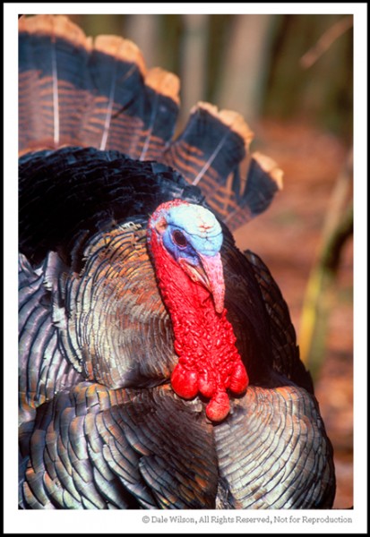
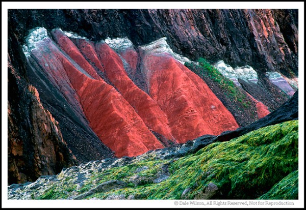
Photo-1

Photo 1

 It has been said that beauty is in the eye of the beholder.  This old gobbler, in photo 1, was having a difficult time locating a mate — evidently it wasn’t just me who thought he was butt ugly. His temperament wasn’t stellar either as I recall, let’s just say this was the last image of the sequence. With that having been said, the photograph was made around high noon and in lighting conditions that had far too much contrast for a pleasing image. By selecting a tight composition to take advantage of the contrasting colour it becomes possible to shoot throughout the entire day. Should this composition not be so tight, the image would have been far less effective. Identify the complementary colours in the scene and allow those to be the focal point while being somewhat oblivious to the subject.  In this case the red is the focal point and is accentuated by the blacks.
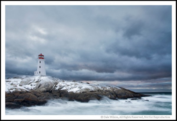
Photo-2Photo 2

 If one is driving down a country road around lunch time, some great tunes rockin’ on the radio, a cloudless blue sky overhead, the arm thrust out the window ala truck driver style … well, what could be better?  Why a field full of beautiful sunflowers appearing over the next hill of course.

Should one compare the golden colour of the sunflower to the deep blue sky in image 2, you would soon realize that gold and blue are opposite on the colour wheel. As a consequence of being complementary colours (or very close to) they will immediately create a colour contrast that will work even when the light is harsh. All that remains is to get permission from the farmer to enter his field and compose the image so there are no competing colours in the viewfinder. Voila, you now have a successful photo taken at a time of day when most photographers are having a noonday nap.

If you think of the colour wheel and how colours complement each other you will soon intuitively be making photographs without even thinking of colour theory. When the scene looks good in the viewfinder it usually is, capture the image and analyse it at home.

And remember, if you are having fun you are doing it right.

Read the Full ‘Learning to See Series’ at:

  • Learning to See Part 1
  • Learning to See Part 2
  • Learning to See Part 3
  • Learning to See Part 4

Post originally from: Digital Photography Tips.

Check out our more Photography Tips at Photography Tips for Beginners, Portrait Photography Tips and Wedding Photography Tips.

Learning to See, Part V


Digital Photography School

 
Comments Off on Learning to See, Part V

Posted in Photography


Improve Your Photography By Learning to Edit

12 Feb

A Guest Post By: John Davenport

You might have read the title to this post and thought that I was going to talk about how editing your photographs can make you appear to be a better photographer, but no, I really do mean better – behind the camera.

Thin Ice

I came across this idea of improving my skill behind the camera, by focusing on my skill behind the computer, when I was going about launching my new YouTube series, “Let’s Edit”, which focuses on how to edit photos in Lightroom.

What Exactly Can Editing Teach Us?

As we start out on our photography journey we are learning everything there is to know about creating a photograph. From how our camera works to how different light effects our shots and this can be a bit overwhelming – especially when we’re out in the field taking photos.

Optional Caption: Learning to Crop Differently Can Teach Composition

Learning to Crop Differently Can Teach Composition

When I first started photographing landscapes I would get lost in the act of trying to fiddle with dials and buttons and forget about composition, or when I’d focus on composition I’d forget about my shutter speed or ISO settings. There is so much that goes into creating a photograph that sometimes it helps to just sit down and learn a different way. So I thought I’d try to learn to take better photographs by focusing on learning how to edit the ones I did take.

One area that editing our photos can teach us is the idea of composition. I know there will be people screaming at the screen as they read this, maybe even ripping their hair out, when I say that cropping photos is an excellent way to experiment with composition, but it really truly is.

You can take the same photograph and crop it countless different ways and by doing this you are training your eye to see scenes differently. Apply this knowledge of composition the next time you’re in the field and you’ll actually see those different compositions as you’re looking through the viewfinder making it possible for you to take more photographs while you’re out in the field.

One other area that comes to mind is learning to see things in the field that will look good once edited. Take this black and white photograph of the Boston skyline that I took while I was out photographing the city with my sister.

By Seeing the Edit in the Field You Can Set Shots Up Accordingly

By Seeing the Edit in the Field You Can Set Shots Up Accordingly

By having the black and white image in my head as a concept I was able to know that by under exposing the frame then and there it’d make my life so much easier when I go about creating the final image back in Lightroom.

Now, this is just two concepts where editing can be applied to what we do in the field, I’m curious, have you ever thought about this idea of applying what you do behind the computer in the field? Do you think you can come up with other areas of editing that will make sense when you’re behind your camera? Let us know in the comments below!

John Davenport is an avid amateur photographer looking to make a name for himself. He has recently started a new YouTube series called “Let’s Edit” as well as launched a community site to go along with it. You can also find John on Facebook and Twitter.

Post originally from: Digital Photography Tips.

Check out our more Photography Tips at Photography Tips for Beginners, Portrait Photography Tips and Wedding Photography Tips.

Improve Your Photography By Learning to Edit


Digital Photography School

 
Comments Off on Improve Your Photography By Learning to Edit

Posted in Photography


Learning to See, Part IV

28 Jan

The Hues and Use of Colour, Part III

Seek the strongest colour possible…the content is of no importance

–Henri Matisse


Upon review of our last entry we learned that the colour, tone or shade of a perimeter colour can, and does, affect the primary subject. The works of the artists identified —Turner, Maisel and Meola — amplify this notion without reservation.

In many cases a specific colour is also very responsible for controlling our subconscious.  When we think of white we translate our thoughts to purity and objectivity. Red is for romance, yellow of jealousy, and green for a pristine environment. At the same time we can look at the colour black as a flat monotone that is suggestive of death; paint that same uninspired black with a wash of high gloss varnish and it immediately takes on a feeling of high-class and being formal. Blue is the most popular and preferred colour by adults in North America.


A Basic Colour Wheel showing Primary and Secondary Colours


An advertising executive once told me colour sells, the right colour sells better. It is not by accident that we instantly identify a specific red with Coca-Cola, yellow with Kodak or National Geographic, HP and IBM with the use of blue, and green by Fuji.  These colours were not selected by accident, and reinforces the notion that colour does have a very profound effect on how we view an image.

If we think of the colours of Coke and Kodak and IBM, we instantly associate these corporate colours as being a bold red, yellow and blue respectively. These are primary colours, from which all other colours are made. If we were to mix an equal amount of two primary colours, the result would be the secondary hues of orange, green and violet. And so it continues, and millions of colours are possible by mixing variations of these three primary colours.

Review illustration two, and see the effect the perimeter colour has on the red square in the centre. Against the black background the red stands up and offers an illusion of brilliance and strength, whereas when bordered by green the red really comes to life and is vibrant and happy. Meanwhile when surrounded by orange there is no contrast and the red square appears as, well, blah! Introduce violet as a neighbour and it simply kills that once vibrant and full of life little red square.


Illustration 2


That is all fine and dandy but what does it mean for the beginning photographer?

Much, and if you remember the basic principle of colour theory you will see yourself moving around the landscape more than ever looking for the complementary colour to support that of the subject. In so doing your final result will have more contrast and impact and you will more often than not be rewarded with the ‘wow’ factor.


This autumn scene near Peggy’s Cove, Nova Scotia is not overly exciting but provides a good example of colour theory in practise. If you cover the bottom half of the picture you are left with a secondary coloured orange foliaged tree and violet coloured sky, and the scene completely lacks any attention grabbing detail. Next cover the top half of the image; although the bottom half of the scene, although much less interesting than the picture as a whole, has far more impact due to the primary colour of yellow being surrounded by the primary colour of red and thus supporting the point of Matisse as quoted at the opening.


There have been many textbooks written on colour theory, and the science of the colour wheel dates back to at least the time of Newton. Personally, my curiosity is aroused when I am out making pictures, all I have to remember is that opposite colours attract, bordering colours repel. Too easy; now get out there and make some great pictures.

And remember, if you are having fun you are doing it right!

Post originally from: Digital Photography Tips.

Check out our more Photography Tips at Photography Tips for Beginners, Portrait Photography Tips and Wedding Photography Tips.

Learning to See, Part IV


Digital Photography School

 
Comments Off on Learning to See, Part IV

Posted in Photography


Learning to See, Part III

20 Jan

Read earlier posts in this series at “Learning to See – For Beginners” and “Learning to See Part 2“.

The Hues and Use of Colour, Part II

Colour is a means of expressing light. – Henri Matisse

In the first installment of the “Hues and Use of Colour” we introduced a discussion on colour, albeit the two colours of black and white. By further exploring the work of Ansel Adams we discovered that black and white is not, well, just black and white, but varying shades of greys between the two extremes.

I also hope your research led you to discover other great masters of the black and white print: Robert Maplethorpe, John Sexton and Edward Weston to name but a few. In your study you should have also witnessed how these world-class photographers were masters in the darkroom. Advanced photographers intimately understand that by controlling one shade of grey they are also effectively complementing the neighbouring tone.

Visual perception of colour may not necessarily be truthful. This is amplified in illustration number one. As you look at the illustration do not over analyse, but ask yourself which circle is actually the whitest? Of course you are going to study the illustration and come to the conclusion that they are all of the same tone, even though the illusion is that the extreme right circle is brightest.

Illustration 1


Now look at illustration number two. Again, which is the brightest circle? I think you would agree the right-hand circle is the brighter.

Illustration 2


In illustration one, all of the circles are 100% white and the background is shades of grey ranging from 25% black on the extreme left square, through 50% black, 75% black and finally 100% black on the extreme right. With just two basic colours, and varying shades thereof, it is quite easy to see the simultaneous contrast. In illustration two the background square is either 100% white or 100% black, and the circle is 18% grey (+/- 3% to provide for the pattern detail). Simply by adding the pattern to the circle, and dramatically increasing the adjoining background variance in tone we can create an illusion of assimilated contrast. The two circles in illustration two are identical in all aspects.

We can take this exact same theory and apply it to colour photography. Many photographers will use post-production software, such as Photoshop, and saturate a selected colour to increase the “punch” in the image. Based on illustration two principles could we not increase the tonal range of the supporting, or complementary colour to achieve the same result?

But what are complementary colours?

Before we get into a large debate and ongoing dialogue I want you to try a small experiment. The materials are quite simple: Print a full sheet of 8.5 x 11-inch paper as a solid bright royal blue. Have a second sheet of equal sized clear bright white paper at hand. Now, stare at the blue paper for a minute or so and then quickly move your eyes to the white paper. That white paper should show a yellow afterimage. That is because yellow is a complimentary colour to blue. Other complimentary colours are Green and Magenta, and, Red and Cyan.


An isolated detail of a shoreline cliff allows the reds to enhance the greens, or vice versa … depending on how you look at it. Location: Five Islands Provincial Park, Nova Scotia, Canada


Now that we have started to think colour and how one colour can complement another, I want you to do a web search looking for some great colour imagery. Look at photographer websites, and their portfolios; a great start would be the work of Pete Turner, a true master of colour.  A couple of other “purveyors of colour” worth more than a cursory glance would be Jay Maisel and Eric Meola.

I raise these great photographers works as I want the novice photographer to get ready for an introduction to the colour wheel in the next installment of “Hues and Use of Colour.” To truly be aware how one colour can affect its neighbour we have to understand the colour wheel and its theories, but not too much as we don’t want to take the fun out of making pictures.

After all, if you are having fun you are doing it right!

Post originally from: Digital Photography Tips.

Check out our more Photography Tips at Photography Tips for Beginners, Portrait Photography Tips and Wedding Photography Tips.

Learning to See, Part III


Digital Photography School

 
Comments Off on Learning to See, Part III

Posted in Photography


Learning to See, Part II

09 Jan

The Hues and Use of Colour 

Colour is to photography what verbs are to writing. –Daryl Benson

From the day we are born we start to see the world in colour. Just like taxes and death there is no avoiding it, or at least we should hope not.

What has developed over the years by academia is a litany of theorems best described by Encyclopaedia Britannica: “The number and variety of these theories demonstrates that no universally accepted rules apply; the perception of colour depends on individual experience.”

If a respected reference such as Britannica recognized that no universally accepted theory could be adopted, then how can a short blog entry possibly answer the question :What is Colour?” Obviously it can’t. The task, then, is to pique your interest, encourage you to explore other references, and employ photographic technique that has proven over time to work.

Before we delve into colour in a fast and furious way, let us step back and think of the great black and white imagery that captures our attention. By having a grasp of what truly makes a fine black and white print we can better understand what creates a lasting colour photograph.

Once a decision has been made to photograph a scene, the beginning photographer would be well served by attempting to cut through the colour and get to the shades of grey between black and white. Then you can really start to see the image reveal itself and provide evidence of the highlights and shadows that will allow you to discern how to best establish a correct exposure for later manipulation in the digital darkroom.

For the landscape photographer, there is probably no better place to start than with the work of Ansel Adams. Any student of photography should be encouraged to study this incredible body of work available at bookstores, libraries or on the web.

As you review the collection, the tonal range of the prints will no doubt intrigue you. By creating a process which became universally known as “The Zone System” Adams was able to accurately pre-visualize how the final print should appear, and he exposed the negative to maximize the latitude of the medium; the blacks would be black without “blocking up” and the whites would be white without “blowing out.”

Books have been written on the zone system so, again, I would encourage a web search for greater clarification.

We can also use the zone system today with digital photography, and, indeed we should have a working knowledge of the topic. Fortunately for us the matrix metering systems in many cameras use algorithms in the same principal as that which allowed Adams to develop the Zone System, thus ensuring we automatically get a good exposure. Whereas Adams zone system generally worked with a tonal range measuring from zero to ten, the same white and black points in today’s digital photography measure from 0 to 255.

I would love to have the opportunity to view an original Adams negative. I suspect it would be very flat and boring, much like a perfectly exposed “middle zone” colour digital file. The answer behind a beautiful high-contrast black and white photograph, or a colour-dripping-off-the-paper giclee print does not completely lie with the exposure, but with the darkroom manipulation techniques after the capture that was employed to “pop” the contrast.

By learning to see and understand the tonal range of the scene in black and white, the photographer will be developing an intuitive process of pre-visualizing the final image in colour and by consequence decide whether graduated filters or multiple exposures should be made for later merging in editing software. With practise this will become an intuitive process.

As you start your creative vision process don’t let your eyes restrict you by what you see, but allow your mind to direct you by what you can create. Only then will you start to have vision true to yourself and begin developing a personal style.

In the next entry we will look at complimentary colours.

And remember, if you are having fun, you are doing it right!


Post originally from: Digital Photography Tips.

Check out our more Photography Tips at Photography Tips for Beginners, Portrait Photography Tips and Wedding Photography Tips.

Learning to See, Part II


Digital Photography School

 
Comments Off on Learning to See, Part II

Posted in Photography


For Beginners – Learning to See

16 Dec

A granite shoreline on a local lake offers endless opportunities for images.


Photography is about vision – real or perceived.

Before we take the camera out of the bag we must first learn to look at what we are seeing, and to see at which we are looking.

Often times beginning photographers will stop dead in their tracks and in haste put the camera to their eye. Then the search begins, the human form will go through contortions resembling those of Gumby and Pokey while the lens is zoomed in and out, raised up and down, and enough gadgets are incorporated to leave any mechanical engineer in awe.

The fact of the matter is that once we have recognized a scene worthy of photographing, the one element that often fails in the process is the inability to see, to really see, what it was that stopped us in the first place.  Once the camera is raised to the eye you should be looking at what it was that you had earlier seen, thus, the camera simply becomes a mechanical device to record the image that the grey matter located four-inches behind the viewfinder has already registered.

So, “how do we learn to see,” you might ask?

This is a million dollar question, and hopefully, the answer is one that you will chase for as long as you are physically able to hold a camera. As we learn to see we incorporate a vision or style, and as you journey along this wonderful path you will find that you will revisit that same subject in a different light as your vision and style evolves. This is healthy and shows a maturity and progression.

But first we must give our eyes exercises so the act of seeing becomes an intuitive process.

As we learn to read, we read slowly by studying each syllable of each word, and annunciating those syllables aloud. As our reading skill improves we learn to read silently, and eventually will often be speed-reading by skipping or scanning words in our left-to-right habit instilled form. We don’t see every word, we just intuitively know what noun, verb or adjective is next simply by scanning that line.

This is a problem for the new photographer. For years we have trained ourselves to not only read, but also to look from left-to-right, and as such we often skip over pertinent details.

A backyard garden is a prefect training ground for the nature photographer. Get down low and study those flowers to see what surprises may be waiting.


One of the first tricks I learned many years ago had nothing to do with photography, but was drilled into me by an army sergeant. It only took a few smacks up the back of my head to learn how to look from right-to-left when scanning a landscape in an effort to see the hidden “enemy” in our mock battles. This process of reverse reading forced me to slow down and read each tree as if it were a syllable I was seeing for the first time. Even today, about thirty years after I called that sergeant every adjective not found in a descent dictionary, I still find myself scanning a landscape from right-to-left.

If you don’t believe this will help in your visual acuity, just read the first line of any paragraph in this column. Notice how your eyes skip and jump ahead of what your mind is absorbing? Now read that same line from right-to-left, I’ll bet you are even turning your head with your eyes as you slowly study each word.

Now put this skill to practise. When you are out at your backyard bird feeder, or at the neighbourhood park, start scanning those trees looking for birds from right-to-left. Soon this will become an intuitive process, and you will see more birds in the forest or spiders on flowers than you ever imagined. Only by seeing that bird or spider can you then make a picture of it.

As the great purveyor of quotes, professional baseball player Yogi Berra, once said: “You can observe a lot by just looking around.”


By training our imagination at the same time as our eyes, a whole new world of opportunities can open. This lake is a centuries-old canoe route for the indigenous aboriginal community. By rotating the image I imagined the Great Earth Mother with arms and hands holding her pelvis and the unborn child in her womb.

Post originally from: Digital Photography Tips.

Check out our more Photography Tips at Photography Tips for Beginners, Portrait Photography Tips and Wedding Photography Tips.

For Beginners – Learning to See


Digital Photography School

 
Comments Off on For Beginners – Learning to See

Posted in Photography


Chesapeake Bay Photographer’s Sailing Adventure – Experiential Learning @ Washington College

21 Nov

The Multimedia Production Center hosted a 4 day sailing adventure on the Chesapeake Bay for student photographers during the 2010 Fall Break. Video production by Brian Palmer. Note: Video footage for this video was shot using both Go Pro HD Hero and Canon 5D Mark II cameras. Still images were provided from all the students and Brian Palmer, from Nikon, Canon, and Pentax DSLR cameras.
Video Rating: 4 / 5

 
Comments Off on Chesapeake Bay Photographer’s Sailing Adventure – Experiential Learning @ Washington College

Posted in Photography Videos


25 August, 2012 – Learning About Photography from Classical Music

25 Aug

Yes, I care as much about new gear and technology as you do. But, I also try to regularly publish essays on "photography" – you know, that thing we do with our shiny new toys to gives them purpose.

Today’s essay by contributor Mark Schacter is titled Everything That’s Important in Photography I Learned from Classical Music.


"You and Jeff did it again!  A great series of videos.

I’ve watched the earlier Camera to Print series as well as the LR 2 & 3 videos and as usual, I learned 
new technique and ideas even though I’ve been behind a camera for 45 years.

Additionally, the rapport you two have is most engaging, enjoyable, and totally different than the sterile video tutorials from others (I’m afflicted with being a visual learner). 

Again, a great series of videos that have helped me grow once again."


The Luminous Landscape – What’s New

 
Comments Off on 25 August, 2012 – Learning About Photography from Classical Music

Posted in News