RSS
 

Posts Tagged ‘Landscapes’

Worlds on End: Geometrically-Rotated Photos Twist Landscapes

13 Jul

[ By WebUrbanist in Art & Photography & Video. ]

reflected landscape

In a smooth and simple motion, a single section of each image in this series is utterly transformed, this piece rotated until it sits precisely upside down with respect to the original scene.

reflected urban setting context

While some feature more complex shapes, in general the process is extremely straightforward and geometry recognizable: squares or circles, centered horizontally (and sometimes vertically) in the frame, turned precisely 180 degrees.

reflected forest mountainside

reflected black white trees

reflected cityscape at night

Victoria Siemer lives in New York City but graduated upstate – reflecting both country and cities, her modified pictures span both natural and urban landscapes but share common themes and methods. What began as a college thesis about fragmentation of self and emotions has morphed into a larger series of shots and prints.

reflected waves surfs up

reflected forest walk

reflected fragmented animal

reflected angular approach

While her surrealistic approach includes everything from universes in coffee cups to cliffs suspended in space, this particular group of works is compelling as much for its quiet directness as anything. Without a clear message or meaning, it is up to the viewer to interpret the results and put these fragmented images back together in their mind’s eye.

Share on Facebook


[ By WebUrbanist in Art & Photography & Video. ]

[ WebUrbanist | Archives | Galleries | Privacy | TOS ]


WebUrbanist

 
Comments Off on Worlds on End: Geometrically-Rotated Photos Twist Landscapes

Posted in Creativity


Winds of Change: Shooting changing landscapes

26 Apr

There are more people taking pictures now than ever before, and as a consequence, some of the world’s most beautiful views have been photographed to death. In this article, nature and landscape photographer Erez Marom explains the value of shooting ‘changing’ landscapes, which offer different perspectives every time you visit – or even from day to day, or minute to minute. Click through to read his article

Articles: Digital Photography Review (dpreview.com)

 
Comments Off on Winds of Change: Shooting changing landscapes

Posted in Uncategorized


Landskating: Giant Chinese Landscapes Drawn with Roller Blades

26 Apr

[ By WebUrbanist in Art & Drawing & Digital. ]

landskating creative drawing process

Modified inline skates holding pots of black pigment allow this artist to create her huge works (up to 40 feet or more) while rolling around the room, with results that look remarkably like smaller-scale works of hand-drawn calligraphy.

landskating art landscape making

giant calligraphy style drawing

A student at the California College of art, Tian Haisu has dubbed her approach Landskating. She notes that her “whole body is involved” in this unusual process, filling her creations with a unique kind of “power, speed and rhythm.”

landskating artist sketches

giant landskating art work

Her works feature landscapes, plants and architecture, all created by pressing down on giant unrolled sheets of paper deployed after she has sketched out and thought through these larger compositions on small sheets.

giant mountain scene

As with any artistic approach, it took the artist time to learn the medium, executing with her feet rather than her hands in a way that both liberates the creative process but also involves complexities and stylistic impacts that are not always easy to predict or control.

Share on Facebook


[ By WebUrbanist in Art & Drawing & Digital. ]

[ WebUrbanist | Archives | Galleries | Privacy | TOS ]


WebUrbanist

 
Comments Off on Landskating: Giant Chinese Landscapes Drawn with Roller Blades

Posted in Creativity


Printing Landscapes

31 Jan

Eine Baumgruppe

Ein Beitrag von: Michael Hummel

Lichtsensibles Papier zu verarbeiten, erscheint mir als eine exotische Beschäftigung, so dass man in der Bezeichnung auf das englische „Fine Art Printing“ zurückgreifen muss; „Vergrößerung“ oder „Kunstdruck“ sind ein wenig schwierig, noch schwieriger wird’s bei der Bezeichnung der ausführenden Person, die jetzt zu Wort kommt.

Warum ich mache, was ich mache.

Wahrscheinlich hauptsächlich deshalb, weil die erste Vergrößerung mich gleich wohlwollend aus der Wanne anlächelte. Ausgerüstet mit einer Zenit erwischte ich auf einem Wiener Nebenprater (dem Böhmischen Prater), einen Drehorgelspieler, der sich auch bereitwillig portraitieren ließ, zuvorkommenderweise ein schwarzweiß-freundliches Matrosenhemd trug und immer wieder lächelnd auf meine russische Kamera blickte.

In seiner darauffolgenden Eröffnung ist dann auch gleich der andere Pol bezeichnet: Er hat bei Leica gearbeitet und holte irgendwann einen Koffer mit Betriebsleicas raus – Wert eine Unsumme, Kapital halt. Die Zenit ist im Altenteil, aber ihre Rolle haben die Holgas, Isolas und Clacks übernommen.

Eine Baumgruppe

Was mache ich eigentlich als Printer? (Medienmassage)

Heutzutage eine gute Frage – eine für mich wichtige Antwort: Ich teile den Bildschöpfungsprozess in drei Abschnitte: Hinhalten und belichten, so entwickeln, dass ich’s nachher auf Papier bringen kann und ebendies durchaus meistgewichtet: Ich interpretiere die Negative immer wieder neu. Im dritten Schritt beginnt der Dialog mit dem Material, auch die Erdung, wenn man so will.

Ein Berg in den Wolken

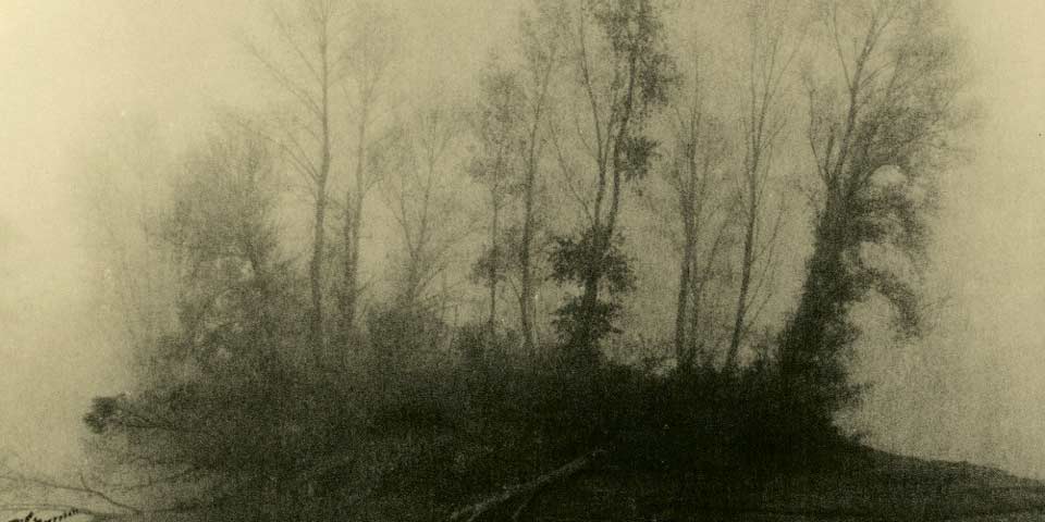
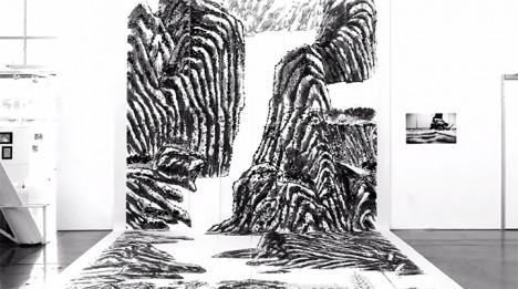
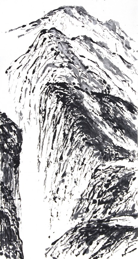
Beispielhaft wird dieser und diese am ehesten im Lithprozess. Die alten Papiere, die ich verwende, unterscheiden sich in der Reaktion allein schon durch die Oberfläche, d. h. dieselbe Emulsion, nur eine andere Oberflächenstruktur. Mattes Agfa Portriga Rapid kann jederzeit zu einer Kornflut anschwellen, filigranes (118) ist körnig aber, beherrschbar usw. Ähnliches gilt für die Färbigkeit.

Was mir für die ästhetische Diskussion relevant erscheint, ist, dass das Korn und die Farbe immer eine Wahl beinhalten und im Allgemeinen in sich stimmig sind (etwa bei einem Farbsplit – die Erdung durch das Material), aber möglicherweise die Anwendung auf das Sujet nicht nachzuvollziehen, dann bleibt nur die Neuinterpretation.

Das Medium hat Grenzen, wie jedes, an denen man zwar zupfen, sie aber nicht zerreißen kann. Schlagwörter wie „Tonwerte“, „Schmelz“, „Fleischigkeit“ seien genannt – nicht dazu gehört die Schärfe.

Ein Dyptichon von Hügelketten

Eigentlich war die digitale Revolution das Beste, was der Analogfotografie passieren konnte. Kein Kampf, eher eine fruchtbare Rollenaufteilung, die digitale hält der anlogen den Rücken frei, also quasi der Khedira Ronaldos.

Für den Workflow des Printers eröffnet sich die nützliche Hybridverarbeitung: Ein kleinerer Analogprint wird eingescannt und groß und in identischer Qualität digital ausgedruckt (tatsächliche Reproduzierbarkeit). Dieses Verfahren erspart einem einerseits natürlich die lästige Retuschierarbeit mit dem Pinsel, andererseits ist es aber etwa nicht möglich, die gerade so spannende Oberflächenstruktur der älteren Papiere zu reproduzieren.

Ein Feld mit Hochsitz

Für die meisten bedeutet der Negativscan aber der schnelle Weg in das jeweilige soziale Netzwerk. Wenn man sich dort in den analogen Kreisen ein wenig herumtreibt, was ich gern mache, stößt man teilweise auf verstörende Schlachtfelder.

Eine Landschaft mit gefällten Bäumen

Der mediale Wechsel hat den Fokus der Analogen klar auf das Material gelegt, das vorher viel unbewusster verwendet worden war. Neben den melancholischen Fetischismen (bei mir twa die sich verlierende Oberflächen- und Emulsionsvielfalt der Papiere) tritt auf einmal der Fehler, das Unerwartete hervor.

Eine Baumgruppe

Im Negativprozess gesellt sich dann zur Zenit (Holga, Isola, usw.) auch der abgelaufene Film und im Falle des ganzen Zyklus die uralten Papiere. Der Makel wird geradezu zur Signatur des Analogen, die Ästhetik zu einer des Handicaps.

Ob und wie weit man dem folgen will, hängt von den persönlichen Vorlieben, aber eben auch vom Workflow ab. Ich brauche Emulsionsfehler weder auf Film noch auf Papier, schätze Plastiklinsen und viele alte Objektive ob ihrer sanften Tonabstufung, kann durchaus mit den Fehlern der einen oder anderen Vignettierung leben und arbeite immer wieder bewusst mit Pfefferkorn.
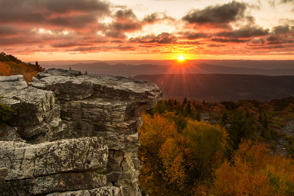
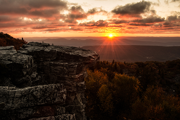
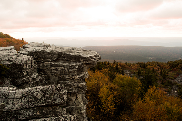
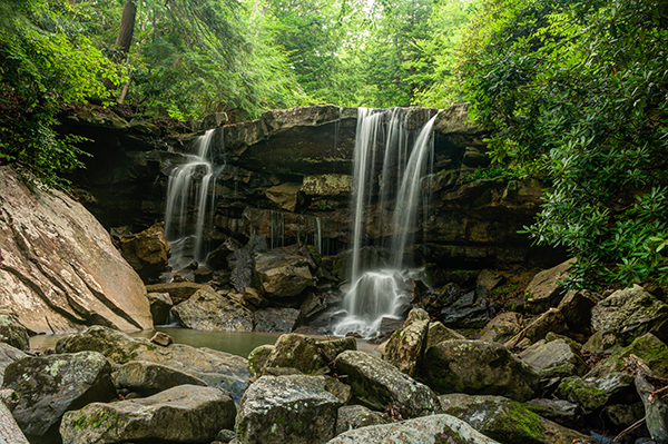
Ein Birkenast

Landschaft

Warum Landschaft? Viele Antworten. Landschaft schließt fotografisch bei mir beide Randgebiete ein: Die Wildnis mit ihrer Bedeutungsherausforderung und die überstrukturierte ausgebeutete Natur mit eventuellem Schönheitsdefizit.

Tatsächlich ist „Landschaft“ ein sehr später Fokus bei mir, man könnte sagen, ich musste das als Stadtkind erst noch lernen und viel dazu beigetragen haben meine Fernreisen per Rad.

Ein Dyptichon von Hügelketten

Außerdem ist die Landschaft ein beliebter Reibebaum der Fotografie, wie man auch den Reaktionen auf einen Artikel von Martin Gommel hier entnehmen kann.

Da bleibt mir die dankbare Aufgabe, das Ganze (der Status Quo der Landschaftsfotografie, wenn man Explore und Konsorten als repräsentativ ansieht, ist fantasielos, erbärmlich und vor allem ohne Liebe gekocht) von der positiven Seite her aufzuziehen.

Baumstämme

Viele Wege führen zur De- und Rekonstruktion von Wahrnehmung; da wäre die Entdramatisierung (keine Lichtspiele) und das Ins-Zentrum-Rücken von anderwärtig als banal abgekanzelten Motiven; das Hyperreale und die Kamerabewegung und natürlich die Ästhetik des Handicaps.

Tja und da muss ich sagen, es gibt etwa auf Flickr eindeutig mehr als zwei Fotografen, die es schaffen, meine Landschaftwahrnehmung immer wieder neu anzustoßen.

Das Ziel des Anstoßens ist sicher zuerst einmal die Verfremdung (Schklowskis ?????????e) durch die wenig getreue Abbildung. Verfremdung ermöglicht Befreiung aus Sehgewohnheiten und setzt die für die Betrachtung nötige Distanz. Außerdem testet sie das Motiv auf seine Beständigkeit, sie schneidet den leichten Rezeptionsweg über das Spiel der Signifikanten („lovely detail“, „Wie schön die Rinde rauskommt“) ab.

Drei Birken

Ein nicht ganz modernes Zitat, das uns aber gelegen kommen könnte:

We shall now discuss the relation of pictorial art to nature, and shall show the fallacy of calling the most scientifically perfect images obtained with photographic lenses artistically true.

They are not correct, as we have shown, and shall again show, but what is artistically true is really what we have all along advocated; that is that the photographer must so use his technique as to render a true impression of the scene.

The great heresy of sharpness has lived so long in photographic circles because firstly the art has been practised by scientists, and secondly by unphilosophical scientists […]

(P.H. Emerson, Naturalistic photography for students of the art. London 1889. p. 114)

(Sinngemäß: „Wir sollten nun das Verhältnis von Bildkunst zur Natur erörtern und den Trugschluss hinterfragen, dass das wissenschaftliche perfekte Bild, das mittels fotografischer Linsen hergestellt wurde, künstlerisch ‚wahr‘ ist.

Dieses Bild ist, wie wir gezeigt haben und zeigen werden, nicht künstlerisch ‚wahr‘. Künstlerische Wahrheit ist hingegen: Dass der Fotograf seine fotografischen Fähigkeiten dafür nutzen muss, einen Eindruck der Szene wiederzugeben.

Die große Häresie der Schärfe gibt es in Fotografenkreisen schon so lange, weil diese Ausdrucksform erstens von der Wissenschaft benutzt wurde und zweitens von unphilosophischen Wissenschaftlern.“)

Zu den „most scientifically perfect images“ braucht man in unserem Kontext nicht viel zu ergänzen, mein Lieblingsteil ist aber eindeutig die „große Häresie der Schärfe“. Die Schärfe als mediale Begründung der Fotografie hat eigentlich ausgedient, sie verkauft sich allerdings nicht nur gut, sondern sie ist quasi ein Sparbuch: Wenn nix anderes geht, kann man auf sie zurückgreifen.

Die Unschärfe ist nicht das einzige Tabu der Landschaftsfotografie (ich denke da etwa an „f/64“), andere wären Emotionalisierung und Subjektivität.

Eine Landschaft

Der Baum vor dem Kopf, die Gnomperspektive, das Einbeziehen des eigenen Schattens, alles kleine Brüche, die im Allgemeinen wenig Variationsspiel lassen und damit den Manierismus im Rucksack führen, allerdings zum richtigen Zeitpunkt auch die richtige Medizin sein können.

Doch die vielen subjektiven Wege können auch den intersubjektiv akzeptierten Weg der Wahrnehmung deformieren, verschieben. Es wird ganz allgemein immer eine Herausforderung bleiben, die sozialen und medialen Nebengötzenopfer stets beiseite lassend (ich mag auch knackige Schärfe, vor allem relative Schärfe und auch die Rindenstruktur von Bäumen) das geltende soziale Konstrukt der Wahrnehmung anzugreifen und als Ziel bietet sich vor allem die „objektiv“ gehegte Landschaftsfotografie an.

Noch viel mehr von meinen Prints gibt es auf meiner Webseite. Ab dem 10.02. sind meine Arbeiten außerdem bei der Ausstellung „Innere Panoramen“ im Rahmen der Industrial Motion Art in Wien zu sehen.


kwerfeldein – Fotografie Magazin | Fotocommunity

 
Comments Off on Printing Landscapes

Posted in Equipment


The Wild Southwest: Jory Vander Galien’s landscapes

17 Jan

Like many fine-art-nature photographers, Jory Vander Galien says that his passion for landscapes was ignited at a young age through National Geographic and Ansel Adams. How, he often finds himself at a location before dawn, ready to fight lightning and dust storms in order to capture the vast and volatile Southwest landscape. See his work and find out more in our Q&A. See gallery

Articles: Digital Photography Review (dpreview.com)

 
Comments Off on The Wild Southwest: Jory Vander Galien’s landscapes

Posted in Uncategorized


Beautiful Dreamer: Garret Suhrie’s moonlit landscapes

04 Jan

Concentrating on landscapes, waterways and exotic locations, Garret Suhrie’s fascination with nighttime photography was sparked as a creative outlet for a demanding day job. Now as a full-time photographer, Suhrie has been traveling the world to capture nature-by-night for more than ten years now. Take a look at his work and find out more about his process. See gallery

Articles: Digital Photography Review (dpreview.com)

 
Comments Off on Beautiful Dreamer: Garret Suhrie’s moonlit landscapes

Posted in Uncategorized


Galactic Booze: Interstellar Landscapes Drawn in Scotch

02 Dec

[ By Steph in Art & Drawing & Digital. ]

booze galaxies 1

Whisky enthusiast and hobbyist photographer Ernie Button was about to wash a glass when he noticed that the scotch residue at the bottom had dried into a series of chalky, delicate lines. This chance discovery eight years ago led to a series of experiments that have used booze as an art medium, with different brands and varieties of scotch producing different effects calling to mind imagery of outer space.

booze galaxies 2

booze galaxies 3

booze galaxies 4

“It’s a little like snowflakes in that every time the Scotch dries, the glass yields different patterns and results,” says Button. “I have used different color lights to add ‘life’ to the bottom of the glass, creating the illusion of landscape, terrestrial or extraterrestrial.”

booze galaxies 5

booze galaxies 6

booze galaxies 7

“Some of the images reference the celestial, as if the image was taken of space; something that the Hubble tellscope may have taken or an image taken from space looking down on Earth.”

booze galaxies 8

booze galaxies 9

booze galaxies 10

Any aged scotch will make the rings, Button reports, but what seems to effect the patterns most is where the spirits are produced. Scotches with smoky flavors made on the islands of Islay and Skye in western Scotland were inconsistent, while those from the valley around the River Sprey in northeastern Scotland produced more predictable results.

booze galaxies 11

booze galaxies 12

The series, entitled ‘Vanishing Spirits: The Dried Remains of Single Malt Scotch’ includes dozens of images combining science with art. If you’re interested in learning more about the physics behind this unusual art form, check out this feature at The New York Times.

Share on Facebook


[ By Steph in Art & Drawing & Digital. ]

[ WebUrbanist | Archives | Galleries | Privacy | TOS ]


WebUrbanist

 
Comments Off on Galactic Booze: Interstellar Landscapes Drawn in Scotch

Posted in Creativity


Scalpel Cities: Urban Landscapes Made of Surgical Tools

13 Nov

[ By Steph in Art & Drawing & Digital. ]

scalpel landscapes 1

Bird’s-eye views of cities around the world, from Paris to Hong Kong, are visualized in the form of surgical tools like scalpels and skin graft blades against glossy black surfaces by famed British artist Damien Hirst. The ‘Black Scalpel Cityscapes’ series continues the artist’s method of using sharp metal objects to create complex compositions in stark monochrome.

scalpel landscapes 3 scalpel landscapes 4

The depiction of these cities (many of which are sites of recent conflict) from an aerial viewpoint references the ‘all-seeing eye’ of constant surveillance in the modern era. Look closely and among the blades and surgical tools you’ll also see small items that relate to each individual city, like cheap silver keychains of the Eiffel Tower in Paris, and even silvery condom wrappers.

scalpel cityscapes 8 scalpel cityscapes 9

In a video interview with White Cube, Hirst explains that he began working with scalpel blades “because they’ve got kind of a nice and nasty feel to them.” Flying over Milton Keynes, a town in England, he noted how modern and unnatural the landscape looked, sparking the idea for the series. In addition to cities like Baghdad, which have a symbolic connection to the medium used, Hirst depicted cities that are personally meaningful to him.

scalpel cityscapes 10 scalpel landscapes 6 scalpel landscapes 7

“I’ve done one of the Vatican where I’ve used lots of religious symbols. So I think you try to make them into a portrait, but always from a distance they’re going to look totally like a photograph.”

Share on Facebook


[ By Steph in Art & Drawing & Digital. ]

[ WebUrbanist | Archives | Galleries | Privacy | TOS ]


WebUrbanist

 
Comments Off on Scalpel Cities: Urban Landscapes Made of Surgical Tools

Posted in Creativity


5 Easy Steps to Exposure Blending for High Contrast Landscapes

27 Oct
Final Image  Bear Rock, Dolly Sod Wilderness Area, West Virginia

Final Image: Bear Rock, Dolly Sod Wilderness Area, West Virginia. Sunrise and Sunsets can be extremely contrasting and very challenging to capture the wide exposure range.

Here’s a problem I am sure you have encountered, instances where you try to photograph an image that has a greater range of light and dark than your camera can accurately capture. In the example above, when we set our exposure to expose the sky correctly, the foreground objects are severely under-exposed. Likewise, if we set our exposure to correctly expose the foreground, the sky is blown out and loses almost all detail. One solution to this dilemma might be to use HDR software to combine several bracketed exposures into one image. However, this method can be overwhelming and time-consuming to do correctly for a pleasing result. Another solution to this problem could be to use graduated neutral density filters. Unfortunately, a good set of filters can be quite expensive and a cheap set can harm the quality of your image.

A simple solution to this problem scenario may be as easy as taking two exposures, one correctly exposed for the dark areas (in this case the foreground) and the other correctly exposed for the lighter area (in this case the sky). Place your camera on a tripod so that both images will be composed exactly the same.

image correctly exposed for the sky 1/10 of a second @ f/10. ISO 100

Image exposed for the sky: 1/10th of a second @ f/10, ISO 100

Image exposed for the foreground: 1 second @ f/10, ISO 100

Image exposed for the foreground: 1 second @ f/10, ISO 100

Now, let’s look at a simple five step exposure blending process, performed in Photoshop, to resolve this contrast issue.

Step 1: Open your images

Open the two exposures in Photoshop as layers. This can be simply done with the following script. In Photoshop, select: File/Scripts/Load files into stacks (if you use Lightroom just select both thumbnails, right click and choose “Edit in>Open as Layers in PS). Then select your two exposure files. Label the layers for identification. (In this case we label one layer “Sky” and the other “Foreground”). Drag the Sky to the top layer if not already in that position.

Step 2: Add a layer mask

Add layer mask filled with black to top layer.

Add layer mask filled with black to the top layer.

Add a layer mask, as shown below, to the highlighted Sky layer. While holding down the ALT (opt) key, select the Add layer mask button located at the bottom of the layer palette. This will add a layer mask to the Sky layer and automatically fill it with black. The black-filled layer will mask out all of the Sky layer and reveal all of the Foreground layer.

Step 3: Paint over sky

Click on the black layer mask and select the paintbrush tool. Set your paintbrush to paint with white, and set the size of your brush as needed. Set the hardness of your brush to a low number to give it a soft edge while you paint. Paint over the sky area of the image, which will reveal the Sky layer. By adjusting the opacity, size and hardness of the brush as you paint, blend the two exposures together.

Paint with white on your layer mask to reveal the sky in the top image. use different opacities and hardness to make the blending look natural.

Paint with white on your layer mask to reveal the sky in the top image. Use different opacities and brush hardness to make the blending look natural. This is what the mask might look like.

Step 4: Add finishing touches

Add adjustment layers (see below) as needed to adjust colors and contrast of the layers to make the image look natural.

Final layer palette

Final layer palette

Step 5: Save your file

Save your file as a Photoshop document (.PSD). This will preserve your image with layers which you can return to if you need to make further adjustments to improve the image.  You can now can flatten the layers (Layer/ Flatten Image) and Save As a single layer file such as a JPG.

This image was created from three files using Exposure blending. Exposure #1 was exposed for the light green area above the falls and exposure #2 was exposed for the shadow area below the falls. The light was hitting the rock on the left  very hard so a third exposure was need just for that rock.

This image was created from three files using exposure blending. Exposure #1 was exposed for the light green area above the falls and exposure #2 was for the shadow area below the falls. The light was hitting the rock on the left very hard so exposure #3 was needed just for just that rock.

So next time you are faced with an extremely contrasting scene, try this easy exposure blending process to extend the exposure range of your image. Do you have any exposure blending tricks that you use? Post samples of your images.

The post 5 Easy Steps to Exposure Blending for High Contrast Landscapes by Bruce Wunderlich appeared first on Digital Photography School.


Digital Photography School

 
Comments Off on 5 Easy Steps to Exposure Blending for High Contrast Landscapes

Posted in Photography


The Winner of Our Loving Landscapes Prize Draw Is….

16 May

NewImageOver the last month we’ve been launching our brand new Landscape Photography Post Production eBook – Loving Landscapes. As part of that launch we offered Early Bird buyers the chance to go in the draw to win $ 1500 towards new gear.

Today we drew that winner and let her know of her win.

The winner is – Sue Hunt!

Congratulations Sue – we’ve emailed you with details!

Thanks to everyone for your feedback on our eBook – we’ve never had so much positive feedback on an eBook.

Here are just some of the reviews!

  • Loving Landscapes: A Review
  • Is Loving Landscapes the eBook For You?
  • How To Process Your Landscape Photographs With Love
  • Loving Landscapes: A Guide To Landscape Post-Processing eBook Review

While our competition is now over the great news is our eBook is still available for purchase. Grab yours here today.

The post The Winner of Our Loving Landscapes Prize Draw Is…. by Darren Rowse appeared first on Digital Photography School.


Digital Photography School

 
Comments Off on The Winner of Our Loving Landscapes Prize Draw Is….

Posted in Photography