Got a few minutes to spare? You’ve got enough time on your hands to help a group of researchers tackle a massive problem. Cities at Night is a project aiming to recruit help from ordinary citizens in classifying images of Earth at night taken by astronauts aboard the International Space Station. An effort of Universidad Complutense de Madrid staff and students, their main goal is to better understand and reduce light pollution. See how you can help
Tag: Images
-
A Quick Video with 7 Tips to Create More Powerful Images
In this short tutorial photographer Josh Cripps shares with you 7 tips to help you create more powerful images right now. You don’t have to buy any more gear, or take any classes. Put these tips into practice and get out there shooting.
So are you getting close enough to your subjects? How about composition? Do you create depth in your images? Are you practiced in the art of using leading lines? All your shots from eye level – why not change up the perspective a bit? How about using the light to your advantage?
That’s a quick summary of the tips in this video. Watch the whole thing to see some great image examples for each one. If you need ideas of what to shoot you can always check out the weekly photography challenge, this week it’s Blue. To see the current challenge you can always fine it in the right hand sidebar next to this article.
The post A Quick Video with 7 Tips to Create More Powerful Images by Darlene Hildebrandt appeared first on Digital Photography School.
-
A Set of Cool Blue Images to Enjoy
This week it’s been hot where I live, almost unbearable so. Therefore I thought some blue images in nice cool tones would help chill things off a bit.
So continuing on my series of colors we’ve already done Golden and Green . . .
A set of cool blue images for you to enjoy!

Bokeh by Joel Ericsson on 500px

Blue by Boris van Berkel on 500px

Blue by Suehana Suzie on 500px

blue by olaus magnus on 500px

The Squareness by Joe@Plasmatico on 500px

Blue Quasar ? 5D/M51 by Josep Sumalla on 500px

Forest in blue by Valerie Anne Kelly on 500px

Flurry. by Chung on 500px

Midnight Blue by Margaret Morgan on 500px

Flower of deep sea by Shihya Kowatari on 500px

The night is coming by Cenzo Photography on 500px

Flight.. by Atif Saeed on 500px

Rajan by Jody MacDonald on 500px

And I Am Off !!!! by Judylynn Malloch on 500px
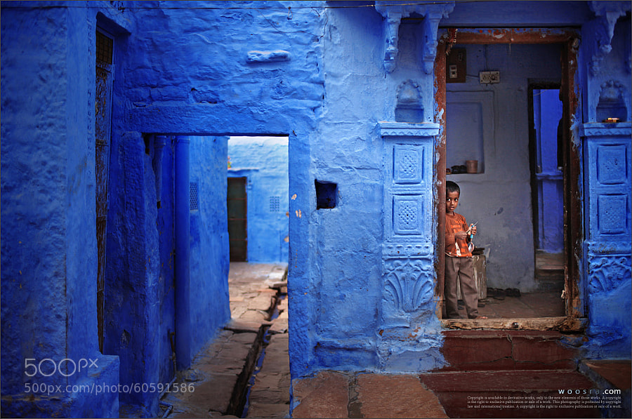
Blue City by Woosra Kim on 500px

NEO OSAKA by Yoshihiko Wada on 500px

IronMan MK II by Suradej Chuephanich on 500px

Blue by Mike Busby on 500px

Hpnotiq by James Brown on 500px

To Each His Own by Juan Osorio on 500px

Story Time by Adrian Murray on 500px

smile by Eszter Virt on 500px

Blue Eyes by Rasif Babayev on 500px

Alone in the dark by AtomicZen : ) on 500px

Blue Syndrome by Lafugue Logos on 500px

Hold hands by YUYU Photography on 500px

?????????? ? ????????? by Natalia Lisovskaya on 500px

Summer Berry Waffles by MARJA SCHWARTZ on 500px

Peacock by strassguetlralf on 500px

Follow the jellyfish… by Ilias Varelas on 500px

Blue by Andres Restrepo on 500px

A Friendly Berber Man by Brad Hammonds on 500px

Jodhpur by Mahesh Balasubramanian on 500px

JODHPUR-BLUE CITY by Harsh Chaudhary on 500px

Blue Cave by Roger Sharp on 500px

Blue Impulse by K Yonekura on 500px

Swimmer by Daniel Stefan on 500px
The post A Set of Cool Blue Images to Enjoy by Darlene Hildebrandt appeared first on Digital Photography School.
-
How to Create Amazing Urban Landscape and Street Photography Images

A stitched panorama in a city can make a great scene!
Many of us live in cities nowadays, in fact almost 80% of the world’s population lives in, or near, a large city. While it is fantastic to be out in nature, photographing the remote seascape scenes or the snow capped mountains, that is not possible for most photographers, everyday. That might mean that you don’t photograph for weeks at a time. As you probably know by now, to make big improvements in your photography you need to practice, practice, and practice some more.
Living in a city has its own scenes that are great to photograph, this is why street photography is such a popular genre of photography. These urban landscapes can not only be interesting, but you can make some very powerful images in an urban or city setting. Here are some pointers on how to create amazing urban landscape and street photography images.
1. Urban landscapes are the same as rural landscapes
Ok, not visually maybe, but in the way you approach them. In traditional landscape photography you will use a leading line to draw the eye into the scene. You will make sure that there is foreground interest that holds the viewers eye. You will use composition guidelines to set up your shot. This is all true for urban landscapes too. Visually design your scene as you would when you photograph a landscape scene. Be sure that the scene has a good background, a strong mid ground and a compelling foreground. This is not a rule, but it will help when you set up your shot.
2. The mundane becomes unusual
We have all seen pretty much all the objects in a city. The fire hydrants, the mailboxes and the scenes all look familiar to us city dwellers. In urban landscapes it’s not only about the architecture or the street scenes, it is about making those well know objects look different or interesting. Think of the time of day that you photograph. Late afternoon sunlight, warm light can make a fire hydrant or mailbox look somehow magical. Graffiti can look gritty, textured, and interesting in the soft light. Look at how you can change the angle or lines in a normal scene. Come from a different angle and see how that change makes all the difference to making mundane objects seem different.

Look for a way to make mundane scenes look different
3. Textures and close up
Every city has literally thousands of different textures, including: walls of buildings, cobbled streets, paved walkways, wooden walkways, benches, grass, the list goes on. Each of these surfaces has texture which are great for urban landscape photography. To emphasize texture, you will want to be shooting in side light conditions. The side light will emphasize the granularity of the surface of the street, or the grain in the wooden bench. Textures can be a whole theme on their own. Think of the textures on the sidewalks, the brick walls, the concrete buildings, the glass surfaces (reflections are amazing too).
Try this, go out into your city and try and shoot 24 photographs of different textures, at different times of the day. The range of different images will amaze you, and it will open up your eyes to what is possible when you focus on just one theme. Secondly, try and isolate some subjects in the scene. Get in closer to what you are shooting. By doing this, you will isolate part of the scene and make it look more intriguing.
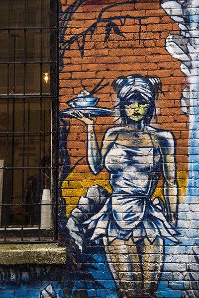
This graffiti art looks amazing, but the textures and grittiness make the image more impactful
4. Use colour
We all photograph in colour nowadays, and then convert that image to black and white (if you don’t, you should!) but shooting for colour in your city can be a lot of fun. Decide on a colour you want to photograph and go out and look for all the different scenes you can find that contain your colour. To make it more challenging, try and isolate that colour to make 80% of your image the chosen colour. This will help you see beyond subjects and look at colour in a whole new way. You can also try and get the different colours in a scene into a cohesive arrangement, your primary colours (reds, yellows and blues) will be immediately powerful in a shot. A fire hydrant can become more interesting because of the redness of it. A blue wall becomes an abstract image, colour is a good theme to use in your urban images.
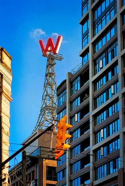
Vibrant colours can make your image pop!
5. Photographing people
Cities are built for people, there are lots of them in any city. It is always fun to see how people interact with the city. Do they use the park benches, do they take time to look around them in the city or do they simply march on to work. Look for opportunities to capture photos of people doing everyday stuff, but try and find a great backdrop to shoot against. A graffiti wall or a moving bus can make the perfect setting, good architecture too! Always be aware of people’s reaction to being photographed. I generally try and photograph people when they are not camera aware. If they spot me taking the shot, I will walk over to them, show them the image and explain why I shot it. Sometimes, people are not happy to be photographed, be respectful of this and be friendly. It’s amazing what a smile and a relaxed attitude can do.
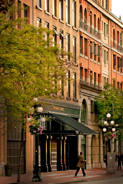
Use the city buildings as a backdrop to the people in the image
Your turn
Photographing in your city can be fun. Of course, always be aware of your surroundings. Be careful not to step off the sidewalk into the street without looking at the traffic (trust me, this happens). Also, be aware of where you are wandering. You may have innocently wandered into the “rough” neighbourhood which might be a bad idea with a large SLR around your neck.
Apart from being aware of your safety, photograph with abandon. Try and capture the essence of the city. Try and photograph the well known places in a new and fresh way. Above all, get out and photograph. As I said earlier, it may not always be possible to go out and shoot in some amazing natural setting, but you can get some really great images just outside your front door, in your home city.
Here is a fun exercise, choose a time to go out and get some urban shots. Select a theme and shoot five images, choose another theme and shoot another five, and so on. Once you have done this a few times, upload your favourite image to the comments below and let’s see how creative the shots are. I look forward to seeing your city through your eyes!
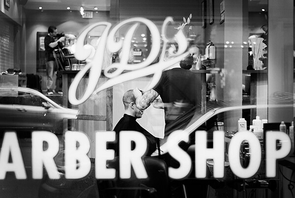
Look for refections, shapes and everyday life!
The post How to Create Amazing Urban Landscape and Street Photography Images by Barry J Brady appeared first on Digital Photography School.
-
HTC Gallery update allows for sharing of Duo Cam images
We weren’t wowed by the HTC One M8’s Duo Cam features in our review of the device, partly because its corresponding re-focusing effects could only be used on the phone itself. HTC has changed that with a Gallery App update, allowing users to share the experience with others through a web interface. Read more
-
A Collection of Golden Images for Your Viewing Pleasure
It’s that time again for me to find some great images for you to see and get inspired by. I have to say that this is one of my favorite parts of this role as Editor as I get to troll through dozens of outstanding images to curate the best for you. Really, it’s a hard job but somebody has to do it, right?!
Without further ado, here is a set of golden images for you to enjoy. I’ll leave the “golden” part open for your interpretation.

Yellow by Milad Haghighi on 500px

Yellow by Mariia Kudriashova on 500px

Panning.. by Selycan on 500px

Canola by Yusuf YAMAN on 500px

Blue | Yellow by Syahrel Azha Hashim on 500px

Lead from the front by Maharajan Pounrajan on 500px

Follow the line by Jiwan Mir on 500px

Turban… by Savan Upadhyay on 500px

Yellow by Ian Stuart on 500px

Yellow by Marta Maseras on 500px

yellow by Andrea Schuh on 500px

yellow by Borni Merisoniom on 500px

Yellow by Jayanta Kshirsagar on 500px

Bed of Melted Gold by Maybelle Dumlao- Sevillena on 500px

golden by Silke Roberts on 500px

Golden by Annette Kelter on 500px

Midnight Rush by Michael Shainblum on 500px

Golden by Ron Lancin on 500px

hypnotic golden by Danny Block on 500px

do you believe in magic? by Jessica Trinh on 500px

Shaking Dog by Lorenzo Patoia on 500px

Monarch by Lorraine Hudgins on 500px

Baños Dorados by David Rodríguez Palomar on 500px
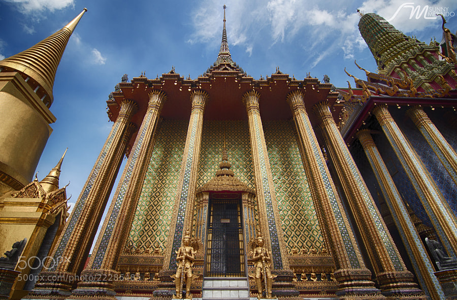
Gold exterior of Phra Mondop by Sunny Merindo on 500px

Novice Monk praying to the Buddha by Sasin Tipchai on 500px

Golden Temple by Phoomin Karagate on 500px

Sunrise : The Golden Mount in Bangkok by noomplayboy on 500px

Pattaya Big Buddha by Mishel Breen on 500px

Golden crown by Jason Meng on 500px

Flower Queen by Serg Tisso on 500px

Golden crown by Chantal Pimparé on 500px

Taj Majal courtyard view by Soma Images on 500px

golden nugget by Sandra Oberer on 500px

Golden Nugget Casino by Cameron Wendt on 500px
The post A Collection of Golden Images for Your Viewing Pleasure by Darlene Hildebrandt appeared first on Digital Photography School.
-
Creating Abstract Images in Nature
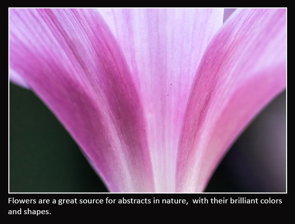
What is a working definition of “abstract” nature photography? Nature so easily lends itself to subjects realistic and dream-like, but what about abstract? You may have heard it said “If it is recognizable as an object – it is not an abstract,” but let’s challenge that notion.
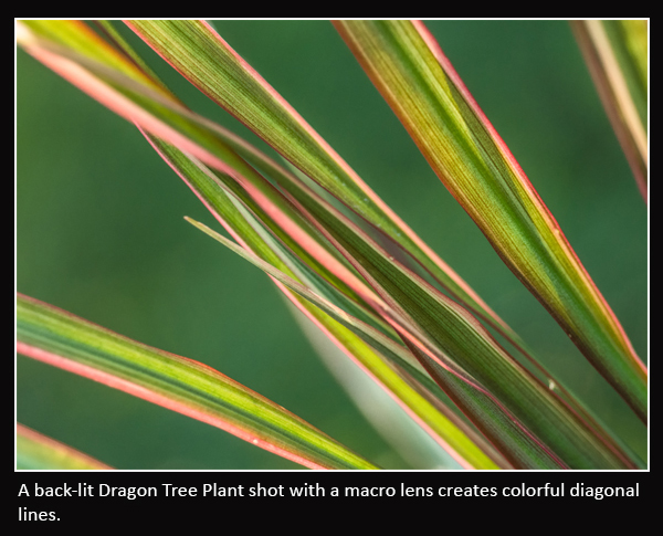
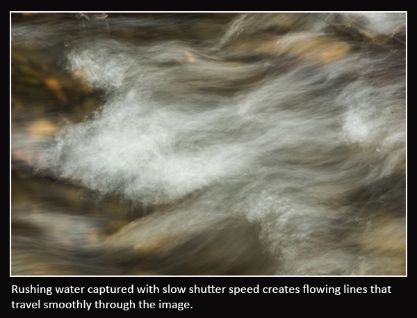
There are no clear rules to abstract photography. The object of the photo may or may not be recognizable. Abstract images may contain a small portion of an object or multiple objects. An abstract will often concentrate on a limited area of a subject that reveals a shape, pattern, form, color or texture. Movement can also create abstract images, such as rushing water or the wind blowing a flower. To capture an image in nature as an abstract, you don’t need any special equipment – just a camera, and the most importantly, your own imagination. What matters most is that your photograph reveals an eye-pleasing image, whether you can identify the actual subject or not.
In this article you are not going to find any magical camera settings to create abstracts, because you need to think “outside the box“. Discovering the right setting is often the key to a great abstract. Don’t be afraid to put your camera in manual mode, and experiment with different apertures and shutter speeds. Remember that your aperture will control your depth of field, and your shutter speed affects the sharpness or blurriness of the image. Likewise, normal rules of image composition do not always apply to abstract photography. The key is to become super-observant, looking for even the smallest of objects with which to create an abstract image.
Where we look to other forms of photography to tell a story or record an event, abstract photography is about capturing an emotion. There are five key elements you want to consider in creating abstract images: lines, shapes, textures, patterns and colors:
Lines
Lines are the base element of design, and their uses are the fundaments of any artistic image.
- Lines that intersect are lines that come from different directions into and out of an image, which can give the viewer a sense of chaos.
- Curved lines allow the viewer’s eye to explore the image in a smooth free-flowing manner, evincing a much calmer emotion than straight lines.
- Repetitive lines or lines in repeating patterns manifest a sense of power and predictability, rhythm and movement in an image.
- Diagonal lines are more visually pleasing than verticals or horizontals and will lead the viewer’s eyes at a much slower pace than a straight up-down line. (By rotating your camera you can turn your verticals and horizontals into diagonals.)
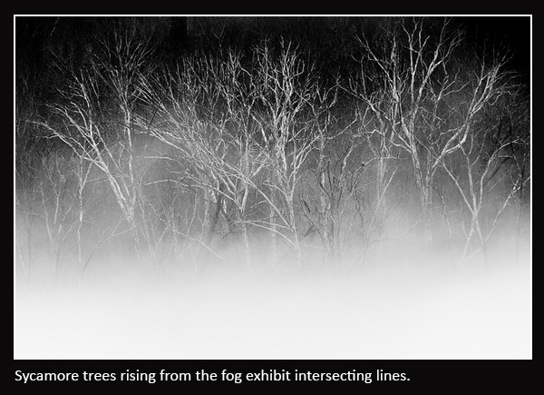
Shapes
Shapes are found everywhere in nature, and can be used to create visual meaning in a photo. To capture an abstract image, choose a shape that is interesting and pleasing to the eye. It’s very important that the shape creates an emotional response from the viewer; this is called the “wow” factor.
- Circles evoke flow, continuity and sensuality.
- Triangles create a sense of stability if set on their base, or precariousness if set on their point.
- Squares exhibit stability and order.
- Spirals create a sense of energy, flexibility and life cycles.
Textures
Texture is created by the roughness of a surface and may seem to be completely random. Textures are often a product of lines. Light and shadow create depth (a macro lens can be useful to capture textures).

Patterns
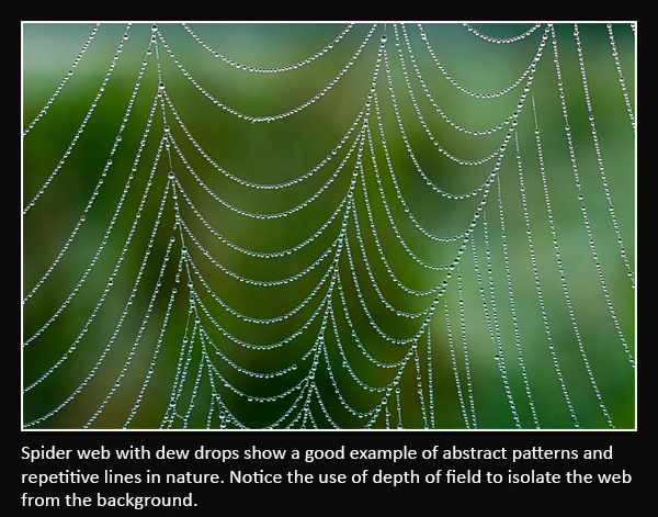
Patterns are similar to textures, but are much more structured. Patterns can sometimes be mathematically composed by Mother Nature, for example; snowflakes and spider webs.
Colors
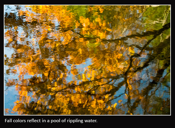
Colors in abstracts are useful in catching your viewer’s attention. Look for complementary colors as they will hold your viewer’s attention longer.
Some other tips to get started on your photographic nature abstract project:
- Photograph common objects. Trees, rocks, gravel, seashells, dew drops – even the most common of subjects can produce abstracts.
- Use depth of field to capture the image you want. Change your F-stop (aperture) to control your depth of field. This is especially useful when shooting textures, when you may need your entire subject to be tack sharp.
- Use motion. Using a slow shutter speed to capture objects in motion can create some very interesting effects.
- Experiment with your white balance. As mentioned earlier, in abstract photography you do not always need to follow the usual rules of conventional photography and you are free to tweak your white balance to create interesting colors.
- Adjust color saturation to create pleasing colors and look for complementary colors.
- Look for creative uses of light for varying effects on your abstracts.
Abstract Blurs
Another method to experiment with uses camera motion to create abstract blurs. Motion blurs are perfect for those nature settings that lack creative inspiration. This method takes a lot of experimentation and you will throw away a lot more images than you keep, but the rewards are worth it when you finally capture that great image. Look for subjects with lines, bright colors and good contrast, like trees and flowers. Warning: this method can become addicting!
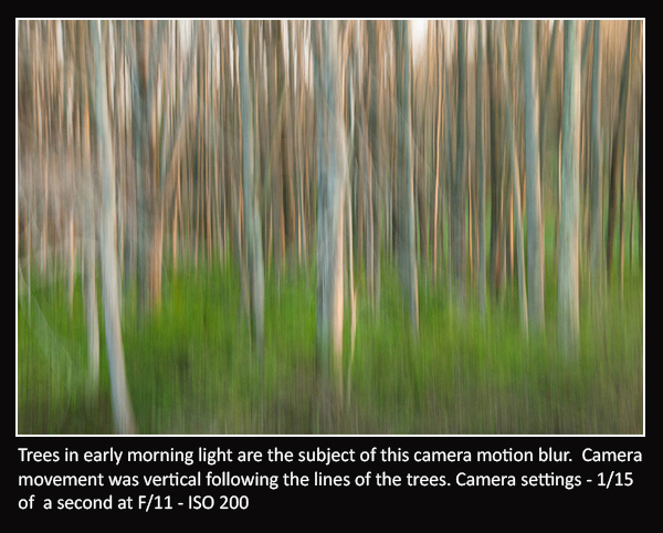
To set up your camera for abstract blurs:
- Set the camera to manual or shutter priority, which ever you are most comfortable with using.
- Set your ISO as low as possible.
- Set shutter speed between 1/4 and 1/20, depending on what your subject is and how close you are to it. Far-off objects may require a slower shutter speed than closer ones to get the blurred effect.
- Adjust your aperture to get a good exposure as you would normally do for any image.
- Look for lower light conditions such as early morning or late evening which will allow for slower shutter speeds without the need of using a very small aperture. It may become necessary to use a Neutral Density filter if your scene is too bright.
- Set your Focus. It is important to focus your camera on the subject even though your resulting image will not appear to be in focus. Press your shutter release half way down to focus on your main subject (back button focus can be a useful tool here).
- Now with your subject still in focus, move your camera to follow the lines of your subject, depressing the shutter as you pass by your main subject, it is important to follow through after the shutter is closed. This will keep all your color tones consistent all the way through your exposure. Experiment with the speed of your camera movement to find the best result.
- Repeat, until you get a result that is pleasing.
In conclusion, the next time you are out with your camera, be observant and look for visual details and interesting ways to express your emotional and artistic viewpoint with an abstract image found in nature. If you have any other ideas on how to make abstracts in nature, please share in the comments below.
The post Creating Abstract Images in Nature by Bruce Wunderlich appeared first on Digital Photography School.
-
5 Ways to Create Better Images Without Buying More Gear
You are a photographer. You love getting out there and doing your best to create great images. Photographers also love something else. Camera equipment. Sometimes you may find that you spend more time searching for a new lens, filter or accessory than actually photographing with it. When you meet other photographers you will hear them talking about the latest piece of equipment that has just launched.
Why is this? Why are some photographers obsessed with equipment. My personal opinion is that we fall into the marketing trap. Sometimes we really do think that a new lens, or new camera body, will improve our images simply because it is a better piece of equipment. That might be true, but it’s only half true. A new lens might make your images a little sharper or have better bokeh, but the best way to get better images is to improve your ability as a photographer. Here are some thoughts that may help you create better images.

The key ingredient in any image is light
1. Become a light snob
Light is the key to every image you make. If you want a good image, shoot in good light, if you want a dramatic image, shoot in dramatic light. There really is no such thing as bad light, there is simply better light for creating images.
Light is the all important component of great photography. You may feel that shooting in the middle of the day is best because it is bright, and all the light you need is in that shot. Yes, there may be lots of light, but there is also a lot of contrast (bright highlights and dark shadows). The resulting shot may be unappealing because the light is flat or uninteresting.
How do you overcome this tendency to photograph at any time? Become a light snob. What does that mean? I mean in a good way, try this next time you go out with your camera. Make a point of shooting in the golden hours. Think about the light you are shooting in, go out in the early morning or early evening. Choose your subject carefully, compose your scene purposefully and shoot it with intention. Don’t shoot the same scene twice, work with the light, make sure you think about the exposure, try your best to get the shot and walk away from the scene. Make sure you expose for the light the results will speak for themselves.
2. Become more flexible – in more ways than one

How often do you photograph from your standing height and mostly in landscape orientation? I know I do, it is natural to do that, we shoot they way we feel comfortable. Change this up a little. Look for unusual angles and vantage points. We have all seen the photographs of children looking up at the camera. Change that, kneel down or even lie down in front of a child you are photographing. Turn your camera to portrait orientation, that changes the scene immediately. If you are photographing a street scene, maybe get to a higher vantage point on a balcony. If you are in a city, shoot straight up! The key thing here is, change your viewing angle and you will change the view of your image. You will give your viewers a unique perspective on a familiar topic and that can make for some very dramatic images.
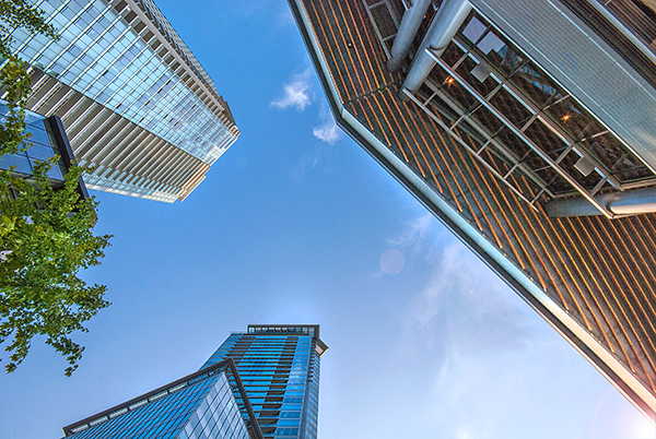
A unique point of view can make for dramatic images
3. Time it right
You have probably heard this about many things, particularly sports: “its all about the timing”. This is true in certain genres of photography too. In street photography, timing can be crucial to making or breaking the image. The famed street photographer Henri Cartier-Bresson spoke about “The Decisive Moment”. What he was saying was this, if you take the shot a moment too soon, the scene has not yet unfolded, if you are a moment too late, the scene has passed, you have to release the shutter at the precise moment.
This is not easy to get right. It requires lots of practice and the ability to sense or anticipate what will happen next. With practice you will get better and better, and in time, you will find that you will “time” the shot better. When is the right moment? It is different for every photographer and every photograph. It might be the moment before a smile, or the moment the first tear appears, the moment of surprise or elation. Each moment is different and each photographer will shoot it differently. You will know when you get that moment captured because the image will be memorable. The moment will come, but you have to be ready and you may have to be patient.

Photographing fireworks is often about timing.
4. Get your exposure right
We all know this one, it’s an old one, but exposure is all important. How do you affect exposure? You take control of your aperture and your shutter speed. This alone is a topic for another article, but what is important is that you, as the photographer, need to take control of your image exposure and not let the camera do that. If you still shoot on Auto and hope for the best, now might be a good time to start venturing into the world of shooting on manual or even aperture priority. Learning how the aperture and shutter speed affect your images will help you make stronger images in just about any light. This is what makes the difference between a good image and a spectacular image, the exposure.

Mastering exposure will make a big difference in your images
5. Use what you have
You have a great camera, seriously, you do! If your camera is less than five years old, it is perfect for taking astounding images. A new camera body will take pictures with more megapixels or better noise reduction, but I am pretty sure, in fact I am CERTAIN, that you can get some amazing images on your current camera. One key element in getting great images is choosing the right lens for the scene. The lens is the eye to the camera. If you are going to invest in any equipment, save up and buy good lenses. Buy some prime lenses and see the results.
First though, use the current lenses you have, make sure you know how each lens affects a scene. A wide angle lens has the effect of making everything in the scene seem far away and spread out, a telephoto lens (say a 200mm) has the effect of compressing everything in the scene (bringing the elements closer together). If you were to photograph a mountain scene with a wide angle lens and switch to a long (or telephoto) lens and shoot the same scene, the elements in that scene would look really different. The perspective and viewing angle changes on each lens, so make sure that you use your lenses and understand the effect that they have on your scene.

Putting it all together
By using these techniques with light, composition, timing, exposure and current equipment, your images will improve. You need to practice, constantly. Keep pushing the boundaries, do the weekly challenges that dPS puts out, try different techniques. Only buy new equipment if your current setup is limiting your photography. The best way to create better images is by practicing and spending hours and hours behind the camera.
I heard a story that a professional golfer who was one of the top three golfers in the world used a very unique way of practicing. Before playing a golf course in an upcoming tournament, he would book the whole course for a week. He would then take 300 golf balls and set up on the first tee. He would tee off from there, hitting each ball from that tee. He would then play each ball from where it landed. He did this on every hole of the golf course. By the end of the week he knew every inch of that course and he knew exactly which clubs he could use from where on the course. Try this in photography. Shoot 100 shots on aperture priority or shoot 100 shots with your 50mm only. Don’t change lenses until you have 100 shots with that lens. Then move to your next lens and do the same. Try each lens with different subject, use a 500mm and shoot some sports, landscapes and macro photos. Mix it up, but learn how that lens works and learn how your camera works and pretty soon, you will be making great images with all your equipment and that shiny new camera will not seem so tempting!

Look for the light, work with the scene and practice, practice, practice.
I will end off with a quote from the actor Will Smith, which sums it up in a good way: “The separation of talent and skill is one of the greatest misunderstood concepts for people who are trying to excel, who have dreams, who want to do things. Talent you have naturally. Skill is only developed by hours and hours and hours of beating on your craft.” – True enough!
Have you put in the hours? Do you have any other additional tips? Please share in the comments section below.
The post 5 Ways to Create Better Images Without Buying More Gear by Barry J Brady appeared first on Digital Photography School.
-
Using Slower Shutter Speeds to Show Motion in Your Images
Changing shutter speed not only changes the amount of light that enters the camera, it also changes the way your images look. By changing the shutter speed, you’re allowing the film or digital sensor to be exposed for a longer or shorter period of time. That affects how motion is portrayed in your image. A short (or ‘fast’) shutter speed will freeze motion, whereas a long (or ‘slow’) shutter speed will allow you to show motion.
Let’s take a look at a few examples using slower shutter speeds to show motion in your images:
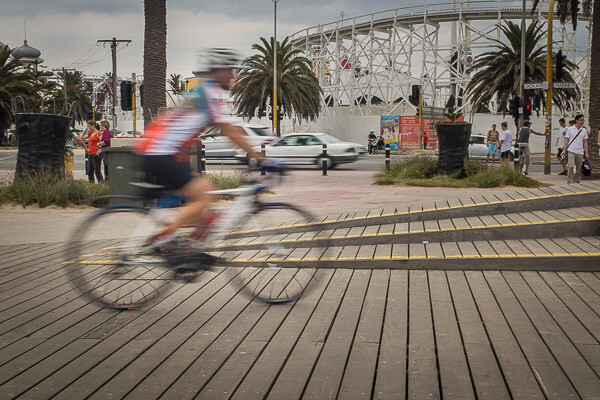
Slow speeds – camera stationary
The image above shows what happens when you use a slow shutter speed while holding the camera still. In this case the shutter speed was 1/40th of a second, which allowed me to hand-hold the camera while still showing some motion on the cyclist. The slower the shutter speed, the more movement in your subject.
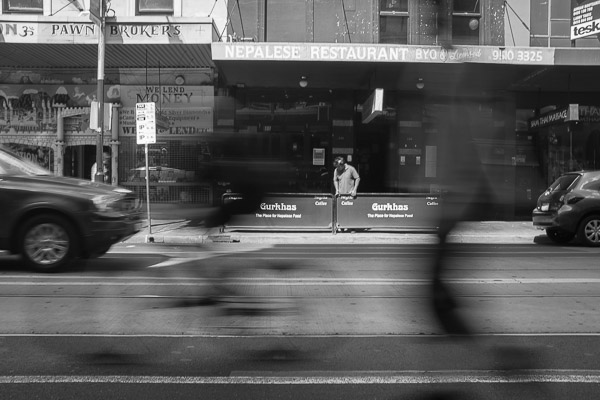
The image below was made with a shutter speed of 1/15th of a second. That’s starting to get a little slow for hand-holding so I rested the camera on the top of a fence rail on the side of the road. The image shows a cyclist riding along the road, followed closely by a skateboarder. Both the cyclist and skateboarder are blurred quite a lot, but they’re still identifiable, while the rest of the image is still in focus. It gives a feeling of movement, without moving the camera.
Panning the camera to add motion
Moving the camera while making an exposure is another way to show movement in an image. Instead of keeping the camera still and using a long shutter speed – you move, or pan, the camera with your moving subject as you expose the image. That way the subject remains sharp, while the background becomes blurred.
This image of another cyclist riding along a boardwalk was also taken at 1/40th of a second, panning with the rider and following him from right to left as he passed by. The shutter speed was slow enough that the background is blurred, while the bicycle and rider are relatively sharp.

Remember, the subject doesn’t have to be ‘tack sharp’ when you’re showing movement. Sometimes a little blur on the subject helps to enhance the feeling of movement in the image, as it does in this case. Notice the spokes of the bicycle’s wheels are blurry too, which also helps to show movement. Using a faster shutter speed while panning would have resulted in the background not being as out of focus and the wheels would have been frozen in time with the spokes clearly visible. In essence, the cyclist would have looked like he was stationary and balancing on the boardwalk, not moving as he actually was.
Moving water
Cyclists and other fast moving objects are not the only subjects for slow shutter speeds. What about shots including moving water. I think it’s fair to say we’ve all seen images of the sea or a river with water that looks buttery smooth. That smoothness is also achieved by using a slow shutter speed.
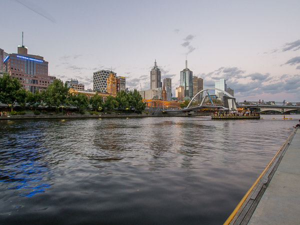
The following three images were all taken from the same location on the side of the Yarra River in Melbourne, Australia. The camera was mounted on a tripod for stability and the images were made at different exposure values. The first image was made with a shutter speed of 1/4 of a second, which is relatively fast for this type of photograph. The individual ripples in the water are clearly visible. You can see some movement, but not much.
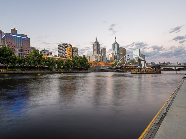
The second image was made with a shutter speed of 2 seconds. The water is starting to get smoother due to the longer shutter speed. The individual ripples are starting to disappear.
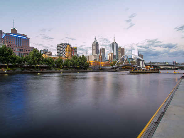
The final image in this series was exposed for five seconds. The water has now become much smoother due to the movement while the shutter was open. Photography is an art form and there is no right or wrong way to photograph any subject, but for me, the third image with the smooth water is much more appealing than the first two versions.
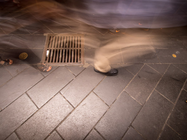
Why not experiment with different shutter speeds next time you go out to make photographs. It’s a great way to add interest to an otherwise static and maybe boring subject! All it takes is a little imagination and patience and you can come away with some really interesting and different images – like this water drain for example, which was hand-held with a shutter speed of one second. The ghostly images passing over the drain make it a little more interesting than just the drain grate itself. The most important thing is to experiment – and have fun!
The post Using Slower Shutter Speeds to Show Motion in Your Images by Ken Lyons appeared first on Digital Photography School.
-
How to use the Contrast Checker Technique to Give Your Images More Punch
I am about to reveal a technique that will have your images looking awesome in seconds every time you use it. I am even going to share the Photoshop Action with you so you can edit in lazy mode, I mean efficiency mode! Before I bare all, I need to give you some background information, and I am pretty sure you have been in the exact same position at some point in your photography hobby or career.
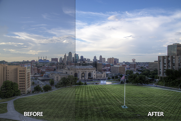
Not long ago, early 2010, I was horrible at photo editing. I was literally tossing my camera in a box and packing it away. My problem was that I was extremely frustrated with the quality of my images. Not necessarily the composition or the subject matter, but I couldn’t get my images to look “good” like all the photographers who were crushing views on Flickr. Thank goodness 500px was not around at the time, I really would have hated my photos.
Just before I sealed the tape on my box of photo gear I discovered High Dynamic Range imaging. Wait, before you judge me, I have been doing it long enough to know the process is not everyone’s cup of tea. However, the HDR process, from the brackets to the tone mapping, forced me to embrace new techniques I never would have dreamed of prior to stumbling upon it.
I started to understand my camera on a level that was foreign to me prior to that time. I also began to accept that it was not necessarily the camera making the great photos, but the person behind it and, more importantly, their post-processing techniques. Nonetheless, I became a tone mapping fool. I tone mapped everything, my car (for the record a Scion xD does not necessarily need to be HDR’ed), candid pictures of my wife, food, candid pictures of my wife eating food, I really tone mapped everything.
You have probably been there before as well, anyone new to HDR thinks it is the greatest thing on everything from the urban landscape to the selfie in the mirror. I would really shy away from the latter of the two! Through all of this understanding and acceptance came another realization, the HDR process can wreak havoc on the contrast in a good photo.
Through the HDR process you are mapping tones from multiple images to obtain one photograph that gets the best of both worlds with a vast amount of detail. The problem with this is that shadow areas lose their depth when too much detail is revealed, and areas that were specular highlights, or inviting highlight blowouts, tend to compress in ways that make them look dark, dingy and stale. Let’s not forget about the hideous over-saturation that can occur if you take the sliders too far.
So how do you combat this? How do you analyze a photograph, HDR or not, and tell what it needs to make it better?
It’s all about contrast
The answer, while simple, holds complexities that can take years to train your eye through trial and error. We are not about to let it take you years to understand. The secret is contrast which is the key to making better photographs right now.
You may know that the Contrast slider exists in nearly every post-processing program, but what is contrast? Simply stated, contrast is the ratio between light and dark in a photograph. If there is no contrast the image appears to look predominantly gray and dismal. On the flip side, an image can be too “contrasty” or devoid of gray (mid tones), a battle between white and black. It is difficult to see this on a color photograph since contrast typically deals with tone.
I studied Fine Art in college, I was a Printmaker (Woodcut, Etching, Screen Printing, and Lithography). I had a fabulous professor. She told me a piece of information once that changed my art forever during a one-on-one critique.
She said if I ever had a question about how harmonious my color print was that I should take a picture of it and convert it to gray scale. If it did not have strong black and white points with a smooth grayscale gradation somewhere in between, then it needed work.
Like any normal college kid, I did not understand her methodology at the time and I rarely took her advice. It was not until nearly ten years later that her advice finally clicked.
The Contrast Checker Technique
You can use this technique in every aspect of your workflow: beginning, middle, and end. It keeps your contrast in check throughout the process. Rightfully so, it is named “Contrast Checker”.
The photograph below is a tone mapped photo of Kansas City, straight from Photomatix Pro. You should always try to tone map your images so that they are not too dark, too light, too saturated, or too stylized.
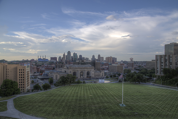
Let’s Check the Contrast you can download the image and follow along if you would like (there is also an Action and a video at the end if you learn better from video)
Step one
Create a new Gradient Map Adjustment Layer to create a Black and White photo.
Step two
Ensure that the Gradient Map is set to Black and White. By default the Gradient Map Adjustment Layer will pull from the colors that you have set as your foreground and background in the tool bar. To ensure they are set to Black and White press the “d” key to reset them to the defaults.
Step three
Make a new Curves Adjustment Layer above the Gradient Map. Your Layers Palette should look like this and your photo should be Black and White.
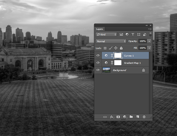
Step four
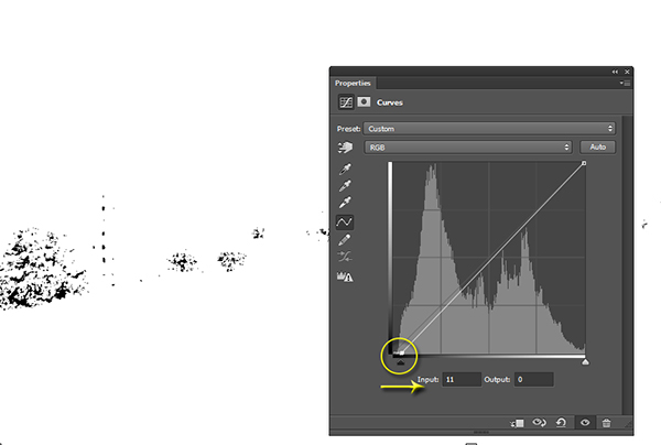
While in the Properties of the Curves Adjustment Layer press and hold “Alt” (Option on Mac) and click the Black triangle on the bottom of the Curve.
Step five
Your photo may turn all white with a little bit of black. This is telling you where black is present in your photo. If your photo is all white with no black specks then your photo currently contains no black point. Move it slightly to the right until more black starts to appear.
Step six
This is called clipping (no detail). By clipping the blacks you are telling Photoshop what you want black to be in the photo. It is important that you do not take this too far, you want a solid black point in the photo, but you don’t want to destroy your shadows either.
Step seven
Now press and hold “Alt” (Option on Mac) and select the White Triangle.
Step eight
Your photo should turn all black with little specks of white. This is telling you where pure white is in your photo. If your photo is all black with no white specks then your photo currently contains no white point. Move it slightly to the left until more white starts to appear.
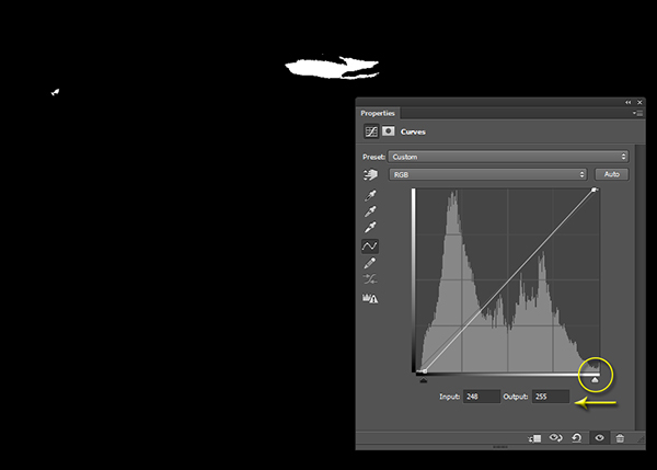
Step nine
Just like the blacks it is important that you do not take this too far to the left as you will be clipping too much of the whites. You are going for just a bit of clipping beyond the specular highlights.
Step ten
The reason you are doing this on a grayscale photograph is to ensure that you are only seeing the clippings of the lights and darks. If you were to do the same thing on a color photograph you would see the clippings for all of the colors within their channels. This makes the process a bit more difficult.
Step eleven
At this point you should already be seeing more drama in your photograph, but you can take it a step further.
Step twelve
Click on the Targeted Adjustment Tool within the Properties of the Curves Adjustment Layer. This allows you to target specific areas of the photo and edit them independently on the tone curve.
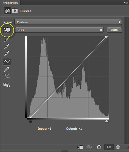
Step thirteen
With the targeted adjustment tool selected, as you hover over the image you will see what is being effected on the tone curve. For this image I started with the lighter colored grass. I clicked on it and dragged the cursor up making it even lighter.
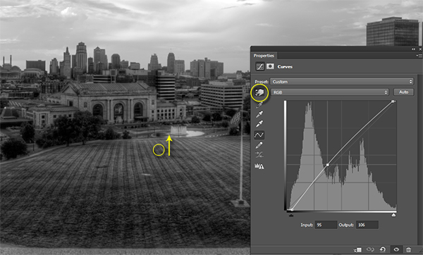
Step fourteen
I also selected the darker colored grass and moved the cursor down to make it darker.
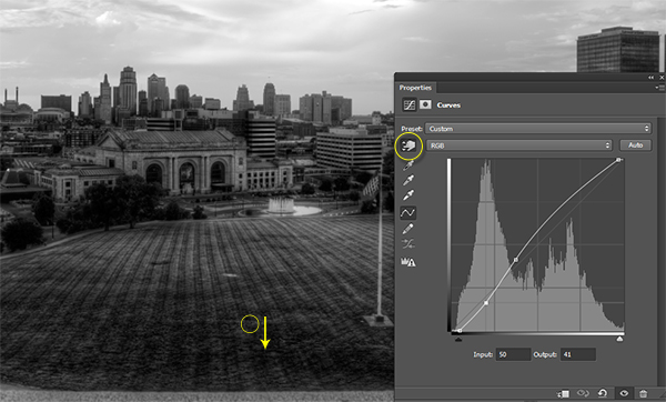
Step fifteen
I then selected an area in the sky that was close to white, but contained a little bit of detail, and dragged the cursor up to make it brighter.
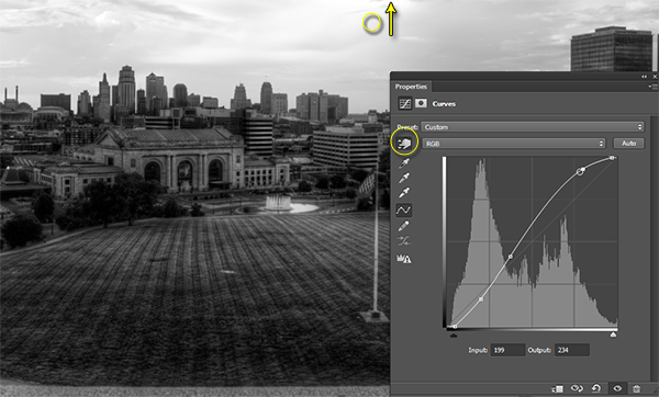
Step sixteen
At this point you should be looking at a black and white photograph with much more contrast than you started with.
Step seventeen
The magic happens when you delete the Gradient Map layer to reveal the Curves effect on the original color photograph.

Step eighteen
If you are not satisfied with the effect the Curve has on the colors in the photo you may change the Blending Option to Luminosity which will only allow it to effect the tones in the image, protecting the color saturation.
For more tips and tricks and to see how the downloadable action for this process works watch the video tutorial below.
The post How to use the Contrast Checker Technique to Give Your Images More Punch by Blake Rudis appeared first on Digital Photography School.