RSS
 

Posts Tagged ‘Images’

Sony A6000 Mirrorless Camera Review and Example Images

02 Dec

The Sony A6000 Review by Gavin Hardcastle

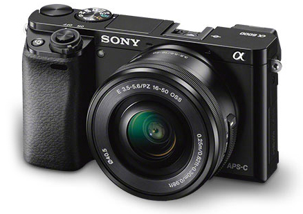
If the Sony A7R is a champion heavyweight in its prime, the Sony A6000 is the scrappy younger brother with a leaner frame, faster feet and a few tricks up its sleeve that big brother hasn’t bothered to learn.

Having spent almost a year with the A7R as my main camera, I’ve become very familiar with the current Sony Alpha system, so I hit the ground running with the A6000. Here is my Sony A6000 review along with a load of example images from my most recent road trip.

Sony A6000 Mirrorles Camera Rewview

For this shot I used my Canon 24-105mm with the hated Metabones Adapter.

Sporting a 24.3 Megapixels APS-C sensor, this mirrorless camera crams a lot of horsepower into a tiny little box and the E-Mount (like the A7R) means you have some nice Sony/Zeiss glass to choose from. You can also use an adapter for the E-Mount which will allow you to use a wide variety of lenses. If you already own some nice Leica, Nikon, or Canon glass for APS-C cameras, you can throw those on the A6000 with the right adapter.

The Price is Right

For just under $ 800 you can walk away with the Sony A6000 and the 16-50mm kit lens, or get the body only for around $ 600. For image quality like this in a tiny package that boasts a lot of versatility, that’s a keen price. When you compare it to the likes of the full frame A7R and the A7S, it’s a total bargain.

Image Quality

Lets face it, Sony are the world leaders when it comes to image sensors and they know how to get the most out of them. While you won’t get ultra low noise, or A7R-like sharpness out of the A6000, you’ll certainly get great image quality and enough sharpness to suite most requirements. This sensor has the same ability to pull up shadow detail like the A7R (although with more noise than its counterpart), while keeping the file sizes at a much more manageable, yet very print-worthy level.

The Sony a6000 reviewed by Gavin Hardcastle

This shot was made with the E PZ 16-50mm F3.5-5.6 OSS kit lens

Faster Focus

One of the main selling features of the A6000 is its super fast hybrid autofocus and focus tracking. While these are features I would rarely use, I can see the attraction for sport, wildlife shooters and parents hoping to capture images of their kids at play. With a burst rate of 11 fps, you’ll have a good chance of catching those golden moments.

Small Form Factor

I actually prefer the feel of the A6000 to the A7R. This camera is clearly all about being small, lightweight, and discreet. The A7R was designed to take advantage of big wide angle and telephoto lenses so it never felt big enough. The A6000 however, feels exactly right for its purpose and for me, that is to get the best image quality out of the smallest package possible.

With the 16-50mm kit lens this camera looks and feels wonderfully miniature. As more premium E-mount lenses become available from Sony/Ziess you’ll be able to get much better image quality but still retain that perfect small form factor. I doubt the prices of that premium glass will be small though.

Sony A6000 Reviewed by Gavin Hardcastle

The 16-50mm Kit Lens

E PZ 16-50mm F3.5-5.6 OSS

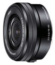
I often find that kit lenses get a bad rap. They are deliberately made to feel shabby next to their more deluxe siblings, but if you know how to squeeze the best out of your glass you’ll be able to get some decent image quality from the 16-50mm.

The sharpest aperture was f/8 with a very noticeable drop in image quality when you select wider or narrower apertures. Sadly there is a very noticeable edge vignette even at f/8, which I thought very shabby of Sony. It’s not a great lens at this price but if you’re prepared to do a bit of tweaking in post, you’ll achieve some decent shots. The main challenge with this budget lens is getting tight focus with the pathetic focus ring of misery.

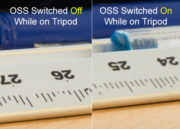
OSS – Optical Steady Shot

Apparently, image stabilization is performed inside the Sony lenses that have this feature but enabling/disabling the OSS has to be done in the menu. I much prefer a switch on the lens to turn this feature on and off.

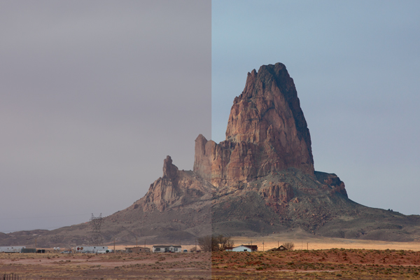
If you plan on shooting on a tripod you’ll want OSS switched OFF. It’s really only any use for hand held shots. Here’s an example of the OSS on and off while used on a tripod. You can see that the numbers on the ruler look much sharper with OSS switched OFF. You’ll find the same results of most cameras that have some form of image stabilization.

Sony A6000 Review by Gavin Hardcastle - OSS testing

Video Quality

While the A6000 records superior video to the A7R, it’s actually not as good as the video quality you can get with the even cheaper A5100 mirrorless camera which boasts the XVID codec. You’ve got to wonder what Sony is playing at with these silly configurations. I’m sure it would have been a small thing to include XVID video recording on the A6000 but Sony in their wisdom decided to forego it to make the A5100 more attractive.

Sony A6000 Reviewed with Example Images

The Sony A5100 as an Alternative

The one thing that stopped me from choosing the A5100 over the A6000 was the lack of dedicated buttons and dials for controlling your settings. Although it has the exact same 24.3 MP sensor, the A5100 is even smaller than the A6000 and that means you’re forced to dig into the menu system in order to play with your settings. This would have resulted in me having a full blown frustration tantrum on a mountaintop and launching the A51000 off a cliff, so I chose the A6000 due to its two dials and three customizable buttons, way more user friendly but man I miss that XVID codec.

The Viewfinder of Mediocrity

If you’re switching from DSLR to a Sony Mirrorless, be prepared to be completely underwhelmed by the horrifically pixelated joke of an electronic viewfinder. DSLR users will look through that thing and feel that there is no chance their image will turn out well. Don’t be dismayed. Just use the viewfinder to set your focus and view your settings but don’t for one second think that your lovely RAW file will remotely resemble the grainy atrocity on display through that poxy peephole.

Apparently the viewfinder on the RX1 is infinitely better, but at almost $ 2800 it should be. If you can live with the lame EVF of the A6000 which is the same as on the much more expensive A7R, you’ll be fine. It took me a bit of getting used to when I switched from DSLR but once you’ve seen those gorgeous RAW files, you’ll come around.

Sony A6000 Example Images and Review

Hot Shoe Accessories for the Sony A6000

Flash fanatics will be delighted to learn that the A6000 has a multi-interface hot shoe slot on the top of the camera. This is also great for videographers who want to add the external mic. Sadly there are no software audio level controls when recording video on the A6000 and that is a MAJOR let down. Again, Sony could have included that software which is available on the A7R but in their wisdom, decided not to.

Apps for the Sony A6000

Like all of the current alpha range, the A6000 allows you to install Sony apps for extended functionality (and cost). The Time Lapse app had an update a few months ago that has made it much more usable. Other apps include remote control, star trails and a bunch of other awful ideas I’ll never bother to download or use.

Review of the Sony A6000 Mirrorless Camera

Built-in Flash

The A6000 does have a built in flash that pops up dramatically. You can even angle the flash to point up at the ceiling to bounce the light.

Tilt Screen

Sony A6000 Tilt Screen

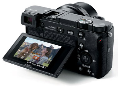
Like the A7, A7R and A7s, the A6000 has a tilt screen which you can angle for low or high shots and still be able to view the screen comfortably. I love this feature and although the A6000 has a smaller screen than the A7R, it works well while fitting into the smaller frame of the chassis. When cameras at this price point all seem to be able to include this technology it baffles me why the likes of Canon and Nikon exclude this feature on their high end cameras.

While I’m delighted that the A6000 does have a tilt screen, it has to be said that the screens image quality is pretty shabby compared to the screens you’ll see on the likes of the Olympus OM-D EM1. I heard a rumour that Sony makes those screens for Olympus so why not include that technology in the A6000? Perhaps that would have jacked up the price to a place where Sony didn’t feel comfortable.

Test images using the Sony A6000 in the Gavin Hardcastle Review

Battery Life Woes

Although nowhere near the longevity of a Canon DSLR battery, the FW50 batteries last longer in the A6000 than they do in the A7R. Just like the A7R, you won’t get a battery charger with the A6000 either so your options are to connect the charger cable directly to the camera or buy a third party charger. I’d recommend the latter as you’ll soon wear out the multi/charge socket on the camera.

Shutter Noise

This is a non-issue with the A6000. Unlike its noisy big brother the A7R, which has a super loud shutter noise (that I love), the A6000 has a very quiet shutter so you won’t startle the koala bears.

What I love about the Sony A6000 Mirrorless Camera

  • Small form factor feels great in the hand – it’s discreet
  • Great image quality if you don’t need full frame
  • Uses the same batteries as the current Alpha family of mirrorless cameras
  • Tilt screen is really useful for low to the ground shots
  • Competitive price
  • Has a built-in flash
  • Shoots 59 fps video in AHVCD
  • Features the E-Mount lenses
  • MU hot shoe
  • I can assign any setting to the three custom function buttons

What I hate about the Sony A6000 Mirrorless Camera

  • No digital level like on the A7R
  • No audio level control like on the A7R
  • No XVID codec like on the a5100 which is cheaper
  • Poor quality display on both the EVF and tilt screen
  • I can’t seem to reverse the EV dial operation
  • I hate the position of the mode dial, I keep hitting it by mistake when I change my aperture setting because that’s where my thumb falls naturally
  • There’s no C1, C2 setting on the mode dial. I have to dig into the menu to call these up.

Should You Buy the A6000?

Sony A6000 Camera Review

Yours truly. Dynamic range is surprisingly good with great highlight recovery and shadow detail.

That depends on your needs. If like me, you use the A7R as your main camera, the A6000 is the logical choice for your backup camera. It shares the same menu, batteries, lens mount and can be configured to be almost identical in operation to the A7R.

If you’re a DSLR user that’s used to the APS-C sensor size, the main thing you’ll struggle with is the EVF. Once you’ve gotten used to that, you’ll enjoy the superior image quality, customizable controls and most of all, the adorably small size of this wrist saving camera. Shoot with one of these for a week and then try going back to your clunky DSLR. Your old camera will feel like a breeze block.

Canon videographers will find little reason to switch due to the average codec and lack of audio level controls on the A6000.

First time camera buyers will love this camera because of its image quality, portability and price.

With that well considered summary, I’m awarding the Sony A6000 four out of five stars. They could have achieved five stars with a better quality LCD that included touch screen functionality.

The post Sony A6000 Mirrorless Camera Review and Example Images by Gavin Hardcastle appeared first on Digital Photography School.


Digital Photography School

 
Comments Off on Sony A6000 Mirrorless Camera Review and Example Images

Posted in Photography


37 Relaxing Cool Tone Images To Chill Out With

29 Nov

This week’s image set is all about relaxing and getting to your zen place. Often cool tones relay that message really well as they feel less stressed and calming than warmer colors. Cool tones include blue, purple and even green. See how you feel after viewing these images:

Relaxing cool tone images

Photograph Misty Mono.... by Jay Sabapathy on 500px

Misty Mono…. by Jay Sabapathy on 500px

Photograph Arctic Symphony by Mikko Lagerstedt on 500px

Arctic Symphony by Mikko Lagerstedt on 500px

Photograph Nallo Night by Sander van der Werf on 500px

Nallo Night by Sander van der Werf on 500px

Photograph Feather-Light by Becky Fuller-Phillips on 500px

Feather-Light by Becky Fuller-Phillips on 500px

Photograph New buds by Allen Adnan on 500px

New buds by Allen Adnan on 500px

Photograph Beautiful Borage by kreativgrund on 500px

Beautiful Borage by kreativgrund on 500px

Photograph Wintery by Macro Marcie on 500px

Wintery by Macro Marcie on 500px

Photograph Taming the Storm by Kah Kit Yoong on 500px

Taming the Storm by Kah Kit Yoong on 500px

Photograph Forest Glow by John Center on 500px

Forest Glow by John Center on 500px

Photograph Joshua Tree - Hidden Valley by Steve Sieren on 500px

Joshua Tree – Hidden Valley by Steve Sieren on 500px

Photograph Blue Flowers by Rachel Friedman on 500px

Blue Flowers by Rachel Friedman on 500px

Photograph Split-Tone Chilling Rhino by Simon P on 500px

Split-Tone Chilling Rhino by Simon P on 500px

Photograph Cool Tone by Tony Haddow on 500px

Cool Tone by Tony Haddow on 500px

Photograph feeling cool by one2_three on 500px

feeling cool by one2_three on 500px

Photograph BREATHE by Joel Sossa on 500px

BREATHE by Joel Sossa on 500px

Photograph Frozen by Kumarov(Amkote) Michael on 500px

Frozen by Kumarov(Amkote) Michael on 500px

Photograph Possession by Sébastien DEL GROSSO on 500px

Possession by Sébastien DEL GROSSO on 500px

Photograph Italy – Piccoli Spiriti Blu by Fabrizio Fenoglio on 500px

Italy – Piccoli Spiriti Blu by Fabrizio Fenoglio on 500px

Photograph The Stairs by Frederic Ansermoz on 500px

The Stairs by Frederic Ansermoz on 500px

Photograph "the blue chapel" by Thomas Windisch on 500px

"the blue chapel" by Thomas Windisch on 500px

Photograph Way to Heaven. by Recesvintus Rex Gothorum on 500px

Way to Heaven. by Recesvintus Rex Gothorum on 500px

Photograph In the forest by Evans Lazar on 500px

In the forest by Evans Lazar on 500px

Photograph Ferragudo at dusk by Luis Mata on 500px

Ferragudo at dusk by Luis Mata on 500px

Photograph The Blue Temple by Conor MacNeill on 500px

The Blue Temple by Conor MacNeill on 500px

Photograph Blue Wall by Hesham Alhumaid on 500px

Blue Wall by Hesham Alhumaid on 500px

Photograph Blue on Blue by Roy Cheung on 500px

Blue on Blue by Roy Cheung on 500px

Photograph Going upstairs by Giannis Papanikos on 500px

Going upstairs by Giannis Papanikos on 500px

Photograph Newspaper relax by Carlo Cattani on 500px

Newspaper relax by Carlo Cattani on 500px

Photograph Blue Chefchaouen by Khanh Nguyen on 500px

Blue Chefchaouen by Khanh Nguyen on 500px

Photograph Light at the end of the tunnel by 911  on 500px

Light at the end of the tunnel by 911 on 500px

Photograph The Purple Hour by Tom Keller on 500px

The Purple Hour by Tom Keller on 500px

Photograph High Voltage by Michael Woloszynowicz on 500px

High Voltage by Michael Woloszynowicz on 500px

Photograph Fortress of Solitude by Dustin LeFevre on 500px

Fortress of Solitude by Dustin LeFevre on 500px

Photograph your mirror by neriman ozder on 500px

your mirror by neriman ozder on 500px

Photograph Refuge du Lac Blanc by Sven Müller on 500px

Refuge du Lac Blanc by Sven Müller on 500px

Photograph Gently Snuggle by Shihya Kowatari on 500px

Gently Snuggle by Shihya Kowatari on 500px

Photograph Talbot by Paul Marcellini on 500px

Talbot by Paul Marcellini on 500px

The post 37 Relaxing Cool Tone Images To Chill Out With by Darlene Hildebrandt appeared first on Digital Photography School.


Digital Photography School

 
Comments Off on 37 Relaxing Cool Tone Images To Chill Out With

Posted in Photography


Flickr Wall Art expands to include Creative Commons images

23 Nov

Flickr Wall Art now allows users to order prints from more than 50 million photographs, the service has announced. This follows Wall Art’s arrival in October, and moves to include all applicable freely-licensed Creative Commons images, licensed artists images, and a curated selection of content from NASA. Read more

Articles: Digital Photography Review (dpreview.com)

 
Comments Off on Flickr Wall Art expands to include Creative Commons images

Posted in Uncategorized


How to Use LAB Color in Photoshop to Add Punch to Your Images

19 Nov

Have you ever wished you could stretch out the color palette of your picture? Or that you could separate colors that looked too flat or close together?

Well, with Photoshop, you can – by converting your picture to something called LAB colorspace and adjusting the color there. That might sound complicated, but it is actually pretty simple. If you have ever made a levels or curves adjustment, you already know everything you need to know to accomplish this.

Grand Canyon

The left side of the picture is an anadjusted Raw file. The right side of the picture is the same except for a curves adjustment layer done in the LAB color space.

In this article, you will learn two things. First, you will learn the five simple steps to achieve color separation using the LAB color move. You can follow these steps without even understanding how any of this works and it will work just fine for you. Second, after walking you through the steps, you will see how this move works. That way, if you want to apply this move to your photos in a more nuanced fashion later it will help you to do so.

The LAB Color Move

So let’s walk through the steps of “the move.” There are five steps in this process, all of which are simple and can be accomplished in 30 seconds or less.

1.  Convert to LAB Colorspace

First, you have to convert your picture to the LAB color space. To do that, just click “Edit” on the top menu, then choose “Convert to Profile.” When you do so, a dialogue-box will pop up.  From the drop-down, choose “LAB color.” That’s all there is to it.

Convert to Profile Dialogue Box

For now, your picture looks exactly the same. All you have done is changed the way Photoshop renders color in your image (more about this later).

2.  Create A Curves Adjustment Layer

Next, you will need to create a curves adjustment layer. There are a few ways to do this, but if you don’t already have your own way, just click on “Layer” in the top menu, then choose “New Adjustment Layer,” then “Curves.” Click “OK” in the box that pops up.

Creating a New Curves Adjustment Layer

3.  Scoot in the Endpoints of the A Channel

Everything so far has been mere prelude to get you to this point, and you haven’t actually changed your picture at all yet. You have converted to the LAB colorspace and created an an adjustment layer to work on. Now the fun begins.

You will see a drop-down menu near the top of your adjustment layer and the current selection will be “Lightness.” Click on it and you will see three choices: the Lightness (or L) channel, the A channel, and the B channel. Select the A channel.

You will immediately notice that your histogram changes dramatically. Most likely, it now looks like a big spike in the middle. Don’t worry about that – that’s the way most histograms look in LAB color.

What you are going to do is grab the left (black) endpoint and drag it toward the middle of the histogram a little bit. There is no set amount to move it, but if you are looking for a little guidance drag it until the Input number reads -90.  Your picture probably just turned an ugly shade of green but don’t worry about it. Now, grab the right (white) endpoint and pull it to the left. In fact, pull it to the left the exact same amount that you moved the left endpoint to the right. You can use the Input numbers below to make sure you are moving each side in the same amount.

A Channel - before and after adjustments

That should fix the green cast. But don’t worry too much about what your picture looks like right now. Let’s go on and perform the second part of the LAB move.

4.  Scoot in the Endpoints of the B Channel

What you are going to do here is exactly what you just did in the step above, but this time you are going to do it in the B channel. So, go back to the drop-down that currently reads “A” channel. Click on that and now select the “B” channel.

As you did above, just scoot in your endpoints toward the middle of the histogram. So grab the left (black) endpoint and drag it toward the middle a little bit. Your picture just turned a shade of blue but don’t worry about it. Now, grab the right endpoint and pull it to the left the exact same amount that you moved the left endpoint to the right. Again, input values of about 90 should get you roughly where you want to be.

5.  Inspect Your Handiwork

Now it is time to see the “before” and “after” pictures of your image; this is one of the benefits of working with layers. On the right side of your screen where your layer is shown, you will see a little eyeball just to the left of each layer. For the curves adjustment layer you just created, click on the eyeball. When the eyeball disappears, you will see your picture before the adjustments you just made. Click again to see the eyeball with your changes to the image.

Eyeball On and Off - Showing Changes in Image

On the left, the eyeball is on, so the changes will be shown. On the right, the eyeball is deselected, so the changes will not be show.

Do you see how your color range has been increased? The colors should also appear more rich and vibrant. If you are not noticing much of an effect, try scooting in the endpoints of the A and B channels a little bit more (say, down to 80 if you are using the input numbers). On the other hand, if the colors look too garish to you, drag the sliders out a little bit (to say, about 110 on each side). Or you can reduce the effect by decreasing the opacity of the curves adjustment layer.

MonumentValley-halves

That’s it, you now know the LAB color move. Go ahead and switch back to your original colorspace and perform any other edits you want on your picture. Then, try this move out on a few different pictures. You will probably find that it doesn’t help pictures that already have vibrant colors, but it can perform miracles on certain landscapes you previously found too flat.

How it Works

Upon learning this move, you may have questions about how this works and why you couldn’t just do it without switching to the LAB colorspace. I will explain that in the remainder of this article.

Sailboats-halves

How LAB differs from your usual colorspace

For starters, we need to have a general understanding of how LAB differs from RGB color. So first you should understand how colors are rendered in RGB, and then we will move on to show how LAB differs.

RGB color

RGB histogram

Histograms of the RGB channels

The RGB colorspace is the standard used in digital photography. This is the colorspace that your camera uses, and the one that Photoshop defaults to. RGB simply stands for Red, Green, Blue, and that tells you a bit about how it works. In this scheme, the camera or computer starts with these three colors and then combines them to create a whole host of different colors. Thousands of them, in fact. If you are having trouble getting your head around how really light colors (say, yellow) can be created by combining red, green, and blue, understand that there are many different shades of red, green, and blue, starting with very, very light (bordering on white) shades. In fact, the way that RGB and LAB deal with lightness is a key difference between them, as you will see.

When you look at a histogram for a picture in RGB, you are seeing a combination of the values for each color channel. You can see each of the individual color channels by clicking on the drop-down labeled “RGB” in your curves adjustment layer. When you do so, you will notice that the histogram for each of the channels is different, but not that different.

LAB color

LAB histogram

Histograms of the LAB channels

The LAB color space goes about defining colors differently. Whereas RGB defines color by a combination of red, green, and blue values of different shades, LAB uses three different channels. They are: Lightness, something called the A Channel, and the B Channel. Hence, Lightness, A Channel, and B Channel are shortened to L-A-B, LAB.

But what are these channels? Let’s start with Lightness, partially because it is first, but also because it is likely to be the most familiar to you. It represents the relative brightness of the pixels without regard to color. So Lightness is kind of like a greyscale image, where each pixel is defined by how close to white or black it falls on the scale. The Lightness histogram probably looks like something you are used to. The values of a properly exposed picture with good contrast should spread out over most or all of the histogram.

The A and B Channels will likely be unfamiliar to you. Whereas the Lightness Channel defines the lightness of the pixels without regard to color, the A and B channels define color without regard to lightness. Color and lightness are addressed separately in LAB, not together as they are in RGB (more on this in a bit).

Let’s talk about the A Channel first. The “A” doesn’t actually mean anything. They just call the two color channels A and B. The A Channel is just a definition of color values based strictly on how much green on one hand, or magenta on the other, are contained therein. The very middle is actually gray, and the hues get progressively more green to one side and progressively more magenta to the other.

The B Channel works the same way as A, except that it defines color by how much blue on one side, and yellow on the other, it contains.

It might help to think about it like this. Whereas RGB renders color by defining each color as some combination of red, green, and blue, LAB renders color by defining each color as some combination of green, magenta, blue, and yellow, with lightness addressed separately. However, while each color gets its own channel in RGB, colors share channels in LAB (two per channel).

If you are starting from scratch with the LAB colorspace, try playing with it. Load a few of your pictures, go into LAB, then go into the three channels on a curves adjustment layer. Look at the effects of sliding in the endpoints of just one side of the histogram. You should start to see how the A Channel is a measurement of the balance of green or magenta. The B Channel is a measurement of the balance between blue and yellow.

The Power of LAB

Here is the really interesting bit and why LAB is so different, and in many ways superior to RGB. Look at the histogram of the A Channel of your picture. There is, no doubt, a spike in the middle. That is because LAB is such a ridiculously broad color space that all the colors you and I would consider “normal” are bunched up in the middle of the histogram. If you go outside of that bunch in the middle, you would soon get some really psychedelic colors, and beyond that you would get into impossible or imaginary colors that are outside the realm of anything we can actually use.

The impossible colors don’t matter, but what does is the effect on the histogram that all this creates. Having the colors of your image all bunched up in the middle of the histogram means that you have lots of room to scoot in the endpoints of the histogram and effectively stretch the color palate.

This move is not possible in RGB. Typically, in RGB you will not have enough space on the sides of the histogram to scoot in the endpoints. The colors will usually be stretched over most of the histogram. But even if you have room to do so on the histogram, in RGB it will affect the brightness and the color balance of the picture.

The other reason LAB is so powerful is the separation of lightness from color.  As a result of this separation, resetting the black point and the white point in the histogram of the A or B channels affects only color.  You can stretch out the colors without making them lighter or darker.

Before and after LAB color enhancements.

Before and after LAB color enhancements.

Conclusion

Just knowing and using the basic LAB color move will significantly impact your pictures in ways that were not previously possible. It is more than just an increase in saturation – it’s stretching the color palette.

This move is only possible in the LAB colorspace because:

  • The LAB colorspace is so broad that there is always room to scoot in your black points and white points on the histogram.
  • Separating the lightness values from the color values, and putting the lightness values on its own channel (the L channel) means that you can impact the colors without affecting the brightness or contrast of the image.

The the basic move is just the beginning of what you can do.  From here you can make additional adjustments to the A and B channels that will remove color casts by moving in one side more than the other.  Or you can apply masks and affect color in specific areas of your image.  Start with this basic LAB color move and you’ll see immediate improvement and soon will start seeing other possibilities.

The post How to Use LAB Color in Photoshop to Add Punch to Your Images by Jim Hamel appeared first on Digital Photography School.


Digital Photography School

 
Comments Off on How to Use LAB Color in Photoshop to Add Punch to Your Images

Posted in Photography


A Collection of Low to the Ground Images

15 Nov

Creating an original image can sometimes be challenging. One of the best ways to do it is to change up your camera angle or perspective. Getting up high and looking down is one method, another is crawling around in the dirt to get a worm’s eye view. As you can imagine the name comes from approximating the view a worm would have from his angle on the ground.

Being low to the ground will set your images apart because the average person doesn’t see that way, or take photos from down there. It can also mean looking straight up. Here are some worm’s eye view images to give you some ideas:

Photograph Really Red Rock by James Wheeler on 500px

Really Red Rock by James Wheeler on 500px

Photograph Walking in a Snowstorm by Tishan Baldeo on 500px

Walking in a Snowstorm by Tishan Baldeo on 500px

Photograph Iowa Corn by Aaron J. Groen on 500px

Iowa Corn by Aaron J. Groen on 500px

Photograph Baby Tortoise by Lee Bothma on 500px

Baby Tortoise by Lee Bothma on 500px

Photograph The Trench Run II by peter stewart on 500px

The Trench Run II by peter stewart on 500px

Photograph Low-Angle by AtomicZen : ) on 500px

Low-Angle by AtomicZen : ) on 500px

Photograph Mouse's View by Alexander Dragunov on 500px

Mouse's View by Alexander Dragunov on 500px

Photograph Through the Keyhole by Harry  Eggens on 500px

Through the Keyhole by Harry Eggens on 500px

Photograph Infinity by Artur Stanisz on 500px

Infinity by Artur Stanisz on 500px

Photograph * by Peter Writer on 500px

* by Peter Writer on 500px

Photograph To The Sky by Suradej Chuephanich on 500px

To The Sky by Suradej Chuephanich on 500px

Photograph Ruddy Strut by Gary Luhm on 500px

Ruddy Strut by Gary Luhm on 500px

Photograph Looking Up by Rob Younger on 500px

Looking Up by Rob Younger on 500px

Photograph Towering giants by Mike Dexter on 500px

Towering giants by Mike Dexter on 500px

Photograph Displaced by Lee Acaster on 500px

Displaced by Lee Acaster on 500px

Photograph Low angle ! by Emanuel Fernandes on 500px

Low angle ! by Emanuel Fernandes on 500px

Photograph Fast Sunrise by Tee Butler on 500px

Fast Sunrise by Tee Butler on 500px

Photograph The Cave by Thomas Brown on 500px

The Cave by Thomas Brown on 500px

Photograph Tube Mice by Aaron Yeoman on 500px

Tube Mice by Aaron Yeoman on 500px

Photograph Mouse point of view by Suren Manvelyan on 500px

Mouse point of view by Suren Manvelyan on 500px

Photograph Tower bridge by Paul Sharp on 500px

Tower bridge by Paul Sharp on 500px

Photograph Boots! by Dee McIntosh on 500px

Boots! by Dee McIntosh on 500px

Photograph Mice perspective / Mäuse Perspektive by Ralf Bitzer on 500px

Mice perspective / Mäuse Perspektive by Ralf Bitzer on 500px

Photograph Fly Agaric Mushroom by Terry Sohl on 500px

Fly Agaric Mushroom by Terry Sohl on 500px

Photograph Escalator by Tracey Whitefoot on 500px

Escalator by Tracey Whitefoot on 500px

Photograph Dawn Patrol by Scott Farrell on 500px

Dawn Patrol by Scott Farrell on 500px

Photograph Walk Alone by Phil Jones on 500px

Walk Alone by Phil Jones on 500px

Photograph . by Oliviero Masseroli on 500px

. by Oliviero Masseroli on 500px

Photograph AL-Marmoum Racing by Shoayb Khattab on 500px

AL-Marmoum Racing by Shoayb Khattab on 500px

Photograph Breno...ground level by Oliviero Masseroli on 500px

Breno…ground level by Oliviero Masseroli on 500px

Photograph Blowing off Steam by mark_fadely on 500px

Blowing off Steam by mark_fadely on 500px

Photograph Florian Prägant by Martin Steinthaler on 500px

Florian Prägant by Martin Steinthaler on 500px

Photograph Worm's Eye View Golfer by Stephen Stringer on 500px

Worm's Eye View Golfer by Stephen Stringer on 500px

The post A Collection of Low to the Ground Images by Darlene Hildebrandt appeared first on Digital Photography School.


Digital Photography School

 
Comments Off on A Collection of Low to the Ground Images

Posted in Photography


Improve your Images with Photography Projects

14 Nov

Photography project

Have you ever been in a situation where you are stuck for ideas about what to take photos of? I certainly have, and a lot of it comes from being so familiar with my surroundings that it’s hard to see the photographic potential in anything. A newcomer to my local area would probably see it completely differently, and find lots of inspiration.

Given that most of us spend the majority of the year at home, is there an easy way to find inspiration? There is – the secret is to get in the habit of setting yourself photography projects.

Projects are a way of giving yourself something to aim for, and developing a thematically linked body of work. Professionals set themselves projects to learn new skills, make new contacts and give themselves something creative and positive to do in quiet times. But you don’t have to be a pro to benefit. Projects can help you become a better photographer, no matter what your level.

Photography project

Benefits of projects

Here are some of the practical benefits of projects.

Projects help you develop new skills.

For example, the photos illustrating this article were taken as part of a personal project photographing circus performers. The aim of the project, apart from creating an interesting set of portraits, was to improve my portrait taking skills. Setting myself a project with a specific theme allowed me to hone in on a group of interesting people. Circus is a tight-knit social group, so once I’d got started it was easy to meet more performers by asking the ones that I’d photographed if they knew anybody else who would be interested.

Best of all I got to meet and get to know a new group of people. It has been great fun and opened my eyes to a way of life and outlook different to my own. The project has fuelled personal growth as well as helping me become a better photographer.

Photography project

Projects give you something to aim for.

Once you’ve committed to a project, and the idea of taking a series of photos over a period of time, you get to compare your newest work with previous photos. You  will see how your skills and ideas progress over time.

Projects can last for years.

That’s right, there’s no need to work on one project at a time, or to work on a project with a finite time span. There’s no reason why you can’t have several ongoing projects, each with an indefinite time span, that only come to an end when you feel that your time with the project is done.

Projects let you explore a subject in-depth.

One way of taking photos is to visit somewhere for a day or two, taking photos of the scenery and anything else that catches your eye. That might help you take photos of landmarks and other well-known scenes, but it’s not an in-depth exploration of a subject. I’m aware of this because I’ve just returned from a trip exploring New Zealand’s South Island. I spent no more than two days in any location, photographing the most obvious (and sometimes not so obvious) landmarks and scenery. But that’s only a shallow coverage.

Imagine how much more depth you can get if you have time to explore a place on a deeper level. If you live somewhere with beautiful landscapes, you can go beyond the more obvious scenic spots and find photogenic but little known places. Or you could photograph the lives of the people who live and work there.

This isn’t easy to do when you’re visiting a place for a short period, but it’s something that’s much easier when your subject is closer to home. That’s why projects are such a good way of getting more out of your home town, or places nearby within a convenient travel distance.

Photography project

Project ideas

Here are some ideas for projects to get you started:

365 project

This has become a classic – take a photo a day for a year, publishing the best photo from the day or your blog or Flickr photostream. The idea is that the discipline of taking a new photo every day pushes you to explore new subjects and encourages you to take your camera out with you to find things to take photos of. Your photography skills should improve immensely over the year.

10o strangers project

I love this concept (written about on Digital Photography School a few months ago by Matt John Robinson). The idea is to take photos of 100 strangers. Not candid photos taken without their knowledge, but by approaching your potential subject and asking if you can take their photo. Not only will you become a better portrait photographer by doing so, but you will meet some new and interesting people along the way.

Photography project

Night skies project

I’ve been very impressed by the work of Wellington based photographer Mark Gee. He has built a reputation taking photos of the night sky, principally in the southern part of New Zealand’s North Island. This is a great example of a long-term project that anyone who lives outside a heavily built-up urban area can undertake. Not only will you learn a new skill (taking photos at night) but it will encourage you to go out and explore your area and appreciate its natural beauty during the night hours.

Garden flowers project

Mandy Disher is another photographer whose work I admire greatly. She takes photos of flowers and insects, the majority created within her own garden. This is a long term project that anybody with a garden can undertake, and it’s a great example of something you can do close to home.

Photography project

Your turn

Have you ever undertaken a photography project, and do you have ideas for projects other than the ones I’ve mentioned here? Please let us know in the comments. I’m looking forward to reading about what ideas you come up with.


Mastering Photography

Composition and line
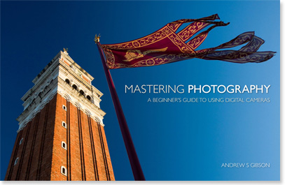
My latest ebook, Mastering Photography: A Beginner’s Guide to Using Digital Cameras introduces you to digital photography and helps you make the most out of your digital cameras. It covers concepts such as lighting and composition as well as the camera settings you need to master to take photos like the ones in this article.

The post Improve your Images with Photography Projects by Andrew S. Gibson appeared first on Digital Photography School.


Digital Photography School

 
Comments Off on Improve your Images with Photography Projects

Posted in Photography


LAB Color Correction Video Tutorial: Creative Grading Techniques for Images

12 Nov

In this second video on LAB we explore a way to add creative color grading onto a desaturated dusk image. Once again exploring LAB colour mode and curves we get playful to create saturation and color contrast to add life to a dull scene. Don’t miss our first video on the LAB colors tutorial. Before After

The post LAB Color Correction Video Tutorial: Creative Grading Techniques for Images appeared first on Photodoto.


Photodoto

 
Comments Off on LAB Color Correction Video Tutorial: Creative Grading Techniques for Images

Posted in Photography


Samsung NX1 real-world sample images

12 Nov

Samsung’s NX1 is the first serious attempt by the Korean manufacturer to target high-end enthusiast and semi-pro photographers. Featuring a 28MP sensor, 15fps shooting capability, 4K video mode and an advanced AF system, the NX1 has features to spare. We’ve been shooting with a pre-production camera for a few days, in combination with the NX 16-50mm F2.0-2.8 S ED OIS and new 50-150mm F2.8 S. Click through for some sample images

Articles: Digital Photography Review (dpreview.com)

 
Comments Off on Samsung NX1 real-world sample images

Posted in Uncategorized


Collection of Images of Generations

08 Nov

We all age and get older every year. Families grow and have children and grandchildren. Generations are formed. In my family there are currently five generations, the matriarch being my grandmother who is 93. This week’s collection is of images that capture those generations, be it people, animals or objects. Enjoy the . . .

Generation gap

Photograph Generations Apart.. United in Prayer. by Nima  Baharlooie on 500px

Generations Apart.. United in Prayer. by Nima Baharlooie on 500px

Photograph I'd like to buy some of those by Lisette Lebaillif on 500px

I’d like to buy some of those by Lisette Lebaillif on 500px

Photograph Expansion #1 by Bjorn van der Meijs on 500px

Expansion #1 by Bjorn van der Meijs on 500px

Photograph Loving Hands by Ben Robson on 500px

Loving Hands by Ben Robson on 500px

Photograph Now and then by Zoran Milutinovic on 500px

Now and then by Zoran Milutinovic on 500px

Photograph 18 and 88 by Kittiyut Phornphibul on 500px

18 and 88 by Kittiyut Phornphibul on 500px

Photograph Years by Ehtiram Jabi on 500px

Years by Ehtiram Jabi on 500px

Photograph The Old and the Young by Esther Visser on 500px

The Old and the Young by Esther Visser on 500px

Photograph Grandfather & Grandson by Bartosz Mazur on 500px

Grandfather & Grandson by Bartosz Mazur on 500px

Photograph Generations... by Emanuele  Toscano on 500px

Generations… by Emanuele Toscano on 500px

Photograph Two generations by Alexander Dragunov on 500px

Two generations by Alexander Dragunov on 500px

Photograph Generations by Stephanie Beaty | Lifeography on 500px

Generations by Stephanie Beaty | Lifeography on 500px

Photograph Timeless Touch by Jeff Clow on 500px

Timeless Touch by Jeff Clow on 500px

Photograph happy by Tikhon Tikhonov on 500px

happy by Tikhon Tikhonov on 500px

Photograph Love among generations by Cathrine Nørgaard on 500px

Love among generations by Cathrine Nørgaard on 500px

Photograph My Kids by Emilio Cabida on 500px

My Kids by Emilio Cabida on 500px

Photograph GENERATIONS by Florence Vahl on 500px

GENERATIONS by Florence Vahl on 500px

Photograph Generations by Florin Bandas on 500px

Generations by Florin Bandas on 500px

Photograph Look grandpa... by KnikmanAV - Hans Knikman on 500px

Look grandpa… by KnikmanAV – Hans Knikman on 500px

Photograph Generations Apart by Axel Halbgebauer on 500px

Generations Apart by Axel Halbgebauer on 500px

Photograph Emotions by Reidulv Lyngstad on 500px

Emotions by Reidulv Lyngstad on 500px

Photograph Generations by DEREK HEISLER on 500px

Generations by DEREK HEISLER on 500px

Photograph 3 Generations by Martin Davies on 500px

3 Generations by Martin Davies on 500px

Photograph Generations by Johan Nilsson on 500px

Generations by Johan Nilsson on 500px

Photograph Sad old woman with a baby doll by Johann Frank on 500px

Sad old woman with a baby doll by Johann Frank on 500px

Photograph Generation gap by Roberto Cornacchia on 500px

Generation gap by Roberto Cornacchia on 500px

Photograph three generations on tonle sap by Stephen Wallace on 500px

three generations on tonle sap by Stephen Wallace on 500px

Photograph GENERATiONS by Dani Mantis on 500px

GENERATiONS by Dani Mantis on 500px

Photograph Slice Of Americana by Alan Crosthwaite on 500px

Slice Of Americana by Alan Crosthwaite on 500px

Photograph 3 Generations by Patrick Dugan on 500px

3 Generations by Patrick Dugan on 500px

Photograph 3 generations by Elad Koren on 500px

3 generations by Elad Koren on 500px

Photograph 3 Generations by Christian Lengert on 500px

3 Generations by Christian Lengert on 500px

Photograph three generations by janaalt morren on 500px

three generations by janaalt morren on 500px

Photograph Three generations by Madyx Jane Photography on 500px

Three generations by Madyx Jane Photography on 500px

Photograph THREE GENERATIONS by Xavi Rosell on 500px

THREE GENERATIONS by Xavi Rosell on 500px

Photograph Three Generations by Manuel Orero on 500px

Three Generations by Manuel Orero on 500px

Photograph Three generations by James McClave on 500px

Three generations by James McClave on 500px

Photograph Three Generations by Brett Walsh : Perfect Strangers on 500px

Three Generations by Brett Walsh : Perfect Strangers on 500px

Photograph three generation ladies. by erol sesi on 500px

three generation ladies. by erol sesi on 500px

Photograph Three Generations by Leo Stenzel on 500px

Three Generations by Leo Stenzel on 500px

Photograph Three Generations by Ahmad Syukaery on 500px

Three Generations by Ahmad Syukaery on 500px

The post Collection of Images of Generations by Darlene Hildebrandt appeared first on Digital Photography School.


Digital Photography School

 
Comments Off on Collection of Images of Generations

Posted in Photography


How To Ensure You Don’t Lose Any Of Your Important Images

07 Nov

In my opinion, having to tell your clients that you “accidentally lost their images“ is one of the worst things that could possibly happen. Whether the data loss was your fault or not, your clients won’t care because it is your job to deliver images, regardless of hard drive failure or a corrupt SD-card. As a photographer, you should be Continue Reading

The post How To Ensure You Don’t Lose Any Of Your Important Images appeared first on Photodoto.


Photodoto

 
Comments Off on How To Ensure You Don’t Lose Any Of Your Important Images

Posted in Photography