Detail recovered from a RAW file, before and after.
There is often a debate among photographers about shooting in RAW. Try it out – next time you are with a group of photographers, ask them who shoots in RAW. Better still, ask them why they don’t shoot in RAW. The conversation will become pretty interesting. When I first started photography, I was told that shooting in RAW was a waste of time and that I won’t need all that “information”. I was told it was better to shoot on JPEG as it saves space. Yes, RAW files are bigger, especially on a high-resolution camera, but is it true that we don’t need all that “information”? Over the past few years, I have done a fair amount of research into the RAW vs JPEG debate and I now shoot completely in RAW. Yes, my image files are MUCH bigger; yes, I need more space to store my images; yes, it does impact my image editing workflow. Is it worth it? A categorical yes. Here are five reasons why you should shoot your landscape images in RAW.
1. Details
RAW files are big because they don’t discard any image information that is captured in the scene. When you shoot on JPEG, the algorithm for JPEG determines which information is discarded and which is kept without changing the way the image looks. That is great for saving space on your memory card, but not so good if you intend to edit your images in Photoshop.
The reality is that your camera can capture a significant amount of data if you shoot in RAW, which in turn gives you much more flexibility in Photoshop later. On average, a normal JPEG file will be between four and six megs per image. The same image shot on the same camera in 14-bit lossless RAW format will be 25 – 30mb, five times bigger. The reason is that there is much more information in a RAW file. That information is critical in post-production. You can get so much detail out of a RAW image, such as pulling back blown-out highlights and bringing back detail in the shadows that would be impossible to recover in JPEG format. This doesn’t mean you should be sloppy and not pay attention to your exposure. What it does mean is that in tricky lighting conditions, you will be able to get a shot that’s usable.
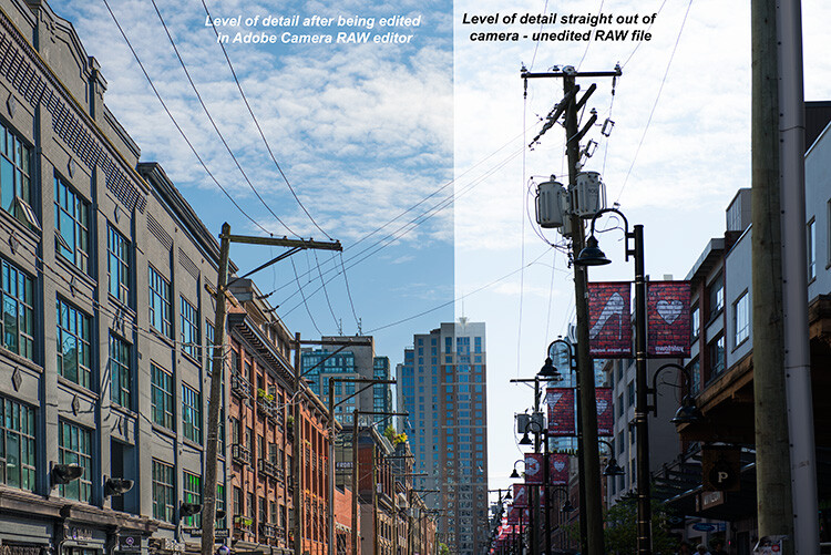
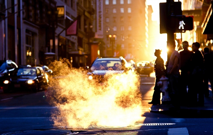
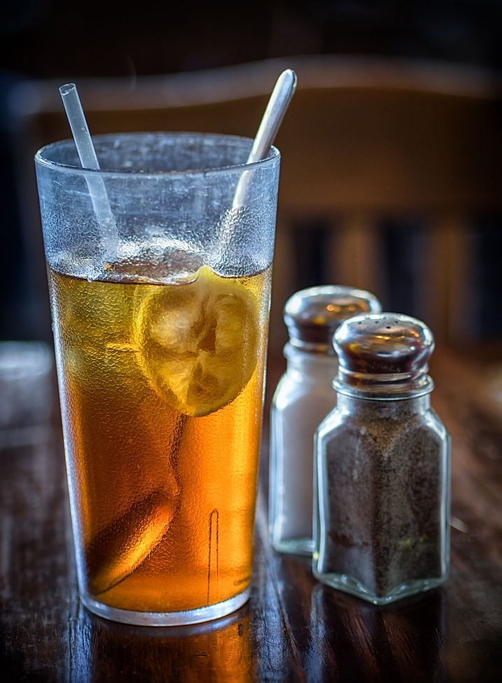
Recovered details in a street scene, overall much more detail can be seen.
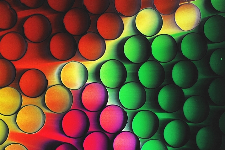
2. Color
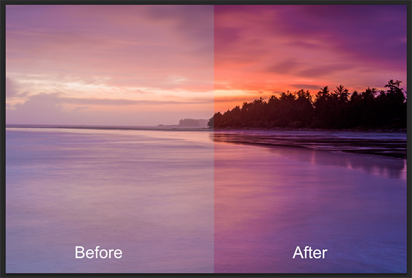
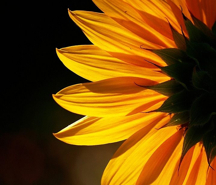
We all shoot on color nowadays. If you don’t, you should, even if you are going to convert to black and white – but that’s for another post. Shooting in RAW means that you are saving as much color information as possible from the scene. This is really important in landscape photography, portrait photography, food photography and even street photography. The color in your scene can make the difference between a good image and a great image. By shooting in RAW, you will have all the color information possible. The important part of that is the subtle color. For example, the gradation in the sky will look better than it would on JPEG, even if you think that JPEG will be fine from a color perspective. If you are shooting a landscape scene, you want to get as much color information as you can. RAW would be the format to do this. In Photoshop, the vibrance function will saturate the colors in your scene which are undersaturated and this can give your RAW file that subtle boost to make the image pop.

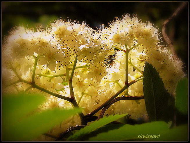
Much more color can be rendered from a RAW file.
3. Exposure
The exposure in your scene should always be as good as you can get it in camera. In the past, most photographers would underexpose a little to make sure they didn’t blow out the highlights. In recent years, most photographers shooting in RAW have been exposing to the right (ETTR). The new generation of cameras have a really good dynamic range and are able to render details in the shadows and the highlights in one shot. This was not possible a few years ago. ETTR means that when you look at your photograph’s histogram, try and push it over to the right a little – in other words, overexpose it a little. The reason is because RAW can handle highlights in a scene really well and if your shadows are a little brighter there won’t be as much noise in the shadows. This is really a good technique to use in landscape photography and architectural photography. Your images will be cleaner and have very little noise in them. Once you adjust the image in Photoshop, you will have a well-exposed image across the dynamic range.
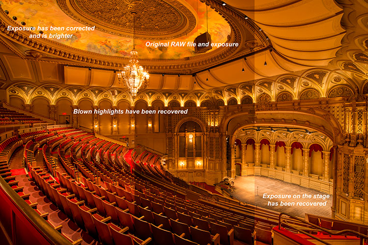
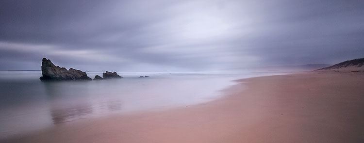
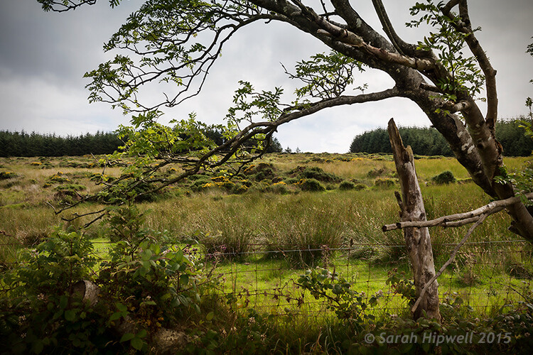
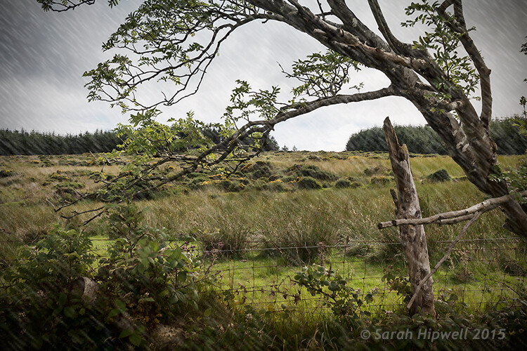
Blown out highlights in this scene were brought down, but the overall exposure was brightened.
4. Flexibility
The best part about RAW files are that they give you flexibility. If you shoot landscape images or street photography, you have a lot of information to work with and you can use that information to create the best possible image. Also, Photoshop is always improving their tools and functions. I have gone back and reworked older images: the RAW file had all the information and the new functions brought out the best of that scene. This has happened quite a few times, so don’t delete “throwaway” images so quickly. For this reason, I am also not a fan of chimping too much. Wait until you download the images to see what is worth keeping. Use RAW to give you as much flexibility as you can, even on older images.
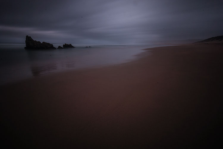
Original RAW file, the image was really dark from the use of an ND filter.
The result of the above image after being edited in Adobe RAW converter.
5. Quality
Editing your RAW image is a two-step process. The first step is converting it in a RAW converter. (Lightroom converts RAW images, as does Photoshop and many other image editing products.) Once you have made the corrections and subtle adjustments in the RAW converter, then you can open the converted image in Lightroom or Photoshop. You will then be editing on the best quality image possible. Image quality is almost the “holy grail” of photography. If you ask any photographer what the most important thing is for any image, it will most likely boil down to image quality. To be clear, when I say image quality I include sharpness, noise, dynamic range, color, tone, chromatic aberration and so on. Anything that adds to the overall look and feel of the image. Your image quality will be fantastic if you work carefully in your RAW converter and edit well in Photoshop. You can get good image quality in JPEG too, but you will be able to squeeze that much more out of the image if you shot in RAW.
Look at the quality and detail of the scene after being edited in Adobe Camera Raw converter.
RAW is a great format to use if you plan on editing your images. If you shoot landscapes, fashion, food, architecture and even weddings you should be considering shooting in RAW. One caveat on using RAW for weddings – you don’t have to shoot the whole wedding in RAW, but shoot the important images or images where the light is tricky in RAW. That way you can be confident you have the shot and information you will need for editing later.
RAW requires a different workflow for your image processing. If you don’t want to spend too much time editing, then maybe RAW will not work for you. The reality is RAW files are bigger, but that’s because they capture so much more information. If you are skeptical, give it a try. Shoot some scenes in RAW and try the Adobe RAW converter. Lightroom also works with RAW files. You might find that you have more details and information in your image than you thought.
googletag.cmd.push(function() {
tablet_slots.push( googletag.defineSlot( “/1005424/_dPSv4_tab-all-article-bottom_(300×250)”, [300, 250], “pb-ad-78623” ).addService( googletag.pubads() ) ); } );
googletag.cmd.push(function() {
mobile_slots.push( googletag.defineSlot( “/1005424/_dPSv4_mob-all-article-bottom_(300×250)”, [300, 250], “pb-ad-78158” ).addService( googletag.pubads() ) ); } );
The post 5 Reasons To Should Shoot Your Landscape Images in RAW by Barry J Brady appeared first on Digital Photography School.


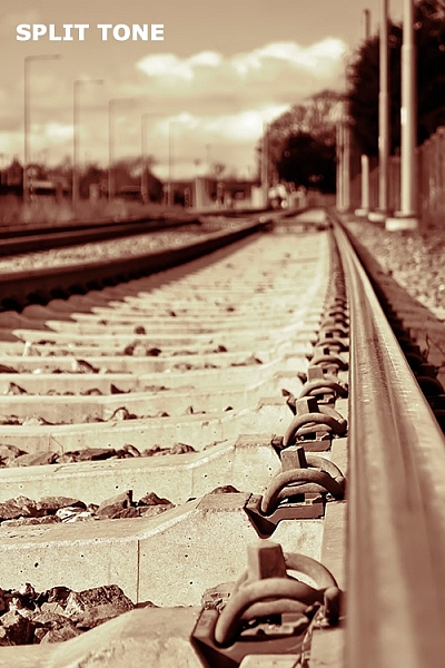
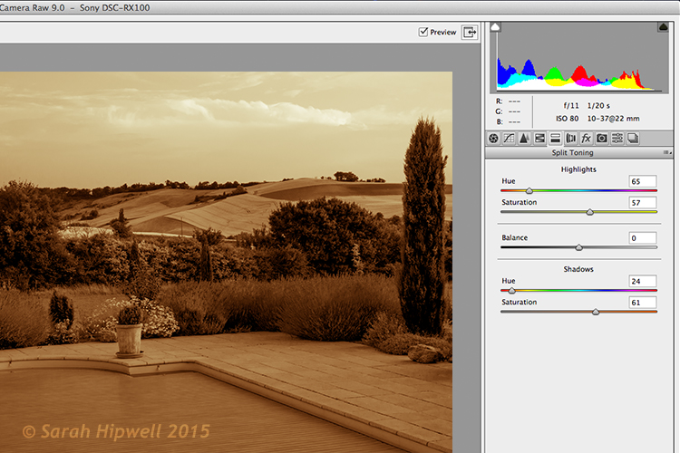
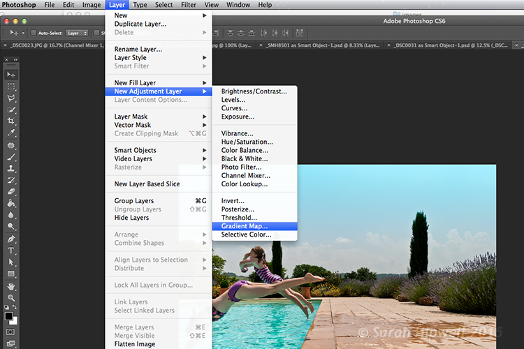
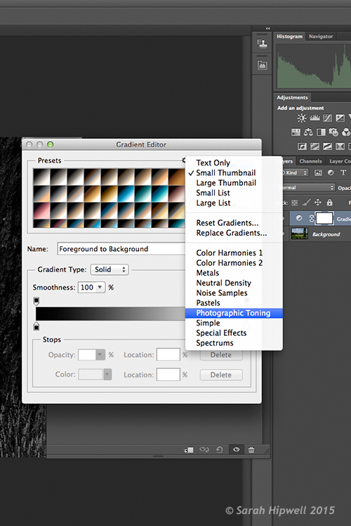
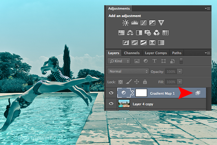
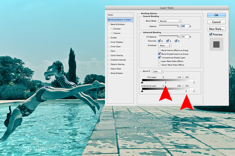
 Introducing split toning


You must be logged in to post a comment.