RSS
 

Posts Tagged ‘Images’

27 Interpretive Images that Represent Time

12 Feb

Okay technically this is 26 images and one really cool time lapse video that represent things related to time. Some are actual clocks or time pieces, yet others are more interpretive, mystical – such as long exposure photography, light trails and stars.

See where these photographers went – around the clock.

Christian Schirrmacher

By Christian Schirrmacher

Arne Bornheim

By Arne Bornheim

Paul Gravestock

By Paul Gravestock

Sacha Fernandez

By Sacha Fernandez

Vaidotas Mišeikis

By Vaidotas Mišeikis

Julen Landa

By Julen Landa

Robert Couse-Baker

By Robert Couse-Baker

Eddi Van W.

By Eddi van W.

Elvin

By Elvin

Bo Insogna, TheLightningMan.com

By Bo Insogna, TheLightningMan.com

Paolobarzman

By paolobarzman

John Fowler

By John Fowler

Luis Argerich

By Luis Argerich

Kat...

By Kat…

Philip Edmondson

By Philip Edmondson

Mikael Tigerström

By Mikael Tigerström

Alice Popkorn

By Alice Popkorn

Charlie Wales

By Charlie Wales

Pablo Fernández

By Pablo Fernández

Vincent_AF

By Vincent_AF

Tekke

By Tekke

Stefanos Papachristou

By stefanos papachristou

Atilla Kefeli

By Atilla Kefeli

Ian Sane

By Ian Sane

Joe Penniston

By Joe Penniston

Michael Shaheen

By Michael Shaheen

googletag.cmd.push(function() {
tablet_slots.push( googletag.defineSlot( “/1005424/_dPSv4_tab-all-article-bottom_(300×250)”, [300, 250], “pb-ad-78623” ).addService( googletag.pubads() ) ); } );

googletag.cmd.push(function() {
mobile_slots.push( googletag.defineSlot( “/1005424/_dPSv4_mob-all-article-bottom_(300×250)”, [300, 250], “pb-ad-78158” ).addService( googletag.pubads() ) ); } );

The post 27 Interpretive Images that Represent Time by Darlene Hildebrandt appeared first on Digital Photography School.


Digital Photography School

 
Comments Off on 27 Interpretive Images that Represent Time

Posted in Photography


How to Add a Texture Overlay to Your Images for a Stunning Effect

07 Feb

Adding a texture overlay to your images is an amazing creative tool. It adds another dimension of depth in the image; it makes it dreamy and adds a painting flavor. It also creates a timeless feeling, especially useful when you want to give a vintage look to your pictures.

You will really love this effect, it can be used in your personal work, and also sometimes in your commissioned work when you have some creative freedom over the result.

Adding a texture overlay is very easy. In this article I will explain how to create your own textures, then how to edit them to have infinite creative possibilities.

05 texture 100 percent

First – shoot your own textures

You can find many free textures online, for example on Deviant Art, or on any stock photo website. This is east, and sometimes helpful, although you can have copyright issues. The textures you will find online for free, are not always at high resolution. You will mainly find small files, not always the best to work with. But, I must say that so far I have never had any issues regarding textures size, even when printing my work in large format.

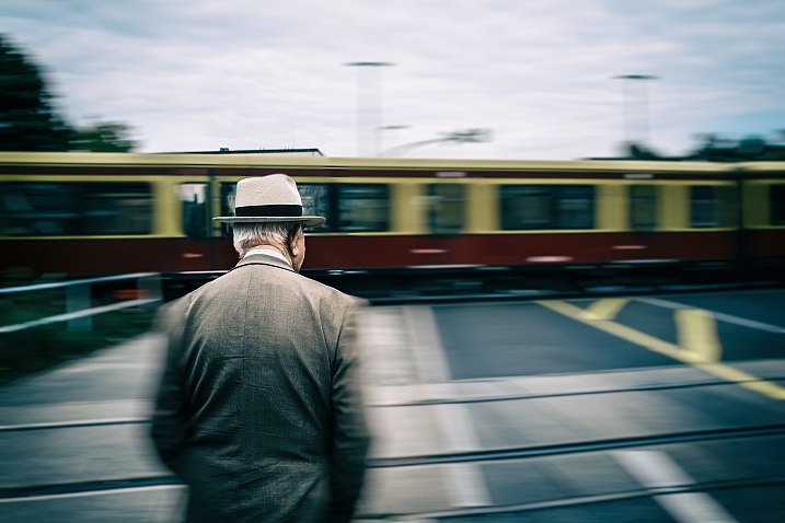
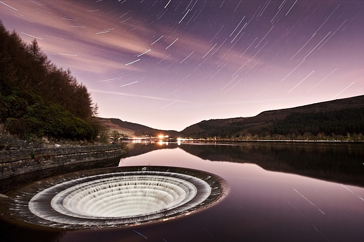
Shooting your own textures can be very fun, and a great creative exercise. Okay sometimes you will feel weird because people will not understand what you are shooting down on the pavement, nor they will see the point in photographing an old and dirty rain gutter. But it is well worth it.

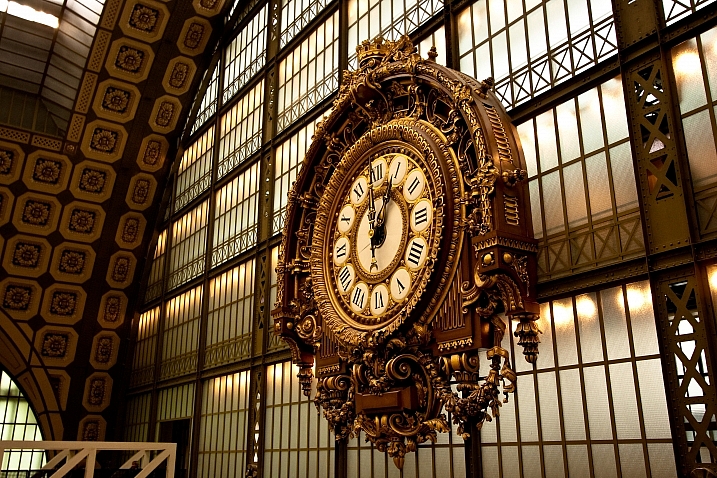
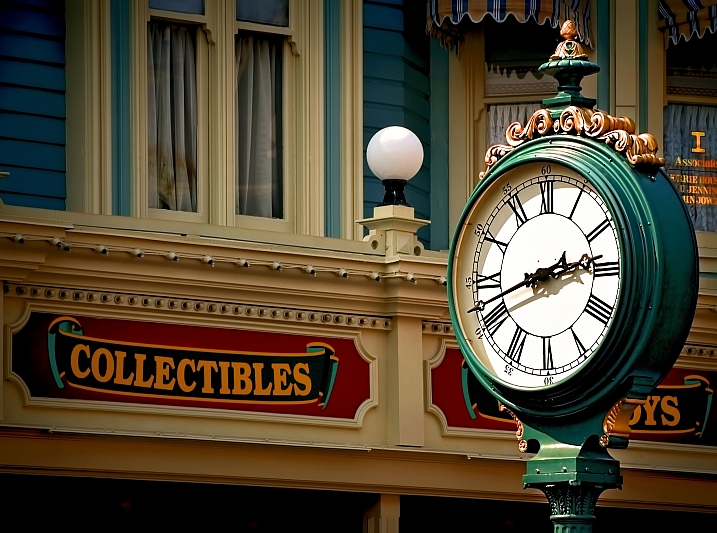
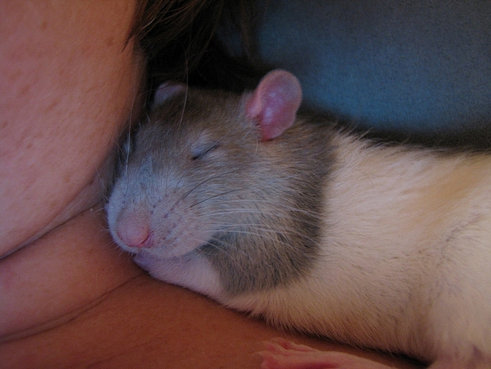
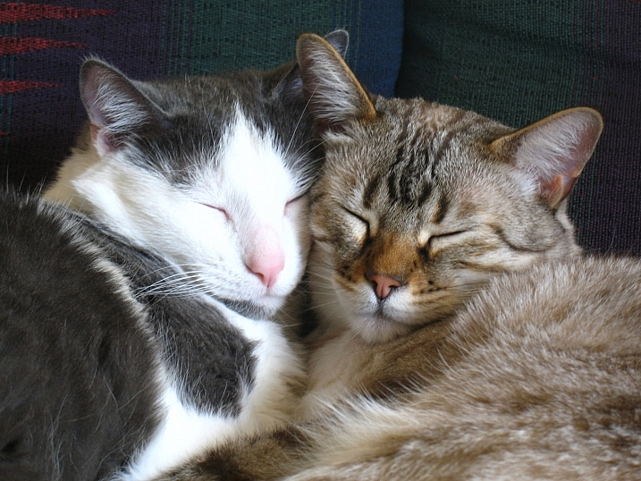
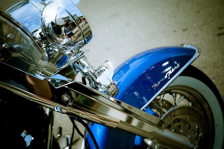
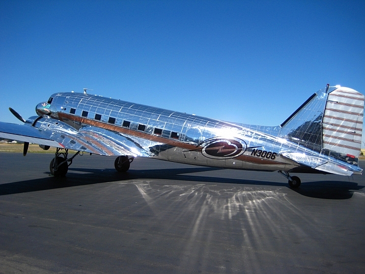
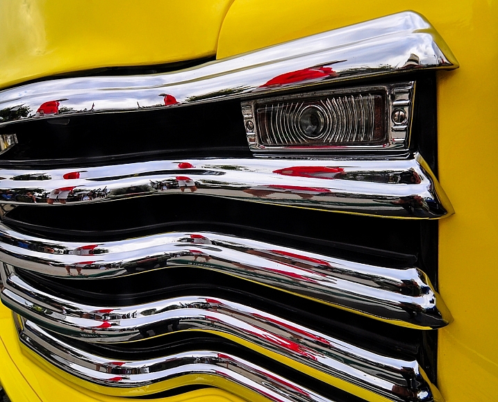
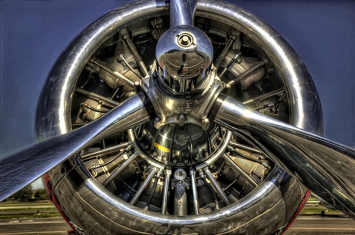
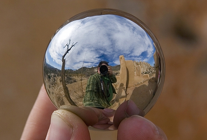
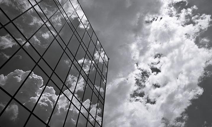
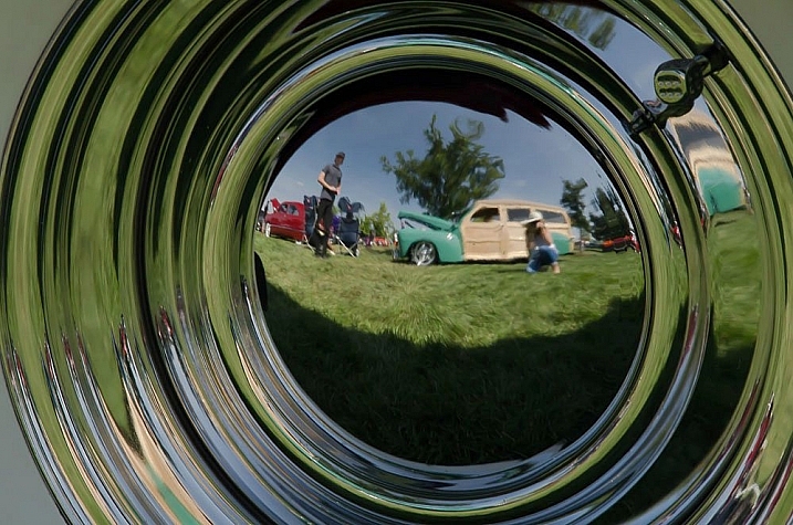
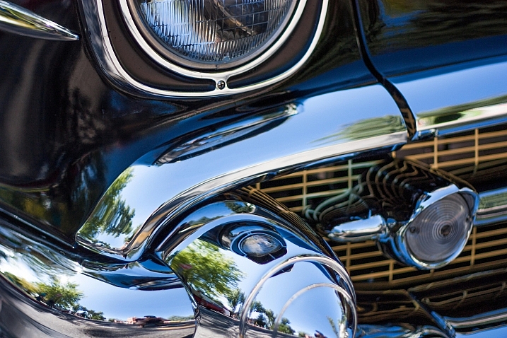
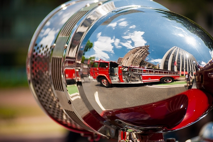
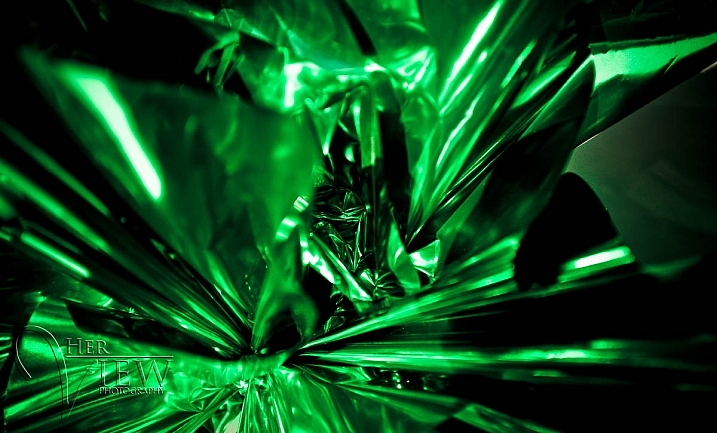
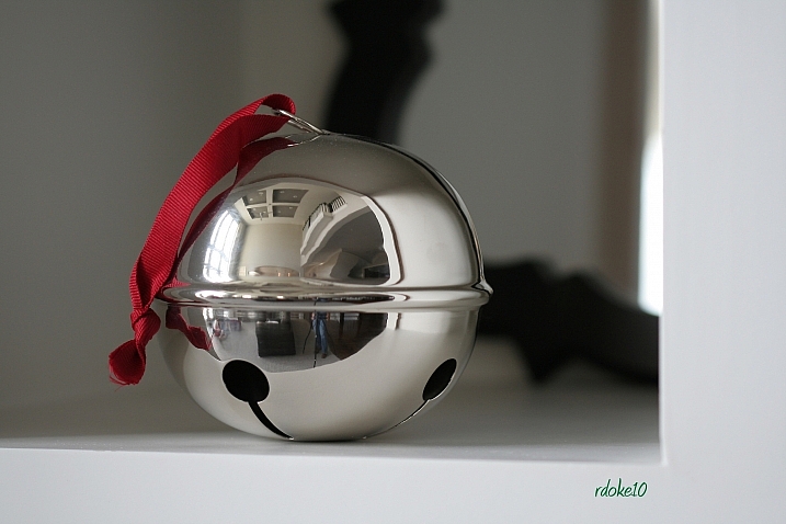
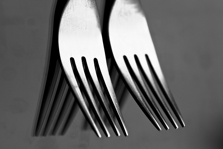
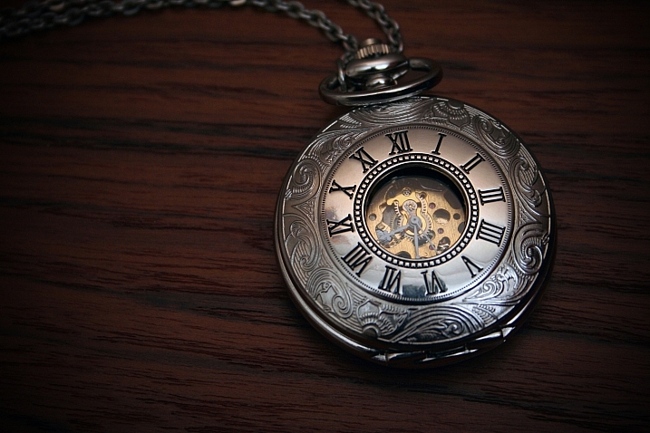
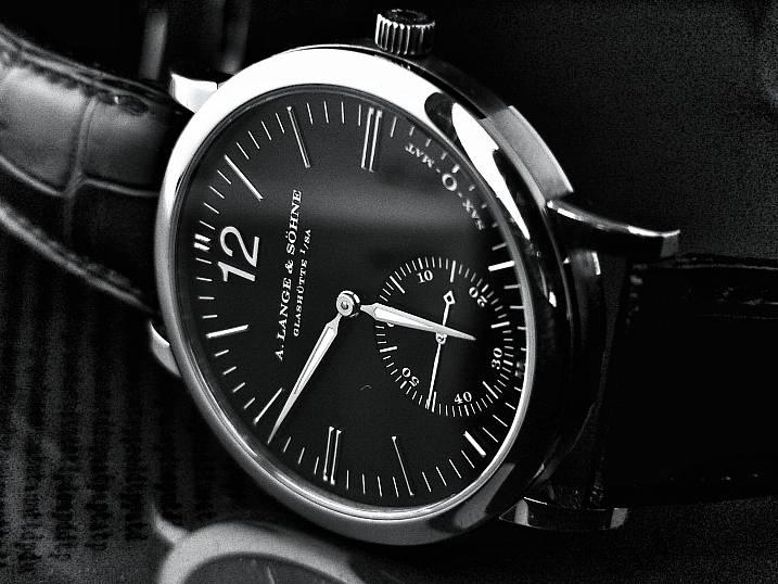
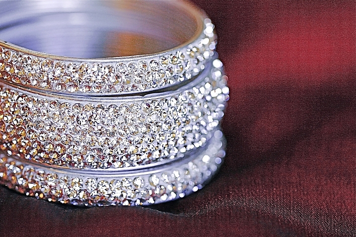
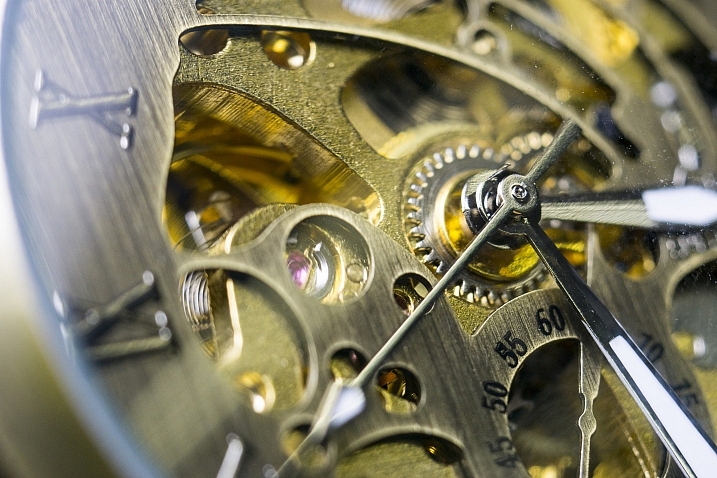
It is very easy to find great textures around you and build you own texture stock. You only have to take a walk with your camera to find textures. Look for some old painting on the walls, wood on the doors, or any bench in the street. You can also find metal objects with great texture and colors. You are looking for whatever has scratches, and can add an organic and natural feeling to your work. You can use stones, such as marble or granite, but also canvas or any other fabric with a nice texture as well.

01 textures

When shooting your texture, pay attention to your exposure compensation, as you want to have a contrasty, image to get more difference between the darks and lights. Also, you want to make sure everything is more or less sharp, so pay attention to your focus, depth of field, and angle from which you are shooting. This way the texture will be more homogeneous on your final image (and as you will see later in this same article you can adjust the texture in many ways).

To help you start your own textures library, you can find a link to download some textures you can use for free at the bottom of this article. I found many good textures for free online, so it is my way to pay forward this kind of generosity I found among photographers.

You can create your own textures at home

In Brussels it is freezing cold and rainy during the winter, so maybe you are the same as me, you do not want to go outside.

03 blue tale 01 no texture

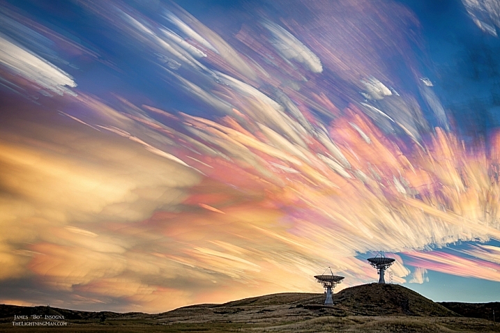
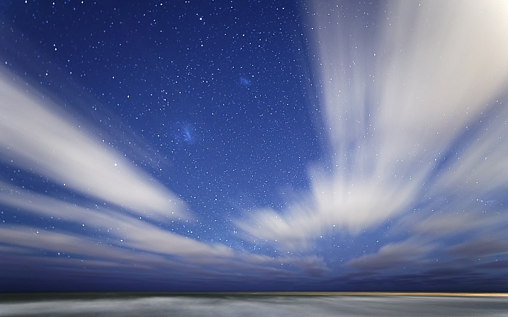
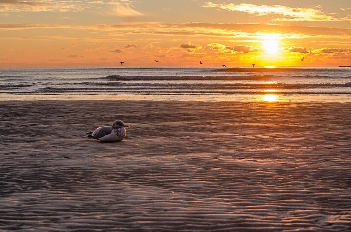
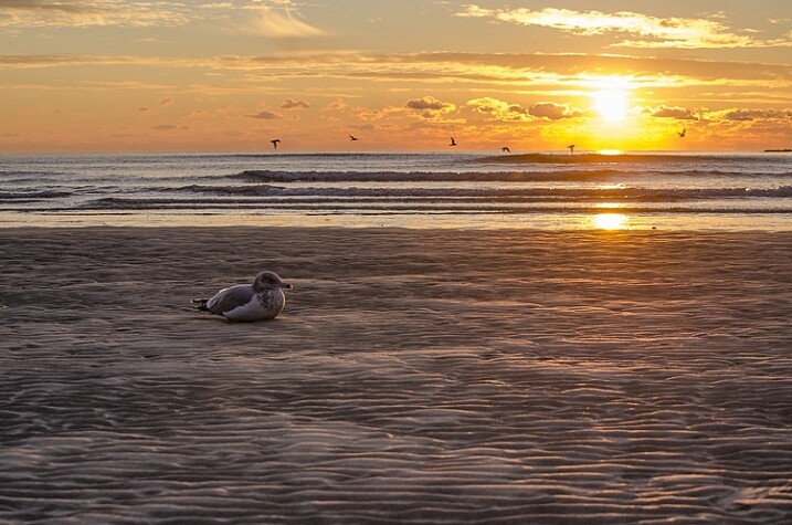
When you look for a specific effect you can make your own specific textures. For example, in the picture A Blue Tale (above) I wanted to play with a pencil color effect. Therefore I created the following texture to be added to the clouds.

I simply colored a piece of paper with a blue pencil crayong to have those lines and a texture effect. In this case, the preparation of the texture is fully part of the creative process, to put all those details together to create the image.

02 color pencil texture

03 blue tale 03 color pencil texture added

03 blue tale textures

You can also play with paper, painting, burn some paper (although I recommend being very careful).

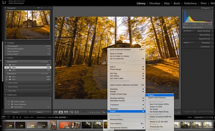
Now that you have your textures ready to be used, let’s open them in Photoshop. You can also use the ones that I shot for you down my street. To add a texture you can simply grab your moving tool and drag and drop it on your picture – or by doing copy/paste on your image.

Play with the Blend Modes

You can change the Blend Mode to change the look. When you add a texture to your image it will first look as follows, you see only the image of the texture on top of your image.

04 texture normal 100 percent

Play around with all the options Photoshop offers. Some texture/image combinations it will look weird, and others will look amazing.

Select your texture and hold down the Shift button, and + or –, to change quickly Blend Modes to go through them one by one, and test on your image. It allows you to see what every single Blend Mode will do to your texture – great way to quickly learn which one you like best.

  • The darkening group will help you to get rid of all light tones.
  • The lightening group will allow you to get rid of your darks.

04 Blend Modes panel

Most of the time, I choose the Soft Light Blend Mode – but you can choose any option, depending on your taste and the sought-after effect.

04 Blend Modes

Modify your texture

Move and resize the texture layer. Grab your Move Tool to place the texture as you wish on the image. Use Cmd/Ctrl+T to activate the Free Transform Tool and resize the texture layer, or flip it, to adjust it to the underlying picture.

You can add a Levels Adjustment with Cmd/Ctrl+L, to add some more detail contrast in your texture. You can also adjust the color. Usually I add the color in my image and prefer a desaturated texture. Hit Cmd/Ctrl+U to play with its color – if you want to desaturate it or change the color tones.

Play with the layer opacity

Turn down the opacity to see what best suits the chosen texture and image, in this case we’ll turn it down to 82%. Once you have found the right opacity you can always go back and change it whenever you want.

05 opacity

Add a layer mask on the texture layer

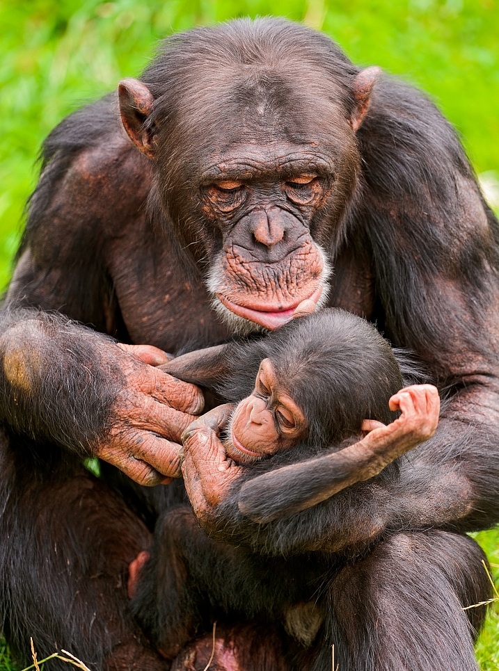
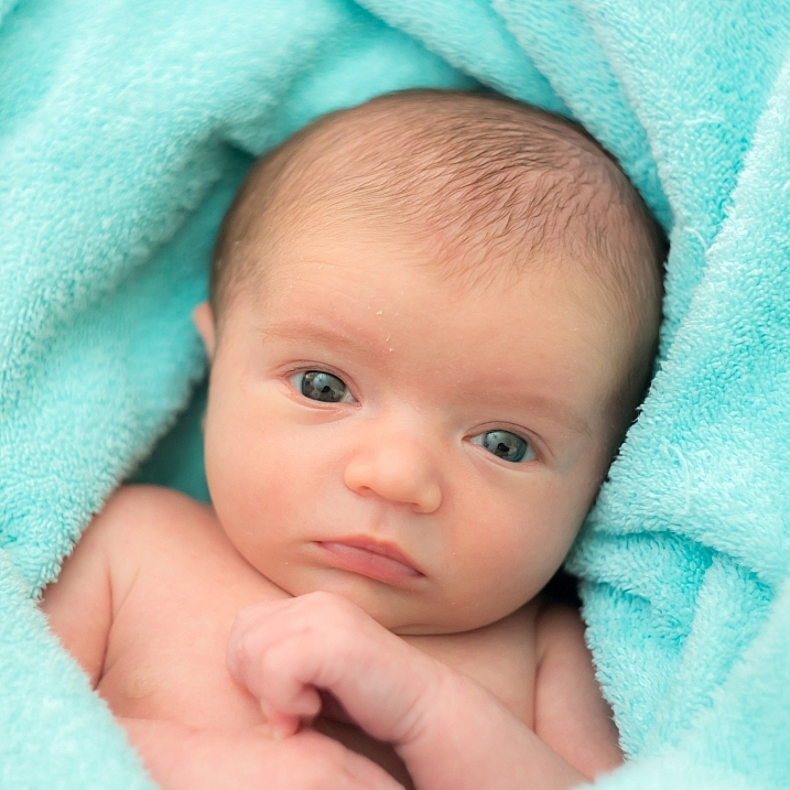
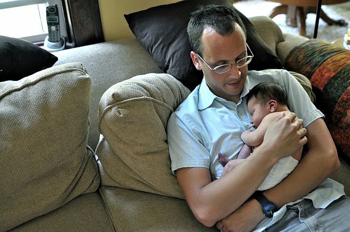
Applying texture over the whole image is great to give an artistic feel when the person is far away or it’s applied on a landscape. But, usually you want to avoid strong texture on your main character, especially if it is a close-up portrait, so you will want to soften the texture, or to erase it completely on areas such as the skin and eyes.

06 add layer mask

Add a layer mask on the texture layer and paint in black, playing with your brush opacity, size, and hardness to erase the texture where you want. Paint white your layer mask with a very soft edge brush, and low opacity, to bring back some texture on the subject edges to blend it with the background.

05 texture 100 percent

Add some more textures

You can lower the opacity of your textures and add as many of them as you whish to get the visual affect you want. If you want to see the full edit of this picture you can have a look at my speed editing video below:

I hope you will now want to add texture overlays to some of your work, or at least give it a try. It’s a great technical and creative exercise.

You can start with the free textures I prepared for you (click here to download them), and with some time start to shoot your own. Feel free to share the results or your technique in the comments below.

Editor’s note: if you have questions or issues downloading the textures, please contact Amelie on her site as they are not being hosted here on dPS so we cannot sort that for you. Thank you.

googletag.cmd.push(function() {
tablet_slots.push( googletag.defineSlot( “/1005424/_dPSv4_tab-all-article-bottom_(300×250)”, [300, 250], “pb-ad-78623” ).addService( googletag.pubads() ) ); } );

googletag.cmd.push(function() {
mobile_slots.push( googletag.defineSlot( “/1005424/_dPSv4_mob-all-article-bottom_(300×250)”, [300, 250], “pb-ad-78158” ).addService( googletag.pubads() ) ); } );

The post How to Add a Texture Overlay to Your Images for a Stunning Effect by Amélie Berton appeared first on Digital Photography School.


Digital Photography School

 
Comments Off on How to Add a Texture Overlay to Your Images for a Stunning Effect

Posted in Photography


4 Steps to Creating Images With More Meaningful Composition

06 Feb

If you wonder what composition really means, it is basically what elements you choose to put in a photograph, and where you decide to place them in the frame.

Vickie-Lewis-MtHood

When composing a photograph you need to consider several things:

  1. What is the story you are trying to tell? In other words, what do you want the viewer to see or feel when they look at your photograph?
  2. What’s your center of interest or focal point?
  3. What elements will most support that story?
  4. How can you maximize those elements?

Let’s consider each of those points individually.

1- What is the story you are trying to tell?

In other words, what do you want your viewer to know or experience when they see the photograph?

Some ideas if you are photographing your children:

  • You might want the viewers to see how cute they are.
  • You might want the viewers to see how smart they are.
  • You might want the viewers to see how much they love their sibling or new puppy.

Each of those ideas will impact how you choose to compose the picture. In the first example, you might choose to dress your daughter with a pink bow and sit her on her princess bed. If you want to show how smart your child is, you may decide to photograph them winning a spelling bee, or playing with test tubes. Of course, if the story is the new relationship with their puppy, you want to capture that moment of them hugging the puppy, or the puppy licking their face.

Lake-Vickie-Lewis-Photography-for-dps

Here’s another example shooting landscapes. Let’s say you want to take a photograph of a beautiful lake in a park, in the middle of a city. What’s the story you want to tell? What’s the experience you want your reader to have when they see your photo?

Here are some ideas:

  • You can isolate the lake and shoot it in such a way that it looks as though it is in the middle of nowhere.
  • You could shoot the lake with the cityscape in the background to show it as a haven in the middle of a grimy city.
  • You could show the restful, or quiet feeling, of the lake by just focusing on an empty park bench, or the reflection of a tree in the water.

grass by edge of lake Vickie Lewis Photography for dps

In every situation, there are many different stories and compositions. Knowing what the story is, and what you want to say, is the first step in composing a photograph. You can start to see how your intention with the photograph becomes important in composing a photograph.

2 – Choosing a focal point

With that in mind, the next step you want to think about is what is your center of interest or focal point? In other words, what is the one element you want your viewer to see first? What ONE element do you want to stand out?

If you are photographing your children, that’s pretty simple, you want your child to stand out. We’ll talk about some strategies to do that in a minute, but first let’s look at our other examples.

If you see a lake that you are drawn to, first ask yourself the story, then ask yourself what one element can be the subject? Is it a tree or rock in the lake? Is it a house on the lake? Is it the moon rising above the lake? Is it the grass growing on the edge of the lake?

Drop-by-Vickie-Lewis

3 – What elements support the story?

As you view the scene, ask yourself, “What elements support the story I’m telling?” As you look through the viewfinder, move your eye around the outside frame of the photo, then look inside that frame and ask yourself if there is anything in the photo that doesn’t belong there.

For example when you are taking a photograph of your child, you ask yourself if you need the dining room table in the background? Do you need your car in the background? What’s important? What elements add to the subject and which distract?

4 – How can you maximize those elements?

In the next section, we’ll look at examples and talk about ways you can clean up your photographs in two simple ways.

1 Lighthouse snapshopt Vickie Lewis Photography for dps

Above is a photo of a lighthouse. It’s a very pretty scene, but it’s filled with elements that don’t really help the composition. There are elements, including a wire overhead and an information stand in the front, that don’t add anything to the feel of the place.

2 Lighthouse Vickie Lewis Photography for dps

This is better. The first shot was taken with a wider angle lens. In this shot, I took a few steps to the right, and zoomed in a little bit. Zooming in not only eliminates some of the foreground, it changes the perspective. Can you see how the image feels more compressed? Also, the wires were not magically Photoshopped out of the picture, I chose to eliminate the top of the tree from the frame.

3 Lighthouse Vickie Lewis Photography for dps

Here’s yet another different perspective. For the shot above, I used an even longer lens, and moved more to the right. The most important element to me, the story, is the lighthouse. The dark tree nicely frames it, and adds perspective. This photo, compared to the first, is much cleaner.

Now, I could have chosen to get closer with the wide angle lens, but the light house would start to lean, and it would have emphasized the power lines.

Different angles can also help clean up backgrounds, so you ask yourself:

  • Would taking a step or two in a different direction get rid of some distractions?
  • Would getting a little bit higher or lower help the composition?
  • Would changing the focal length help with the composition?

1 Foggy Shack vickie lewis for dps

2 Foggy Shack Vickie Lewis for dps

Here’s a great scene of a foggy shack on a lake. It’s next to a very busy highway, so I chose an angle from which you can’t see any cars. In the first example, the emphasis is on the grass. I used a wider lens and looked for a patch of grass for the foreground that made a nice pattern. The grass leads the viewer into the photograph. The shack seems further away.

In the second image, I chose to focus just on the reflection and the quietness of the scene. I found an angle from which I could shoot with no grass. My focus changed, the feeling also changed. Which one do you like better?

1 Nehalem River Vickie Lewis for dps

Here’s a beautiful scene with lots of potential. But your eye really has no place to go. There isn’t a strong sense of interest. The story is one of serenity and a great place to go fishing.

2 Nehalem River Vickie Lewis for dps

To improve the composition, I waited until some fishermen popped into the right place. In the second photo, can you see how your eye has a place to go? It’s immediately drawn to the fishermen in the red boat.

You can greatly dramatically improve the composition in your photographs by framing a photo and waiting for the right elements to come together.

So now, moving forward with your photography, you have some great ideas to work with:

  • Consider what story you are telling with your photographs.
  • Make sure you have a center of interest.
  • Decide what elements support the story.
  • Maximize the elements by changing position and focal length.

googletag.cmd.push(function() {
tablet_slots.push( googletag.defineSlot( “/1005424/_dPSv4_tab-all-article-bottom_(300×250)”, [300, 250], “pb-ad-78623” ).addService( googletag.pubads() ) ); } );

googletag.cmd.push(function() {
mobile_slots.push( googletag.defineSlot( “/1005424/_dPSv4_mob-all-article-bottom_(300×250)”, [300, 250], “pb-ad-78158” ).addService( googletag.pubads() ) ); } );

The post 4 Steps to Creating Images With More Meaningful Composition by Vickie Lewis appeared first on Digital Photography School.


Digital Photography School

 
Comments Off on 4 Steps to Creating Images With More Meaningful Composition

Posted in Photography


24 Cuddly Images That Make You Say Awww

05 Feb

Who doesn’t love a good warm and fuzzy image? All things fuzzy and cuddly that make the heart thump and make us feel good.

These photographers captured the essence of cuddly with their images:

Marji Beach

By Marji Beach

Scott Wills

By Scott Wills

Jürgen Schiller García

By Jürgen Schiller García

Julien REBOULET

By Julien REBOULET

Jonathan Kriz

By Jonathan Kriz

Wsilver

By wsilver

Jan Truter

By Jan Truter

Tambako The Jaguar

By Tambako The Jaguar

Snugg LePup

By Snugg LePup

Mark Philpott

By Mark Philpott

Chris Fifield-Smith

By Chris Fifield-Smith

Barry Rayburn

By Barry Rayburn

Fivehanks

By fivehanks

Tambako The Jaguar

By Tambako The Jaguar

Ray Dumas

By Ray Dumas

Sandor Weisz

By Sandor Weisz

Franziska Geiser

By Franziska Geiser

Lou Bueno

By Lou Bueno

Kathleen

By Kathleen & Ryan Rush

Björn Láczay

By Björn Láczay

Rachel

By Rachel

Luke Jones

By Luke Jones

FancyLady

By FancyLady

Nathan Rupert

By Nathan Rupert

googletag.cmd.push(function() {
tablet_slots.push( googletag.defineSlot( “/1005424/_dPSv4_tab-all-article-bottom_(300×250)”, [300, 250], “pb-ad-78623” ).addService( googletag.pubads() ) ); } );

googletag.cmd.push(function() {
mobile_slots.push( googletag.defineSlot( “/1005424/_dPSv4_mob-all-article-bottom_(300×250)”, [300, 250], “pb-ad-78158” ).addService( googletag.pubads() ) ); } );

The post 24 Cuddly Images That Make You Say Awww by Darlene Hildebrandt appeared first on Digital Photography School.


Digital Photography School

 
Comments Off on 24 Cuddly Images That Make You Say Awww

Posted in Photography


How To Find Your Lens’ Sweet Spot: A Beginner’s Guide to Sharper Images

03 Feb

Are you tired of blurry images?

It’s time to learn how to capture sharper images by finding your lens’ sweet spot. This will give you more confidence, save time, and help you take better photos.

In this article you’ll learn:

  • How to find your lens’ sweet spot (for sharper images)
  • Why you should shoot in Aperture Priority mode (and how to use it)
  • How to perform a test to get your sharpest image every time
  • How important is your lens’ sweet spot? Notice the difference

Mid range aperture sharper than wide open

In the above images of the clock, the one on the right is sharper. Look closely at the words and at the leaves behind the clock. The f/9 image is sharper throughout because it was shot in my lens’ sweet spot. The f/3.5 one was not.

First, take a look at your lens

In this beginner’s guide, we’ll use an entry level zoom lens as our example. Most kit lenses (the basic lens that comes with a DSLR) generally shoot their sharpest at the mid-range aperture settings. To determine the mid-range of your lens, you’ll need to know its widest (or maximum) aperture setting. It is located on the side, or end, of the lens and will look something like this 1:3.5-5.6.

For example, here it is on my Canon 18-55mm zoom lens.

Lens aperture range

This means that when my lens is zoomed all the way out, its widest aperture is f/3.5. When zoomed all the way in, its widest aperture is f/5.6.

The rule to finding that mid-range sweet spot, is to count up two full f-stops (aperture settings are called f-stops) from the widest aperture. On my lens, the widest aperture is f/3.5. Two full stops from there would bring me to a sweet spot of around f/7.

Use this chart to count your f-stops

Robin Parmar

By Robin Parmar

There is some wiggle room in the mid-range, so anything from f/7 to f/10 will capture a sharp image. Once you know the mid-range of your lens, you can do an easy test to get your sharpest image. To perform the test you’ll need to shoot in Aperture Priority mode.

Take control with Aperture Priority Mode

Shooting in Aperture Priority allows you to choose the aperture setting you want, which gives you more creative control than Automatic mode. By controlling the aperture setting, it’s much easier to get a sharp image, and because your camera still chooses the ISO (if you are set to Auto ISO) and shutter speed automatically, it’s very easy to use.

You’ve probably heard that apertures like f/16 and f/22 are best for keeping everything in focus. While that can be true, focus does not always equal overall sharpness. Choosing a mid-range aperture will give you sharper images throughout. You can improve them even further by reducing camera shake with a tripod and a remote shutter release (or your camera’s self-timer).

Here’s an example of how shooting in your lens’ sweet spot will give you sharper images.

Sharp images shot in lens sweet spot

Mid range f stop sharper than small f stop

In the above split-image, the f/9 image is sharper than the f/22 one. The needles and shadows are not as soft or blurry as in the f/22 shot (look at the crispness and sparkles in the snow too).

Switching from Automatic to Aperture Priority Mode

To take your camera out of Automatic and put it in Aperture Priority, just turn the large Mode Dial to Aperture Priority. This is what that looks like on my Canon (on Nikon and other brans look for the A).

Aperture priority on canon mode dial

Automatic mode is the green rectangle; Aperture Priority mode is the Av (or A on a Nikon). Once your camera is in Aperture Priority mode, turn the smaller Main Dial (shown here on the top of my Canon) to choose your f-stop.

Main dial canon

As you turn that dial, you’ll see the f-number changing on your screen. In the next picture, it’s set to f/9.5.

Aperture setting on canon LCD screen

Perform a Lens Sweet Spot Test

Once you have your camera set up on a tripod, performing a sweet spot test only takes a couple of minutes. To begin, put your camera in Aperture Priority mode, then compose your shot and take a photo at varying apertures. Start out with the widest, then click that main dial a couple of times (to the right) and take another. Keep doing that until you’ve taken seven or eight photos.

Upload your photos to your computer and zoom in on them. You’ll quickly see which aperture settings gave you the sharpest overall image.

This next photo of my daughter was shot using natural light. Shooting in my lens’ sweet spot gave me a pretty sharp image, even in this low light setting.

Mid range aperture sharp image low light

Find your lens sweet spot for sharper images

The close up of the mugs shows the advantage of shooting in the lens’ sweet spot. Whenever you want to make sure you get the sharpest capture possible, take a shot at each mid-range setting f/7, f/8, f/9, and f/10.

Getting Your Sharpest Images

Now that you know your lens’ sweet spot, it’s time to practice. I hope you’re as pleased with the results as I’ve been!

Mid range aperture for sharper images

I love shooting in natural light, and learning how to capture sharper images in low light has made me so much happier with my photos.

Tips for capturing your sharpest images:

  • Shoot in Aperture Priority mode
  • Choose a mid-range aperture (usually f/7 to f/10)
  • Use a tripod and a remote shutter release (or your camera’s self-timer) to reduce camera shake
  • Take a series of shots at f/7 through f/10 when a sharp capture is especially important

But don’t stop here. Keep playing with settings in Aperture priority mode. It’s awesome to get images that are sharp throughout, but there’s a lot more to aperture than that.

Learn more about aperture and depth of field here.

Do you have any lens sweet spot tips to share? Please do so by commenting below.

googletag.cmd.push(function() {
tablet_slots.push( googletag.defineSlot( “/1005424/_dPSv4_tab-all-article-bottom_(300×250)”, [300, 250], “pb-ad-78623” ).addService( googletag.pubads() ) ); } );

googletag.cmd.push(function() {
mobile_slots.push( googletag.defineSlot( “/1005424/_dPSv4_mob-all-article-bottom_(300×250)”, [300, 250], “pb-ad-78158” ).addService( googletag.pubads() ) ); } );

The post How To Find Your Lens’ Sweet Spot: A Beginner’s Guide to Sharper Images by Dena Haines appeared first on Digital Photography School.


Digital Photography School

 
Comments Off on How To Find Your Lens’ Sweet Spot: A Beginner’s Guide to Sharper Images

Posted in Photography


How to Size Images for Online Sharing

03 Feb

Whether you’re running a photography business, or sharing your photography on the web with friends, it’s important to know how to properly size your images for various uses. Generally speaking the smallest size you can share, while still retaining enough quality for the viewer to appreciate the photograph, is what you’ll want to aim for, but let’s dive into this with a bit more detail.

First rule – use the sRGB Color Space for anything going on the web

Before you even think about sizing an image for the web, you’re going to need to make sure that you’re using the correct color space. The web is standardized on the sRGB color space, which means that if you want your photography to appear accurately across the web, that’s the color space you need to use when you save your image.

Take a look at this side by side comparison of the same photograph, saved directly from Lightroom, using the sRGB color space versus the AdobeRGB color space.

sRGB

sRGB

AdobeRGB-750

AdobeRGB

You’ll notice that the AdobeRGB color space appears slightly more muted in terms of color and it has a slightly more greenish tint when compared to the sRGB image.

Second rule – Smaller size over image quality

Even in this world of high resolution monitors, it’s still the best practice to use smaller sizes when sharing images on the web.

Here at dPS, images in the articles are sized to be 750 pixels on their longest side at an overall size of around 200kb. The reason you want to reduce the size of your images for use on the web is primarily to improve the user experience for your readers. The more data a webpage has to load, the longer it will take for the reader to be able to see content.

Social media and dedicated portfolio sites, like Smugmug or Zenfolio, are the exception to this rule as they have optimized their backends to handle large image files when necessary, and actually require the full size image for printing purposes.

How to size your images?

Knowing why to size your images is only the first piece to the puzzle, now it’s time to learn how to size your images. This article will show you two ways to size images, one with Lightroom and another with Photoshop, as they are the two most commonly used pieces of software among dPS readers.

How to size an image in Lightroom

The best thing to do with Lightroom is to set up an export preset specific for your needs. Once this preset is set up, all you’ll have to do is select it, and everything will be done for you.

Step 1: Select any photograph and right click. Navigate to Export and select Export from the fly out menu.

export-images-lightroom

Step 2: In the box that opens, after selecting your Export Location and File Naming options, you’ll want to navigate to the File Settings and Image Sizing sections.

In the File Settings Section: Make sure that Image Format is set to JPEG, and that Color Space is sRGB. You can choose to limit the file to a specific siz,e if this matters to you, but know that too much size reduction can result in noticeable quality loss of an image.

sizing-images-with-lightroom

In the Image Sizing Section: You’ll want to check “Resize to Fit” and make sure that the drop down is set to Long Edge. Check the box “Don’t Enlarge” which will mean that any time you export an image smaller than your “Long Edge” setting, it won’t stretch the to fit that dimension. Finally, you’ll need to pick what size you want your image to be – here it’s set to 750px and 72 pixels per inch which is what we use at dPS.

To save this as a preset that you can use over and over again, click on the “Add” button in the lower left corner, and name your preset when the dialogue box opens.

sizing-images-with-lightroom2

Now, whenever you want to export a photograph to the web, all you have to do is right click on the image you wish to export, and navigate to the preset you’ve just created. Super easy!

export-images-lr2
How to size images with Photoshop

When you want to save your images for the web with Photoshop, the best option is to use Photoshop’s “Save for Web” tool. This will let you choose from various file types (in most cases you’ll want JPEG), and also allow you to convert the image to the all important sRGB color space.

photoshopsaveforweb

To find the Save for Web option you’ll want to navigate to File > Export > Save for Web

Once you select this option a new window will open, providing you with a number of options for exporting your image from Photoshop. Here you’ll want to make sure that “Convert to sRGB” is checked, and that your file format is set to JPEG. Sizing can be done by picking a width or height, and as long as the two are connected with the link symbol, Photoshop will calculate the other’s value based on the one you input and maintain the image proportions accurately.

The most important part about saving photographs for use on the web is getting the color space correct, and realizing that people browsing photographs on the web are often doing so on smaller screens, with limited time on their hands. Fast load times not only improve your user’s experience, but they also will reflect favorably on Google’s search engine’s algorithm which is used to determine if your content is worthy of being shown to people searching Google for answers.

How do you size your images for online use? Please share in the comments below.

googletag.cmd.push(function() {
tablet_slots.push( googletag.defineSlot( “/1005424/_dPSv4_tab-all-article-bottom_(300×250)”, [300, 250], “pb-ad-78623” ).addService( googletag.pubads() ) ); } );

googletag.cmd.push(function() {
mobile_slots.push( googletag.defineSlot( “/1005424/_dPSv4_mob-all-article-bottom_(300×250)”, [300, 250], “pb-ad-78158” ).addService( googletag.pubads() ) ); } );

The post How to Size Images for Online Sharing by John Davenport appeared first on Digital Photography School.


Digital Photography School

 
Comments Off on How to Size Images for Online Sharing

Posted in Photography


10 Ways That Understanding Your Camera Leads to Better Images

02 Feb

Perhaps you’ve heard this one before, or said even it yourself: I could take great pictures too, if I had your camera. But saying pictures are great because of the camera is like saying Michael Jordan was great because of his shoes. Sure, the camera determines an image’s resolution, but give a $ 7,000 camera to a toddler and you’ll have Continue Reading

The post 10 Ways That Understanding Your Camera Leads to Better Images appeared first on Photodoto.


Photodoto

 
Comments Off on 10 Ways That Understanding Your Camera Leads to Better Images

Posted in Photography


How to Create Dynamic Images with an LED as Your Only Light Source

02 Feb

With a limited budget it’s easy to feel limited by your gear (or lack of gear I should say) but with time, and experimentation, you can discover ways to use the gear you have now, to make compelling images. In this tutorial you will be given a few pointers on how you can use just one LED light to make beautiful and dynamic images.

Equipment

For this tutorial you will need:

Intro image 1

  • An LED light. The light used here is a Neewer CN-126 LED Video Light which was bought on Amazon for under $ 35.
  • A DLSR – Canon, Sony, or any other brand is suitable. I used a Canon 5D Mark II.
  • A tripod or stable surface.

Direct light

Let’s start with the easiest setup: Placing your LED light directly on top of your camera, or on a light stand directly in front of your subject, may seem fairly basic. On its own, it can create a standard, flatly, lit image, which may not seem very exciting to your viewer. However, placing an item that has an interesting pattern or shape directly between your light and your subject can give a unique and creative result.

You can, for example, place a lace tablecloth between your LED light and your model/subject. Playing around with the fabric’s distance from the light, causes the pattern’s shadow to change size, and sometimes even shape. Adjust the distance and placement of your fabric (or other item) until you find a combination that works for you.

DL image 1

DL image 2

DL image 3

For the image above, I used my 50mm lens with an ISO of 2000, and my exposure set manually with shutter speed at 1/50th and aperture at f/1.4. My LED light was adjusted to medium brightness.

You can also use movement to add interest to your image as shown below. A slow shutter speed along with quick movements can make your images a real conversation piece. Try experimenting with moving your body, or an object like a colourful scarf or umbrella in your image.

DL image 4

Side light

Taking your LED off-camera, and placing it at an angle to your subject is another easy way to create a beautiful image with this simple setup. Keep your LED light setting between low and medium, and angle it at roughly 45 degrees from your subject, can give a nice soft light cascade across your image.

SL image 1

If you try placing your LED light directly to the right, or left, of your subject, you will get a pretty cool effect as well. This placement creates an interesting shape in the natural shadow your subject makes. In the image below, the LED is propped up at eye level, on a bookshelf to my left. The angle of the light, coupled with a delicate pose, created an image that was both compelling, and visually interesting. Camera settings for this image were ISO 1600, f/3.2 and 1/160th of a second with a 50mm lens.

SL image 2

Playing around with overlays and textures in Photoshop can further enhance your photo.

SL image 3

Backlight and overhead light

For small objects you can do a simple backlight setup, using your LED light. If you place a sheet of white letter sized printing paper directly over your LED light, and place your subject directly on top of it, the result is pretty interesting. When using this method try to choose a subject that you think would have an interesting silhouette. You can also try items that are slightly translucent and may possibly glow when back lit. Try capturing your final image by shooting from an overhead angle, but don’t be afraid to experiment with other camera positions as well.

BL image 1

BL image 2

Interesting images can also be created by putting your LED light directly above your subject. In the first image below, the light was angled slightly above the rose. This created a nice, softly angled, light effect that gave the rose a different dimension.

OL image 1

Coupling the overhead LED placement with interesting poses gives really striking results. Posing your subject with their face turned upward, in the direction of the light, for example, creates some really nice shadows along the contours of the face. Some creative editing in Photoshop resulted in these final images.

OL image 2

OL image 3

With this simple tool and a little imagination, you can create dynamic, visually appealing images for your portfolio. The key here is to experiment, play and have fun.

Let me know other creative ways you have used an LED light to add interest to your photography in the comments below.

googletag.cmd.push(function() {
tablet_slots.push( googletag.defineSlot( “/1005424/_dPSv4_tab-all-article-bottom_(300×250)”, [300, 250], “pb-ad-78623” ).addService( googletag.pubads() ) ); } );

googletag.cmd.push(function() {
mobile_slots.push( googletag.defineSlot( “/1005424/_dPSv4_mob-all-article-bottom_(300×250)”, [300, 250], “pb-ad-78158” ).addService( googletag.pubads() ) ); } );

The post How to Create Dynamic Images with an LED as Your Only Light Source by Tricia Bent appeared first on Digital Photography School.


Digital Photography School

 
Comments Off on How to Create Dynamic Images with an LED as Your Only Light Source

Posted in Photography


29 Polished Images of Shiny Things

29 Jan

I think as human beings we are all attracted to shiny things – oh look squirrel! Just kidding.

But they go grab our eye. However, photographing them can be a bit trickier. You have to watch out for reflections, or maybe use them in your composition to your advantage. But you have to be intentional about it as a photographer.

In these images I found of shiny things let’s see how some other photographers handled this tough subject:

Darlene Hildebrandt

By Darlene Hildebrandt (a selfie of mine from 2009!)

Brian Burger

By Brian Burger

Bill Gracey

By Bill Gracey

Sean Molin

By Sean Molin

Lawrence OP

By Lawrence OP

Dave Wilson

By Dave Wilson

Kurt Bauschardt

By Kurt Bauschardt

Alan Newman - An1.uk

By Alan Newman – an1.uk

Neil  Kremer

By Neil Kremer

Kolby

By Kolby

Siggi Churchill

By Siggi Churchill

Cathy McCray

By Cathy McCray

Jon Matthies

By Jon Matthies

*Vintage Fairytale*

By *Vintage Fairytale*

Killerturnip

By killerturnip

Kolby

By Kolby

Tiago

By Tiago

Darlene Hildebrandt

By Darlene Hildebrandt

> Mr.D Photography

By > Mr.D Photography

Thomas Hawk

By Thomas Hawk

Mark

By Mark

Ron Doke

By Ron Doke

Nana B Agyei

By Nana B Agyei

Genna G

By Genna G

Philippa Willitts

By Philippa Willitts

Carlos

By carlos

Aleksey Gnilenkov

By Aleksey Gnilenkov

Fatima

By Fatima

Tobias S.

By Tobias S.

googletag.cmd.push(function() {
tablet_slots.push( googletag.defineSlot( “/1005424/_dPSv4_tab-all-article-bottom_(300×250)”, [300, 250], “pb-ad-78623” ).addService( googletag.pubads() ) ); } );

googletag.cmd.push(function() {
mobile_slots.push( googletag.defineSlot( “/1005424/_dPSv4_mob-all-article-bottom_(300×250)”, [300, 250], “pb-ad-78158” ).addService( googletag.pubads() ) ); } );

The post 29 Polished Images of Shiny Things by Darlene Hildebrandt appeared first on Digital Photography School.


Digital Photography School

 
Comments Off on 29 Polished Images of Shiny Things

Posted in Photography


Corbis Images content to be distributed by Getty

26 Jan

Getty Images is set to become the exclusive distributor of its rival’s content after a deal in which Corbis Images was sold to a Chinese company that has a partnership with the Getty agency. It was announced recently that Unity Glory, an affiliate of media business Visual China Group (VCG), has bought the assets and brands of Corbis Images for an undisclosed sum. A pre-existing agreement between Unity Glory and Getty will see Getty Images representing the Corbis content in all territories outside China, as the two companies have worked together for over ten years to share content. Once the Corbis still and moving images archives have been migrated into Unity Glory’s own archive, Unity Glory will distribute within China and Getty Images will sell the work in the rest of the world. 

Getty Images and Corbis Images have been rivals since Bill Gates, who was still Chairman of Corbis, changed the name of his Interactive Home Systems company to ‘Corbis Corporation’ and acquired the Bettmann Archive in 1995. The 16 million images of the collection made Corbis the largest supplier of stock images in the world, and the library went on the next year to acquire the rights to 40,000 photographs by Ansel Adams. After numerous other acquisitions Corbis bought the Sygma news agency in 1999, which bought over 40 million images of significant European events into its control. 

Getty Images is said to already control almost 200 million images, including 80 million from its Hulton Archive historical collection. The Getty empire includes iStockphoto (or iStock as it is now), the Tony Stone agency – now called ‘Stone’ – as well as the collection of royalty-free image business PhotoDisc. Thinkstock is Getty’s current royalty-free division. 

The Corbis Images content will be gradually merged into Getty’s own, which may well lead to job losses across the two agencies. An article on the Time Lightbox website quotes Getty Images’ Senior Vice President of Business Development, Craig Peters, as saying that Visual China Group will take over the contracts of all contributing Corbis photographers. “Contributors will [be able] to execute their rights as their contracts stipulate,” he says, according to the report. 

VCG is China’s largest visual media content company and currently has over 14,000 photographers and artists contributing to its collection. It won’t hold the physical assets of the Corbis purchase, such as historic documents and images recorded on film, plate and in print, and Getty will be responsible for taking over the housing and digitising of these. 

Whether this turns out to be good or bad news for contributors we will have to wait and see. Less competition in the market will perhaps stop the downward trend of stock photography prices, but ultimately the likely consequences are unclear. A joint statement from Getty and VCG says ‘details about the transition will be communicated to customers and contributors in the coming weeks’.

For more information see the Getty Images, Corbis Images and Visual China Group websites. 


Press release:

Getty Images and Visual China Group Partner in Exclusive Global Distribution Partnership for Extensive Visual Content Collection of Corbis Images

Getty Images, the world leader in visual content and communications, and Visual China Group (“VCG”), a leading Chinese visual communications and new media business, today announced an exclusive distribution partnership that will enable Getty Images customers to access the extensive visual library from Corbis Images. As a result, the existing Getty Images collection of almost 200 million images will expand to include Corbis Images content, creating an unprecedented collection of images, videos and historic archival content for creative and editorial use worldwide.

The partnership follows VCG’s acquisition announced today of Corbis Images, Corbis Motion and Veer. Under the terms of that agreement, Unity Glory, an affiliate of VCG, will own and manage the worldwide images and motion archives, names and trademarks associated with these three Corbis licensing brands and Getty Images will have exclusive distribution rights to these Corbis brands and content.

VCG has partnered with Getty Images for over a decade to market and distribute Getty Images’ award-winning content exclusively in China.  After a transition period, Getty Images will exclusively offer Corbis creative stills, Corbis Motion content and Corbis archival and documentary content to its global customer base outside of China.

This partnership brings together the best creative and editorial imagery and combines Getty Images’ renowned Hulton Archive, the largest privately held archive in the world with an estimated 80 million images dating back to the beginning of photography, with Corbis’ Sygma and Bettmann archives. The Bettmann Archive is a significant historical image collection comprising of more than 16 million photographs from the 19th and 20th centuries, while the Sygma Archive holds 34 million images covering Europe’s most important historical events.

“As the most trusted and esteemed source of visual content in the world, Getty Images is always innovating and investing to bring customers the most comprehensive and diverse offering of quality content,” said Craig Peters, Senior Vice President, Business Development, Product and Content at Getty Images.

“We are excited to deepen our longstanding partnership with VCG, a trusted business partner for Getty Images in China, and to offer an unprecedented breadth and depth of gold-standard content across creative, editorial, archival and video, which customers will be able to access through an expanded and unified service at gettyimages.com and through our market leading sales teams all over the world.”

Amy Jun Liang, Chief Executive Officer of VCG, said: “We are proud to work with our partner Getty Images to assemble such impressive visual assets and work together to better serve our customers around the world. This maximizes the commercial value of the assets, strengthens our market position in the industry, and marks a significant milestone in the expansion of our business portfolio to the world. As one of the largest companies in the image industry, we foresee a growing interest in China and around the world for premium visual content and we look forward to collaborating with Getty Images to fulfil this demand.”

Getty Images will create specific collections to house this new content on gettyimages.com, where it will sit alongside award-winning content from Getty Images’ own staff photographers, its network of over 200,000 contributors and from approximately 330 existing image partner relationships, including prestigious partners NBC Universal, BBC Worldwide and AFP.

Getty Images’ purchasing options such as Premium Access agreements and recently introduced UltraPacks, the simplest way to buy and download content across creative, editorial, archival and video, will provide streamlined and flexible ways for customers to search, purchase and download imagery.

VCG is China’s largest image licensing company. Its VCG.com website is China’s largest online licensing and copyright distribution for premium visual content, and its contributors’ network includes more than 14,000 photographers and artists and hundreds of image partners globally, serving the needs of advertisers, media outlets, and other organizations using licensed images, videos and musical content.

VCG and Getty Images will immediately begin work to migrate Corbis content, with migration to be completed as quickly as possible to ensure a seamless transition for customers, contributors and other partners. In the interim, Corbis customers will continue to access this content in the usual way via the Corbis websites and sales team.

Articles: Digital Photography Review (dpreview.com)

 
Comments Off on Corbis Images content to be distributed by Getty

Posted in Uncategorized