What is a vignette?

The word vignette comes from the root word vine, which originally was taken to mean a decorative border on a page. In photography, this translates to a border around the edge of the image. This border is caused by a reduction of light from the center of the image, or a light fall-off. Light fall-off can be due to a variety of reasons: the amount of light hitting the sensor, the type of lens used, or an intentional addition in post-production. This article will focus on the latter.
In adding vignettes in post-processing, you have two choices: darker or lighter, and soft-gradual or hard-edge.
Why add a vignette?
The addition of a vignette in post-processing comes down to your personal taste. It would also largely depend on your photography style, and the type of image you are editing. Generally speaking, high-key images do not need a dark vignette. If you want to add a vignette to bright images, most often a lighter one looks better, but I would still be very careful about adding one.
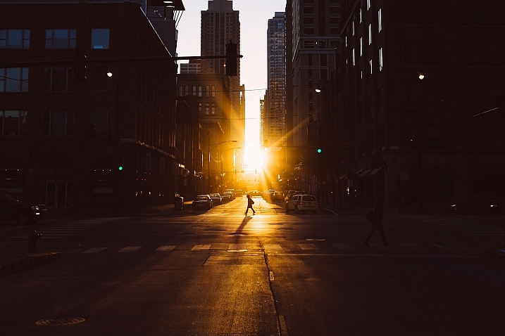
A vignette helps draw the viewer’s eye to the center of the image. This is particularly useful if the image has plenty of clutter, or distracting elements around the edges. Similarly, if the edges are pretty bare which makes the image look flat, a vignette adds an illusion of foreground, or another layer to the image, giving it more depth.
Be gentle and sparing when adding a vignette, it can enhance or ruin an image. What works often, and best, is a gradual and very subtle vignette, especially for portraits. More exaggerated vignetting may be required on some artistic images – the choice is yours. If you want to add a spotlight effect to an image, then adding vignettes can be essential. A hard-edged vignette, if done unintentionally, makes your image look like a view through a periscope and can burn your image, like a moth to a flame.
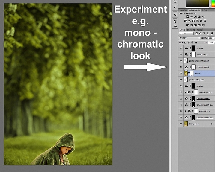
Here are four quick ways to add a vignette
In Adobe Camera Raw
The quickest and easiest way to add a gradual and gentle vignette in your image is via Adobe Camera Raw (this works in both Photoshop and Lightroom). My previous article on batch editing with Bridge and Adobe Camera Raw explains how you can open your file in Camera Raw and make your initial edits.
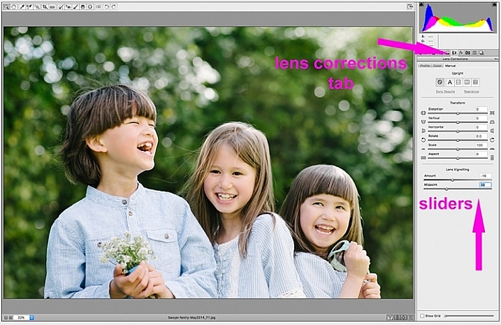
1. Using the lens correction tab
On the image below, you will see the lens vignetting slider under the lens correction tab. Move the sliders along to add, and remove vignettes to your image, according to taste.
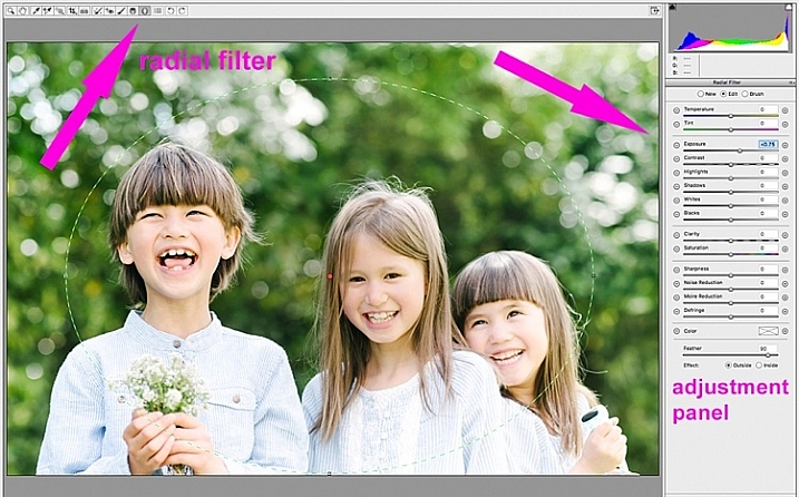
2. Using the radial filter tool
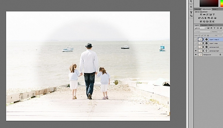
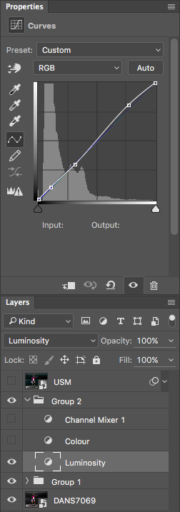
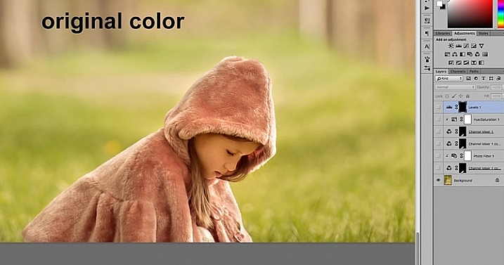
You can also add a dark or light vignette using the radial filter tool. On the adjustments panel, you need to specify where you want the vignette added – whether inside or outside the radius, then adjust the exposure to lighten or darken the vignette (with this method you can even add blur, lower highlight, or change the color of it if you like – anything on the sliders). This is a really handy feature in ACR because it acts like a layer mask, although you can’t easily do fine tuning with this tool like you can in Photoshop.
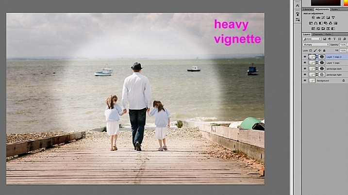
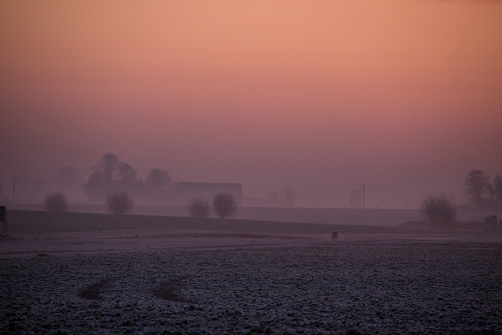
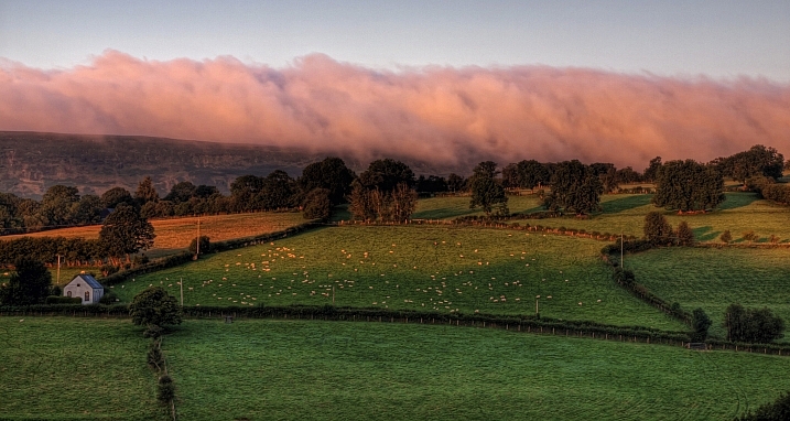
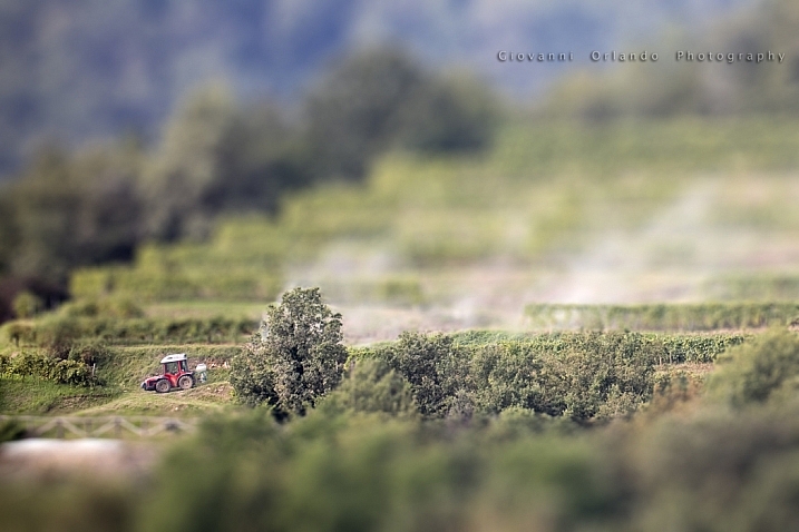
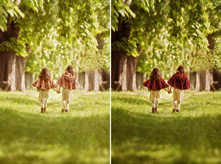
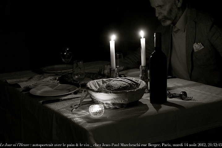
Below is an image with a pretty dark and heavy vignette. In my opinion it’s too much, and takes away from the image, rather than enhancing it.

Below is the same image with a bright vignette; this doesn’t look right to me at all.

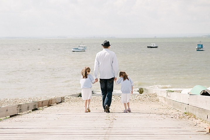
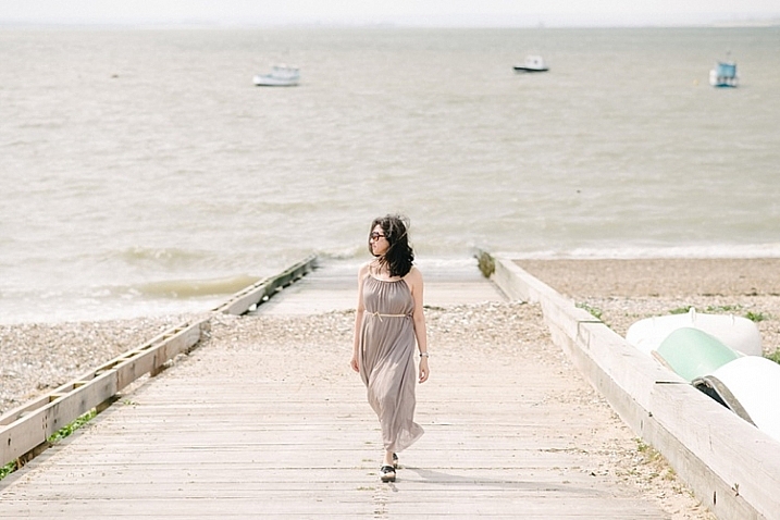
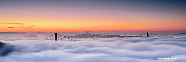
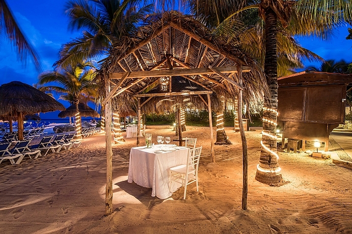
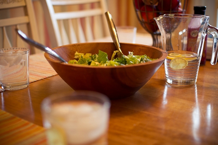
On this version below, I think the vignetting is just right, as it enhances the natural look of the photograph, which was my aim.

In Adobe Photoshop
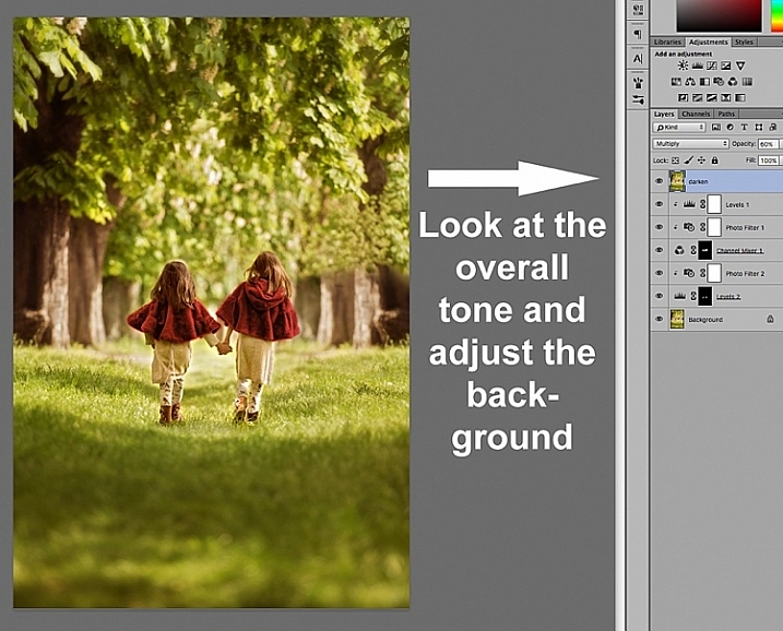
If you skip Adobe Camera Raw and open your file in Photoshop, there many ways to add a vignette. Below are the two quickest ways I have found. Before attempting to add a vignette in Photoshop, in order to perform non-destructive edits to your images, I recommend you learn to use layers and masks.
1. Using blend modes
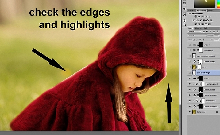
The first quick way of adding vignettes in Photoshop that I found is by duplicating the background layer using CMD/CNTRL + J. You need to make all your adjustments on the layers above your background layer, in this case the duplicated layer, so that your original file is safe and untouched.
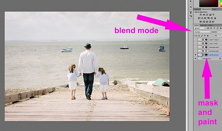
With your duplicate layer selected, change the mode to darken or multiply to add a dark vignette, or to screen or lighten to add a light vignette. Now add a layer mask to the duplicate layer. If you choose to paint the vignette on, make sure the mask is blacked out. Select a big soft brush, using the brush tool set to a very low opacity, and paint with white on the vignette around the edges.
Alternatively, you can choose to remove the vignette instead of painting it on, which in this case would be my preference. With your duplicate layer superimposed on the background layer, add a white layer mask. Choose a big soft brush set to a higher opacity and start painting the layer mask black, starting from the middle and ever so gently radiating outwards until all the vignette is removed from the center, and only a touch on the edges is left. Adjust the opacity of the layer to suit your taste.
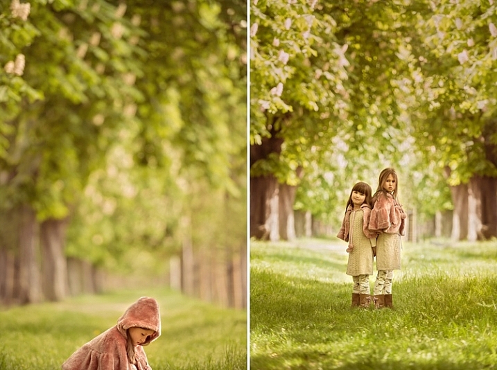
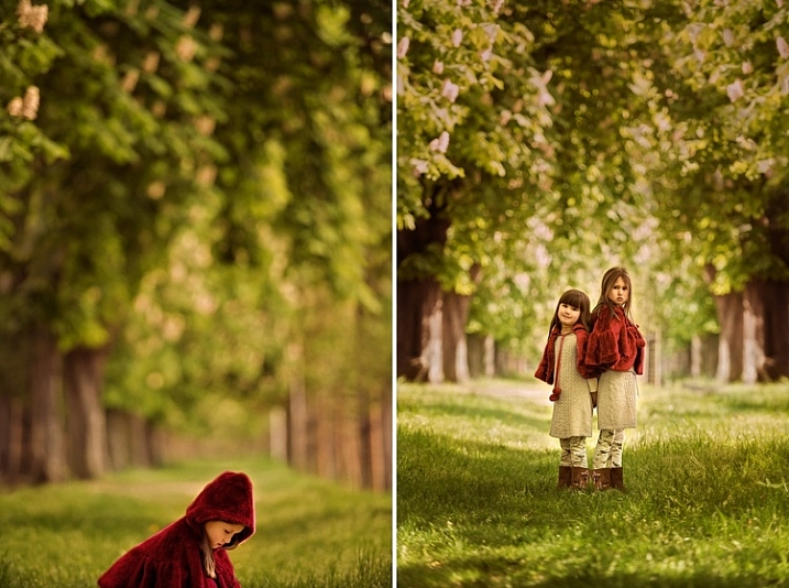
Below are two examples of exaggerated vignetting added in Photoshop using this method.
Manually painting, or removing the vignette by hand, gives you flexibility as to where to apply the vignette, how far in, and to what degree, depending on what’s required for each image.
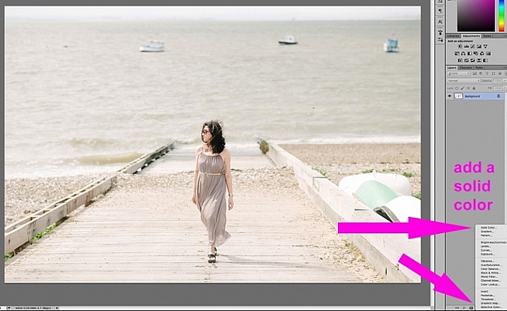
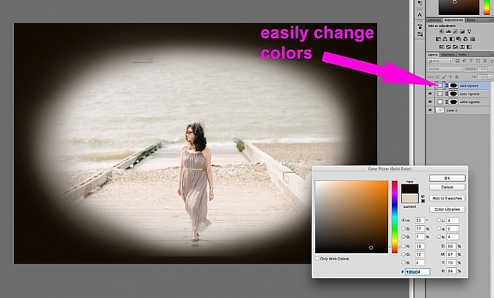
2. Using a solid color layer
Another quick way is to add a solid color. This method allows you to be more experimental, as it’s very easy to change the colors with a click of the eyedropper tool.
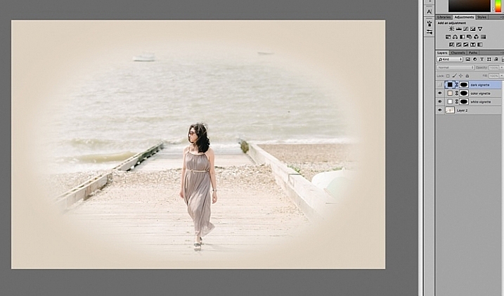
The solid color will sit on top of your image, so all you will see is a flat rectangular block of color. You need to add a layer mask, and start removing some of the color beginning at the center and radiating outwards. Again, use a soft large black brush to remove the color. If you do this kind of vignetting, as in the two images below, it has to be intentional as these do not give you a natural look to the images at all. They may work for a scrapbook, or other specific purposes, but this is not the look I would give to my clients.
On the image below, the vignette was added using the same solid color method as above. You can then play around with the blend modes to see what looks best.

This was done using the same solid color as above but Color Burn Blend Mode.

This one is done with a black solid color added, masked, and Overlay Blend Mode with the layer at 80% opacity.
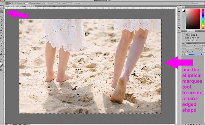
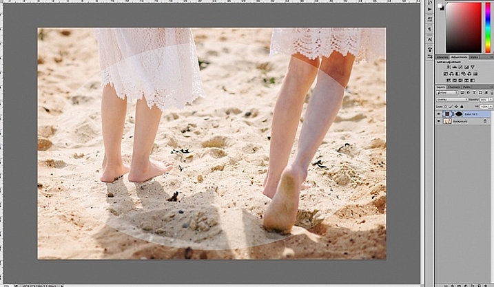
You can also make shapes as vignettes, using the marquee tool. The elliptical marquee tool was used for the image below, creating a hard-edged vignette. Make your shape by dragging this tool on your image, and you will see marching ants around the shape you have just created. You must immediately invert it using CMD/CNTRL + shift + I so the outside of the shape will be selected and would now be the area surrounded by the marching ants (as below).
Click on the solid color icon and select a color. A new layer with your shape filled with the solid color will automatically be created. Select this layer and play around the the blend modes and the layer opacity. You will see below what the Divide, Color Burn and Overlay modes look like.
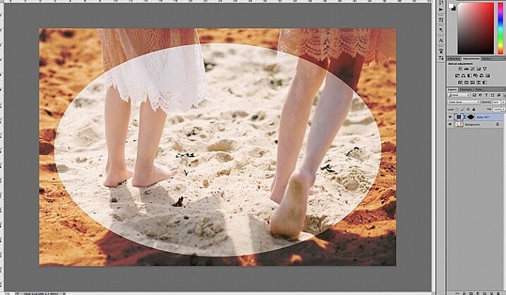
Color Burn Blend Mode
Divide Blend Mode
Overlay Blend Mode
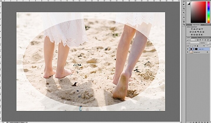
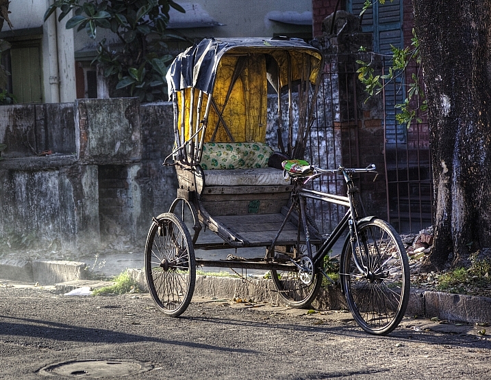
You will want to feather the mask on your color layer, or blend the edges manually using the brush tool so that you do not see the edge of the vignette so well-defined. I’ve left it like this for demonstration purposes so you can see what the vignette layer is doing.
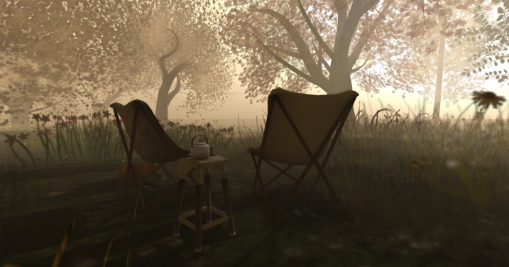
Below is the final image with only a hint of vignette on the edges, just to take the edge off the brightness of the scene.
I hope this tutorial has given you some new ideas on how to enhance your images using vignettes. Do you have other quick ways of adding vignettes to your images? Share them here.
googletag.cmd.push(function() {
tablet_slots.push( googletag.defineSlot( “/1005424/_dPSv4_tab-all-article-bottom_(300×250)”, [300, 250], “pb-ad-78623” ).addService( googletag.pubads() ) ); } );
googletag.cmd.push(function() {
mobile_slots.push( googletag.defineSlot( “/1005424/_dPSv4_mob-all-article-bottom_(300×250)”, [300, 250], “pb-ad-78158” ).addService( googletag.pubads() ) ); } );
The post 4 Quick Ways to Add a Vignette to Your Images in Post-Processing by Lily Sawyer appeared first on Digital Photography School.

Digital Photography School


You must be logged in to post a comment.