In this article, I share with you the start of my post-processing workflow for pretty much all of the photos I take. I’m mostly using Lightroom for 90% of my post-processing and very rarely do I go into Photoshop for some extra stuff.
Before we begin I must confess that I’m no post-processing master, nor do I know Lightroom inside and out, and I definitely don’t know Photoshop inside and out. But, as I learned, and I hope you will too, it turns out you don’t have to be a master in order to be able to bring your Raw photos to life. It can be done by just about anyone with just a few simple steps as I’m going to show you.

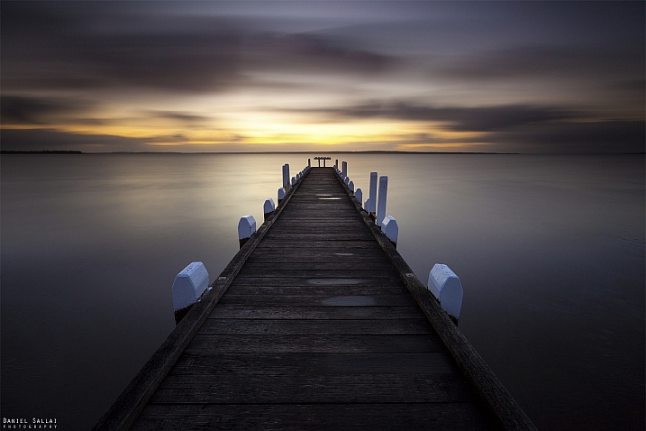
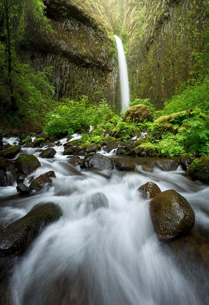
Before we start, here is the image as taken straight out of camera.
The photo I’m going to use (above) for this tutorial is one that I took while on a Dead Sea Night and Sunrise Workshop. I didn’t really plan for this photo ahead of time, but it’s probably the best image I took during that workshop. It’s a photo of one of the biggest sinkholes in the Dead Sea area (one out of more than 5,000 and counting) and it’s an 89 second exposure, done with a 10 stop neutral density filter that allowed me to smooth the water inside the sinkhole, and stretch the clouds moving above.
Now let’s make it POP!
1. Lens Corrections

The first thing I do is apply Lens Corrections. This specific photo was taken with a wide angle lens, and if you’re into landscape photography then a wide angle lens would be your go to lens 80% of the time, so fixing the distortion it creates is important.
just go to the Lens Corrections Panel and mark the Enable Profile Corrections. Lightroom has profiles for plenty of lenses, and chances are that it will have one for the lens you are using. If not, make sure you update to the latest version of Lightroom as they keep adding support for new lenses as they are being released to the world.
In some cases I decide to leave the photo as it is without doing the lens correction. It is just a matter of what seems or feels right for each specific photo.
Under the Lens Corrections panel you can also correct perspective in your photo, so I always click on Auto and see how that affects the image. If it’s good, I keep it. If it’s off I undo it and align in manually, or rotate using the crop tool if necessary.
2. White Balance

Adjusting the White Balance comes second. Since I’m always shooting Raw (and if you’re not, then please start) I don’t really mess with White Balance while I’m shooting. Again, this is a matter of playing with the options in Lightroom to see what looks the best, and what makes the image as close to how it looked when I was out shooting.
80% of the time I’m using either the Auto or As Shot options, and for this photo I kept it at As Shot.
3. Spot Removal

Spot Removal is a MUST. Not removing the spots from your photos is a really bad habit. It’s hard to avoid having these spots, as the lens or sensor will get some dirt and dust on them, and having them cleaned on a consistent basis is not really something most photographers do. I know I don’t.
Spots can ruin a photo in my opinion, I simply hate them, but I love getting rid of them and Lightroom makes it super easy to do. As you can see in the screenshot above I marked two very obvious spots with arrows but after using the Visualize Spots feature look what happens.

BOOM!
I know I shouldn’t be so happy since my lens (or sensor) is pretty filthy, but thanks to this great feature in Lightroom I can see pretty much all the spots and get rid of them.
You can choose between Clone or Heal in the Spot Removal tool. I usually use Heal as it does a better job of removing the spots and picking the best places to copy over from.
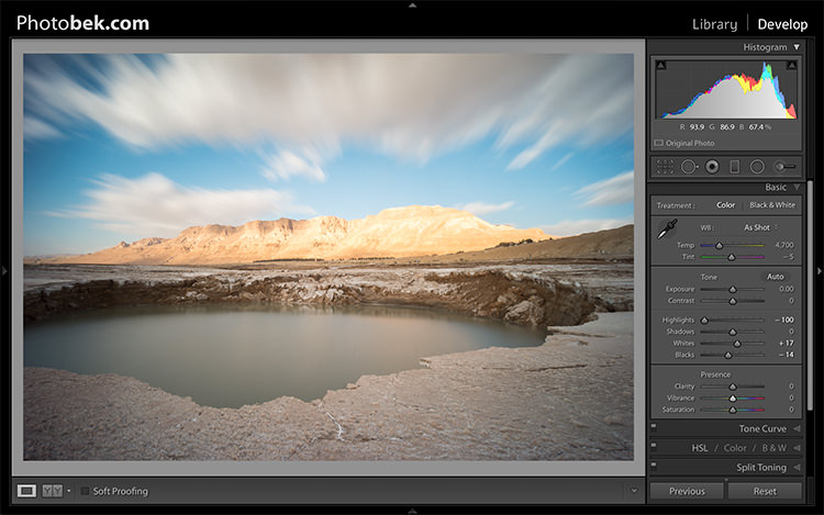
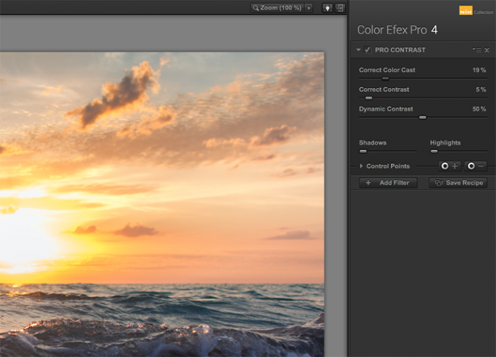
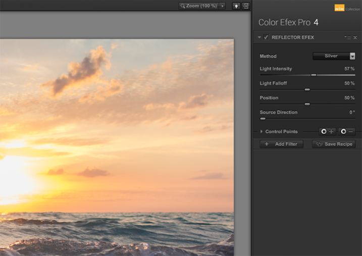
4. Basic Panel

This is where most of the magic happens, and this part makes the biggest impact on the photo. It has nine sliders (besides the two sliders for White Balance which we already took care of in step 2) and the most important thing for you to know, is that every photo needs its own adjustments as each image is different.
The adjustments I’m going to make on this specific photo might not work so good on a different shot, so keep in mind that the overall process is similar and I’ll use all these sliders for every photo, but not necessary move them to the same locations.
Let’s begin:
4.1 Exposure

Since the photo was exposed well, and there is no clipping as you can see in the histogram above, I didn’t need to make any adjustments to the Exposure slider, so I left it at 0.
The histogram is a great tool that you should keep your eyes on at all times during your post-processing work on an image. It will provide you with valuable information about the clipped areas in a photo (in case it has any).
Here is what it would like if the highlights were clipped (press J or click/hover on the arrows that are shown at the top of the histogram to activate the clipping indicators).

Here is what it would like if the shadows were clipped.

Keep in mind that some clipping is perfectly acceptable, and might even be desired at some occasions. The trick is to find out where the clipping is occurring, and deciding whether a loss of detail in that area is acceptable or not, and that is entirely up to you to decide.
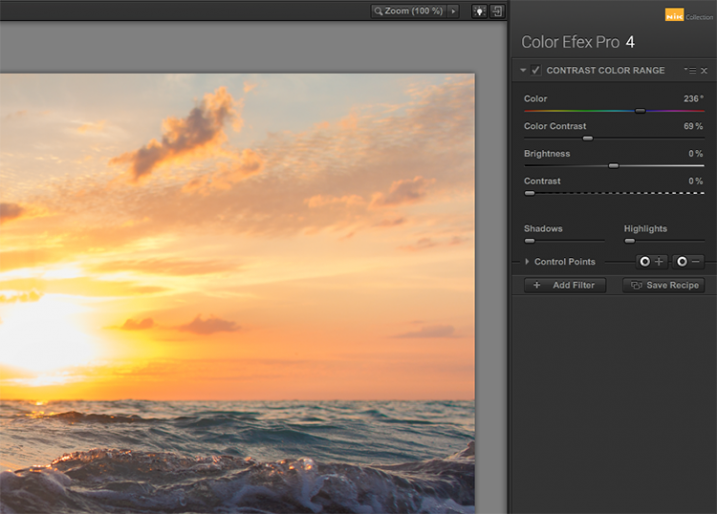
4.2 Contrast
I usually don’t mess around with the contrast slider much, as making the adjustments to the following sliders also has a big impact on the contrast of the photo, so I don’t find it necessary. I kept Contrast at 0 for this photo.
4.3 Highlights
The highlights slider is designed to bring back detail (moving slider to the left) in the brightest areas of an image, or to brighten (moving slider to the right) highlights while protecting against clipping.
What you should do is drop the highlights slider all the way down to -100 while watching your histogram, and move it back up if needed. In the case of this photo I dropped it to -100 and kept it there, and you can clearly see that it brings back plenty of detail in the clouds and the mountain in the background.

4.4 Shadows
The Shadows slider will affect the midtone shadows, to the lower end of the deeper shadows. To brighten up the shadows, simply pull the slider to the right. To darken the shadows, move the slider to the left. For this photo I actually kept it at 0.
4.5 Whites
The Whites slider sets the White Point (brightness) or extreme tonal range of an image, by either lowering or raising this white value. The difference between Highlights and Whites is that the whites slider help you to define the true white in a photo, and the hightlights slider helps you recover lost detail in the highlights of your photo.
While clicking on the option (MAC) or ALT key (PC) move the Whites slider to the right until you just start to see parts being highlighted in the photo (this indicates which parts are being clipped) then drop it back a little and stop there. For this photo I moved it to +17.
4.6 Blacks
The Blacks slider deals with the darkest areas of the image. While clicking on the option (MAC) or ALT key (PC) move the Blacks slider to the left until you see black areas appear (those areas are clipping in the shadows) than move it back a little and stop there. For this photo I moved it to -14.
Shadows, Whites and Blacks adjusted
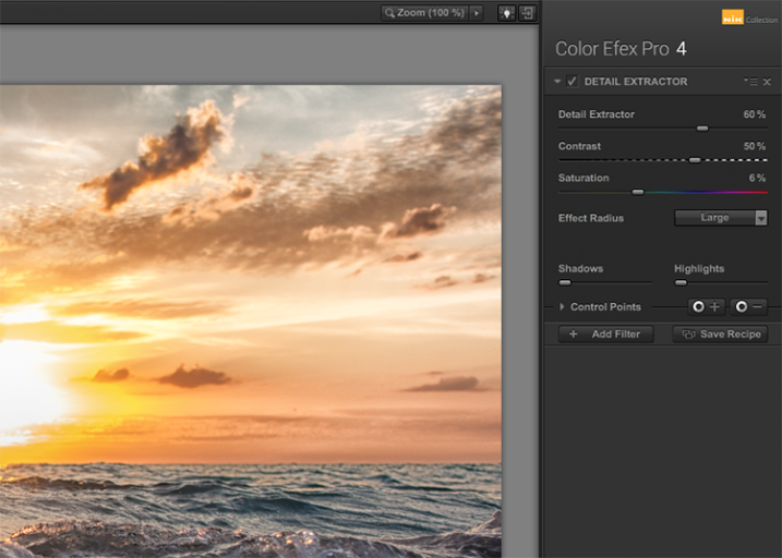
4.7 Clarity
Clarity is, in effect, a contrast tool. However, rather than boost contrast across the entire range of the image, it affects it only in areas of the image where it finds edge contrast. This makes it a more subtle tool than the contrast slider and it’s excellent for adding punch to your images, without making them look unnatural.
Raise it up until you think it made the impact you want on the photo, but don’t over do it. For this photo I took it up to +52.
4.8 Vibrance
Vibrance is the close cousin of Saturation, and at first they may seem to be almost the same, but Vibrance is different. The Saturation control moves all the colors in the spectrum up or down in saturation, more or less together. Vibrance on the other hand, is a lot more selective about the way it saturates colors as it only saturates colors that need it, which means it doesn’t oversaturate colors that are already very saturated or colors of very low saturation.
Raise it up until you think it made the impact you want on the photo, and again don’t over do it. For this photo I took it up to +32 to add more blue to the sky and more earth colors to the mountain.
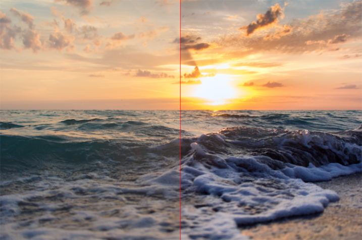
Clarity and Vibrance adjusted
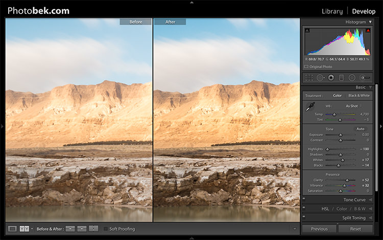
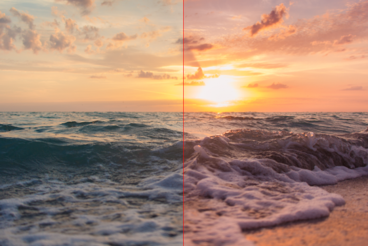
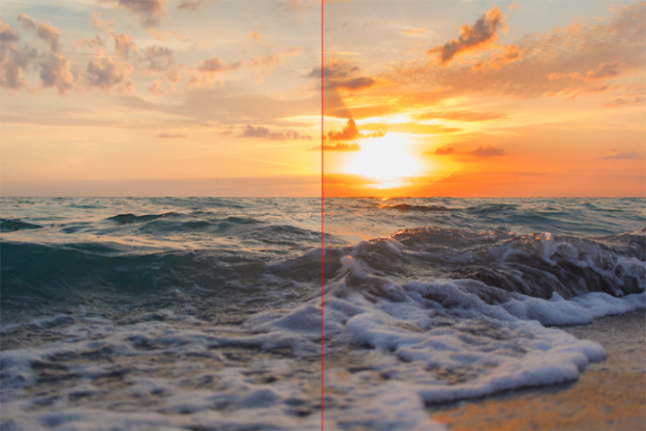
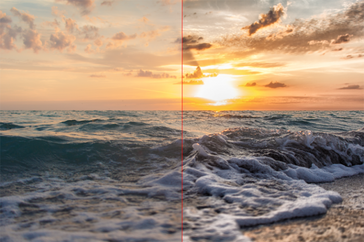
Before and After
As you can see, not much was done to the image and this entire process shouldn’t take more than a few minutes (depending on how many spots you have). I think it makes a world of difference to this specific image, and to any image for that matter.
Here is the image as taken straight out of camera:

Here is the image after the adjustments were made:

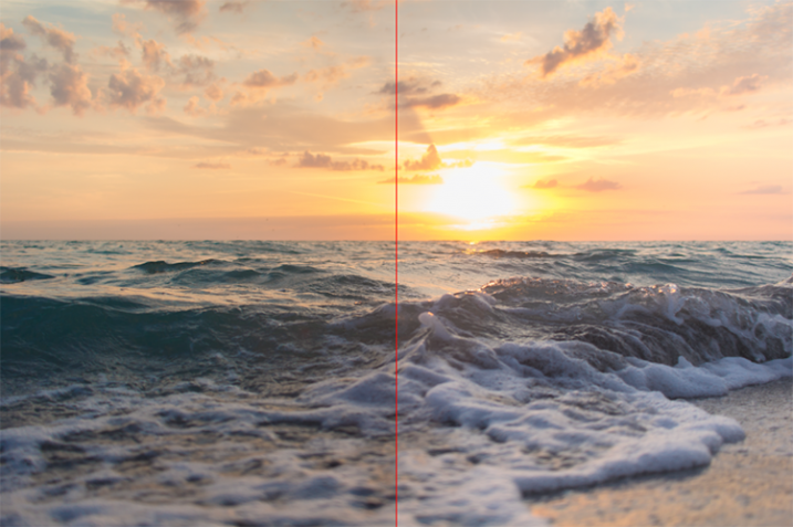
Finally, here are the before and after one next to the other:

I hope you enjoyed this tutorial, and more importantly, I hope you’ve learned something that you can actually implement on your own photos to make them POP.
googletag.cmd.push(function() {
tablet_slots.push( googletag.defineSlot( “/1005424/_dPSv4_tab-all-article-bottom_(300×250)”, [300, 250], “pb-ad-78623” ).addService( googletag.pubads() ) ); } );
googletag.cmd.push(function() {
mobile_slots.push( googletag.defineSlot( “/1005424/_dPSv4_mob-all-article-bottom_(300×250)”, [300, 250], “pb-ad-78158” ).addService( googletag.pubads() ) ); } );
The post 4 Steps to Make Your Images Pop in Lightroom by Dror Bekerman appeared first on Digital Photography School.

Digital Photography School


You must be logged in to post a comment.