Winning images from Red Bull Illume 2016
© Lorenz Holder / Red Bull Illume
Lorenz Holder of Germany has taken the top prize for a second year in a row in the Red Bull Illume sports and action photography awards. His photo of pro BMX rider Senad Grosic took Overall Winner as well as the Athletes’ Choice award. Read on to learn more about the winning image and see more category winners. An exhibition of the top images is underway in Chicago and will go on tour after October 9th – visit Red Bull Illume’s website for a schedule.
Winning images from Red Bull Illume 2016
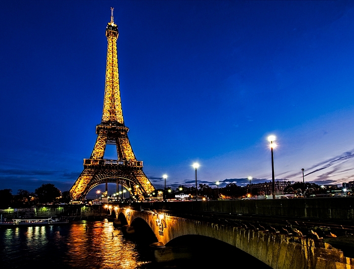
© Lorenz Holder / Red Bull Illume. Overall Winner
‘Senad and I were on the way to a different location early in the morning, when we passed this scenic spot. We saw a sign from the street and I had some pictures in mind that I’d seen from this bridge on the internet. When we got there the sun was just above the trees and it was lighting up the full color-spectrum of the autumn leaves in a very soft way.
One thing that was a little annoying was that the lake was covered with leaves which had fallen from trees, so the reflection of the bridge in the lake was just not there. But sometimes you just need a bit of luck – I had been on a fishing trip some days before and still had my fishing-boots and a net in the car. So got the stuff and tried to clean the lake by hand. It took a while until it was almost perfectly clean – at least where it was relevant for the picture. Luckily the sun was still very soft, so we had good light for the shot.
I’d chosen a very low camera position to get an almost perfect mirrored scene on the water surface. The bridge looked like a perfect circle and the light was still very good. When Senad was on the bridge, it took us two or three tries to get the shot. There was also no more time for another try because the wind came up and the perfect reflection on the water was gone.
We jumped back to the car and drove towards our originally planned spot. It was an awesome feeling to have shot this picture with more or less pure luck. Without the sign next to the road, we would have passed one of the nicest photo scenes.’
Camera: Canon EOS 5D Mark III
Lens: EF 24-70mm F2.8L USM
ISO: 500
F-Stop: 8.0
Shutter Speed: 1/640
Winning images from Red Bull Illume 2016
© Daniel Vojt?ch / Red Bull Illume. Sequence by Sony Winner
‘Red Bull asked me to do some portraits and action photos of the Flying Bulls. We had an air to air photoshoot and I knew it would be great for a sequence. An airplane is the only place from where you can see something like this. I did one fast attempt. After I stitched the sequence it was great, but I could still be a little bit closer.
We had another photoshoot on another day so we tried it again but I was much closer to the planes in front. It was cloudy so the final image looks very dramatic. The pilot also turned on the smoke so you can see the trail behind.
The camera I used for this photo was Nikon D5 and Nikkor 16/2.8 fisheye because there was almost no space and I wanted to show inside the part of the airplane I was sitting to show the pilot’s POV.’
Camera: Nikon D5
Lens: 16mm F2.8 AF Fisheye
ISO: 640
F-Stop: 5.6
Shutter Speed: 1/250
Winning images from Red Bull Illume 2016
© Jody MacDonald / Red Bull Illume. Lifestyle Winner
‘When I was young I used to look through National Geographic magazines and dream of adventures like this; train hopping through the Sahara on one of the world’s longest trains. I had dreamt of the oceans of sand, the loud noises of the train, the cold, the wind, the scorching sun, the unknown smells and sounds of the desert and the discomfort that goes with it. So when I was asked to dream up and photograph a trip in harsh conditions, a 700 kilometer journey through the Sahara desert in Mauritania came to mind.
After weeks of planning, our journey began in the capital of Nouakchott, from there my brother and I moved north through the interior to board the Mauritania Railway. Our risky rail journey started from the iron-mining center of Zouérat in the Sahara, and snaked through the barren desert toward the port of Nouadhibou on the Atlantic. We wanted to get to the coast to try to find some unexplored surf breaks and capture the spirit of adventure and exploration through this incredible landscape. Having only a few minutes to hop on the train in the middle of the night, we spent 15 long hours slithering through the desert on the three kilometer train that transports approximately 84 tons of iron ore across a country crippled by terrorism, slavery, and poverty.
I photographed this image with Leica’s new X-U all weather camera with a fixed 23mm lens. I used a shutter speed of 1/500 to stop the motion of the train and an f-stop of 7.1 at ISO 100.’
Camera: Leica X-U (Typ 113)
Lens: 23.0mm F1.7
ISO: 100
F-Stop: 7.1
Shutter Speed: 1/500
Winning images from Red Bull Illume 2016
© Dean Treml / Red Bull Illume. Spirit Winner
‘In this image Josh Neilson of New Zealand is supported by fellow paddlers (L-R) Barnaby Prees, Sam Sutton, Tim Pickering, Ben Brown, Jamie Sutton and Jared Seiler as he waits for a helicopter evacuation after a bad landing off Matze’s Drop, Storulfossen, Norway on July 7th 2014. It left him with a broken L1 vertebrae.
I traveled to kayaking mecca Norway for a few days to shoot and hang with my Kiwi mate Ben Brown, one of the world’s most prodigious adventure kayakers. As fate would have it he dislocated his shoulder the day I arrived, but luckily he was traveling with some brilliant paddlers so I still had subjects to shoot.
On the last day we found ourselves at this spectacular waterfall, where five others made the run, then Josh went off. After a good entry the nose of his kayak was thrust up and he flat landed at the bottom, the impact breaking his back. His colleagues were immediately on hand to assist and stabilize Josh, and Ben, who had previously suffered a similar injury, was able to reassure Josh while a helicopter was summoned. Josh was flown to Lillehammer hospital and then on to Elverum for successful surgery. With determined rehabilitation in New Zealand, Neilson was back in a kayak one year later and subsequently traveled back to Norway to paddle their rivers again.’
Camera: Canon EOS 5D Mark III
Lens: EF 24mm F1.4L II USM
ISO: 400
F-Stop: 2.0
Shutter Speed: 1/2500
Winning images from Red Bull Illume 2016
© Vegard Aasen / Red Bull Illume. Mobile Winner
‘This winter some friends and I went to Hakuba in Japan to ski some deep powder and big mountains. The day this shot was taken was a really windy one but the snow was still really good, so we went out into the backcountry. One of my friends brought his DSLR camera, so I decided to not bring my camera because I wanted to ski instead of taking photos.
We hiked for a while, and discovered a group hiking across the ridge above us. The wind and the clouds looked amazing, so my friend took out his camera and started shooting. I hated myself for not bringing my camera. Luckily I had my mobile phone in my pocket. I could not see anything on the screen, but obviously managed to aim pretty well.
A week later, I scrolled through my phone, while waiting for sushi at a restaurant. I had completely forgotten about the shot, so I was pretty stoked when I found it. I edited it to black and white in Photoshop Express on my phone, and was really happy with the result.’
Camera: HUAWEI P8
ISO: 64
F-Stop: 2.0
Shutter Speed: 1/3200
Winning images from Red Bull Illume 2016
© Dean Treml / Red Bull Illume. Enhance Winner
‘Jonathan Paredes of Mexico dives from the 28 meter platform on the roof of the Copenhagen Opera House during the first practice session of the second stop of the Red Bull Cliff Diving World Series, Copenhagen, Denmark on June 20th 2013.
I remember while I was originally scoping out the location for this event thinking how surreal images could look without the diving platform jutting out, and just the small form of the diver, and the huge cantilevered roof dominating the frame, and even discussed it at the time with my wife (the photographer Romina Amato) who was also there.
As I am editorially focused the integrity of the image is paramount so the platform stayed, but while reading the categories of Red Bull Illume this image jumped into my mind and I figured a quick ‘fix’ to one of my shots couldn’t hurt, so this version of the image really came about thanks to the ‘Enhance’ category. ‘
Camera: Canon EOS 5D Mark III
Lens: EF 70-300mm F4-5.6L IS USM
ISO: 400
F-Stop: 5.6
Shutter Speed: 1/4000
Winning images from Red Bull Illume 2016
© Micky Wiswedel / Red Bull Illume. Wings Winner
‘My buddy Jimbo had been opening new hard routes in the area and we wanted to try and capture some of the climbs. With climbing photography it’s not often you can just walk somewhere to get a good angle – most good shots require some form of rigging. The angle of this image happened by chance. We were setting up for another shot but when I looked back I knew we had to change plans and grab the shot with the sea and horizon in the background, framed by this huge rock roof.
Lighting is also difficult, as climbers prefer to climb in the shade as cooler temperatures provide more friction between skin and rock. This often means overexposed backgrounds and underexposed foregrounds. The best I could do in this situation was to shoot somewhere in the middle.
The route is one of the hardest on Table Mountain. The last ‘crux’ section is near the top – you have a few pieces of protection below but there’s a final jump, or ‘dyno’ for the last hold. The image captures what happens if you don’t manage to stick that hold!
There was always a chance that Jimbo would fall, so I was ready for it. For the couple of seconds leading up to the big move I was holding my breath and ready to fire. I could definitely feel the adrenaline pumping! It’s a pretty big and impressive fall, but luckily far from the ground – that doesn’t make it any less terrifying.
We had planned to grab some cool climbing shots, but in the end this image of Jimbo mid-air was the shot we felt captured the intensity of the climb. Jimbo did send the route that day – after a few more falls.’
Camera: Canon EOS 5D Mark III
Lens: EF 16-35mm F2.8L USM
ISO: 400
F-Stop: 3.5
Shutter Speed: 1/1600
Winning images from Red Bull Illume 2016
© Ale Di Lullo / Red Bull Illume. New Creativity Winner
‘I’d been working on shots through transparent surfaces for a few years but it was during a long drive across Europe that I had this idea. I was forcing myself to think of new angles and nothing really came to mind. But when I said to myself that the best ideas are the simplest ones, that usually you have the answer in front of you, I realized the shot was actually in front of me. It was right there, where most people spend a lot of time everyday – cars!
Nobody had done an extreme sport shot from inside the car having the rider riding on the windshield. I understood that a shot like this had to be made in an iconic spot and the spot had to be in a city so it was clear that New York City with all its bridges was the place. And what could have been better than a NYC cab to shoot from?
Choosing Aaron Chase as the rider was natural. He has been a friend for a long time and happened to be a pioneer of street riding in our sport and is almost a local in New York. It took us one year of preparation, one full day of work, involved a few people and a bit of money. But I kept shooting, all the while fearing I would break the windscreen, and 12 attempts later I nailed this shot.’
Camera: Canon EOS-1D X
Lens: EF 8-15mm F4L Fisheye USM
ISO: 640
F-Stop: 5.6
Shutter Speed: 1/1600
Winning images from Red Bull Illume 2016
© Lorenz Holder / Red Bull Illume. Playground Winner
‘I shot this unique location a couple months before this action shoot as a landscape picture because I just liked the whole structure and the way it was integrated into the landscape. It’s a viewing platform made of steel that has rusted over the years. You can walk up the stairs to enjoy the view over the lakes that surround the area.
I knew somehow, that there was the potential for it to be a location for an action photo. My first idea was to shoot snowboarding in it, but that was just impossible because of the limited space. I almost gave up on the idea, but then I bumped into Senad Grosic in Berlin one day and we talked a bit about spots and stuff. I showed him the landscape picture and he told me that we need to go back there to see what’s possible.
So Senad and I took a road trip and drove all the way to Senftenberg. We discussed and fine-tuned a plan that would look rad on photo. Senad had the idea to be dressed all white to give it more contrast, because I didn’t want to use flashes to keep the structure as evenly lit as possible. The angle is almost the same angle I chose for the landscape picture. It’s actually an architectural picture with the spice of action sports in it.’
Camera: Canon EOS 5D Mark III
Lens: EF 24-70mm F2.8L USM
ISO: 500
F-Stop: 6.3
Shutter Speed: 1/400
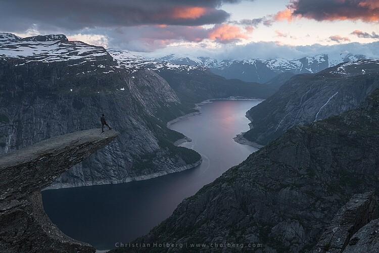
Articles: Digital Photography Review (dpreview.com)


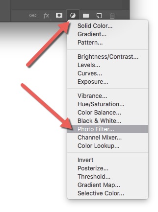
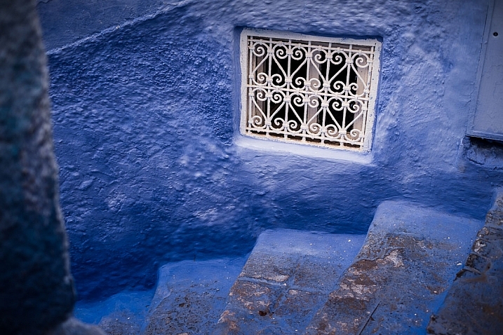
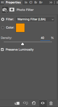 A warming filter is the default setting so, as you might see, the image now has an orange color cast. Personally, I prefer using Warming Filter (LBA) as I find this to have the most natural color that suits my images best (see screenshot on the right). Select this filter by clicking on the Filter dropdown menu. Alternatively, you can select a color manually that might suit your specific image better. If you find the adjustment to be a little too weak you can strengthen its appearance by increasing the Density. I rarely go above 40% Density as the colors then quickly become washed out and results in a look I don’t want.
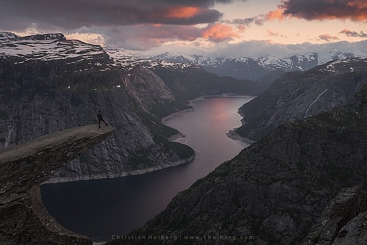
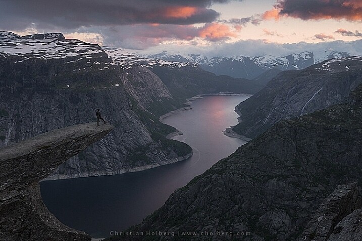
 Left of the Photo Filter 1 text there’s a white box. This is the layer mask, basically telling Photoshop what area of the image should be affected by that particular layer. White means that it’s visible and black means that it’s concealed. By default the entire mask is white. To remove the adjustment from the landscape itself follow these steps:
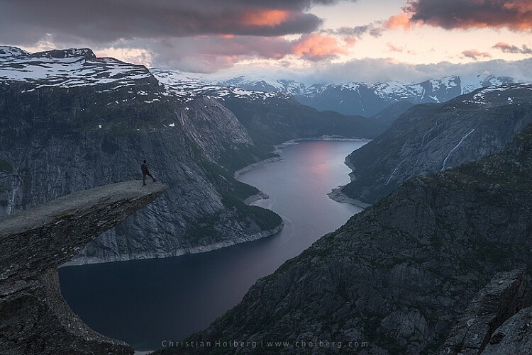
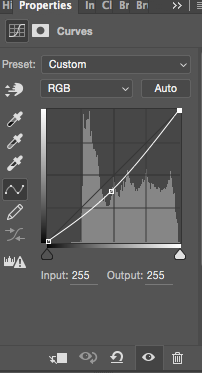 Another easy method to add colors is by using the Curves Adjustment Layer. Unlike Photo Filter, we will be using Curves to add contrast in the sky. Follow these steps to do a Curves adjustment:
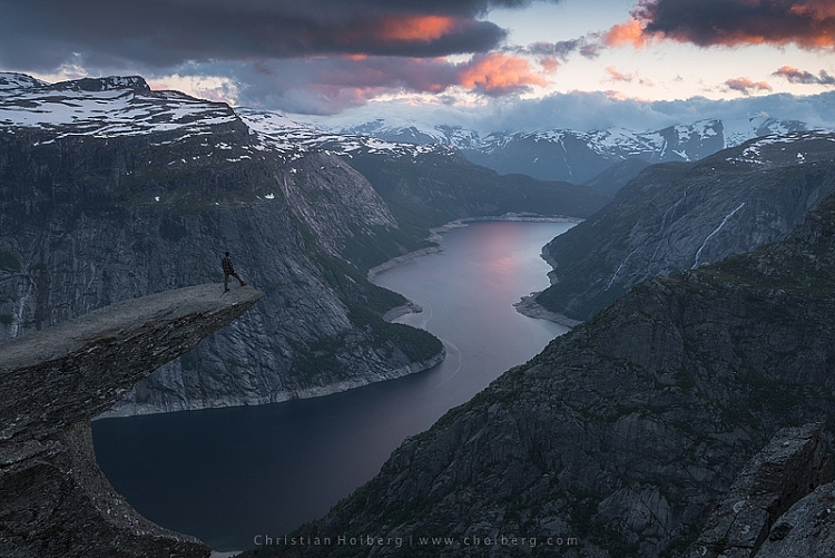
You must be logged in to post a comment.