The true key to growing as a photographer is to dedicate and immerse yourself in it on a consistent basis. Passion and enjoyment are key to becoming great at your craft.
That beings said, there are many things to consider in order to progress through this journey as effectively as possible. If I were to start all over again, these are the stepping stones that I would have preferred to have taken, beginning with the technical and ending with the conceptual.
Part 1: Learning the Technical
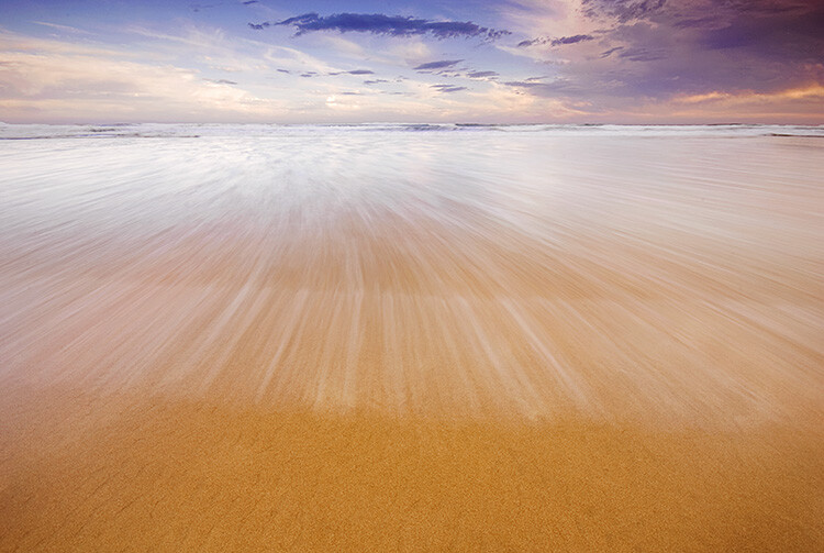
1. Look at Light
When you start out in photography, it seems obvious to say that learning to use your camera is the logical first step. However, thinking this way can actually confuse you. The camera is just a tool that has the ability to record light.
When you walk out the door to photograph, the first thing you should think about is light, and not the camera. What time of day is it? How strong is the light and what direction is it coming from? Is it sunny or cloudy? Is the light soft or contrasty? Is the sun in front of, or behind you? Where are the artificial light sources and what colors do they give off?
This is the first thing that a seasoned photographer will look for every time they begin to shoot, and constantly be aware of while they are shooting. They do this for a reason. The light will affect how they shoot and the settings that they use. Even a slight change in direction to your light source can completely change how an image will look. You can’t learn how to use your camera correctly if you do not first understand the light.
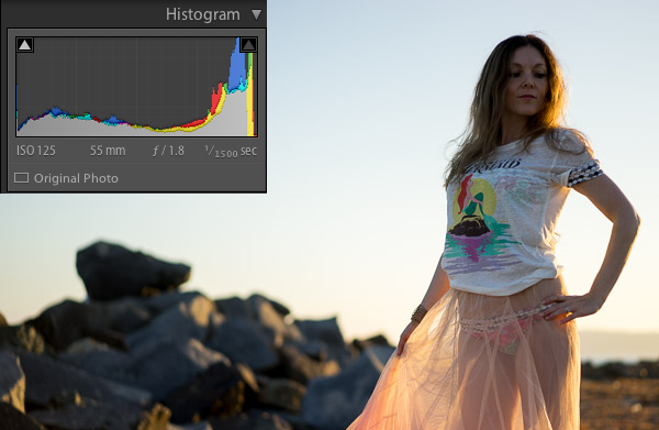
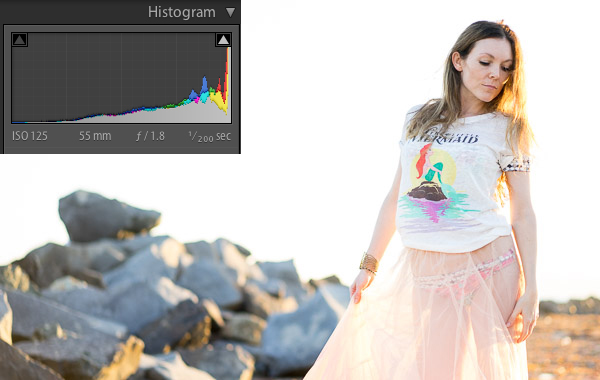
2. Learn Your Camera Settings
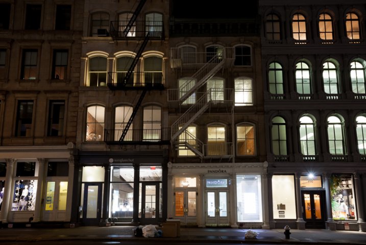
SoHo at Night, NYC.
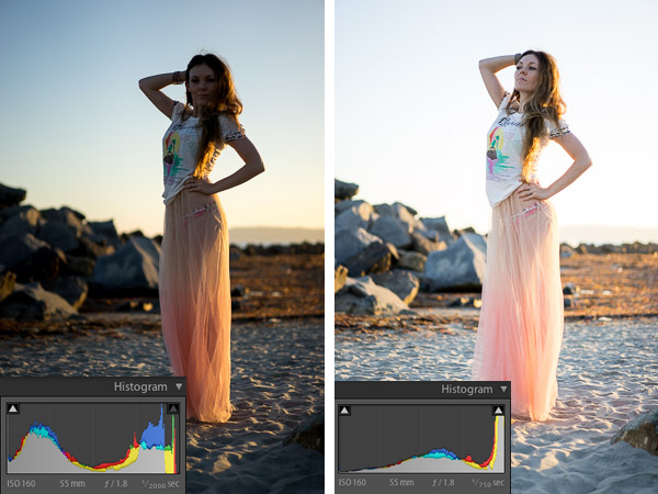
Once you evaluate the light and environment, and figure out how you want the image to look, that is when you want to think about camera settings. For instance, do you want as much of the image as possible to be sharp, or do you want a lot of bokeh in the background? Do you want to zoom in and have a compressed look to the image or would you rather use a normal or wide angle lens? Do you want it to be a high-key shot, or on the darker side?
That is when you change your settings to achieve the desired effect. It sounds like a lot of work just to take a single photo, and it is. However, if you start out shooting this way, eventually it will become second nature. It is just like learning a basketball shot or a golf swing. Doing it the correct way might feel unnatural and weird at first, but eventually it will come naturally and quickly, and you will be much better off for having spent time at the beginning to focus on it.
Take your camera off Auto and experiment with either shutter priority, aperture priority, or manual mode. Some photographers take pride in shooting manual, and sometimes it makes sense to shoot that way, but manual is no better than shutter or aperture priority modes, and in many situations it can be a worse way to shoot. It all depends on the situation.
Experiment with different zooms on your lens, with different apertures and shutter speeds, and experiment with different ISOs to see how the digital grain (noise) looks. Do not be afraid to raise your ISO when you do not have a tripod. Go back to look at your photos in Lightroom, zoom in to the details, and look at the settings to see how they altered the way your images look.
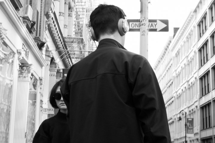
3. Composition and Form
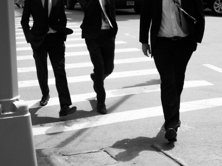
Three Men, SoHo, NYC.
Now is the time to think about composition. Some newer photographers tend to have a bad habit – they look up, see something interesting, then they photograph it quickly and move on. Yes, sometimes you’re on the move and this is the only way to shoot, but take some time to compose your image in the best possible way. The difference between a snapshot and a work of art is thought. If you see an interesting scene, you need to think about how to best capture it. Where is the best place to stand? Can I include other elements into the scene to create a more complex composition?
I prefer to think about composition in this way – if I made a larger print, put it on my wall, and a friend came over and saw it for the first time, where would their eyes begin and how would they move through the image? How would it feel to them? Where are the lines in the image? What is the relationship of the main subject to the background? Is rule of thirds better here or is it better to center the main subject? Are there interesting shapes in the image? Do the edges of the image look good and keep the viewers eyes from moving out of the composition? Is there a foreground, middleground, and background in the image and does the image even need that?
The difference between a decent image and a great image could be moving a foot to the left. This is another idea that can seem overwhelming at first, but will come to you more naturally the more you pay attention to it.
4. Color
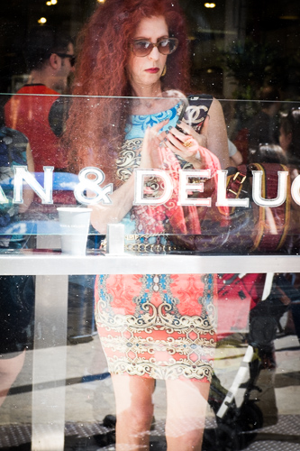
Dean & Deluca, SoHo, NYC.
Color (or lack there of) is a very important element of photography. Look at a color wheel and study how the colors work together. What do different colors represent? Do the colors add to the image or detract from it? I enjoy creating both black and white, and color images, and this is one of the first questions I think about when I am editing.
What is the color quality of the light? Is it cool or warm, is there a color cast, and does that add or detract from the image?
In addition to thinking about color while shooting, you will find yourself significantly improving your ability with color while you are editing. Play around with color temperature to see if you like an image warmer or cooler. Desaturate it, or add a little saturation, to see how it feels. How does changing the contrast affect the colors?
For doing quality color work, make sure that you have a good monitor that has been recently color corrected. All your work will be for naught if your monitor shows colors that are different from the file and final print.
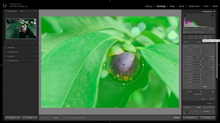
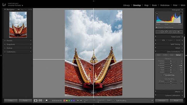
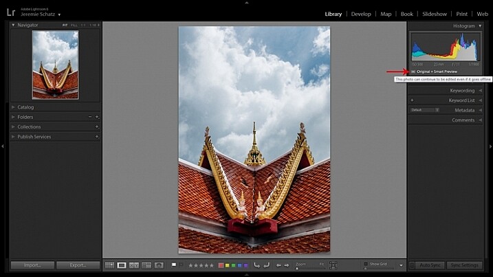
5. Learn Lightroom
Editing is vitally important to developing your vision and becoming a good photographer. I suggest using Lightroom, as it is the industry standard and it works well for so many photographers. Photograph in RAW to get the most flexibility and quality in your images and explore all of the RAW development settings. Try to recreate the looks of other photographers to get a feel for how their editing was done.
Be diligent about organizing your archive. A little time spent each time you upload images will save you so much time in the future. Star your good images (Lightroom allows 1 through 5 stars) so they are easy to find, and create collections based on ideas that you grow over time. Viewing your work in this organized fashion will help you develop your skills much faster than if you have a messy archive.
6. Print
Maybe my views are rooted in the past and nobody is going to print in the future, but I do not feel like an image is truly complete until it has been printed and framed. That is the final step to all of this, and it is a great feeling to put an image on your wall.

36×48 inch Corkboard
But there is another aspect to why you should print. It is one thing to see how your images look on a monitor, but it is a completely different experience to see them in their final, printed form. This will allow you to see how the light, the color, and your camera settings all affected the final image. You will learn a lot about how to shoot, from the art of printing. Try different papers, and view your prints under different lights.
My favorite printer is the Epson 3880, but you do not need to do the printing yourself. Create a relationship with a local printer, or one of the reputable companies online, and have them made for you. If you do not print frequently, it can be much more affordable to have your prints made for you than making them yourself. But, don’t forget that doing the printing yourself can be very fun and satisfying, and it gives you the ability to make slight changes and see how they look right away.
Try creating a photography corkboard. I have a 36×48 inch board next to my workstation and I swear by it. Fill it up with 5x7s and 4x6s and constantly change it. See how the images play off each other, which images last, and which you lose interest in. Use this as a playground for your prints.
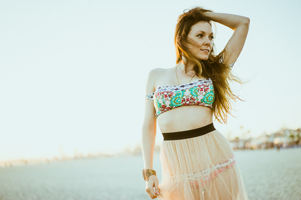
Part 2: Developing Your Photographic Voice and Style
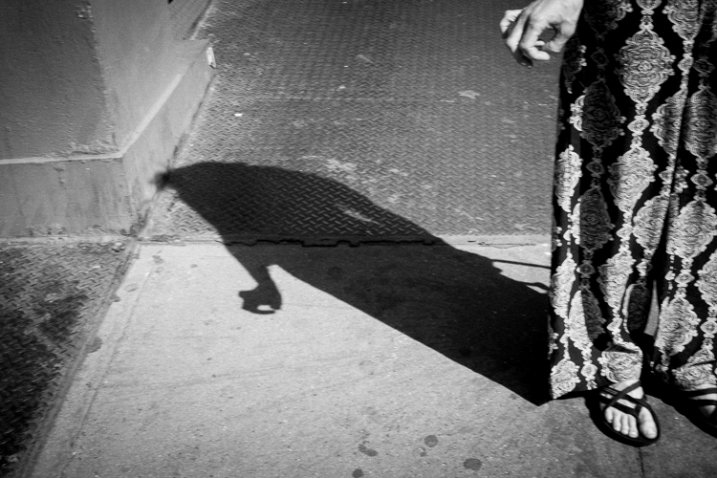
Nerves, SoHo, NYC.
Once you have gotten this far you are in a very good spot. Technically, you know what you are doing, your prints look beautiful, and they are well composed. But what’s next?
The next step is to figure out how to take unique and interesting photographs. It is now time to spend more effort thinking about what it is that resonates with you in photography, and what makes an image stand out in your mind.
7. Photograph!
This is so simple, but it is the key to everything and needs to be said. So many people only take their cameras out on trips or vacations. They go to places that are specifically for photographing, such as mountain ranges, zoos, gardens, safaris, cute towns, or cities with great architecture. While this is great to do, push yourself further than that. Take some photographs during the course of your everyday life. Even use a cellphone when you are unable to take your main camera with you.
The best photographers can take great photographs in the most ordinary of places. Practice this. Go out, anywhere, or specifically go out to someplace that you think will be terrible for photography, and figure out how to take an interesting photograph there. This practice will help you so much in your development. You can understand light and camera settings cold, but if you are not out photographing in a variety of situations on a somewhat consistent basis, then you are selling yourself short as a photographer.
8. Galleries, Photo Books, and Reading
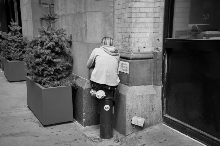
Disconnected, NYC.
One of the best ways to develop your own voice and style is to look at the work of others. Go to galleries, purchase photography books, and study the images of great photographers. The internet is a great place to view photography, but it is so easy to get lost. Galleries and books are curated for a reason. Study the images, think about how they were done, and figure out the context behind them. Sometimes images will hit you whether or not you know the context behind them, but other times it can be important to learn about the photographer and the history that are behind the image. This will add another layer to your appreciation.
Try out the different styles of photographers that you like. Try to shoot like them to learn how they did it and why. Pick and choose your favorite elements from different photographers and merge them to create your own style.
Purchase some prints. I’ve heard this a few too many times (sorry for the gender stereotyping) but it’s usually a wife saying something to me like, “I’d love to get this for our wall, but if my husband sees me buying the work of another photographer, he’ll kill me!” The average home has a lot of walls; enough for many artists.
Yes, there is something satisfying about seeing an image, then going and figuring out how to create it for yourself, but it is really important to appreciate the works of others. Buy prints from other photographers to display along with books. Immerse yourself in the works of others to create your own inspiration.
Finally, one of my favorite ways to gain inspiration is to read about things unrelated to photography. Learn about where and what you are shooting. Read poetry, read current events, read anything. This practice is about growing your voice outside of photography; the two are related.
Nerves, SoHo, NYC.
9. Keep Coming Back
Pick an area or a subject and immerse yourself in it. Go back to the same place at different times, in different light, and keep photographing it. This is very important for your growth since it will allow you to learn the area or subject like the back of your hand. Your images will take on more depth. There are photographers who have spent 40 years photographing in the same area.
10. Curate a small group of photographers and friends to show your work
The internet is an amazing place for sharing your work and learning about photography. However, it is also a very impersonal place. Everyone sees thousands of images a day from hundreds of people. While it’s definitely possible, it can be tough to get a proper critique and evaluation of your work over the internet.
Find a few people and put together a group to show physical images to every once in awhile. You ultimately want to shoot for yourself, but seeing how others relate to your images is important for your growth. The more they get used to your work and your style, the better comments and thoughts they will have for you.
These people do not have to be photographers. They can be friends, creatives, even significant others. A good tough critique from your partner can be very valuable. It can sometimes be tough to hear at first, but figure out how they really feel about an image. Your partner will know you well enough to be honest and not hold back, and that will be good for you to hear. Figure out what they like, and what they don’t like.
11. Put together an edit of similar images
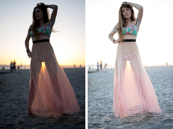
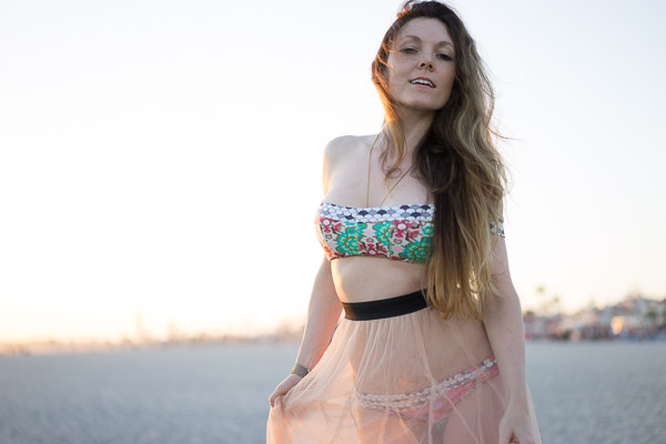
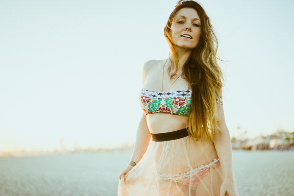
One of the most beautiful aspects of Lightroom is that it allows you to create collections of images outside of your normal file structure. Start to group and sequence your images that relate to each other. Begin to turn them into a project. You can see how the images in this post relate to each other. This was done over time, not all at once. You can, and should, think about projects from the very beginning and go out to photograph them, but often projects and ideas will come about naturally during the process of daily shooting.
Doing this will help you notice these moments when photographing in the future and over time you will develop ideas organically into beautiful projects.
12. Develop a voice in your photography
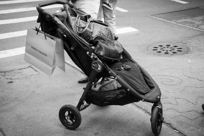
Stroller, SoHo, NYC.
If you have done the rest of these steps, your voice and style will develop organically over time. Think about it, and pay attention to it as you progress, but do not force it. Let it come to you over time. You can learn to use your camera quickly, but you cannot become a good photographer overnight. Take your time and try to improve a little bit each day and you will make huge strides over the course of a few years.
Have you followed these steps? Do you have any others you’d add as part of the learning and growth process? Please share in the comments below.
googletag.cmd.push(function() {
tablet_slots.push( googletag.defineSlot( “/1005424/_dPSv4_tab-all-article-bottom_(300×250)”, [300, 250], “pb-ad-78623” ).addService( googletag.pubads() ) ); } );
googletag.cmd.push(function() {
mobile_slots.push( googletag.defineSlot( “/1005424/_dPSv4_mob-all-article-bottom_(300×250)”, [300, 250], “pb-ad-78158” ).addService( googletag.pubads() ) ); } );
The post 12 Steps to Becoming a Good Photographer by James Maher appeared first on Digital Photography School.

Digital Photography School


You must be logged in to post a comment.