RSS
 

Posts Tagged ‘Creative’

Flip for This: 12 Crazy and Creative Skate Ramps & Parks

18 May

[ By Steph in Architecture & Cities & Urbanism. ]

skate ramp grand canyon

Glide you way through a multi-story dedicated skate park, a glow-in-the-dark bowl, an old subway tunnel under London, a floating ramp on Lake Tahoe or even a ramp that goes right off the edge of the Grand Canyon. These 12 skate parks and ramps, from California to Dubai, offer some of the world’s most amazing places to practice your tricks – places that are legal, anyway.

World’s First Multi-Story Skate Park
skate parks multistory 2

skate parks multistory 1

Many a skater has eyeballed the surfaces of a spiraling parking garage and wished they were curvier. Soon, a quiet seaside town in Britain will be home to the world’s first multi-story structure devoted to exactly this activity: the Folkestone Sports Park by architecture firm Guy Holloway. The world’s first facility of its kind, Folkestone will feature three entire floors for skaters as well as a climbing wall, underground boxing ring, cafe, training room, youth room and first aid center.

Skate Park Doubles as a Working Sundial
skate park sundial

skate park sundial 2

You don’t have to glance at a watch or phone to figure out what time it is when you’re skating at this park in Lugano, Switzerland. Brightly painted markings on the concrete of the bowl will tell you according to the sun and shadows. Designed by Moscow group Zuk Club, this park is one big rainbow-hued sun dial.

Abandoned Tunnel Turned Subterranean Skate Park
skate park tunnel london

skate park london 2

London’s famous Old Vic Tunnels under the Waterloo Station are home to the city’s first subterranean skate park, a cultural complex taking up 32,000 square feet. House of Vans offers a pool-style bowl, street section and mini ramp as well as a music venue, bar, theater, cafe, artist studios and gallery space.

Sink or Skate: Floating Ramp Design

skate parks floating ramp 2

skate parks floating ramp

This sculptural wooden ramp took up residence right on the surface of sparkling Lake Tahoe as a promo for the California tourism industry. Built by skateboarding pro Bob Burnquist with the assistance of art director Jerry Blohm, the structure features a half pipe, quarter pipe and 45-degree ramp and weighs an amazing 7,300 pounds. Bob had a wet-suited snorkeler waiting in the waters nearby to retrieve his board anytime it went over the edge.

Next Page – Click Below to Read More:
Flip For This 12 Crazy And Creative Skate Ramps Parks

Share on Facebook


[ By Steph in Architecture & Cities & Urbanism. ]

[ WebUrbanist | Archives | Galleries | Privacy | TOS ]


WebUrbanist

 
Comments Off on Flip for This: 12 Crazy and Creative Skate Ramps & Parks

Posted in Creativity


Get Creative with Displacement Maps in Photoshop

09 May
Creating a film noir look with a displacement map in Photoshop.

Creating a film noir look with a displacement map in Photoshop.

What is a Displacement Map?

If you are new to Photoshop, the mere mention of displacement maps can be daunting. The purpose of this article is to give you an introduction to them; guide you in easy-to-follow steps on how to generate simple grayscale displacement maps from an existing image, and show you how to effectively implement them using the Displace Filter in Photoshop.

A displacement map is a grayscale version of the same image that you are working on, saved as a Photoshop (.PSD) file. This displacement map is then used to apply a texture to a flat graphic via the Displace filter, and it distorts the graphic to conform to the shape of the map. This gives the flat graphic, or 2D object, a more realistic 3D look. You may have seen images online where a texture is mapped onto someone’s face or a logo contoured onto a textured surface.

Why use Displacement Maps?

Displacement maps are a great way to map texture onto 2D objects, such as logos or text, add give depth and a 3D perspective. I hope to illustrate that displacement maps are not as daunting as they might appear, although, I do realize that this article may suit intermediate users of Photoshop rather than complete novices.

How to implement a Displacement Map?

Once a displacement map has been generated. You need to use the Displace filter to distort the 2D object, or flat graphic, onto the map. The Displace filter has been in Photoshop since version 2.0. It hasn’t changed much since then, however, it’s still a filter worth getting to know. It may appear to be a convoluted process to use, but when you have tried it a couple of times, it is straightforward. What it does is move the light pixels up and to the left and the dark pixels are moved down and to the right. This creates an illusion of depth through light. This is why your displacement map needs to be quite contrasty.

Filter-Distort-Displace

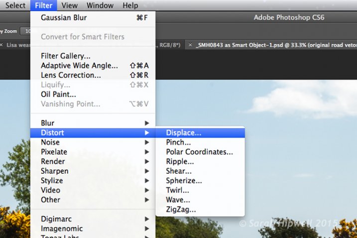
How to access the Distort filter in Photoshop.

The first method I describe below shows you how to use a vector shape to create a road marking and map this onto a road surface. This process would be the same for applying logos or text on any textured background. In the other two examples, I describe how displacement maps can be used to create shadow effects. Let’s take a look.

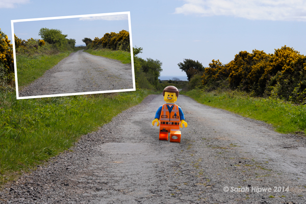
1. Adding a realistic road marking

Before-after-road-marking

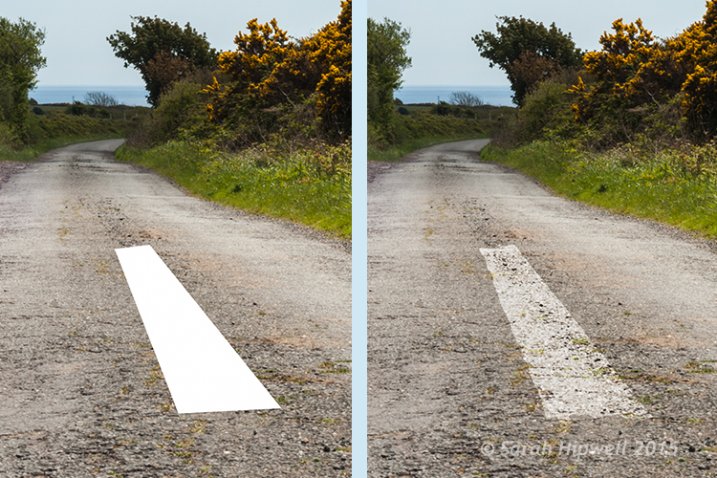
Before and after where the road marking has had a displacement map applied.

Aim: To create a realistic road marking from a vector graphic.

Let’s start with the base image of the road. The displacement grayscale map will be created from this image. The third image is the flat vector image of the road marking. I used the Polygonal Lasso Tool to draw a shape similar to a road marking and filled it with white. Convert this to a Smart Object, then hide this layer.

Displacement map process:

Open your Channels panel and click on each of the red, green and blue channels to see which has the most contrast. In this example, I chose the Blue one. Click and Duplicate this channel.

Duplicate-channel-panel

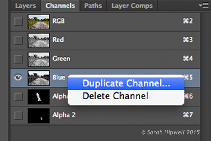
Duplicating the blue channel to create a displacement map.

This brings up another dialog box (see below). Where it says Document, click on the tab and choose New. Name this file Displace road or whatever you want and click OK.

Duplicate-channel-new

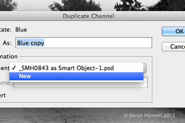
Clicking on the Document tab to select New to create a new document for a displacement map.

This creates a new document with the layer named Alpha 1. Before you save this document out as a grayscale PSD (Photoshop) file. You need to add some more contrast, go Menu> Image>Adjustments >Levels, then add Gaussian Blur of 9.9 pixels. This will allow the edges of the road marking vector shape to hug the contours of the road, rather than have a jagged edge. Convert this image to Grayscale and save it out as Displace road.psd. Close this document.

Duplicate-channel

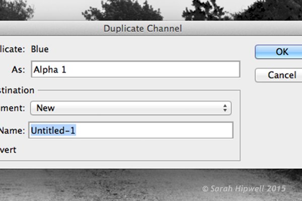
This dialog box appears directly after selecting New in the previous step.

Displace-road

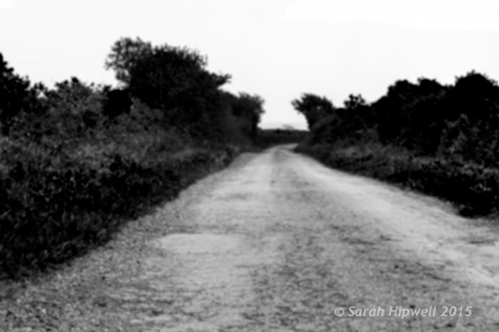
A grayscale displacement map of the road image.

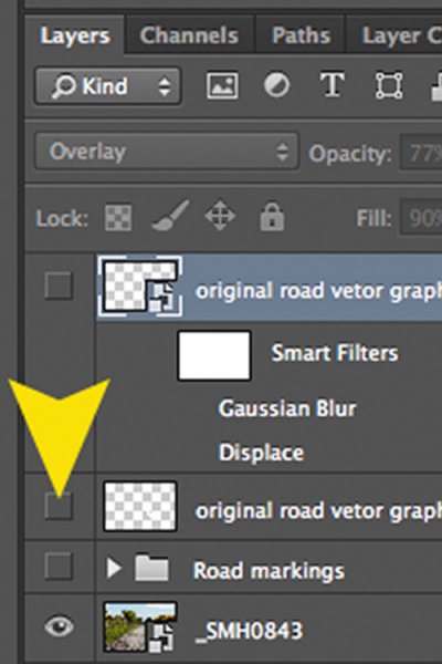
Go back to the original document where we are still in the Channels panel and the blue channel is still highlighted. Click on the RGB layer, to bring back the image to colour.

In the Layers Panel (I normally have this nested beside the channels panel) click on the square to the left of the layer thumbnail to bring back the visibility of the road vector shape that I had drawn before making the displacement map. See image below.

Layer-visibility

With this layer highlighted, go up to Menu>Filter>Distort>Displace. A small dialog box appears. The amount of distortion that you apply will depend on the values that you enter in the Horizontal and Vertical scale boxes. It defaults to 10 in each box. These values represent percentages.

The higher the values the greater the distortion. Experiment to see the desired effect that you want. When you convert your layers to Smart Objects, any adjustments that you make can be done easily and non-destructively. For this image, I chose 55 in the Horizontal scale and 80 for the Vertical one. I wanted more distortion on the road marking so that it would match the worn look of the road.

At this point your image may look a bit odd, follow the next step to make it look more blended and realistic.

Zoomed-in-road-marking

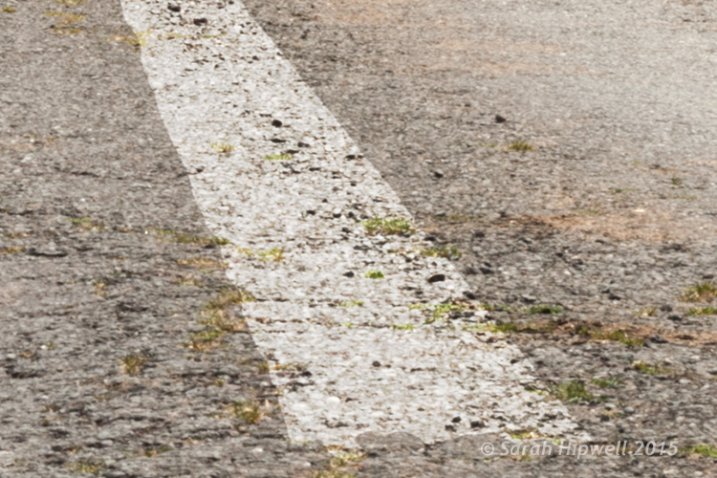
Close-up of the road marking after the displacement map and final tweaks have been applied.

Final tweaks: To give the road marking a more realistic look.

I added Gaussian Blur of 4px to get rid of the ever so slightly pixelated edge on the shape. Double-click anywhere to the right of the layer to bring up the Layer Style box. I changed the Blend Mode to Overlay, reduced Opacity to 77% and Fill to 90%. In the Blend If section, I moved the black slider to 187 on the Underlying Layer.

Tip. If you hold down the Alt/Option key when dragging the black or white sliders, this splits the slider arrow into two which makes the blend more smooth.

Layer-style

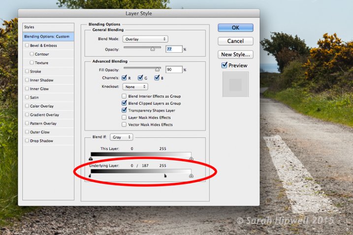
The black slider is split on the Underlying Layer in the Blending Options dialog box.

2. Shadow Effects – Water

Displace-in-water

Displace-in-water-map-applied

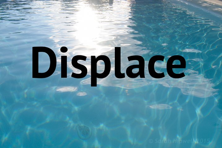
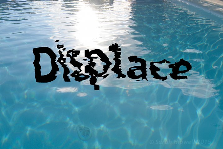
Before and after images showing the distortion on the word “Displace” when a displacement map has been applied.

Aim: To create a realistic reflective shadow in water with text.

I used the word “Displace” to show how a shadow in water can look quite effective and realistic. The displacement map I made for this image worked really well in distorting the text to wrap around the ripples of the water. I followed the same steps to generate the displacement as above but I applied a Gaussian Blur of 5.4px for this image.

The values I added in the Displace dialog box for the Horizontal and Vertical scales were 80 respectively.

For the final tweaks, I added Gaussian Blur of 10.1px. I changed the Blend Mode to Softlight, reduced Opacity to 78%, and Fill to 80%. In the Blend If section, I moved the black slider on the Underlying Layer to 148.

Displace-in-water-final

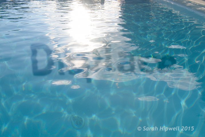
The word Displace distorted using a displacement map.

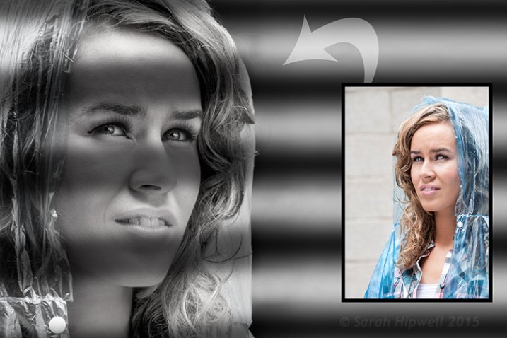
2. Shadow Effects – Film Noir Look

Woman-film-noir

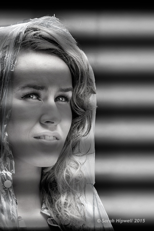
Using black horizontal lines and a displacement map to simulate light shining through window blinds.

Aim: To create a film noir look or the effect of light coming through blinds.

For this image I had to do more work in Photoshop to get the final look. The process to generate a displacement map is the same here as in the other examples. Just bear in mind that the blue channel is not the best choice for subjects as the skin tones look awful.

I isolated the model from this image and put it on a separate layer with a layer mask. I added a Black and White adjustment layer, then created thick black horizontal lines using the Rectangular Marquee Tool to resemble window slats on a separate layer. Next, I duplicated that layer. I used one for the background layer and added a significant amount of Gaussian Blur. I then moved the other layer above the model with the layer mask. I wanted to angle the black lines (window blinds) across the model’s face. I did this using the Free Transform Tool.

Woman-black-lines-film-noir

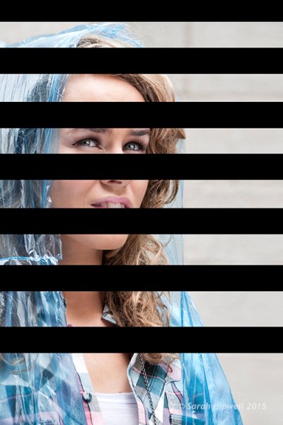
Black lines created using the Rectangular Marquee Tool.

I made a displacement map and distorted the slats over the model’s face using 15 and 20 as the values for the Horizontal and Vertical scales.

Woman-displacement-map-applied

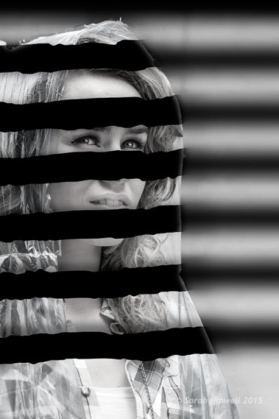
The black lines have been distorted via the Displace filter using a displacement map.

This is only a brief description of the final tweaks: I applied a Gradient Overlay and some Burning to darken the left side of the model as the light source is coming from that directoin. I added Gaussian Blur of 28.9px and reduced Opacity to 40%.

Tips

  • Blue is the worst channel to choose if you are making a displacement map where skin tones are involved.
  • The green channel usually shows the most contrast.
  • Make sure to use Gaussian Blur when generating displacement maps.
  • Displacements maps must be saved out as a grayscale .PSD file.

I hope I have inspired you to start making displacement maps and use the Displace Filter if you have never tried it before.

googletag.cmd.push(function() {
tablet_slots.push( googletag.defineSlot( “/1005424/_dPSv4_tab-all-article-bottom_(300×250)”, [300, 250], “pb-ad-78623” ).addService( googletag.pubads() ) ); } );

googletag.cmd.push(function() {
mobile_slots.push( googletag.defineSlot( “/1005424/_dPSv4_mob-all-article-bottom_(300×250)”, [300, 250], “pb-ad-78158” ).addService( googletag.pubads() ) ); } );

The post Get Creative with Displacement Maps in Photoshop by Sarah Hipwell appeared first on Digital Photography School.


Digital Photography School

 
Comments Off on Get Creative with Displacement Maps in Photoshop

Posted in Photography


Creative Ways toPhotograph FlowersIn Your Home

07 May

For many of you, the harshness of winter has finally come to a close. (Yay!)

In its place you now have the beauty of spring, which means flowers are everywhere.

We’ve already starting making the most of this new and colorful season with our recent guide on frozen flower photography.

Now we’re gonna share four more ways to get creative with flower photos right in your own home.

So go pick some flowers and let’s get shooting!

Creative Ways to Photo Flowers Indoors

(…)
Read the rest of Creative Ways to
Photograph Flowers
In Your Home (497 words)


© Taylor for Photojojo, 2015. |
Permalink |
No comment |
Add to
Photograph Flowers
In Your Home”>del.icio.us

Post tags:


Photojojo

 
Comments Off on Creative Ways toPhotograph FlowersIn Your Home

Posted in Equipment


Wrap It Up! 10 Creative Building Scrims & Scaffolds

12 Apr

[ By Steve in Architecture & Cities & Urbanism. ]

Scrim Scaffold 0
These artistic wraps, scrims and scaffolds creatively conceal the ugly truth of building construction, remediation and restoration.

Scrim Scaffold 1b

Illusion of justice? OK, that was too easy but restoring the United States Supreme Court Building was anything but. Designed by Cass Gilbert, the building’s classical marble facade has fronted the inner workings of the SCOTUS since 1935. The white Vermont Imperial Danby marble has aged gracefully for the most part but after 75 years of Washington weathering, a comprehensive restoration of the columned West Facade was deemed necessary… and it was going to get messy. What to do?

Scrim Scaffold 1a

Scrim Scaffold 1c

The solution employed by Rockville-based Forrester Construction Co. was a clever combination of inner rigid scaffolding wrapped in a decorative scrim depicting a photo of the facade in its forecasted finished state. Derived from practices commonly used in Europe, the scrim kept the dirty work of cleaning and restoring the facade under an attractive cover for the better part of two years, being removed upon the project’s completion in late 2013.

Dutch Treat

Scrim Scaffold 2

Sometimes less is more and conversely, more may seem like less. That was the case on Kettingstraat in The Hague, when Dutch architecture office Archipelontwerpers installed a Gehry-esque golden scrim to camouflage restoration and renovation work. Who’s going to notice the construction with a shimmering curtain of gold to distract their eyes?

Meat-Wrapping District

Scrim Scaffold 3a

Scrim Scaffold 3c

Scrim Scaffold 3b

In 2012 when the Whitney Museum of American Art dedicated a retrospective to 83-year-old Japanese artist Yayoi Kusama, they decided to promote it in a big way. Take “Yellow Trees”, a building-sized art installation doubling as a practical scaffolding scrim on West 14th Street at 9th Avenue, near the Whitney‘s new location in NYC’s trendy Meatpacking District.

OZ-some!

Scrim Scaffold 4

Scrim Scaffold 4b

Scrim Scaffold 4c

Sydney Town Hall was an Australian showpiece when it opened in 1889 but over a century’s worth of grime can’t be removed in a day or for a dollar. It took $ 33 million and quite a few days, in fact, and the use of a custom 30m (66ft) tall scrim for the clock tower and 20m (44ft) tall screens for the front facade helped preserve the old gal’s dignity while her cosmetics were being applied.

Next Page – Click Below to Read More:
Wrap It Up 10 Creative Building Scrims Scaffolds

Share on Facebook


[ By Steve in Architecture & Cities & Urbanism. ]

[ WebUrbanist | Archives | Galleries | Privacy | TOS ]


WebUrbanist

 
Comments Off on Wrap It Up! 10 Creative Building Scrims & Scaffolds

Posted in Creativity


Flickr Wall Art removes Creative Commons prints

20 Dec

Flickr has apologized to users upset over its Creative Commons-licensed print options. Effective immediately, all CC images have been removed from its Wall Art printing service. Users are still able to order prints of their own images, photos provided by Flickr’s own licensed artists and photographers who have requested their images be included. Read more

Articles: Digital Photography Review (dpreview.com)

 
Comments Off on Flickr Wall Art removes Creative Commons prints

Posted in Uncategorized


The Controversy Around Flickr Selling Creative Commons Licensed Photos

25 Nov

Douglas MacMillan has an article out in the Wall Street Journal today about the controversy surrounding Flickr selling prints of Creative Commons photos and not paying contributors for these images. It should be stressed that Flickr is only doing this on Creative Commons licensed photos where free commercial use is permitted by the license. If you license your photos Creative Commons Non-Commercial, this does not include you.

In the article he quotes Flickr founder Stewart Butterfield: “Yahoo’s plan to sell the images appears “a little shortsighted,” said Flickr co-founder Stewart Butterfield, who left the company in 2008. “It’s hard to imagine the revenue from selling the prints will cover the cost of lost goodwill.”

In addition to the Creative Commons photos that Flickr is selling and not paying photographers for use (legally), they are also handpicking other photos for this sales effort and here they are offering photographers 51% of the revenue on sales of these images who have agreed to participate.

My two cents:

I think it’s important that each photographer fully understand how the license that they are using with their photos online works. It is first and foremost the photographer’s responsibility to understand licensing. Creative Commons is a wonderful and liberal way to share your photos. It’s not for everyone though. You choose how your photos are licensed on Flickr though. By default Flickr licenses images “all rights reserved,” the most restrictive license available. So only photographers who have gone in and changed their license to a more liberal license would be affected by this.

I license my images Creative Commons Non-Commercial. This is one of several variations of the Creative Commons license. This means that people can use my images for personal use or non-profit organizations can use them, but folks like Yahoo/Flickr and others can’t sell them commercially without my permission.

If you are going to license your photos Creative Commons with no restriction, then you ought to be prepared for this type of use. If it’s not Flickr selling them, anyone else can, legally. If you are uncomfortable with this idea, then you should not use Creative Commons without any sort of restriction. If you like the idea of Creative Commons but are uncomfortable with commercial use without being compensated, then consider changing your license to Creative Commons Non-Commercial like I license mine.

I think a lot of people though don’t consider the full implications of the license that they choose and like Stewart I wonder if the revenue is worth potential lost goodwill in this case. Some people will inevitably be put off when they see that the community (and Flickr is as much a community as a company) that is hosting their photos for them is now selling them without sharing the profit or asking for permission. Reminding people to read the fine print of their photo license that they chose without really considering it thoughtfully might not be the best answer to that complaint. People on Flickr LOVE to complain about anything and everything.

I think Flickr does have to figure out how to pay for a free terabyte of storage for every user and maybe this is one way to do that.

I haven’t been asked to participate in the online print marketplace, but if I was and was offered a 51% payout, I’d probably say yes. Anything 50% or better feels pretty fair to me. I create the image, but Flickr is driving the traffic to it for sale and handling fulfillment, etc. If I were to have a physical gallery sell my works, I’d probably be looking for a similar cut.

The idea of selling Creative Commons images and getting to keep all of the money is interesting to Yahoo I’m sure, but maybe Flickr would be better off instead focusing on more of a total revenue share model for the entire effort and treating CC images like they treat CCNC and all rights reserved images. I bet people who license their work CC would be pleased if their images too were handpicked for inclusion and they got paid for use. Even if it were a small amount, it would be a positive affirmation to them about their photography and that would feel good.


Thomas Hawk Digital Connection

 
Comments Off on The Controversy Around Flickr Selling Creative Commons Licensed Photos

Posted in Photography


Flickr Wall Art expands to include Creative Commons images

23 Nov

Flickr Wall Art now allows users to order prints from more than 50 million photographs, the service has announced. This follows Wall Art’s arrival in October, and moves to include all applicable freely-licensed Creative Commons images, licensed artists images, and a curated selection of content from NASA. Read more

Articles: Digital Photography Review (dpreview.com)

 
Comments Off on Flickr Wall Art expands to include Creative Commons images

Posted in Uncategorized


3 Creative Uses of the Drop Shadow in Photoshop

15 Nov
Default-Drop-Shadow

Default Drop Shadow applied to Text

Layer styles are a great way to add effects to your images in Photoshop. In this article, you will learn about the Drop Shadow. A typical example of the drop shadow effect in Photoshop is to add a 3D look to your text. Another example is when working with multiple images in the same document, the cutout elements should appear seamless in the background. A drop shadow effect can also be used in a creative way to make your image stand out.

You get into the layer styles in Photoshop, by clicking on the fx icon at the bottom of the layers palette. Then, click on Drop Shadow, this brings up the Drop Shadow Dialog Box.

Drop-Shadow-Dialog-Box

Drop Shadow Dialog Box

Let’s take a minute to look at some of the default settings:

  • The Blend Mode has been changed to Multiply.
  • Opacity has been reduced to 75%.
  • The distance of the shadow from the object is set to three pixels.
  • The Size is what blurs the shadow, it is set to three pixels as well.

All of these settings can be modified within this Dialog Box. For example, you may want to change the angle to 90 degrees so that the drop shadow is directly underneath. If you are new to adding effects in Photoshop.

Getting to grips with layer styles is a good start. These effects are applied non-destructively. I prefer to work with layers so that I have more control over any adjustments that need to be made. I use Gaussian Blur quite a lot which can be found under Filter on the Menu bar. Next, I’m going to show you how to put the drop shadow layer style on its own separate layer.

Beginning with the Drop Shadow Dialog Box already open, click Ok, then go back up to the Menu Bar>Layer>Layer Style>Create Layer. A dialog box appears with ‘Some aspects of the Effects cannot be reproduced with Layers!’ Just click Ok again.

Custom-Drop-Shadow

Custom Drop Shadow

What this does is put the drop shadow on its own separate layer. You can now make modifications non-destructively to the drop shadow using adjustments layers. By moving this layer around, you are creating the distance and the angle of the drop shadow in one movement. Changing this layer to a Smart Object will mean you can add Gaussian Blur or any other filter and this effect will also be applied non-destructively. In the layers Panel, go up to Opacity to reduce the intensity of the drop shadow.

Create a custom creative shadow

You can also create a drop shadow without using the layer styles. When I am working with two or more images, (i.e. compositing) I import an image that has a clipping path or layer mask so that the subject or object has been already isolated or cutout from the background. For example, this image:

Women-at-work

Women at work

The concept behind this image was a play on the men at work theme. Follow along the following steps:

  • Take a photo of your model.
  • The light isn’t important as will be turning your subject into a silhouette.
  • Create a clipping path with the pen tool, then open the destination (in this case the blank street sign) image and copy the path of the model into that image.
  • Next make a selection from the path and fill it with black.
  • Duplicate that layer and name it drop shadow.
  • Now you have two layers with the same black silhouette of your model.
  • Put the layer named drop shadow underneath the silhouette layer.
  • Next using the keyboard shortcut Cmd+T on a Mac(Ctrl+T on a PC), activate the Free Transform tool.
  • By holding down the Cmd key on the keyboard, hover your cursor over the top mid-point until the arrow turns white.
  • Click and drag the shadow out to the left and down.
  • Reduce the opacity to about 32%, convert this layer to a Smart Object, and apply a Gaussian Blur (I used four pixels).

This is a creative drop shadow rather than a realistic one. See the resulting image below.

Women-at-work-free-transform

Women at work with free transform handles

Shadows

Shadows will play an important role when working on multiple images, especially if you want the cutout element to look as seamless as possible against the background. Let’s look at creating a more realistic shadow.

In this image of a deserted road, I imported a cutout of the Lego figure. I used a combination of the method used above then created another drop shadow under his feet using layer styles. Follow along to create something similar using your images:

  • Duplicate the Lego figure (or your version of him) and fill it with black to give the long shadow cast by the sun.
  • Reduce the Opacity to about 22%.
  • Click on the fx icon at the bottom of the Layers panel to add the drop shadow layer style. In this image I wanted this drop shadow to be underneath the figure at its feet.
  • Put this shadow on its own layer (see description above) and convert it to a Smart Object.
  • Paint away the shadow on the body using a layer mask and then apply some Gaussian Blur, but not too much.
  • Reduce Opacity to 70%.
  • Shadows around the feet area will be darker and not as large as other shadows. The Lego figure now looks anchored to the image as opposed to floating in it.
Lego-figure

Lego figure

In summing up, the drop shadow is a very useful effect and can greatly enhance your imagery. For realistic shadows take note of the direction and the type of light. Is the sun shining overhead or is it over to the right? Morning and evening light will have longer shadows than in the middle of the day. Gaussian Blur and Opacity will be your allies here.

Do you have any other drop shadow tips or creative uses of them?

The post 3 Creative Uses of the Drop Shadow in Photoshop by Sarah Hipwell appeared first on Digital Photography School.


Digital Photography School

 
Comments Off on 3 Creative Uses of the Drop Shadow in Photoshop

Posted in Photography


Next-Level Pop-Ups: 15 Creative Sidewalk Shops & Services

12 Nov

[ By Steph in Drawing & Digital. ]

pop up theater main

Whether you’re in need of some quick sidewalk psychotherapy, a spa treatment in a subway station, sandwich delivery via parachute or a bowl of sugary cereal with a side of technology-dependence guilt, there’s a pop-up concept waiting for you. These 13 off-the-wall pop-up shops offer some of the most unusual goods and services that you could ever expect to find in your path while going about your day in the city.

Pop-Up Psychotherapy
pop up psychotherapy

Need to talk to someone about your problems? You’d be lucky to pass by the Unhappiness Repairer in the street, a pop-up psychotherapy stand by artist Silvia Neretti that explores the connection between happiness, psychotherapy and design. Neretti asks – Is it possible to design happiness? Sure, she’s not a licensed therapist, but the idea of having such easy access to mental health services is an intriguing one.

Pop-Up Spa on a Subway Platform
pop up subway spa

pop up subway spa 2

The typically unpleasant sticky heat of the 34th Street subway platform in New York City was turned into a positive with The Subway Spa, a prank by performance group Improv Everywhere. Figuring you might as well enjoy yourself if you’re going to get sweaty, the group set up a steam room, massage tables, sauna benches and table proffering fluffy white towels. Most of the people who took off their clothes to don robes and relax on the platform benches were actors, but a few citizens actually joined in.

Remote Controlled Pop-Up Shop
pop up remote control 1

pop-up remote control 2

The world’s smallest pop-up shop is no more than a tiny box with a red awning reading ‘SHOP’ on top, zipping around the streets of Tokyo all on its own. The shop is built on a tiny remote-controlled car that zooms up to passersby to hawk British designer Duncan Shotton’s tiny push-pin figures. That’s certainly one way to get your products noticed.

Pop-Up Sandwich Shop Delivers Food via Parachute
pop up shop sandwiches parachute

pop up shop sandwiches parachute 2

A pop-up sandwich shop called Jafflechutes delivers piping hot sandwiches from the 7th floor of an apartment building to the street below using parachutes. Customers pay via PayPal and wait on an ‘X’ marked on the street until their sandwich comes floating down.

Pop-Up Store Tool Kit to Transform Vacant Lots
pop up tool kit

Got an idea for your own pop-up? Made in the Lower East Side (miLES), a group promoting urban revitalization, offers a Storefront Transformer that makes it easy for anyone who wants to open their own shop in a vacant storefront with plug-and-play shelving, partitions, tables, seats, lighting, wifi, power strips and more. miLES also facilitates the short-term rental of these vacant spaces.

Stairway Cinema: Pop-Up Sidewalk Theater
pop up mobile theater

pop up mobile theater 2

Duck under a red awning and take in a film with ‘Stairway Cinema,’ a mobile pop-up movie theater by experimental design collective OH.NO.SUMO. Fitted with a movie screen and a projector, the theater can be grafted onto the steps of vacant buildings. The designers created it in response to the lack of interaction seen between huddles of people waiting at bus stops and outside launderettes on the corner.

Next Page – Click Below to Read More:
Next Level Pop Ups 15 Creative Sidewalk Shops Services

Share on Facebook


[ By Steph in Drawing & Digital. ]

[ WebUrbanist | Archives | Galleries | Privacy | TOS ]


WebUrbanist

 
Comments Off on Next-Level Pop-Ups: 15 Creative Sidewalk Shops & Services

Posted in Creativity


LAB Color Correction Video Tutorial: Creative Grading Techniques for Images

12 Nov

In this second video on LAB we explore a way to add creative color grading onto a desaturated dusk image. Once again exploring LAB colour mode and curves we get playful to create saturation and color contrast to add life to a dull scene. Don’t miss our first video on the LAB colors tutorial. Before After

The post LAB Color Correction Video Tutorial: Creative Grading Techniques for Images appeared first on Photodoto.


Photodoto

 
Comments Off on LAB Color Correction Video Tutorial: Creative Grading Techniques for Images

Posted in Photography