RSS
 

Posts Tagged ‘Creative’

8 creative tips for shooting waterfalls

30 Jul

8 Tips For Shooting Waterfalls

Photographing waterfalls can be a tricky endeavor – especially when shooting in conditions where the light can change drastically depending upon the weather conditions. If you’ve ever struggled to get the waterfall shot you envisioned, you’ve come to the right place. This article will cover everything from basic tips to more advanced techniques to make shooting waterfalls a breeze.

Choose the Right Gear for the Job

The most important piece of gear that you will need beyond a camera and lens is a sturdy tripod. This is an absolute must when shooting longer exposures. Here’s a list of a few more important pieces of gear that will come in handy in the field:

  • Tripod: Any time you’re shooting long exposures a tripod is a must
  • Selection of lenses: I generally try to cover a focal range of 16mm to 300mm to give myself a number of options in the field
  • ND filter: I typically don’t use ND filters as I generally shoot fairly short exposures, but they can come in handy depending upon the lighting conditions and the type of water texture you hope to achieve
  • CPL: I always use a circular polarizer when shooting waterfalls as it can really help give the vegetation more ‘pop’ – the above image is an example of where a CPL can make big difference in terms of how the foliage appears in your photo and it can also help enhance the appearance of wet rocks and reflections in the water
  • Remote Shutter Release: This isn’t a necessity but it certainly can make shooting waterfalls a bit easier
  • Rocket Air Blaster and Lens Cleaning Cloths: Let’s face it; you’re going to get wet. Using these two products, plus a waterproof housing (or zip lock baggies) can help to keep your lens and camera dry while shooting
  • Bag of Rice: You never know when disaster may strike, so I always bring a large bag or canister of rice with me in the event that my camera decides to take a dip  

Shoot in Diffused Light

If you’ve ever tried to shoot a waterfall in direct sunlight then you’ll know how difficult it can be. Shooting with an ND filter can help to resolve some of these issues but shooting in diffused light is the best solution to the problem. When planning a waterfall shooting trip I always take a look at the weather forecast and check sunrise/sunset times before heading out to a location.

In general, I’ve found that shooting during the hours just after sunrise offers the best results as morning light can provide some impressive shooting conditions. The image you see here was shot about 3 hours after sunrise at Metlako Falls in the Columbia River Gorge, OR.

Choose the Shutter Speed

It seems like it was only a few years ago that using extremely slow shutter speeds while shooting waterfalls was all the rage, but lately I find myself using shorter shutter speeds to really capture the texture in the water. The rate at which the water is falling dictates how quick or slow of a shutter speed you will need to use when shooting in lower light conditions. To give you an idea, the above image (Panther Creek Falls, WA) was shot at a shutter speed of 1/4 second to freeze the water and capture some of the texture as it cascaded down the rock face.

Choosing a longer shutter speed will soften up the water a great deal and in some cases that’s just what the scene calls for. It really all comes down to personal taste. Experiment with the shutter speed while you’re out in the field – the more options you have the better!

Save the Foliage

If you’ve ever shot a waterfall on a breezy day you know that it’s nearly impossible to utilize slower shutter speeds while simultaneously ‘freezing’ the foliage in the frame. You almost always see motion blur in the vegetation surrounding the waterfall.

To solve this problem I always take at least two exposures: one for the waterfall at your favorite shutter speed to obtain the right amount of water texture, and an additional exposure taken at a much faster shutter speed to freeze the foliage in place. In the above example I blended two exposures together to get sharp foliage along with the amount of water movement I was trying to achieve with the longer exposure.

Choose Your Composition Carefully

Choosing a strong composition can be challenging when shooting waterfalls. Here are a few of the key guidelines that I follow when shooting images like the one you see above:

  • Find a leading line or an ‘S’ to work with in your composition
  • Let the water flow guide you to the focal point
  • Shoot downstream of the waterfall to add depth
  • Utilize rocks and other elements in the scene to guide your eye to the focal point
  • Don’t be afraid to try out several variations – I always shoot at least 3 or 4 compositions at any given location

Think Outside of the Box

One of my favorite things to do while shooting waterfalls is to think outside of the box in regards to composition. Taking an abstract approach to shooting a waterfall can lead to some really fun results. Use different focal lengths and experiment with tighter compositions that may only show a small portion of the waterfall.

I always try to shoot at least a handful of abstract shots while I’m in the field because let’s face it: it’s just plain fun to get the creative juices flowing!

Adjust Your Exposure

Getting the exposure right can be a tricky business when shooting waterfalls. When using longer shutter speeds it’s very important to constantly meter your exposure to make sure that you aren’t losing detail in the water by clipping your highlights. Check the histogram to make sure that you are staying to the left or dead center in your exposure. As the light changes you will have to do this quite often so definitely keep an eye on it!

Provide a Sense of Scale

Waterfalls come in all shapes and sizes, but it’s often difficult to provide a sense of scale while shooting them. Adding a human element to your photo can really bring a whole new sense of wonder and scale to your image. Special thanks to Max Foster for snapping this photo of me at Spirit Falls, WA.  

Save

Articles: Digital Photography Review (dpreview.com)

 
Comments Off on 8 creative tips for shooting waterfalls

Posted in Uncategorized


Mood Boards: Communicate Your Ideas To Your Creative Team

23 Jul

This is the time to hear out others opinions (if you’re open to them, which


Fashion Photography Blog

 
Comments Off on Mood Boards: Communicate Your Ideas To Your Creative Team

Posted in Uncategorized


Photographers to Get (Small) Reward for Their Creative Commons Images

19 Jul

dotspin

Image courtesy: Dotspin

Someone is benefitting from your Creative Commons-licensed images, and it probably isn’t you. Sure, you might get a little thrill out of knowing that you’re helping a designer with a small budget (or a blogger with no budget) to use an attractive image. And if you’re able to see your pictures in use, the validation can be a fun boost. But that’s a big ‘if’ and it’s pretty much where the benefits end. One new company, though, believes that photographers willing to give away their pictures should receive more for their efforts. Dotspin is trying to line up gifts for photographers who apply Creative Commons licenses to their pictures and give them away on social media sites.

The company has been online since the beginning of May and is still in beta. Its aim, says co-founder Gastón Paladini, is to reward photographers for their contributions to the Internet.

“The idea come from a vision to have a more fair web for all. We think that social media users should be recognized for good content (photos) shared and to be protected in a legal way (copyrights).”

Dotspin is connected to both Instagram and Twitter. Having signed in using an account on either one of those services, Dotspin’s users can take a picture, apply their filters and upload it to their account, tagging the image with the hashtag #dotspin.

The hashtag ensures that the photo is also submitted to Dotspin where, by default, it is licensed as Creative Commons. A settings page, however, allows photographers to change the type of license applied. Rather than selecting one of the various Creative Commons licenses in use, they’re asked whether they’re willing to allow modifications and commercial usage in addition to personal use.

The image will appear in Dotspin’s galleries watermarked with a colored dot, but not before the community has voted on it. Users are presented with two random pictures and asked which they prefer. Images that receive a large number of votes receive “dotcredits,” points which they can redeem for rewards.

At the moment those rewards come from Dotspin, based on “some agreements with Amazon.”

“But we think that soon the suppliers and brands will come to us to offer their products on the Dotspin catalogue,” says Gastón.

Put Your Ads in Front of… Picture-Takers

He may be right.  Instagram currently has more than 100 million users, offering a massive potential market for sellers looking to promote their goods. It’s likely that Dotspin will be able to find some companies who are willing to offer vouchers or freebies in the hope of turning the winners, as well as the site’s users, into future customers.

But the site will face a number of challenges too.

The first is the lack of demographic data. Awarding points that users can redeem means that suppliers can’t target their advertising. They’ll have to settle for offering their products to a demographic made up of roughly of people who like taking pictures. That’s a broad category.

The voting system, too, leaves much to be desired. At the moment, two images are placed against each other at random, forcing users to choose between a picturesque sunset and a mirror-shot selfie, for example. A voting system that pitched two images showing similar topics or that were shot in similar styles against each other might be a more serious way of judging talent.

But a bigger problem is the site’s goal itself. Gastón’s aim to reward people willing to give away their images may be fair and reasonable, but the lack of rewards on offer so far hasn’t stopped people from sharing their pictures. Flickr alone has more than a quarter of a billion photos available under one form of Creative Commons license or another. Donors of those images have made them available with no hope of reward. Gastón wouldn’t say how many photographers have signed up since the site’s beta launch but he did indicate that the numbers are “much more than we thought.”

That could be a good sign but it will be interesting to see whether Dotspin is able to capture a good chunk of the photographers willing to allow people to use their images.

Creative Commons Users Want Tracking for Their Photos, Not Thanks

The most likely outcome is that some photographers currently sharing their images through Instagram and Twitter will sign up to Dotspin and start adding the hashtag. They’ll enjoy the extra feedback provided by the voting system, especially if it’s enhanced. And if the site is able to bring in donors, they might feel a rush if they’re able to win enough credits to pick up a free app download or a discount from a printing service.

But none of those rewards is likely to have an impact on photo-sharing as a whole. They aren’t likely to encourage it and the odd prize isn’t going to come close to rewarding photographers for giving away for free an asset that costs other photographers a great deal to produce.

That’s because when photographers add a Creative Commons license they aren’t doing it for the reward. They’re doing it because they want people to use their images — even the images that few people are ever likely to use. And most of all they want to see their pictures in use.

That would have been a much more powerful reward than goodies redeemable against voted credits. If a platform were produced that highlighted the best of the most recent Creative Commons-licensed images, helped publishers, bloggers and editors to find them, and informed the photographers each time an image was downloaded and told them where it was going to be used, that would be much more rewarding.

And if that service also gave the photographers a share of the page’s revenues, then photographers who applied Creative Commons licenses to their images would really start to feel the benefits.


Photopreneur – Make Money Selling Your Photos

 
Comments Off on Photographers to Get (Small) Reward for Their Creative Commons Images

Posted in Equipment


Planning A Shoot With A Creative Team

18 Jul

Plan a shoot!


Hey FashionPhotographyBlog.com readers,

Last time we discussed what is a creative team and how to find one. Once you have assembled your creative team, it’s time to plan a shoot together. I’ll be using the experience from one of my previous shoots to talk about this process. 


I’m going to walk you through some of the planning behind my editorial for Kenton Magazine, “Surrealia,” however, the same basic principles apply to planning a test.


Get Inspired! 


Come up with a concept and do your research. The idea behind this shoot started when talking to an illustrator, and good friend, Matt Tedford. (Check out his work, he’s awesome!) We wanted to collaborate on an editorial so took some time to sit down and look at other editorials which incorporate illustration.


These were our two favorites:


– Defragmentation of Beauty by Marcin Tyszka for 25 Magazine

– Abbey Lee Kershaw by Greg Kadel for Numero


One thing we planned on doing was to use seamless and have a simple background. This way nothing detracts from the illustration. This idea of a non-distracting background was apparent in both the editorials we favored and reaffirmed our initial plan.


By dissecting what we saw in our two favorite stories, together we decided on a general direction for where the illustrations should go. From Greg Kadel’s images, we loved the use of bright pops of color and cutouts around the model. From Marcin Tyszka’s shoot, we loved the organic, free feeling the illustrations had and the use of line. I left a lot of the illustration to Matt, without too much guidance, because I trust his aesthetic. Good thing too, it turned out amazing!


marcin-tyszka-25-magazine Marcin Tyszka


abbey_lee_kershaw-numero-magazine-shot-by-greg-kadelGreg Kadel


Find your team


After deciding on what type of style we want for illustration, we decided to keep the clothing simple as to not distract or fight with the artwork to be added later. Being a bit inspired by Givenchy’s Spring 2012 collection and current trends, we decided on high contrast clothing and the use of the peplum. Simple, classic and chic. Hair was to be simple, down with beautiful curls and body. Makeup was decided to be pretty natural with a light smokey eye to define the face a bit, in order to compliment the hair and clothing.


We had our idea, now we had to find our team. Be sure to look for creatives that will compliment your concept. If a hairstylist is fantastic at big, beautiful waves but doesn’t favor doing up-dos (which is what you’re planning on doing), perhaps keep them on hold until you have a shoot that requires that big, beautiful wavy hair that they excel at. If someone is enjoying what they’re doing, it will show.


Styling was easy. Jocelyne, a stylist and all around awesome person that I’ve worked with before was the obvious choice. Her style matched exactly what we were looking for. She is great at keeping it simple and classy without over styling with accessories or trying to do too much at once (which is quite common, especially among stylists just starting out.) Fashion doesn’t have to be about excess! Often, less is more.


For hair and makeup we got lucky and were able to find one artist that is excellent at both! I had seen Mayela’s work around and loved her portfolio. I contacted her with details about our shoot and next thing we knew, she said yes and it was time to shoot!


So now that you have planned your shoot, got inspired and found your team it’s time to get ready to shoot. However, with a team of people on board. How do you communicate your photographic vision effectively with your team. Stay tuned, because next time we will be discussing how to communicate your ideas clearly using mood boards.


IMAGE SOURCE:


Feature image: Defragmentation of Beauty by Marcin Tyszka for 25 Magazine (left) & Abbey Lee Kershaw by Greg Kadel for Numero (right)

Image 1: Defragmentation of Beauty by Marcin Tyszka for 25 Magazine

Image 2: Abbey Lee Kershaw by Greg Kadel for Numero


Fashion Photography Blog

 
Comments Off on Planning A Shoot With A Creative Team

Posted in Uncategorized


Mood Boards: Communicate Your Ideas To Your Creative Team

18 Jul

Communicate Your Ideas Clearly With Your Team Using Mood Boards


Hey FashionPhotographyBlog.com readers,

Last time we discussed planning a shoot, getting inspired and finding your creative team. Today we’re going through how to effectively communicate your photography vision for the shoot with your team members and get the most out of them in terms of collaboration.


This is the time to hear out others opinions (if you’re open to them, which it’s always good to be) and really hammer down the details. When reaching out to your team, it’s standard protocol to provide them with a mood board.


What is a mood board? Essentially, it’s a collection of images to serve as inspiration and direction for how the shoot is to be pulled together. Typically, it’s a page (can be more) that compiles images and ideas which allows everyone to be on the same wavelength. Often it’s a good idea to include keywords and color references. If you’re not the kind to make a mood board, you can also compile images into a folder to send to your team but it’s the norm to compile it all on a single board.


On a mood board I tend to include inspiration for hair, makeup and styling along with an idea of how I want the image to look in the end. Sometimes this last bit will be a drawing or an image that has the same type of color scheme I’ll end up applying. Anything it takes to get your idea across. Don’t overcomplicate it.


The mood board is then followed up with emails (meetings or phone calls) to clarify any questions, hear out any suggestions and really communicate the idea to be portrayed. Jocelyne and I spent the next week exchanging numerous emails, deciding exactly which clothing to use, which trends to reference, what type of accessories to incorporate, etc. She would show me clothing which I would sort through and show images to Matt. Together we all made decisions which clothing to work with and which to forget about. No stone was left unturned.


*** It’s important to be involved with choosing which clothing you’re going to shoot. Especially if you are working with a new stylist or one that is just starting out in the field. Often times people will listen to what you say but pull clothing that suits their vision, not yours. There have been several times that I’ve showed up to a shoot to find awful clothing that was not at all what was described in the mood board. Sometimes you just have to learn the hard way. Being hands on is the only way to guarantee results that perfectly match your vision.


On the day of the shoot, make sure when your team gets there they have a clear idea of what is to happen for the day. I always take ideas and advice from my creative team but ultimately it comes down to the final concept and what is going to work best. If someone is giving you trouble on set and trying to override your ideas, pull them aside and speak with them. Don’t make it an awkward thing. “I respect your ideas but I don’t necessarily see it working with the overall concept for this shoot,” is all it takes.


Pardon for the quickly thrown together mood board – I couldn’t find the original.

Mood board


So that’s how you can get the most out of your creative team using mood boards. I hope that helps. If you have any suggestions you would like to share on how you use mood boards, please feel free to leave it in the comment section below. We’d love to see it!


Now that everyone on your creative team is onboard with your photography vision it’s now time to shoot it & wrap it up in post production. Stay tuned, because next time I will be sharing with you my tips for making the time during the shoot and after the shoot in post production run smoothly.


Until then – 

Alana


IMAGE SOURCE:

Feature image & image 1: courtesy of Alana Tyler Slutsky


Fashion Photography Blog

 
Comments Off on Mood Boards: Communicate Your Ideas To Your Creative Team

Posted in Uncategorized


Shooting With Your Creative Team & Post Production

18 Jul

Make It happen & Post-Production


Hi FashionPhotographyBlog.com readers,

Last time we talked about how to communicate with your creative team clearly using mood boards, today we are talking about how to make the process of shooting with your team and taking the shots into post-production run smoothly. So here we go…


Once everyone on the creative team and everything for the shoot is confirmed, I’ll reach out to agencies and find a girl that suits the idea. This isn’t always the case. Oftentimes you’ll see a model and be inspired by their look. 


Be sure to send out a call sheet the day before your shoot. This serves as a reminder for everyone as to the time and location of the shoot as well as provides everyone with the contact information for all involved. This is a standard protocol on any professional shoot.


fashion-photoshoot-run-sheet-example

 Then… Shoot! If you keep everything organized and set yourself a bit of a time table to stick to, you’ll be on track for a successful shoot. For “Surrealia,” we managed to shoot two models with several looks in just a few hours.


Remember, make it fun! If everyone is enjoying what they’re doing, it will show. Put on some music – ask the model what their favorite band is or put on something that sets the mood to help convey the feeling in the images.


Post-Production


I know, this is the least fun part of any shoot. The edit. Jocelyne and I decided to pick our final images together and made sure our selects portrayed the model and clothing nicely.


As with any good retouch.. It took forever. Well worth it though! After retouching the images and converting to black and white, it was time to send them off to Matt for illustration.


The process I went through with Matt is basically the same as the process you go through when sending images off to a retoucher:


1) Send over the images and let them do their thing (of course, with a general sense of guidance from you.)

2) You’ll receive a “first round” which you can mark up anything you dislike or don’t see fit and send it back for revisions.

3) Repeat the process of markups and revisions until the image is complete. Don’t forget to be conscious of budget when working with a retoucher.


Working with Matt was fantastic. There was bright color, organic shape, line; all the elements we had like in the editorials we found when doing our research. Except they suited us! Matt did an excellent job of taking those elements we liked and translating them to suit his vision and compliment my photographs.


The result? A batch of images I’m proud to have my name on and remain some of my favorites to this day.


The best thing you can do when planning a shoot is be meticulous. Leave no leaf unturned. Be sure to think of every detail and put your stamp on it. The same type of work goes into planning a test, however you don’t need as extensive a concept. It can be as simple as just shooting a portrait.


Hope you liked my posts about finding, planning and working with a creative team. As always, if you have any questions, feel free to leave a comment below or shoot me an email.


Until next time.. See ya!

Alana


IMAGE SOURCE:

Feature image: Ophelia by Gregory Crewdson

Image 1: courtesy of Alana Tyler Slutsky


Fashion Photography Blog

 
Comments Off on Shooting With Your Creative Team & Post Production

Posted in Uncategorized


Software Review: Macphun Creative Kit 2016

17 May
Image edited in Macphun Intensify CK

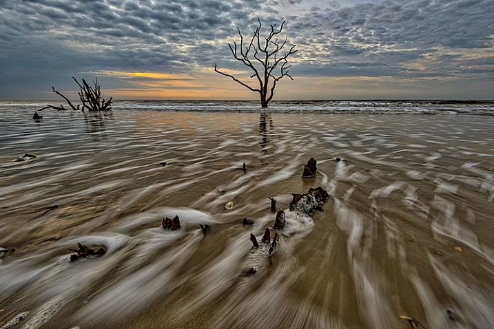
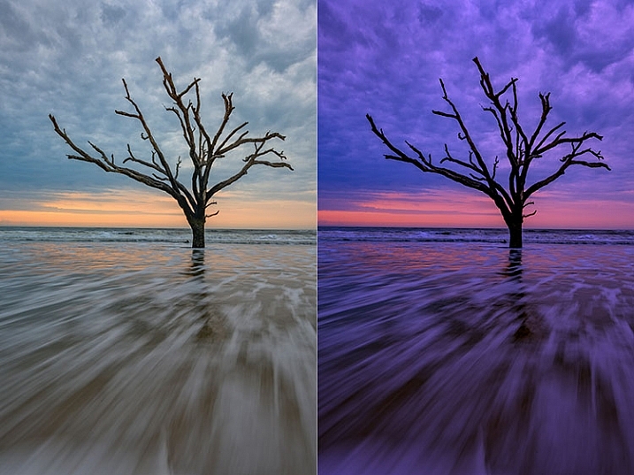
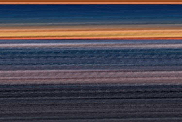
Boneyard Beach, Botany Bay Plantation, South Carolina. Edited in Macphun Intensify Creative Kit.

My philosophy on photography has always been that photography starts with the push of the shutter button, but it does not end there. Back when film was king, I spend a lot of time in the darkroom, learning and mastering darkroom techniques, and printing my work. With the advent of the digital age, those processes moved to the digital darkroom. Always one for working smarter, not harder, I have often employed plugins with Photoshop to make the work of editing my images a bit easier. I’m a big fan of plugin suites that offer a soup to nuts solution for editing images, so when Macphun released its Creative Kit 2016, I was excited to give it a try.

Note: all Macphun products are made for Mac only.

Macphun’s Creative Kit 2016 includes six plugins for Photoshop or Lightroom. This is a comprehensive collection that can handle all aspects of image editing, from color and contrast adjustments, to black and white conversion, to removing unwanted elements, sharpening, and noise reduction. The six modules are Intensify, Tonality, Snapheal, FX Photo Studio, Focus, and Noiseless. I’ll explain each one individually to give you an idea of the capabilities of each. Macphun Creative Kit, as the name implies, is only for Mac users, and is currently on sale at Macphun for $ 129 (USD)

Intensify CK

Macphun Intensify CK application window

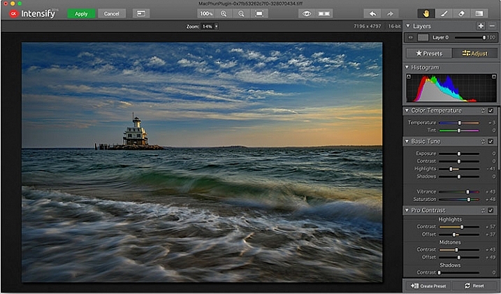
The Macphun Intensify CK application window.

Macphun Intensify is a plugin in the same vein as Topaz Adjust. You can adjust everything from color temperature and saturation, to contrast, structure, and details.  When you open Intensify, your image will be in the center of the screen with a tool bar on the right, which can alternate between presets and manual adjustments.

The list of presets is broken down into groups: Architecture, Black & White, Creative, Detail Enhancement, Image Tune, Landscape, and Soft. Within each group is a list of presets that pertain to the subject of the main group. For instance, within Landscape is Aerial Photo Enhance -2, Gloomy Day, Natural Enhance, Structured Scape, and Warm Day. When you select a preset, an amount slider appears underneath so you can adjust the amount applied to the image. You also have the option of manually adjusting all the sliders to tweak the preset to to your tastes.

Macphun Intensify CK Comparison Image

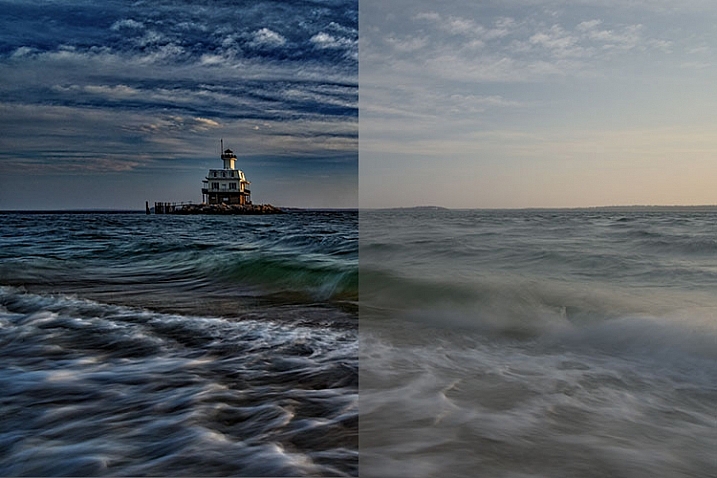
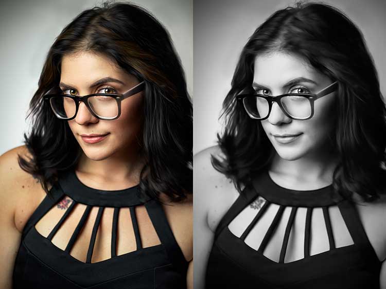
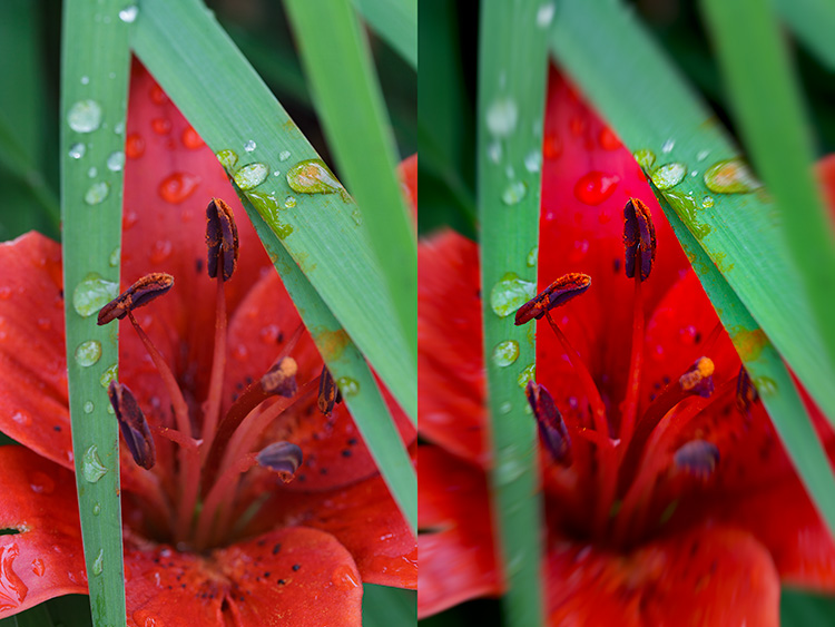
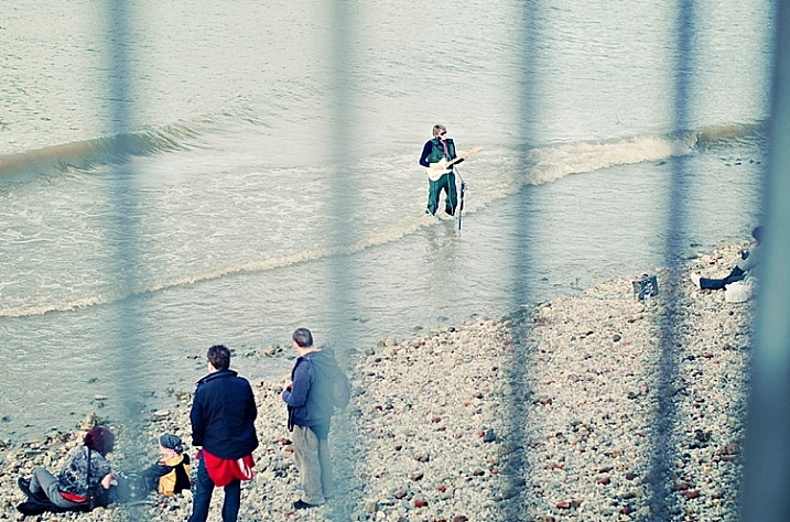
Comparison of an image edited in MacPhun Intensify, before (right) and after (left).

While I found many of the presets to be a bit heavy handed, manual adjustments are easy to make, and gave me a much more satisfying result than simply clicking a preset. For a more in-depth look at Intensify, read MacPhun Intensify Pro Software Review. While Macphun Intensify CK is a newer version, the controls and presets are largely the same and Andrew Gibson does an excellent job of breaking them down.

Intensify-Architecture

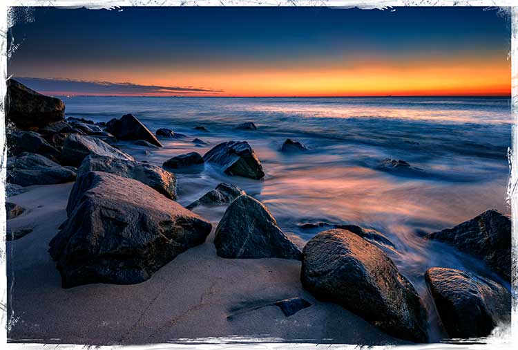
Before (left) and after (right) Intensify CK

Snapheal CK

Macphun Snapheal CK application window

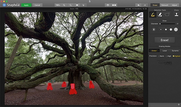
The Macphun Snapheal CK application window.

Snapheal CK may very well be the crown jewel of this collection. Think of the healing brush or clone stamp on steroids, and that’s what Snapheal CK is like. Snapheal CK is an amazingly simple way to remove unwanted objects from a scene. When you open Snapheal CK, You’ll notice a tool panel on the right, and a menu bar across the top. You’ll see zoom and move tools, an eyeball icon, which shows the object you’ve removed, a comparison button, arrows to step forward or backward, and finally – Erase, Retouch, or Adjust, which are the different modes you can work in. The selection tools at the top are a paintbrush, an eraser, and a marquee selection. There is also a cloning stamp tool.

Once you have your image in Snapheal CK, if you select Erase mode, you can either use the paint brush or the marquee tool to select the object you want removed from the scene. A red mask will appear over the object you’ve selected. The size of the paintbrush can be adjusted using the slider, or the bracket keys on the keyboard. If you paint in an area you don’t want removed, simply select the eraser tool and erase the painted area.

Image before Macphun Snapheal CK.

An image before using Macphun Snapheal CK. The signs in the scene were not allowed to be moved, so I was resigned to having to clone them out.

Underneath the selection tools, you’ll find the options for each tool, such as brush size, polygonal or free marquee, and for the clone stamp, diameter, softness, and opacity. Beneath the options, is a very large button clearly marked as Erase! Under the erase button are three erasing modes: Global, Local, and Dynamic, as well as three Precision options: Norm, High, Highest.

Once you’ve made your selection, you simply press the Erase button and Snapheal CK goes to work. While you wait, the status bar displays a variety of interesting facts to keep you entertained. It does take a few minutes to do its thing, even on my 2015 Macbook Pro with 16GB of RAM. After the process has finished, if the result is not to your tastes, try changing the erasing mode to one of the other modes. Each one behaves a bit differently and will produce a different result. The same goes for the Precision setting.

After Macphun Snapheal CK

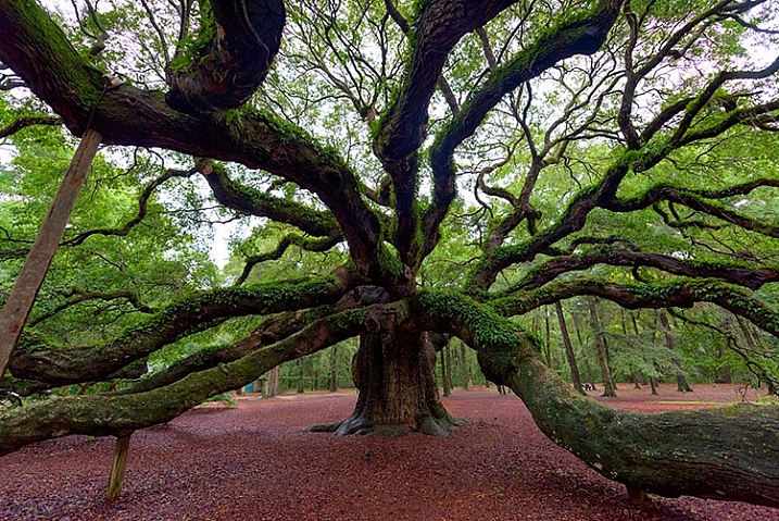
The same image after being edited in Macphun Snapheal CK. The signs and other unwanted objects have been removed.

Retouch mode works similar to erase mode, but instead of erasing, it allows you to adjust the selected area for color, contrast, and more. Adjust mode is similar but instead of working on a selected area, it makes global adjustments to the entire image.

Even without the Retouch and Adjust modes, the object removal mode of Snapheal CK makes it worth the price of admission in my book, saving me time every time I need to clone or remove an object from an image for whatever reason.

Note: if you are a Lightroom user and want a more powerful cloning and healing tool without having to purchase Photoshop, this may be a good option for you to look at.

Tonality CK

Macphun Tonality

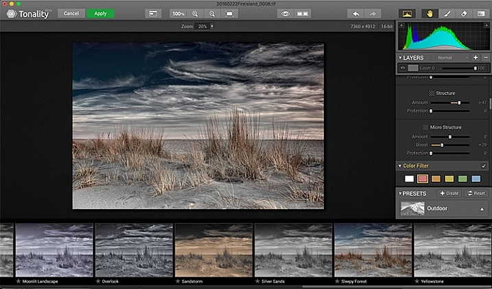
The Macphun Tonality CK application window.

Macphun bills Tonality CK as, “The world’s most advanced black & white photo editor.”  With hundreds of presets available to you, as well as the ability to work in layers and adjust virtually everything about the image, there’s a lot of truth in that statement.

As you open Tonality CK, you will be presented with your image in the main window, a menu bar across the top, tool palette on the right hand side, and preset preview bar across the bottom.  The palette on the right hand side features all of the settings, including; layers, a histogram preview, adjustment sliders for color temperature, tone, clarity and structure, color filter, tone curve, split toning, glow, lens blur, texture overlay, vignette, grain, photo frames, and layer properties. There are a lot of variables to adjust to get exactly the look you want. Beneath these adjustments is a drop-down menu to select various presets, from groups including Basic, Architecture, Portrait, Dramatic, Outdoor, Street, Vintage, Film Emulation, Toning, HDR, a Favorites group, and a group for user defined presets.

Macphun Tonality CK Comparison

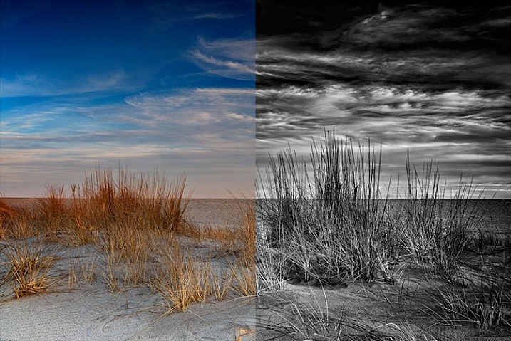
Before (left) and after Macphun Tonality CK (right)

With the use of layers and individual adjustments, there are literally endless combinations and looks that can be creative with Tonality CK. I really like the amount of freedom I have in the editing images, and the ability to create layers with different effects, and mask them off if desired, takes that freedom to a whole new level. For a more in depth review of Tonality, Product Review: Macphun Tonality Black and White Photo Editor goes in depth. As with Intensify CK, Tonality CK is an update to the version reviewed, but both are similar enough that I found the review helpful when I first began using Tonality CK.

Tonality CK applied on a portrait

Tonality CK applied on a portrait

Focus CK

Macphun Focus CK application window

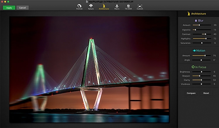
Macphun Focus CK application window.

Macphun Focus CK is a plugin that allows you to create lens focus effects easily and quickly. The interface when the plugin is opened is a minimalistic one, with only six presets across the top of the screen, and your image in the main window underneath. The presets are as follows: Portrait, Nature, Architecture, Macro, Tilt-Shift, and Custom. Truth be told, Nature, Architecture and Tilt-Shift are all similar, in that the blur is similar to that created when using a tilt-shift lens. There are subtle differences in each preset, with the most notable being the angle of the blur. This is user-adjustable, however, as are several settings sliders, which are adjusted slightly differently according to the preset selected. The same can be said for the Portrait and Macro settings, except instead of a parallel blur field, they create a circular blur field.

When you select a preset, a series of sliders appear on the right side of the screen, in three groups. The first group is Blur. This set of sliders, as you may have deduced, adjusts the image in the blurred area. The settings include amount of blur, vignette, contrast, highlights, and saturation.  The next group of sliders is Motion, which allows you to add motion to the blur, rather than simply a normal blur. Here you can adjust the amount and the angle of the motion. The final group of sliders is for the In Focus area of the image, and allows you to adjust the brightness, sharpness, clarity, and vividness of this area of the image.  Beneath these sliders are a Compare button, to allow you see before and after the blur is applied, and a Reset button, to allow you to start over if you don’t like what you’ve done.

Before and after comparison of Macphun Focus CK

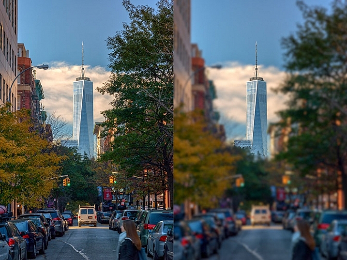
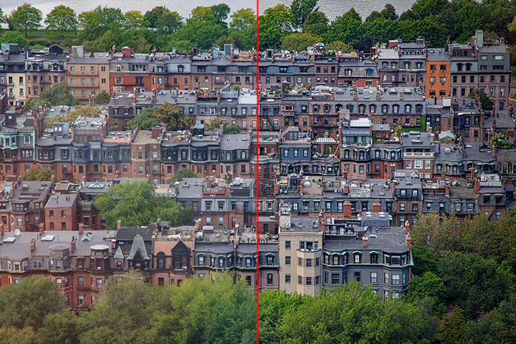
Before (right) and after (left) Macphun Focus CK.

The most fun part of Focus CK is the Custom setting. The custom setting allows you to mask off the areas of the image you wish to remain sharp, using the paint brush. As you paint, you’ll see the effect on the image. There is an eraser tool if you paint in an area you’d like to remain blurred. This custom setting allows you to really create different looks within your image. Have two objects at different depths, and want them both sharp and everything else blurry? No problem. Simply mask each object and adjust the blur of the out of focus areas to taste.

The biggest drawbacks in Focus CK is in this custom mode. There is no ability to zoom in on the area you are masking to do fine detail work, and the brush will not go smaller than 20 pixels, making it very difficult to mask off fine detail, such as the antenna on the building in the example above. If those two deficiencies could be rectified, I could see using Focus CK much more in my personal work.

Focus-CK-Portraiture

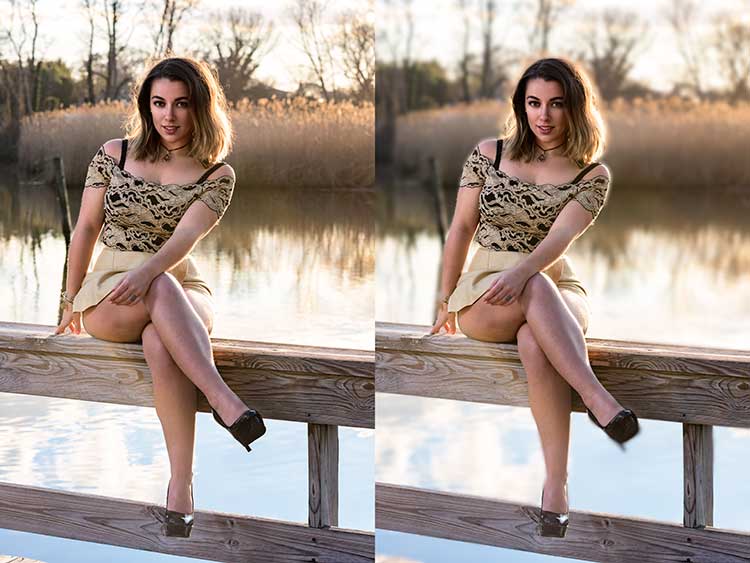
Focus CK applied to a portrait

Focus-CK-Macro

Focus CK applied to a macro image

Noiseless CK

Noiseless CK is Macphun’s entry into the digital noise removal arena. Like the other plugins in the Macphun Creative Kit, the interface features a large window for your image, a button bar across the top, and a palette of sliders on the right, that allows you to adjust a wide array of settings and customize the noise reduction to your preference.

Macphun Noiseless CK application Window

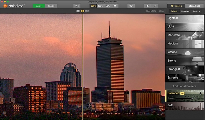
Macphun Noiseless CK application window.

To test out Noiseless CK, I dug out an image I created several years ago that has the worst noise I’ve ever had in an image. It was a four minute exposure, and I had neglected to turn on long exposure noise reduction. I found Noiseless CK was able to subdue the noise pretty easily.

Noiseless is simple to use. Open your image in Photoshop or Lightroom and start the Noiseless Plugin. On this image, I started at the Lightest preset, just to see how that would do with the noise, knowing that most likely it wouldn’t come close to reducing it enough for my taste, due to the heavy noise within the image. As I worked my way down the list of presets, I found that once I hit the Strong preset, it really reduced detail in the image, which I wanted to try and avoid. In addition to the presets ranging from Lightest to Extreme, there are also two additional presets, called Balanced and Soft. The Balanced setting seemed to work the best on this image. There is also an Amount slider to adjust the application of noise reduction using that setting.  From there, I could also select the Adjust tab, and individually adjust the settings individually to get a look I was happy with. If I wanted to save those settings, I can create a custom preset of my own for future use.

Before and after editing in Macphun Noiseless CK

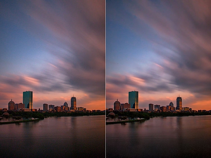
Before (right) and after (left) comparison of an image edited in Macphun Noiseless CK.

I found that using some of the presets resulted in a greater loss of detail than I was happy with, but once I went into the Adjust tab and started using the sliders, I was able to get some detail back, and get a look I was happy with. As I said, this was an extreme image I was using to test, and I have to say Noiseless CK did a great job with it. The ability to adjust the noise reduction using both the amount slider and individual settings sliders, gives me the confidence that Noiseless CK can handle almost anything I need it to.

FX Photo Studio CK

Macphun FX Photo Studio CK

Macphun FX Photo Studio CK application window

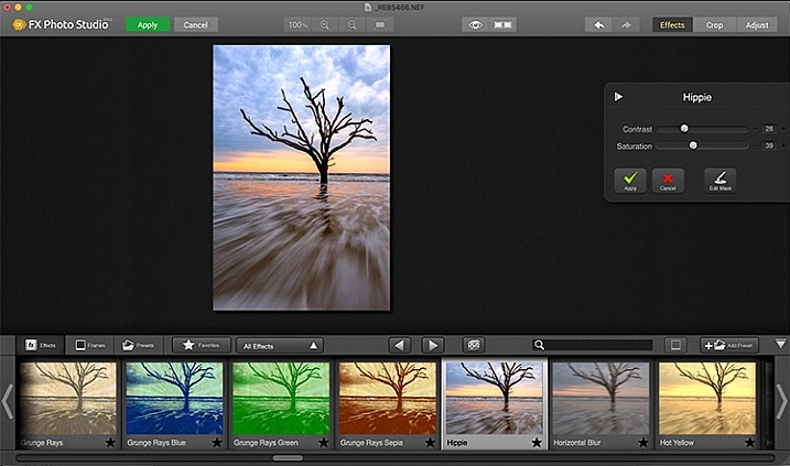
FX Photo Studio Ck is a special effects generator and photo editor that, at first glance, looks relatively simple and easy, but doesn’t offer many options. However, if you dig a little deeper, you’ll see there is more than meets the eye here. It offers over 200 different effects and frames, as well as the ability to create your own.

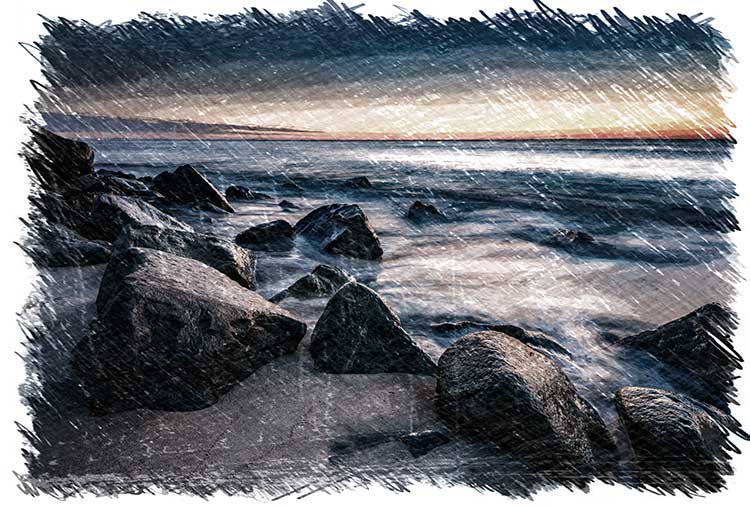
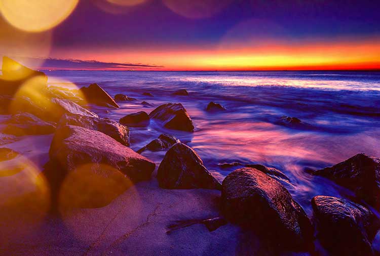
When you first open an image in FX Photo Studio CK, you’ll see your image in the main window, and underneath is a preview bar of presets. You will also notice the menu bar above, and on the right end of that, a mode selector, allowing you to select from Effects, Crop, and Adjust. The presets for Effects include Effects, Frames, and Presets, with Presets in this case meaning user-defined presets. The Effects tab also features a drop down menu with 20 groups of effects. These include Art, Black & White, Blur, Color Fantasy, Color Lenses, Color Strokes, Color Temperature, Cross Processed, Distortion, Glow, Groovy Lo-Fi, Grunge, Hollywood FX, Hue, Photo Styles, SFX, Sketch, Symmetry, Vignettes, and Vintage. When you select the Frames tab, you’ll be presented with a preview of frames below, and a drop-down menu to select different groups of frames appears, allowing you to select between Art, Classic, Grunge & Analog, and Photo Borders.

Before and after comparison of Macphun FX Photo Studio CK

An image before editing in Macphun FX Photo Studio CK on the right, and after, on the left.

To be honest, most of the effects and frames do not appeal to me. But there is more to FX Photo Studio CK than just presets and frames. At the right of your image are adjustments for the various effects. These adjustments will vary depending on the effect chosen, and is usually a minimal control of one or two sliders to adjust the effect. You can combine effects, by selecting one, applying it, and then selecting another one to apply to that. FX Photo Studio CK lacks the layer capabilities of Tonality, which would really make it easier to combine multiple effects and adjust how they are applied together. As it stands now, you must commit to one effect before adding another. One great feature of FX Photo Studio CK is the ability to edit the mask on the image, so you can apply the effect only to areas of the image you want, and hide the effect in other areas.

FXPhotoStudio-Frame-Grunge

FXPhottoStudio-Color-Charcoal-Sketch

FXPhotoStudio-Groovy-Lo-Fi-Napa

If you wish to make further adjustments, you can select the Adjust tab, which opens a palette of sliders including Temperature, Saturation, Hue, Exposure, Brightness, Contrast, Shadows, Highlights, Sharpen, Red, Green, and Blue. There are fewer controls available than in Intensify CK, so I’m not sure I see the usefulness of FX Photo Studio CK for in-depth editing, but for someone looking to quickly add an effect or frame to their image, FX Photo Studio CK may be just what they need.

Error using frames

Error using frames

Note: I could not get FX Photo Studio to give me a clean image. Every frame I tried, every file I tried, gave me the same result when I tried to use the Art Frames and Classic Frames. I was able to use a Grunge Frame, and have shown examples above. Not sure if this is a greater bug with MacPhun’s software or a problem with my system specifically.

Conclusion

The Macphun Creative Kit is a full-featured, well thought out, suite of image editing tools that would be welcome in any photographer’s tool kit. While I would prefer more control in certain areas of the suite, Macphun has continued to develop the software for the past several years, and I have no doubt they will continue to make improvements as they move forward.

Overall rating: 3.5 out of 5. I really liked MacPhun Creative Kit and think it has a lot to offer, but I ran into a bug with the FX Photo Studio when trying to add a frame to an image, and I think Focus CK needs a zoom feature and a finer brush to allow for more precise masking. Fix the bug with the frames and add the zoom and finer brushes to Focus CK and I’d give another star.

googletag.cmd.push(function() {
tablet_slots.push( googletag.defineSlot( “/1005424/_dPSv4_tab-all-article-bottom_(300×250)”, [300, 250], “pb-ad-78623” ).addService( googletag.pubads() ) ); } );

googletag.cmd.push(function() {
mobile_slots.push( googletag.defineSlot( “/1005424/_dPSv4_mob-all-article-bottom_(300×250)”, [300, 250], “pb-ad-78158” ).addService( googletag.pubads() ) ); } );

The post Software Review: Macphun Creative Kit 2016 by Rick Berk appeared first on Digital Photography School.


Digital Photography School

 
Comments Off on Software Review: Macphun Creative Kit 2016

Posted in Photography


Adobe announces updates to Creative Cloud video-oriented applications

14 Apr
With Adobe’s upcoming version of Premiere Pro CC, users can start editing video files immediately, even while still importing, and can switch between native and proxy formats as well.

Ahead of next week’s NAB Show in Las Vegas, Adobe has announced new features to its Creative Cloud software applications for video editing, motion graphics, and audio, including Premiere Pro, After Effects, Audition and Media Encoder.

Of particular interest to video editors, Premiere Pro users will now be able to start editing video files immediately, even while ingesting clips. Additionally, editors can now work natively with high resolution video formats up to 8K. New proxy workflows facilitate quick switching between native video and proxy formats while editing, which should be helpful to those working on older machines or laptops.

Premiere Pro also introduces virtual reality (VR) editing capabilities, making it possible to work with imported stitched video, including the ability to show field-of-view so it’s possible to see what the viewer will be seeing in any direction, and tagging of VR files so that VR-capable video players, such as YouTube, will automatically recognize VR footage.

Other noteworthy features enhanced Lumetri Color tools, improved captioning and titling options, and initial support for Apple Metal for improved performance on Apple devices.

The updated applications should be available in ‘early summer.’


Press release:

Adobe Unveils Breakthroughs in Video and Film Production

Virtual Reality, Character Animation, Sound Innovation Comes To Creative Cloud

SAN JOSE, Calif. — April 13, 2016 — The way consumers access and view content has undergone sweeping changes. Media and entertainment companies, along with creative professionals, are under increasing pressure to find new ways to create, deliver and monetize content. They must also adapt to rapidly evolving technology advancements, including high resolution capture, new delivery formats and virtual reality to name a few.  Also, enterprises are dealing with an explosion of content demands from constituencies and need to integrate high-impact content types, like video, into their communications strategies. 

Ahead of the National Association of Broadcasters (NAB) Show next week, Adobe (Nasdaq:ADBE) has revealed new features across its Creative Cloud tools for video editing, motion graphics, audio and collaboration. Media and entertainment companies are combining these advanced content creation capabilities with Adobe Primetime to help deliver TV and video content across screens. With Adobe’s digital marketing tools TV networks and pay-TV providers can drive viewer acquisition, engagement and monetization as audiences embrace “over the top” (OTT) content via connected devices such as Apple TV, Sony PlayStation, Roku and Microsoft Xbox. At NAB, Adobe will demonstrate the updated tools and new workflows at booth #SL3910, South Hall (lower) in the Las Vegas Convention Center and at over 120 partner booths from April 18-21.

Adobe Creative Cloud video tools are becoming the go-to source for film editors of both award-winning Hollywood and indie films. The most recent example is Deadpool, the 20th Century FOX blockbuster which shattered box office records. The post-production team from Deadpool will discuss their state-of-the-art workflows and why they chose Adobe Premiere Pro CC in a Creative Master Series panel at NAB on April 19 from 4:15–5 p.m. PT. 

Upcoming productions using Premiere Pro CC include Mindhunter, David Fincher’s new series for Netflix, and 6 Below directed by Scott Waugh and starring Josh Hartnett, which is currently shooting in 6K RED and will be edited natively in Premiere Pro.

Creative Cloud video tools are also powering a new generation of content delivered via social channels like YouTube, Facebook and Instagram.

“The videos we make at RocketJump are pure entertainment,” said Freddie Wong, Founder of RocketJump, the hybrid studio/production company behind the popular RocketJump YouTube channel with nearly 8 million subscribers and 1.3 billion views. “We’ve been users of Adobe’s Creative Cloud for years and love the new features coming soon. In addition to editing native footage in Premiere Pro and creating awesome visual effects in After Effects, we use Photoshop for graphics, Audition to sweeten audio, Media Encoder to export content, and now Creative Cloud Libraries to share assets.” 

Immerse Yourself In Creativity 

Adobe continues to deliver technology that opens unimagined creative opportunities for video and film production, and now, immersive experiences. In the next release of Creative Cloud –- available in early summer — Premiere Pro CC will add new virtual reality capabilities, including “field of view” mode for spherical stitched media.  In addition, thanks to Adobe Stock integration into CC apps, customers are already experiencing productivity increases of 10 times, when adding stock content into creative projects, including video*. In the upcoming release, Adobe Stock will have enhanced connections with CC apps and new workflows will enable Adobe Bridge and Lightroom users to contribute to the Adobe Stock marketplace directly from within the application.

Other feature highlights coming soon to Creative Cloud include:

  • Edit immediately during ingest allows Premiere Pro CC users to get straight to work, while importing their video and audio files in the background.
  • Powerful proxy workflows in Premiere Pro CC and Adobe Media Encoder CC enable users to easily work with heavy 8K, HDR and HFR media, so editors can switch between native and proxy formats freely – even on lightweight machines. 
  • Enhanced Lumetri™ Color tools within Premiere Pro CC adds HSL Secondaries to expand the editor’s toolkit for making color correction and adjustment easier for all filmmakers. 
  • New video and audio preview engine in After Effects CC delivers superior playback of cached frames for a smooth experience. 
  • Easier and more efficient Character Animator includes a simplified puppet creation process that enables users to easily tag puppet layers easily and record multiple takes of a character’s movement. Users can animate puppets to respond to motion and trigger animation accordingly. 
  • New Essential Sound panel in Audition CC enables anyone to mix audio content with professional results. 
  • Quickly find Adobe Stock assets with new filtered search in Creative Cloud Libraries. Licensed assets in your library are now badged for easy identification, videos are displayed with duration and format information, and saved videos are linked to video previews on the Adobe Stock site. 

“There’s rapid change happening in the digital landscape with video now the fastest growing media type across social media platforms and OTT shaking up broadcast and film,” said Bryan Lamkin, executive vice president and general manager, Digital Media at Adobe. “Adobe is transforming the industry with Creative Cloud and Primetime by helping customers create beautiful content to engage viewers and technologies that monetize content that audiences care about.”

Pricing and Availability

At NAB, Adobe is previewing the next major updates to Creative Cloud. These updates are expected to ship in the coming months. The company is offering Adobe Creative Cloud for US $ 49.99 a month. For more information, visit http://www.adobe.com/go/video.

Articles: Digital Photography Review (dpreview.com)

 
Comments Off on Adobe announces updates to Creative Cloud video-oriented applications

Posted in Uncategorized


4 Steps for How to Make a Creative Photo Diary

11 Apr

If you are a visual learner like me, seeing images and written words reinforces your memory, and enhances your learning. Concepts, ideas, and experiences associated with images, colors, and action, stay longer in our memory, help us savour the moment, and relive the events more clearly.

Spring is in sight, the days are getting longer and lighter, let’s go out and make the most of the season and make some new memories. Here’s a fun personal photography project for you: write a creative diary in pictures!

component-creative-photo-diary_0000

A diary or a journal is a record of your day to day life and experiences. Entries report both mundane and unusual goings-on, your emotions, thoughts and feelings, your actions and reactions, including opinions that may even be outside your immediate experience. Diaries and journals tend to be written in a chronological sequence.

Let’s apply this definition to a photo diary and see how well you can record a point in your life using pictures alone. The challenge is whether you can piece together a coherent and complete story, just by looking at the pictures alone.

Here are four basic components of  a creative photo diary. When making yours, feel free to be as exhaustive as you like. In this example, I will show photos under each component and hope that you will try and piece together the entire story. That way we can gauge just how strongly and effectively the photos alone were able to recount the narrative.

component-creative-photo-diary_0000

#1 Set the context – lay out the plan

Think of this like a prologue or an introduction in a book. Include photos of the locality and vary the angles; wide scenes, close ups, details, panoramas. Don’t forget to take photos of preparation, getting ready for the trip, or some action en-route to the destination.

Set the mood. If it’s a gloomy and rainy day, take pictures of the rain or the storm clouds. If it’s a sunny day, snap photos of the sun, flare, and silhouettes included. Keep your eyes peeled and look around you. What do you see on the way to your destination? Any interesting sights? Anything out of the ordinary? Anything special or alluring? Anything new that you have never seen before? Or perhaps it has always been there but you just never bothered to look close enough until now.

component-creative-photo-diary_0000

component-creative-photo-diary_0000

component-creative-photo-diary_0000

component-creative-photo-diary_0000

component-creative-photo-diary_0000

#2 Have an opening chapter – a beginning

You have reached your destination and thus the narrative begins its ascent. So far you have only given glimpses of your main character, clues to the destination, snippets to the story. Now you are ready to introduce your characters and show more of their personalities. Make them shine and take center stage.

Vary your images by employing different angles; close up, far and wide, bird’s eye view, worm’s eye view. How about an inquisitive and questioning view? Be creative about it and think outside the box. There are many ways of presenting a person’s character like emphasizing color, favourite objects, unique accessories, action, identifying marks, etc., other than the ubiquitous frontal portrait. The obvious isn’t always the most interesting.

component-creative-photo-diary_0000

component-creative-photo-diary_0011

What happened when you reached your destination? Did the plans change? Were there distractions or unforeseen events that led you to switch gears, or take a different route? Or did you head straight on to what you wanted to do? Were there any curious twists to the plan, or some surprises – nice ones or otherwise?

component-creative-photo-diary_0000

component-creative-photo-diary_0008

component-creative-photo-diary_0000

component-creative-photo-diary_0000

#3 Inject some action or drama

It may be that nothing happens that is spectacular or which causes emotional upheaval. That doesn’t mean you can’t create something dramatic or notable. You can focus on particular emotions, or something pretty mundane, and make a choice to celebrate life’s simple pleasures. If on the other hand there was plenty of action, choose a few main actions shots of defining moments from the day, especially those that elicited the most impressive reaction, or the quietest but most precious twinkle of an eye.

component-creative-photo-diary_0000

component-creative-photo-diary_0014

component-creative-photo-diary_0014

component-creative-photo-diary_0014

component-creative-photo-diary_0014

Adopt a photojournalistic stance, and record what happens without thinking too much about meaning or composition. Photograph what catches your eye, or that which you get drawn to instinctively. Trust your eyes to lead you to interesting contrasts and juxtapositions – light and shade, silence and noise, darkness and light. Aim to capture and savour every highlight. Don’t rush, but linger and indulge in the moment. The more you focus on something, no matter how small, the bigger its effects on you will be. Find an experience in the simplest of things; you are writing a story. Writers emphasize, exaggerate, infer, and aim for a climax. Don’t be afraid to do the same with your pictures. Be pro-active and creative.

component-creative-photo-diary_0012

component-creative-photo-diary_0000

component-creative-photo-diary_0000

component-creative-photo-diary_0000

#4 Start the closing chapter

In a book, this part is usually referred to as falling action. It comes after all the excitement and drama happen. It’s like a letting out a big sigh and things start to gather at a much slower pace. Prepare your audience for the conclusion, and end of the story. Unlike the conclusion in a book where the plot is usually unravelled, this part could plainly be writing the last paragraph to the entry of your diary for the day. It could be as simple as taking your shoes off after a long and tiring walk, drinking a well deserved cup of tea after a day full of challenges, or the sun slowly setting or the moon rising.

Remember the purpose of a diary is to record, preferably in detail, what transpired during your day; the running of events, emotions, actions, thoughts, ideas, changes, differences, transformations. So many elements to capture in a few photos. But perhaps in and amongst all the snapshots from the day, there could be one photo that somehow encapsulates how you may be feeling at the end. Use that photo to close your diary entry, and end your story.

component-creative-photo-diary_0000

component-creative-photo-diary_0000

component-creative-photo-diary_0000

component-creative-photo-diary_0000

Have you attempted a creative photo diary in the past? If not, I hope you try it one of these days and enjoy the experience. What do you think is the story in this example above? Please share your thoughts in the comments below.

googletag.cmd.push(function() {
tablet_slots.push( googletag.defineSlot( “/1005424/_dPSv4_tab-all-article-bottom_(300×250)”, [300, 250], “pb-ad-78623” ).addService( googletag.pubads() ) ); } );

googletag.cmd.push(function() {
mobile_slots.push( googletag.defineSlot( “/1005424/_dPSv4_mob-all-article-bottom_(300×250)”, [300, 250], “pb-ad-78158” ).addService( googletag.pubads() ) ); } );

The post 4 Steps for How to Make a Creative Photo Diary by Lily Sawyer appeared first on Digital Photography School.


Digital Photography School

 
Comments Off on 4 Steps for How to Make a Creative Photo Diary

Posted in Photography


Adobe issues fix for Creative Cloud Mac update that could delete files

16 Feb

Last week, Adobe rolled out a Creative Cloud update with a harmful bug that, for some Mac users, deleted files from the system root directory. Once the bug was discovered with the help of backup platform Backblaze, Creative Cloud version 3.5.0.206 was pulled from release and was replaced Sunday with an update that promises to fix the issue.

The bug appears to have deleted the first file in the root directory for users who downloaded the update, whatever that file might have been. Backblaze users noticed problems because alphabetically, the service’s .bzvol folder sits at the top of their root directory. When Creative Cloud deleted the folder, Backblaze alerted the user that something was wrong.

In a blog post on Friday, Adobe acknowledged the issue, saying that ‘the updater may incorrectly remove some files from the system root directory with user writeable permissions.’ Version 3.5.1.209 was released Sunday with a fix for the problem.

Adobe directs users who experienced problems with the Creative Cloud update to contact customer service. The latest update is available now for Mac and Windows.

Articles: Digital Photography Review (dpreview.com)

 
Comments Off on Adobe issues fix for Creative Cloud Mac update that could delete files

Posted in Uncategorized