Introduction
This tutorial is a demonstration of the SLR Lounge Lightroom 4 Preset System. With over 200 presets, the LR4 Preset System has been critically acclaimed as the most powerful and intuitive preset system available for Lightroom 4. DPS users can get 10% off by using the DPS10 coupon code upon checkout. Click the link above to learn more/purchase.
Overview
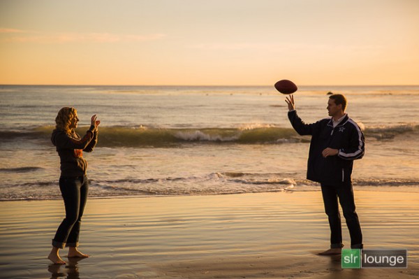
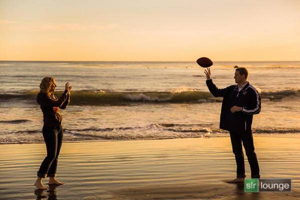
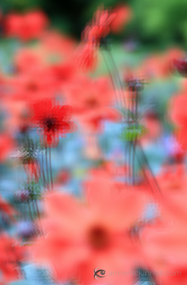
In this Lightroom 4 tutorial, we will show you how to create a warm, sunset-toned look in Lightroom 4. It is a great look that can be applied to a late afternoon outdoor images. I particularly dig this look on shots like this one at the beach. We will also correct for uneven exposure across the image that is caused by the directional lighting of the sun.
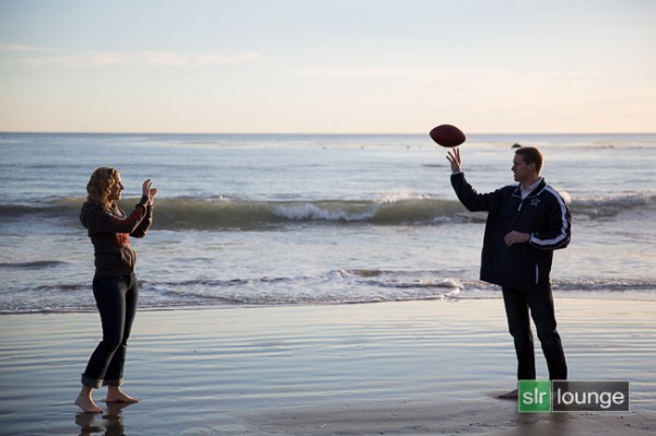
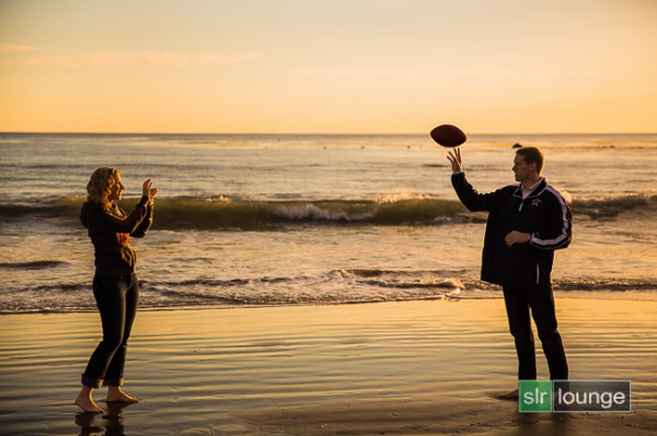
Before and After Image
Before
After
Lightroom 4 Preset System Mixology
If you own the SLR Lounge Lightroom 4 Preset System, this effect can be achieved in 3 clicks as shown below. If you don’t own the preset system, please skip to Step 1 to learn how to do it manually.
Lightroom 4 Presets
00 MY MIXOLOGY – 10 SOFT PORTRAITS > 16 SP HDR Light
01 BASE ADJUST – 00 EXPOSURE > 04 Darken -0.5
01 BASE ADJUST – 40 SHADOWS BLACKS > 42 Heavy Brighten (+30, +60)
Warm up Temperature and increase the Magenta in Tint to your liking. To see all the tweaks and adjustments applied, please continue on.
Step 1. Applying our Basic Adjustments
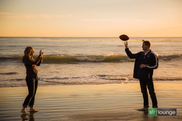
This image from a recent engagement session was shot around 4pm late in December on one of our many SoCal beaches  . Although it was late afternoon, there were not a lot warm tones in the atmosphere, and the photo lacked dynamic range.
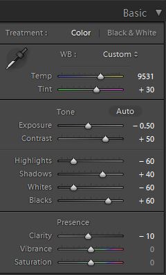
So in the Basic Adjustment Panel, let’s warm up the image by raising the Temperature to between 8000K to 10,000K. Additionally, we want to add some Magenta Tint in order to keep the image from looking too green. Without the pink/red tones that will be added from boosting Magenta tones, we end up with an image lacking the rich warmth we desire. This is the one of the advantages of shooting in RAW, you can change the color temperature of the image at will.
The background environment is also a little too bright and flat, and since we want a moodier shot, let’s lower the exposure by -0.50 stop and increase contrast by +50.
Next, let’s expand the dynamic range of the image by decreasing the Highlights and Whites by -60 while lifting the Shadows and Blacks by +40 and +60 respectively.
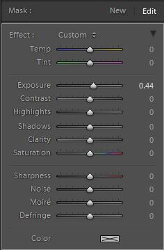
Finally, bring down the Clarity by -10. We will reintroduce Clarity with an adjustment brush to everything but the couple’s face, hair, hand, and feet.
The Basic Adjustment Panel and the image should look similar to below.
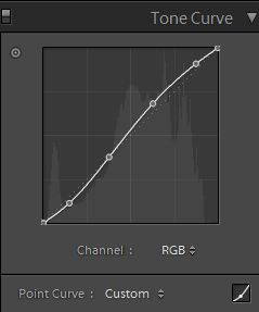
Step 2. Adding Additional Contrast via Curves
In addition to adding Contrast in the Basic Panel, let’s add a slight contrast-boosting “S” curve that pulls down the shadows a bit and boosts the highlights up a bit.
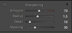
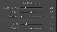
Step 3. Sharpening and Noise Reduction
Normally, if you are using the SLR Lounge Preset System, standard Sharpening amounts are automatically applied. Here is what we typically apply to our image:
Because we boosted the dynamic range and pulled up the shadows, we do need to apply some Noise Reduction. We use this setting for Noise Reduction:
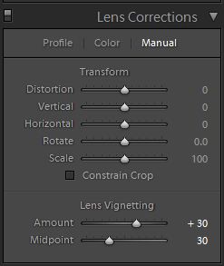
Step 4. Opening up the Borders with Vignetting
Finally, the brightness is not that even along the edges of the frame, so let’s add some Lens Vignetting at +30 Amount and +30 Midpoint to even out edge-to-edge brightness.
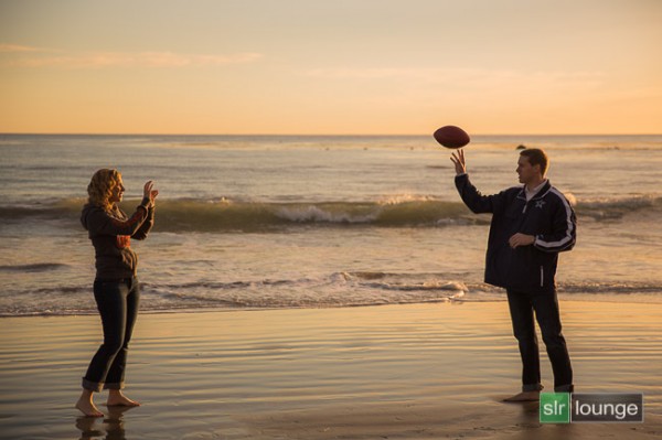
Here is how your image should look like after applying all of these adjustments.

That is it for the global adjustments, we are now going to use the adjustment brushes and graduated filter to add more clarity and contrast to the environment, as well as work on evening out the overall exposure.
Step 5. Using Adjustment Brushes for the Sky and the Ground
In the Lightroom 4 Preset System, there is an adjustment brush called the “Sky | Cloud | Ocean” that we apply to the sky, cloud, and ocean. The purpose of this brush is to increase the contrast and clarity. Additionally, this adjustment brush also increases saturation.
Here are the settings for this adjustment brush:
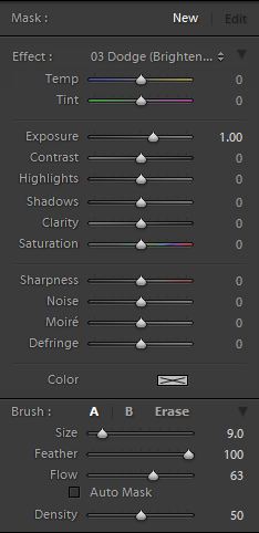
We want to apply this brush to the entire scene except for the couple’s exposed skin. The quickest way to accomplish this is to fill the entire scene with the brush, then use Erase brush at the bottom of the Brush Panel to remove the effect from their face, hair, hands, and feet.
Hold Alt (Opt on OSX) while in the active brush to switch to the Erase brush.
Because there is a lot of contrast between the subjects and their surroundings, you can use the Auto Mask to allow Lightroom to mask around the individuals.
To make it easier to see what part of the image is being affected by the adjustment brush, press “O” on the keyboard to toggle the Mask Overlay. The adjustment brush is applied on any part of the image that is overlaid in red.
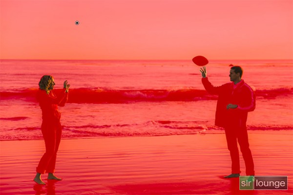
Once you are finished applying this adjustment brush, press “O” again to hide the overlay. Your image should have a punchier look that similar to the deep shadows of the setting sun.
Step 6. Using an Graduated Filter to Even Out Exposure on Left Side
At 4pm, the winter sun had already started its decent to the horizon, which meant that light was beginning to fade quickly. Because the sun is lighting the scene from the far right, the left side of the image was a tad underexposed in comparison to the right side. We want to correct for this subtly, so we will be using a Graduated Filter to slightly brighten the left side of the frame.
One final adjustment I would like to make to this image is just to remove the rock in the water that is just behind and above the male subjects head. But, given the size and position of the rock, this will best be done in Photoshop.
Final Before and After Images
Finally, here are the before and after images comparing the original image to the new image with the warm, sunset mood look.
Original
Warm, Sunset Mood Image
The Lightroom 4 Preset System
The SLR Lounge Lightroom 4 Preset System is designed to enable users to achieve virtually any look and effect within 3-5 simple clicks. From basic color correction, vintage fades, black & white effects, tilt-shift effects, faux HDR, retouching, detail enhancing, and so much more. The sky is the limit with what has been dubbed the most powerful and intuitive preset system available. Click the link above to learn more/purchase.
You can also purchase the LR4 Preset System as part of the 30 hour 3 DVD Lightroom 4 Workshop Collection set, containing every bit of education and tools needed to run a Lightroom 4 based photography studio.
Post originally from: Digital Photography Tips.
Check out our more Photography Tips at Photography Tips for Beginners, Portrait Photography Tips and Wedding Photography Tips.
Create a Warm, Sunset Mood Image in Lightroom 4

Digital Photography School
 Here’s what she said:


 Did you know that your brain has magic color changing abilities? Well, sort of.
 First things first, we need to locate where the White Balance settings are on the camera.
 White Balance settings are most often denoted by a set of symbols that represent the light source. They either warm things up, or cool them down!
 Now that you now where the settings are located and what each symbol means, it’s time to start experimenting!
 In this example, the natural light was from an overcast day (lame!).
 This time we’re inside under a mix of Fluorescent and Daylight.
 Using the “wrong” White Balance goes against the grain for most photography teachings, so we want to share an awesome photographer that uses this technique to achieve great results.


You must be logged in to post a comment.