Creating a reflection using Photoshop is one of those things that at first glance looks really hard, but really isn’t, once you break down the steps (just light Light Painting which I covered in another two part series). In this article I’m going to demystify creating a reflection, a technique that works particularly well on images with open pavement, and HDR processed images which tend to make the pavement look wet already.
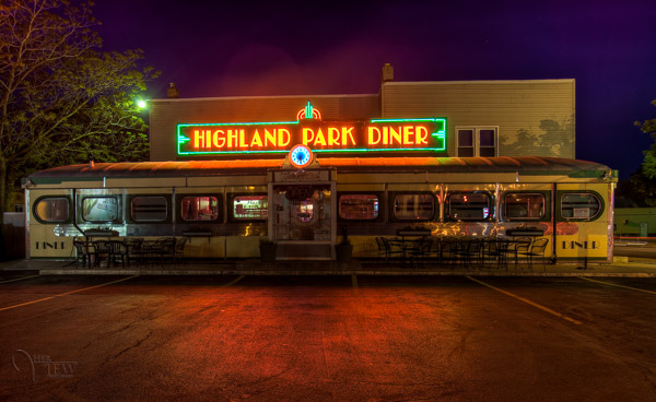
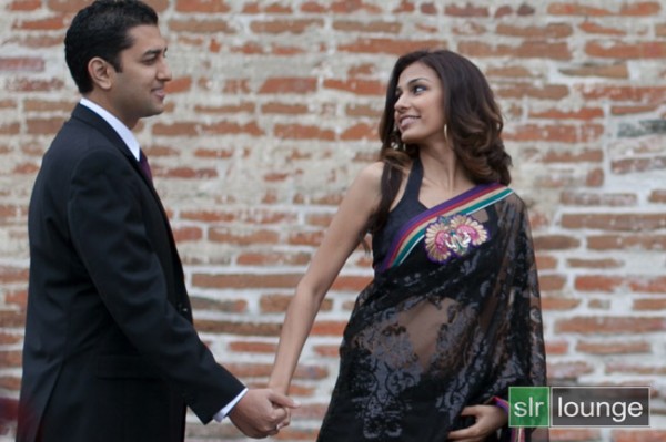
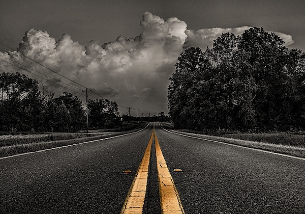
We’re going to learn how to go from this . . .
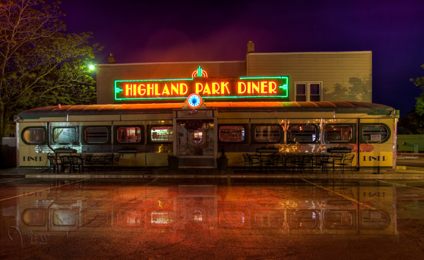
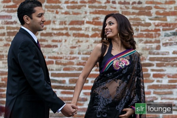
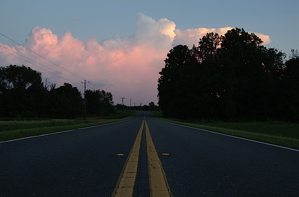
To this!
In less than 10 minutes!
I recently showed one my HDR classes how to do this, and they all followed along with me step by step. Some of them were using Elements (which works just fine, but you may find the menus and choices look slightly different), and this technique can be done using that program too, so if you use Elements, not to worry. Many of my students were also self proclaimed “Photoshop novices” and when I asked them if they thought they’d be able to this when I showed the before and after images, most said “no”! But they all did, and we were done in less than 10 minutes. **Note that also included me going super slow to ensure each of the 12 people in the class were on the same page with me. I’m going to guess this will take less than 5 – ready GO!
Here are the six easy steps to follow in Photoshop. This is the super condensed version for those quick readers and skimmers.
- copy a section of the image
- paste it as a new layer
- flip it
- position it
- change the layer blend mode
- mask it
That’s it! You want a few more details?
Let’s dive in a little deeper into each step
STEP ONE – COPY
Using the marque tool (“M” is the keyboard shortcut) draw a box around an area of your image that will become the reflection (see Figure #1 below). Make sure you go edge to edge on the sides, and get enough of the image vertically. If you grab more than you need that’s fine we’ll be moving it around and masking later anyway.
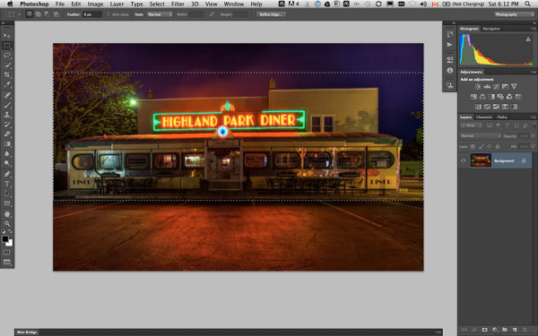
Figure #1 make a selection
Copy the selection as a new layer. You can do that a few ways.
- right click on the image and from the menu that pops up choose “layer via copy” (see Figure #2 below)
- from the edit menu choose “copy” or using the keyboard shortcut “command/control+c” (see Figure #3 below)
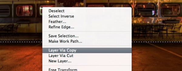
Figure #2 right click>Layer Via Copy
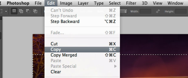
Figure #3 Copy from Edit menu
STEP TWO – PASTE AS NEW LAYER
If you chose the “layer via copy” method above you already have the selection pasted as a new layer. If you haven’t already done that go ahead and paste either from the Edit>Paste menu option of the keyboard shortcut “command/control+v”. You will end up with something that looks like this, Figure #4 below.
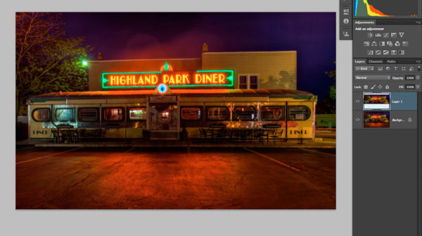
Figure #4 paste new layer
Doesn’t look much different right? Right! Because it’s basically on top of itself. But look at your layers, it is there on a new layer and it only grabbed part of the image. Now the magic begins!
STEP THREE – FLIP IT
Next from your Edit menu choose “Edit>Transform>Flip vertical” to flip this new layer upside down. You should end up with something funny looking like Figure #5 below.
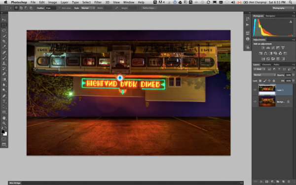
Figure #5 flip vertically
STEP FOUR – POSITION IT
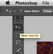
Figure #6 move tool
Next select your MOVE tool from your tool palette (see Figure #6 right – “v” is the keyboard shortcut) and grab the flipped layer and drag it down until the images start to line up where the reflection will begin. In my image I’m using the edge of the sidewalk in front of the diner. If it doesn’t line up perfectly don’t worry about it, you can mask any imperfect bits out later in step six.
Now you want to have something that looks like Figure #7 below. The reflection is in roughly the right position. Make sure you don’t move side to side, just down, otherwise you’ll have gaps on the edges of your reflection.
NOTE: once you’ve selected the Move Tool, you can also use the up and down arrows on your keyboard to move the layer up and down. This works great for smaller adjustments when you get it close to position.
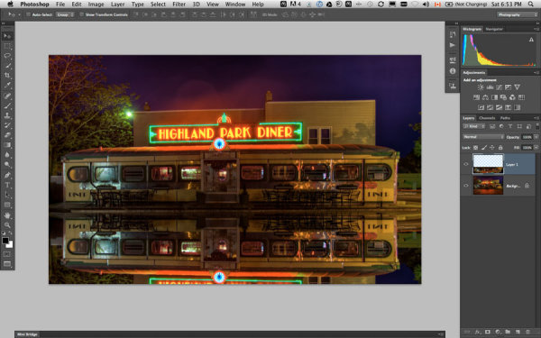
Figure #7 position the layer
STEP FIVE – CHANGE THE BLEND MODE
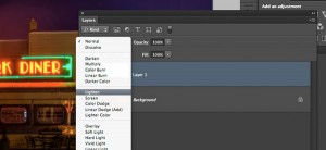
Figure #8 Lighten blend modes
From your layers panel change the layer blend mode to one of the “lighten mode”. You will find the layers blend modes near the top of your layers panel, next to “opacity”. By default the blend mode is “normal”.
The Lighten modes are the ones in the third section down (see Figure #8 right), they include: Lighten, Screen, Color Dodge, Linear Dodge, Lighter Color. Layer blend modes change how the selected layer interacts with the one below it (the original image). By selecting one of the options in this section it will only show areas of this layer that are lighter than the one below it, and any areas darker will not appear. For reflections I usually choose Lighten or Screen, depends on the image. Try them all and choose the one that looks best for your image. For this example I’m using Screen mode.
Now I have something that looks a little closer to a real reflection (see Figure #9 below).
Are you still with me!? Do you have something reasonably similar?
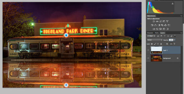
Figure #9 change the layer blend mode
STEP SIX – MASK IT
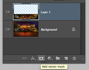
Figure #10 add a layer mask
Okay we’re almost done and it’s looking pretty good. But in my image the neon sign in the reflection is too bright. It doesn’t look natural because reflections are usually darker than the original – so we’re going to tone it down using a mask and the gradient tool.
First, make a layer mask by clicking on the “add layer mask” icon at the bottom of your Layers Panel (Figure #10 right). You can also do it by going to the Layers menu>Layer mask>Reveal all.
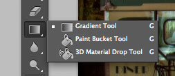
Figure #11 gradient tool
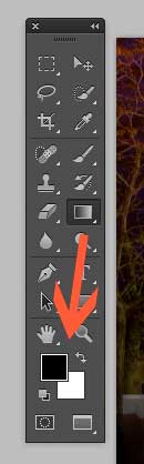
Figure #12 foreground/background colors
Next select the Gradient tool from your tools panel. Keyboard shortcut is “g” but make sure you have the gradient tool and not the paint bucket. See Figure #11 above. Hit the “d” key on your keyboard to set your foreground/background colors to default, then hit “x” to switch them. Make sure you see black as your foreground color and white as the background color (see Figure #12 right).
Once you have your colors set to black and white, and your gradient tool selected and ready for use – make sure you are on the layer mask not the layer. You can tell because whatever is active has corner brackets around it. If you layer thumbnail is selected, just click on the white layer mask thumbnail to make it active. We need to make sure we are doing this on the mask, NOT the layer.
How masks work is that anything in white on the mask reveals the contents of the layer. Where ever there is black on the mask it hides that area of the layer. So we want to hide the outer edges of this layer so it fades out gradually towards the bottom of the image and looks more natural.
With the gradient tool, by default it paints from the foreground color, to the background – fading from one to the other depending on how we create the gradient. Sometimes it takes a little experimenting to get it just right but you can always “undo” using the handy “command/control+z” shortcut on your keyboard and it goes back one step or undoes what you just applied.
NOTE: ”undo” is your best friend in Photoshop, if you learn no other keyboard shortcuts, memorize this one!
So, to apply it to our reflection start with the cross hairs for the tool in the middle of your image, near the bottom. TIP: holding the SHIFT key down will keep the gradient from applying at an angle, it will just go straight up. Click and drag the tool up (you’ll see a line drawing the gradient spread) and let go when you get near the top of your reflection. If it’s not exactly how you want it you may have to start a little more away from the bottom edge, or drag it up higher, or other variations.
NOTE: with the gradient tool on a mask you don’t actually even need to “undo” if you just drag another one overtop it replaces the first one. But it’s still good to know how to undo!
Here’s the image with my gradient applied to the layer mask. Notice on the mask it goes from black to white? So it’s hiding the bottom area of this layer which is what we want. See Figure #13 below.
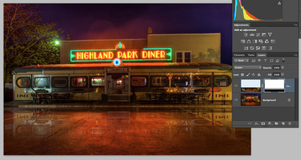
Figure #13 gradient applied to the layer mask
OPTIONAL FINISHING TOUCHES
Now if you want to do any other masking to show or hide certain areas of the reflection just use your brush tool (“b” shortcut) at a lowered opacity (10-20%) and paint with black on the mask over areas you want to hide, and white on areas you want to show. In this image I painted over the edges of the diner where I felt it was still a bit too bright. You can also change the opacity of your layer to adjust it that way too.
SeeFigure #14 below for my final version. Notice my mask where I painted a little up the sides to hide those areas just a little bit more. You could also paint away a little in the middle of the reflection where the pavement is the darkest if you wanted. That’s the neat thing about photography – it’s all subjective!
It’s really easy to get upset or hurt feelings when someone else says something that we perceive as negative about one of our images, something we put blood, sweat and tears into, right!? Well my personal opinion is that it is just their opinion, one person, and you don’t have to agree with them. If they have a valid, or constructive criticism YOU get to decide if you want to take it on board or, just agree to disagree and move on. Life is too short to worry about pleasing other people.
Do photography for you! If other people like it, then great!
If not, oh well! Move along and life goes on.
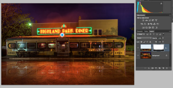
Figure #14
OKAY YOUR TURN!
So, think you can do this? Give it a try!
Here is my image to play with, in case you don’t have one that will work. It’s 2000 pixels wide which is plenty big enough for this test.
Download diner image – just click on this link and save the image that opens in a new tab.
A few trivial things FYI about this image:
- it was taken in Rochester, NY, USA when I was in the area and visited Eastman Kodak House. If you’re ever there, do go, it’s worth the trip to see where photography took roots and grew
- it is a 5 image HDR, tone mapped in Photomatix and finished using LR4
- during the longest exposure of my bracketed series a kid on a skateboard, carrying a goldfish in a bag skated right through the parking lot in front of me. Why didn’t he show up? Because my exposure was 30 seconds long and if you aren’t there for more than 1/2 the time you will not appear.
Okay, off you go and let’s see your results!
Cheers Darlene
Post originally from: Digital Photography Tips.
Check out our more Photography Tips at Photography Tips for Beginners, Portrait Photography Tips and Wedding Photography Tips.
How to create a reflection in Photoshop in 6 easy steps


You must be logged in to post a comment.