
by Steven McConnell
Do you remember the time you were learning to drive a car?
If you’re like most people, it began as a purely technical, logical activity. You had to think about your every move. You were reacting to your environment, rather than anticipating it.
Over time, that settled into a form of unconscious competence. You began to drive by feeling the car, rather than thinking about it.
Learning to shoot portraiture is similar. Beyond the mechanical, logical world of preoccupation with gear, ISO, f-stops and focal lengths is a realm of feeling your way around your environment, connecting with your subjects, witnessing their stories and sharing them with the world through your photographs.
It’s easy to say, I hear you say. But how do I start moving in that direction?
For me personally this has been a focus of my attention for the past few years and I feel like I’m just starting to scratch the surface. Every time I discover something new I see how much more there is left to uncover.
It’s my aim here to share some of my main discoveries with you. I hope that lessons I’ve learned on my journey to becoming a portrait photographer help you along in yours.

1. Forget The LCD
I see so many photographers take a few photos and then bend over to check what they got on the back of their camera.
Meanwhile, their subject is just standing there. Their mood is collapsing. All kinds of weird thoughts are starting to run through their head.
Checking the histograms every now and then is important, but your main job as a portraits photographer is to be aware of, and manage, your subject’s headspace.
You can’t do it effectively if you’re spending more time with your camera than you are with your subject. You need to be completely present with the person you’re photographing.
It means you need to photograph a lot and often, until know with a reasonable degree of confidence when you’ve nailed the shot – without having to check it on the LCD.

2. Explore Av & Tv [Aperture and Shutter Priority Modes]
There’s a sentiment in the photographer community that you must always shoot in your camera’s manual mode because “that’s what serious photographers do”.
Manual gives you great creative options in certain situations – for example, when you’re combining ambient light with strobes.
But be aware that you don’t always need it – and sometimes it will shoot you in the foot.
If you’re using only natural light, for example, and it’s likely to be changing while your subject is moving, the last thing you want is to miss moments while you’re chasing exposure.
Try shooting in aperture-priority mode (Av), using aperture to control depth of field as a creative element while dialling the exposure compensation in or out to fine-tune exposure.
3. Lose The Fat Lens
I shoot with prime lens because I like to have as few physical barriers between me and my subjects as I can.
If I can’t look them directly in the eye as I’m photographing them, then I want to look at them through as little metal, plastic and glass as possible.
Also, I think there’s a lot to be said about removing everything you can which will intimidate your subjects.
As photographers we tend to view gear as something to get excited about. But in doing so we forget that something like a 70-200 f/2.8 (even a 24-70 f/2.8!) on front of a DSLR can be unnerving to most people.

4. Research Your Subjects
When I started photography, I did enough research about cameras to be able to quote the pros and cons of just about any DSLR body out there.
But if you asked me what the person I was photographing wanted to be when they grow up, I’d have no idea.
How can a photographer tell a story about a subject through the photos if they don’t know anything about them?
What are your subject’s dreams? Obsessions? Fears? Ice-cream preferences? Why do they get out of bed in the morning? What kind of personality they have – quirky, calm, strong, bubbly or intellectual?
Answers to those questions are a great departure point for your creative choices as a photographer.

5. Put The Camera Down
I picked this idea up when I was watching this video of Annie Leibovitz photographing Keith Richards:
Notice how at 1:55 she puts the camera down to give him direction. It’s not accidental – by doing so, she injects a healthy dose of warmth and intimacy into their interaction. She reminds Keith that there’s a real human taking his photo.
6. Control Your Purpose
How you come across to your subjects is heavily influenced by your purpose in any moment. And that will determine how they act around you.
My default purpose is “Here I am, the photographer, about to photograph you – the subject”. Needless to say, it’s not very conducive to creating a connection of facilitating a particularly warm dynamic.
Before a shoot I literally have to shift the context through which I view the session to one which helps me set a warmer tone.
If I’m photographing kids, I’m likely to change to a space of “Let’s play – and I’m bringing my camera along”. If I’m with adults, I’ll probably take things in the direction of “Hey, let’s get to know each other – and I’ll take some shots along the way”.
Connection takes first place, photography second.

7. Meditate
This looks odd as a piece of advice on a photography blog. But here’s why I think it’s useful.
As photographers, we tend to be quite analytical – we go through the world thinking about it, rather than feeling our way around it. We spend a lot of time preoccupied with our thoughts, which can give our emotional tone a somewhat distant edge.
Meditating 10-15 minutes a day will helps you settle down and feel more centred. You will come across as a warmer, more approachable and confident photographer. You will also be more present with your subjects’ needs and be able to respond to them (rather than react to them).
It’s important because your subjects will largely mirror your emotional tone. The easiest way to help them settle down and connect with you is for you to be calm yourself.
Steven McConnell is a family photographer at Family Photography Sydney. You can connect with him on Google+. and Twitter.
Post originally from: Digital Photography Tips.
Check out our more Photography Tips at Photography Tips for Beginners, Portrait Photography Tips and Wedding Photography Tips.
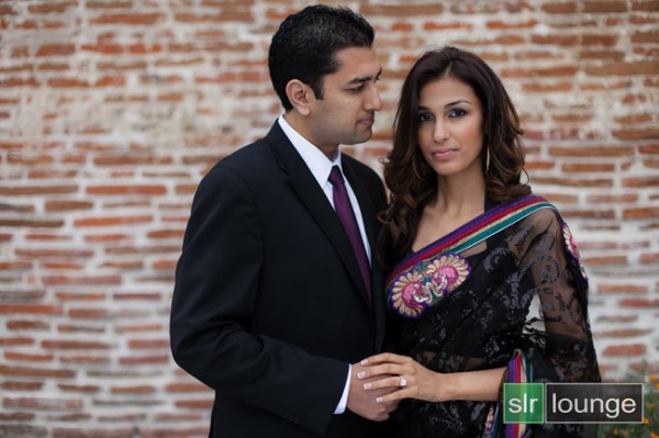
7 Ways To Create Authentic & Powerful Portraits


You must be logged in to post a comment.