
Do you use Lightroom for processing portraits but get frustrated by its limitations?
One way around this is to use a plug-in or buy some Develop Presets. But these can be expensive, so you may be interested in a cheaper alternative.
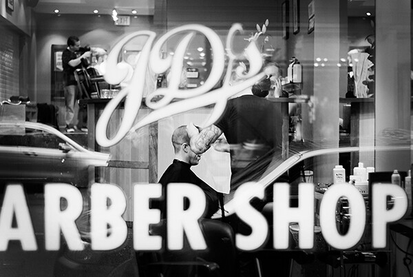
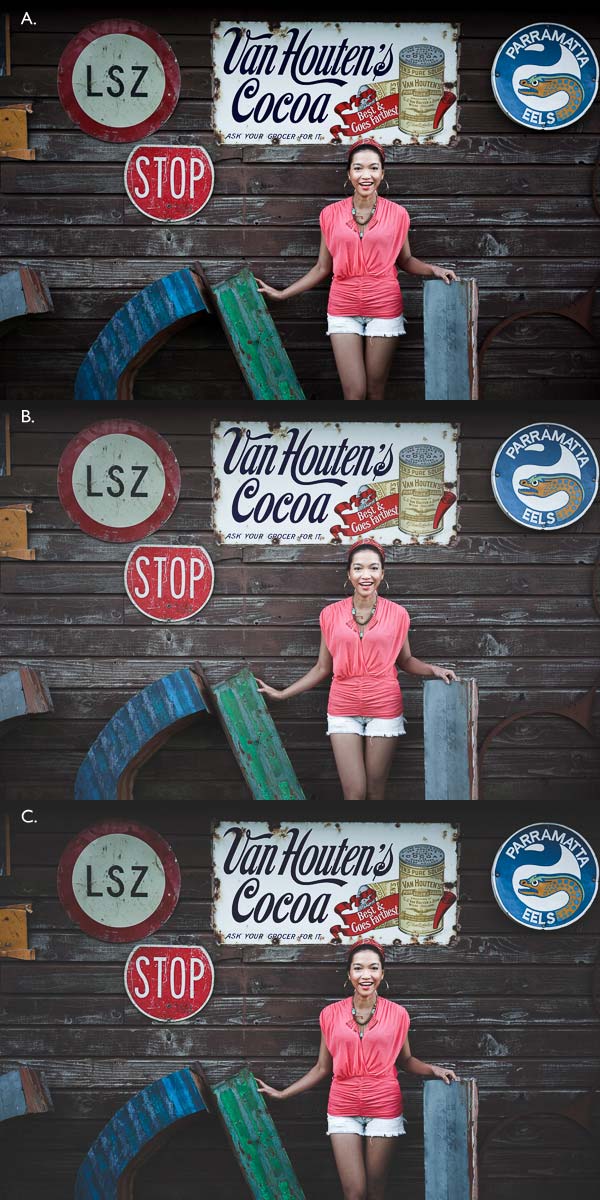
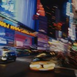
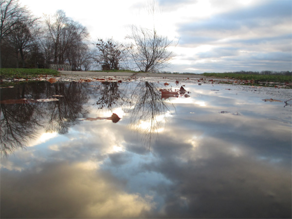
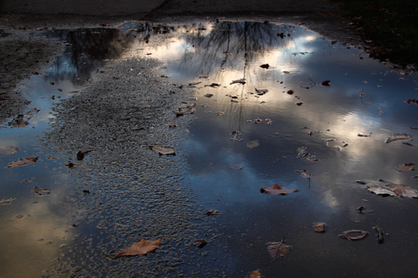
One of my favourites is Nerve Center’s CameraBag 2. It’s a bargain at just $ 20, and while it’s not as convenient to use as a plug-in that you can access directly from Lightroom, it is easy to incorporate into your workflow. Let me give you a couple of examples. Here’s the first; I selected it because there’s a dramatic difference between the photo created in Lightroom and the one created in CameraBag.


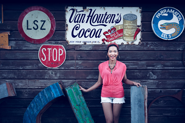
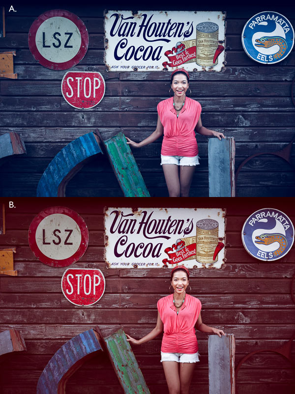
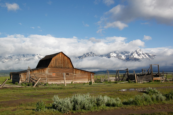
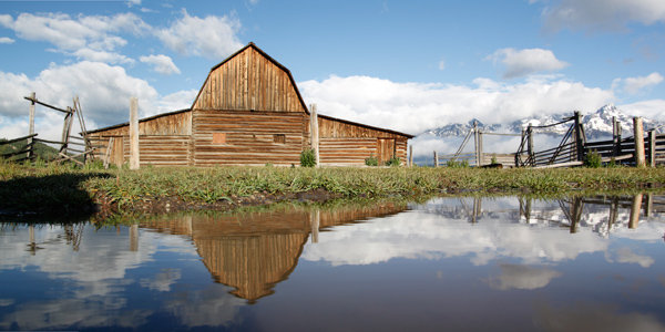
Here’s another one. The changes are more subtle, to show you can use the software with a light touch.


Lightroom workflow
Now you’ve got a taste for what CameraBag can do, I’d like to show you how to incorporate it into your Lightroom workflow.
As CameraBag is not a Lightroom plug-in, you need to export your photos as either JPEG or TIFF files (I recommend 16-bit TIFF) before you can open them in CameraBag. Start by creating a folder on your hard drive to store the photos. I call mine Photos (plug-ins temporary).
In Lightroom, select the photo/photos you want to edit in CameraBag. Go to File > Export. These are the settings you need to adjust in the Export window.
Export Location: Select the folder you just created. This is where Lightroom will save the files.

File Settings: Set Image Format to TIFF, Color Space to sRGB and Bit Depth to 16 Bits/Component.
You don’t need to touch any of the other settings in the Export window.

You can speed up the process by creating a User Preset. Click the Add button and give the new preset a name. All you have to do in future is click on the preset to apply the same settings. Easy!

Processing portraits in CameraBag
Start by opening the portrait you want to edit in CameraBag. You will see something like this:

The layout is minimal. Use the four buttons* in the top-right corner to access the program’s editing options.

* Alternatively, you can access the controls by clicking on the tabs on the very right of the screen. The functions are the same, just laid out differently.
My Styles and Cameras
Click either of these buttons to instantly choose from over 150 filters. Naturally, not all of them will suit your portrait. But look closely and you will definitely find something you will want to work with.

My Style filters. This is where you’ll find the majority of the filters.

Camera filters. There are some additional choices here.
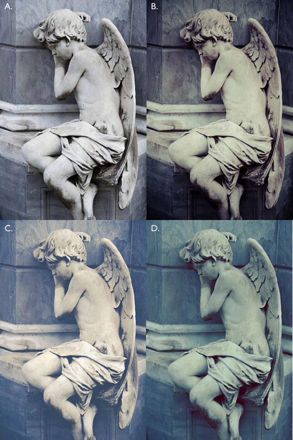
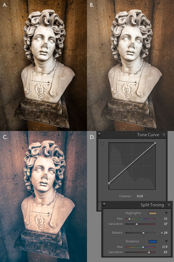
On the surface, CameraBag may look as if it’s just another program designed to give your photos an Instagram type look. But dig a little deeper and you’ll see that it is a high quality photo editor. There are two important things to note here. The first is that CameraBag uses a 32-bit processing engine, preserving your portrait’s fine graduations of tone and colour.
The second is that all editing is non-destructive. You can adjust or undo any edits you make. For this example I’ve chosen the Film NC-1A filter. It’s a subtle preset that adds a slight matte effect and a blue cast to the shadows.

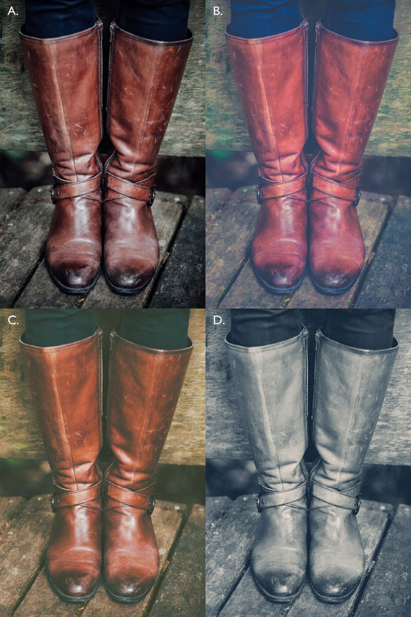
Now look at the tiles that have appeared below the photo.

Some of these represent the edits that have been made by the filter to your portrait. The others are additional, allowing you to alter the effect of the filter. For example, when I click on the Toning tile, a slider appears that lets me adjust the strength of the effect.

When I click on the Saturation tile, the slider is set to 50, indicating that no change to colour saturation has been made. But the option is there to increase or decrease it.

Adjustments
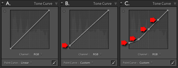
This is where you’ll find CameraBag’s photo editing tools. It’s a comprehensive selection. Among other things you can adjust colour, contrast and tonal values, add grain or a vignette, tweak the RGB or colour curves, crop, and adjust the colour temperature. I won’t bore you with detailed explanations, because you will be able to figure it out easily enough for yourself if you download the trial.
However, there’s one tool I’d like to draw your attention to (I used it in both opening images at the beginning of the article), and that’s Lightleak. There are two sliders: Remix, which changes the appearance of the light leak effect, and Amount, which adjusts the strength.

Borders
Finally, we come to the borders. You can choose one of CameraBag’s borders, or create your own in another program (such as Photoshop) and use that. While I used borders in the opening images to highlight one of the differences between CameraBag and Lightroom, they are something that I tend to avoid as I see them as bit of a gimmick. But they are there if you want to use them.
You should also note that if you use one of CameraBag’s built-in borders, it reduces the size of your image to 2000 pixels along the longest edge.

By the way, you can create your own filters using the current settings you have picked for the photo you are editing. Just go to File > Add Filter to My Styles to do so. CameraBag prompts you to enter a name and it is stored under My Styles.
You can download more filters, created by other CameraBag users, from the CameraBag website. You can also submit your own for others to share. Here’s the final version of my portrait (without the light leaks effect).

What CameraBag lacks
Is there anything that CameraBag doesn’t have? There are two features that I would really like to see included in future versions. The first is some kind of masking feature so you can control which part of the image is affected by an edit. The second is some portrait retouching tools. Having said that, if you use CameraBag at the end of your workflow, to edit portraits that you have already processed in Lightroom or Photoshop, then these features won’t be missed much.
Here’s a summary of CameraBag’s good and bad points.
Pros:
- Quick and easy to use.
- Lots of interesting built-in presets.
- Complements Lightroom and Photoshop.
- Good control over colour, contrast and tonal values like highlights and shadows.
- 32-bits per component colour depth.
- Non-destructive editing.
- Raw file support.
- Inexpensive!
Cons
- Reduces image size to 2000 pixels along the longest edge if you apply a built-in border.
- Only works with one colour space (whatever your monitor is set to).
- Can’t be added as a plug-in to Lightroom, Aperture or Photoshop.
- No local adjustments or portrait retouching tools.
- No batch processing tool.
Give it a try
As with any software or plug-ins, the best way to see if CameraBag is for you is to download the trial version and have a play. Follow the link to download the software or learn more about it. You’ll find lots of information about CameraBag on the website, including how-to videos here.
Your turn
Have you used CameraBag or an inexpensive/free image editor such as Pixelmator, Picasa or GIMP? I’d like to hear about your experiences. What inexpensive software would you recommend for our readers?
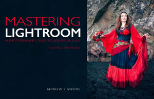 Mastering Lightroom: Book Four – The Photos
My new ebook Mastering Lightroom: Book Four – The Photos takes you through ten beautiful examples of photography and shows you how I processed them step-by-step in Lightroom. It explores some of my favourite Develop Presets and plug-ins as well as the techniques I use in Lightroom itself. Click the link to learn more.
The post Create Beautiful Portraits with CameraBag 2 Software by Andrew S. Gibson appeared first on Digital Photography School.


You must be logged in to post a comment.