Lighting Effects using Color Dodge Blend Mode in Photoshop.
There are numerous methods to creating lighting effects in Photoshop. I’m only going to cover four but they can be used in many ways. But first let’s take a look at a couple that are in the Filter gallery under Render in Photoshop (CS6 and CC). The first is Lighting Effects, which has been upgraded and is more powerful and easier to use than previous versions of Photoshop.
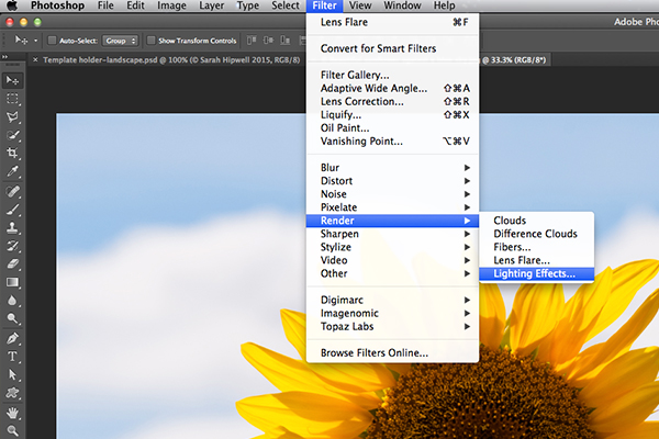
How to access Lighting Effects in Photoshop CS6.
The preview box has been replaced with a more sophisticated interface. You are presented with three different types of lighting effects in the Options Bar – Spot, Point and Infinite – and various presets to choose from. There is a Properties panel that customizes the look of the light that you want in terms of direction, placement, etc. This filter works on Smart Objects, so that you can work non-destructively. It is too comprehensive to go through all the aspects of this filter in this article. The best way to use it is simply open an image, experiment with the different options and see what you think.
Instead, I will show alternative techniques that I prefer to use in Photoshop and Adobe Camera Raw (ACR), some of which you may already be familiar with. I really like the Graduated Filter tool in ACR. This works in similar way to a Graduated Neutral Density filter on your camera. Landscape photographers use graduated filters so that they don’t overexpose the sky area. The dark bit on the ND is on top allowing less light in, as exposure is set for the foreground. You can achieve similar results using the Gradient Editor in Photoshop.
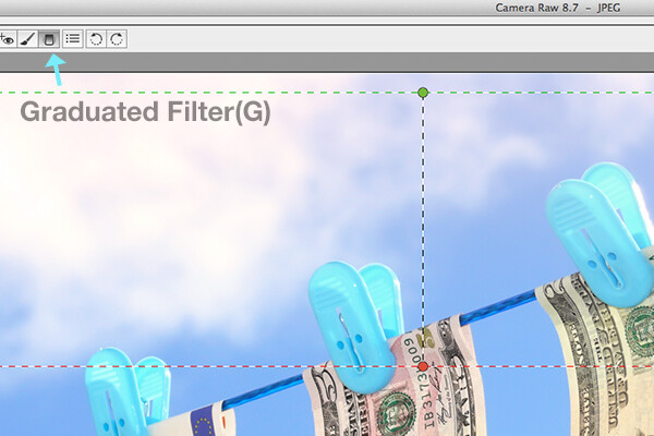
The Graduated Filter icon in Adobe Camera Raw.
With your image opened in ACR, select the Graduated Filter tool. Drag over an area on your image where you want the effect to be applied. Adjust the slider options on the right – Exposure, Highlights etc., to either lighten or darken the area. You can also choose a color to add warmth or a cooler effect.
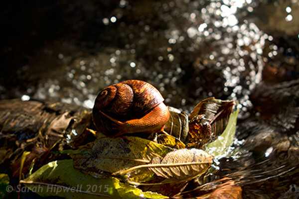
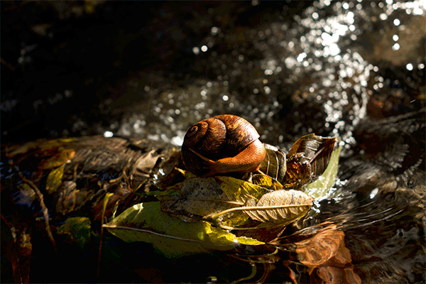
This is the original image of a snail before the Graduated Filter has been applied.
In the image of the snail, I used the Graduated Filter in three different areas on the image. I wanted to add more warmth to the water, so I used a yellow color to create an impression of a sun dappled effect. The second area was to lighten a little more of the water eddy, bottom right of the photo. Finally the third spot, I wanted to simply darken the area directly behind the snail so that the viewer’s eye is drawn to the it. Although, these are subtle light effects, they can add more drama and even change the composition of a photo.
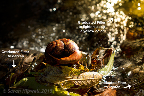
The snail image with the Graduated Filter applied in three different areas.
Animated GIF to show before and after effect from the Graduated Filters effects.
The Lens Flare, which is also found in the Filter gallery under Render, is a lighting effect that can be quite useful but you need to use it with care, using the less is more approach. For example in the image with the golf ball on the red tee below.
Lens Flare effect added to this image.
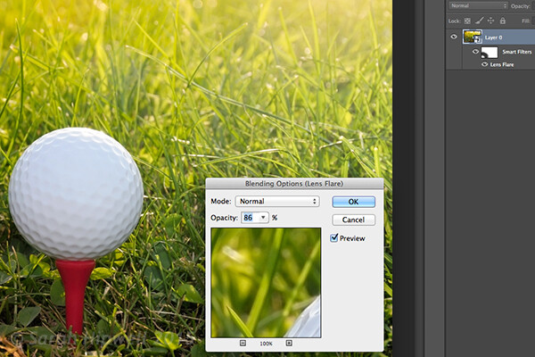
I used the Graduated Filter in three areas, similar to the snail image. I added a magenta color tint on the grass, bottom left of the image to break up the green flat look. Adding a different color using the graduated Filter in this way gives the image more depth. I then added a Lens Flare effect to the top right and reduced the opacity so that the effect caught the tips of the blades of grass. Converting your image to a Smart Object first before applying the filter effect, makes it easier to make changes non-destructively. I was also able to mask out some of the effect that I felt was too strong.

Animated GIF of golf ball with Graduated Filter effects and Lens Flare.
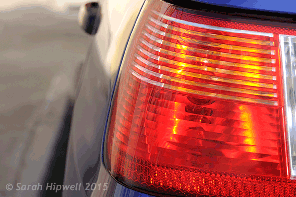
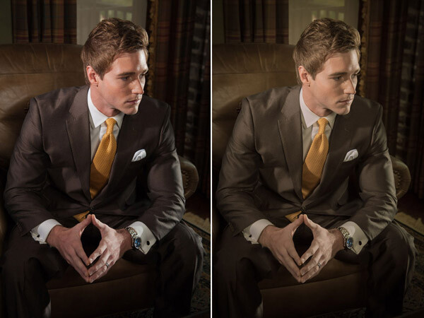
This brings me onto the third technique, the Color Dodge blend mode. I wanted to create the effect that the rear lights were switched on in this image of a car (below). This is such an easy way of creating a lighting effect in Photoshop and the result is brilliant.
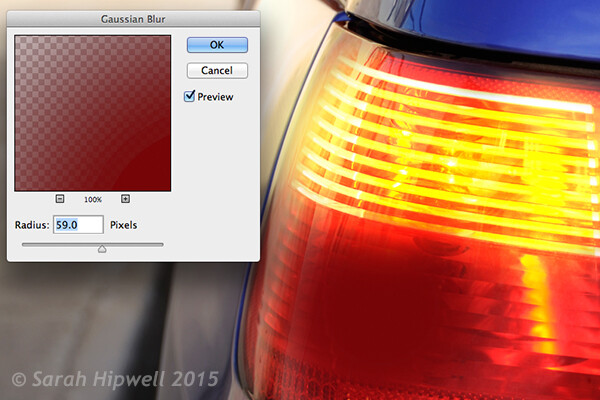
First, create a new blank layer on top of the original image. Select a darker colour to the part of the image that you will be working on. For the lower section of the light, I used a dark red. Using the Brush tool set to soft, paint a small daub and then make it a bit bigger using the Free Transform tool.
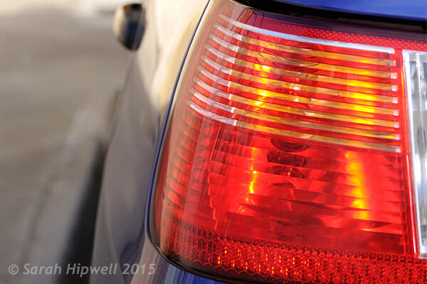
Rear taillights of a car.
Add some Gaussian Blur so that there is no ‘hotspot’ in the middle and the color looks uniform. Position this on a section of the light, change the blend mode to Color Dodge and reduce Fill, not Opacity, to achieve the desired effect. In this case, I reduced the Fill to 59%. I then duplicated this layer and moved it over to the right. You can reduce the size of the spot area if you feel the over spill is too much. So now I had the bottom tail light working. I repeated the same steps for the top section of the light. But I used a darker color yellow there.
On a separate layer, paint a darker colour to the area intended and add Gaussian Blur.
Animated GIF with flashing taillights using Color Dodge Blend Mode in Photoshop.
The forth and final technique is similar to above. When you need to add a highlight(s) to an area of an image to bring out more detail, this technique and the one above can be used on any type of image. It is so easy, quick and very effective. In the photo of the grapes (below), I wanted to create highlights on the dark areas to make them stand out. Same as the above step, create a new blank layer on top of the image and using white as your color, paint a small daub. Make it bigger using the Free Transform tool and add some Gaussian blur. Change the blend mode to Overlay or Softlight, I generally use Softlight. Reduce the Opacity until you get the result that you want.

Animated GIF to show highlights on areas of some of the grapes, using Overlay/Softlight Blend Modes in Photoshop.
Do you have any other tips for adding or creating lighting effects in Photoshop or another way? If so please share in the comments below.
googletag.cmd.push(function() {
tablet_slots.push( googletag.defineSlot( “/1005424/_dPSv4_tab-all-article-bottom_(300×250)”, [300, 250], “pb-ad-78623” ).addService( googletag.pubads() ) ); } );
googletag.cmd.push(function() {
mobile_slots.push( googletag.defineSlot( “/1005424/_dPSv4_mob-all-article-bottom_(300×250)”, [300, 250], “pb-ad-78158” ).addService( googletag.pubads() ) ); } );
The post 4 Lighting Effects You Can Create in Photoshop by Sarah Hipwell appeared first on Digital Photography School.


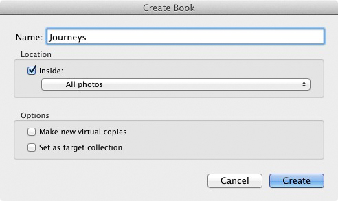
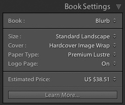
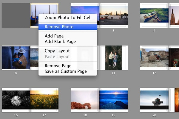
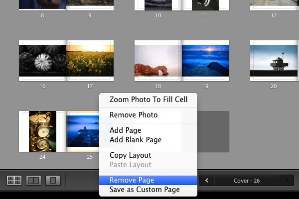
 Mastering Lightroom: Book Five – The Other Modules


You must be logged in to post a comment.