RSS
 

Posts Tagged ‘Create’

How to Create an Effective Workflow and Image Organization

28 Aug

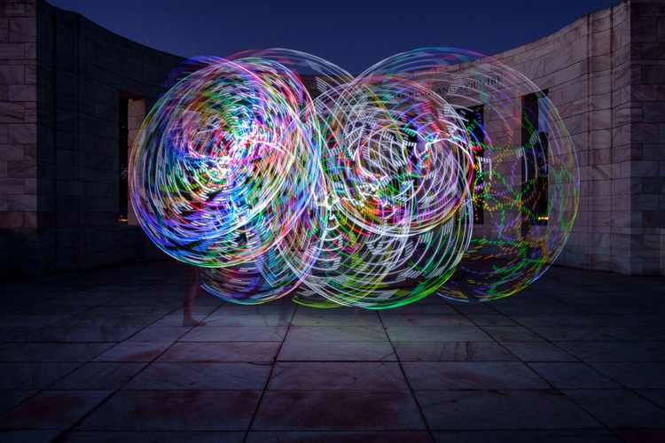
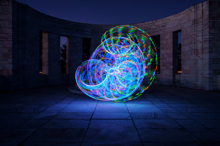
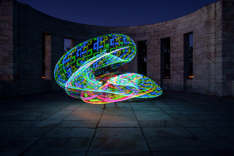
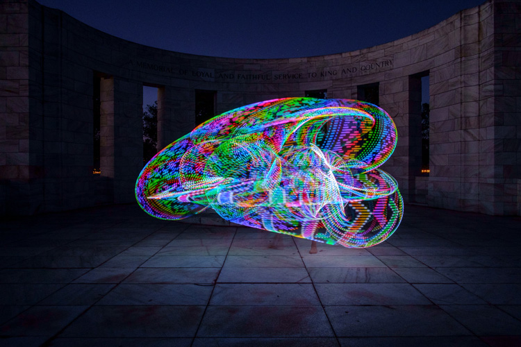
Lets face it, we all love to take pictures, basically to get out there and photograph what makes us happy and gets our creative juices flowing. Many of us, myself included, hate sitting in front of the computer, sorting and sifting through images from a session, wedding, or just personal work. From busy professionals to active hobbyists, having a good solid workflow and method of organizing images is crucial. I am a wedding, lifestyle and travel photographer. So my workflow is slightly different based on the type of session I am photographing, but for the most part I follow the same series of steps. Here are some tips on how to create an effective workflow that can work for your style of photography.

Memorable Jaunts DPS Article Editing and Workflow -4-2

Camera gear

My camera of choice is a Canon 5D MKIII with a Canon 5D MKII as a backup camera. I have to admit, 90 percent of my sessions are shot using the MKIII. I very rarely use the MKII, but when I am photographing a wedding, the MKII is fully loaded and ready to go, in case I need it. I start of each session (wedding or lifestyle) with a fully charged battery and a Transcend 32GB CF card. I own four 32GB CF cards, three 16GB CF cards and two 8GB CF cards.

For weddings that are over 10 hours long, I carry all my cards with me. Each camera will start with formatted 32GB CF card. When I am traveling for work or pleasure domestically, I carry my MKIII but when I am traveling internationally I typically carry both MKIII and MKII. The night before any photoshoot (either wedding, travel, or lifestyle), I charge all my batteries (I have five batteries between my two cameras and luckily they are the same configuration) and format all my CF cards. My bag is packed and ready to go in my office.

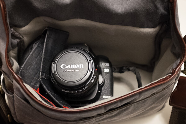
Fits a Canon 5D Mark II with 28mm lens.

During the shoot

Depending on the photoshoot timeline, I will swap out my cards during a logical break in the shoot. For example – the bridal portraits, first look, etc., will be on one or more CF cards. I will swap out the used card before the ceremony (even if it is only partially used), so I can photograph the ceremony on a fresh card. I learned this the hard way early on, when I lost an entire session on a card that failed. Luckily it was not a wedding, but a personal shoot that I was able to recreate. Since then I don’t take any chances with failed CF cards, especially for important events like weddings. Used CF cards from a photoshoot are placed in a separate pouch, from fresh CF cards which are placed in another pouch in my camera bag.

After the shoot (local)

When I am back home from a wedding or a lifestyle shoot, the first thing I do is pack away my gear. I separate my camera bodies from my lenses, and pack them away separately. All batteries are removed, including those from my flash. I have heard horror stories where batteries, especially AAAs, have leaked into the flash socket, so I don’t want to have to deal with that mess!

I download the images from my CF cards onto an external hard drive, that acts as a storage for my RAW images. Once the RAW images are transferred to my external hard drive, I then format the cards in camera (not via the computer). I use Seagate external hard drives to store my images. I also download my images into the Photos app on my iMac computer. The Photos library resides on another Seagate external hard drive.

Memorable Jaunts DPS Article Editing and Workflow -2

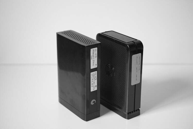
My external hard drives from Seagate are used to store RAW files from my cards and my Photos library. The RAW files are not deleted but the Photos library are deleted at the end of every year.

I use iPhoto (now Photos) and quickly sort through the images that I like. Those images are exported as Originals to a folder on my iMac (I name my folders based on the date of the shoot. For example: YYYYMMDD_ClientName_TypeoftheShoot. These selected images are then imported into Lightroom, my preferred editing software.

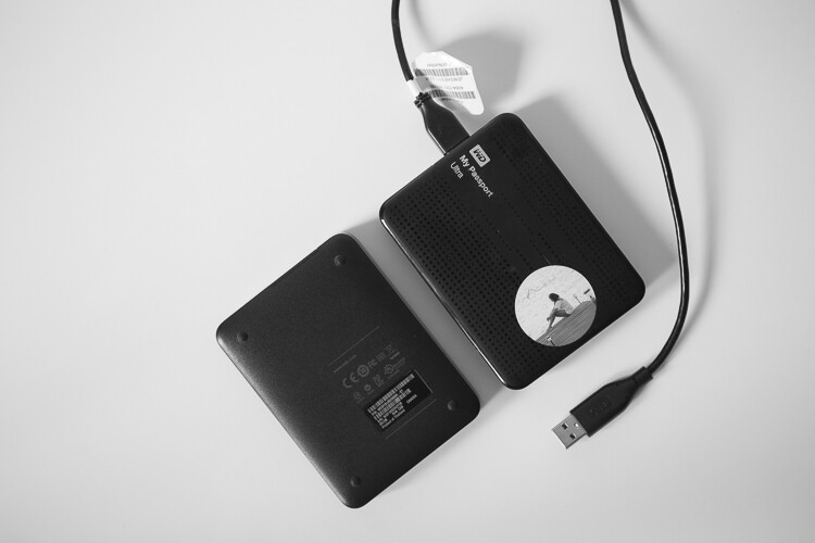
My Lightroom catalog also resides on a WD My Passport Ultra, external hard drive. I understand you may have some concerns over running a LR Catalog on an external HD, because of potential LR speed issues. So far, I have not experienced any issues with LR in terms of speed by having the catalog on an external HD. But if you are concerned about speed then your LR catalog can be put on your computer’s hard drive, and keep a backup on the external HD.

This is more portable than a Seagate and I carry it on extended trips, especially international travel. Once the images are imported into Lightroom (I retain the same name of the folder in Lightroom as well), I delete the folder containing the RAW images from my iMac hard drive. If you are keeping track, my RAW images are stored on two separate external hard drives – one that is a dump of the card and the other in a Photos catalog.

After the shoot (on the road)

When I am traveling for work or pleasure, I carry two WD My Passport Ultra external hard drives. One holds the RAW files from my CF cards, the other holds my Lightroom catalog. My original LR catalog is also backed up on one of my Seagate external hard drives. Once I copy the Raw files over, I follow the similar process as when I’m at home.

When I get home, the raw files from the CF cards used during the trip are copied over to the Seagate that houses all my RAW images, and deleted from the WD Ultra so that it is ready for my next trip. I carry my Lightroom catalog only for extended travel trips, when I know I will be editing images and posting them on social media and/or my blog. For short weekend getaways, I either carry just the WD Ultra just for the raw files or nothing at all, based on the duration of the trip.

Memorable Jaunts DPS Article Editing and Workflow -3

My portable hard drives are used to save my RAW files when I am traveling, as well as my Lightroom catalog when I am traveling for an extended period of time.

Editing and delivery workflow

80% of my editing is done in Lightroom. I use Photoshop sparingly if I have to make any advanced editing like head swapping, and or removing large objects from images. I have invested in the Adobe Creative Cloud for LR and Photoshop. It’s the bundle package deal for $ 10 per month for photographers (get both for only $ 7.99 as a dPS reader). I am able to use both on both my iMac, which is my primary editing device, as well as my MacBook Pro, which is my travel companion.

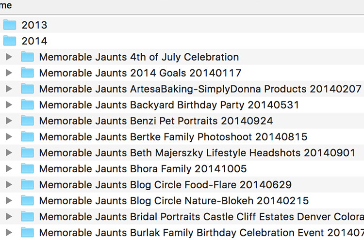
After editing is complete, I export my client images onto the same WD Ultra external hard drive as my Lightroom catalog. The client folders are also arranged by date of the session. This time my naming standard is as follows: Memorable Jaunts_ClientName_YYYYMMDD – all images will have the same naming convention as the folder, along with an image sequence number. The images are also uploaded to my portfolio site, in a gallery which is password protected. I share the password with my clients, for viewing their images and ordering any prints. I use Zenfolio to host my client galleries. I have been with them since I launched my business in 2010, and have had a very good experience with them (and no, I did not get paid to say this about them, my views are my own).

Memorable Jaunts DPS Article Editing and Workflow 01

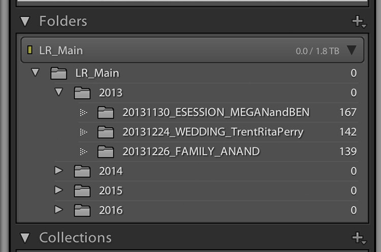
My naming convention for my Lightroom Catalog – the folders are ordered by Year and then by date for each of my sessions

When I am traveling, I follow the same process, and edited images are saved in the same WD Ultra external hard drive. Should I need to touch-up or re-edit an image when I am back home, I simply connect the same external hard drive to my iMAC, launch the LR catalog, and I am good to go.

Client galleries are live online for two weeks, and then they are deleted. At the end of every year, I delete old client processed images from my external hard drive. I retain client session raw files for three years before I delete them from my Seagate external drives (both the original CF card download as well as the Photos catalog) to make room for new sessions. My personal images (images of my family and personal travel) follow the same process as my client sessions. Except these images are never deleted, they are too precious to me and live on forever on my external hard drives!

Client galleries are live online at Zenfolio for two weeks, and are then deleted from that site. At the end of every year, I delete client processed images from my external hard drive. I retain client session RAW files for three years before I delete them from my Seagate external drives, to make room for new sessions. This is something that I communicate with all my clients when when they receive the link for their online gallery. If any of my clients request additional time to store and/or purchase their images, that is something I will most certainly accommodate 

My wedding photography packages all include edited images on a personalized flash drive. Whereas my family portraiture clients have the option of purchasing digital images, if they want them for future use. If you don’t want to delete client images in the event that a client may come back to you after a few years (for example in case of death in the family, etc.), you can invest in a large external storage unit like Synology system for backing up, or use Amazon s3 in a cloud environment. 

Memorable Jaunts DPS Article Editing and Workflow -4

The naming convention for my processed files

Summary

As you can see, my workflow and image organization is not too complicated. I tried a few different variations, both in terms of file naming conventions, as well as file storage options, but I find working off external hard drives is fast, easy, and safe. It does require investment in external hard drives, but I typically pick some up when they are on sale.

I encourage you to use this, or some variation of this workflow, and tweak it to make it your own. Having a workflow will help you be better organized, spend less time in front of the computer, and more time out there doing what you love the most – shooting.

googletag.cmd.push(function() {
tablet_slots.push( googletag.defineSlot( “/1005424/_dPSv4_tab-all-article-bottom_(300×250)”, [300, 250], “pb-ad-78623” ).addService( googletag.pubads() ) ); } );

googletag.cmd.push(function() {
mobile_slots.push( googletag.defineSlot( “/1005424/_dPSv4_mob-all-article-bottom_(300×250)”, [300, 250], “pb-ad-78158” ).addService( googletag.pubads() ) ); } );

The post How to Create an Effective Workflow and Image Organization by Karthika Gupta appeared first on Digital Photography School.


Digital Photography School

 
Comments Off on How to Create an Effective Workflow and Image Organization

Posted in Photography


Samsung uses brain-inspired processors to create digital camera ‘vision’

17 Aug

Samsung has used IBM’s neuromorphic computer processors, built under the latter company’s TrueNorth project, to create digital ‘eyes’ that see in real time. The IBM TrueNorth processors are composed of 4096 small cores that simulate brain neurons, the primary advantage being faster data processing with lower comparative energy usage. Combined with Samsung’s Dynamic Vision Sensor, the technology functions somewhat like a digital eye, perceiving the world by changing each pixel independently of the others to record movement.

Samsung Advanced Institute of Technology’s VP of Research Eric Ryu detailed the technology at an IBM Research event in San Jose last week. Unlike ordinary cameras, this DVS-based camera only changes pixels when necessary to record the movement of specific objects while other pixels remain unchanged. Because of the unique pixel technology, this camera can process video at 2000 fps while using only about 300mW of energy. 

The combination of super high frame rates and exceptionally low energy consumption makes the technology useful for other types of technology, including self-driving cars, robots, gesture-recognizing gadgets, and more. Samsung envisions projects that utilize many of these chips stacked together; a 16-chip stack would be akin to utilizing nearly 86 billion brain neurons.

Via: CNET, Inilabs

Articles: Digital Photography Review (dpreview.com)

 
Comments Off on Samsung uses brain-inspired processors to create digital camera ‘vision’

Posted in Uncategorized


NASA combines exposures on the fly to create high-speed 3D HDR video

09 Aug
Credit: NASA

NASA has successfully tested a camera that uses multiple frames of different exposures to create HDR video. The demo of a rocket test shows that the dynamic range provided is enough to capture plumes of exhaust fire and the surrounding area at the same time. The High Dynamic Range Stereo X, or HiDyRS-X, camera is capable of recording a collection of different exposures using very high frame rates which it then combines to create individual frames of HDR video – in 3D.

The idea is to be able to capture the extremely wide range of brightness values during a rocket test so that the rocket itself and the flames of the plume can be seen and studied simultaneously – not something that traditional capture methods can do.

NASA says that the trial, using the Space Launch System Qualification Motor 2 test, allowed its scientists to study elements and behaviors they had not been able to see before. As with many critical moments in photography things didn’t go completely smoothly for the photography team during the unrepeatable engine test. The camera’s automatic timer failed to start the recording so the team had to intervene manually, and then the vibrations of the rocket itself caused the camera’s power cable to fall out.

The HiDyRS-X camera was developed as a part of a scheme to allow young engineers to come up with concepts and lead projects to create new hardware to help with NASA’s space programs. The project won one of the Early Career Initiative grants in 2015 and was led by structural dynamist Howard Conyers from the Stennis Space Center in Hancock County, Mississippi.

For more information on the camera and the test visit the NASA website.

Articles: Digital Photography Review (dpreview.com)

 
Comments Off on NASA combines exposures on the fly to create high-speed 3D HDR video

Posted in Uncategorized


MIT researchers use ordinary cameras to create extraordinary interactive videos

03 Aug

Augmented reality is in the news plenty lately, but some researchers from MIT have put an interesting twist on the popular technology. Using new algorithms and as little as a few seconds of video created by a traditional camera, they’ve been able to create Interactive Dynamic Video, or IDV. The objects respond in a surprisingly realistic way as they’re poked, prodded and manipulated.

IDV records the tiny vibrations of an object in motion during a short video clip, and then uses that information to allow users to interact with the object virtually. The potential applications include things like monitoring the structural integrity of bridges or buildings. The technology could also provide filmmakers with a cheaper, less time-intensive alternative to 3D modeling. Case in point: this little green monster running around a playground.

See the video below to learn more about the research and its applications.

Articles: Digital Photography Review (dpreview.com)

 
Comments Off on MIT researchers use ordinary cameras to create extraordinary interactive videos

Posted in Uncategorized


How to Use Framing to Create a Sense of Scale

02 Aug

One thing that can be difficult to get across when taking pictures is a true sense of how large something is in real life. A skyscraper that appears towering and imposing in person, can come across as unimpressive, or stripped of its majesty when photographed. Natural formations that inspire awe and self-reflection, often seem puny and insignificant when we go through our photos later at home or on our phones.create-sense-of-scale-bok-center

This is something I have had happen many times in my own journey as a photographer, and while it can be tricky to create a sense of scale, there’s a way to use the concept of framing to capture the massive size of things in the world around you.

What is framing?

Framing has to do with the way the elements in a picture are positioned, in relation to one another. I struggled with the concept of framing for scale for a long time, before I really got the hang of it. But if you really want to show how big something is, it helps to put something else in the picture with it. This concept might seem a little counterintuitive, but adding elements to the foreground, background, or image sides, helps to not only give the viewer a sense of scale by showing how big the object is in relation to something else, but often it helps make the picture more compelling from a compositional perspective.

As an example, here’s a picture I took when I visited the Grand Canyon a few years ago. I really wanted to capture the sheer size of this natural wonder, so naturally I pointed my camera out from a precipice and took a few pictures. Sadly, the resulting images look flat, muddy, and downright boring – almost the polar opposite of the Canyon itself.

An incredibly boring picture of one of the most amazing natural formations I have ever seen.

An incredibly boring picture of one of the most amazing natural formations I have ever seen.

The problem with this image is it does nothing to impart a sense of scale to the viewer. In order to truly appreciate how big the canyon is, we need other visual information in the frame, to which we may compare the background elements. Fortunately, one of my friends took a much better picture that includes a few foreground elements, which although they block out some of the Canyon, help to capture the grandeur of this natural wonder.

create-sense-of-scale-grand-canyon-foreground

A much better picture, even though part of the Grand Canyon is blocked out.

The second picture works because it contains several layers: me, the trees, the plateau, and a glimpse of the rest of the Canyon. Of course this concept, like much in the world of photography, is quite subjective and some might think the top picture looks better because you can see more of the canyon itself. However, in my opinion the bottom image is more interesting because of the multiple compositional layers, while at the same time helping the viewer understand just how big the Grand Canyon really is.

How to apply framing to show scale

You can see the same principle at work in the following pair of shots as well. The first one was zoomed in a little and focused just on the crane, which is fine, but it doesn’t really tell the story of how big the crane is, or how much it towers over the surrounding buildings.

create-sense-of-scale-crane-unframed

To adequately capture the size of this piece of construction equipment I stood in the same place, but zoomed out a little bit, in order to frame the crane between two of the surrounding buildings. The result is a picture that adds a great deal of additional context, which helps the viewer to understand the size of the subject in the photo.

create-sense-of-scale-crane-framed

Often these types of framing decisions are not all that complicated. It can be as simple as stepping a few meters in any direction, or zooming in and out with your camera. Another example is this set of two images taken at the Philbrook Museum in Tulsa, Oklahoma. It’s a grand building with a rich history, but unless the building is properly framed it can look like any other house.

create-sense-of-scale-philbrook-unframed

Looking at the above image you might get the idea that this dwelling is somewhat old, with a bit of a terrace in front. But, it doesn’t really capture a true sense of the scale, not only of the house, but its surrounding gardens.

create-sense-of-scale-philbrook-framed

In the second image (above), the size of the mansion is smaller in the image, yet it seems much larger because it is framed on the sides by rows of trees, as well as the lower portion of the photo which shows many distinct levels of the terrace. It’s somewhat ironic that stepping back and re-framing a shot like this, so that the subject is smaller in the frame, can actually make it appear larger. But, you will find this phenomenon to be true across a wide range of photographic situations in which you want to convey the true size of something.

Don’t overdo it

Of course, just as important as knowing how to frame your subjects is knowing when to hold back a little bit. The picture below shows the student union of Oklahoma State University, one of the largest student unions in the country. Yet when it is framed between two trees on the sides and a hedge in the foreground, it almost gets dwarfed and seems somewhat diminutive in size.

create-sense-of-scale-student-union-framed

One reason the framing is not useful here is because it actually covers up part of the building, whereas in the previous example the technique was used enhance the large subjects. There are also several visual cues, such as windows and stairs, that on their own do a good job of imparting a sense of size to the viewer. To properly showcase how big this structure is, it’s enough to simply show it on its own.

create-sense-of-scale-student-union-unframed

The above examples are just a few illustrations of how you can use the idea of framing to capture a sense of scale, but I’m curious about your own personal approach. How do you use various photographic techniques to truly capture the size of your subject? Leave your thoughts and images in the comments below.

googletag.cmd.push(function() {
tablet_slots.push( googletag.defineSlot( “/1005424/_dPSv4_tab-all-article-bottom_(300×250)”, [300, 250], “pb-ad-78623” ).addService( googletag.pubads() ) ); } );

googletag.cmd.push(function() {
mobile_slots.push( googletag.defineSlot( “/1005424/_dPSv4_mob-all-article-bottom_(300×250)”, [300, 250], “pb-ad-78158” ).addService( googletag.pubads() ) ); } );

The post How to Use Framing to Create a Sense of Scale by Simon Ringsmuth appeared first on Digital Photography School.


Digital Photography School

 
Comments Off on How to Use Framing to Create a Sense of Scale

Posted in Photography


More Ways to Create Better Images Without Buying More Gear

28 Jul

Jay Maisel has to be one of the most interesting photographers alive today. He is 85 years old and he still makes a point of carrying his camera with him every day, everywhere he goes. I recently watched a few videos where Scott Kelby spent a few days with Jay, just wandering through the streets of New York and later, walking through Paris.

In these two different videos, Jay imparts his photography philosophy, and how he makes his images. The remarkable thing I noticed is that Jay almost never talks about photography equipment. Rather, he speaks about technique, about getting it right in camera, and making sure you spend time getting the best shot possible.

This article is a follow on from an article I did a while ago, which had a similar title to this one – 5 Ways to Create Better Images Without Buying More Gear. I now want to expand on that and add 5 more things you can do to improve your photography without buying more gear.

#1 Show the viewer something different

This is something really important that, but we don’t often think about. There are so many things being photographed every day.

5 more things image 8

Think about this: if you go to Paris, you will no doubt want a photo of the Eiffel Tower. Of course, every photographer does. The challenge is, we have all seen photographs of the Eiffel Tower, so, how will your image be different from anyone else’s? Better still, how will you make the image look like it is taken from a new vantage point or angle.

These are the tough questions, the things that we need to think about as photographers. You could try a few things, go in really close and get some detailed shots of the metal structure, find an area of it that is looking old and grungy, maybe try and shoot it from a very extreme angle, work hard to show your viewer something they haven’t seen before.

Think of the photos you have seen of the Eiffel Tower. If your image looks like any of those shots, then you need to try something different. The goal here is not to be different for the sake of being so, but to try and be unique.

Of course, you should shoot the usual postcard shot, at least you have that, but then play around, walk around, lie on the ground, shoot straight up, put your camera lens against the structure, try anything to get an angle that you have never seen before.

Show me something I have never seen before. – Jay Maisel

Look for something you have not seen before

This is one of Jay Maisel’s key messages, “Show me something I have never seen before”. He is not being flippant, we have all seen a car, a tree, a glass building, and people on the street. What he is looking for is to be shown these everyday subjects in a different way, that’s the key to this principle.

#2 Practice patience

In the video with Jay Maisel, he mentions that he was once out doing street photography with another well known photographer. As a typical New Yorker, he was walking at a pretty quick pace. After some time, the other photographer turned to him and said, “Jay, do you know why you aren’t getting any good shots? You’re walking too quickly”.

That comment caused Jay to slow down. Not only did he slow down his walking pace, but he slowed everything. He would stop in a place for five or 10 minutes. He would find a scene he liked and then, like a theatre stage, he would wait for the actors to appear, the people on the street. So he stands in a particular spot sometimes, for up to 20 minutes, and just waits for something to happen.

Sitting and waiting can result in some great images

Sitting and waiting can result in some great images

Give it a try. Next time you are out photographing in your city, stop for a while. Observe the scene in front of you. Make note of how people are moving through that scene, and start looking for an opportunity to make an image. It may take a while, if you can, sit down and just watch, pretty soon, the right person will enter your “stage” and you will have your image.

#3 Change your composition

We all know about the rule of thirds, very often it is our first introduction to composition. It’s a good starting point for creating good composition, but there are many other ways to make your images look compelling.

Composition is one area of photography that can make a vast difference in your images. Simply changing from landscape to portrait orientation for example. More than that, look a little deeper. There are some great techniques you can use to enhance your composition.

5 more things image 10

One of these is using depth of field. A shallow depth of field will isolate your subject and make the background less distracting. Speaking of backgrounds, make sure that you have looked at the background in your image and that there is nothing distracting that will take the viewer’s eye off the subject.

You could also try and frame your subject using a door frame, a window, or some overarching trees. The frame will point the viewer to the subject and, if done correctly, framing can be a very powerful compositional tool.

Remember to change your viewpoint. Lie on the ground, get as low as you can, or maybe get up as high as possible. If your viewpoint is unusual, your subject will benefit immensely.

Shooting from a different viewpoint can make all the difference

Shooting from a different viewpoint can make all the difference

#4 Go out empty

Another piece of Jay Maisel wisdom is to go out empty, and let your images fill you up. What does that mean?

Very often, you may go out on a shoot and are “hunting” for a particular image. Maybe you are looking for a man with a blue shirt riding a red bicycle, which is pretty specific, and really difficult to find. The challenge is that if you are looking for only that one type of shot, you may miss all the others that are out there.

By going out empty, you are open to whatever comes into your viewfinder. You may get a shot that you never thought of before or have seen before, that’s the point. Sometimes it is good to shoot with constraints, it forces you to be creative.


By going out empty, you may be surprised at what you will see

By going out empty, you may be surprised at what you will see

At other times, go out without any limitations, simply look at what unfolds in front of you and shoot whatever you find interesting. That’s one way to get some great shots. Also, be open to what happens while you are out shooting.

I was photographing in an old area in the East Side of Vancouver. A lady came up to me and asked what I was doing, and I told her I was looking for some great shots of the homes in the area. She asked if I wanted to see inside her home, I am so glad she invited me. Her home was amazing, and it was a great opportunity to see inside a true heritage home.

#5 It’s not about cropping, but about framing

As photographers, we can become a little lazy. We will compose the shot, look at the scene, and realize we need to move a little to the left because there is something distracting in the shot. Many times, we might think, “It’s okay, I can crop that out later”.

5 more things image 9

Yes, that is true, you can crop it out later, but it may change the whole perspective of the shot. I might mean that you lose another important piece of information.

Jay Maisel reminds us that it’s about framing, not cropping. He says that it is the photographer’s responsibility for what is in the frame and, sometimes more importantly, what is NOT in the frame. Instead of assuming you can crop something out later, maybe move around the subject a bit, look at it from different angles, and then decide what needs to be in the frame and what doesn’t.

As Jay says, “The photographer is responsible for everything in the frame”. Make sure that everything that’s in the frame is there for a reason, otherwise, change it.

5 more things image 5

You are responsible for everything in the frame.

Of course there are no rules in photography, there are only guidelines. These ideas are simply suggestions that can help you improve your images, and to see more clearly. Once you begin practicing these things, you won’t have to think about them as much. You will do them instinctively, and that’s when your photography will change and become more mature.

So get out there and give these ideas a try, practice one of these suggestions on each photoshoot or photowalk you do. Keep making the changes and slowly working on your craft, and you may look back in a year and be astounded at how much your work has improved.

googletag.cmd.push(function() {
tablet_slots.push( googletag.defineSlot( “/1005424/_dPSv4_tab-all-article-bottom_(300×250)”, [300, 250], “pb-ad-78623” ).addService( googletag.pubads() ) ); } );

googletag.cmd.push(function() {
mobile_slots.push( googletag.defineSlot( “/1005424/_dPSv4_mob-all-article-bottom_(300×250)”, [300, 250], “pb-ad-78158” ).addService( googletag.pubads() ) ); } );

The post More Ways to Create Better Images Without Buying More Gear by Barry J Brady appeared first on Digital Photography School.


Digital Photography School

 
Comments Off on More Ways to Create Better Images Without Buying More Gear

Posted in Photography


How to Create Beautiful Light Painting Images With an Illuminated Hoop

12 Jul

Early last year I collaborated with a friend who is a professional circus performer and hula hooper to create the unique images that you see in this article.

There are lots of good light painting photos around, but the factor that sets these ones apart is that my friend Tess used something called a FutureHoop – a transparent hula hoop that has built-in lights that can be programmed to flash in different colors and patterns. It helps that Tess is a trained dancer and hooper, so she was able to create some beautiful patterns with the FutureHoop.

painting with light

You can try this technique yourself – if not with a FutureHoop then with any number of colored light tubes or similar devices that are available (or make your own). Do a search on Amazon to see what you can find, and use your imagination to reveal their potential.

Whatever you end up using for your painting with light experiments, there are a number of things you need to consider to get the best results. Take care of these and you should be able to create some strong images.

Choose a Location

painting-with-light-7

Pick a good location. You need a dramatic background that complements the painting with light technique you choose to use. For these photos we went to Massey Memorial, built in remembrance of a past New Zealand Prime Minister on a hill in Wellington. I knew it would be a great place to take the photos because the marble pillars form a dramatic background. There was also plenty of room for Tess to move and dance with the FutureHoop.

Take the practicalities into consideration when choosing a background. For example, beaches often make good locations for painting with light photos, but you need to make sure your model can walk around safely in the near dark without tripping over rocks (or falling into the sea). Incidentally, isolated beaches are also a great place to try steel wool spinning, another form of painting with light.

painting with light

Pick a model

Pick the right model. Tess is a professional performer and I couldn’t have created these photos without her. She had the appropriate costume, including an illuminated bra that can also be programmed to give different color displays.

Her training also meant that she could strike professional poses. The following photo demonstrates this perfectly. Look at the arch of her back, the way her feet are positioned, and how the toes on her left foot are pointed. You can even see the flashing bra.

painting with light

The other thing that helped is that Tess thought about the patterns she would use on FutureHoop, and how she would move the hoop before the shoot. That helped us nail the shoot the first time.

Ask your model to practice, and be prepared to reshoot if necessary. It is possible that you won’t create your best images during the first attempt. During the shoot, look at the photos on the camera’s LCD screen and see what works and what doesn’t. Then you can suggest things that your model can try, or ask her to do something again if you didn’t quite time the photo correctly. Use feedback to refine the images and work towards something beautiful.

painting-with-light-15

Time of Day

Choose the right time of day. The best time for painting with light is twilight, as it is dark enough for the lights to show, but there is still enough ambient light to subtly illuminate the background, and maintain some color in the sky.

The only difficulty with twilight is that the light fades rapidly, so you have to keep up by changing the exposure settings as you go along. The photos you take earlier on in the shoot, will be different from the ones you take later, as the light is fading. The ratio between the light from the FutureHoop (or whatever devices you are using), which stays constant, and the ambient light, which is fading, changes.

painting with light

painting with light

The two photos above show the difference. The first was taken early in the evening, the second one when it was nearly dark. The pillars in the background in the first are lit by the light of the setting sun. The FutureHoop seems much brighter in the second because the ambient light levels are lower. Note that I darkened the background of the first image in Lightroom to match that of the second one.

This photo shows Tess warming up at the start of the shoot. It was still too bright as this stage for the painting with light photos – you can barely see the light of the FutureHoop.

painting with light

If you shoot at night the exposure should remain constant, but the sky will lack color. On the other hand, the light from the device your model is using could light up the background beautifully if it is close enough. So there may be advantages to working at night, rather than twilight, but in most cases the light during twilight will be better.

Technique and Camera Settings

Get your technique right. You need slow shutter speeds to take this type of photo, so a good tripod to support the camera and a cable release are necessities. I used shutter speeds between two and four seconds for these photos – you may need longer exposures depending on how long it takes your model to move the device you are using through the air. Tess moved quite fast, so the shorter shutter speeds we used worked better.

painting-with-light-16

Set your camera to Manual mode so that the exposure remains constant throughout the series (the moving lights will confuse your camera’s light meter in an automatic exposure mode). It is easy enough to open the aperture, or raise the ISO, if you need to as the light fades.

Use the Raw format to give you maximum leeway in post-processing. Shooting Raw simplifies the shoot greatly as you don’t have to worry about settings such as color profile until you sit down to process the photos.

In this shoot, once the camera was set up, I kept the aperture at f/8 or f/11 and raised the ISO as the light faded. I set the White Balance to Daylight so I could see the natural colors of the FutureHoop and the ambient light. Using auto White Balance may result in some strange color casts as the camera tries to compensate for the colored lights.

painting-with-light-14

Above all, have fun. If you both enjoy the process you create better images. If your model enjoys it she will want to collaborate with you on future ideas. Below are a few more images from our shoot – enjoy and hopefully they give you some ideas.

painting-with-light-6

painting-with-light-13

painting-with-light-12

painting-with-light-11

painting-with-light-10

painting-with-light-9

painting-with-light-8

Any questions? Let us know in the comments and I’ll do my best to answer.

And if you’d like to learn more about the basics of photography, then please check out my ebook Mastering Photography: A Beginner’s Guide to Using Digital Cameras.

googletag.cmd.push(function() {
tablet_slots.push( googletag.defineSlot( “/1005424/_dPSv4_tab-all-article-bottom_(300×250)”, [300, 250], “pb-ad-78623” ).addService( googletag.pubads() ) ); } );

googletag.cmd.push(function() {
mobile_slots.push( googletag.defineSlot( “/1005424/_dPSv4_mob-all-article-bottom_(300×250)”, [300, 250], “pb-ad-78158” ).addService( googletag.pubads() ) ); } );

The post How to Create Beautiful Light Painting Images With an Illuminated Hoop by Andrew S. Gibson appeared first on Digital Photography School.


Digital Photography School

 
Comments Off on How to Create Beautiful Light Painting Images With an Illuminated Hoop

Posted in Photography


How to Use Light to Create Moody Images

04 Jul

It isn’t difficult to take sharp, well-exposed photos with modern cameras. But how do you take it a step further and create moody images that capture the spirit of a place?

What is mood?

I define mood as a feeling or emotion you get while experiencing something. For example, while travelling through Xi’an, a city in China, last year I spent some time in the city’s Muslim Quarter. I felt a mixture of things – overwhelmed by the crowds and the sticky heat, fascinated by the sights and smells coming from stalls selling home-made street food, and claustrophobic while wandering down hutongs (alleyways) connecting the main streets. Then there was the paradox of the city’s ancient open air mosque – a peaceful paradise amongst the noise and dirt of the old city.

Mood and light

The mood in this photo was created by the mix of artificial and natural light. The lights in the market stall bathe the scene in an orange glow, while the blue light of early evening creeps in at the edges.

Once you have the sense of the mood of a place, you can start thinking about how to capture that in a still frame. Part of the answer lies in composition and the subject. In this example it is obvious that well composed images taken amongst the hubbub of the Muslim Quarter in Xi’an will help capture the atmosphere. But the one thing you really have to pay attention to, the thing that will elevate your photos above the ordinary, is light.

How light and time of day affect your images

Most photographers are familiar with the idea that the moodiest, most evocative lighting comes at either end of the day, close to sunrise and sunset. Golden hour is the name for the time when the sun is close to the horizon, casting golden light that creates long, raking shadows. The blue hour is the time at dusk, or just before sunrise, when there is light in the sky and the natural color of the ambient light is deep blue.

The light at both these times is incredibly moody. Once you have found an interesting place to photograph, and identified with the spirit of the place, then you really can’t go wrong by venturing out at these times to take photos. Yes, you can take interesting photos at other times of the day, but the light won’t be as evocative.

One of the challenges of working in moody light, especially during dusk, is that light levels are low. This is less of a problem than it used to be because high ISO performance on modern cameras is so good you can easily raise the ISO to work with a hand-held camera in low light. It also helps if you have a prime lens, as this lets you use wider apertures which let more light in, enabling you to use lower ISOs or faster shutter speeds (or both). Image Stabilization in its various forms may also be useful.

Mood and light

This photo balances the orange glow from the lanterns against the fading blue light of the evening sky. I used an ISO of 6400 to work in low light shooting without a tripod.

If you are a landscape photographer, these points aren’t so important, as you would simply use a tripod to support the camera, allowing you to use small apertures, low ISO settings, and long shutter speeds (another tool for creating mood in the landscape) without camera shake.

Returning to my example of taking photos in Xi’an, I didn’t bother going out with my camera in the middle of the day (when the light was too harsh). Instead, I visited it in the late afternoon, when the fading light and encroaching artificial lights added to the mood, and helped me create a sense of place. This was as interesting time to work, as the low light and the crowds created various challenges to be overcome.

Mood and light

Look carefully at this image and you’ll see that the ground is glistening after a rain shower. Together with the out of focus orange lights in the background, this helps to add mood to the photo.

Mood and light

The green fluorescent lights in this image create a different type of mood. The fluorescent light is ugly, rather than beautiful.

Using color contrasts for more drama

One of the key aspects of light at the end of the day is that it often utilizes the contrast between orange and blue. It is something you see a lot in the landscape, with the orange light from the setting sun contrasting with the blue of the sea. Or you may have a photo taken during the blue hour, with a corresponding contrast created by an artificial light source. Sadly, the practise of using fluorescent or white LED lighting is making this less common, but it is something to look out for.

Mood and light

This photo, taken during the golden hour, shows the contrast between the orange light casty by the setting sun on the tower and flag, and the blue sky.

I recently came across an example of this color contrast in a blacksmith’s forge in Lincolnshire, UK. The forge is a historical building, and the people who work there use techniques that were used in the forge over a hundred years ago. The interior has changed little in that time – one of the blacksmiths told me that they are visited by people who remember the forge from childhood over 50 years ago, and say it still looks exactly as they remember it.

There were two types of moody lighting in the forge. One was daylight coming through the small windows, the other was orange light coming from the fire in the forge, and sparks cast by the blacksmith as he worked. I chose to emphasize these even more in post-processing, by using a split tone to give the background a cold blue color.

Mood and light

What examples of moody lighting can you think of? Please let me know in the comments.


Mastering Photography

If you’d like to learn more about creating beautiful photos with light then please take a look at my ebook Mastering Photography: A Beginner’s Guide to Using Digital Cameras.

googletag.cmd.push(function() {
tablet_slots.push( googletag.defineSlot( “/1005424/_dPSv4_tab-all-article-bottom_(300×250)”, [300, 250], “pb-ad-78623” ).addService( googletag.pubads() ) ); } );

googletag.cmd.push(function() {
mobile_slots.push( googletag.defineSlot( “/1005424/_dPSv4_mob-all-article-bottom_(300×250)”, [300, 250], “pb-ad-78158” ).addService( googletag.pubads() ) ); } );

The post How to Use Light to Create Moody Images by Andrew S. Gibson appeared first on Digital Photography School.


Digital Photography School

 
Comments Off on How to Use Light to Create Moody Images

Posted in Photography


How to Create a Dramatic Cinematic Style Portrait Using Photoshop Color Grading

30 Jun

Cinematic style portraits are personally one of my favourites. What I like the most about them are the desaturated colours and the dramatic ambience.

Before we start the tutorial on colour grading, I will give you some of my best tips to achieve this cinematic look:

  • Use a large aperture, something between f/1.4 and f/2.0. If you have a long lens then you can also use that. The idea is to have a nice background bokeh (when things in the background are blurred). You also want to have nice separation between the model and the background.

IMAGE 1

  • If you’re shooting indoors with strobes, then try to add ambience by adding shadows to the model’s face. You do not want flat lighting, it is boring.
  • If somehow you can’t get the dramatic lighting, don’t hesitate to enhance the contrast with some dodging and burning in Photoshop.

IMAGE 2

  • If you’re shooting outside, the I recommend shooting right after sunset. You will get nice soft light on the model’s face, and you will also have city lights behind them, to really get a cinematic feel. This only works with a large aperture, and it adds another point of interest.

IMAGE 3

  • Your model should have a strong expression on their face, especially if it’s a male. Cute smiling images do not really work that well with this style.
  • Leave some space in the frame. You do not want your model to take up the whole frame, so leave some space around them, to add context to your image. You can get better results if the viewer is able to locate the spatiotemporal context of your image.

IMAGE 4

  • Your model should not wear something too flashy (something like pink or yellow), limit their clothes to sombre, subdued colours.
  • Try to use complementary colours as much as possible, it creates nice depth to your images. Usually in movies, the actor is either in blue and the background in yellow/orange, or vice versa. Try to keep your actor in a range of cold colours and your background in warm colours, it works the best. The opposite also gives you good results.

IMAGE 5

  • The most important thing is that your model should look like a character. Try to add accessories, clothes, or poses that make the character look credible. You can discuss with the model or stylist before the session, the look you want to give to your images, and have a look together at the wardrobe.
    IMAGE 6

Color Grading in Photoshop

For the colour grading tutorial I am going to work on this image:

IMAGE 7

This image was taken on a Canon 6D, with an aperture of f/1.8, on a 50mm lens. This was taken during a short film where I was the photographer. There was a lighting behind the window aiming at the model, we added some fog to create this 1945 look.

What we’re going to do with this image is bring it back to life, by enhancing the contrast between the yellows in the highlights, and the greens in the shadows. We’re going to have a colour scheme based on analogous colours, going from green to yellow.

Let’s start with some basic exposure correction on Lightroom, this will depend on your image, so adjust accordingly.

IMAGE 8

Do basic adjustments in Lightroom, or your program of choice, first.

After the basics are done let’s move the image over to Photoshop to start our colour grading. If you are using Lightroom just right click and choose Edit in Photoshop.

First, duplicate the layer in Photoshop so that you won’t do any destructive editing. You can always go back to the original layer if you don’t like the results.

IMAGE 9

IMAGE 10

Make a duplicate layer.

The first thing we’re going to do is to create a new layer adjustment, go to: Layer > New Adjustment Layer > Color Lookup…

Screen Shot 2016 06 23 at 2 08 13 PM

Pick filmstock_50.3dl and reduce the opacity of the layer to around 20%. You need to reduce the opacity otherwise the effect is going to be too strong.

IMAGE 12

IMAGE 13

Next thing we’re going to do is create a curves layer and redo the contrast. This will really depend on your image, so adjust according to your taste.

IMAGE 14

Adjustment layer Curves to add contrast.

Then create another curves layer, go to the blue curve and lower the top right extreme of the layer. This will add yellow to your shadows.

IMAGE 15

Add yellow to the shadow areas using this curve adjustment

Next step is to play around with the colour balance (make another new adjustment layer) to enhance to greens in the midtones and the yellows in the highlights. Once again just the sliders to add green and yellow to both the highlights and the midtowns.

IMAGE 16

Select Midtones from the pull-down menu and add green and yellow.

IMAGE 17

Select Highlights from the pull-down menu and add green and yellow.

Right now, we are basically done with colour grading. Lastly is to quickly dodge and burn, to enhance the light coming from the window, and to darken the image and the background. We are basically doing a manual vignette.

To lighten up the image, create a curves layer, make it brighter, and add a black layer mask (CMD/CNTRL+I to invert the layer mask). Call the layer Dodge, and paint with a white brush (because the mask is black) in the spots where you want to brighten up the image. Pick a brush with an opacity around 40% with and edge hardest of 0%

To create a dark layer, we will basically do the same thing but darken up the curves layer and paint over the spots in the image we want darker.

IMAGE 18

This Curves adjustment layer is for dodging or lightening areas of the image.

IMAGE 19

This Curves adjustment layer is for burning or darkening areas of the image.

IMAGE 20

Rename your layers to identify them easier.

IMAGE 22

This is the final result:

IMAGE 23

Conclusion

Cinematic portraits rely heavily on great colour grading – but the lighting, model, camera settings and ambience should not be neglected. It all starts with a great image and ends with Photoshop to enhance your vision.

Enjoy the art !

googletag.cmd.push(function() {
tablet_slots.push( googletag.defineSlot( “/1005424/_dPSv4_tab-all-article-bottom_(300×250)”, [300, 250], “pb-ad-78623” ).addService( googletag.pubads() ) ); } );

googletag.cmd.push(function() {
mobile_slots.push( googletag.defineSlot( “/1005424/_dPSv4_mob-all-article-bottom_(300×250)”, [300, 250], “pb-ad-78158” ).addService( googletag.pubads() ) ); } );

The post How to Create a Dramatic Cinematic Style Portrait Using Photoshop Color Grading by Yacine Bessekhouad appeared first on Digital Photography School.


Digital Photography School

 
Comments Off on How to Create a Dramatic Cinematic Style Portrait Using Photoshop Color Grading

Posted in Photography


Zig-Zagging Cantilevered Shipping Containers Create a Dynamic Pavilion

28 Jun

[ By SA Rogers in Architecture & Cities & Urbanism. ]

cantilevered shipping crates 1

Recognizable in their original form, twelve shipping containers form a two-story recreational pavilion for the Chinese city of Shanxi, stacked and set at an angle with the top units cantilevered over the bottom ones. People’s Architecture Office (PAO) capped the ends of each container in glass and removed sections of the walls, floors and ceilings to create a surprisingly bright and open interior that carries natural daylight into every corner.

shipping crate architecture

shipping container building

The containers are staggered, which not only creates a terrace on the open ceilings of the lower red crates, but also produces a dynamic floor plan with lots of nooks and crannies for seating overlooking the surrounding city. This clever arrangement effectively multiplies the space without having to add additional containers, and each container acts like a viewfinder stretching out toward the skyline.

shipping container building 2

shipping container building 3

shipping container building 4

Exterior stairs offer easy access to both rooftop terrace levels, providing residents with even more views. Perpendicularly set on top of the red containers, the yellow cantilevered units cast shadows on the ground to create sheltered spaces outside. Inside, there’s plenty of room to congregate, making it a convenient meeting space for people who live in the adjacent housing developments.

shipping container building 5

shipping container building 6

shipping container building 7

Since the containers have barely been modified, it would also be a breeze to pack the whole thing up and transport it to a new location when necessary, or replace individual containers if they get damaged. While other architectural projects reclaiming used shipping containers often take pains to disguise them (and at least insulate the interiors, which seems like a budget-friendly but potentially uncomfortable oversight in this case), this one stands as a highly visible example of affordable alternative architecture making use of widely available portable materials.

Share on Facebook


[ By SA Rogers in Architecture & Cities & Urbanism. ]

[ WebUrbanist | Archives | Galleries | Privacy | TOS ]


WebUrbanist

 
Comments Off on Zig-Zagging Cantilevered Shipping Containers Create a Dynamic Pavilion

Posted in Creativity