RSS
 

Posts Tagged ‘Composition’

How to Solve 5 Composition Conundrums Faced by Landscape Photographers

07 Sep

2-for-1 special

As part of Landscape Photography Week here on dPS, we’re offering TWO for the price of ONE on our best-selling Living & Loving Landscape Photography ebooks!

Click here to take advantage of this offer.


Do you ever get frustrated when reviewing your landscape shots? In the field you thought you’d nailed the scene, but back at your computer you now see that things don’t look so great. I know sometimes my frustration seems endless after a landscape shoot. There are just so many questions about how to shoot and compose breathtaking landscapes.

DSC01032edit

Landscapes are both one of the easiest things to photograph, and the most difficult. Easy – because landscapes are everywhere, and they don’t really move, so no expensive technical equipment is needed. Often novice photographers mistake this ease of access with easy photography. Landscapes are difficult to photograph well because, like most other subject matter, the devil is in the details, and there are a myriad of details to pay attention to in landscape photography.

It is these details that create conundrums for photographers, especially when it comes to composing a great landscape shot.

When I’m out with a photography class, students seem to have several common dilemmas they want solved. So in this article we’ll explore these compositional conundrums and try to get you some solutions.

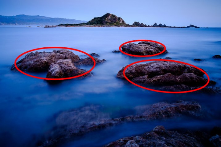
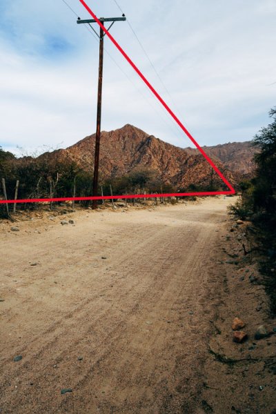
1) How do I choose my point of interest?

Most photography guides say that a great image must have a strong point of interest. In an expansive vista it’s often difficult to decide on just one central point. In fact, you may often feel like the entire scene is THE point of interest. But try thinking about the scene this way – why are you attracted to this scene? What is it that make it so stunning?

It might be the light at sunrise or sunset, or a confluence of streams, or maybe the patterns of wildflowers.  Take a moment to think about why you want to photograph this landscape. In a few moments a story will start to evolve in your mind.

If your story is about the light, where in the scene is the light most spectacular? In the clouds? Reflecting off water? Lighting up a mountain peak? You’ll soon find your answer, and will have solved conundrum #1. You now have a solid point of interest.

DSC01032editsymmetry

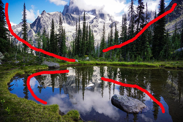
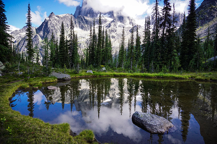
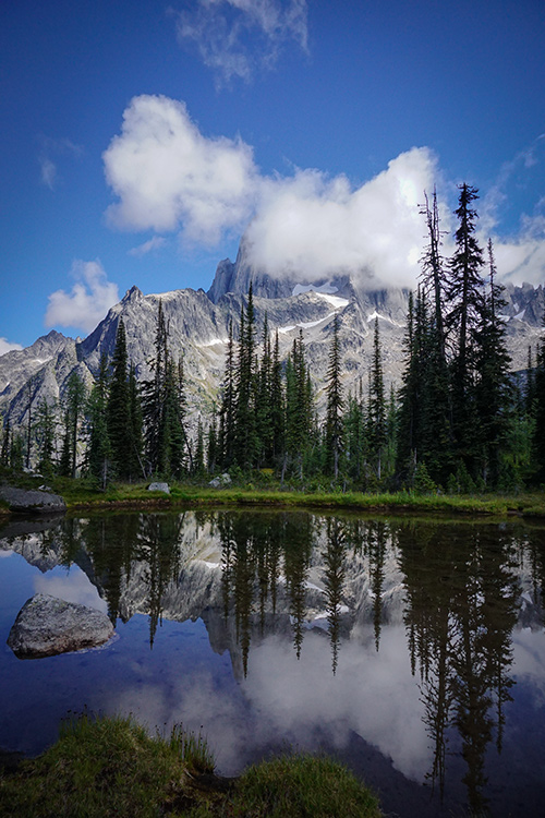
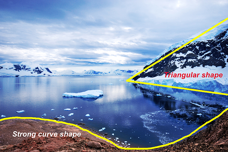
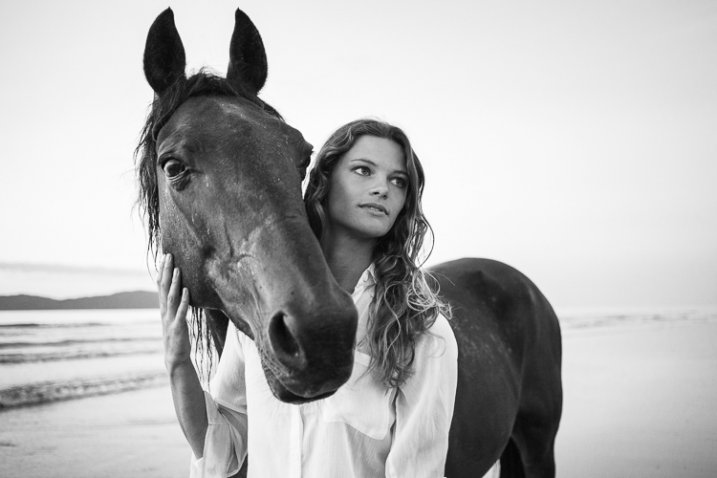
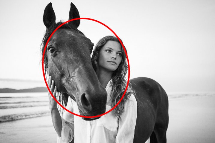
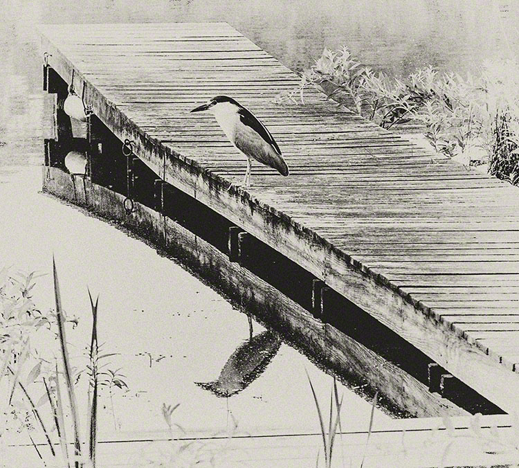
All roads lead to Rome – or in photography, to your center of interest. The symmetry of the scene is mirrored in both the reflection and the composition.

2) What should I include and exclude in the frame?

This is a big compositional conundrum for most photographers. Sometimes you may want to create a frame for your scene with something from the surrounding environment – tree branches are a common framing device. But will they be distracting? Will they prevent your viewer’s eye from traveling INTO your image, to land softly on the great point of interest you carefully identified above? Sometimes the scene itself will have framing elements in it. Should you use these?

If you decide to use this type of compositional device to frame your subject, should it be on the right? On the left? On the top, or all three sides?

_2DS2439before

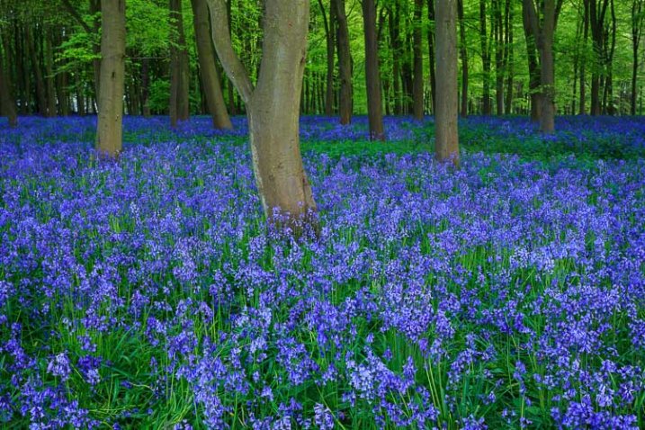
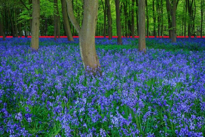
BEFORE: The half tree on the left does nothing to move the viewer to the center of interest. Let’s remove it.

_-2DS2439after

AFTER: Using the framing technique AFTER removing distracting elements.

There are really only two considerations with objects at the edges of your viewfinder frame.

The first is to make sure that your leading lines are not broken by the object. So, if there is a nice big tree on the left of your composition, make sure to position yourself in such a way that the tree helps guide the viewer towards your centre of interest. If it is just a big dark shape on the left of your scene it may not add to the composition, and in fact may be detrimental. Large vertical objects on the left, or in the centre of the frame, tend to arrest the viewer’s gaze, and make for a weak composition.

Second, if you are going to use objects around the edges as a framing technique, be bold, and do it with purpose. Make sure your viewer doesn’t think it was a mistake, or something you didn’t notice. Bits of branches or clouds that seem to poke into the frame are more like intruders than active participants in your image. Move around a bit more to make sure there are no interlopers jutting in, or remove them in post-production.

2015-03-25-23.35

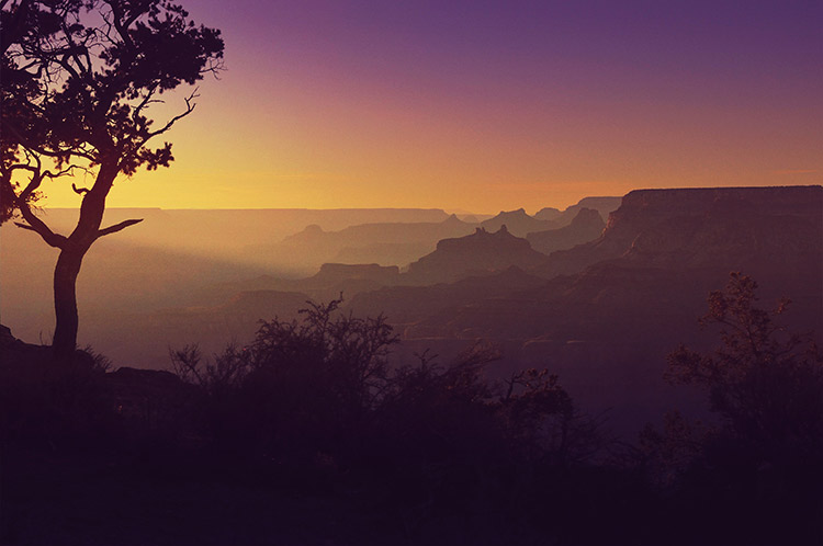
Be bold – add it like you mean it – include elements with purpose. This tree is here on purpose and its branch leads to the sun ray that takes you right into the center of interest, the glowing layers of the landscape, framed by the dark shrubs in the foreground.

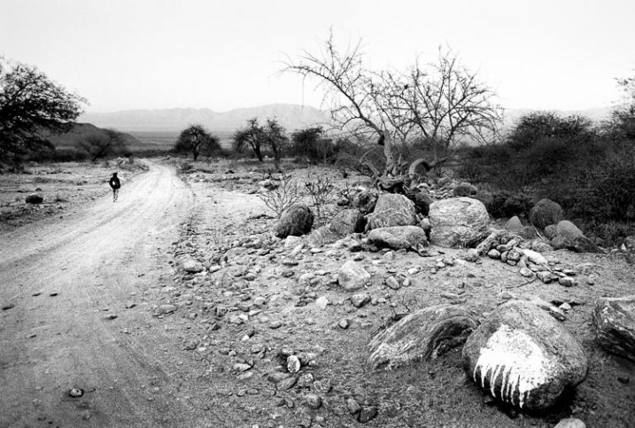
If you’re using a wide angle lens, you know to include lots of the foreground to guide the viewer into the frame. But often students ask me what makes a good foreground? They walk around a bit, point to various items, and ask, “Would this be good? How about this? Or this?”

Because of the way the wide angle lens exaggerates perspective, you should take advantage of that by choosing a foreground subject that can create leading lines into your image. If there’s a big boulder in your scene, how does it look close-up through the wide angle lens? Does it create a pointer, or a set of lines that lead to your main point of interest? That will make a good foreground.

If the objects closest to the camera consist of mainly horizontal lines, running left to right in the frame, they may not be a great foreground to include, unless you can shoot at an angle so they become leading lines into your image. You may need to walk around the scene a bit more to see if this will work with the overall view. If not, choose another foreground, or if there is nothing that works, you can always select another lens – a 50mm is often a great choice for landscape photography.

Which brings us to the next conundrum – focal length, your lens.

3) What focal length is best for landscapes?

I think this is always the first question I get asked when shooting landscapes with a group, “What lens are you using?”

But the real question is what is your artistic intention for your image? If you want to get that awe inspired feeling you have as you view the scene into your image, why not try 50mm. This lens on a full frame sensor approximates what your eye sees in terms of angle of view. So it could be the best choice if what you want to convey is that awesomeness of the view that you are seeing with your eyes. Lately I have been using a 50mm (full frame) lens for landscapes almost exclusively.

4-whither-the-phoenix

The big picture, wide angle lens, and 50mm works well too.

Remember too, that the longer the focal length, the more compressed the image gets, and the closer the background becomes. It’s not just a matter of getting nearer or getting more in the frame, the entire look of your image will be very different depending on the lens. This is a definite conundrum for landscape photographers, because the choice is usually very subjective. If, as I mentioned above, you have nothing suitable for a creative foreground, try your 50 mm to get the big picture but without the perceptive grabbing view of the wide angles. If your intention is to get a more intimate view of the place, then a longer lens would be a better choice.

2_DSC6358W

A more intimate look at patterns, textures, and shapes with a 200 mm lens.

So your choice of lens has a few considerations, but a quick check of your intention, and the surrounding space you are standing on, will help you solve this one.

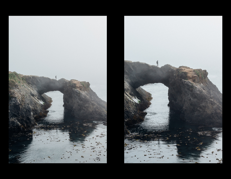
4) Should I Shoot Vertical or Horizontal?

This is another common landscape photographer conundrum, and one that I often have myself. Fortunately this one is very easy to solve. My way of dealing with this is to shoot the scene both ways, then do an honest critique once I am back at a computer to view the full images. But given the traditional style of landscape photography, most often the horizontal or (curiously!) named “landscape” orientation will serve you best.

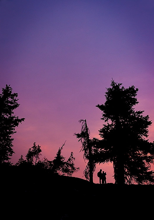
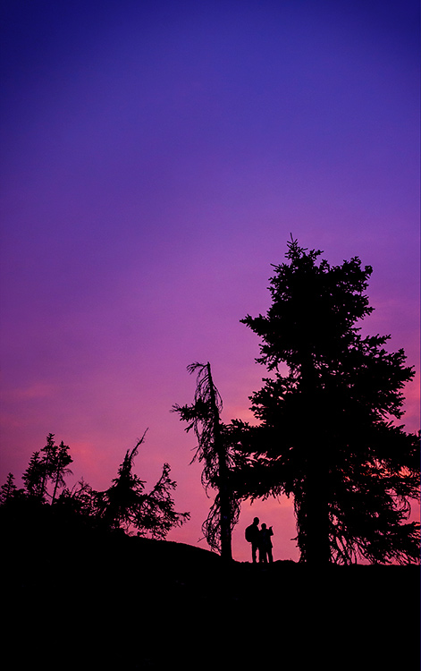
However, some things may be more suitable for the vertical (portrait) camera orientation: scenes with reflections in lakes, scenes with dramatic skies where the sky has a dominant role in your story, scenes that include the moon, or a dramatic afternoon sun with some lens flare shining through trees or objects, and scenes that include people beside tall objects or monuments so you can capture the sense of scale.

When in doubt, shoot both ways. It’s easier than having to go shoot the place again, if that is even possible. So conundrum #4: solved!

DSC01030W

_DSC1467

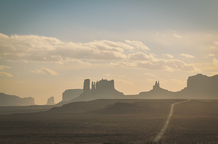
Horizontal or landscape orientation – the scene has a certain mood and story.

This image tells a very different story and has a different mood.

_DSC1451W-

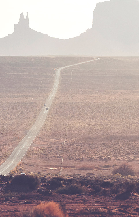
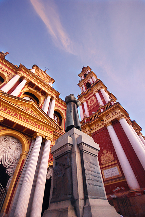
Vertical shot, with a telephoto lens. Depth is compressed and the background is much closer in the frame.

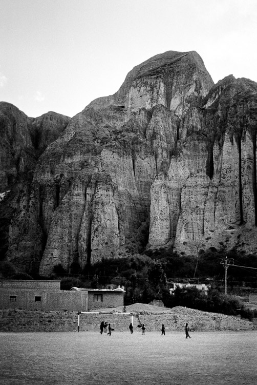
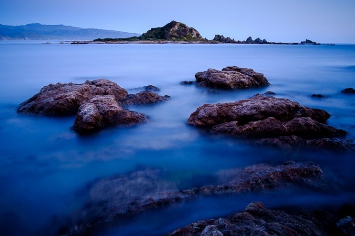
5) Is this scene photo-worthy?

As unfortunate as it is, not every grand landscape is suitable for making a great photo. It may be that the light is not right, that there is just no place for the eye to rest, or that your point of view is not providing  a clear enough vantage point. There may be too many distracting items poking into your frame that would be too hard to remove in post-processing. There are numerous reasons that a landscape might not make a good photo. But consider this a challenge – capture it anyway, see if you can make something of it. Try different lenses, camera orientations, walk around a bit more. Get down like a worm and see if there is any vantage point that will give you a creative point of view.

Practice every chance you get, and know that the conundrums will present themselves in every landscape, but hopefully now you have them solved!

DSC00826W

A pretty scene, but not such a great photo. Not every landscape will make a killer photograph. Do you know how to tell if it will or not?

Have you ever struggled with any of these conundrums? What are some of your landscape photography struggles?

Have you solved them? How did you decide what to do?


Here on dPS this is landscape week – here is list of what we’ve covered so far. Watch for a new article (or two) on landscape photography daily for the next couple days.

  • 6 Tips for Better Low-Light Landscape Photography
  • Landscape Photography and the Human Element
  • 5 Ways a Telephoto Lens Can Improve Your Landscape Photography
  • Landscape Photography from the Side of the Road
  • 32 Majestic Landscape Photos to Inspire Your Wanderlust
  • Weekly Photography Challenge – Landscape
  • Landscape Photography – Shooting the Same Location Through the Seasons

googletag.cmd.push(function() {
tablet_slots.push( googletag.defineSlot( “/1005424/_dPSv4_tab-all-article-bottom_(300×250)”, [300, 250], “pb-ad-78623” ).addService( googletag.pubads() ) ); } );

googletag.cmd.push(function() {
mobile_slots.push( googletag.defineSlot( “/1005424/_dPSv4_mob-all-article-bottom_(300×250)”, [300, 250], “pb-ad-78158” ).addService( googletag.pubads() ) ); } );

The post How to Solve 5 Composition Conundrums Faced by Landscape Photographers by Alex Morrison appeared first on Digital Photography School.


Digital Photography School

 
Comments Off on How to Solve 5 Composition Conundrums Faced by Landscape Photographers

Posted in Photography


5 Ways to Change Your Composition For Better Photos

28 Aug

If there is one thing in photography that every photographer can work on, it’s composition. Like many of the other techniques in photography, your composition will improve the more you practice. Very often, photographers seem to go to their comfort zone of the rule of thirds. I personally like the rule of thirds as a starting point, not every photograph however, needs to be composed on the rule of thirds. In fact, it is a good idea to shoot the same scene in a few different compositions, even depth of field can be used as a compositional tool.

A good way to work on your composition is to start with the rule of thirds, then change it up, try a few different compositions and see how that works. The challenge is this, what other compositions can you use? Let’s take a look at some advanced compositional techniques that you can try out on your next shoot.

1. Left to right

The smooth curving water leads our eye to the rock on the right of the image

The smooth curving water leads your eye to the rock on the right of the image

In the western world, we read the words on a page from left to right. It is logical to think that when someone views your image, they will generally begin on the left side of the image, and move to the right. You can use this technique in a few ways.

Firstly, you could place your subject on the right hand side of the frame with a leading line drawing the eye to your subject. The leading line could be a river, a road, or a railway track – it doesn’t really matter, all that it needs to do is allow the eye of the viewer a natural entry point, then lead them to the subject.

Secondly, if you were shooting street photography, you might have a person in the frame on the left hand side, looking toward your subject on the right. You might even have a vehicle such as a car or a motorcycle, moving from left to right. These techniques will immediately draw the eye to the right side of your image.

2. Use shapes – both seen and unseen

In many images, there are hidden and visible shapes. Window frames are square or rectangular, doors are rectangles, and so on. Look for shapes in your images, look beyond what the actual object is and see its shape. You can also compose the scene to create a shape. Sand dunes can become triangular shapes, open fields can be green rectangles, so look for shapes in your scene and compose your image to include them.

There are many shapes in each scene, use them to enhance your composition

There are many shapes in each scene, use them to enhance your composition

3. Use numbers – not literally!

If you are shooting a scene with trees or leaves, or even a river with some exposed rocks, try and use odd numbers of things. Odd numbers tend to create a dynamic feel in your scene – three trees or rocks will feel more dynamic than two trees or four rocks. This also works well for groups of people. If you have a large group of say 12 people, try not to make three rows of four people, maybe have them pose in two rows, one with seven people and one with five. For people photography, you can also try and create a triangle shape with your subjects. Three people naturally creates a triangle, give it a try!

Odd numbers work well in most images

Odd numbers work well in most images

4. Use negative space

Negative space can really make an image interesting. Negative space is essentially blank space, but really, it helps to anchor your image. It provides really important information about the image. A blue sky can be used to create negative space. The blueness of the sky tells the viewer that it was a sunny day. Your blue sky may have one small cloud in it and that can make the negative space seem interesting.

The blue sky and the hint of a cloud makes this negative space interesting

The blue sky and the hint of a cloud makes this negative space interesting

5. Framing

Framing can be used very effectively to showcase your subject. You can use a window, a door, or even trees to frame a subject. The idea is to create a frame around the subject that does not distract from the subject, but causes the viewer to know immediately where to look.

A tree, framed by an old wooden door.

A tree, framed by an old wooden door.

When you are looking at a scene for the first time, try some of these techniques, or try a combination of them. Shoot from different angles and move around your subject before settling on a composition. You will find that by looking at the scene in many different ways, you will unlock more creativity. Your best shot, may not be your first compositional choice. Composition is one of the more flexible tools in your creative toolbox. You don’t need any particular piece of equipment to change it, you simply need to move your camera around. Give it a try, load your results up in the comments!

googletag.cmd.push(function() {
tablet_slots.push( googletag.defineSlot( “/1005424/_dPSv4_tab-all-article-bottom_(300×250)”, [300, 250], “pb-ad-78623” ).addService( googletag.pubads() ) ); } );

googletag.cmd.push(function() {
mobile_slots.push( googletag.defineSlot( “/1005424/_dPSv4_mob-all-article-bottom_(300×250)”, [300, 250], “pb-ad-78158” ).addService( googletag.pubads() ) ); } );

The post 5 Ways to Change Your Composition For Better Photos by Barry J Brady appeared first on Digital Photography School.


Digital Photography School

 
Comments Off on 5 Ways to Change Your Composition For Better Photos

Posted in Photography


Composition After the Fact: Cropping for Maximum Impact

10 Aug

It may at first seem simple. You took the shot a little wide, or a sneaky branch that you didn’t notice found its way into the edge of your photo. In Lightroom (LR) it’s just a quick press of the R key to activate the crop tool, hold down the shift key to constrain the crop so you don’t get a weird aspect ratio, and your task is complete.

A cropped portrait

The crop tool – simple, yet powerful.

On the contrary, cropping is one of the more powerful tools that you have at your disposal to dial in the composition of your images. Prime lens users will also find that the limited versatility (compared to zoom lenses) can result in the need for cropping more often.

First, let me make the caveat that many aspects of photography are highly subjective. Some of the information and advice offered in this article is my personal opinion, and is the approach I take to create images that fit my style. Personal preference always prevails. Anything called a rule is only so because a common pattern was identified within compositions that are considered especially attractive.

In many respects cropping echoes the fundamental principles of composition. Luckily, if you didn’t get what you wanted the first time around, when you took the photo, you get a second chance, albeit limited, to recompose your images in post-production for maximum impact.

The Basics

The very first thing I look for, and correct, in any photograph that I edit is straight lines. Horizon lines and any vertical lines that are near the edges of the image, should be straight. It absolutely drives me crazy when I see photos with crooked lines.

That being said, lines can be crooked, but it better be obvious that was the intent, otherwise it just looks like careless composition or lazy editing. In the right context a skewed horizon can add drama, and make an image more dynamic.

Photo cropped with crooked horizon.

Crooked horizons can make viewers cringe unless the intent is obvious.

Make this your first step in cropping, because depending on how radically you have to rotate the image you may be forced to crop the edges of the image.

If you have the time when composing the shot, and your camera has a built-in virtual horizon feature for levelling, by all means do so. I have delegated a customizable button on the front of my camera for activating this feature, and I use it all the time.

With the crop tool activated in LR (keyboard shortcut R) there are a few ways to straighten out an image:

  • Drag the Angle slider left or right
  • Click on the value to the right of the slider and drag left or right (scrubby slider)
  • Click on the numerical value and enter whatever you want
  • Hold the CTRL key while dragging along a straight horizontal or vertical line (will correct on either axis) and LR will fix it automatically
  • Also new in LR6 (LR CC) is the “Auto” feature for the crop tool. Just click it and see how it does – then tweak as necessary.

Elimination

A senior photojournalist at a newspaper I once interned for, gave me a memorable piece of advice while critiquing my photos, he said, “crop until it hurts.” It was his way of telling me that I was leaving too much dead or negative space in my compositions.

To this day his advice always resurfaces in my mind when I’m editing images, especially with portraits or other photos with people in them. Fight the urge to become attached to pixels. Crop out half of the photo if need be. Unimportant areas of a photo are not precious real estate.

Cropping to isolate the subject.

You can’t always get as close to the action as you would like (or it is safe to do so) and heavy-handed cropping can make all the difference.

The fact of the matter is that simple is better. We all suffer from attention deficit disorder, and viewers usually don’t want to spend too much precious time analyzing a photo to get the story. Consider the allure of silhouette images. When cropping look for simple compositions and try to distill the scene down to its essence.

Once the image is rotated and you’ve been forced to chop off some of the edges, look for elements that detract, distract or add little to the image. You may not have a choice but to include them, but it’s good practice to be cognizant of them and it may help guide the rest of your editing process or future compositions.

You see many images where the photographer is too conservative when cropping portraits or photos of people. Again, each photo is different, and there is no magic formula, but for example, I find that tight profile shots of people grab my eye more when they are cropped in really close. I am not afraid to cut off the back of the subject’s head, putting their ear in the upper corner of the image, or even cropping the ear out.

Tight cropped portrait

Cropping in very tight can sometimes create a more powerful image.

Negative space can play an important role, especially if shooting for a publication where they need space for text. But, the nice thing about having post-processing options is that you can always revert back to the original. If you compose your images super tight in camera, you can’t get that negative space back.

Leading Lines

Although thoughtfully composing your shots through the viewfinder is one of the more rudimentary skills in photography, there are often distractions. You may find surprises when you pull up the final image on your computer screen.

In photography, as well as painting and other forms of art, you should always be thinking about the arrangement of elements in the image that are going to draw in the viewer’s eye. A compelling subject is just that, but it is your job as photographer to strive to portray that subject in the most powerful, or striking way possible.

Utilizing leading lines to draw in the viewer's eye.

It’s easy to overlook compositional elements while shooting moving subjects. Post -processing cropping reveals additional possibilities for framing your shots like using leading lines to draw in the viewer’s eye.

When we talk about leading lines it’s not always an obvious straight line. Often it is an invisible thread that takes the viewers’ gaze hostage and leads it through the scene. Think of a series of elements that create a pattern.

Diagonal lines which stretch towards the subject are a common, and effective, way to create interest and tension in an image.

Using Crop Overlays as Guidance

In all of its ingenious glory, LR has included several overlays in the Crop tool to help guide your cropping endeavors. There is a basic grid, the Rule of Thirds, the Golden Ratio, the Golden Triangles, diagonals and the Golden Spiral. With the Crop tool active, the keyboard shortcut O cycles through the various overlays and Shift+O rotates the overlay where applicable.

Personally, I find myself using the Rule of Thirds overlay most often. The Rule of Thirds says that when two horizontal and two vertical lines are drawn across the frame to divide it into equal thirds, the subject or elements of interest, should be placed on, or near the intersection of those lines.

Example of the rule of thirds.

The rule of thirds suggests that the subject be placed at the intersection of lines that separate the image into thirds.

An easy mistake to make is placing the horizon line right in the middle of the frame. This is generally considered a no-no, and is a significant compositional faux pas. The Rule of Thirds overlay gives you those handy horizontal lines for recomposing your photo.

The Golden Ratio and Golden Spiral overlays are closely related. There are a bunch of names for this formula including Phi, the Golden Mean and Fibonacci’s ratio. The Golden Ratio grid employs the same basic concept as the Rule of Thirds. I find that the Golden Spiral really isn’t much different, and is more useful to consider in your original composition, instead of trying to apply it after the fact.

The Golden Triangles overlay shows a diagonal line drawn from one corner to another with two branching lines to the other two corners separating the image into four triangles. This gives you a guide for aligning diagonal leading lines, and a suggested location for the subject at the intersection of the lines.

The diagonal overlay calls for placing elements of interest along 45-degree lines drawn across the image. Although the overlay is meant to fine tune this alignment in post-processing, it has been found that artists tend toward this layout intuitively.

The Moral of the Story

Cropping in post-processing is far more than just a simple tool to tighten up composition. Experimenting with various crops of the same image can help you develop an eye for the hidden compositions in a photo.

After you familiarize yourself with the possibilities, you will likely find yourself looking back through your photo library to revisit old images, in order to give them fresh compositions.

Photography is all about seeing, not just looking, and sometimes instead of taking a step back to see the big picture, you need to take a step forward to discover the small one.

What is your thought process when cropping in post-production?

googletag.cmd.push(function() {
tablet_slots.push( googletag.defineSlot( “/1005424/_dPSv4_tab-all-article-bottom_(300×250)”, [300, 250], “pb-ad-78623” ).addService( googletag.pubads() ) ); } );

googletag.cmd.push(function() {
mobile_slots.push( googletag.defineSlot( “/1005424/_dPSv4_mob-all-article-bottom_(300×250)”, [300, 250], “pb-ad-78158” ).addService( googletag.pubads() ) ); } );

The post Composition After the Fact: Cropping for Maximum Impact by Jeremie Schatz appeared first on Digital Photography School.


Digital Photography School

 
Comments Off on Composition After the Fact: Cropping for Maximum Impact

Posted in Photography


Become a Composition Master with This Great Guide: 60% Off Today Only

03 Jul

Deal #2 in our massive Mid Year Sale has just gone live – and it’s a goodie!

Iics hero shot discount

Today only you get 60% off Photography Concentrate’s Incredibly Important Composition Skills.

For the next 24 hours and only $ 19.98 (an exclusive dPS price), you’ll get:

  • A comprehensive 225-page ebook — filled with everything you need to know to come away with a deep understanding of composition and the practical know-how to put it to good use
  • 7 bonus videos — looking at examples of theories and techniques and how they influence the look and feel of each photograph, to bring all the concepts covered together
  • A printable pocket field guide — with the most essential composition information laid out, for you to print out, fold up and slip in your camera bag

Check out the video on the Photography Concentrate site to meet Lauren, the author of this tutorial, and learn more about how Incredibly Important Composition Skills will totally transform your photography!

Composition

This deal is an unbelievable amount of value.

Especially because building your composition skills is one of the fastest and most lasting ways to transform the quality of your images.

You see, people view images in predictable ways. And when you discover these patterns, you can use them to your advantage to create photographs that best communicate your desired message.

So are you ready to become a master in composition and gain real skills that you’ll use in every single shot you take?

Head to Photography Concentrate to snap up this amazing deal!

No Risk: Your Satisfaction is Guaranteed

Your satisfaction with this deal is guaranteed. For a full 60 Days, and if you don’t feel like you have stronger composition skills you’ll get 100% of your money back with no questions asked.

googletag.cmd.push(function() {
tablet_slots.push( googletag.defineSlot( “/1005424/_dPSv4_tab-all-article-bottom_(300×250)”, [300, 250], “pb-ad-78623” ).addService( googletag.pubads() ) ); } );

googletag.cmd.push(function() {
mobile_slots.push( googletag.defineSlot( “/1005424/_dPSv4_mob-all-article-bottom_(300×250)”, [300, 250], “pb-ad-78158” ).addService( googletag.pubads() ) ); } );

The post Become a Composition Master with This Great Guide: 60% Off Today Only by Darren Rowse appeared first on Digital Photography School.


Digital Photography School

 
Comments Off on Become a Composition Master with This Great Guide: 60% Off Today Only

Posted in Photography


6 Tips Using Visual Weight to Improve Your Composition

19 Jun

Andrew’s newest ebook Mastering Composition is now on special for a limited time only at Snapndeals.

Visual weight (also called visual mass) is the principle that some elements of the photo pull the eye more than others.

Take a look at the portrait below. Where does your eye go? It should go straight to the eyes, because they have the most visual weight. They are the element exerting the greatest pull.

Visual weight and composition

Notice that the model’s eyes are not positioned on the traditional intersection points created by the rule of thirds. That doesn’t stop them from pulling the eye, although it could be argued that their visual weight would be strengthened by placing them on a third.

Let’s look at the principles of visual weight (or visual mass) that you can use to improve the composition of your photos.

1. Light tones

Light tones and highlights pull the eye more than dark ones (the basis of tonal contrast). There is a strong contrast in the portrait above between the model’s skin and hair, and the dark background. It is easier to see in a black and white version of the same photo.

Visual weight and composition

2. People

Curiosity about other people is part of the human condition. Our eye goes straight to any human figure that is present in a photo. Recognixable faces exert a stronger pull, while the eyes (the window to the soul) have the strongest visual weight of all.

This explains why you can use people, small in the frame, to give scale and context. It works because our eyes go straight to those figures, as long as they stand out from the background (gestalt theory in action).

The people in the photo below are small, yet the eye goes straight to them. The inclusion of the human figures helps give the scene scale, and emphasizes the size of the mountain behind them.

Visual weight and composition

3. Visual weight and size

The larger the element of a photo, the more it pulls the viewer’s eye. This principle works in harmony with the others discussed in this section. A small human figure, for example, can have much more pull than a large, inanimate object. A small splash of red can also pull the eye very strongly. But for objects of similar texture and colour, the larger one has the stronger pull.

For example, the dials in this photo are virtually identical in terms of shape and design. The one on the right has the most visual weight because it is the largest of the two.

Visual weight and composition

4. Sharp or recognizable elements

Objects that are sharp or easy to recognize pull the eye more than ones that aren’t. According to gestalt theory, the mind looks for patterns and shapes that helps it make sense of chaotic scenes. Once something is identified, it gains significance in the frame compared to those that aren’t.

The most obvious example of this is a portrait taken against a strongly blurred background. The visual weight of the background is reduced because it is no longer sharp, and no longer recognizable. The use of negative space also comes into play.

Visual weight and composition

5. High contrast

High contrast subjects have more visual weight than low contrast ones. This is a good principle to apply in post-processing as well as the photo taking stage. Instead of increasing contrast universally across the image, try increasing it more in the areas where you want the viewer’s eye to travel. Lightroom’s Clarity slider is an excellent tool for this.

In this example I used the Clarity slider to emphasise the texture of the old car and help draw the eye to it.

Visual weight and composition

6. Visual weight and colour

Bright, saturated colours draw the eye. But not all colours are equal. Warm hues have more visual weight than cool ones. Red is the strongest colour of all.

Simplifying the composition makes the relationship between the colours in the photo easier to see. A technique you can use, if your subject is brightly coloured, is to position it against a background comprised subdued, less powerful hues like grey, green and brown.

Simplifying works for all aspects of visual weight. Eliminate everything that isn’t necessary. Keep the background as simple as you can. Once you’ve done this, look at the remaining elements and think about how the eye will move around between them, according to the principles of visual weight. The relationships between them become clearer as the composition is simplified.

The red figurine in the centre of the photo below has the most visual weight. I emphasised this in post-processing by using the Clarity slider to increase its contrast and adding a vignette to darken the background.

Visual weight and composition


Mastering CompositionMastering Composition

My new ebook Mastering Composition will help you learn to see and compose photos better. It takes you on a journey beyond the rule of thirds, exploring the principles of composition you need to understand in order to make beautiful images. It’s on special for a limited time only at Snapndeals.

googletag.cmd.push(function() {
tablet_slots.push( googletag.defineSlot( “/1005424/_dPSv4_tab-all-article-bottom_(300×250)”, [300, 250], “pb-ad-78623” ).addService( googletag.pubads() ) ); } );

googletag.cmd.push(function() {
mobile_slots.push( googletag.defineSlot( “/1005424/_dPSv4_mob-all-article-bottom_(300×250)”, [300, 250], “pb-ad-78158” ).addService( googletag.pubads() ) ); } );

The post 6 Tips Using Visual Weight to Improve Your Composition by Andrew S. Gibson appeared first on Digital Photography School.


Digital Photography School

 
Comments Off on 6 Tips Using Visual Weight to Improve Your Composition

Posted in Photography


7 Tips for Using the Gestalt Theory for Better Composition

08 Jun

Andrew’s newest ebook Mastering Composition is now on special for a limited time only at Snapndeals.

Gestalt theory and composition

Gestalt theory evolved in the 1920’s to explain some of the ways in which people perceive the world around them. The basic idea is that, when faced with a visually chaotic scene, the human mind simplifies it into more recognizable patterns and shapes.

Gestalt theory provides an insight into the pattern recognition process that occurs when people look at photographs. Once you understand the principles of gestalt theory, you can use them to improve the composition of your photos.

These are some of the useful aspects of the gestalt theory.

1. Proximity

A pair or group of objects that are close to each other are more likely to be perceived as belonging together than if they are far apart.

In this portrait, the proximity of the girl and horse suggest a close relationship between them. If closeness is what you want to show, it would be far less effective to position them with their heads further apart.

Gestalt theory and composition

Gestalt theory and composition

2. Similarity

Objects that are similar in shape, size or colour are seen as belonging together.

In this landscape photo, the three rocks in the middle distance are linked by proximity (the previous point) and by their similarity in texture, colour and shape.

Gestalt theory and composition

Gestalt theory and composition

3. Closure

The mind completes shapes that don’t exist. This is a principle used in some optical illusions but it also applies to photography. Part of the skill of composition is learning to recognize shapes, and building the design of the image around them. The principle of closure helps you see shapes in the subject.

For example, take a look at the landscape below. The bluebells form a solid block of colour in the lower two-thirds of the photo, with a strong horizontal line along the top. The line is interrupted by the trees passing through it, yet we still perceive it is a continuous straight line. The mind automatically fills in the gaps.

Gestalt theory and composition

Gestalt theory and composition

4. Simplicity

The mind perceives parallel lines that are close together as a single line.

The landscape photo below contains several lines, all leading towards a vanishing point on the horizon. The lines that are close together, like the cables dangling from the telegraph pole, are simplified by the mind which sees them as a single line.

It’s the same with the fence. This set of short, vertical lines is simplified into a long, diagonal line that follows the side of the road.

Gestalt theory and composition

gestalt-theory-composition-5a

5. Continuation

The mind assumes that lines extend beyond the edges of the frame. In the landscape photo above this principle helps create a sense of depth (along with the use of a wide-angle lens) as the mind believes that the road continues beyond its vanishing point.

6. Segregation

For human figures to be recognizable they must stand out from the background. That way we can identify them easily even if they’re small in the frame. This is a useful principle because you can include small human figures in the landscape to indicate scale. But it is important that they don’t merge into the background, otherwise they are difficult to see.

In this landscape, the man walking away from the camera is a dark figure against a light background (tonal contrast in action), and is easy to see and recognize.

Gestalt theory and composition

Gestalt theory and composition

7. Emergence

The viewer may not notice something in the photo when he first looks at it, but it becomes apparent after a period of study. This is an important concept because it is a way of making photos more interesting by presenting the viewer with something that is not evident at first, but reveals itself after reviewing the image. It’s a way of rewarding the viewer, and gives photos staying power.

For example, how long did it take you to see the cat in the photo on this page? Or the cow’s head in the opening photo (top of the article) of the singer?

Gestalt theory and composition


Mastering Composition ebookMastering Composition

My new ebook Mastering Composition will help you learn to see and compose photos better. It takes you on a journey beyond the rule of thirds, exploring the principles of composition you need to understand in order to make beautiful images. It’s on special for a limited time only at Snapndeals.

googletag.cmd.push(function() {
tablet_slots.push( googletag.defineSlot( “/1005424/_dPSv4_tab-all-article-bottom_(300×250)”, [300, 250], “pb-ad-78623” ).addService( googletag.pubads() ) ); } );

googletag.cmd.push(function() {
mobile_slots.push( googletag.defineSlot( “/1005424/_dPSv4_mob-all-article-bottom_(300×250)”, [300, 250], “pb-ad-78158” ).addService( googletag.pubads() ) ); } );

The post 7 Tips for Using the Gestalt Theory for Better Composition by Andrew S. Gibson appeared first on Digital Photography School.


Digital Photography School

 
Comments Off on 7 Tips for Using the Gestalt Theory for Better Composition

Posted in Photography


Composition and Learning to See

05 May

How many times have you captured the perfect picture, only to download it and discover a rogue tree branch jutting into your frame from the side, or a random person’s head sneaking into your foreground? At one time or another, maybe even often, it’s happened to all of us – and it’s a bad habit that’s easy to repeat if we allow it. Let’s call this photo ailment of ours blind excitement; letting the excitement of our subject blind us to all other elements that are in our frame. Is there a cure? Absolutely.

“On The Dock” – There was a lot going on here, much to see and evaluate before pressing the shutter. Other birds, kayakers on the lake, and windblown reeds all played a role in my “seeing” this image the way I wanted to capture it.

“On The Dock” – There was a lot going on here, much to see and evaluate before pressing the shutter. Other birds, kayakers on the lake, and windblown reeds all played a role in my “seeing” this image the way I wanted to capture it.

Blind Excitement

You know the feeling of looking through your viewfinder at that beautiful, rare subject that you have been waiting to capture, that’s all you see. Blind excitement, or being overcome by your subject, has kept you from seeing the other elements in your viewfinder; elements that very well may ruin your treasured image to be. You know that feeling, don’t you?

One of the best tips that I ever received on creating artistic photography came years ago from a mentor helping me to hone my photographic skills. Keep it simple; eliminate all unnecessary elements in the image, take your time, and be sure to really see what you are shooting before pressing the shutter. That’s the tip. Simple, right? Sounds like a no brainer doesn’t it? Keep reading!

 “Beware The Serpent” – an example of being able to quickly and accurately see the whole frame and capture. The illusion of a “sea serpent “reaching for a female in background lasted but a moment.

“Beware The Serpent” – an example of being able to quickly and accurately see the whole frame and capture. The illusion of a sea serpent reaching for a female in background lasted but a moment.

Seeing…and Believing!

It does takes some work learning to slow down, breaking the ol’ trigger finger on the shutter habit for you to truly see what’s in the frame – but with that tip my photography really did start to become art. I looked through the viewfinder and began to see things that I never noticed before; things that had added no value to my image, things that only served to detract from the intended message of my work. I slowed down and LOOKED through the viewfinder before pressing the shutter, I mean REALLY looked. I walked around and found better angles, lower and higher to shoot from that eliminated photo clutter. I was no longer blinded by the main subject of my frame, but now saw everything within it.

It’s amazing what appears when you take the time to see! I had made a conscience decision to actually compose my photograph BEFORE pressing the shutter. Yes, I know…I, too, thought I was doing that all along, but surprise, surprise – I learned differently.

A Boat or Two

Baker Ashore Antigua 1

Take a look at these two images taken in Antigua. The day was amazing, the sun, the surf, music, and colors of the Caribbean all filling my head and eyes – with blind excitement. The whole idea was to capture some island flavor for a client with the colorful boat sail, the sand, and the beautiful blue water of the Caribbean. I looked and pressed the shutter, but I didn’t see! I didn’t see the second boat sneaking in behind my subject – you see it now, don’t you? Image #2 is free of this distraction and makes a much better photograph; keep it simple and clean. When the full sail came around with all that color, my blind excitement pressed the shutter and that’s all I saw. Fortunately I had other opportunities this time, and got the shot – but that won’t always be the case!

Baker Ashore Antigua 2

On Second Thought

I then began to review some of my older work scrutinizing each for the importance of the things in my images. “Wow, how could I have missed that?” was the phrase I found myself uttering more often than I care to admit. I couldn’t believe how many things I discovered stuck into my image from the edge, or lurking without value in the background. I was truly amazed at what I was now seeing. Why didn’t I see that in my frame before I took the shot? Answer: Because I didn’t know how to see.

It’s always a great exercise to take some time and look at your work from a year ago, from three years ago, etc., and compare to your latest. I am always working at my photography. To see the difference in my work from several years ago is rewarding and it also acts to confirm that compared with today, I was flying half blind back then.

See below, one of my photographs that garnered considerable attention and won multiple awards, including Best Seascape in a national exhibit. I think this is a good example of eliminating all unneeded elements in capturing the desired mood – calmness. Read what the gallery director wrote of my work Morning Calm:

BobbyBaker Morning Calm

The exhibition is showing four of Baker’s pieces, but my favorite is Morning Calm. This photograph shows how little is needed to create a beautiful and amazing image; and, while there is very little in this photograph, one can also say that there is so much in this photograph. There are so few physical elements…the horizon, a hill, a boat and its shadow. There is, of course, a lack of color. There is even a lack of shades of gray, being basically a black boat, a light gray backdrop, and a medium gray horizon and hill. But the photograph says so much with so little. The photograph has tremendous spirit and depth. It speaks…with silence. It surely says different things to different people, but, without question, this photograph speaks. A beautiful and amazing image.

While there is so little in this photograph, one can say that there is so much in this photography. Exactly! What do you want your image to say? What are the elements in your frame acting to say in your desired overall message? If you don’t know, or they are sending the wrong message, something is amiss. It’s time to recompose, time to slow down and actually SEE what you are shooting.

While Morning Calm leans towards the extreme of minimalism, you could say that I succeeded in capturing a message of calmness. That early, quiet, spectacular morning on Cape Cod when I captured this shot, I knew it would be special. I was excited looking at the subject, but I took my time, I looked at everything in my viewfinder, and positioned myself to be sure that none of the other boats would be in my frame. I waited to be sure no birds were flying in the space, absolutely still water, nothing but what I wanted my audience to see – and feel – when viewing Morning Calm. Click. I breathed and smiled, as I knew that I had learned to see and got the shot that I wanted. Knowing that you got the shot is such a great feeling, isn’t it?

BobbyBaker AloneTogether

In my image, Alone Together there are more elements in the frame than in Morning Calm; you have an angry sky, rocks and water sculpted sand. Here all the elements work together in supporting the subject (a person in thought contemplating a lone tree); they do not detract from the main subject, but add to the mood that will evoke thought and emotion from the viewer. One of the keys to creating this shot was to see, before pressing the shutter, that I needed a space between the subject’s head and the land; without this space the shot would have been ruined.

To this day, I can still recall that cold February day on Cape Cod knowing that I needed to be sure the person’s head was clear of the land and adjusting my shooting angle to be certain I had that needed space. A couple of years earlier, I know that in my blind excitement to capture the shot (believe it or not, this was not posed) I would have just gone ahead and pressed the shutter only to be disappointed later when viewing in my studio and realizing the person was attached to the land at her head. Years of practicing how to see before pressing the shutter allowed me to act quickly in surveying what was in my frame, and keying on a most important must have compositional item, the space above the subject’s head – before the subject moved and/or learned I had arrived behind them.

BobbyBaker_Shooting Star

“Shooting Star” – most of my work is coastal. Not only do you need to be aware of intrusions into the frame (people, birds, etc.) you must also consider the potential of intruding on beach goers privacy by placing them in your frame unwanted! Also, parents are understandably super sensitive to anyone near their child with a camera. Don’t put yourself in that position by not seeing everything!

Are you excited? Now look, and SEE!

Take a good look at your work. Look at all the elements in your image. The next time you are out shooting, pause and REALLY look before pressing the shutter. Set yourself apart from the glut of shutter-happy shooters with well thought out, well seen, well composed photography. Trust me, this exercise of making yourself pause, look, and see, will make a BIG difference in your photography and with practice will become your way of composing before shooting.

Now go make some art!

All images in this article are © Bobby Baker Photography

BobbyBaker_Rock Harbor Romp

“Rock Harbor Romp” – The isolated, silhouetted person was not created by cropping, rather by moving my camera to the left while framing the image. The girl’s friends are to the right side of the frame, and I was able to see that they would create clutter in the image if captured. The lone tree and lone girl act to balance each other in this image.

googletag.cmd.push(function() {
tablet_slots.push( googletag.defineSlot( “/1005424/_dPSv4_tab-all-article-bottom_(300×250)”, [300, 250], “pb-ad-78623” ).addService( googletag.pubads() ) ); } );

googletag.cmd.push(function() {
mobile_slots.push( googletag.defineSlot( “/1005424/_dPSv4_mob-all-article-bottom_(300×250)”, [300, 250], “pb-ad-78158” ).addService( googletag.pubads() ) ); } );

The post Composition and Learning to See by Bobby Baker appeared first on Digital Photography School.


Digital Photography School

 
Comments Off on Composition and Learning to See

Posted in Photography


10 Portrait Composition Tips to Frame Your Subject Perfectly

16 Feb

How you compose and frame your portrait is important for creating visual impact and connection with the viewer. It can dictate the mood and feel of the portrait, making it feel inviting or uncomfortable. Knowing a few rules, and how to break them effectively is a good place to start. In this article I’m going to give you some general Continue Reading

The post 10 Portrait Composition Tips to Frame Your Subject Perfectly appeared first on Photodoto.


Photodoto

 
Comments Off on 10 Portrait Composition Tips to Frame Your Subject Perfectly

Posted in Photography


Shoot for the Light – Improve Your Composition

05 Feb

JB 1134 Edit

JB 2111

Here is one of my most valuable tips. The one I will offer to someone who comes to me, complaining that after 20 years of taking photos they can’t get out of their usual compositions, and want to get into a new level of creativity.

It may sound like something you have heard before. Yes, photography is all about light, and if there is a good light then there is a good photo.

But no, I am talking about something more specific.

JB 2548

Please note that I have always focused my photography, and my articles on travel photography, on people. So when reading this article, please think people photography (which also includes street photography).

In travel photography, most people tend to look for a good subject to photograph. Of course that means that this subject should be “sitting” in an appropriate light, with a good catchy background, something not too distracting. The problem with this approach, is that you might end up taking the same kind of compositions again and again. Framing your subject on the side, rule of thirds, looking into the photo, etc. As much as these are nice photos, you may feel the need to develop your creativity and come up with something different.

JB 1174

JB 2352

What I am telling you, is to completely not focus your attention on your subject. After all, your subject does not matter (unless you happen to meet the new “Afghan girl” of Steve McCurry, or the girl with green eyes of David Lazaar). No, believe me, as someone living in Vietnam: one old lady with a pointy hat looks the same as another old lady with a pointy hat.

Instead of that, try and focus your entire attention on the light around you. Not the beautiful sunset light in the whole sky, but the little spots of golden light right there, on the floor next to you. Yes, can you see them? Well, there is your next photo my friend.

Yes, I hear you already, “What do you mean shooting light?! And what is my subject, what am I telling a story about?”. Well – now your job is to patiently wait for the right subject to walk into that light. But remember? Shoot the light.

JB 6808

IMG 6354

In the same way as we say “fill your frame” in photography. Keep things simple, only include elements which are relevant to the story you are telling. You can fill your frame with that sumptuous golden light you found on the floor. And that is what is going to lead you to a completely new level in composition and creativity. Because you are only shooting that piece of light, you are going to crop your subjects in way you would never have dared before. You are going to break all the rules you have carefully been following until now, and create something new.

IMG 3204

It will surely be beautiful, as your light will be stunning. You may miss a lot of photos, as you have to get used to getting that close to things and people in a light that can be quite full of contrasts and colors. But with time and a bit of practice, things will start to take shape. You will get used to such new ways of composing your image, and your results will become sharper over time. Until you are getting comfortable with this new idea, and start re-creating your templates that will allow you to be fast and efficient and not miss your images.

EJB 1426 IMG 1761

“Heresy!!!” I can already hear. Sorry? Which book are you talking about? Look at the results you are going to achieve with this technique, and tell me if does not make you think in a complete new way, bringing completely new styles of images. If you don’t like it, well go and try something different. But surely you would have learned something out of it.

Last year, while running a photo workshop in Myanmar, I managed to capture this image using this exact technique. I could see the light on the floor, and the beautiful blue color next to it. I also knew that this monastery was quite busy, and if I waited long enough someone would walk into my frame.

EJB 1515

One of my students and I laid down on the floor. I switched from Aperture mode to Manual (making sure I would have the right exposure, as the situation had very strong contrasts). I did compose the photo, exactly the way I wanted to have it, and I waited. Surely, after half a minute, some novices went down the stairs. They did spot us, and feeling a little shy to be photographed, they ran through the corridor, laughing out loud.

Click – Click – Click

I did not expect them to run in the first place so my shutter speed was right enough to freeze my hand shakes, or someone walking. But it gave some blur to the novice’s robe, and I liked the shot even more like that. After all, most new things that were created on our planet are the result of accidents!

Go ahead, give it a try!

EJB 1830 IMG 8352

JB 6091

IMG 6605

IMG 4331

IMG 9911

googletag.cmd.push(function() {
tablet_slots.push( googletag.defineSlot( “/1005424/_dPSv4_tab-all-article-bottom_(300×250)”, [300, 250], “pb-ad-78623” ).addService( googletag.pubads() ) ); } );

googletag.cmd.push(function() {
mobile_slots.push( googletag.defineSlot( “/1005424/_dPSv4_mob-all-article-bottom_(300×250)”, [300, 250], “pb-ad-78158” ).addService( googletag.pubads() ) ); } );

The post Shoot for the Light – Improve Your Composition by Etienne Bossot appeared first on Digital Photography School.


Digital Photography School

 
Comments Off on Shoot for the Light – Improve Your Composition

Posted in Photography


How to Use Triangles to Improve Your Portraits Composition

23 Jan

Do you ever look at a picture and absolutely love it, but you don’t know why? There are a lot of elements that can go into a great shot, but the hardest thing to see/ easiest thing to pick up on are triangles, which are leading lines that frame your subject, drawing your eye deeper into their inner lives. The Continue Reading

The post How to Use Triangles to Improve Your Portraits Composition appeared first on Photodoto.


Photodoto

 
Comments Off on How to Use Triangles to Improve Your Portraits Composition

Posted in Photography