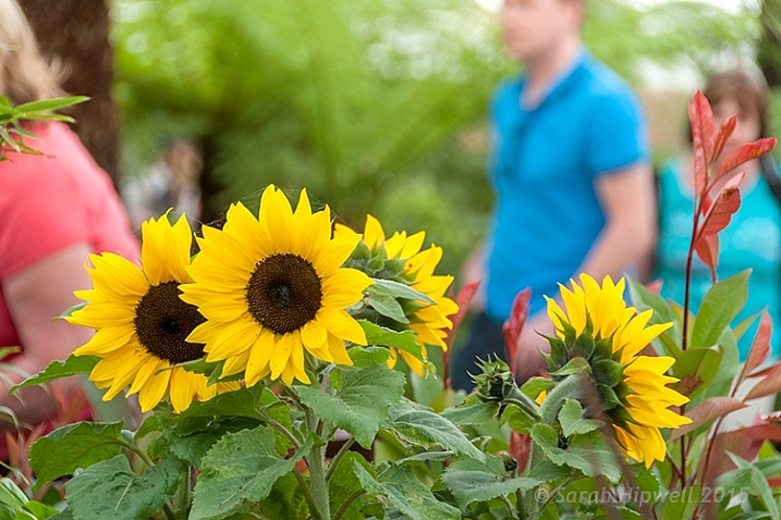
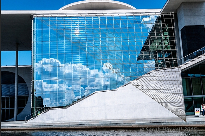
If you wonder what composition really means, it is basically what elements you choose to put in a photograph, and where you decide to place them in the frame.

When composing a photograph you need to consider several things:
- What is the story you are trying to tell? In other words, what do you want the viewer to see or feel when they look at your photograph?
- What’s your center of interest or focal point?
- What elements will most support that story?
- How can you maximize those elements?
Let’s consider each of those points individually.
1- What is the story you are trying to tell?
In other words, what do you want your viewer to know or experience when they see the photograph?
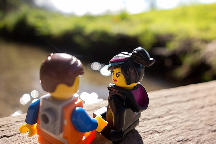
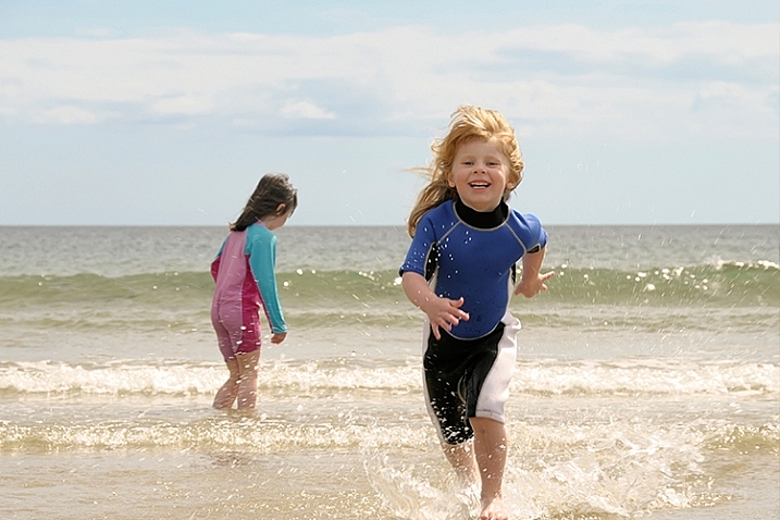
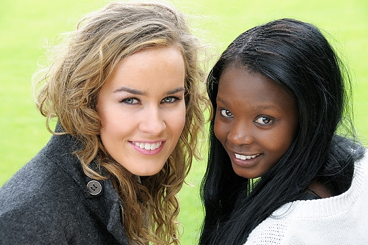
Some ideas if you are photographing your children:
- You might want the viewers to see how cute they are.
- You might want the viewers to see how smart they are.
- You might want the viewers to see how much they love their sibling or new puppy.
Each of those ideas will impact how you choose to compose the picture. In the first example, you might choose to dress your daughter with a pink bow and sit her on her princess bed. If you want to show how smart your child is, you may decide to photograph them winning a spelling bee, or playing with test tubes. Of course, if the story is the new relationship with their puppy, you want to capture that moment of them hugging the puppy, or the puppy licking their face.
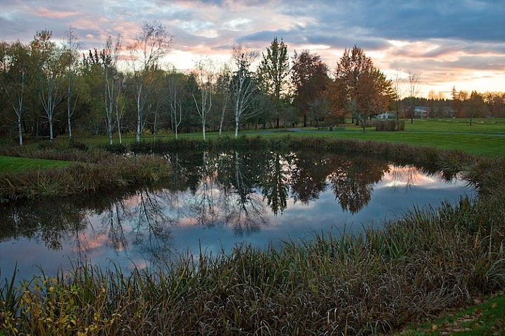
Here’s another example shooting landscapes. Let’s say you want to take a photograph of a beautiful lake in a park, in the middle of a city. What’s the story you want to tell? What’s the experience you want your reader to have when they see your photo?
Here are some ideas:
- You can isolate the lake and shoot it in such a way that it looks as though it is in the middle of nowhere.
- You could shoot the lake with the cityscape in the background to show it as a haven in the middle of a grimy city.
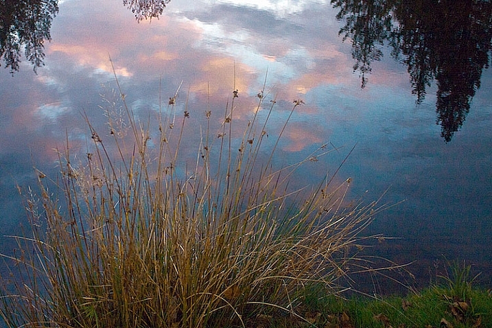
- You could show the restful, or quiet feeling, of the lake by just focusing on an empty park bench, or the reflection of a tree in the water.
In every situation, there are many different stories and compositions. Knowing what the story is, and what you want to say, is the first step in composing a photograph. You can start to see how your intention with the photograph becomes important in composing a photograph.
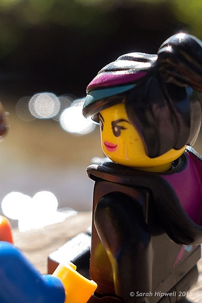
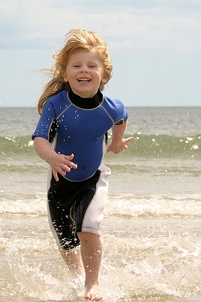
2 – Choosing a focal point
With that in mind, the next step you want to think about is what is your center of interest or focal point? In other words, what is the one element you want your viewer to see first? What ONE element do you want to stand out?
If you are photographing your children, that’s pretty simple, you want your child to stand out. We’ll talk about some strategies to do that in a minute, but first let’s look at our other examples.
If you see a lake that you are drawn to, first ask yourself the story, then ask yourself what one element can be the subject? Is it a tree or rock in the lake? Is it a house on the lake? Is it the moon rising above the lake? Is it the grass growing on the edge of the lake?
3 – What elements support the story?
As you view the scene, ask yourself, “What elements support the story I’m telling?” As you look through the viewfinder, move your eye around the outside frame of the photo, then look inside that frame and ask yourself if there is anything in the photo that doesn’t belong there.
For example when you are taking a photograph of your child, you ask yourself if you need the dining room table in the background? Do you need your car in the background? What’s important? What elements add to the subject and which distract?
4 – How can you maximize those elements?
In the next section, we’ll look at examples and talk about ways you can clean up your photographs in two simple ways.

Above is a photo of a lighthouse. It’s a very pretty scene, but it’s filled with elements that don’t really help the composition. There are elements, including a wire overhead and an information stand in the front, that don’t add anything to the feel of the place.

This is better. The first shot was taken with a wider angle lens. In this shot, I took a few steps to the right, and zoomed in a little bit. Zooming in not only eliminates some of the foreground, it changes the perspective. Can you see how the image feels more compressed? Also, the wires were not magically Photoshopped out of the picture, I chose to eliminate the top of the tree from the frame.

Here’s yet another different perspective. For the shot above, I used an even longer lens, and moved more to the right. The most important element to me, the story, is the lighthouse. The dark tree nicely frames it, and adds perspective. This photo, compared to the first, is much cleaner.
Now, I could have chosen to get closer with the wide angle lens, but the light house would start to lean, and it would have emphasized the power lines.
Different angles can also help clean up backgrounds, so you ask yourself:
- Would taking a step or two in a different direction get rid of some distractions?
- Would getting a little bit higher or lower help the composition?
- Would changing the focal length help with the composition?


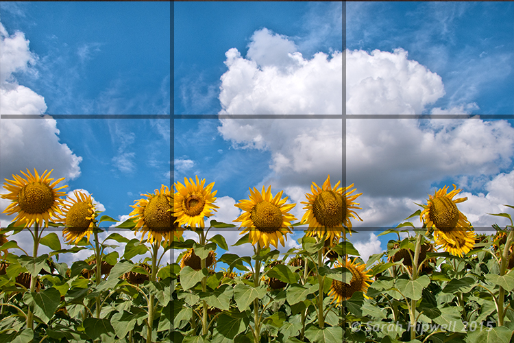
Here’s a great scene of a foggy shack on a lake. It’s next to a very busy highway, so I chose an angle from which you can’t see any cars. In the first example, the emphasis is on the grass. I used a wider lens and looked for a patch of grass for the foreground that made a nice pattern. The grass leads the viewer into the photograph. The shack seems further away.
In the second image, I chose to focus just on the reflection and the quietness of the scene. I found an angle from which I could shoot with no grass. My focus changed, the feeling also changed. Which one do you like better?

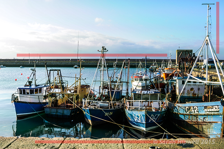
Here’s a beautiful scene with lots of potential. But your eye really has no place to go. There isn’t a strong sense of interest. The story is one of serenity and a great place to go fishing.

To improve the composition, I waited until some fishermen popped into the right place. In the second photo, can you see how your eye has a place to go? It’s immediately drawn to the fishermen in the red boat.
You can greatly dramatically improve the composition in your photographs by framing a photo and waiting for the right elements to come together.
So now, moving forward with your photography, you have some great ideas to work with:
- Consider what story you are telling with your photographs.
- Make sure you have a center of interest.
- Decide what elements support the story.
- Maximize the elements by changing position and focal length.
googletag.cmd.push(function() {
tablet_slots.push( googletag.defineSlot( “/1005424/_dPSv4_tab-all-article-bottom_(300×250)”, [300, 250], “pb-ad-78623” ).addService( googletag.pubads() ) ); } );
googletag.cmd.push(function() {
mobile_slots.push( googletag.defineSlot( “/1005424/_dPSv4_mob-all-article-bottom_(300×250)”, [300, 250], “pb-ad-78158” ).addService( googletag.pubads() ) ); } );
The post 4 Steps to Creating Images With More Meaningful Composition by Vickie Lewis appeared first on Digital Photography School.


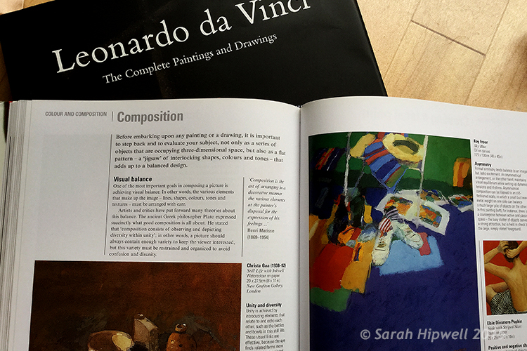
 Mastering Composition


You must be logged in to post a comment.