The quality of light is an important aspect of successful photography – good photographers spend hours chasing the most suitable light for the type of photography they do. That usually means working at the beginning or the end of the day, when the sun is low in the sky and the light has many beautiful qualities.
But what about the middle of the day? Many photographers avoid shooting in direct sunlight in this period, especially in summer, because the light is so hard and strong. You can’t use it for portraits (unless you use flash, which is the subject for another article) or find a place in the shade for your model. It’s nearly impossible to use it for landscapes, because they always look so much better in the softer light, characteristic of the the day’s end.
Perhaps the problem is not so much bad light, but a poor match of light to subject. So the question becomes, is there a subject that you can successfully shoot in strong, midday light? I believe there is. I like to use this part of the day for photographing a subject comprised of strong lines and graphic shapes – architecture.
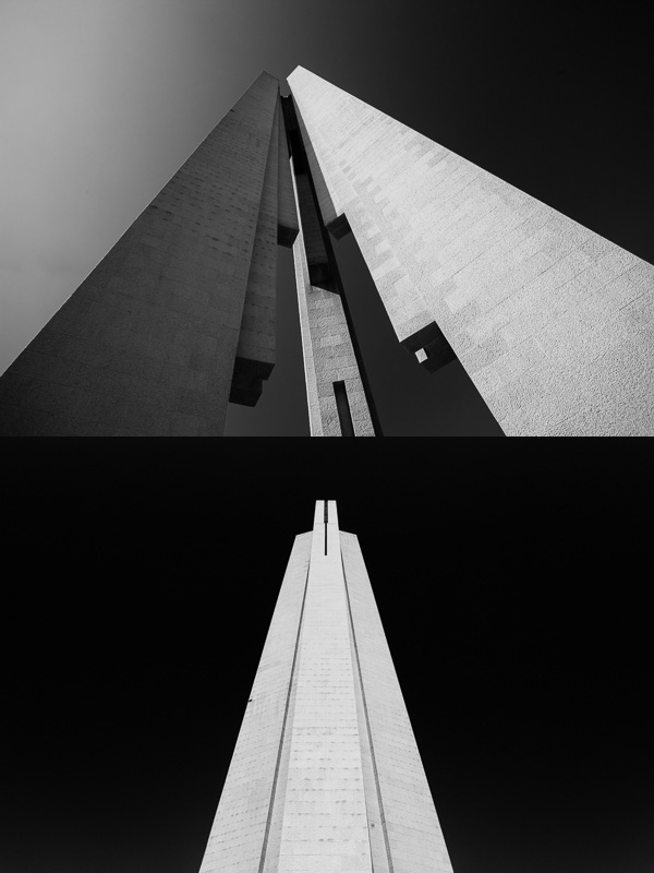
Two photos of the same structure (Monument to the People’s Heroes in Shanghai) taken moments apart. In both cases I was exploring the shape of the structure against the blue sky, shooting with a wide-angle lens from ground level looking up. The first image concentrates on shape and line. The second is more abstract. I used a polarizing filter to darken the sky, and photographed the sunlit monument against it for maximum tonal contrast.
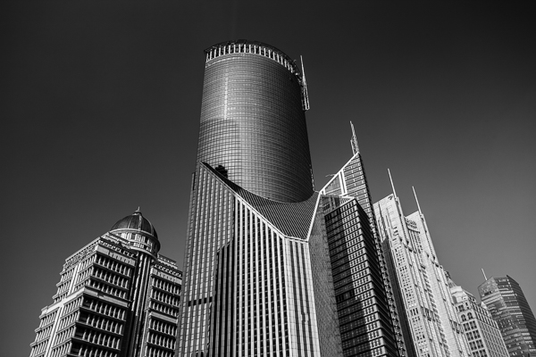
This may seem a little strange because buildings are often best photographed during the golden hour, but there is no reason why you can’t shoot during the middle of the day as well. The only drawback is that colour photos of buildings taken at this time of the day, often with a deep blue sky in the background, are usually not very exciting.
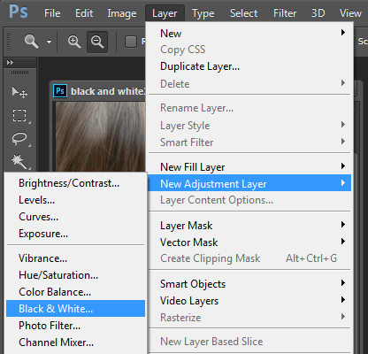
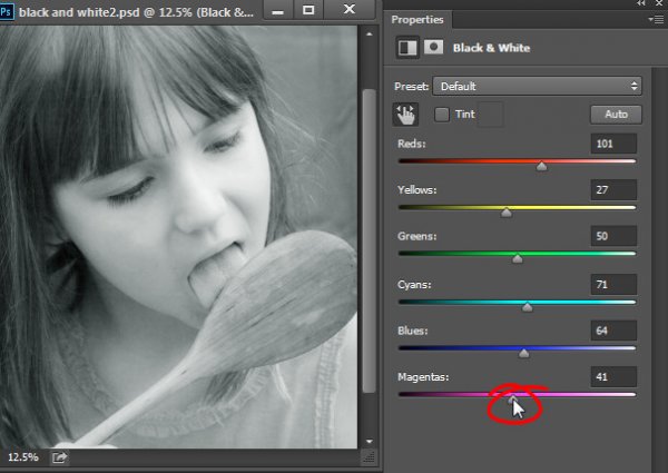
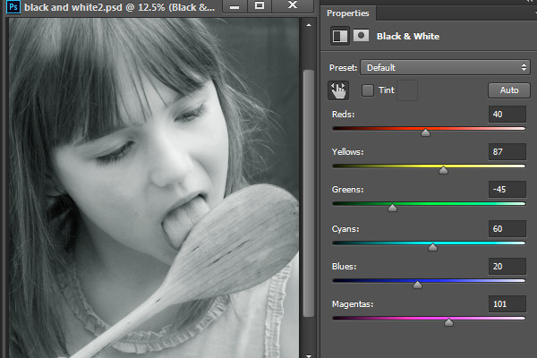
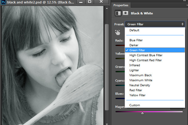
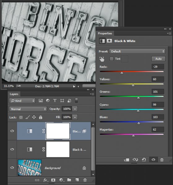
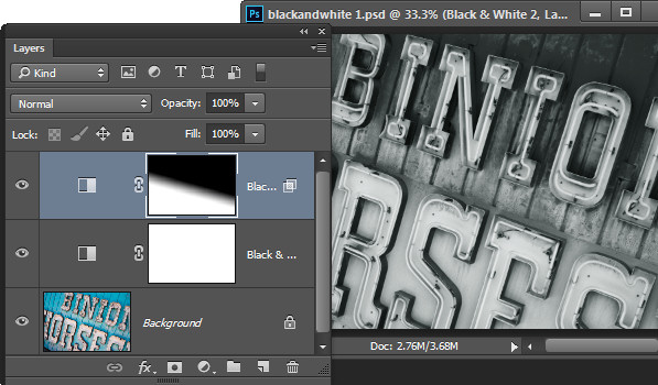
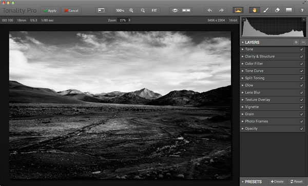
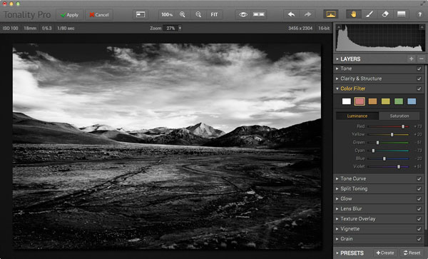
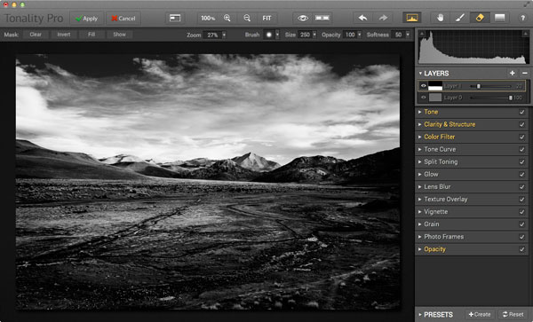
But switch to black and white photography and it’s a different story. Without colour, and the strong distraction of a deep blue sky, the photographic possibilities change entirely. Suddenly you’re not looking at the colour of a scene. Instead you’re exploring line, shape, texture, form and shadow. Then, take those photos into Lightroom and there’s all kinds of wonderful, creative things you can do in post-processing to enhance the image.
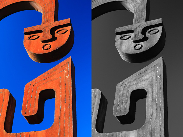
Details like this sculpture can work very well in midday light as the hard shadows suit the material it is constructed from. I enhanced the black and white version of this photo in Lightroom by using an Adjustment Brush to increase Clarity and Contrast on the metal surfaces in the image.
Learning to see in black and white takes time, but there are a couple of things you can do that will help.
The first is to shoot in your camera’s black and white mode, but with image quality set to Raw. When you play back your image on the camera’s LCD screen it is displayed in black and white, yet because you are using Raw you have the full colour file to work with in Lightroom or Photoshop.
You will probably find it useful to spend some time looking at your photos on the camera’s LCD screen during the shoot to see how the colour scene in front of you translates to monochrome. As you gain experience you will need to do this less and less, but it can be incredibly helpful the first few times you try.
If you have a camera with an electronic viewfinder, the camera displays the scene in black and white in the viewfinder. This is even more useful because you don’t have to visualize how the colours in the scene will convert to black and white. The camera does it for you and you can concentrate on creating beautiful compositions.
The second is to use a polarizing filter to turn the already blue sky an even darker shade of blue. This can look fantastic in black and white. If you enable the red filter setting in the camera’s black and white mode options it will make the blue sky darker yet, and it may even turn black. Position a sunlit, light-toned, building in front of that dark sky and you have some amazing tonal contrast and the basis for a dramatic black and white architectural study.
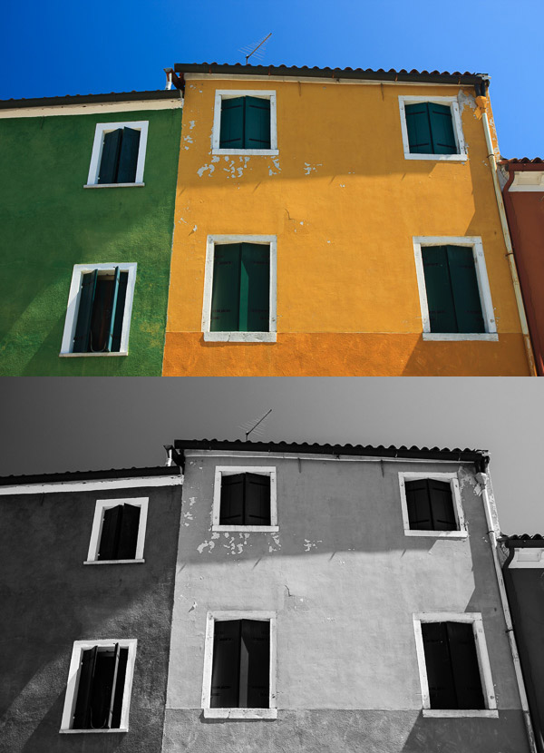
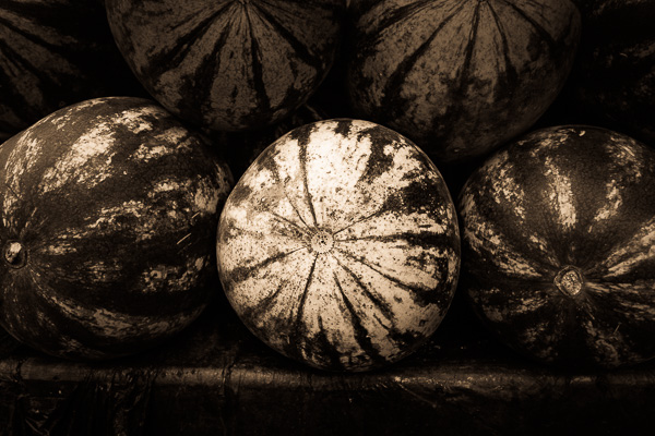
It is easy to be seduced by colour, especially when presented by colour buildings such as these ones in Burano, Italy. This photo was taken around midday, but because the sun was overheard it cast a raking light over the front surface of the buildings, bringing out the textures in the wall. I increased Clarity in Lightroom to emphasize the texture in the black and white conversion.
I’ve concentrated on photographing buildings in this article, but I’d like to hear what other subjects you shoot during the middle of the day. Please let us know in the comments.
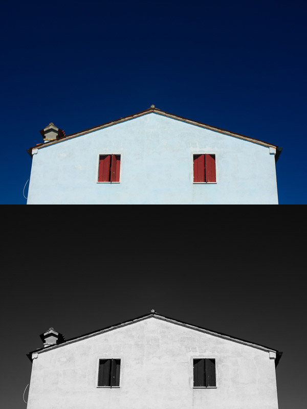
This photo, also taken in Burano, is a study of the shape of the house against the deep blue sky (emphasized by a polarizing filter). The symmetry of the house is broken by the chimney on the left.
The Mastering Lightroom Collection
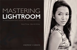
 My Mastering Lightroom ebooks will help you get the most out of Lightroom 4 and Lightroom 5. They cover every aspect of the software from the Library module through to creating beautiful images in the Develop module. Click the link to learn more or buy.
googletag.cmd.push(function() {
tablet_slots.push( googletag.defineSlot( “/1005424/_dPSv4_tab-all-article-bottom_(300×250)”, [300, 250], “pb-ad-78623” ).addService( googletag.pubads() ) ); } );
googletag.cmd.push(function() {
mobile_slots.push( googletag.defineSlot( “/1005424/_dPSv4_mob-all-article-bottom_(300×250)”, [300, 250], “pb-ad-78158” ).addService( googletag.pubads() ) ); } );
The post How to Make the Most of Hard Light with Black and White Photography by Andrew S. Gibson appeared first on Digital Photography School.
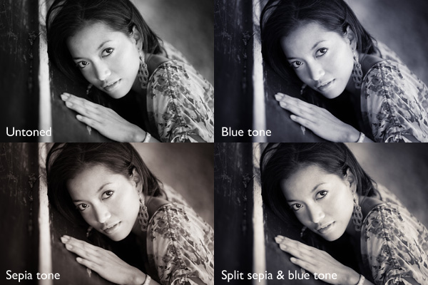
 My ebook Mastering Lightroom: Book Three – Black & White goes into the topic of black and white in depth. It explains everything you need to know to make dramatic and beautiful monochrome conversions in Lightroom, including how to use the most popular black and white plug-ins. Click the link to visit my website and learn more.


 Recently we launched our Essential Guide to Black and White Photography. As part of the launch we put everyone who purchased a copy into the draw to win $ 1000 in camera gear.
You must be logged in to post a comment.