RSS
 

Posts Tagged ‘Balance’

How to be Creative with White Balance

08 Mar

This is the fourth in a series of articles by Andrew S Gibson, the author of Understanding EOS: A Beginner’s Guide to Canon EOS cameras.

01

My approach to photography is to keep things as simple as possible from a technical point of view. That helps me concentrate on emphasising with my subject, finding beautiful light and getting the best possible composition. These concepts are harder to pin down but they are the ones that are really important when it comes to creating beautiful images. Of course, the technical settings are important too, because they help you capture and make the most of the vision that you have in your mind. But keeping the technical side as simple as possible gives you time to concentrate on the other stuff.

02

White balance

Now, you’re probably wondering what this has to do with white balance. Here’s the answer:

The simplest way to deal with white balance is to set your camera’s white balance setting to daylight and then forget about it.

If that statement puzzles you don’t worry, I’ll come back to it in a bit.

First, let’s take a brief look at what the white balance function does.

Colour temperature

If this is the first time you’ve come across an explanation of white balance you may be surprised to learn that the colour of ambient light can vary. Our eyes adjust to it automatically, so we often don’t realise until it is pointed out. This phenomena is called colour temperature.
03

If you take photos by the light of the setting sun, then anything illuminated by the sun’s light turns orange. That’s because the light from the sun, at this time of day, has a strong warm cast (that’s why it’s called the ‘golden hour’).

Similarly, if you take a photo of something lit by the light of a tungsten bulb (ie at night or indoors) then the light has a strong orange colour and your subject will also come out orange.

04

If you take a photo after the sun has set, but while there is still a little light in the sky, then the light has a strong blue colour. I mentioned the golden hour earlier, this period is called the ‘blue hour’ by landscape photographers.

If you take a photo on a cloudy day, the light also has a blue colour, although it is not so noticeable.

If you take a photo of something in the shade on a sunny day, the light also has a surprisingly strong blue colour.

If you take a photo lit by the sun at around midday it will have neutral colour. That’s because the white balance setting on your camera is calibrated to give photos with a neutral colour cast at this time of day. The exact colour of the light at this time of day depends on your geographic location and the season, so it does vary, but generally holds true.

Candescent light

What do all these scenarios have in common? The light in each is created by a candescent light source. That means that the light is generated by a burning object. In the case of daylight, that’s the sun (a burning ball of flammable gases). In the case of tungsten light, it’s the filament inside the bulb that is burning. There are no flames because there is a vacuum inside the bulb.

Light produced by candescent light sources behaves predictably and is easy for your camera to cope with. It is either neutral in colour (ie sunlight at midday) or it has a warm colour cast or it has a cool colour cast.

Daylight white balance setting

So, why do I use the daylight white balance setting on my camera? The reason is that I always use the Raw format. That lets me make the final decision regarding white balance when I process the images in Lightroom 4 (the software I use to process all my Raw files). I can warm up or cool down the white balance as required. I also use a calibrated monitor so I know the colours I see on-screen are accurate.

There are two benefits to setting colour temperature in post. One is that you can see the result of your adjustment right away on the monitor. The other is that you can also set the white balance on an individual basis per photo if you need to.

If you use the JPEG format life gets a little more complicated. While there is a lot you can do to a JPEG file in post, it’s not as flexible as a Raw file. You need to get the white balance setting as accurate as possible when you take the photo. That takes more work. It can distract your attention from making the most of the light and the subject at the time of shooting, so I avoid it.

There’s another reason I use the daylight setting, and it’s a personal one. I started in photography before the digital age, and I used daylight balanced slide film for most of my colour work. It taught me to appreciate the way that the colour of light changes throughout the day. With slide film, there is no post-processing, so you had to think about the colour temperature of the light and use filters to warm it up or cool it down if necessary. Now, I appreciate that my digital cameras make dealing with colour temperature much easier. That’s why I set it and forget it.

Using white balance

There are three ways to use the white balance function:

1. To create a photo with a neutral colour cast. This is important if you’re taking say, a product photo for a catalogue company, or you want a ‘clean’ look to your photos.

2. To emphasise the natural colour of the light. This is a creative way to use white balance. For example, if you are taking a photo of something lit by the setting sun, you may choose a white balance setting that emphasises the warmth of the light instead of trying to neutralise it.

3. To warm up photos that benefit from warm colours. A good example is portraits. Warm light is generally the best for creating a flattering portrait. There are exceptions, but warm is generally best.

There are some examples of photos with creative light balance at the end of the article.

Incandescent light sources

We’ve already looked at candescent light sources (light sources that burn). But light can also come from incandescent sources. These are light sources that produce light by a method other than burning something. The most common types you will see are fluorescent light, neon light and sodium lights (used in street lighting).

The light from these sources is more difficult for your camera to deal with as they don’t fit neatly on the cool to warm scale of candescent light sources. They are often mixed with daylight which makes your job even more difficult. You may be able to adjust the white balance to produce a neutral coloured image in daylight, you might also be able to do it with the artificial light, but (fancy post-processing techniques aside) you can’t get the white balance right for both light sources at the same time.

The lesson? Avoid fluorescent, neon and sodium lights as much as you can when you take photos. For example, if you are taking a photo in a building indoors lit by fluorescent light (and daylight coming through the windows) turn off the fluorescent lights (if you can) and just use daylight. Or turn off the lights and use flash instead (that’s how real estate photographers get such great results). The results will be better.

However, there are times when you can use these light sources creatively. A good example is if you take a photo of street scene at night or at dusk. The light from different light sources may add to the atmosphere.

Creative white balance examples

Here are some photos where I have used white balance creatively:

05

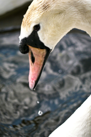
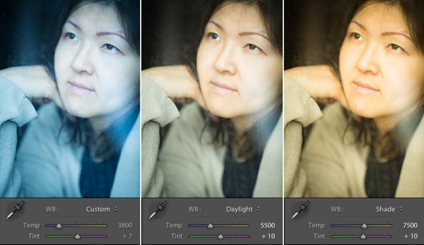
Here’s a portrait taken in shade. The quality of light in the shade is soft and beautiful – perfect for portraits. But the colour of the light is blue. I warmed up the image in Lightroom 4.

06
Here’s another portrait taken in the shade. The difference is that the girl’s hair is lit by the last rays of the setting sun. That’s what has produced that lovely warm colour on her hair.

07
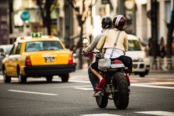
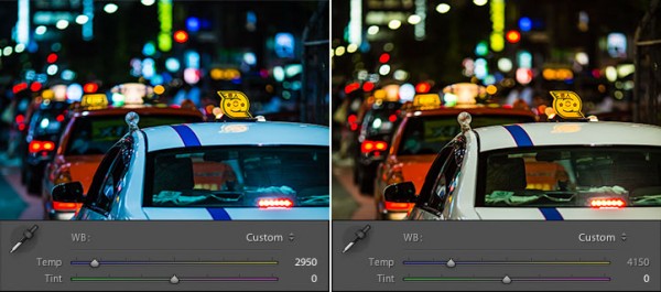
A neon light against the evening sky. The light from the neon sign is red, and the ambient light illuminating the rest of the scene is blue. The colour contrast between the two is what makes the photo.

08

Steel wool spinning. Again, the colour of the ambient light at this late hour is blue. The light of the from the buildings in the distance and the burning sparks from the steel wool spinning is orange. There is a strong colour contrast between the two.

Previous articles

This is the fourth in a series of four articles. You can read the previous articles here:

Introducing the Creative Triangle

Finding Your Way Around the Mode Dial

Understanding Colour on Your Digital Camera

Understanding EOS

09

Andrew S Gibson is the author of Understanding EOS: A Beginner’s Guide to Canon EOS cameras. The use of white balance is one of many topics explored within the ebook.

Post originally from: Digital Photography Tips.

Check out our more Photography Tips at Photography Tips for Beginners, Portrait Photography Tips and Wedding Photography Tips.

How to be Creative with White Balance


Digital Photography School

 
Comments Off on How to be Creative with White Balance

Posted in Photography


How to Set a Custom White Balance on a Canon 60D DSLR

13 Feb

Check out Bas Rutten’s Liver Shot on MMA Surge: bit.ly www.mahalo.com This video explains how to set up a custom white balance on your Canon 60D DSLR See the rest of our 60D Videos: www.youtube.comCheck Out These Related Mahalo Pages: DSLR Buying Guide: www.mahalo.com DSLR Comparison Guide: www.mahalo.com How to clean your DSLR: www.mahalo.com Digital SLR Camera: www.mahalo.com Check Out these Mahalo How-To Playlists: How To Apply Makeup: www.youtube.com How To Become a Pharmacist: www.youtube.com How To Become a Photographer: www.youtube.com How To Dance the Fox Trot: www.youtube.com How To Dance the Salsa: www.youtube.com How To Dance the Waltz: www.youtube.com How To Flirt: www.youtube.com How To Get 3 Stars on Angry Birds 1st World: www.youtube.com How To Get 3 Stars on Angry Birds 2nd World: www.youtube.com Royalty Free Music by DanoSongs.com
Video Rating: 4 / 5


Perfecting and Playing with White Balance

09 Feb

As photographers we often question the strength, type and direction of light, but because most of today’s cameras’ auto-functions are greatly enhanced, it can be easy to forget about the colour of light.

Seasoned shooters will undoubtedly be aware of the importance of white balance, but for those new to photography or for photographers looking to go ‘off piste’ and take a more manual approach to image-capture then this whistle stop guide might be able to help. In this handy tutorial, we’ll explain not only the importance of controlling white-balance, but how it’s done and what effects can be achieved.

Why bother with white-balance?

In this image we wanted to exaggerate the warmth in the light hitting the leaves in the trees, so we used a 'Cloudy' present in the White-Balance options.

In this image we wanted to exaggerate the warmth in the light hitting the leaves in the trees, so we used a ‘Cloudy’ present in the White-Balance options.

By controlling the colour of light photographers are able to shoot with a balance that is as neutral as possible, replicating the colour of natural daylight whilst resolving issues with colour casts. Alternatively shooters can manipulate white-balance values for creative effect.

What is the problem with using auto-white balance?

Most contemporary cameras do a solid job at rectifying ‘problems’ with colour casts in the light, and so when a scene is put in front of the camera it will attempt to compensate for any shift in values to make the scene look as close as possible to natural daylight as possible. So say you were using an auto-white balance setting to shoot a scene flooded with a rich amber afternoon light, you may be disappointed to find the camera diluted the richness of the hue as it has attempted to cool down the scene by using a blue cast to pull back the colour balance to replicate that of natural daylight. Conversely, when you shoot with flash a cool tone is usually projected from the bulb, as such cameras set to auto-white balance will warm the picture up in-camera using an orange/amber cast. Another issue is night photography, as the colour of neon signs or street lights can often affect the camera’s reading and results in confused colour-cast frames. By setting the white balance manually you’ll find a more realistic result is attained.

How can I control white balance?

1. Use Presets

Within your camera’s settings menu you should find a section labelled ‘White-Balance’. Here various presets are offered, each with an icon clarifying in what light the option should be used, for example; flash, cloudy, fluorescent, ambient, indoor, outdoor, sunset etc.  

By telling the camera what conditions you are shooting in, it can more accurately and consistently apply values to compensate. It is especially wise to use this mode if you feel the auto white-balance isn’t on point.

2. Use Custom

By taking a white-balance reading from the swan's white feathers we were able to get a more realistic and natural result

By taking a white-balance reading from the swan’s white feathers we were able to get a more realistic and natural result

Whilst presets have their place, they can sometimes be a little wide of the mark, so to influence greater control find ‘Custom’ within the White Balance settings. This option allows you to take a reading by photographing an area of white or natural grey so your camera recognises and understands the exact lighting conditions you are working in.

If this is the approach you want to go with, it can be a good idea to carry a piece of white or grey paper, card or plastic to take readings from when you’re out and about.

3. Post-Production
Should you return home to discover your images carry an unsightly colour cast, all is not lost. Almost all contemporary photo-editing software allows users to correct colour balance issues with a touch of an ‘auto colour balance’ button or slight incremental change with a slider, but by far the best option is to use a white balance Colour Picker or White Balance Tool to select a part of the image you know to be white or grey. What is more, most of these software products offer options to apply values to batches of images instantaneously, potentially saving you hours! To do this most effectively it’s best to shoot in RAW so you can have a wider scope of flexibility to resolve colour balance issue.

What if I don’t want a neutral balance?

Using a manual white balance will allow you resolve colour cast issues in-camera, but just as it is possible to neutralise the colour of light, it is also possible to manipulate values to create colour-thrown captures. For example, to exaggerate the rich red hues of a sunset force the camera to pump up the colour even further by using the Custom option or use a Preset such as Daylight or Cloudy to make the camera ‘think’ it is shooting a dreary scene and as such will add a warming cast. The result will be a vivacious and colour-striking sunset. There are dozens of situations when using the ‘wrong’ white balance can enhance or exaggerate the colour values of an image, it just takes a little imagination and practice.  Good luck!

Post originally from: Digital Photography Tips.

Check out our more Photography Tips at Photography Tips for Beginners, Portrait Photography Tips and Wedding Photography Tips.

Perfecting and Playing with White Balance


Digital Photography School

 
Comments Off on Perfecting and Playing with White Balance

Posted in Photography


Understanding White Balance

28 Jan

Rob Barron, AKA ‘My Photo Tutor’ (www.myphototutor.com) explains why we need white balance, what it is and how to use the custom white balance function on your dSLR. The principles apply to all dSLRs, irrespective of make or model though method of selection will naturally differ.


Create In-Camera White Balance Experiments

18 Jan

Extra photos for bloggers: 1, 2, 3

Did you know that white balance is the quickest way to turn your camera into an InstaLomoCrosstography machine?

This tutorial is a fun, simple way to play with color a la Instagram or Lomography without any apps or chemicals!

All you need to do is take the correct white balance and set it to the “wrong” white balance to get sweet shifts in tones and colors.

We put together a guide on exactly what kind of color shifts you’ll get with each setting. No Android-based technology here. You can do it all with the settings your camera already has!

Create Sweet White Balance Experiments

p.s. We’re giving away an iPhone Lens Dial (our primo iPhoneography gizmo) today! Here’s how to enter.

Why it’s cool:

ingred-smDid you know that your brain has magic color changing abilities? Well, sort of.

Your brain can’t change it’s own color (bummer!), but it does an awesome job at making sure the color white always looks that way. In other words, our brains are stuck in Auto White Balance.

Our cameras are a bit different. To them, white isn’t always white, but is influenced by the source of the light, whether it’s a buzzy fluorescent light in the ceiling or a cozy tungsten bulb under a lampshade.

This technique involves forcing your camera’s white balance to the incorrect setting for the scene so that the colors are purposely skewed. Sometimes it looks a little weird, and sometimes it looks awesome; it’s all about experimenting, with no computer or fancy editing programs required!

For an awesome explanation on how to achieve correct white balance and color temperatures, follow this tutorial by our friends over at SLR Lounge!

Ingredients:

paint-sm

  • A camera that allows access to white balance settings
  • A willingness to experiment!

STEP 1: Locating White Balance Settings

paint-smFirst things first, we need to locate where the White Balance settings are on the camera.

Here’s where ours is located. Look for the letters “WB” or the for “White Balance” if it’s under a set of menus.

Step 2: Crack The Code: Figure Out The Symbols

paint-sm White Balance settings are most often denoted by a set of symbols that represent the light source. They either warm things up, or cool them down!

  • AWB or A: Auto, correct White Balance
  • Sun: Sunshine or Daylight. Neutral.
  • House Casting a Shadow: Shade. The warmest.
  • Cloud: Cloudy. Very warm.
  • Light Bulb: Tungsten Light Bulbs. Very cool, very blue.
  • Glowing Rectangle: Fluorescent Light Bulbs. Cool blue and purple
  • Lightning Bolt: Flash. Warm.
  • Square Floating Over Triangles: Custom
  • K: Specific Kelvin Temperature

Step 3: Time to Play

paint-smNow that you now where the settings are located and what each symbol means, it’s time to start experimenting!

Remember, the AWB or Auto setting will let your camera determine the correct White Balance for the scene; we want to set the “wrong” White Balance to get cool colors!

Featured below are examples of how you can use this technique!

Outside: Cloudy Day Meets Fluorescent and Shade

paint-smIn this example, the natural light was from an overcast day (lame!).
In this instance, Cloudy would be the correct setting. Compare that to the Shade and Fluorescent settings.

The Shade setting is much warmer, which gives a stronger orange and yellow hue. The Fluorescent setting adds some neat purple and blue hues.

Outside: Cloudy Day Meets Fluorescent and Tungsten

paint-sm
This time we paired up another overcast day (round 2!) with Fluorescent and Tungsten.

We have to admit, the Fluorescent setting is one of our favs for getting sweet colors

Inside: Fluorescent meets K10,000 and K2,500

paint-sm This time we’re inside under a mix of Fluorescent and Daylight.

We got even more experimental this time and tried to dial in our own Kelvin temperatures for the white balance! 2,500 Kelvin shifts the photo towards blue, and 10,000 Kelvin shifts the photo towards a warm orange.

Real Life Use

paint-smUsing the “wrong” White Balance goes against the grain for most photography teachings, so we want to share an awesome photographer that uses this technique to achieve great results.

His name is Ryan Waite, and he creates some really sweet portraits! He shared a few tips with us on how to use White Balance to get cool effects. These are a little more advanced and will likely require some editing software to accomplish.

  • Shift the White Balance to “bring out different tones in the skin and create emphasis on certain areas of the face in unique ways.” This can influence the reds and blues in skin tone, or change the highlights and shadows. (seen above!)
  • Push the White Balance so that it’s “excessively warm and then lower the saturation for an aged, vintage feel.” A sepia-esque look without the monotone.
  • In post-production, “you have easy access to the color temperature and the tint. The temperature is great for creating warm and cool effects, but tint can specifically bring out the purples and greens in a photo.” Boost the magenta tint in afternoon sun to get beautiful yellows and purples, or boost greens for trees and plants to make them pop!

Extra Tips

  • Try it for Black and White photos: the colors from the original can make a huge difference before you convert! Try warming up the white balance and shifting the tint all the way green.
  • Go full analog: grab some film balanced for a particular light source and shoot it in another.
  • Use Live View to see the results in real time!

Related posts:

  1. DIY Photo Magic: How to Turn Black and White Photos into Full Color Images! Extra photos for bloggers: 1, 2, 3 We love the…
  2. Black and White Conversion: The Best Ways to Turn Color Digital Photos Into Beautiful B&W ~Have a cool photo product or site? Reach 270,000 photo…
  3. How to Create Coloring Book Pages Using Your Very Own Photos! Extra photos for bloggers: 1, 2 Imagine a world where…


Photojojo

 
Comments Off on Create In-Camera White Balance Experiments

Posted in Equipment


Stunning Portraits: Manipulating White Balance

17 Jan

I am always looking for more interesting and unique ways to take interesting and beautiful portraits. It is a personal challenge for me to push my own creative envelope as much as possible so that I am constantly broadening my own bold and colorful style. There are so many ways to take a portrait the possibilities are almost endless and the range of emotional and psychological expressions that can be achieved are truly spectacular. Portraits can be editorial, lifestyle, fashion, glamour or extremely creative in style and the true wonderment of any portrait is the amazingly, maddening ability of the human face to portray expression in so many captivating ways. So let’s look at a more creative way to take a portrait that I think gives the final photo a simply stunning look.

Before we get into the details of shooting, I think a little review of white balance is in order as this technique involves a basic understanding of the topic. Every light that we take photographs in, whether it be an incandescent light bulb indoors or the bright shining sun outdoors, is made of of a different spectrum of colors. Now when we look at objects under these light sources with our own eyes, we take it for granted that our vision compensates for all the different color casts of these lights amazingly well and we get a pretty standard representation of all colors in the scene. Basically, when we look at something that is supposed to be white in varying light conditions, our brain interprets the situation and our eye sees it as white. The camera works a little bit different.

The camera sees color in a much different way and has a less sophisticated way to interpret colors under different lighting situations. This is where the white balance setting helps us out. Many photographers that I know tend to keep there cameras white balance on the automatic setting. With the automatic white balance setting, your camera searches for a white reference point in the scene you are shooting. Then all of the other colors are set to this reference point. Therefore, your camera tries to make an educated guess to ensure the colors are represented correctly in your photo. The problem is that sometimes the camera is wrong and we have to bypass the automatic settings and go to that very scary place of setting the white balance in a more manual way, either by using the preset settings that the camera contains or even, heaven forbid, we might have to use some sort of white balancing device to help set our colors. There is a wealth of knowledge on this subject and I encourage you to pursue this topic at your leisure. You can also click on the following links for a decent explanation and breakdown of white balance (DPS-Intro to White Balance and White Balance in Digital Photography). The take home message is simply that we have to be conscious of how our camera views color and understand that we might have to give it some help by changing our camera’s white balance setting.

Now that we have introduced the concept of white balance let’s turn the tables on this subject and manipulate it to create some drama and eloquence in a portrait. The lighting setups for these portraits can be seen in the following diagrams:

Essentially, both diagrams are the same with the only difference being the placement of the light with the shoot through umbrella. I switched it from one side to the other just to see what sort of difference it made and concluded that both light placements worked just fine.

The overall concept for the shot was to contrast the old, decayed tree with the young beautiful model (Brittney) and to highlight each with some warm and cool tones for effect. So where does one start with getting the camera settings and flash setup properly?

First, lets talk about the manipulation of the white balance. I used an Alien Bees 1600 flash unit set at full power, covered with a full CTO (color temperature orange) gel, and modified with a shoot through umbrella. The CTO gel is commonly used to balance the color of light from the flash to that of a tungsten light bulb. Thus, when one is shooting flash in an indoor setting, the color of the flash matches the color of the light bulbs in the room and a camera white balance setting switched to tungsten will create a wonderfully balanced color palette in the photo. When used outdoors, a CTO gelled flash, combined with a white balance setting to tungsten, will balance the colors for anything upon which the flash falls. However, this tungsten white balance setting will also cause the sky and anything not receiving light from the flash to take on a majestic deep blue color cast that can be captivating. Compositionally, this simple white balance manipulation creates a mix of cool blue tones with warm orange tones that works fantastically well and makes the image pop.

Now, if you find yourself a little anxious about using flash outdoors you should go ahead and relax cause you can definitely pull off this shot. Before you start shooting with any flash at all, the very first thing you want to do is meter the scene and reduce your exposure about 2 stops so that the background is underexposed. Doing this in full daylight requires a few considerations and I recommend shooting either in the morning or the evening so that the sun is not too high in the sky, otherwise you will have a hard time getting your flash to overpower the sun. Camera settings are pretty easy to figure out. First, the white balance needs to be set to tungsten to get the desired effect. You are shooting in daylight and want the background underexposed so low ISO is a must which in my case was 200. The shutter speed cannot be too fast as it can only be that of your flashes sync speed which in my case was 1/200 seconds. What does this mean exactly? If you set your shutter speed faster than your flash can fire, the shutter will open and close before any light from the flash can be seen by the camera and you will never capture your flash in the image. So the only real variable was the aperture in this case which in order to get 2 stops underexposed for the background had to be at f/16. Basically, the environment for the shoot had already dictated my camera settings.

Since my camera settings were already determined, the only thing I needed to do was to turn on my CTO covered flash and adjust the power until I could see the effect in the image. Since I am shooting in daylight and trying to overpower the sun I knew I would need a lot of power from my flash and actually had brought a second flash unit just in case I needed more power then one flash head had to offer. I started with one flash about 5 feet from the subject at full power and took a few sample shots and it was just a little shy on power. I moved the flash as close to the subject as I could without it being in the frame (about 2.5 feet) and took a few more shots and it looked great. A few outfit changes and a serendipitous bit of sun flare from behind the tree and I had the makings for a stunning set of portraits. I hope this post encourages you to not only push your creative boundaries, but also to take a small step further into the excitingly surprising realm of flash photography.

Post originally from: Digital Photography Tips.

Check out our more Photography Tips at Photography Tips for Beginners, Portrait Photography Tips and Wedding Photography Tips.

Stunning Portraits: Manipulating White Balance


Digital Photography School

 
Comments Off on Stunning Portraits: Manipulating White Balance

Posted in Photography


D300s Custom White Balance with 18% Gray Card

16 Dec

D300s Custom White Balance with 18% Gray Card

 
Comments Off on D300s Custom White Balance with 18% Gray Card

Posted in Nikon Videos


Creative Color Processing (Part 1/3 – White Balance)

12 Dec

It is often said that photography is a visual language. Through our photographs we tell stories, share experiences, and communicate emotions. Aside from journalism, where faithful captures are important for ethics reasons, photography is often about creatively interpreting a scene, rather than simply recording what is in front of the lens.

Tokyo street scene with creative color

Tokyo street scene with creative color

Tokyo street scene with 'normal' color

Tokyo street scene with ‘normal’ color

Creative use of color can be a powerful tool for controlling the mood in your photographs. In a series of three posts I will discuss three Lightroom controls that can be used to control color and mood in your photos:

1. White Balance
2. Split Toning
3. Tone Curve

In this first article in the series I will discuss white balance, the simplest of the three tools.

Note: I shoot Raw and import my photos into Lightroom, converting to DNG on the way into Lr. Shooting Raw gives me much more flexibility to make creative color decisions in post processing. The screenshots from are from Lightroom 4, but with the exception of the Tone Curve technique that I will cover in Part 3 of the series, these techniques can be used in previous versions of Lightroom.

White Balance

White balance allows you to control the overall color temperature of your image, and adjust for different light sources like tungsten, daylight, flash, etc. If you’ve never heard of white balance take a look at this post.

White Balance Example

Example of different white balance settings

Most of the time you’ll read that white balance is there to help you get accurate color in your photos. This article is not about accurate color. For the next few minutes, forget about accurate color and let’s just look at how white balance can be used to change the mood in a photo. I like to think of white balance as just another tool for controlling color image my images. Thinking of white balance this way is liberating and encourages experimentation.

Tokyo Taxi White Balance Example

Tokyo Taxi White Balance Example

Notice how a cool white white balance creates a totally different mood than a warm white balance for the same scene? Which of the above images do you prefer? When you feel like getting creative with your images, try shifting the white balance either cooler or warmer for creative effect.

I hope this article has encouraged you to think creatively about white balance, and to experiment with shifting white balance for creative effect. I love hearing your feedback, please comment below or feel free to connect with me through Facebook or Google+.

In Part 2 of the Creative Color series I will discuss Spit Toning, and demonstrate how white balance and split toning used together for even more creative control over color.

Post originally from: Digital Photography Tips.

Check out our more Photography Tips at Photography Tips for Beginners, Portrait Photography Tips and Wedding Photography Tips.

Creative Color Processing (Part 1/3 – White Balance)


Digital Photography School

 
Comments Off on Creative Color Processing (Part 1/3 – White Balance)

Posted in Photography


GVN Reviews – Art of Balance TOUCH! Review

09 Nov

Visit Our Website: gamingvlog.net Find Us On Your Favorite Social Networks Google+: bit.ly Twitter: bit.ly Facebook: on.fb.me Instagram: Gamingvlognetwork My Gaming Names PSN: Luismacintosh GamerTag: Luismacintosh 3DS: 0473-7775-6576 Join Our Mario Kart 7 Community: 68-8569-2386-4851 Join Our Steam Community: bit.ly Art of Balance TOUCH! Review Art of Balance TOUCH! Review Art of Balance TOUCH! Review Art of Balance TOUCH!, Art of Balance TOUCH! Review, Art of Balance TOUCH! gameplay, nintendo, nintendo 3ds, nintendo 3ds eshop, nintendo eshop, nintendo 3ds puzzle, Art of Balance TOUCH! 3D Animation Wii Ipod Iphone Apple Cartoon Psp
Video Rating: 4 / 5

 
Comments Off on GVN Reviews – Art of Balance TOUCH! Review

Posted in Animation Videos


GVN Reviews – Art of Balance TOUCH! Review

09 Nov

Visit Our Website: gamingvlog.net Find Us On Your Favorite Social Networks Google+: bit.ly Twitter: bit.ly Facebook: on.fb.me Instagram: Gamingvlognetwork My Gaming Names PSN: Luismacintosh GamerTag: Luismacintosh 3DS: 0473-7775-6576 Join Our Mario Kart 7 Community: 68-8569-2386-4851 Join Our Steam Community: bit.ly Art of Balance TOUCH! Review Art of Balance TOUCH! Review Art of Balance TOUCH! Review Art of Balance TOUCH!, Art of Balance TOUCH! Review, Art of Balance TOUCH! gameplay, nintendo, nintendo 3ds, nintendo 3ds eshop, nintendo eshop, nintendo 3ds puzzle, Art of Balance TOUCH! 3D Animation Wii Ipod Iphone Apple Cartoon Psp

i know I say it is the last part in the description but I hope u guys dont mind that:) Hi, So today I am bringing you guys a speed art:)!. I hope u will like it as much as I do:) If u liked the speed art make sure to click that like button and if u have any suggestions, feedback, question…
Video Rating: 5 / 5

 
Comments Off on GVN Reviews – Art of Balance TOUCH! Review

Posted in Animation Videos