RSS
 

Posts Tagged ‘Balance’

Demystifying White Balance

03 Aug

White Balance (WB) is one of the most challenging camera settings for beginners to learn. White Balance can also be difficult to fix later when you are shooting in JPG format. In this post I’m going to discuss what WB is and how to use it properly when shooting JPGs. I am a food photographer, but keep in mind the WB principals apply the same way, to anything you are shooting.

01White Balance Eggs

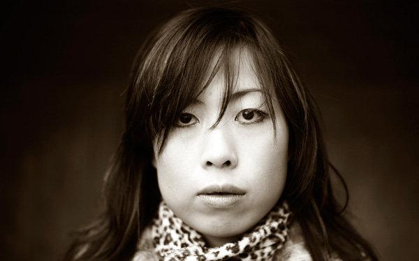
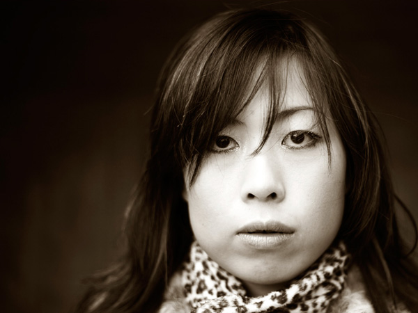
The image on the left has a cooler, or bluer, color temperature than the image on the right.

White Balance is one of the most important camera settings because it hugely affects how the colors look in your photos. The White Balance setting is used to tell the camera what type of lighting you are using for your shot, or in what type of scenario you are shooting. White Balance, also known as color temperature, is measured in degrees Kelvin, so I will be referencing that as well. The main reason White Balance is so hard to grasp is because our eyes are so good at filtering light, and our eyes make everything look “normal” under almost any lighting condition. We don’t see the blue or yellow sunlight. It just looks like white light. As you learn more about light and its color temperature, you will start to actually see these slight differences throughout the day.

Where to find the White Balance camera setting

Not all cameras access the WB setting in the same way. Some have a little button on the body of the camera with a “WB” under it, while other cameras make you access this setting in the camera menu. Below is how to find the WB menu for the Canon 5D Mark II. In most Canons the WB menu is located here.

02White Balance camera menu 1

The White Balance is inside the camera settings menus on most cameras.

03White Balance Menu

Here are all the WB settings available for the Canon. Yours make looks slightly different.

If you can’t find your White Balance setting, look it up in your manual or google it for your camera model. If you are having a hard time finding it, make sure you are on the “Manual” camera mode setting, or one of the other modes that your camera will allow you to adjust the WB. Depending on your camera, certain modes will lock you out of the WB menu.

What the WB setting icons represent

To make things easier, camera manufacturers have come up with some standard icons that represent the most common lighting scenarios. When you set your camera to one of these settings, you are setting it to a specific color temperature, or degrees Kelvin. Depending on your camera, you might only have the first six settings. Advanced cameras have settings 8 and 9.

  1. Auto White Balance (AWB) – the camera will analyze the light in the scene that you are shooting, and pick a setting for you. Depending on your camera it will be set anywhere between 2,000 and 10,000 degrees Kelvin.
  2. Full Sun – this is for a bright sunny day, hardly any clouds, with a blue sky, and you are shooting in direct sunlight. Degrees Kelvin will be in the 5000-5500 range.04White Balance 1
  3. Open Shade – the icon is showing a house with shade on the right side. This setting is for when you are taking a picture in the shade, no direct sun, and the sky is blue. This blue sky is actually color contaminating your shot. This setting will “warm” up your shot to counteract the blue light that is coming into your scene. Degrees Kelvin will be 7000-7500.
  4. Cloudy Day – this setting is for when you are shooting on a day when the sky is white with cloud coverage – no blue sky is coming through, the light is very neutral so you don’t need to counteract any blue light contamination. Degrees Kelvin will be 6000-6500.05White Balance 2
  5. Tungsten Light – this is your standard household light bulb, or studio hot lights. Degrees Kelvin will be 2800-3200.
  6. Fluorescent – this type of light is generally found in commercial spaces. It has a wild array of different colors and temperatures, and some cameras will have multiple choices in this category. Fluorsescent light also makes images look very green so this setting counteracts that by adding a magenta (pinkish) color to balance the shot. Degrees Kelvin is around 3400-3800 – please note – I did not take a shot with the Fluorescent setting because it would just be flaming magenta.
  7. Flash or Strobe Light – this type of light is emulating daylight so usually this setting is the same as full sun and sets the camera to 5000-5500 degrees. If you have a pop-up flash, your camera might change to this setting automatically.06White Balance 3
  8. Custom White Balance – this option is for creating a custom setting for your scene by photographing a white card (or a grey card), having the camera analyze the light on that card, and then setting your camera to this new custom color temperature number.
  9. Manually Set Degrees Kelvin – this setting is for the shooter who fully understands WB and wants to manually control the color temperature in camera.

Numbers 8 and 9 are more advanced, for those shooters who are making custom WB settings to either neutralize light that might be mixed colors, or to use the WB setting creatively. I use number 9 all the time to warm up my food images. I always like to set this to a “warm” setting. So if I am shooting in daylight (and depending on the time of day), I might put my setting at 7000 or 7500 degrees Kelvin to really warm up the shot, as I am always shooting in open shade, using natural light at my studio.

For those of you who are just starting out here in Digital Photography School, it’s very important to learn about your camera’s White Balance setting when shooting only JPGS. As I’ve mentioned above, adjusting the White Balance on JPG images can be challenging and not nearly as easy as RAW files. It simply doesn’t look as nice as when you tweak RAW files. Below you can see the difference in Lightroom between the White Balance adjustments for JPG versus RAW files. It’s on the very top with “Temp” and “Tint”. When you shoot JPGS, you are limited to a slider (left image below) that goes from blue to yellow with a scale range that does not relate to the actual color temperature in degrees Kelvin. On the right side, you can see that the “Temp” scale has degrees Kelvin right next to it so you can easily customize your images.

07Lightroom WB Setting

The image on the left is the editing tab for JPG files and the one on the right is the editing tab for RAW files.

Your assignment, should you choose to accept it

If you are still shooting JPGS, I suggest you give yourself an assignment to really get a feel for White Balance. This assignment is going to be called:

Natural Light White Balance Bracket Test

A bracket is a range of images of the same subject where each image has a setting that has changed. Figure out a shot you can take, preferably on a tripod to make this easier, when you have some time to do this. It doesn’t have to be a studio shot. This could be a landscape or a portrait taken outside. Figure out what your exposure should be. Then find where your White Balance setting is in your camera and take the same shot several times, each time changing the WB setting on your camera – TAKE NOTES. The point here is to learn what each setting looks like. Make notes of where you are shooting, the time of day, and your camera exposures.

Now, for your bracket test – shoot in the following WB settings: Auto, Full Sun, Shade, and Cloudy. Download your files and have a look – which color do you like the best? Make a note of that for future reference. Try to bracket with different shots too. While you are learning photography, if you are shooting a scene that has mixed lighting or it’s just a moment you are capturing at an event or something, then the Auto WB setting will probably be fine for that. I do use Auto a lot if I’m shooting at a farm or something similar where I just don’t have time to fiddle with it.

A few precautions

I have to mention something here – when shooting outside it can be extremely hard to see your camera’s LCD screen, so you might not even see the difference on the LCD when you take the pictures with the different WB settings. You HAVE to look at these on the computer you edit your files on. Here’s the other thing that’s a total drag. Your camera’s LCD screen is very inaccurate for color and many times for exposure too, especially when you are looking at it outside in daylight. It’s very hard to know if you have the correct exposure or not. I’m assuming that you haven’t learned about your camera’s histogram yet for judging exposure, so until then, for this assignment, try to do this in a situation where you can download your files right away to make sure your exposures are good.

Do some test shots, download, adjust if needed, then shoot your bracket. After downloading your image, name each shot the WB setting it was taken in so you don’t get confused. This is why you took your notes. Some software will tell you what your settings are. If you don’t know whether yours does this or not – write down your info so you can just look up your shot number with your notes. Your assignment should look something like this:

08Lav Test 1

09Lav Test 2

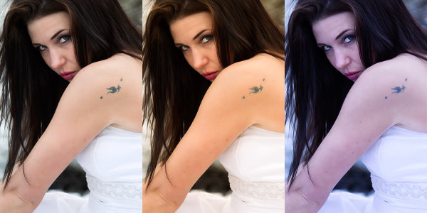
When I took these shots above, it was a bright sunny day with a blue sky and white billowy clouds. Time of day was about 2:45 P.M. I prefer the “Full Sun”, or daylight WB. Now, keep in mind that with shots like these, the “correct” color balance can be very subjective and some people might like the warmer shots and some people might like the cooler shots. I think we can all agree that the shot taken in “Shade” is way too yellow for this scene. Until you learn how to edit RAW files, here is what I suggest you do. Set your WB to Auto if you are still nervous about this, OR match the WB to the lighting condition of your scene. If you have time with the shot, take a bracket of your settings.

What I always suggest to new students is to set your camera, if possible, to shoot in JPG and RAW files. The camera will actually create two images of the same exact shot, one as a JPG and the other as a RAW file. They will have the same image number, with a different file extension. Work on the JPG for now, then when you learn how to edit RAW files, you will have these to go back to, and you will be so happy that you did that. On Canon bodies, the menu settings to change the file format look like these below. Notice I am also picking the largest file size I can for each file type. I always do that in case I ever want to print anything.

Canon Quality Menu

Canon Quality Menu

Alright, now go out there, play with the White Balance and see what it does. Get control of that camera and take your photography to the next level.

The post Demystifying White Balance by Christina Peters appeared first on Digital Photography School.


Digital Photography School

 
Comments Off on Demystifying White Balance

Posted in Photography


Using Balance in Your Landscape Photography Composition

19 May

How to use Balance in your landscape photography

If you want to take your landscape photography to the next level, it’s time to start thinking about how you balance your subjects. The most powerful compositional tools that you have at your disposal are your knees, and your feet.

Simply stepping to the side a couple of feet can change your landscape compositions drastically. Take things one step further (weak pun intended) and bend those old knees to get a lower point of view. Now things might start to look more interesting.

The reason why I say this is because horizontal and vertical movement will allow you to achieve the ideal balance of subjects in your landscape images. If you’ve got a camera with one of those flippable LCD screens, you’ll be able to get right down on the ground or way up high on your tripod. Nice.

So what do I mean by ‘balance’?

Composition basics - using balance in your landscape photography

Something Wicked

I’m referring to how you balance subjects in your image on the horizontal and vertical planes. Simply plonking your interesting subject slap bang in the centre of your image might work, but there are times when you might get a better composition by placing it to one side of your image, and counter balancing that with something on the opposing side.

With my image above ‘ Something Wicked’, I wanted the moody storm clouds to be the main subject but it was essential to capture it bearing down on the mesa. By devoting the lower third of the frame to the mesa and the upper two thirds to the menacing clouds above, I balanced the subjects to my liking.

Subjects can’t move but you can

There may be times when you actually use interesting space to counterbalance your main subject, don’t assume that your spaces have to be filled with obvious subjects. I like to invite my viewers to think about what’s in that space, drawing their eye to what at first appears to be nothing, but upon closer inspection reveals something interesting.

Balancing subjects in images that feature reflections is really important. Perhaps you want to give more emphasis to the reflected elements? Movement from left to right, or up and down, can really place those elements exactly where they need to be. Moving one foot to the left might eliminate a pleasing mountain ridge in the distance. Dropping down a few inches might bring it back.

How to balance reflections in landscape photography - Gavin Hardcastle

With my image of Mono Lake above, I found that if I got too low to the ground, I lost some of the mass in the reflected clouds. The ideal vertical position was at an agonizing semi crouch that had my quads screaming. If I’d moved a little more to my right I would have lost the foreground tufa mound that you see in the lower left corner, which adds depth to the image.

I’ve done this so many times that I no longer think about doing it, something just clicks and I know the shot is in the bag. When you’re starting out however, this might require a bit of conscious thought, so here are two tips I always teach to my workshop students.

Do the Squat

After you’ve taken a shot with your camera at normal height on the tripod, squat down for a few seconds and survey the scene from a lower perspective. Make it a habit and I can virtually guarantee* that you’ll see a better shot around 50% of the time.

Do the Cobra

Rather than shuffling left to right, I often like to crack out my Cobra impersonation and move my head from side to side while trying to maintain the same height. By doing this I can see how my foreground subjects move around the subjects in the distance. If you see some bloke with a tripod on a cliff edge who looks like he’s doing some type of shamanic dance, that’s me setting up a shot.

This sounds really obvious, but I notice a lot of photographers don’t bother with these two basic moves. There’s more to composition than your standard tripod setup.

Composition tips for landscape photography

My shot of Los Arcos Park in Cabo San Lucas (Mexico) is a prime example of how ‘doing the Cobra’ helped me to visualize the ideal composition for having El Capitan (the central sea stack) positioned so that it fits just right in that gap. If I’d moved just 12 inches left or right I would have lost that pleasing ‘equidistant’ position. If I’d moved lower (the Squat), that foreground rock would have obscured the footsteps in the sand that lead your eye towards El Capitan.

Go Handheld

Yes, yes, I realize I’m a one man tripod enforcement unit but I’ll often start a shoot without the tripod so that I’ve got the freedom of movement to find the best compositions. Once I’ve discovered that ideal balance of subjects along the vertical and horizontal planes, I’ll grab the tripod and take the shot. This will save you a lot of fiddling around with the tripod, especially if you’re rocking one of those flimsy box store tripods that belong in the recycling bin.

Try it out

Go out and try the ‘Squat and Cobra’, then post your comments here to let me know your results. Being conscious of how you balance your subjects will give you better landscape images, and with practice, will become automatic.

** Guarantee is virtual and only worth the paper on which it is written.

For more articles on composition try these:

  • Composition, Balance and Visual Mass
  • A New Photographer’s Guide to Composition
  • Perspective in Photography – Don’t just stand there move your feet!

The post Using Balance in Your Landscape Photography Composition by Gavin Hardcastle appeared first on Digital Photography School.


Digital Photography School

 
Comments Off on Using Balance in Your Landscape Photography Composition

Posted in Photography


Guide to Creative White Balance for Landscape Photography

16 Apr

If you’ve been using a digital camera for any length of time, you’ve probably heard about White Balance. You may still be wondering exactly what it is, and how to use it; or you may be using it right now and be wondering how it can possibly be something “creative”.

Creative white balance landscape photography

Different white balance settings create different looks

I’m going to show you some of my techniques for using White Balance to creatively enhance your landscape photography and with a few simple steps you can unlock the remarkable power of creative White Balance. Don’t worry, this is not a technical discussion, there are lots of references about that aspect of White Balance online. This article explains a simple shooting technique you can start using right now.

The Color of Light

Creative white balance landscape photography daylight

Daylight setting

Have you ever taken photos in an office, and been dismayed to see that your results had a sickly green cast to them? Or taken photos under cloudy, lifeless, skies only to see your images appear cold, flat and a little blue?

This happens because light comes in a variety of colors. The reasons for these colors is a result of wavelengths of light and the light spectrum. But we’re not going to get into this too deeply here. Just know that all light has different colors, and even the sun has different colors at different times of the day. Every landscape photographer knows about the “sweet light” or the “magic hour” – the times around sunrise and sunset when the color of the light is perfect for photography.

The crazy thing is that your eyes usually adjust to compensate for these color shifts, especially the subtle ones, so you won’t necessarily perceive these color differences, and in some cases your eyes are not as sensitive to color shifts as are the sensors in your camera. So you snap that office photo and the result isn’t as great as you had expected. Because of the color, those fluorescent bulbs cast a green pall over everything but you didn’t see it because your eyes “adjusted” the color for you.

This is where your White Balance settings play an important role in correcting potential problems by adjusting the color of the light in the camera. It is really important when you’re taking images of people, because the skin tones will be unattractive and far from natural looking.

But, if you are a landscape photographer, armed with the knowledge that light has color and your camera has a tool that can change the color of light, you can use this knowledge to do more creative landscape photography.

White Balance for Landscape Photography

Creative white balance landscape photography hicolour fluorescent daylight

Fluorescent setting

I shoot a lot of landscapes, in fact I pretty much ONLY shoot outdoors. Thankfully I almost never have to deal with those ugly green fluorescent lights. But what I do deal with are sunsets, sunrises, autumn colors, mountains, flowers, etc. – all those good things we find in nature.

I noticed that sometimes my sunset images just didn’t pack the punch the way I SAW it at the location. Sure, I could go back to my computer and make adjustments. Or, without degrading any pixels, I could punch up my images in camera by purposely fooling it into using a different White Balance. In other words I don’t use White Balance to correct color casts, I use it to ADD color casts! I deliberately use the “wrong” White Balance setting.

Landscapes created at sunset or sunrise, snow and winter scenes, and those with night sky dominating lend themselves well to creative White Balance techniques.

Sunsets can become more warm, or more soothing, with violet overtones if you use the Cloudy White Balance setting. Autumn foliage pops with yellow and orange when you use Shade as your White Balance! The Aurora Borealis (Northern Lights) becomes a rich alien green, rolling through a deep royal blue sky, by changing your White Balance setting to Incandescent or Tungsten. Please note, that you use these settings regardless of actual light colour.

Creative white balance landscape photography hicolour fluorescent daylight

Fluorescent daylight camera setting

Creative white balance landscape photography customA3 M3

Custom white balance setting A3 M3

Creative white balance landscape photography auto

Auto white balance setting

Creative white balance landscape photography direct sun

Daylight white balance setting

Creative white balance landscape photography shade

Shade white balance setting

How to use Creative White Balance

To use creative White Balance, there are just a few things to understand about using White Balance in general.

Since White Balance is designed to correct color casts, the setting on your camera will compensate, or change the light, to be the opposite of the shooting situation. In other words, incandescent lights are too warm (orange), so changing your White Balance setting to Incandescent or Tungsten will add a blueish tinge. The light in the shade is blueish, so changing the White Balance setting on your camera to Shade adds warmth, orange and red.

To get creative with White Balance you’ll need to find the dial or menu for changing your White Balance settings. Most cameras have presets for Flash, Shade, Cloudy, Incandescent (Tungsten), Fluorescent, Sunny (or Daylight), and Auto.

Look for the ICONS – a cloud (cloudy), a house (shade), a sun (full sunlight), a fluorescent bulb – long and skinny (fluorescent), an old school light bulb (incandescent or tungsten), a lightning bolt (flash), and AUTO or A for automatic.

Next you’ll need to know how to set your White Balance for a specific type of shot. The best way is to experiment by trying all of your White Balance settings for the same scene. So if you want to ramp up your warm colors, say in an autumn scene or sunset, change your White Balance to Shade, Flash, and Cloudy! Compare your results.

Shooting the night sky or the Aurora Borealis, change to Tungsten or Incandescent to make the colors cooler, make that Aurora really pop! The added blue tones give the night sky a rich royal blue tone, while the green light of the Aurora turns an eerie alien glowing green.

Here’s a handy chart I made for you – so you can literally “dial it in”. All you need to do is change your settings according to the type of landscape scene, using the chart. This will give you a great place to start.

Chart

Supercharge your Creative White Balance

Depending on your camera, you may also be able to fine tune and supercharge your custom White Balance once you find one that provides the boost you like.

In Nikon DSLRs you may see this graph that enables you to make your own custom White Balance presets. It’s typically in your shooting menu under the White Balance tab. Consult your camera manual to see if your camera has this option, and how to apply it.

2customWB1

1customWB

Custom white balance in camera

By selecting a specific color balance presets, you can ramp up the warmth and impact for sunrise and sunset, as well as boost the coolness for winter snow landscapes.

Easy Experimentation

If you shoot RAW, and can’t switch White Balance in the field, you can also easily adjust your White Balance in post-production. Lightroom, Photoshop, Nikon Capture and most other image editing programs have a RAW White Balance setting. Nikon shooters note that you’ll get the best results adjusting RAW [NEF] White Balance if you use Nikon Capture, as Nikon encrypts its White Balance “formula”. Other software can only read parts of the White Balance data so your results may not be as high impact as they could be.

If you have some landscape sunset or sunrise shots on your computer, give creative White Balance a try right now. Here are few of my Lightroom White Balance edits so you can see how much control you have over the drama and mood of your lighting.

Creative white balance landscape photography auto

Auto white balance in Lightroom

Creative white balance landscape photography cloudy custom

Cloudy custom white balance in Lightroom

Creative white balance landscape photography auto adjustments 2

Auto white balance adjustment in Lightroom

Creative white balance landscape photography auto adjustments3

Auto white balance adjustment in Lightroom

Do you have some other tips you can share on using White Balance creatively? Please tell us about them in the comments below and share your images as well.

For some other landscape photography tips try some of these articles:

  • 5 Steps to Help you Take Better Landscape Photos
  • 10 Most Common Mistakes in Landscape Photography – and How to Overcome Them
  • So you Want to Shoot Landscapes? [Top 12 dPS Landscape articles from 2013]
  • Living Landscapes – A Guide To Stunning Landscape Photography – a dPS ebook
  • Loving Landscapes A guide to landscape photography workflow and post-production – a brand new dPS ebook by the authors of Living Landscapes

The post Guide to Creative White Balance for Landscape Photography by Alex Morrison appeared first on Digital Photography School.


Digital Photography School

 
Comments Off on Guide to Creative White Balance for Landscape Photography

Posted in Photography


Nikon Capture NX 2.4.6 adds D3300 support, improved white balance

05 Feb

shared:NikonLogo.png

Nikon has released Capture NX version 2.4.6. The latest update adds Raw image support for the recently announced entry-level D3300 and the improved white balance adjustment options can now match the ‘Auto 1’ setting found in newer DSLR and Coolpix cameras. Version 2.4.6 also expands Fine Adjustment range from 4132–7042k to 2500–7042k when using the Direct Sunlight option for Daylight. Get the update

News: Digital Photography Review (dpreview.com)

 
Comments Off on Nikon Capture NX 2.4.6 adds D3300 support, improved white balance

Posted in Uncategorized


All You Have to Know to Master the Basics of White Balance

04 Jan

As an amateur photographer, you can go a long, long time without knowing what white balance is or why knowing how to adjust it even matters. I had my first DSLR (my current DSLR is a Canon EOS 450D) for five years before white balance entered my photography glossary, and it took another few months until it felt necessary—or at Continue Reading

The post All You Have to Know to Master the Basics of White Balance appeared first on Photodoto.


Photodoto

 
Comments Off on All You Have to Know to Master the Basics of White Balance

Posted in Photography


Photography Rules and Finding Balance to Discover Your Own Style

13 Oct

By Lori Peterson

Digital photography has put the camera in more hands than ever before and everyone seems to either want to follow the standard mold of photography or they want to completely break away from it.

For instance, Ian Ruhter took a delivery van and transformed it into a giant wet plate camera. There are so many photographers out there that are wanting to copy someone else’s style instead of finding their own. Learn the rules and then use them or twist them as you need to do to make your own art and to tell your story. One part of your image may follow the standard photography rules and another part will completely be out of the norm. Not everyone sees the image or the story the same and that is fine. Don’t get so caught up in trying to make everything absolutely perfect that you lose the shot.

One of the rules that you hear a lot is to simplify your image. Sometimes, especially in street photography, you can’t simplify the scene. Sometimes the scene has to speak for itself. Whether it’s chaos or clutter, sometimes you need to just go with what you have and work with it. There are stories that can be told just by being the silent observer and recording the image at that place and time.

Photography Rules and Finding Balance

Some photographers will talk to you endlessly about the Rule of Thirds and not centering your subject. Composition of the image is really subjective, but people get too comfortable just centering the image and when they start thinking outside of that box they begin to see everything in a new way. Moving your subject slightly off to the side can actually bring the focus onto them. Just make sure that no matter where your subject is in the image that they are the focus.

Photography Rules and Finding Balance

Using patterns and lines can draw your viewer in more. It helps for them to picture the scene and even put themselves into that moment in time. S-curves work really well to draw your eyes to a particular spot in an image. You can also try a new perspective and get down really low to the ground and use whatever lines are there to your advantage. Experimenting with your shooting techniques can help you learn what works for your style and what doesn’t.

Photography Rules and Finding Balance

Use of color and tone in an image can set the scene for the viewer. Colors can bring a harmony and unity to an image or it can be used to emphasize a certain part of the image. Color can add contrast, it can help parts of the image blend in, or it can really make a bold statement. Using color in your image can convey emotion and without a written word it can tell you what time of day it is, such as sunrise or sunset.

Photography Rules and Finding Balance

You could do a Google search on photography rules and it would make your head spin from trying to follow all of them, but the important thing about photography rules is knowing when to follow them, when to break them, and when to vary them up just enough to fit your image. Learning to find that balance takes time and practice. Sometimes you just have to learn from the mistakes you make and take those lessons with you to your next shoot. Don’t forget that art is very subjective and what works for one image may not work for another. Experimenting with techniques and composition helps you to learn about photography and find your own creative balance.

Lori Peterson is an award winning photographer based out of the St. Louis Metro Area. Her dynamic work ranges from creative portraits to very unique fine art photography. Lori’s work can be seen at www.loripetersonphotography.com and also on her blog at www.loripetersonphotographyblog.com. You can follow her on Facebook at https://www.facebook.com/LoriPetersonPhotography.

Post originally from: Digital Photography Tips.

Check out our more Photography Tips at Photography Tips for Beginners, Portrait Photography Tips and Wedding Photography Tips.

Photography Rules and Finding Balance to Discover Your Own Style

The post Photography Rules and Finding Balance to Discover Your Own Style by Guest Contributor appeared first on Digital Photography School.


Digital Photography School

 
Comments Off on Photography Rules and Finding Balance to Discover Your Own Style

Posted in Photography


Setting The Mood By Adjusting Your White Balance

04 Sep
This set of images was taken from a RAW file, with the white balance adjusted using Kelvin white balance in Adobe Camera Raw. The first image was set to Auto in camera. The middle shot was warmed up by setting the white balance to 7500°K, and the third shot was cooled off by setting the white balance to 4000°K. EOS-1D Mark IV with EF 24-105 f/4L IS. 1/200, ISO 100, f/4.

This set of images was taken from a RAW file, with the white balance adjusted using Kelvin white balance in Adobe Camera Raw. The first image was set to Auto in camera. The middle shot was warmed up by setting the white balance to 7500°K, and the third shot was cooled off by setting the white balance to 4000°K. EOS-1D Mark IV with EF 24-105 f/4L IS. 1/200, ISO 100, f/4.

Photographers often deal with a variety of light sources, each of which has it’s own color cast.  When compared to daylight in the middle of the day, tungsten lighting, like that which comes from traditional incandescent bulbs, looks yellow.  Standard fluorescent lighting looks green.  Light in shade, or on a cloudy day will have a bluish cast compared to midday sun.  These color casts are referred to as the color temperature of the light.  Color temperature is measured in degrees Kelvin.  To beginners, color temperature will appear to be a bit backwards.  From 2000°K to about 3000°K are warm tones, and above 5000°K are cooler tones, getting progressively more bluish as the color temperature goes higher.  Midday sun tends to be at around 5500°K – 6000°K, while the sun at the horizon is warmer, at about 5000°K. Overcast daylight will be around 6500°K, and shaded daylight will be around 7000°K.

In this landscape shot, The first shot was processed using the Auto white balance setting, which chose 7500°K.  The second shot was processed to a much cooler tone at 4500°K, and the last shot was processed setting the Kelvin white balance at 11250°K.  EOS-1D X, EF 14mm f/2.8L II. Exposure: 0.5", f/16, ISO 200.

In this landscape shot, The first shot was processed using the Auto white balance setting, which chose 7500°K. The second shot was processed to a much cooler tone at 4500°K, and the last shot was processed setting the Kelvin white balance at 11250°K. EOS-1D X, EF 14mm f/2.8L II. Exposure: 0.5″, f/16, ISO 200.

Thankfully, today’s digital cameras have a tool to correct for the different color casts created by the various light sources we encounter.  For beginners, using the Auto White Balance setting is an excellent start. The camera will try to neutralize the color cast caused by different light sources and give the image a pleasing balance. However, while a neutral color balance is often desirable, there are times when as artists, we may want to use the white balance tool to creative effect.

You can choose what kind of mood you want to set before shooting if you like, by choosing a preset white balance. Most cameras offer Auto, Daylight, Cloudy, Shade, Fluorescent, Tungsten, Flash, Custom, and Kelvin temperature white balance settings.  These settings will neutralize the color cast from the light source they are designed for. For instance, Fluorescent neutralizes the greenish cast given off by fluorescent light.  Custom white balance is a user defined setting where you tell the camera what in the scene should be white, and the camera corrects to make it so. Finally, the Kelvin white balance setting allows you to choose the color temperature of the light source you are shooting in.  If you choose to use the presets in lighting other than what they are designed for, your image will be warmer or cooler, depending on your setting and the available light.

For all of those settings, the camera is simply looking to make white look white.  While that may be what you want, by intentionally setting a different white balance, you can add to the mood.  Choosing  Shady or Cloudy white balance will warm up your image, and choosing tungsten will cool your image. This type of thing is done constantly in movies and television shows to help set the mood.  Photographers as well choose their white balance to set the mood.  A cooler color cast gives the image a colder, harsher feel, while a warm color cast is generally seen as inviting.

If you shoot only JPEG, you’ll be stuck with whatever white balance you had selected at the time of shooting, so if you want to change the mood by adjusting your white balance, you’ll have to choose to do this beforehand.  However, if you shoot RAW, the white balance can be adjusted after the fact, using whichever RAW converter you choose.  You’ll be able to choose from the presets that are loaded in the camera, click in the image to determine what color should actually be white, or you can simply select Kelvin white balance, and using a slider, adjust the white balance in degrees Kelvin and see what the different color temperatures look like.

By taking control of the white balance, you give yourself another tool that can alter the mood of your images and allow you to better communicate what you want to say with your image.  Not every image will benefit by shifting the white balance setting, and there will be some photographers who will be adamant that you should always shoot to the “correct” white balance.  As the artist, this is your time to exercise your creative license and do what feels right to you.

Post originally from: Digital Photography Tips.

Check out our more Photography Tips at Photography Tips for Beginners, Portrait Photography Tips and Wedding Photography Tips.

Setting The Mood By Adjusting Your White Balance


Digital Photography School

 
Comments Off on Setting The Mood By Adjusting Your White Balance

Posted in Photography


Composition, Balance and Visual Mass

31 Jul

Black and white photo

In previous articles I wrote about the concept of balance in relation to the colours orange and blue, and in relation to composition in the square format. Today I think it will be interesting to explore the concept of balance in relation to photographic composition in more depth.

Central composition

Black and white photo

This is a portrait that I created with a central composition. There are a couple of interesting things going on here. One is that the composition is virtually symmetrical. One half of the image is a mirror image of the other, with a few variations. In this case, that reinforces the sense of balance created by the central composition.

What happens if we crop the image to move the girl’s face off-centre, closer to a third? Let’s take a look. Here I’ve cropped it to the 4:3 aspect ratio:

Black and white photo

Do you see the difference? In this example the eye is encouraged to move around the frame more by the off-centre composition. Placing the girl’s face off-centre has created a more dynamic composition.

The first version is about balance, the second is about being off balance and adding a kind of tension to the image. The subject is the same, but one simple variation in composition creates two different effects.

Tonal contrast

The portrait is also an interesting study in tonal contrast. The light tones of the face and scarf contrast with each other. Roughly one-third of the image is made up of light tones, and the rest dark tones. What we’re looking at here is an example of what some photographers refer to as visual mass. Light tones pull the eye more than dark tones. Therefore, to create a balanced image, there needs to be more dark tones than light tones. If the ratio was around equal, the image wouldn’t feel so balanced.

This is what happens if we crop the portrait to a square. The ratio of light to dark tones is about even. But the sense of balance between dark and light tones in the original has been lost:

Black and white photo

Here’s another example of balancing the visual mass between light and dark tones:

Black and white photo

Now, here’s another example to illustrate the same concept:

Black and white photo

The photo is split into three bands. The strips of dark tones at the top and the bottom are balanced by the band of light tone in the middle.

There are other ways this image is balanced too. The mountains occupy the bottom part of the frame, and are balanced by a large expanse of stormy sky. The mountains have more visual mass than the sky, therefore the photo benefits from having more sky in it.

The telegraph pole in the bottom right third is the focal point of the image. It has a lot of visual mass, assisted by its placement on the thirds. The visual mass of the telegraph pole is so strong that even at this small size it is balanced by the rest of the image.

Finally, an image with a composition that at first glance seems to be at odds with what I said earlier about tonal balance:

Black and white photo

In this image, the light tones of the salt flats are balanced by the brooding dark tones of the mountains and sky in the distance.

The thing about visual mass and balance is that they are difficult concepts to condense down into rules like the rule-of-thirds. Every scene is different and the best composition may depend as much upon your intent (ie. would you like a balanced image, or a less balanced one with more dynamic tension?) as it does upon the subject.

One of the best ways to improve the composition of your images is to read as much about these concepts as you can, absorb them, and then compose according to ‘feel’. Does the image feel right when you look through the viewfinder? As your understanding of composition improves, so will your photos.

Mastering Photography

Black and white photo

My latest ebook, Mastering Photography: A Beginner’s Guide to Using Digital Cameras introduces you to digital photography and helps you make the most out of your digital cameras. It covers concepts such as lighting and composition as well as the camera settings you need to master to take photos like the ones in this article.

Post originally from: Digital Photography Tips.

Check out our more Photography Tips at Photography Tips for Beginners, Portrait Photography Tips and Wedding Photography Tips.

Composition, Balance and Visual Mass


Digital Photography School

 
Comments Off on Composition, Balance and Visual Mass

Posted in Photography


How to Improve the Balance of your Photos by Paying Attention to the Corners

12 Jun

Balance is a very important aspect in photography. If you are aiming to create a balanced photo, then there is one key that is often overlooked.

The corners of an image.

Our eyes have a natural tendency to want to dart off of the sides of a photograph when we look at it and so, when we can, we need to use the edges to fight this natural urge.  Putting elements in the corners will stop the eyes so that they move back into the scene.

When you are framing a photograph look into each corner to see what is there.  It can often help to cut off elements.  A hint of a stair, window, or tree branches will simultaneously make us feel like the full element is there while still grounding the photo and pushing our eyes back into the middle.

If you’ve noticed why some photographs feel balanced and some don’t and can’t tell why, the corners are often the reason.

Here are 5 examples to look at.

Jimmy Webb, Trash and Vaudeville

The corner lines all lead the eyes to the middle, except the lower left corner, which adds another level of interest but still eventually pushes the eyes back into the photo.

Flat, East Village

Notice on the top how you only need a tiny area in the corners to provide balance.  You can see how this effect applies to the elements on the top and left and right sides of the photo as well.

5 Canal Street, Chinatown

The lines all push the eyes into the scene.  Notice how there are two ‘corners’ providing balance on the top right.

Shipping Docks, Cortlandt Alley

Red Wall, Midtown

The ‘corner’ elements don’t have to be at the very edge.  They can be further away from it.  They just have to provide the feeling of balance.


Post originally from: Digital Photography Tips.

Check out our more Photography Tips at Photography Tips for Beginners, Portrait Photography Tips and Wedding Photography Tips.

How to Improve the Balance of your Photos by Paying Attention to the Corners


Digital Photography School

 
Comments Off on How to Improve the Balance of your Photos by Paying Attention to the Corners

Posted in Photography


Adjusting White Balance in Lightroom

12 Apr

Lightroom white balance opener

Lightroom has a set of tools that you can use to adjust white balance in your images. To see these at work open an image in the Develop module. At the top of your Basic panel are the white balance adjustment tools.

White Balance Options

The dropdown list will show you some options for adjusting white balance – what is shown here will vary depending on how your images are captured. If you capture in raw then the white balance dropdown list will contain the same options as you have on your camera for setting white balance. If you’re capturing jpg images then there are fewer options – As Shot, Auto and Custom.

Lightroom white balance 1

On the left are the options for a raw image and on the right those for a jpeg image.

The Temperature and Tint sliders also have different units of measure depending on whether you’re working with jpgs or raw images. For jpg images both the sliders range from +100 to -100. If you’re working on a raw image then the Temperature slider shows degrees Kelvin from 2000 – 50,000 and the Tint slider ranges between + 150 and – 150.

Kelvin is a measurement of the color of light – daylight is around 5,500 degrees Kelvin. Lights we consider to be warm or pink/orange in color including tungsten globes are around 3,000 degrees Kelvin and cool lights which are blue in color such as overcast daylight are around 7,000 degrees Kelvin and higher.

Adjust White Balance

To adjust the white balance in the selected image you can select an option from the White Balance dropdown list to use to fix the image or you can use it as a starting point and then fine tune the result.

You can also manually adjust the Temp slider to add warmth or remove it from the image. Drag the sider to the left to add a blue tint to the image (to cool it down), or to the right to add a yellow tint to it to warm the image.

Use the Tint slider to balance out any excess magenta or green in the image. Drag towards the right to add magenta to the image cancelling out any green tint and drag to the left to add a green tint cancelling out any unwanted magenta.

White Balance Selector

You can also use the White Balance Selector to adjust white balance. You can select the tool by clicking on it or press W.

Lightroom white balance 2

From the White Balance toolbar under the image you can select options that make the White Balance tool easier to use. I suggest you deselect Auto Dismiss as you can then click on the image in various places to attempt to fix it. If you have Auto Dismiss enabled you’ll only be able to click once before the selector is dismissed so, if that fix isn’t perfect then you’ll need to select the tool again to attempt another fix. This is a cumbersome way to work so I prefer to disable Auto Dismiss and put the tool away only when I am done with it.

If you click the Show Loupe checkbox then you’ll see a 5 by 5 pixel grid beside the mouse cursor. The center point in the grid is the pixel that you are currently targeting and which will be used to adjust the image if you click. This grid makes it easier for you to pick the correct point in the image to adjust to. The scale itself can be increased or decreased using the Scale option on the toolbar.

At the bottom of the loupe itself are the RGB percentage values of the pixel under the cursor. These values tell you if the pixel is neutral or not. If it is neutral then the percentages of R, G and B will all be equal – if they are not equal then there is color in that pixel.

Lightroom white balance 3

To balance the image using the White Balance selector, click on a pixel that should be neutral grey – not white or black. When you do so, Lightroom will adjust the image so that the selected pixel is a neutral grey and, as a result, all the color in the image will change. At the same time Lightroom adds an entry to the image History for that adjustment. This means that you can wind back the history to return to an earlier white balance fix, if desired.

Lightroom white balance 4

You should be aware that adjusting image white balance is to an extent a subjective assessment – so there is no one value that is “correct”. There are, instead, a myriad of different results that can be achieved so look for one that is it pleasing to you. In most cases viewers prefer to see some warmth in photos as they are more pleasing to the eye if they are warmer rather than cool.

I find that a good approach to take is to experiment with the white balance selector to see the effect on the image by selecting different pixels to adjust to. Then choose the most aesthetically pleasing result.

Post originally from: Digital Photography Tips.

Check out our more Photography Tips at Photography Tips for Beginners, Portrait Photography Tips and Wedding Photography Tips.

Adjusting White Balance in Lightroom


Digital Photography School

 
Comments Off on Adjusting White Balance in Lightroom

Posted in Photography