RSS
 

Archive for May, 2016

Critical eye: Picturesqe aims to highlight your best frames and throw out the worst

28 May

Picturesqe is a software application that’s designed to speed up the process of selecting the best image from a sequence of frames and the most successful pictures from a day’s shooting or a project. Load your images into the program and it applies artificial intelligence and machine learning to pick the best shots based on its own criteria and common preferences in photography.

The idea is that the program analyzes the pictures as you import them, highlighting some and rejecting others, in an automated process that takes the strain out of determining which are the frames to use. All you have to do is review those Picturesqe selects and chose the best of three, for example, instead of the best of the 26 you shot in that sequence.

I have to say at this very early stage that I’m not very keen on a machine making artistic decisions for me. It’s enough to battle the wants and tastes of a pushy modern camera without then allowing a canned algorithm to replace the subtle process of appreciating line, form, focus, light, composition and atmospheric exposure. That is quite a lot to expect a computer program to do, no matter how ‘intelligent’ it is. Nevertheless, I endeavored to give Picturesque a shot.

What it does

The beginning of the process involves importing your images into Picturesqe, which sends thumbnails to its servers to create groups and then determine which pictures are the best of each group.

Picturesqe is a desktop application that runs on PC and Mac platforms, using support from the cloud to run its more power-intensive tasks. Once installed the program invites the user to import images either from an external source, such as a memory card, or from files already stored on the hard drive. As images are imported they are analyzed so that they can be formed into groups of similar-looking images and then arranged in order so that the best frames of each group are positioned at the top left of the screen.

The process of grouping and ordering is done via an algorithm that exists in the cloud – or Picturesqe’s servers – so thumbnail images are sent from your machine for inspection and the information gleaned returns to Earth to inform the arrangement of images in the Picturesqe user window.

The import process doesn’t actually copy files from the memory card onto your main desk drive but acts as a filtering system in between the two – a sort of staging post – so that you’ll eventually only have to save the best of your images. This way you’ll stop clogging your machine with pictures that will never be used and never seem to get deleted.

Does it work?

I imported the contents of a memory card into the software and it sorted the 460 image into groups according to content and what it determined would be the pictures I would want to choose the best of. Pictures it couldn’t find groups for, and lone images, are left floating freely. While most grouping exercises go well there are exceptions, such as this group in which the images clearly do not belong together.

I found the results of an import and a dose of analysis to be a little mixed. At first I was impressed that Picturesqe was able to divide the contents of a memory card that contained street images, portraits and product shots into a number of mostly sensible groups. Images that feature the same color in about the same place get grouped easily, and those that contain the same objects in approximately the same composition are also bundled together with a decent degree of accuracy. Pictures that fall between stools are left ungrouped for us to leave floating on their own, to manually delete or to add to the group we think most appropriate.

Opening a group reveals what the program thinks of your pictures, as it orders them according to its perception of their merits and labels those it doesn’t think much of with a waste paper basket. Those with a sensitive nature should avoid this stage, as the program’s mathematical opinion will not necessarily reflect everyone’s perceptions of their artistic brilliance.

I had to remind myself that it was a machine I was dealing with so I didn’t have to take things personally

In some instances I was glad of Picturesqe’s help in selecting the best frames from each group, but in others I was left slightly mystified by the way my images had been treated – like entering a camera club competition. Pictures that I thought were the better of the group were often not placed ahead of others I thought less pleasing. On more than a few occasions pictures I had previously selected for printing were marked out for shredding by the algorithm in the cloud. I had to remind myself that it was a machine I was dealing with so I didn’t have to take things personally. I hope Picturesqe has good insurance to pay for user’s trauma therapy. 

I wouldn’t have grouped all of these images together as, while they are all from the same shoot, they represent the pool from which I’d hope to pull three quite different pictures. It doesn’t make sense, to me at least, to group uprights and landscape format images together.

The criteria for the grouping process is a little more open than I’d like as, for instance, it doesn’t seem to take into account the orientation of the image. When shooting a portrait, for example, I’ll shoot poses and locations in upright and landscape formats, and generally edit to offer the sitter one of each. To me then it doesn’t make sense to group uprights and landscape format images together as though you’d pick one or the other instead of one of each. On the whole though the grouping process does a pretty decent job of working out which pictures belong together, and will only rarely drop an odd frame into a group in which it clearly doesn’t belong.

Groups can be edited, of course, once the program has made them, and we can reject individual images from the group so that they float free in the main browser window. A process of drag-and-drop then allows us to manually create our own groups by bunching images together.

This is how the images look when they are first imported into the program – as they should. Picturesqe though then drops the camera-dictated color, contrast and styles for a much more ‘Raw’ looking image. Removing image characteristics doesn’t make picking a winner easier.

The application works with Raw and JPEG files, and I was impressed it is able to display the latest Raw files from the Panasonic Lumix DMC-GX80/85 even before Adobe can. It does it though at the expense of any in-camera processing settings so we see the Raw ‘Raw’ data with distortions that are usually corrected before we get to view the picture. Anything you’ve shot in black and white using Raw will also be displayed in color, though for a short few seconds images are shown as we intended before Picturesqe renders them flat and with native colors. Thus we have to make our judgements without a good deal of the qualities we might often weigh-up when selecting the best of our images – such as color.

I found this quite irritating. JPEGs are rendered just as they should be though, but when fed simultaneously-shot Raw and JPEG files we only get to see the Raws but with the rendering of the JPEGs – though I found the relationship between what I’d shot and what was displayed a little inconsistent across camera brands. If you only shoot Raw though you get to look at slightly flat and unsharp images.

Judgement Day

It seems that the ‘best’ picture (top left) has been selected by the software because the subject is quite central in the frame. The picture the software likes least (bottom right) shows the subject against a distracting background.

It’s not completely clear on what grounds the program and analysis makes its judgements as it orders our images from good to bad. I spotted that it seems to like a subject that’s in the middle of the frame, and one that sits on a third, and that it can tell within a group when the subject is against a clear background and when it’s against one that’s a bit distracting.

Magnifying the eye of the sitter from this group of portraits makes it clear that the software doesn’t place sharpness at the top of its list of priorities. The sharpest picture (bottom center) is actually marked with a waste paper basket, indicating that that Picturesqe thinks I should dump it. The shot it recommends is a good deal less focused.

Things that humans might take into account though the software doesn’t seem to – such as exposure, over-powering flash, focus and whether there are distractions in the background. It can work out when eyes are closed though, and it knows the difference between someone facing the camera straight on and someone at an angle – but it always prefers face-on as though that’s the safe formula for a ‘good’ picture. It can’t tell an unflattering angle from a complementary one though, and doesn’t distinguish between a well-lit subject and lighting that makes a nose look big.

The zoom feature identifies the part of the subject that you want to inspect and just magnifies that bit. The clever bit is that it doesn’t just magnify the same area of the frame of each picture, but actually identifies the part of the subject – wherever that subject is in the frame.

A very nice feature is the synchronized zoom that is great for checking focus across a number of images at the same time. With a collection of portraits, for example, you can zoom into the eye of one frame and the eye area of all the other frames get magnified along with it. What is particularly clever is that the eyes don’t have to be at the same coordinates in the picture for the program to magnify them, as it can identify similar objects in the images across the series.

This feature worked brilliantly for portraits, allowing closed eyes and missed focus to be spotted easily and early on, and on occasions it worked even when the images weren’t all in the same orientation. The success rate is reduced for landscapes and more general scenes where the element you want to inspect isn’t as distinct or as obvious as an eye, but the application can concentrate on rocks, trees and buildings so long as the object you are checking has reasonably powerful edges and outlines.

When the images are less regular, such as in these street pictures, the software finds it more difficult to identify the subject. Using the zoom feature didn’t allow me to compare the sharpness of the subjects in the street pictures, even though they have similar outlines and contrast in each frame.

Export

Once you have whittled your selections down to the best images in each group, or to the better groups in the collection, you are ready to export the pictures to their final destination. The editing process involves deleting the images that aren’t wanted – not from the card or from their home on your hard drive, but from the imported collection. No files are actually deleted.

To do this you’ll have to click on the trash can icon on the image. And that will have to be done on every unwanted image. So, if you have shot a sequence of 100 images and only need one you have to delete 99. You can attend to each frame individually and delete each one in turn, or you can select them all and use the delete key on the keyboard.

I’m a little unhappy about the solely subtractive nature of the process and feel I’d rather just select the best frame and export that without having to deal with the wreckage of the frames that didn’t work, but the truth is it’s more of a big deal in my head that in reality. Clearing away the duds doesn’t take that long.

Images can then be exported to a chosen folder on your hard drive or directly into Adobe Lightroom for editing. 

The research program

At the export stage the first option in the navigation is to send the images to Picturesqe’s research program. The company wants users to send images that have been rated by humans so that it can compare the ‘right’ ranking and grouping with the way the software performed. The idea is that the company can study the differences and similarities and develop algorithms that select and grade more like the user does.

The uploaded images, we are assured, will never be used for anything other than research, and the company takes only a 1500×1500 pixel thumbnail that is studied by a computer and not by a human. The idea is to build a database of how images are selected to allow the software to learn and get better at its job.

In this example the software has compared a Raw file with a JPEG I processed from that same file, and has concluded that the Raw file isn’t just weaker than the JPEG, but that it should be deleted. Had I used the software to select which Raw files I would save for processing in the first place, this one wouldn’t have ever got to the black and white JPEG stage.

Conclusion

So, Picturesqe isn’t perfect. Not by a long shot, in fact, but it gets enough right that shooters who work with long sequences of the same subject will find it useful. In more general work it is not much of a chore to compare three or four frames to select which is the better, but if your photography involves long bursts of action or multiple frames of the same thing, then what it does will be enough to make it useful and to save you time. As the engineers seem to have prioritized portraiture it makes sense that this is the area in which it works best, and for which I’d most recommend it, but motor sports and general action would suit it too.

The company doesn’t claim that Picturesqe can make judgements of taste

As the selection process tends to judge on more formulaic principals you’ll have more success with images that are more about content than artistic ideals. The company doesn’t claim that Picturesqe can make judgements of taste, but that it uses math and obvious standards to rank images, and that is exactly what you get.

There is a good deal of potential to make this a very powerful program for factual photographic subjects and the learning element of Picturesqe promises great things. Right now it needs a bit more work to make it of a standard that the majority of photographers will find it useful, but it is an interesting idea and even as it is will be useful for a good many.

Fortunately we don’t have to take its advice completely, and when you work together with the program, combining its literal mind with your own taste and style, it can work very well if you shoot the right sort of subject.

What we like:

  • A great concept
  • Easy to use
  • Very good for comparing magnified views 
  • It does have some success
  • Good for factual images

What we don’t like:

  • Success rate just isn’t high enough yet
  • It doesn’t sort by orientation
  • Doesn’t seem to take focus into consideration


Interview Q&A with Picturesqe CEO Daniel Szollosi

We got some time with Daniel Szollosi, the CEO and founder of Picturesqe, and questioned him about the way the application works and some of the issues we picked up during the review process.

DPReview: The process to get to the pictures photographers want to save and work on means they have to delete those that they don’t. So, in a collection of 100 pictures to get to one you want to keep you need to delete 99. Is there a way to just export the one you want instead of going through the process of deleting the 99?

Daniel Szollosi: We realize it is not a perfect workflow concept, you are totally right. Originally our primary goal was to get rid of the digital trash – so image deletion was the main focus. Since then we have come up with a new workflow, which directly helps the selection of top quality photos. The new workflow is going to be released in the next version of Picturesqe.


DPR: Raw files don’t always look the way they were shot – when they are supposed to be black and white, for example. Does that only happen when there is no simultaneously shot JPEG imported with it?

DS: We know about this bug. It’s related to white balance, we have problems with setting the right value yet. 


DPR: Your program displays Raw files from cameras that are new and which Adobe can’t display yet. How does that happen?

DS: We’re using a 3rd party library for decoding Raw camera images. Another advantage of this library is that the user doesn’t need to install any kind of camera drivers. 


DPR: The program doesn’t always detect when images are out of focus – is it supposed to or is that something you are working on?

DS: We are definitely working on it! In the next version we expect a really big improvement regarding focus detection. We have developed a technology which seems to be better than the current state-of-the-art regarding local sharpness/blur evaluation. 


DPR: Picturesqe seems to prioritize images where the subject is in the centre of the frame, or on a third. Is that part of the analysis? What other factors are taken into account?

DS: We do take into account composition factors, like rule of thirds. The quality factors we take into account are:

  • Location of visually attended area
  • Exposure (globally and in the visually attended area)
  • Focus (global blur, wrong focus localization)
  • Lighting distribution
  • Color harmony
  • Composition
  • Optical distortions
  • Visual noise

DPR: In some cases the program recommends deleting a Raw file but promotes a JPEG processed from that file to the top of the stack. Why does that happen?

DS: Thanks for mentioning this, we have not thought about it. We resize the images to a smaller size when evaluating the quality and aesthetics and on this scale Raw information does not exist anymore. We can easily implement a filter which prioritize Raw images when compared to its JPEG descendant.


DPR: Does Picturesqe assess exposure and the content of the background?

DS: Semantically we do not interpret the content of the background, but visually we assess the background and the foreground separately. The quality attributes calculated from the foreground have more weights.

Articles: Digital Photography Review (dpreview.com)

 
Comments Off on Critical eye: Picturesqe aims to highlight your best frames and throw out the worst

Posted in Uncategorized


Dual-cam Duel: Sony and LG Innotek rumored to be competing for Apple orders

28 May

Judging by the number of rumors buzzing around the internet it seems almost certain that at least one version of the upcoming iPhone 7 will come with a dual-camera setup. Word on the street until now has been that in addition to the standard model Apple is planning to offer a premium version of the larger ‘Plus’ model with a dual-cam designed by Linx, an optical engineering company that was bought by Apple last year.

According to new information this might be, at least partly, incorrect. Financial publication Barron’s quotes Citi Research in saying that all 5.5-inch iPhone models coming this fall will have dual-cameras on the back, not just a premium model.

Barron’s also quotes Chris Chan of Asia-based financial services group Nomura:

‘We think Sony may not be able to deliver its full share of dual cameras to Apple due to: (1) lower-than-expected yield, and (2) damage to its production facility from the April earthquake in Kumamoto. As a result, we think LGI will gain majority share of the initial dual camera orders from Apple…’

Looking at the amount of information out in the open there is almost no doubt that whatever the manufacturer of the modules, we’ll have a dual-cam iPhone to play with in September. The question is if the dual-lenses will be used for optical zooming, as on the LG G5, or to enhance image quality and simulate a shallow depth-of-field, as we’ve seen in the Huawei P9.  We’ll only have to wait a few more months to find out…

Articles: Digital Photography Review (dpreview.com)

 
Comments Off on Dual-cam Duel: Sony and LG Innotek rumored to be competing for Apple orders

Posted in Uncategorized


Weekly Photography Challenge – Flowing Water

28 May
Franck Michel

By Franck Michel

Start by viewing these 23 images of flowing water to get some inspiration.

Then read some articles on the subject:

  • 3 Tips for Waterfall Photography Beyond Just Using a Long Exposure
  • Simple Tips for Photographing Waterfalls
  • 7 Tips to Help Improve Your Seascape Photos by Controlling the Waves
  • How to Create a Silky Water Effect in Post-Processing without Using Filters or a Tripod
  • 9 Top Tips for Shooting Waterfalls, Creeks and Streams
Jacob Surland

By Jacob Surland

Jon Rawlinson

By Jon Rawlinson

Andy Rothwell

By Andy Rothwell

Weekly Photography Challenge – Flowing Water

This week your challenge is to find some running water and photograph it. Here are a few ideas, you don’t have to be near a waterfall:

  • River
  • Stream
  • Waterfall
  • Ocean waves
  • Fountain
  • Shower in your bathroom
  • Kitchen tap
James Niland

By James Niland

Tarek

By Tarek

Riccardo Cuppini

By Riccardo Cuppini

Share your images below:

Simply upload your shot into the comment field (look for the little camera icon in the Disqus comments section) and they’ll get embedded for us all to see or if you’d prefer upload them to your favourite photo sharing site and leave the link to them. Show me your best images in this week’s challenge. Sometimes it takes a while for an image to appear so be patient and try not to post the same image twice.

googletag.cmd.push(function() {
tablet_slots.push( googletag.defineSlot( “/1005424/_dPSv4_tab-all-article-bottom_(300×250)”, [300, 250], “pb-ad-78623” ).addService( googletag.pubads() ) ); } );

googletag.cmd.push(function() {
mobile_slots.push( googletag.defineSlot( “/1005424/_dPSv4_mob-all-article-bottom_(300×250)”, [300, 250], “pb-ad-78158” ).addService( googletag.pubads() ) ); } );

The post Weekly Photography Challenge – Flowing Water by Darlene Hildebrandt appeared first on Digital Photography School.


Digital Photography School

 
Comments Off on Weekly Photography Challenge – Flowing Water

Posted in Photography


Novoflex releases Canon EF electronic adapter for Leica SL

28 May

Just bought a Leica SL but can’t afford to buy a Leica lens to put on it? Don’t worry – German manufacturer Novoflex has just the thing for you.

The new Novoflex SL-EOS adapter allows certain Canon EF lenses and teleconverters to be used on the Leica SL, with support for several functions including autofocus. 

Novoflex has launched its new SL – EOS electronic adapter which, according to the manufacturer allows ‘around 30’ Canon EF lenses to be used with the Leica SL camera. The adapter transmits focal distance and aperture EXIF data, has an AF/MF mode, and supports autofocus, aperture control, and depth of field indication. According to Novoflex, ‘around 30’ Canon EF lenses and teleconverters work with the adapter, and image stabilization is not supported.

The SL-EOS adapter is currently listed on Novoflex’s website for €499 (~$ 555)

Articles: Digital Photography Review (dpreview.com)

 
Comments Off on Novoflex releases Canon EF electronic adapter for Leica SL

Posted in Uncategorized


Missing Pyramid: Louvre Installation Makes Iconic Monument Disappear

27 May

louvre pyramid camouflage 1

In a work of large-scale urban camouflage, French street artist JR has made the iconic glass pyramid standing outside the Musée du Louvre disappear. At least, it seems to disappear, when viewed from one very particular angle, thanks to a massive wrapping printed with a photograph of the museum’s facade. Known for paste-ups on a monumental scale as well as digital projections on architecture, JR transforms the 11,000-square-foot pyramid by I.M. Pei, which became a Paris landmark after its installation in 1989.

louvre pyramid camouflage 2

The illusion convincingly stands in for the entrance to the Louvre palace, despite being rendered in black and white, and matches up perfectly with the facade. Before the Pyramid became publicly accepted as an integral part of the Louvre, it was controversial, with some critics arguing that the clash of architectural styles was an affront to what the museum itself represents. In camouflaging it, JR takes us back to the days before it was built, leaving us with the distinct feeling that something is missing. The display will be in place through June 27th, 2016.

louvre pyramid camouflage 3

“Making the Pyramid disappear is a way for me to distance myself from my subject,” says JR. “The feud between traditional and modern tastes in art and architecture is nothing new. The Pyramid, Buren’s columns at the Palais-Royal, and the Pompidou Center – all of these caused controversy. My work is about transmitting history to better understand the present, and find echoes with our own times. What happened in the past is part of a broader context that can still have relevance for today.”

“By erasing the Louvre Pyramid, I am highlighting the way Pei made the Louvre relevant for his time, while bringing the Louvre back to its original state. The Pyramid is one of the most photographed French monuments. I am redirecting its energy, because people are going to have to move around it. They are going to look for the best angle to get the full impact of the anamorphic image, and really make the Pyramid disappear.”


WebUrbanist

 
Comments Off on Missing Pyramid: Louvre Installation Makes Iconic Monument Disappear

Posted in Creativity


Content-aware cropping coming soon to Adobe Photoshop CC

27 May

Adobe Photoshop CC will soon offer content-aware cropping, the company has announced. The feature, as demonstrated in a video released today, will allow Photoshop users to automatically fill any white space around an adjusted photo with content that matches the original image. The tool can be used to add content (to change the aspect ratio, for example), or to fill in gaps that result from rotating or repositioning the image.

Content-aware cropping has been a frequently requested feature, says Adobe. The company will include the new cropping tool ‘as part of an upcoming major release,’ though it doesn’t specify whether it will be the next major update or a later one.

Via: Adobe

Articles: Digital Photography Review (dpreview.com)

 
Comments Off on Content-aware cropping coming soon to Adobe Photoshop CC

Posted in Uncategorized


World’s First 3D-Printed Office Building Unveiled in Dubai

27 May

3d office front dubai

Printed layer by layer from the ground up using a special cement mixture, this rapidly-produced curvilinear structure is a functional example as well as proof of concept, illustrating the architectural potential of 3D printing.

3d printed office

3d scultupre interance

The entire 2,700-square-foot structure was built for a relatively modest $ 140,000, requiring just one operator to oversee the printer plus an array of electricians, plumbers and detailers to outfit the completed shell for power, water, lighting and telecommunications. The modular machine assembled to do the printing measured approximately 120 by 40 feet and stood 20 feet high, able to build while sitting in one place.

3d interior curves

3d interior

The new building will (aptly enough) be home to the Dubai Future Foundation, providing space for offices, workshops and events. Global architecture firm Gensler designed the building in partnership with structural experts from Thornton Tomasetti and Syska Hennessy.

3d lounge meeting area

3d future foundation

Complex curves on the interior and exterior were both considered part of the visual design but also a way to showcase the possibilities of 3D printing technology.

3d office person

3d bakc yard

“We announce today the opening of the first 3D-printed office in the world, after less than one month of launching Dubai 3D printing strategy which showcases a modern model of construction. This is an experience we present to the world on utilizing future technology in people lives. It also represents a new milestone for the UAE as a global leader in strategic achievements,” Sheikh Mohammed said.


WebUrbanist

 
Comments Off on World’s First 3D-Printed Office Building Unveiled in Dubai

Posted in Creativity


Western Digital acquires SanDisk as more data moves to solid state memory

27 May

Hard disk drive giant Western Digital has completed its acquisition of flash manufacturer SanDisk in a deal that will create a partnership that WD hopes will help it leap into the future of computer memory. The company announced plans to buy SanDisk last fall.

Western Digital’s reliance on spinning disk technology in a world that is swiftly moving towards solid state drives has been a cause for concern for the company that currently claims 44% market share for HDDs. Acquiring the world’s largest producer of NAND flash memory should settle some nerves.

Western Digital is said to be interested in cloud storage and computing solutions as PC sales continue to decline, so SanDisk’s know-how in flash data center technologies that provide more capacity in a smaller space, with less heat and faster communication have proven attractive. 

All told, the deal cost Western Digital $ 17 billion in cash and shares, $ 2 billion short of initial estimates. The company expects to be able to make significant savings through economies of scale, expecting combined revenue of almost $ 20 billion with a better position to compete against Samsung and Micron.

For more information visit the SanDisk and Western Digital websites.


Press release:

WESTERN DIGITAL COMPLETES ACQUISITION OF SANDISK, CREATING A GLOBAL LEADER IN STORAGE TECHNOLOGY

Western Digital® Corporation (NASDAQ: WDC) today announced that its wholly-owned subsidiary Western Digital Technologies, Inc. has completed the acquisition of SanDisk Corporation (NASDAQ: SNDK). The addition of SanDisk makes Western Digital Corporation a comprehensive storage solutions provider with global reach, and an extensive product and technology platform that includes deep expertise in both rotating magnetic storage and non-volatile memory (NVM).
The Company also indicated that the debt financing associated with this transaction has been consummated and that the previously obtained funds from this financing have been released from escrow to Western Digital Technologies, Inc.

“Today is a significant day in the history of Western Digital,” said Steve Milligan, chief executive officer of Western Digital. “We are delighted to welcome SanDisk into the Western Digital family. This transformational combination creates a media-agnostic leader in storage technology with a robust portfolio of products and solutions that will address a wide range of applications in almost all of the world’s computing and mobile devices. We are excited to now begin focusing on the many opportunities before us, from leading innovation to bringing the best of what we can offer as a combined company to our customers. In addition, we will begin the work to fully realize the value of this combination through executing on our synergies, generating significant cash flow, as well as rapidly deleveraging our balance sheet, and creating significant long-term value for our shareholders.”

The integration process will begin immediately through the joint efforts of teams from both companies. As previously announced, Steve Milligan will continue to serve as chief executive officer of Western Digital, which will remain headquartered in Irvine, California. Sanjay Mehrotra, co-founder, president and chief executive officer of SanDisk, will serve as a member of the Western Digital Board of Directors, effective immediately.

“As a combined company, we will be best positioned to address the demands for data storage, which is growing exponentially every year,” said Sanjay Mehrotra. “Growth and change go hand in hand, and we couldn’t be happier to grow and change together with Western Digital. I look forward to contributing to realizing the potential of this combination as a member of the board.”
Under the terms of the transaction, each outstanding share of SanDisk common stock was converted into the right to receive $ 67.50 per share in cash and 0.2387 shares of Western Digital common stock.

SanDisk shareholders looking for information with regard to the payment of the merger consideration should review the Public FAQ available in the Investor Relations section of our website at investor.wdc.com or click here.

Articles: Digital Photography Review (dpreview.com)

 
Comments Off on Western Digital acquires SanDisk as more data moves to solid state memory

Posted in Uncategorized


How to Improve the Impact of Your Urban Images Using Lines

27 May

If you are struggling with getting your photos of cities and architecture to pop out, chances are that you are underestimating the power of lines in your images. Lines help you structure your images in ways that lead your viewers to look at different parts of the picture, and create interest in both your main objects and the surroundings.

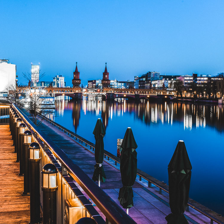
using lines for more impact in your images

The image above shows an example of how you can use lines to create a visual guidance within your city and architecture images, that will help your viewers find multiple points of interest and take a closer look.

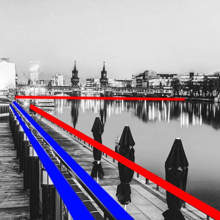
using lines for more impact in your images

To help you understand how the lines work in a rather complex image like this, reducing the image to a black and white version with high contrast, can help visualize the structures of the image without getting distracted by the color elements.

Why lines are important especially for urban images

While in many areas of photography, using depth of field and blurred backgrounds is a good way to lead the viewers’ eyes to the most important element, and add a sense of perspective, as city photographers we rarely have this choice. In architecture images, you want most elements to be in focus.

When taking pictures of city scenes, you need to structure your images in different ways to provide perspective and a feel of scale. The conscious use of lines in your images can divide a photo into smaller pieces, separate elements from each other, provide a sense of perspective and lead your viewers’ eyes to where you want them to focus.

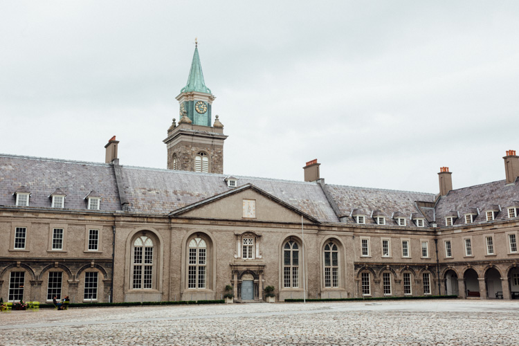
using lines for more impact in your images

The image above shows an example of a random shot without considerations for the use of lines. With its grey stones, the National Museum of Ireland in Dublin on a cloudy day, doesn’t offer much to work with when trying to create an interesting image. This is merely a documentation of the place, but probably wouldn’t make it as a header image.

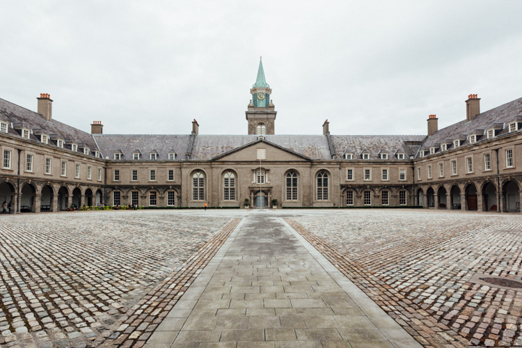
using lines for more impact in your images

However, beyond the documentary aspect, the use of lines to create perspective, orientation and symmetry can increase the impact, even of an otherwise dull looking image.

Which lines can you use to increase impact?

You can separate the lines in three categories which I call:

  • Dividing lines
  • Leading lines
  • Symmetrical lines

A dividing line structures your images into separate areas of interest. It can be horizontal, vertical, or diagonal. You can use it to make a clear difference between bottom and top of an image, but also make sure to use dividing lines to show near and far. In many outdoor images, the horizon line is a natural dividing line.

using lines for more impact in your images

In this image, I am using a major dividing line to clearly separate the floor and the wall. Less noticeable, the additional line in the wall serves as another separation in the photo. Without the addition of this line, the right half of the image would be rather boring. By adding a simple line into the frame, it helps dividing the image into a left and right.

Make sure that your dividing lines are in the right place. With very few exceptions, make sure to place your lines outside of the center of the image (both horizontally or vertically) but also not too close to the borders. The well known Rule of Thirds is good guidance, in many cases dividing images into a two-thirds and a one-third part works best.

Leading lines are an important way to provide your viewers with an idea of perspective. They will lead the eyes into, and around the image. Leading lines often come in pairs, slowly merging into the distant part of the picture. But in fact, you can use multiple leading lines, even one can help the viewer find orientation. Leading lines don’t even have to be straight, you can use curves and angles just as well.

using lines for more impact in your images

The main street in this image serves as a single leading line, it helps the eye find orientation from the interesting space in the foreground, and puts it into the context of the big city.

The third way of using lines to increase impact, is the use of symmetries. When looking for interesting images to capture in a city, try to find symmetrical lines in the architecture around you. Thankfully, architects also know the visual impacts of symmetries, and use them to create the buildings around us.


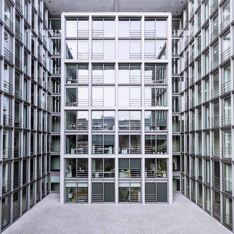
Bürogebäude des Deutschen Bundestages in Berlin,, Deutschland.

Buildings like this lend themselves to be taken in symmetries. While the content is not perfectly symmetrical due to the individual office decorations on the inside, the structure of the building makes an interesting frame for these individual elements. The symmetry helps to create interest, as you subconsciously start looking for the differences between the halves.

Learn to focus on lines

If you are shooting with a camera capable of RAW images, there is an easy way to train yourself to look out for lines: Use your camera settings, and change your camera to shoot in black and white!

When shooting RAW, the camera will still capture and store all the data from the sensor, including the color information. So when you are back at your computer to edit images, you will find all the options to create color images as well. But while shooting, you can look at your images at the screen in black and white, which will eliminate distractions from the forms in your image.

using lines for more impact in your images

Going a step further, in most cameras you can set up your own image processing profile in camera: Increase the contrast and sharpness of the image as far as possible, and you will end up with a preview image on the camera screen that is mostly reduced to the lines.

Additional ways to use lines

using lines for more impact in your images

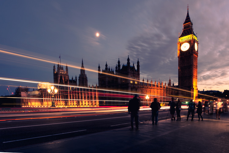
Probably one of the most photographed objects in the world, the houses of parliament and the tower with Big Ben in London, UK, it is hard to come up with a unique version. In this image above, I added the light trails created by the passing traffic to add an interesting element. The light trails serve both a dividing lines between the other photographers in the foreground and the architecture in the background, as well as leading lines providing perspective from the left to the right part of the picture.

using lines for more impact in your images

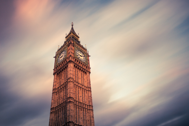
When taking images of tall buildings, like in this case the tower of Westminster, the borders of the building will typically provide leading lines from the bottom (near) to the top (far). To generate an additional element of interest, I used a long exposure image to create another set of lines, through the moving clouds in the sky above the building. This helps add a dynamic element and interest, to an otherwise static and often boring background.

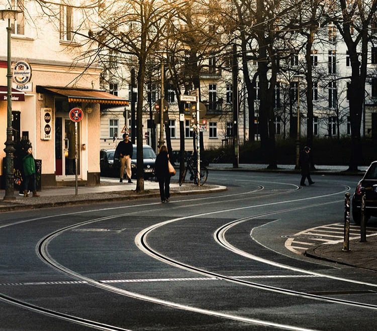
curved leading lines

Do not limit yourself to using only straight lines. While a horizon should always be straight and strictly horizontal, others, especially leading lines, can also be curved. In this image above, the cable car tracks take two turns that lead the viewer’s eyes from the bottom (near) to the center (far) part of the image.

Even complex scenes win from the use of lines

Once you become aware of the lines in your images, you can use them to structure even more complex scenes.

using lines for more impact in your images

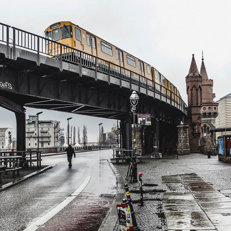
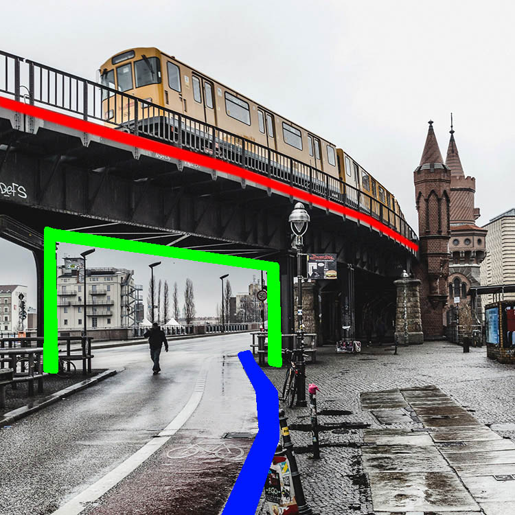
While the above example might show the lines all that obvious, you will most likely see the curb of the street easily as a (curved) leading line into the image.

using lines for more impact in your images

However, upon a closer look, you can also note the use of a dividing line separating the photo into a top and bottom part to provide additional perspective and scale. Finally, a use of lines as a frame puts more emphasis on the silhouetted person crossing the scene, adding further scale to the size of the elements contained.

These lines help the viewers structure the image into separate parts and make it easier for the brain to digest all the elements contained.

How do you use lines in your compositions? Please share in the comments below.

googletag.cmd.push(function() {
tablet_slots.push( googletag.defineSlot( “/1005424/_dPSv4_tab-all-article-bottom_(300×250)”, [300, 250], “pb-ad-78623” ).addService( googletag.pubads() ) ); } );

googletag.cmd.push(function() {
mobile_slots.push( googletag.defineSlot( “/1005424/_dPSv4_mob-all-article-bottom_(300×250)”, [300, 250], “pb-ad-78158” ).addService( googletag.pubads() ) ); } );

The post How to Improve the Impact of Your Urban Images Using Lines by Michael Zwahlen appeared first on Digital Photography School.


Digital Photography School

 
Comments Off on How to Improve the Impact of Your Urban Images Using Lines

Posted in Photography


Minimalist Tattoos: Elegant Body Art Drawn With Just One Line

27 May

single line art

Tattoos are generally lauded for their intricacy and complexity, but these bold, beautiful and simple alternatives become artfully different thanks to a simple trick: the use of a single continuous line.

one line lips

single line tattoo

Made by Mo Ganji, a Berlin tattoo artist, each of these works (if you look closely) starts and ends at a single pair of points, no matter how they appear at first glance.

one line koi fish

one line hands together

The zigs and zags required to make this approach work are what signal the viewer to make such a closer inspection in the first place.

one line face

one line bike

Despite the simplicity and consistency of the method, the results are surprisingly varied, from very geometric shapes of human-made objects to organic curves of human and other natural forms.

one line tree

one line conifer

In some cases, pointillist patterns are added to add texture, creating leaves, shadows or other details, but kept intentionally non-linear so as not to detract from the primary lone-line drawing. (via Colossal)


WebUrbanist

 
Comments Off on Minimalist Tattoos: Elegant Body Art Drawn With Just One Line

Posted in Creativity