RSS
 

Archive for March, 2016

Change of scenery: How a photographer’s trip to Idaho inspired a big move

27 Mar

$ (document).ready(function() { SampleGalleryV2({“containerId”:”embeddedSampleGallery_8112216034″,”galleryId”:”8112216034″,”isEmbeddedWidget”:true,”standalone”:false,”selectedImageIndex”:0,”startInCommentsView”:false,”isMobile”:false}) });

What could convince a California native to leave the state’s famously beautiful coasts and sunshine behind? For photographer and Resource Travel editor Michael Bonocore, a visit to Idaho’s pristine wilderness and towering mountains was enough. He recently spent some time traveling and photographing the state, from bustling Boise to the untouched powder of the Selkirk Mountains.

The photographic opportunities were so rich and the possibilities for outdoor adventure so abundant, Bonocore decided to make a full-time move to the Gem State. See some of his photos here and read the full account of his trip on Resource Travel.

Articles: Digital Photography Review (dpreview.com)

 
Comments Off on Change of scenery: How a photographer’s trip to Idaho inspired a big move

Posted in Uncategorized


A Colourful Collection of Images from The Holi Festival

27 Mar

Happy holi by Khan Clicks on 500px.com

Holi is a spring festival in India and Nepal, also known as the festival of colours or the festival of sharing love. It’s a wonderful festival for participants but presents photographers with an amazing opportunity.

The festival happened in the last week so we thought we’d put together a collection of images from it (and previous years).

If you’ve been – we’d love to see your images from it in comments below!

Holi Matura by Vichaya Pop on 500px.com

Holi-Festival of Colors by Muthu Krishna on 500px.com

Lost in the Echo by Mrigankamouli Bhattacharjee on 500px.com

Holi @ Banke Bihari Temple by Saravanan Dhandapani on 500px.com

"The Holy Chants" by Prakash singh on 500px.com

Colors Wave by WAEL ONSY on 500px.com

Holi Festival Girl by Ron Kimhi on 500px.com

~ Color Palette ~ by Rudra Mandal on 500px.com

color gaze by AMITABH KUMAR on 500px.com

The Colours Of Holi by Vichaya Pop on 500px.com

Intense Colours by sathis ragavendran on 500px.com

Faith by Sudarshan Das on 500px.com

Holi Melody by Utkarsh Chaturvedi on 500px.com

Rain of Colors by Sreejith  Babu on 500px.com

Colored Face by Tom  Abraham Dcruz on 500px.com

Colours of life by Prakhar Tripathi on 500px.com

Holi man by dimitris manioros on 500px.com

googletag.cmd.push(function() {
tablet_slots.push( googletag.defineSlot( “/1005424/_dPSv4_tab-all-article-bottom_(300×250)”, [300, 250], “pb-ad-78623” ).addService( googletag.pubads() ) ); } );

googletag.cmd.push(function() {
mobile_slots.push( googletag.defineSlot( “/1005424/_dPSv4_mob-all-article-bottom_(300×250)”, [300, 250], “pb-ad-78158” ).addService( googletag.pubads() ) ); } );

The post A Colourful Collection of Images from The Holi Festival by Darren Rowse appeared first on Digital Photography School.


Digital Photography School

 
Comments Off on A Colourful Collection of Images from The Holi Festival

Posted in Photography


How to Give Your Images the Hollywood Treatment Step by Step

27 Mar

fig 1-1

Do you have an image that you would like to give the Hollywood treatment to, and really help make it pop? In this article, I’ll be showing you a method that you can use to give your images the blockbuster treatment, and take them to the next level. The best part about it is that you don’t have to be a Photoshop genius to do it!

The technique that we’ll be exploring is referred to as color-grading. The term color-grading is generally reserved for motion pictures where the editors would apply a creative color correction to films, but now it’s something that is appearing more and more in the vocabulary of still photographers. Color-grading is not to be confused with color correcting; it’s something quite different. Where color correcting is the process of ensuring that color casts are removed and colors are more accurate as a result, color grading is the process of altering and/or enhancing colors in specific areas in your image, such as shadows and highlights, to communicate a particular emotion or simply make the subject pop more, for example. If you have seen a movie then chances are extremely likely that you have seen color-grading at work.

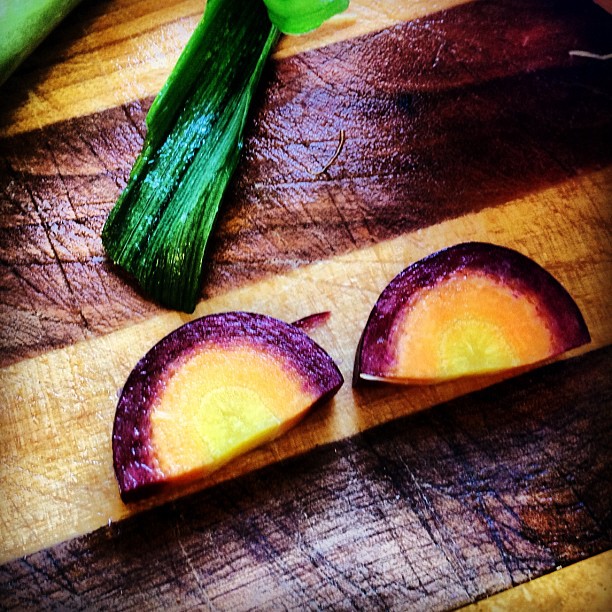
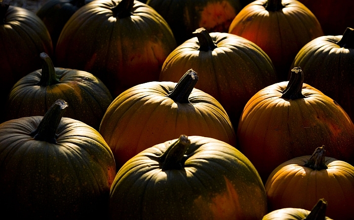
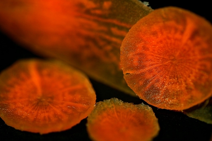
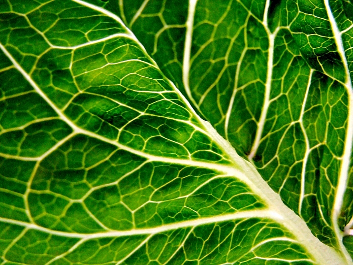
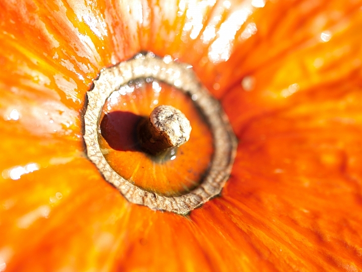
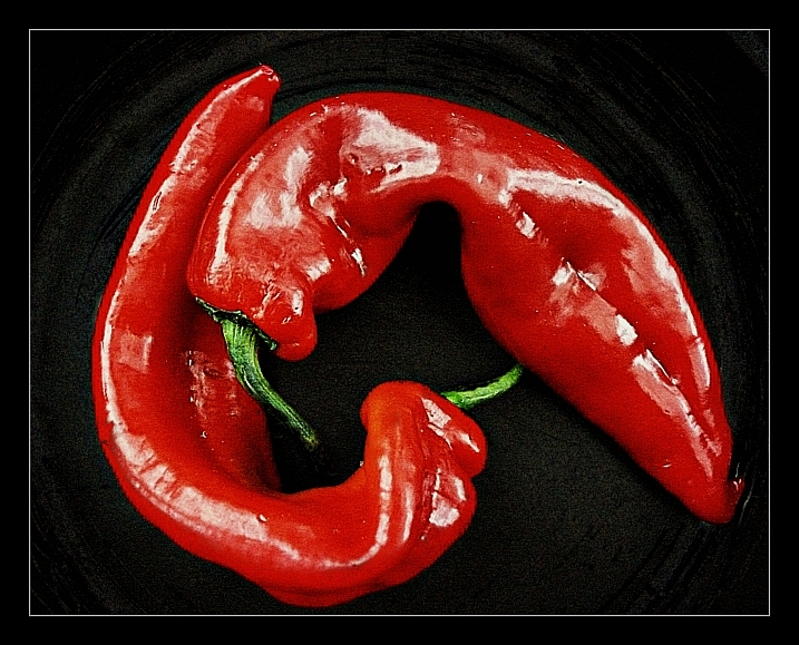
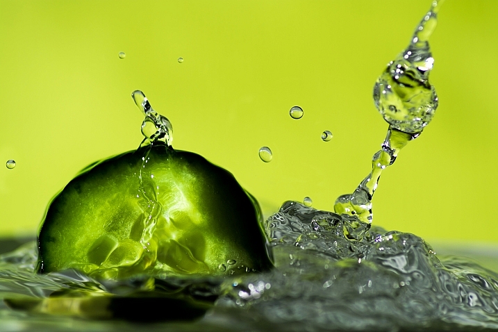
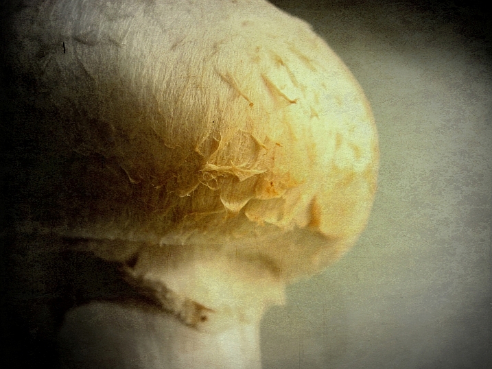
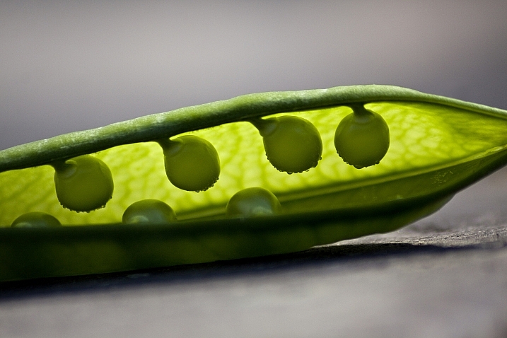
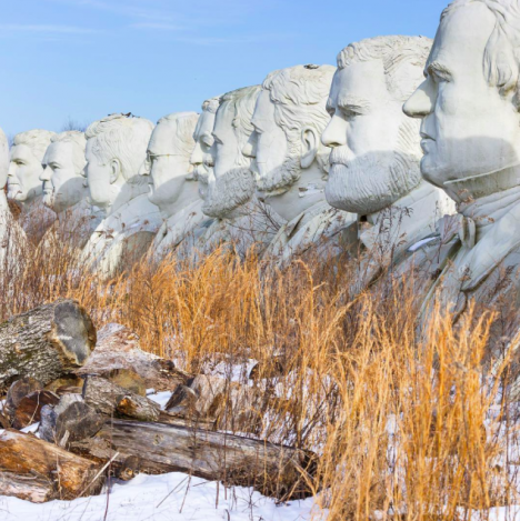
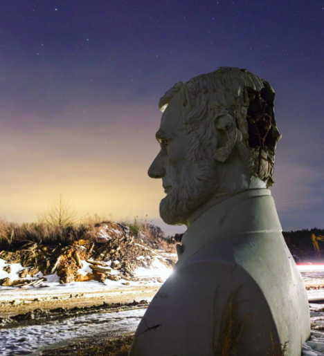
The most common, and easiest color-grading, is the use of  complimentary colors; for example teal/blue tones in the shadows and the opposite color, yellow/orange, in the highlights. These two groups of colors sit opposite each other on the color wheel and being complimentary colors, they work harmoniously together and help the subject stand out more. See these other examples of complimentary colors in action. There are other types of color-grading using different color theory methods, such as analogous and triad, however complimentary is the simplest to learn and it can provide great results.

Before you begin, please ensure that the image you wish to work on has no color cast already, as this will affect the final result. Correcting your white balance is a great place to start. If you are unsure how to do that, 3 Ways to Change White Balance in Lightroom may help you.

In this article, I’ll be using curves in Photoshop to add the color-grading, so if you are unfamiliar with curves, How to do a Quick and Easy Curves Adjustment in Photoshop. As with many other things in Photoshop, there is always more than one way to get the job done, but for a straight forward process that gives fantastic results, you cannot beat curves! (Curves would have to be one of my favourite adjustments in Photoshop, as you can control so many aspects to your image with this function alone.) I won’t be giving you exact numbers to dial in with each adjustment, as your tastes may vary to mine, and you will also be working on an image different to mine, so what will work for my image will not necessarily work for yours.

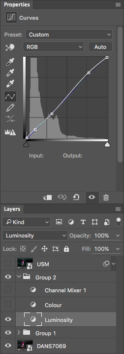
Step 1: Add two adjustment layers

Base Image

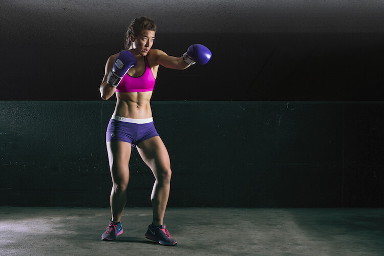
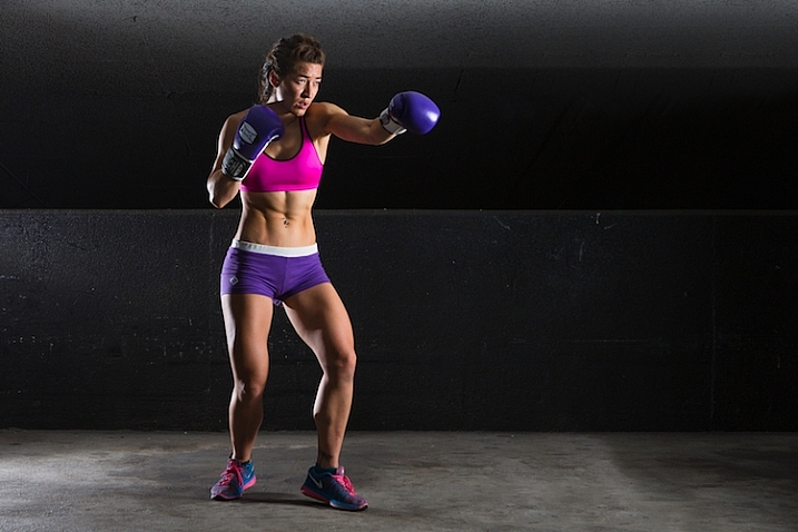
I have the image that I would like to color-grade, and I want to add the teal/orange color combination, to give it that blockbuster look. I’ve ensured that there are no color casts already so I am good to go with this file. Get your image ready, and follow along.

The first step now is to add two curve adjustment layers; name the first one Luminosity and the other Color (I always like to name each of my layers as part of my workflow as it quickly helps me remember what each layer is doing). Now change the blend mode of the Luminosity layer to Luminosity. To do this, simply click on Normal in the layers panel; this should bring up a drop-down menu. Now scroll all the way to the bottom and select Luminosity.

Next, do a similar process with the Color layer selected; only instead of selecting Luminosity blend mode, you’ll be selecting Color. What these two steps are doing is very helpful when making adjustments to the curve in each layer. By changing one layer to a luminosity blend, you are effectively making only adjustments to the luminosity, or light levels of the image, and not adjusting color in any way. This is very help when increasing contrast, for example, as increasing contrast can alter the saturation of colors in the image.

Conversely, altering the blend mode of the Color layer to Color ensures that only color adjustments in the curve layer will be applied, and it will have no affect on the luminosity values of the image at all.

Step 2: Adjust the curve layers

Now that you have the two curve layers made and named, it’s time to adjust them and let the magic happen. Firstly, we want to increase the contrast of the image. So with the Luminosity curve layer selected, add a simple S-Curve to the curve layer. This is referring to a curve that is in the shape of an S, and this style of curve increases contrast.

Contrast Curve Layer

As you can see, I have made a very slight adjustment with contrast here; the shadows have been darkened slightly and the highlights increase slightly. The image was already quite contrasty so I didn’t want to add too much more to it.

Contrast Curve

Here’s the effect of adjusting the contrast curve.

Step 3: Add color-grading

With the overall contrast of the image looking pretty good, it’s now time to move on to add the color-grading. To add teal to the shadows and yellow to the highlights, select the Color curve adjustment layer and click on the RGB drop down menu. First up is red. we need to remove red from the shadows, but add some to the highlights. If you click on the bottom left of the curve and drag the shadow anchor point to the right, you will see a drop in red from the shadows and green begins to appear. To add red in the highlights, simply click the anchor point at the top right and slide it toward the left.

Repeat this step for each of the green and blue colors in the drop-down menu.

There is no set amount as to how much each should be moved. Start off with small amounts and increase as, and if required. To prevent the skin tones from being affected, I added an anchor point to the middle of the curve. To do this, I simply clicked on the curve in the centre of each color curve. This will lock that specific part of the curve and skin tones are around the mid-tone area.

Curves

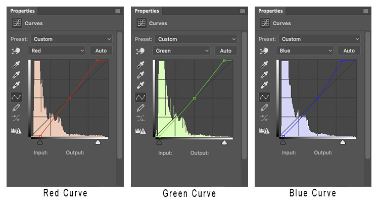
Here is how each of the color curves looks with this image.

If there are areas where you feel the color has been affected too much – perhaps you have too much red in the face, for example – clicking on the targeted adjust tool (TAT) will allow you to pinpoint the exact area on the curve that needs adjusting. Simply select the TAT and click in the image, on the area you want to target, and this will place an anchor point on the curve. You can now move that anchor up or down to suit. Using the keyboard keys to move up and down is most accurate.

Colour Curve

Now I have adjusted the colors in the curve to how I would like them to look. Switch this adjustment layer on/off to see what impact the adjustments have for you. You may need to revisit each of the color curves and readjust slightly.

Step 4: Add a Channel Mixer layer

The final step in this is to add a Channel Mixer adjustment layer. For this image, I selected the Black and White with Red Filter, but feel free to experiment with different options for your image. You want to use one that creates a nice amount of contrast in your subject and background. You can also adjust the RGB sliders to suit, and finally, reduce the opacity of this layer (I usse 34%).

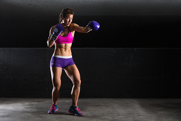
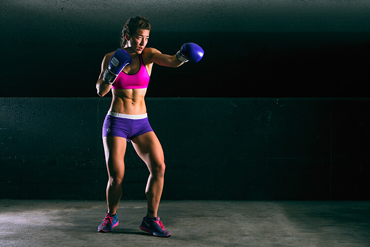
Here is the final product.

fig 2

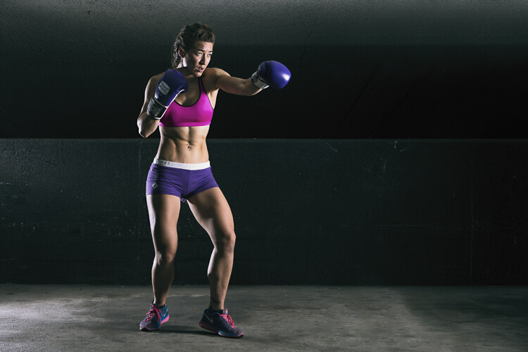
There is quite a difference when compared with the original image below.

Base Image

Let’s look at them side by side:

Before

Before

After

After

Where to now?

Now you have an introduction to color-grading using curves in Photoshop. With this example I showed you how to add a teal cast to the shadows, and a warmer orange tone to the highlights, but don’t feel that you are trapped with just this color combination. Experiment with moving the shadow and highlight anchor points in each color channel in a different direction; not just horizontally. Just remember that as a general rule, cooler colors such as greens and blues are more prevalent in shadow areas, and warmer colors such as reds and yellows should be in the brighter areas.

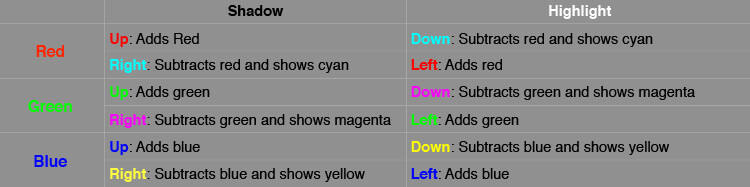
Here is a run down on the effects of moving the shadow and highlight anchor points for each color channel:

Table

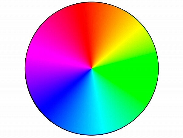
If you ever forget what the opposite colors are, here is a handy color wheel.

Color Wheel

googletag.cmd.push(function() {
tablet_slots.push( googletag.defineSlot( “/1005424/_dPSv4_tab-all-article-bottom_(300×250)”, [300, 250], “pb-ad-78623” ).addService( googletag.pubads() ) ); } );

googletag.cmd.push(function() {
mobile_slots.push( googletag.defineSlot( “/1005424/_dPSv4_mob-all-article-bottom_(300×250)”, [300, 250], “pb-ad-78158” ).addService( googletag.pubads() ) ); } );

The post How to Give Your Images the Hollywood Treatment Step by Step by Daniel Smith appeared first on Digital Photography School.


Digital Photography School

 
Comments Off on How to Give Your Images the Hollywood Treatment Step by Step

Posted in Photography


How Thinking Film and Shooting Digital Can Improve Your Photography

27 Mar

Film is not dead. But since the advent of digital photography, about 20 years ago, film has certainly taken a back seat. Since just over a decade ago, when digital cameras were widely available to the masses, film has almost been completely replaced. However, there’s a lot to be learned from the disciplines of analog days, before the ability to take photos so instantly, and at a phenomenal rate and remarkable quality, was made accessible to everyone with a digital camera.

think film shoot digital creative project_0000

Back in film days, we only had a limited amount of frames we could shoot on one roll. Often the camera sat for days and weeks until we had shot all the frames on the roll of film. We then carefully rewound the film and packaged it off to the film developers, then we wait…hours, days, weeks before we even saw the images we shot. Shooting film was no doubt a methodical exercise in process and patience.

think film shoot digital creative project

But, film has made a comeback in recent years. Many professional digital photographers have added film to their arsenal, others have made the complete switch back to film, and there are those who never made the switch to digital in the first place. Exciting days for analog in this predominantly digital age!

One way to learn from the disciplines of shooting film is to think in film mode.

think film shoot digital creative project

Go out with your camera with the following restraints:

  1. Set yourself an imaginary film roll number. Limit the number of frames you can shoot to 12, 24, or 36.
  2. Keep your ISO to a set number like 100, 200, 400, or 800 – which are the common film speeds from those days.
  3. Use only one lens. I’m sure not many of us, unless we were professionals then, walked around with an array of lenses in hand. Often we just used one lens, carried no back up film, or batteries, or external flash!

think film shoot digital creative project

Now shoot like you have a film camera in your hand and adopt these mindsets:

1.Don’t spray and pray!

When you take a photo, bear in mind how many frames you have left, and think carefully before you press the shutter. You cannot spray and pray with film, therefore have to exercise restraint. Look at things carefully, with an intentional eye, and imagine what the scene might look like before you take the shot. This helps you compose the frame more meticulously, and look at the light and dark contrast of the scene with more discernment.

think film shoot digital creative project

2. Think of a story or theme, or limit yourself to one place.

Boundaries are always helpful, they stretch you to think outside the box, more than when you have all the freedom in the world to photograph anything you please. It also helps make a cohesive story at the end, should you wish to collate your photos together on a blog or in an album.

think film shoot digital creative project

3. Don’t fear deep darkness or the raging midday sun.

Film is so good at retaining details in highlight and shadow areas of a photograph, that the dynamic range of the image is miles better compared to the digital camera image. Film also has a very forgiving nature when it comes to underexposure and overexposure over a wide range of stops. So with your film brain on, don’t fear extreme brightness or deep darkness. However bear in mind the settings to use that could help you in such circumstances.

When your subject is in bright daylight, and you don’t have a light meter handy, adopt the sunny f/16 rule. This means you use the following settings: aperture f/16 and your shutter speed set to the reciprocal of your ISO, or film speed. For example, if you have set your ISO to 100, this means your aperture will be f/16 and your shutter speed to the closest of 100 which is 1/125 (or any equivalent exposure value such as f/11 at 1/250, or f/8 at 1/500).

think film shoot digital creative project

4. Go where the light is

Whether it be natural light or any other available light, whether under the brightness of the sun or just candelight in a room, find the light. Film is extremely sensitive to light and if you adjust your shutter speeds in low light accordingly, you will be surprised at how well film can capture ambient light. Remember when shooting in low light, steady yourself or your camera, lower your shutter speed and adjust your aperture (open it wide). Your ISO cannot be changed; with film you only have two sides of the exposure triangle to play with.

think film shoot digital creative project

5. Edit for a film look

Nowadays there is a plethora of Lightroom presets, and Photoshop actions, that replicate the film look. If you are a dab hand at Photoshop, you can probably do it yourself from scratch. The main elements you are after to replicate the general film look are: pastel tones, creamy highlights, soft shadows, low and controlled contrast, reduced saturation, matte look (reduced black output), creamy skin tones, and some grain. Of course the actual overall look depends of the type of film used, but this list would encompass the general look and feel that film gives to an image.

think film shoot digital creative project

The photos I have used in this article were taken with a D700 and a 35mm f/1.4G, captured one day in London when I went out thinking film and shooting digital. I shot 22 frames out of 24 in three hours, nailed 19, botched two and fixed one in Photoshop.

think film shoot digital creative project

I hope you try this exercise and have fun with it. Share below in the comments how many frames you managed to shoot under great restraint, and then celebrate!

think film shoot digital creative project

amzn_assoc_placement = “adunit0”;
amzn_assoc_enable_interest_ads = “true”;
amzn_assoc_tracking_id = “dpsgeneral-20”;
amzn_assoc_ad_mode = “auto”;
amzn_assoc_ad_type = “smart”;
amzn_assoc_marketplace = “amazon”;
amzn_assoc_region = “US”;
amzn_assoc_linkid = “6710d26f550e9793f41475ee806fee9e”;
amzn_assoc_emphasize_categories = “13900861”;
amzn_assoc_fallback_mode = {“type”:”search”,”value”:”digital cameras”};
amzn_assoc_default_category = “Photo”;

googletag.cmd.push(function() {
tablet_slots.push( googletag.defineSlot( “/1005424/_dPSv4_tab-all-article-bottom_(300×250)”, [300, 250], “pb-ad-78623” ).addService( googletag.pubads() ) ); } );

googletag.cmd.push(function() {
mobile_slots.push( googletag.defineSlot( “/1005424/_dPSv4_mob-all-article-bottom_(300×250)”, [300, 250], “pb-ad-78158” ).addService( googletag.pubads() ) ); } );

The post How Thinking Film and Shooting Digital Can Improve Your Photography by Lily Sawyer appeared first on Digital Photography School.


Digital Photography School

 
Comments Off on How Thinking Film and Shooting Digital Can Improve Your Photography

Posted in Photography


Nothing to Hide: Open Glass Islamic Culture Center for NYC

26 Mar

[ By WebUrbanist in Architecture & Public & Institutional. ]

islamic center facade

Designed to dispel fears surrounding Muslim culture, practices and traditions, a new wide-open skyscraper design for New York City invites people of all faiths to enter, through both programmatic functions and a clear facade.

islamic center facade glass

The schematic proposal by local firm Buro Koray Duman was commissioned by the American Society for Muslim Advancement (ASMA), aiming to promote progressive change and social justice. The Society hopes to show another side of Islam to the city and the world.

islamic center entry door

The idea is, in part, to highlight cultural aspects of Islam as apart from the strictly religious (and particularly: radicalized) associations, distinguishing between peoples and religions.

islamic center design diagrams

The building is structured to be as welcoming and open as possible, consisting of horizontal floors stacked to fit a vertical urban landscape.

islamic center walkways interior

From Dezeen: “His studio’s schematic design for the centre features a 100,000-square-foot (9,290 square metres) building that takes its cue from historic Islamic cultural complexes, called kulliyes.”

islamic center vertical stacks

“In these complexes, which are laid out horizontally, low-slung buildings with varying functions are organised around a centrally placed mosque.”

islamic center central volume

A central volume contains an auditorium, library, prayer room, restaurant and offices, connected by walkways that span public and private spaces around the perimeter.

islamic center vertical wrap

This design may or may not be realized; the idea of building Islam-centered architecture near the site of the 9/11 attacks has been contentious for well over a decade.

islamic center nyc

Supporters hope, however, that structure (conceptual or actual) can show another dimension to even the wariest members of the public, at least opening the door to interfaith and intercultural dialogue.

Share on Facebook


[ By WebUrbanist in Architecture & Public & Institutional. ]

[ WebUrbanist | Archives | Galleries | Privacy | TOS ]


WebUrbanist

 
Comments Off on Nothing to Hide: Open Glass Islamic Culture Center for NYC

Posted in Creativity


Readers’ Showcase: Steven James Martin

26 Mar

Readers’ Showcase: Steven James Martin

Oranges on sale at Kalaw train station, Burma (Myanmar), January 2014. Photo by Steven James Martin

DPR reader Steven James Martin took up photography while living in Asia. Originally from the UK, Martin suddenly found himself within easy traveling distance of locations some photographers can only dream of visiting, like Vietnam, Thailand and Myanmar. His colorful portfolio reflects a love of travel – see some of his images here and find out more about him in our Q+A.

See more of Steven James Martin’s work at his website, and keep up with him on Facebook, Twitter and Instagram. Interested in having your work featured in an upcoming Readers’ Showcase? Let us know! Include your DPR user name a link to your online portfolio.

Readers’ Showcase: Steven James Martin

Fisherman on Inle Lake at sunset, Burma (Myanmar), January 2014. Photo by Steven James Martin

Tell us a bit about you and what your history with photography is.

My interest in photography really began in 2006, when I bought a Nikon D40 while working in Japan as an English teacher. I lived in Japan and South Korea for three years, which gave me the opportunity to visit some fantastic places in Asia, including Thailand, Vietnam, Burma (Myanmar), India, Malaysia, the Philippines and Indonesia. I’ve also visited many photogenic countries in Europe – Italy, Portugal and Greece in particular – as well as Morocco and the USA. For me photography has always been linked to travel, and exploring new places, landscapes and cultures. In 2015 I started selling my images through the premium stock photography agency Offset.

Readers’ Showcase: Steven James Martin

Buddha at sunrise, Borobodur, Java, Indonesia, August 2015. Photo by Steven James Martin

What do you shoot with now?

I shoot with a Nikon D5100, predominantly with an 18-55mm lens and a 50mm F1.8 lens for portraits. I often receive comments expressing surprise that I only use an entry-level DSLR and kit lens. However I really don’t think much more than that is needed, particularly if you’re shooting travel rather than sports or wildlife – I’d go out on a limb and say the image quality of most DSLRs on the market today is fairly comparable. I’m considering adding a wide-angle lens to my lineup, but overall I think it’s the photographer that captures the moment and makes the image, rather than the gear.

Readers’ Showcase: Steven James Martin

Indian sadhu (holy man), Varanasi, India, November 2014. Photo by Steven James Martin

Many of the photos in your portfolio come from trips to Southern and Southeastern Asia. What draws you to that region? 

I lived in Asia for three years, during which I really developed an affinity for the region, and since then I’ve kept going back. There’s something about the warm and welcoming people, the amazing food and the beautiful lush scenery and beaches that make it a really rewarding and photogenic area of the world to visit.

Readers’ Showcase: Steven James Martin

Adraga Beach, Portugal, September 2013. Photo by Steven James Martin

Where haven’t you been that you’d like to go?

I’m keen to visit Laos and southern Vietnam – that might be my next trip to Asia. But before then I’d love to visit a whole host of other places on different continents – Kyrgyzstan and Uzbekistan in Central Asia, Iran in the Middle East, Ethiopia and Namibia in Africa, and Peru, Bolivia and Argentina in South America are all on my list of places to go, given the time and money!

Readers’ Showcase: Steven James Martin

Balloons at sunrise over Bagan, Burma (Myanmar), January 2014. Photo by Steven James Martin

Do you have any tips for photographers traveling to far-off places?

Travel light! Lugging heavy equipment round all day can make you tired and irritable, and less likely to concentrate on what you’re experiencing. Bring plenty of batteries and SD cards, some lens cleaning cloths and other useful, lightweight accessories. Do some research before you go, but be open to new experiences and changes to your itinerary. Be prepared for the unexpected! And don’t be afraid to interact with locals – a few words and a smile can break down barriers very quickly, and people who are initially hesitant can become happy to be photographed.

Readers’ Showcase: Steven James Martin

Children playing on abandoned fishing boat, Kuta, Lombok, Indonesia, August 2015. Photo by Steven James Martin

What resources have been most useful to you as you’ve learned photography?

One of the things that makes photography so compelling as a hobby for me is that it combines art and creative vision with gear and technology. On the artistic side, Steve McCurry is the professional photographer who has probably influenced me the most. I love his work, and studying the work of the masters can really help you to learn a lot of lessons about the use of lines, shapes, light and colour. Another influence is David duChemin, who talks a lot about vision in photography. I was pleased to be featured on one of his Vision is Better YouTube episodes.

On the tech side, I enjoy listening to photography podcasts such as This Week In Photo, Martin Bailey’s Photography Podcast and Tips from the Top Floor, and various YouTube channels.

Readers’ Showcase: Steven James Martin

Ceiling detail, St Peter’s Basilica, Vatican City, July 2014. Photo by Steven James Martin

Are there any photographic projects you’d like to, or are planning to tackle?

I tend to become really lax at shooting when I’m not travelling, which is a shame as there’s plenty of inspiration at home if you’re willing to look for it. I really enjoy portraiture, so I’m thinking of doing some UK-based portrait work, which would involve learning to use external flashes – something I haven’t had any experience with yet.

Readers’ Showcase: Steven James Martin

Buddhist monk, Nyaungshwe, Burma (Myanmar), January 2014. Photo by Steven James Martin

What’s been the best advice you’ve been given as a photographer?

A lot of photography is about observing things around you, and those observational skills can only develop if you slow down and be patient. Cartier-Bresson said something about finding an interesting background and then waiting for an interesting foreground element to present itself, and I think that’s very true. Also, pay attention to the time of day: wait for the best light either early or late in the day, as it makes a massive difference. And finally, invest in Adobe Lightroom! Not only as a place to do some post-processing tweaks, but also as an excellent way to rate and catalogue your images.

Articles: Digital Photography Review (dpreview.com)

 
Comments Off on Readers’ Showcase: Steven James Martin

Posted in Uncategorized


Photogenic Edibles – 25 Artistic Photos of Veggies

26 Mar

Inspired by Edward Weston’s famous image of a pepper, comes this week’s image collection – veggies. Can a simple vegetable become art? You decide.

Ryan Lane

By Ryan Lane

Grahamvphoto

By grahamvphoto

Matt Artz

By Matt Artz

Aurelien Guichard

By Aurelien Guichard

Thomas Hawk

By Thomas Hawk

E.c.johnson

By e.c.johnson

B .Y

By B .Y

William Warby

By William Warby

Andreas Engel

By Andreas Engel

Grant

By Grant

William Warby

By William Warby

Violscraper

By violscraper

Ian Richardson

By Ian Richardson

Marianela Díaz-cardozo

By marianela díaz-cardozo

Rum Bucolic Ape

By Rum Bucolic Ape

Sid

By sid

Dominique Pelletier

By Dominique Pelletier

Oveja

By Oveja

Yasser Abusen

By Yasser Abusen

Stanley Zimny (Thank You For 17 Million Views)

By Stanley Zimny (Thank You for 17 Million views)

Nebojsa Mladjenovic

By nebojsa mladjenovic

Valentin Kold Gundersen

By Valentin Kold Gundersen

Kurtis Garbutt

By Kurtis Garbutt

Sarah Horrigan

By Sarah Horrigan

Tjarko Busink

By Tjarko Busink

googletag.cmd.push(function() {
tablet_slots.push( googletag.defineSlot( “/1005424/_dPSv4_tab-all-article-bottom_(300×250)”, [300, 250], “pb-ad-78623” ).addService( googletag.pubads() ) ); } );

googletag.cmd.push(function() {
mobile_slots.push( googletag.defineSlot( “/1005424/_dPSv4_mob-all-article-bottom_(300×250)”, [300, 250], “pb-ad-78158” ).addService( googletag.pubads() ) ); } );

The post Photogenic Edibles – 25 Artistic Photos of Veggies by Darlene Hildebrandt appeared first on Digital Photography School.


Digital Photography School

 
Comments Off on Photogenic Edibles – 25 Artistic Photos of Veggies

Posted in Photography


Weekly Photography Challenge – The Humble Vegetable

26 Mar

Earlier we looked at some artsy images of everyday objects – vegetables.

Williamo!

By Williamo!

Weekly Photography Challenge – the humble vegetable

This week we want you to go find some produce and photograph it! Think outside the box:

  • Try black and white
  • Shoot macro
  • Go for an abstract
  • Backlight it
  • Light paint it
Samandel.com

By samandel.com

Flavio~

By Flavio~

Lynn Friedman

By Lynn Friedman

Amelia Crook

By Amelia Crook

Woodleywonderworks

By woodleywonderworks

Tristan Bowersox

By Tristan Bowersox

Gillie Rhodes

By Gillie Rhodes

Tim Geers

By Tim Geers

Jar []

By jar []

Share your images below:

Simply upload your shot into the comment field (look for the little camera icon in the Disqus comments section) and they’ll get embedded for us all to see or if you’d prefer upload them to your favourite photo sharing site and leave the link to them. Show me your best images in this week’s challenge. Sometimes it takes a while for an image to appear so be patient and try not to post the same image twice.

David Reber

By David Reber

googletag.cmd.push(function() {
tablet_slots.push( googletag.defineSlot( “/1005424/_dPSv4_tab-all-article-bottom_(300×250)”, [300, 250], “pb-ad-78623” ).addService( googletag.pubads() ) ); } );

googletag.cmd.push(function() {
mobile_slots.push( googletag.defineSlot( “/1005424/_dPSv4_mob-all-article-bottom_(300×250)”, [300, 250], “pb-ad-78158” ).addService( googletag.pubads() ) ); } );

The post Weekly Photography Challenge – The Humble Vegetable by Darlene Hildebrandt appeared first on Digital Photography School.


Digital Photography School

 
Comments Off on Weekly Photography Challenge – The Humble Vegetable

Posted in Photography


DJI Inspire 1 Raw Edition with Zenmuse X5R 4K MFT camera starts shipping March 28

26 Mar

The DJI Inspire 1 Raw Edition quadcopter with Micro Four Thirds Zenmuse X5R camera will begin shipping on March 28, the company has announced. Additionally, DJI plans to start shipping the standalone Zenmuse X5R camera on March 31 for those who want to buy it separately. The Zenmuse X5R features interchangeable lenses, remote-controlled aperture and focus and records 4K video.

According to DJI, the Zenmuse X5R is the smallest lossless 4K camera designed for use with drones. Videos are recorded at an average bitrate of 1.7Gbps (up to 2.4Gbps) in CinemaDNG to an internal SSD. Likewise, the X5R also features a D-LOG mode for more flexible post-production color grading.

The Inspire 1 Raw with Zenmuse X5R was announced in September 2015 and is currently available for preorder. DJI stated today that both products will go up for sale through its own stores and through its dealers, as well as through ‘all sales channels’ starting next week. The drone with camera is listed for $ 5,999 on B&H Photo’s website.

Via: DJI Forum

Articles: Digital Photography Review (dpreview.com)

 
Comments Off on DJI Inspire 1 Raw Edition with Zenmuse X5R 4K MFT camera starts shipping March 28

Posted in Uncategorized


Presidential Graveyard: 43 Colossal Statues Crumble in a Field

26 Mar

[ By Steph in Destinations & Sights & Travel. ]

Drone footage of abandoned president statues

Nearly every single President of the United States, from George Washington through George W. Bush, sits in a dead field in Virginia, some with the tops of their heads blown off or streaks of dirt streaming down their cheeks, looking rather war-torn. Stark white and silent, they wait for what will likely be their ultimate fate: total destruction. The 43 crumbling statues were saved from demolition after the closure of Presidents Park in Williamsburg, Virginia in 2010, and now drone footage has captured them in their current state of purgatory.

Screen Shot 2016-03-25 at 8.28.20 AM

Screen Shot 2016-03-25 at 8.51.30 AM

A man named Howard Hankins was reportedly tasked with destroying the statues when the park shut down after six years in operation, and couldn’t bear to go through with it. He had them moved – at a cost of $ 50,000 – to his farm in the small town of Croaker, about ten miles away. Most of the damage to the twenty-foot-tall statues was sustained during the move. The field is private property and not open to visitors, but Hankins did allow one drone operator access to take this stunning video.

Screen Shot 2016-03-25 at 8.28.27 AM

Weighing up to 20,000 pounds each, the statues were a challenge to relocate. The tops of the their heads had to be cracked so a crane could hook onto the metal frame inside each one to move them, and some sustained neck damage as they were lifted. Once in place, they continued to peel and crack. Ronald Reagan bears the scars of being hit by lightning.

Screen Shot 2016-03-25 at 8.33.38 AM

Their presence in the field is a bit eerie, especially when the landscape is icy, as captured by photographer David Ogden of Abandoned Earth. It’s hard not to see them in a post-apocalyptic light, imagining them crumbling to dust as a symbol of a culture destined to fall – our version of the ruins of Rome. But at this rate, it doesn’t seem like they’ll be around much longer. An attempt to raise funds to preserve them hasn’t mustered any more enthusiasm than the Presidents Park did when it was a tourist attraction tucked behind a motel, too far from Williamsburg’s more popular sights.

Share on Facebook


[ By Steph in Destinations & Sights & Travel. ]

[ WebUrbanist | Archives | Galleries | Privacy | TOS ]


WebUrbanist

 
Comments Off on Presidential Graveyard: 43 Colossal Statues Crumble in a Field

Posted in Creativity