RSS
 

Archive for February, 2016

Urban Microscape: Build Your Own Miniature Metropolis

23 Feb

[ By Steph in Design & Products & Packaging. ]

microscape 1

Display your own little corner of your favorite city – or the entire metropolis of Manhattan – on your wall or table, scaled down to 1:5000 and simplified in white monochrome. ‘Microscapes’ are 3D-printed tiles developed from up-to-date aerial scale data so they can evolve along with built environments, including buildings still under construction or in planning phases. The designers are kicking off their campaign with New York City and will expand to other major cities across the United States and the world once their Kickstarter campaign is complete.

microscapes 10

microscape 2

microscape 3

The entire island of Manhattan is available in the form of individual, 6” square tiles, but to collect all 200, it would cost you a rather shocking $ 25,000. But early backers on the campaign can get a single tile of their choice, featuring some of Manhattan’s most popular locations, for a pledge of $ 65 or more. Each tile captures roughly half a square mile of the city.

microscape 4

microscape 5

microscape 7

microscape 8

The tiles are made from biodegradable, non-toxic white thermoplastic derived from cornstarch and range in height according to whatever section of the city you’ve chosen, up to 5.5 inches tall for the highest skyscrapers. The campaign is already generously over-funded, but you’ve still got a little bit of time left to snag a pre-order of your own.

Share on Facebook


[ By Steph in Design & Products & Packaging. ]

[ WebUrbanist | Archives | Galleries | Privacy | TOS ]


WebUrbanist

 
Comments Off on Urban Microscape: Build Your Own Miniature Metropolis

Posted in Creativity


Hiding in Plain Sight: 17 Secret Spaces from Safes to Pubs

23 Feb

[ By Steph in Design & Fixtures & Interiors. ]

hidden gun safe 2

If you don’t have a Narnia-themed playroom hidden behind a wardrobe, a zombie-proof shelter accessible via your kitchen island or a gun safe under your 900-pound bulletproof couch, you just aren’t living. Some of these hidden rooms, secret passageways and cleverly concealed storage spaces are probably a bit excessive, but who doesn’t wish their house contained at least one of these cool features?

Real-Life Bat Cave: Hidden Garage in San Francisco

hidden garage

In San Francisco, where private parking spaces are just as rare and precious as affordable housing, one house in Haight-Ashbury took the situation into their own hands in a way that wouldn’t upset the city council. The base of the Haight-Ashbury house is indistinguishable from the rest of the historical Victorian facade, but at the push of a button, it reveals a hidden four-car garage.

Narnia-Themed Playroom Hidden Behind Wardrobe
hidden wardrobe narnia 1
hidden wardrobe narnia 2

hidden wardrobe narnia 3
When building a new house, the parents of one particularly lucky nine-year-old girl realized there was some extra space next to her bedroom and decided to have a bit of fun with it instead of just using it as storage or sealing it up. A tiny doorway concealed in the back of a wardrobe leads to the small Narnia-themed playroom complete with a mural that stretches up onto the ceiling.

Storm Shelter Under a Kitchen Island
hidden storm shelter kitchen island

In some parts of the country, having a storm shelter is just as essential as having a bedroom. A company called GFS Storm Shelters came up with a brilliant way to fit one into a home – by placing it under the kitchen, with the entrance hidden under an island. While its actual usage might be a bit mundane, it’s fun to imagine it functioning as a hideaway during the zombie apocalypse or just a fun secret. Hopefully there’s another exit that leads directly outdoors in case a real tornado takes the entire house down on top of it.

Porthole to a Playroom
hidden porthole 1

hidden porthole 2
A circular porthole that blends right into the faux wood floor of this modern home spits you out onto a slide that curls down into a colorful playroom.

Covert Concepts: Fireplace Door & Storage
hidden fireplace door

Anyone searching your home for valuables probably wouldn’t think to check the usually-decorative panels on a wooden fireplace surround, making this a pretty safe place to keep items you’d like to conceal.

Next Page – Click Below to Read More:
Hiding In Plain Sight 17 Secret Spaces From Safes To Pubs

Share on Facebook


[ By Steph in Design & Fixtures & Interiors. ]

[ WebUrbanist | Archives | Galleries | Privacy | TOS ]


WebUrbanist

 
Comments Off on Hiding in Plain Sight: 17 Secret Spaces from Safes to Pubs

Posted in Creativity


8 Tips to Improve Your Photography by Creating Instead of Taking Photos

22 Feb

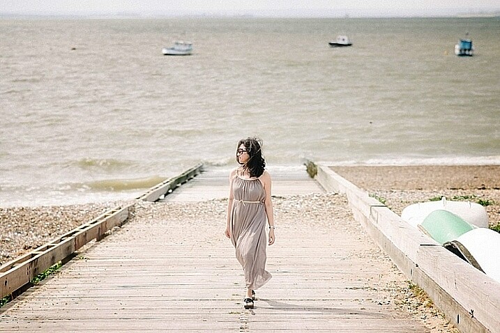
If you’re like most photographers you use your camera to capture a moment; you see an interesting subject, so you photograph it to the best of your ability. But a worthwhile experiment is to try staging a photo. Rather than waiting for all the elements to perfectly arrange themselves, take control and create the moment yourself.

It’s an important lesson in thinking about the story and composition, and it’ll improve your photography in no time. I spent three years photographing everything in sight, but it was only after taking control of my images that I was able to turn my hobby into a profession.

Field of Dreams

Creating a photo can be as simple, or elaborate, as you wish. If you’re interested in street photography, this could involve asking an interesting stranger to pose in a particular place or way. For macro photography, setting up a backdrop behind a pretty flower can make the subject more dynamic. For portraits it could be a photo of your child dressed in their favourite costume, acting out a scene in your backyard. As long as you have actively directed the subject in some way.

Elements to consider are:

  1. Story
  2. Subject
  3. Setting and location, era, time of day
  4. Props
  5. Wardrobe
  6. Pose
  7. Lighting
  8. Framing / Composition and angle, lens used

Let’s break these down one by one.

#1 – Story

What’s happening in your photo? What’s your subject or character doing? A story isn’t always necessary, but having answers to these questions certainly helps make it more engaging, and gives you an idea of what extra elements can help enrich the story.

In “Return of the Sword” (below) I was playing with the idea of King Arthur’s Excalibur, and I wanted my character’s reflection to look as if it were offering her the sword. To be able to tell this story I needed to have the right prop, costume, and location, to help the viewer understand what was happening, and associate it with the original story.

Return of the Sword

#2 – Subject

Who is your character? What physical attributes do they need to have? If you have a willing family member or friend on hand, that’s great! Otherwise you can recruit models through places like ModelMayhem. However, your subject needn’t be a person, an object or an animal are fine too.

I shoot self-portraits, primarily because it’s convenient, but I’m certainly no classic beauty, so I try to disguise my face as much as possible. In “Red Runs” below, I wanted to show Red Riding Hood running through a forest, followed by a wolf, so my character needed a red cape and blonde hair. This was easily achieved with the help of a blonde wig and my dog, Koda.

Red Runs

#3 – Setting

Where and when is your story taking place? To find interesting locations, assess your local area for unique landmarks. Use Google Maps to discover what’s nearby, then use your car and your feet to explore further. If your goal is to photograph an interesting insect, your where might be in front of some black cardboard to cut out the background clutter, and your when might be early morning when the light is soft and appealing.

In “Siren’s Sorrow” below, I used an impressive local relic, the Gayundah Shipwreck, to tell the story of a regretful mermaid. I shot at sunset to add interest to the sky, and I wanted the time period to be non-specific, so I was sure not to include any objects in the shot, that would anchor it in time. There were many walkers passing by, and an active construction site overlooking the area, but you’d be surprised how quickly you stop being self-conscious when you start doing self-portraits.

Siren s Sorrow

#4 – Props

Having your subject interact with something will make your shot more interesting and further your story. You can buy props from cheap used clothing shops, eBay, or just use things you have lying around the house. If you’re going for something simple, spraying water on a flower adds interest, as does adding people to a landscape.

In “The Blue Girl” I wanted to tell the story of a girl who had cried for so long, that she filled a room with tears, and turned it into an ocean. I placed polyfill behind her head for the clouds, and added birds and a friend’s model ship, to give interest to the scene.

The Blue Girl

#5 – Wardrobe

What would your character be wearing? I have a rack full of costumes, specifically to be used in photoshoots, that I’ve bought from eBay and op shops, but you needn’t get this involved. My main considerations are usually whether the outfit suits the story, and if its colour will contrast with the surroundings, to make it stand out. If my face will be seen, I generally wear basic make-up I’ve applied myself.

In “Dance of the Jacarandas” I used a $ 30 wig from eBay, and a $ 5 dress I bought at a local theatre’s costume sale. The dress was the perfect colour and shape, to make my character look like a Jacaranda flower.

Dance of the Jacarandas

#6 – Pose

What would your character naturally be doing in their story? Are they powerful or submissive? I tend to shoot the main pose, and then do a few variations so I have options to work with.

In “I Tried to Drown My Sorrows”, I wanted to show a girl who looked like she’d fallen into a glass. The pose had to be compact to fit in the glass, yet rigid to show the shock of the fall. I did this by jumping around in my backyard, then flipping the image upside down so I was falling instead of jumping. The movement caused by jumping makes the pose more dynamic and my hair look like it’s floating.

I Tried to Drown My Sorrows

#7 – Lighting

Lighting can be tricky, and expensive, so it’s always best to start out with natural light, positioning your subject so the light sculpts their features. Shoot early, or late in the day, and aim for overcast or cloudy days to avoid harsh shadows (unless that’s what you want). You can start experimenting cheaply with lamps and candles.

I usually like to work with natural, overcast lighting, because it makes compositing easier. But, in “Self-Destruct” I wanted the character to look as if she were burning the world down, so I shot as the sun was rising which would make the landscape a warm orange.

Self Destruct

#8 – Framing

Do you want a wide shot to see the location, or a tight shot to really focus on your subject? Do you want to shoot from low down to make them look powerful, high up to make them look submissive, or straight on to let the image alone tell the story? Do you want the whole scene in sharp focus, or do you want the background to be blurry?

I shot the three elements (sky, character, flowers) of “Time Flies” straight on, so they were easy to composite together. I cropped the image so the girl filled the frame, but removed her face to add mystery to the image. The loosely pointed hand directs the eye around the scene.

Time Flies

Summary

When planning your image, try sketching out your idea beforehand, as this helps you visualize what it will look like, and if any extra elements are needed to strengthen your story. My images often take on a life of their own, different from my original concept, so don’t get too disheartened if your shoot doesn’t work out. You’ll still have learned a ton of things from the experience that you can use next time.

Naturally your concepts don’t need to be as involved, or as heavily Photoshopped as mine, but I’m certain you’ll find the process of creating something from your imagination incredibly fun and rewarding. I’d love to see the results of your own staged shoots, please share in the comments below.

Rosewater

googletag.cmd.push(function() {
tablet_slots.push( googletag.defineSlot( “/1005424/_dPSv4_tab-all-article-bottom_(300×250)”, [300, 250], “pb-ad-78623” ).addService( googletag.pubads() ) ); } );

googletag.cmd.push(function() {
mobile_slots.push( googletag.defineSlot( “/1005424/_dPSv4_mob-all-article-bottom_(300×250)”, [300, 250], “pb-ad-78158” ).addService( googletag.pubads() ) ); } );

The post 8 Tips to Improve Your Photography by Creating Instead of Taking Photos by Hayley Roberts appeared first on Digital Photography School.


Digital Photography School

 
Comments Off on 8 Tips to Improve Your Photography by Creating Instead of Taking Photos

Posted in Photography


Takeout Shakeout: 10 Abandoned Chinese Food Restaurants

22 Feb

[ By Steve in Abandoned Places & Architecture. ]

abandoned_chinese_restaurant_1a
What’s on the menu at these abandoned chinese restaurants? Stereotypical architecture and signs displaying near-racist “oriental” fonts, for starters.

Maybe we shouldn’t be so quick to play the race card – countless structures in the orient are more flamboyantly exaggerated than the worst of these over-the-top chinese restaurants. Besides, show us an “ethnic” eatery that DOESN’T lay on the “culture” with a trowel: setting the mood for a foreign-style feast means ya gotta go there.

abandoned_chinese_restaurant_1b

abandoned_chinese_restaurant_1c

That said, chinese restaurants have a tradition of going the extra mile when it comes to cultural embellishment. Take the Floating Restaurant Sea Palace in Gothenburg, Sweden. Moored at the Gullbergskajen docks since 2002, the dragon-headed (and tailed) restaurant soon went bankrupt and was abandoned by its owners.

abandoned_chinese_restaurant_1d

abandoned_chinese_restaurant_1e

After becoming a hangout for homeless people, the City complained and forced the owner, John Wang, to relocate the barge to the comparatively inaccessible Gullbergsvass marsh. Wang states he intends to repair and relaunch the restaurant but as of May 2013, no action had been taken.

Oh Man…

abandoned_chinese_restaurant_3a

abandoned_chinese_restaurant_3b

The good news is that this visually wrong-on-many-levels chinese restaurant in east London, UK is abandoned. The bad news is, nobody thought to remove – or at least cover – that distressing sign. OK, we get it, it was “the olden days” (note “Peking”) and nobody batted an eyelash but puh-lease… we expected better of you, Hackney. Flickr user Fat Les (bellaphon) snapped the offensive ex-eatery on March 17th of 2010 while runABC posted an artistically decorated version that ignored that glaring eyesore of a sign.

No JOY in Dublin

abandoned_chinese_restaurant_2d

Flickr user William Murphy (infomatique) snapped the abandoned JOY Oriental Take Away restaurant on January 30th of 2010, then again a year later, and returned for yet another shot in July of 2011. It would seem restaurant turnaround in Dublin, Ireland isn’t exactly brisk. What a Seamus.

Remember the Mein

abandoned_chinese_restaurant_4a

Who can say when the above uber-decrepit Sun Sun Chow Mein restaurant on Frederick Douglass Boulevard in NYC’s Harlem closed… can anyone living even recall eating there? In any case, Flickr user Margie & James snapped this warts-and-all photo of the abandoned business way back in 2001 – it was demolished sometime after 2004.

Next Page – Click Below to Read More:
Takeout Shakeout 10 Abandoned Chinese Food Restaurants

Share on Facebook


[ By Steve in Abandoned Places & Architecture. ]

[ WebUrbanist | Archives | Galleries | Privacy | TOS ]


WebUrbanist

 
Comments Off on Takeout Shakeout: 10 Abandoned Chinese Food Restaurants

Posted in Creativity


Winter Kayaking on the Lower St Vrain Creek

22 Feb

February 11, 2016. I did some scouting and a little bit of paddling on the lover St Vrain Creek. First, I checked some potential launching spots, i.e., bridges, below I-25 highway. Then, I ended up paddling upstream from the county […]
paddling with a camera

 
Comments Off on Winter Kayaking on the Lower St Vrain Creek

Posted in Photography


3 Easy Steps to Photograph Glassware with Minimal Gear

22 Feb

Photographing glass objects is always a complicated task because of the reflective surface, and at the same time translucent nature, of this material. The catalogue images with great glassware perfectly illuminated, are usually done with complicated setups, in studios that allow the control of reflections, and lighting equipment with accessories that are not accessible to most photographers.

In this article I will show you how photograph a glass on both white and black backgrounds, with minimal equipment, and a fairly simple lighting setup.

01

The techniques used here are known as black-line and white-line lighting, and are defined by the way light is shown at the edges of the glass, in contrast to the color of the background. This is usually done with a light placed behind and above the object, with softboxes or diffusion panels to create the transparency in the glass, black and white cardboard to create the edges, and black and white acrylic panels to create the bottom reflection.

Equipment needed

Well, you may not have a studio and lighting equipment with accessories available, but it doesn’t mean you can’t give this kind of photography a try. Here is what you will need:

02

Besides the camera body and the lenses of your choice, you will need two flashes with diffusers, a trigger to fire them, some white cardboard, and two identical glasses (you will see why you need two of them later).

Step one: Clean the glasses

The first step, and a really important one may I add, is to clean the glasses really well, as any dirt in the glass will be visible in the image. Toilet paper and glass cleaning fluid are a good choice to get rid of spots or smudges, and a compressed air can be a good choice to get rid of dust specks.

03

Step two: Prepare your set

In these images, instead of an acrylic panel to create a reflection effect, I decided to use an old school technique to simulate the same effect – with the use of another glass turned upside down, under the main photographed glass. I use this technique a lot, as it allows me to have a pure white or black background, without a horizon line created by the base that holds the object, which can give ghost reflections sometimes, and is hard to keep clean due to electrostatic.

Step three: set up your lights

Even though camera flashes (speedlights) are very low power compared to studio units, they have more than enough power for this kind of setup, and are an accessible and simple solution.

You will need to use the white cardboard as the background, and one flash with a diffuser on each side of the glas, illuminating the background evenly. This simulates the use of a softbox as backlight in a really simple way.
Here is the behind the scenes image showing the setup:

04

Voila, here is a perfect white background glassware image. It’s amazing what you can get straight out of the camera with such a simple setup. The camera settings used were: f/22, 1/200th (flash sync speed), ISO 50. Both flashes were on 1/2 power with a 50mm zoom setting.

It is important to have a large depth of field to get well-defined glass edges (including the back side of the glass), and to use the highest sync speed for your flash/camera combination to avoid the ambient light making a reflection and changing the color temperature of the image.

Bonus step: Black background setup

The black background image might seem a lot more complicated, but actually it’s as simple as cutting a hole in your white cardboard, that will function as an open window for the black background. Here is the behind the scenes image for that setup:

05

Here is the black background glass image.

The camera and flash settings are the same, but the white cardboard acts as a reflector, defining the white line around the glass. Just be sure not to have anything behind the cardboard or use some black velvet as the background, which doesn’t reflect light and guarantees you a pure black.

So, there you go, a simple, yet highly effective technique to produce amazing glassware images with white or black background, and bottom reflection effect – without a studio, fancy lighting equipment, or a ton of accessories.

Give it a try, I’m sure you’ll get great results! Please share your images in the comments area below.

googletag.cmd.push(function() {
tablet_slots.push( googletag.defineSlot( “/1005424/_dPSv4_tab-all-article-bottom_(300×250)”, [300, 250], “pb-ad-78623” ).addService( googletag.pubads() ) ); } );

googletag.cmd.push(function() {
mobile_slots.push( googletag.defineSlot( “/1005424/_dPSv4_mob-all-article-bottom_(300×250)”, [300, 250], “pb-ad-78158” ).addService( googletag.pubads() ) ); } );

The post 3 Easy Steps to Photograph Glassware with Minimal Gear by Ivo Guimaraes appeared first on Digital Photography School.


Digital Photography School

 
Comments Off on 3 Easy Steps to Photograph Glassware with Minimal Gear

Posted in Photography


Wonder of nature: Eight winning photos from the 9th International Garden Photographer of the Year competition

22 Feb

$ (document).ready(function() { SampleGalleryV2({“containerId”:”embeddedSampleGallery_0735964398″,”galleryId”:”0735964398″,”isEmbeddedWidget”:true,”standalone”:false,”selectedImageIndex”:0,”startInCommentsView”:false,”isMobile”:false}) });

A photographer from the UK has collected £7500 along with the title International Garden Photographer of the Year as the results of the ninth competition have been announced. Richard Bloom took the first prize with a picture of a field of lupins he came across while in the South Island of New Zealand in the summer of 2015. Bloom commented ‘The landscape was already amazing, scattered with drifts of naturalised lupins, which gave it an almost psychedelic, wonderland feel.’

The competition has eight main categories along with additional prizes for portfolios, projects and photographers under the age of 16. The competition culminates in an exhibition at the Royal Botanic Gardens, in Kew, London, and a book is produced of the winning entries and those commended. On request judges also offer feedback on entries once the winners are announced.

The 2016 competition is already open for entries, and is open to photographers around the globe, with a deadline of October 31st. Entry costs from £10 for adults.

To see more of the winning entries visit the International Garden Photographer of the Year website.

Articles: Digital Photography Review (dpreview.com)

 
Comments Off on Wonder of nature: Eight winning photos from the 9th International Garden Photographer of the Year competition

Posted in Uncategorized


4 Quick Ways to Add a Vignette to Your Images in Post-Processing

21 Feb

What is a vignette?

way-to-add-vignette-tutorial
The word vignette comes from the root word vine, which originally was taken to mean a decorative border on a page. In photography, this translates to a border around the edge of the image. This border is caused by a reduction of light from the center of the image, or a light fall-off. Light fall-off can be due to a variety of reasons: the amount of light hitting the sensor, the type of lens used, or an intentional addition in post-production. This article will focus on the latter.

In adding vignettes in post-processing, you have two choices: darker or lighter, and soft-gradual or hard-edge.

Why add a vignette?

way-to-add-vignette-tutorial

The addition of a vignette in post-processing comes down to your personal taste. It would also largely depend on your photography style, and the type of image you are editing. Generally speaking, high-key images do not need a dark vignette. If you want to add a vignette to bright images, most often a lighter one looks better, but I would still be very careful about adding one.

A vignette helps draw the viewer’s eye to the center of the image. This is particularly useful if the image has plenty of clutter, or distracting elements around the edges. Similarly, if the edges are pretty bare which makes the image look flat, a vignette adds an illusion of foreground, or another layer to the image, giving it more depth.

Be gentle and sparing when adding a vignette, it can enhance or ruin an image. What works often, and best, is a gradual and very subtle vignette, especially for portraits. More exaggerated vignetting may be required on some artistic images – the choice is yours. If you want to add a spotlight effect to an image, then adding vignettes can be essential. A hard-edged vignette, if done unintentionally, makes your image look like a view through a periscope and can burn your image, like a moth to a flame.

Here are four quick ways to add a vignette

In Adobe Camera Raw

The quickest and easiest way to add a gradual and gentle vignette in your image is via Adobe Camera Raw (this works in both Photoshop and Lightroom).  My previous article on batch editing with Bridge and Adobe Camera Raw explains how you can open your file in Camera Raw and make your initial edits.

1. Using the lens correction tab

On the image below, you will see the lens vignetting slider under the lens correction tab. Move the sliders along to add, and remove vignettes to your image, according to taste.

way-to-add-vignette-tutorial

2. Using the radial filter tool

You can also add a dark or light vignette using the radial filter tool. On the adjustments panel, you need to specify where you want the vignette added – whether inside or outside the radius, then adjust the exposure to lighten or darken the vignette (with this method you can even add blur, lower highlight, or change the color of it if you like – anything on the sliders). This is a really handy feature in ACR because it acts like a layer mask, although you can’t easily do fine tuning with this tool like you can in Photoshop.

way-to-add-vignette-tutorial

Below is an image with a pretty dark and heavy vignette. In my opinion it’s too much, and takes away from the image, rather than enhancing it.

way-to-add-vignette-tutorial

Below is the same image with a bright vignette; this doesn’t look right to me at all.

way-to-add-vignette-tutorial

On this version below, I think the vignetting is just right, as it enhances the natural look of the photograph, which was my aim.

way-to-add-vignette-tutorial

In Adobe Photoshop

If you skip Adobe Camera Raw and open your file in Photoshop, there many ways to add a vignette. Below are the two quickest ways I have found. Before attempting to add a vignette in Photoshop, in order to perform non-destructive edits to your images, I recommend you learn to use layers and masks.

1. Using blend modes

The first quick way  of adding vignettes in Photoshop that I found is by duplicating the background layer using CMD/CNTRL + J. You need to make all your adjustments on the layers above your background layer, in this case the duplicated layer, so that your original file is safe and untouched.

way-to-add-vignette-tutorial

With your duplicate layer selected, change the mode to darken or multiply to add a dark vignette, or to screen or lighten to add a light vignette. Now add a layer mask to the duplicate layer. If you choose to paint the vignette on, make sure the mask is blacked out. Select a big soft brush, using the brush tool set to a very low opacity, and paint with white on the vignette around the edges.

Alternatively, you can choose to remove the vignette instead of painting it on, which in this case would be my preference. With your duplicate layer superimposed on the background layer, add a white layer mask. Choose a big soft brush set to a higher opacity and start painting the layer mask black, starting from the middle and ever so gently radiating outwards until all the vignette is removed from the center, and only a touch on the edges is left. Adjust the opacity of the layer to suit your taste.

Below are two examples of exaggerated vignetting added in Photoshop using this method.

way-to-add-vignette-tutorial

way-to-add-vignette-tutorial

Manually painting, or removing the vignette by hand, gives you flexibility as to where to apply the vignette, how far in, and to what degree, depending on what’s required for each image.

2. Using a solid color layer

Another quick way is to add a solid color. This method allows you to be more experimental, as it’s very easy to change the colors with a click of the eyedropper tool.

way-to-add-vignette-tutorial

The solid color will sit on top of your image, so all you will see is a flat rectangular block of color. You need to add a layer mask, and start removing some of the color beginning at the center and radiating outwards. Again, use a soft large black brush to remove the color. If you do this kind of vignetting, as in the two images below, it has to be intentional as these do not give you a natural look to the images at all. They may work for a scrapbook, or other specific purposes, but this is not the look I would give to my clients.

way-to-add-vignette-tutorial

On the image below, the vignette was added using the same solid color method as above. You can then play around with the blend modes to see what looks best.

biege - color-burn

This was done using the same solid color as above but Color Burn Blend Mode.

way-to-add-vignette-tutorial

This one is done with a black solid color added, masked, and Overlay Blend Mode with the layer at 80% opacity.

This one is done with a black solid color added, masked, and Overlay Blend Mode with the layer at 80% opacity.

You can also make shapes as vignettes, using the marquee tool.  The elliptical marquee tool was used for the image below, creating a hard-edged vignette. Make your shape by dragging this tool on your image, and you will see marching ants around the shape you have just created. You must immediately invert it using CMD/CNTRL + shift + I so the outside of the shape will be selected and would now be the area surrounded by the marching ants (as below).

elliptical marquee

Click on the solid color icon and select a color. A new layer with your shape filled with the solid color will automatically be created. Select this layer and play around the the blend modes and the layer opacity. You will see below what the Divide, Color Burn and Overlay modes look like.

Color Burn Blend Mode

Color Burn Blend Mode

Divide Blend Mode

Divide Blend Mode

Overlay Blend Mode

Overlay Blend Mode

You will want to feather the mask on your color layer, or blend the edges manually using the brush tool so that you do not see the edge of the vignette so well-defined. I’ve left it like this for demonstration purposes so you can see what the vignette layer is doing.

Below is the final image with only a hint of vignette on the edges, just to take the edge off the brightness of the scene.

way-to-add-vignette-tutorial

I hope this tutorial has given you some new ideas on how to enhance your images using vignettes. Do you have other quick ways of adding vignettes to your images? Share them here.

googletag.cmd.push(function() {
tablet_slots.push( googletag.defineSlot( “/1005424/_dPSv4_tab-all-article-bottom_(300×250)”, [300, 250], “pb-ad-78623” ).addService( googletag.pubads() ) ); } );

googletag.cmd.push(function() {
mobile_slots.push( googletag.defineSlot( “/1005424/_dPSv4_mob-all-article-bottom_(300×250)”, [300, 250], “pb-ad-78158” ).addService( googletag.pubads() ) ); } );

The post 4 Quick Ways to Add a Vignette to Your Images in Post-Processing by Lily Sawyer appeared first on Digital Photography School.


Digital Photography School

 
Comments Off on 4 Quick Ways to Add a Vignette to Your Images in Post-Processing

Posted in Photography


Working with what you’ve got: Bambi Cantrell on photographing brides, babies and more

21 Feb
 

Bambi Cantrell is a 30-year veteran of the photography industry specializing in portraiture and wedding photography. In this presentation from PIX 2015, she translates lessons learned over her career into real photographic results, whether her client is a bride, a couple or a young family. As Cantrell’s tastes and photography have evolved over the years, she encourages others to embrace change. ‘Lay a strong foundation on concepts,’ she says. ‘Don’t put blinders on…. You can adapt as you decide to change and get older.’

Keep it simple.
‘Give me a wall, a window and a reflector, and I’m home free,’ says Bambi Cantrell, ‘Don’t feel like you have to have every single tool that’s made to get good pictures.’

Do what you can with what you’ve got.
‘I love tungsten lighting as well,’ Cantrell says. ‘Use existing light sources to create beautiful images. It’s not that the planets line up perfectly for [pro photographers] and not someone else. It’s how can I take the best possible picture with what I’ve got in front of me right now.’

A great expression can be perfection.

‘She’s just laying across the bed in her home, holding her newborn baby,’ Cantrell says. ‘It’s about who you’re photographing. What is this person like?’

Articles: Digital Photography Review (dpreview.com)

 
Comments Off on Working with what you’ve got: Bambi Cantrell on photographing brides, babies and more

Posted in Uncategorized


Quick review: Nextbit Robin camera

21 Feb

The Nextbit Robin is a different kind of smartphone. It’s an Android device with a fresh modern design, but its most important feature is the one you never see – it’s fully integrated with the cloud, backing up and archiving your phone’s images, apps and files so you never run out of local storage. We got ahold of an early unit to test out its camera and unique interface. Read more

Articles: Digital Photography Review (dpreview.com)

 
Comments Off on Quick review: Nextbit Robin camera

Posted in Uncategorized