RSS
 

Archive for June, 2015

7 Tips for Using the Gestalt Theory for Better Composition

08 Jun

Andrew’s newest ebook Mastering Composition is now on special for a limited time only at Snapndeals.

Gestalt theory and composition

Gestalt theory evolved in the 1920’s to explain some of the ways in which people perceive the world around them. The basic idea is that, when faced with a visually chaotic scene, the human mind simplifies it into more recognizable patterns and shapes.

Gestalt theory provides an insight into the pattern recognition process that occurs when people look at photographs. Once you understand the principles of gestalt theory, you can use them to improve the composition of your photos.

These are some of the useful aspects of the gestalt theory.

1. Proximity

A pair or group of objects that are close to each other are more likely to be perceived as belonging together than if they are far apart.

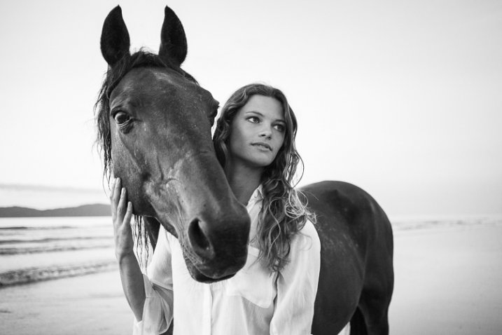
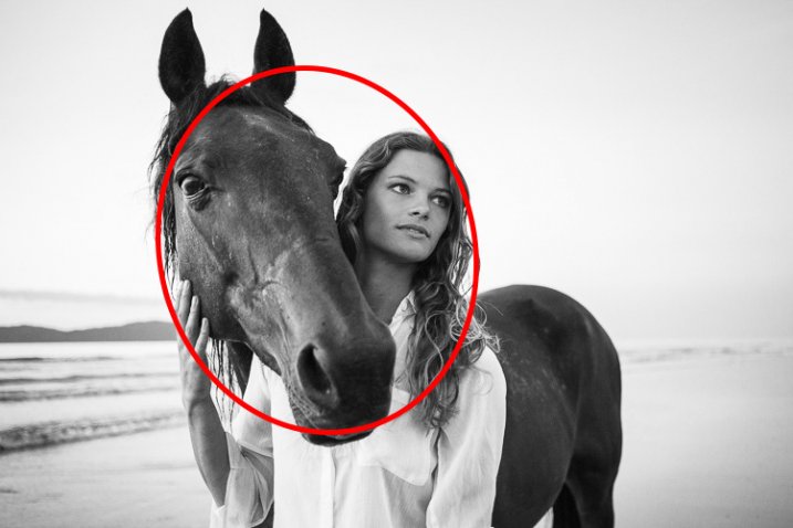
In this portrait, the proximity of the girl and horse suggest a close relationship between them. If closeness is what you want to show, it would be far less effective to position them with their heads further apart.

Gestalt theory and composition

Gestalt theory and composition

2. Similarity

Objects that are similar in shape, size or colour are seen as belonging together.

In this landscape photo, the three rocks in the middle distance are linked by proximity (the previous point) and by their similarity in texture, colour and shape.

Gestalt theory and composition

Gestalt theory and composition

3. Closure

The mind completes shapes that don’t exist. This is a principle used in some optical illusions but it also applies to photography. Part of the skill of composition is learning to recognize shapes, and building the design of the image around them. The principle of closure helps you see shapes in the subject.

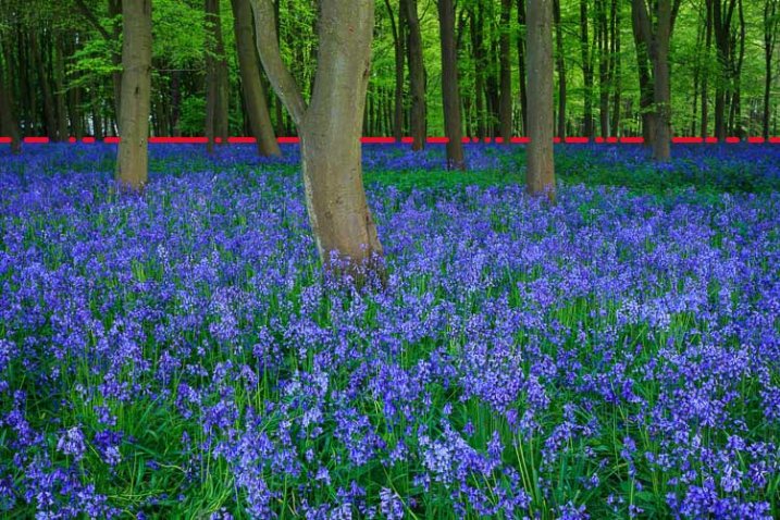
For example, take a look at the landscape below. The bluebells form a solid block of colour in the lower two-thirds of the photo, with a strong horizontal line along the top. The line is interrupted by the trees passing through it, yet we still perceive it is a continuous straight line. The mind automatically fills in the gaps.

Gestalt theory and composition

Gestalt theory and composition

4. Simplicity

The mind perceives parallel lines that are close together as a single line.

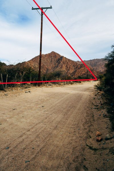
The landscape photo below contains several lines, all leading towards a vanishing point on the horizon. The lines that are close together, like the cables dangling from the telegraph pole, are simplified by the mind which sees them as a single line.

It’s the same with the fence. This set of short, vertical lines is simplified into a long, diagonal line that follows the side of the road.

Gestalt theory and composition

gestalt-theory-composition-5a

5. Continuation

The mind assumes that lines extend beyond the edges of the frame. In the landscape photo above this principle helps create a sense of depth (along with the use of a wide-angle lens) as the mind believes that the road continues beyond its vanishing point.

6. Segregation

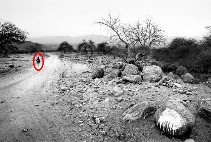
For human figures to be recognizable they must stand out from the background. That way we can identify them easily even if they’re small in the frame. This is a useful principle because you can include small human figures in the landscape to indicate scale. But it is important that they don’t merge into the background, otherwise they are difficult to see.

In this landscape, the man walking away from the camera is a dark figure against a light background (tonal contrast in action), and is easy to see and recognize.

Gestalt theory and composition

Gestalt theory and composition

7. Emergence

The viewer may not notice something in the photo when he first looks at it, but it becomes apparent after a period of study. This is an important concept because it is a way of making photos more interesting by presenting the viewer with something that is not evident at first, but reveals itself after reviewing the image. It’s a way of rewarding the viewer, and gives photos staying power.

For example, how long did it take you to see the cat in the photo on this page? Or the cow’s head in the opening photo (top of the article) of the singer?

Gestalt theory and composition


Mastering Composition ebookMastering Composition

My new ebook Mastering Composition will help you learn to see and compose photos better. It takes you on a journey beyond the rule of thirds, exploring the principles of composition you need to understand in order to make beautiful images. It’s on special for a limited time only at Snapndeals.

googletag.cmd.push(function() {
tablet_slots.push( googletag.defineSlot( “/1005424/_dPSv4_tab-all-article-bottom_(300×250)”, [300, 250], “pb-ad-78623” ).addService( googletag.pubads() ) ); } );

googletag.cmd.push(function() {
mobile_slots.push( googletag.defineSlot( “/1005424/_dPSv4_mob-all-article-bottom_(300×250)”, [300, 250], “pb-ad-78158” ).addService( googletag.pubads() ) ); } );

The post 7 Tips for Using the Gestalt Theory for Better Composition by Andrew S. Gibson appeared first on Digital Photography School.


Digital Photography School

 
Comments Off on 7 Tips for Using the Gestalt Theory for Better Composition

Posted in Photography


Nikon 1 J5 and Samsung NX500 added to studio test scene

08 Jun

We’ve just added a pair of compact mirrorless cameras to our studio test scene – the Nikon 1 J5 and Samsung NX500. The J5 brings a 1″-type 20.8MP BSI-CMOS sensor to Nikon’s entry-level mirrorless lineup. The NX500 is Samsung’s scaled down version of its flagship NX1, using the same 28MP APS-C BSI-CMOS sensor. See how each camera performs in our studio scene. Read more

Articles: Digital Photography Review (dpreview.com)

 
Comments Off on Nikon 1 J5 and Samsung NX500 added to studio test scene

Posted in Uncategorized


Buchrezension: Anton Corbijn – 1-2-3-4

08 Jun

Anton Corbijn

Bei seinen anhand der Fülle der Bilder und der Länge der Zusammenarbeit erkennbaren Lieblingskünstlern wie REM, Metallica und Depeche Mode ist Anton Corbijn schon seit den 80er Jahren heimliches Bandmitglied. Seine Schwarzweiß-Fotos und sein visueller Stil haben aber auch bei vielen anderen Bands und Solokünstlern maßgeblich das Image und die öffentliche Wahrnehmung über die Musik hinaus geprägt.
kwerfeldein – Fotografie Magazin | Fotocommunity

 
Comments Off on Buchrezension: Anton Corbijn – 1-2-3-4

Posted in Equipment


High Art Hits Streets: Classical Paintings in Modern Settings

08 Jun

[ By WebUrbanist in Art & Drawing & Digital. ]

art street train car

If context is critical to understanding art, then what happens to a work when you push a famous piece through time and space to a highly familiar and everyday place? Where fine artwork meets street scenes, strange and beautiful things begin to happen.

street art sidewalk scene

art coffee shop remix

In a series called Art History in Contemporary Life, Ukrainian artist Alexey Kondakov elaborately relocates key figures from their historical canvasses into jarringly mundane settings, putting classical art in modern contexts. The results are seamless and convincing – one could almost imagine rehanging the hybrid works back up in museums.

art classic harp player

art dive bar scene

art kissing train cars

Madonna, child and a chorus of angels are suddenly found sitting in a dirty subway car, cherubs flutter below a shanty overhang and a half-naked hand harp player spins tunes for pennies for commuting pedestrians. Famous figures share drinks at a modern dive while lovers kiss on a darkened subway car.

Share on Facebook


[ By WebUrbanist in Art & Drawing & Digital. ]

[ WebUrbanist | Archives | Galleries | Privacy | TOS ]


WebUrbanist

 
Comments Off on High Art Hits Streets: Classical Paintings in Modern Settings

Posted in Creativity


How to Build an Impressive Photography Portfolio from Scratch

08 Jun

Creating a photography portfolio can be a daunting experience. As a rule, photographers have basic or no knowledge of design at all. Moreover, creating a site with the pictures in focus can be a tricky task.

Being a photographer makes you a wearer of many hats. It’s critically important to have an online portfolio, so you can easily show your potential clients what you’re capable of. If you have no idea how to start, where to take pictures, how many of them you need for a site, and how to make your portfolio work for you, these tips may help you get started:

What is a portfolio? How Many Shots Do You Need?

A portfolio is an opportunity for you to present your work, but it’s important to consider why you need this portfolio. Are you going to use it to apply for a job? Do you want to use it to start your own photography business? Or do you just want to exhibit your work?

1

Portfolio by Marcus Smith

Also, you have to think about how many images you need to upload to your site. The layout usually looks good with a small amount of images uploaded on the home page. There should be a balance between the number of images you’re going to show and the negative spaces you leave between, or around them. If you have many images, consider separating them into categories.

When it comes to the home page, there should be something to pull the user in, then let them decide what to look at next. Value visitors’ time – they don’t need to see all the photos you took since 2008. Rather, display only your top-notch work and then show the potential client more photos if they request it. Don’t overwhelm them with pictures. Put the best pictures on the first page to stand out, and leave your other good work on the second page.

Think of Your Audience

Once you have decided why you need an online portfolio, you need to consider the audience you’re going to reach. Think of the reaction you want to evoke – do you want your clients to be touched, surprised or even shocked by your pictures?

2

Portfolio by Brian Ingram

If you’re aiming to specialize in wedding or portrait photography, it’s logical to include these shots first in your portfolio. There is no need to demonstrate your awesome landscape shots if you are aiming to attract clients for portrait photography. Keep your target audience in mind and do your best to create a site that solves their problems and provides answers to their queries, rather than simply bragging about your versatility as a photographer.

Brainstorm Project Ideas

If you have no idea what photos to upload to your portfolio, or you have no photos yet, you need to do some brainstorming. You’re building your portfolio in hopes of getting more clients, meaning that you don’t have hundreds of photo models knocking at your door. Start photographing your friends for free, shoot some events for charity, or even ask a popular wedding photographer from your area to hire you as an assistant, just to get wedding photos for your portfolio.

3

Portfolio by  Brett Arthur

There are many options when trying to find new project ideas: you can start a 365-day or 52-week project which will give you a great chance to practice as a photographer. This could lead to you shooting a subject that you never thought about and may result in a set of great shots for your online portfolio. Look at the work of other photographers to get new ideas for shooting, analyze their portfolios and try to make your own.

Present Like a Pro

Your portfolio website is nothing but a presentation, so when creating it, refer to some iconic presenters like Steve Jobs for better results. For instance, here are three presentation techniques from Apple’s founder you can apply to your own portfolio:

1. Make your passion prominent.

Jobs was passionate about every product he was involved in, his enthusiasm was obvious to anyone who heard him speak. There are few things in the world that spread as quickly as enthusiasm. Connect with your website visitors on an emotional level by showing your passion for what you do. This can be achieved through things like personal notes or comments on every image in your portfolio, a funny story told on your About page, or a set of behind-the-scenes photos shown in your main image slider or website background.

2. Build a clean, visual interface.

In his iPhone presentation, Steve Jobs used 19 words compared to the average 40 words used in a PowerPoint presentation. Make your website less wordy by utilizing a spacious preview page layout, big image sliders, and clean typography. Your business is about good pictures after all, not about writing essays. Make sure your site looks great on mobile devices and tablets, as that’s where the lion’s share of your visits will come from.

4

Defrozo

Among some free website builders that enable you to create beautiful, mobile-friendly websites are Defrozo and Koken. The first one is actually a multi-tool marketing platform that includes a full-fledged photography CRM (customer relation management), shopping-cart system, and other photo business tools in addition to a website builder. While Defrozo is a hosted service offering automatic updates and user support, Koken needs to be deployed on your own server.

3. Inspire your audience.

Every presentation by Steve Jobs was a great source of inspiration and education for his listeners. Images are a powerful medium that you, as a photographer, take advantage of by default. On your website, create a combination of images and words that would make people want to act and achieve something.

5

Portfolio by Estevez & Belloso

For instance, using a famous quote next to a photo, or telling a story behind one of your projects, can do the job of creating an extra layer of interactivity and inspire your web viewers.

Tell a story

Who doesn’t like a good story? Storytelling has become a powerful marketing engine lately and there’s no reason you can’t leverage it for your own business.

When uploading photos to your portfolio, you must describe them. A description is even more important than a title. Remember, when people see your photos for the first time, they want to know who or what is displayed in the image, what the context is behind the image. Maybe there were some interesting facts connected to the image. Feel free to share this with your audience.

Ask for Feedback

Getting your portfolio in front of other eyes can help you pick up on the omissions and bugs in the site’s design and performance. Submit the preview link to some forums and photography communities you’re a member of, or simply let your friends and family play around the site. Create a quick survey for them to fill in after they have checked it out – keep it short and to the point, asking only questions you plan to act on, and include some open-ended questions at the end.

Have different options

You need to decide what kind of portfolio you need: digital or paper? In the past, everything was on paper.

6

Portfolio by Michael David Adams

While a digital portfolio seems the ultimate solution these days, it’s also good to have a print portfolio for meetings with clients. Digital cannot fully replace print because of the special feel a printed photograph gives to the viewer. Consider creating your printed portfolio in a smaller format for portability purposes.

A beautifully designed image slideshow with emotional music added to it is also an essential element to your portfolio package. Along with a responsive website and personalized client photo galleries, it will make your digital showcase toolkit work at full power.

Over to You

What are your top techniques of building your photography portfolio? Share your proven tips with fellow photographers in the comments below.

googletag.cmd.push(function() {
tablet_slots.push( googletag.defineSlot( “/1005424/_dPSv4_tab-all-article-bottom_(300×250)”, [300, 250], “pb-ad-78623” ).addService( googletag.pubads() ) ); } );

googletag.cmd.push(function() {
mobile_slots.push( googletag.defineSlot( “/1005424/_dPSv4_mob-all-article-bottom_(300×250)”, [300, 250], “pb-ad-78158” ).addService( googletag.pubads() ) ); } );

The post How to Build an Impressive Photography Portfolio from Scratch by Nancy Young appeared first on Digital Photography School.


Digital Photography School

 
Comments Off on How to Build an Impressive Photography Portfolio from Scratch

Posted in Photography


7. Juni 2015

08 Jun

Das Bild des Tages von: the smiling sam

© the smiling sam

Im Ausblick: Ein Männerportrait
kwerfeldein – Fotografie Magazin | Fotocommunity

 
Comments Off on 7. Juni 2015

Posted in Equipment


Readers’ Showcase: Alexander Jikharev

08 Jun

DPReview regular Alexander Jikharev counts Henri Cartier-Bresson among his photography heroes. When asked why, he quotes his understanding of photography as ‘recognition, in real life, of a rhythm of surfaces, lines, and values.’ That rhythm is alive and well in Jikharev’s photography. Take a look at a few of his images here and find out more about him in our Q&A. See gallery

Articles: Digital Photography Review (dpreview.com)

 
Comments Off on Readers’ Showcase: Alexander Jikharev

Posted in Uncategorized


dPS Writer’s Favorite Lens – the Nikon 70-200mm f/2.8 VR2

07 Jun

We all have favorites; colors, cars, movies, and dogs. For one reason or another, they grow on you and the more you’re exposed to it, the more partial you become.

When it comes to photographers, we have favorites too. Brands, camera bodies, software, and of course, lenses. I’m no different.

Over the years many lenses have passed through my hands. I have also had experience with a slew of other lenses through newspaper jobs and loaners from friends; everything from fisheyes to 400mm, Sigma to Zeiss.

Each new lens gets to be a favorite for a time – I call it the honeymoon phase. But to really work its way into your heart and truly be that solid go-to favorite, you have to have the lens for an extended period of time. You also need the opportunity to put it through its paces under a multitude of conditions.

70 200 by Jeremie Schatz  10

The lens that fits the bill for me is the Nikon 70-200mm f/2.8 VR2.

Now, I am fully aware that the quality of this lens has never been in question. It is, after all, Nikon’s flagship fast telephoto zoom – with a price tag to match. Let’s start with the bad news: it costs a pension, it’s the size of a small tree, it weighs as much as a newborn baby, and its minimum focusing distance is about a mile away.

For some photographers any or all of these reasons can easily make this lens a deal-breaker. The price is a non-issue if you are a pro. I paid over $ 2000 for mine more than four years ago and I wouldn’t flinch to do it again. The resale value stays fairly high as well, which may help enthusiasts justify it to themselves.

The size and weight (3.4 pounds); well, you have to pay to play. I’m a bigger guy so I don’t often have the same complaints about the size and weight of a pro body and lens setup, and actually find smaller cameras a bit awkward to use for extended periods of time.

One reason I don’t mind the size of the 70-200mm is because I find the long barrel gives me ample space to get a solid grip. This provides stability for hand-held shots as well as providing a good pivot point for panning shots.

70 200 by Jeremie Schatz  4

The longer barrel of the 70-200mm has space to get a solid grip which can help obtain sharper panning shots.

The minimum focusing distance is 4.6 feet which, in contrast to the 10.8 inches of my second go-to lens – the Nikon 17-35mm f/2.8 – seems absurd. Would I trade any of the 70-200’s other features for closer focusing? Not a chance.

Those are my justifications for tolerating this lens’ shortcomings.

So why is this the lens that spends most of its life hanging off the front of my camera? Performance is definitely a factor. This is the sharpest lens corner to corner, throughout the aperture and zoom range I’ve ever used. While capturing dangerously sharp images, it maintains very impressive contrast, color rendition, and saturation under any conditions.

70 200 by Jeremie Schatz  1

The front lens element coating reduces ghosting and flaring, and produces great contrast and saturation in challenging lighting conditions.

Even compared to the tried and true Nikon 80-200mm f/2.8 (which I have used extensively) that many still stand by and the subsequent VR1 model (which I have also owned), the VR2 with Nano coating blows them out of the water. Backlighting, cross lighting, or shooting right at the sun don’t even phase it.

Some maintain that with camera bodies’ ever-increasing high ISO performance, optical stabilization isn’t as necessary as it once was. Perhaps. However, even compared to the previous iteration of this lens, the VR feature makes a very noticeable difference. I have scored sharp images shooting at quarter-second exposures hand held. Paired with its ability to focus in pitch darkness, it almost feels like cheating.

Since I don’t get any commission for selling Nikon products, and performance is reason enough for anybody to use this lens, let me explain why this is the lens for me.

Photojournalism, sports and weddings are what I primarily shoot.

For photojournalism assignments it is imperative to carry at least a couple lenses. I can almost guarantee that no photojournalist in the last 10 years has walked out the door in the morning without a 70-200mm on one camera and probably something like a 24-70mm or a wide fixed lens on another body. If I had to head out into the unknown and could only bring one lens it would be the 70-200mm.

70 200 by Jeremie Schatz  8

A wider lens would have resulted in the planes looking tiny in the far distance. Being able to quickly zoom in and compress the scene can be very advantageous.

The 70-200mm is a no-brainer for sports. Although it is nice to have a second body with a wide lens, that camera spends 98% of the event unused, while the workhorse does its thing.

70 200 by Jeremie Schatz  6

The 70-200mm is a mainstay for sports photography. Being able to quickly zoom out to 70mm allowed me to grab this shot.

Another handy feature of this lens is its ability to be matched to a teleconverter. Dedicated career sports shooters mortgage their houses to buy a fast 300mm or 400mm lens. For the somewhat rare occasions where I can’t get as close to the action as I would like, I can compromise and use a 2x teleconverter. Yes, this leaves me with a f/5.6 maximum aperture and less overall sharpness, but it is a much smaller price to pay.

70 200 by Jeremie Schatz  5

Although image quality and aperture suffers, a 2x teleconverter turns the 70-200mm into a 140-400mm opening up a new range of possibilities.

Personally, I love this lens for portrait-type work as well. While 85mm and 105mm lenses are favorite focal lengths for portrait work, the 70-200mm has both of these lenses built-in essentially. Maybe not at a super fast aperture but I much prefer to have the added versatility.

70 200 by Jeremie Schatz  9

Although some may not consider it a dedicated portrait lens, the 70-200mm delivers creamy backgrounds and its focal length doesn’t distort facial features.

Even getting up close I will keep this lens mounted. I find 70mm to be wide enough that you don’t have stay too far from the action, while being able to get those tightly-cropped detail shots with creamy bokeh.

Another reason why I stick with a longer lens is that depending on what I’m shooting, I often prefer to stay away from the action. We have all heard someone say something like, “who needs a zoom lens when you have feet”. I have found that if you have to get too close to the action, you inevitably become part of it. My feeling is that in many cases a photographer’s responsibility is to capture an event unfolding and not distract or divert attention from it. It’s not a hard and fast rule, but one I adhere to as often as possible to maintain the fly-on-the-wall philosophy.

70 200 by Jeremie Schatz  2

Sometimes you can’t, or don’t want to, get too close to the action.

Everyone has an opinion, with reasons to support it, and those are mine. Anyone agree? Anyone think I’m full of it? If this is your go-to lens as well, what are your reasons?

googletag.cmd.push(function() {
tablet_slots.push( googletag.defineSlot( “/1005424/_dPSv4_tab-all-article-bottom_(300×250)”, [300, 250], “pb-ad-78623” ).addService( googletag.pubads() ) ); } );

googletag.cmd.push(function() {
mobile_slots.push( googletag.defineSlot( “/1005424/_dPSv4_mob-all-article-bottom_(300×250)”, [300, 250], “pb-ad-78158” ).addService( googletag.pubads() ) ); } );

The post dPS Writer’s Favorite Lens – the Nikon 70-200mm f/2.8 VR2 by Jeremie Schatz appeared first on Digital Photography School.


Digital Photography School

 
Comments Off on dPS Writer’s Favorite Lens – the Nikon 70-200mm f/2.8 VR2

Posted in Photography


No Perking: 15 Drained Dry Abandoned Coffee Shops

07 Jun

[ By Steve in Abandoned Places & Architecture. ]

abandoned coffee shop 2b
These 15 drained, disused & abandoned coffee shops recall a kinder, gentler, perkier time before Starbucks rebrewed the latte lover’s landscape.

abandoned coffee shop 2c

abandoned coffee shop 2a

Black gold, Texas tea… not the rich dark liquid you were looking for? Well you’re lookin’ in the wrong place, pardner. Said to be “a far West Texas oil town eatery” that last flourished along with the rest of Penwell, Texas back in the Roaring Twenties, the Joker Coffee Shop looks to have last provided service (with a smile) long, long ago.

abandoned coffee shop 2d

Regarding the stuffed leopard in the former cafe’s restroom, let’s just say they didn’t call it The Joker for nothing. Hey kitty, why so serious?

Beaver Tales

abandoned coffee shop 15

abandoned coffee shop 15b

Here’s a late and no doubt lamented “abandoned coffee shop/adult entertainment facility” in Okayama, Japan. The place’s name is “Beaver” (of course); Flickr user Trevor Williams visited the site in June of 2009 for some, shall we say, “creative photography” and we are SO glad he did!

3 Stars, Yer Out!

abandoned coffee shop 3a

abandoned coffee shop 3b

Central Perk it ain’t… The cozy 3 Star Coffee Shop on Columbus Avenue at 86th Street in Manhattan’s West Side has seen better days, as have almost every other store on the block.

abandoned coffee shop 3c

West Side Rag‘s “intrepid tipster Kenneth” (hey, it’s better than being an intrepid hipster) was sent to check out the abandoned coffee shop in August of 2014 and he was, shall we say, less than impressed: “Half torn out. There must have been 1 million flies inside. Clearly, food must have been left inside.” Guess their signature Donut Burger Sandwiches didn’t exactly sell like Cronuts.

Hey Jo…

abandoned coffee shop 4

Starbucks may have dealt traditional coffee shops a wicked uppercut; then McCafe moved in to deliver the knockout punch – at least, such can be surmised about the above abandoned Jo To Go in Savannah, Georgia. “This drive-thru coffee shop was built in the parking lot of the shopping center at the corner of Waters Ave. and Eisenhower Drive, behind a McDonald’s, in the spring or summer of 2007,” according to Flickr user C-Bunny, “and had closed sometime earlier this (2010) year.”

Denny’s Destiny

abandoned coffee shop 14a

abandoned coffee shop 14b

When Flickr user Charles Hathaway snapped the sad state of Denny’s Coffee Shop (and adjoining motel) in Palm Springs, California, he hedged his commentary by stating “It seems like someone has bought the land with the intention of re-opening the motel.” Hope someone’s watering the palms in the meantime.

abandoned coffee shop 14c

“A restaurant will likely open in this former Denny’s once the motel opens.” That was in January of 2008… what was the ultimate fate of this palm-treed oasis and its Space Age architecture and awesome flying saucer chandelier?

Next Page – Click Below to Read More:
No Perking 15 Drained Dry Abandoned Coffee Shops

Share on Facebook


[ By Steve in Abandoned Places & Architecture. ]

[ WebUrbanist | Archives | Galleries | Privacy | TOS ]


WebUrbanist

 
Comments Off on No Perking: 15 Drained Dry Abandoned Coffee Shops

Posted in Creativity


Photo District News Presents The Look Competition

07 Jun

Photo District News The Look Competition 2015


Hey there FashionPhotographyBlog.com readers,


We are really excited to announce that our friends over at Photo District News (PDN) are having a competition, called The Look and are open for entries right now!


The Look is PDN’s comprehensive competition for evocative fashion and beauty photography, with categories for professional photographers, such as still photographers and motion photographers, as well as for students of photography.


We are at FPBlog are excited for the next edition of the look and you should be too! I’m sharing this competition to you guys because we know that winning a prize like this could really help give you a boost to your photography existing career or help you start one.

Photo District News The Look Competition 2015


3 Reasons why you should be excited about the Look Competition


Here are our top 3 reasons why we are excited about this competition:


1) The range of work. The Look includes many categories to enter in such as advertising, editorial, still life/accessories, personal work/fine art, runway/street scenes and beauty, plus a motion category for film and a debut/student category for rising stars.

The competition aims to cover all facets of the fashion industry. Last year’s winning work included a series of Chloé handbags shot for Barneys’ look books, a beauty series in Vogue Italia, and a film from a Valentino runway show.

Photo District News The Look Competition 2015


2) The grand-prize package. With a $ 3,500 award to fund a photographer’s work, $ 500 for equipment at B & H, and a one-page profile in Photo District News, the grand-prize package provides the winner with an exceptional opportunity for growth.


3) Promoting the winners. All the winners of this competition will be published in PDN’s October issue this year. Online, The Look winners’ gallery always makes for a beautiful collection of work, and PDN are proud to showcase them! In addition to the print and online gallery, PDN organized an exhibition of the winners’ works at the PhotoPlus Expo at the Javits Center in October last year, which saw 22,000 visitors over the event. PDN will be looking for more opportunities like this to exhibit this year’s winners. You can take a look at last year’s winner gallery by clicking here –> The Look 2014 Winners


Photo District News The Look Competition 2015

The Look Competition Prizes


Here is a recap of the prizes offered in PDN’s The Look Competition for 2015:


ONE GRAND-PRIZE WINNER WILL RECEIVE:


– $ 3,500 cash prize


– A $ 500 B&H Gift Card


– A one-page profile in an issue of PDN


SEVEN FIRST-PLACE WINNERS WILL RECEIVE:


– $ 100 B&H Gift Card


ALL WINNERS WILL RECEIVE:


– A one-year PHOTO+ Basic Membership


– A place in the print/online winners’ gallery in the October 2015 issue of PDN


– The official winners’ seal for The Look


For more information on how to enter The Look competition, you can click and visit this link here -> The Look Competition Details


Entries close June 30th 2015, so do hurry to enter!

Photo District News The Look Competition 2015


Fashion Photography Blog

 
Comments Off on Photo District News Presents The Look Competition

Posted in Uncategorized